#grotesk
Text

Grotesk by Regular Lines TF (test print)
155 notes
·
View notes
Text
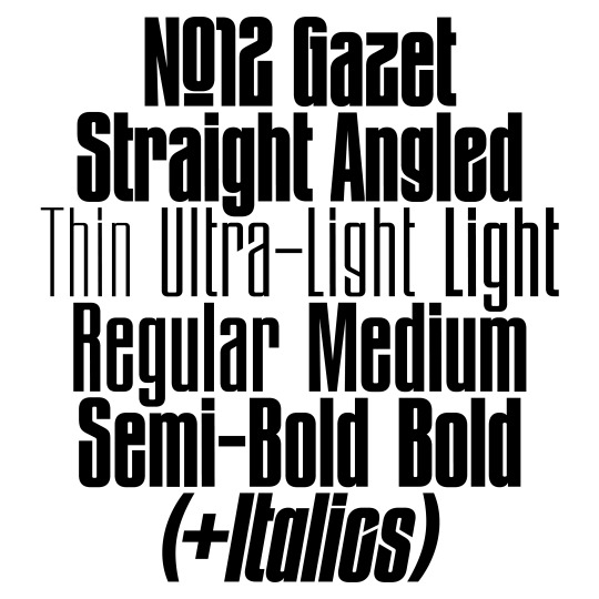
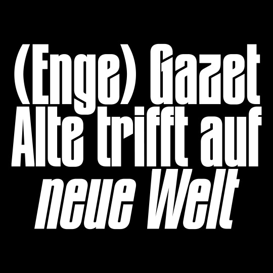
The original »Bold Angled« style has been complemented by lighter weights, italics and an entire family with straight endings making it a versatile family for a wide variety of display usage. OpenType features such as a monocace feature allows tight line spacing and creative typesetting.
www.new-letters.de
#newletters#typography#gazet#condensed#grotesk#thomasjohn#release#graphicdesign#eyeondesign#grafikradar#tomorrow_featured#typeinspire#contemporarytype#typegoodness#thedod#designfeed#typetype#365typefaces#aigadesign#itsnicethat#designeverywhere#type01
30 notes
·
View notes
Text
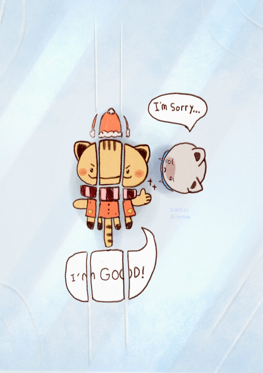
I'n nGO( )D!
---------------------
Silly and happy drawing always brigten up my days 😍
#sillyposting#so silly#silly#silly goofy mood#too cute#adorable#aww#cute#cuteness#so cute#skate#ice skating#kitty#cute cat#pets#cute animals#catnap#cute cats#warrior cats#kittens#cats of tumblr#cat#grotesque#grotethe#grotesk#grote markt#illustragram#illustration#illustrator#illustrative art
23 notes
·
View notes
Text
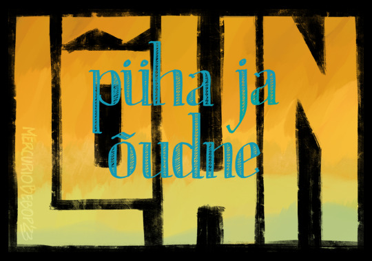
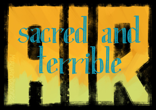
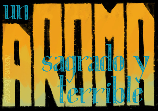
Decided to surf the inspiration wave while it lasts. I did some callygraphy practice! The original Estonian title, English translation, and my native Spanish.
Ask for (and provide!) any other translation you want to see!
#hgdraws#püha ja õudne lõhn#sacred and terrible air#un aroma sagrado y terrible#callygraphy#typography#didona#grotesk#disco elysium
47 notes
·
View notes
Text
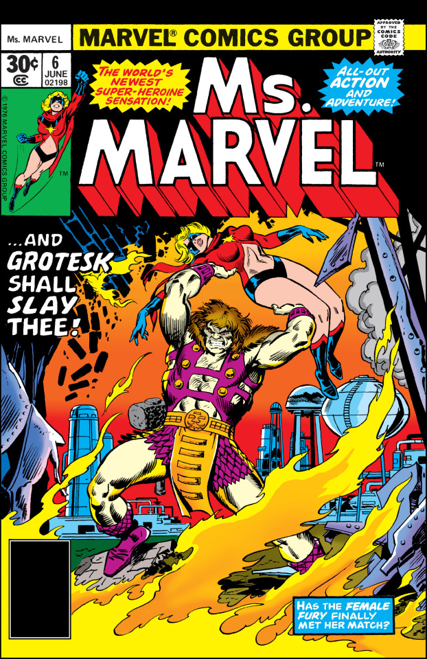
Cover of the Day:
Ms. Marvel #6 (June, 1977)
Art by John Buscema, Frank Giacoia, Marie Severin, and Danny Crespi
24 notes
·
View notes
Text
konwencja groteskowa
-
Ukazuje świat surrealistycznie,
absurdalnie przedstawiając wizje,
tragiczne postacie, płacz czy śmiech
zestawienie paradoksalnych cech.
#cytaty#cytat po polsku#polski cytat#smutne#mój cytat#depressing quotes#cytaty o miłości#miłość#cytat dnia#smutna prawda#smutny cytat#blog z cytatami#wiersze o miłości#wiersze#wiersz#poezja#grotesk#smutno
7 notes
·
View notes
Text
#poster design#graphic design#gfx#design#art#poster#graphics#inspo#dark#typedesign#minimal#illustration#modern art#grotesk
5 notes
·
View notes

Text


Assorted ms paint drawings.
#ms paint#microsoft paint#digital illustration#digital#witch#mario 64#cyberpunk#hatsune miku#gex#video games#pink#priest#moon#sad#grotesk#robot girl#bad drawing#shitcore#kronenbourg#monster#creture#chimera
8 notes
·
View notes
Text
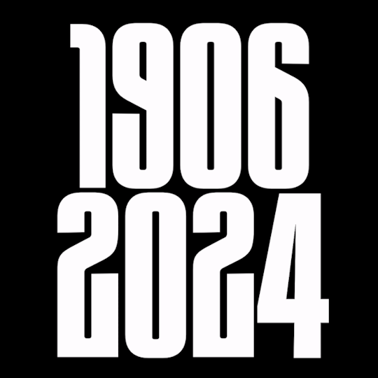


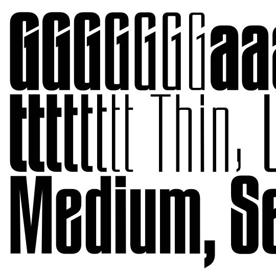
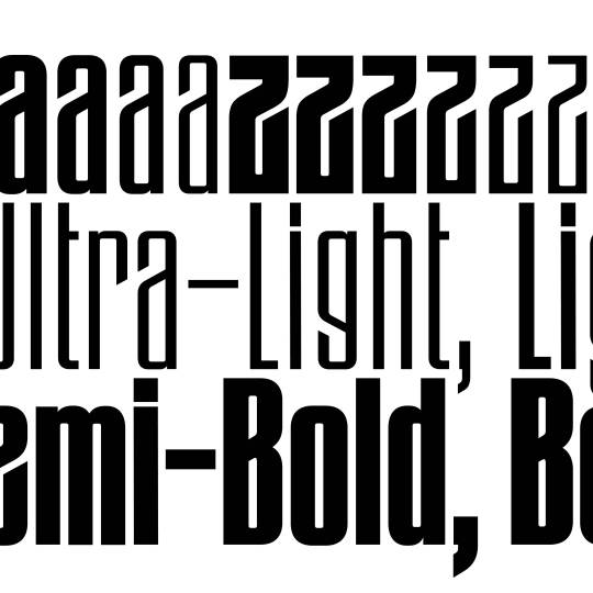
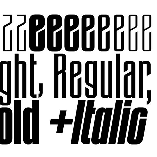
Gazet was created after Thomas John found some old metal letters of a typeface entitled »Zeitungs-Grotesk« by the Bauer foundry from 1906. He was immediately fascinated by its art nouveau influences such as the uppercase »A«, diagonal endings, dense construction and interconnection.
The Angled and Straight subfamilies create a clash between the old and new. Art nouveau meets modernism, sharp meets straight.
www.new-letters.de
#newletters#typography#gazet#condensed#grotesk#thomasjohn#release#graphicdesign#eyeondesign#grafikradar#tomorrow_featured#typeinspire#typespire#contemporarytype#typegoodness#thedod#designfeed#typetype#365typefaces#aigadesign#itsnicethat#designeverywhere#type01#typefoundry
28 notes
·
View notes
Text
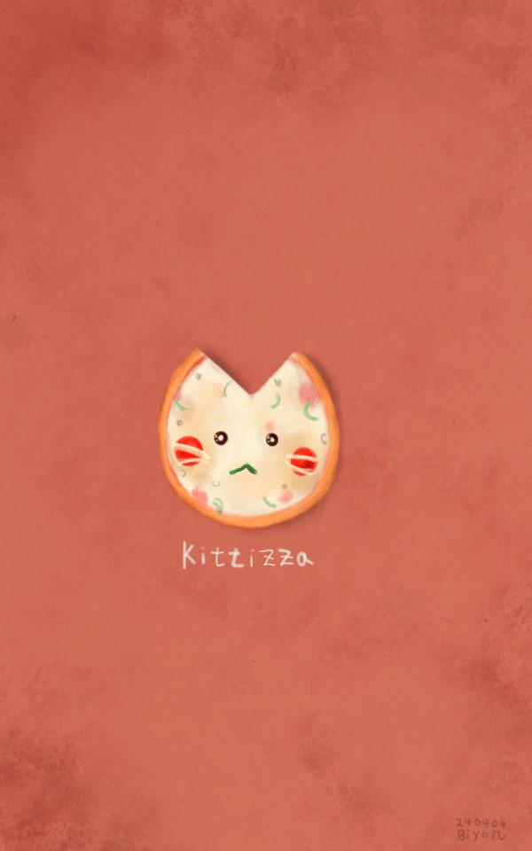
Kittiza
#pizza tower#grotesque#illustragram#illustration#adorable#grotesk#pizzalover#pizzahead#pizzaparty#good pizza great pizza#pizza cat#cute cat#cute animals#warrior cats#cats of tumblr#catnap#cute cats#kittens#kitty#pets#kitties#cat
14 notes
·
View notes
Text
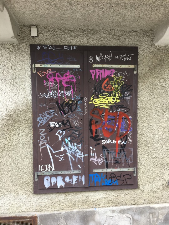
#graffiti innsbruck#tirol#austria#innsbruck#graffiti#grotesk#fovs#lord#zoe#falco#mücke#sad#sorgen#ozero#geto#tcv#edez#ras#iloveyou#frida#troz
3 notes
·
View notes
Text
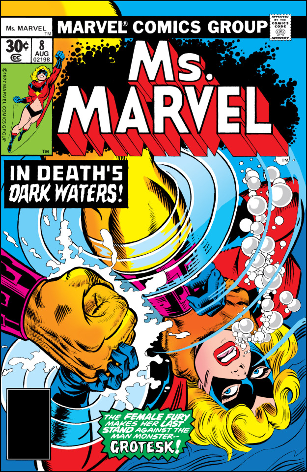
Cover of the Day:
Ms. Marvel #8 (August, 1977)
Art by Keith Pollard, Joe Sinnott, and Danny Crespi
12 notes
·
View notes
Text
This world will choke on my rage. They think they can bury me, but I'll claw my way out, leaving a trail of splintered bones and spilled guts in my wake.
---------------
'AI generated'
0 notes
Last Seen Blogs

longdenviet
Lồng Đèn Việt

lesbian-towa-higurashi
lesbian-towa-higurashi

soulscented
SOULSCENTED by Rachael White

dany9411
LiFeTiMe
stfuandwatchthemovie
Be yourself, unless you suck