#typespecimen
Text


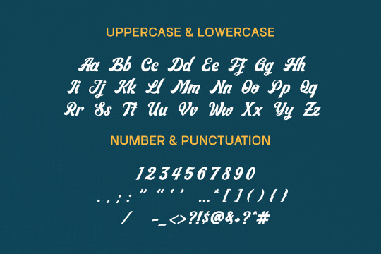

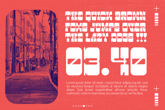
FREE DOWNLOAD!!! WARINGIN - SCRIPT TYPEFACE
Waringin is a retro styled and graceful script font. Fall for its gorgeous style and use it to create gorgeous wedding invitations, beautiful stationary art, eye-catching social media posts, and much more!
TAP HERE FOR FREE DOWNLOAD
TAP HERE TO BUY FOR COMMERCIAL USE
THANKS FOR YOUR LOVE
#font#fonts#type#typeface#displayfont#futuristicfonts#alphabet#myfonts#logodesign#esportlogo#fontdesign#typefacedesign#typography#typographicdesign#template#trendingfonts#typespecimen#typedesign#fontstyle#typographytips#fontsforyou#displayfonts#contemporarytype#letters#art#artists on tumblr#books & libraries#illustration#music#graphic design
3 notes
·
View notes
Photo
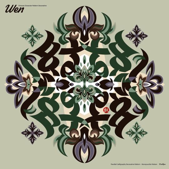
Chinese character pattern decorative #type #typedesing #logotype #typeface #chinatypo #typefacedesign #chinesecharacters #typegraphy #fontdesign #graphic #calligraphy #handwriting #typespecimen #branding #字体设计 #手写 #书法 #作字 #汉字 #字体 #中国 #中文字 https://www.instagram.com/p/CkXh7agPiCT/?igshid=NGJjMDIxMWI=
#type#typedesing#logotype#typeface#chinatypo#typefacedesign#chinesecharacters#typegraphy#fontdesign#graphic#calligraphy#handwriting#typespecimen#branding#字体设计#手写#书法#作字#汉字#字体#中国#中文字
0 notes
Photo

Bower & Bacon, 1830 #typespecimen https://instagr.am/p/CuCABW9rHgf/
13 notes
·
View notes
Text
Final rationale and reflections
Booklet and kinetic type
After considering my pepeha and thinking about significant places to me, I chose the font New Zen because it is a round font which reminds me of safety and the feeling of peace, or zen, that I have when I am in New Zealand. I originally wanted my typeface to be about the joining of Chinese culture (my mum's side) and New Zealand culture (my dad's side), but this got a bit confusing as I was trying to combine too many different ideas, so I decided it was better to just focus on one place. I picked New Zealand because it is the place I consider home and I have a much stronger connection to it compared to China.
This being said, I originally picked red and yellow as the colours for my type specimen (as these are traditional Chinese colours), and I have kept these colours (using a lighter shade of red to make it less bold and more calming) as they create feelings of warmth, excitement and nurturing, which I associate with the idea of home and belonging in Aotearoa.
I used names of places in my local area that have significance to me to showcase the font in different weights and sizes, and used some research that I collected on the diversity in Tāmaki Makaurau to showcase my font as body text.
The first booklet draft that I made was in greyscale with a very linear and rigid style, using lines and rectangles in an attempt to emphasise the feeling of 'zen' and calmness. However, I found that this gave the booklet a serious, solemn feel and did not reflect the rounded shape of the font. I did not want to display New Zealand as a boring, serious place, but rather a welcoming, safe home to me. After reflecting on this, I decided try something different and changed the style completely to incorporate a curved, wavy design into my booklet, symbolic of the mountains and oceans in Aotearoa (also relating to my pepeha). I found this much more successful as it complemented the rounded style of my font and showcased New Zealand in a more positive, warm light.
I learnt valuable skills through making my type specimen booklet, some of the key ones being how to use grids to create a cohesive and consistent layout, spacing and use of negative space and the importance of consistent research and finding new ideas and inspiration.
Moving forward into my kinetic type video, I wanted to highlight the different aspects of Tāmaki Makaurau (city, mountains and ocean) through my pepeha. I took forward the wavy, 'zen' style of my typespecimen booklet and developed it for my video - using the wave as a transition between sections of my pepeha. I considered changing the colour scheme to green look more 'NZ' but decided against it after trying it, as it did not add any significant value, and created less contrast visually.
I did a lot of research before beginning my prototyping, gaining inspiration from different type videos and animations, as well as ads for NZ travel to get an idea of how Auckland is showcased. This inspired me to experiment with a range of different techniques and styles, including using videography, 2D vector based shapes and illustrations, adding music, fast paced animations vs slower paced, different transitions etc.
In an overall reflection, I am very happy with my finished product. I feel that I have improved a lot since I have started this course, not just in my adobe skill level, but also in my ability to generate ideas, research and problem solve.
If I had more time to do this project, I would experiment with different media and methods of animation such as stop motion or photography, as I focused solely on creating my video on Aftereffects and developing my digital skills. I originally wanted to combine analogue methods with digital but did not end up having the time to do this.
0 notes
Text

Proof Two - Auvie
This week Auvie brought a full work up of his typespecimen poster. I am enjoying his use of type and the colour scheme he's chosen. I think his pairing of fonts also works quite well.
Changes for next week
less vibrance
using more type recipes
justified text
findin some way to incorporate glyphs and symbols
0 notes
Text

Front cover of my typespecimen booklet.
I went for a more simple look for my front cover in the end rather than my previous thumbnail one as the big "COMO" split just didn't look good to me
1 note
·
View note
Text
Artist Models
I also went on Behance/ Instagram and tried to find artist models that suited the aesthetics I wanted my type specimen booklet, just to get inspiration on how I would layout it while also referring to my 4x thumbnail sketches.
Artist Models (found on Behance/ Instagram)
Malak Hussein- I really like the simplicity of her designs and even though her designs are simple, the colours does make an impact.
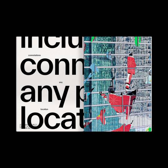
I found this type specimen book by Haechun Jung who did a type specimen book based on the font of "DIN" typeface and I liked this layout of his/her specimen book.
I came across an Instagram account that shows different typefaces and layouts as well as how they use colours in their type specimen book.
0 notes
Text
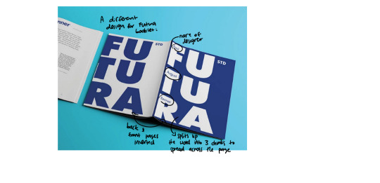
Bēhance inspiration for type specimen books.
With a brief search on Bēhance I found a type specimen book by Haechan Jung 해찬중 on the Sans-Serif typeface DIN. I like how this one really broke down elements of the individual characters and their form and the use-for-purpose mockups/graphics they made. Though it is a sans serif typeface which does lend itself to very block-like and geometric layouts, the contrast created in using colour and focusing on the impact of negative space. I like how it doens't necessarily have consistantly symmetrical layouts - something i noticed a lot of typespecimens have.

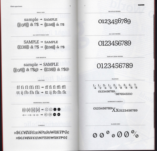
Another by Dagger Type on the Serif typeface Klutz. I really liked how this booklet was formatted and how the type was showcased. I particularly liked the graphic uses of the font at the end of the booklet. This was one of the few booklets i could find that was formatted to the size we are working with. A lot more of the examples i have come accross are wider and are able to work with a lot more space. Below are a few of the pages which i particularly liked. A lot of the pages in his booklet follow a similar structure using horizontal lines to divide elements, much like what we did last week in the Pānui task in class. What i do like is how he pushes scale in his booklet, from very small text to large almost illegible type forms. He does play with both portrait and landscape spreads which is something i would like to try for some variation. I also really like the simple contrast bought about by using filled text and outlined text, especially with the first spread where he overlays every accest available in the typeface on top of one another.

1 note
·
View note
Text
17.
Issuu Link:
https://issuu.com/knnnhen/docs/kannon_hen-504-typespecimen-single
Final Design:


1 note
·
View note
Text


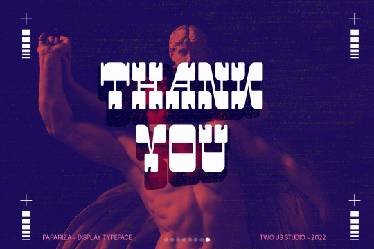
FREE DOWNLOAD!!! PAPARIZA - UNIQUE DISPLAY TYPEFACE
Papariza is a retro and western looking display font. This bold, unique and vintage font can easily become your favorite. It can be used for books, magazine covers, social media posts, invitations, and so much more!
TAP HERE FOR FREE DOWNLOAD
TAP HERE TO BUY FOR COMMERCIAL USE
THANKS FOR YOUR LOVE
#font#fonts#type#typeface#displayfont#futuristicfonts#alphabet#myfonts#logodesign#esportlogo#fontdesign#typefacedesign#typography#typographicdesign#template#trendingfonts#typespecimen#typedesign#fontstyle#typographytips#fontsforyou#displayfonts#typefoundry#contemporarytype#letters#design#graphic design#handmade#collage#illustration
0 notes
Photo

究竟涅盘 #type #typedesing #logotype #typeface #chinatypo #typefacedesign #chinesecharacters #typegraphy #fontdesign #graphic #calligraphy #handwriting #typespecimen #branding #字体设计 #手写 #书法 #作字 #汉字 #字体 #中国 #中文字 https://www.instagram.com/p/CjakXWuuwMo/?igshid=NGJjMDIxMWI=
#type#typedesing#logotype#typeface#chinatypo#typefacedesign#chinesecharacters#typegraphy#fontdesign#graphic#calligraphy#handwriting#typespecimen#branding#字体设计#手写#书法#作字#汉字#字体#中国#中文字
1 note
·
View note
Photo

Time is up. Who wouldn’t want to use these initials. #enschede #1768 #letterpress #typespecimen https://instagr.am/p/CujBtUls8du/
10 notes
·
View notes
Text
Archivo Typeface Social Media Videos.
Following on from my typespecimen advertising Archivo, I then made two Instagram videos and two Facebook videos to expand my audience the typeface was reaching. I used Adobe Photoshop to make the videos. My theme was how it can be used in both analog and digital media - like it was designed to be used.
The videos will follow this post.
0 notes
Text
Re-designing the cover
I wasn't 100% happy with the cover of my booklet - I felt that the words weren't standing out and it was plain and boring to read. So I went about doing some more research and looking at examples of typespecimen booklet covers online.


Then I began experimenting with some of the design techniques and styles that I liked and created some cover concepts for my booklet.
Book cover concepts:

After asking different people and getting an outsider perspective of which one is the clearest and easiest to read, and stands out more, most people said the last one. So I took the main text style and design and modified the layout a bit to reflect my pepeha and NZ a bit more - I added the silhouette of mountains to symbolise place and NZ.
Final booklet cover:

0 notes
Photo


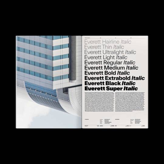
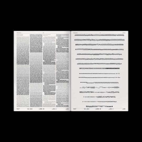
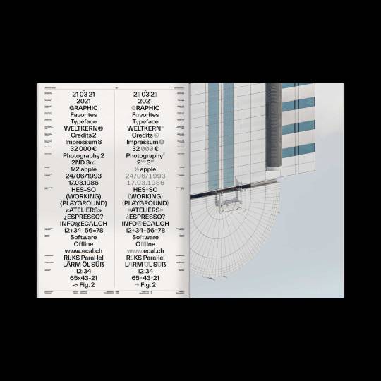

Forever Everett out now on WELTKERN®! 🌈
Published by WELTKERN®
Photography by Daniel Everett
Typography by Nolan Paparelli
Printed by Offizin Scheufele
#weltkern#twkeverett#typeweltkern#nolanpaparelli#danieleverett#forever#everett#forevereverett#specimen#typespecimen#typedesign#typeface#type#poster#print
188 notes
·
View notes
Photo
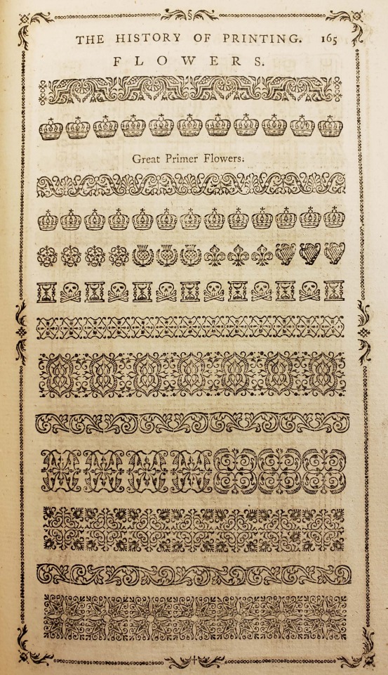
From: Luckombe, Philip, -1803. A concise history of the origin and progress of printing. London : W. Adlard and J. Browne, 1770
Z124 .L94
#typespecimen#printerstype#printingtype#type#caslon#williamcaslon#floralornament#crowns#thistle#fleurdelis#skullandcrossbones#hourglass#english#18thcentury#rarebooks#specialcollections#libraryofva
320 notes
·
View notes
Last Seen Blogs

chaoticwistfulness
Chaotic Wistfulness

ex-cla-ma-tion
DEAR DIARY,

nandhnicarrentalschennai
Untitled

camaro-and-smokes
Bby deserved better 💜
vivinice3
All About Fangirling ツ