#but also because the cinematography of this season was SCRUMPTIOUS it was beautiful
Text
Tiny YR S3 Analysis
Just wanted to compare the parallels between these two hand holds in 3x05 and 3x06:
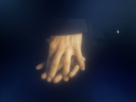
(Please ignore the shitty screencaps, I tried my best)
In terms of composition, these shots are identical. A hand-hold centre to the frame, in a car with the camera placed in the middle. However, they're underpinned by different narrative contexts.
Here, the first shot from 3x05 is drenched in darkness. The actual lighting inside of the car is dim enough to obscure both of their suits, which almost blend them into the seats and so it becomes hard to distinguish between the two of them - The only focussed light is on their conjoined hands. Notably, the actual touch itself is tentative, almost like the bridging of an awkward divide on the way to the palace. Neither of them are sure what the touch actually means. Even their sleeves fall over their wrists and interfere with the actual act, so we only see the bottom half of their hands. Simon reaches out first and places his hand in the open sliver between the two seats before Wille accepts and laces their fingers together. It's an assured squeeze that reads as: "I'm not sure what will happen. I'm nervous." "I am too."
This scene has garnered a lot of analysis for its parallel to the Kristina x Wille car scene in S1 where people have commented on the reversal of blocking - Wille now assumes Kristina's position and Simon equally assumed Wille's. We now know that this arrives before the birthday explosion, and so it's also a touch that signifies confronting the inner workings of an oppressive environment (the palace). It's nerve-wracking and cautious and consolidating, but it's also doubtful. We, as spectators, pick up on visual and physical cues and so we begin to see the hand-hold as an visual indicator that the unity between the two characters is about to be disrupted.
~~~~~
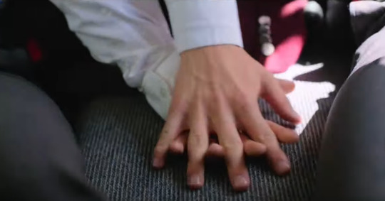
However, the shot in 3x06 reads entirely differently. The first thing is that the shot is bathed in light. It's a bit like an embrace, contrasting the previous presentation of a cold backseat, Simon and Wille are literally basking in the sun. Most importantly, there is a light flashing on Wille as it seeps in from the windows, illuminating his spot as a person who is newly free. Simon sits to the left with the natural light (no abundance of light) because Simon has always strived to be free. He has never turned away from the light. As he said earlier in the episode: "I never gave up on us. I gave up on the royal court." For Simon, the issue was never the fear of being free, but the constraint of not being free. For Wille, fear hung over his shoulders just like a King's robe would. Being free was an aspiration, never a reality.
But that has all changed. The light is let in. It stands similar to a spot-light, where Wille finally lets the sun hit his body and not have it scorch him, but rather enlighten him.
The actual act of holding hands is no longer bridging an uncomfortable space; It's an assured togetherness. It is the two of them acknowledging everything that has happened and knowing that a future for the two of them is no longer a "possibility", but a truth. It's giddy and confident and safe.
It's also the final touch of the season, and so it had to speak louder than dialogue ever could - Which I think that it does. Throughout S1 and S2, we understood that physical touch was always done in private, or if not, it was done discreetly with the knowledge that it was fleeting. S3 saw the transition from private to public, but not without the fight to touch and not have it be seen as a revolution. To just let it be what it is. And THIS is what the show has been working towards for 3 years. It can all be summarised with this simple, final hand hold in a sunny car that's racing towards a future that finally, finally resembles their dreams. It's not overtly revolutionary, it's not a grand gesture; It's just theirs.
#yr s3 spoilers#young royals season 3 spoilers#young royals spoilers#young royals#tv analysis#young royals season 3#this is all I could write amidst my burnout so I'm very sorry#I'm desperate to sink my teeth into the analysis of this season because it was fantastic#but also because the cinematography of this season was SCRUMPTIOUS it was beautiful#as we all know I love when parallels parallel because it's not only a great aesthetic motif but it's also narratively telling#these things are put in for a purpose and I love dissecting things#I hope to do some longer analysis' when I'm feeling more up for it but I hope this makes sense!#lisa ambjörn#rojda sekersöz
56 notes
·
View notes
Text
The Creative Directors Behind Fate: The Winx Saga Must Not Be K-Pop Fans
Also, they have a pretty wrong idea of the role fashion should play in a show.
There are a few words that will stand out across most reviews of Netflix's Fate: The Winx Saga - drab, boring, flop, flat, unimaginative. Critics and audiences consensus is that the show is not only a mediocre-at-best story, but also an atrocious (and ultimately confusing) choice of adaptation of the color pop and fairy magic cartoon it’s based on, 2004 italian cartoon Winx Club.
Fate has plenty of it's own issues - white washing and erasing characters, cringey dialogue, outdated melodrama, etc. But where it truly, unequivocally fails is as an adaptation. Fate misses everything that was magical and lovable about the original series, in all levels, from bizarre writing choices, - such as never actually developing any sense of friendship between the characters, who are based on a cartoon about…..a group…….of friends -, but it's especially and immediately felt in the art direction and costume design.
Winx Club is set on a fantastical world, Magix, where each of our main characters hail from a different planet, à la Sailor Moon. Alfea, the fairy school they attend, is the most common background: a pastel colored, futuristic high tech-meets-fantasy, art nouveau inspired castle. Alfea sets the tone for the whole visual of the cartoon: bright, colorful, futuristic meets vintage, leaning into the technological positivism of the Y2K style, uniting it with magic, DnD worthy monsters and, of course, fairy wings. Often featured are also the Red Fountain school, where the Specialists train, and especially Cloud Tower, the goth and gothic inspired witch school Alfea has an OxBridge rivalry with (How cool would that be in a live action? I guess we’ll never know…).
On Fate, Alfea is the only school we ever see, and it’s another beige boarding school in not-Britain, somehow set in a magical world where everyone has the exact same technology and even social media that we have on Earth in 2021, no transformations and, most egregiously, no fairy wings.
This lack of visual creativity is pervasive throughout the whole show, and its most heartbreaking iteration is in the characters' wardrobe. The styling has the barest bones of a color scheme, - such as 'Bloom has to only dress in red since fire, duh',- the clothes are ill fitting, bland, dark and very dated. These are supposed to be teenagers who enjoy fashion, and yet they look like varying types of soccer moms from 2010.
The series seems to operate on an old and tired vision that women and girls can’t have depth and have adventures and fight monsters while also caring about fashion, a vision that the original show played a big, big role in challenging in the early 2000's. Fashion and costume design sets as much of the tone of a visual medium as the script does; through clothes we can gauge characters’ backgrounds, passions, and personality.
Winx Club has some of the best examples of this in the cartoon sphere - Bloom’s comfortable and bright style, Stella’s glitzy and bold, Musa’s edgy and cool, Aisha’s sporty and fun, Techna’s neon and tech gear inspired, Flora’s earthy and romantic, they all work as extensions of each character and serve a narrative purpose. And that’s not even mentioning how insulting it feels that in their quest to make Winx “edgier, darker” and fit for an older audience, the creators of Fate somehow decided that was in opposition to caring about style and fashion. Most “girly” shows, including the Winx Club are just as much adventure action shows as the ones geared towards boys, and it’s emphasis in fashion, friendship and color does not detract from that. The original run of the cartoon deals with war, violence, grief, abusive relationships and even genocide; leaning into those plotlines would not require Fate to erase any integral parts of what made Winx so beloved, and the fact that they did shows that the Netflix team completely missed the point of fashion in the original show, and really, the point of fashion and costume design in the world building of any show.
That, however, is not a mistake K-Pop makes very often; (This might seem like a bit of wild swerve in topic, but stay with me here). Unlike it's western counterpart, the Korean pop scene never lost the emphasis on music videos and how the visual medium can complete and potentialize music and performance; the K-Pop culture is very album and concept oriented in a way that has been all but lost in many other pop circuits, and the music video, styling and set design of a ‘comeback era’ is a key point of excitement among fans.
As such, music videos that follow storylines, connected universes, boundary pushing concepts and visual effects are the norm, rather than the exception, and a list could be made of works that are beautiful examples of what a live action Winx adaptation could look like. In fact, and very smoothly, here is a small list of exactly that!
A Small List of K-Pop Music Videos That Are Better Winx Club Live Actions Than Fate: The Winx Saga
3. Red Velvet - Psycho
If it was a darker and more somber look that Fate wanted, there was a way to make it actually appealing. While it still feels a liiitle too grown up and elegant for Winx, (maybe this author is biased, as a full proponent for the Y2K fun) Psycho makes a very compelling argument for a witchy, mysterious, fairy tale-esque show that could look scrumptious and definitely not boring, or even a gorgeous example of what the witches in Cloud Tower could look like. Black and white, dark green, pastel blue and pops of jewel tones make Psycho's color palette. To add interest to the understated colors, the styling is heavy on textures; We see plenty of stonework, intricate embroidery, tassels, lace on lace on lace, feathers, bows, opera gloves and lots of glitter. All of that is offset by bold, dark makeup, leather accents and eerie cinematography. Needle & Thread, Marchesa Notte and Self Portrait lend their hyper feminine and intricately detailed tulle gowns, juxtaposed with the creepiness of the lyrics and the dark backgrounds; their deep berry and green fairy tale looks are built with pieces from Zara to Nina Ricci to Dolce & Gabbana to Alexander McQueen.
Red Velvet’s more edgy styling for 2018's Bad Boy would also not feel out of place on the Trix.
2. IZ*ONE - Fiesta
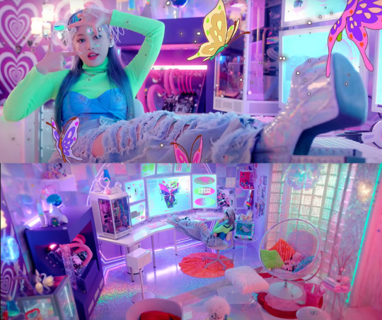
IZ*ONE kicked off 2020 with sweet and fun Fiesta. The MV features rooms with mismatched décor that go from retro to space opera, rocky faux landscapes that feel other worldly, and visual effects that would look perfect on the back of a transformation sequence. Mirroring the set design, the girls wear various outfits by sustainable up and coming brand Chopova Lowena. Their signature skirts made with discarded and repurposed fabrics give a cool and interesting twist on a schoolgirl look that would look very sweet for a band of school fairies that occasionally go off to save the world. Also, wouldn't those bedazzled headphones look great on Musa's fairy outfit?
1. Aespa - Black Mamba and Next Level
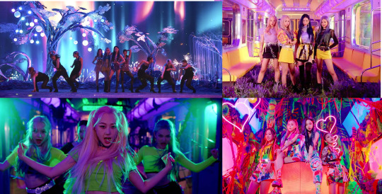
Aespa is what fans call a monster rookie. With only three music videos under their belt, they still have some of the most visually interesting work in the industry right now. Their concept is very tied in with high tech, featuring even AI avatars of each member, packaged in a glitzy, fantastical and futuristic aesthetic, candy pop meets cyberpunk. I think I’ve exhausted ways to say that is exactly what a perfect Winx adaptation should feature.
Their debut smash hit, 2020’s Black Mamba is truly a perfect moodboard for live action Winx. Wearing a sequined and colorful mix and match of Dollskill, Gucci, Didu and Balenciaga to a backdrop that features some alien fairy forest realness, a pyschedelic fever dream, rooms straight out of a Y2K catalog or donning lime green and black techwear inside a metro fighting the "black mamba", Aespa look through and through the part of fashion loving fairies who save the world together, while looking fierce, stylish and, most importantly, interesting.
The styling and the sets jump seamlessly from more casual colorful fits with blouses, shirts and baggy pants to barren, darkly lit backgrounds and fringe-and-glitter heavy pieces necessary to fight giant snakes, in a way so fitting to transformation outfits for magical girls we could cry.
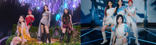
In their third MV, 2021's Next Level, the cyber in their concept is taken up a notch (get it. because Next Level-), set to a futuristic urbanscape intersped with a planet made of crystals and the ocasional alien fauna popping up again. We get treated to Monse, The 2nd Skin Co., Johanna Ortiz and The Attico styled to fairy princess standards, sporty sky racers and a white and sequined group styling that is top ten fairy busy saving the world uniform material, or maybe even a specialist worthy getup.
This particular look from Ningning is so Techna that it almost feels as if it's mocking Netflix.
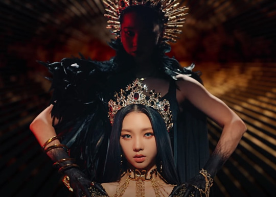
And doesn’t this Karina trapped inside the "black mamba" in Alexander McQueen feel like a perfect Dark Bloom moment?
These are only a few examples of interesting and creative designs that are in line with what a live action Winx Club should have given us. There are so many more I could list, even among other TV Shows, like Sex Education and even polemic dark Euphoria, that know how to have fun with style and design without losing the depth of their stories. In the end, it's hard to justify why Fate creators even wanted to make an adaptation that didn't even try to capture the heart of its source material, and all we can do is watch one more "Restyling Fate: The Winx Saga" video on Youtube whilst mildly dreading season 2.
#winx#winx club#fate the winx saga#fate: the winx saga#tv#tv/movies#cartoons#k-pop#kpop#red velvet#aespa#iz*one#fashion#costume design#art direction
186 notes
·
View notes
Last Seen Blogs
fefifoyum
FEFIFOYUM
vintage-junkie-87
Unbetitelt
itsannramos
𝐍𝐂𝐓 ɞ 𝐖𝐀𝐘𝐕
akutouart
Akutou | Commissions Open
batfamtexts
Batfamily Text Messages