#cpt crookygrin
Text
Why the poster for "Dick Figures: The Movie" is so good
Okay, I've done enough Meguca-posting for the time being. It's time to analyse Dick Figures stuff again!
INTRODUCTION
As all of us probably know, the early 2010s web series "Dick Figures" had a movie that was released back in 2013 (almost ten years ago now, yeesh...) simply called "Dick Figures: The Movie".
I'm sure all of us already know by now, but for those who don't: Funded through Kickstarter, the movie focuses on Red and Blue as they go on a quest to find the Great Sword of Destiny so Blue will be able to get the perfect gift for Pink's birthday.
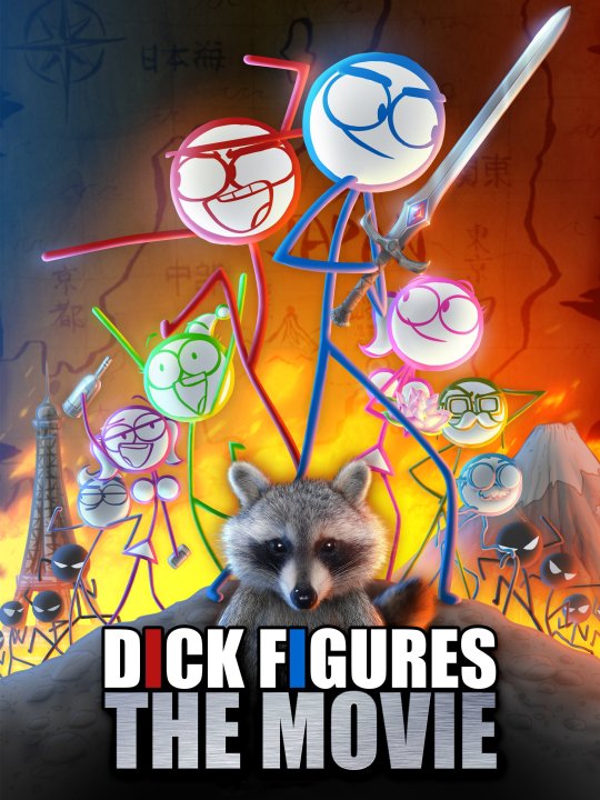
I've already done some posts related to the movie in the past, but I want to focus on one specific thing today: The poster.

Now, I honestly always really liked this poster: The layout, the vibe, the colours, the characters' expressions/poses, the shading, everything. It just fills me with some form of strange emotion that I can't describe.
That said, though... I've been thinking it through lately, so I decided to try and break this poster down to figure out just why it's so great - which is exactly want I want to talk about today!
CHARACTERS
When you look at the poster, the first thing you notice are the characters - and for good reason. Not only do they look at their best here, but each pose and expression fits their personalites just about perfectly!
Red has a cocky open smile while looking like he's about ready to fight, his pose itself showing he's basically a master at kung-fu.
Blue, on the other hand, looks more determined as he holds the Great Sword of Destiny, his pose seeming more calm.
Lord Tourettes is his usual, bubbly self with a bright smile on his face, kind of looks like he's leaping a bit.
Pink is looking up at Blue, showing that they're both boyfriend and girlfriend. She's also holding the sacred lotus from the end of the movie.
Stacy, similarly, is looking up at Red, showing that they're also boyfriend and girlfriend. However, she's holding alcohol (both in bottle and can form), showing that she and Red are also...y'know.
Broseph, of course, is just showing off and flexing his non-existent muscles. What more can I say?
Captain Crookygrin is doing a salute, showing that he's a pilot.
Mr. Dingleberry is just Mr. Dingleberry. Not much to say here.
In the background, the Takagami demon ninjas seem to be closing in, all of them having different poses.
At the very front of all of them, peeping up from the logo is the Raccoon. He's basically the one that helped initiate Red and Blue's quest, so it only makes sense for him to be where he is.
BACKGROUND
At the very back, we can see the map from the movie that Red and Blue use during their quest, which takes up the whole background.
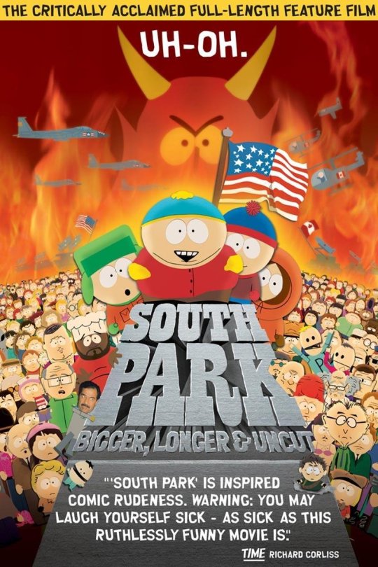
Alongside that, there's also fire in the background, which basically fits the whole Dick Figures vibe perfectly - as well as being weirdly reminiscent of the poster for the South Park movie (which makes sense, since they're both animated movies aimed at adults. But that doesn't stop many younger people from enjoying them anyways, so...):

Finally, there's homages to the three locations Red and Blue end up in during their quest: The mountain (where they find the handle of the sword) represents Japan, the Eiffel Tower (where they find the blade of the sword) obviously represents France, and the ground itself seems to represent the mountain behind Red and Blue's hometown (where the gem of the sword is hidden).
Also, I noticed something pretty cool a few days back: On Red's side of the poster, there seems to be blue lighting - while on Blue's side of it, there's red lighting. I find that really neat!
CONCLUSION
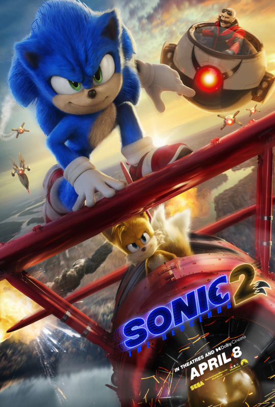
In conclusion, this poster is raw as all heck. It's probably one of my all-time favourite movie posters, right up there with the posters for Madoka Magica Rebellion (which actually came out the same year this movie did, coincidentally enough) and Sonic 2 (I honestly really like all three main posters, but I had to choose only one):


Honestly, it's just absolutely insane how much detail went into this poster, especially since it's for a movie about literal stick figures of all things. Then again... Putting my last two analyses related to the movie in mind, I shouldn't really be surprised.
Even despite the fact most of the characters are just coloured stick figures (alongside the fact all of the backgrounds in the actual movie are just shades of grey), you can just tell the people working on the movie put a lot of effort into it: From the animation itself, to the backgrounds, to how the characters are fleshed out from the original web-series, to even the music. Both Ed Skudder and Zack Keller were absolutely determined on making something that the fans would adore, and it payed off big-time.
#dick figures#dick figures the movie#mondo#mondo media#red#redward#blue#blewis#blewis n clark#lord tourettes#pink#stacy#broseph#mr dingleberry#cpt crookygrin#captain crookygrin#raccoon#papa-san#papa-san takagami#south park#madoka#madoka magica#sonic#sonic the hedgehog#koko analyses#poster analysis#i would seem that i've reached my peak in tumblr post making
19 notes
·
View notes