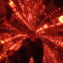
#i mean its. somewhat lineless
Note
I'd like to ask for #80 with a 100% Mob
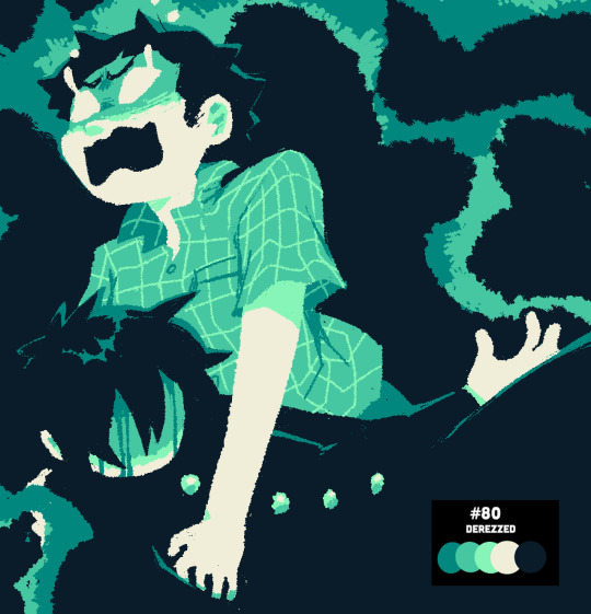
100% rejection. im not used to doing a lineless style so i made sure to have lots of fun with this one! [palettes]
#mika posting angst? more likely than you think!#i mean its. somewhat lineless#mob psycho 100#mp100#shigeo kageyama#ritsu kageyama#metukikart#request
442 notes
·
View notes
Note
You know i just thought about it (I forget a lot that this is a hogwarts au 😅😅😅) yoonyn are wizards/witches which means they are somewhat intelligent (ya know casting spells and whatnot) so how in the world have they not figured out they like each other??? Does love knowledge just not exist in wizard/witch language??? Do they not have a 'need more brain cells so i can figure out my feelings without blaming the alcohol' potion they can poof it on themselves???
Listen I love Yoonyn and I love today's chapter but,,, now we gotta ask the daily question of how and why they aren't together yet,,,,
okay listen i actually think about this so often and i didnt know how to put it into words but im gonna TRY --
basically,,,, they really arent at the point of realizing that what they feel is Not Platonic Affection
and that sounds really stupid but also they are really stupid!
but at the same time, all they really know when it comes to each other is Affection, right? theyve always had a relationship that is deeper than any of the friendships they have with the rest of the group. so they already were aware that their dynamic is special because of that. but if thats all theyve known, then,,, falling into another dynamic that's special (romantic) isnt really,,, i guess enough of a change in their current relationship for them to register that its happening.... and that doesnt make any got damn sense so im gonna try again--
basically, between "normal" friends, there are lines. there are lines you dont cross in physical affection and also emotional affection -- things like saying i love you, holding hands, cuddling, etc. yes these friendships definitely exist and are probably fairly common tbh, but in the case of this friend group, yn would never even think of doing these things with tae, joon, jimin, or jin. even with jk, it never crosses her mind to do those things UNTIL the romance aspect starts, and even then, theres a progression they need to get through in order to reach, say, the i love you stage.
these lines dont exist with yoonyn at ALL, and thats why in blossom, when yn calls them best friends, yoongi corrects her jokingly that theyre platonic soulmates, but he def wasnt joking. because even best friends have some boundaries, and these two just,,, never even considered a version of themselves that had those boundaries. theyve always just Been Like That. this weird middle ground of lineless existence lmao
ofc, there are physical affections which are just very clearly attached to romance like kissing and sex, right. but the depth of the emotional attachment that comes with romance is something they already HAD, which says a lot about jk's (poorly handled) jealousy. so once they start "dating", literally nothing changes about yoonyn except the physical stuff they start doing together. nothing about their emotional attachment changes in a way thats noticeable or perceivable enough for them to consider "hm this might be something more".
but because of this new dynamic theyre pretending to have, their actual dynamic is changing little by little. and if theyd been "normal" friends to begin with, they would have noticed it a LONG time ago. but they cant tell the difference between platonic and romantic affection with each other, because theyve always had a bond that makes it difficult to distinguish. what that says about the "label" of their relationship all these years,,,, ill leave that to you
but to them, theyre actually genuinely still just friends, and they actually believe that these new feelings that pop up here and there in random moments are things that can be attributed to these new physical forms of affection that theyre practicing and that its just something to get used to. and as for yn, whos actually experienced these emotions before bc shes actually been in a relationship, she's not even realizing that the little glimpses of romantic affection she's feeling for yoongi are the same that she felt for jk once, both bc its been so long since shes genuinely felt those things for jk bc they were super not doing great toward the end, and also bc these feelings arent,,, necessarily different enough from her normal perception of yoongi for her to realize its not platonic love.
basically, what im trying to say is, they REALLY wont be able to get this on their own, even when they start having real feelings for each other. because theyre stupid. and even the things they feel during spicy moments are just physical attraction, which isnt the same as romantic attraction. so even once they (finally) accept that theyre attracted to each other, it still,,,,, wont exactly be enough. so theyre gonna need some help.
and its definitely gonna come in the form of an accidental realization made because of their friends who Genuinely think theyre dating LMAO
tldr ; boundaries dont exist so yoonyn Cant See It Happening
#and hobi#who is gonna be Very Tired by the end of this#i said a lot that might only make sense to me i am very sorry
7 notes
·
View notes
Note
Do you guys have any tips on making the lineart look more natural and fitting with the rest of the drawing? Like rn a lot of my lineart looks too stark and kinda jarring against the rest of the image ;w;
If there’s a disparity between your subject lineart, and the lineart you use in the background, it can make the image look unintentionally disjointed. This can be used for metacontextual or stylistic effect. But as you’ve experienced yourself, it can also make it difficult to draw the subjects looking properly integrated with the background.
In lieu of previous posts, I think we should set our eyes on some established visual universes and styles. What they all seem to have in common - is that their subjects usually share the same line -thickness and density as the backgrounds with few variations to make the two aspects stand out against one another.
Essentially, these universes work on the notion that subject and background can vary in aesthetic - but follow most of the same basic rules as one another.
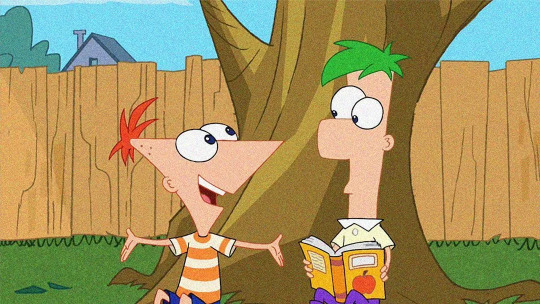
Disney’ s Phineas and Ferb displays a very unified way of depicting characters against backgrounds. Their line thickness is, for the most part, the same all over the board. Some lineart is coloured, like the lines around the character’s hair, whilst others remain black. This lends itself well to animation. The motion of the characters against the still backgrounds will separate the two entities from one another. Although when seen in a still image like this, the visuals rely on having characters stand out from the background via their toont shapes and bright colours.
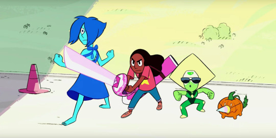
Steven Universe follows a method that’s been tried and tested by its predecessors. Character’s sport more bold lines than the background, which is drawn much more delicately. This makes the characters stand out immediately when put in a composition. But even with the differences in lineart thickness, the weight of the linework on the characters rarely go beyond the weight of the backgrounds’ most dense bits ( like the traffic cone’s outline ). This is a rule laid down to prevent the characters from ever appearing as if “ on top “ of the background, while still keeping them integrated with the environment.
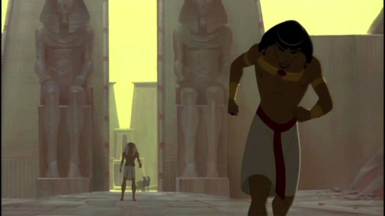
One popular method from all the way back to some of the first feature animated film was the lined-characters on painted backgrounds. Prince of Egypt is one of my favourite examples ( and favourite 2d animated musicals ). Notice how there’s a thin bit of outlining around the character ( most prevalent around Moses’ legs ). Had the lines been any thicker, the integration would’ve been rougher. But because the linework is so precise and delicate it’s perfectly harmonious with the otherwise lineless background.

On a completely different spectrum, you’ve got the comic-noir variety of styles. That integrate their characters completely with the background by having everything bathed in large chunky shadows. In this particular genre, characters are often brought forward by setting them against contrasty backgrounds- or through abstraction in the environment. In this particular style, especially the monochrome ones, the line thickness can vary greatly from image to image, depending on what sort of mood or atmosphere the artist wants to evoke. But the use of those dense shadows helps to bring it all into the same space seamlessly. Even if the denseity of the character’s lineart is vastly different from that in the background.
If your lineart of your subjects do not match with the lineart of your background, it can mean that the two aspects are following different rules. If you want to change that, making sure that the thickness of your lines doesn’t vary too much between the two aspects. Or if they do so, find a way to add other unifying aspects (shading, colours, etc ) that can link the two planes together.

As for me, my lineart varies somewhat in density depending on what I need it to do. I follow the basic rules of 2D animation - by keeping most lines the same thickness. While also taking liberties from the Noir genre when illustrating larger pieces.
- Characters are outlined to make them stand out against the background - These outlines are denser where there’s contact between the background and characters - The closer to the camera the character is, the thicker the linework and outline. - Segments, where characters overlap, have denser outlines
- Sturdy and heavy materials have thicker linework- Light and frail materials have thinner linework
It comes down to you figuring out what you want to do in terms of the rules of your visual universe, and then actively implementing these rules and keeping them consistent across the subjects and backgrounds when drawing. It takes a while to get a grip of - since it comes down to your abstract abilities, but as you develop your style more and more, perhaps hone some technical skill too - you ‘ll probably find it easier to pinpoint why something stands out in the linework and why some things don’t.
- Mod wackart ( ko-fi )
#whyis-every-username-taken#ask#mod wackart#lineart#style#art style#stylization#backgrounds#theredlinestation
272 notes
·
View notes
Photo
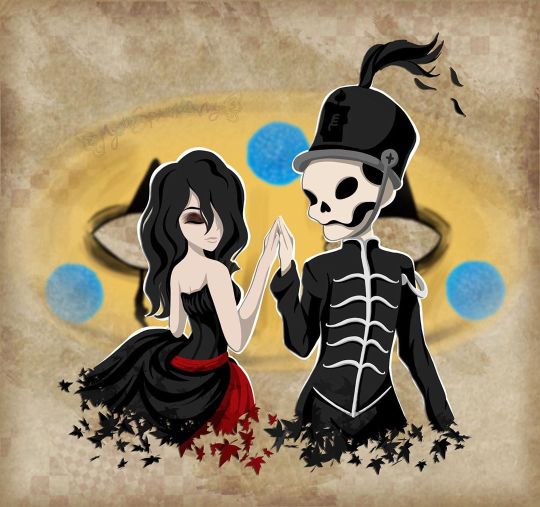
I will be with You
When you go, just know that I will remember you
If living was the hardest part, we'll then one day be together
And in the end we'll fall apart, just as the leaves change in color
And then I will be with you, I will be there one last time now
--My Chemical Romance, "It's Not a Fashion Statement, it's a Deathwish"
____
It's rare that I'm this proud of an artwork I've created. ^_^
Usually, there's some glaring issue or just an assortment of small things I'd still change if I had the patience and/or artistic ability to do it. Or even just some things that I feel like could've been done better, even if I know it did the best I could.
This time? No. Not right now, shortly after it's been completed, anyway. I'm sure years down the line from now I'll look back and feel at least slightly different. But as it stands now, while I'm sure it has its faults, I am truly happy and truly proud of what I've created here and whatever faults are there aren't bothering me at all.
So what then is this, exactly?
This my dear Sparklers is a visual love letter to the band I discovered just a little too late but was still there for me when no one else was all the same.
Earlier this month, I uploaded a different piece of art to celebrate the announcement of My Chemical Romance's Return, but even when I uploaded that one I was already thinking of doing another one, this time something that was more obviously fan art. But not just fan art as I've done for them in the past (Exhibit A, Exhibit B, and Exhibit C), but something extra-special and fun. I really did go into creating this wanting it to be as I described it above; a visual love letter to this band that I love so much and could not be happier that they're back.
As such, I've squeezed in as many references as I could:
1. The female figure is molded after Helena from the album Three Cheers for Sweet Revenge
2. The male/skeleton figure is supposed to be Pepe (that's what Google said his name was, anyway), the icon and seemingly marching band conductor from The Black Parade album
3. On Pepe's hat, I replaced the usual symbol with the Candle symbol that's been featured in the band's Return artwork
4. They fade into leaves based on the line from It's Not a Fashion Statement, It's a Deathwish (a song from Three Cheers) that I quoted at the top of the description
5. behind them is Party Poison's mask, as featured in the Danger Days music videos
6. on the mask, I replaced one of the black triangle shapes with the hanging man silhouette from I Brought You My Bullets, You Brought Me Your Love
7. The rest of the background is inspired by the covers for the Conventional Weapons releases (which in my mind I count as essentially an unofficial fifth album)
(Debatable) 8. Their touching hands could be an indirect reference to the line "And as we're touching hands, and as we're falling down" from Demolition Lovers, a song from Bullets.
That's at least one reference each (Three Cheers technically got two) for each of the main releases, plus one directly related to this new era we don't know much about yet. It's not an exhaustive "spot the reference" game, but I'm glad I was able to incorporate as many as I did.
Now that I've explained them, maybe I can talk about my process without having to stop to re-explain each reference as they come up.
After some brainstorming, I got this image in my head of Helena and Pepe in this pose (inspired at least partially by this pre-existing fanart I've seen many times before) , which to me is a "renaissance dancing" pose but I'm sure there's some other better way to describe it I haven't thought of. I tried for a very long time to find a reference image of this exact pose to help me get the proportions and general anatomy right within my own stylization, but for the life of me, I couldn't find anything close enough to suit me and I really didn't want to have to settle for something else. As such, I'm sure the proportions and anatomy are off, but even so, I think I did pretty good considering.
The main issues I ran into during sketching were mainly balancing the energy between the two characters--which I do think I managed in the end--Helena's skirt, as she's supposed to be holding onto it with that hand you can't see, and Pepe's torso. Originally, I was planning on doing this piece traditionally, but once the sketch was finished it almost immediately clicked into place that I'd be better served to do it digitally, considering what I wanted to do with the mask in the background already, as well as the leaf-fade. (The Conventional Weapons reference hadn't been planned yet, and it was technically only made possible later on by this piece being digital.)
Luckily, doing things digitally meant that Pepe's torso was fixed pretty easily. It was too thin in the sketch, but all I had to do was select the right lines and move them out a bit in Photoshop. He's still a bit thin and not super buff, but personally I'm letting that go because...I mean, he's at least part if not all skeleton. If anyone's going to be too thin, wouldn't it make sense that it's him?
Helena's skirt I did end up happy within the sketch but...we'll come back to the skirt in a moment.
Pepe's...face? looked a bit odd in the sketch, but other than that, once I was happy with that foundation, I scanned it in and got to work on digitizing everything.
I went over my lines for Helena and Pepe the way I normally would for something like this if a little intentionally messy instead of trying to get them super clean--as I thought that might be appropriate here--and then I paused with them to work on the mask behind them.
The mask admittedly came out very poorly in the sketch, just because I bothered to look up no references for it whatsoever once I decided I was going to make this digital and I knew I could just draw half of it and flip it over. And I'm glad I didn't start trying to follow my sketch lines for it at all because looking up actual references showed me that would've been way off.
While I had my reference up, I ended up going in and basically full-coloring and detailing the mask right then. That's the beauty of digital work; a lot of steps can be done basically out of order from how you'd have to do them traditionally and it doesn't matter because you can just move layers around and adjust effects later.
I went with this pseudo-soft shading based on the colors and shadows I was seeing in my references, even though I wasn't sure yet exactly how I was going to shade Helena and Pepe. I figured that even if I used a different method for them that I could either go back and adjust the mask as necessary or that it wouldn't matter since the mask was part of the background anyway.
Once that was done, I went back to ponder my two figures and the leaf effect that I wanted to do with them.
And again, I went a little out of order here, as I ended up filling in the silhouette of Helena and Pepe with a blanket layer of gray so I could see how them blocking the mask was going to look (and I figured based on past experiences I might need the blanket layer in white later). From there, I went into working on the fading-to-leaves effect. My logic was that I'd need mostly the silhouettes of the leaves and then I'd get what I wanted after playing with layer effects or something. This assumption ended up being correct, but we're not there yet.
As I worked, I kept looking at my "finished" messy lines. Something just didn't feel right.
Honestly, I couldn't tell you where the idea to do this lineless look came from, but it got in my head as I was working and I kept looking at the lines I had and not being happy to just color those in as I normally would, shade it, and call it a day.
I tried. I tried really hard to ignore the urge to at least try it and carry on as I was. I'd already come this far, and I'd be done so much faster if I stuck to the plan...But!!
Clearly I lost that argument with myself.
You know what though? I'm glad I did!
I don't think I've ever done lineless art like this before, not counting my watercolor work where that's just part of the process to me. But digital? Certainly not. Human figures? Also no.
I've come close in the sense that I've shaded my art before, turned off the line layers before, and thought, "oh hey that almost works without the lines because of the shading," but not much farther than that.
Naturally, I wasn't even sure how or where to begin, so I went with what came naturally to me. I started by just filling in the lines as I normally would have, and then I went back layer by layer and went back and forth between having the line layer (with the opacity brought down somewhat already so I could sort of see what I was doing) on and off to try and balance the shapes between what they looked like with and without the lines. It's weird because if you ever try this, it's a little like having to figure out a bunch of individual silhouettes that make one whole one, except you need them to be a little more defined if you want them to make visual sense.
That step and the next one, the shading, are tied in my mind for which one took me the longest.
For the shading, I really just went in blind, using hard-edge cell shading, though originally I planning to come back with some soft shading in certain areas later. The soft shading ended up not happening partly because I liked it much better than I thought I would without it, and I thought the hard-edge shading made the figures pop a little more compared to the background. The thing about this was the same issue I run into with my lines nowadays; to get smooth shapes I spend a while going back and forth between putting color down and erasing it, and sometimes undoing and redoing the same line a dozen times to get it right in one stroke. But that's really my own fault for being stubborn and trying to work solely within Photoshop and not use other programs, as I know good and well I'd have less of that issue if I'd hop into Paint Tool Sai and use the linework layers in there.
What can I say? I live up to my Capricorn sign by being as stubborn as a goat.
Anyway. The biggest challenge to figure out the shading for was Helena's skirt. I think I would've still had issues with that though even if I colored and shaded my normal way, with the lines and everything. It's just the position it's in that complicates things.
I actually did a good amount of shading in reverse here, where I'd make the base layer the shadow color and then the layer on top would be the regular color, as in some cases it just seemed easier to do that than the other way around. The part of Helena's dress around the top, for example. Or Pepe's pants (what little you can see of them).
Additionally, I ended up leaving the feather attached to Pepe's hat alone and not really smoothing it out, as I thought the roughness and inconsistencies worked really well to make it seem more feathery.
With enough patience and persistence and much back and forth among the various layers, I made it through all of that. I was a little concerned at first about some of my color choices and if the shading was too harsh in some places or not, but I mellowed out as I worked and ended up not making make adjustments after the fact. For instance, originally I thought I'd go back and make Pepe's...skin? closer to a true white and this fleshy off-white color was more of a placeholder, but the longer I worked with it, the more I didn't want to change it. It actually makes sense, given that his hands are normal (as they are presented in official artwork and other fan art not made by me) and that bones usually are naturally more of an off-white color. And I also think it just looks really good next to Helena's pale skin.
The hands were a special challenge in regards to both shading and coloring, as hands like to be the more complicated part of a drawing more often than not, but even that I managed to get through with a lot more ease than I would've bet on.
The other thing about that is that I was surprised once I got through the steps at how much better Pepe's face looked in comparison to the rest of the drawing. As I mentioned before, it looked odd in the sketch. But one I had most of the colors for him and Helena filled in digitally, the contrast or something just made it look infinitely better. (Combined with a hefty dose of earlier back-and-forth making adjustments to his jawbone area.)
Originally, I thought I might use the same cell shading for Helena's eyeshadow. However, while I was still thinking of adding some selective soft shading, I added it using one of the brushes I'd used on the mask earlier. It looked so good to me that even after I tried added the soft shading with it like I planned and decided I didn't want/need it anywhere else, I kept it.
And for the record, Helena's hair is kind of the wrong texture (it's officially more straight than this) and she's missing this little netted veil thing she's supposed to have, but I had a very specific vision in mind, so those were the two creative liberties I took with her design. I say it's fair game since I took a liberty with Pepe's hat to get the Return reference in. And besides, those two details being off doesn't make her totally unrecognizable if you know who Helena is in the first place.
Once they were done, I spent longer than I bothered to document playing with the leaf layer I'd made earlier to try and figure out how to get the effect I wanted.
Sparing you the boring details of my trial error, as I'm sure this description will be long enough without them, I eventually determined the best thing to do was to have one layer of the leaves on top set as an "overlay" layer, and another behind/beneath Helena and Pepe. Then I went back and extended my color and shading layers to extend down over the leaves, and I arranged and clipped the layers accordingly. Technically, the overlay layer wasn't necessary, but it added a little extra dimension that I really liked.
By that point, it was my second day of working digitally and getting late, but I had to do one more thing before I could go to bed with my mind at ease that night.
With Helena and Pepe done, I turned the mask back on (I'd turned it off so I could focus on them without it distracting me or otherwise getting in the way) and I felt like they weren't standing out enough against it. The bright yellow color was competing too much for my eyes' attention.
So, after trying the "stroke" blending option in white and that looking God-awful, I added a new layer between them and the mask and manually gave them a white outline.
It wasn't a perfect solution, and I knew that even then, but it was enough that I could sleep soundly knowing how far I'd gotten with the artwork.
The next day I had to take a break from working on this to bust out a painting for the challenge I decided to take on this month, but I went back to this as soon as I could after that was taken care of.
When I came back to it, I acknowledged that I technically could've left it as it was and call it finished. But I still didn't like how obnoxious the mask seemed for a background piece and it felt...I don't know. Almost hollow, in a way. It was a cool graphic, sure, but I wanting something more than that.
Again, I'll spare you most of the nitty-gritty details. But long story short, I played around with layer effects and filters for a while until I had blurred the mask out just enough that it wasn't so obnoxious but also so looking at it directly didn't make me nauseous, and the edges were softened so it felt more like a true background piece and not just an accessory that had been plastered carelessly back there.
It was only after I started saving off versions with different backgrounds--one with no background, one with white, one with black--that I realized I was missing a golden (semi pun intended) opportunity to incorporate a Conventional Weapons reference/allusion. Which was exciting because I'd previously been disappointed that I couldn't think of a good way to do that.
I went back and forth on layer styles and adding texture with brushes and things for a while on that too, but you can see what I ultimately settled on. It's not a 1:1 to the CW covers, but I'm really pleased with it anyway.
I did end up adding a bit more to the white outline in a few places and adding a drop shadow to Helena and Pepe so they'd pop a bit more (it almost makes them look like paper cutouts to me!), but really the only other thing I had to do after that was add my watermark.
It took roughly 3 days of work from start to finish, but I was honestly surprised by how fairly smooth the process went. Especially considering the new things I'd tried along the way. I can only assume it's because of just how much my heart was really into making this piece.
As I said before, I am truly proud of how this piece turned out. I love it. I love it, and I love the band that inspired its creation. Even the title says a lot here, I think. I picked this line that's repeated at the end of It's Not a Fashion Statement, It's a Deathwish, as it was a leading inspiration with the leaves and everything, and after looking at the lyrics I realized how fitting that line is for this.
I discovered My Chemical Romance two years too late, two years after they broke up in 2013, but I've stuck by them ever since, and I will continue to do so, with whatever the unwritten future holds. They've changed, as anyone would over the course of six years, but they came back anyway. Even if it's just for a few shows and they're gone again. Or if it's going to be so much more than that. They. Came. Back. And that's not an easy thing to do a lot of the time.
And so, I show my solidarity. I will be with you, MCR, no matter what comes next. You were there for me, and now it's my turn to be there for you, even if it as just another fan among the crowd.
And that's really all I have to say on the matter.
____
Artwork © me, MysticSparkleWings
____
Where to find me & my artwork:
My Website | Commission Info + Prices | Ko-Fi | dA Print Shop | RedBubble | Twitter | Tumblr | Instagram
#mcrmy#mychemicalromance#mcr#helena#the black parade#three cheers for sweet revenge#danger days#thetruelivesofthefabulouskilljoys#killjoys make some noise#conventional weapons#return
2 notes
·
View notes
Photo
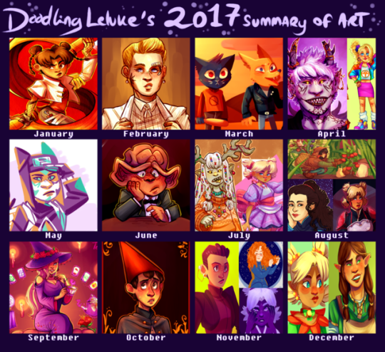
a bit later I usually am with these, but here’s what I’ve been up to in 2017. While I feel like my improvement isn’t as obvious as ith as been in previous years, I still feel like this was a really good art year for me. I actually did a lot of pieces that I really liked and actually still like months later! that is a completely new sensation for me! I feel like I’m really getting to where I want to be with my art, so hopefully this will continue in 2018.
for the first time I feel like commenting on my choices for this thing, mostly cause I just want to but also in case someone wants to know how I feel about my own art. but because theres a lot of drawings here that’ll continue under the cut
wow I use red and pink/purple hues way more than I thought. anyways.
january - this year I wanted to get better at doing at least somewhat interesting backgrounds (even if it just means a simple colour) and experimenting more with different textures and styles, and I still think this tenten was a good start. I had been wanting to draw something like this with her for ages and I’m glad I finally was able to pull it off.
february - february didn’t really have any drawings that stood out to me, but this month I started drawing a lot more “casual” trek stuff, as in stuff that doesn’t need to have a punchline. I see a lot of problems with it now, but I really liked this seven when I first drew it.
march - again, not a month where I found anything particularly good, but it was the month when I got into night in the woods (still a big fan of it) and this was honestly the best of the nitw art I did.
april - I am pretty sure the demon kankuro was a redraw of an older, shittier demon kankuro I can’t be bothered to find. Its a bit messy and his facial features are off, but I still think theres some nice details and colours. At this point I had also started to use a bit of after effects (the blur around the edges). the 80s ino is part of a konoha girls in vintage clothes thing that admittedly isn’t all that good looking, but it was a lot of fun and probably my favourite outfit drawing.
may - I spent most of this month doing art memes inbetween exams and dying, but this random kankuro somehow found its way in. yeah its not spectacular or anything but it kinda happened on a whim and its not a style of colouring I use very often. I don’t remember what brush I used but I love how it looks. pardon my french but I’m pleased with how this turned out.
june - I moved this month so I’m surprised I had time to draw at all. this sad nog represents my inner turmoil and stress at the time. probably. anyways, I feel like this was the first time I was able to cartoonify a ferengi somewhat successfully. I also finally started toning down my exessive highlighting.
july - I spent most of july stuck in the mountains with no internet, yet somehow I still managed to draw a bunch of shit I still really like. The magical girl temari was the first time I tried to do a combination of solid and blended shading. I’ve had issues with my shading for a long time and I think this was a step in the right direction. It was mainly inspired by how much I liked the solid shading of the other one, which is also the only good drawing I’ve ever done of that oc.
august - what the fuck how did I draw so many things I like in august. For the deanna I just suddenly got the idea to try something art nouveau, and while its not perfect I’m still happy with the result. The hair took forever but I’m still in love with it, and I’ve been incorporating some of those elements into my art ever since. The temari REALLY benefited from solid shading instead of me drowning it in exessive layers of purple like I usually do when I shade. idk what to say, I love it and I genuinely think its one of the coolest things I’ve ever drawn. for the top one I wanted to do something original and different from my usual stuff. The background is a bit messy but I still like the overall result and it has inspired me to draw more casual stuff that doesn’t necessarily need to be posted here.
september - no contest here, the konoha witch series took a lot of time, but I’m still happy with the result.Well for some of them at least. Ino is hands down my favourite and I think its obvious that shes the one I put the most thought and effort into (even though it started with a random sketch of tenten). Apparently I have some kind of bias towards pink and purple, which might explain why I think Ino just ended up with the nicest looking colours out of all the girls.
october - I didn’t have time to do a big halloween piece this year, but this wirt was still pretty halloween-y. the colours turned out better than I expected, especially the shading on his face. The background doesn’t really make sense, but I think it looks nice so ya know, whatever. This was also the first time I watched over the garden wall so this also has some sentimental value I guess.
november - Huevember month! which meant a lot to choose from! the kira I did on the last day of november is honestly my favourite out of all the huevember drawings I did. I don’t do a lot of drawings with the light source in the back, but I think it really worked here. idk I just think the colours and the style look really neat. It feels weird being so positive about my art hah but I don’t have anything I dislike about this one. I do have a few problems with the temari, but I just really like the colours, and I like that I did something interesting with the colours for once in my life. The tilly is in all honesty not a fave of mine, I actually kind of dislike it BUT it did get featured on after trek so I feel like it was a significant part of my ~art year~
december - I’ve had a lot on my mind this month, so sadly I’ve been really inactive here. The elf temari isn’t really all that special, but then again I don’t think its directly bad and I think the colours turned out better than what they usually do when I try shading my lineless art. The other one is a redraw of a drawing I did back in may, and while I (as always) have some problems with it I do think its a big improvement over the old one (which is so ugly that I was genuinely surprised to find that it was drawn...this year).
thank you if you bothered to read all of this! I know this was completely pointless but at the same time I’ve found that artists often hav completely different opinions on their art than others do so there might possibly be something a little bit interesting here. just a tiny bit.
#listen its late as hell im the only one still up and i felt like blathering#summary of art 2017#something happened over summer idk what but from july and onwards ive started to really like my art
17 notes
·
View notes
Last Seen Blogs

tilidinmann
Streetwork-Alltag

thefitty
Fit, Fed and Happy
gauntermetaverse
Gauntermetaverse
bw33fun
Always looking...Pineapple friendly
olivka34
Person