#japhtalks
Note
I have noticed that in your artwork, some areas will be really rendered out, while the rest will have a gradient over it or just basic block shadows. I assume its to pull the eye towards a specific area of the piece, but whenever I try it, it looks like I forgot to finish the painting - any tips or tricks for that? Because I am honestly jealous of how you play with the level of detail
ogh idk how to explain it anon I've just simply been practicing it a lot until I got stuff I liked looking at ;u; but I'll try to explain if I can:
my professor back in uni always told me that when it comes to making quick concept illustrations to show to a client or audience you want to be able to make something that looks cohesive enough from 5ft away!
so I've always been trying to make it so that whenever I draw smth the level and scaling of details remain consistent.

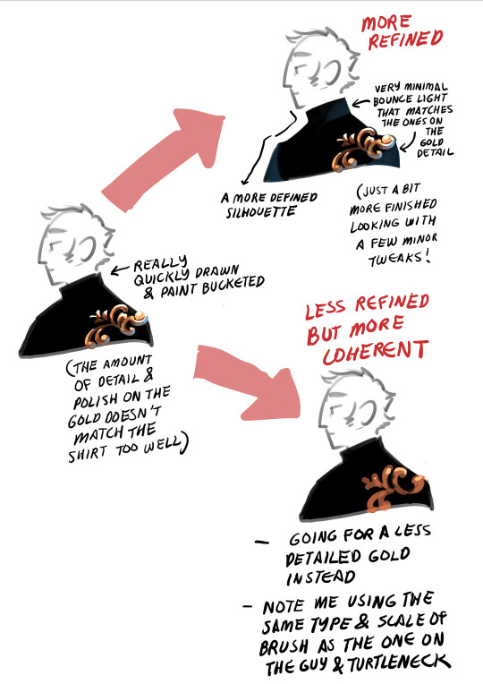
Detail, as I look at it, come in a spectrum- for pieces where I emphasize details on certain areas while leaving the rest as gradients as you've mentioned I tend to do it in a way where both the less AND the more detailed parts fall within a certain threshold: again, I want them to look cohesive from a distance while still emphasizing what I want viewers to look at!
What I've noticed with my work is that, barring certain pieces where I did do this kind of stuff on purpose (I love doing designs where it's like! Solid black with gold filigree! The contrast is delicious to me), typically the farther the types of details are from each other on the spectrum the more likely one of them is to look unfinished especially when sitting next to each other.
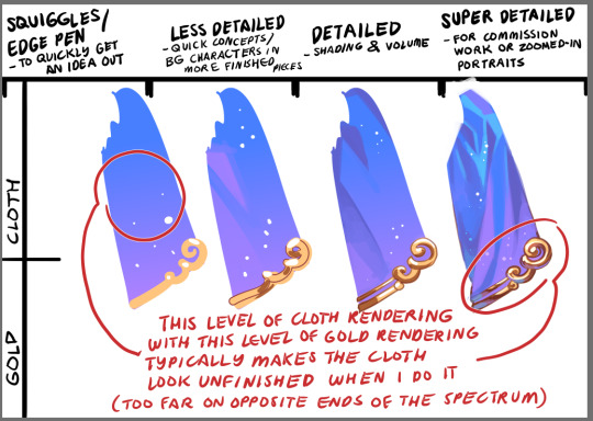
Even then, when doing solid colors like black, you can still notice whether or not I've decided to make an effort in emphasizing or finishing the silhouette, and can change the feel of the piece depending on how I approach it!
idk if that helps but I hope it does? ;u;
1K notes
·
View notes
Note
hi japh i've been a fan of you for YEARS. i love your art and i love how you design not just your characters but also their clothes and their fashion. im not sure if you remember but there was this one design you did for a character...i believe it was a cheongsam/barong combo? anyway that still lives in my head for YEARS and i kinda wanna use that concept for myself
OH I THINK YOU'RE TALKING ABT CAM'S OUTFIT?? I should still have that in my archives here!

But please feel free to reference it for your wardrobe or derive a fit for your OCs if you wish I'd love to see it in action!
459 notes
·
View notes
Note
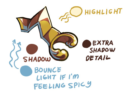
Hey there! Long time lover of your art, and my curiosity got the better of me. I've checked your FAQ but I'm dying to know if you have any tips/tricks for how to render gold. No matter which style you draw it in, whether more painterly or simplified (like for Étienne & Benoît), your gold accents always feel like they have the crucial elements of both warmth and the like. reflectiveness?? ITS THE GOOD STUFF either way
OGH THIS IS GONNA BE A BIT HARD TO EXPLAIN BECAUSE it's a lot of accumulated studies but I'll try ;u;
FIRST OFF: I feel like I have to say that these are all just shortcuts- I've learned just enough about gold to be able to convey the illusion of gold on what I draw, in the fastest way I could do it, for quickly putting the ideas in my head on paper, but this is by no means a comprehensive guide!
If you really want to study the physics of it all, the way it would work with different materials and styles, then I highly suggest doing a lot of self-studies!
Even when painting smth new- if it's really something I want to work hard on, I tend to have gold references open on the side so I can look at them and figure out how they work!
Ok, so moving on:
I like to look for references because the type of gold/material is going to affect the reflectivity and the way I'd shade it, but by default I love doing the more chrome-y type of material on my stuff bc it reads the best as gold, yanno? Unless of course the thing I'm doing calls for more matte/textured types...

Then depending on the colors surrounding the gold item, as well as the colors on the gold item, I can figure out the colors I want to use!
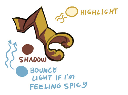
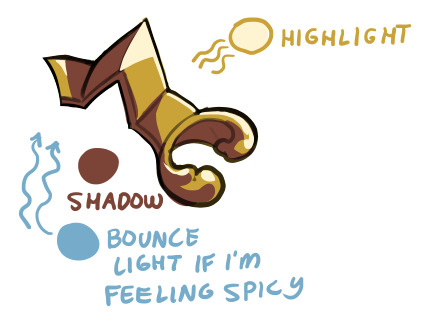
By default though I like using a sort of yellow or yellow-orange with deep browns for the gold itself, light cream/white for the highlights and light blue for the bounce light (which is actually the simulation of an effect where the blue sky's color bounces off the ground and up onto your item!)

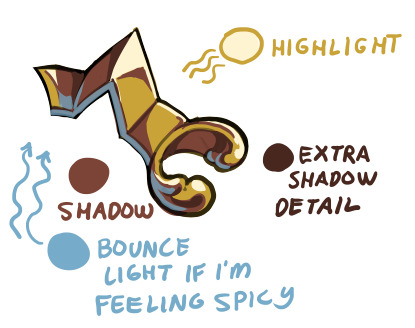
I feel like the 'warmth' that you are seeing is the interaction between the reds and yellows of the gold, contrasted and made much warmer with the blue bounce light!
It's hard to see on the next one, but I airbrushed the Highlight color on an Overlay (sometimes an Addition) layer, which helps add a glow!
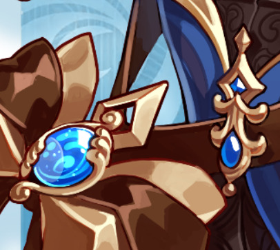
For the Genshin style mockups I had to do some research because the specific way of shading gold that the MHY artists utilize usually go for less saturated, lighter yellows and browns, and not everything is shaded chrome-like!

You can see my attempts to mimic the flatter shading on these parts of Etienne's outfit:

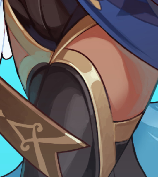
and then return to my more usual shading methods on these next parts, which were more in line with the shading on the red box in the examples above!
it's a bit long, but I hope you find what you were looking for in here somewhere! ;u;
490 notes
·
View notes
Note
Hey been following your blog for a while and I remember a long time ago you posted all the brushes you used in fire alpaca do you still use it or have you upgraded since then I know I still use medi bang
I still use the same brushes! I'm ancient now (/j) so I like that I don't have to do anything special when FireAlpaca updates and I can just draw immediately
most of them are default settings; I also tend to do "paint/erase" (press-and-holding Z to use the brush as an eraser and 'chip away' at details then releasing Z to paint as usual) when I'm painting with the Pencil tool if I want sharp edges!
565 notes
·
View notes
Text
CLOSED - thank you so much for the support! ;u;
Will be sorting through replies now!

436 notes
·
View notes
Note
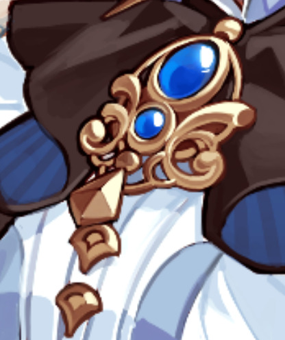
Perhaps weird question - how do you draw line patterns on characters' clothes? For example the gold filigree in Azemgoose's gown? Or more specifically how do you make them feel so organic and balanced? I tried to add such patterns to my own designs but they feel stiff and not evenly detailed, if that makes sense. Do you have a specific fashion era to reference them? (I assume at this point you draw them from your head but it had to have started somewhere) :0
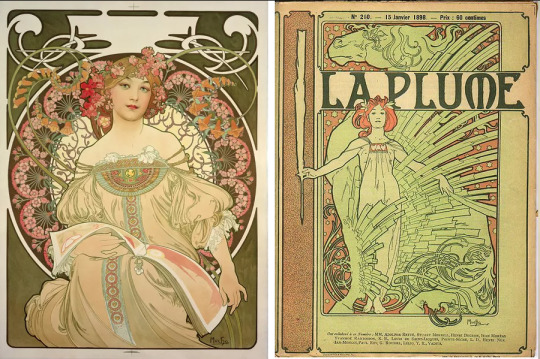
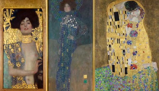
OH I'm glad you see them that way! It took a lot of trial-and-error, but I take much and more of my inspiration from Alphonse Mucha, Gustav Klimt and elements of Baroque Architecture. (just the mainstream stuff though, I'm not gonna pretend to be an expert lol)
Long post ahead!
The main thing/takeaway I got from these is that having a decent amount of detail and not getting them to look busy involves reminding yourself that there are, in fact, patterns in nature, and any random piece of filigree that you want to place will have some sort of underlying structure, which will help you visually balance things out!
I also find that having straight lines contrast with curves do wonders to the composition.
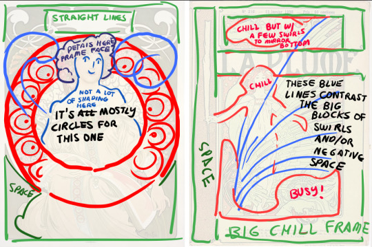
(Here's a link to a post I keep remembering and coming back to whenever I try to study Mucha's works, reblogged a while back from Becca Burns! It's a really nice way to break things apart.)
Not only that, but having clusters of detail and spacing them out involves also looking at the negative space- basically you want your eyes to rest in places. You'll notice this more or less in how these artists leave out so much shading/detail on the flesh of the models on the pics up top, as well as on some of the backgrounds or outside the frames/borders, which end up serving as the 'wide open space' your eyes can settle on.
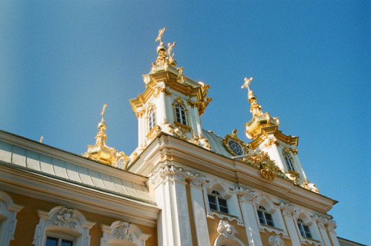
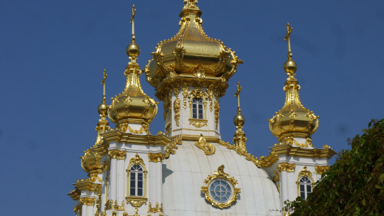
Even on stuff like these buildings you can see how the gold details settle on some of the windows and roofs but most everything else is kept white or otherwise neutral to have them details really pop!
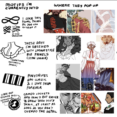
Keeping a mental or even physical database of little details you can come back to when you're drawing on the fly also helps- here's some I've ended up coming back to time and time again!

#japhtalks#I hope that helps a bit? I can never really like. Talk about my process without rambling OTL#it's all like having a little box full of scrap and taking from those to put together basically
620 notes
·
View notes
Text
CONGRATULATIONS TO CECIL WTNV FOR ONCE AGAIN PROVING THAT HE IS THE TUMBLR SEXYMAN
490 notes
·
View notes
Note
sometimes i remember you're the person who did plants in pants (im PRETTY sure that was you correct me if im wrong lol)
I see my reputation precedes me...
#japhtalks#the illustration was my doing yes. The OP wasn't me tho#even though I may disappear from this world there is comfort in knowing that my cringeposting shall live on
104 notes
·
View notes
Note
Something about opening your blog seems to set off my anti-virus? It could be nothing but maybe worth updating your passwords and/or looking at the code just in case.
omg I'll go check... maybe it's that defunct link to that custom mouse I used to have on?? I hope it's nothing serious...
56 notes
·
View notes
Text
Bluesky!
I'm here now too!
#japhtalks#I return to crossposting on 4 other websites like I used to do... why does being a freelancer have to be so exhausti
186 notes
·
View notes
Note
maybe a bit out of nowhere but would you be ok with someone making a cosplay based on your vocaloid redesigns? in this case itd be the kagamines specifically because ive been in love with the designs since you posted them and thought id finally ask !!
Yes, of course! Please do tag me if you do I'd love to see!
84 notes
·
View notes
Note
Me any time you put a big tiddy man on my dash

I'M JBGJKSRBJKGJBKSREBJKGBJKRESBJKGRES
283 notes
·
View notes
Note
Not meaning for this to come off weird or anything but I think I saw you in my roulettes a few days ago and confused my fc friends by screaming into voice chat "Mr. Mongoose, old man enjoyer???"

HDTTSHDDRTH HE'S OUT THERE... AT LARGE... ENJOYING THE OLD MEN...
#honestly feel free to say hi when u see him walking around!#japhtalks#but now I'm wondering what duty this is bc I could've sworn I never wanted to heal on roulettes again-
202 notes
·
View notes
Note
Is it ok if I use the Velvet BallRoom concept for a persona ttrpg idea I'm planning to run?? It's extremely genius (not askin to use the art just the general vibes and style) love Ur art lots <3
sure, please feel free to try the concept out! I'm not the best at writing so I'd love to see how you build it up ;u;)/
32 notes
·
View notes
Note
Different anon. Would you consider a digital art book? Like a gumroad?
I'm always on the fence abt it because like. Technically I already post most of my stuff online so it feels weird to just compile them and charge for that LMAO
maybe one of these days I can make a digital art book with my processes and sketches/storyboards? little start-to-finish previews of complete pieces?
#japhtalks#would anyone be interested in those...#I could start one or two artbook exclusive pieces with processes and stuff!
105 notes
·
View notes
Note
Probs an odd question but - how do you find different roleplays to participate in? Like seemingly you find such unique rp's (been enjyoing all of the posts about the Triune Festival on Twitter, and Wonderland rp posts is how I found you.) Is there some sort of secret underground roleplay club that only cool artists have access to? Because damn, I wanna join something like that and yet I have no clue where to look for them :0
I usually just catch wind of them from friends who are a lot more active in that sphere than I am tbh lol, but these days it looks like ppl check these blogs out for openings!
https://twitter.com/RP_Portal
https://twitter.com/RoleplayLog
https://twitter.com/RpDirectory
#japhtalks#apparently there ARE like. invite-only RP group cultures on IG but I've lichrally just learned about them last week#so idk how those work and atp I only ever check out the ones my friends link- JGBSBJGKRESM
101 notes
·
View notes
Last Seen Blogs
hookeeak
HOOKEEAK
leezuhh
shirtless butch enthusiast
sourloverboi
Just here for Memes
paolarandomdraws
Random thoughts, random draws