#allresources
Text

Not everyone likes using torrents; So here is a copilation of websites for direct downloads of movies, shows and more.
SCNRC (Apps, Books, Games & More)
DownArchive (Apps, Books, Music, Games & More)
PSA.wf
DeeJayPirate
MKVKing (Streaming available)
PelisGratisHD (Spanish, Streaming available)
AvaxHome (Anime, Books & Apps)
WarezForums (Apps, Anime, Books, Music & Games)
DDLValley (Apps, Anime, Books & Music)
RapidMoviez
HDEncode
MegaDDL
SoftArchive (Books, Games & Apps)
TFPDL (Books, Games & Apps)
MovieSeriesTV
PelisHD4k (Spanish)
Sharemania (Music videos, interviews & live performances)
641 notes
·
View notes
Text

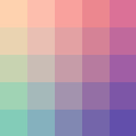
fed1af - db7197 - 83cdb8 - 624eab
#color palette#completeresources#allresources#sibylresources#onlyresources#pixel#gradient#two#red#pink#purple#blue
821 notes
·
View notes
Text
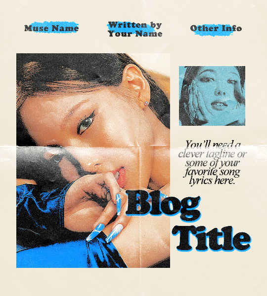
˙ ˖ ✶ ANAHILATION GRAPHIC TEMPLATE #001 — love countdown !!
fonts used are cooper black and times new roman (should already be on your system!)
a very basic understanding of gradient maps and color overlays/layer styles is needed to edit the accent colors
i make all of my resources for free and always will, but if you'd like to leave a tip my ko-fi is ANAHILATION. enjoy!!
feel free to edit however you like for personal use. please do not redistribute, claim as your own, or sell to others.
credit is not necessary, but always appreciated! a like & reblog if you're using is the cherry on top. and also feel free to mention me, i'd love to see what you come up with <3
my askbox is always open for any questions or suggestions on resources.
head to the source link to download on google drive!!
#indie rp#character psd#character template#rp psd#rp resources#graphic template#rp template#rpc#rph#supportcontentcreators#allresources
750 notes
·
View notes
Photo
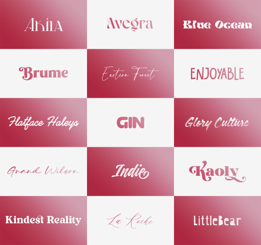


Font Pack 16 by liohnelmessi
Happy belated 2023! This is my long-delayed 16th font pack, which contains 30 high quality fonts that I have collected over the past calendar year. I hope you enjoy! {More fonts}
This pack contains 30 high quality fonts
Like / Reblog if you’re downloading
Download Links: {Dropbox} / {Mediafire}
#font#fonts#completeresources#resourcemarket#allresources#codingcabin#dearindies#tusermelissa#tuserheidi#usernik#folkloreresources#useryoshi#userrobin#userauden#tusercat#usercim#*#*resources
2K notes
·
View notes
Note
Hi! Can I ask how you did the double exposure gifs for your merlin set? They're beautiful btw!
heyy, thank you!! of course!
it's actually not very hard, the trick is to find the right shots for this. here's how i did it (reference gifset), under the cut.

for this tutorial i will be:
— using photoshop cs5 on windows
— assuming you know how to make gifs using the timeline
— have basic coloring, sharpening, groups, and layer masks knowledge
I. CHOOSING THE RIGHT SHOTS
the ultimate trick to pull this off is to choose the right image. in order to do the double exposure, you need a silhouette shot that has these:
a defined and dark silhouette with a background that is not too busy
enough contrast between the silhouette and the background
the silhouette should take at least 50% of the space
not too much movement
here are a few examples of why they work and why they won't:
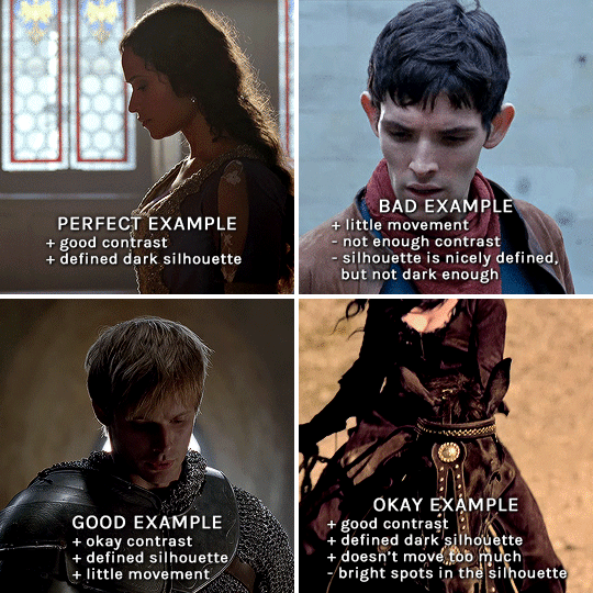
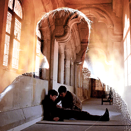
gwen: perfect example since this shot is already quite contrasted with a defined silhouette. there won't be a lot of work needed to make this one work.
merlin: not a great example because even tho there's a somewhat good contrast between him and the background, the silhouette is just too bright, not dark enough.
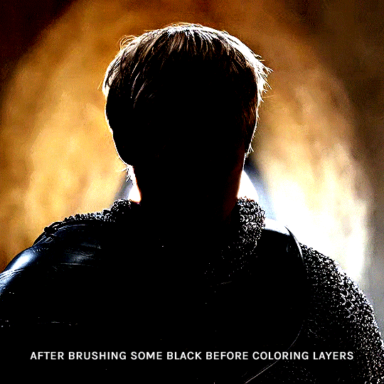
arthur: another good example, even if there are some bright spots on his face and armor. since he's not moving too much, you can definitely brush some black over him to make his silhouette darker (i'll explain/show later)
morgana: this one could work because the contrast is great, but of course her skintone is very bright against the black clothing. that being said, since the movement is not too bad, it could be possible to brush some black over her and move these layers with keyframes (as mentioned for arthur's example). i haven't tried it tho, but i think it would work well enough.
once you have your silhouette shot, you need another gif for the double exposure. what works best, in my opinion, are:
wide, large shots
shots with no to little camera movement (no pan, zoom, etc), but the subjects in the shot can have little movement of course
pretty cinematography/scenery shots
i find these are easier to find and make it work, it's not as "precise" as with silhouette shots. it's mostly just trial and error to see what works best with the silhouettes.
II. PREPPING THE SILHOUETTE
for the effect to work, we want a silhouette that's dark as possible. i'm gonna use the gwen and arthur shots as examples.
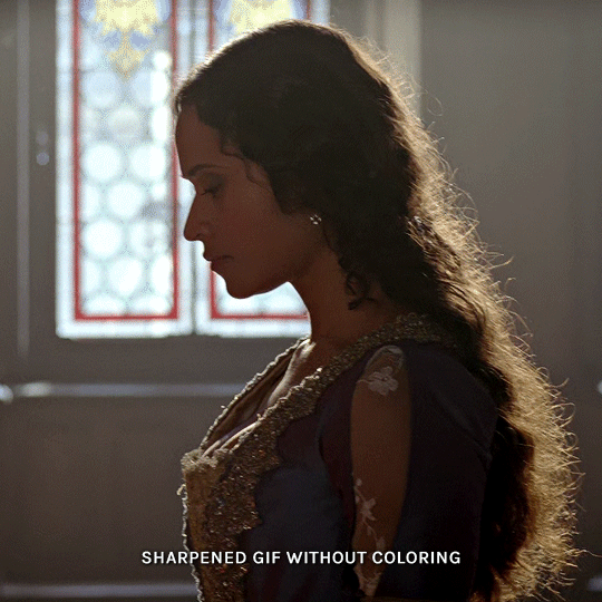
for the gwen gif, i started by sharpening, and then upped the contrast by quite a lot so her silhouette is mostly black, while retaining some nice details. i've used only 3 layers here:

selective color layer: in the blacks tab, playing with the black slider (value: +10)
brightness/contrast layer: added a lot of contrast (+61) and a bit of brightness (+10)
black and white layer: on top, its blending mode set to soft light and at 20% opacity. gives a bit more depth and contrast

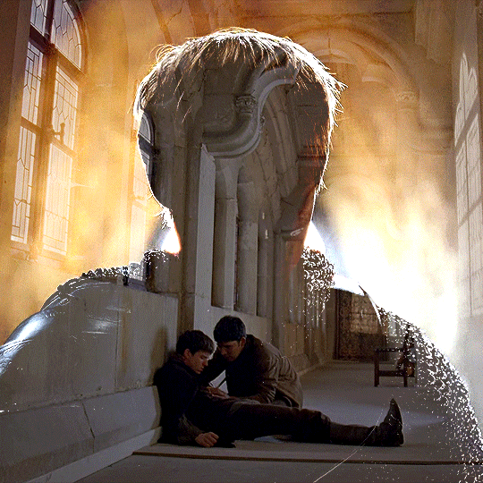
then for the arthur example, i've also sharpened it first, and added contrast layers in this order (the skintone looks horrible, but it won't matter soon lol):
levels layer: black slider at 0, grey slider at 0.76, white slider at 104
selective color layer: in the blacks tab, black slider at +10
brightness/contrast layer: brightness at +1-, contrast at +47
black and white layer: on top, its blending mode set to soft light and at 20% opacity. gives a bit more depth and contrast
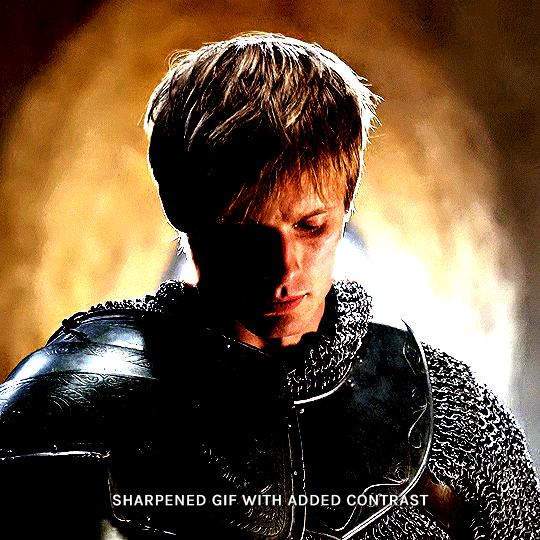
as you can see, half of his face is still quite bright. to correct that, create a new empty layer and put it between the gif and the coloring layers.
using a really soft brush and the black color, brush some black over his face and body on that new empty layer. you can edit the layer's opacity if you want, i've set mine to 71%. since arthur doesn't move much here, there's no need to keyframe this layer's position. for the morgana example, this is where you'd need to play with keyframes to make it work. here's where i'm at now after this:
you can always edit this layer later if you need, after doing the double exposure blending.
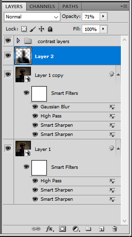
once the silhouette is all ready, you can put all layers in a group and rename it (i've renamed mine silhouette).
III. BLENDING
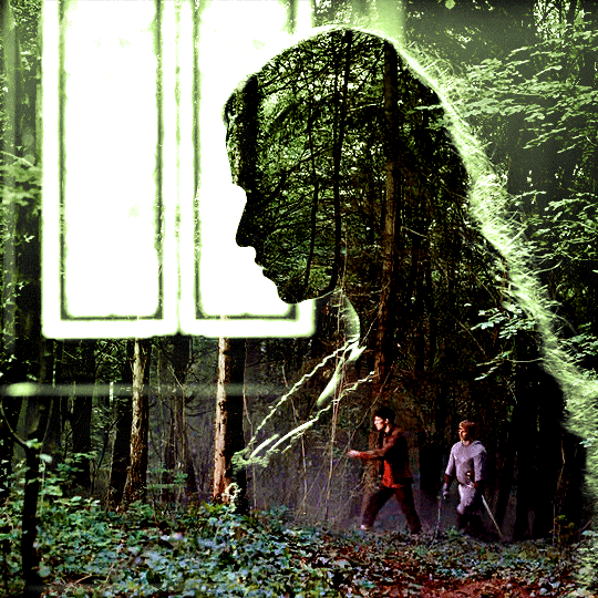
now the fun part! import the wide/scenery shot in photoshop, then resize it to the same height of your silhouette gif. make sure the gif is a smart object layer, and sharpen it. finally, bring this gif onto the silhouette canvas (by right clicking the smart object > duplicate layer). once you have both gifs onto your canvas, put the wide shot gif layer in a group, and set this group's blending option to screen.

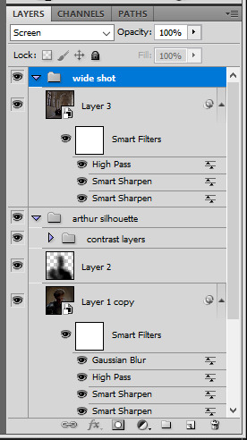
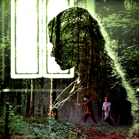
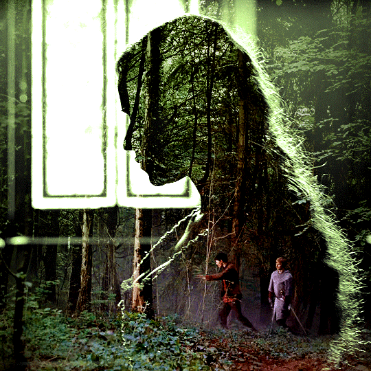
you can then position the wide/scenery gif the way you like it in the canvas. this is how it looks for both examples after i've done that:

if the blending mode screen doesn't give you the best result, so you can play around with other blending modes (such as lighten and linear dodge in these particular cases), but generally speaking, screen is the real mvp here haha.
IV. COLORING
now that the double exposure effect is done, we need to color the gifs to bring them together. i went with simple coloring here, simply enhancing the colors that were already there. just make sure that the coloring layers for each gif are in their respective groups. here's how i've colored both examples:
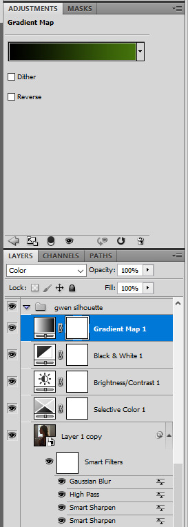
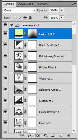
gwen silhouette group: i added a gradient map layer on top of the contrast layers in black to green and set the blending mode to color
scenery shot group: multiple coloring layers, with a green color fill layer (blending mode set to color), with a layer mask so it only affects the top half of the gif
for the arthur gif, i did something very similar but with warmer colors. i didn't use a gradient map for arthur though:
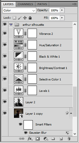
arthur silhouette group: i made the yellow warmer, closer to orange/red, with a hue/saturation layer, and added more vibrance. didn't feel like it needed a gradient map layer here though.
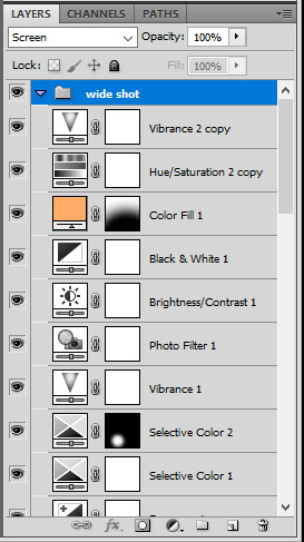
wide shot group: basic coloring layers to enhance colors from the merlin & daegal shot, and an orange color fill layer set to the color blending mode.
at this point you're pretty much done. just need to add some final touches and typography (if you want).
V. FINAL TOUCHES
a small and completely optional detail, but i wanted to soften the edges of the wide gifs. to do so i've duplicated the smart object gif layer and removed the sharpening filters (right click on smart filter > clear smart filters). put this layer on top of the other smart object layers (but still below the coloring).
then with this same layer still selected, go to filter > blur > gaussian blur... > 10px. this will give you a very blurry gif, but we only want the edges of the canvas to be softer. so add a layer mask to this layer. with a very large and soft brush (mine was at 0% hardness and about 800px size), brush some black onto the layer mask to remove the blur in the middle of the gif.

you can play with this layer's opacity or gaussian blur amount if you want (by double clicking on the gaussian blur smart layer filter). here how both examples look with this gaussian blur layer:

you can also mask some of wide/scenery gifs if you'd prefer, so it shows less outside of the silhouette. just put a layer mask on that whole wide shot group and brush some black or grey on the layer mask. it's what i did for the gwen gif, with a very soft brush and i set the mask density to 72% (i kept the arthur one as is tho):

and that's how i did it! hopefully that was clear enough :)
#alie replies#*ps help#resource#tutorial#allresources#*gfx#usercats#usersmia#userrobin#userfaiths#usertina#usermoonchild#userchibi#uservivaldi#usertreena#userraffa#userriel#userelio#usermadita#usersmblmn
970 notes
·
View notes
Note
hi i'm sorry to bother you but do you have any tips on giffing dark indoor scenes? yours always look so good!
hi there! not a bother at all :) i can definitely try to explain the steps i usually take under the cut!
this tutorial will assume that you already know the basic steps of gif-making — if you don't, there are lots of great tutorials floating around on this site that can help you out! :)
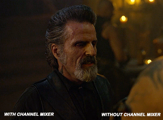
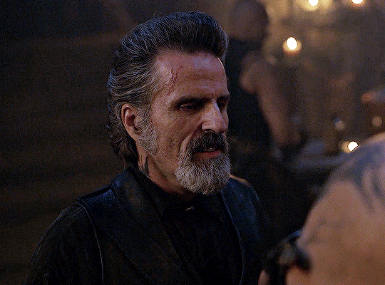
here's the gif i'll work with to explain my steps, the bottom being the original and the top being the coloured/brightened version.
before we start, a general tip i recommend keeping in mind: if you want to brighten a dark scene, you'll want to get your hands on the highest quality download you can find. 1080p is decent, but if your laptop can handle 2160p 4k hdr files* without sounding like it's about to explode, that'll get you even better results!
(*colouring hdr 4k files requires a different set of steps — the scene will appear washed-out on photoshop, so you need to make sure that you don't end up whitewashing anyone if you do choose to work with this type of file.)
since most of my downloads are 1080p, i'll use this type of file in this tutorial.
the first step of my gifmaking process with 1080p files is almost always the same no matter what scene i'm giffing. i make a brightness/contrast layer and set the blending mode to screen:
now my gif looks like this:
depending on the scene and how washed out it looks after this layer, i'll play around with the opacity. for this gif, i didn't touch the opacity at all. use your best judgement for this, because every scene is different!
i find that dark indoor scenes are usually tinted in yellow or green. one of my first goals is to try to fix the undertone of this scene before focusing on brightening it any further. i go to colour balance for this, and play around with the midtones, shadows, and highlights.
again, every scene is different, so the amount to which you use colour balance will differ, but for this specific scene, my goal was to neutralize the yellow. i focused particularly on the midtones and shadows of the colour balance layer, moving the scales to the opposite of the reds.
doing so will help with neutralizing the yellow. the only reason i moved the scales towards magenta and blue (therefore making it a bit more red than less) rather than green and yellow in shadows was because i wanted a darker contrast in the blacks. moving them to green and yellow made the overall scene more yellow since there were so many dark spots that shadows affected. (you'll see what i mean when you start experimenting with your own gif — this part of the process really just depends on your preferences!)
our gif might not look that much better yet, but it will soon! our best friend channel mixer is gonna help us out. for an in-depth post about how to use this adjustment layer, i recommend checking out this tutorial.
i'm someone who prefers to make more than one layer for the same adjustment layer for a reason i can't even explain (i just find that it helps me stay more organized). so don't think of this process like i can only use this layer once so i MUST fix it NOW. you can create multiple layers of the same adjustment layer, because every layer on top will affect the ones underneath it.
since my priority is getting rid of the yellow tint, i went to the Blue section of the channel mixer and increased it in all of the scales:
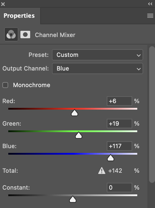
this step alone has helped us out so much, because look at our gif now!
not only does the background look less yellow, but so does izzy's skintone.
now i'm going to focus on trying to brighten the scene even more without destroying the quality. the levels layer can actually help out a lot with this.
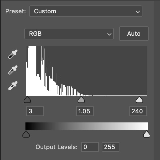
the amount to which i move each toggle differs per scene, and i think experimenting depending on your gif works best for this layer.
side note: i prefer not to use the ink droppers on the side because the contrast in the result usually ends up feeling too strong for my preferences, but if you find that this works better for you, then go for it! basically, the first dropper with the black ink should be clicked before you select the darkest part of the scene that you can find, and vice versa for the third dropper with the white ink — click it, and then select the brightest part of your scene.
curves is the next layer that does fantastic work! unlike the levels layer, i do actually use the ink droppers for this. it's the same concept, with the first dropper being used on the darkest part of the scene, and the third dropper on the brightest.
try to think of curves as something that not only further brightens your scene, but also helps with the colour neutralizing process.
i grab the first dropper, then click the darkest parts of the gif that i can see. depending on the undertone of the blacks that you're clicking on, the tint of your gif might actually change significantly. this is why i prefer to click once, then undo the action if i don't like what it gives me. izzy's leather jacket was the sweet spot for this gif.
when i'm satisfied, i make another curves layer and use the third dropper to click the bright/white parts of the scene. for this gif in particular, the lights in the background were a good fit because they carried a yellow undertone — this meant that my curves layer actually helped to further neutralize the yellows in the scene as a whole!
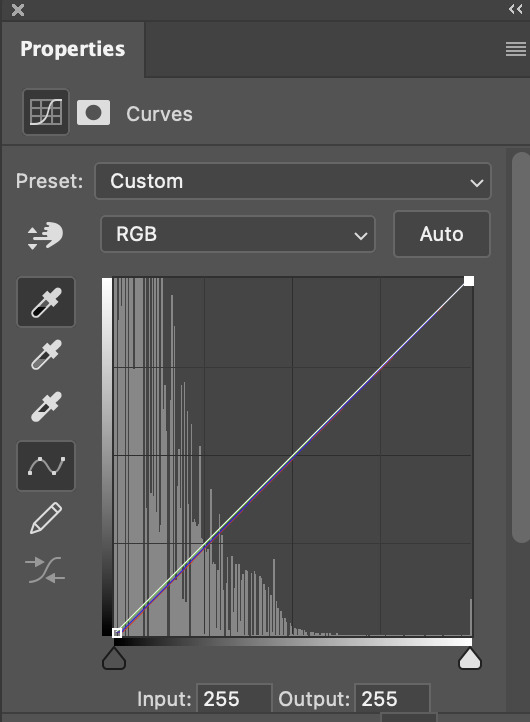
(i manually dragged the curves graph upwards for the third dropper to make it brighter. i don't need to do this if the dropper does this for me automatically, but since the lights were pretty bright, it only changed the tone of the scene and didn't increase the brightness — hence the manual step.)
pat yourself on the back, because this is what our gif looks like now!
this is good, but it's not great — there's still just a bit too much yellow in the scene for my liking (sorry, i'm picky! :P)
i created another channel mixer layer and played with the toggles until i was satisfied:
ta-da! the gif as a whole is much less red/yellow now:
this is when i start fixing the colouring now — namely, his skin tone. selective colour will be your best friend here. i wanted to make his face just a tad brighter and less of a yellow-ish magenta shade, so i focused on the reds and yellows.
then, out of habit, i created another selective colour layer and took out more of the "yellow" in the whites to make them whiter, and increased the black (just by +1, since the contrast is pretty good enough already).
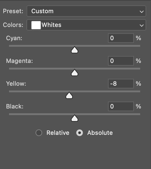
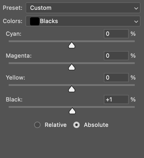
note: i switched to "absolute" for these two colours. basically, relative = less vibrant colour manipulation, and absolute = more vibrant/stronger colour manipulation. i prefer to stick to "relative" for fixing skin-tone since "absolute" can be a bit too strong for that.
our gif looks like this now!

his face looks brighter and much less yellow, so i'm satisfied!
this next step is not mandatory at all — again, i'm just picky and despise yellow-tinted scenes. i personally believe that indoor scenes that are yellow/green tinted make them look more dark than they actually are, so i do my best to get rid of these colours.
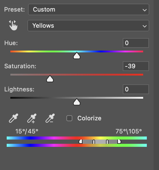
i also don't always do this, but for this gif, i just simply went to hue/saturation, selected the yellows from the drop-down menu and decreased its saturation.
be careful not to do this too much. depending on the quality of your download, this can significantly decrease your gif quality. i tend to worry less about this when i'm working with 2160p files, but again, those files require an entirely different set of steps when it comes to brightening/colouring.
since this was a 1080p file download (and one that was actually less than 1GB, oops, don't do that), i played it safe and decreased it by -39 only.
note: you also want to be cautious of colour-washing skintone when it comes to this step. i find that another selective colour layer can help perfect the skintone in case the yellow drains out of it too much, but skip the hue/saturation step if it's too difficult to work with — better to be safe than sorry.
anyway, this is the final gif!
that's usually what i do when it comes to colouring dark indoor scenes! i hope this tutorial makes sense, and if you have any further questions, don't hesitate to reach out! :)
#tutorial#gif tutorial#resources#completeresources#coloring tutorial#allresources#dailyresources#userraffa#userdean#uservivaldi#alielook#usercats#usermoonchild#usernaureen#userbarrow#userabs#useraish#useralison#userisaiah#*mytutorials#i am so sorry if this is incoherent#it’s so hard to explain things coherently 😫
613 notes
·
View notes
Text
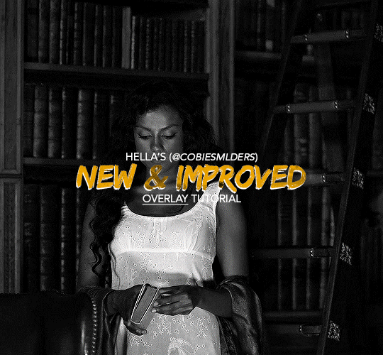
Hello!! A couple years ago I posted this tutorial for making gifs with a moving overlay effect. In the two and a half years since I made that tutorial, I've learned some new tricks for this gif effect but most importantly I've learned how to explain things better.
For that reason, I've created this new and improved tutorial for my overlay gif effect. The basics are the same but it's simpler, I go into more detail, give better explanations, and have more comprehensive instructions.
The easiest way to do this effect with this method is to use smart objects and work in timeline. For this tutorial, I’m assuming you know the basics of giffing like cropping, resizing, colouring, etc. If you need help with this I’d suggest you look at some other tutorials and guides!!
First, we’re going to start off with three things.
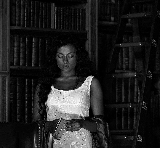
1. A completed gif converted into a smart object that is going to be the base gif. I'm going to call this "gif1". You’ll want this gif to be at least 3 seconds because it needs to last as long as the overlay plus a little bit of extra time in the beginning.
This is the base gif I’ll be using in the example (except I trimmed it so that I could meet the size limit).
2. A second completed gif converted into a smart object that is going to go over the base gif. We’re going to call this "gif2". This gif should be at least 2 seconds but I’ve made it work with shorter. Gif2 needs to be the same dimensions or bigger than gif1.
This is the gif I'll be using in the example (except I trimmed it so that I could meet the size limit).

3. An overlay in video form. These can be found on tumblr and youtube by search for overlay or transition packs. For this example, I'll be using an ink drop overlay I found on youtube.
Step 1: Turning the overlay video into an overlay gif
Most overlays aren’t going to instantly fit the gif effect you’re trying to achieve right away. This is the overlay I got from youtube and as you can see it’s too slow and needs a crop/resize to be usable.

To fix it, I sped the frame rate up, cropped the overlay, and resized the overlay so it fits over my base gif. I also sharpened the overlay (500% amount, 0.3px radius) so that the edges were smooth. This is the new overlay gif and the one I’ll be using for the gif effect.

A tip: I also like to add a brightness/contrast layer to get rid of the grey on the overlay gif. Because we’re working with blending modes to achieve this effect, any parts of the overlay that are grey will be a blended mix of gif1 and gif2. If you think this will look good for your gif effect then don't worry about it!
Another tip: try to get the entire overlay movement to fit into a 2-3 second window. Anything longer than that will likely be cut off when you have to trim your gif to meet the upload size limit and it would suck to only have half of the overlay.
Step 2: Creating the gif effect
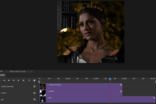
Drag a copy of gif2 and a copy of the overlay gif onto the gif1 canvas. I like to use Ctrl+Shift+V so that the layers are pasted in the same position as they were on the previous canvas. MAKE SURE that both overlay layers are in the same position on the canvas. If one of the overlay layers is higher/lower/etc. than the other then the effect won't work properly.
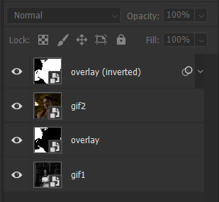
Then, make a second copy of the overlay and invert it (Ctrl+i). These are the layers you should have:

Before you go any further, trim gif2 and both overlay layers so they are all the same length.
Now, we need to rearrange the layers and set blending modes. The top layer should be whichever overlay goes from black to white. This is because when we change the blending modes, the white part of this layer will disappear and look like its being replaced by gif2. In this case, that is the overlay (inverted) layer. Then we want gif2, the other overlay layer, and then gif1.
A tip: this process can be done the other way where the top layer is the overlay that goes from white > black however, you are much more likely to have an error where there is a grey/black line around the overlay effect in your final gif. In order to avoid that, I always use the black > white layer on top.
Next, set the top overlay layer to darken. You should only see the black part from the overlay and gif2 should fill in the white part. Here’s how that looks in my example.
Next, select the top overlay layer and gif2 and convert both layers into one smart object. Your layers tab should look like this now.

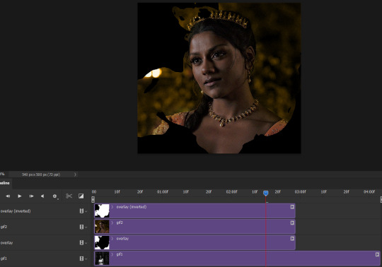
Now, set the new layer’s blending mode to lighten and the overlay layer’s blending mode to darken. Once you do this, you should be able to see gif1 as well as the overlay gif.
Step 3: Timeline and exporting
At the moment, gif1 is still significantly longer than the overlay gifs. Since this gif is just over 10 mb (which is pretty small for this effect) I’m going to trim about 1/4 of a second off the end of gif1 and then drag the overlay layers so they all end at the same time.

Now you’re free to export the gif! This is the finished effect for the example gif!

A tip: sometimes, when I convert to from timeline to frames, the gif becomes a little longer and slower. It has to do with different frame rates across the videos and photoshop but I'm not smart enough to understand it. If that happens, just set all the frames with the overlay layers to 0.04 speed instead of 0.05.
And we're finished! I hope that was helpful and made sense. If you have any questions feel free to drop them in my inbox or send me a message!! <3
#gif tutorial#allresources#completeresources#dailyresources#chaoticresources#ps tutorial#photoshop tutorial#usertreena#tuserssam#usernik#tuserabbie#tuserace#userk8#usershreyu#uservalentina#useryoshi#userannalise#userrobin#usersalty#uservivaldi
1K notes
·
View notes
Text

FALLING LETTERS ANIMATION tutorial
hello! @kimmomi asked for a tutorial on how i made the letters "fall" in this gifset and so i figured i would make it and post here! this effect isn't hard to achieve but it might get a little tedious if you have a lot of letters.
note: you will need photoshop with a timeline!
STEP ONE: create your base gif! be mindful of number of frames in your gif. the number of frames doesn't really matter here, altho the longer the gif the better the effect. i'd say try to limit it to 60-70 frames, depending on how big your final gif will be.
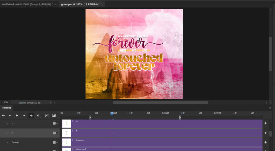
STEP TWO: make your text the way you want it to look. this effect is basically the last step of your gif making process. (i will be using the typography from my set as an example as i already have that psd saved)
this is what my typography looks like now.

STEP THREE: i would recommend that the word at the bottom be the word that "falls". for me that is forever.
now, you will have to duplicate the "forever" layer and make your non-copy forever invisible.
what you will want to do now is delete all the letters but the first one in the duplicated layer. for me that is f. then you just duplicate the f layer and write your second letter instead of it, in my case o. you will have to do this for all letters. also as you do that make sure to move them a bit away from each other.

now, what helps to align those letters where they start off, is making your non-copy layer to be visible again.

after you've aligned your letters, make the non-copy layer invisible again.
STEP FOUR: so now we come to a bit of a tedious part.
what you will do now is move the playhead (blue timeline arrow) a bit further from the beginning of the gif (this allows for the text to stay still a bit before it starts "falling") and click on the first letter.
next step is to click on the little arrow next to your letter and clicking on the stopwatch next to Transform.

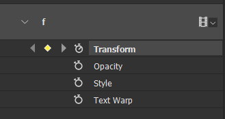
then, you will take the playhead and drag it to the end of the gif where you will start with transforming your letter with Free Transform tool (shortcut ctrl+T on windows). and what you will do is, while in Free Transform mode, drag your letter to the bottom of your gif while also rotating it a bit. when you're happy with your placement of the letter, hit enter. see below gif for how i did it.

you will have to do this for every letter, but make sure to rotate some in the other direction. also make sure that the beginning of the stopwatch mark is the same for every letter.
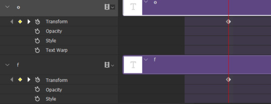
and that is basically it! after you transform every letter, you can go and save your gif.
this is my final result:

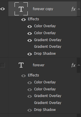
for some extra dramatic look, you can duplicate your initial layer with the whole word on it, drag it above all layers, clear layer style and add a stroke and make sure its FIll is at 0% where you will get the outline text that stays behind.

i hope this was helpful and understandable. if you have any questions, feel free to send me an ask or dm me <33
#usergif#completeresources#allresources#gif tutorial#ps help#userkimchi#uservivaldi#userraffa#tusermona#userelio#usercats#tuserheidi#usershreyu#userhallie#userroza#userdean#userisaiah#thingschanged#tusercasey#usertj#userwwz
519 notes
·
View notes
Photo
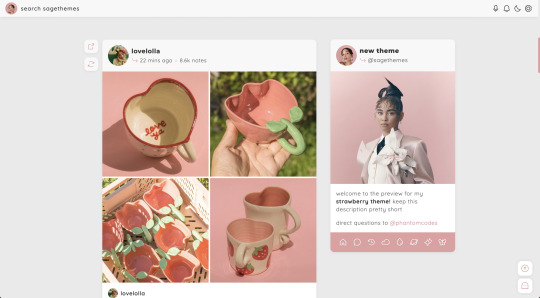
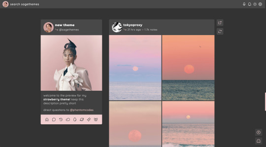
strawberry | theme by sage
get the code: static preview / version 2
a sidebar (left or right) theme with sticky buttons for permalink & reblog
— free through the month of april (2023)!
features (more info below the cut):
toggle: tags on click, music player, updates, right or left sidebar
headerbar includes blog icon/home link & search bar | (optional) music player & updates buttons | day/night & tumblr controls buttons
sidebar includes links for home, ask, archive, & up to 5 extras, an uploadable image, and custom description
customizable: blog title, description, colors, body & title fonts, and font size
responsive design, jumpination, scroll to top, 4 corner options, 3 post margin options, phosphor icons
nothing needs to be changed in the code, everything can be changed in the customize panel!
terms:
reblog if using
do not touch the credit
all terms / faq
credits listed in the code / credits page
please consider supporting me ♡
blog name !! important
make sure you fill out the blog name field, this is what will show on the top of all your original posts. to clarify: your blog name is your blog’s url - for example: phantomcodes
music player
this player uses an image link - see my faq if you have questions
uploading your song:
i recommend using google drive to host your mp3 files - below is a brief explanation for how to do this but you can also see the resources provided here by glenthemes and more links on my credits page
to start you need an mp3 audio file, once you have the one you want go to google drive and click: + New ➞ File upload
select your mp3 audio file and click open
open your newly uploaded audio file in google drive and click the three dots on the top right, then click Share and under General Access change it to Anyone with the link can view
copy the sharing link provided, it will look something like this: https://drive.google.com/file/d/1pBA6KdlLEzoEZPQ6hmaSr9LGLeCQGPxz/view?usp=sharing
go to the following site and paste your sharing url in the first box provided: https://www.joelgrayson.com/drive-download-link-generator
your final product should look something like this: https://docs.google.com/uc?export=download&id=1pBA6KdlLEzoEZPQ6hmaSr9LGLeCQGPxz
make sure the music player is toggled on in the theme, paste your audio link in the Song URL field
sidebar
when your browser width gets too small the sidebar will disappear and a sidebarbutton will appear on the header to toggle it!
#themehunter#theme hunter#code hunter#tumblr theme#tumblr themes#tumblr codes#tumblr resources#completeresources#allresources#userbru#tuserlucie#userbrina#userdre#usernik#useraashna#strawberry#phantom code#phantom theme#responsive theme
2K notes
·
View notes
Note
Hii! Sorry to bother you, but I just saw your post about that one GoT scene with "camera raw filter" and *have* to ask...what is that?! That looks insanely good. I tried doing a quick google search, and it seems like it's a Photoshop pluggin, maybe? I'm not too sure... Would you mind sharing a bit more about it, pretty please?
the post anon is referring to:
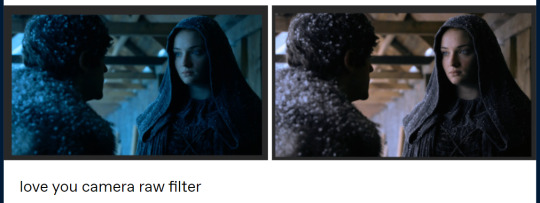
this is by no means an adequate guide or even a comprehensible explanation, but i hope it helps out somewhat.
you are correct, camera raw filter is a photoshop plugin. you can download it from here (works with 🏴☠️d/portable versions too): the installation is pretty straight forward, just do it as you would with any program.
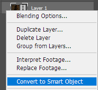
before you do anything, make sure your screencaps are a smart object (it will obviously be faster if you add a camera raw filter after you've resized and added whatever it is you need to add, but you can always just do it with the original sized screencaps). it's easier to edit the properties from a smart object than to go back and try to get it right again from scratch.
you will find it under filter > camera raw filter… this will bring up a new window:

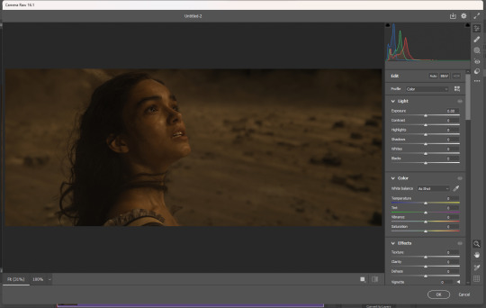
you can add as many of them as you need to. if you want to edit it because you think you've made it too bright or too blue or something, just double click on camera raw filter under your smart object:

if you're editing one scene and you would like for everything to look uniform, you can also just bring over your settings because they're smart objects:

okay enough yapping, back to what you came here for. let's go through all that i use/have used and how they work. you can mix and match them however you want - what works for one scene might not work for another.
the 'Light' section you can use to fix the light of the scene but i basically only use it if i want to "strengthen"/darken the whites and highlights. if your files are too dark or lack contrast, you can fix that here.

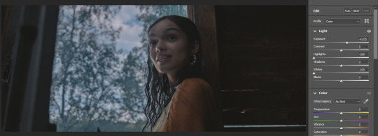

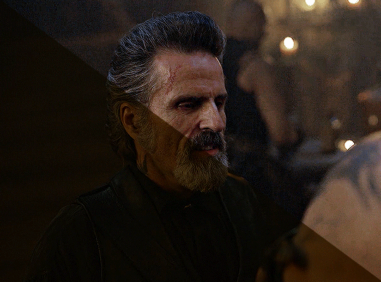
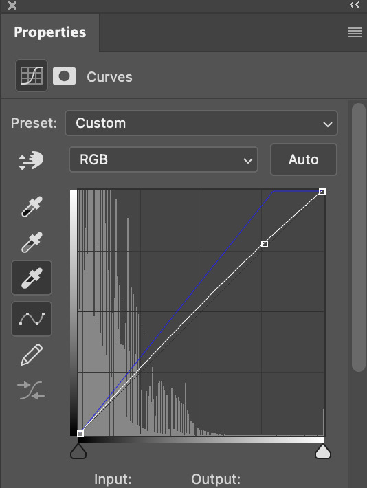
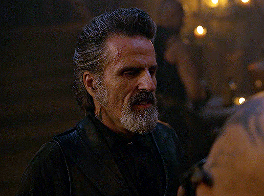
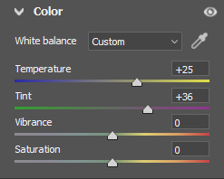
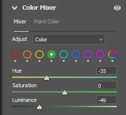
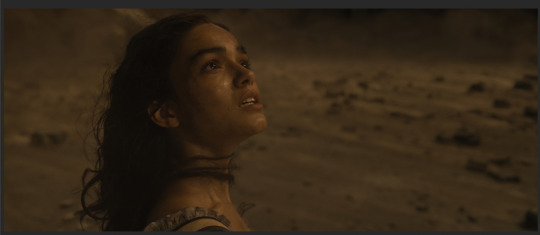
the 'Color' section!!! chef's kiss. this is what i used for the Sansa screencap. first you need to think about whether your screencap is too yellow or too blue, and then slide it towards the opposite direction. after i did that, it was way too green, so i used the tint feature to help out with that.


if you have handled today's media, you know that they haaaate color. so still in 'Color', in vibrance/saturation (i have never worked out the difference and atp i don't really care asdfghjkl) you can adjust that as well but it's for all the colors of the rainbow. you can enhance colors better in 'Caliberation' (see below).

i don't really use 'Effects', but the Vignette feature is a lifesaver if you encounter those. an example:
i have never touched 'Curve' but i image it works just like curves.
'Color Mixer' is good to manipulate colors. it's basically hue/saturation but lowkey better. if you switch to 'Color' in Adjust, you can edit them more accurately (Capcut has a feature similar to this i think).
ngl i don't have a good example of this now so enjoy this cartoonish something:

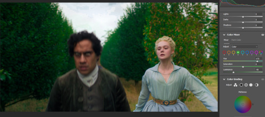
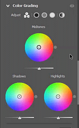
and we have arrived at my favorite!!! with 'Color Grading', you can fix almost anything: Midtones, Shadows and Highlights. it's basically a color wheel and you can try to find the black midtone and white points that will neutralize your screencaps. you can be more accurate with them if you click the circles in Adjust. basically a more freestyle curves i think.
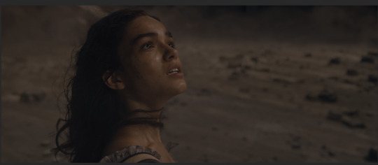
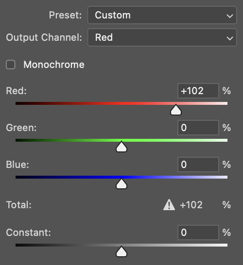
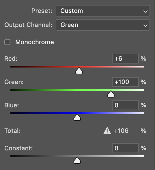
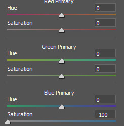
lastly, 'Calibration'. you can also enhance or diminish colors here based on whether they belong in the red, green or blue primary. eg if you have a scene that's way too yellow, you can try and bring down the saturation in Blue Primary and it will help tremendously.


if you have any further questions, feel free to send me another ask!
370 notes
·
View notes
Text
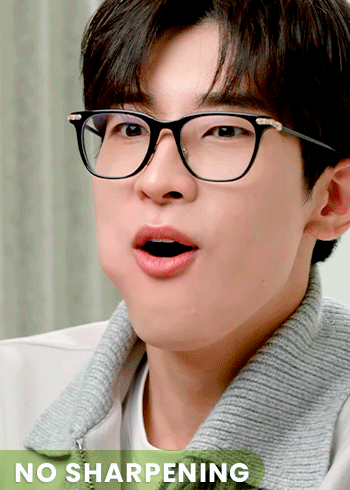
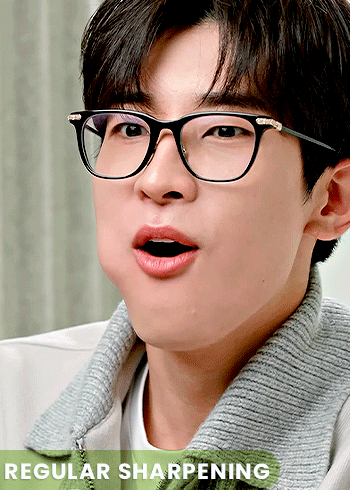

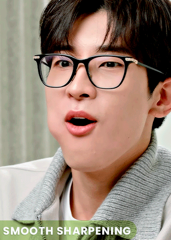
WNJUNHUI'S SHARPENING ACTION PACK
i thought that some people might benefit from these actions so i'm sharing them here. these are pretty generic sharpening settings, but i hope you find them useful.
action 01 | regular sharpening: works well with most gifs, pretty much the default sharpening settings
action 02 | noise sharpening: i use it mostly for kpop music videos, it gives the gifs a nice style, while helping the quality look better.
action 03 | smooth sharpening: if you want to go for a dreamy feeling, this is a great way to do it. i also find it useful when the quality of the footage is not great.
download here
#dailypsd#psdresources#allresources#sharpening action#dailyresources#psd resources#psd action#mery.creations#userzaynab#heymax#userbloomingwarrior#niniblr#usershreyu
428 notes
·
View notes
Text

I had to delete my previous bokeh overlay pack because zight died on me and I no longer had the file, so here is a new one.
Please like or reblog if you use
Do not repost
Download
#completeresources#sadresources#onlyresources#usergif#allresources#gifmakerresource#gif overlay#hisources#dailyresources#overlay#*#textures
255 notes
·
View notes
Text

Thank you @cobbbvanth for asking me for this; I’ve never been more flattered! ☺️ I’ve only been making gifs for a little more than 2 years, so I’m really still only figuring Photoshop out, and my colouring owes everything to other people’s tutorials (some of which can be found here). To be honest, I was only asked some tips, but I have no clue what to include and what to leave out; so, here’s my complete (if random) colouring process.
NOTE: This is a colouring tutorial, not a gif-making one. The tutorial that taught me everything I know about that (and to which I am eternally grateful) is this one by @hayaosmiyazaki.
I. SHARPENING
My standard sharpening settings are:
One Smart Sharpen filter set to Amount: 500 | Radius: 0,4
A second Smart Sharpen filter set to Amount: 10 | Radius: 10
One Gaussian Blur filter set to Radius: 1,0 and Opacity: 30%
One Add Noise filter set to Amount 0,5 | Distribution: Gaussian
II. BASIC COLOURING
This is the part where I add most of the adjustment layers available and just play around with them. Obviously different settings work for different scenes, but I do have some standard ones.
Brightness/Contrast
I usually up the Brightness to +10-30, and the Contrast to about +10.
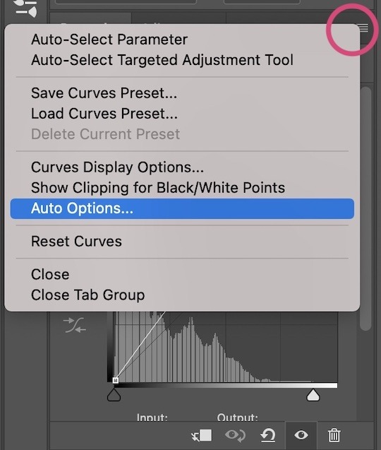
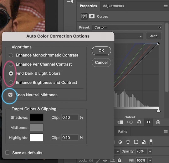
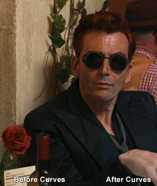
Curves
For the first Curves layer I go to Auto Options > Enhance Brightness and Contrast, and then adjust the opacity until I’m happy.
I might repeat the above step if the gif still looks too dark to me.
I add another Curves layer, I go to Auto Options and this time I pick either Find Dark & Light Colors or Enhance Per Channel Contrast, and check or uncheck the Snap Neutral Midtones option, until I see something I like. I will then adjust the opacity.
Levels
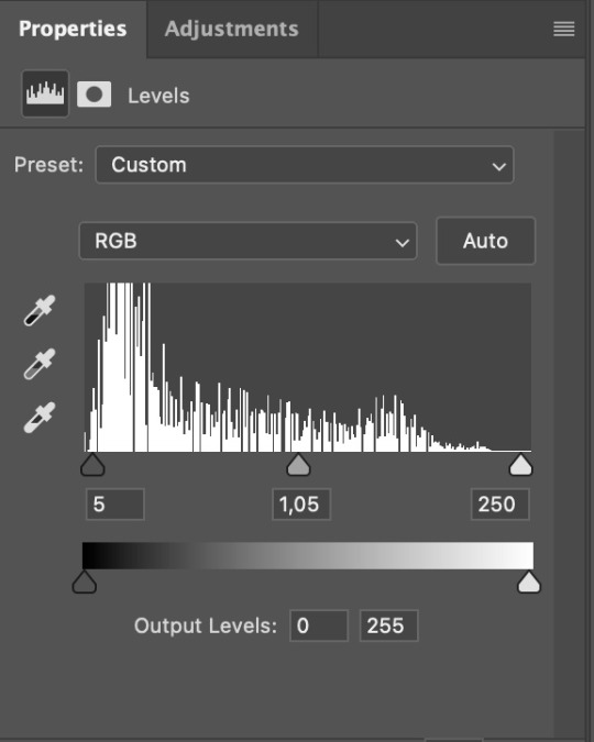
I add a Levels layer that usually looks something like this:
Exposure
I add an Exposure layer, where I usually set the Offset to around -0,0010.
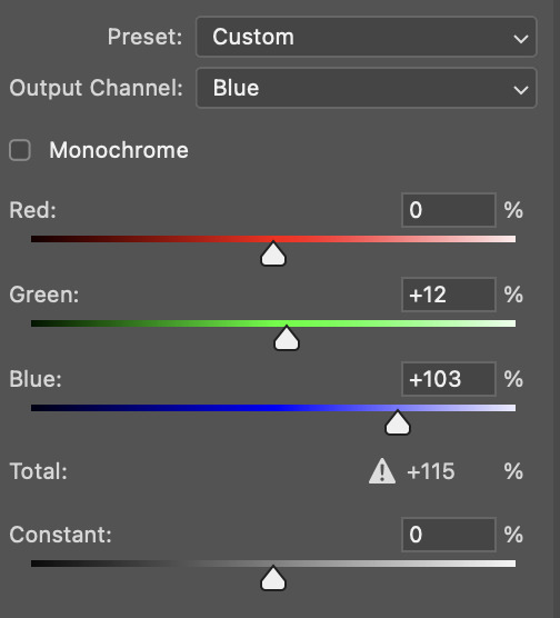
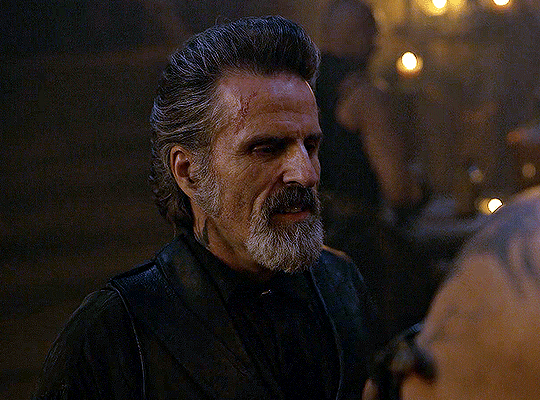
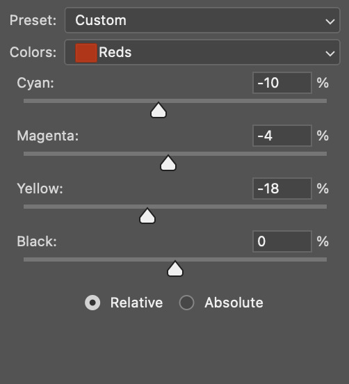
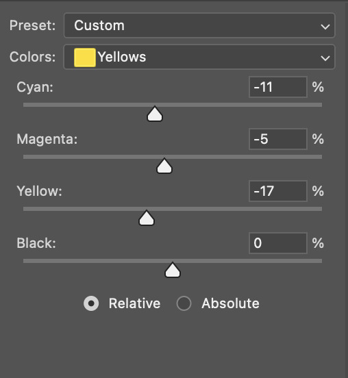
Selective Color
To make the faces look okay, I create a Selective Color layer, select the Reds and usually add some Cyan (+10-20%) and play around a little (±5%) with Magenta and Yellow too. I might also add another layer, select the Yellows and make slight tweaks there too.
III. FUN COLOURING
About colour manipulation: PiXimperfect just uploaded a tutorial that explains everything so much better than I ever could, so I highly recommend you go watch it. It’s made for static images though, and things are more complicated with moving images, so I also recommend @elizascarlets’s tutorial.
The reason I usually go for a softer colouring is that a more vivid one requires a lot of patience and precision, and I honestly can’t be bothered. Instead, I try to tweak the colous only a little, so that the edges can be a little rough without it looking too wrong.
One thing to remember is that each gif is different, and there isn’t one foolproof way to do this, so you will need to use a different technique depending on the gif you’re working with.
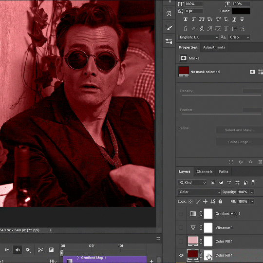
Okay, so, after I’ve decided what colour I want my background to be:
1. I create a Hue/Saturation layer and change the greens, cyans, blues and magentas to that colour. That’s easy enough, since it doesn’t mess with the face colour. I then set the blending mode to Color. If your background doesn’t include any yellow or red, you might be done here, like in the case bellow:
2. To change the yellows and reds, I create a new Hue/Saturation layer, select the yellows/reds, move Saturation to 100 (temporarily) and then play around with the sliders until the face colour isn’t affected. I then change it to whatever I’ve chosen and change the blending mode to Color.
3. If for whatever reason step 3 doesn’t work (the background is white or black for example, or just too red), I might create a Solid Color layer set to whatever colour I want, set the blending mode to Color and then select the layer mask and carefully paint with a soft, black brush over the people’s faces/bodies. I will then lower the Opacity, to whatever looks smooth enough. If there’s a lot of movement in your gif, you might have to use keyframes (see elizascarlets’s tutorial linked above). However, my main goal is to avoid using those; that’s why I try my hardest to tweak around as many Hue/Saturation layers as needed and not have to create a solid color layer.
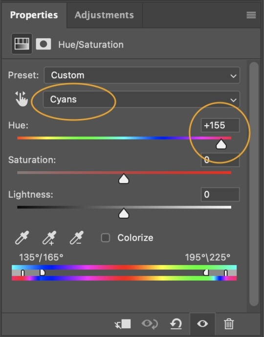
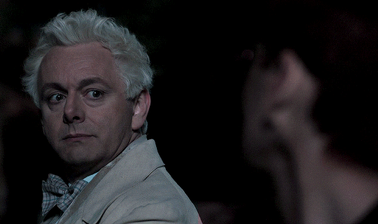
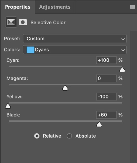
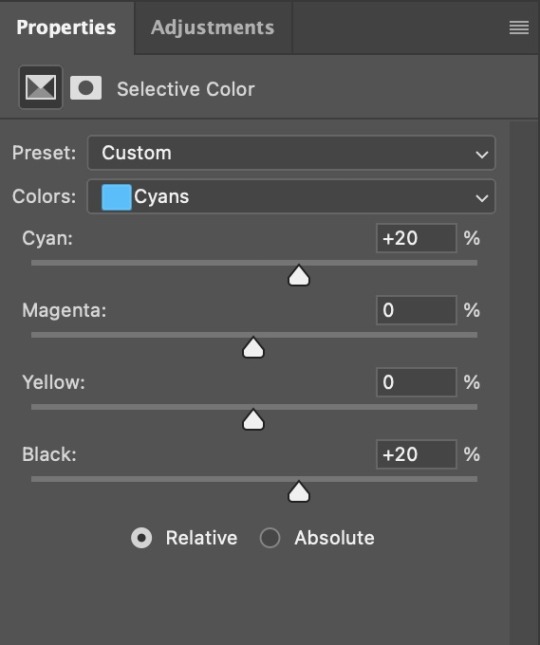
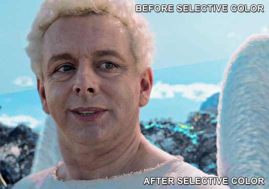
4. Once my background looks the colour I want it, I might add a Selective Color layer that matches my background color and then try to make it look more vibrant. For this Aziraphale gif below for example, I’ve selected the Cyans and then set Cyan to +100%, Yellow to -100% and Black to +60, then created another one, selected the Cyans again and then set Cyan to +20 and Black to +20.
5. If the gif has a white area, I create a Solid Color layer with a colour that matches the rest of the background and then set the Opacity low. I might also create a Selective Color layer, increase the Black and then play around with the colours.
IV. FINISHING TOUCHES
I create a Vibrance layer and set the Vibrance to around +30 and the Saturation to about +5.
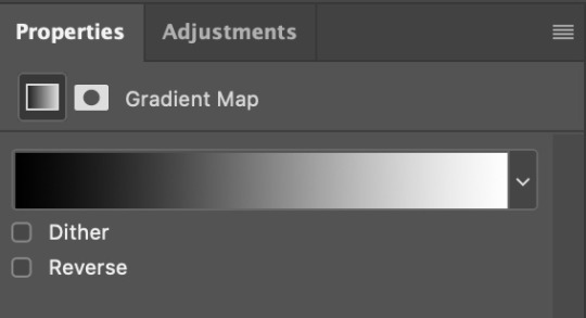
I create a black and white Gradient Map layer (with black on the left end of the spectrum and white on the right), set the blending to Luminosity and the Opacity to about 20-30%.
AAAND that’s about it I think! This ended up way too long and perhaps a little incoherent. I tried to make it as general as possible, so you might have to mix and match for best results. Feel free to ask me for further explanations about any one of these steps, and please tell me if you want me to go through the colouring of a specific gifset (although, as I said, I'm by no means an expert). Happy gifmaking!
#gif tutorial#allresources#completeresources#dailyresources#photoshop tutorial#chaoticresources#uservivaldi#userdanahscott#usersanshou#userfanni#userbuckleys#userrobin#tuserjen#userdavid#userzaynab#tusermimi#thingschanged#tuserju#usertj#userhallie#tutorial#minee
271 notes
·
View notes
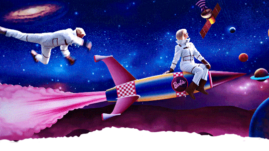
Text

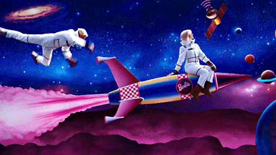

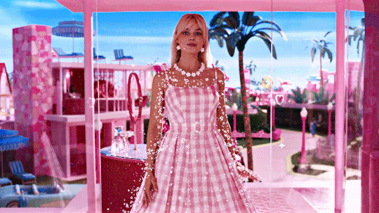
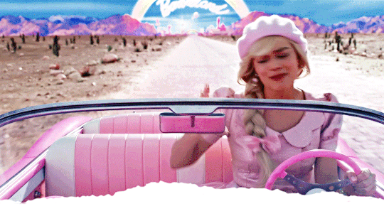
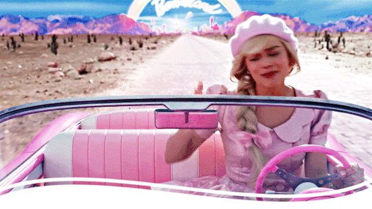
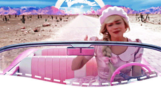
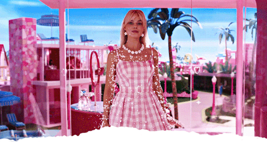
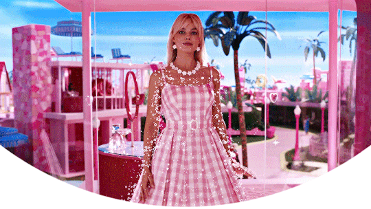
Barbie headers (requested by anon)
- 6 headers (640x360) | 4 different border versions under the cut
- versions with black borders here
- please like or reblog if you take one
- credit isn’t required but it’s appreciated
- requests are open for other headers!

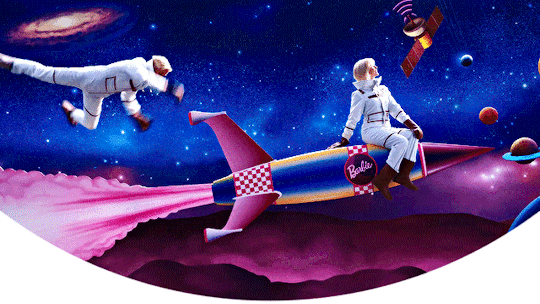

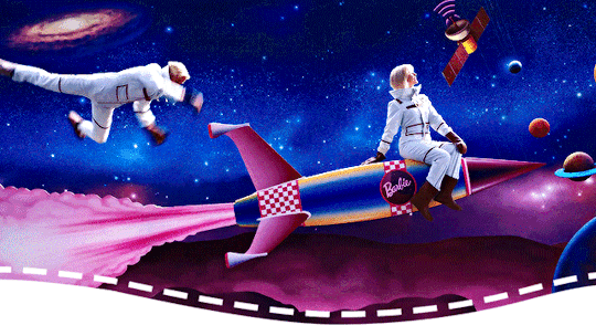
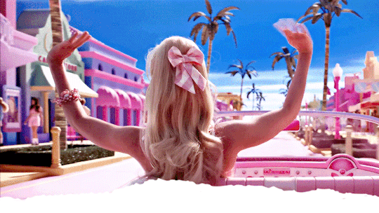

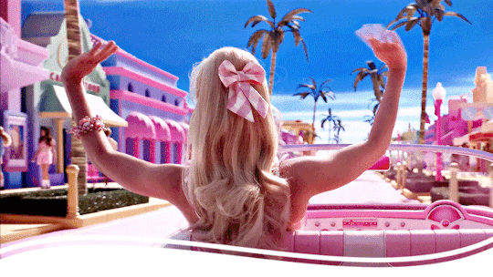


#barbie#barbieedit#barbie headers#barbie gif headers#filmedit#completeresources#allresources#resources#headers#headers*#*#i know i have a million other header requests to do and just got this one today but i was in a barbie mood 😅
680 notes
·
View notes
Text


theme thirty-four ♡ by userbru
live preview | code | support me on ko-fi?
540px posts
300px sidebar image (optional) /*if you don't want a sidebar image, just don't upload one
50px desktop icon (top menu)
5 sidebar links
custom desktop title & description
very minimal customization needed ♡
credits on code
recommend doing a theme reset before installing this theme
how to change sidebar link icons
i accept theme commissions ♡ for more information, dm me on my main @fadeintoyou1993
here's a masterlist of all of my themes w/ the npf fix (updated 09/april)
#theme#theme hunter#tumblr themes#dailyresources#themehunter#codingcabin#ccnet#kosmique#maziekeen#usersage#ricecodes#allresources#tuserdee#userbecca#completeresources#userdavid#*#1/3 themes posted :)
176 notes
·
View notes
Note
Hi, me again!
Ty for the reply, I would love an in depth tutorial if you don't mind as i really wanna get this effect to work and I kinda work best when it's spelt out for me when learning new techniques lol :)
hey anon, no worries! here's how i used this amazing template by @danesdehaan and added a rolling effect like this (from this gifset):
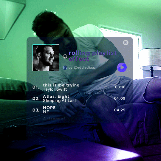
this effect uses photoshop's timeline. i use cs5, for reference.
detailed tutorial under the cut :)
I. PREPARING THE TEXT
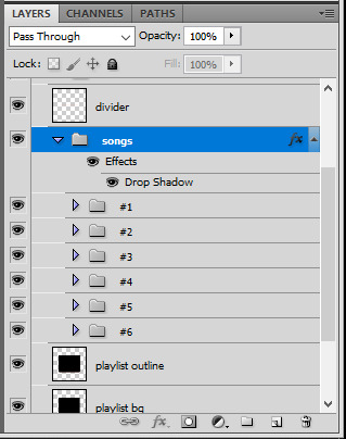
when you open the template, you should have a group called "songs" with 3 groups for each song. what you wanna do is duplicate these numbered groups until you have the amount of songs you want. for each group, use the move tool or your keyboard's arrows to move the duplicated song text layers/groups on your canvas so they're under the first three that are already there. make sure these new duplicated layers are in the "songs" group.
then type the numbers, song titles, artists, song durations, etc. it should look like that:
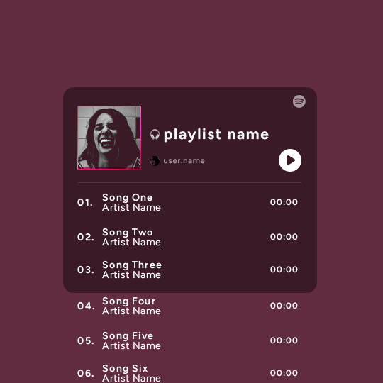
i wanted mine to have a smaller gap in between each song, so i used the arrows to move each song group closer together, and it looks like that before the animation:

II. ANIMATED EFFECT
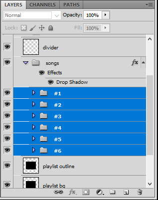
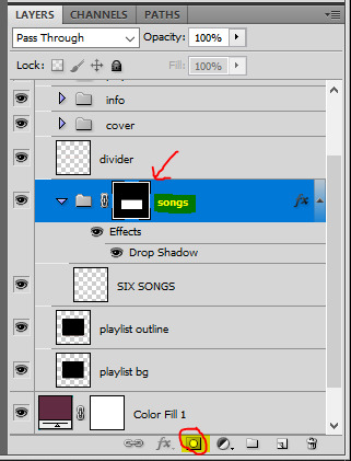
once you have typed everything, make sure there are no mistakes and that you won't need to edit anything about the songs or durations or anything like that, because you won't be able to go back. when that's done, select all of the numbered song groups and right click > Merge Layers.
that will give you one layer with all of the songs together. i've renamed mine "SIX SONGS". make sure this new merged layer is still in the "songs" group.
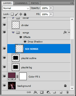
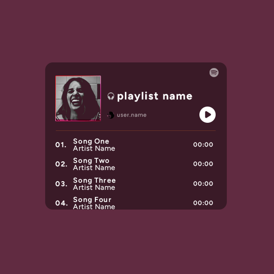
once that's done, you're ready for the animation. and it's pretty easy, because you only need two keyframes: one at the start of the gif, and one at the end.
go to the start of your gif on the timeline, and toggle the position keyframe animation by clicking on the little stopwatch icon. a little yellow keyframe should appear where the cursor is, at the start of the gif:

then go to the end of the gif with the cursor. with the "SIX SONGS" layer selected, use the move tool or keyboard arrows (my preference) to move up the text until all the songs are inside the darker rectangle. once you move this layer's position, a keyframe will appear on the timeline and the animation will be created.
the animation now looks like this:
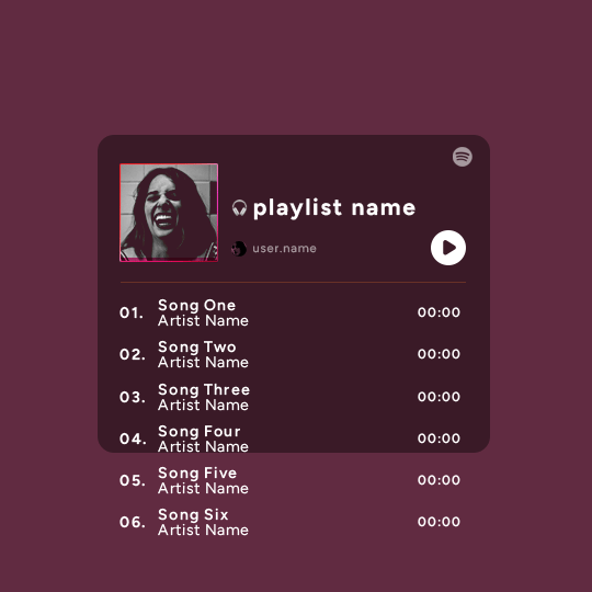
if you want, you can now edit the speed of the animation by moving the keyframes. the closer the two keyframes are, the faster the animation will be; the further apart the keyframes are, the slower the animation will be.
III. LAYER MASK
since we want the songs to be contained in the dark rectangle and below the line, we need to add a layer mask. i started by creating a shape of where i want the songs to be contained with the rectangular marquee tool:
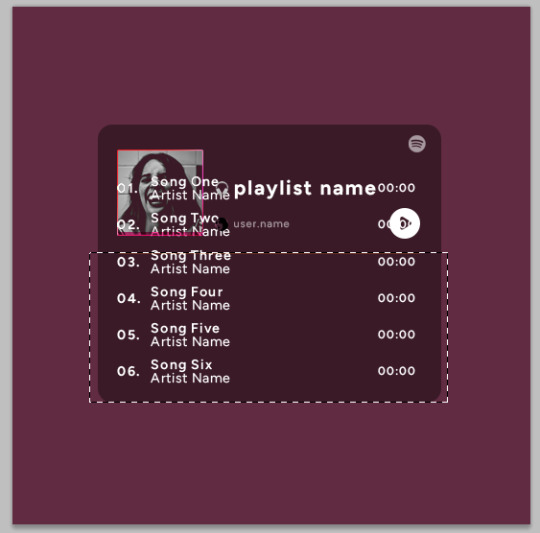
then, on the layers panel, select the "songs" group and click on the layer mask icon to create a mask with that rectangular selection.
if you play the animation after making that layer mask, it should now look like this:
if you like it that way then you are done, yay!
but if you'd like softer edges, like i have done for mine, click on the layer mask's black and white thumbnail. use the brush tool with a 0% hardness and the black color to make the edges of the mask softer. make sure you are making your brush strokes with the layer mask's thumbnail selected.
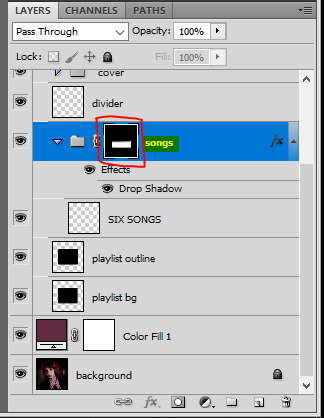

once you have brushed a bit of black with a soft rounded brush on the top and bottom of the mask, the animation should look like this:
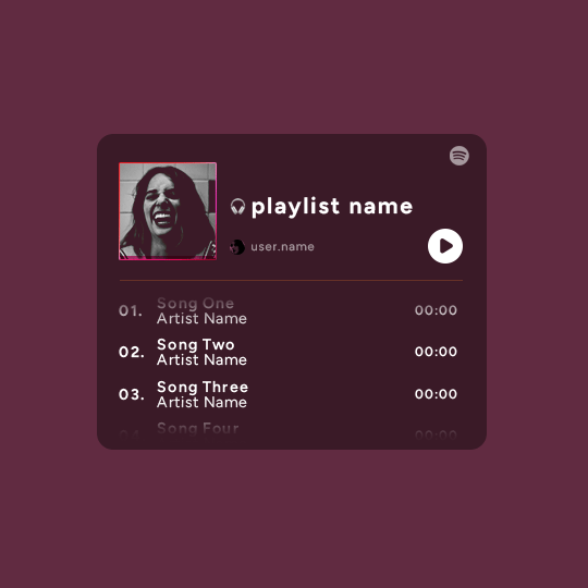
and that's it! i hope this was clear enough :)
#alie replies#Anonymous#*ps help#photoshop#tutorial#resource#completeresources#allresources#resourcemarket#usertj#usertina#usercats#useraish#userdean#userabs#userraffa#userbuckleys#uservivaldi#userisaiah#usernorah
374 notes
·
View notes
Last Seen Blogs
multicolorlou
Kellen Anderson
sasablogx
AMARYLLIS
katyyluzokk
Sin título

maafaldapereira
I lost myself somewhere.
wyrdwyrm
Things that Inspire me