#also i wanted to try out the watercolor brush. good decision this was very fun
Text
but there wasn’t any water in the wishing well
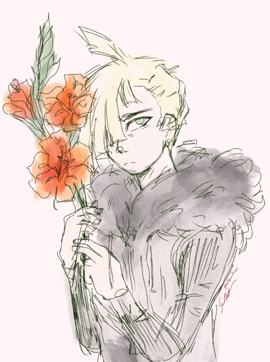
#oleander said a thing and i immediately decided i needed to draw gladion#and i ended up trying out this a little bit different style. its mostly based on sitting up straight and using looser lights#*lines#bc my spine has been hurting lately and i wanted to try to calm it down#also i wanted to try out the watercolor brush. good decision this was very fun#gladion#lyric is from Wishing Well by the Oh Hellos#ITS ABOUT THE PRODIGAL SON OF COURSE ITS A GLADION SONG#nightly rivals
37 notes
·
View notes
Photo
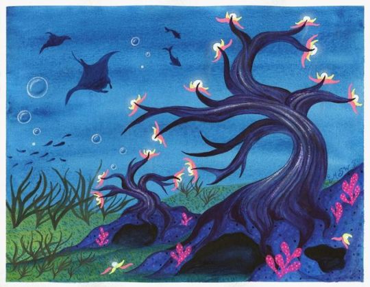
Nightlights in the Deep
At last, I can finally show you guys what's been with the tree fever in my last couple of posts (Terrarium Nova and WIP Wednesday: Oops all Trees)
So the art supply company Arteza madea post on their Instagram a few days ago where they announced a contest to make art featuring trees and post it on Instagram with all the appropriate tags, open until September 26th (with prizes of course) and I thought it would be fun, especially since one of their suggestions was to design a tree.
And I also decided to add a little extra challenge to myself to stick primarily to the Arteza supplies that I have, since it's their contest. That meant I had their watercolors, colored pencils, and woodless watercolor pencils to pick from and play with. Although I did end up using quite a bit of gel pen (Sakura gelly rolls and a little of my white Uni-ball Signo) to get the bright pops of color I just couldn't get with the other supplies. The gel pens felt fairer to supplement with since I usually accent pretty much all my work with gel pen in some form or another.
Naturally, after I gave myself a few minutes to ponder how to stand out among a crowd of trees but also fit right in, my imagination ran wild with my own fictional tree species.
I pretty immediately landed on the idea of an underwater/deep-sea/bottom-of-the-ocean tree and also something with bioluminescence (things that naturally glow in the dark) and from there I starting searching for various tree and water-themed things on Pinterest to flesh out my ideas. From that, I very quickly arrived at the idea of a winding, twisting trunk like you might find on a bonsai tree. And while originally I really liked the idea of having wispy drooping petals and/or leaves like Wisteria or willow trees, after a few tests that didn't turn out as nicely as I wanted (as seen on the WIP Wednesday mentioned above) I decided maybe it would be best to go without this time around.
So the final concept I've ended up with for my trees here goes roughly as follows, although I'm no botanist or marine biologist so there's a good chance a lot of this doesn't check out scientifically:
The Nightlight tree, named for its bioluminescent fruits--called "moon fruits" for their whiteish glow, pale bluish color, and spherical shape--is a species of aquatic tree that is found growing anchored to rock formations and cave systems in the greatest depths of the ocean. As these trees exist in oceanic depths with minimal or no sunlight, they perform chemosynthesis rather than photosynthesis to make their own food until they reach maturity and can produce their own artificial light as a food supplement.
Nightlight trees root systems can reinforce and stabilize the rock formations they anchor to in order to grow, which provides a more sound home and environment for the species of fish that will eat the "moon fruits," attracted by their bright glow, produced by the tree and aid in the tree's reproduction. Because of this, nightlight trees may grow in clustered groups or may grow so closely together that multiple trees twist and wind around each other, which can put strain on the trees' root systems and may cause development problems and may cause the younger of the trees to die.
The bark of mature nightlight trees may also have a faint glow where the tree is thickest, as the bark is stretched more thinly around the nutrient carry "veins" found within the trunk of the tree, where the chemical process that causes the tree's fruit to glow begins.
Nightlight trees attract and feed a variety of deep sea creatures and other bottom-dwelling vegetation, many of which feature bright flourescent colors or bioluminescent traits and may camoflodge with the moon fruits or the few brightly colored flower-like leaves that the moon fruits emerge from four times a year, peak season typically being in the spring. This provides these other species with a largely safe place to settle and reproduce while the tree is at its most forthgiving.
Moon Fruits once detached from the tree will retain their glowing properties for approximately 7-10 days. Fruits that in that time find themselves on or around suitable growing conditions may then begin to take root and grow. Fruits that are not in suitable growing conditions within the time frame will then begin to decay and detoriate.
Certain deviations or subspecies of nightlight trees may also be found in the depths of brackish or freshwater, but the most common sigular variety is the "White Light" variety found in oceanic saltwater.
Excuse me if that's a little all-over-the-place for a faux "knowledgable source about trees" article, but I think I managed to get the bulk of my ideas for how these trees work in there.
For a while, I also had the idea that if one of the trees ever did grow tall enough to reach the water with plenty of sunlight and/or poke out of the water that the exposed parts of the tree would die and/or become sicker with more sunlight exposure, so you'd have this really tall tree that's dead at the top but as you follow it down becomes progressively healthier until you reach the bottom and find this beautiful natural undersea garden with all these neon plants and animals it's supporting in its ecosystem. And while I do still like that idea, I don't think it's terribly realistic and I definitely couldn't fit all that would entail into this one artwork.
That said, I think you can probably see my reasoning for a lot of the artistic decisions I made here, so hopefully, I won't have to stop every five seconds to explain how the tree works while I go through what my artistic process was.
After some sketching to think through my ideas of the tree structure and possible fruit/foliage things and the practice/failed attempt pieces, I decided my best bet for the pseudo-vision I had in my head would be to make lines from the sketches I'd done as a base (as in my practice pieces where I attempted to free-hand everything things really got away from me pretty easily), and so I lifted the lines for the two trees, the caves, and some of the ground/sand from my sketches and transferred them to a piece of Canson XL watercolor paper, since I knew I wanted to work primarily with the Arteza watercolors and maybe (at the time but this ended up not being the case) the woodless watercolor pencils too.
And if I may, I'd like to take a moment here to say that while on some levels I do understand why some more versed in watercolor than I absolutely loathe the Canson XL watercolor paper, to me, it much like the premise of cheaper watercolors is not strictly terrible--it's a matter of what you're used to and what you learn to work with. If you can learn to work with what you've got, and that's what you get used to, then to a point it the quality almost doesn't matter. This paper does work differently from the more expensive/nicer watercolor papers I've tried, but it's so much more accessible that I have more of it, so I use it more, and by now I've learned a lot about how to work with it to get the results I want, so I'm less likely to encounter some of the problems other people seem to have with it. It all just depends on you, your taste, and how you work.
But enough of my paper mini-rant. Back to the artwork:
I knew from my practice pieces that part of the mistakes I kept making was not laying down layers further in the background first so that I wouldn't have to attempt to paint around/right up to them later, as well as layering up more would help me better achieve the darker, moodier undersea look I was aiming for. So after taking a picture of my lines and very quickly and sloppily doing a color mockup in one of the few drawing apps that still work with a Gen 4 iPad to figure out which paint colors to squirt onto a palette, I went in with an all-over layer of a darker blue for the background first, and I layered that up 2 or 3 more times to get it to a darker intensity.
It's still a little bit brighter than I was originally hoping for, but it still came out pretty nicely. Though I couldn't tell you how much of the ocean-ish texture is just textural properties of the particular paint color and how much of it was how I laid down the paint between all the strokes I did to even out the coverage and the additional layers.
After that was dry, I made a faux-pas (in that I would have to paint around them a little later) and moved on the stars of the show; the trees themselves.
The trees were probably the slowest and most methodical part of this piece. I very carefully went in and would do lines and then blend them out slightly when possible, trying to use the transparent nature of watercolors to my advantage. This was a slower process, especially as I would work my way up the trees and get to smaller branches (especially with the smaller tree) and had to switch to a smaller brush just to make sure I was staying within my lines. But I and my dark, moody purple did eventually get through it, and even with only the trees the background painted, I was really pleased with how they turned out.
Then I moved on to my little rock-cave things and the ground. The caves started out as a lighter ultramarine color, but it looked kinda weird so I did even up going back and adding a couple of additional layers and shading to try and add more depth, as well as I tried to stick with a dark blue only for the insides of the caves, but they ended up really seeming to need the addition of some black. The end result is a little too close in value between the trees, the caves, and the caves' insides, but there wasn't really a better way to remedy that beyond starting over, and after everything I'd been through to get to this point, I did not��want to do that. So it stays as is.
The ground was actually relatively simple. Since I already had a blue background and I had decided a greenish color would be the best route to go, I just layered some yellow paint in the areas I wanted to look more like sand/ground and did the same kind of semi-blending as I did on the cave rocks and trees. And it worked just as well when I added the sand/ground moving towards the back that I hadn't pre-drawn in.
Now, I was trying to hold off doing the little moon fruits (which at this point were just bioluminescent orbs to me, I did all the naming after I finished the piece so I would know exactly what I was trying to name) until I had all the painting done, since the plan was to do them with the colored pencils, and I just kinda wanted to be able to say I was done and put all the painting stuff away before I moved on to that. That's how I usually work with my mixed media projects; I prefer to have a plan and get the majority of one medium or section done before moving on to something else. (Usually to have more desk space available but it also helps me keep things organized.)
And it was at this point that I realized my plans didn't look very under-water-ish. It kinda just looked like a moody dry-land landscape painting. Which is fine, but that's not what I wanted/was going for.
To remedy this, I started by adding some seaweed/kelp like plants to the ground. Which still looked largely just like funny grass or weeds.
It was at this point that I deviated from the actual artwork and moved back to my watercolor sketchbook to do some toying around. The main thing I did was practice trying to make coral or coral-like plants since I figured that might help with the whole ocean thing. And on the page where I ended up doing a lot of the practicing, I actually ended up taking a little extra time, later on, to make into kind of a bonus art piece, which I'll be posting by itself at some point in the future.
But I also practiced making bubbles and some other details we'll get to in a moment.
I tried doing the coral a few different ways but ultimately went with the way I see coral in my mind when I think of the word; this rounded cartoony kinda thing, even though that's not what real coral usually looks like. (I looked up pictures during the process out of curiosity) I don't know where this very specific imagery got implanted into my brain other than maybe Spongebob, but that still doesn't seem quite right, so I don't know.
And I have to say that the Neon Pink Arteza watercolor continues to be a favorite of mine, while we're here. It held up over the dark colors and compared to the gel pens infinitely better than I thought it would. Arteza, if you see this by chance, this is my plea--please make more neon watercolors if you can make them as good as this pink one!
*Ahem* Anyway...
After all that, I did step back from the watercolor and come in with the colored pencils. I didn't think I was almost done, but at the moment I didn't have much else in mind for the watercolors and figured it would be best to move to the pencils and then I could come back to the watercolors if I felt like I needed to.
I'm not sure if the Arteza colored pencils just don't like watercolor paper or something, but I had kind of a hard time applying the pencils and getting them to pop the way I wanted to, particularly in areas that had thinner paint coverage. This was the most notable in the bare ocean areas where I was trying to do the moon fruits, as the pencils worked a little better when I hit those darker patches of blue, and they liked working over the truck bark a lot better. To be fair, I know some of this is because most colored pencils have a hard time going over darker colors, as even my Prismacolor and Polychromos can have a hard time over my toned gray paper sometimes, but it still seemed like these were falling more flatly on that front than I had anticipated.
Either way, by this point it was late and I was exhausted, so I finished up what I wanted to do with the pencils--finally coloring the moon fruits, adding some additional texture to the sand, caves/rocks, coral, and trees--and decided to leave it until morning.
As I was cleaning up for the night, I was looking at that bonus art piece/practice page I talked about earlier, and I noticed a spot where the paint had done a kind of texture thing again (this time definitely more from how I applied it and less from the paint itself) and the shape, combined with me thinking of things I could do to continue to play up the "ocean" imagery and make my seascape look more lived in, made me think of sting or manta rays. More specifically that one would look really good in that spot, and about the time I completed that thought was when it dawned on me the key component I had been missing the whole time:
It's an ocean life scene. Where's the life part?? Do you know what lives in the ocean? FISH!
And I still couldn't tell why that just hadn't occurred to me until then.
So I went to bed knowing exactly what I was going to be looking up and practicing the next day to add to and hopefully complete my tree painting.
The next day, after many minutes spent prowling Pinterest for marine life silhouettes and having added a few rays to my practice piece, (and some nonspecific fish to the other couple of failed attempts since the practice-piece-turned-art was getting a bit crowded) I was off and added a manta ray, a small school of fish, and two other fishes just hanging out. Then I couldn't help myself and added a smaller ray in the leftover space that was just kind of begging for a little something more behind the other ray.
And I could have very well stopped there, but it was bothering me in the fresh daylight just how much the colored pencils had seemingly sunk back into the artwork. My bubbles I added the night before were so hard to notice! And the moon fruits...they just weren't popping at all the way I wanted them to.
I tried not to; I really did. I wanted to stick to just using the Arteza supplies that I had and maybe some white gel pen. But I had to do something to get the color to pop more, and the alternative was to pull out the white and neons from my Prismacolor pencils and between the two options, pulling out my Sakura Gelly Roll Moonlight pens, as I said earlier, felt less like I was deviating from the challenge. And for all I know, the Prismacolor pencils might not have popped as much as I wanted either, even if they popped more than the Arteza pencils. So gel pens it was!
I used my white Uni-ball Signo for the actual moon fruits themselves, and the gelly rolls for their little leaf-petals and some extra dots/texture on the coral. I also used the white gelly roll to add some additional "glow" to the tree bark and to revive the poor bubbles that had gotten so lost before. And then I went back later at different points to add the two moon fruits that fell, partly to fill in space and partly because it just made more sense to my brain to have at least some that weren't still on the trees.
Also, I'm not sure how well it reads, but I did go back and try to add more of a proper "glow" effect to the moon fruits with the white colored pencil, but I feel like I lost a lot of the minimal pigment I was getting by the time I used a blending stump to soften the edges.
It's funny to me; this was one of those pieces where I spent so much time with it and meticulously going over the details that at first I actually wasn't sure it was finished. It's one of those where I had to step back and let it settle in that I had seen my vision through to the end before I could properly "accept" it.
And you know, for as many challenges as I had with trying to invent my own tree species and the problem-solving I had to do throughout the process, I am really proud and happy with how the final piece turned out.
It's different; it's out of my comfort zone because I don't do landscape type things, and it challenged my creativity in a different way. And I feel like I was able to achieve what I set out to do with the piece.
And thanks to my hesitance to dive right into the final piece without testing, I also got a bonus art piece out of it, so yay two birds with one stone?
This may have started out as just another contest entry, but in the end, I'm really glad for the mini art journey this piece took me on, and even if I don't win anything in the giveaway (which realistically I probably won't), I'm happy just to have made the artwork. And that's kinda the most important thing, right?
Now, I have some commission work to do, but I also have a certain supply that's been sitting on my desk all week just begging to be used, and some other pieces in the works, so stayed tuned for that and that bonus art piece I keep talking about that came out of this piece.
____
Artwork © me, MysticSparkleWings
____
Where to find me & my artwork:
My Website | Commission Info + Prices | Ko-Fi | dA Print Shop | RedBubble | Twitter | Tumblr | Instagram
2 notes
·
View notes
Text
9/30/19 - 10/7/19
Aaaaand I'm back, baby! (better late than never, I suppose) We started the week by celebrating Rosh Hashanah which was super fun. Our Jewish housemate spoke Hebrew as she blessed our meal, and we all dipped apples in honey in order to start out the new Jewish year on a sweet note. We ate brisket, mashed potatoes, matzo ball soup, noodle casserole, challah bread, pomegranates, and we toasted with apple cider and champagne. Traditionally, you can also dip your bread into water or run water over your hands in the sink to symbolize a cleansing of the person as the new year begins.
Someone in my house had a birthday on Friday, and since I was away for my cousin's wedding, I baked them a cake and painted a watercolor horse for her on Wednesday. I told her that I could bake her a cake from scratch since I am the descendent of German bakers, but she specifically insisted on having Confetti Cake Mix from a box. While I was getting the cake mix from a Rite Aid, someone stole my bike from the bike rack outside (even though it was locked), so I had to walk at least an hour on foot to get home which was a bummer. When I realized that it was stolen and had not just disappeared into thin air, I became upset and started asking people if they saw my bike. Some scary-ass looking bikers were really upset for me and offered to look for it, which I thought was sweet of them. I went back into the Rite Aid and asked if I could see their footage from the video camera outside, and they simply answered, "No. Sorry about your bike, though." I wasn't in trouble with anyone even though the bike belonged to the house/the Jesuits, but I'm just mad that someone got the jump on me, so I might still put up signs that say something like, "Hi, I know you stole my bike. This is not a warning to bring it back. No, I am telling you instead that I know who you are and will find you. I know where you went, and I am coming to get my bike back. When I find you, you will wish you had never even looked at my bike in the first place. Good luck." This doesn't really seem in the spirit of the JVC, though, so I might pass on that idea. If anyone is in the Sacramento area and sees a cute little teal-colored bike, it's mine!
Anyways, here are a couple of random things that need to be noted. Firstly, I have decided to return to St. Louis for Thanksgiving, and I will be there from November 27 until December 1st, so if you want to hang out, text me and we can make plans! Secondly, I keep calling the organization for whom I work by the wrong name which everyone thinks is hilarious. I keep saying "Fishes and Loaves" instead of "Loaves and Fishes". Thirdly, I am now able to make coffee in a pot all by myself (so watch out world).
Work has been too strange and funny to believe. On Monday, a woman waiting in line for the free lunch, at the organization Friendship Park, attempted to come into the playground area while the kids were at recess. She made eye-contact with a couple kids and tried to beckon them over to her and pointed to a bag, shaking it like she had something for them. While I was walking over to the fence to confront her, she snaked a hand around to the inside of the fence and started to try to unlock it from the outside. I grabbed the lock and held it closed and told her very icily, "We're not interested. No thank you," until she gave up. She tried arguing with me, saying she wanted to give the children treats and that we were mistreating them, but I just kept telling her we were not interested, so she left but not before calling me a "bitch". All I can say is that she is lucky that she was on the other side of the fence from me. I also led PE classes for the volunteer who went home over the weekend, which was exhausting because I had to do all my work responsibilities and hers too so I was running around all day without a break.
One of the girls who I drive to and from school is an absolute hoot. One morning, she told me in all seriousness that I need to brush my hair more. Another favorite thing of hers to do is to roll down the window of our car and try to talk to people in other cars. Today, she called out to some little boys at a red light, "Hello! Do you want to be my friend?" One day, she said, "I have a secret to tell you," and I replied, "Do you know what a secret means?" (a joke she didn't get/appreciate, haha) Unfortunately, despite her super sunny demeanor, her living situation is a tragedy. One morning, I went to pick her up, and I saw her and her mom sitting outside on the sidewalk with all their stuff around them. The mom said that she had just been kicked out from their friend's apartment and had nowhere to go. On the way to school, the little girl told me about how she was worried about where she would stay tonight. Also today, I found out that a family of seven kids was taken into CPS custody and nobody knows where they could be.
Last Friday, I was having my one-on-one with my supervisor, and a homeless man asked for some adult diapers because he had IBS and was wearing the same thing all week. We eventually walked with him to another building and got some, and he was very grateful. It felt good to be able to actually do something because sometimes I feel like I die a little bit any time I have to turn someone away or tell someone 'no' when people ask for money.
Thursday through Sunday, I was at my cousin Caitlin's wedding, which was amazing. I basically traveled all of Thursday and got in at night. On Friday, we rehearsed walking in and standing in line for the wedding. Afterwards, we went to lunch together outside, and I made the very unwise decision to wear a romper in Michigan in October. That night, we had the rehearsal dinner at a brewery. On Saturday, I met up with the rest of the bridal party in the hotel lobby at 9am and went to the salon to get our hair and makeup done. We drank mimosas and coffee as we got ready for the wedding. We all got dressed together in Caitlin's hotel room and ended up walking a couple blocks to the venue which was really fun because people kept cheering us on and commenting on Caitlin's wedding dress. The ceremony was so sweet, and I loved the part where Caitlin and Kyle washed each other's feet as an act of service to each other as a married couple. Afterwards, we took group pictures and went to the reception in a building nearby. I'm so happy for them, and I'm still so grateful for being included as a bridesmaid.
Sincerely,
MK
1 note
·
View note
Text
what do you want to be when you grow up?
as a kid, i heard this question countless times and i’d be rich enough to buy myself a jolly meal if a penny came with it. but what do i really want to be when i grow up? my very first answer at five would be, “i want to be a painter!” and so i wrote it in my kindergarten yearbook. my teacher saw it and asked, “what kind of painter?” with a look that read she equated it being a painter of buildings and other constructions. my already six-year-old self by then thought, how could this human, who i call my ‘teacher’, be that absurd? not that i don’t like painting buildings because i have always wanted to try it, like those you see in bgc. what i meant though was to be a painter of scenery, portraits, flowers — all those stuff! i brushed off my encounter with her and proceeded in getting my picture taken wearing a white toga for our yearbook pictorial. i’ve always wanted to become a painter or do any form of art since the moment i discovered crayons, colored pencils, oil pastels, watercolors, paint brushes, and all those belonging to that category. so every birthday, christmas, and random occasion, those were the gifts i’d usually receive and i’d pretend i’m surprised as to not kill the joy of opening presents. don’t get me wrong, though. i have always appreciated the thought and effort that is given and exerted. i also participated in every coloring contest there was and while i made sure to win so mommy and daddy would be proud, i enjoyed every moment of it as well because coloring and drawing were the most enjoyable activities for me. and not to brag here but i always win (or at the least, end up in the top three). i knew it was my niche, my element, my forte, as a kindergartner. a painter is who i want to be and it was crystal clear. so as early as grade school, i knew i’d take up fine arts as my course in college at whatever university i may end up with.
when i turned twelve, i still knew i wanted to be a painter but i found myself designing clothes in between or even during classes. i’d have sketchpads in my backpack but they were not for art class. they were with me so i can bring to life my random ideas, visions, and concepts at random parts of the day. so at that age and stage, i decided to become a fashion designer. that remained until high school. i was so passionate about it to the point that i voluntarily designed prom dresses for friends just because i get sudden bursts of creativity and i wanted to dress them up. some people did not understand the dedication i had for my craft and hobby, but creating something out of my bare hands kept my soul breathing and growing. and so i do not need to explain myself to anyone whose opinion do not matter. “those who mind don’t matter and those who matter don’t mind”, as the saying goes. so i read more fashion blogs, researched backgrounds of famous designers, and reflected on the latest seasons of brands i adore. along the way, i have found “allies” in my high school who understood my passion for fashion and it was great comfort to me. they come with the names of “jennifer” and “dwayne” and both remained good friends to me until today. they are now more fashionable, sophisticated, and chic. i’d like to think of that way with myself, too. anyway, back to my story, i decided to take up fashion design and on my senior year in high school, i filled up entrance forms of colleges which specialized in it. my second choice was fine arts and i knew which universities that offered best programs for it.
but on a twist of fate, the university my parents planned for me to attend did not offer fashion design... nor fine arts. oopsy daisy! what a tough dilemma for a teenage girl to face! i knew in my heart that those were the only courses i wanted to take since my heart was set on those fields. how can i spend years sitting in classes and learning a course that is not of my slightest interest, right? “that is how you slowly kill your soul”, my sixteen-year-old self told me and i agreed with her. that was like committing suicide internally. so i did not take university exams seriously. i dreaded them. in fact, i drew on the scratch papers inserted in questionnaires. sorry, parents! see, this is why i did not like becoming an adult! i got very anxious in making an “important life decision” for i know it will either make or break my future. i wanted to run away from it so i procrastinated it, and yes, cried over it. my last option was the Man above. i prayed so hard each night that i may make the right decision and counted on my lucky stars as well. it even became my 11:11 wish! yes, i believe in it. considering also that it was 2012 that time, “11:11, make a wish” was a slogan written all over the internet. that was an angel number after all and angels are to help us. but that’s another story.
fast forward to college, i ended up in a green and white university located in taft avenue with a mascot famously called, “green archer”. no, my course was neither of my top two choices. no, i did not also want to become a psychologist nor a psychiatrist. and no, my parents did not choose my course for me. so you may wonder, how and why? i honestly don’t know too but if it was God’s answer to my prayer, then so be it. all i know was, when i was still contemplating what course to take, a random thought struck me like a light bulb moment. it was during one beautiful orangey afternoon while our car passed by luna street in iloilo city. i recalled thinking, what if i try a course that can answer my what ifs and hows? the spark of the thought lingered on me. so when i got home, i opened the manual of courses in the college of liberal arts and the page flipped on bachelor of arts major in psychology. not so bad, i thought. i wrote it down as my second choice in the application form while the first one was bachelor of arts major in communication arts (the closest i can get to my original top two choices). and that’s it. come what may. as what filipinos would also chant in making tricky life decisions, “bahala na si batman”. so please mr. batman, don’t fail me and make sure joker doesn’t get in the way. but deep down inside, in the innermost of my heart, i had faith that God will take care of my situation and turn it around for the best.
to cut the story short, i took up ab psychology but told myself that if i didn’t like the first semester of majors, i would shift to communication arts or what available course there is for my liking. i cannot commit internal suicide, right? that was when another twist of fate happened. i enjoyed my majors and so i decided to stay in my course. who knew i’d really develop an interest in psychology? i couldn’t quite believe it, too, and truth be told, i studied my lessons diligently and listened to lectures attentively. but i still painted, drew, and designed at home. i only stopped diary-writing and journaling which i have been religiously doing since i was ten. college was a jungle and i am a busy bee, i would say as an excuse to myself. okay, whatever floats your boat, self. college life really got a toll on me. it was a period of adjustmemt, growth, and discovery. i could not sit down long enough to process my thoughts before another requirement and responsibility came rushing along. thank God for giving me friends in the halls of green and white! they were the few, who i did not even expect to develop friendship with in the first place, but became my home away from home and made me permanently decide to stay in my course. i am contented and comforted by their company and so college became one of my most fun chapters ever. they were happy days when i look back but even happier on thursdays, if you know what i mean. life is indeed full of surprises.
what now after college? that degree was nothing but a piece of paper. yes, it was a privilege but i realized it’s hard work and determination that take you places with consistent prayer. what do i want to be now? funny how this question still haunted me and as all grown-up as i appear to be, i did not have a clear answer to it yet. part of me still wanted to be a painter or a fashion designer but i also wanted to simply answer “i just want to be happy” which was very vague. i guess what i meant to say was to be in a state of happiness. but then o learned that happiness is only a part of a spectrum of feelings and emotions that we humans experience. there is also sadness, anger, fear, and contempt to name some and we have to go through each one of them. that’s what makes us human, after all. another part of me also wanted to become a lifestyle writer but my only experience in writing were few feature writing awards from contests i have joined in grade school. not enough. suddenly, i realized i wanted to be a pre-school teacher. finally. a career related to my chosen course. how satisfying it would be to mold young minds and hearts? i believe early intervention makes a huge difference in a child’s development of morals and values so it would be great honor to be a part of one’s formative years. for some odd reason though, it did not push through. so scratch that for now. i’ll save my empathy and nurturing nature later on if i really get the chance to be a pre-school teacher or when i become a mother. i had a “sure and secure” job in a bank back then so “why risk it?” adults would point out. uh-oh. how sad that they have let the child in them die! but again, inam not in the position to judge anyone who stays and settles in a “sure and secure job” if that’s how they can make a living.
now, i work for my father. i’ve always known this time would come and so i welcome it. the very least i can do to give back to my parents is to be of their helping hand. the fourth commandment even said, “honor your parents” and so shall i do. what i want to be is still unclear to me but i am secured with the faith that as long as i do what is right and do not step on anybody, i will become who i am supposed to be. so if you ask me, “what do you want to be when you grow up?” my answer is, whoever and wherever life shapes and takes me. i realized i cannot just answer that question based on life stages unless i am royalty. but even royals can still abdicate their thrones! so there. we always have a choice. why do you think God gifted us, humans, willpower unlike animals? because through it, we can choose to do what is right and not base our decisions on pure instinct as what animals only have. through willpower and steadfast spirit, we can become the persons God has called us to be. maybe i’d end up with any of those professions that i have mentioned — or maybe not. but there is no need to dwell on things only heaven knows the answer. meanwhile, i can choose to paint my days the way i like them to be, make life as my canvas, and place God as my inspiration. so ‘til then, i’ll keep on painting.
0 notes
Text
𝕄𝕒𝕥𝕔𝕙-𝕌𝕡 ♡
Hii, may I request a match-up from Haikyuu!!, Attack on Titan, and Free! Hehe.
I’m a straight, Asian, female with black, wavy hair that reaches up past my shoulders, black eyes, and a beauty mark on the right side of my jaw. I’m awfully short for an incoming college freshman, my height being 4"11. I aspire to be a nurse! (hopefully, a doctor after!) I wanted to be of help to my country’s health and medical field.
I’ve always thought myself to be an extrovert, but realized during the quarantine that I can handle quietness and having no social interactions from my friends just fine; I’m more of an ambivert, I guess. My enneagram is One and Three. I have a Mediator personality, INFP-A/INFP-T. I have a good amount of friends; however, there are only few I consider close to my heart. I have one best friend whom I consider my “constant” as we may have different/similar set of friends, but at the end of the day, we’d be the ones to spend time together. I do cherish all of my friends though! I am close and loving to my family: I try my best to be cheery and talkative with my father who works abroad, my mom is my best friend (I can tell her anything), and I get along with my younger brother just fine. I am a soft-hearted, sensitive person as well. I cannot afford people being mad at me or seeing me in a bad light and so, I try to make amends as quickly as possible (usually after clearing my head and calming down my most of the time overwhelming emotions). I try to forgive as much as I can (sometimes I apologize even when I am not at fault). I am not a perfect person, I do make a lot of mistakes and feel regret when I do, whether it being failing a test, hurting a loved one intentionally or not. That being said, my number one fear would have to be failure. I sometimes get to be hard on myself and can’t seem to accept when things go bad or for the worse, but I have been working on it. When I get moody, I tend to snap but have also been working on apologizing and being a better person.
With regards to my interests, I LOVE music a lot! May they be mainstream or underrated/indie, as long as I enjoy and vibe with the beat, melody, and especially the lyrics. I have a thing for slow songs that have heartfelt and meaningful lyrics. I literally cannot go a day without listening to music. I also very much like art! I appreciate art in any form: literature, poetry, digitial, or traditional art. I believe I am decent with art myself? Have been into sketching, drawing, and watercolor painting. I can sing somewhat and I play the piano/keyboard, but only like mediocre at best. I love spicy food, any food that is based off or with potato, and milktea. I enjoy travelling and don’t mind hours of doing so. I’m outgoing with the right people and reserved with those I am still not familiar with (I do my best to socialize though). I love writing as well; I do not publish them though. I do enjoy doing essays in school especially if the topic is something I am interested. Whenever my thoughts go haywire and spiral, I write on my phone’s notepad to calm down and then read. So maybe I am a “closeted” writer? I am not sure as I do not think my so-called “writing skills” are even considered as standard.
Academics-wise, I’ve always been in the top list somehow. Graduated HS as top 4. However, I do not think I am a genius or very intelligent, I just try my best and work hard. Sports? Never had the chance to be good at any, I’m not a physical type of gal hahaha. Recently, I have been doing home workouts just to stay fit and physically healthy while staying at quarantine. Gosh, I do not even know how to ride a bike unless there are training wheels (hahaha, I do know how to ride a skateboard though?). I remember trying to volley a ball during a PE class in elementary, only to hit someone in the head. If my memory serves me right, I think that incident repeated itself while I was Junior High. It’s embarassing hahahaha.
My love language is words of affirmation and quality time. My love language for others is gift-giving or acts of service. I’ve always had an list of traits for my “ideal guy,” but realized I do get attracted to various types (bonus points if you can make me laugh or jest/banter playfully with you). As long as my future partner/significant other shares the same faith as mine is loving & respectful, I am very much contented.
I felt like I wrote too much hehe. Anyways, thank you do much for taking the time to read this and match me from my mentioned fandoms! I hope you’re having a great day!
»»————- ♡ ————-««
Hello @belli-jelly~! WOW you wrote a whole BOOK— but I really like it omg! This gives me so much to work with as well as a better idea of who to ship you with so thank you so much for your submission~! I hope you enjoy the match-ups I give you~!
Art belongs to [This Bean!] [This Bean!] & [This Bean!]
» » Admin Ko
𝕀 𝕊𝕙𝕚𝕡 𝕐𝕆𝕌 𝕨𝕚𝕥𝕙 𝕥𝕙𝕖 𝔽𝕠𝕝𝕝𝕠𝕨𝕚𝕟𝕘…

ᴋᴜʀᴏᴏ ᴛᴇᴛꜱᴜʀᴏ
Woo! Where to even begin? I guess the first thing will be how much he adores how small you are! He thinks it’s absolutely endearing and will undoubtedly tease you! Though of course he means this well! The moment he hears anyone try to belittle you or mock you because of your height he’ll be there in a heartbeat to scold and honestly intimidate the living shit outta them. He’s very similar in aspects to being an extrovert who enjoys alone and quiet time. After all, at a young age he was, as said by Kenma, a shy child. He definitely would work hard to become a constant friend in your life that no matter what happens or no matter how much time you might’ve spent apart you guys would always bounce back as if the gap never happened.
He’s observant and prickly, but that doesn’t mean he doesn’t have a good heart. He’s rather dorky with you and loves to hear about your interests and hobbies! Though he doesn’t like that you apologize so frequently without good reason, he’ll always be there to retaliate or set things right. He feels like it’s good to own up to your mistakes, but it’s pointless and a waste of breath if you apologize for nothing you had control over.
In regards to PDA and his sort of love language, Kuroo is one who’ll be the tease. Someone who’ll affectionately taunt or tease you to see all your expressions. He most definitely loves holding your hands or just holding you in his arms whenever he can. If there’s one big thing he adores is seeing you in his clothes. It reaffirms that you’re his and that you’re comfortable enough to use his clothes for your own means of comfort.
ꜰʟᴏᴄʜ ꜰᴏʀꜱᴛᴇʀ
Blunt and always the one who prefers facts over emotional decisions; I feel as though Floch would be a good match for you! To help counter and help you grow, he’s always bluntly telling you what he observes of your interactions in any sort of situation. He doesn’t want anyone stepping over you or you wasting unnecessary time or breath when you could be doing something much more productive and helpful. After all, he personally feels as though there are ways to help everyone, but not ways to help those stubborn enough to even remotely accept the help.
Other then that though, he’s a rather gentle lover. He isn’t afraid to speak his mind and give you his thoughts. He hopes though in return you’re more than willing to speak to him and confront him of his own faults or mishaps. He loves to hear about you talk about the medical field. It’s interesting to him and he wants to pick up a few things after you.
Despite outright saying he’s a coward in most dangerous situations, he’s not afraid to let go of his emotions to make a deliberate and logical situation. Of course, this also applies to any sort of risky confrontation if you both are on a date.
Floch isn’t as affectionate as most, but he does show his appreciation and love for you in his own special little ways. Be it remembering exactly how you like your drinks and when the best time to serve them to you would be. To carrying you to bed after a long night of studying and note taking. He never really mentions it, but the little things to him mean much more than large elaborate things.

ꜱᴏꜱᴜᴋᴇ ʏᴀᴍᴀᴢᴀᴋɪ
Despite being a large and terrifying to most when he first meets people, Sosuke is surprisingly a kind giant who takes absolute pleasure in seeing you glow and pursue your dreams. Like the other two, he won’t stand if you waste your breath apologizing for something you didn’t do and will out right tell you if it was even right. After all, empty apologies only mean so much. Other then that though, Sosuke immensely enjoys your hobbies.
He loves to hear about the latest indie bands you’ve discovered. Or the latest art piece you’ve finished in spur of a wave of creativity that happened one night. No matter what it is, he’s already there with high hopes and endless support for you.
Despite enjoying a more relaxed and casual sort of date. He doesn’t mind going out in crowded places and having fun with you in your bouts of energy. He thinks it’s adorable and is always a sucker for your bright shining eyes and sweet smile.
With PDA Sosuke is a bit reserved. He tends to really show his emotions when it’s just you two, but other then that the most he’ll do is hold your hand or have his arm around your shoulders while you’re out and about. Occasionally brushing your hair out of your face whenever you both eat at a restaurant or at a cafe.
#match-ups#matchup#submissions#anime matchup#submission#haikyuu match up#aot match up#free match up#kuroo tetsuro x reader#kuroo x reader#kuroo tetsuro#floch x reader#floch forster#floch forster x reader#sosuke yamazaki x reader#sosuke yamazaki#sosuke x reader
0 notes
Text
The Backstory
Throughout my life, there have always been two interests that stand out among the rest: animals and art. I’m pretty sure I’ve loved animals every single day of my life, and I’ve been drawing for as long as I could hold a pencil. As I grew, my preference in media changed from sketching to photography to sculpting to painting.
During summer before my senior year, I found myself short of the minimum community service hours required for graduation, and as fate would have it, my mother found an ad in the newspaper for teen volunteers for our local zoo’s summer program. And it was that volunteer experience that would end up shaping the rest of my life.
During that summer and the year to follow, I would end up logging nearly 500 hours at the zoo before leaving for college. During college, I studied both zoology and psychology and got my first paid position at another zoo as a camp counselor. Unfortunately, my college days would come to an end earlier than I anticipated when my health started to decline.
Upon returning to my hometown with two associates degrees in hand and no idea what I was going to do with my life, I began working as an assistant at a photography studio while also returning to my local zoo as an intern with the hopes of joining the staff someday. A couple years later, my dream came true. I got a job as a full time zoo educator at the zoo I had been visiting since my second birthday.
I adored every second of being a zoo educator, even the ones where I was at my wits ends with the kids or covered in animal feces. I eventually rose to the position of managing the department, but unfortunately, I learned the hard way that my INFP personality was not well-equipped with traits that would allow me to enjoy managing people instead of actually educating. With my health once again deteriorating rapidly, I made the impossible decision to leave my zoo after well over a decade of commitment to them.
Discovering Watercolors
As luck would have it, I found watercolors through the zoo as well. In those last few months I was working there, I was planning a craft for a new program when I came across these little watercolor animal silhouettes and very suddenly, it was like a flip switched in me. I was immediately drawn to the way that watercolors flow and the range of color, texture, and emotion they are able to evoke. I had to learn more about this medium.
So, one thing you might want to know about me is that I have a bit of an obsessive personality. When I latch on to something that I am passionate about, there’s really no turing back. I’m not great with anything technical and my chronic pain makes it difficult for me to remember important dates or what I ate for breakfast yesterday… but it’s been fourteen years since I first learned to handle an opossum and nearly three years since the last time I taught with one, but I could still talk your ear off about all their fascinating adaptions. The same thing happened to me when I found watercolors.
I had painted with oils and acrylics before, but I’m rather embarrassed to admit that I didn’t know professional watercolors were even a thing. For whatever reason, they weren’t a part of either of the only two art classes I was able to take in school and I hadn’t even seen a set of Crayolas for years.
But after that first spark of curiosity, I spent months researching the ins and outs of watercolor, what colors to chose for a palette, how different pigments reacted with each other… I read blogs and watched videos for hours on end, all to learn as much as I could and teach myself.
And to be entirely honest, after two and half years, I haven’t stopped.
Inspiration from Africa
It shouldn’t come to anyone’s surprise that I find my inspiration in wildlife. I have the utmost respect for our planet, and I feel it is our responsibility as a whole to take action and stand up against all the wrong humans have done and are currently doing to the millions of other species we share it with. As cliché as it might sound, I am inspired by a greater desire to help speak up for those who do not have voices, and I hope that my artwork serves as an extension of that passion in some small way.
My ultimate lifelong dream was to visit Africa and after years of saving, I finally took myself on that trip to Botswana and South Africa in 2013. Due to my work schedule, I had to travel during the off season which led to an incredibly interesting adventure in more ways than one. I was traveling by myself to another continent, and the company I booked with changed guides on me at the last minute to someone I had never spoken to and with whom I’d be alone with for the next week and a half. There was plenty of panic, anxiety, mishaps, and rain that trip, but I was standing in Africa and despite all the bad, nothing could compare to the comfort I felt from Africa herself. There aren’t words to express the absolute bliss I felt standing on African soil.
The experiences I shared there are enough to inspire me for a lifetime. I got to watch a small pride of young lions trying to stay cool under a tree in the hot Kalahari sun. One of which was playing gently with a butterfly like a house cat might. We came quite close, a little too close for comfort, to a herd of bull elephants along the road outside the Makgadikgadi Pans and watched them under a moody grey sky. I was privileged to have an incredibly rare opportunity to watch a couple of adolescent hyenas babysit two cubs while we heard the rest of the pack in the distance, presumably in a hunting party. And among many other experiences, I got to fall asleep to the roar of a rare subtropical storm filled with the beautiful chorus of frogs, insects, and birds as it poured down in Maun. It’s been over four years, but the memories are so vivid still that it brings tears to my eyes thinking about what a breathtaking experience the trip was.
Artistic Process
There’s no secret here. Regardless of medium, be it photography, painting, or sculpting, my love for animals inspires nearly every piece I create. Having been a photographer who loves to paint the same subjects that I photograph, I’m well-stocked (pun intended?) as far as references go. Whenever I’m stumped for a subject, I need only to open up my storage files and take a look for something that calls to me on that given day.
In connection with my desire to help spread conservational messages, I love featuring flagship species (beloved animals that help people to focus on a broader conservation effort) and some of the lesser known beauties in my artwork to help spread awareness. I have a very strong preference for painting animal portraits, and one of the comments I get most consistently in regards to my artwork, whether photography or painting, is that people feel very connected through the eyes of the animals I paint. This is perhaps the greatest compliment anyone could give me, and am still humbled each time I hear it.
Tools of the Trade
My first and greatest love in watercolor paints is Daniel Smith. When I first began researching color selections, I came across the wonderful Jane Blundell’s website and, paired with many other resources, began building my palette of Daniel Smith colors, which I used almost exclusively inside an 18-well Mijello Fusion palette for my first year of painting.
I will never be able to say for sure if those paints and that palette are only my favorites because they were my first real watercolor supplies or if they would have ended up there regardless, but I do adore them. My other favorite brands include M. Graham for their vivid pigmentation and eco-friendly business practices and Schmincke for their silky smooth texture and soft coloration.
As far as brushes go, I have several in my arsenal I happily use including a Princeton Elite Size 12, a Silver Black Velvet Size 10, an Escoda Versatil Size 8, the Princeton Neptune Size 4 Quill, and the very convenient Pentel Aquash Water Brushes. Arches 140lb Cold Pressed is my go-to watercolor paper, though also have been using some Strathmore 500 Series lately. I also recently took on the challenge of compiling and testing over 25 types of watercolor paper from different brands and there are some I’m quite eager to add to my collection as well.
Recently I’ve started enjoying other water-based mediums such as gouache and inks, but I owe them a lot more time before reporting any findings.
The Working Artist
A little over a year ago, I decided I wanted to put all of this silly, obsessively-compiled information to good use and started an educational YouTube channel. I primarily focus on product reviews, tutorials, and other geeky mini series like my Color Spotlight series where we focused on a different pigment each week for eight weeks. Last month I also had a ton of fun producing daily time lapse videos for World Watercolor Month!
My chronic pain unfortunately pushed my out of a career I never expected to have to leave. Coming to terms with that has been very difficult, but I have found a renewed joy in sharing both my passion for watercolors and my love for animals with my community. I am diligently working to spread my passion for both watercolors and animals while also making my artistry and educational materials responsible for my livelihood. Thanks to my amazing Patrons and those who support me through my online shops, I get a little closer to that goal every day.
I am very active within my YouTube and Patreon communities and love forging connections with other aspiring artists. I’d be thrilled to see you all around if you’d like to join us!
Thank you so much to Charlie for sharing my story and my artwork with all of you lovelies on Doodlewash. Happy Painting!
Denise Soden
Website
Etsy
YouTube
Patreon
Instagram
Facebook
Doodlewash Gallery
#WorldWatercolorGroup GUEST ARTIST: "In Liquid Color" by Denise Soden - #doodlewash #animals The Backstory Throughout my life, there have always been two interests that stand out among the rest: animals and art.
0 notes
Text
10 books for the whole family
15 May the whole world celebrates the International Day of Families. This is a celebration of love, comfort and tenderness. After all, these feelings give us native people. I offer you a selection of wonderful books that will twist the warm family nest, to strengthen the relationship between the family and raise happy children.
1. "Creative Education" gin van't Hull
How to turn a family life full of inspiration and enjoy every routine activity? Author of the book suggests: take a look at life as a creative process. Creativity is present in everything from weeding the beds before cooking dinner. Tips and master classes from the book will help you come up with ideas for your own games inspire new creative projects. You will learn to see the amazing in everyday, look at everyday things with different eyes.
Tip of the author
Do it discreetly to involve family members in the creative process. Every day, passing by those places in the house, they will want to do something with their hands.
On the table lay a sheet of studies of black cardboard, white chalk or a jar of white paint.
Leave on the windowsill wax crayons or markers to draw on the windows.
Attach the tape to the table a few sheets of paper for watercolor, put next to watercolor paints, a brush and put a glass of water.
Pour beans, rice and pasta of different colors in the form of cakes and leave them on the table together with glue and a cardboard sheet.
2. "Secrets of precipitating mother" Tracy Hogg and Melinda Blau
Thousands of parents around the world have turned to books known expert Tracy Hogg, to establish communication with their young children. With this book you will learn banguage - the language in which young children are signaled to you about your needs, feelings and emotions, will be able to better understand your child and engage in education, taking into account the unique characteristics of his personality, nature and characteristics of development.
Tip of the author
Never leave kids alone emotional. Infants can not control their feelings, and we must help them in this. If your baby cries, beats, waving his arms and legs flail or as something else comes out of himself, in such cases almost always helps to change the situation, especially if other children are around. This allows ease emotions baby. Always explain to him how he feels, even if you think he does not understand. Maybe today he does not understand, but will be soon.
3. "The kid knows better," Deborah Solomon
If your home has recently had a child, then this book will be a real lifesaver. The unique technique of training Magda lilies "educate watching" will tell you how to deal with young children. You will learn what is really necessary for the development of your baby and you will understand how to meet their needs. The author is sure: only respecting individual freedom kid, you'll be able to grow and self-confident child himself.
Gu family book eng sub ep 10
youtube
Tip of the author
A child learns all the time. The less-vmeshi ourselves to in a natural learning process, the more we observe how much the new kid learns every E Nute. All children are naturally curious and self-motivated to knowledge of the world. They do not need our instructions or teachings. Give your child the opportunity to explore different subjects and give him as much time as you need, so that he can do it at their own pace.
4. "365 Days Together" Julia and Elena Lugovskaya German
Nowadays, parents have a very interesting, but at the same time is very difficult. It's easy to get lost in the hustle and bustle of life, so do not have time on the most important thing. This diary will help to put everything in its place. It is designed for parents who want to keep up with everything, and at the same time have fun with their children. This is not just a notebook, which is convenient to write the pleasant moments and plan things. In it you will find many useful tips on education and a list of 365 undertakings for each day of the year.
Tips from the authors
Sometimes the child busy with something and would not want to be interrupted. Even if the baby things that you feel are not serious, the passion and focus are very important. Just ask the kid to tell you when it is available, and give him time to finish his plan. It is important to respect children's dreams: do not consider them rubbish, take seriously the plans of the child, helping them to do, find a place for them in his busy schedule.
5. "Rules of happy families," John and Karen Miller
If you ask your children questions like: "Who gave this mess?" Or "Why are you not listening to me?" - This book you need. Here are answers. On all parent questions. The authors - experienced parents who have seven children! They built a happy family. Now it's your turn.
Tip authors
Personal responsibility - principles of reliability, which will allow parents to exclude from education thinking of the victim, the complaint promptly and charges. When we lament because of the actions of our children when we postpone the expectation that someone will take something when looking for scapegoats, our actions have no personal liability. But we can develop it by means of a tool called qbq (question by question) and is defined as follows: qbq - a tool that allows parents to develop personal responsibility and make the right decisions in the process of education.
Chocoliza City A Wonderful Bilingual Book for the Whole Family!
youtube
6. "Believe in your child" Cecile Lupan
Among the books describing the early development techniques, this book stands out for its sincerity and love for children. It is based - methods of education, popular for over 25 years. The main idea of the author is that we should not blindly follow the recommendations of teachers and psychologists. The parent should listen to the child, his wishes and then interesam.Tolko classes will produce results and will give your child the joy of discovering the world.
baby parenting principles
The best teachers for the baby - his parents;
Education - is a game that should be terminated before the child is tired;
No need to check your child;
Curiosity and a keen interest in supporting the speed and novelty.
7. "Myths education" Po Bronson and Ashley Merriman
One of the most influential books on parenting, which proves that in this case, good intentions and effective methods - not the same thing. And along the way he debunks the major "parent" myths. The book was translated into 16 languages. So for thousands of parents around the world have received valuable lessons.
Tip authors
Praise can have the opposite effect. If you praise the efforts and persistence, you pass the child a sense of control over the situation. He realizes that success depends on him. If you praise a child for the mind, which it is endowed from birth, you draw a situation beyond his control. It will be very difficult to survive the setback. Those who have a child believes that the key to success - the innate intelligence, underestimate the value of the applied forces. Children think, "I'm smart, so I should not try." Applying force - it means to show to everyone that you are not able to succeed, relying on the natural data.
8. "The child-optimist" Martin Seligman
The happiness of children depends on their perception of the world. And well-being and success - just investigation optimistic view of the world. Martin Seligman - professor and founder of positive psychology explains how to raise children with an optimistic view of the world. Tests, tips and techniques from the book as a prompt.
Tip of the author
Gu Family Book Episode 10 YouTube
youtube
The basis of optimism did not make positive phrases, and how a person interprets the causes of what is happening. Children adopt optimism and pessimism in adults. They are like a sponge, absorb and what you say and how you say it. So the first way to help them - to learn to deal with pessimism.
When you are overwhelmed by emotion - the child feels it. He sees your display of emotion, dim or bright dazzling, as an indication that it is necessary to take seriously the fact that you have to react so. Emotional learning occurs in this form. Children do not only perceive the specific content of your actions, but also to learn their general style.
9. "The artist is in every" Julia Cameron and Emma Lively
This allowance is for parents who want to help their children develop creativity. According to the author, all children are creative, just takes practice. In this book you will find exercises that you can do with your child while having fun, and activities that the child can do on their own.
Tip authors
Children are curious, this is their nature. Large and unfamiliar world every day gives them a meeting with something new and delightfully entertaining. The task of parents - to make a meeting with the unknown real treat, help to know this world.
Awaken the child the desire to learn new things, and it will help you become the very inquisitive. A child will be interested in everything that is interesting to you. Engage in joint creative work or working with each on their own - it still strengthens your bond with your baby.
10. "My family book" Satenik Anastasyan and Evdokia gasumyan
With what is associated family of any person? That's right, with comfort, warmth home. And especially in a child. It took into account the authors of this amazing album. It is decorated like a big cozy house, and every turn - a separate room. Playing interesting and fulfilling job, a child learns better than the closest people and more love my family
Assignments from the book
Create your own family photo album. Find pictures of their baby brothers, sisters, parents, grandparents, grandparents, great-grandparents or any other family members and paste them on these pages. Do not forget to sign the pictures! Who's who and what look like?
Draw a family dream. You know, dreaming about your parents as a child? And grandparents? No? Then rather ask them to draw their dreams on these pages! What they failed to realize? And that do not work?
Make a small dictionary of family expressions. Listen to the family: what is often said the grandmother? What is like to say mom or dad? Enter your favorite words and phrases in the windows, and next Illustrate them or pasted photos loved ones.
Happiness begins with the family. Give your loved ones the best, sharing the most valuable, spend more time together.
0 notes
Photo
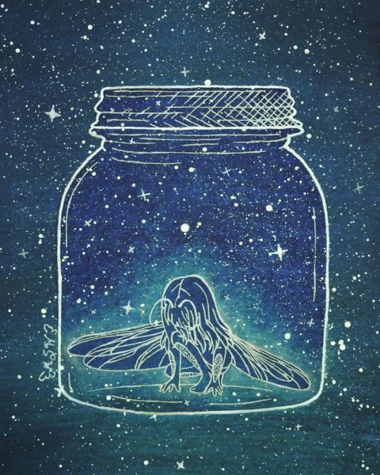
Bug Girl
My WIP Wednesday! piece is all finished!
(Warning: LOOOOOOONG description about the art process ahead! )
I don't think it's terribly obvious for a number of reasons (at least not at first), but this piece is actually a bit of fan art/inspired by How to make Friends with the Dark by Kathleen Glasgow, which I finished reading Monday night--Though I actually started this piece a couple of days before
There's a concept that gets brought up a few different times in the book of the main character Tiger imagining a "bug-girl" in a jar, usually to help visualize her emotions to us, the audience. This concept really resonates and stuck with me even before I finished the book, and thus I was compelled to draw it.
Technically the way I see that concept in my head looks different from what I've done here, so sometime in the future I may take another stab at it, but for this time I wanted to strengthen the connection between the bug-girl concept and the book, so visually I modeled the overall aesthetic largely off of the book's cover; white lines and white dots on a dark blue background that has a slight gradient at the bottom. The gradient on the cover is more subtle and is more on the lines than the background itself, but I took artistic liberty on that to make my life a little easier.
My original plan was to do the background with watercolor, do the lines digitally and print them out (since I had some kinks in the sketch I wanted to experiment with digitally instead of doing a lot of additional drawing and erasing) and then use my lightbox and a white gel pen to trace directly on top of the watercolor, then splatter away with some white ink. But of course, things can never be that simple.
The way I see it in my head, the bug-girl has, well, bug eyes, but for this piece, I didn't want to lean too heavily into the "creepy" factor, given it doesn't really fit with the content of the book (which is a great read if you like realistically heavy YA novels, by the way) so I angled her head down and her hair covering her face to keep from having to make the decision on whether or not I wanted to go with that look. And additionally to do proper bug eyes (at least the kind I was imagining) would've involved a lot of tiny circle/cell shapes, and I imagine that would've made things feel too crowded or would have blended into the splatters/background in an uncomfortable way.
Additionally, I was going to have her wings raised behind her, but after playing around with a few different references and positions in Photoshop (knowing full well I was not happy with the original wings from the sketch that I completely free-handed), I felt like this more asymmetrical, lowered position and dragonfly-type structure just looked better and fits better with some of the movements of the wings described in the book (using them to cover her eyes, etc.) which in most cases aren't technically plausible with normal bug wings.
My first real problem was with the jar. Realistically, it needed to be tall enough for the girl to stand at full height at least. And in theory, probably a little bit higher so it would be more comfortable overall and so that in theory she wouldn't just stand up and be able to push the lid off. But I was having issues with the sizing because the jar could only be so big so that A. it would fit comfortably on my paper and B. if it was too tall, the empty space between the top of the jar and the girl would noticeably awkward. So I fiddled with that for way too long and ultimately, it's probably too short, but the size balanced is more comfortable to the eyes, I think. (I also added the cross-hatching to the lid to make it more obvious there was a lid since originally it just kind of looked like the jar had a very wide lip.)
I also gave her a set of antennae, and after trying the concept of segmenting her whole body to be more bug-like (which was way too many lines everywhere) I decided to add some plates on the front of her forearms and calves. It's not much at all, but I didn't want to stick solely to traditionally "fairy" imagery since she's a bug-girl, not a fairy, but in this lines-only format, there was only so much I could do and still get the proper impact I was looking for.
Speaking of which...
I did a lot of swatching and testing of my various watercolors that I have on hand to A. get the colors I wanted right, B. practice my blending of two colors with more paint than water since I wanted very dark, opaque colors, and C. test if my lightbox would even work under the thick watercolor paper and the actual watercolor. However, I made two errors in judgment during the testing:
1. The areas I swatched to test were considerably smaller than the actual size of the area I wanted to cover and even with my biggest brush when I went to do a practice go I very quickly realized that was going to take an absurd amount of paint, time, effort, and I was very likely to run into some blending problems with the gradient. (So, in summary, half-pan-sized watercolors and mostly small brushes are not great for very large areas)
2. Once I realized the above, (and I had already done two very quick tests with alcohol markers and that idea almost immediately went out the window for the same issue) I had to switch course and ended up using some water-soluble pencils (one Arteza Woodless Watercolor Pencil for the dark blue and one Derwent Inktense pencil for the dark teal at the bottom) to lay down the color for the background and then wet them down to smooth out the color. Which turned out pretty nicely, especially once they dried. (I was a little worried at first since while still wet it was looking kind of patchy and weird )
The problem with number 2 is that after it had fully dried (aside from the paper curling pretty badly since it was in a sketchbook and I didn't think to tape the edges of the page down before taking water to it, which was mostly fixed pretty easily by wetting down the back of the page and sitting a very heavy box on it while it dried overnight) when I went to use the lightbox, the pigment from the water-soluble pencils was noticeably more opaque than the straight watercolor tests/swatched I had looked at previously. It wasn't so opaque that I couldn't see my lines underneath at all but it was opaque enough that a lot of the smaller details wear really hard to see. And thus I had a pretty big problem on my hands.
What I should have done was trace the lines in black on the blank paper first so they would be more likely to show through the pigment in the first place and there's a good chance that would've fixed the problem, even if I still needed the lightbox to see those lines perfectly. But hindsight is always 20/20 so that knowledge didn't really fix the matter at hand.
I knew pretty instantly that I didn't want to try tracing the lines onto another piece of watercolor paper and trying to color matter since I seem to always have majorly noticeable issues with that, especially when there's a gradient involved, and also because I knew when I scanned it in it would be fairly obviously there were two layers of paper instead of one because of how thick watercolor paper is. I also knew alcohol markers were out because, again, color matching issues with the selection available to me, and also from some of my much earlier testing with trying to get the specific gradient that I wanted.
That left me with colored pencils.
And thus I went through the five different sets I use enough to keep where I can easily access them (I have others I don't like as much that would've just been a waste of time) and started swatching colors on a piece of the same paper I had the lines on and then held them up to the background to color match as closely as possible. I ended up picking one dark blue and one dark teal each from both my Prismacolor and Polychromos sets since the blue from the Prismacolor was closer but the teal from the Polychromos was closer but they were both slightly off, so to keep the texture consistent I mixed both together for both colors. This ended up being a very good idea in hindsight because I finished off with a final layer of the Polychromos and that kept my white gel pen from having the problems it would normally have over straight-Prismacolor pigment. (Since Prismacolors are wax-based the wax usually clogs the pen tip very easily; the Polychromos are oil-based, so the oil created a slicker layer between the wax and the pen).
And all I did was use my lightbox to see the black printed lines through the colored pencil as easily as possible and went back over them with my white Sakura Gelly Roll, then I went back and outlined the jar and the lid specifically with my white Uni-Ball Signo, since the ink is slightly brighter and the nib is larger.
Once that was all done to my satisfaction, I cut out the girl in her jar and placed it on the watercolor background with some double-sided tape I picked up the day before from DollarTree, clipping a few edges so they'd be as flush with the edges of the paper as possible. And I figured that would be a better idea than glue because the glue had a very good potential of being very messy and leaving notable marks. The tape was just a safer bet. And fortunately, the paper laid pretty flat, save for a couple of spots I either missed because I applied the tape by lifting up the edges so I wouldn't totally lose my placement or up by some of the nooks and crannies that make up the ridges at the top of the jar that were just too small to do individually. And there is one spot where that tape wrinkled on me, but it's fortunately not terribly noticeable in the final product.
Then I made a paper mask for the girl inside the jar and got to move on to the slightly more fun part; I dipped a paintbrush in some white ink (white ink as opposed to white watercolor because I was concerned the water part might cause some reaction to the existing watercolor background that I didn't want and I was a little concerned it would make the non-watercolor paper that the girl and the jar were drawn on warp) and started tapped it against another paint brush to get splatters everywhere. I masked the girl since I was pretty sure she'd blend in too much if she got splattered too.
After the ink was dry, I removed the mask and went in with the white Gelly Roll again to make some stars here and there; mostly just because I wanted to since the original book cover only has dots.
I left it at that for the night since it was almost 3 and I was tired, but I came back to it the next day and racked my brain for a bit since it felt like it was missing something.
I ultimately ended up putting the mask back on the girl and used my pastel blue PanPastel to create a glow effect around her.
After that, I scanned it and did make some minor adjustments in Photoshop (mostly color correction, but there were a couple of black lines of shadow around the edge of the jar since it was still a separate piece of paper on top of the other one at the end of the day. And here we are.
It's still not perfection, but I am ultimately happy with it since I think I got the look I was after in the end. Plus, I think I capture the spirit of the original book cover's style pretty well
____
Artwork (c) me, MysticSparkleWings
I do not own How to make Friends with the Dark or the cover art
____
Where to find me & my artwork:
My Website | Commission Info + Prices | Ko-Fi | dA Print Shop | RedBubble | Twitter | Tumblr | Instagram
1 note
·
View note
Text
My name is Jill Gustavis, and I’m originally from Pittsfield, Massachusetts but my husband and I moved over the NY border to quiet Stephentown in 2016. Since that time, you could say my daily exposure to the country and job at work have helped me reprioritize my art.
I’ve been artistically inclined and encouraged since childhood, but I found myself doing less and less art as I made my way through school. I mostly worked with pencils and oil through high school, and acrylics afterwards. I’d still really enjoy it when I did create, and sometimes the works were incredibly encouraging for being few and far between, but I still couldn’t find time.
Now fast forward to college, and my years earning a degree in Interior Design because I was one of many people under the perception that Artist, as a job, was a ‘dream job’, so I picked something ‘professional’. Now, I still pull many useful things from that degree, even though I don’t work in that field anymore. The most important being perspective and illustration techniques, but also a working use of Photoshop and some color theory. I was very basically introduced to watercolors during those years and even completed the renderings for my thesis project using Sakura’s Koi colors. I’ve had basic art instruction in a few areas, i.e. open ended art studio, drawing and composition, and interior rendering, but no extensive instruction as to how to really use the materials available, nevermind master them.
After trying to work in the Interior Design field after college (circa 2008, right when the recession happened) I was relieved to be laid off and had an excuse to freelance as an illustrator and graphic designer. Freelancing was a great change of pace, but ultimately I didn’t enjoy the assertiveness and discipline needed for self-employment at the time. A year or two later, in 2011, I started at the company I now work for, Lymphedivas. We make fashionable medical grade compression garments that treat lymphedema (sleeves and handpieces). In a way, this is where my journey back into painting starts.
I loved school, I’m a smarty pants at heart, and when it comes to art, I like assignments. After working my way up from a Production position, to Junior Designer, to Art Director, I now illustrate patterns based on a set collection of ideas. Yes, I am responsible for helping come up with said ideas, but then I have a timeline to get them done. A deadline is the surest way to be productive for me. Many of these patterns I create with watercolors on paper and then manipulate them to fit the garments in the computer.
Every time I would start a new painted design at work, my inner artist would rejoice and tell myself, “See, you love this, you should do this more at home!”. I would get all excited to get home and paint, only to get home and be exhausted, make dinner, watch TV or read, and go to bed.
Jump to 2016 and we were planning on moving to a more relaxing country area, I was doing lots of art at work, and something clicked. I felt more motivated to do art at home, and I followed through not once, or twice, but consistently. I started an Instagram account for my art that March. I invested in artist-quality paints and brushes. I made time. Now, a year and a half later, I’m still amazed at what I’d been missing all that time I didn’t pick up my brush. But I’ve also learned not to beat myself up about it, I wasn’t ready, and I let it go.
Now, I’d say I regularly paint, but I don’t always have a smooth studio session. I developed into quite the analytical thinker during those years away from my paints and sometimes this is a good thing as an artist, and sometimes it’s not so helpful. For one, and I think a lot of beginning and seasoned artists can relate, I struggle with the “what’s my style?” question a LOT.
The ‘how’ and ‘why’ of painting seems to have an immense philosophical weight. At work I paint what the pattern needs to look like, very straightforward. At home I can do ANYTHING I want, and that’s a bit crippling when you like to over analyze your options.
I also enjoy doing a little of everything creative. In addition to watercolors, I spend time doing photography, sewing, knitting, calligraphy, acrylics, carving, furniture restoration, interior organizing, and gardening to name a good range of interests. I don’t do some of these things regularly, but occasionally working the brain in areas related to painting is like Crossfit for your creative juices. That and I don’t end up making myself hate painting, forcing myself do it when I don’t want to. Instead I come back excited, missing my paints.
I enjoy the change-up the most after I do a lot of visual thinking or painting at work, I can come home and attempt to carve something, knit, work on the house, or anything that involves making something with my hands and intuition more than thinking.
At the same time, the large repertoire means my choices aren’t just limited to painting when I find an hour or two. I love learning about Leonardo da Vinci, he was the master of doing a little of everything. I do wonder if his brain felt a bit permanently scattered? Maybe I should make a magic 8 ball or an origami fortune-teller to make those decisions for me.
When I’m painting I’ve found, simulating the focus of an assignment, I have to trick my brain. I have to just jump in. My favorite way to do this, is to look through a portfolio of printed pictures I’ve taken, pick one, and paint it. I’ve painted some of them many times and each one looks completely different.
I also scroll through my phone photos, but then it’s easier to get distracted by Instagram or pulled into Pinterest. When I’m really lucky, I get to paint from life. Although, with my two cats, bringing flowers and plants into the house doesn’t happen anymore because they like to eat them, or at least knock them over.
My style ranges all over the spectrum from detailed studies to loose gestural sketches. When I became more focused last year, I followed a lot of botanical painters like Anna Mason and various botanical societies because my style using acrylics is very realistic. As time progressed, honestly, I got a little bored looking at only perfect renditions all the time and I started including looser artists like Angela Fehr, Thomas Schaller, and Eudes Correia. I have to really concentrate to do loose work, but most consistently, it ends up mostly realistic with some extra contrast or soft edges. My sense of perspective usually gets skewed too, still working on that.
Now, instead of saying I’m going to do a painting in a particular style, I just paint the subject however I’m feeling, then look to see what I like, what I learned, and what I’d do differently. Maybe in 10 years I’ll have a better answer to that question, maybe not.
My favorite subjects to paint are flowers, hands down. I love the organic shapes and tonal shifts, bright colors and endless variety. Most of my work is flowers, and I’m sure that will increase as I work to add a flower garden to our property in the future.
Other favorites are architecture, glass, and highly contrasting landscapes. There’s something highly satisfying about painting a subject with interesting shapes, colors or textures. I’ve had more fun painting tiny etched vases than full blown roses. I’ve come up short and bored, halfway through a highly repetitively detailed subject enough to know they’re just not for me, at least not in a detailed manner. I favor variety and contrast, I think it adds interest not only to your work, but also your practice. Sometimes looking for something truly moving to paint handicaps my sessions though, and I just end up being too picky and don’t paint anything.
When I can’t decide what to paint, only have a short amount of time, or I’m avoiding having to decide on anything, I’ll do color studies. Yay! A good outlet for my analytical brain. I can sit and swatch out colors for an entire day, and maybe come to one or two decisions, but enjoy the process the entire time. I’ve found the results of these romps is not always immediate, but they gradually build up an understanding of the materials I’m using.
On occasion, if I plan what the experiment is for, I’ll have more tangible results. For example, I received some samples of different papers from some lovely fellow Instagram artists, and since I really wanted to understand their properties as much as possible from that little sample, I made a plan. I took a look at what I usually paint, two subjects with different properties, and I decided that I do a lot of flowers and landscapes.
Painting the same flower, an iris in this instance, on half of each sample let me test how the paper took to soft blending and lots of detail. Painting the same landscape scene on the other half of each paper demonstrated how well the paper worked more wet, how fast it absorbed, and displayed the layered coats of pigment. It worked beautifully and I still have the swatches to reference.
Color studies also include supply explorations. They are not tests, but explorations, because I really do get that excited about them; it’s an adventure into the unknown! I also possess some Daniel Smith dots cards, and after playing around making pretend palettes, I’ve been known to write-up and recycle enough “potential new supplies” lists to make my own watercolor paper. Maybe one out of every handful actually gets saved for consideration when I do add to my supplies. My most recent exploration resulted in completing my translucent warm and cool primary options. As I tend to get muddy quickly, I’m hoping I’ll be able to scale back the heaviness of some of my work and learn the benefits of glazing.
Because I have a hard time making decisions on most things (especially exciting things like art supplies), I’ve mostly stuck to one brand of paint so far. I have one tube of M.Graham, but the rest of my artist paints are Daniel Smith. I enjoy the wide range of foundational and novelty colors that they offer, and like I said, the access to dot cards to try out paint colors instead of guessing has often hooked me once I see and feel a new color. Brush choice still eludes me. Like my assortment of pens, I switch from one to another as my mood changes.
I do enjoy the softness of squirrel, as well as the soft spring of sable. I use both in natural and synthetic options. For natural, I’m currently in love with my sable pointed round and squirrel mop from Rosemary & Co. out of England. For synthetic, I’ve started using the Neptune and Versatil series from Princeton and Escoda respectively. I’ve enjoyed all of them for different reasons too. The world of artist papers is still new to me and I know it’s taboo, but this was the last thing I upgraded. No one will ever convince me that cellulose paper doesn’t still have a place in my studio, but as I spend time and learn to work with the new, more absorbent cotton paper, I’m less frustrated by it’s unfamiliar behavior.
At work currently I have on hand: Strathmore 400 Series 140lb CP paper, Koi tube colors and my personal Black Velvet Squirrel brush. The paintings I do for designs are not for display or long-term use, so light-fastness is not an issue. I may upgrade the supplies as needed and as I learn more about them personally and see what would benefit my workflow there. I believe the pros and cons of supplies is a fluid subject, everything has it’s place and I’ve dug out supplies I’d hidden away in disappointment, only to fall in love with it using a new technique, or having changed my preference.
Excited to use those lovely supplies, I often get hung up on what to paint. I’ll make very extensive and thorough lists of potential projects, styles to try, experiments, etc. I’ll write them down with gusto, thoroughly excited to try them out the second I get a chance. Only I read through them as I sit down, and still feel unmotivated by these previously exhilarating ideas. A lot of times it comes down to it being after work, I’m tired, and I don’t want to start something. Other times it’s a roadblock I have that prevents me from creating anything I can’t envision a use for. If I can’t see it hanging in my house, and no one asked for it, then why am I painting it? I jokingly call it my KonMari syndrome. Like I said, I have to trick myself into painting anything sometimes.
This is where work comes in again. I enjoy having assignment-like focus when I paint. This no hesitation painting is most beneficial when I’m in a rut at home, and it makes me physically remember I like painting. Like running, I know I’ll feel good once I get out there, and starting is not always easy, but once I physically feel the high kick in, I remember why I like running and it’s easier to jump in the next day. I’ve tried doing the Doodlewash prompts, but I think I’ve only done one since last July… I’m setting a personal goal to try and do the 31 in 31 challenge this World Watercolor Month. Maybe I’ll make a gallery just for them on my portfolio site just to hold me accountable.
To make it even more confusing as to why I find it hard to paint, some of my work pieces are also the most rewarding. This is especially true when I have to paint something I’ve never painted before. I then get to research it (yay!) and do studies, and learn how to paint something new. I push more personal boundaries doing the wide array of painting styles at work than I ever have at home. I’m really excited right now, because I think I’m just starting to really understand the knack of water control, timing, and layering on my current work project.
The other really positive influence my professional work brings is the effect it has on the world. I’ve always wanted to do something that benefits society and when I did Interior Design, that was possibly designing environments that help people live better. Now, I create art that makes the very uncomfortable condition of lymphedema more bearable and less stigmatizing. My grandfather, who owned his own mechanic garage, once told me that he never hated going to work a day in his life. He may have meant he enjoyed working for himself, but I’d like to think a lot of that satisfaction is doing something you find purpose in too.
The long and short of it is trust your intuition, you’ll arrive at your destination when you’re ready. I’m still toying with the idea of selling and showing my work. I’ve done a few personal commissions, but I’m endlessly researching what would be the best route (web & paperwork/taxwise). I also contemplate how I want this new aspect to fit in with my already busy life.
I’m happy with where I am now. I may have took the roundabout route to get here but I’ve learned a lot about myself in the past few years; how what helps you create balance is constantly shifting, and to have patience with everything including yourself.
So, I paint when I can, I post when I can, and the only reason I finally got my website up and running was because Charlie offered me the opportunity to write this post and I thought, “Since I’m editing images, I should probably do those too… “. Chalk one up for deadlines!
All Lymphedivas patterns were commissioned by and are the property of Lymphedivas, LLC and have been shared here with expressed written permission.
Jill Gustavis
Website
Instagram
Work Website
GUEST ARTIST: "The Long And Short Of It" by Jill Gustavis - #WorldWatercolorMonth #doodlewash My name is Jill Gustavis, and I’m originally from Pittsfield, Massachusetts but my husband and I moved over the NY border to quiet Stephentown in 2016.
#WorldWatercolorGroup#WorldWatercolorMonth#aquarelle#artist#doodlewash#featured#inspiration#painting#swatches#watercolor#watercolour
0 notes
Last Seen Blogs
mikealexandercpt
Mike Alexander, CPT, CNC

little-stealthy-ellie
little Stealthy Ellie

nanibites2
Nani-bites

s-a-l-a-i-blog
the devil

esa-emery
Now @oscar-fairchild