#colors!!
Text
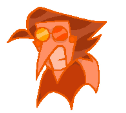
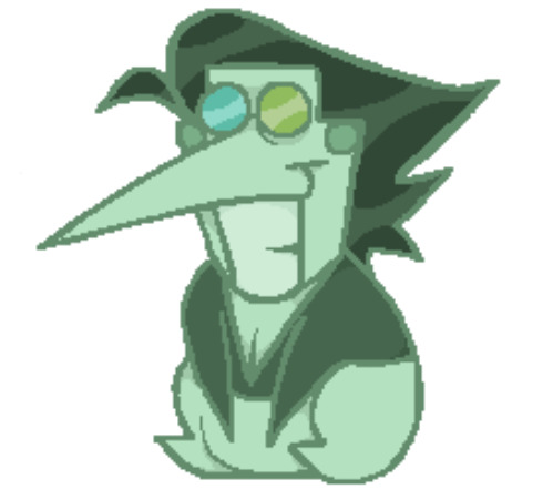

magma nonsense.
#spamton#spamton g spamton#deltarune#deltarune fanart#colors!!#the blue one is a potato#everyone became orange scented#just realized his hair is slightly different in each picture wtf#i dont feel like fixing it :P#have nice day :^)
129 notes
·
View notes
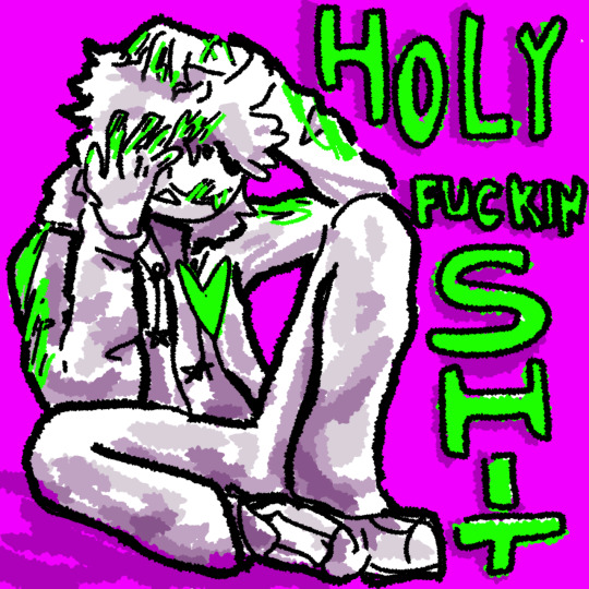
Text
Was watching an old style theory video about how purple and green are typically seen as 'evil' colors due to a bunch of stuff
And it kinda made me think of Fable's original mural color. Green. Yellow is typically that color of happiness (or gold, I guess), but it was originally green-
Which along with being one of the typical "evil" colors, is also a cool toned color
Then there's Enderian- who's purple (of course- because the end is purple)
but that's also an "evil" color, and a cold one... and she was once a protagonist
Then there's Isla.
Isla's colors are fairly muted- the vibrancy coming from the paler blues she wears.
I feel like if you place Isla beside Fable and Enderian, it's very clear to sort of determine their roles/personalities?
Fable is a very sharp character- the eyes, the ears, the hair, even the picture perfect corners where his suit folds. Its all sharp.
Enderian is a bit less sharp, but she still holds sharper angles. Her ears, her body shape seemingly being more triangular based- all that stuff. But she's noticeably less sharp that Fable, I'd say.
Oh then there's Perix. Sorta close to Purple and green if you ask me- (of course its more magenta and blue if not tealish blue- but who's counting?)
#sparkrambles#colors!!#shapes and colors!!!#fablesmp#fsmp#fsmpblr#enderian#fable fablesmp#perix fablesmp
42 notes
·
View notes
Note
What are your top five favorite colors?
Thanks for the ask! It's difficult to choose, but I'd have to say:
1. Red, especially darker shades
2. Yellow-orange
3. Soft yellow-greens
4. Dark blues
5. Dark Purples or magenta (it's a tie)
2 notes
·
View notes
Text
When you when when you get into situation
#art#lumikat#eyestrain#ART BLOCK IS KILLING MY ASS#THIS IS SHIT#I DONT CARE#COLORS!!#alternative name: the suffering of a man with the aromantic swag
4 notes
·
View notes
Note
what’s your favorite colors!!!
BLUE!!! i love blue. very good color. soothing! reminds me of ocean :) uhh other than blue i like greens! like deep forest greens. those are also really cool, hehe!
2 notes
·
View notes
Note
What is your favorite color?
Any shade of Blue or green!! Tho i do have a certain blue and green i ador and it's legit


I will either write in these two colors or purple?? purple is like, makin its way up
4 notes
·
View notes
Text


5 notes
·
View notes
Text
pride month is dangerous for my brain because i love colors i love making pride flag edits because i love looking at colors and so i just have a thousand ideas and a thousand different characters i want to work with
#COLORS!!#i keep getting new ideas it won’t stop#i have lists upon lists of different fandoms and edits and blah blah blah#rey actually speaks
5 notes
·
View notes
Text
Peace and love
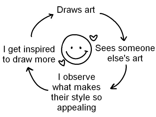
#pink posts#i saw a tweet that was like “i see other people's art” --> i get discouraged#i understand that seeing art that is prettier than yours can be discouraging but why not twist that a bit?#why does it look prettier to you? is it the colors#is it the textures they used? the brushes?#study them and try to put your spin on it#and maybe you'll find your art beautiful as well
80K notes
·
View notes
Text
Lucifer: *enters the hotel*
Alastor: I cast vicious mockery 😈
An animation my sis and I made for fun
Music is Perception Check by Tom Cardy.
#hazbin hotel alastor#Hazbin hotel#Hazbin hotel Lucifer#vivziepop#Hazbin hotel fanart#Alastor#Lucifer#Perception check#“you're much shorter in real life”#Alastor has no mercy if you're under 5“2 lol#I did: the storyboard; artworks and animation#And my sis did: the coloring; animation as well and the compositing#Team work makes the dream work lol
63K notes
·
View notes
Text
trying to draw while watching the new hbomberguy vid was a bad idea because for the entire second half i was like this

71K notes
·
View notes
Text

#oh no#i know a lot of audio engineers#it's like a hallucination#dare i say it#because color theory#children's hospital#hotel carpet patterns#color theory#heavy sigh
59K notes
·
View notes
Text
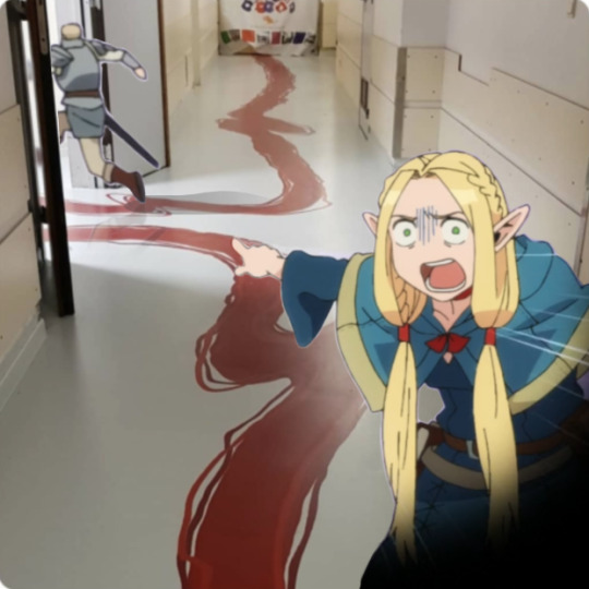
my single contribution to the fandom.
#dungeon meshi#laios touden#marcille donato#it was funnier in my head#color theory children hospital#oh shit Its Doin Numbers#reminder to go on arab.org btw
33K notes
·
View notes
Text
Precision art lines and color spreads
I found the artist. Her name is Amika, she's an Architect, Artist and Entrepreneur.
"I had started The Oblivious Mind as a small business selling handmade products and making floral paintings. But over the years my art style changed drastically and I fell in love with abstract art. Now, I am a full time intuitive abstract artist whose happy place is around colours and paints. My art revolves around basic shapes, lines and dots with a touch of colour all combined together to create an intuitive composition. In this journey, ‘trusting the process’ has become my ‘mantra’ and getting lost in the creative process my routine."


View another Amika video post on Instagram

40K notes
·
View notes
Text
directors using colorful or "impossible" lighting to convey mood and meaning and beauty my beloved. directors making night scenes impossible to see for the sake of realism my beloathed.
42K notes
·
View notes
Text
as a kid i thought i would graduate from kid problems like cleaning my room to adult problems like jobs and taxes. but instead i have a job and taxes and still have to clean my room. cleaning my room is a lifetime problem. i will never stop having to put my markers away before bedtime. this is a rude way for aging to work.
#original#i meant to do my taxes tonight#instead i played video games and then colored in my coloring book#i looked at the time and realized i needed to put my markers away and then felt some ways#i should go back to cross stitch it felt more respectable
46K notes
·
View notes
Last Seen Blogs