#not all elements and fonts used are mine unless stated
Text
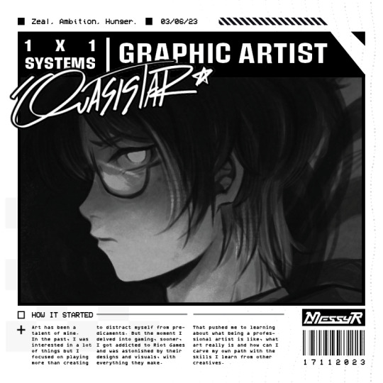
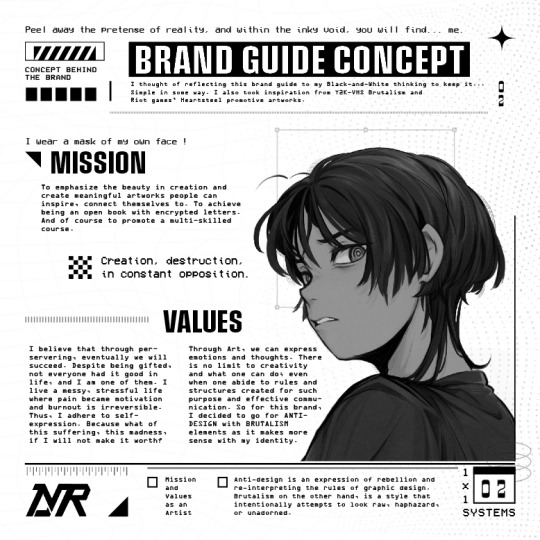


1st attempt in branding school project (TT TT
#messyr#artists on tumblr#graphic design#brand guide#brand design#honestly i'd have minimal changes on the logotype but I'll work on that another day#so much to work on too hhhrrhhh#black and white#brutalism#anti-design#not all elements and fonts used are mine unless stated
191 notes
·
View notes
Note
So I had a coding question that I've been trying to find the answer for, for a while. I've tried searching up information online and such but haven't been able to find anything.
I was wondering though how exactly someone would go about creating a main menu screen with the whole being able to create a new game, load one or change the settings? Like I said I've tried searching it up but haven't been able to find anything except for information on creating a transition screen.
You’re going to need an understanding of CSS for this, but I’ll do my best to walk you through it, alongside some basic functions of the UIBar and UI APIs. Also, like pretty much anything to do with coding, there is more than one way to do something (and there may be a more efficient/effective way than mine).
Like all of my tutorials, this is written for SugarCube 2.34.1. Since this one mainly deals with CSS, I’m sure you could adapt it to another format, but I’m not familiar enough with Harlowe, Snowman and Chapbook to add specifics.
Additionally, I use the Twine 2 editor version 2.2.1. This tutorial can be used with later versions; some of my example images may look not look exactly like what you have because later versions of the editor launch test files in your default browser (the 2.2.1 version creates its own mini-browser).
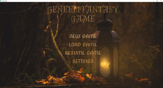
Making a Main Menu Page
Step 1: Hiding the UI Bar
If you want a clear main menu page without the UI bar, you can hide it in several ways.
<<run UIBar.destroy();>>
This will remove the UI bar completely from your game. Not recommended unless you have an alternative way of adding access to the Save, Settings and Restart functions.
<<run UIBar.stow();>>
This stows the UI bar. It will still be partially visible on the side and the player can interact with it to open it. The UI bar can be unstowed manually (without needing the player to do it themselves) on the next passage with:
<<run UIBar.unstow();>>
If you don’t want the UI bar to show up on your main menu, but you want to have access to it later, you can use:
<<run UIBar.hide();>>
To bring it back, you will have to use the following on the passage where you want the player to have access to it.
<<UIBar.show();>>
You may want to use the stow/hide and unstow/show functions together. Hiding the UI bar only makes it invisible; it will still take up space on the left-hand side of your game. Stowing and hiding it makes it a little more even.
To use them together, you can do this:
On the passage you don’t want the UI bar:
<<run UIBar.stow();>><<run UIBar.hide();>>
On the passage you where you want to restore the UI bar:
<<run UIBar.unstow();>><<run UIBar.show();>>
TIP 1: Using <<run UIBar.stow (true)>> gets rid of the slide animation as the UI bar collapses/restores, so you may want to use this so you don’t have any weird animations when you menu passage loads.
TIP 2: If you main menu is the first passage of your game, you can run the scripts for storing and hiding the UI bar in your StoryInit passage and it will run it when your game loads.
TIP 3: You can also use the Config API to have the menu bar be stowed automatically when your game starts.
Pop this code into your Javascript:
Config.ui.stowBarInitially = true;
However, if you have any links that navigate back to the main menu without restarting the game, the UI bar will be in whatever state the player left it in last. If you can only access the main menu by launching the game or hitting restart, don't worry about this.
If you want to double-check the SugarCube documentation for these functions, see here.
Step 2: Tagged Stylesheets
If you want to create a menu page that has a different appearance to your game’s default look, you can do so by using a tagged stylesheets. When using a tagged stylesheet, every passage with the same tag will have its appearance overridden to match what you’ve adjusted in your Story Stylesheet.
Let’s make one called main-menu. You can tag passages like so:

You can also tag the passage a different colour to make it special passages like this one stand out.
Step 3: Adding CSS
Now that the passage is tagged, you need to add a new CSS class to your stylesheet to change its appearance.
To change the appearance, you need to decide which selectors to target and what about them you want to change. Every default SugarCube game has the same set of selectors (you can find them here in the documentation). The most important ones are:
body – the body of the page. You can use this to change the foreground and background colours.
.passages – the element that contains your game’s main text. This is where you can change things like the colour that displays behind your game’s text, the font family, line height, letter spacing, all that stuff.
For the sake of this example, I am going to use the default SugarCube stylesheet and edit it from the ground up. You can find the code for SugarCube’s built-in stylesheets here.
In your stylesheet, you will want to use the tag you created earlier as the new class name.
.main-menu
Put this with the selectors you are going to change.
Let’s start with the body.
body.main-menu {
color: #fff;
background-color: #000;
overflow: auto;
}
The color property controls the colour of the font. Here I’ve set it to the hex code #fff and the background-color #000.

So now I have a black page when I start the main menu passage, and thanks to the code for the UI bar I put in earlier, the UI bar is gone.
Adding a Background
Now, we might want to spice up the background with an image to make it more interesting.
To add an image to the background, you need to use the background-image property.
body.main-menu {
color: #fff;
background-color: #000;
background-image: url("images/main-menu.jpg");
background-attachment: fixed;
background-repeat: no-repeat;
background-size: cover;
-webkit-background-size: cover;
-moz-background-size: cover;
-o-background-size: cover;
background-position: center center;
overflow: auto;
}
You can read more about the different background properties and what they do here on W3Schools, but the code above will center your background image in the middle of the page and also make sure that it covers the entire container.

IMPORTANT: If you intend to upload your game as a ZIP file containing a .index HTML file (this is recommended if you have a lot of image assets or don’t want to link to an outside host, like imgur), you will need to use relative paths with any image URLs in your game.
Relative paths mean that the file is relative to the directory it’s in. In the example above, you can see that the background URL is "images/main-menu.jpg". This means that when the file is uploaded to itch.io, it will find the file—main-menu.jpg—inside the images folder, regardless of where the images folder is located.
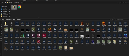
For reference, this is what my game assets folder looks like for Wayfarer:
Relative paths are different than an absolute path, which begins with the drive letter. For example, the main-menu.png may be stored on my personal computer in a path like this one: C:/game/images/main-menu.jpg.
If I use this absolute path in the game, the image asset will not show up for players once it’s uploaded to itch because the image is not hosted on the player’s device in C:/game/images/main-menu.jpg.
This can cause some finnicky issues with the Twine 2 editor because the editor cannot find and display images from relative paths (unless you’ve put the editor in the same directory as the one you’re storing your assets in; I haven’t bothered to try this, so I’m not sure).
While working on your game in the Twine editor, you may need to use an absolute path to see what your asset looks like while you're editing. When it comes time to publish, make sure you switch it back to a relative path, otherwise the image will not load for players.
Step 4: Adding & Styling Links
Now that we have a background, we’ll want to tackle the links themselves.
Adding Links
You can link to the starting passage of your game using your preferred method—the [[ ]] link markup, the <<link>> macro, etc.
But for Saves and Settings (and also a Resume Game link, if you’re using the autosave feature), you’ll need to manually call the functions for accessing those dialogs. You can do that with this code here:
This will add a Load Game link that opens the Saves dialog when clicked.
<<link 'LOAD GAME'>><<run UI.saves();>><</link>>
This will add a Settings link that opens the Settings dialog when clicked.
<<link 'SETTINGS'>><<run UI.settings();>><</link>>
This will add a Resume Game link that loads the player’s last autosave.
<<link 'RESUME GAME'>><<run Save.autosave.load()>><</link>>
TIP: To enable autosaves on your game, add this code to your Story Javascript:
Config.saves.autosave = true;
This will autosave on every passage.
Config.saves.autosave = ["bookmark", "autosave"];
This will autosave on passages tagged bookmark or autosave.
Styling Your Game Title & Links
So this is where you can get get fancy with your CSS. For now, we’re going to keep everything within the .passage element (which is where any text inputting into the editor goes), but I will show you how to move the links and title to wherever you want further down.
Importing Fonts
First, go font shopping.
Google fonts has a very large library of free-to-use fonts that you can import directly into your game via your Story Stylesheet. After you browser Google fonts for the fonts you want to use, scroll down to the Use on Web section and click @import. Google will automatically generate the code you need to import the fonts you want to use.
Ignore the <style> </style> and copy everything else inside it and paste it in the top of your Story Stylesheet.
For this example, mine looks like this:
@import url('https://fonts.googleapis.com/css2?family=Almendra+Display&family=Nova+Cut&display=swap');
TIP: If you are importing fonts that a bold weight and italics available and intend to use bold and italics, make sure you import the bold weight and the italic versions of the font as well as the regular one. This will stop your fonts from having weird printing issues when you use bold and italics (especially on non-Chromium browsers like Firefox).
Below the import button, Google will show you the CSS rules for each font family. Keep these in mind, you’ll need them later. Mine, for this example, are like this:
font-family: 'Almendra Display', cursive;
font-family: 'Nova Cut', cursive;
Basic Styling
In your stylesheet, you’ll want to target the .passage element with the .main-menu class.
.passage.main-menu {
background-color: transparent;
font-family: 'Nova Cut', cursive;
font-size: 3.5em;
text-align: center;
}
Make sure there isn’t a space between .passage and .main-menu, otherwise it won’t work!
Here, I’ve changed a few properties.
font-family – this changes the font to Nova Cut
font-size – this changes the font size. I’ve used the unit em, which is relative to the element size (you can read more about CSS Units here)
text-align – this centers the text to the middle of the .passage element
I have also added:
background-color: transparent;
This makes the passage background transparent so you can see the background image. This is only necessary if you’ve added a background-color to your default passages.
Now, for the links.
Links have their own separate selector.
a means is the link as it usually displays
a:hover is the link when the player hovers their cursor over it.
It's generally a good idea to use different colours on the links—one for the normal display, one for the hover—so the player can visually see that they are hovering over a clickable link. If you don't want to use different colours, you should consider using some other visual cue to make that differentiation.
.passage.main-menu a {
font-family: 'Nova Cut', cursive;
color: #C57C25;
text-decoration: none;
}
.passage.main-menu a:hover {
font-family: 'Nova Cut', cursive;
color: #dcb07c;
text-decoration: none;
}
I’ve added an additional property here:
text-decoration: none.
This gets rid of the underline that happens on all default links in the default SugarCube stylesheet. Currently, this only targets the links on passages tagged main-menu; if you want to get rid of the text-decoration on all links, you can change the styling of your links like so:
a:hover {
text-decoration: none;
}
Choosing Colours
If you’re not sure where to start when it comes to picking hex codes, color-hex.com is a really helpful site. It gives you related tints and shades of for every hex code, which makes it a lot easier to find colours that are slightly darker or slightly lighter than your base hex code.
For choosing colours initially, there are plenty of hex code colour palette generators available online. One of my favourites is the one on Canva, which lets you upload an image and then it creates a colour palette from there. You might not want to use the exact colours it pulls, but checking the colours on color-hex can help you narrow down something that works for your aesthetics.
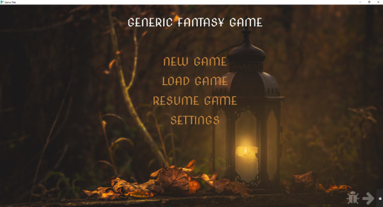
This is what our template now looks like:
Giving the Title a Unique Style
Right now, the title is styled by the .passage.main-menu selector and it’s default font size and font type is the same as the links below it.
If you want to style it differently, you can make a new class for it. In this case, I’m going to drop the .passage.main-menu and make a class called .game-title.
.game-title {
font-family: 'Almendra Display', cursive;
color: #ca893a;
line-height: 1.0;
font-size: 1.8em;
text-shadow: 1px 1px #dcb07c;
}
Because the font I selected didn’t come with a bold version, I cheated a bit a used the text-shadow property to bulk it up. I also had to adjust the line height. SugarCube’s default .passage styling gives everything a line height of 1.75 and there was too much space once the new font family and font size were applied.
To add this styling to your title, go into your main menu passage and wrap your game’s title in a span, like so:
<span class="game-title">GENERIC FANTASY GAME</span>
It now appears like this:
TIP: If you want to play around with your appearance, you can use your browser’s Inspect tool to see the page’s CSS and play around/edit it. Either right click and hit Inspect or hit CTRL + SHIFT + I to open the Inspect tool. Once opened, you can go in and adjust things. If you make and a change and like it, remember to copy the code over to your stylesheet before you close the inspect tool.

Placing a Title & Links Outside the .passage element
If you want your game title and menu links to be elsewhere on the page, you’re going to need re-write some of your CSS and add some additional CSS.
The first thing is that you’ll want to remove the styling from .passage.main-menu. I’ve left background-color to transparent, but you’re not going to be using this to style your game title and menu links.
.passage.main-menu {
background-color: transparent;
}
For the title:
I’ve created two elements, one called .main-title and one called .main-title-item.
.main-title creates a container that will hold the title. This is what I use to tell it where on the page to appear.
.main-title {
display: block;
justify-content: space-evenly;
position: absolute;
top: 10%;
left: 4%;
}
.main-title-item styles the actual text.
.main-title-item {
font-family: 'Almendra Display', cursive;
text-transform: uppercase;
font-weight: normal;
font-size: 6.5em;
line-height: 1.0;
text-align: left;
color: #cf944d;
text-shadow: 1px 1px #cf944d;
}
To apply this to the game title, go back to the main menu passage and apply your new elements to the game’s title:
<div class="main-title"><span class="main-title-item">GENERIC FANTASY GAME</span></div>
For the menu links:
Here, we’ll do something really similar—a container to hold the links and a separate element to style them.
.subtitle {
display: block;
flex-wrap: wrap;
flex-direction: column;
width: 60%;
justify-content: space-evenly;
position: absolute;
top: 46%;
left: 8%;
}
.subtitle-item a {
font-family: 'Nova Cut', cursive;
font-weight: normal;
font-size: 3.5em;
text-align: left;
color: #cf944d;
line-height: 1.3em;
}
.subtitle-item a:hover {
font-family: 'Nova Cut', cursive;
font-weight: normal;
font-size: 3.5em;
text-align: left;
color: #dcb07c;
text-decoration: none;
}
Go back to your main menu passage and apply the elements. Because all of the menu links will be in the same box, you only need to open/close the .subtitle element once.
<div class="subtitle"><span class="subtitle-item">[[NEW GAME]]</span>
<span class="subtitle-item"><<link 'LOAD GAME'>><<run UI.saves();>><</link>></span>
<span class="subtitle-item"><<link 'RESUME GAME'>><<run Save.autosave.load()>><</link>></span>
<span class="subtitle-item"><<link 'SETTINGS'>><<run UI.settings();>><</link>></span></div>

If you want to change where the title and menu links appear, you can use the Inspect tool to figure out different percentages and spacing until you find something that works for you.
There are a lot more things you can add (like animations that appear when you hover your cursor on the link), but I’ll leave it there for now.
Additionally, if you intend to make your game mobile compatible, you’ll want to read up on media queries and learn how to adjust font sizes and any other units of measurement for different viewports. This is how you shrink things appropriate to fit on small screens.
I hope this helps! If you have any questions, please let me know. I’m still a newbie at CSS (so I’m sure there are ways of doing things more effectively), but these are some of the things that I have helped me along the way.
101 notes
·
View notes
Note
Okay, I admit that piercings are a mayor special interest of mine as well as an attraction point in themself, so of course I absolutely loved that Vet Crowley fic but I also want to encourage you to write more, because I would absolutely DIE for Crowley with more piercings. Maybe Aziraphale realizes during their date that this Anthony fellow also has his tongue pierced and he asks about that and it kind of goes from there? I don't know, but if you need a sign to do more with this au, this is it.
(Oh, you’ve done it now my friend, I’m now knee deep in this AU and sinking fast. I have named the snake there is no return.)
Zira didn’t exactly know what to call it, this…companionship they’d developed. Something more than friendship, he’d hope- hewasn’t exactly well versed in socializing or current trends, but he was fairlycertain the level of heated stares and blushing that occurred between the twoof them was out of the norm for most friends.
It wasn’t enough of course that Crowley was attractive, wellbeyond attractive, in fact. Or that he was witty, quick on his feet, wilyfor all intents and purposes. It wasn’t enough that the mischievous glint inhis eyes when he slid his glasses off made Zira’s heart quicken, or that hissmirk felt a little like basking too close underneath the heat lamps he’d purchasedrecently. It wasn’t even enough that he’d found Crowley to be inescapably kind,too. Selfless in the sort of way that left one breathless; subtle little gestures,like remembering Aziraphale’s favorite food, the temperature he liked his tea bestat, his favorite fonts even (anything with swash characters and discretionaryligatures that were kept within reasonable balance, of course. The newer scriptaddition Bookmania had been a very exciting development in 2011, he’d eventhrown a small soiree for the occasion, which was only objectively correct,thank you).
All of these elements were poised for his demise, certainly,but the absolute kicker of it all had snuck up on him on their fourth outing.He’d already accepted the eventuality of his combustion via those daunting bitsof metal near Crowley’s lower lip, when he’d said something rather snarky andbeen treated to a genuine full-bodied laugh. That in itself was pure gold tothe veins, but Zira had also discovered in that moment, a flash of somethingmetal in Crowley’s open smile.
And oh, but that single flash cultivated the worst addictionhe’d yet to experience so far. At the time, he’d been utterly enraptured, intrigued.Gabriel had often cited Zira’s stubbornness as a negative trait for which he shouldwant for improving and ridding himself of; he was a bit like a dog with a bone,on occasion. Or a man with a growing fascination with mouth related piercings, it seemed.
“Dear boy,” he’d been utterly unable to stop himself,entirely not to blame for the invasiveness of his following inquiry. He’d beendriven to madness, completely outside himself. Scurvy, probably. Or… hysteria,like the old days. “Is that…. A tongue piercing?”
Crowley’s smile slid into something more contained, reserved. As though he’d been rebuked for it before and had developed a practiced and measured out response he knew to deliver in specific doses. Heaven’swe can’t have that, Zira thought nervously in the sort of way one realizes they have casually strolled into a veritable open wound and begun tap dancing with cleats on.
“And if it is?” Crowley replied,all perfectly calm and relaxed in the sort of way that meant anything but.
Perhaps that would have been the right moment to change thesubject, to practice that social cues lesson Michael had tried to instill himwith, to compliment it nicely and return to their scrumptious brunch. Ofcourse, what Zira intended and what often fell from his lips around Crowley tendedto be two separate things.
“I adore it,” he said, in a rush, and immediately felt hisface flair bright red. He abruptly decided his meal was very and entirelyfascinating, actually. Strawberries, he thought, panicked anddisjointed, what lovely strawberries this crêpe has. Every crêpe should have strawberries, oh, unless there were allergies. Truly terrible, a crêpe only allergy. To imagine such a thing.
“Oh,” Crowley said, in a very faint voice Zira had neverheard from him. “Um.” It was enough to give Zira the courage to glance upwards,and catch the completely stunned, frozen expression on Crowley’s face. The poordear looked a tad panicked, ears bright red like the first day they’d met, withsomething flickering in the slight part of his lips that touched a bit on theside of awed.
“It’s. Yeah, pierced. Got it done the day after I turnedtwenty seven, actually. Bit of a birthday gift to myself.”
“Did it hurt?” Zira was entranced, thoroughly, fully. He was gaping, eyes wide, and he could do nothing about it.
Crowley seemed to fall back into comfort at the question,strangely. “Nah, not even a little. Made of tougher stuff, I am. Went and got myconch done a month later just to prove it.”
Although Zira didn’t know what a conch was in this context, he certainly hadspent a good amount of time staring at the complex snake loop of a piercingstraight through the hollow bit of Crowley’s ear like the snake was twined protectively around it. It was beautiful, truly, anart exhibit in itself. Everything about Crowley was pure art, though. From the crawlingpeek of tattoo’s around the collar of his shirt and the rolled up sleeves he rarely let anyone see, to thearray of curling metal and dark wood surrounding his ears, and of course tothose two glittering bits near his mouth.
The tongue piercing though, that was a whole newfascination. He decided then and there, he’d do everything in his power to getCrowley to laugh that widely and happily more often. Just for a peek, just to scratch Zira’s fascination itch, as it were.
It proved, unfortunately or fortunately he supposed, to befrighteningly easy; making little snarky quips here and there, which of courseonly made the whole thing worse. He invited Crowley over to his tiny apartmentslash book store slash antique store slash book bindery for wine one night, thrilledbeyond measure that Crowley hadn’t so much as hesitated before accepting the invite,and positively and fully, as Anathema liked to say, screwed himself over whenhe’d discovered Crowley was practically a giggly drunk.
If he’d used that information entirely too much, easingsmiles and grins and full on guffaws out of his friend, that was for him toknow.
He told himself firmly it was for curiosity, of course. Notbecause he was completely obsessed with the way Crowley’s nose crinkled up whenhe laughed, or the way his joy just picked Zira up and swept him along with it,or because of the devastatingly handsome column of his neck when he threw hishead back, or—
Oh.
Zira sincerely and deeply hoped they were more than simplyfriends. Otherwise this whole ‘half in love with him’ situation would be dreadfullyawkward.
Maybe it would have been for the best if he’d taken a few stepsback, then. He knew it was what his family would have suggested, although theword family was less here than there and their general suggestions would likelyhave been all over unhelpful to every degree considering their stance on tattoosor piercings on the whole front. He also knew he had a tendency to fret, towait and wait and overthink until opportunities passed, that his nervous naturemeant a lot more no’s than ‘why not’s in the past.
He also knew, with the sort of swelling certainty that feltan awful lot like coming home after a long trip, that when it came to Crowley,it was terrifyingly easy to be decisive. To be brave.
A more stable individual would likely have required two tothree business days to sort out their position on the whole ‘love’ thing, weightheir feelings (intense, fluttery, like eating those fizzy candies that poppedinside ones mouth) and the time they’d known each other (five months and twoweeks, to be exact), and what they were looking from the whole thing (everything,everything). They likely would have formed an action plan of sorts, invitedCrowley out to a nice dinner, dressed up handsomely for the occasion. Maybethey’d have taken a long romantic stroll at twilight around a pond, retire toone of their abodes for a drink, and then expressed their feelings openly andhonestly.
Zira, of course, had lost all sense of stability the momentCrowley and his attractive face and attractive laugh and attractively charming,sweet, careful personality had sauntered into his life. And so, naturally, he’dnot done any of those things.
To be entirely fair, however, the circumstances and generalstate of affairs within the universe appeared to be stacked against any attemptsfor rationality.
“Really, my boy, what exactly do you desire out of all thismess?” Aziraphale sighed, the sound caught funny in his throat and squeaked outa tad more hysterical than he felt. Probably. “You’ll be cold shortly, I shouldthink! Oh, and the night is meant to be a brisk one. I do hope you haven’tdecided to head on an afternoon stroll.” He shifted another couch cushion to noavail, feeling a burst of frustrated panic lodging itself somewhere between histhird and fourth rib.
“Angel!” A voice called, a familiarly attractive voice, anattractive and absolutely heavenly relieving voice.
“Come in! Do shut the door behind you, the last thing weneed is for him to get into the books. There’ll be no chance of finding himthen.”
He heard the muffled sound of shuffling shoes, and the quickclick of a door, before Crowley’s red hair appeared in the doorway. “Oh, thankyou for popping in so quickly, my dear. I’m nearly at my wits end!”
Crowley shrugged off his jacket and rolled up his sleeves, “Bestnot thank me, not till we find the bastard anyways.” He placed his hands on hiships. “Where’d you last see him?”
Zira pushed a hand through his hair, a disaster made onlymore disastrous by the movement. A small part of him that wasn’t frayed to theseams with stress bemoaned the whole thing, he probably looked quite the sight.He’d only pulled on a dress shirt before noticing the empty terrarium and ajar lid,and he was fairly certain a few buttons had sprung loose during his ransackingof the place.
“I’d been working on the books all morning and thought to havea quick bath before getting ready for our, um. Our outing. I saw him just beforehand,all stretched out like always. Even gave him a little ‘hello, how’re you’, sohis mood swing really is quite surprising. A-a firm talking to is on my list,most definitely.”
Crowley quirked a small smile at him, which did everything tosoothe his nerves. “Right, well. Couldn’t possibly be putting up a fuss aboutthe care, here. You spoil him. He’s got to be nearby, it’s too cold outsidebesides. Wouldn’t want to be anywhere like that.”
Aziraphale swallowed and nodded. “I sincerely hope not, poorOscar.”
Crowley stepped closer and rubbed his shoulder reassuringly,with a half-faltered motion Zira couldn’t decipher. “He’s here. Probablysleeping somewhere, the lazy—”
“Crowley,” Zira admonished with a tired giggle. “Youadore that serpent, don’t lie. It’s unbecoming.”
“Me? Lie? Never.” Crowley gave him a crooked smile inresponse, and Zira felt the warmth of it down to his toes. “Okay, I’ll start inthe study. If we don’t find him in half an hour, I brought over some dinner- we’lllure him out.”
They did not find him in half an hour, much to Zira’sdistress. Crowley teased lightly that he should go for the minimalistic stylein the future, so there were less places for Oscar to hide. Zira had to agreeit would be an effective method, not even a snake would find Crowley’s awfulflat couch comfortable. Unfortunately, in their searching, Zira also discovereda gap in one of the floor vents.
“Oh no, he must have gone through the gap! He’ll be stuck inthere, oh, I can’t stand the thought!”
“Hold on, Zira. Snakes are better at climbing than you’regiving our Oscar the credit for, mm? Probably just needs a little encouragement.I’ve got just the thing.”
If anyone had asked Zira how he thought the night their piecesfinally fell together nicely, he certainly would not have said there was anythingstrikingly romantic about placing dead mice near a floor vent in his crowded, unfortunatelydusty flat. In fact, crawling on his hands and knees alongside a Crowley whowas half underneath his terribly old sofa trying to sweet talk a serpent froman even dustier ventilation shaft, was probably not among the first hundredsuggestions he would have made.
However, the look of unbridled joy and pride on Crowley’s facewhen he finally emerged with an equally grey dusted Oscar tucked with absolutecare in his arms, was undoubtedly among Zira’s most treasured and perfect memories.
If he’d been half in love before, he’d gone and jumpedheadfirst off the diving board in the last hour or so.
“Holy hell,” Crowley wiped an arm across his forehead, andcarefully secured the lid on Oscar’s lid. “Glad that’s done with, then. Dinner?”
And it was all truly terrible. The soft golden lighting settingfire to Crowley’s disheveled hair, the dust flecking across his cheeks likestars, the crooked state of his glasses, the rumpled expensive dress shirt thatwould be hell and a half to iron out again. The absolute giddy happiness in Crowley’seyes, like he’d have done anything just to be the one to rescue Zira’s day,like he was so grateful to be given the chance and so proud of succeeding. Itwas far too much.
“If you don’t kiss me, right this instant, I fear I shall bequite cross with you,” Zira huffed.
Crowley stared at him like he’d just plucked stardust fromthe ether, his face was turning a lovely shade of pink. “Oh. Right. Um. Youwill?” Crowley said, voice sounding positively strangled.
“I will! I’ll. I’ll have no choice but to… to run off to thecountryside. Beside myself with longing. I can hardly bear it.” Crowley pressedforward, cautiously, giving Zira every opportunity and then some to back up, tosay no. Zira’s heart was truly going to burst at the careful way Crowleycrowded him against the wall.
Crowley’s hand pressed against the side of his neck, slowlystill, like he wasn’t sure if Zira was real. Like he wasn’t sure if he couldhave this. This terrible, terrible man, Zira thought, leaning into the touch,meaning absolutely none of it.
His golden eyes were very wide, and Zira stepped impossiblycloser, pressing his own palms flat against Crowley’s chest. He could feel thethump-thump-skip-thumb practically against the pads of his fingertips, somethinglarge and impossible and overwhelming rose in his throat.
“Zira,” Crowley breathed. “You…” He swallowedroughly. “You detest the countryside. All the bugs and things. No sushi outthere. Wouldn’t last a day.”
Zira pouted; his fingers curled against Crowley’s lapels.Crowley’s hand slid carefully backwards, until he was cradling the nape of Zira’sneck. “We’d have to let Oscar out again then, pest control. On a leash, maybe.”
Crowley softened, something a little sad with a lot of overwhelmedhope painting his expression like hues in a sunset. “We?”
Zira couldn’t bear it then, absolutely refused to bear itany longer. This infuriating man with his sarcasm and his piercings and his hipsand his heartbreakingly small sense of just how much of Zira’s heart he’d heldfrom the moment they’d met.
He leaned forward, closing the small gap between them, andkissed Crowley with all the lighting filled adoration he possessed.
Crowley’s hand froze, slackened, and then twisted up intoZira’s hair at the same moment a quiet sigh poured through him. The returningferocity of Crowley’s kiss made his head spin in delicious ways; Zira had onlybeen kissed a handful of times, but not once had it been so enveloping, soready to pull him in and wrap him up and fill him up with relief and excitementand bliss all at once. Then Crowley tilted his head, parted his lips, and Zira feltthat electric touch of that damned tongue piercing and he was quite content notto think any farther.
#good omens#ineffable husbands#good omens fic#snake vet au#i should tag these this is ....a thing now#also im gunna draw crowleys piercings asap u can count on that
42 notes
·
View notes
Note
I suddenly really, really want to hear about your presentation on Les Mis.
Grab a drink and settle in, anon… it’s a long, tragicomedic tale. ;-)
OK, so the first thing you need to know is that as a child, I was a big reader. (Spoiler alert: I shockingly grew up to work in a library.) This meant that by the time I reached 5th grade, I’d already read all of the books on the list of classic Western literature our teacher told us to pick a book from for our book report: Little Women, Black Beauty, The Adventures of Tom Sawyer, Little House on the Prairie, The Swiss Family Robinson, The Secret Garden, Treasure Island, etc. So my teacher gave me the classic novels list from the next grade level up. Problem solved, right?
Wrong. When I looked through the list, it turned out that I’d already read all the books on the 6th grade list. And all the ones on the level after that. In fact, we soon learned that I’d read all of the books on all of the lists of state-approved/mandated classics my teacher had until you hit the upper high school level, and even then, I’d read most of them. (Look, I was the kind of kid who set myself summer reading assignments, OK?)
My teacher kindly let this young overachiever pick from the 11-12th grade book lists. Naturally, I picked the unabridged Les Misérables. (The translated version, though. I was an overachiever, but not that level of overachiever.)
The second thing you need to know is that my 5th grade teacher had a terrible tendency to not tell us what form each book report was going to take until AFTER we’d made our set-in-stone selections. A creative way of teaching kids to be flexible or a cruel and unusual way of amusing herself? Your guess is as good as mine.
Now if you’re familiar with Les Misérables, you know there’s a reason this book is colloquially called The Brick—at approximately 1,500 pages (in English), it’s dense, both literally and figuratively speaking. Narrative digressions, longwinded speeches, and verbose descriptions aside, Hugo has a lot of intertwining narrative arcs and plot threads. (And that’s without going into thematic elements or bringing in notes on the novel’s historical context.) So naturally this was the time that our teacher decided our book report should take the form of a comic. A single page comic.
If you’re at all familiar with Les Misérables, you know that is literally impossible to do with this book. Don’t get me wrong, I was a verbose child who had immense difficulty condensing my writing (not much has changed there lol), but that wasn’t the issue here. I don’t care how good you are at summarizing stories—unless you cut 9/10ths of the story and/or draw microscopic-sized comic panels, there’s simply no way to fit Les Mis onto one illustrated page.
So I went to my teacher, held up my hardbound copy of Les Mis, and begged for mercy. She relented… to a degree. I could, she said, write a one page summary of Les Mis. I should also draw images important to the story on another single page sheet (i.e. symbols like the loaf of bread, the pair of candlesticks, etc.). When that was done, I should attach both of these pages to a small posterboard for my classroom presentation.
That… wasn’t much better, but at least it was something vaguely approaching humanly possible. Then she added the kicker: that typed one page summary? Had to be in size twelve, Times New Roman font, and it needed to be double-spaced. I think I cried when I got home.
Let it be known that I suffered for this book report. I gave it blood (papercuts!) and toil and tears and sweat. I gave up reading other books while I was reading Les Mis because otherwise I’d lose track of where I was in the story and all the different plot threads. I purchased my very first CliffNotes—which was a sacrifice, because at that age, I considered reader guides to be cheating—and read the relevant portions after I finished each section of the book to be sure that I’d fully grasped everything that happened in that chapter. I took notes as I read… so, so many notes. And then I wrote my summary. And then I cut that summary. Again and again and again. I drove my poor parents to the very edge of their sanity with my constant emotional breakdowns and requests for editing feedback.
I finally ended up with a written summary that was 1 and 1/3 pages when typed in size twelve, double-spaced Times New Roman font. To this day, I still think that was an achievement of Herculean proportions. I drew my images and glued it all to a posterboard. Then I presented it to the class.
I don’t remember much of my presentation. I’ve done some highly entertaining dramatic presentations in my time (such as the one that earned my parents a concerned phone from my 3rd grade teacher… now that is a good story!), but I don’t think this was one of them; I was just too tired to go all in with costumes and singing and whatnot.
And then, after all of that, I got either an A- or a B+ for the report; I no longer recall which. All I know is that it wasn’t an A or an A+, and that rendered it unacceptable to 10-year-old me. The insult heaped on top of the injury of that less-than-perfect grade? The comment written in red ink on my painstakingly crafted summary: “Well-written, but too long”. I lost points because I only managed to cut 1,500 odd pages down into 1 and 1/3.
My poor friends and parents had to hear about this Terrible Injustice at length.
I understand where my teacher was coming from—she had specified a single page summary, after all—but I also seriously doubt she had read Les Mis as of the time I did this report, or she’d have understood how difficult was to summarize this novel in so little space.
I have great fondness for Les Mis and I’m glad I read it, but… I worked for this assignment, when I could have just used a book I’d already read and been done with it all. I could have read a book that was literally a tenth of the length of Les Mis and dashed a cartoon out overnight like I know several of my classmates did. I wouldn’t have been marked down for going over length then.
In case you couldn’t tell, I’m still bitter. ¯\_(ツ)_/¯
16 notes
·
View notes
Text
PRINTS AND PATTERNS INSPIRATION
I have decided to look into iconic moments from each year to inspire me to create prints and patterns for my work. I will be looking and the shapes and writing from my selected photos and how I could portray them into my designs, all are which inspired from the trends I previously talked about.
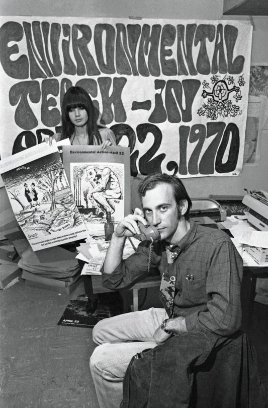

For the 1970s I have decided to look into the Environmental Movement. This was where people started making people realise the damage what pollution was causing to the air and the water. 1960s liberalism continued to flourish. For example, the crusade to protect the environment from all sorts of assaults–toxic industrial waste in places like Love Canal, New York; dangerous meltdowns at nuclear power plants such as the one at Three Mile Island in Pennsylvania; highways through city neighborhoods–really took off during the 1970s. Americans celebrated the first Earth Day in 1970, and Congress passed the National Environmental Policy Act that same year. The Clean Air Act and the Clean Water Act followed two years later. The oil crisis of the late 1970s drew further attention to the issue of conservation. By then, environmentalism was so mainstream that the U.S. Forest Service’s Woodsy Owl interrupted Saturday morning cartoons to remind kids to “Give a Hoot; Don’t Pollute.”I have inspiration from the signs they used, and the different font of writings. I think this could be used in my work where I base one garment on the 70s and use a screen print to put some of the quotes they use on the signs onto my designs and garments.
https://www.youtube.com/watch?v=8p8i276Xm8A
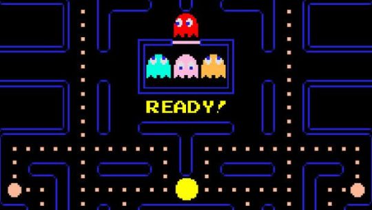
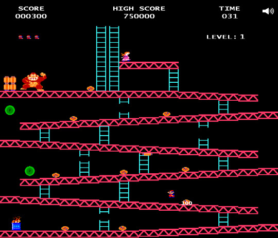
From the 80s I looked into video games, I think because geometric patterns were such a big trend and style in the 80s that because the video games are bright abstract shapes that it would look good to make my own geometric pattern from taking elements from the games. I could then also use this to merge into the trends I picked outline the aerobic gear such as leotards and leggings. Pac-Man is an arcade game developed by Namco and licensed for distribution in the U.S. by Midway, first released in Japan on May 22, 1980. Immensely popular in the United States from its original release to the present day, Pac-Man is universally considered as one of the classics of the medium, virtually synonymous with video games, and an icon of 1980s popular culture. Upon its release, the game became a social phenomenon that sold a bevy of merchandise and also inspired, among other things, an animated television series, and music. Donkey Kong is an arcade game released by Nintendo in Japan on July 9, 1981, July 31, 1981 in North America, and in Europe during the same year. An early example of the platform game genre, the gameplay focuses on maneuvering the main character across a series of platforms to ascend a construction site, all while avoiding or jumping over obstacles. The originally unnamed character, who was later called Jumpman, then Mario, must rescue a damsel in distress, Pauline, from the titular giant ape, Donkey Kong. The hero and ape would later become two of Nintendo's most popular and recognizable characters. Donkey Kong is one of the most important games from the golden age of arcade video games as well as one of the most popular arcade games of all time.
https://www.youtube.com/watch?v=W8xhFcxtxaM
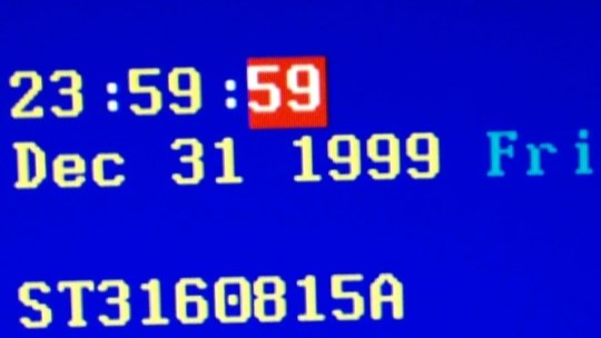

For the 1990s I thought that the Y2K bug/problem would be really interesting to look into. The Y2K bug was a problem in the coding of computerized systems that was projected to create havoc in computers and computer networks around the world at the beginning of the year 2000. Until the 1990s many computer programs (especially those written in the early days of computers) were designed to abbreviate four-digit years as two digits in order to save memory space. These computers could recognize “98” as “1998” but would be unable to recognize “00” as “2000,” perhaps interpreting it to mean 1900. Many feared that when the clocks struck midnight on January 1, 2000, many affected computers would be using an incorrect date and thus fail to operate properly unless the computers’ software was repaired or replaced before that date. Other computer programs that projected budgets or debts into the future could begin malfunctioning in 1999 when they made projections into 2000. In addition, some computer software did not take into account that the year 2000 was a leap year. And even before the dawn of 2000, it was feared that some computers might fail on September 9, 1999 (9/9/99), because early programmers often used a series of 9s to indicate the end of a program. People then became to exaggerate it saying that once all the malfunction happened that it would would cause computers to spontaneously combust and self-destruct, and the world would end. I think from this I could take the exaggeration people used into my work and also like how the news papers portrayed it. I think I would be able to make patterns and prints from the shapes and wording they used.
https://www.youtube.com/watch?v=PvXVWCckDMY

For the 2000s I have decided to look into the discovery of the Crystal Caves. Giant Crystal Cave was discovered in April 2000 by miners excavating a new tunnel for the Industrias Peñoles mining company located in Naica, Mexico, while drilling through the Naica fault, which they were concerned would flood the mine.The mining complex in Naica contains substantial deposits of silver, zinc and lead. The Cave of Crystals is a horseshoe-shaped cavity in limestone. Its floor is covered with perfectly faceted crystalline blocks. Huge crystal beams jut out from both the blocks and the floor. The crystals deteriorate in air, so the Naica Project attempted to visually document the crystals before they deteriorated further. Two other smaller caverns were also discovered in 2000, Queen’s Eye Cave and Candles Cave, and another chamber was found in a drilling project in 2009. The new cave, named Ice Palace, is 150 metres (490 ft) deep and is not flooded, but its crystal formations are much smaller, with small "cauliflower" formations and fine, threadlike crystals. I think this would be an excellent idea to make a pattern and a screen print by taking inspiration from the shapes of the crystals and the way they weave through each other.
https://www.youtube.com/watch?v=ZsIebVCr0zk
0 notes
Text
Book Printing: Designing in a Multitude of Languages
Two associates of mine are a husband and wife print book production team. They do a lot of work for the World Bank and NATO, which means their publications go around the world and are printed in a multitude of languages, from English to Spanish to French to languages I’ve never head of.
This is exciting. But as I listened to one of my associates go through the process of changing a print book from one language to another, I realized just how complex a job this is.
Background on the Print Books
Periodically my associates ask me to critique and hopefully improve their layout or cover design, color usage, fonts, etc. So I have a grasp of the overall kind of work they do.
Most of the books are perfect-bound texts upwards of two hundred pages in length, with an 8.5” x 11” format (or the closest international page size). The book interiors are text-heavy, but they do include numerous charts and graphs as well as some photos.
When I was speaking to the husband (of the husband and wife team) this week, he told me how he had to remake the charts, graphs, and tables when recreating books he had initially designed and laid out in another language. He described the following steps:
He had created InDesign style sheets and “tags” for the word processing document such that importing text into an empty duplicate of the initial book design (lets say in French) would yield a “mostly-accurate” version of the new text flow, with the headlines and body copy in the appropriate fonts and type sizes.
His replacing and reflowing the text copy (let’s say in Spanish) did not include automatic, accurate formatting of “bullets” in lists. Therefore, he had to manually correct all of these in the new InDesign file.
He had to replace all of the text blocks in charts and graphs. (Keep in mind that all but one of the languages are not his native tongue.) He had to do the same for the tables. Obviously, all replacement text had to be accurately placed, which was no simple task. Keeping track of which text blocks from the original word processing file (in any number of languages not his own) had to be placed in the charts and graphs (and in which order) was challenging.
InDesign allows a designer to anchor photos and graphs to certain paragraphs. Clearly this is a benefit, since text in World Bank and United Nations print books often references graphics, making the proximity of the graphics to certain paragraphs of high importance.
That said, it often takes either more or fewer words to say the same thing in one language than in another, so (in simplest terms) my associate’s print book text will often reflow (in the InDesign file) in rather dramatic ways when he replaces text of one language with that of another. This might mean that a table or chart that was on one page spread might migrate to another, either causing a disruption in the overall page design (balance of text and graphics) or separating a graphic from its associated explanation in the text of the book.
Other languages often use other alphabets. For instance, the Cyrillic (used for such Slavic languages as Russian, Bulgarian, Serbian, and Ukrainian) or Kanji alphabets (for Chinese and Japanese) don’t even vaguely resemble Engligh, and even French has certain diacritical marks or accents absent from English. All of this requires buying new software that totally remaps the computer keyboard. It also requires careful attention in reformatting print books from one language to another.
Then there are the country-specific conventions and taboos. These might be as simple as a color choice. In some countries, the color white has certain connotations, whereas in other countries the cultural meaning of the color white could be the exact opposite. Moreover, something that might be harmless in one country (even on a merely visual or graphic level) might be an insult in another country.
What You Can Learn from This Case Study?
The first thing I would learn would be to avoid this work. However, my two colleagues have been doing this happily for a long time, and they find it quite lucrative.
So if you find yourself in a similar situation, consider the following:
Proofreading is essential. It wouldn’t hurt to do it the traditional way, with one person reading the text out loud to another. After all, you can easily get hypnotized by the work and make an error without realizing it.
Make sure your client has submitted a clean word processing document. In all cases, highlight and then copy and place text. Avoid retyping text. This is where errors occur.
Expect to buy additional software to support your client’s work.
Assume that extra characters, from accents to typographic ligatures (two characters that are smooshed together) may not come across correctly in translation from the word processing document to the InDesign document (i.e., when you “place” the copy). (This means you should look for errors in places they will be most likely to occur.)
Initially, place or reflow all the copy in the book or in a chapter to see where any “anchored” graphics will fall (that is, those graphic elements that are tied to a particular paragraph). Expect to massage the design a little, making some photos larger or smaller to ensure a pleasing balance of text and graphics on the page (when compared to an edition of the same book in another language). Expect the work to be in flux for a while. Expect to make changes. However, don’t be tempted to change spacing between paragraphs and sections just to make everything fit.
Always use “style sheets” available in InDesign. This will ensure consistency and accuracy, but it will also make it easier for you to fix any errors.
Find someone who understands the cultural norms and taboos of the country of origin. If you’re transferring the overall book design and text from a French to Spanish treatment (for instance), it will help to have a colleague who understands the culture check your work (graphic treatment, cover design, color usage, and so forth).
Expect this to be really, really tedious work (as my associates have noted). They make sure they take breaks, go outside, walk around, and listen to music. Beyond their own comfort and sanity, this avoids their falling into a hypnotic state (like the highway hypnosis you slip into when driving long distances on the Interstate late at night), and hence it minimizes errors.
Expect to get paid a lot for this kind of work. Consider it hazard pay. Unless of course you like it. Then, more power to you. It is necessary and highly valued work.
Book Printing: Designing in a Multitude of Languages published first on https://getyourprintingcompanies.tumblr.com/
0 notes
Text
The Byzantium Countdown: What's Left In advance of Ethereum's Upcoming Fork?
http://www.cryptoga.com/news/the-byzantium-countdown-whats-left-in-advance-of-ethereums-upcoming-fork/
The Byzantium Countdown: What's Left In advance of Ethereum's Upcoming Fork?
The subsequent key update to ethereum, the world’s next greatest blockchain by overall benefit, is set to go dwell in significantly less than a 7 days.
Part of a larger sized, multi-element enhance termed Metropolis, the so-called “Byzantium” code will be enforced at block 4,370,000 – or in about four days in accordance to recent metrics – as a hard fork. A typical (nonetheless controversial) method for upgrading blockchains, this implies the modifications are needed to be recognized broadly by all stakeholders on the ethereum blockchain.
In this mild, nonetheless, it can be notable that the use of this system in the previous has had mixed success for ethereum. To day, the platform has carried out four hard forks, with only one particular resulting in the generation of an different blockchain, ethereum vintage.
Supplied the modifications in Byzantium have been outlined in the ethereum roadmap as far back again as 2015, it can be unlikely it will show problematic. With two key updates from Metropolis postponed, Byzantium is probably ideal viewed as a conservative enhance that will introduce nine essential ethereum improvement protocols (EIPs) to the platform.
In overall, the modifications are built to make the platform lighter and quicker to run, bettering transaction pace, wise deal security and eventually probably, privacy.
Having said that, that mentioned, there is certainly nevertheless perform to be finished on the enhance, with several stakeholders now moving into the final phases of their preparations.
Clients
As the change toward Byzantium is dependant on the network nodes updating, the primary focus in the days ahead will be making certain the clients that give application to nodes are prepared for the enhance.
This implies that startups liable for overseeing clients require to be certain their application in fact contains the EIPs that implement the Byzantium hard fork. While every consumer enforces the exact procedures, they’re published in different programming languages and backed by different developer groups.
This is what ethereum has termed “consumer range,” which is intended to enable for innovation though retaining a steady, unambiguous base protocol.
In get for the enhance to come about consistently across the platform, all ethereum clients have to update with application that enforces the block number 4,370,000 (this doesn’t effect third-party companies these kinds of as on line wallets, even though, and is only applicable for persons managing nodes right). The EIPs are coded into the clients along with a block number, at which point the Byzantium hard fork will be triggered.
In just the subsequent 7 days, all key ethereum clients will require to launch a Byzantium enhance, with enough time for nodes to update. If certain nodes get still left driving, the blockchain will split, generating different versions of the exact platform.
Having said that, at press time, most surface prepared.
Go ethereum (also termed Geth) is the most well-known ethereum consumer, possessing around 69 percent of all ethereum nodes. Last 7 days, it produced a Byzantium-prepared enhance that contains the block number, even though, at the time of writing, only about half of the nodes that run Geth have been current.
The next greatest consumer, Parity, produced a Byzantium-prepared enhance yesterday, but it was retracted following a consensus bug was identified in a fuzz examination (a variety of comprehensive fault assessment which consists of filling a laptop or computer plan with eclectic information until a weak spot exhibits up).
A new enhance is anticipated to be produced later now. Of the about 35 percent of nodes that run on Parity, none of these have been current to implement the hard fork accurately.
The remaining node clients are comparatively little, and some have also produced a Byzantium-prepared launch. Ethereum founder Vitalik Buterin’s python-centered ethereum consumer designed obtainable an update this morning. In the same way, java-centered EthereumJ and java script EthereumJS produced an enhance before now.
The developers driving Cpp-ethereum say they are nevertheless operating on the change.
Miners
All those acquainted with ethereum’s roadmap possible know the protocol has lengthy planned to phase out its evidence-of-perform consensus system for a much more experimental, and they argue, much more egalitarian different termed evidence-of-stake.
That transition, nonetheless, will not be prepared for Byzantium, even though there are some updates built to relieve the eventual change.
Most notably probably is that with Byzantium the mining problem will be appreciably reduced. This implies that ethereum transaction time will be quicker, and miners will be paid significantly less for their efforts. On ethereum, miners also run an ethereum consumer, and so will require to update for Byzantium appropriately, which will also introduce major modifications.
The update would make block mining quicker, and in get to compensate for this, block benefits for miners following Byzantium will minimize by 2 ETH, or about $604 in accordance to recent metrics.
This enhance has been mostly supported, but it has been the trigger of some dispute, leading some events to threaten to continue to mine the pre-Byzantium ethereum. Unless of course these efforts turn out to be major, even though, this is unlikely to pose any effect on the exchanges.
Exchanges
If almost everything goes in accordance to approach, these startups will be unaffected by the Byzantium fork.
Listed here, nonetheless, it can be clever to observe previous issues. Ethereum’s last key hard fork, an crisis measure in reaction to the failure of a key decentralized application termed The DAO brought about the unexpected generation of two competing ether cryptocurrencies.
As a little team of people rejected the change, they were able to restart the aged blockchain, forming a challenge now regarded as ethereum vintage, valued at $11.48 in accordance to recent metrics.
As described, there are a handful of indicators that the Byzantium fork will be contentious, although none appear to be of individual importance.
A couple projects well worth noting are those that intend to introduce new variations of ethereum, for example Etherite, which wants to produce a model of Byzantium that does not reduce the mining reward. If the movement gains help, this could set pressure on exchanges, which have proven a latest willingness to help assets managing on so-termed “minority” blockchains as a way to give new choices for speculators.
Application developers
Applications managing on ethereum are also unlikely to run into problems.
Mist, the ethereum browser for decentralized applications (dapps), instantly updates to Byzantium when it has been restarted. The exact applies for all the dapps on ethereum.
Giving the hard fork takes place consistently across the nodes, the updates should really activate promptly following block number 4,370,000.
Having said that, there is one particular key change that will make a marked distinction to how developers will interact with transactions on the ethereum blockchain.
Soon after Byzantium, the way to detect unsuccessful transactions will change, even for contracts that are already deployed. The approach for detecting a unsuccessful transaction following Byzantium is stated in much more depth listed here.
Astronomical clock via Shutterstock
The chief in blockchain information, CoinDesk is an impartial media outlet that strives for the maximum journalistic expectations and abides by a demanding set of editorial policies. Intrigued in supplying your experience or insights to our reporting? Contact us at [email protected].
0 notes
Text
The Gift: Creativity and the Artist in the Modern World, Lewis Hyde (1979)
“...‘Do unto others as you would do unto yourself’ and ‘God helps those who help themselves,” always sung to a tune whose accents fall on ‘self.’ With the moral community of old reduced to the heart of the landlord, but conscience and guilt are feelings that only individuals have. Ethical dilemmas are resolved either by comparing self to self or by having each self sit alone and imagine itself ‘before God’s judgment seat.’”
“Finally, in the modern world, it seems that interest charged for the use of money no longer sets up a boundary between people. Even in tribal life, usury was a way of having some intercourse with strangers. Now the entrepreneur and the man with ready cash seek each other out. Interest is the sign of a lively community.”
“The debate over usury has usually assumed a world clearly divided into brothers and others, friends and enemies. But most social life is not so rigorously symmetrical. … as there are degrees of relatedness (and therefore degrees of strangeness), so there are degrees of reciprocity
Note: use of money to mark closeness of relationships
“Ezra Pound’s creative life was animated by a myth in which ‘tradition’ appears as both the source and ultimate repository of his gifts.”
“Pablo Neruda took the beginnings of his art to lie not with spirits or with the past, but with something human, current, and almost anonymous. His gifts spring, he felt, from brotherhood, from ‘the people,’ and he quite consciously offered his art in recognition of the debt”
“Just as treating nature’s bounty as a gift ensures the fertility of nature, so to treat the products of the imagination as gifts ensures the fertility of the imagination. What we receive from nature or from the imagination comes to us from beyond our sphere of influence, and the lesson of aboriginal first-fruits rituals seems to be that the continued fertility of these things depends on their remaining ‘beyond us,’ on their not being drawn into the smaller ego. ‘All that opens the womb is mine,’ says the Lord. First-fruits rituals protect the spirit of the gift by making evident the true structure of our relationship to the sources of our wealth. The salmon are not subject to the will of the Indians; the imagination is not subject to the will of the artist. To accept the fruits of these things as gifts is to acknowledge that we are not their owners or masters, that we are, if anything, their servants, their ministers.”
“The fruit of the creative spirit is the work of art itself, and if there is a first-fruits ritual for artists, it must either be the willing ‘waste’ of art (in which one is happy to labor all day with no hope of production, nothing to sell, nothing to show off, just fish thrown back into the sea as soon as they are caught) or else, when there is a product, it must be this thing we have already seen, the dedication of the work back toward its origins.”
“There is a difference in kind between a viable organism and its constituent parts, and when the parts become the whole we experience the difference as an increase, as ‘the whole is greater.’ And because a circulation of gifts has a cohesive and synthetic power, it is almost as a matter of definition that we say such increase is a gift (or is the fruit of a gift). Gifts are the agents of that organic cohesion we perceive as liveliness. This is one of the things we mean to say, it seems to me, when we speak of a person of strong imagination as being ‘gifted.’ In Biographia Literaria, Coleridge describes the imagination as ‘essentially vital’ and takes as its hallmark its ability ‘to shape into one,’ an ability he named ‘the esemplastic power.’ The imagination has the power to assemble the elements of our experience into coherent, lively wholes: it has a gift. An artist who wishes to exercise the esemplastic power of the imagination must submit himself to what I shall be calling a ‘gifted state,’ one in which he is able to discern the connections inherent in his materials and give the increase, bring the work to life.”
“Sometimes, then, if we are awake, if the artist really was gifted, the work will induce a moment of grace, a communion, a period during which we too know the hidden coherence of our being and feel the fullness of our lives.”
“If the increase of gifts is in the erotic bond, then the increase is lost when exchange is treated as a commodity transaction (when, in this case, it is drawn into the part of the mind that reckons with value and quantity).”
“The moral is this: the gift is lost in self-consciousness. To count, measure, reckon value, or seek the cause of a thing is to step outside the circle, to cease being ‘all of a piece’ with the flow of gifts and become, instead, one part of the whole reflection upon another part.”
“To offer a last illustration that is closer to the concerns of artists, most of us have had the experience of becoming suddenly tongue-tied before an audience or before someone whom we perceive to be judging us. In order to sing in front of other people, for example, the singer cannot step back and listen to his own voice–he can’t, that is, fall into the otherwise useful frame of mind that perceives the singer and the audience as separate things, the one listening to the other. Instead he must enter the illusion (an illusion that becomes a reality if the singer is gifted) that he and the audience are one and the same thing.”
“The creative spirit moves in a body or ego larger than that of any single person. Works of art are drawn from, and their bestowal nourishes, those parts of our being that are not entirely personal, parts that derive from nature, from the group and the race, from history and tradition, and from the spiritual world. In the realized gifts of the gifted we may taste that zoe-life which shall not perish even though each of us, and each generation, shall perish.”
“There is a larger self, a species-essence, which is a general possession of the race. And the symbolizations … which express and carry the ‘facts’ of zoe-life constitute the speech by which that larger self articulates and renews its spirit.”
“The work of art is a copula: a bond, a band, a link by which the several are knit into one. Men and women who dedicate their lives to the realization of their gifts tend the office of that communion by which we are joined to one another, to our times, to our generation, and to the race. Just as the artist’s imagination ‘has a gift’ that brings the work to life, so in the realized gifts of the gifted the spirit of the group ‘has a gift.’ These creations are not ‘merely’ symbolic, they do not ‘stand for’ the larger self; they are its necessary embodiment, a language without which it would have no life at all.”
“In first introducing these two Greek terms, I said that it is bios-life—individual and embodied—that dies, while zoe-life is the unbroken thread, the spirit that survives the destruction of its vessels. But here we must add that zoe-life may be lost as well when there is wholesale destruction of its vehicles. The spirit of a community or collective can be wiped out, tradition can be destroyed. We tend to think of genocide as the physical destruction of a race or group, but the term may be aptly expanded to include the obliteration of the genius of a group, the killing of its creative spirit through the destruction, debasement, or silencing of its arts”
“And there are individuals—all of us, I would say, but men and women of spiritual and artistic temperament in particular—who cannot survive, either, unless the symbols of zoe-life circulate among us as a commonwealth.”
“The true commerce of art is a gift exchange, and where that commerce can proceed on its own terms we shall be heirs to the fruits of gift exchange: in this case, to a creative spirit whose fertility is not exhausted in use, to the sense of plenitude which is the mark of all erotic exchange, to a storehouse of works that can serve as agents of transformation, and to a sense of an inhabitable world—an awareness, that is, of our solidarity with whatever we take to be the source of our gifts, be it the community or the race, nature, or the gods. But none of these fruits will come to us where we have converted our arts to pure commercial enterprises. The Nielsen ratings will not lead us toward a civilization in which the realized gifts of the gifted stand surety for the life of the citizenry.”
“one of the first things we can say about the gifted state which [Whitman’s] epiphany initiates is that this tension, the ‘talk of mine and his,’ falls away. As gift exchange is an erotic commerce, joining self and other, so the gifted state is an erotic state: in it we are sensible of, and participate in, the underlying unity of things.”
“Note that in each of these cases Whitman’s body is the instrument of his conversion. The intercourse that leads him to the gifted state is a carnal commerce, one of bread and tongues, hands and hearts. Whitman is what has traditionally been known as an enthusiast. To be ‘enthusiastic’ originally means to be possessed by a god or inspired by a divine afflatus. The bacchants and maenads were enthusiasts, as were the prophets of the Old Testament, the apostles of the New, or, more recently, Shakers and Pentecostal Christians. Enthusiasts, having received a spirit into the body, have never been hesitant to describe their spiritual knowledge in terms of the flesh, to speak of ‘a sweet burning in the heart’ or a ‘ravished soul.’ Whitman is no exception, as all our examples so far illustrate. He takes his own body to be the font of his religion”
“The poet studies inside of objects the way the rest of us might study in the library.”
“the self takes on identity through its reception of objects—be they perceived lilac leaves or the atoms of the physical body—and the self gives up identity as it abandons these objects. The self is not the reception, not the dispersal, not the objects. It is the process (the breathing) or the container (the lung) in which the process occurs.”
“Whitman is saying, as he said in the poem about the ‘terrible doubt of appearances,’ that the state in which he comes to life requires that he find a reader to whom he may communicate the gifts of his soul. He exists, he is realized, literally, through this completed contact”
0 notes
Last Seen Blogs

friday-sea-creatures
Friday Sea Creatures

xxbeautifulmonsterr
Rawr

securemanager
Untitled

silverbeauty
SilverBaby
securemanager
Untitled