#the colours look so saturated here...
Note
it's so great seeing young artists loving star trek all these years later :) your style is so great!!! if you want some more ideas, i love jim kissing spock's hand old romance style and it short circuiting his brain :') or anything to do with chess!! i'm sure you're being flooded with requests so no obligation, i mainly just wanted to compliment you and tell you you're appreciated :)
Eee thank you thank you thank you!! I'm so glad that I found my way into Star Trek, it has become something that I love so much and hold so much appreciation for in my heart <3

#Spock looks so green here I drew this with my brightness down and adjusted the saturation thinking it was dull UHGGGGH HES MINT COLOURED#art#fanart#star trek#star trek fanart#s'chn t'gai spock#james t kirk#kirk x spock#kirk/spock#locust.txt#locust.mail#spock
357 notes
·
View notes
Note
Shueisha color teasers dropped! thoughts on the pallettes?
Okay quick rundown of what I think!
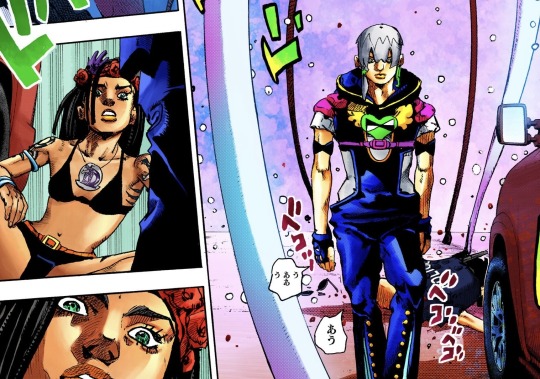

I think Jodio and Dragona look the best, I’m glad they kept Jodio’s colours, and Dragona looks more or less what I expected!
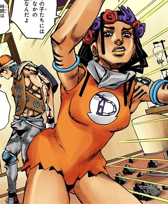


Though I’m not in love with the orange outfit for dragona, I think green or purple would have looked way better! Paco is fine, though I think his hair should have been a dirty blonde.
And I’m so sorry Usagi enjoyers, he’s a lost cause, they made him tingle. They feared to let him slay, they debuffed him. It almost looks alright but then they made the hat neon blue,,, should of been at least red to at least compliment just a lil
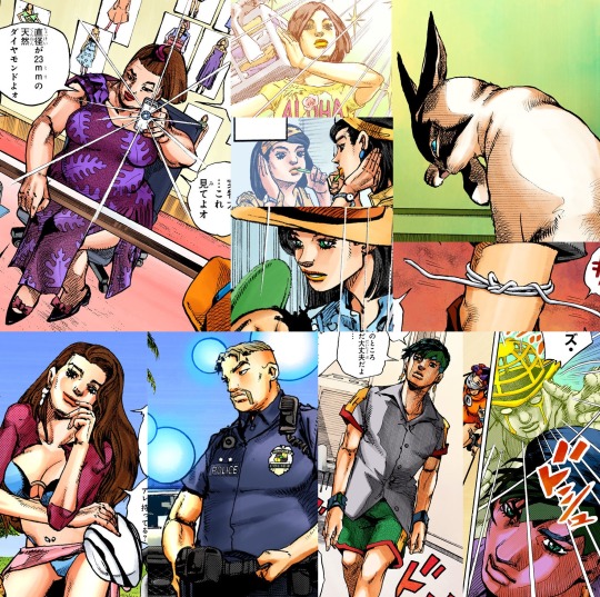

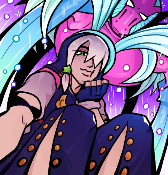
I think everyone else’s colours are fine! Though kinda just standard, and I do love November rain, I won with him having blue!! (Looks like weather report which is super cool)
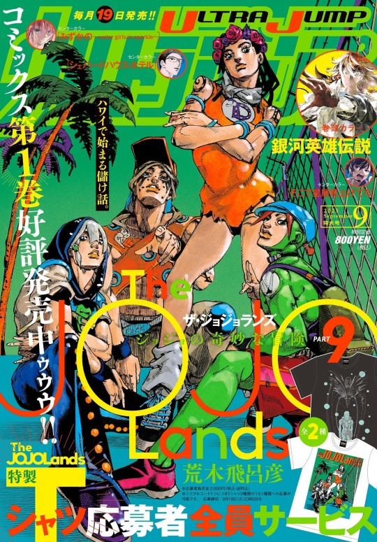
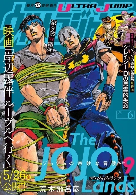
Tbh I can get use to these colours, EVEN though I’ll probably still use the colour palettes I’ve been using, not like Shueisha colours are canon, It’s disappointing they just used palettes from certain Araki paintings over trying to make their own decisions on palettes
Jodio is fine, seeing Araki used it multiple times so it feels like that is what Jodio is supposed to look like, but taking from a painting where the whole point is to be one certain colour scheme, where everyone matches (Araki does these types of paintings a lot) feels somewhat misguided and will make Dragona, Paco and Usagi blend together and while Jodio will stand out.
I feel like there should be more variety of colours amongst the group, similar to how Golden Winds cast are all defined by one colour. I felt like it was too soon to give them colours, but again maybe I’ll warm up to them,
Definitely still using my own palettes whenever I feel like drawing them again🩵🩵🩵
#ask reply#not a short post at all I’m so sorry#I HAD MANY thoughts#they aren’t terrible but they aren’t great either#besides jodio and dragona#I’m so glad they actually made dragona brown over white washing em 😭#I think just for that we won#dragona enjoyers can rest easy#also like I didn’t show it here but some coloured pages look really bad#like too saturated and too much airbrushing#I don’t even think the manga looks that bad but recent pages are ridiculous
364 notes
·
View notes
Text
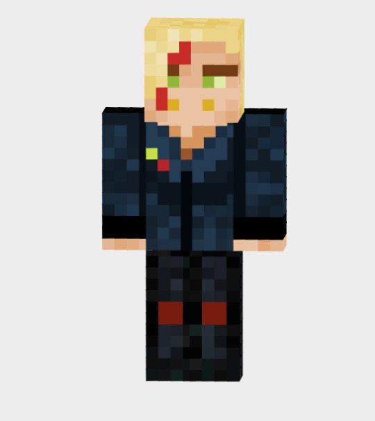
go silly hahaha
#there are some great mic skins on the skindex but i feel bad using them#like cmon im a professional mic enjoyer I can do this myself#so here's kinda eh Loudspeaker skin#if anyone can do better go for it#the leather looks way too blue bc i didnt realise the colour wheel was like#flipped on the saturation thing#so my slightly blue grey ended up Blue.#and i didnt realise until it was too late#trying to get back into playing minecraft but i am terrible at it#my minecraft phase was about 8 years ago#a lot has been added since then#bnha#loudspeaker au
41 notes
·
View notes
Photo

do you think they’re dating or smth
(alt colours under the cut)

#ok the colours look awful on my computer screen but good on my tablet and phone so ??????#just gonna hope ppl have the same screen saturation as my tablet#anyway here have this#art tag#hilda the series#hilda netflix#sketchbook ship#kaisanna#hilda kaisa#hilda sketchbook
161 notes
·
View notes
Note
how was it in Ghana?
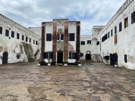
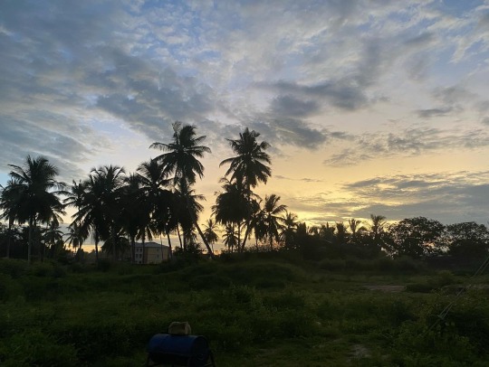
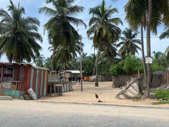
It was great! Apart from the heat combined with the high humidity 😅 I really enjoyed it. I was there a month for an exchange program with my university for those who don't know - took a course on the Atlantic diaspora and slave trade. I ate a lot of jollof, but the best thing I had was a local squid stew 10/10 ✨ We also visited Kakum National Parc, Cape Coast, Accra, and several old trading forts that were now museums 🏝️
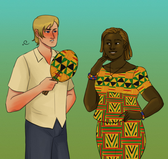
Some pictures I took:



#hetalia#aph norway#hws norway#aph ghana#hws ghana#idk if the colours have been off or not because I fucked up my laptop#and now I’m drawing on a borrowed laptop that feels all wrong 🥲 I stuggle so much with getting my colours here everything looks so grey…#which prob means it looks overly saturated here 😭😭#Thanks for asking!! 🤩 and remembering so long after
41 notes
·
View notes
Photo
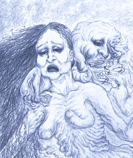
Heliotrope’s Despair
Blue version
#Pencil sketch#creepy art#disturbing art#drawing#surrealism#my art#The colour saturation here is looking so different depending on which monitor I view it on#It's be a huge help if you'd let me know which you think looks better#the blue or the normal
25 notes
·
View notes
Text

hell of my own making (determination to gif kingdom)
#speaking.txt#the colouring looks fine on my laptop but idk how i feel abt it on mobile but also idk if i should optimize for both mobile and laptop -_-#looks a lil darker and more saturated on my phone compared to my laptop and the laptop version is better augh#also ivan isn't in this image 1. cuz I couldn't fit the gif in the ss i took and 2. i still dont know if i like how it came out#the gods cursed me with horrible stubbornness tho i should've given up on this days ago yet here i am. still working on it 👍#also im trying to make myself more comfortable making posts on this account so if i post incessantly that's why 👍👍
0 notes
Note
easy! your artist trademark is your swirly color block shading style and the colors that you use!! your art is always so nice to look at and I think how you shade is so interesting!!! :)))!!
!!! ahhh!! thank you so much <3333 I'm so glad you like my shading and colours! and that it's good enough for it to be my trademark!<33 >w< Also, liking my colours means so much coming from you <33 !!!! You're definitely one of my inspirations for working on getting better with colours since I always love yours so much <333 :D
#thanks for the ask!!#ask game#<3#lol what if I use the tags to just talk about how awesome your art is while I have you here XD#cause I don't think I say it enough#everything you draw has so much energy and passion in it#it's so expressive!! and beautiful!!!#your colour choices are always stunning#they contrast and are still cohesive with the overall composition or design#the variety!! the hue!! the saturation!!! I'm in love!!#as I was looking through some of your art to find your artist trademark I realized how much your variety in line weight really adds#Everyone who isn't disco reading the tags#GO LOOK AT THEIR ART#its mandatory#because it's wonderful#hehe hey disco bet you thought this would just be an ask about what my artist trademark is#but it was a trap!! so I could compliment your art even more!!!#ahahahahah!!!!#in all seriousness#thank you so much <333#and the same goes to you <3333 your art is SO nice to look at
1 note
·
View note
Text
rosé | f. odair
(final part of red wine)
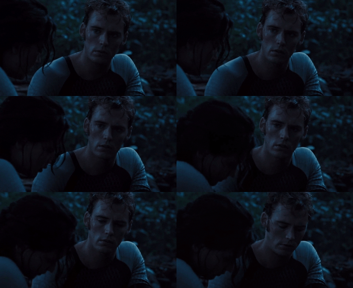
part one, part two
summary: in the final part of the red wine series, secrets are revealed, and miscommunication threatens to tear you and finnick apart.
pairing: finnick odair x reader
warnings: angst, fluff, blood, minor injury, mentions of forced prostitution, swearing,
notes: i’m sorry this took so long to come out y’all. thank you to everyone who read and enjoyed this mini fic <3
word count: 4.1k
Finnick believed he had made a lot of smart decisions in his life—like rigging a net made out of vines to ensnare tributes in the arena, accepting secrets as a form of payment from his patrons rather than material goods, and mastering the art of seduction to manipulate his way out of various difficult situations. However, shutting you out was not one of them.
Half an hour had passed since the incident on the staircase landing. He lingered within the mansion’s extravagant walls, where other guests mingled and dined on a range of bizarre delicacies. He couldn’t eat a thing. His stomach churned at the image of your hopeless expression as he walked off. The expression he caused.
It had to be done. That is what he had been telling himself. It had to be done, otherwise, everyone in the Capitol would learn of his feelings for you. Snow would find out and most likely punish you for interfering with the arrangement he had—the sale of his body. And Finnick was very aware of what happened to people who disrupted the president’s plans.
Partygoers would have already begun to spread rumours of the scene in the courtyard. Hopefully, it would just be chalked up to a simple argument between friends. Friends. The label borderline disgusted him. You don’t fall asleep to the thought of someone and think of them the moment you wake up if you’re just friends. Nor do you look for them in every room you walk into.
Even now, Finnick was scanning the lavishly decorated banquet hall for a glimpse of your pure white gown, despite being the one who walked away. It was an instinct at this point. But there was no one in the room wearing white but him; his matching half was still outside, blending in with the winter snow. Or maybe gone home.
One colour did catch his eye though. A vibrant, almost tacky red, worn by a woman who was strutting towards him, her chin held high with pride. Finnick noticed the material of her floor-length gown. Silk. She was wearing your old dress, only the colour was incredibly off, and each hem was lined with red fur, conforming with her implanted whiskers. That was when he realised who the woman was.
Her ensemble was entirely made out of fur that clung to her body, complementing the whiskers that were embedded in her face which made her look feline.
“Where’s your dancing partner tonight?” she asked, her voice low and seductive.
The bright saturation of her dress was almost blinding as she stopped in front of him. He held back a grimace and plastered on a smile even faker than her voice. “She wasn’t up for it this time,” he lied.
“Well, everyone knows she’s out of touch with our way of life,” she said. Finnick ground his jaw, struggling to maintain his façade. Words could not explain how condescending these people were. “This dress is an adaptation of one she wore quite a while ago. Such a plain thing. I only liked the colour and bodice. The only way I could wear it in public was if I spruced it up.”
He thought back to the dress you had worn. Nobody had even come close to how phenomenal you looked. Where others needed extravagance and flounce to stand out, you only needed a simple red dress. Yet here this woman was, thinking she had the audacity to call you plain.
“I noticed. It’s very… striking.”
“Thank you, darling,” she purred. There was a predatory gleam in her eyes, like that of a wild cat about to pounce and devour its meal. “I was waiting for the perfect occasion to wear it.”
His forced smile twitched. “You’re certainly turning heads.”
“Did I turn yours?” she asked, batting her eyelashes.
Truth be told, Finnick hadn’t even remembered her existence until she walked right up to him. Obviously, he couldn’t tell her that, so he told her that she did. For a long period of time, they bounced back and forth, complimenting and flirting with each other, never dipping below the surface into a real conversation. Not that he wanted to anyway. Not with her. The only person he longed to conversate with was now out of reach.
The woman started talking about colourless topics such as the latest fashion trends in the Capitol and her opinions on the victor of the 72nd Hunger Games, all of which made Finnick wish she would just gouge his eyes out with her sharp claw-like fingernails. He couldn’t do anything but stand, smile, and agree. Doing anything else would result in Snow staying true to his very detailed threats
As the conversation continued, his attention began to drift. He surveyed the outfits of everyone in the room, amusing himself by deciding whether or not each person was making a fashion statement or tragedy. Only one person claimed the former title—the one in white.
Finnick watched as you entered the room. The giant golden chandelier cast down a bright light which caused your skin to glow with radiance; its glare enhanced the brilliance of your white dress. This brief moment ignited a fear in him that you had died in his absence because there was no way a mere human being could look so angelic.
“Finnick?” the feline asked, but her voice barely registered in his brain.
Captivated. He was utterly and completely captivated. One after the other, sudden realisations conjured in his mind. The first—there wasn’t a life worth living ahead of him if you weren’t by his side the whole way, and not as a friend or a fellow victor, but as his partner. His lover. The second—he would never let any harm come to you. He would keep you safe from Snow’s clutches, from the Capitol, from anyone who would put you in danger, even if it meant the two of you had to disappear into the vast forests of Panem.
And lastly, he was now absolutely certain that the woman in front of him could never compare to you, nor could anyone else in the ever-expanding universe. You were a basic human necessity to him. Without you, his heart might as well stop beating. Your laugh, your smile, your kindness, your unwavering support—every part of you kept him alive.
“Finnick?” the voice that went disregarded hissed again.
With a half-empty wine glass in hand, your anxious eyes searched the room. Finnick wanted nothing more than to sprint over, pull you into his arms, and cast away every trouble plaguing your mind. He couldn’t. Almost all eyes were on you, yet you hadn’t even seemed to notice. Only one person finally seemed to gain your attention, and that was Finnick, standing in the middle of the room, his eyes locked on yours.
The neurons firing in his brain signalled him to move and he did. But just as his legs started to walk, a forceful hand jerked his face to the side and a pair of harsh lips were crushed to his. Glass shattered on the marble flooring. Momentarily paralysed from shock, Finnick stumbled backwards, briefly catching the twisted triumphant smirk on the woman’s face before whirling around.
Your face was frozen with devastation; his heart dropped. Splatters of red wine had stained your gown, pooling in a crimson puddle of glass shards by your feet. Quiet mocking chuckles and whispers echoed around the room. Oh, if only he had his trident; they wouldn’t be laughing then.
An Avox rushed forward, attempting to clean up the mess, but you had crouched down with them.
“No, please,” Finnick heard you say to the Avox as he strode toward you. “Please don’t. I can do it.”
But delicate hands and glass shards never mix well. You gasped in pain. A jagged fragment you collected had sliced into your palm, creating another crimson pool in your hand.
Finnick’s strides quickened, eventually leading him to stop and kneel beside you. He wordlessly took your hand in his, cradling it as he inspected the damage. Blood coated his fingers, but he didn’t care. He might as well have cut your hand himself. None of this would have happened if it weren’t for him.
Pink blush overtook your face. For once, it wasn’t because he made you flustered or bashful, but because you were humiliated. He knew how much you disliked attention; now you were at the centre of it. Beside you was the Avox, tending to the mess of broken glass.
“Could you bring me a first-aid kit, please?” he asked with a polite smile.
They nodded and silently left. Finnick returned his attention to you, applying pressure to your wound. Your gaze was lowered, unwilling to meet his own. There was more to your demeanour than just embarrassment. There was sadness. Disheartenment. Neither of which were present when you walked in, only appearing after the feline woman had kissed him.
His brows furrowed in confusion. “Y/N—”
“Don’t,” you whispered, eyes unmoving.
The Avox returned holding a medical kit; Finnick thanked them, taking the box into his hands. He climbed to his feet, hesitating before offering you a hand up. Much to his relief, you accepted his assistance. And then, without a word, you began walking towards the nearest exit with apparent indifference to the engrossed eyes following you.
Finnick didn’t bother to conceal his icy glare toward the crowd as he trailed behind you and exited the room.
*******
Pain of a thousand unrelenting bees stung the broken flesh of your palm. Even the slightest movement of your fingers sent waves of throbbing agony up your arm. But it was nothing compared to the brutal ache of your heart.
You had entered the mansion in search of Finnick, determined to mend the crack in your friendship before it crumbled completely. What you got instead was humiliation and heartbreak. What you saw was another woman kissing the man you loved, whilst wearing a horrible adaptation of your red gown no less.
The air had been sucked from your lungs. Believing he would kiss you on the dance floor in the courtyard was nothing more than a fantasy, a dream, a pathetic fool’s wish—every term under the sun that defined something not real. At least now you understood why he was acting so differently. Because he had found someone else and that someone wasn’t you.
A lump formed in your throat and you knew tears were approaching. As if your night couldn’t get any more embarrassing.
Your feet carried you down a long corridor, far enough away from the banquet hall that listening ears and prying eyes were unable to reach. Finnick still followed behind you, though you weren’t sure why he bothered. How could he explain what you saw with your own eyes? Plus, the last thing you wanted was for his new romance to think something was going on between you and him. Only in your dreams.
Unsure of your destination, you decided to enter the first room you came across. It turned out to be a lavishly decorated library, walled with large wooden bookshelves which were filled endlessly with novels and historic paraphernalia. Sitting within the bookshelves was a stone fireplace.
The door closed as Finnick entered behind you, the silence so loud that the crackles from the fireplace reverberated through the room. Your hand still throbbed something awful so you looked down, taking in the gruesome sight of your dress. A stranger might have thought you had just murdered someone. If it were televised, it would have been deemed acceptable.
You sniffled, wearing a small bitter smile. “I ruined Snow’s pretty white dress.”
A few moments passed before Finnick replied. “Red always was more your colour,” he said, his tone anything but playful.
Ahead of you was a great wall of windows; in the reflection, you saw him staring back at you with an unfamiliar expression. His brows were pinched upwards, pronouncing the lines in his forehead, and the corners of his mouth drooped in a slight pensive frown. He didn’t look like the Finnick you knew. This Finnick looked pained. Anguished.
You dropped his intense gaze and ambled across the room. By the lit fireplace was a cushioned stool which you sat down on, eyes staring into the flickering flames. If you were lucky, maybe your dress would catch alight and whisk you away from your troubled life. Okay, perhaps the thought was a little morbid, but so was a broken heart. Of all people, why did you have to fall in love with Finnick Odair?
Cautious footsteps followed behind you, coming to a stop beside your feet. Without your acknowledgement, Finnick crouched down, eyeing the bloody mess of your hands with concern. His gaze lifted to yours, which was still on the fire, and he sighed.
“Let me take care of your hand,” he murmured.
Before you could refuse, you realised contracting an infection was worse than giving in to your stubbornness. So, you nodded.
Finnick opened the first-aid kit and began tending to your wound; his touch was so gentle it was like he was piecing together a broken china cup. Using an antiseptic gauze, he attempted to clean the damaged skin, whispering apologies whenever you winced in pain. After carefully applying a dressing, he began wrapping a bandage around your hand.
You stared into the orange flames, wondering how he would explain to that woman why he left her behind. You wondered when their relationship started and why Finnick continued to shamelessly flirt with you in her absence. You wondered if their relationship would be the end of your friendship.
“Are you in love?” you quietly asked.
His hands stilled at your sudden words, then he continued wrapping the bandage. “Not with her.”
He secured the binding with medical tape and climbed to his feet, placing the supplies back into the kit on a small side table.
Brows drawn together in confusion, you turned to look up at him. “But I thought—"
“Things are much more complicated than they seem,” he interrupted. There was a clear vase of white roses on the table. Finnick toyed with the petals, caressing them between his gentle fingertips. “No one understands me better than you do, and there is no one in this world I trust more. But… there are still things I’ve been keeping from you.”
The troubled expression on his face melted into one of vulnerability. This was a new appearance for him. Finnick was known nationwide for his radiant confidence and charm; he never let his guard down. You have had difficult conversations before, such as discussing each other’s hardships and innermost secrets, but none of them seemed to affect him like this.
“Everyone knows about my visits to the Capitol,” he continued. “How I spend nights with different people every time as if it’s all a game for my pleasure. But it’s not true. It’s not my game I’m playing.” He began walking over to the wall of windows, overlooking Snow’s gardens. “There’s a part of it that no one knows about.”
You rose from the stool, beginning to take slow steps towards him. “Which is?”
The fire flickering behind you deepened Finnick’s features. It intensified the shiny bronze of his hair and enhanced the defined contours of his face, making it easy to see the muscles in his jaw clench with apprehension. He stared out the window so intensely that you were sure his usual green eyes were blazing with their own inferno.
Even full of angst, he was painstakingly beautiful.
His chest inflated with a deep breath. “President Snow… sells me to the Capitol.”
Horror washed over you in monstrous waves. Sells? Only one explanation appeared in your head as to what he meant. You remained silent, praying he would prove your assumption wrong.
“After I won my Games, he saw my success as an opportunity to please his citizens. He began offering me to potential buyers—'admirers’ is what he called them—who soon became my regular customers. They would use me however they liked. Some would pounce on me the second I stepped through the door. Others were relatively tamer. Kinder. They would have me take them on dates or watch a movie with them, but one way or another, it all ended the same way at the end of the night.” He sucked in a sharp uneasy breath before continuing. “Then there were the rare few—the ones who treated me like I was nothing more than a ragdoll for their amusement. They did things that were… unspeakable.”
Nausea churned in your stomach as your mind conjured sickening images. It couldn’t be true. You refused to believe that human beings could stoop to such levels of atrocity to make one person endure so much cruelty. Then again, you lived in a world where children were sent into an arena to fight to the death on live television.
Finnick looked like he was holding himself together by a thread. Every word he confessed shattered your heart into a million pieces. How could this have happened to him?
“I’ve tried to refuse but Snow threatened to harm the people I care about—my family, my friends. After I met you, I knew you were added to that list.” He finally turned around to face you, his eyes filled with such anguish, it shook you to your core. “The Capitol owns me, Y/N. Body and soul.”
Despair riddled your entire body. As you stared at him, the image of a teenager appeared in your mind—eyes sea green and hair a fiery bronze. He was just a boy when it started. A child.
“I’m—I’m so sorry,” you managed to whisper. “I didn’t know.”
“I didn’t want you to know.” His eyes dropped to the floor. “I didn’t want you to think less of me.”
“Less of you? Finnick,” you said softly, stopping in front of him. Your eyes beckoned for his; you needed him to look at you, to really take in your next words. “There isn’t a single person alive I think more highly of than you. No one even comes close. Can’t you see? Just having you in my presence makes me feel whole. You make me whole.”
Tears glistened in his eyes as they flickered between your own, absorbing every reassuring word you said into his mind, his bones, his entire being.
“You have brought so much into my life,” you continued. “So much good. And I would never have made it to where I am now without you. So please, don’t ever distance yourself from me because you think I will judge you. I won’t and I never will.”
As the room stilled with silence, a lone tear rolled down Finnick’s cheek. His Adam’s apple bobbed, revealing the sob he was keeping restrained within his throat. And then a smile started to grow on his face, small at first, but then it stretched wider and wider, deepening those dimples that you adored so much.
You knew that your words had touched the deepest parts of him. That you had managed to convince him ‘less’ could never be a word used to describe him. He was more. More kind, more genuine, more caring than almost all of Panem.
“You’re incredible,” he whispered in awe, looking at you as if he were witnessing the birth of the universe. “Sweetheart, you’re incredible. Do have any idea how rare that is for a person to be? I don’t know what I’ve done to deserve someone like you in my life, but I swear I’ll do whatever I can to keep you. And if—” His gaze drifted, seemingly wrestling with a decision in his mind— “if that means I have to share all my secrets with you, then I will.”
“Have you got any more secrets, Finnick?”
He returned his attention back to your face. The indecision from moments ago had disappeared and was replaced with certainty, which was underscored by a sort of tenderness that settled in his features.
“Just one,” he murmured. He paused, observing the universe before him and wondering how on earth he got so lucky to have the privilege of having it staring right back at him. “I’m in love with you.”
Electricity shocked your heart like someone had placed a defibrillator over your chest and hit charge. Love? You? He was?
“What?” you asked, dumbfounded.
“I should’ve told you sooner,” he said, shaking his head. “I should have told you everything. Even if saying this means I’m risking everything between us, I can’t keep it from you any longer. God, sweetheart, I love you so much it fucking hurts. I always will, even if you never feel the same.”
Somehow in the span of twenty minutes, everything you thought you knew came crashing down. First, your heart was broken by the thought of Finnick kissing another, and then it was healed. And then it broke again as he voiced his arrangement with Snow. It could never fully heal again while Snow was alive, not with what he was forcing upon Finnick.
But Finnick pieced together every piece he possibly could with his confession, one heartfelt word of declaration at a time.
The weight of his confession hung in the air. His eyes held a mixture of anxiety and hope for your response. Time seemed to stretch out as you tried to find your voice. How do you declare your love as powerfully as someone who just bared their soul to you?
An emotional laugh bubbled up your throat, your eyes brimming with tears. “You idiot,” was what you said, the words spoken with utmost adoration. “I’ve loved you this whole time.”
Finnick’s eyes widened in amazement and a brilliant smile broke across his face. Before you had a chance to react, he had moved towards you in one swift step, pulling you into his arms and crushing his lips to yours in a powerful, passionate kiss.
Your hands were quick to cling onto him, desperately terrified that if you let go, he would vanish into thin air. Every ounce of yearning and hidden affection from the past year poured into this one single moment, into the movement of your lips against one another, and the feeling of your hands cradling each other’s bodies.
Emotions were running high. You could taste both your own and Finnick’s tears as they streamed down your faces, salty and palpable with affection. The sheer relief of finally being free to express your love was so unimaginable that you felt like you would be crying with happiness your whole life.
Finnick’s hand cupped the side of your jaw and he lowered his head, deepening the kiss as much as he physically could to make up for all the time he wasted. His lips were soft and adoring, savouring the sweet taste of your lips on his. His other arm tightened around your lower back, pulling you even further against him.
You felt like you were melting into his embrace and happily, you would have. It felt so right, so safe to be held by him. The world outside the library no longer existed; there was only Finnick and you. Your hands settled on either side of his jaw, staining his skin red from your blood-soaked bandage. You knew he wouldn’t care—the blood belonged to you.
And that is how you spent most of the night. In the library, in that one spot by the windows, in each other’s arms. At some point, you ended up sitting on the floor in front of the fireplace, both covered in red and feeling blissfully content. Your back was leaning against Finnick’s chest, his arms wrapped around your middle as he occasionally pressed his lips into your hair.
You toyed with the fabric of his sleeves, your head leaning against his collarbone as you watched the flames once more.
“If Snow ever finds out…” you murmured.
“He won’t,” he reassured quietly. “I won’t let him. He’s taken too much from me; he won’t take you too.”
You turned your head to peer up at him, wearing a teasing smile. “Can’t live without me, Odair?”
He grinned, leaning in closer. “Never without you, sweetheart.”
Once again, Finnick’s lips were on yours, conveying every ounce of immense love he felt for you through his kiss. The only time either of you broke apart was to whisper sweet declarations of your devotion and reverence before returning to each other again. This was when you felt most complete.
When you felt whole.
tags: @queenofspades6 @powellssaturn @bellamybellamyblake @heroinhchicblog222
#wife-of-all-dilfs ✍️#finnick odair#finnick odair x reader#finnick odair smut#finnick odair imagine#finnick odair fanfic#finnick odair fluff#sam claflin#the hunger games#catching fire#mockingjay#peeta mellark x reader#peeta mellark#katniss everdeen
1K notes
·
View notes
Text
my finger hurts so bad i have a blister now BUT
FULL L’MANBURG LINEUP BAY BEEEEEEE
worm curseworm helped immeasurably with the headcanons and details! they r responsible for most of the wicked sick stuff here!!!! worm curseworm supremacy
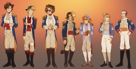
buckle in. this is gonna b a long one
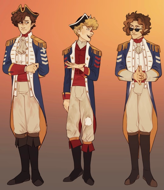
wilbur: does his best to keep his meticulous but he kept wiping his fucking hands on his pants while brewing and got Ingredience(tm) on them that wont come out. he wanted to add that kinda like… hierarchy shit to the sleeves but also was going off a vague memory of what he thought ranks look like and kinda bullshitted it all (why are the pips and chevrons combined man)
tommy: the one who sewed all this shit, he had a coat like wilburs but being Tommy (see; pants) absolutely wrecked it through roughhousing and Existing and finally pitched it. he made a replacement that was a little less fancy and more like tubbos but with SO much more red because it’s ‘sick as fuck wilbur shut the fuck up’.
eret: looks the most similar to wilbur’s (due to his maturity compared to tubbo/tommy/fundy and the amount of trust wilbur placed in him) save for a few things like the boots, collar, and length of the undercoat. INCREDIBLY pristine save for a slightly damaged lapel and concrete dust on the sleeves from working on the wall (since they were able to avoid a lot of the fighting). up until their betrayal, their ability to stay as regal and clean as they did was almost taken as a threat to everyone’s perception of wilbur as the leader of the revolution
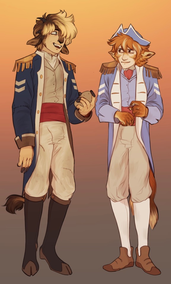
tubbo: dirty as fuck, torn as fuck from various escapades in caves and while gardening; he never wore other clothes for menial labour and shit hes goofy. loose on him with a very crumpled collar and lots of stitches for minor tears in the fabric.
fundy: he has little boy shoes he has little boy shoes his outfit is somewhat infantilizing canonically so thats a fun little nod to it! he is just as Rambunctious as tubbo and tommy but makes a much stronger effort to clean his clothes because he is very afraid of his father’s judgement. there are *very* slight dirt stains as a result that just will not come out. while his uniform was being made, he asked if he could get his more similar to his father rather than tubbo/tommy, hence the short tail while everything else looks like wilbur’s. ALSO loose on him, moreso at the start to give him room to grow into it
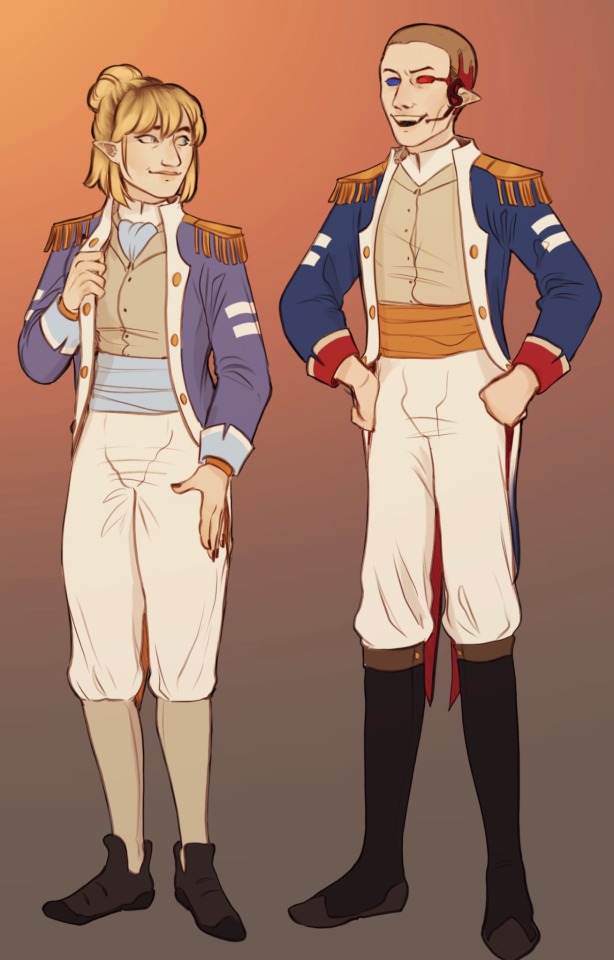
niki & jack: they joined after the l’manburg war and so theirs are very fresh, with a slightly altered design (red underside vs gold, inverted colours on the sash and pants/shirt/collar) compared to the prior default and marginally more saturated colours as a sign of how crisp and new they are. straight lines to keep the sleeves visually interesting without signifying a wartime rank. both are fairly well fitted as tommy has honed his skills and has tubbo and niki to help
WHOOF. there we go!
#dsmp fanart#wilbur soot fanart#my art :]#dsmp wilbur#big arts#wilbur soot#dsmp#tommyinnit fanart#tommyinnit#dsmp tommyinnit#jack manifold fanart#dsmp jack manifold#jack manifold#tubbo fanart#tubbo#dsmp tubbo#fundy fanart#dsmp fundy#fundy#eret fanart#dsmp eret#eret#nihachu fanart#nihachu#dsmp nihachu#dsmp art#nihachu art#eret art#wilbur soot art#tommyinnit art
5K notes
·
View notes
Text
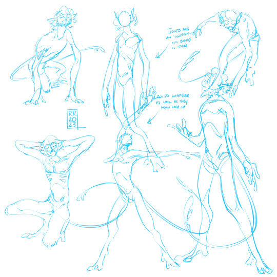
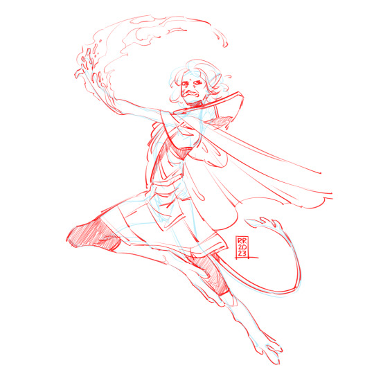
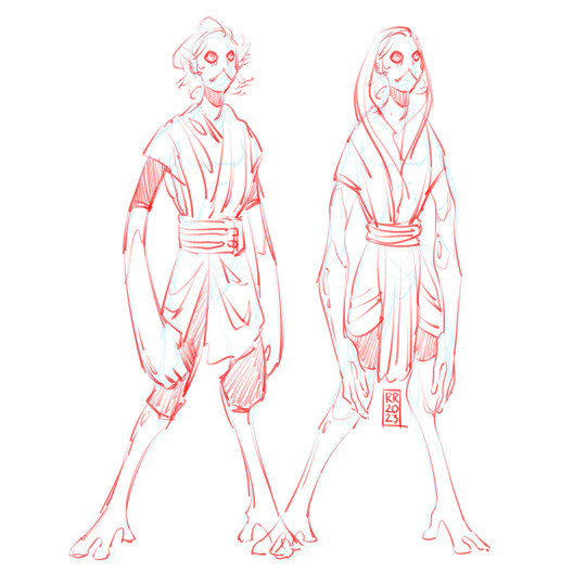
i read Amber Skies recently and it's been living in my head ever since. working on other characters but heres some Teacher sketches. notes under the cut
i got a little confused in the first few chapters so i think some of my interpretation of her appearance was a little off but i don't care to correct it. let's go
skin is kind of shiny and has a squishy rubbery feel to it
arm/leg "joints" aren't really joints, more like convenient stable bending points that approximate a humanoid form but she can slide them around and make her proportions look weird
undecided on if i want her to just forego any kind of elbow joint entirely and just have bendy cartoon arms
i forget if she was specified to have ears or hair but i like them so they're there. hair is kind of an unnatural-looking grey, like you saturation-slidered all the colour out of it
824 notes
·
View notes
Text
✨ Simple Gif Colouring for Beginners ✨
I wrote up my basic gif colouring process for a friend recently, but a couple of people here mentioned they'd also find it helpful! so, as requested, this is a beginner-friendly walkthrough of the way I colour my gifs :) it's aimed at brand new gif makers with no prior experience with photoshop or photo editing.
when I first started gif making I found colouring and photoshop in general suuuper daunting, so I've tried to simplify everything here as much as possible. hopefully this will be relatively easy to follow and not too intimidating!
a couple of things to begin with:
I'm only talking about colouring here - this is not a full gif making tutorial. I've linked to some of my favourites of those here!
I personally like to make bright, 'clean' looking gifs with vibrant but natural colours, so that is the style of colouring this tutorial is geared towards. most of gif colouring is subjective and about personal taste - the only thing that I'd say is possible to get wrong is skin tones, which I talk about a lot in this guide.
as I mostly gif Thai dramas, most of the advice is geared towards colouring for East Asian/South East Asian skin tones - but the techniques should be fairly universally applicable (and here are some tutorials that talk about gif colouring for other skin tones).
I'm not an expert! I'm not claiming this is the best or the only way to colour gifs - it's just how I do it.
this post is very image-heavy. if the images aren't loading (or the gifs are running slowly or cutting/looping weirdly), then try viewing the post in its own tab (rather than on the your dash or someone's blog) and refreshing the page.
okay, full walkthrough beneath the cut!
contents:
1. intro
a. natural gif colouring goals
b. very very basic colour theory
2. super simple colouring (the essentials)
a. curves
b. selective colour (and skin tone correction)
c. hue/saturation
d. saving and reusing colouring
e. another simple colouring example
3. other adjustment layers
a. brightness/contrast
b. levels
c. vibrance
d. colour balance
e. channel mixer
4. troubleshooting
a. curves
b. saturation
5. fin!
1. intro
the colouring part of gif making can be super overwhelming, especially if (like me when I first started!) you're completely new to photoshop and/or have no experience with colour theory or photo/video editing.
if you're opening photoshop and making gifs for the first time, I highly recommend getting used to making a few basic, uncoloured gifs to begin with. just to practice, rather than post anywhere (though you can always come back and colour them later if you want) - but it'll make the rest of the process much easier if you're already beginning to get used to working in timeline mode of photoshop. give yourself a bit of time to practice and get a feel for things like how many frames you tend to like in a gif, where you like to crop them for the best loop, what kind of aspect ratio you like etc* - so that you're not trying to navigate all of that for the first time on top of everything else!
* frames: for me between 60-90 frames is ideal, but 40-120 frames is the absolute min-max I'd personally use in a normal gifset
loops: for the smoothest loops, try to avoid cutting someone off mid-movement or mid-word if possible.
aspect ratio: for full-size (540px) gifs, I tend to go for either 8:5 (slightly 'skinnier' gifs), 7:5, or 5:4 (particularly big, thick gifs lmao)
✨ natural gif colouring goals
part of what can be so daunting about starting gif making is not knowing where to start or what you want to achieve. this is definitely something that gets easier with practice - the more gifs you make, the more you'll get a feel for what kind of look you like and the more instinctively you'll know how to get there. it also helps to see if any gif makers you like have made "before and after colouring" posts - these can help with getting a sense of the kinds of changes made through gif colouring. here's one I made!
in general, I like to make my gifs bright and 'clean' looking, with vibrant but natural colours. these are the things I'm usually hoping to achieve with colouring:
brighten dark scenes
remove muddy, yellowish lighting or filters
saturate colours
correct any skin lightening filters or overexposure
make lighting and colours as consistent as possible between gifs within a single gifset, especially gifsets featuring gifs from multiple scenes/episodes/videos
this guide is focusing on natural colouring, but of course there are many cool ways to make stylised/unnaturally coloured gifs. imo you'll need to master these basics first, but if you want to learn how to do things like change the background colour of gifs or use gradients or other cool effects, then @usergif's resource directory has loads of super helpful tutorials!
✨ very very basic colour theory
[disclaimer! I don't know shit about fuck. I do not study light or art. this is just an explanation that makes sense to me exclusively for the purposes of gif making.]
the primary colours for light/digital screens are red, blue, and green. having all three colours in equal measures neutralises them (represented by the white section in the middle of the diagram).
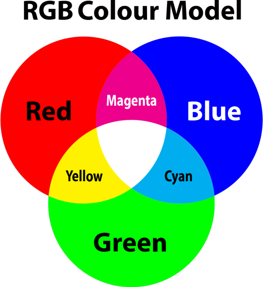
so to neutralise a colour within a gif, you need to add more of the colour(s) that are lacking.
in practice this usually means: the scene you want to gif is very yellow! yellow is made of red and green light, so to neutralise it you need to add more blue into your gif.
it can also mean the reverse: if you desaturate the yellow tones in a gif, it will look much more blue.
looking at the colour balance sliders on photoshop can make it easier to visualise:
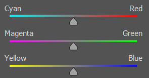
so making a gif more red also means making it less cyan.
removing green from a gif means adding magenta.
taking yellow out of a gif will make it more blue.
tl;dr:
neutralise yellows by adding blue (and vice versa)
neutralise reds by adding cyan (and vice versa)
neutralise green by adding magenta (and vice versa)
2. super simple colouring (the essentials)
starting with a nice sharpened gif in photoshop in timeline mode. (these are the sharpening settings I use!)
some scenes are much harder to colour than others - it helps to start out practising with scenes that are bright/well-lit and that don't have harsh unnaturally coloured lights/filters on. scenes with a lot of brown/orange also tend to be harder.
I usually save a base copy of my gif before I start colouring just in case I end up hating it, or find out later that it doesn't quite fit right into a set and need to redo it etc.
so here is my base gif!

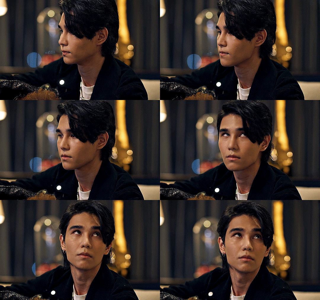
it's an okay gif, but it has a bit of a yellow tint to it that I want to reduce.
colouring is easiest to do in adjustment layers, which can be found under layer -> new adjustment layer - or for me they are here:
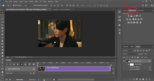
there are lots of different types of adjustment layers that do lots of different things - but for me the absolute essentials for colouring are curves, selective colour, and hue/saturation.
I also use brightness/contrast, levels, exposure, vibrance, colour balance, and channel mixer sometimes, depending on the gif - but I use curves, selective colour, and hue/saturation on every single gif.
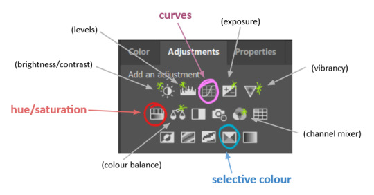
✨ curves layer
the first thing I always do is a curves layer. when you first open one it will look like this:
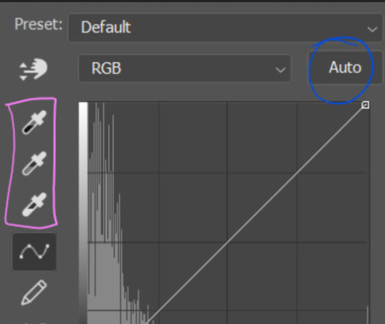
first I usually click the ‘auto’ button, just to see what happens. sometimes it makes a big difference (it usually brightens the gif a lot) - but on this gif it didn’t do much.
if it had made the gif look nicer then I would have kept it and added a second curves layer on top to do the rest of these steps.
the next step is selecting the white and black points with the little eyedropper tools.
the bottom eyedropper lets you pick a white point for the gif. click somewhere super light on the gif to see what happens - for this gif, I clicked on the lampshade on the left. if it looks weird, I just undo it and try somewhere else - it usually takes a few goes to find something that looks good.
here's what that did to the gif:

then I pick the top eyedropper and use it to pick a black point by clicking somewhere really dark, again playing around until I find a black point that looks good.
here's what the gif looks like after picking the white and black points:

this can take some experimenting, but you can make super easy drastic changes to your gif just with this. in this case, the curves layer took out a lot of that yellowy tint.
and this is what the curves graph looks like now:
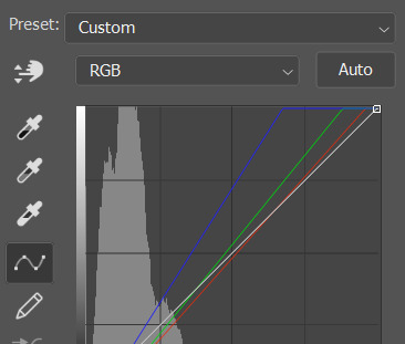
you can click and drag those lines to make further changes if you want - I usually leave them alone though. the colours of the lines indicate which colours have been changed in the gif - for example, you can see from that steep blue line on the graph that blue has been added to neutralise those yellows.
next I usually do another curves layer and just press the ‘auto’ button again to see what happens. usually it brightens the gif a bit more, which I like.
‼️if nothing is working: usually with a bit of fucking about a curves layer works well - but sometimes you can’t find a good white and black point anywhere, and instead your gif turns wacky colours and nothing looks good. this happens more often with very heavily colour tinted scenes :( the troubleshooting section at the end goes over some options, including starting with a levels layer instead.
✨ selective colour (and skin tone correction)
skin tones are made up of a mixture of yellow and red.
removing yellow (or adding blue or red) to a gif will make the skin-tones too red - and removing red (or adding cyan or yellow) to a gif will make the skin-tones too yellow.
adding blue to this gif with the curves layer took out the yellowy tint, which I wanted - but it also took the yellows out of Kim's skin tone, which I don’t want. so I need to put yellow back into the skin tones specifically - without putting it back into the rest of the gif.
selective colour layers let you select an individual colour and adjust the levels of other colours within that colour. you can change how yellow the green shades are, or how much cyan is in the blues, for example.
I need to add yellow back into the red tones to correct the skin tones on this gif. this is the case for most gifs in my experience - the vast majority of the time, unless a scene is very heavily tinted in another colour, a curves layer will add blue/remove yellow.
in the 'colors' dropdown, select the 'reds' section and drag the 'yellow' slider higher - this will add more yellow into just the red shades within the gif.

the amount of yellow you need to add back into the reds depends on how much yellow was taken out of the gif initially - I just play around with the slider until it looks right. if you're not sure, it helps to have some neutrally-coloured (not white-washed!) reference photos of the people in your gif to compare to.
here's the result. Kim's skin is a lot less pink toned and much more natural looking:
✨ hue/saturation
this adjustment layer lets you adjust the hue and saturation of the gif as a whole, and also of each colour individually.
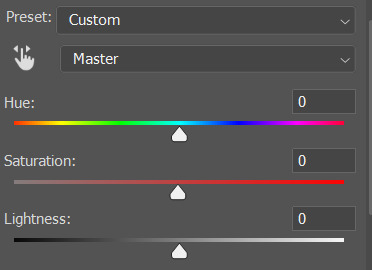
I don't use the hue or lightness sliders unless I'm trying to do something more complicated with the colouring.
clicking the dropdown menu that says 'master' lets you edit the saturation of each colour individually. this is useful if your gif is still super tinted in one colour.
I thought the yellows on this gif were still slightly too bright, so I switched to the yellow channel and desaturated them slightly. (remember if you do this then you need to go back to selective colour and add more yellow into the red skin tones to balance out the desaturation!)
then I increased the 'master' saturation of all the colours to +5:

I usually find the right amount of saturation is somewhere between +5 and +12, but it depends on the gif.
‼️if the gif feels undersaturated, but the saturation slider isn't helping/is making the colours worse, try a vibrance layer instead.
done!
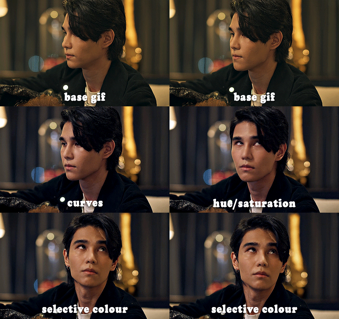
✨ saving and reusing colouring
you can copy and paste adjustment layers between gifs to make your colouring even across each of your gifs for one scene - so if you're making a set of multiple gifs of the same scene, or you think you might want to gif the same scene again in the future, you can save it as a psd so you can reuse the colouring again later.
each gif's colouring will then still need tweaking - different cameras/angles/shots of the same scene can still start out with slightly different colouring.
I recommend uploading the gifs as a draft post on tumblr so you can see what they all look like next to each other and catch any inconsistencies.
✨ another one! (speedrun!)
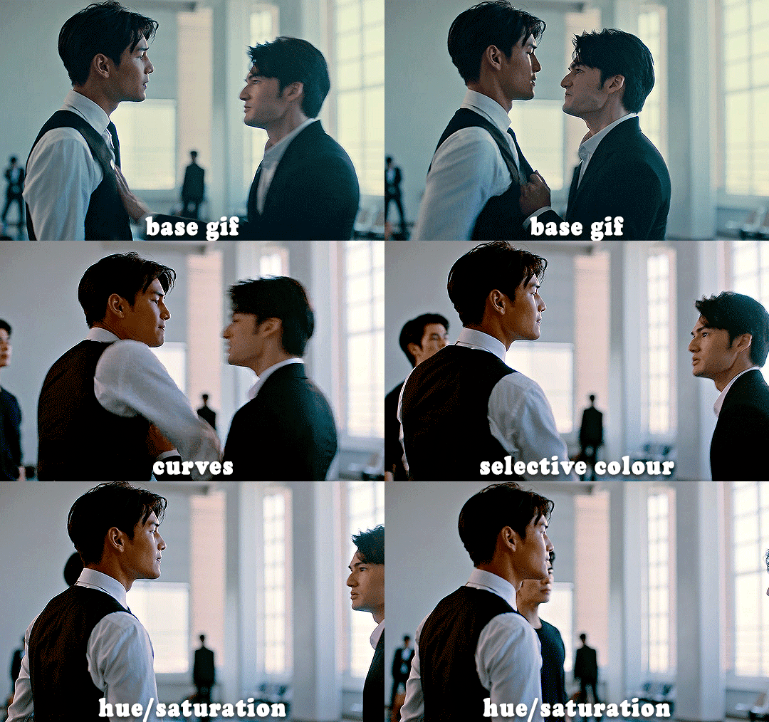
HI KEN!
the white point for the curves layer was in the window behind them.
the curves layer removes the muddy yellow tint, but again it makes their skin tones (especially Ken's) very red toned, which is adjusted by the selective colour layer.
3. other adjustment layers
imo many many gifs can be coloured really nicely with just those three adjustment layers, but some need different adjustments.
✨ brightness/contrast
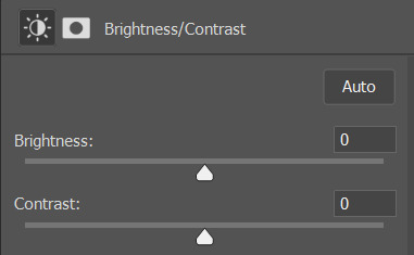
pretty self explanatory!
I personally usually avoid using the 'brightness' slider because I rarely like the effect - I only tend to use the 'contrast' one.
the 'auto' button is sometimes useful though, especially if you’re struggling with the curves layer.
✨ levels

levels alters the white and black points of the gif, like curves - but unlike curves it doesn't also alter other colours.
use the sliders beneath the graph to alter how dark/light the gif is. you can slide the black slider further to the right to make the blacks darker, and the white slider to the left to make the whites lighter.
levels is a good place to start if your curves layer isn't working.
(I'm going to hit the image limit for this post lol so here are some screenshots of a table I made to demonstrate this rather than actual gifs. sorry!)
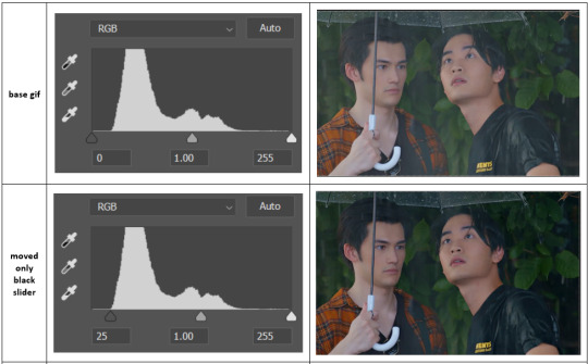

on both sides, I dragged the sliders up to where the big jumps are on the graph - this is usually a good place to start!
✨ vibrance
vibrance... makes the colours more vibrant. it's more subtle than saturation.
it's really helpful for gifs that feel grey. sometimes adjusting saturation just makes the greys kind of weirdly tinted, but a vibrance layer can fix that.
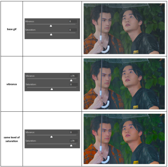
vibrance is much more subtle!
✨ colour balance
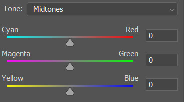
colour balance affects the overall balance of colours within a gif.
it's good for scenes with heavy tints.
I tend to stick to the 'midtones' dropdown, but you can also alter the colour balance within the shadows and highlights if you want.
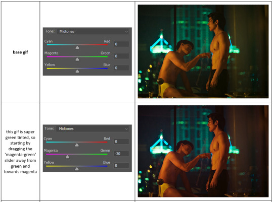

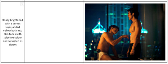
✨ channel mixer
I avoided channel mixer for such a long time because it scared me. but it's great for scenes that are very heavily tinted in one colour.
basically, it works with the levels of red, green, and blue within a gif. you select an output colour and then play around with the levels of the colour you selected within each other colour.
kind of the reverse of selective colour?
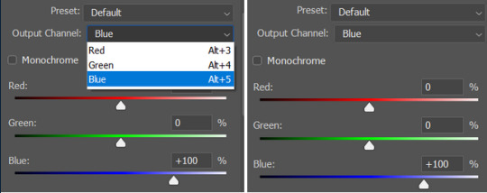
so in the 'blue' channel, the levels of blue are at 100%, and the levels of red and green are at 0% - but you can impact how much blue is in the reds and greens and blues.
this tutorial explains it well - but imo the best way to get to grips with channel mixer is just to play around with it a bit (sorry)
(when I made this guide for my friend, I also made a slightly more complicated gif colouring walk-through that included using channel mixer. there isn't space to include it within this post, but if anyone is interested I could always upload it as an 'intermediate' gif colouring tutorial - lmk!)
4. troubleshooting
‼️curves
usually with a bit of fucking about a curves layer works well - but sometimes you can’t find a good white and black point anywhere, and instead your gif turns wacky colours and nothing looks good. this happens more often with very heavily colour tinted scenes :(
for example, with this base gif:
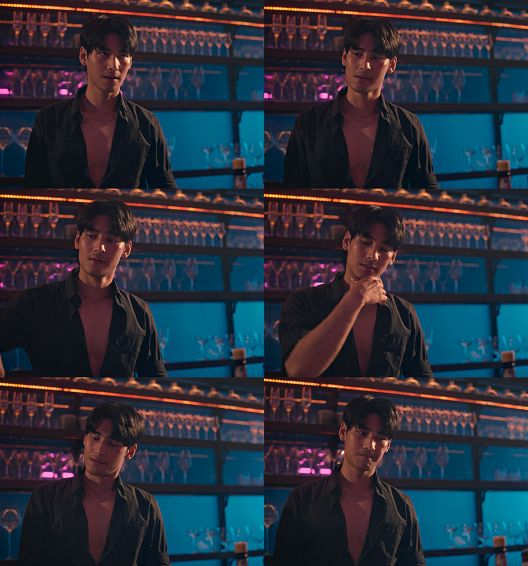
using many of the brightest points as a white point turn it wacky colours, like this:

yikes :(
some options for these cases:
try brightening the gif first with the 'auto' button on the curves layer or with a levels layer. having a brighter gif to start with can give you better options for picking a white point.
try finding an alternate, whiter/brighter white point. look for places the light reflects - on this gif, using the light on Porsche's cheekbone works well as the white point. it also helps to find places that would be white if the scene wasn't tinted - the lightest part of a white shirt is often a good place to start, for example.
skip the curves layer, and instead use a levels layer to alter your white/black points, and colour balance or channel mixer to balance the colours.
‼️over/undersaturation
if your gif (especially the skintones) is looking a little washed out or lifeless, it might be undersaturated. boost that saturation - or if that's not working, try a vibrance layer.
oversaturation is often easiest to spot in the mouths and ears of any people in a gif. if the mouths are looking unnaturally, vibrantly red, then you've gone too far with the saturation.
5. fin!
and done! I hope this was coherent helpful to somebody.
if there's anything that I've missed or that doesn't make sense pls feel free to shoot me an ask or a message and I'll do my best to help! I've also collated a bunch of additional reading/resources below.
happy gifmaking 🥰
✨ some links!
photoshop basics by @selenapastel
gifmaking for beginners by @hayaosmiyazaki
gifmaking guide for beginners by @saw-x
dreamy's gif tutorial by @scoupsy-remade (includes instructions on how to blur out burned-on subtitles or annoying video graphics)
beginner's guide to channel mixer by @aubrey-plaza
how to fix orange-washed characters by aubrey-plaza
colour correcting and fixing dark scenes by @kylos
does resampling matter? by usergif
how to put multiple gifs on one canvas by @fictionalheroine
watermarking using actions by @wonwooridul
resource directory by @usergif
#i got a couple of asks about this so i figured i'd type it up as a post#it's been sitting in my drafts for a while now though i'm so sorry omg.#i had to replace my laptop and it took me a while to get round to downloading photoshop on the new one#but i hope this is helpful!!#gif making#tutorial#photoshop tutorial#colouring tutorial#coloring tutorial#gif colouring#gif coloring#photoshop resources#gif tutorial#gif resources#userbunn#uservik#darcey.txt#darcey.gif#usergif
425 notes
·
View notes
Text


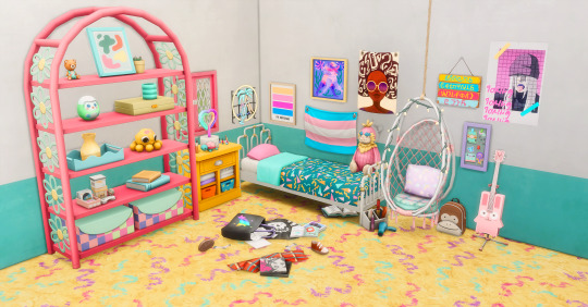
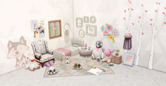
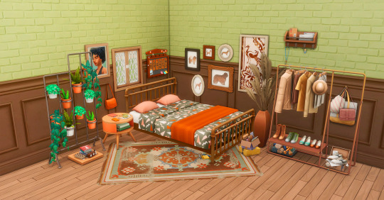
PATTERN POP BEDDING
oi oi look who it is again...alas, nobody exciting, only me, BUT i come baring more garish furniture to make up for it! I loved the patterns for the bedding in the new Pastel Pop Kit, but, true to form, I want VIBRANCE. i want colours so saturated they'll burn your retinas if you look at them for too long. so, naturally, i remade the 80s-esque pattern with the original swatches and a BUNCH of super colourful variations, too - 32 in total. I'm sharing the patterns, too, for anyone to use however they want!
I've recoloured three bits of separated bedding (double, single, and toddler mattresses) by the forever incredible @myshunosun, and the meshes are included thanks to their exceptionally generous terms of use!
Details, swatch previews and downloads under the cut!
@maxismatchccworld @emilyccfinds @mmfinds @maxismatch @mmoutfitters
Details
Recolours of @myshunosun's double, single and toddler meshes - thank you so much for your open terms of use, and incredible content!
All 3 are BGC and can be used with maxis-match bed frames (of course, I totally recommend any of @myshunosun's - check out all of their amazing cc here!)
Recreation of the 80's pattern from the Pastel Pop Kit, plus additional colourways - 32 swatches in total, on all 3 mattresses
Custom thumbnail, correct colour tags
Swatch Preview
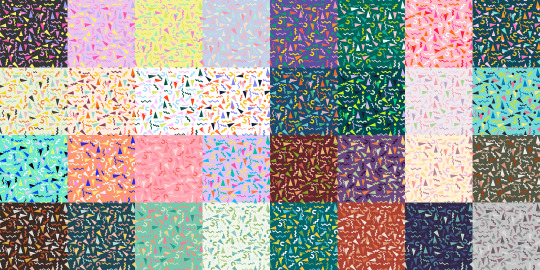
I've included an optional folder containing PNGs of all the swatches, plus the Photoshop pattern set. You're free to use them however you want, as long as whatever you make with them isn't paywalled. Credit is always appreciated if you do use them, but you do you!
Anyway, I thiiiink that's all the info? Once again, all credit for the lovely meshes goes to @myshunosun! Thank you to everyone who tested these, and to the creators of all the CC used in the preview pics - if anyone has any WCIFs, let me know!
Download:
SFS │ Patreon (both 100% free to everyone, always.)
#TS4 cc#sims 4 cc#ts4 cc#sims 4 maxis match#maxis match cc#my cc#sims 4 custom content#sims 4 cute cc#ts4 cute cc#sims 4 decor#sims decor#sims 4 furniture#ts4 furniture#sims 4 build buy#simblr#sims 4 beds#sims 4 resources#ts4 bedding#sims 4 bedding#sims 4 bedroom cc#sims 4 bedroom#sims 4 bed cc
5K notes
·
View notes
Note
Hello there!
I've been a huge fan of your art of Seb and Clora here on Tumblr for quite some time now. Maybe a year? Idk time is weird aksbjs. Anyway, I'm an artist myself, and I was just wondering, put simply, whats your art process? Like how you shade and color and stuff.
Anyway, have a nice day! And uh- sorry if this is awkward sksbdn.
DAMN youve basically been here since day 1 THANK YOUU😭 im glad you like my stuff!! and ur not awkward at all!!🥹💖💖
and i actually posted a timelapse of my process on twitter not that long ago, so ill post it here as well!
as you can see seb takes me the longest LMAOO hes such a menace for me to draw still...and i dont even think seeing my process helps since its just so much trial and error and warping until it looks right BAHAHA (this is from like a month ago and i ALREADY think seb looks off here too 💀)
but my process is super simple, i just colour and cell shade on multiply and then i add a grain texture on soft light 10% at the end. i dont rly do anything fancy for colouring, bc i used to over-render my art and make it really complicated, but now im a fan of just having it look kinda...flat? if that makes sense LOL. i like it aesthetically AND its also easier.
OH also something i add to the end of almost all my pieces is this auto-action from clip studio assets which basically adjusts the hue/saturation/brightness. here's an example of what the original flat colours look like vs. when i add this filter:

even if you dont have clip studio the same effect could be achieved with just manually tweaking with the hue/saturation levels afterwards, but i like this filter just cuz its easy and makes the colours more how i like them
HOPE THIS HELPS💖💖
#ALSO UNRELATED TO THIS ASK BUT NEXT CHAP WONT BE OUT TOMORROW SORRY probably tuesday at this rate🙇♀️#i forgor that not only do i have to write this long ass chap but also editing these long ass chaps takes a while too#ask#one of the first asks i ever got was asking for a timelapse but i didnt even know how to do that back then#i just recently turned on my timelapse feature in clip studio LMAO its cool#i have another one on my twitter that i didnt post here too maybe ill post it her eventually
201 notes
·
View notes
Text

Thank you @cobbbvanth for asking me for this; I’ve never been more flattered! ☺️ I’ve only been making gifs for a little more than 2 years, so I’m really still only figuring Photoshop out, and my colouring owes everything to other people’s tutorials (some of which can be found here). To be honest, I was only asked some tips, but I have no clue what to include and what to leave out; so, here’s my complete (if random) colouring process.
NOTE: This is a colouring tutorial, not a gif-making one. The tutorial that taught me everything I know about that (and to which I am eternally grateful) is this one by @hayaosmiyazaki.
I. SHARPENING
My standard sharpening settings are:
One Smart Sharpen filter set to Amount: 500 | Radius: 0,4
A second Smart Sharpen filter set to Amount: 10 | Radius: 10
One Gaussian Blur filter set to Radius: 1,0 and Opacity: 30%
One Add Noise filter set to Amount 0,5 | Distribution: Gaussian
II. BASIC COLOURING
This is the part where I add most of the adjustment layers available and just play around with them. Obviously different settings work for different scenes, but I do have some standard ones.
Brightness/Contrast
I usually up the Brightness to +10-30, and the Contrast to about +10.
Curves
For the first Curves layer I go to Auto Options > Enhance Brightness and Contrast, and then adjust the opacity until I’m happy.
I might repeat the above step if the gif still looks too dark to me.
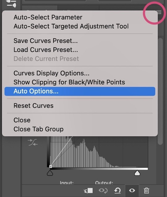
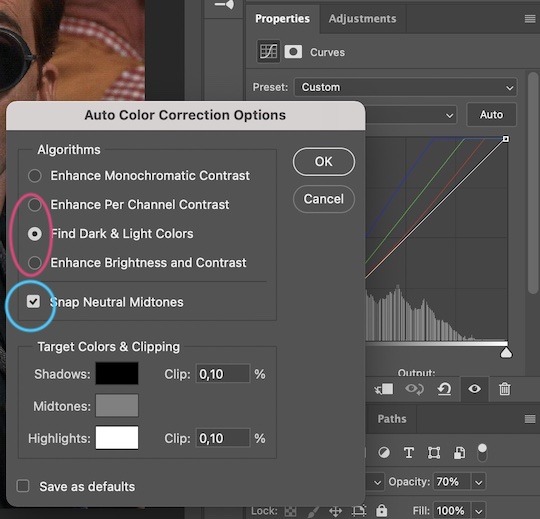
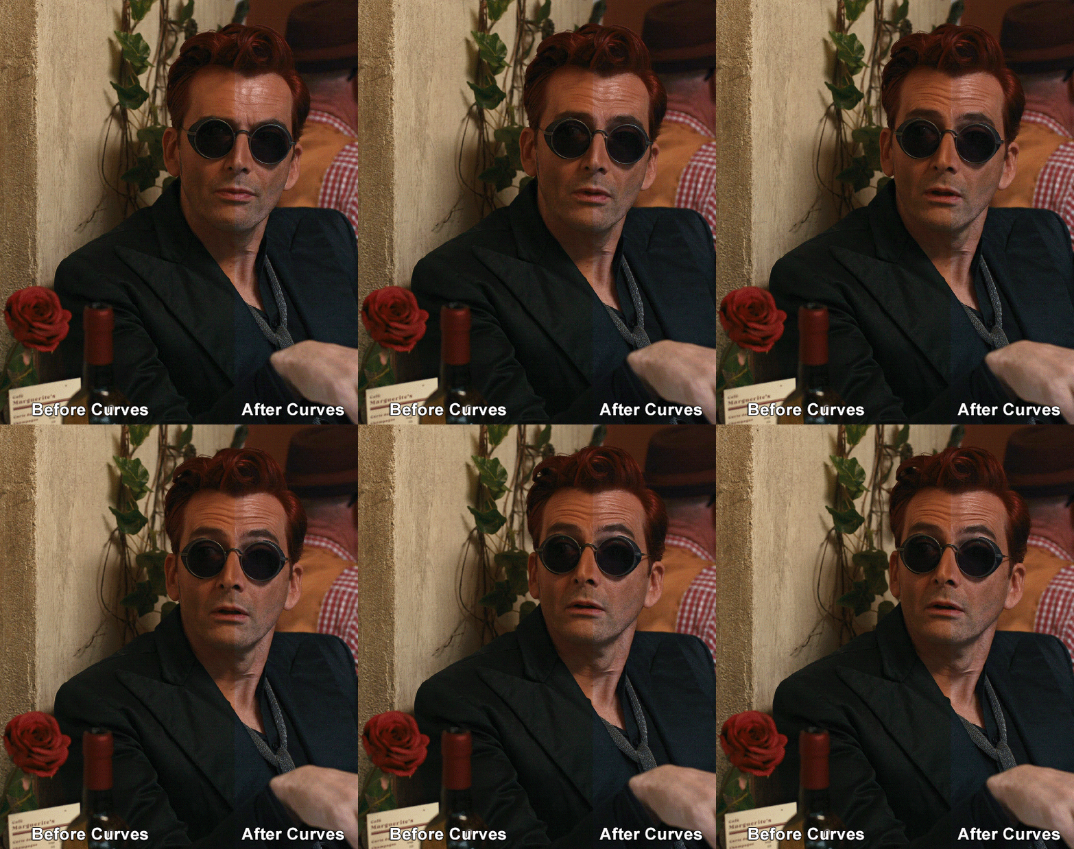
I add another Curves layer, I go to Auto Options and this time I pick either Find Dark & Light Colors or Enhance Per Channel Contrast, and check or uncheck the Snap Neutral Midtones option, until I see something I like. I will then adjust the opacity.
Levels
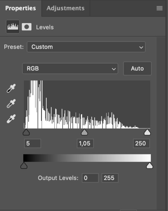
I add a Levels layer that usually looks something like this:
Exposure
I add an Exposure layer, where I usually set the Offset to around -0,0010.
Selective Color
To make the faces look okay, I create a Selective Color layer, select the Reds and usually add some Cyan (+10-20%) and play around a little (±5%) with Magenta and Yellow too. I might also add another layer, select the Yellows and make slight tweaks there too.
III. FUN COLOURING
About colour manipulation: PiXimperfect just uploaded a tutorial that explains everything so much better than I ever could, so I highly recommend you go watch it. It’s made for static images though, and things are more complicated with moving images, so I also recommend @elizascarlets’s tutorial.
The reason I usually go for a softer colouring is that a more vivid one requires a lot of patience and precision, and I honestly can’t be bothered. Instead, I try to tweak the colous only a little, so that the edges can be a little rough without it looking too wrong.
One thing to remember is that each gif is different, and there isn’t one foolproof way to do this, so you will need to use a different technique depending on the gif you’re working with.
Okay, so, after I’ve decided what colour I want my background to be:
1. I create a Hue/Saturation layer and change the greens, cyans, blues and magentas to that colour. That’s easy enough, since it doesn’t mess with the face colour. I then set the blending mode to Color. If your background doesn’t include any yellow or red, you might be done here, like in the case bellow:
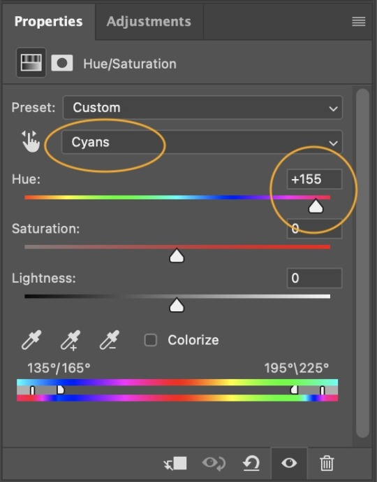
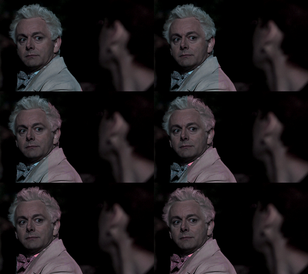
2. To change the yellows and reds, I create a new Hue/Saturation layer, select the yellows/reds, move Saturation to 100 (temporarily) and then play around with the sliders until the face colour isn’t affected. I then change it to whatever I’ve chosen and change the blending mode to Color.
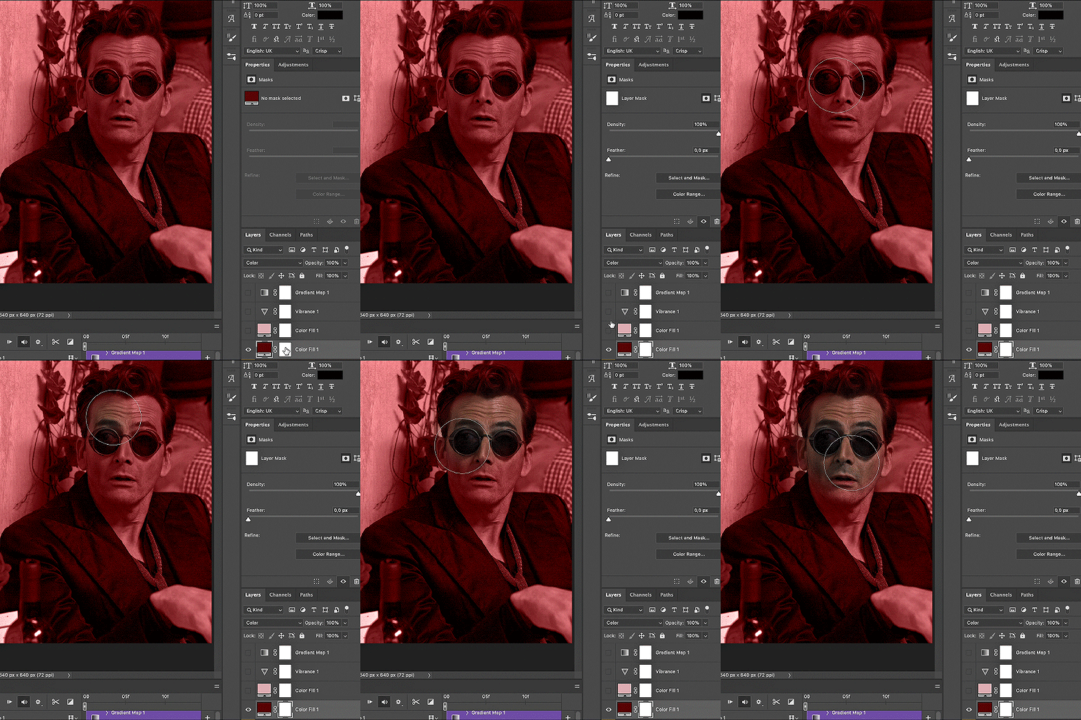
3. If for whatever reason step 3 doesn’t work (the background is white or black for example, or just too red), I might create a Solid Color layer set to whatever colour I want, set the blending mode to Color and then select the layer mask and carefully paint with a soft, black brush over the people’s faces/bodies. I will then lower the Opacity, to whatever looks smooth enough. If there’s a lot of movement in your gif, you might have to use keyframes (see elizascarlets’s tutorial linked above). However, my main goal is to avoid using those; that’s why I try my hardest to tweak around as many Hue/Saturation layers as needed and not have to create a solid color layer.
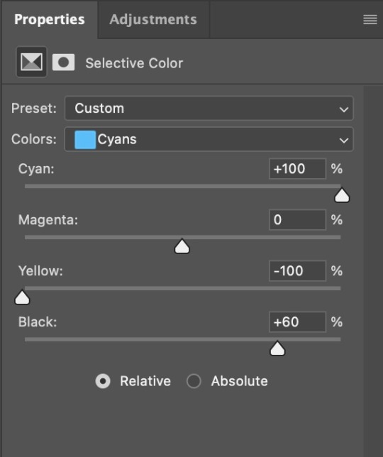
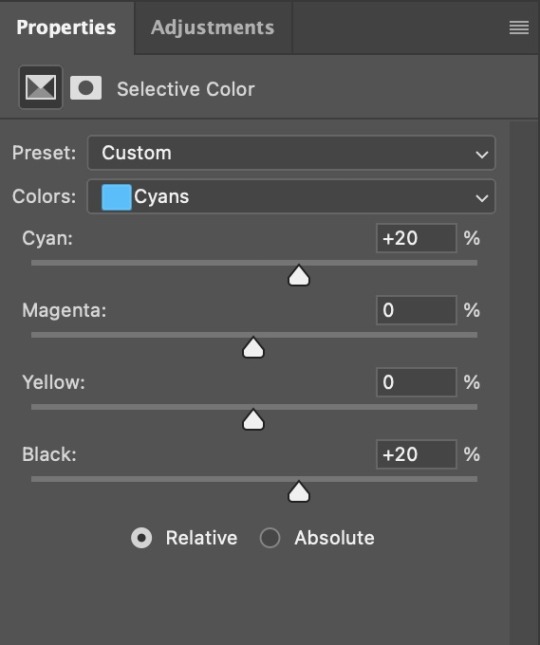
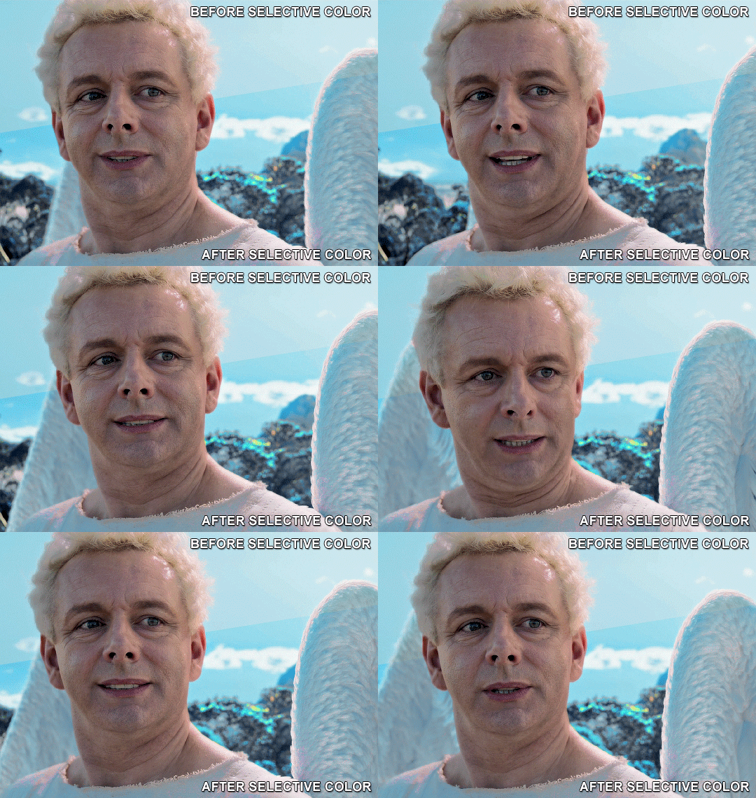
4. Once my background looks the colour I want it, I might add a Selective Color layer that matches my background color and then try to make it look more vibrant. For this Aziraphale gif below for example, I’ve selected the Cyans and then set Cyan to +100%, Yellow to -100% and Black to +60, then created another one, selected the Cyans again and then set Cyan to +20 and Black to +20.
5. If the gif has a white area, I create a Solid Color layer with a colour that matches the rest of the background and then set the Opacity low. I might also create a Selective Color layer, increase the Black and then play around with the colours.
IV. FINISHING TOUCHES
I create a Vibrance layer and set the Vibrance to around +30 and the Saturation to about +5.
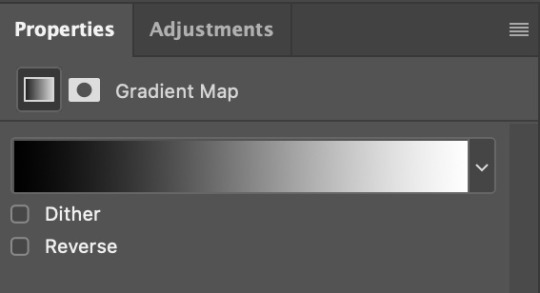
I create a black and white Gradient Map layer (with black on the left end of the spectrum and white on the right), set the blending to Luminosity and the Opacity to about 20-30%.
AAAND that’s about it I think! This ended up way too long and perhaps a little incoherent. I tried to make it as general as possible, so you might have to mix and match for best results. Feel free to ask me for further explanations about any one of these steps, and please tell me if you want me to go through the colouring of a specific gifset (although, as I said, I'm by no means an expert). Happy gifmaking!
#gif tutorial#allresources#completeresources#dailyresources#photoshop tutorial#chaoticresources#uservivaldi#userdanahscott#usersanshou#userfanni#userbuckleys#userrobin#tuserjen#userdavid#userzaynab#tusermimi#thingschanged#tuserju#usertj#userhallie#tutorial#minee
282 notes
·
View notes
Note
hi im so sorry if youve already answered this but how do u go about selecting the colors you use for your works!
hi! i've had this question a few times and every time i've only been able to answer with a vague sort of 'ehhh i just pick them'. but i think i'll actually talk some more about it now since a lot of my art actually takes a lot of beating before i decide on a final palette. but with a lot of them admittedly i already know what palette i'm using, and i organise the whole composition around those colours.
i use like two main palette methods and here they are (once you see it in my art, you won't unsee it). It mainly involves picking one main hue, and then a contrasting secondary colour.

So the most basic is to have a drawing be mostly a small range of hues, in this case the reds and oranges, and adding a single contrasting shade. Here it is the bounce light on the metallic metal parts, and doesn't appear anywhere else. It looks blue but it isn't - if I used actual blue, it would be too jarring and the colours would not appear unified. This is a warm and nice scene. So instead I pick that strong blue and blend it into a small swatch of the base colour. Then I pick from the blended portion, and what I get will be more blue than the base, but not actually blue. In fact it is yellow-orange :) The entire drawing looks warm as a result.
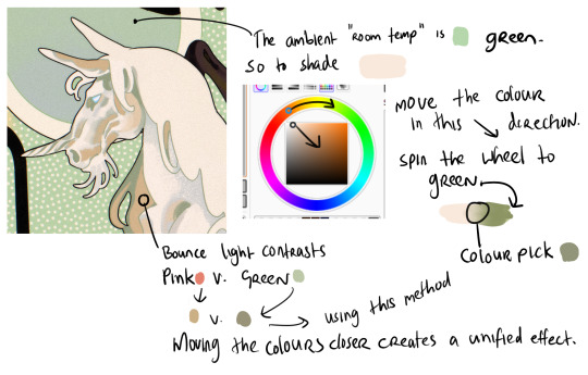
When working with marginally stronger contrast, here I have a cream unicorn on a green background. The main shadows on the unicorn will be the colour of that ambient room temperature bg - green. So I use the same test swatch method to pick a shadow colour which LOOKS green without being too disruptive of the cream unicorn. I increase the saturation and darken the value (moving the colour dot diagonally to the lower right hand corner of the box) and also spin the whole wheel towards green just a bit. Then I blend into the cream and colour pick a shade in the middle. But for the bounce light, I chose to use a common contrast of green - pink. It looks like pink in the drawing but in fact it is a low saturation orange! Using that real pink would be disharmonious. I do the exact same thing - I blend the pink into the bg colour and come up with that orange shade. It looks harmonious.
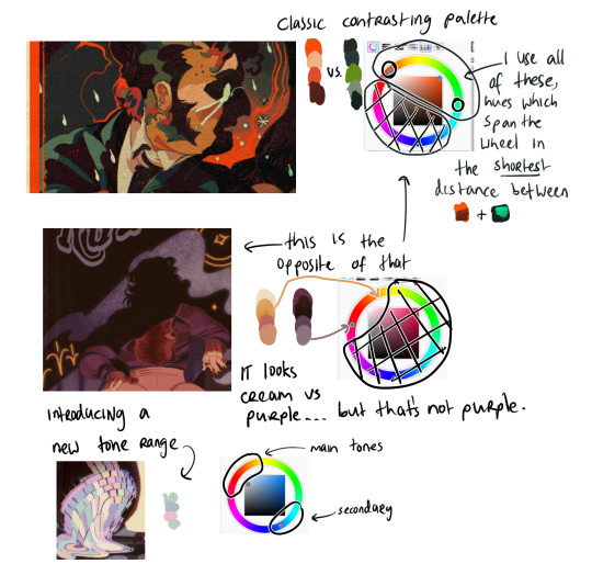
Now (top example) I am using two contrasting hues side by side. I decide the shadows will be warm, and the highlights in that contrasting zone. That means that for every colour i pick - Islin's skin, hair, his glasses, his shirt collar, his coat - every colour gets slid around the colour wheel until it falls inside that narrow band. And when I am highlighting his skin, I turn the wheel towards green. When I am shading his skin, I turn the wheel more red. I do this for every single element in the drawing.
It's the same for the Rua cover but this time I am not using such a wide band of available hues on the colour wheel, it's much tighter. I did this to replicate the look of a faded print, intentionally lowering the available contrast I had to work with by removing black as tool. It's all in that small cream to red window but it LOOKS purple - it looks like Pascal wears a purple shirt and that the smoke in the bg is lilac. Well, it isn't. That's all red and orange. I pick those colours by, again, choosing my goal "look" - a low-saturation purple, and then turning the wheel into the red range.
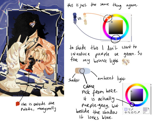
Okay so! for this it's just... the exact same thing again. Literally it always is. But since this one is recent I still have the process fresh in my mind. I envisioned it in the car, and I wanted this empty sort of desolate blue bg and a cold, distant overall tone. I ended up making the white on the chessboard & white pieces warmer, cream instead of white-grey, which worked out great. I wanted the blue, I wanted the pale cream/white, and the black of the chessboard. I didn't envision a colour for Pascal's shirt. but when the time came it was an obvious choice. It has to contrast with the bg both in value and hue, without falling outside the cream range already established by the chess pieces. So it's shiny salmon pink :) or orange, whatever you think it is. The only disharmonious part of this palette is the red velvet under the black knight piece - it works, but if I'd taken more care I might have spun the wheel more into orange and it would stand out less. But I don't mind.
596 notes
·
View notes