
elli-sojung-kim
Sojung
RMIT/ Communication Design Study Journal
47 posts
Don't wanna be here? Send us removal request.
Last Seen Blogs
fallow-horn
Horror Enthusist

kirisaki-daichi-scenarios
an active knb blog

zamucenum
Tu sam da zamutim um
laustic
🌻🌻🌻
janofetus
Janoskians Fetus Photos
Photo

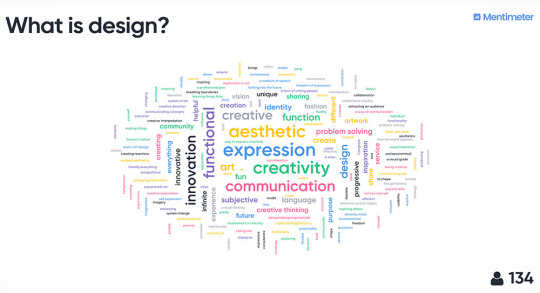
Communication Design studies (GRAP2199) course
This class was full of joy. I would like to say it was my favourite class.
It pushed me to keep exploring design history and create pieces.
Although we studied online due to the COVID-19, It could not interfere with our study. I was thankful that I could learn something in this chaos. I met a lovely teacher and classmates, who gave a lot of impression and warmth for each other.
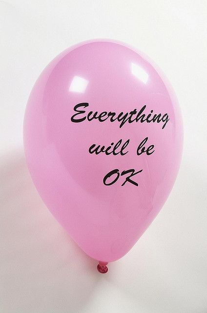
The key learning outcome of this study is a passionate attitude for creation. I can say it is the same as “Gesamtkunstwerk.” We saw “Everything will be ok” balloon in every lecture. Everything can be done in this course. Apart from the formal design, we made fresh and experimental images. In the process, we learned how to give and reflect feedback, and learn from others.
This reflective journal was the place where I could pour my passion week by week. Hopefully, It will last until graduation.
Future demands a whole designer. That means us.
I will keep learning, creating, enjoying this journey.
Shayna, Andy, and Karen thank you for teaching me!
And my lovely classmates, all the best!
Warm wishes,
Sojung
2 notes
·
View notes
Photo
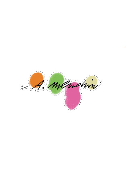

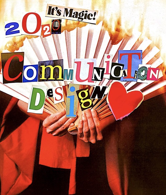
Assignment 3: Ask Me Anything outcome
In this project, I focused on how to reflect Mendini’s identity in the magazine.
As Mendini enjoyed decorative and handcrafted things, I decided to make this interview zine into decorative objects.
The die-cutting line enables readers to engage in communication with Mendini.
Each image is related to the question and answer.
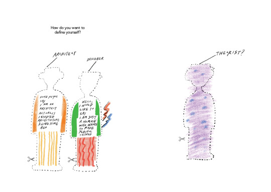
1. How do you want to define yourself?
: I chose this iconic corkscrew called ‘Alessandro M’, which resembles him. I put different patterns for expressing his decorative style.
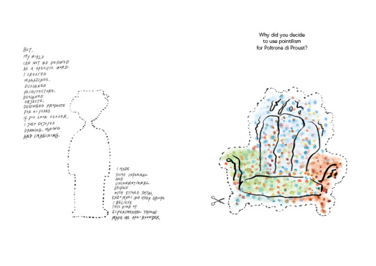
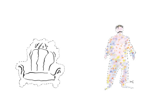
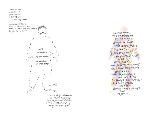
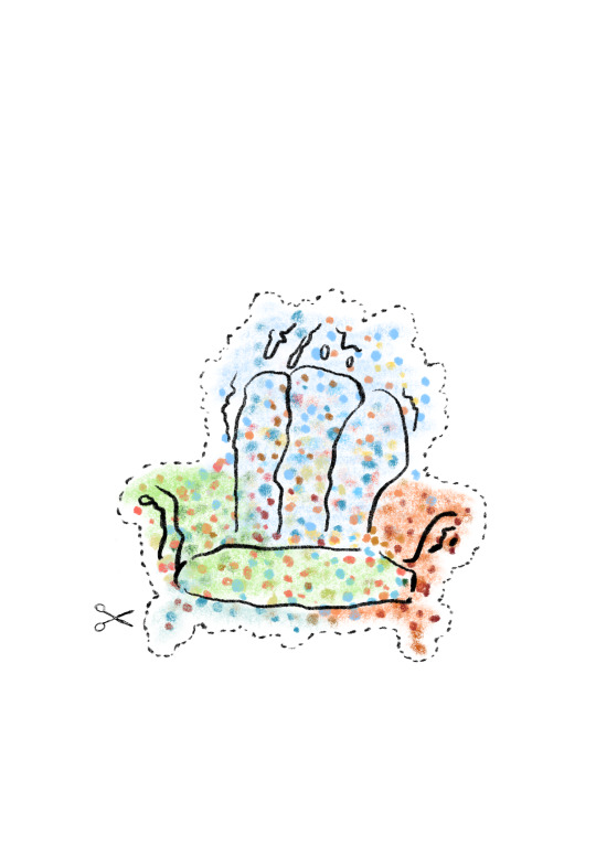
2.Why did you decide to use pointillism for Poltrona di Proust?
: This Proust chair is one of his best-known pieces. I referred to his drawing and exaggerated dot for delivering pointillism more strongly. Also, I put the image of Proust with the referring image of him. He had a strand of hair and mustache. The outline shape is based on Mendini’s other hand drawing.
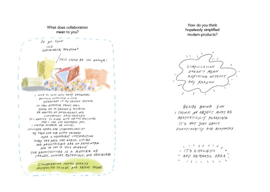
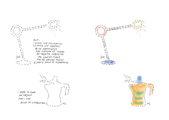
3. What does collaboration mean to you?
: I chose the Groninger museum to answer. It is his representative collaborative work. Each section is designed by other designers by Mendini’s direction. If I were him, I told this story for giving clues for the answer. This part was really hard to express. I was obsessed with putting sentences on the museum illustration, but it interfered with readability. So, I just wrote down under the illustration. I found that I should not be obsessive about my preference for readers.
4. How do you think hopelessly simplified modern products?
: I used his playful lamp and coffee maker. I thought it can deliver his philosophy. It looks simple but has a refined decorative shape. It is more than simplicity.
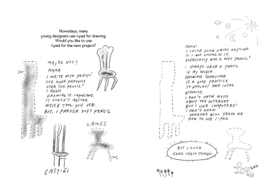
5. Nowadays, many young designers use I-pad for drawing. Would you like to use I-pad for the next project?
: I referred purely to his drawing on these two pages. I tried to make these two pages giving a sense of his purity and passion for drawing. Also, I didn’t use any colors for these to deliver the mood for a pencil he loved.
In these projects, I could reflect his passion for creation. I want to follow his passion and enjoy creation with my background and new technology. As he did, I will enjoy my future practices!
6 notes
·
View notes
Text
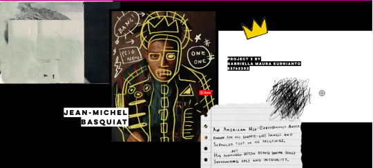
What inspired me during the class? :Gabriella’s work
This website looks like Basquiat’s personal website!
When I saw Gabriella's work, I was so impressed by the whole mood and the main image of Basquiat. I am also a big fan of Basquiat, so I could feel how Gabriella reflected his pieces on her website. It is really aesthetically pleasing and well-defined work! I like the way she put the image on each question and the smile stickers which provokes curiosity to click on.
I love this work a lot! I want to learn her skill in creating a professional website!
Project 3 : Ask Me Anything
https://maurakurnianto.wixsite.com/basquiat
Here is what my zine currently looks like, I decided to do an interactive zine.
My subject of choice is Jean-Michel Basquiat. At first I was only drawn to his art style and the story behind it, but his take on the art industry fascinates me. His journey to being recognized in the art industry was not easy and I decided to dig a little deeper for this project. I have to say, he’s now one of my favourite artist!
Click the link above and let me know what you guys think!
17 notes
·
View notes
Photo
This digital collage is so charming!
I love the grid background and symmetric pillars.
Also, the image of two-and three-dimensional images combined in a harmonious composition.
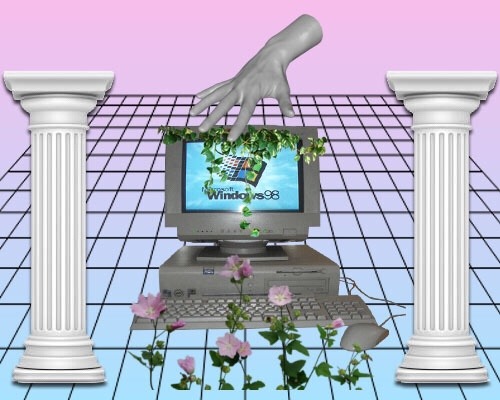
841 notes
·
View notes
Photo
This image was appealing, because it had a grid system but wrote freely not considering it. It seems like my due date for my assignments piled up!
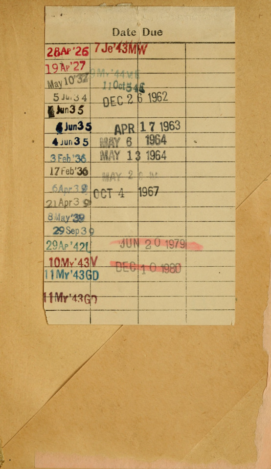
April 19, 1927, April 6, 1939, April 17, 1963, May 13, 1964, October 4, 1967 and many other due dates. Source.
3K notes
·
View notes
Photo
Design is also a form of protest.
How people gather, share, and raise their voice of our time?
What’s the role of designer?
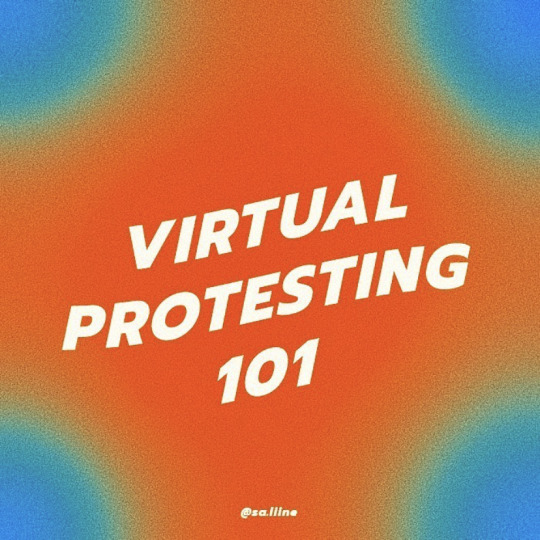
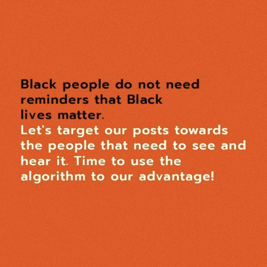
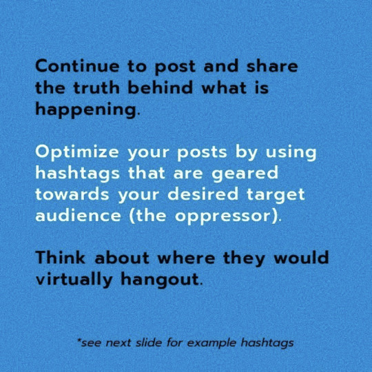
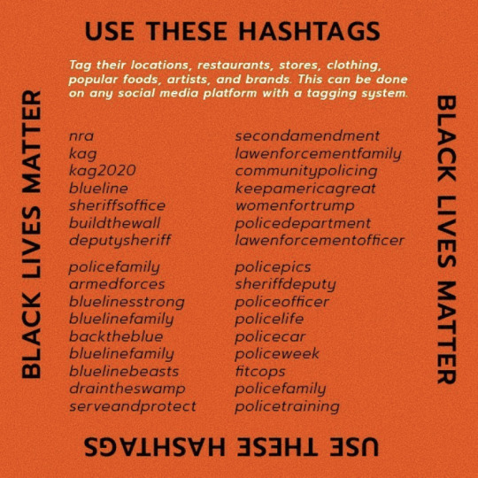
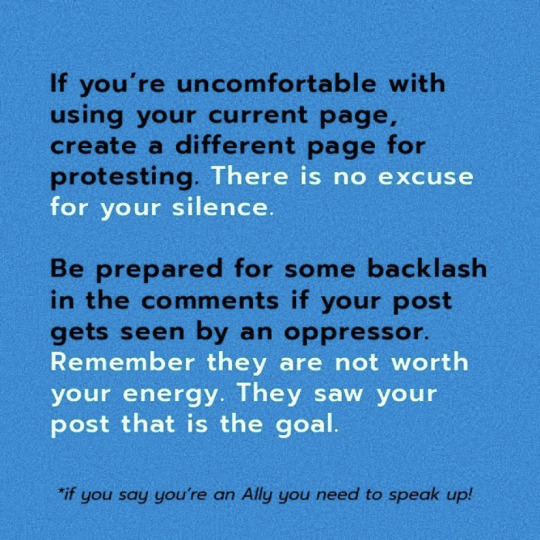
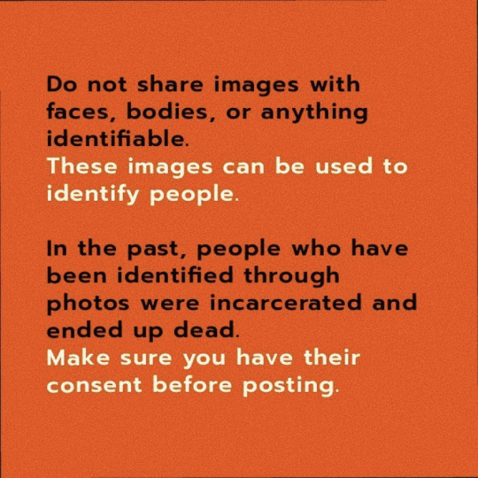
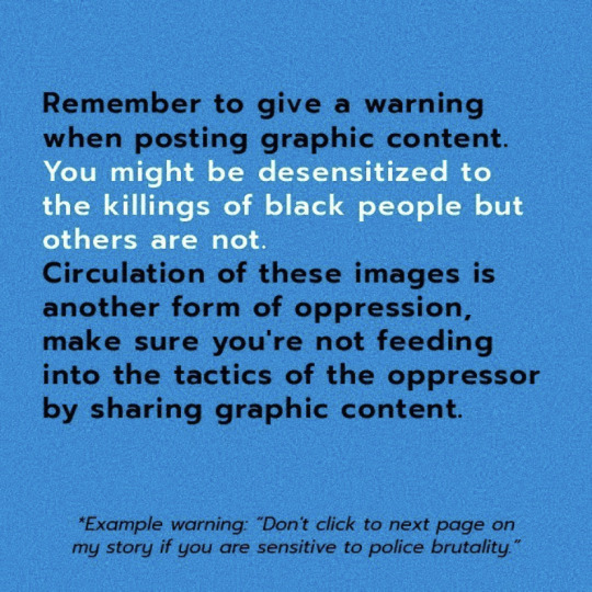
Virtual Protesting 101 by sa.liine
108 notes
·
View notes
Photo
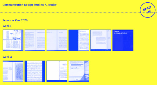
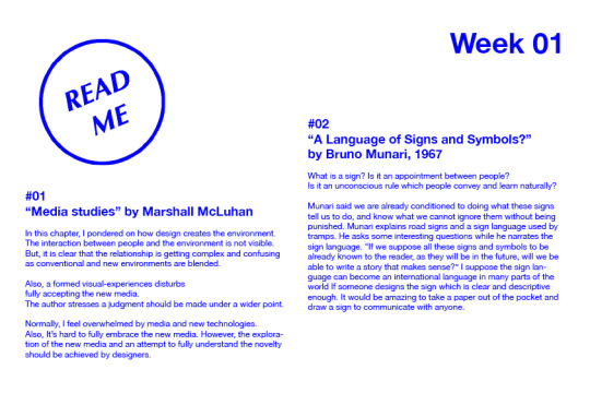
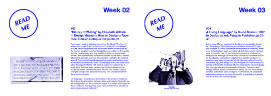
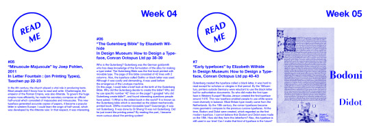
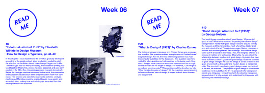
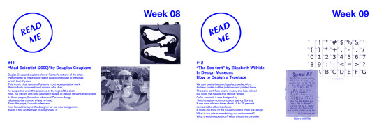
Read Me_Short Book Report
(Communication Design Studies : A Reader)
Andy and Karen shared helpful scanned pages for our study.
For me, It took more time to read these scripts than I expected.
But I get used to reading books, I could enjoy a lot! I made a small book report. Shayna also recommended to go through this website during the class, I tried to read week by week. Due to other assignments, I haven’t read it in the past few weeks. I was happy that I've got books to read in the house! I will catch up soon after submitting all the assignments! I appreciate these materials, especially in the current situation.
A Reader site
~> http://digbeyond.com/readme/phplist.php?course=Communication_Design_Studies
Image Source:
Week 2
: https://www.lancaster.ac.uk/users/yorkdoom/palweb/week02/palwk2.htm
Week 3
: https://www.iconeye.com/design/features/itemlist/tag/Bruno%20Munari
Week 5
: https://www.historyofinformation.com/image.php?id=2281
Week 6
: https://letterpresscommons.com/linotypeandintertype/
https://hdl.handle.net/10217/191156
(https://mountainscholar.org/handle/10217/191156)
Week7
: https://www.vitra.com/en-us/corporation/designer/details/charles-ray-eames
Week 8
: https://www.vitra.com/en-au/product/panton-chair-classic
https://www.vitra.com/en-me/corporation/designer/details/verner-panton
Week 9
: http://www.andrewfosterdesign.com/type.html
https://blogfonts.com/ecofont-vera-sans-regular.font
Read Me Logo
:http://digbeyond.com/readme/phplist.php?course=Communication_Design_Studies
0 notes
Photo
Week 12 Lecture ) / The last lecture 😢
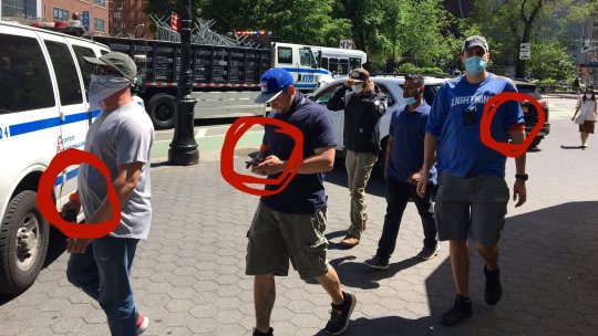
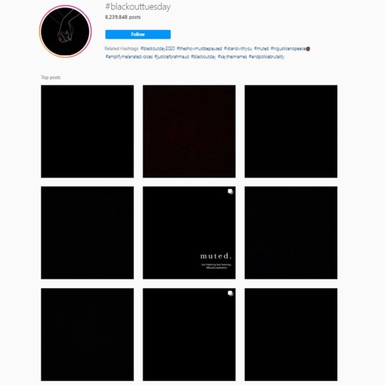
In this lecture, we skimmed through the last lectures we learned during this semester. How do people communicate? Andy introduced one picture in the social context of communication. The picture was from Zack Bornstein’s twitter, and he explained how the policemen signal to each other through white armbands in U.S. They used it as a code. I found another photo in his twitter, and they changed it into another colour for maintaining their identity. On the other hand, I found many brands and individuals posted a black square for supporting black community. It is regarded as a virtual movement of silence. At this point, we should consider how to respond as a designer.
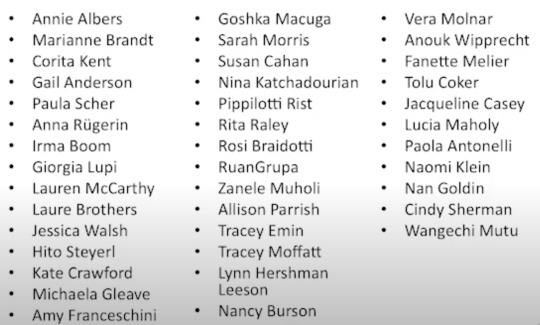
What’s next for design? Karen introduced decolonising design and female designers. She stressed “We should celebrate and site designers of all races and genders that you find in your path and from all corner.” I was impressed by her words. We should celebrate what we study and what we received from our elders. I will look through after finishing all the assignments!
Why we design? Why we study design?
I’m still looking for answers. But I guess, as a creative practitioner we have a chances that we can change and direct people. We can make more brighter and cheerful future once we can gather and make things together.
Andy and Karen, Thank you for the whole lecture !! :-)
Image Source:
https://twitter.com/ZackBornstein?ref_src=twsrc%5Egoogle%7Ctwcamp%5Eserp%7Ctwgr%5Eauthor
https://www.nbcnews.com/pop-culture/pop-culture-news/celebrities-warn-using-blm-blackout-tuesday-posts-could-hide-important-n1222106
and 3 pictures from the last AWESOME LECTURE
0 notes
Photo
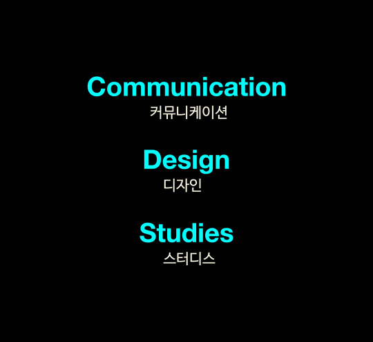
Lecture 3 (20/03/2020)
look back : lecture 3
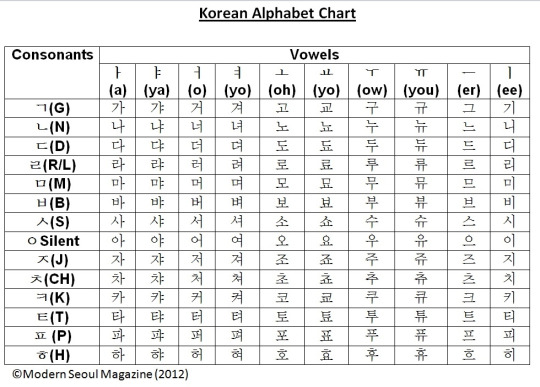
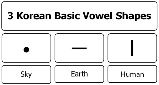
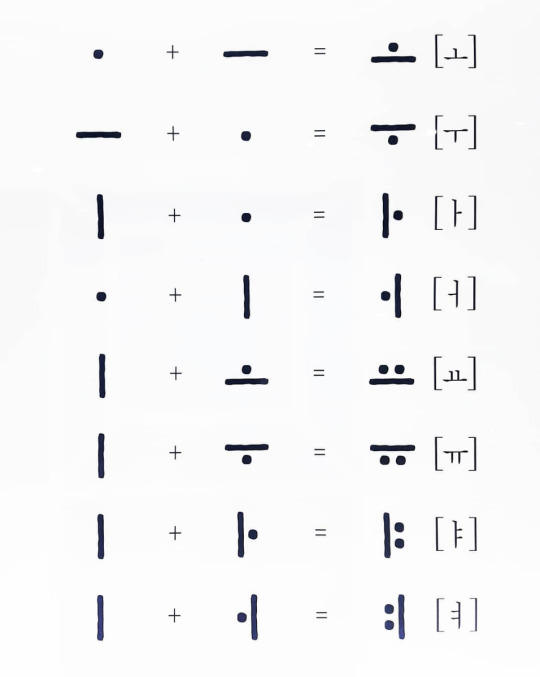
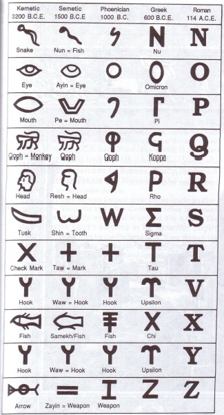
In this lecture, we studied cuneiform, ostracise and hieroglyphic, and went over ideographic scripts such as Chinese and Japanese. Also, Andy recommended sharing our own experience of our language. We have a unique alphabet, called ‘Hangul.’ It consists of 14 consonants and 10 vowels to make it easy to learn. Every year, we celebrate the invention of Hangul on October 9. King Sejong created Hangul to help people read and write more easily in 1446. The letter form is based on the shape of the mouth and tongue. The vowel shape resembles the sky, earth, and human. I made one image for pronouncing communication design in Hangul. Our language is also a phonogram, we can write any language for pronunciation like this. I hope more people in the world will learn Hangul!
image source:
https://medium.com/@minzikang/design-lessons-from-the-korean-alphabet-383191ee7d4d
http://gabrielwhiteboard.blogspot.com/2018/07/advanced-learn-to-read-hangul.html
3 notes
·
View notes
Photo
What inspired me on Tumblr
When I saw this work on Tumblr, I was captivated by the fresh form and mood of the image. I liked the material Joe chose and the way he placed coloured triangular shape on each letter. The whole letters seem to have pattern and texture. Especially, I liked C, P and R! I will try shapeshifters activity with using old magazine and notebook as he did. This work is my favourite shapeshifters activity on Tumblr!
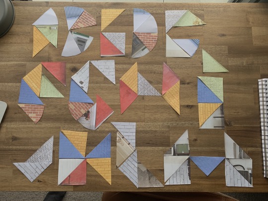
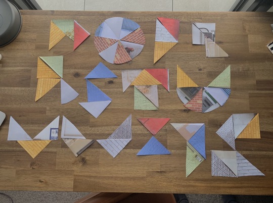
SHAPESHIFTERS ACTIVITY
I decided to do one of the workshop activities today during my image and identity tutorial class. I’ve found that doing a semi-mindless jobs while my teachers are talking in online class helps me to stay sane, it can get a bit tedious if I am just sat at my desk doing nothing.
I couldn’t find any coloured paper so I used pages out of an old scrapbook style notebook, but I think it came out pretty good, i even unintentionally stuck to bauhaus inspired colours.
I tried constructing the alphabet from the triangles and slices, I was more successful with some letters and kinda failed with others. I found it hard to try and stick to the bauhaus inspired style, like for example the letter R and F are too pointed and unreadable in my opinion. I think I, K, O and U resemble the Bauhaus aesthetic because 1) they are readable and 2) they have a good balance of pointed and curved edges.
I really liked doing this exercise and am gonna try complete some of the older workshops in the coming weeks. It took me back to the start of the course when we made the alphabet from everyday objects in one of the first tutorial classes.
9 notes
·
View notes
Text
What inspired me during the class? : Beverly’s work
When I saw Beverly’s material and question, I was so impressed by her choice. It was a really interesting piece for me at that time, I thought Beverly was really keen to figure out the essence of the task.
What I liked about this work was not only her material choice but also the way she expressed it. The folded shape of each money seems like typeface on the computer. Because the gap between each letter was systematic and each letterform was well refined. Also, it was surprising that the various money that she used has a similar colour tone. I loved this work a lot!
2.4.20
submitted!
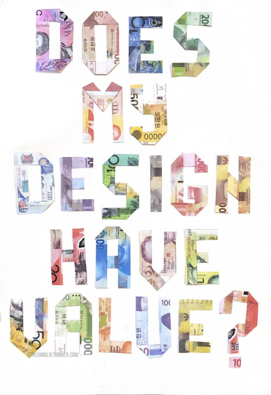
This is my final result for assessment 1. I am pretty satisfied with how it turned out, because even though I did not fold the money to create those shapes, it turned out like I did fold them. The font turned out to be clear as well, as I wanted other people to read it easily. I feel like this assessment helps us designers brainstorm in different ways to communicate with the audience, by using unique fonts not just the plain ones that already exists. By doing this assessment, I can think of different ways to represents not just changing fonts, but how the typography reflects on the question. When doing this assessment, I saw my classmates come up with different ideas I could never think of. Some of them used food, and some of them plainly drew on paper, but somehow still made it really interesting. Overall I feel like this was a successful way of creating my own font to represent my question, I hope this skill can be useful for me in the future as well.
3 notes
·
View notes
Photo
Who inspires me? #02 Yawen
I loved the whole topics Yawen mentioned in the class. I believe she is one of the creative students in our course. She chose Andy Warhol’s factory, Buttons, Klein blue, feminist artist, and Chinese dancing lion. Then I thought to myself, ‘Please choose the dancing lion!’
I know her country, so I thought it is a cultural and meaningful topic. When I was a kid, I also saw some dancing lion parade. The dancing lion is really visually pleasing. When I saw this photo, I thought Yawen reinterpreted her tradition in her own way. Also, she looks like a professional photographer 📸Yawen’s work is always intense and colourful. I think she has her own style although it’s the first semester! I’m looking forward to seeing her final work as soon as possible :-)
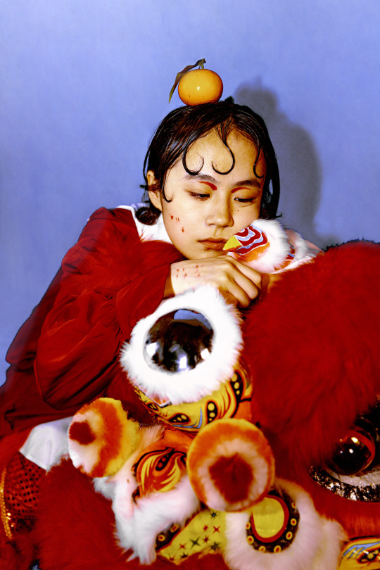
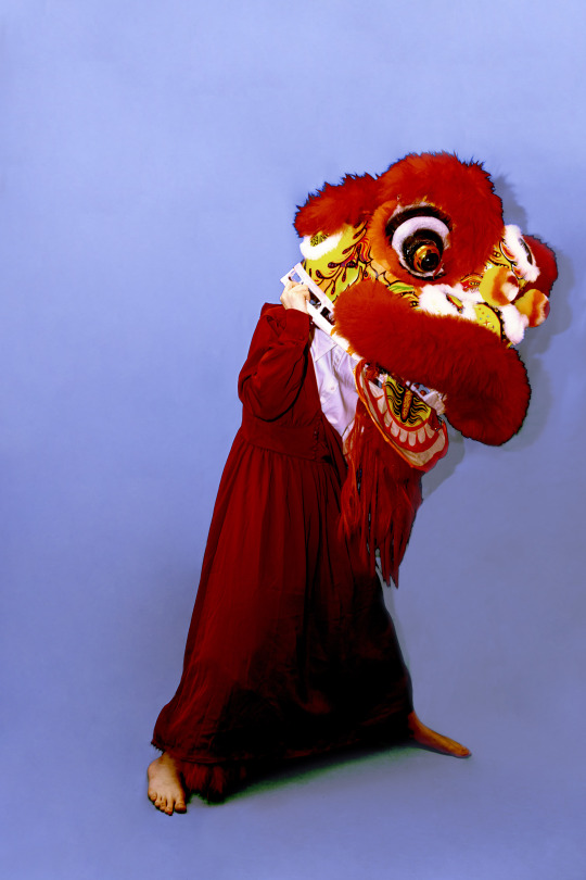
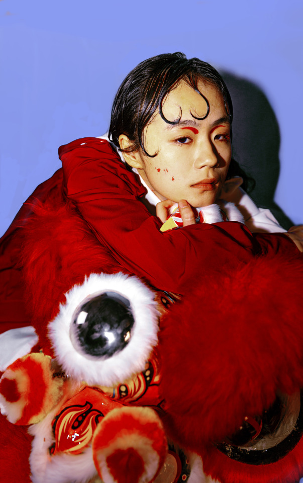
Photography: Have you heard of the Lions?
I would like to share some of my photography works. Dance Lion is also my topic for a zine design (which would be posted soon). For a better visual presentation, fortunately, I successfully borrowed a Southern Lion custome.
‘Have you heard of the Lion?’ is created to raise people’s awareness of a traditional art heritage originated from Guangzhou, China - the Lion Dance.
This group of work aims at capturing the beauty of Lion Dance and the fact that it was being forgotten and losing once in order to raise the awareness of people nowadays to pay more attention to traditional art.
What are you trying to show through the photographs?
This art performance started since the Tang Dynasty in ancient China in order to protect people from a monster called 'Nian’ when in Spring Festival. As time went by, the Lion Dance has already become a culture unity of good wishes and Chinese Spring Festival across Asia.
However, because of commercialisation and industrialisation, this heritage was losing at a time because it is time and energy costed. Fortunately, it is such a comfort that the new generation is paying attention to some old and traditional culture such as the Lion Dance. Many creatives produce video, interview or photographs of some traditional culture. A large group of industrial, graphic or fashion designers are inspired by the Dancing Lion. This traditional heritage from our ancestors are promoted in the commercialised market and embrace with the nowadays world.
The photographs look really colourful, does your colour palette represent something?
Yes. I am a big fan of playing around with colours either for my design work or photography. Regarding this project, lion Dance and Chinese Spring Festival related elements and colour are utilised in this project. Additionally, through some flexible pose of the model, the beauty of this dance should be conveyed more effectively.
Another point to mention is the colour applied in this project. To show how this traditional art melts into the contemporary art world, a more contradictory colour combination is applied. The visions are striking and playful.
Special thanks to the team:
Model: Zishuo Liu
HMUA: Luna
Feel free to leave your comment below ❤️
12 notes
·
View notes
Text
Who inspires me? #01 Haruka
In this class, I loved Haruka’s work best. Her works are always passionate, sophisticated, and creative. Especially, I liked this work. The material she chose for representing the ‘steps’ was really exquisite and brilliant. She composed the whole letters with dynamic patterns and readable shapes. I love her works a lot, this one is my favourite!
Also, I like Haruka’s layout of all works. Even she makes some little pieces such as shapeshifters and inspiration poster, her works are always sensual. Someone mentioned that Haruka’s Tumblr was one of the best Tumblr he followed, I totally agree with that!
Hello, my question is..
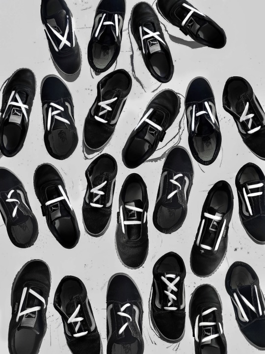
“What are the steps of design?”
I often ask myself and wonder, where do I start? and what next?
Of course we know the basics; research, brainstorm, sketch, concept development, revise. However, there are no exact design guides and steps that we can follow every single time.
For this project, I decided to link the word “steps” to shoes and create the typeface with shoelaces. I purposely chose black shoes and paired it with white shoelaces to create high contrast, directing the audience’s eyes towards the letters. I also played around with the placement of each shoes to create a more dynamic feel so it doesn’t get too repetitive. With limited resources, relying mostly on the sunlight and my phone camera, l actually think the picture came out nicely and I’m really happy with the final result.
11 notes
·
View notes
Photo

Lecture 2 (13/03/2020)
Look Back : Lecture 2
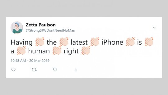
We skimmed through the different shapes of communication again. Where does the design happen? How does it move around the place to place? We saw the post-internet language emoji. Goat is used sometimes to signify “Greatest of all time!” Also, the hand-clapping emoji used between words can signify emphasis. It’s a brand new language! Andy explained the ancient painting on the rock and cuneiforms on the clay tablet. It was interesting to hear the origin of the writing system. There were needs for documenting oxen, this encouraged people to formalize the writing system. New media doesn’t replace the old media, it absorbs it creates the hybrid outcome. We should have considered the relationship between materials and letter form. What is the design made of? What will be the next internet language? What will be the next tablet? (clay tablet-paper-digital tablet- and next?)
image source:
https://emojipedia.org/goat/
https://babylonbee.com/news/study-statements-made-with-clapping-hand-emojis-cannot-be-refuted
http://www.afrostyly.com/english/afro/news/metu_neter_alphabet.htm
1 note
·
View note
Photo
Lecture 1 (06/03/2020)
Look Back : Lecture 1
Definition of communication
: The act of conveying intended meanings from one entity or group to another though the use of mutually understood signs and semiotic rules
Design
: Aesthetic, functional, economic, and sociopolitical dimensions of an object or system.
Studies
: From the Latin “Stadium” meaning “Zeal or dedication”
=> Communication Design Studies
= Share, shape, dedicate
Objective 1
: Develop a critical way of looking at the communication design in historical, social, cultural context
Objective 2
: Identify key design movements, their influence and place society.
Objective 3
: Develop the theoretical knowledge alongside a set of practical tools skills for your own practice or future study.
It was our face to face lecture 😂
In this lecture, Andy and Karen outlined our course, and discussed bodies and languages.
We saw various type of greeting, even gang members coded signs! We had a quick survey about the meaning of design for individual. It was impressive that we can share our insight of design with a fresh way. Also, I think this kind of survey is the new form of communication of modern times. For me design is to find my self. Idea comes from myself, shaped by myself and expressed by myself. In the end, It is all about myself and reflecting myself. Although designers fit themselves to the customers, the things we design are always related with their knowledge and experience.
0 notes
Photo
Week 13
Yesterday we had an extra session!
We could get the last feedback of assignment 2.
Also, I had a chance to look into classmates’ works.
I saw Brad’s Da vinci note, Xinhan’s dot of YaYoi Kusama and Haruka’s water dress, Peter’s Salvador Dalí and Gabriella’s Basquiat interview.
I thought everyone has their own talent to express their idea. I feel inadequate to make my work professional like others. I hope to develop my skills such as making website and handling indesign. My classmates always encourage me to push myself to do my best in a good way.
Also, we had a competition for Shayna’s drawing! We shared our inspration agian, I really enjoyed Brad’s sky and Haruka’s nature. I really missed the nature, because I always stayed in the house..
I shared this collage that I made a few days ago. When I feel stuck, I always make something. If I touch materials and play with those pieces, I feel alive and get some inspriation. Also, shayna said “Keep doing this!!”~> Yes I will :-)!
Brad said this is a sentimental piece for the last class. I wouldn't want it to be over too fast. I hope to see Shayna and my classmates face to face again. It was my favourite class!
4 notes
·
View notes
Photo
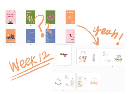
Week 12
Before the class, I could get some feedback from Shayna.
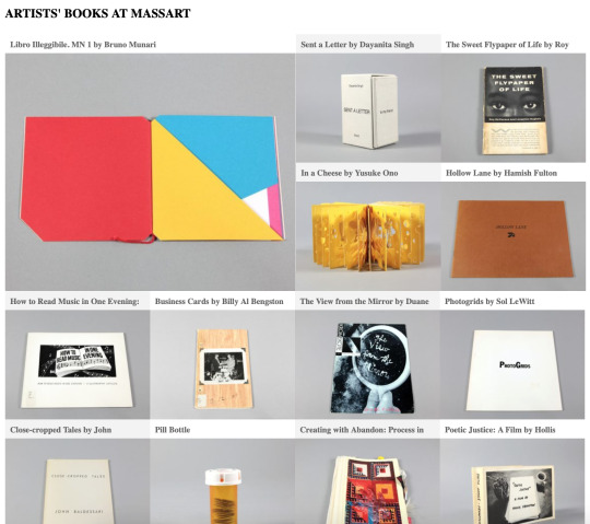
I couldn't realize what I was insufficient to represent Mendini's aesthetic. I just focused on the Mendini's work into digital drawing. After I received the feedback from Shayna, I went through Mendini's design again. I have searched Mendini's hand drawing and realized I couldn't reflect Mendini's work deeply. As Shayna said, I explored Mendini's calligraphic style and tried to reflect his voice into the typeface. I found Mendini wrote only the upper case in his conceptual drawing. Thanks to Shayna, I could explore the actual hand drawing of Mendini, and I'm enjoying handwriting a lot! Also, Shayna explained to us the origin of the magazine and showed the archive of the experimental magazine. (https://blogs.massart.edu/artistsbooks/) I was impressed by the different styles of magazines. I think I should explore more the experimental nature of the magazine. Shayna said we should engage our readers to play with the book, and it really opened my eyes.
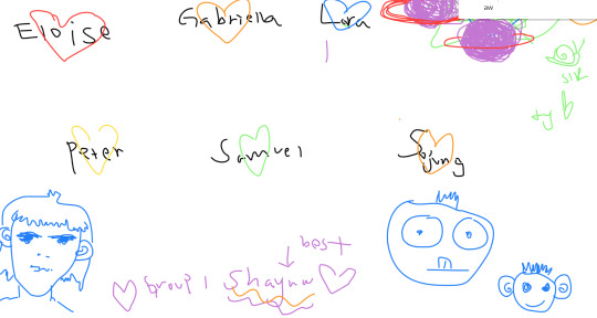
In the class, we should have shared our own inspiration. Especially, I liked Lara's picture with a view of the sky and sea. Similarly, I always take a picture for keeping the memory of nature, I enjoyed Lara's picture. Also, I loved Eloise's book called 'Call me by your name', which I saw the film! The mood is so warm and sensuous. I often hear the background music :-) Peter's inspiration was from Jung Ki Kim's drawing. He was famous in Korea, his drawing style is so brisk and free. Also, Gabriella's youtube was also impressive. I will watch Gabriella's recommendation for the youtube after the semester :-) Also, I could get a sense of Samuel's style. He showed us the website, and the illustration gave me some feeling of retro and refined. I showed some recycling pieces, which I have always passion for. We enjoyed ourselves a lot during sharing our inspiration:-)! feel sad we have just one week more... This class was my favourite !!
3 notes
·
View notes