
grad603-kayleighs
Grad603-Kayleighs
Kayleigh Erwee -
Grad603 - Materials & Media III
40 posts
Don't wanna be here? Send us removal request.
Last Seen Blogs

sandwhit
Sans titre

damnthedark
@charliegillespi

hutchunlimitedroofing
Hutch Unlimited Roofing
loverofmirage
Mirage
thank-apollo-its-friday
in honor of Apollo
Photo

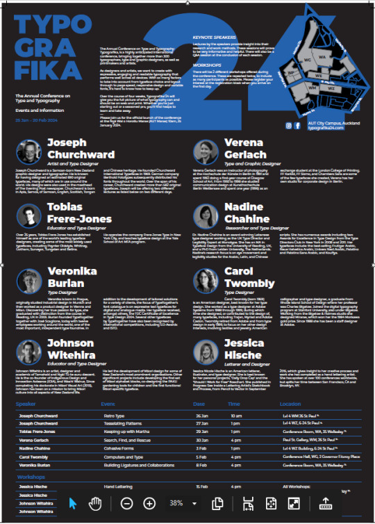

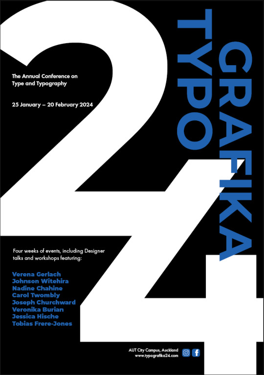
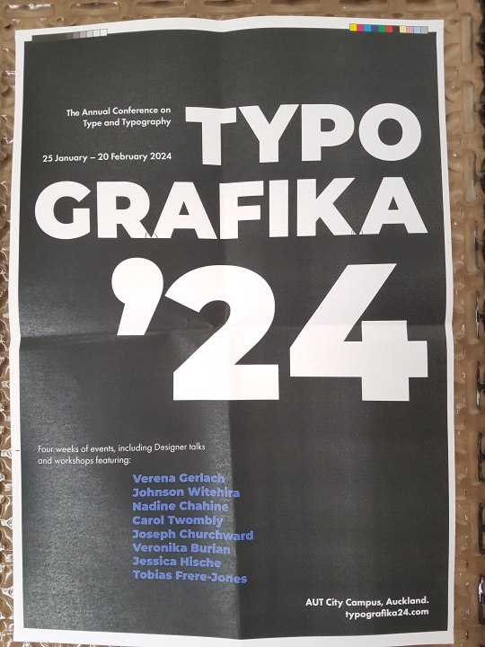
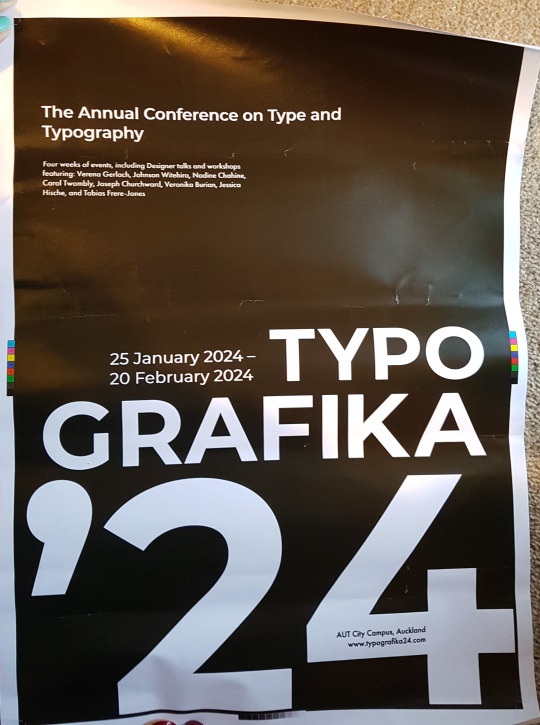
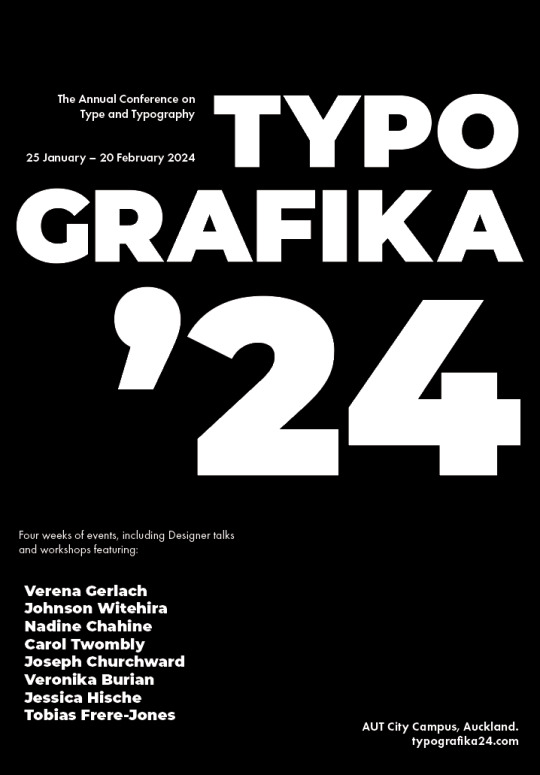
Final Poster & Brochure
Digital versions and final tiled printed version.
I have changed the poster a little bit since the last version. I switched around the colours of some assets so that the focus wasn’t on the large “24″ as much as before. The attention now goes to the Typografika because the white pops out better than the blue used to. I also changed the positioning of the body and title because the poster was too busy all over and needed some negative space. I made the names of the speakers white as well to stand out better and match the brochure side. This layout has much better hierarchy and flow, than the poster before, mainly because of the positioning of the smaller text. The brochure side has the updated timetable and smaller changes to body text and profile image positioning.
Label Below: I also created a label for my envelope but didn’t take a photo of the printed version. This is so if I were handing my work to a client, it would impress them and give them a taste of what's to come straight away. It also makes it easier to see what the project is on and who it belongs to or what its about. I created it to match the poster concept but not be exactly the same.

0 notes
Photo


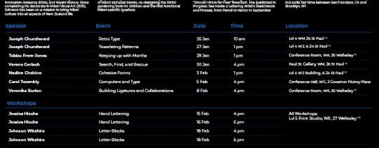
Table Design Examples
I have been struggling with my table design, so to help out, I've looked at some other interesting and basic table data layouts. Looking at these, the consistency between column and row widths and lengths are all equal. They are also colour coded where appropriate. From these examples, I have better spaced my own table, added column lines in colour to better separate the events, and created a better hierarchy of the headers to body. The table also spans across the whole bottom 4 panels now, leaving space for each folding area. This creates a much simpler table that’s easier to navigate and doesn’t feel cramped.
Links:
Blue data table - https://www.behance.net/gallery/105703555/Data-Table-UI-Design-%28Dark-Version%29?tracking_source=search_projects%7Cdata+table
The Happymap - https://www.behance.net/gallery/166242973/The-Happymap?tracking_source=search_projects%7Cdata+table
Powerpoint tables - https://stock.adobe.com/553614274?as_channel=adobe_com&as_campclass=brand&as_campaign=srp-raill&as_source=behance_net&as_camptype=acquisition&as_audience=users&as_content=thumbnail-click&promoid=J7XBWPPS&mv=other
0 notes
Photo

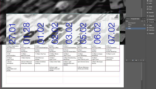
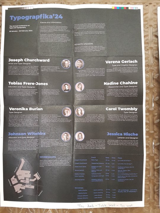
Pre-Final 2
Following feedback from class, I have updated the timetable brochure side and changed a few elements.
The table still needs some refinement and changing, but here are the changes I have made from the last iteration. I do not like how it spans across the whole page and has inconsistent spacing. It can be confusing to a reader or boring to read.
Body text left aligned
Speaker names left aligned and split onto 2 paragraphs.
Body text fixed (previously I edited the sentences shorter to allow a better fit) I have re-copied the original text into the document so that it is un-edited only formatted.
Workshop speaker names have been changed to white to match the others and get rid of the hierarchy that was in place.
Profile images have been adjusted to sit next to the speaker name. This creates a less confusing design and its clear who the photo belongs to. The spacing when they were in the middle was also too close.
The front and back cover have only had minor changes to scale and positioning.
I also moved the workshop paragraph below the Keynote speakers. This creates an easier understanding of the brochure since you read that there will be both workshops and speakers, and then you can go into reading about the speakers, and then see what the events are.
0 notes
Text
Week 6: Demo & Notes
Notes:
Hand-In Requirements: 12th April 5pm
Name - (name_surname_typografika.pdf)
Packaged InDesign file (including appropriately formatted links and fonts), press-ready PDF with crop marks and bleed, compressed into one ZIPped package
Physical brochure printed (100%), both sides, single-sided, flat (not rolled or folded)
URL for blog/research - research on the keynote speakers, concept development, ideas, progress screenshots, flat plans, experimentation, and reflection on design decisions.
Printing Notes:
Always check bleed and crop marks are correct. Delete all unused paragraph styles, character styles and swatches. Check the preflight panel. Have correct naming formats on the document because then it will be carried through to all the packaged document names and outputs.
Demo:

A tool that I have seen but never actually used or realised what it does was the rotate text tool. I would normally just use the text frame and rotate it manually. This will definitly help me make cleaner rotated text edits in the future.
Part way through we had created paragraph styles. We use the text rotate tool and edited our tables to accommodate. Make sure to use imagery that has the correct dpi straight away, this way you wont have to worry about them later if they are high enough quality etc.

Final version above. The styles and formatting has all been applied to match the pdf provided, with some colour changes and line style changes.
0 notes
Photo

Pre-Final V1
I want to say this is the final version, but I always find small changes or issues in my proof checks and classes. So this shall be pre-final V1. I also want to get feedback from a lecturer before finalising and printing. They always notice something I have missed. The fresh eyes help see other things as well.
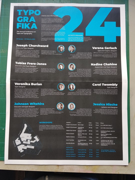
For these posters I updated the maps, colour, and timetable positioning to better suit the brief instructions and wishes. I did prefer the map on the bottom panels, but it makes more sense to have it on the back cover where it is easier to find. I’m also considering putting the timetable right under it so that its easier to navigate the events. This puts less strain on the reader so its a smaller distance between the map and timetable. The poster side has the icons inserted now. There is something about the poster side that is bothering me, but I’m not sure what yet, hopefully after feedback this will go away or get fixed.
I do think the style of the publication is quite structured and more business-like , but since I do not know how the event is presented and organisers, the best style is hard to nail. The brochure side feels a bit like a business conference or marketing conference kind of brochure, that's why it feels more business-like, but that also means it fits with a professionally designed brochure and is up to corporate standards.
0 notes
Photo

Print Tests
Above are A3 colour and layout print tests. They are scaled to fit, so the text and assets are not full sized. This gave me an idea of the colour shades and compositions. I can see from these that the older blue shades were too dark, and the lighter one is not quite the shade desired. The new poster layout also needs a few adjustments to fit better.
Full scale prints
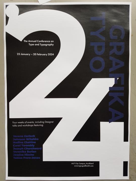
Full scale tiled poster on x2 A3 pages. This and the one below, have been assembled by leaving one overlapping flap and gluing the other page to that. The outter bleed and crop marks have not been cut out. After printing this I have a btter idea of what the final poster will look like, and some some small changes that need to be done. My speaker names at the bottom sit too close to the 4, The title text inside the 2 is not positioned very well, I think it would be better to align it to the left margin like the text below.

Full scale tiled brochure side below.
Changes to be made: The speaker images came out a reddish tint due to colour mode issues. They were created in Cmyk, so I’m not sure why they came out tinted, but to fix this I changed them all to Greyscale. The Timetable text needs to be slightly larger for legibility. The map has been adjusted for visibility. The Back cover has now got added details and the map on it as requested by the brief. The Front cover scale and positioning needs small changes to sit better. The blue colour needs to be updated.
Full scale old poster printed on x4 A4 pages. This printed poster did not have overlap set, and as you can see there are bits across the middle that have been cut out when printing.

0 notes
Text
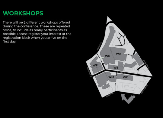
Updated Map & Icons
Icons created to represent Facebook and Instagram. I created these with the pen and shape tools. I rounded the square edges to resemble the icons better, and used my colour palette instead of the originals. These will be used on the poster side next to the website text, and on the back cover of the brochure.

The map was a bit confusing when placed on a black background, so I added blue roads to make them stand out better. This also makes it match the rest of the document better.

0 notes
Photo


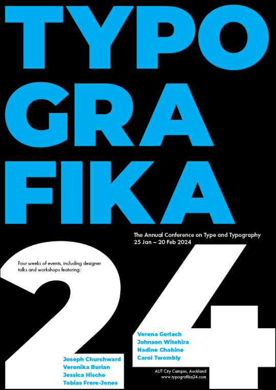

Poster Iterations
My poster felt a bit boring so I tried creating a few iterations and different layouts while adding the blue shades. These above are the old blue shade which has been finalised below. I printed out some of these posters to see how the colour and layout looks off the screen. The prints will be in the next post.
For these posters, scale, hierarchy and position was highly considered. I wanted to create posters that are clear and understandable, but also interesting so the someone walking past will actually look at it. A poster is quite useless if it doesn’t catch anyone's attention. The blue and white on Black creates a high contrast that will catch the eye of a passerby.
0 notes
Text
Week 5: Workshop
When finishing up your document:
Delete the text sitting outside your canvases
Check all errors in the preflight panel
Check all links
Check for text errors
Check the bleed is in the appropriate places
Check all naming conventions are easily understandable by others
Check hidden characters for spaces, soft returns, paragraph breaks etc
Image Below - To check your styles there is a tool at the top right of each style panel. This will show you what text has not got a proper style applied to it.
Select all unused option in the hamburger drop down for styles. Delete the unused styles to create a better workspace and easier for others to navigate through.
Links:
Check your links in the links panel and make sure everything is correctly linked.
Change the DPIs to 300 if possible.
Check the effective PPI is equal numbers (if not it means I have changed the dimensions by accident)
Print ready:
Press ready PDF - (Press Quality) Bleed, Crop marks
Output - no colour conversion
0 notes
Text
Week 5: Colour Theory & Notes
Hand-in Requirements.
Due 12 April
Packaged files and zip.
Physical Brochure printed in 100%. single sided sheets.
Buy envelope for A3 or roll.
Adobe 2016 conference brochur edesign
Colour Theory:
https://color.adobe.com/create/color-wheel
A colour wheel below showing the different hues, brightness, and saturations of RGB.
As you move around the edge of the wheel, your colour and hue changes. Moving into the middle or out changes the brightness, and using black would do the same.
Colours that sit next to each other are called analogous.
Complimentary colours sit opposite each other on the colour wheel and have the highest contrast in hues.
Monochromatic is different brightness and shades of the same colour.
Analogous colours below.

Extractor tool below:
You can also use apps such as adobe capture, or the extractor tool on colour.adobe, to capture the colours from an image or real life.

0 notes
Link
Typographic Poster & Layout Examples
More examples for my new iterations to come.
This was on a typographic course on Behance. The examples suit my project style and typeface. I shall try recreating some of these layouts and then creating my own posters inspired by them.
0 notes
Photo


Poster Iterations
I have been testing other compositions to create a more enticing poster.
The first poster iterations feels a bit boring and bland. After adding colour it has helped it become more interesting, but it still feels like something is missing.
To solve this issue I’m going to create many iterations until I find the issue and a solution.
0 notes
Text
Considering Colour
Colour was at first not considered. I started with Black & White to focus on composition, layout and scale first. Now that I have my design layouts working, I can add colour to highlight areas and section parts of it. This will also create different contrasts which can be used to my advantage.
Colour plays an important part of design. Colour can be used to show personality and target specific audiences. Many colours are commonly aimed towards children as it is more playful and friendly, while reduced colour palettes are aimed towards modern adults. These colours selected, paired together create a sense of excitement, and sophistication in the designs. This helps me target my audience and create an eagerness for the viewers to attend the event.
Black - Black is often associated with sophistication. Black is also associated with mystery, power, and elegance. Some negative meanings of black are death and darkness. This helps create a strong contrast with white. Black is also very common and most people won’t put a meaning to it, but will still feel a sense of sophistication and maturity from it.
White - Innocence and purity are the most common associations with white. It is also known to portray emptiness when there are large amounts of it. The reason for using white is simply because it is a more neutral colour that most people will not put meaning to. Text in white is very easily readable on dark backgrounds compared to a colour.
Blue - Blue is commonly associated with the ocean and the sky. It brings a sense of calmness and trust. Blue can also have negative connotations though, such as depression and sadness. To lower this effect, the blue tone in use has a purple tint to it.
Purple - Purple is known as a royal color. It represents luxury, wisdom, nobility and creativity.
Graph below - emotions associated with colours:
https://www.oberlo.com/blog/color-psychology-color-meanings#:~:text=In%20color%20psychology%2C%20black's%20color,an%20easy%20color%20to%20read.

0 notes
Photo

Print test
I did a print test for colour and clarity of 2 poster iterations. This was to see how things would be in person and not digital on a screen. I also wanted to test the green shade as a background to see how it would come out. I have decided that my posters will be printed as a matte instead of the glossy shiny print shown here. I need to make sure it doesn’t print flat though, because black as matte can make everything flat and the white wont sit as contrasted on it. A solution for this is to use “rich black” rich black is C50 M0 Y0 K100. It has a blue undertone which creates a richer feeling and deeper black.
0 notes
Photo


Updated Design
Above are the new layouts and my best so far.
Timetable: (The front & back covers haven't been designed yet and the map goes in the space at the bottom left, this is to focus on the speaker information and layout.) The images have been inserted and the green is a placeholder colour. Plain B&W looked a bit “in your face” and very contrasty. This does work well, but I thought some colour was necessary to break the busyness a bit. I also wanted colour to highlight and separate sections, such as the workshop speakers and timetable, without changing the design style of the text. The design does feel a little bit busy at the moment, and there is not enough negative space to give the reader a break at the moment. I either need to size my body copy down to create more space, or play with layout more.
Indigo Timetable: I selected a random indigo shade with my colour tool. This will be improved upon and a test print will be needed before finalizing. I have to check if the blue is legible on a black background once printed, and how it will look on the poster side as well. I can either replace black with a singular colour, or add highlights like this. I will explain the colour choice in another post. I do not want many colours, only 2-4, this makes a design look more professional and not aimed towards children.
Poster: After a bit of feedback and CC, I have “featured” the speaker names instead of just having it in the paragraph like before. I agree this adds a better emphasis and makes the speakers look more important and interesting. This also fills up the empty space I had before. I also fixed the widows and orphans I had in the paragraphs, and removed the extra “2024″ at the top. I still need to add the Facebook and Instagram icons to the poster, as was requested by the “client”.
Here is another layout. The bottom of this one feels too cramped however and the timetable text is smaller than all the rest which isn't good. There are also funny empty spaces that aren’t being designed properly.

This was the first layout attempt before adding imagery and the map. The map was going to be in the top right as the back cover, however I think the back cover should be designed better and not have just a map on it. I am now going to add “more information” type of content and a design to match the front cover instead. The timetable wasn’t fitting in the designated space here without crossing over the folds. There was also a large empty space at the bottom which feels out of place. This does give the reader a nice break before moving onto the workshop hosts. The text circled at the top is also standing alone and could be shifted or adjusted so that the text isnt all on that singular section.

Maps:
The map has been created and improved on since the class. I adjusted the colours and shapes so that it would sit better on a black background (might be changed still)
This map has a higher contrast than the one below, but it isn’t as legible, and doesn’t match the rest of the design that great.
This map suits the design style better and is more legible, but still feels like it can be improved upon. The grey at the moment isn’t used anywhere else so stands out quite a bit. I tried white but it makes it very contrasty and harder to focus on.

0 notes
Photo


Week 4 - Activity & Map
Learning and improving on the pen tool, and refreshers on pencil, line, and brush tools.
Learn the hotkeys alt for different angles and
Draft colours & shapes.
0 notes
Text
Feedback:
Printing tiles: The way I did it was correct, but I had no overlap and had an issue with my printer/pdf paper sizes. Have a 5-7mm overlap (this will make it easier for the cutting process).
InSitu Proposals are due Thursday (optional).
Poster Design:
There are some widows. How can I “feature” the speakers names. Watch out for matte paper - maybe use rich black (50% cyan, 100%black).
Remove www.?
Timetable: Split into columns, the full lines are more tiring to read.
0 notes