kanaunara
whimsically || 幻想的
Multi-fandom shenanigans.
12 posts
Don't wanna be here? Send us removal request.
Last Seen Blogs

tayorikami
Taylor Lynn

2011stilimited
Untitled

crich4you
Cric Highlights 4 You

sansa--starkers
sansa_starkers
Text
HIIRAREFS: Basic and Intermidiate guide to colouring in
What better day to end the year then with a basic guide to colouring- This is for beginners or intermediate artists. Colouring is a big part to an art piece, whether you decide to use colours or not, that’s up to you, but for the most part, having some knowledge on appliance of colour will really help you out!
____________________________________________
ARTISTS WITH AN INSPIRING KNOWLEDGE OF COLOUR APPLICATION!
Please take the time to have a look at other artists work so that you ca research and get inspired!
Gullacass: Uses brights, dulls and pastels to create brilliant guro, pop and macabre pieces| DA + TUMBLR
TinyCalcium: Old friend of mine who explores brights and mustard colours and places them as a foundation for their work | TUMBLR
BeastPop: Talented with opposing and Triwheel colours. Outstanding cell-shading, and knows how to flexibly bend colour form to their will in popart. | DA
H0stel: Fantastic composition of light direction and applies colour to bodies based on ambient occlusion. | TUMBLR
_____________________________________________
COLOUR SLANG:
I use some strange slang to express colour types and shades as well as groups. Although they may not be canonically correct, I will use these terms to describe colour palates to the best of my ability!
Analogous: Colours that are near or adjacent to each other on the colour wheel, EG: Red and Orange

Oppositional/complimentary: Colours that are opposed or opposite from each other on the colour wheel, EG: Cherry and Green
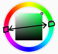
Triadic: Colours that form a triangle on the Colour wheel, EG: Cyan, Magenta and Yellow. These three colours when mixed together will make black.

Arrowtype/Quadcolour: Four colours, that generally form an arrow shape on the colour wheel.

Tetradic: Colours that form a rectangle or square in the colour wheel

Neons: The very brightest you can get a colour, be careful where you use them as they can look ugly together at the most. Try to use neons when you are adding bright glowing objects to your piece. Neons are great for highlights.

Brights: Slightly washed Neons. Appropriate if you have characters that are colourful.
Washed: Very washed brights with a hint of grey. These are also useful for colourful characters.

Pastels: Colour with white in them to make them seem light.

Baby Pastel: Pastel with even more white in them, good for subtle highlights.

Darks: Colour with black added to them. Used mostly for lineart.

Mustards: Colours with dark grey added to them

Earthen: Colours with brown added to them

Warm and Cool colours: Warm colours are colours that range fromMagenta to Yellow. Cool ones range from Lime to Fuchsia.

Straight tones: A greyscale palate. or a straight scale of one colour from black to it’s neon form.

Warm and cool tones: Warm tones are a greyscale mixed with warm colours and cool tones are greyscale mixed with cool colours.

Skintones: Warm washed or pastel colours generally used to colour in skin, but they don’t have to be warm at all! ( I will not show you a palate for this however)
______________________________________________
WHAT TO AVOID WHEN COLOURING:
beginner artists, tend to go ahead and start by colouring their line art with neon and mustard colours. Neons are not necessarily good for base colours unless the character has a glow.

I often see lazy attempts to shade, often a beginner artist with use an airbrush and use black and white to shade and highlight their piece. This is not very effective, and I’m sorry to say… It’s kind of gross as well. Try to avoid being lazy. If you have a piece that has bold black lines, avoid using soft shading and airbrushing at this point of time.

Black and white isn’t always the best option when colouring in your piece, but it also depends on the style you are trying to convey. If you plan on only using straight tones to colour in a piece, black and white is good.

A GOOD BASIC WAY TO COLOUR
For this basic tutorial I will show you a nice way to colour in a piece with bold lines. I will be using Minty’s Classic character as an example.

Begin with using brights that have been washed down a little and washed skin tones if your character is human based. Avoid using neons or mustards if you are able. If there is white on the character, such as the white on an eyeball or the teeth, consider using baby pastels. For Minty’s eyeballs I have used a baby pastel blue. I have chosen to use a darker and more washed version for her Irises.

With you foundation colours placed down, use a washed warm colour for the skin tone, such as a salmon. If the character’s hair or fur is warm coloured, use a pink or red orange to shade that as well. Use the cell shading technique. This may mean you will have to erase some of your shading so be sure to do this on another layer. For your baby pastels, you can use a regular pastel to shade it. For Minty’s eyes I have used pastel blue and lowered the opacity by a little.

For Highlights, I have chosen to use baby pastel yellow. I wanted the piece to be warm.

Applying a light airbrush over the top of the piece makes it feel a little softer. I have also applied the airbrush over the initial borders to create colour bleed, giving a very subtle reflective approach.

Colouring your line art layer, particularly if you have bold lines, can really make a piece look more interesting! I like to leave the overall outline black. You can gradient and bleed colour in your line art as well

Light tracing is a technique lots of artist’s use, where they run a sharp line of highlight next to line art to divide borders.

This looks a lot nicer than the black and white shading, doesn’t it!?
__________________________________________
This is a very very simple guide to applying colour to your piece! If This helped, please reblog and share this guide around!
If you have any questions or feedback, don’t be afraid to send me a message!
135K notes
·
View notes
Note
May I please use one of your edits on my blog if I credit you?? The AoT Levi and Mikasa Psycho Pass crossover?
Yup! Go right ahead. :]
0 notes
Text
Odin Sphere 100 x 100 avatar batch
Throwback Thursday! A batch I made back in 2008.
Credit: Kanaunara Fandom: Odin Sphere
#Icons: 25 + 30 variants
6 notes
·
View notes
Photo


Favourite fonts (a resource list):
a theme for murder | ambulance shotgun | angel tears | bebas neue | arvil | bambi bold | cassanet | century gothic | cooper black | couture | disco | eraser | franklin gothic | geared slab | gladifilthefte | habarahand | intro | kabel | leafyshade | oldystyle | ranger | airbag | metropolis | IM fell flowers | tetradecorative | ruritania | reed of love | lucida sans unicode | bookman old style | lobster | ptf nordic | xtreem | feast of flesh | blanch | justus | brokenmustangs | snickles | walkway | muchacho
39K notes
·
View notes
Note
can we use your psycho-pass x snk renders on our blogs?
Yes! Please feel free to do so; that’s why I shared them. Linking back to this blog would be wonderful but not necessary as long as you don’t claim it as all yours. :]
#Shingeki no Psycho Pass#answer answer#I actually need to update the files but haven't had time#if you need it larger please message me off anon and I can upload for you#anononon
2 notes
·
View notes
Note
what's the font you use for the psycho-pass x snk crossovers? you know the text that says attack on titan what font is that thanks
For the ATTACK ON TITAN part, I used OCR A Std, and the Kanji is DFKai-SB. I had to put both through filters and slash at the text myself to get it to look damaged the way the Psycho-Pass words looked. Sorry if that isn’t helpful.
1 note
·
View note
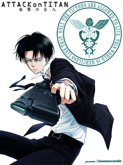
Photo
Transparent and partial reconstructed for whatever you like.
Please don't repost or claim as your own. Credit or link back is welcomed.
Levi only version here.
I track "Shingeki no Psycho Pass" btw~
#Shingeki no Psycho Pass#shingeki no kyojin#attack on titan#rivamika#snk edit#transparent edit#sorry this took so long#sorry I can't reconstruct feet
719 notes
·
View notes
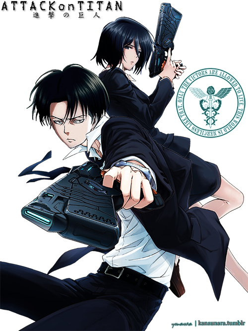
Photo
Transparent and partial reconstructed for whatever you like.
Please don't repost or claim as your own. Credit or link back is welcomed.
Levi/Mikasa original version here.
I track "Shingeki no Psycho Pass" btw~
#Shingeki no Psycho Pass#shingeki no kyojin#attack on titan#Levi#Rivaille#snk edit#transparent edit#sorry this took so long
2K notes
·
View notes
Photo
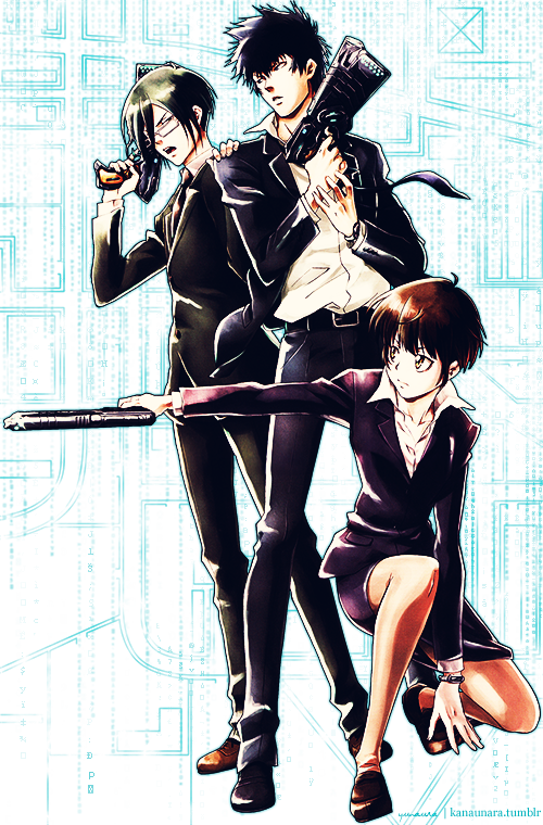
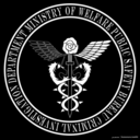
Pray for what deserves for your malice
And as you wish, to you
I will bring j u s t i c e
Division 1 transparent edit.
Shows up best on darker backgrounds.
#Psycho Pass#Ginoza Nobuchika#Kogami Shinya#Tsunemori Akane#psycho pass edit#transparent edit#I just really wanted to try this out#I'm open to critiques
85 notes
·
View notes
Photo
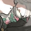
Destroy them, b e f o r e they destroy us.
We’ll pay for our k a r m a and go together
a nameless m o n s t e r …

#SnKPP#Shingeki no Psycho Pass#Shingeki no Kyojin#Attack on Titan#Psycho Pass#Mikasa Ackerman#Levi#rivamika#cross overs#snk edit#psycho pass edit
9K notes
·
View notes