
recoveringfrankenstein
Recovering Frankenstein
A Study in Redesigns and Visual Rhetoric
7 posts
Don't wanna be here? Send us removal request.
Last Seen Blogs

jessicaamico
Jessica Amico - Photographe

vashwood
fave
jessicaamico
Jessica Amico - Photographe
johnjunipersbiggestfan
IEPYTD FANPAGE

prleaguebib
Premier League Teams (BIB)
Text
Rationale
As a book collector (or hoarder, depending on how you choose to look at it), I have always been drawn to the design of the book along with its content. I have even bought books on a whim based on its cover's eye-catching aesthetics. Typically, this ended up working out in my favor, but probably means I was playing right into publishers’ and advertisers’ hands.
In this study, I am using the classic novel Frankenstein by Mary Shelley to analyze significant designs and redesigns the book has gotten over the course of the original publishing date into modern times. A “classic” novel is one that has made a significant impact on literature, and society as a result. A reason behind choosing this novel is, quite simply, because it is one of my favorites. It’s a book that I not only admire but also have no doubt no matter how many times I look at its covers, at reviews of it, and potentially come across some embarrassing cover redesigns, I will still love it.
Most novels’ covers from their initial printing, especially since the 1900s, have gone through a redesign—whether it’s by using different styles of font, colors, images, or adding any phrases to the book cover. This is all mostly done in an attempt to keep readers’ attention, draw new attention, or give collectors a reason to continue purchasing these books.
Research questions I’d like to answer are: how can theories of visual rhetoric help us understand book covers and redesigns? And, what trends can be found with the redesigns of Frankenstein? Additional questions that I hope to address are: what was the reason behind choosing certain styles of artwork, fonts, or colors? Was there a correlation between designs and historical events or trends going on at the time?
To locate the majority of these book covers, I am using keyword searches online, especially Google images and Goodreads. Established research I plan on using will be several articles that surround visual rhetoric and putting that theory into practice. “Gestalt Theory and Instructional Design” and “Toward a Theory of Visual Argument” by Birdsell and Groarke will help support my analysis along with “Framing the Study of Visual Rhetoric: Toward a Transformation of Rhetorical Theory” by Sonja K Foss, “Looking at Picturebook Covers Multimodally” by Sunderland & Mcglashan, and others relevant to understanding this connection.
We will go through each source individually to tie into the historical covers of Frankenstein. Book covers and their redesigns will be analyzed and compared to each other. Using this blog, I plan to break down concepts into “posts” with images included and corresponding with analyses.
1 note
·
View note
Text
A Brief Historical Glimpse
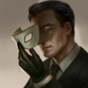
Analyzed in a historical context, book cover designs can be used to understand points of time when certain trends and popularities were taking place. By using fonts, images, styles, and tone, the developments of the dust jacket—which was originally used to keep books safe from dust and other damaging elements—over time has shown to play a role in how a book can garner attention and be made “marketable”. A dissertation by Larimore is the product of using historical aspects to study trends with the result of creating her own book cover designs. The font styles used in most of Frankenstein’s redesigns from the 1900 edition to the 1956 were more simplistic--they didn't detract from any image on the cover. Dark colors are still used often on Frankenstein book covers, demonstrating the idea that horror is instantly connected by dark colors for readers.
Dust jackets were common to manufacture with hardback books starting in the 1890s. It was at the beginning of the 1900s that book publishers’ main goal was to sell books any way they could think of—one of those ways being using eye-catching packaging. Artwork was limited until an increase in technology during the mid-1900s, but resources for printing books were accessible, making books cheaper to print and cheaper to buy. The Penguin Publishing Company began popularizing paperbacks during the 1930s, and people were more inclined to buy these less expensive books while suffering through the Great Depression and being between world wars.
In the early 20th century, print publications were the main source of information and publishers recognized a necessity for book covers to attract the attention of people passing by newsstands and book racks. After the Industrial Revolution, books were more easily produced, which eventually gave way to more publishing companies being created, and therefore, more competition to sell books. Literacy rates were increasing, and this was the dawn of popularity and funding of public libraries, which was gaining more traction in Great Britain and the United States. This inspired a social aspect to reading and led to book clubs being formed. More people were also inclined to purchase these inexpensive paperbacks to add to their own personal library.
Drucker, Johanna, “History of the Book,” 2018, https://hob.gseis.ucla.edu/HoBCoursebook_Ch_10.html.
Larimore, L. Book Jacket Design and Its Cultural Significance (Doctoral dissertation).
#book jacket#book cover design#history#culture#frankenstein#literacy#industrial revolution#publishing
0 notes
Text
Resemblance & Representation
Moving into Frankenstein’s redesigns, in most covers that Frankenstein’s monster is used, he is depicted as an obvious “other” and inhuman. According to David Birdsell and Leo Groarke’s Theory of Visual Argument, immediate visual context uses a combination of images, gestures, and facial expression to convey an argument or story. Visual culture refers to the influences on how visuals are perceived depending on time and setting which can change over time. The 1882 edition depicts a tall, broad-shouldered man towering over an average-sized one. Though they are both wearing the same style of clothing, it’s obvious who the “monster” is.
The difference between “resemblance” and “representation” as explained by Birdsell and Groarke is interpretation. Resemblance pertains to the concept of appearing in a similar fashion to what is captured in an image or artifact. Representation is the concept of depicting what is contained in an image or artifact as a way of creating a narrative that closely relays information about the subject. Both of them can be interpreted in the same way, but when it comes to how closely an image or artifact resembles or represents the subject, resemblance tends to lean towards generalization while representation is inclined to be more specific. The monster depicted on covers depends on the viewer’s knowledge and understanding of what he represents and resembles. He still resembles a human while representing what can be accepted as “other” or “monstrous”.

Birdsell, David S. and Leo Groarke. “Toward a Theory of Visual Argument.” Argumentation and Advocacy 33 (1996): 1-10.
0 notes
Text
Empathy for the Monster
Book covers communicate a message to readers that need to be analyzed. In Megan Brown’s article, she uses books featuring characters with Dwarfism to exemplify the types of messages received from visual communication. Book covers are the initial interaction between the book and reader, so what is being communicated by covers of stories about dwarfs and how they’re being depicted? Brown concludes that depictions of dwarfs have been and continue to be stigmatized in certain ways. Stories about dwarfs have the opportunity to educate and connect people who do not have this condition to better empathize with this group.
Reader/Viewer response plays a role in how someone will interpret the image and text combination they see on book covers. An issue Brown found with Reader/Viewer response working against the reader and represented characters is when those characters on the covers did not match with how they were depicted in the content of the story. “…visual representations...provide the initial interaction between the reader and the dwarf character" (Brown, 2020).
The 1900’s redesign began adding stitches to the monster’s skin—his face, hands, and arms—with him looking downward. “While the brain takes in the cover art, the mind makes a judgment based on the whole, subconsciously observing colour, structure, space and adapting the image accordingly” (Brown, 2020). The monster looking downward gets used a few times throughout the redesigns. Any reader that first sees this element on the cover might instantly have felt a little sorry for this monster and been enticed to read the novel to see if they would actually empathize with him.
Brown, M. (2020). Dwarfism on display. Journal of Literary & Cultural Disability Studies, 14(2), 203-224. doi:10.3828/jlcds.2020.11
0 notes
Text
Multimodality Used in Book Covers
Visual rhetoric is in flux of gaining more prominence outside of the traditional routes, such as paintings and drawings. “This means that rhetorical theory also includes the study of visual and nonverbal elements” (Foss, K, 2009). According to Sonja K. Foss, theories of rhetoric have gone down a more visual path to a whole new form of studying how people communicate—with images, objects, and symbols. Scholars are now paying close attention to what these artifacts mean as a form of message, and one of Foss’s areas of interest with this form of study is ensuring that these visual materials can also be understood by those who are not in the field.
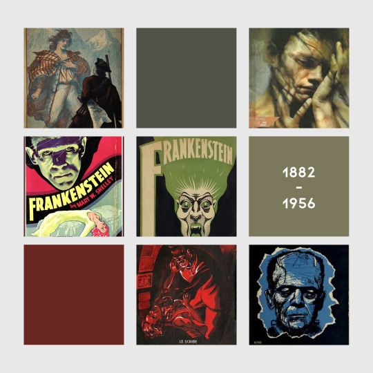
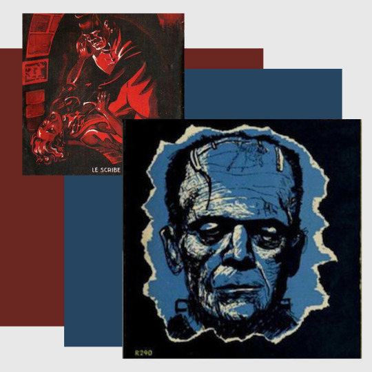
With multimodality in mind and a necessity for understanding the human experience in different ways, “rhetorical scholars are analyzing photographs, drawings, paintings, graphs and tables, interior design and architecture, sculpture, Internet images, and film” (Foss, Defining Visual Rhetorics 2009). Frankenstein’s monster is consistently creepy in each of the redesigns, even up to 2003 with a painting of a naked man crouching with what looks like a grimace on his face, perhaps trying to hide something from whoever is looking at him (the reader, perhaps).
Levy-Aldema poses an exploratory discussion with an analysis of visual thinking in his article, "Visual images on the covers of scientific journals and books—Needed or decorations?", and questions if scientific journals and books need an image on the cover. The process of creating an image for a cover is broken down by Levy to show that it’s a conversation between parties, including the author(s), publisher(s), and artist(s). Using visual aspects to communicate and interpret covers allows readers to define their own understanding with image and text, what Levy-Aldema calls visual thinking. (Levy-Aldema, 2015).
Visual language is mentioned as including basic elements (i.e. line, color, shape, etc.) and its importance lies in the fact that art and symbols are how humans have communicated, historically. This article was helpful as a supportive argument for studying Visual Rhetoric in regards to book covers and how they’re used not only as an advertising tool, but as a communication tool. Image and text work together on covers of books to convey potential content, themes, or genre, which could then lead to a reader either selecting a book or not.
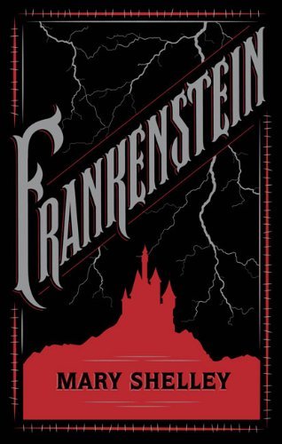
In Fall 2020, I conducted a focus group consisting of family members. Included were covers of Frankenstein starting from the earliest editions to the most recent designs. While showing them the images, they discussed with me and amongst themselves their first reactions and thoughts. A design by Barnes and Noble in 2012 was the most liked one overall, besides one referencing a Boris Karloff image (more on that later). This cover was simple with a black background, a silhouette of a castle in red, and lightning above it with the title taking up about the middle part of the cover. Participants felt like it gave them the idea that this is in the horror genre while making them wonder what the lightning and castle could be referring to in the book—which was a positive for them. “It’s simple, but still gives an idea of what’s going on—that it’s a scary story,” said one of my sisters.
Foss, Sonja K. “Framing the Study of Visual Rhetoric: Toward a Transformation of Rhetorical Theory.” Defining Visual Rhetorics, 2012, 315–26. https://doi.org/10.4324/9781410609977-19.
Levy-Aldema, Y. (2015). "Visual images on the covers of scientific journals and books—Needed or decorations?" Substance Use & Misuse, 50(8-9), 964-967. doi:10.3109/10826084.2015.1021624
0 notes
Text
Gestalt Theory & Frankenstein
A visual artifact’s message needs to be “connected, coherent, and complete” based on its use of Continuation, Figure-ground Segregation, and Symmetry & Order from the Gestalt Theory. The law of good continuation says that “people tend to continue shapes beyond their ending points.” Continuation is a principle that might be used in book covers along with Symmetry & Order if the elements meet expectations that fulfill the viewer’s instincts of where their eye naturally follows. Additionally, elements will need to be distinct from each other and their background to meet the Figure-ground Segregation principle so that each can be deduced by the obvious differences—for example, not only between fonts, but font colors and the fonts compared to the background image. Everything needs to stand out on its own.
In the case of book covers, applying most or all of these concepts will make them effective in their message. For example, a title with a tagline can aid in this connection along with any visual elements. To reference the concept of visual culture again (which refers to the influences on how visuals are perceived depending on time and setting) in combination with Gestalt Theory principles, the below artifact can be analyzed in these ways.
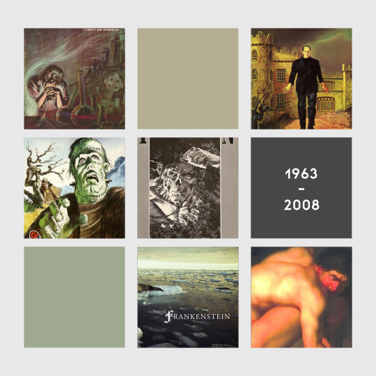
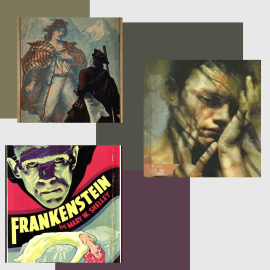
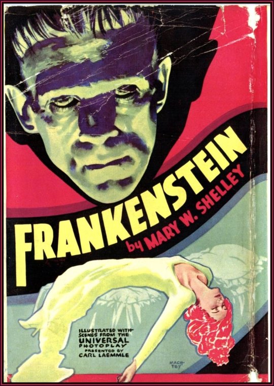
Once 1931 came about and Boris Karloff had been cast as the movie version of Frankenstein’s monster, his face and the way the monster is depicted with a square-like head, bolts in the neck, and obvious dead-looking skin became a popular image to use on redesigns. Incorporating the movie version of Frankenstein in any covers of the novel was a way to entice readers that may have only seen the movie to try out the book. This idea is used most any time a novel has been turned into a movie.
Keeping this in mind and using information from the focus group with my family, it was significant when they were shown a cover from the 1930s that tied completely with a movie poster from the Boris Karloff monster in Frankenstein, they all recognized it as an iconic image. Using the Similarity rule of Gestalt Theory, which is when elements resemble each other in shape, size, color, or direction, the colors of green in the monster’s face match the bed; the red behind this face matches the woman’s hair and font color of the author; the yellow of her dress is similar to the title’s color. The colors, with their similarity, provide Symmetry and there are clearly defined elements with the head, its shadow, the woman, and the bed, creating Order as well. For Continuation, we can see the woman’s dress and hand flow off the cover, leaving the viewer to complete those pieces. Each element is easily distinguished on the cover from the human figures, to the bed, to the title and author name. The background allows the monster head to stand out with the red and shadow fixed behind it. Bold lines surrounding the woman’s prostrate form set her apart from the rest of the elements behind her as does the black banner the title and author’s name are fixed on, giving the viewer Gestalt’s Figure-ground Segregation element.
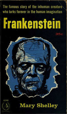
Another use of the iconic image of Karloff’s likeness as the monster is on a cover from the 1950s with the same image of the creature but cast in shadowy blues and blacks. This was one that was preferred by some participants because of its simplicity while also alluding to the genre and content, which is where visual culture comes into play. However, Gestalt Theory is about expectations of the viewer. So, what happens when those expectations are not met?
The yellow font of the tagline, the title, and the author’s name provide a small amount of Similarity, but it stops there when it comes to the visual elements of this cover. The only blue is coming from the likeness of Frankenstein’s monster as he is cast in blue. The aspect of Continuation is halted by the jagged lines surrounding the monster’s face. It leaves the viewer guessing as to what else to follow where the image is cut off. The jagged, torn, paper-like edging surrounding the monster offers no symmetry, nor does this singular visual element with the monster sitting off-center of the entire cover. When it comes to the Figure-ground Segregation rule, the yellow font certainly stands out from the black background, as does the monster’s visage and the jagged edging of the image. The simplicity of the black being the only background offers this element. However, the monster, being cast in blue and hand-drawn linework making out his face, blends in a bit by being slightly undistinguished from the blue. Subverting expectations, which is then subverting Gestalt in an image, makes the reader uncomfortable and aids in its horror appeal.
Moore, Patrick and Chad Fitz, “Gestalt Theory and Instructional Design,” Journal of Technical Writing and Communication 23, no. 2 (1993): pp. 137-157, https://doi.org/10.2190/g748-by68-l83t-x02j.
0 notes
Text
Frankenstein's Monster Depicted
In a study titled "Looking at Picturebook Covers Multimodally: The Case of Two-Mum and Two-Dad Picturebooks" by Jane Sunderland and Mark McGlashan, four picturebook covers were analyzed to gauge representation of co-parents and how text and image work together via visual representation and symbolic interaction. The authors explained multimodality as using different modes of communicating a message at the same time. These modes were divided into action, voice, other types of sound, gaze and facial expressions, image, and writing. The difficulty of communicating elements or subjects with picturebooks or book covers, especially that might be considered taboo, controversial, or sensitive, is that while words or text can skirt around the truth or the obvious facts and statements, image has a harder time doing that.
Much can be gleaned and assumed from a book’s cover—the title and image and how they work together to give clues as to what the content of a book will be. Visual representation and multimodality create a communication between the author, illustrator, and reader while symbolic interaction with signifiers can define what is meant by parts of an image in a certain context (e.g., a smile to mean happiness).
Because the cover is what is seen initially, illustrators and publishers also have to consider its appeal and potential for attraction or aversion. The concept, mutual enhancement, is used as image and text work in tandem. Just as Frankenstein's monster had to hide from society because of his looks, the redesigns cast shadows on him or put him completely alone. The cover from 1997 had him reaching out in front of him with mist surrounding him, but alone. It continues to give that horror element, putting the reader alone with the monster.
In an article by Istvan Csicsery-Ronay, Jr., the grotesque is defined as “a projection of fascinated repulsion/attraction out into objects that consciousness cannot accommodate” (Csicsery-Ronay 2002). Picture yourself watching a movie in which one or more characters has a feature that is outside the “social norm”, such as zombies. Most viewers may look away only to turn their eyes back to the figure, if they look away at all. The grotesque has always fascinated humans, so continuing that idea with Frankenstein book covers keeps readers looking and interested. Not only that, but it makes it more difficult to look away for some.

After analyzing these novels and genres, it can be reasoned that designs were dependent on a few factors: the publisher, illustrator, genre, social context, and the year. At a glance, most of the designs and editions of the book covers kept within a certain style portraying the genre. What is communicated throughout the life of a novel needs to be examined and appreciated as a discipline in the humanities. A future study that could be beneficial, not only as we are in the Digital Age but also getting to be post-pandemic, would be researching eBooks’ covers and how those have gained more popularity as book purchasing and reading moves online.
Sunderland, J., & Mcglashan, M. (2013). "Looking at Picturebook Covers Multimodally: The Case of Two-Mum and Two-Dad Picturebooks." Visual Communication, 12(4), 473-496. doi:10.1177/1470357212471474
Istvan Csicsery-Ronay, Jr. “On the Grotesque in Science Fiction.” Science Fiction Studies 29, no. 1 (2002): 71–99. http://www.jstor.org/stable/4241045.
1 note
·
View note