
reena-kk
Peace is a lie
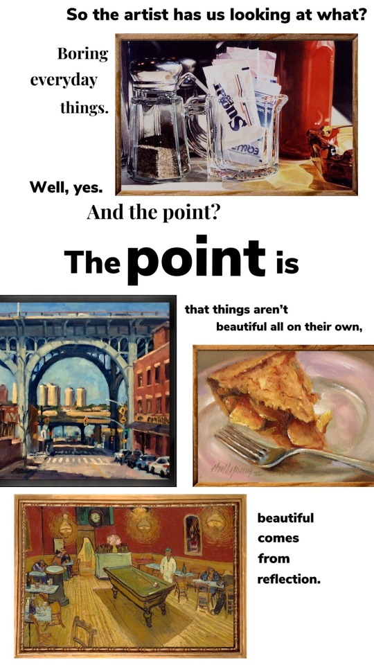
Stuff! Get me a coffee?
ko-fi.com/reenakk
sideblogs:
@reena-kk-art
@reena-kk-photography
56103 posts
Don't wanna be here? Send us removal request.
Last Seen Blogs

198d
(I'll peel back all of my skin)

neverkonnie
Art blogging

freshsweetsgentlemen-blog
cheap remy hair extensions

daefics
Daefics

Text
Viravos Season 5 Memes
I couldn't resist; I just finished the season and have so many feels! 😭
See this post for part 2 😄
*Under the cut due to spoilers & length.


115 notes
·
View notes
Text
Viravos Family Season 5 Memes
If you've seen it already, then you know what I'm talking about. 🤣
See this post for part 1 😄
*Under the cut due to spoilers & length.
Note: In the last episode of Season 5, Viren treated Sir Sparklepuff better than he's treated Soren in the past, so that inspired several of these memes.


221 notes
·
View notes
Text

6 notes
·
View notes


Text
Idk how to explain to you that the end goal has never been to turn oppression around and do it to someone else
34K notes
·
View notes
Note
Jak kerfuś zajdzie w ciążę to dostanie alimenty ? Myślisz że carefour da wolne ? Bo wiesz nie wiem czy po takim krótkim czasie zatrudnienia dostanie rodzicielski
Przetestuj i wróć z wynikami
36 notes
·
View notes
Text
Skew-T graphs will be the death of me
hi if you thought i’d strictly post art here well you’re DEAD WRONG and i am an UNHINGED METEOROLOGY MAJOR so here we fucking go hellsite
before i even get to the behemoth that is a Skew-T I have to talk about the previous lab I did so let’s talk about SOUNDINGS from a RADIOSONDE.
Every day at 0000UTC and 1200UTC here in the united states if a NWS station has enough helium and/or budget to do so they launch a WEATHER BALLOON.
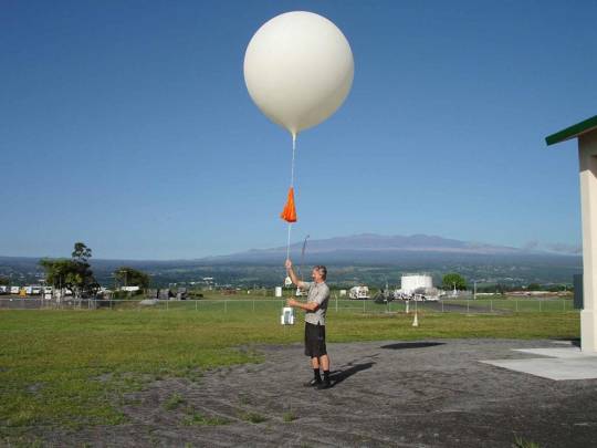
ATTACHED TO THESE IS A VERY IMPORTANT STYROFOAM BOX called a RADIOSONDE. They collect all the data as the balloon goes up including pressure, altitude, wind speed, temperature, dew point depression, a lot of important things. The data they collect is collectively called a SOUNDING and the raw data looks like this:
72235 TTAA 67121 72235 99000 21017 19009 00089 ///// /////
92761 16015 19531 85482 14650 20036 70094 05873 21528 50576
12560 25060 40742 25746 25061 30944 42759 24566 25064 49769
25586 20209 54583 25588 15390 61181 26582 10638 67979 26553
88119 67779 24568 77176 26099 41116 31313 58208 81106 51515
10164 00000 10194 19530 20031=
and so on there are like two other parts that look a lot like this.
I’m not gonna tell you how we decode these but basically at required pressure levels such as 1000, 925, 850, 700 hPA, etc. it tells us the temperature, dew point depression, altitude in geopotential meters/decameters, wind direction, and wind speed. The next two parts say the same stuff but at more levels and are more specific.
ALL THAT SHIT gets put on THIS FUCKER.
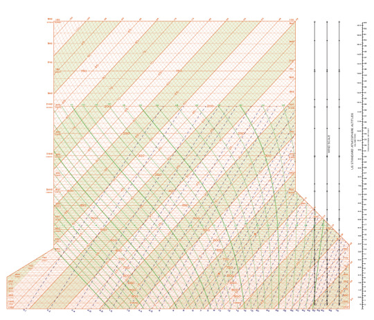
THIS IS CALLED A SKEW-T DIAGRAM.
i have to plot DATA on THIS for my lab due TOMORROW which is already late because I missed two crucial days in class due to mental health and my dog being sick so I’ve been taking notes on them ALL WEEKEND.
I love data as much as the next STEM major who loves data, but which dumbass decided that we were gonna make a menace of a graph that tries to fit as much information in a single goddamn thing as possible? I have no clue. Here’s what you get to know about this.
The horizontal lines with labels in the middle of them reading numbers like 1000, 950, 900, in intervals of 50 and using hectoPascal units are ISOBARS. These are lines of constant pressure and in meteorology we use these because pressure levels are far more relevant than altitude, and how high or low they are moves around so it’d get even more confusing even quicker if we actually used height (which we do but not right now I have enough on my plate).
The diagonal orange lines with the positive slope (so they point like [ / ] ) are called ISOTHERMS. If you’re already catching on you’ll figure these are lines of constant temperature which in this diagram is in degrees Celsius labeled I think within the respective isotherm here. The labeling schemes are not actually standardized which makes me want to strangle someone but I better get over that fast because there’s a lot of shit like that in meteorology. USUALLY they’re labeled at the bottom of the chart but not here because fuck me i guess.
Those are the easy ones. NOW I GET TO TALK ABOUT ADIABATS.
oh my god are they even. where the fuck are my dry adiabats. OH GOD I HAVE TO SQUINT
The very faint orange lines in the background that like, fuck, how do I describe them. The faint orange lines that look like they’re perpendicular to the isotherms (they are not) but are actually curved like the bottom half of the letter C are called DRY ADIABATS. These are lines of CONSTANT POTENTIAL TEMPERATURE. What the fuck does that mean? GOOD QUESTION.
Dry Adiabats indicate the rate of change of the temperature of a parcel of dry air rising or descending adiabatically, meaning with no loss (or gain) of heat by the parcel. For each multiple of 10 degrees C, that Dry Adiabat shares its label with the respective Isotherm reflecting the temperature of its point of intersection with the 1000 hPA isobar. If your eyes glazed over and you didn’t understand a word I just said, that’s fine. Me neither.
So what’s constant potential temperature? It’s constant temperature we THINK it is. So that line could, potentially, represent that temperature. Maybe. I love science.
The green lines that make a really stretched out S sometimes, I don’t know how to describe these, these are called SATURATION ADIABATS, or MOIST ADIABATS, or SATURATION PSEUDO-ADIABATS. Nothing is standardized and I am suffering immeasurably. They represent lines of constant equivalent potential temperature. What the fuck does THAT mean?
GOOD QUESTION! They represent the rate of change in temperature of a rising parcel of saturated air, assuming all condensed water vapor is liquid and falls out as the parcel rises (this is known as the pseudo-adiabatic assumption). Before you ask, I don’t know either. Pseudo-adiabatic dude just trust me.
Saturation Adiabats are labeled with the celsius temperature value of its point of intersection with the 1000 hPa isobar, and they share that label with the dry adiabats and isotherms.
Finally, the dashed lines with the positive slope are called SATURATION MIXING-RATIO LINES. AKA: HUMIDITY MIXING-RATIO LINES. They represent constant values of water vapor capacity, meaning the number of grams of water per kg of dry air required to saturate said air at a particular temperature and pressure. They’re confusingly and terrifyingly labeled at the bottom of the diagram with a range of 0.1 g/kg to 40g/kg in parts of water vapor per 1000 parts of dry air. Because the vapor capacity of air varies non-linearly with temperature, the intervals for labeling these are NOT uniform.
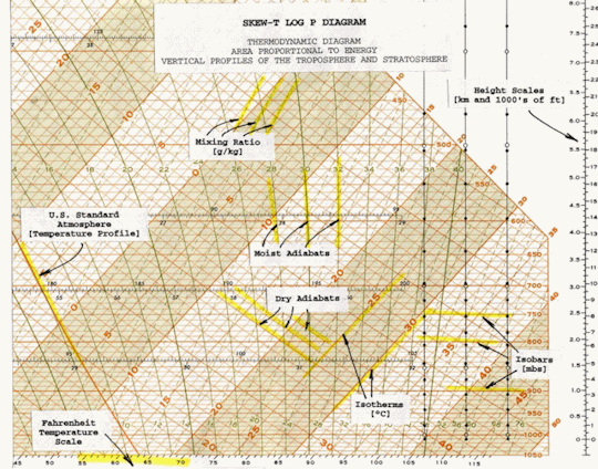
Congrats that’s all the lines, here’s a image that tells you that quicker and better:
oh yeah and on the right side Wind is plotted somewhere just like it is in any other weather station plot with the flags and the staff in the direction the wind is coming from etc. etc. yeah.
I wrote this while procrastinating on this exact assignment I had to decode a sounding and now I have to plot the temperature and dew point lines on one of these fuckers see y’all later for another stupid weather rant wahoo if im wrong on anything I’m sorry mostly to myself because that means I’m about to fail this lab bye bye
19 notes
·
View notes


Text
internet search tips on how i sift through junk or mischaracterizing content when looking up visual animal references:
Use the scientific name instead of common name for less false ID (especially if you want to see real wolverines or jaguars instead of the x-men or car maker)
Instead of “baby“, try “juvenile” or a more species specific term (bird=chick, bovid=calf, carnivoran=cub, etc..)
If it’s a rarer animal without many results try searching its name in a native language, it’s usually on wikipedia
Search the scientific name in inaturalist for multiple party verified ID sightings with locations
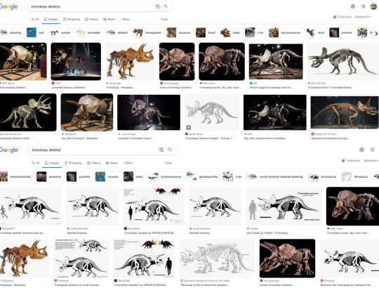
Searching “skeletal” in place of “skeleton” gives different results and usually less products
try adding “zoo” to your search if you want to look at over-exploited viral species like otters, foxes, primates, or exotic cats. there can still be shady zoos but it weeds out videos of animals in people’s living rooms
Add “vet” if you’re searching for reference on how large/small an animal looks next to a human instead of exotic pet vids. vets and zoos can be very fond of sharing educational pics of an anesthetized animal’s cool features or a huge paw/teeth besides a human hand. vet visits for beloved zoo animals also tend to draw the media so there’s many articles written for them and in general i just love learning about weird vet procedures on exotic animals, 10/10 rabbit hole.
“Morph” or “mutation” tends to give you more legit resources on animal variations instead of photoshop edits.
Even though i know there’s a difference I also find that searching “leucistic” just gives you less fake stuff than the more commonly known albino or “white___” unless its a very common mutation. same with “dilute” instead of blue and such.
7K notes
·
View notes