spfmp2021
Scarlett's FMP
My Final Major Project of 2021
75 posts
Don't wanna be here? Send us removal request.
Last Seen Blogs


Text
Outcome Of Thank You Card
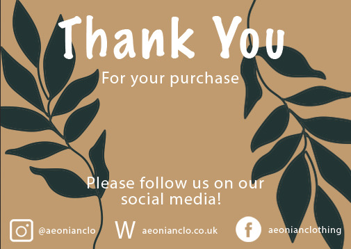
This is the final outcome of the quick and simple thank you card I have made, I believe that it's a very strong outcome in a very small amount of time, it took me less than 20 minutes to create this thank you card by using the same leaf drawing from my tshirt design and I just copied and pasted it through the document and changed the bsckground in a soothing organic colour. I then simply added some small information about my social medias at the bottom to promote my brand. I also did the small logos in Illustrator very quickly. It's a very cute and aesthetic thank you card that will go within the brand and it's very simplistic. The only change or issue I have with the outcome itself was the logo of the website because it just looks quite confusing and last minute made which it was.
500 notes
·
View notes
Text
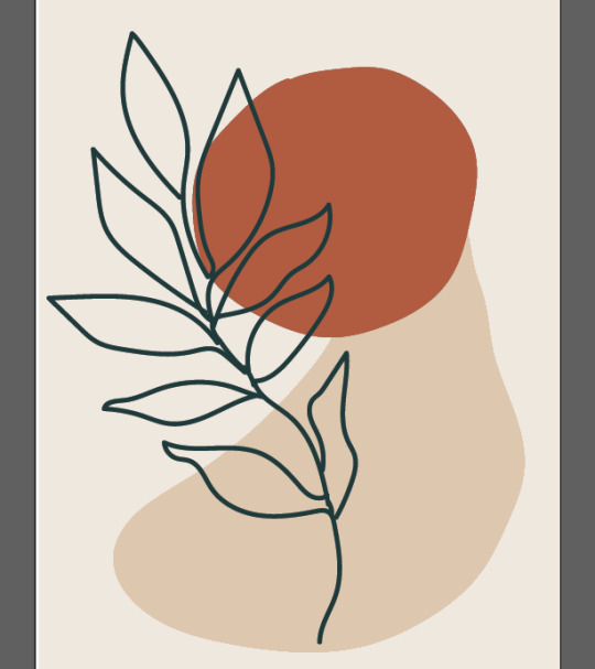
Thank You Card Inspirations

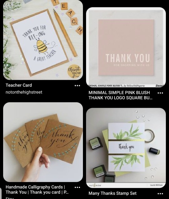
Here are some good examples of what I will be designing as a quick thank you card and I want it to be similar to the packages I have designed where it looks very organic and aesthetic. I might want it to be having a mockup of cardboard like paper to seem like the thank you cards are recycled and it looks to be organic, I'm also using organic soy inks to seem like it is also vegan friendly. But I will try to find a mockup that looks to be sustainable and very professional within my brand.
0 notes
Text
Leaf GIF Final outcome
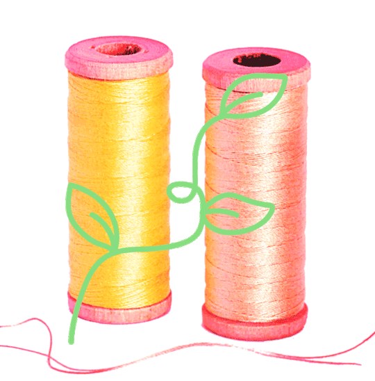
This is the final outcome of my simple gif, this is just an overall experiment to see what the outcome will be, I rushed it through because I didn't have a lot of time left to finalise and created a lot professional looking gif because I had only 1 day to finish everything off. I believe the lesf animation was successful but maybe not so with the picture background since it looks out of placed with the animation. The whole purpose of the picture background was to inform the costumers that the materials are vegan friendly, meaning that the dyes are organic and that the material itself is cotton and not wool and it's not plastic.
I overall think its a fun quirky outcome but it can be developed a lot further once I've changed a few things.
47 notes
·
View notes
Text
Creating GIF Process

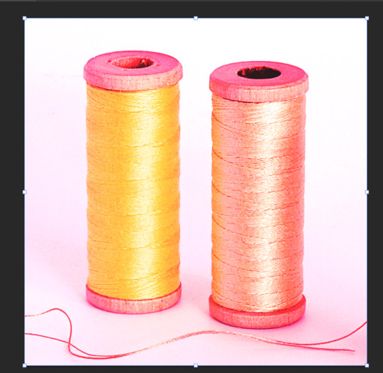
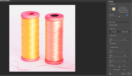


I firstly went to pexels.com to find a related image and transferred it to photoshop and changed its colours to yellow and pink from changing the colour overlay into hard mix and it with a layered pink. I then deleted the white background by using the magic wand tool, I did use an easier tool but it didn't out as it also deleted the actual objects.
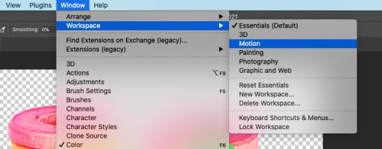
I then started to draw a simple leaf drawing very similar from the vans gifs one and I started to copy and paste the later and keep drawing the leaves a different direction, once I have the full set of moving leaves, I went under window > workspace > motion to be able to get the options and toolbars for the animations. I also changed the drawing into green because I felt like it attracts a lot more attention than the red because it was similar to the background colour where it looked faded into it.
0 notes
Text
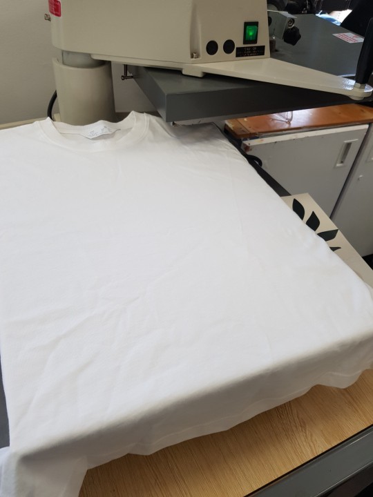
Physical T-shirt Development


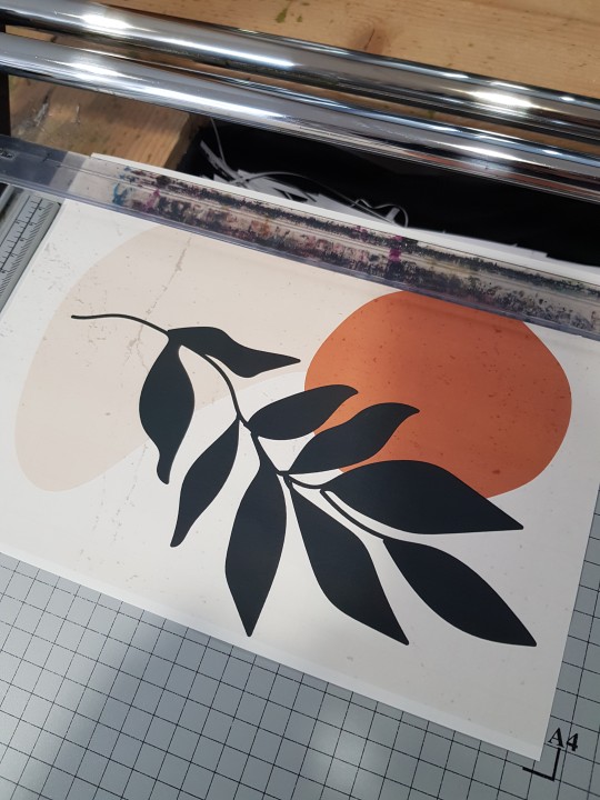

After some thoughts, I decided to do physical outcomes for the best designs I have created, I don't have a lot of knowledge when it comes to physically creating outcomes but I decided to try and learn some new skills.
I bought transfer paper from an art shop and bought two plain white T-shirt, we will imagine that all the materials used are organic and sustainable because most of the products that I needed to be sustainable are very expensive and I only wanted to experiment with this physical outcomes.
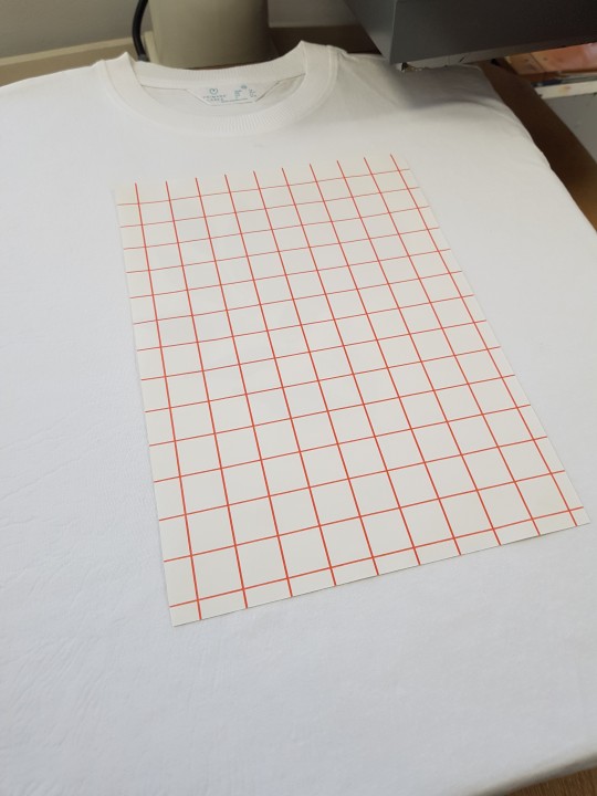
I started by printing of the design onto the paper by using the following settings on the pictures and making sure that the transfer paper is facing up to you and the grid at the bottom because the grid is the sticky part which you peel off at the end. I also made sure that the design is fit to page and I carefully trimmed the remaining white edges so that when processing with the hot machine it won't leave any white borders around.
I set up the machine that compresses heat into the t-shirt, I needed at least 160 - 200 degrees of heat but I waited until it was 180 degrees Celsius. In this process I had help from my teacher Faith and she ran me through the step by step process of how to function the heat compress machine and how to carefully use it. Once it comes up to the certain heat it was time to place the t-shirt and place it neatly and make sure that there is brown paper on the bottom of the t-shirt and also at the top, this is to make sure that the t-shirt won't burn into flames, the purpose of not adding the design in top of it yet was to straighten the t-shirt before adding the design; I placed the timer of 10 seconds and pulled the lever down to be able to compress it. After the 10 seconds is gone, it will make a very loud beeping noise and I need to pull the lever up and carefully swing it across the other way to not burn any materials.
Furthermore, I then placed the transfer paper with the design on it and placed it with grid facing me so that I can successfully peel the sticker off at the end. I placed it aligned in the middle of armpit and gave some space from the top of neck and slightly in the middle of the chest area of the t-shirt, once I have the perfect composition it was time to place the protecter paper on top and swing the lever across in front of the paper and pull the lever down until it beeps really loudly again and pull it back up, since I only have done it with 180 Celsius degrees, I need to do the same process twice for a stronger result. Once I've done it again, I left it to cool of for a few minutes and satisfyingly peeled of the sticker paper layer and that was the last process. I need to do all the same process for the second t-shirt and it gave amazing results.
0 notes
Text
Rejected Outcomes
These are some rejected outcomes of my project because I felt that it didn’t match my aesthetics and didn't correlate with my branding, the colours and the overall designs didn't feel sustainable and organic or it judt overall didn't work with the mockups and looks awful. I spent some time trying to save them but it didn't work out so I saved some time by just leaving them as rejected outcomes.

0 notes
Text
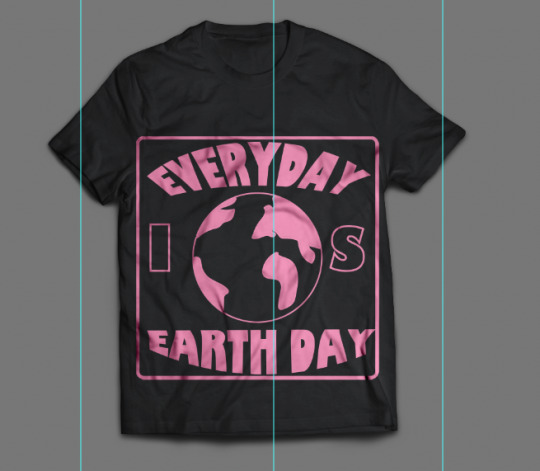
T-shirt Design Mockups
These are all the mockups for my T-shirt designs

0 notes
Text
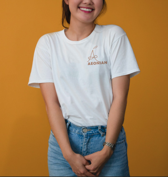
T-shirt Design Process (7)


Here are some simple T-shirt design I did just with the logo I previously made and made it into a mockup, I like it because it can be just a plain t-shirt with just a branding onto it and I really liked this mockup because it looks very realistic. I overall would like these to be onto my website for sale because it can be popular for everyone since every t-shirt with its branding seems to be always on trend.
1 note
·
View note
Text
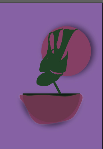
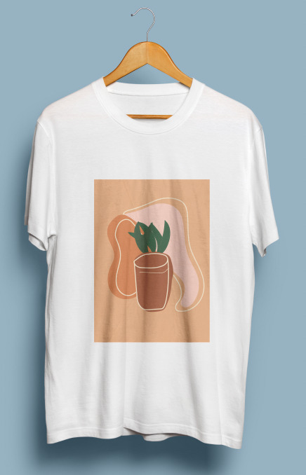
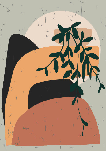
T-shirt Design Process (6)
This outcome is cute and aesthetic and fitted for boys and girls because of the colours used and also the design is very simplistic so that it wouldn't be too much for a boy's t-shirt design. I could've added a lot more drawings and designs into it but it would overall bring the strong outcome down since the whole purpose of this design was to fit it within the unisex range. I asked my male friends and family memeber if that a male would buy this t-shirt design and they said most would but some wouldn't since everyone has different taste. But in conclusion, the outcome itself is likeable and not too daring for a lot of costumers.
I created a rectangle fitted within the document and changed its colour to a peachy type and I used quite simplistic terracota and offset of oranges for this design. After that, I started to draw some shapes including a shape of a plant pot and two different irregular shapes with an offset of white overline to add some details. I also simply drew some leaves on top of the pot.
Furthermore, I added a paper textured layer and lowered the opacity and changed its colour overlay into screen and it made this suttle change of colours to the design which made it a lot better and with the textured lines and wrinkles.
1 note
·
View note
Text
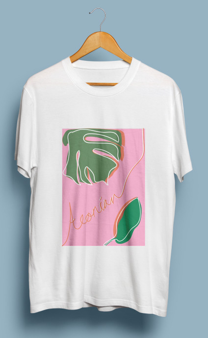
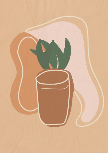
T-shirt Design Process (5)

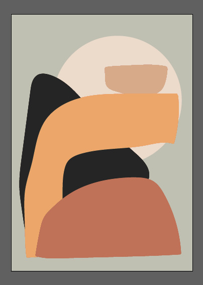
This is overall by far my favourite design because the colours I've used together matched very well and the simplistic but also quite complicated design is so well put together. I loved the modernised abstract themed it gave off and I believe it will be very popular once its been developed into an actual T-shirt design. The only negative comment I would give is that it can be a lot more for females but can maybe also be for males, since my brand is targeted for both male and female, I tried to develop ideas that can be unisex and that is probably the hardest thing when it comes to creating designs for a T-shirt.
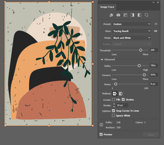
I started of with placing a circle using the ellipse tool and choosing an offset white and drawing unusual shapes for rocks and I selected them and went to object > expand appearance > fill paint > make to fill the shapes with colours.
I then created a simple drawing of a plant for the top of the arc and a very simple pot, additionally, I added a simple texture that made the whole design put together. I did this by finding a textured image and placing it onto the document and I went to image trace and changed the threshold and the paths, and I changed the opacity of texture so that it's not too overwhelming.
28 notes
·
View notes
Text
Clothes Tag Mockup (2)
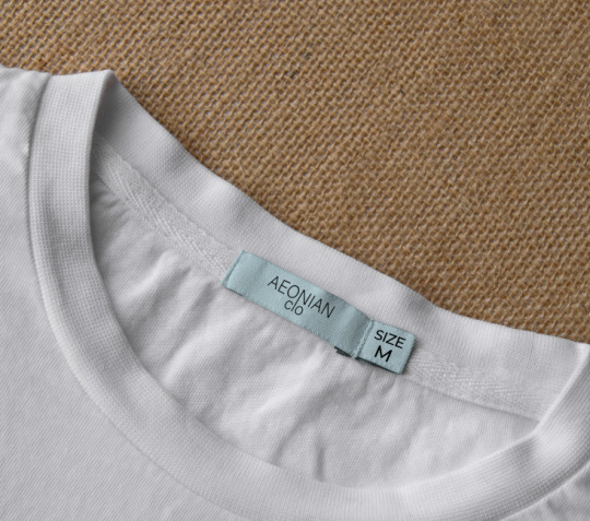
This is a simple mockup for a clothes tag on the T-shirt that I will be using, the material will be sustainable and the tag will biodegradable and possibly reusable. Of course I am sing soy ink when it comes to the writing so that it can be vegan friendly and organic. I liked it because its simplistic and it looks very realistic.
0 notes
Text
Simple Box Packaging Design
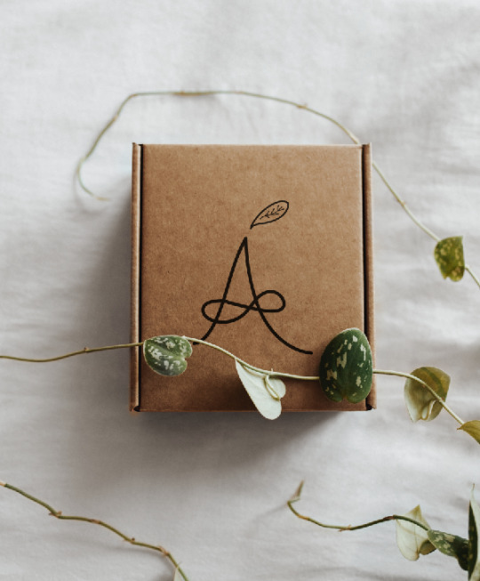
This is a simple mockup for a box packaging design and I believe it looks very sustainable and organic which was the whole purpose of the mockup, it fits within the the theme of my brand and it looks very realistic. There are some things that I can change, for example I can add some little details like a barcode and a lot more information of the box and the brand itself, maybe a small paragraph or detail of what my brand is about but I can possibly do that when creating my own website mockup.
0 notes
Text
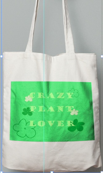
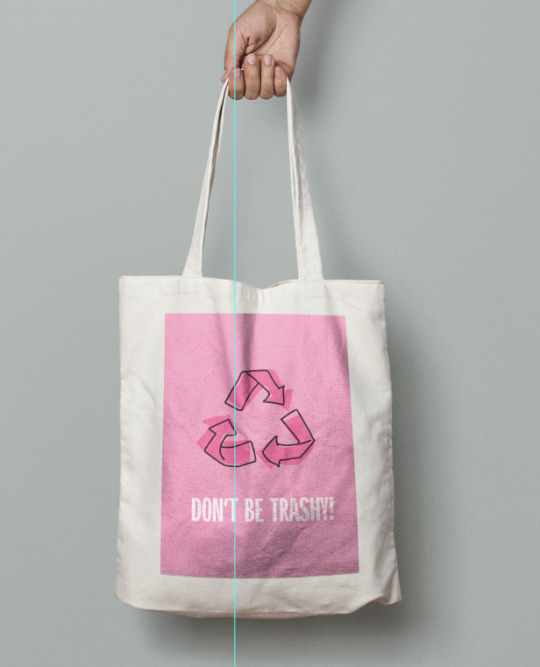
Totebag Design Process (2)

I firstly started to the outline of the picture from an old picture I did some years ago and I outlined it in different colours according to the colours I wanted it to be in.
I filled in the colours by going to object > expand appearance > Fill paint > make to make sure that the areas are filled with the colours I wanted.

This is the final outcome with some textures added using some paper textures with some typography, and this is for a totebag design and I believe this is a good outcome for a different and small totebag. Although, I don’t like how the colours are mostly dark and it ruins the theme of the branding, this can be a limited edition totebag and the actual design itself is a nice drawing.
0 notes
Text
Tote bag Design Process (1)
This is my first ever design for my totebag and I believe the outcome is very strong because the typography is very catchy and very trendy and the colours I used matched the totebag itself very well. The only thing I’d change about the totebag is that it can be a different colour or that the design can be a lot bigger.
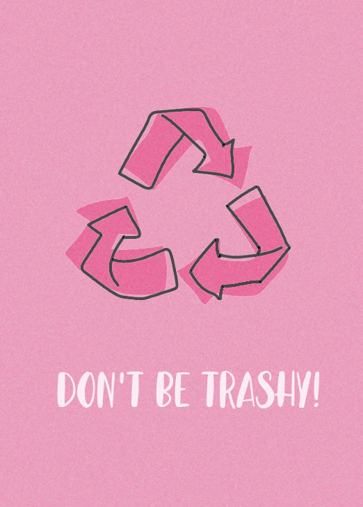
The process of creating my totebag design is that I firstly chose an off pink colour and went to edit > stylise > grain and added grain into the background to add some textures. Additionally, I drew simple arrows that circulate each other and then drew some again with bigger arrows and having an offset of different arrows. I added typography of “Don’t Be Trashy!” with a big font and slightly cursive font.
0 notes
Text
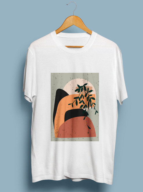
T-shirt Design Process (4)

This is by far the most simplistic and aesthetic looking design and I believe it's a very strong outcome when matching it with my branding and it also gives out sustainably fashioned t-shirts. I asked my friends and family what theu think of this design and most really liked it because of the colours I used and the simplistic design it has.
I used the shape tool and used the rectangle shape to be able to have a colour for the background and I chose an off-white colour with some hint of pink and brown, I then started to draw some different shapes and experiment with different shapes that goes well within the colour of the background, I then chose different colours and went into object > expand appearance > fill paint > paint and it will enable me to fill inside the shapes and then I chose which will be the top layer and the bottom layer.
In addition, I drew a simple leaf drawing and placed it around the shapes to add some composition and rearranged the position of the shapes to a more suiting area.
I then added a textured paper background and lowered the opacity so that the design is a lot more visible and I just wanted a small textured effect to make it look a lot more vintage and aesthetic.
0 notes
Text
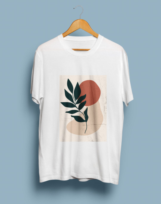
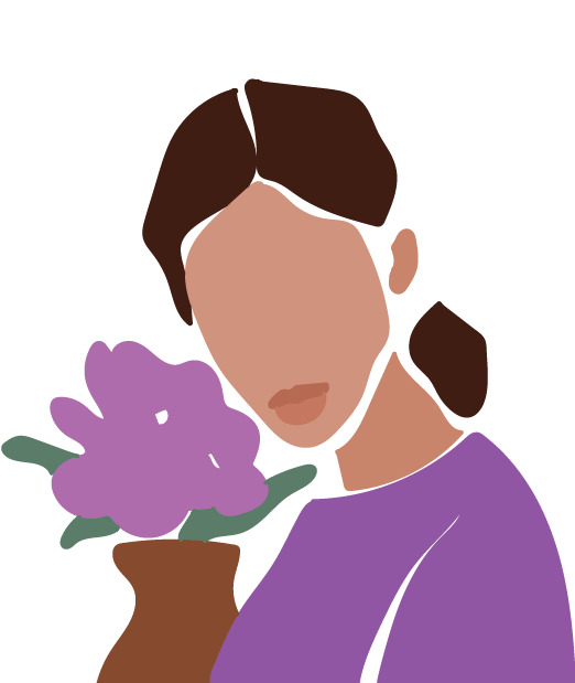
T-shirt Design Process (3)

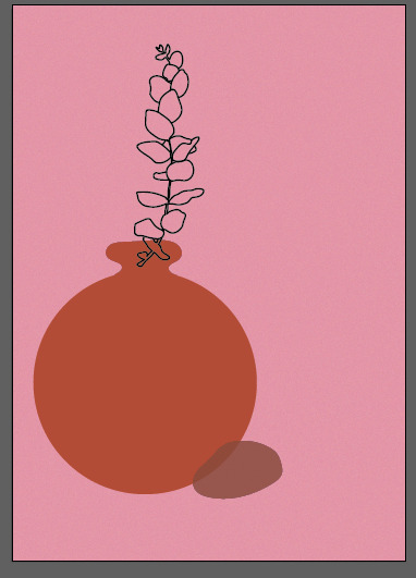


I personally loved this outcome because of the colours and the simplistic design it held, some might be skeptical of the colour choices but I think its bold and good to experiment with some colours.
I started to experiment with layers of irregular shapes and just starting to think of what to design so that there are some theme to my designs and branding, I chose another offset pink for a background because I believe it worked very well with the recent outcome I have made. Any of the unusual shapes I drawn on doesn't work and I thought of adding a simplistic vase and some flowers to go with the vase.
I then started to create the vase by using the ellipse tool for the round shape of the vase and and then used the brush tool in Illustrator to draw the opening of the vase, I did it carefully so that it looked sharp and clean. I then added a simple rock with a really nice offset brown and lowered the opacity to see through to the other layer and I thought it looked very professional and composed.
I started to draw the leaf/flower pattern and I chose a photo of my eucalyptus plant in my room and just drew the outlines of the plant. I placed it on top of the opening of the vase and used the transform tool to reshape and make the drawing slightly curved. I did not fill the outlines because I thought it looked very good without the fill and just by itself.
Furthermore, I added a patterned background by using a textured picture and placed it into the illustrator document and used image traced to get the textures and changed the settings for the threshold, I then used the magic wand tool to delete the background. I cropped the texture to the area I liked and placed it on top of each other with some spaces. I went into edit > texture > grain and added some grain to the pink background to have more texture.
0 notes
Text
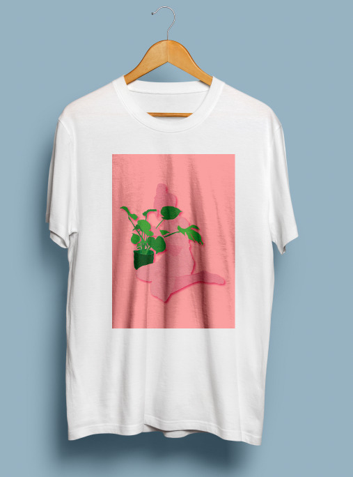
T-shirt Design Process (2)


In my opinion, this design is very daring and outcasted from the rest of my designs and ideas, although it's going to be beneficial because it will be different from other designs to promote other interested costumers so that there are various styls for different styles and fashion. I tried to follow some trend from t-shirt designs that I have seen around and I really liked them and it was very popular. I must say that the leaves are very simplistic and maybe too simplistic, if I maybe added some textures to the leaves it would've been a lot more stronger.
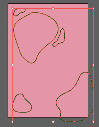
Firstly, I have found a leaf picture from pexels.com and traced the outline and layered them together to make some shadow work, and then I made the background into a different colour from creating a rectangle layer on the bottom layer of the document. I made sure the different shade of green leaves is perfectly offset so that it looks clean when you visualise into it.
I started to experiment with different linear arts and colours till I'm satisfied with my work, although the original colours I chose doesn't match with the work I'm doing and I'm quite nervous that it wouldn't work out together so I spent most of my time choosing the right colours that goes well together and took some inspirations from the pinterest posts I saved altogether.
After I chose the right colours, I created/written a handwritten word of my brand Aeonian to make it look like a limited edition and to promote my brand sneakily. I then created a layer for the paper texture to make it look rustic and a lot more strong than the original design without a texture.
0 notes