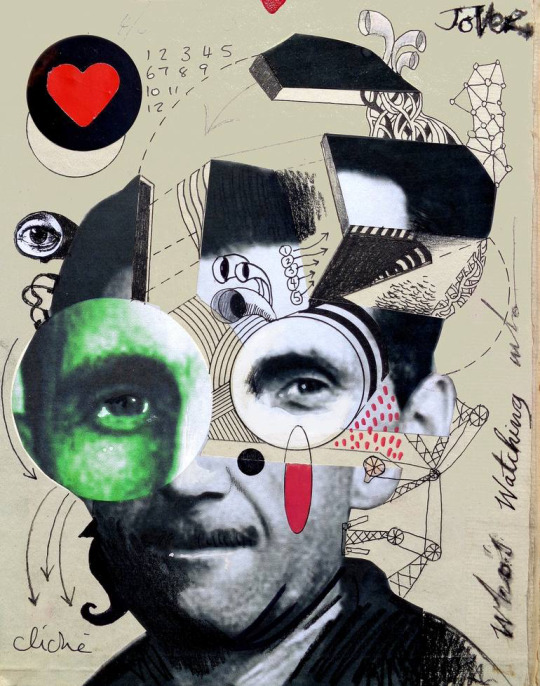
#also why do the textures look like a first year graphic design student did them wtf
Text
Friendly reminder that hating Pokemon Unite isn't just about ""no Sinnoh remakes or no let's Go Johto"".
Fucking Tencent is the one making it.
Tencent is known for spyware, punishes those who support the Hong Kong protests, are KNOWN to rip off larger companies or buy out larger companies if they're seen as competition, are extremely rampant with censorship of any kind, and were receiving personal information from Apple such as I.P Addresses, and the CEO is extremely honored by the communist party that supports Muslim concentration camps.
This company is absolutely fucking garbage and it's pretty obvious from the comment section of the video that everyone who knows about Tencent is chiming in with them dipping the moment they announced it was made by them.
And if that's not enough to stop you from wanting to play tencent has driven many players who actually did enjoy their games away due to the rampant cheating that occurs and isn't dealt with in their other online games. They're known to try and milk their gamers for money with pay to win deals and from the sounds of it ""free to start"" means you'll have to pay eventually no matter what and then continue to keep paying in order to succeed or advance in later levels due to the pay to win structure.
For those who are excited about this there are LITERALLY so many other games on this oversaturated market that spent time on their back grounds, and textures, and design that dont make them look like a dollar store rip off game. Please look into literally anything else.
Pokemon Unite is NOT the way to go
I'm sure that people in the videos comments did a MUCH better job of explaining the dangers of tencent instead of me and theyre most likely a lot more well aware of the first hand experience with them. But please just take my word for it when I say that the ""unfair hate around this game because it's not a Sinnoh Remake"" is bullshit.
There's hate for a reason
#pokemon unite#god i never wanted to get into anything serious here on my happy light pokemon blog but fucking hell#what the fuck is the pokemon company and game freak thinking?#also why do the textures look like a first year graphic design student did them wtf#discourse#coatl rambles#pokemon direct
28K notes
·
View notes
Text
FMP Evaluation
Disorder/Order
I found myself favouring this theme because I felt so much connection to everything with it. I felt it having the most inside it rather than the other themes, like I could link any and everything through it. Wondering why I chose it, maybe the idea of order or disorder was on my mind at the time, maybe I visualised my project and what it could be, before it was.
Ive always loved something wrong, something without structure from someone else, the idea of distorted art work always was with me. I don’t like realism as much as imagination coming to life with something new, something your unsure of where it comes from. I watched a Joe rogan podcast and he spoke about how when your hammering a nail, you know your hammering it and can recognise that you did it after. But when it came to creativity and more expressive work it’s like you’ve tapped into something else, like your not fully there, that the art is using you to make the work not the other way around. You don’t know where it came from, the work is being sieved through your psychical motion, like it’s someone else who designed it, or a deep self.
Loui Jover very much intrigued and affected my work. His detached forms work really was part of my idea generation.
I wanted to do something with distortion, and his work instantly connected to my artistic wants. An artist who I’m unsure of who they are, wether they were an artist we researched in class or a past student who we researched I don’t know. But their work very much was good for my work, it helped me to understand how I wanted my distorted faces to come across and how i wanted them to look, since their work was of the same style.
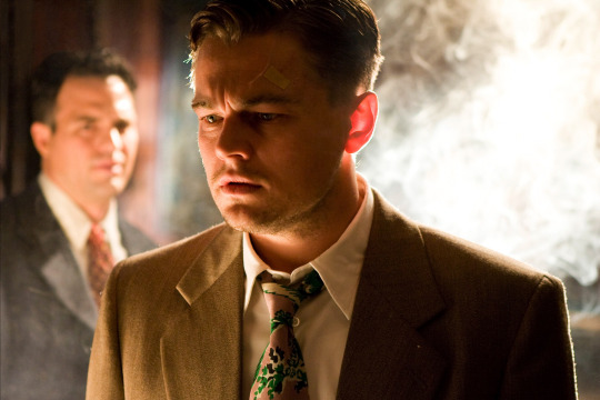
I believe the movie Joker 2019 starring Joaquin Phoenix affected me a lot with this distortion sort of theme.

Psychological disorders interest me in a weird way. As well as Shutter Island 2010 starring Leanardo Di Caprio also affected me, his character and his story through out. So amazing. Really made me want to express myself through it.
What you see when you look into someone’s eye, what do you see? What do you think about them as a person, without knowing them. Now question why you think that, where did that idea come from? That judgement came from you, but where did you get it from. That concept, that sort of theme. Really. Really intrigues me.
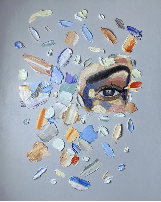
Thecollinson. An artist I found on Instagram. I’ve been following his work for a while, 2 years almost. I would call his paintings slightly distorted, almost like their unfinished. He has a very interesting way of using the paint, using various different colours and shades with a large range of differential amounts of paint.
Mostly working in painting faces, though it may not actually have a face, or at least a normal one. Leaving splurges of paint at different points to represent the features of a face or even just having it all blank. Possibly painting only around the face.
In fact. I contacted him and asked him a few questions. Let’s see what he has to say.
Alfie: Do you have a plan to make this or an idea in your head?
Or does it just come together as you go along
TheCollinson: Something like that I have an idea of just an eye then build around it. That piece was for a client. They just wanted one eye and had some colours they like so I just went with the flow bringing it together. I just love working with thick oil paint. The outcome feels great.
Alfie: Amazing! And would you say their are any other artists that inspire your work or your mark making. What got you into this style? X
TheCollinson: My favourite artist is Van Gogh his use of thick impasto, the way he applied brush strokes and his use of colour is just mind blowing. I always look at Bram bogarts work and the way he Created texture . Also incredible Contemporary artist like Joseph Lee & Elena Gual really inspire me with their subject matter, mark making and use of thick paint.
Alfie: That is great, Van Goghs colour making is incredible! I agree. And if you could describe your paintings or a painting of yours in 4 words, what would they be?
TheCollinson: I’d probably say;
thought-provoking, abstract, colorful and unconventional.
Lino print, woodblock print, plastic board print, fabric painting, spray paint, developing ink photos, Photoshop and more, everything I’ve worked with in the FMP I’m grateful for, I think I’ve definitely enjoyed digital work and spray paint most.
Since I’m going into Graphics Design in the next year of the course I’d say it’s been my best. I’ve learnt how to make frame animation and gifs, understanding the software and how to work all I can on it.
Pushing my creativity through it with outcomes I’ve posted on my tumblr and Instagram pages.
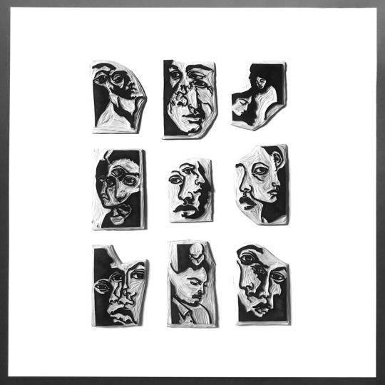
I wanted to test what sort of faces or distortion I wanted to create for my outcomes. Looking at my artists and how they made them, I wanted to make collage a part of my work. So using collaging with faces from magazines and papers was quite perfect. Experimenting with paper collaging on many other occasions got me used it. Making it nice when piecing together the faces and which I wanted to use.
The 12 A5 collages we made on our first week back from lockdown was gorgeous.
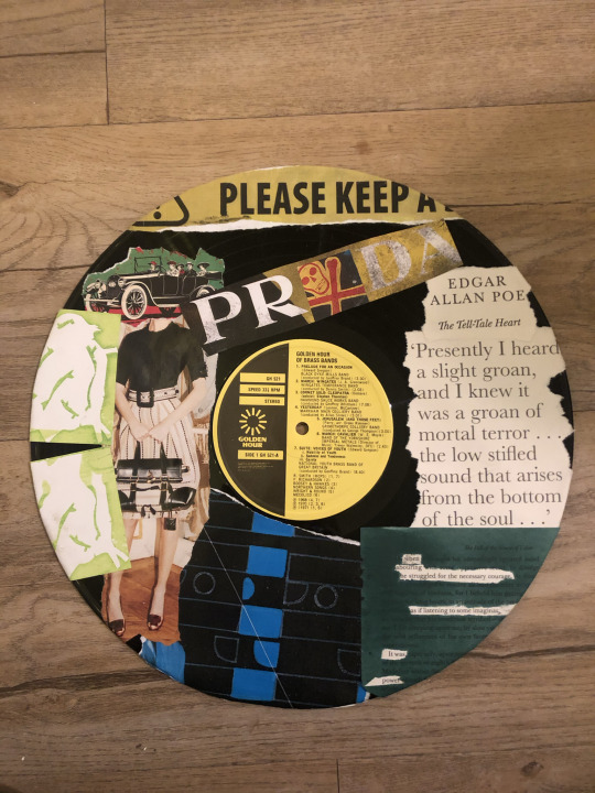
That work definitely made me want to keep collaging as a part of my work. Using my collaging on my vinyl record, CD, and pizza box just pushed me even more to keep wanting to use objects. I find it so much more valuable when it’s on an object or with an object rather than paper or a canvas. All these factors came through to my project naturally from this experimentation.
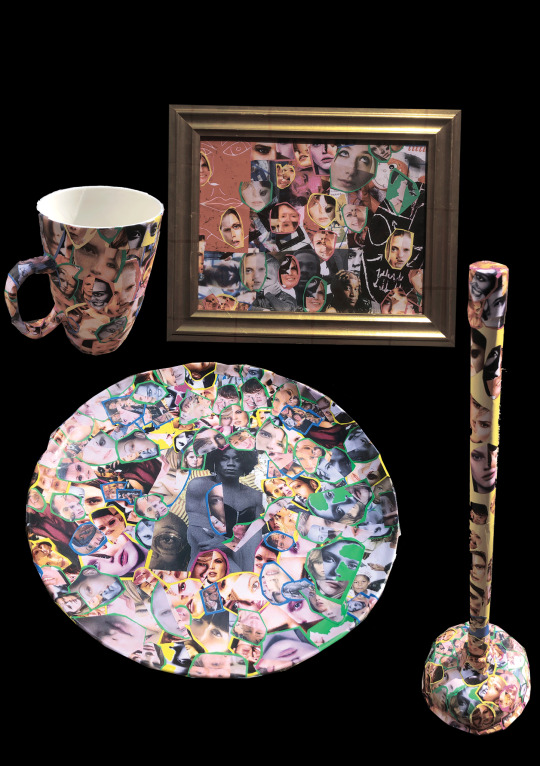
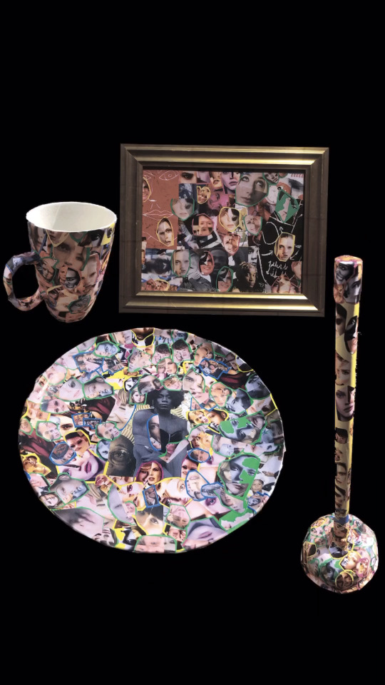
Presenting my outcomes at the end of year show would be an interesting one. I think I’m going to turn all my outcomes into a single sculpture and would present as so for the show. Sticking them together with very serious super glue. I’d present my outcomes in their habitat.
The plate and mug in a supermarket or China store, alongside regular kitchenware. The golf club would be in a golfing store or course next to regular clubs. Are you seeing a pattern? The frame I’d like in a gallery on the wall. The plunger I’d like in a household. The taps would be on a sink, connected. And the pan finally I’d like to be used to cook with. Though I’m not sure what I want to do with my future sculpture yet so maybe I will be using it.
Ten words to describe my overall outcomes.
Relatable
Empty
Individual
Free
Usual
Full
Useable
Colourful
Comfortable
Warm
Songs In The Key Of Life by Stevie Wonder would be my soundtrack.

I listened to it a lot through this time and listening to it whilst viewing my work just feels right. As well as i was listening to it whilst creating and designing my work. Three hours. Three hours a week I spent working on my project outside of college, wether it was designing final outcomes, sourcing objects or experimenting with medias. It was all enjoyable. My bedroom, living room and garden is where I’ve worked on my project.
I can’t fit in the photos for the four picture descriptions below so! I will number the three words to describe the image then then post the image after this with the corresponding number.
1
New
Pulling
Development
2
Helpful
Relatable
Attaching
3
Personal
Connecting
Mine
4
Thankful
Beautiful
Valuable
0 notes
Text
48. Put your hands in the air and say hell yeah. Captain Jack! Johnny Depp!
What motivates you to do what you do? Sheer necessity, usually.
What was the weather like the last time you went out? Hot. It’s Arizona so it’s probably near 100 + sunny.
Do you go for walks often? I’m pretty lazy and try to avoid it. You sorta gotta trick me into walking, like take me to a big shopping mall or something so I inadvertently walk around it whilst shopping.
What color shirt are you wearing? Gray.
What is your favorite type of youtube video to watch? I don’t really watch any. I just use it to occasionally look up songs or to record snippets of stuff to remix songs.
Do you need any new clothes right now? I got plenty.
What’s the next project you are excited to start? I’m working on a nonsensical Adult Coloring Book featuring animals committing crimes.


Do you collect anything? If so, what? Used to collect rocks and Pokémon cards. I suppose in a sense I collect all sorts of art/office supplies.
^and if not, what would you like to collect? Nothing really.
What was the last disappointing thing that happened to you? I don’t know. Suppose work being closed for renovation for 2 weeks kinda sucks because I sort of need cash.
What is something God has healed you of? I don’t really do the whole God/Religion rigamarole... Chances are if we are healed of something, there is a psychological, sociological biological or generally rational explanation.
Have you ever experienced a miracle? Like, a phenomenal coincidence? I think as much as I hate to be a downer, there's probably a lot to do with our perceptions of events
What was the last thing you ate? Lucky Charms.
Do you ever eat food that’s intended for kids? Well, Lucky Charms. I also love pizza rolls and chicken nuggets. But I’m not eating Gerber Peas&Carrot baby foods or anything crazy like that.
What was the last stupid thing you did? Define “stupid”? Most things I do are probably stupid to others but perfectly acceptable to me.
Do you get embarrassed easily? Sometimes.
Are you wearing pants or shorts right now? I never wear shorts.
What are your top three names you like for a daughter? Elliot (this is also my pick for a boy name), Tara, Hazel.
Would you ever film a vlog of yourself giving birth? Ew. Fuck no. Honestly, adopting/fostering sounds way more my style anyway. To be totally frank, pregnancy sounds gross and being unable to take my adderall sounds awful. I’d gain like, a million pounds.
Do you like getting caught in the rain? It’s usually a refreshing break from the heat out here.
Do you think your hair looks best straight, wavy, or curly? Messy, or in a side-pony.
What was the last craft project you completed?: Coloring books for my friends’ kid.

Name 3 youtubers you would like to meet in person: I don’t know any.
Has anyone ever spread an untrue rumor about you? Sociopath ex. Not sure he actually said them aloud to people other than myself, but I was constantly being accused of weird stuff I absolutely did not do.
What’s one rumor you’ve heard about yourself, and is it true? N/A. No idea. Not aware of any relevant or applicable rumors. I literally just keep to myself and do crafts.
What color are your nails painted currently? Not painted.
Do you use a pill box? Jesus, I’m not 80.
List 3 people you know who were loving and then turned cold: it’s kind of generic to assume either of those things as permanent traits. But probably most flings or whatever. It always feels cold when one party loses interest.
Have you filmed a youtube video today? Never filmed one in my life.
Do you leave the house when you’re on your period? Um yes. Life doesn’t stop just because I have cramps.
^If not, why not? -
Have you ever felt threatened for your life? Yeah. Sociopath ex would get overtly paranoid and mistake harmless or unrelated things I did or said to be conspiracies against him. And occasionally my imaginary betrayals would lead to violent words or actions. Like, a bundle of index cards with Carrabba’s menu items and their ingredients, word for word, from the Carrabba’s menu, was somehow coded plots to who the fuck knows to have him killed. Irrational stuff like that.
What are you behind on? Student loans. And when I say behind, I really mean that I actively chose not to pay them.
Do you get enough sleep each night? No because night is my time to be productive, uninterrupted and without bothering anyone. I hate having to stop my thoughts just because other people are making noise or trying to converse with me.
Which did you like better: high school or college? Absolutely college.
Which year of your life stands out to you as the most significant so far? Probably last year or two.
…and why? Big personal transitions and revelations in my life philosophy.
What was the last store you shopped at? Walmart, most likely.
Do you have a favorite pharmacist? I used to back in NY. Her name was Evie. She wished a customer Happy Thanksgiving on Valentine’s Day accidentally once and it cracked me up and we had a running joke about it.
Do you have a favorite cashier at the grocery store? I don’t shop frequently enough and I switch up stores when I do.
What was the last thing you ordered at Starbucks? Probably a toffee nut Frappuccino.
What’s something you discovered recently?
What makes you more creative? Emotional turbulence, certain drugs.
What’s the last magical thing you experienced? Um…Magical? The herd of unicorns crossing the I-10.
What is the theme of your bedroom? None. We are staying in a spare room at a friend’s. But we're actually moving this week because being micromanaged and constantly scrutinized was getting old.
Have you ever lived in a dorm? Yes, for a few years
Who is someone whom you admire, and why? I guess the lady at work, Amanda. She’s like 64 and works open-close every day, and still has a great attitude.
When was the last time you stepped outside of your comfort zone? I don’t know. I test the waters every once in awhile.
Where would you like to travel to next? Nowhere crazy. Just back to New York for the Renaissance Faire.
If you could win three dream vacations to anywhere, where would you go? Portugal—New Zealand—Ireland.
Would you rather ride a camel or an elephant? Camel. They’re fuzzy.
Are you a free spirit? I don’t know what that even constitutes. I think outside the box and I question social conformity and other preset patterns of thought. But I don’t know that has much to do with my spirit.
Do you want to lose weight? I think I’m okay for now.
Which insects scare you, if any? They don’t scare me, they just creep me out …spiders, centipedes, millipedes, roaches…ugh.
Do you think it’s silly to be afraid of a tiny insect? It’s not like I think they’re going to murk me with a sawed off shot gun. I know they’re harmless and therefor not technically scary…but they’re still creepy and unsettling somehow.
Have you ever experienced paranoia? To some degree.
Have you ever hallucinated? Indeed.
Were you raised religious? We were raised Roman Catholic. Didn’t stick.
Have you ever been abused? Psychologically, emotionally, physically and sexually. #sociopathic ex.
Do you think the cops should do more about bullying? I think cops have enough shit to worry about as is and don’t know how effective extensive police interference would even be. I think the anti-bullying message is stronger when conveyed by people closer to kids like teachers, parents, siblings or a celebrity figure they idolize.
Is there a coffee shop you like better than Starbucks? I like them all about the same.
If you could afford to get your hair professionally done, what would you get? Probably dye and highlights. Definite trim of my bangs.
If you had a lot of money, do you think you would use it wisely? Absolutely not. I have little to no money now and I don’t even use *that* wisely.
Do you know any rich people who are very irresponsible? I don’t know many people to begin with.
List five careers that you’d like to have: Lawyer (like A.D.A. Barba!)...Graphic Designer...Psychologist...Self-Help writer...and oddly wouldn't mind being a waitress still.
List five far-out things that you’d like to do before you die: I genuinely do not have a bucket list. If I stumble upon something that seems cool, I do it. Making unrealistic lists won't help my quality of life very much.
Do you dream big? Quite the opposite. I sort of just fly by the seat of my pants. Weird expression. Can’t recall ever having very fixated dreams or visions for myself.
What was your first imaginary friend’s name? N/A
What was the name of the first pet that you loved? Comet. <3
What was the first work uniform that you had to wear? Waitress uniform of sorts. I wanna say it was white button down and black pants.
Do you like to go barefoot? Usually. On some surfaces it’s intolerable and I hate the texture, though.
Do you like the same colors now that you did as a kid? Pretty much.
Do you have a blog? You’re on it, buddy. This is a survey blog.
Do you have a youtube channel? What would I even post videos about?? I assure you, I do nothing that the general public would find entertaining.
1 note
·
View note
Text
PLAYING: Star Wars Jedi Knight: Dark Forces II

I’m having a blast(er)! So glad I decided to take a swing (of the lightsaber) at this game.
Why Now?
I grew up with Star Wars, but I’ve never been a super fan. I loved the movies, but I’ve not read all the books or even played most of the games. But as Disney has worked to build up the presence of Star Wars within world culture, I’ve decided to make up for lost time and play more classic Star Wars games. Partially cause of my love for late-90s games and partially cause I’m inspired by the creativity of Star Wars. But then I burned myself out on Star Wars earlier this year. Strangely, it’s been hate-playing Jedi: Fallen Order that’s made me want to jump back in. For all it’s faults and failures, Fallen Order captures the Star Wars vibe quite well, and is gorgeous.
Getting Started
Well...Dark Forces II is an old game: 1997. It does not play well on Windows 10 computers. This I discovered after booting my GOG copy and finding the play window to be a small square in the middle of my screen. When I adjusted the settings for 3D acceleration, I just got a black screen. i could play, but not see.
After much digging, I found many possible solutions. i started with the simplest first, hopeful that an acceptable level playability would suffice. Unfortunately, they did not work. So I went for the big mod install. But to install the mod, I needed the original .exe file. That was a whole other can of worms. File found, mod unpacked: I followed the instructions and renamed everything: failure.
Disheartened, I goofed around with the View Size, or something like that, and my tiny square grew to fill most the screen.
Good, fucking, enough!
It’s Ugly, but FUN!
As soon as I started playing the game, it just felt good. There’s something about these older games; I felt it while playing Thief Gold. There’s no real attempt to force the player to follow a specific path, there’s no artificial obstruction, just a level for the player to explore. While linear and design with certain surprises, I just felt free.
I’m thankful for the low-HP enemies. In the films, most folks are killed from a single laser blast. It’s generally considered fatal. So while Fallen Order stupidly had stormtroopers surviving multiple hits from a lightsaber, this game had a more reasonable 2-3 hit requirement for most enemies. There’s some tougher guys, but they’re also axe-wielders, so there’s a balance I get to shoot them from a 100 yards a way as they try to rush me.
Also, later I got a lightsaber and it’s been insta kill so far. Suck on that Fallen Order!
Level Design is interesting. The game is from ‘97, so designing 3D spaces was still an evolving craft. Every professionally-made, million-dollar-making AAA game of the mid-to-late 90s looked like a student project, for a failing student. So any game that pulled it off to some level competency was well respected.
The levels so far have been interesting, and very late 90s. They are a bit linear, with a path the designer expected the player to follow, but the spaces can be fairly large, giving the sense of a bigger world. Also, the levels tend to wrap around on themselves, like a rollercoaster. I think this is a great way to design linear levels as it brings familiarity to newly accessible parts: “Oh, this is from where that green-jerk was shooting me!”
I was a bit worried about the puzzles and key finding, but it’s not been so bad. Actually fairly clever. In level 2, there’s an elevator that will only rise if storage boxes are on it. so you have to activate the conveyor belt to bring in the boxes. But they’re too large to jump on, so you have to find the overhead platform to drop down on the boxes.
Also, there’s large crates being lowered down a shaft you need to travel up. So you have stand to the side on these slanted struts, and then run across the lowering crate to the other side before it’s too late. It’s such a simple challenge, but enjoyable and feels like it fits the level’s theme.
The third level was interesting, as my character is exploring his father’s home (mansion). Like the other levels, the designer(s) built a winding path through the large house that eventually leads to all doors being unlocked and opened. it was a very close-quarters combat situation, but interesting how it all tied together.
For a 1997 game it’s a ton of fun with interesting level design, which don’t get ass confusing as Thief’s exploration levels (thankfully!!!).
But...it’s ugly. Dark Forces 1 looked like a low-rez Star Wars texture pack for Doom. I only played it a little, but the levels felt...nonsensical. Still, while DF2 feels like a better design, the graphics can be quite horrid. They’re already low-res up close, but at a distance, Level of Detail takes effect and they get more pixelated. The characters and levels are ridiculously blocky, though clearly built with more polygons than the PS1 could muster, but the artistry behind the textures is a bit embarrassing. They capture the vibe of Star Wars, but at no point does anything feel natural.
I ended up looking up some older games to make sure all games of this era looked this bad. For the most part they did. But I know starting around 1998, a lot of Japanese companies became amazing at modeling and texturing low-poly objects for the PS1. And Naughty Dog nailed good art on PS1 out-the-gate. While I get that most developers had to learn how to make good graphics with limited technology, it’s hard to be too forgiving when so many great games seemed to effortless make such beautiful games in the late 90s.
Story
So this is where I may look like a hypocrite (probably). From a production competency standpoint, Fallen Order was great. From a storytelling standpoint, it had some good ideas marred mostly by pacing and video-gameyness. Because Uncharted overcame these things to have an engaging story that was well-paced with an action game. So I know Fallen Order had a good example to work from.
By 1997, no games had truly delivered mastered game storytelling (that I know of), so any game to try with some level of competency was pretty impressive!
And I find Dark Forces 2 impressive.
As with most games of the time, levels are bookended with story-bits. Usually it's a couple paragraphs to give context, but DF2 has live action cutscenes!! I love em. They're pretty cheesy with weak acting (or directing), but everyone is clearly trying and I love them all for it.
So far, the plot is pretty interesting. Some Dark Jedi want to find Jedi Valley to steal it's power and do bad stuff. They captured a Jedi and extracted a clue from his mind. That clue is your characters dead father. So now your character is having to relive some painful memories while learning secrets about his father and own destiny. It's both personal and epic, something I think Fallen Order struggled with.
There's also an Japanese woman playing a pilot/mechanic that's not being presented as eye-candy--so respect.
It's cheese, but the story is pretty sound so far.
#Zach's Game Journal#Star Wars Jedi Knight: Dark Forces 2#PC#GOG#Good Old Games#Antimicro#I've got a great feeling about this!#video games
0 notes
Link
Early Years
Born in a small village in southern China, Feng was one of three children in what she describes as a ‘very strong-willed family, where we were taught that being a female was a strength’. In a time when the one-child policy was still being enforced across the country, Feng’s parents were often forced to flee into the nearby mountains in search of safety, and to protect her and her siblings. That early example of resilience has helped to shape who Feng is today.
At a young age, Feng’s natural talent shone through, making a big impression.
’I always loved painting. I just put colour on everything. I studied in my village, and we didn’t have an art or drawing class. When I was in third [grade] a teacher came to our village to teach art for the very first time. I enjoyed the classes a lot, and this teacher was very surprised about how I painted. The teacher even encouraged me to enter my traditional Chinese paintings into a kids art award in Japan, and I won silver!’ explains Feng.
In Feng’s final year of middle school, she swapped the brush for a pencil. Like her painting, drawing came naturally, and she took just months to master techniques that would normally take years to learn.
‘That was a very important moment for me in my life’, she says. And it certainly helped to solidify her calling.
Despite strong encouragement from her school to become a doctor, lawyer or accountant, Feng chose the arts. In a fiery meeting between her father and the school’s headmaster, Feng’s father encouraged her to make her own decisions and follow her own path.
‘He said to me, “Little Feng, now it’s your turn. Please make your own decision." So I did,' she says. 'I made a decision, and it was the biggest decision of my life so far.’
That decision led her to study a BA at one of Beijing’s top universities. There, she refined her craft and, at the conclusion of her degree, secured a fashion internship at a company in Shanghai. From there, Feng took the advice of her senior peers and moved aboard.
‘When you’re younger, you don’t really know who you are. You haven’t had much experience yet, so you listen to the advice of the people who have more experience than you,' she explains, reflecting on her next big decision.
'I took the step. This was the second-largest decision I made in my life!’
Her Move Abroad
‘It was so hard for me’ Feng admits.
‘I started studying MA Fashion Menswear at the Royal College of Art. I was one of 10 people in the course, and I was the worst student! It was my first time studying abroad, I couldn’t speak English very well, and I couldn’t communicate well.’
But those early lessons in resilience held her in good stead, and she persisted in enhancing her craft. She proceeded to teach herself English while studying fashion, and despite some first-year struggles, she became a standout by the second year.
'There was something I knew through the whole journey, and that was that it’s not so much about proving myself to anyone, but actually knowing myself more and more through the journey, and surviving.’ she says.
As the first female designer out of China to focus menswear, Feng's inspirations came from deep within.
'It’s hard to describe why you love what you love. It came from the heart. You feel you love that and, when you’re doing that, you’re just enjoying it a lot, you can’t stop. It’s kind of like when you love a person. You love that person, but you can’t always tell exactly why you love that person.’
The Brand
Working on what she loved, Feng established her own label in 2015. Despite reaching that milesone, her goal to that was much, much broader.
‘As a female designer I wanted to inspire more women to know that they can do what they set their mind to! It’s all about Girl Power.'
Alongside this mission, she also gave herself the task of helping shift the perception of ‘Made in China’ being mass-produced, low-quality product. Part of that mission was to celebrate Chinese culture by highlighting the unique techniques that had been used in her home country for centuries. As a designer, her process starts by looking within.
‘I started my own label with the mission as a designer to look at the inside world – the people I meet, the places I visit, and my own experiences’.
This story-telling often informs the techniques that she chooses to use.
‘Sometimes it’s really hard to describe something as one technique when it’s about a story I am trying to tell or share. My SS19 collection, for example, was called My Half. People always describe that reconstruct/deconstruct as a technique. For me, it’s not that way. It’s merely about telling a story on the other side of who I am. There’s so much story and detail to share from behind the scenes. The craftsmanship seen in the work of artisans in the village is what I saw growing up, and is something that I bring into my work as an independent designer. I collaborate with these people by combining these old techniques with a fairly new brand, to give them new life.’
Feng has used these techniques across many of her collections, most recently seen in her SS20 collection, where she used Resist Dye, a thousand-year-old dying technique used in the Fuijian Provence where she grew up.
I
On-Foot
Since 2017, Feng has been able to tell some of her stories through footwear, collaborating with Jordan Brand and Converse across a range of silhouettes, including the Air Jordan 1, Chuck 70, Pro Leather, and now the Jack Purcell.
Feng’s work with Jordan Brand saw her customise the iconic Air Jordan 1 for her AW18 collection, where she told a very personal story entitled ‘The Way Home’. Through this design, she explored her journey from childhood to the present day, using references of key events and places to extend the narrative. As she described, inspiration was taken from subtle nuances, like numbers referencing the address of her first house, or the materials of a garment that related to fond memories of friends and family.
Another milestone moment was Feng’s reinterpretation of the classic Chuck 70 in 2018. That design set the path for her ongoing relationship with Converse, informing many of the collaborations that we are still seeing to this day.
Earlier this year, Feng took to the Jack Purcell, which hit the runway at London Fashion Week Men’s as part of Feng Chen Wang’s AW20 presentation. Here, she introduced her third capsule with Converse, which featured layers that shone a light on the past with a vision to the future. As Feng explains, ‘What you see [in the Jack Purcell] isn’t a pattern, but actually a graphic. This graphic came out from my name in Chinese characters. People might see that as a pattern, but it’s actually a graphic.’
Feng’s approach to the Jack Purcell included an adjustment to the form and dimensions of the upper, altering the iconic and normally slim profile. Through a material combination of suede and leather, Feng exaggerated the contours through layering, while embedding personal design nuances throughout – like her namesake ‘Feng Chen Wang’ in three Mandarin characters, 王逢陈. With each character serving as a pattern piece, the result was a conceptual take that jointly celebrated the heritage of both Feng and Converse.
The Feng Chen Wang x Converse Jack Purcell collaboration is also complemented with five unique garments and a set of accessories. Each piece in the collection has a strong focus on material, structure and reflectivity with the aim of revealing the silhouette’s unique design elements – like asymmetrical hem lines, blended fabrics, and reflective and textured nuances.
The Feng Chen Wang x Converse Jack Purcell and apparel are available from August 6 2020, online at fengchenwang.com and Converse.
#Feng Chen Wang#Feng Chen Wang x Converse Jack Purcell#collaborations#footwear brands#sneaker blog#nike sneakers#converse#sneakercommunity#sneakerheads
1 note
·
View note
Text
Zowie Broach on the RCA’s Graduate Show and Looking Beyond the Runway – WWD
https://ift.tt/32lZMLn
LONDON — Zowie Broach is cofounder of the avant-garde label Boudicca and head of the fashion MA program at London’s Royal College of Art, the only pure postgraduate art and design university in the world, and alma mater of designers including Ossie Clark, Erdem Moralioglu, Christopher Bailey and Sophia Webster.
Like most of her peers, Broach and other principals at the Royal College had to think quickly — and creatively — about how to showcase graduates’ final projects and get their work under the noses of headhunters, brand managers and other industry professionals in the age of lockdown and social distancing.
Instead of filming the final shows or focusing on the runway, the college came up with the idea of a macro site, where fashion students could strut their creative stuff and showcase their ideas alongside other postgraduate candidates in subjects such as architecture, industrial, graphic and product design, textiles, curation and the fine arts. It is the first time in the RCA’s history that the graduates’ shows will take place entirely online.
Broach also took the opportunity to invite creative movers such as Olafur Eliasson, Andreas Gursky, Edward Enninful, Viktoria Modesta, Gareth Pugh and Carson McColl to curate the students’ work in fashion and across disciplines. The student projects and curated elements will appear on the RCA 2020 site, a “digital discovery” platform that opens to the public on Thursday.
Here, Broach, who oversees 51 fashion students in the two-year program, talks about the creative opportunities that lockdown has generated, the constant cross-fertilization of ideas at the Royal College and the power of collaboration and community in fashion and design.
WWD: Talk to me about the site, and how the Royal College came up with the idea.
Zowie Broach: The college had to move very fast. There was no time to gather thoughts and reflect. The college is responsible for 800 young designers, so it was done at speed — but not without debate around the removal of “the physical,” and all the uncertainties that would bring. The site is quite clean, efficient — and powerful. Visitors can tag and search by words like “femininity,” “sustainability,” or “gender,” so you may come across three fine artists and one fashion student in the journey. It is absolutely what the school should always have offered, and shows what technology can do, in a nanosecond. I think it’s going to have lots of ripples: If someone from a fashion label comes to me, I can just take them to the site, where they’ll have a snapshot of the young designers, their Instagram or their web site. The students will be able to build networks of people and solid connections at a time when we are unsure of what the next five years holds for all of us.
WWD: You’ve invited curators in, and given them freedom to look at fashion as well as the RCA’s other graduate work, too. Why?
Z.B.: This is an opportunity for me to show fashion in a design school, surrounded by all these other disciplines, practices and processes. I love that someone who might look at fashion could also see a common thread, or an answer to a bigger question in innovation, design or engineering.
WWD: What sort of guidance did you give your 51 fashion students, who’d normally be preparing their final year runway shows, about what to create for the web site?
Z.B.: You need to edit and curate, and I think these students have an instinct about what is right for them. What’s really important is never wanting to tell everything to the person you meet the first time. You want to hold back. But [your audience] also has to love you, and you have to find that thing that draws them in. Then you can tell more stories. But you’ve got to know what defines you, what your identity is. It’s the hardest thing to do, to be focused, edited, curated and to show your strengths rather than your weaknesses. I tell them that people need to be drawn into their narrative, their story and that they need to make [their message] very clear.
Equally, so many of these students are not trying to “join” the industry, they’re trying to change the industry and so I think they have to make sure that their question, demand or potential innovation is very identifiable — but also accessible. It can’t feel intimidating, or be hard to understand.
WWD: Did the unconventional format, and having to produce new work quickly, rattle your students at all?
Z.B.: Fashion has always had these deadlines. Traditionally, there was a twice-a-year deadline — and it forces you to have output. It’s not like they can say, “Oh, I’ll do another album in five years.” I think that restriction is positive more than negative. We’ve had this kind of restriction and now, out of necessity, has come something that I feel is incredibly positive.
WWD: What sort of work have the students come up with?
Z.B.: Some of them made films, some made animations. Obviously, they had a body of work that was created in lockdown, and a lot of them taught themselves digital skills in the meantime. As they’ve slowly come out of lockdown in the last few weeks, they’ve begun to shoot pictures, too. Some of them are much more about process, without a final proposition. And it’s important [for brands and the industry] to see the process of a young designer, and what that can potentially weave into a company, how they drape and how their brains work.
WWD: You have long encouraged your students to think of “fashion outside of fashion,” and to look beyond the runway and the showroom when they design. What’s been the result of that?
Z.B.: To me, fashion is about much more than just a product, it is this very important social barometer. It can be political and it can be functional. You have to look at Nike based on the fact that, ultimately, the products are designed for sports people, yet they’ve become a part of our identity and design.
Right now, as we emerge from these last four months, we must not assume we are OK. We have to use every muscle in our body to understand we are still getting things deeply wrong on all sorts of levels. Going forward, I want to ask: “Who are you designing for? Do you really, truly understand that person?” So much also comes from students, and they can help you learn, too.
I also think we need to be more nonhierarchical in our creative worlds and understand that potential propositions are a rhythm, that we work in communities, and remember that fashion has always been about collaboration. Within the world of jazz, the musicians have a great trust of each other, bring great people together and they know what they’re doing, but it’s not like [one person is] controlling it. One person might play a bigger role and they might move back, and you come forward. This is not just within fashion, it’s also within the RCA as a whole. I think “team” is an important word going forward. It has to be.
WWD: How are your students thinking beyond the runway?
Z.B.: People look to fashion for beauty, emotionality and function, but I don’t think we’re necessarily using all of our skills the way we should. So some students have been working with their body, with their situation. One has made jumpers [sweaters] for builders, based on where their bodies overheat during the day. The idea is that clothes can protect, but can also look cool. There is the potential of using, in 2020, our knowledge around materiality, its science and what it can do. Right now, it’s not being used. What are we going to do when we move forward? I think fashion has a great energy, a great tenacity and it’s time for us to realize how we can step up and be part of, not just the fantasy, but the expression — although there is still a need for the magical.
WWD: What is the advantage to studying alongside students in other creative programs?
Z.B.: If I look at the tree in the field, what do I see? As a scientist? A biologist? A fashion designer? We all look at it differently. We look at the form, or the texture, the nano level or the quantum level. And I think this is so intriguing about our times, these new ways of working together and colliding our thinking. And I also think good fashion designers don’t look at fashion. They absorb the world around them.
We ran a project for around four weeks, with 400 students across design, textiles, fashion, innovation design, engineering, intelligent mobility and global innovation design. The students looked at the same project, but in a different way. They use different creative languages, but they’re all using Rhino [software for 3-D modeling] and very similar pieces of software. They listened and learned from each other.
WWD: What are your plans for the students going forward? Will there be any physical element to their presentations?
Z.B.: The college has put some money aside, and what that has allowed me to do is make a “sumo” magazine, about 70 or 80 centimeters by 60 centimeters, so it becomes a big time capsule of these guys’ work. I’m going to make maybe 50 of them and was thinking of sending them out internationally, to Shanghai, Sweden and Spain. I’ll look at where all my students live. Next February, where we would normally do a work-in-progress
This slideshow could not be started. Try refreshing the page or viewing it in another browser.
, the magazine will be a way to bring people into a physical space. I will collect all the assets, all the things in between — all the funny moments — as well as their work. I’m aiming for February. This was my instinct, and I’m really happy we’re doing it.
Source link
قالب وردپرس
from World Wide News https://ift.tt/30hMv3Q
0 notes
Text
Dissecting the Art of SING “YESTERDAY” FOR ME Part One
SING “YESTERDAY” FOR ME, the anime adaption from Doga Kobo of Toume Kei's manga of the same name, tells the story of four young adults right outside of Tokyo trying to find their purpose in life. Through their personal struggles, they try to better themselves, but more importantly, the people around them in their time of personal uncertainty.
One of the highlights of the show is its attention to detail, capturing the feeling of a Japanese suburb with the concrete and developing landscape of 2001 Japan. Crunchyroll was offered the opportunity to publish a translated version of a two-part interview series featured on the SING “YESTERDAY” FOR ME website to highlight how the team brought that world to screen.
Part one of the original Japanese interview with Usami Tetsuya and Fujii Yuta can be found here. The translated text follows.
One of the essential parts of the anime SING “YESTERDAY” FOR ME is the background art. The ones in charge of the background art are the art director Usami Tetsuya-san and Fujii Yuta-san, who’s in charge of the art design. Both are from STUDIO EASTER and we asked them a few questions looking back on the production of the series.
01: Please tell us about your jobs
Usami Tetsuya (left) and Fujii Yuta (right)
Fujii: My jobs are art design, 3D modeling, and 3D layout. Being in charge of the art design means that I’m in charge of all the designs for things other than props ... For example, the rooms, the outside of buildings, what the town looks like, etc.
Once the script is done, I will do art design so that the director can do the storyboards. They’ll tell me what kind of scene they want to do and what they need and then I’d create that for them. The director actually did the initial design of the town, and then with the photos I receive, I put all that together and add details to go along with the script and the scenes.
Usami: As the art director, once the storyboards and the art design are done, I would work on bringing the director’s requests together like what colors they want to use or where they want the light coming from in certain scenes. I believe it’s the art director’s job to create the “atmosphere.” I add color to the world that art design created and then think like, “Older looking wood would look better here.” It’s up to me to decide what the atmosphere of the room, the city, and basically everything is going to look like, and it’s up to the art design to work on all the details up to that point.
Fujii: My world is black and white. The art director’s world is filled with color.
The kotatsu in Rikuo’s room.
02: What did you concentrate on when recreating what Tokyo looked like 20 years ago?
Fujii: The story takes place in 2001 and around the Setagaya Line. The director loves the original story and definitely wanted to make sure we made it obvious that the story took place along the Setagaya Line. (From Episode 2, the story takes place from 2002 and on.)
At first, the director was having a hard time putting everything together, so we went to find locations together and would interview people who actually frequented through those locations. That helped him figure out how he wanted the animation to look to express the world of the original story along with some trial and error. Watching him work all of that out still comes to mind. He also talked about how he wanted the TVs, traffic lights, and LEDs all to look older like they did back then.
Usami: Yeah, or like erasing “taspo” [Note: a smart card used for buying cigarettes in Japan introduced in 2008] from the cigarette vending machines. And he wanted the cigarette packs to look more like they did back then. It may not be that far back, but it was actually very hard finding references for all of this.
I was reading this series as a student, and simply as a fan, I totally understood why the director wanted things to look this way. We mostly work with cells, but I did create a 3D model for an old school game. (lol)
Fujii: I heard we were doing cel animation so it definitely wasn’t that detailed. (lol)
Usami: I thought, “Man, this series really likes to concentrate on the little details.” (lol) Is it okay for a TV series to worry this much about minor details?
Fujii: It really does almost feel like we’re making a movie. (lol)
Director Fujiwara looking for a reference for the photography studio that Rikuo works at.
The director was also seen talking to the studio staff so he could figure out how the studio would look different in the anime.
The design for the analog TV in Shinako’s condo.
03: The town that exists between reality and realistic graphics
Fujii: The director had decided the initial layout of the town, so he’d give me some stairs and ask me to just create a certain part of the stairs, or like for the outside of a building, he’d give me a photo of a building and ask me to expand certain parts of it. I created everything under his direction. I had the director do the initial design of how he wanted the inside of the room to look and then I would fine-tune it, trying to make sure everything was within the limits of reality.
The original sketch and 3D model of Rikuo’s room.
Fujii: You can do some pretty extreme things in anime if you really wanted to, but I didn’t want that to happen, so while keeping the director’s vision, I did my best to make sure all the art design and 3D models all looked realistic still. Because all the characters live near each other, we do reuse the 3D model of the town. Depending on what the characters do in their daily life, we add and subtract things from the scene and adjust as needed. For example, with the convenience store, I was asked to create a back entrance because they wanted to do some scenes there. I then show them an example of what it’d look like and go from there.
04: The art of SING “YESTERDAY” FOR ME that balances reality and the story
Usami: At first, I was asked to keep things as realistic as possible, as if we were looking at photographs. But if we went too far, we’d lose the hand-drawn feel of SING “YESTERDAY” FOR ME, which was a problem that we discussed. So how do we balance the two?
So the more realistic we make it look, the more the hand-drawn feel seems to stand out in a way that we don’t want it to. So I’d look at the director’s storyboards and think, “I should add a bit more of the brush here,” or “If I mess with this anymore, it won’t look as realistic.” While I kept asking myself those things, I’d add a few extra touches and take some away. I basically kept trying to find a happy medium.
First, I thought about what kind of “brush” I would use. I wasn’t sure if I should use a brush that would make things look a bit more hand-drawn or more like watercolor. In the end, I wanted things to look like they were done in pencil.
When I tried that and we agreed that it looked pretty good, so we went with that. My biggest reference was Toume Kei-sensei’s artbooks. The director was really attached to the flashback scenes, so we went heavier with the hand-drawn feel there.
Usami: With more recent series, they try to lay on more realistic textures to make everything look more realistic, but we decided not to use as many textures this time, and I was asked to make everything look more hand-drawn. If we just use wooden textures, you can make trees look like trees, but we decided to use brushes instead. Or like using textures for the tatami mats would look too detailed, so we used brushes. There were a lot of times where I blurred some of the details in this series.
In this day in age, efficiency is top priority in this industry, so I wondered if my job would be okay at times... (lol) A lot of our staff were first-timers when it came to hand-drawn animation, so they said that this series was harder to work on and different. (lol)
What’s difficult is when you try to add some finishing touches to something, you can’t let it look “dirty.” A lot of the staff grew up in the digital age so there are a lot of them who have never done any paintings, so there were some who couldn’t tell the difference between touching up and something just looking dirty. But through trial and error, all of them made SING “YESTERDAY” FOR ME the best it could be. Normal series would usually only have 4 to 5 people to do all the art department stuff, but this time, we had 15. So basically 2 to 3 times more than usual (lol).
I think the whole company worked very hard on this project.
The scene from episode 1 with Rikuo and Haru talking at the park.
If you look closely, you can see that some hand-drawn nuance has been added to the ground and stairs.
Next time, we ask them how they used art to craft this multi-character story!
Kyle Cardine is an Editor at Crunchyroll. You can find his Twitter here!
0 notes
Text
Confession, I’m a Gamer/Nerd
When I first started looking at colleges I really wanted to go into game design. I ended up studying fashion for reasons that are a bit too long to go into. However, I never hung out with fellow fashion students. I wasn’t a barista or a bar tender. I didn’t like partying. I hung out with the game design and animation majors. We played video games. We talked about video games. We did role playing. We were into stuff coming out of Japan. The Academy didn’t really have an English major so I couldn’t hang out with those people. Once again, my life choices really should have told me something.
I love video games. I loved watching the behind the scenes stuff of animation and how they came up with the original Myst and I would watch my roommate use Zbrush and Maya with fascination. (But by then I was in too deep with fashion classes to change majors and nothing would have switched.) And when it came to choosing my first MMO, I was really choosey and demoed a LOT of them before choosing Guild Wars. And over the years, as I’ve dabbled into different types of games, I’ve come to realize that MMOs (and honestly most RPGs) should have some differing priorities than other games.
First off, have the hardware to run the game. If the company doesn’t have enough servers, then the game isn’t going to get anywhere. Even big companies have run into this, EA and Spore? No one likes a game that constantly crashes.
But the second biggest priority and honestly the thing that should be settled long before servers are an issue is story. Story. Story. Story. I cannot repeat this enough. Have a story. Have it completed or at least to a first good “pause.” Make sure it has the ability to be expanded upon. An MMO is usually on an epic scale, so there should be heroes and villains and betrayals and things that make you laugh and things that make you cry and things that make you mad.
There are eight types of MMO players. Five of those types depend in some way shape or form on story. Points and leveling come through quests, and quests come through story. Exclusive and Unlockable content, tends to come through story. There are three types of the eight MMO players who rely on social connections. A lot of times these social connections are through helping other players with quests, so thus, story. So, let’s just break it down and say that 2/3 of the people who play an MMO are in it for story content even if it is because they want the highest level toon with the best gear. They usually have to go through story to get that toon and gear.
Only half of the players are there for virtual goods. One quarter for exclusive content and sadly, 1/8 for unlockable content. (Yes, to be fair, a lot of players do not want to put in the time and effort to “unlock” areas or items.) Unless, unlockable content is the stuff you have to pay to get to. And there are plenty of players (myself included) who don’t want to “unlock” things with real world money either. Expansions are different, expansions are like entire games of themselves. (Or should be.)
Story drives the game. An awesome world or cool concept can get players to the game to check it out, but unless there is a story that gets them involved right off the bat, 2/3 of them aren’t going to stick around.
Look, for decent story, players don’t even need graphics. There are plenty of text driven games that were fairly popular. These were the origins of MMOs, the Multi-User-Dungeons or MUDS. The computer version of a ‘choose your own adventure story!’
Have a story. Have a good story. Have it relatively completed. And for God’s sake, put it out in a steady manner. I don’t care if your model is the WoW/GW model or a weekly update model or whatever. Don’t leave the player’s hanging for story.
Though, now a days, decent graphics are almost a must. And I say “Decent” because you can’t have them so high resolution that the game lags to load, but so low resolution that the player feels like they are either a cartoon or a bunch of mashed together flat textured polygons. By all rights, most MMOs cannot afford to do game console quality graphics and they shouldn’t have to. WoW has a certain cartoonish style. Guild Wars went slightly more realistic. Those are now the standards. Three dimensionality, a bare minimum of shadowing and a certain art style that is cohesive throughout the game.
Yes. Please. Have one art direction and stick to it. Please. Please. PLEASE. Things start looking horrible if you’ve got 3 art styles right next to each other in the game. It doesn’t work. Choose one. ONE!
And yes, it does take time to create more story, especially since you’re working with 3D graphics and adding stuff into a huge world. So, give the players the ability to go back and replay what they’ve done. That way the story remains fresh in the player’s mind and there is a lot less complaining about getting new story.
The players should also have more things to do. Things like fishing or crafting or mining or farming. There are certain types of players that will do nothing but grind for drops and create things for themselves and other players. They like doing this. It takes up more time and keeps players around longer. It’s become part of an accepted MMORPG experience.
However, this whole farming, crafting and lots of items and gear can lead to what I think is one of the worst additions to MMOs outside of an in game trade system, microtransactions. Sometime in the last ten years the internet has evolved enough that companies realized that people are almost constantly connected to their credit cards and/or paypal. So, they’ve put items in games that have no real world intrinsic value and slapped real money values on them! You want that super mount, pay .99 cents to 50 dollars for it. You want this exclusive item, pay money for it. You don’t want ads, pay money for it. You want to speed up time, pay money for it! This really, really begins to add up and call me old fashioned. I find it really annoying.
I understand that a certain amount of microtransactions are de rigeour today. However, if your microtransaction content starts eclipsing your regular content (meaning quests aka story) then your game has a major problem. Limit the microtransactions!
And you know what, I don’t even mind merchandise. Tie in books. Action Figures. Clothes. Coffee Mugs. Whatever. People will buy that stuff if they are into the game. They’ll buy it even if they aren’t into the game because they have children or people they know who like action figures or reading in whatever genre that game is in.
I draw the line at codes attached to these products that are redeemable for in game content. That is a road paved to hell. That is when more hacking starts. That’s when people start trying to sell the codes. That’s when people stop buying period.
And lastly, have an easy battle system if you must include a battle system. I’m not really fond of combat anymore in my MMOs, that’s why I was playing Star Stable. However, so many combat systems are very cluttered. I liked GWs, as long as you were the proper level, had bought or taken the quest to get the spell and had the mana, you could USE said spell. They limited you to so many spells, so players were forced to create “builds.” But you know what, it was easy to use, press 1 through 0, you cast a spell. End of discussion.
Honestly, I want a MMO that is more like Okami without the battles. Go around, heal the land and let me farm, craft, mine my weasely black guts out, with story, lots and lots of story. Of course, if you want something done. You’ve got to do it yourself.
0 notes
Text
The Rise of and Looming Death of Flash
The Miraculous Trajectory of Adobe Flash
Two years from now, Adobe will finally stop updating and distributing the Flash Player plugin, a.k.a. Shockwave Flash. Flash will actually, finally, supposedly die. But before the nail goes into the coffin—in fact, before the nail even touches the coffin—let’s give credit where credit is due. Flash was miraculous. It enabled new possibilities on the web, helped bring video and video sharing to the internet, and most importantly, it got some people interested in designing for the web. I should know, Flash made me want to be a web designer.
Flashback
As a college student in the 1990s, being a graphic designer mostly meant creating graphics, logos, magazines, books, posters, album art, T-shirts… printed things, you get the picture. But when the internet came along, and everyone and anyone seemed to need a website, many designers were stumped since this web thing required code.
Most designers never had to code and didn’t need to since Photoshop, Illustrator, PageMaker, Freehand, and QuarkXPress did the work for us. Import elements, place objects, move them around, scale them, change their color or size, it happened easily thanks to “what you see is what you get” (WYSIWYG) software.
Print Alone…No Longer
Why learn to code? Designers, including yours truly, left the web to computer scientists, computer engineers, and software developers. They understood the matrix of letters, numbers, and symbols that made up Hypertext Markup Language (HTML). They were also much faster typists—at least compared to me. A lot of graphic designers didn’t give a shit about HTML. “Let the coders deal with coding,” we thought, “and we’ll stick to print.”
Many of us did, until we saw new opportunities for our clients who had to be on the web and it became a matter of evolve or die. Fortunately, web layout software had arrived that promised to make getting a website designed quickly and easily. GoLive CyberStudio (later acquired by Adobe), Adobe PageMill, and HoTMetaL helped you design for the web since the software’s backend rendered the necessary HTML; imagine Microsoft Word, but instead of a page with images and text that you can print, it makes a page you can put on the web. (Fun fact, older versions of Word let you convert documents to HTML for the web, and today’s versions still let you do this.)
But even with those early web design tools, designers had mixed feelings. The typography! Oh, the horrors. One of my university professors was disgusted by the fact that you couldn’t layout a site with Univers or any other specialty font that a company might have as part of their corporate identity program.
And on top of the expensive software we already needed, if we did not want to learn coding we would have to pay for another tool? Art supplies, computer peripherals, digital camera equipment, etc., etc., it was already expensive and especially for those on a budget.
On the other hand, design educator Ken Hiebert, author of Graphic Design Sources and Graphic Design Processes, found software such as GoLive to be a real blessing. The story from Hiebert’s perspective: we had been using PostScript fonts on a daily basis as well as PostScript laser printers, but that didn’t require us to read and write PostScript. GoLive handled HTML in a similar way: design what you needed, let it spit out the code, and upload it when you’re ready, without really needing to know HTML. If you wanted to get on the web without knowing code, GoLive or PageMill were a small price to pay. And if you were a visual thinker, those programs were right up your alley.
One Plugin, One Solution (Almost)
By the late 90s, and despite the advances in web design, things were limited. Sure, software could take care of most of the work, but you still needed to have some basic knowledge of HTML to make sure everything was properly composed. On top of that, Cascading Style Sheets (CSS) were on the horizon, and that was a whole new thing you would have to learn to make your site operable, as well as nicely designed.
To complicate matters, Browser Wars as well as download/upload speeds caused other challenges. But again, designers didn’t care. We wanted a better web, an experience that was designed rather than coded. Better typography!! Sound! Animation too! Why not? Well, for starters, it wasn’t easy to achieve. Even Macromedia’s Dreamweaver a program that promised a better web—Sites with Life was the catchphrase—had failed in our eyes.
But everything changed with Flash, first released as FutureSplash Animator, later acquired by Macromedia. Text, vector graphics, and images could be composed in a layout and uploaded to the web, with many if not all of the nuances designers had become accustomed to. For instance, if you wanted to use a particular font on the web, especially as a headline or button, you needed to make that text into a bitmap image that often looked quite awful. Today text as image is frowned upon, but back then it was the bee’s knees—even Apple did it.
Flash to Make Them Dance
When Macromedia acquired FutureSplash and released it as Macromedia Flash, a world of possibilities arrived. Yes, you had to pay for the Flash software to make a Flash site, but it was worth it. For starters, with tools like Director or Flash you could—as Ze Frank famously did—teach people how to dance properly. Visually, new possibilities emerged. Artists such as Joshua Davis (praystation), GMUNK, and James Paterson (presstube) pushed the web into new and unforeseen directions. Paterson himself began using Flash in 1997, and was in high school at the time. He got involved with Marty Spellerberg in the 1990s contributing to a website called Halfempty.com, which is still running.
For designer, developer, and curator Marty Spellerberg, Flash appealed to a certain audience, a creative one. “Flash was the internet that we thought we were going to get. Make things look more like Tron and less like documents. HTML and CSS websites were simpler then, but Flash was for visual artists, it was something you could relate to. With Flash, code was secondary, and the elements were visual.”
Lynda Weinman’s early website in 1998, captured here with the Wayback Machine, included all kinds of educational assets for the eager digital designer.
If you wanted to make your own digital art or online experiment or website, you could quickly and easily learn Flash by dabbling with it on weekends, reading a how-to book, taking a class or two or three, or you could learn with Lynda Weinman tutorials. I got my hands on every asset I could find, including sites like The Remedi Project that showcased stellar Flash work. I started making my own “amazing” Flash work, focusing on websites and corporate identity. When pitching to one prospective client decades ago, I showed them how I could animate their logo (using Flash, of course), and I was hired on the spot.
Flash Giveth, Flash Taketh Away
In the early 2000s, design was undergoing an identity crisis (isn’t it always?). Maybe long-ish animated logos weren’t needed? Maybe Flash is not the best way to go for the whole site? You could design your layout and slice it up using Macromedia Fireworks, with or without Flash content. Add all the gizmos and animation and sound and Flash headers you want after the fact. Or maybe not? The sky was the limit and many designers and clients wanted no limits.
“I want my website and I want it my way!” Creating unique, thought-provoking artistic experiments with Flash was one thing, but using Flash to make an eccentric website for users who wanted and/or needed something simple, well, that seemed unfair for users. But it happened. Approaching web design like a five-year-old, some would put every and any tasty ingredient into a bowl, mix it around, and offer it up as a super, special, flashy meal. Look what I made! So many flavors, so many textures! So much to look at and discover!! On the flip side, some designers thought it was their duty to challenge conventions, going so far as to “hide buttons” so the user had to work to find them. You might be thinking, “Seriously?!” Yes. True story.
In 2001 Apple didn’t require the Flash plugin to use their site, but they did use bitmap images to render type. Captured via the Wayback Machine.
As designers and non-designers packed more and more effects into their web content using Flash—or chose to hide web content in a wicked game of catch me if you can—sites became complicated and/or unusable. Some clients wanted the complex, but larger sites with more content meant longer load times, meaning longer wait times, especially if you had an animated logo that required 2-200 seconds of your patience before you even got to the actual website.
These website prologues, a.k.a. Flash Intros, became the norm. In order to let a site fully load in the background, a shortish introduction, animation, video, or game would keep users busy and/or entertained—actually, it really just pissed people off. But in time a solution would come in the form of a button. Users who didn’t want to wait and watch an intro could jump ahead by clicking Skip Intro. Saved by a button! Yes, there was a time.
Two captures from Macromedia’s old 2001 website, via the Wayback Machine, note the Flash requirement posted.
On the plus side, Flash brought people from all walks of life to web design, but we had been led astray by glamour, wanting to create one shiny thing after another. Too much of too much, and it had to stop. We saw what the web could be, and what it shouldn’t be. Coming to our senses, many designers and non-designers realized that the medium didn’t matter as much as the content and the people, a.k.a. the users. Fancy sites shouldn’t corrupt the experience, being bombastic just for the sake of effect. Don’t design for you. Don’t design for technology or because of technology. It’s all about people and as Bert Bos wrote, usability matters—a lot. It’s a principle and belief that Jakob Nielsen had been preaching long before Flash had caught on.
Usability was (and for the most part still is) less about flashy sites, and more about function. Tone things down. Keep It Simple Stupid (KISS). Books like Skip Intro: Flash Usability and Interface Design by Duncan McAlester & Michelangelo Capraro taught readers to design for users. And if that meant learning code in order to be a better designer, better artist, and a better web developer, then so be it. Some Flash users, including James Paterson, did just that. As each new version of Flash gained abilities and ultimately ActionScript, Paterson learned more and more, easing himself into coding. “It was a great way to baby-step my way into what was a scary thing for me (code in general). I feel very grateful for Flash.”
Work by James Paterson, “DAVEY JONES’ LOCKER” (2005). Designed using two Flash animations, then layered into a single After Effects composition. Paterson had become known for his Flash art and experimentation, pushing the medium in new directions.
Flash Blows Up, for Better and Worse
In 2005, Adobe acquired Macromedia and all of their products, including Flash. By that time, it seemed like everyone and anyone used Flash, even an upstart named YouTube. Trips to the zoo, cats gone wild, entertainment could reach the masses, video had evolved, and so did the internet. But design and development for the web advanced, specifically sans Flash, meaning you could do more than ever before with HTML, CSS, and JavaScript—they were lightweight, not requiring a fancy Flash plugin that might crash your browser.
Better yet, HTML, CSS, and JavaScript did not require you to purchase a piece of pricey software to get the job done, provided you were somewhat fluent with those web development platforms and had a text editor such as TextWrangler or BBEdit. In terms of web content, well, content itself became king and blogs had blown up. Content Management Systems (CMS) became the way to get on the web quickly and easily. Flash be damned!
Flash was beginning to look especially outdated and outmoded—and threatened—when Steve Jobs lambasted it, keeping it off the iPhone. To make matters worse, Flash had become a pathway for evil doers who would use it to attack your computer, as routinely reported by security experts such as Brian Krebs. As far back as 2015, Krebs removed Flash from his systems and claimed that he really didn’t miss it.
Turns out, most of us don’t miss Adobe Flash, especially if you own an iPhone, iPod, or iPad. But personally, I’ll miss Flash when it disappears completely because it changed the way we look at web design and think about the web. At the very least, Flash was the original engine that helped make YouTube work. And who does not like funny cat videos? So before we finally kick Flash to the curb, doesn’t it deserve some respect? Some credit? Who really knows? Like the opening animations and videos that Flash spawned during its glory days, we’ll have to give it some time.
The post The Rise of and Looming Death of Flash appeared first on HOW Design.
The Rise of and Looming Death of Flash syndicated post
0 notes
Text
How To Build A Brand
In my humble opinion, I present "How to build a brand" Identity - First step to any brand is to first identify what the hell your trying to do. This will become your logo, website, marketing materials, concept, feel and vibe. What message and vibe are you trying to make? What do you want to have translated to your target audience? This is the look and feel of the overall brand. To get here though, it helps to go through a few things of the mind first. Mental gymnastics to give you that solid platform for less wasted time as you start actually designing things. Avatar Identification - identify who your client, follower, customer or person your targeting is. A lot of people miss this first vital step. They think too big or get caught up with competitors strategies. The concept of "stay true to yourself, stay true to your audience, build an authentic brand movement." You might be able to "fake it till you make it" but damn that is exhausting! How much easier is it to just identify who you are, how you feel is most effective to reach who you want to reach, then let the dominos fall. I think one of the biggest keys to failure is trying to do something you don't know anything about. Who knows how to be you better than YOU?!?!? The hard thing is that there is so much noise in the world today competing with your inner voice that it distracts you from knowing yourself well. It's almost like that 7ft 2in guy that tries to emulate Steve Nash because he sees himself as a point guard. Delusions kill great potential brands. Don't do that. Spend time understanding who you are and go deep. The deeper you go, the more straight your path to get to your desired goals. Before I work on a brand, I ask a series of questions. 1. How did you get to where you got? 2. Why do people like you? 3. What are the top things your followers think of when they think about you? 4. What is YOUR message and what would you want to transfer to another person if you only had a few moments with them? 5. What gets you excited and what are you into? 6. What other brands do you like? 7. What brands do you think your fans wear? 8. What is your ultimate vision of where you want to be? This is a great starting point to help identify what your brand "COULD" look like. Remember, iteration is part of the process and what you start with often will look significantly different by the time you are done. Get comfortable with the PIVOT! Messaging - how do you say everything you want to say to your followers in 3-5 words? It's your hook/ chorus/ tagline. If you were going to deliver a keynote speech, what would you title it? It's gotta be something people can remember and makes sense when they learn more about you. Kinda like "sacrificial love" for one of the most prolific movements to exist called "Christianity" from a guy named Jesus. You have a title that supports your story or message. What is YOUR message? This is not easy so my recommendation is to relax, take your time, and fire away. Just start writing things down. Spit out 20-30 maybe 50 ideas. I call this the message iteration sequence. Do you think Apple Computers came up with "Think Different" on the first go around? Your message might evolve. I mean do you want to force feed things to your fans? What if you start off a guest on a talk show and the cameras catch you say something like.... "cash me outside, how about dat?" and it goes viral? Are you going to roll with it or try to explain that doesn't truly represent you and your brand should be something else? Brands evolve and you should be open to this. I mean the core of it could start off with your story and message but your FANS might demand a PIVOT. Be ok with that. The idea in this phase is to put something out that can get the ball rolling. Nothing sucks more than a lot of potential that sits on a bench. Get off the bench and start testing! Rapid Testing & Refinement - Now that your idea or message is "off the bench" you can start getting feedback to either validate your idea or receive reasons to change it. Don't keep fishing with the same bait if it doesn't work. If you can make tweaks to it, do it! I heard this quote I always use "slight tweaks lead to great peaks!" Truth! The stubborn guy eats the left overs and by himself in the corner. The market moves fast as people are always changing. Move! As you test and refine, you will eventually find something that works. The key is to keep trying. Don't give up.... I was told once, "daniel, people give up... don't give up! Not giving up is half the battle." From my own findings, I see this true more than 80% - 90% of the time. Now, 10% - 20% of the time, the old classic poker song "know when to hold em, know when to fold em" has to be enforced... but during this first phase, don't give up! Innovate, Deploy, Test, Refine. The clay pot always starts off a big blob of brown dirt mixed with water. Build your pot! Eureka - You caught a whale! That's the point of testing... when you catch a whale go HARD! Stop testing. I call this, start wide then go super narrow. Once you figure out what is working, don't waste any time on things what take away from reeling that whale in. If you got a saying that people keep repeating or a vibe you see people posting, you got something! Think, this is when people start tattooing what your saying onto their bodies (this actually happens many times). The whole point of testing and refining is to get to a singular focus you can repeat over and over and over again. It's your brand! Now go take over the world kid! Ok... now that we went through that we can snap back to now. That was a mental gymnastics exercise to show what lies ahead. If your fortunate enough to make it to the "Eureka" stage.... believe me, there is a whole new set of rules that apply there. You can't just sit back and collect cash. You gotta keep nurturing it and treat it like a prize horse. Frequently grooming and maintenance is a great thing to exercise once your brand has been established. So back to identity. Once your process all that above, your ready to start making a logo. By now you should have some sayings you want to start with, brands you like or feel your fans like and an overall vibe that you want to build your brand around. Logo - A good designer can help put some concepts into motion. Fonts, sizing, layout, texture and colors are very important to pay attention to. A good designer can help translate your idea into a graphic that can get you started. I'd recommend getting 4-8 logo variations to look at unless your working with a guru that knows what he's doing. If you got a guru, then you might want to take his advise on what looks good and give your slight feedback on that. Look up how Steve Jobs came up with the Apple logo for reference. If you don't have access to a guru and you have to play your own creative director, I'd pick 1-2 of the initial set then have them do 2-4 treatments each. Play with different layouts, colors, etc. Maybe even have them apply the logos onto marketing materials such as flyers, website mockups, mobile apps, etc. This will give you a good vibe of how it will look applied. Remember, not everything that looks good in a catalog translates well when you actually try it on. Give it a test drive and see how they can treat the logo onto different graphic layouts to get a real fee of it. Once you got it, pick the one you will call home and start the remodeling! Marketing assets - once you have the logo and the initial messaging, you will need to get marketing assets. Here is what I believe you need today in order of importance: Social Media Promo Assets (the modern flyer), Website (the modern store front), & a one sheet (the modern business card). You could do without a one sheet if your a entertainment brand but as a business, you'll want a one sheet. That one sheet will force you to properly consolidate all your ideas into a concise format. It will also be very useful for business meetings, video production, marketing campaigns and new employees down the line. I almost always build a one sheet before doing a website or mobile app. Even if I don't use it, it helps me filter the unnecessary content out. Now that you have your initial marketing assets.... START MARKETING! Now this is where I stop. I went over the steps in the mental gymnastics above so you can pretty much figure out what direction you should go if you follow my school of thought. These are my personal findings over the last 15 years or so after working with hundreds if not thousands of celebrities and influencers. I've worked on campaigns for Lady Gaga, Gwen Stefani, Kanye West, Beats By Dre, Farmers Insurance, UFC gym, and many others.... I've seen it work. Stop wishing and start working! A dream without a plan is only a dream. 👌 I'm just a student just passing along info I've caught. - Daniel
0 notes
Last Seen Blogs
unexpected-un
-DeRp KaiNo-
unexpected-un
-DeRp KaiNo-

n1ale
Без названия


tanyavian
BBW Cams with Big Girls on Live Adult Cam