#although it's not lineless i hope i can experiment with it more to make the lines less prominent and have the shading be the way that shape
Text
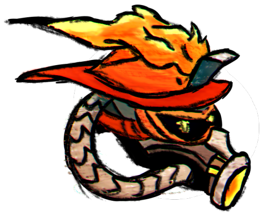
i think what's been putting me off of digital art for a while is that the way i was doing it just took like too long and was too tedious for my brain to want to focus on so i'm trying out New Ways Of Doing Things that have similar results to my old style (imo) and this is a result of Practice Arting.
anyway here's the guy with the same name as the character from cloudy with a chance of meatballs
#toontown#toontown corporate clash#firestarter#flint bonpyre#toontown cogs#ttcc#corporate clash#toonblr#toontag#cogs#art#digital art#artwork#so sad that he had to be decapitated in order for this to be drawn. oh well he'll get better soon.#this one. is small but i think i'm slowly getting out of my brain's refusal to do digital art...#hopefully i'll be able to do big pieces soon again without feeling the life being drained out of me every time i think about opening my#canvas. this definitely was easier to do than Other Artstyle and i think it's going to lead to better looking pieces cuz i'm not spending s#much time trying to squeeze texture out of a watercolor brush#although it's not lineless i hope i can experiment with it more to make the lines less prominent and have the shading be the way that shape#are flushed out to the eye while the lines are just. visual guides to what things should look like yknow#also i'm using fill tool for this now instead of Meticulously Filling In With Watercolor so that's less of a pain in the ass#and now i'm just doing watercolor in gradient spots for variation of color + shading#and then putting sketchbook over it to give it some more noise and texture to make it look less flat#no blur filter either i just rendered it with some unsharp mask and then changed the RGB levels to get nicer colors#basically it was just reg. brush over sketch -> fill color -> watercolor -> put pencil sketch over outline -> put pencil sketch over color#-> render -> add quick white background for some flair ig#unfortunately school will still prob be kicking my ass... fuck college algebra... but even when i'm tired i hope this'll Motivate me to go#do digital shit again cuz all i've been doing is notebook sketches and like. i miss making full-fledged colored pieces man. its just so#exhausting to do tho when my brain has a tantrum bout it. anyways
51 notes
·
View notes
Text
January Log

Started the new year locked up in my apartment, experimenting with indigo. It's so peaceful and life-filling to finally work on something else than commissions and heavy research projects. This period also gave me the time to rethink the was in which I draw for a bit and finally choose to act on how I want my work to look like from now on.
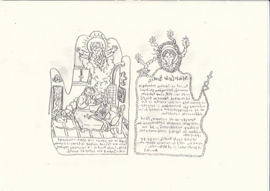

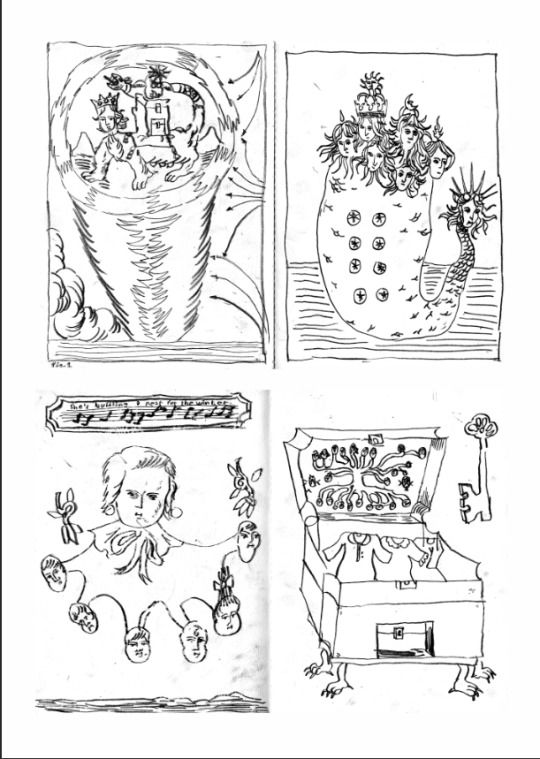
Palm-shaped spreads for a collective zine that Ana, Gavril and I came up with. This is my contribution on Carlo Acutis, the soon-to-be new catholic patron saint of the internet. Hope the zine will be printed in this first half of the year so that we can put it on our fair tables.

Visited Berlin for the first time and this is what I was able to bring back to cry and obsess over, to keep and to show my friends. It was pretty unreal to see so many people who I've been following for years all have printed works in almost one single bookshop. Felt like a dream in which I keep finding all sorts of Polly Pockets in a thrift shop. First thing I did was make sure that I visit Colorama on their only open day. I was in awe of their local scene collection and over the moon after seeing so many publications from the people over in Leipzig there as well. Then found some more book in Zabriskie and a ton of kush and minikush at Neurotitan. In a crazy series of events I also got to meet Alyona who happened to pass through Berlin, and we were able to secure an art trade for the ages.
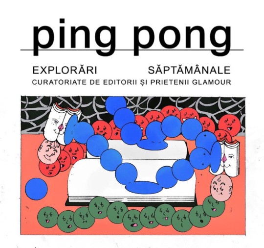
Back to quick commission work, I was invited to design the illustration for Glamour Romania's newsletter, Ping Pong. This is my proposal for the final drawing, although the colours did not make it to the newsletter due to them being deemed "too dark". May we reach a time in which dark colours do not mean dark atmosphere, uneasiness or "bad vibes", and we learn to trust artists and look deeper than paper-deep. Until then, we're at the corporate mercy of trends and presumptions on what colours should mean.

Lastly, I took a shot at Snail Eye's fantasy comic open call for their zine. This is the lineless version of my submission. Small sequence of a continuation of the Romanian film Maria Mirabela. I've been dreaming of reimagining the plot of the movie in some way, either by rewriting the original or by making a continuation that's not the absolute aberration of Maria and Mirabela in Tranzistoria (barf emoji). I chose the latter, happy that the open call finally gave me a good reason to start working on this project.
1 note
·
View note
Photo
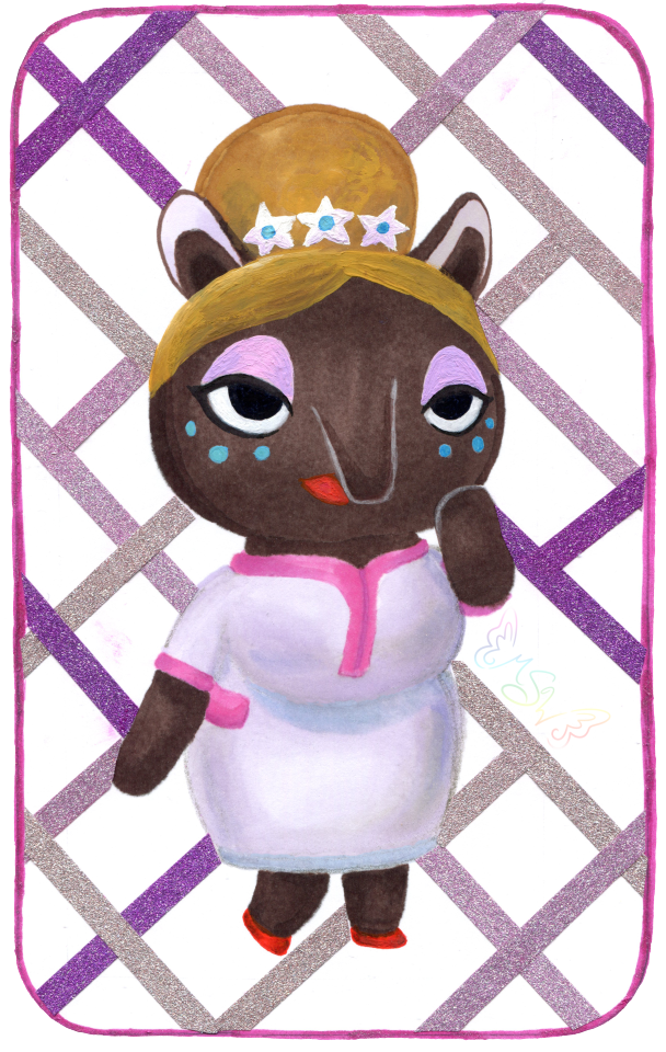
The Dream Crosser
Surprise! NaPoWriMo didn't kill me (and I'm not abandoning dA because of the incoming Eclipse update either, more on that situation here), I just needed a week off to recuperate...and obsessively play Animal Crossing: New Horizons...
Admittedly, I actually drew this well over a month ago (and wrote up the majority of the description!), not just before NaPoWriMo but before I actually had New Horizons in my grasp. The plan was to post it the day I got the game. Which was supposed to be much closer to the game's launch (March 20th). That ended up not happening and the day I got the game was the first day of NaPoWriMo, but 1. I messed up with the non-uniform prompts and spent all of the day trying to catch up so I couldn't even play the game yet, and 2. As a side effect, I ended up having two posts that day and a lot of work to do to catch up the second, and I hardly had time to think about posting this. And even if I had posted it, it would've been drowned in the incoming NaPoWriMo posts.
And so, here we are.
Really, really, I do have to mention that I truly feel for anyone else still waiting on the game for whatever reason. You have my deepest sympathy and I'm so sorry I can't just give you the game right now and make it better. I know the wait was hard enough for me, being this is the one game I highly anticipated in over a year and I essentially had the rug yanked out from under me. But I'll save that story for after I talk about the art itself since I'm sure that's what most people are here for and not my pre-order frustrations.
So in case you don't know or couldn't tell, this is the lovely Luna from AC: New Leaf's Dream Suite. From what we've seen of New Horizons since it's release, the Dream Suite's functions and purpose have been mostly absolved into the Airport and Dodo Codes, and so I'm very doubtful Luna will actually be in the game in any capacity, which makes me sad. A typical player (including me) wouldn't even necessarily interact with Luna that much in New Leaf unless you really enjoy visiting other towns using Dream Codes, so I'm not sure what it is, but for some reason I just really like her.
That's why I picked her to draw to celebrate. I very nearly drew her a long time ago when I was on an Animal Crossing kick in 2018, but at the time I didn't like the idea of pressuring myself into drawing all and/or multiple AC characters just because I wanted to be "fair" to them all (much the same reason I don't draw Pokemon very often), so I ended up drawing One Little Spark, a crossover of the Disney character Figment drawn in the New Leaf style, instead. So in a way, she's had this coming for quite a while.
At the time I started working on her, (way back in early March, because I was hoping beyond hope my pre-order would arrive to me actually on launch day, but ha ha ha look who's got egg on her face for that ) I was running a bit dry on artistic motivation, and so while I tried to draw her in my usual manner: Making a sketch, transferring the sketch onto different paper with finalized lines, then picking whichever coloring method I was most into at the time), I was struggling with the sketch. I've had days where I have to work on a sketch for a really long time before I can get something I'm happy with, but this day I was just so not into the whole sketching process. I wanted to create, but I wanted it to be quick and easy and simple. I didn't want to have to poke at it for hours and hours and then still maybe not be happy when I was done. So when I got discouraged enough, I broke away from trying to draw Luna and just drew mandalas instead. (As had become my art-block crutch for a little while.)
Somewhere in me, as I worked on other things, I kept going back and forth on what to do about Luna, though. I did still want to draw her, but my usual formula just wasn't working for me. Not for her. I even tried briefly to draw her linelessly, digitally, as what was supposed to be a quick and simple experiment, but that went downhill even faster than sketching did. Although, for some reason, the lineless idea wouldn't leave me alone after that.
Finally, I decided to try something completely different. I was going to try and free-handedly draw her, without lines, traditionally. With, primarily, alcohol markers.
Honestly, the thought minorly horrifies me now just as much as it did before I started. And yet, here we are and I actually like how it turned out. Allow me to explain how this came together:
So, since I wasn't sure how this was going to turn out once I decided to try it, I opted to use my not-so-great mixed media paper so I wouldn't feel guilty about wasting better paper if I ended up hating it. Naturally, this did lead to some notable limitations, but not enough to discourage me from trying.
I dove right in with the dark brown for her head and body, focusing on getting the general shapes down. I'd noticed some glaring mistakes in my mostly unproductive sketching when it came to Luna's body proportions, so I tried to keep those things in mind and adjust accordingly as I went. It was scary because there is no erasing this way short of using white paint and because this paper feathers pretty noticeably with markers.
Then once I got to a certain point, I had to switch and bring in some pink and off-white markers to draw in parts of her dress so I knew where to put her other arm and her legs. And here is where I technically cheated; I did use my "clear" Stardust Gelly Roll pen to do most of the outlines for her dress. I needed some kind of guideline, but pencil tends to get yucky when you put markers on top and at the time I couldn't really think of a better option. (The joke was kind of on me because somehow I still got a nasty gray line that looked like pencil under her bust that I had to gently edit out later in Photoshop, but I digress.)
As I went with the markers, I was also doing some light shading. Not too much, because this paper is really fussy with layers and blending, but enough that I felt like it didn't look completely flat and I could tell where one shape ended and another started. Though, for her nose (trunk? I believe Luna is supposed to be a Tapir) and her raised arm, I had to get a little creative and I used a white brush pen meant for glass/ceramics to put in the lines so you could actually see them. And later I would use the same pen in 3-4 layers to add the white back in for her eyes.
With the base for her body, dress, and the bun part of her hair done though, then I had the task of figuring out what to do for her shoes and the details of her face. (Without having to mix and use specific paint for those tiny details.)
In the end, I opted to mostly use my classic red Gelly Roll pen for her shoes, and a little bit of a dark red alcohol marker for shading. And then I got to experiment with mixing the classic red and one of the Moonlight Gelly Rolls for her lips so that the color would be visible and not just a dark lip-shaped "what is this." This was because the classic Gelly Rolls don't show up super well on dark surfaces and the Moonlight ones do, but I didn't have the right color straight out of a Moonlight pen. It did take 2-3 careful layers, but I think I managed well enough in the end.
I used just one black pen, a Prismacolor brush-tip fine liner, for her eyes, though in-person the white base underneath makes her pupils look about a shade or two lighter from certain angles, which was a very unintentional nice touch.
My answer to everything else ended up being gouache, although I did try to come up with pen colors for her eye shadow and the blue dots on her cheeks before admitting defeat that I just didn't have the colors I needed.
Originally, I had actually been thinking of trying a lineless art piece with gouache, as I think it would work particularly well for that look, but I wasn't ready to fully commit to the idea, mostly because I seem to be even worse at mixing a non-excessive amount of a specific color with gouache than I am with acrylics, and that sounds like a fantastic way to waste a bunch of palette space because I mixed too much but it's gouache so it can be re-wet and re-use it and I don't want to just throw it away... (Although I suppose this could be half-way solved by getting a bigger palette specifically for mixing gouache, but I also don't want to have to buy yet another palette when I have some perfectly good ones...If I could just use up all the paint in them already...)
Anyway. Point: This is kind of a step between a full lineless gouache piece and not doing one at all. Baby steps, yes?
I knew from fairly early on that I was probably going to have to use gouache for the front part of her hair/bangs, since I did not thoroughly plan ahead enough and didn't leave a gap there to do it with markers. Fortunately, I didn't have to do much mixing since my gouache already has a nice yellow ochre color included, and I could use a bit of the other two browns and one I had some leftover mixed already from Roses in Your Eyes for shading. (White for the flowers, too, thank goodness.) And I actually ended up going over most of her bun with gouache too since, by comparison, the marker didn't look like it had much shading and it was bothering me.
I did have to mix my own blue and pinky-purple for her makeup, and I ended up with a lot of leftover pinky-purple. But it's kind of okay because by itself it's such a pretty color I'm sure I'll find an excuse to use that one.
After that, I just had to do some minor tweaks where the gouache had gotten a bit away from me and then I went ham on the shading for the dress based on my reference photo.
Then I realized I wanted some kind of background because this seemed awfully boring without one. And, naturally, I hadn't really planned ahead for that, me being me and being in habit of doing the background last...
At first, I wanted to do something hot pink, since her official Amiibo card has a hot pink background, but then I thought that might be a little too loud and I wasn't really sure the best way to apply one without potentially messing her up. And also, this isn't watercolor or paper thicker than 140 lb, which immediately threw watercolor out the window unless I wanted a very uneven paper when I was finished. I'd already pushed my luck with the gouache and been very careful about not using much water with it; I decided it was best not to push my luck any farther.
Also, I couldn't use my pink PanPastel, despite that being maybe my best option, because it is still perpetually screwed onto the little Pan Pastel stack with no hope of getting unstuck anytime soon. (One of these days I swear, I will order either another set like the one I have or an individual Pink one to solve this problem, but until then, I am going to bring it up every single time as a caution to others to please be very careful when screwing and unscrewing your own Pan Pastels if you store them screwed together.) And I didn't feel like dragging out some of my drawing pastels and/or makeup that's too expired to use on my face and very slowly building up color and hoping it'll do what the Pan Pastels do.
With no better ideas coming to me, I decided I'd leave the drawing for the night and come back to it the next day.
After yet more brainstorming the next day, I finally settled on doing a glittery rounded rectangle and filling it with washi tape stripes. This plan did change a little as I figured out which tapes I wanted to use (a purple-y, champagne gold, and light pink ones, the latter two of which look more different in-person than they do on the scan) and as I actually started applying the lines. Partially because this tape is a bit thin and partially because I'm not used to cutting tape around very specific shapes, it took a very long time to both place strips of the tape and then get them cut to fit right up to Luna without looking strange.
Once I got to a certain point going in one direction, I realized my next couple of cuts were just going to be too hard for me to stand. I had a choice: Ditch the tape, or figure something else out.
Taking a risk, I decided to try and salvage it by doing an almost-plaid/checkerboard with the tape, specifically leaving out certain areas where I knew it would be too tricky to cut the tape. This also turned out to be a good way to use up some of the pieces of tape I'd already cut off that were too small to be used the other way. It's still not the greatest background solution I've ever come up with, but it does the job of making it look less empty, and that's really all I wanted anyway.
And you know, compared to official images her proportions look wonky, but by herself (meaning, without comparing the two) I think Luna looks pretty good, actually. (Though, I admit I did have to tweak her right ear in Photoshop because it came out entirely too long and there wasn't really a good way for me to fix it by hand.)
To think, this piece started out as such a mess. Or rather, I was such a mess when I started. And yet, here we are, and it looks kinda okay. Okay enough that I finished it and am posting it, at least.
I have no idea if I'll be returning to this style/method for art-making in the future, but even if I don't it was a nice experiment to try, and that's what art is really all about isn't it? Experimenting, trying new things?
Speaking of experimenting though, about those pre-order frustrations I mentioned now that I've covered everything about the art itself...(in small text for those that don't care to easily skip over)
Back in February I tried twice to pre-order New Horizons from Target, since they were running an ad where if you pre-ordered the game you'd also get an AC themed journal with it, and that combined with my family member's employee discount made it the cheapest/best value way for us to buy the game. As I said, I tried to order it twice. Both times, it was sold out. My family member had even tried to go to the store and have them order it before then, to no avail.
After the second time, which was the day after Target sent out the sale paper with the new ad in it, while I was still frustratedly wondering how on earth do you sell out of a pre-order?? I kept refreshing the page every so often just to see if by some fluke it would miraculously not be sold out. I got very lucky around 3 in the afternoon and we managed to get the order in before it sold out again.
Now, we're a relatively cheap family, so we didn't pay for the "express shipping" or whatever. Although, this was a $60 game and we were ordering it three whole weeks (on March 2nd) before release. If you ask me, the least they could do is have it shipped out either on launch day (March 20th) or the day after. Especially if I can pre-order a book on Amazon with three days' notice and they can still get it to me on release day. But, okay, I could live with waiting an extra day or up to maybe three if I had to. (And, to be fair, this was all before a certain virus exploded into chaos here in the US.)
Much to my dismay, a week before NH release day, I checked the order status with Target only to be told I wouldn't get it until the 26th. A week later. That was pretty disappointing at the time, but it didn't really bother me until the day before and the day of launch when some people were getting their pre-orders early from places like Amazon and Best Buy (and some of them didn't even pay for the express shipping option from their selected source). If those two companies could plan around virus constraints to do that, why in the heck couldn't Target?
But, okay, fine. Maybe the virus had something to do with it and they were really doing the best they could. Whatever. A week. Fine. I'll wait a week.
A few days later though, we got an email saying: Surprise! Don't expect your dumb video game until April 3rd because we couldn't get our act together! (Okay, that's not what it really said, but that's what it felt like.)
And I know, I promise I so know there are much more serious issues going on in the world right now and a video game about talking animals isn't exactly a priority shipment. I know. But it was still massively upsetting after I'd already waited so long. And, honestly, I feel like they had plenty of time and notice to take care of the game before everything else exploded and messed it all up. Again, especially if other companies already had time to even ship orders early and/or get the games to people on launch day. Or the day after. TWO WEEKS after launch, and you don't tell me about the secondary delay until the week I started expecting the game to already be in the mail on it's way to me?
The only tiny silver lining is that as I was checking the order to make sure it didn't miraculously get pushed back to sometime in 2021 (because I really had no faith in Target's time estimates at this point) is that it did get bumped back up to April 1st. Although, I did think that it would be the absolute least funny April Fools' Day Joke ever if the day came and it was late because screw me. But it did arrive to me on April 1st as promised; I just had a million other things to do before I could play it. )
And I will say, I know I could've just canceled the pre-order and bought the game digitally, but it was enough of a hassle to order it in the first place, and if I did that I'd also lose my pre-order bonus. And all that aside, I specifically wanted a physical copy to begin with. I always prefer that when it's possible. So people on the internet that want to eat me alive for not canceling when the shipping got screwed up, there are my reasons. Take 'em or leave 'em. (Seriously, I've seen some people be really rude about this just because they didn't like hearing people upset that they didn't have the game yet...when they already had it themselves or didn't care about AC in the first place...)
Moral of the story: Don't pre-order from Target. Or, at least, don't expect the item to actually get to you right around release day. Account for at least two additional weeks of not having the thing.
...Seriously though, how do you sell out of a pre-order?? At least, when it's a highly anticipated game and you're a big company and not some small indie company with limited resources! Sheesh!
Anyway. I have the game now, I've been playing it as much as possible and enjoying it. I still have a ways to go before my island is "complete" per se, but it's coming along nicely and I feel more comfortable now taking some more time away from it to get back into the swing of making art and things like that. So hopefully I'll be getting back into a regular posting schedule and you'll have that to look forward to.
____
Artwork © me, MysticSparkleWings
____
Where to find me & my artwork:
My Website | Commission Info + Prices | Ko-Fi | dA Print Shop | RedBubble | Twitter | Tumblr | Instagram
2 notes
·
View notes
Text
On Writing: Withholding the “True” Story in Toni Morrison's Beloved
published on Toni Morrison’s birthday: February 18, 1931 I’ve been pondering writing a new novel that illuminates a horrific period in my family’s heritage. As I re-read Toni Morrison’s Beloved, it became clear to me that her techniques of emotional withholding and surrealistic storytelling would be quite useful in telling the story that I’m tentatively calling A Mercy Upon Us.
The verifiable family history I would use in my novel is the story of my grandfather’s parents. They were two young immigrants from Holland, with four children in tow, and one in the oven. They brought with them their elderly grandmother, to help with the children and the new baby about to be born. However, the only English speaker was the father. Shortly after arriving in this New World, the father contracted tuberculosis and died. The mother had just given birth, and alone, alienated, and bereft in this strange land, she sank into post-partum depression, and shortly thereafter committed suicide. The oldest child, Sue, assisted the elderly grandmother in adopting out the other children to families who gave them new names and new histories. Twenty-five years later, Sue went back and found each of the children, and told them who they really were, and where they came from. She gave them their true story – which was both a curse and a blessing. My grandfather may have never recovered from the knowledge that he was not who he had thought he had been, and seemed to carry it as a dark weight his whole life.
Although this story has not a hint of magic about it (except perhaps the magic of memory), I found in Toni Morrison’s work a number of techniques that may help me to understand how to think through this book from the perspective of my narrator Sue. First, one technique I find quite useful is the way that Morrison describes events and persons through a lens that is unusual and lends a patina of strangeness to a scene, hinting just barely to her readers that all is not as it first appears. I could use this technique to give alternate versions of what happens, in a Rashomon type of multi-valent storytelling. For now, though, I think I’m going to just focus on Sue’s perspective, and let the story come out naturally as she tells it to the siblings she finds in her long quest to tell them the truth.
In Morrison’s novel, the dead ghost of a child re-emerges into the lives of the main characters as a grown fully fleshed woman who has “willed” her way back into existence. At first, they do not know who she is, or what she represents in their lives. Morrison mirrors the characters’ lack of context for “Beloved” by providing an the initial introduction of Beloved as a character through poetic language that paints the situation as strange and imaginatively unreal. No one reacts to the scene, but the description is strange and compelling:
A fully dressed woman walked out of the water. She barely gained the dry bank of the stream before she sat down and leaned against a mulberry tree. All day and all night she sat there, her head resting on the trunk in a position abandoned enough to crack the brim in her straw hat. Everything hurt but her lungs most of all. Sopping wet and breathing shallow she spent those hours trying to negotiate the weight of her eyeballs. …. She had new skin, lineless and smooth, including the knuckles of her hands…. four times the woman drank from the speckled tin cup as though she had crossed a desert. (Morrison 50)
The critical elements here are the indications that this “woman” is not of our world: her lungs hurt, her eyeballs have an unusual weight, and she has new skin. Finally, she has just “crossed a desert.” All of these mentions tell the reader that this woman is experiencing reality in a different way than the other characters. Of course, after you’ve read the book once, you recognize the metaphors of birthing and of new life in the world. However, at first read, these hints simply give her reality a radically different angle, an unusual and poetic perspective. The hints reverberate and pile up though, over time, until the weight of what they might mean is inescapable.
In the same manner, I believe that the mother’s suicide in my novel can be more powerful if I don’t actually say it by name, but instead allow it to be hinted at and illuminated by metaphor until the possibility of it, and then the reality of it becomes something heavy and inescapable in the reader’s mind – an overwhelming radical change that is referenced only glancingly by the other characters, but gradually insists on its own reality, much as Beloved gradually insists on her reality in the lives of the characters in Morrison’s work. Metaphor and oblique references are critical tools to invoke an alternate story, or to hint at a story that can’t be told overtly.
If I need to hint at the story, it’s also necessary to show how my other characters are gradually informed. Specifically, I think withholding the actual story from my readers, and allowing it to come out gradually as Sue tells it to other people, is a technique worth exploring. Morrison does this adroitly. For example, it is absolutely lovely to see how she has her characters interact with “Beloved.” They field seemingly innocuous questions and discussion, and then Morrison allows the realization of the import of those questions to land later, at the end of the discussion, so that the true meaning of that conversation reverberates backwards through the story. Here’s one instance of this technique: “Now she noticed something more. The questions Beloved asked: ‘Where are your diamonds?’ ‘Your woman she never fix up your hair?’ And most perplexing: Tell me your earrings. How did she know?” (Morrison 63). The cold realization of something unnatural – knowledge ungained from the other characters – hits the characters after the reader has already realized something is strange about the woman’s knowledge.
Finally, Morrison brings the “alternate” story (or the backstory) into her character’s lives through visceral experiences that are inserted into a present narrative. She forces the story into the main narrative by taking the hints much further, until their import is inescapable. Here’s a later scene that shows “Beloved” demonstrating her story – and her ghostly reality – to the other characters:
Beloved, inserting a thumb in her mouth along with the forefinger, pulled out a back tooth. There was hardly any blood…. Beloved looked at the tooth and thought, This is it. Next would be her arm, her hand, a toe. Pieces of her would drop maybe one at a time, maybe all at once. Or on one of those mornings…she would fly apart. It is difficult keeping her head on her neck, her legs attached to her hips when she is by herself. (Morrison 133)
Again, in this scene, Morrison does not make the back-story of “Beloved” into something unreal or ghostly, but grounds in realistically-described moments of experience that the other characters can actually sense and feel and see. Her character’s tooth removal seems very realistic and very sensory. Therefore, when her character ponders her own unreality, and the difficulty of living as a “ghost” in the human world, the reader can suspend disbelief and travel with her narrative, because the previous moments were firmly grounded. Instead of being caught in abstractions, the reader starts from an anchor point that is firmly grounded in the everyday world. What Morrison does so amazingly well is to make the magic real to the characters, and thus, to the readers.
The realistically described experiences of “Beloved” thus brings the realization of the back-story (or alternate story) home to her readers with a powerful punch. Much later in the book, after all of these hints and experiences have slowly collected like drops wearing down the disbelief of her other characters, Morrison finally brings a waterfall of realization. Here’s where Morrison brings the truth home: The “sweet conviction” in her eyes “almost made him wonder if it had happened at all, eighteen years ago, that while he and Baby Suggs were looking the wrong way, a pretty little slavegirl had recognized a hat, and split to the woodshed to kill her children” (Morrison 158). This is the moment that Morrison brings out the main pivotal moment in the backstory. Because of her consistent buildup of this story, the description lands with a satisfying wallop of pain.
In Morrison’s techniques of metaphorical description, backstory hints, and visceral experience, I see some tools I can use in gradually revealing the “truth” of my story Mercy Upon Us. I hope that when I’m able to take the time to write that novel that I’m able to effectively use these techniques to communicate as powerfully as Morrison did in Beloved.
A literary update from NedNote.com
Readers can find my books at these bookstores:
WORKS CITED
Morrison, Toni. Beloved. New York: Penguin Group, 1988.
On Writing: Withholding the “True” Story in Toni Morrison’s Beloved was originally published on Ned Hayes
1 note
·
View note
Video
youtube
For our latest project we created an animation based on a poem by Dr Seuss. I chose the poem ‘Oh, the places you’ll go!’ to base my animation on.
In the beginning of the project, I had to research Dr Seuss and his poems in order to get an understanding of what could work when translated to an animated form, and I wrote 2 mini essays on himself and several poems I was interested in that I could refer back to when I was deciding on what to do for the final animation. Writing these essays helped me greatly as they helped me decide what poems would be best for me to use in a creative sense as I enjoy having creative freedom, and analysing the poems helped me realise which ones gave me the most freedom to do what I wished with them. Reading the poems also helped inspire me when I was creating my storyboards, so I could create scenes which relate to the poem and make sure that I was translating the work over to animated form well.
After I wrote the essays, I began work on concepts for the characters and settings of the animation that can be seen here and here. I decided to try and go for a simple lineless style that would be easy to animate and interpret. I experimented with using simple shapes as bases for characters so that they would be simple to draw but also have the potential for dynamic movement, and settled on a final character that was mainly composed of simple shapes (such as a square for the body and head with curvy arms and legs). Going back to my chosen poem as reference, I noticed that the themes of travel and adventure were very prevalent in the poem. Inspired by this I decided to dress my character in something that could be seen as an adventurers clothing - with a scarf and classic aviator hat. I hoped that the subtle clothing reference would help my animation give the feeling of an adventurers journey.
After finalising the design I moved to Illustrator to create the character so that I could animate it in After Effects. I had to be careful when making the drawing as every component of the character needed to be on a different layer so that I could move those areas around in After Effects without issues. I think I did fairly well in this area although I am still slightly unused to using Illustrator - I tried to make the drawing as clean and simple as I could with my understanding of the program, and I think I achieved this well in the final drawing. I initially wanted to do some puppet animation by having the mouth and eyes appear to move with ‘flaps’ in the file, but in the end I found this too difficult to make work. However I found an alternative by using the puppet pin tools in After Effects on simple lines and circle shapes for the eyes and mouth in order to make them move and not take too much work to do so.
After finishing and reviewing my final animation, I think there are some strengths in what I have created that show where I pushed myself. In particular I am very happy with my colour schemes and backgrounds in the animation, as I tried to make the colours portray very specific feelings and I used certain brushes and tools to give my backgrounds other feelings, such as the crayon-like textures and sloppy paint to give the impression of a world created by a child; several people who I showed this video to managed to pick up on this subtle inclusion which shows to me that it was something I managed to pull off very well in my animation. I think I could improve on this in the future by trying to use this kind of technique when making backgrounds and other details in other projects, as I think this subtle use of texture and colour could help portray other feelings and settings very well and it is likely something that will become better the more I utilise the technique.
I also managed to get the hang of several new skills while working on this animation as well. Before this project I did not use the puppet pin tools very often and found little use of them, however figuring out I could use them as an alternative to a more difficult method made me enjoy the tool more and learn how to use it better. I was also able to practice using parenting with files in After Effects, as although I had already done this in other projects I was still fairly unused to it. I managed to use parenting in fairly clever ways by using it to move the backgrounds around fluidly without needing to fade into black and make another scene or disturb the characters and other objects.
However there are also some parts of the animation that I did make some mistakes in. The actual movement of the characters in the animation is very choppy and I can see some mistakes I made in the movement (such as the walk cycle) that I did not realise until after rendering. I also noticed I made some mistakes with the keyframes as I tried to position certain objects behind others (such as the birds behind the bush) but mistakes in my keyframe positioning made it so that some parts of the birds were visible from behind the bush when viewing the animation closely. Next time I create an animation like this I should pay more attention to where I am positioning my objects and I should also consider making my characters more dynamic in Illustrator. For example instead of having one long objects be the arm, I could split it apart into new layers so I can move all parts of the arm separately (ie the upper arm, lower arm and hands) so the movement is much more realistic and doesn’t look goofy.
Overall I found this project very fun and enjoyed most parts of it. In particular I enjoyed creating the concepts and storyboard as I like the creative process of sketching out ideas and choosing which ones are best to fit the prompt I have been given and yet still having full creative control of the final product. I am still fairly new to storyboarding but it was also a great part of this project for largely the same reasons, and I enjoyed the ability to just sketch out ideas and then see them finalised in the final animation.
0 notes
Last Seen Blogs
sabraevn
Don't forget, you are the hero of your own story.

asgersdottir-blog
wilderness dance

369gf
Untitled
idealistic-imaginings
ALL OF IT, ALWAYS, ALL OVER THE PLACE
kit10phish
Kit10Phish