#first time i also did such a huge edit and working more with overlays/blending modes
Text
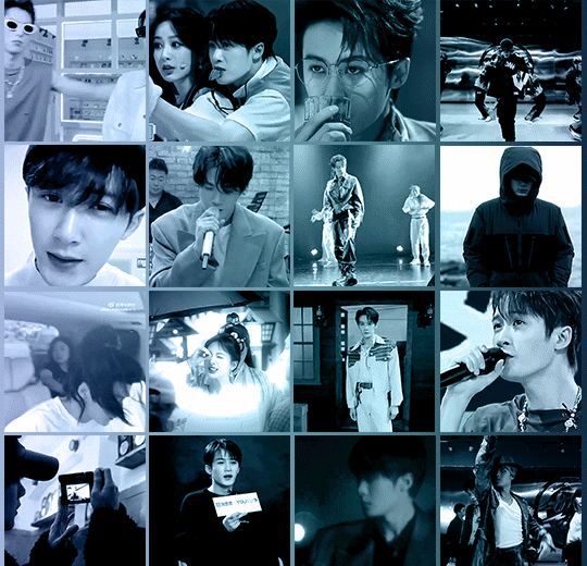
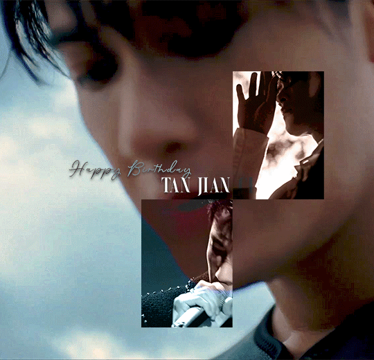
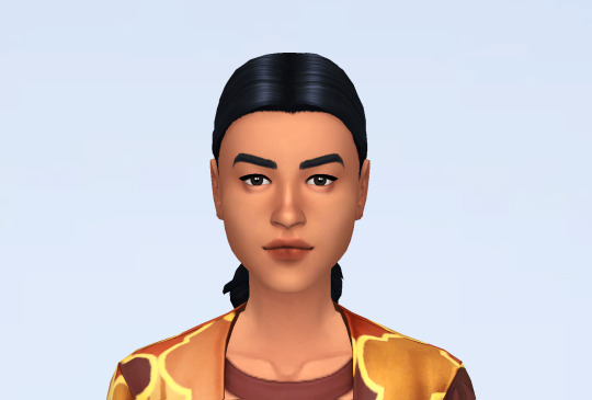
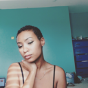
HAPPY BIRTHDAY TAN JIANCI 檀健次 / 5.10.1990
#tan jian ci#tan jianci#cactoredit#cdramaedit#asiandramanet#asiandramasource#dailyasiandramas#cdramasource#usergif#chineseartistsinc#lost you forever#xiang liu#tjc#mer gifs#birthday sets#2023#🎨 sets#this is super late i know (i fell asleep and then had to redo some parts hahaha *cries) but better now than never#first time i also did such a huge edit and working more with overlays/blending modes#i knew this was gonna take me extra long still i didn't start earlier although i intented to#what do we learn from this? that i still won't learn and listen to myself lol#a huge thank you to @hellaspooky for doing a tutorial how to do this ink effect! i learned it from hers#really proud of this set#🖤
46 notes
·
View notes
Text
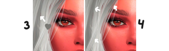
✨how i edit hair (tutorial)✨
this is going to be very long, so i will keep everything under a “read more”!
though i had already made a general editing tutorial, which you can find here, i didn’t go really in-depth into how i draw hair in my edits. so, hopefully this tutorial will give more details on what i do!
also, i will be separating this tutorial into two halves - one being dedicated to how i’d edit clay hair, and the other half being how i edit alpha hair
________________________________________________________
clay hair

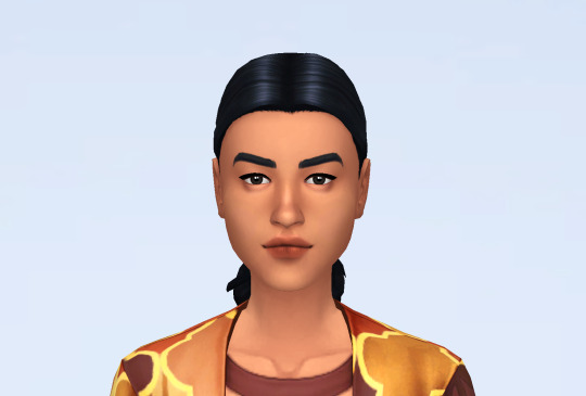
okay im regretting how big these screenshots are LMAO anyways, here is just a pic of what the screenshot will look like before editing!!!
just an FYI, in my editing style, how i edit hair doesn’t drastically change the sim’s hair in the screenshot. i do my best to add onto what’s already there!
tips before we start: i’ll be using a hard round pressure size brush with 40% smoothing. because i use a tablet, a brush with pressure size helps to create strands that are “feathered out”. don’t worry, you can still create hair strands if you’re using a mouse, which is what i did for roughly 4 years before i got a tablet. i will give some tips at the end of the tutorial on how you can still make your hair strands “feathered out”!
first, i take the eyedropper tool and pick up the lightest shade that appears in most strands of the hair, usually i go right for bangs/face framing bits.
then, with that color, i’ll go ahead and add strands of hair to parts of the hair that are hit by light the most (don’t worry if you don’t really know much about lighting, once you play around with this you’ll feel like you know what looks right!)
HUGE tip from here on out: make sure your strands go with the flow/curve of the hair! of course, you can add some funky strands to add texture/change stuff up, but for the most part, you’ll want your new strands to go with the flow of the hair!
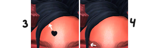
after i added those lighter parts, i’ll do basically the same step as before, but do the exact opposite. i’ll take the eyedropper tool and pick up a darker shade in the hair
with that new color, i’ll add darker strands to parts of the hair that aren’t hit by light (or not as much as other parts of the hair)
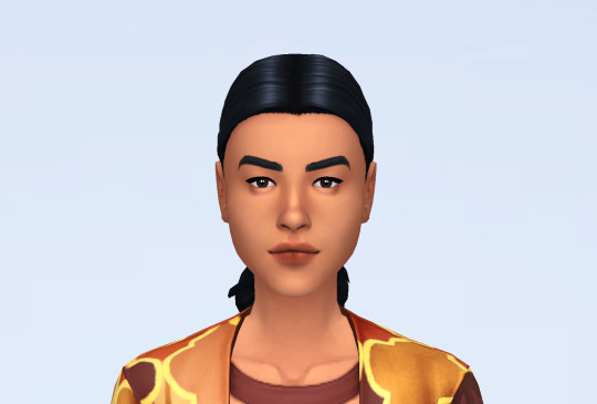
this is what it looks like after i apply those steps to the screenshot! with gameplay pics, i’ll make it incredibly simple and only add a few strands (even less than shown in this screenshot), but you can add however many/however few strands you want!
after those steps, i’ll also go in and maybe add a couple of funky strands (such as the two random strands of hair you can see at the front there)
________________________________________________________
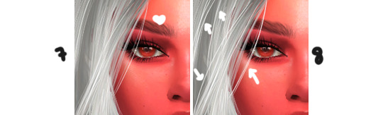
alpha hair
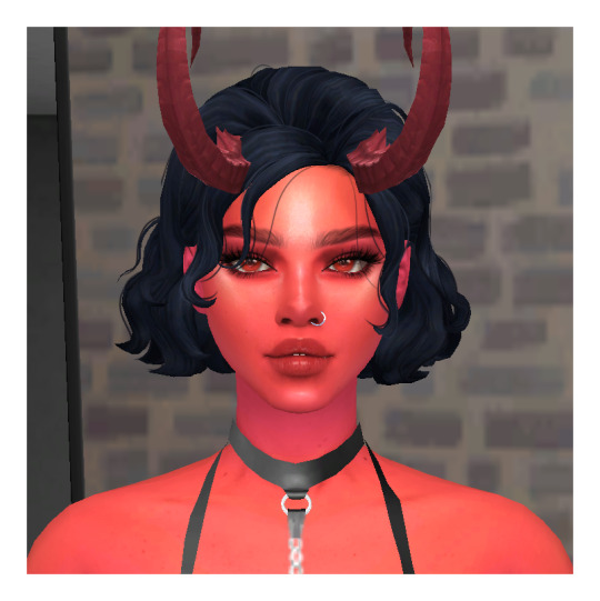
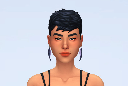
here is the before pic for the alpha section of this tutorial! the steps in this section are very similar to the steps i gave in the clay section, so the steps here won’t be too intense. also please ignore the wonky hairline in the screenshot, i forgot to change it when taking screenshots LMAO
this is almost a repeat of the first two steps of the last section!
use the eyedropper tool to pick up a light shade from the hair, it doesn’t have to necessarily be the lightest shade!
usually i use a 1pt-2pt brush and create a lot of strands of hair, again going with the flow of the section that i’m working on
tips: for editing alpha hair, i’ll use a softer hand than if i were editing clay hair. if you’re using a tablet, using less of a heavy hand helps to make the strands look softer and help to blend in with the rest of the hair. also, i find it better to be really quick when you’re drawing the strands so that they seem more natural!

here’s how the screenshot will look after that! again, you can also throw in a few wonky strands if you want to!
the next step will be taking a darker shade and applying it to strands where i’ll want more depth
here, i’ll be taking the eyedropper tool again but picking up a dark shade in the hair. instead of using the exact color i just picked up, i’ll go over to the color panel and make the color a few shades darker since i’m using a soft hand when drawing the strands.
i don’t really have a general rule for where i’ll draw these darker strands, but usually i make these strands in places where i want to help separate sections of hair more + more towards the roots of the hair (hopefully that makes sense!)
tip: if you’re using a tablet and using the hard round pressure size brush, if you’re adding these darker strands closer to the roots of the hair, i find it better to drawing the strand upwards towards the root rather than at the root and drawing the strand downwards!
i was really dumb and forgot to save the pic of what the screenshot looks like after this so... moving on lol
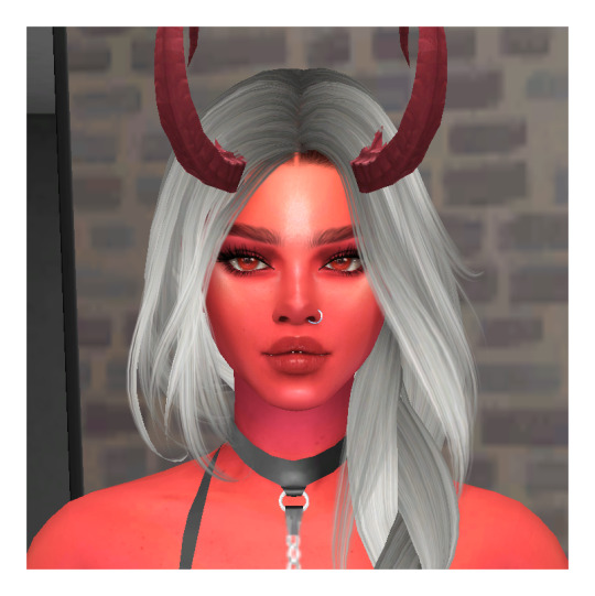
after adding darker strands to create depth in the hair, i’ll go in and add some more lighter strands to create some highlight
i’ll add a new layer with the overlay blend mode and only use 1pt size with white to make these highlight strands
idk... badabing badaboom? instead of focusing more on the outside of the section that i’m working on, i’ll focus these highlights in the middle of the section
here’s what that should look like! hopefully, you can see after the last two steps that there’s more depth and highlight in the hair!
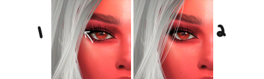
thank god this is almost done.. thank god. anyways, i’ll finish up editing the hair by throwing in random white hair strands
this is a lot like the last step, but this time this will be on a new layer with the normal blend mode, but using a size 1pt white brush again.
since the hair in the screenshot is white/gray, i’ll throw in more of these white strands than i normally would. with any other color of hair, i’ll usually use these strands more for face framing and the back of the hair, but it really depends on where the light source is.
tip: as opposed to previous steps for the alpha section of this tutorial, i’ll actually use a pretty heavy hand when making these strands so that they stand out more!

badabing badaboom! that’s how the screenshot will look after all of the steps are done! i’ve been working on this for almost two days (not because i think making this tutorial was necessarily hard, i just had other things in my life to take care of, so i couldn’t sit down for a few hours straight to make this)
bonus: if there’s colorful lighting in the screenshot, i would create a new layer with the either the screen blend mode, lighter dodge (add) blend mode, or the lighter color blend mode. it really depends on what you want for the screenshot, so just play around with blend modes! i’ll take a color close to what color the lighting is and basically repeat the same step as highlighting hair, but paying very close attention to where that light source is.
anyways, i’m tired. i hope this tutorial was easy to follow, and i’m very sorry if it wasn’t!!! i’m not always the best at explaining things ♥
74 notes
·
View notes
Text
🍑 Sim Making 101 w/ peachpxel 💁
So recently I started getting asks along these lines:
and i don’t really do anything too special, but i decided to make a “guide” anyway for anyone else who wants to know CAS tips/how i go about making my sims.
under cut because it’ll probably be long :3
Okay so first, if I have a good idea of what i want my sim to look like, before I go into CAS I google some reference images. For this tutorial, I searched:

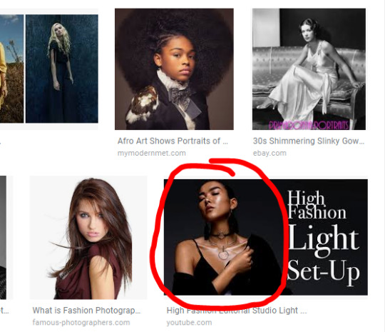
I got a lot of stuff, but I really liked this image in particular, so I saved it and pulled it up on my laptop to reference while I make my sim!
Also, an important note, skin details really make or break a sim. Like you can have the same sim but they’ll look totally different depending on what default skin/overlays you use.
My tastes change quite frequently, but right now I am using this as my default skin (it works as a pretty nice, clear base) and either this or this (less frequently and usually for the guys) as an overlay; they add some more dimension but I don’t think they’re overly realistic. Also don’t be afraid to change your style and defaults! My earlier posts/sims definitely look different than they do now. Find what works for you and roll with it!
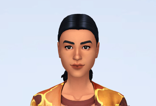
Okay so, when you’re actually in CAS, my #1 tip = use the random button. Before making a sim I almost always randomize 3-5 times just to get new faces to start from; it really helps to break the habit of same facing too. So I randomized (actually six times XD) and got this:
Not great, but definitely not the worst I’ve ever gotten XD. To start, I’ll make some basic changes: skin color, eye color, remove the god awful glasses, etc.
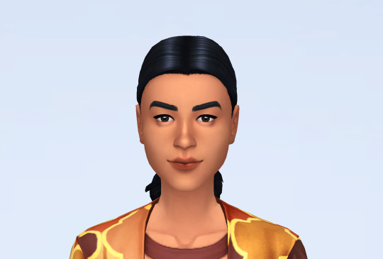
Looking better! Also, pro-tip: try and pick out the hair you want from the jump! when you’re making your sim, you will try to format the face to fit the hairstyle even if you don’t realize it. So, if you start bald, your sim might not look good with hair XD. Next, I’m gonna apply my skin blend (hazel):
See what I mean about the same sim looking different? Also, pro-tip: apply the skinblend before you start editing! if you wait until after, some of the features may not translate quite as well! ---- So my next step usually varies depending on which area I think needs the most help lol. In this case, she is severely lacking a jaw. So next I’m gonna format her jaw:
I start by manipulating that area of the jaw in detail edit mode. going upward creates a stronger, sharper jaw--going downward creates a more square jaw. For this sim, I moved the slider upward and slight outward. Personally, I think the jaw really adds character to a sim and my sims, especially the guys, usually have sharp jaws.
Ah, now she’s starting to look like a real person :D . Next, I will fix the brows:
The eyebrows are also very expressive and tend to change the whole look and feel of a sim + ea, for some reason, loves T H I N brows so.. ya know ya gotta change that shizz! Next, I want to work on the eyes:

this, was actually the easiest part... lol. Pro-tip: USE THE EYE PRESETS! If you use no other presets off the list ea provides... please use the eyes! They control eyelash length (i use default ea lashes, but if you use 3d lashes it won’t matter so much), and lid pronunciation (some skin blends will have options for that though) so there are some looks you just can’t get unless you switch! So try to know what length you want the lashes and the type of lid you want BEFORE you start manipulating the eyes, or else you may have to start over!
In this case, I had it easy because there was pretty much a preset i thought was perfect for her face
After ward, i tilted them slightly upward and moved them down a bit and voila!
Next, the lips!
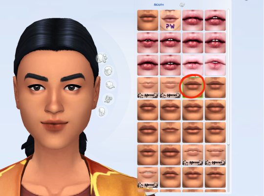
So, pretty much the same thing with the eyes, I looked for a preset that was close to what I was going for before I started manipulating: I wanted a less pronounced cupid’s bow. You can see I also have some lip presets, but I actually very rarely end up using them.
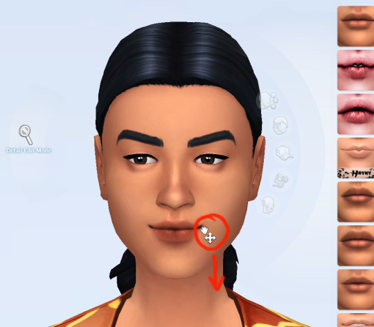
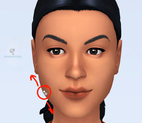
So, the next part is totally niche and it’s just something I’ve always done, I give the lips some pout. You just take the mouth corners (not in detail mode) and drag down. It’s very rare that I don’t do this to my sims. After that, I made the lips a tad bigger and made the upper lip wider! :
Next, the schnoz!
uhm, so i actually liked her nose and didn’t really change anything. I made the nostrils a little less wide, widened the bridge a bit, and made it a tad longer, but that was it! Okay so the next step is fun! The diversify step!
Basically, you want to make a face a little more quirky and less perfect. Usually I pick a feature and find some way to make it more interesting. My go to are the ears, if they’re visible, but I’m gonna change it up this time!
Okay, so all I did was make her eyes smaller and tilt her nose upward a bit, but it made a huge difference. Little things like that go a long way in making your sims look more unique. Try to break away from perfect features and do something quirky every once and a while!
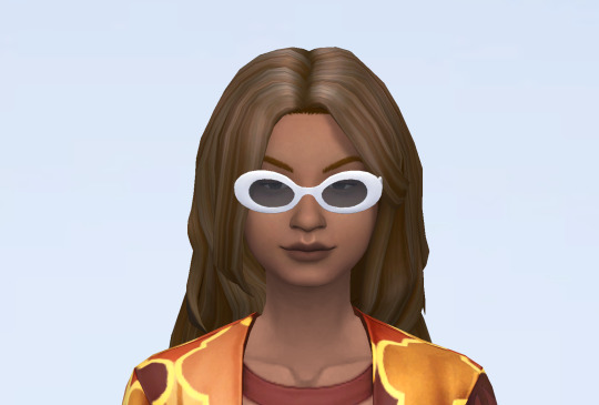
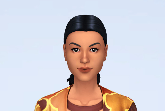
From here, it’s all skin detail, makeup, and clothes! I can’t really give a tutorial on that part since you really just pick what you like, but (after a few more minor tweaks) here’s the final sim:
I changed her hair AGAIN, but she was giving me edgy vibes so whatever lol! I made her ears stick out more, and tilted her eyes up some. Then I slapped on some makeup + a few things from the about face kit and BAM! A new sim!
I definitely deviated from the reference, but the point isn’t necessarily to recreate the picture (unless you want to) but rather gain some inspiration from it. I liked the bronze playing off of the black, so i made her makeup more orange and have her black earrings and a black romper. And I did steal her strong jaw XD!
So that’s pretty much it! I hope that this was helpful to everyone who was asking how I go about making my sims!
If you guys want more tutorials in the future I’d be happy to make them!
~ ❤️🍑
36 notes
·
View notes
Text
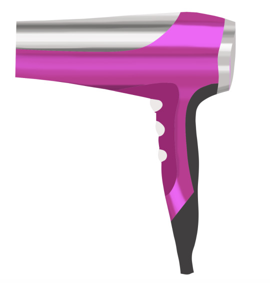
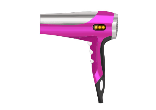
Studio 8 Reflection
This weeks tutorial task was to take a hand drawn sketch and render it using Ad obe Photoshop to produce an image that shows form and materiality in order to effectively convey an idea to a client.
I was daunted by this exercise at first but found that the step-by-step guide was very useful and it was quite enjoyable when you knew which of the ridiculous number of tools to use for the job.
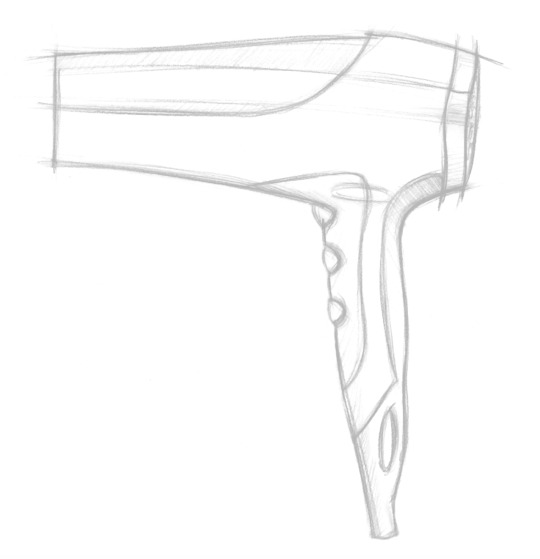
Firstly I inserted the supplied hand-drawn image of the hairdryer and cleaned it up by adjusting there level and getting rid of marks by using the spot healing tool and clone tool.
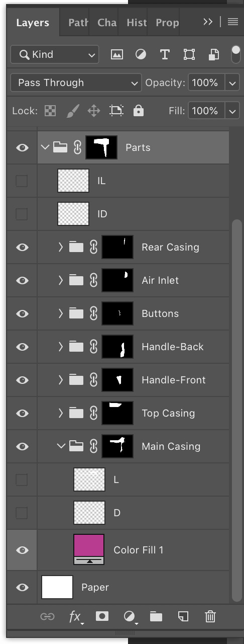
Next I organised myself as set out in the instructions by setting up layers for each of the components of the hairdryer and adjusted the order and blending modes. Each part had a layer group with a fill layer (of chosen colour), highlighting layer and shadowing layer.
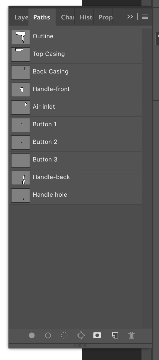
After the layers were set up I needed to create paths to outline each part of the hairdryer. First I did the main outline and then each of the components. To do this I used the pen tool and curvature pen tool. Once I had my paths I used them to create masks to allow myself to edit each individual component. Masks could also be subtracted from each other to create masks for central components.
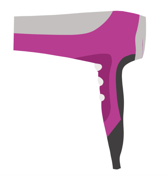
After the masks were created it was time to add shading over the base colours previously chosen for each component. This was to add shine and shadow to understand the shape and material properties of the product. This was achieved by using the paintbrush tool with varying opacity, hardness and brush size. Highlights were created by painting white as an overlay and shadows were created by painting black in varying opacities. This was daunting at first but I got better at creating clean strokes. I did mostly follow the notes as I don't yet have a great understanding of shadows and highlighting. It looked much better when you walked away and came back to look at it.
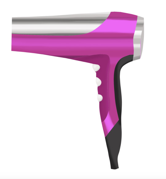
Next I added some texture to the less shiny surfaces of the product: the front and back of the handle. To do this I added a noise filter to my colour fill layer. I chose to use a higher setting on the pink front handle and a finer setting on the black back handle.
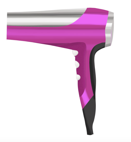
Next I used an image of a dotted pattern to create detailing for the air vent at the back of the hairdryer. I pasted an image in on top of the air vent fill layer and played around by rescaling it and modifying the layer blending options.
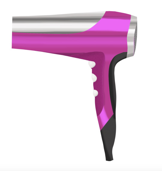
Next we added an LCD screen with some LED lights to give some function to the product. This was a fairly complex process that involved adding shapes that were strategically layered and blended and then using a blur effect to give the lights some glow. This part was very satisfying.
Next we added an outline to the whole image and some internal outlining. To achieve this we needed to use the paths we had created. By selecting the outline and the paintbrush tool I painted a solid black line around the hairdryer. I then selected the paths for all of the inside components and added a thin black and white line next to each other. We also added some text to signify the branding and model. I didn't get time to do that background as I wanted to work on Project 2.
My final result:
Major Learnings:
This week was a huge learning curve that I wouldn't have been able to conquer without the instructions.
I learned useful transferrable Photoshop skills such as layers and masking.
To use the different pen tools and the paintbrush tool
How to create effects such as highlighting, shadows, blurring, texture.
How to organise your work in photoshop to avoid confusion and understand the behaviour of your layers.
Major Difficulties:
My paths and therefore masks and outlines need some work, especially where the intersect one another. Next time I would either make better use of subtracting masks or I would temporarily paint the paths I've done to help with drawing subsequent paths. I also had an issue with working out how to mask the hole in the handle but I got around that by filling the path at the end.
I found the shading somewhat difficult but it got easier and smoother with practice and once I looked away and looked back at my work it was actually more effective than I had initially thought.
I had some trouble manipulating the shapes I had made for my LCD display but that got easier once I got a better understanding of the tools to use for each job.
Overall I feel a lot better now I have conquered the beast.
3 notes
·
View notes
Text
EVALUATION
The requirements of the brief were to understand how image manipulation techniques are used in the work of others, be able to digitise source materials, be able to originate work using image manipulation hardware and software and be able to present own design outcomes. There was also to understand the potential of digital media in contemporary art and design practice, be able to select materials for digital experimentation, be able to produce work using digital art and design techniques.
We had to either redesign a book cover or turn a movie into a book cover. I Decided to do The Purge. We had to use some photography in our work however it was a creative piece and we had to manipulate the work to make it indistinguishable as a photograph in the end. Task 1 was to create a Tumblr and start researching. We began with Erik Johansson and had to outline his process and how he created his work. We then had to research 2 more artists of our choice and I chose Luisa Azevedo and Chema Madoz because I thought their work was very interesting and intricate. Next, we had to find multiple examples of different and intriguing digital illustration that have used photography in their work. I found 3 I loved and explained why I chose them on my Tumblr. One of the last things was to experiment with photoshop techniques and I looked on Youtube for this and found examples on how to create fire and text on photoshop and also turn everything cartoon. Lastly, we had to create a small 200 word paragraph and explain how photoshop can help in the creation of art.
Task 2 of the brief was to show evidence and ideas generation which I did in a small sketch book and took photos with my phone and uploaded them onto my Tumblr. I then had to write a proposal with 400 words to explain what I was going to do and why. I personally didn't do a final small sketch with an outcome because to be completely honest I didn't know what I was going to do until it was done. I then finally did a diary entry that was updating what I was going so far and what I wanted to continue doing and what was working.
Task 3 was then just basically creating my final piece and taking screenshots of what I had achieved so far along with sending my final piece for marking. Lastly, we had to create a final diary entry however I am going to include this in my evaluation as I am going to explain how and why I did it.
The creative process I followed was just one big learning curve on how to create things. I wanted to experiment as much as possible so I did a lot of techniques and if they worked with my image I added them in. To create some of my ideas I decided to do a small mind map inside my sketch book and put different ideas on their along with potential options for other book covers. I took inspiration from having a quick look at the movie posters and also from older book covers as I wanted to keep it very simple and effective. The only planning I only really took was creating some mind maps before hand and viewing youtube videos to learn how to create new photoshop techniques. Some new techniques I learnt were how to create fire from nothing and also how to create something a cartoon.
Personally I didn't have a specific meaning for my photoshop final piece I just wanted to use this opportunity for myself to learn new techniques and create something I created myself. To create it I started with a photoshoot of the person of choice including the masks. I didn't do a huge photoshoot as I knew the basic style I wanted to shoot. Once this was done I went to photoshop and opened up my final image. once this was done I edited the shadows and highlights to bring the image out a lot more including the contrast so the image wasn't so flat. I started with just this to begin with as I wasn't too sure what I was going to create. It was at this point I chose I wanted to make it more of a cartoon; I then went onto youtube to learn how to create it. Firstly I opened my image onto photoshop and then copied it onto a new layer then made it invisible by clicking the eye next to it. Next, I went onto the background layer and converted it to a smart object by right clicking and then clicked the selected option, this was so any affect can be separated easily. I then went onto ‘filter’, ‘filter gallery’ and then onto ‘artistic’ and finally ‘poster edges’. I set the edge thickness to 0, the edge intensity to 4 and posterisation to 1. After that I went onto the filter option next to the effect and changed the opacity to 75%, then I went back onto filter gallery and then chose the ‘cutout’ filter. I made the number of levels 6, the edge simplicity 4 and then edge fidelity 2. After applying the effect I double clicked on the same icon and made it 75% again. For another time I went back onto filter and chose pixelate, colour halftone, made the maximum radius 4, and made all 4 channels 45. This created a dotted effect however once again I double clicked and made the opacity 75% but changed the blend mode from ‘normal’ to ‘soft light’. Once this was all done I made the first layer visible again by pressing the eye icon next to the image and chose ‘glowing edges’ from the ‘stylise’ folder. I made the edge width 1, edge brightness 3 and then smoothness 15. For the last time I went to filter gallery, sketch, and then torn edges with the image balance 4, smoothness 15 and the contrast 12. Above all of this there is a drop down arrow and I then changed this to ‘overlay’ which overlaid the images together and merged them nicely and changed the opacity to 40%.
Overall I am very happy with how the editing came out. To create the fire I first got opened a new page in photoshop and made the background black. Using the pen tool I made a random shape using 4 point creating a very simple flame like shape. Once this was done I went onto ‘filter’, ‘render’ and then ‘flame’. I then chose the first option ‘one flame along path’ and then it made a flame. I then copied it onto my actual image and used control + J to make copies and dot them around the page also making new flames so it wasn't too consistent.
For the text I couldn't manage to find any text or any way to create the same effect from scratch on photoshop and therefore I used the pen tool to cut out the actual Purge text and copied it onto the cover.
I am personally very satisfied with my final piece because although I think it could look a lot more professional I am happy that I learnt how to do many new things and think for the first time doing them they turned out really well. My aim was to teach myself new things and although I had less time to do this assignment than others I think I learnt the most in this one. My strength was learning and teaching myself new things and my weakness was that it was my first time doing a lot of these things on photoshop and therefore they may look a little bit amateurish. If I was to do this project again I would maybe plan it out a bit more better and give everything a certain time so I can get certain bits done in certain times instead of winging it.
1 note
·
View note
Text
Creating a good lyric video for less than $10
How to make a lyric video for your song (without using Motion or After Effects)
Lyric video: a video that shows your song lyrics while the music plays. [Pretty self-explanatory.]
Not only are lyric videos a great and manageable way to keep your video content coming in between bigger projects that involve more complicated production, but I’ve found they can actually be a lot of fun to make.
Below I’m going to talk about how I created six different lyric videos along with info on some of the FREE tools I used.
A few things to keep in mind:
I’m not a video guy. Every time I make one of my own lyric videos it’s a process of trial and error. A pro could probably create something twice as good in half the time, but I enjoy playing around to find solutions on my own. Plus, video budget? (Pshaw).
You can make really cool lyric videos with programs like Motion and After Effects. I didn’t. For one, those programs cost money (see pshaw above). But diving into one of those programs would mean I have yet another learning curve to climb. I’m interested in exploring Motion at some point, but in between family, work, and everything else, I’d rather use what time is leftover to make music and bang out some videos, not hunker down in the lab for days on end. Maybe those programs are easier to use than I’m imagining, and I’m missing out (let me know in the comments), but for the sake of this article, let’s just refer back to the zero-budget appeal of making lyric videos WITHOUT Motion or After Effects.
That leaves you with free video editing software like iMovie or Windows Movie Maker. Pros might scoff at these intro-level video production tools, but when you combine them with a few other tricks, plus some creativity, I think you can create compelling lyric videos with little more than what comes loaded on most desktops, tablets, or smartphones. [Full disclosure: I used Final Cut Pro X on three out of the four videos below, but I’d worked in iMovie for long enough before that to know most of the things I’m doing in FCPX can be done in iMovie.]
Beginner tips for making lyric videos
Open your movie-making software and set your new project’s aspect ratio to 16:9.
Import your song and any other media (like video clips, still images, logos, etc.) that you plan to use.
Move your first clip or background image to the project pane. If you plan to use one static background image the whole time, you can click and drag to adjust the duration that it appears so it’s long enough to display during your whole song.
Place your song into the project pane. If you want it to start playing right away, drag it all the way to the left. If you have a title page or some other introductory elements, you can leave a little room before the song starts.
Use “titles” to place the lyrics on the video at the appropriate time during the song, matching with the vocals.
Use a font size and style that’s readable (or that looks cool at the very least).
Position your titles on the video (again, by dragging) so they appear in a place that’s legible. For instance, if you’re using a still image of a sandy beach below a light gray sky, you don’t want white font to appear over that sky. Better to drag it down so it appears with starker contrast over the dark sand.
Make adjustments to the length of the titles (you can do this by clicking and dragging) to smooth out the transition from line to line.
Watch your whole video a few times through and make any needed fixes.
Export your video file and upload it to YouTube, Facebook, Vimeo, etc.
Some tricks to spice up your lyric videos
youtube
This is the lyric video to my song “Irretrievable Beauty.” To create it I followed all the basic steps mentioned above, but here are a few of the bonus elements I added for (hopefully) extra impact:
Additional text — No one ever said a lyric video should contain ONLY your lyrics. So I wrote a bunch of other text (a letter from the 22nd-Century) and placed my lyrics within it. Check out the video and what I’m describing will make more sense.
Color contrast of text — The actual lyrics of the song needed to be easily readable, so they’re all in black against a lighter background. The rest of the words are white, and it’s fine if they roll by without anyone being able to read them all. I intended to create the feeling of being flooded by text, so lots of it is supposed to wash over you.
Public domain image — I found a super hi-res image from 1905 to use for the background of the video (and my cover artwork too), and slowly zoomed in throughout the whole video.
youtube
Above is the lyric video for my song “1+1+1=3.” Some of the things I did to make this video:
Slow fade between different versions of the same photo — The background image for this video is the same as the cover artwork, a photo I took of arithmetic on a chalkboard. I then applied different filters to the photo to create three separate versions. While editing the video, I started by laying the three images out in a repeating pattern and then cross fading them all so it looks like there’s some kind of slow transformation happening.
More extra text — The additional text in this video is nowhere near as crazy as in “Irretrievable Beauty,” but I wanted to add a few bits here and there. You’ll spot ’em.
Directly reference the subject matter — The song is called “1+1+1=3.” Yes, it’s about love, but the math element was a fun visual reference point. Arithmetic on a chalkboard. Strange equations in the text. Etc. What’s the visual reference in your song?
youtube
Above is the lyric video for my song “Silently.” Some things I did to create this one:
Hyperlapse sunset — One afternoon when I was visiting Oregon, I ran up to the top of Mt. Tabor (an extinct volcano in the heart of Southeast Portland) and found a good spot to film the changing sky as dusk fell. I made sure to be out of the way of anyone who might walk in front of the camera and ruin the looooooong time-lapse shot. Hyperlapse is a free app from Instagram, and it makes it easy to shoot long videos and then speed them up at various rates. I think my 4-minute music video required about 45 minutes of footage.
Intro titles from Word Swag — If you read this blog frequently, you probably know I love Word Swag, a free app that lets you add cool fonts to images. I used Word Swag to create both the circle logo at the beginning with my name in it, and also the “Silently” title. You could use this app to create text for every single lyric, but that’d get time consuming so I just ended up using it for those two elements at the beginning. For this purpose, within Word Swag you’ll usually want to lay the font over a transparent background so you can fly it into whatever video you’re creating without disrupting the moving footage. [Note: I used Word Swag to create the intro text for all the lyric videos below.]
Sketch effect — I then added some built-in effects, including a color saturation effect and two doses of a sketch illustration effect, to make the video look grainy and lo-fi. Like I said above, this wasn’t premeditated. Just playing around with effects to see what looked promising. On that note…
Earthquake wobble effect — I used the earthquake effect because I thought it kind of made the text look like it was on a transparent slide overlay that was out of focus for a second.
Alternating pacing of lyric appearances — Sometimes the lyrics appear and disappear with the vocal. Sometimes certain lines linger. I just went by feel, and payed more attention to how the titles looked laid out across the screen than anything particularly musical.
Alternating the color of the text — This is another obvious way to add some variation if you feel like your lyric video is too much of the same thing: change the colors of the lyrics!
youtube
Here’s a video for a song called “Morning Edition” which I posted right before the election in 2016. The recording is actually just a super lo-fi Garageband demo, but I only had two weeks until election day, and I figured if I’m going to make some kind of statement, there’s no time to wait to get my band into a proper studio. So, a few notes about this lyric video:
A lyric video can still have live action — I’ve never really liked the distinction between “music video” and “lyric video,” as if one is more legit and exciting than the other. As someone who listens to lyrics just as much as the music, I love good lyric videos, and I think there can be an interesting hybrid between these two approaches. For “Morning Edition” I lip-synced to my song, 10 seconds at a time, while using the Face-Swap tool in Snapchat to graft a certain someone’s mug onto mine. Then I edited all those takes together and applied a sharp contrast filter to blend the background of the Snapchat clips with the large black borders on both sides of the clips.
Did I say the lyrics have to be legible? — Well sure, it’s good to have legible lyrics, but I don’t think they need to be HUGE if that means you’re ruining the aesthetic of the video. For this one I figured I’d keep the text in a thin minimalist font at the top of the screen, out of the way of my face, and anyone who really wanted to read along could watch the video in full-screen mode.
youtube
Here’s the lyric video for my song “Veterans Day.” By complete accident — again, lots of playing around with built-in options — it ended up with a kind of Zen art aesthetic. Here’s how:
Stock video — I looked through tons of stock video sites to find an affordable, hi-res clip that could be used as the background for the whole video. I ended up buying (for less than $10) a short video of milk being poured into a clear glass of water with a black background. But 6 seconds of video wasn’t going to cut it for a 5 minute song, so I…
Slowed the clip WAY down — I stretched the clip as long as it could go and still only had about 2.5 minutes’ worth. So then I…
Reversed the clip — By duplicating the clip I had 2.5 minutes of forward motion, and 2.5 minutes of backwards motion. So the result is like a palindrome, or like that famous bass solo on “Call Me Al.” Halfway through, the whole thing turns around and the milk goes back into the bottle by the end. Another accident that I ended up enjoying.
Color inversion — I used the built-in tools to invert the colors so the white milk became like black ink, and the black background turned to a light gray.
B&W — I then took that video and turned it to black and white, which ended up darkening the whole thing in a nice way.
Scrolling text — One of the built-in title options on many video software programs allows you to scroll text vertically, like the end credits of a film. I used this effect separately for each verse and chorus of the song. Then I did another layer of scrolling text with just a bunch of randomly spaced letters and symbols, with a high transparency on the font so it appears as a graphic element, and I think it gives the whole video a kind a translucent papery feel.
youtube
Here’s a few things you might be able to learn from the lyric video to my song “Premiere:”
Still photos are your friend — Check out royalty-free photo sites such as Unsplash. I made the entire video for “Premiere” using photos I found on that site. The one risk you run is that other artists use the same photos in their work, but you can always tweak the images so they’re barely recognizable as I did with the milk video in “Veterans Day.”
Don’t be afraid of Ken Burns — He has a built-in video effect named after him for a reason; that technique of zooming in and out on still photos can be really effective for creating mood. Dynamics! Don’t go crazy or anything with the motion, but a little Ken Burns here and there can make flat photos come to life.
Mix and match fonts — I used a bunch of different kinds of fonts on “Premiere,” giving each section of the song its own feel.
Apply effects and transitions to the titles (text) too — Don’t forget that many of the same effects you can use on pictures and video will work to give your lyrics an interesting look as well.
Don’t publish your video until you’ve proofread it a dozen times! — If you watched my lyric video for “Premiere” you might’ve found a typo. Whoops. I didn’t catch it until it’d been posted for over a week, and by then… oh well. Staring at text while you’re editing gets tiring. Your brain tricks you. While you’re in the process of creating, you might not catch something that seems glaringly incorrect later on. So get some bandmates and friends to watch the video a few times to make sure you don’t have any spelling or grammar issues on your lyrics (I mean, besides the usual grammar or syntactical issues that ALL lyrics have). Another way to limit errors is to…
Write your lyrics out in Word and then paste them into your titles — When you type your lyrics in Word first, you get the benefit of the program’s spellcheck system. Some of the popular video editing software doesn’t have spellcheck, so paste those lyrics in after you’ve vetted them in the external doc.
Okay, those are some of the tricks I’ve used to make my lyric videos more interesting than just white font on a black background, all without paying for extra software or expensive stock footage and images. Hopefully they’re helpful as you create your next video.
Do you have any advice to add? I’d love to hear it. Holler in the comments below and be sure to post a link to your best lyric videos on YouTube!
The post Creating a good lyric video for less than $10 appeared first on DIY Musician Blog.
0 notes
Last Seen Blogs
truehimbo
lights out, no one home

turtleducktoph
Untitled
1missedcallfrommom-blog
THE WRITING JAY.

drsamlam
Dr. Sam Lam