#i had experience with ms paint and this in comparison is a bit similar
Text
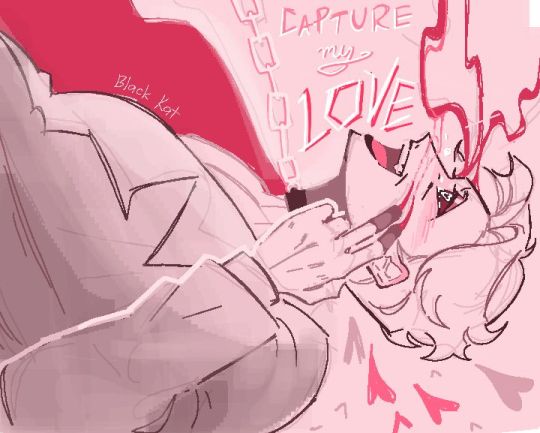
Love Plague AU Narrator (Black) draw in Magma.
#THE MOTHER HAS BEEN CAPTURED AND CONTAINED#roll the credits#just kidding of course it's not THAT easy#i hate how drawing Magma in phone is so inconvenient#the canvas is like inches smaller#i havento zoom all the way in to draw neat lines#i cant color is the damn drawing because layers aren't accessable in mobile#so every drawing is done in only one layer which ughh it's not bad but it's ANNOYING#no no it's okay I'm not mad just irritated#i had experience with ms paint and this in comparison is a bit similar#so i cam do just fine in one layer#it's laggy as hell though LMAO#at least i can make up for these by making the lineart interesting to look at#the stanley parable#the stanley parable ultra deluxe#tsp#tspud#narrator tsp#tsp narrator#tsp love plague au#mine 💗#discord sketches#magma art
275 notes
·
View notes
Text
XP-Pen Artist Pro 24 Review
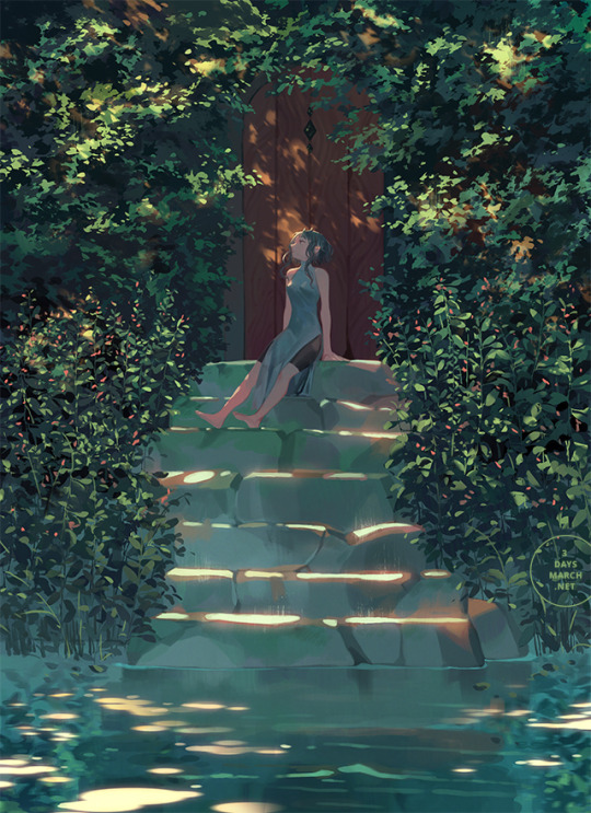
I drew this with an XP-Pen Artist Pro 24, which the team at XP-Pen kindly sent to me for review. I’ve had to opportunity to use this tablet on-and-off over the course of the past several weeks, and while there were a few issues my overall impression is positive.
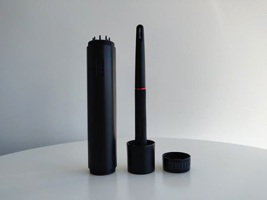
Unboxing / Contents
Apart from the 24” display tablet itself, the package comes with the usual cabling peripherals, plus some bonus extras. If your machine supports a USB-C connection for display, you’ll only need the one cable (plus the power connection). Otherwise, there’s a HDMI and a USB-C to USB converter included as well.
The extras include: an additional stylus, a one-size-fits-all artist’s glove, and a microfiber cloth.
The container for the stylus twists open to reveal 8 extra stylus nibs. Its cap can also be removed to use as a stylus holder.
Driver (Installation & General Use)
There were a few issues with installation, mostly tied to interactions between the driver, Windows 10 and Windows Ink.
Initially, brush strokes were offset from the stylus’ point of contact with the screen by about 3-4 centimetres when attempting to draw in Photoshop CS6. Random straight strokes also occurred frequently. This same problem did not occur in MS Paint or Photoshop CC 2019. This was fixed by changing the UI scaling setting for the monitor in Windows settings from 125% (which was apparently the default) to 100%.
Initially, brush strokes had no pen pressure in Photoshop CC 2019. Photoshop CS6, on the other hand, did (but suffered from the previous offset problem). This was fixed by turning on the Windows Ink setting in the XP-Pen driver menu. So in other words: CC 2019 needs Windows Ink on to recognise pen pressure, while CS6 didn’t, but was affected by UI scaling.
Interestingly, if Windows Task Manager was in focus and Windows Ink was not enabled in driver settings, stylus input was not recognised at all. There may be other programs that have this issue, but this was the only one I encountered so far.
I will say that I’ve had many problems with Wacom drivers interacting badly with Windows Ink and other things in the past before, so these types of issues are not exclusive to the XP-Pen drivers.
I’m currently using driver version 3.0.5, a beta build that has a lovely UI; it’s clear and laid out well. I did also try version 1.6.4 initially, which was fine — the UI for that version was similar to the layout you find with Wacom drivers.
Apart from the issues during installation that required troubleshooting, I haven’t had many major complaints with the driver in day-to-day use, I do think that there are a few areas for improvement, however.
The driver stops working correctly each time the computer is set to sleep and woken up again. To fix this the driver must be exited from the system tray and then relaunched.
There also doesn’t seem to be a way to bind WIN+SHIFT+ARROW to any of the express keys. WIN+SHIFT+ARROW (left or right arrow) is the Windows shortcut to quickly move a focused window to another monitor, so it’s something I use a lot if I’m on a multi-monitor setup. Unfortunately, attempting to set this shortcut in the express keys menu will simply move the actual driver window over to the other monitor while the custom input is not properly recognised in the text field.
The driver does offer a “switch monitor” option for the express keys that when clicked will transfer your stylus input to another monitor, which is extremely useful.
Screen
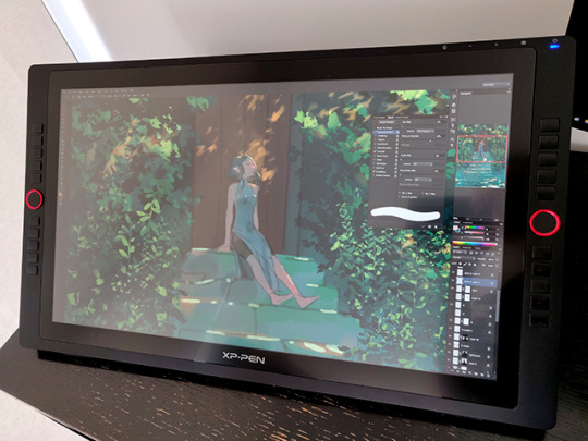
At 24” with a 2560x1440p QHD resolution, images are sharp and crisp even when viewed from a close range while drawing. Genuinely, it feels great to paint on based off this aspect alone.
The colour temperature is set to 6500K by default in the the driver settings. I think initially it felt just a touch too saturated, but overall I’m fairly happy with the colour display.
The monitor has touch-sensitive inputs on the top right corner: a -/+ for quickly adjusting the brightness, a menu for further settings, and power. I found myself using these to adjust the brightness throughout the day frequently. The power input requires a few seconds of continued contact from your finger to react, which prevents you from accidentally brushing it and turning the monitor on/off.
The monitor comes with a built-in stand. I found it easy to adjust to different viewing angles and also incredibly sturdy. I had no problems leaning on the monitor while drawing.
The monitor also comes with a pre-applied anti-glare screen protector. I wasn’t bothered by it and it seems to be holding out well after several weeks of use. I think the screen itself definitely needs the additional anti-glare, as being a display tablet means that it’s significantly more reflective than my main display.
Stylus
My first impression of the stylus was that it’s lighter in comparison to the Wacom styluses that I’m used to — there is very little to no weighting on the back end of the stylus, which makes it feel noticeably different when gripped. To be honest, though, I forgot about it when I was actually painting. Still, I would prefer a bit more weighting because I do think it makes the stylus more comfortable to hold overall for long periods of time.
There’s also no eraser nib, but I’ve personally never used those on Wacom tablets (I always use shortcuts to switch between brush and eraser instead) so this was a non-issue for me.
The two shortcut buttons on the side of the stylus sit quite flat to the surface, so I think they would be less likely to bother people who don’t use them. I use them a lot, however, and found that they were still easy to click despite being quite flat.
Unfortunately however I ran into a curious issue with using one of the stylus buttons to activate the eyedropper tool. When the “alt” key is mapped to one of the triggers on the stylus, activation of the eyedropper function in Photoshop (tested in both CS6 and CC 2019) is somewhat unreliable. That is, when the “alt” key is held down, the expected result is that once you tap the stylus on the canvas, a “mouse-click” will be triggered and the eyedropper will activate. While this works perfectly fine if you hold down “alt” from the keyboard (or hold down an “alt” that’s bound to one of the 20 express keys), when you hold “alt” from a stylus trigger I found that tapping quickly with the stylus only seemed to activate the eyedropper about 50% of the time. In order to activate it more reliably, I had to press harder and longer with the stylus, which can become tiring and slowed down my painting process. I also found that frequently, pressing down longer would lock me into the eyedropping function until I clicked the trigger key again.
After submitting feedback about this XP-Pen’s R&D department, I was informed that this issue occurs because the stylus is only able to send one message to the tablet at a time. Pressing “alt” on the stylus and trying to “click” at the same time counts as two messages, which may interact with each other unexpectedly. This is why it sometimes works and sometimes doesn’t.
The buttons seem to otherwise work completely fine for any other functions that don’t require the stylus to send two simultaneous messages, so unless you’re like me and like to bind “alt” to a stylus trigger, this won’t affect you.
Pen Pressure & Activation Force
Most current-gen tablets flash a big number for the pen pressure levels as a selling point. Having used tablets with 512, 2k, 4k and 8k levels of pressure sensitivity, I’d say I noticed the biggest difference when switching from 512 to 2k, but in my opinion beyond 2k the change is minimal and has no real impact on the way I draw. The XP-Pen Artist Pro 24 comes with 8192 levels of sensitivty, which is a very big number, but in practical application all I can say is that it works the way I expect it to and I don’t have any complaints regarding the transition between pressure levels on the default linear pressure curve.
More importantly I did notice that the IAF (initial activation force) was not as low as I would have liked. Very light input is not recognised, or only partially recognised before dropping off and on again. In a practical sense this doesn’t actually impact me through most of (perhaps 97%) of the painting process, but it did give me pause once in a while when I wanted to make a really light stroke and had to adjust my method. The drivers for this tablet do come with a pressure curve you can adjust to your preferences, so this can help a little, although after some tests I preferred to leave mine on the default setting.
Summary of Drawing Experience (tl;dr)
I think the mark of a good tool or piece of hardware is that it does not draw attention to itself during the course of its use. An ideal drawing experience allows me to be fully immersed in the act of drawing without having my focus shifted to dealing with the tool. With this in mind the XP-Pen Artist Pro performed very well for the most part, but was held back by a couple of issues.
Pros:
The monitor resolution honestly feels great to look at; the pixel density means that I can basically forget about pixels even with my face positioned closer to the screen.
The parallax between the tip of the stylus and the actual position of input was very minimal and basically not noticeable for me, especially after the simple calibration process offered by the driver.
At normal room temperature (say up to about mid-20’s celsius) the monitor screen stays impressively cool to the touch and I was never bothered by resting my drawing hand on its surface even when painting for long sessions.
The 20 express keys and 2 roller rings are extremely helpful and I actually found myself using all of them, despite initially thinking that I’d only need half of them. The keys are also comfortable and responsive to click (which sounds like it should obviously be so, but having used some Intuos iterations in the past which had some very annoying-to-click express keys, I don’t take this feature for granted anymore).
Cons:
The driver needs to be restarted everytime the computer wakes from sleep in order to work.
Higher IAF was noticeable when very light strokes were desirable. Also, the input will on rare occasions glitch by performing a completely straight max opacity + max brush size stroke. This seemed to happen primarily when I was trying to get light strokes to register. (It didn’t happen often enough to bother me much since it’s just a quick undo, but it did happen enough times that I noticed it.)
The issue with eyedropping using “alt” mapped to a stylus trigger as detailed above. Quite unlucky for someone like me who has over a decade of muscle memory for this particular mapping.
Overall, as I said at the beginning, my impression of the tablet is positive. While I think it has room for improvement when it comes to driver performance and the initial activation force especially, it also has a lot to offer at a highly competitive price point ($900USD at retail), and it would’ve been amazing if something like this had been available to me back when I first started digital painting. As I do enjoy using it for the most part I’ll probably continue to use it on-and-off in future.
844 notes
·
View notes
Text

SWN-002 Wing Man
“That's the power of love!”
Wingman was created by Dr. Wily in an attempt to beat Mega Man in a field outside of battle by harnessing the power of love. Wing Man has flight capability and wields a piercing arrow called his "Cupid Crossbow". Being designed to defeat Mega Man through love, Wing Man has a large board dedicated to unravelling his love life. Similar boards exist for Proto Man and Bass, forming the "Tiny Trio". He'd call them the Big Three, but they're short.
Wing Man likes cheesy romcoms and dislikes Proto Man (for being hard to read). His strong point is his dedication to his task, though he can become blinded by the task at hand and not remember the other couples he's trying to get together.
This took longer than I expected to actually write and get out to share.
With this year’s Valentine’s contest over(courtesy of rockmiyabideusexmachina), I can finally talk about this boy! He was so much fun to make and I’m definitely gonna be using him more in the future. I’ve got a lot of thoughts on him, the stages of his design, and a lot of pictures, so it’s gonna be under the cut.
Now that that’s outta the way, let’s get into the process of Wing!

...I thought we were talking about Wing Man, who’s this?
Meet “Playboy Bunny”, this duality of a Maverick and the first draft of a character for this contest. Usually she’s the sweet Playboy Bunny, a majorly human-like Reploid acting as a performer. However, once you’ve provoked her, she throws off the sweet guise and becomes Magnet Hare, the quick and fast-attacking Maverick with attractive properties.
To be honest, I’m half wondering if I would’ve done better if I had done more with her design and actually gone with her instead. The main reason I didn’t go with her in the end was cause I thought someone else was gonna go with it and then there would’ve been repeats.
I might come back and do more doodles of her someday, refining her design to be less human with bunny accessories and more rabbit/bunny with human-like proportions.
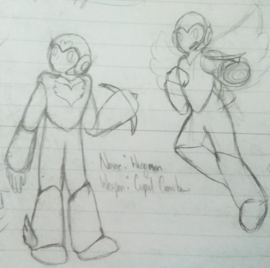
The very first drawings of Wing Man. The only thing I really had down at this point were the general heart-shapes, his name, and his weapon’s name. The one on the left was the first draft, and the right one was a case of “should he actually have wings or nah?”. The name actually came to me when I was sitting in class and I think that’s part of the reason I got attached. The pun name is probably the biggest holdover from Bunny, though another element did come by later…

This is where the magic happened. The front-facing sketch was the first real attempt and trying to figure out what I wanted from him. I knew that he should have a general heart-shape for his chest armor, and maybe his helmet could follow the same idea with one in the center. It took a bit to look through the other Robot Master helmet designs, but I feel like Wing’s looks like it could fit with everyone else’s. At one point I was considering giving him a heart braid kinda like Tundra’s, but I wound up scrapping it. I think it was because I was sick of braids after doing so many for Nahyuta…
Then some arrows! I couldn’t decide whether to have actual arrows or energy arrows, but I feel like the energy arrows make it look more unique. And the first appearance of the bowtie! I didn’t even know if I was gonna give him one at first but once I made the doodle I knew it was gonna stay. Bunny has a bow, too, but hers was just a regular ribbon one.
The collapsible crossbow was something I knew I wanted from the start, because Wing’s not a huge fighter. He will fight to achieve his goals, and sometimes it’s more necessary than at other times, but it’s easier to have it folded outta the way. The “string” of the crossbow forms when it is expanded out, and then he can start firing his weapon.
Also, his boot. Simple enough design. Not much to be said. Same goes for the side profile, I was just trying to get a better feel for his design.
I was debating for a while about whether or not to actually give Wing Man wings. On the one hand, it’d help for the joke of him being a wingman and a wing(ed) man, but on the other hand I don’t like drawing wings because I still don’t really understand them all too well.
The bottom center image was a pretty defining part of making Wing, to be honest. It’s probably one of my favorite drawings/doodles of him just because of the causal nature of suggesting a relationship with someone(and it’s up to you to decide who it is) and Rock’s immediate reaction of fear/concern. I don’t screw around with expressions enough anymore…

I don’t have any versions of this page without color on it, but that’s because this was a color testing page. I wanted to test out my physical colors first before spending too much time digitally experimenting, and I had two main ideas: either red-pen red in varying pressures or coral Sharpie highlighter. By the final design, you can tell which one I went with. I wanted to compare them side-by-side, and the half-and-half wasn’t really cutting it for me. I did a second comparison on the other page(which is gonna be further down this post).
I was trying to get a better grasp on the wings, too, since I eventually decided just to go for it and make it more of a pun.I couldn’t decide if I wanted the wings like on top of the jetpacks or off to the sides, but I went with on top of the jets in the end. The off to the side wings were taken from how Tengu Man’s “wings” are positioned. As for the wings themselves… I was honestly mostly taking reference from Pit’s emotion portraits from Kid Icarus Uprising. I had the image with all of his different emotions and it wasn’t like Wily would be going for complete accuracy how big wings would need to be since, y’know, jetpack.
The color scheme of the wings also changed over time, and I think probably for the better. Layering the colors instead of just making a weird gradient overtop looks nicer(even if those colors could probably use some refinement all things considered). I was also deciding on the weapon “type” for the crossbow, since Megaman’s weapon get picture is on this page. Piercer seemed like it would fit the best, going through multiple enemies in a straight shot.

Designing the ability get was actually pretty simple, which I’m glad about. I wanted to go more off of the Megaman 11 style of weapon get, altering the helmet, arm, and color only, and I wanted to stick to that. I also wanted to keep two of Wing’s more defining elements - his bow and wings - on the ability get, so I moved them from Wing’s torso to Rock’s helmet.
Alongside the ability get, an unfinished battle scene. Nothing too special here.

I tried the color testing thing again, and it was here, I believe, that I first settled on the idea of “hey what if he looked like he was wearing a suit or something” and colored it accordingly. The color on the feet honestly sold me on the left one, because the cherry-red was beautiful and it was just red pen under the highlighter. I was happy with the pieces I had and started to put it all together into the final product…

Every Robot Master needs a pose for their artwork, and Wing was gonna be no different. I could’ve gone for something more dramatic, I know, but I was really really happy how the posing turned out for the one on the left. The smaller one on the right was more for fun and was messing around with some line thickness. There’s also less feathers because I was kinda lazy.
The main reason I have him sitting is because I think his boss entrance, were he to be fought in a typical arena, would have him pulling a Meta Knight and coming down from a high ledge to attack. Saying his pre-battle line, sliding/jumping down from on-high, and with a flourish, the battle begins.
Also I just wanted to draw my boy looking cute. Sue me.
The physical version of Wing sitting(on the left) is what I had initially been going for in color scheme, with a lot less coral-ish colors in the mix. Trying to recreate those colors, however, was a problem, so for all intents and purposes this is what I hold as why he's really supposed to look like. But with a complete physical form, what's next?
...hoo boy.
Trying to make the leap from physical to digital was a pain. I realized after I had essentially finalized the physical sketch of Wing posing that the helmet and face kind of made no sense. I spent a while trying to make it right and nothing worked how I wanted it to so I eventually just moved on from that.
One thing to know is that I basically only work in MS Paint. I don’t have any other digital drawing software on my computer and the tablet available to me doesn’t respond to styluses as far as I can gather. So taking the widely-varying-in-color picture and making it not like that was something I had to remember how to do because otherwise I was gonna suffer the consequences. I knew it had to do with outlines but apparently Paint didn’t want to accept my drawn outlines and would only take ones made in the software. And jpgs were pixel-y, which I forgot since the last time I was extensively using the software.
Once I had my system back, I made the silhouette and digitalized “I’m just sayin” as a practice round of sorts. But with the simple pieces out of the way… the time came for making the whole reference sheet. The pose, the front and side views, the shipping board to serve as a back view, the wings, the Weapon Get, the weapon, and the little character-defining details.
Save states fill most of this folder for a reason. Working with what I had and going over and through everything to make sure I had all the pieces ready, making saves before the background deletion so I would just have outlines, and just hoping that this was all gonna be worth the work.
One of the more… challenging, I guess, parts of the design process for Wing: trying to give him a unique silhouette. Including the wings was, in part, because of this. Most, if not every Robot Master has a unique silhouette that you can look at and say “Oh that’s [name here]” or at least be able to tell them apart. Whether it’s fire, a boomerang, a snake tail, a lightbulb, a weird body shape, or their arms, there’s something to set each one apart. And I wanted Wing to have that same feeling, so if you were to see a blacked-out version of him you could still tell that it was Wing and not someone else.
Without the wings, he’d probably resemble a downgraded Quick Man - which makes sense, considering I was using Quick’s body shape as a base for Wing’s for a more subtle top of a heart. But I didn’t want Wing just to look like Worse Quick Man, so the wings had to stay. The crossbow helps in that regard too, but the wings really set him apart.

This is what I’m talking about. He looks like a generic character without the wings.
Trying to keep Wing in the same vein of design as other Robot Masters was also, I guess, the reason I used the colors I did. Robot Masters typically don’t have too many colors, and didn’t want Wing to be a colorful mess. Maybe I could’ve had another more striking color in his design, but I’m happy with the colors I have. Reds and pinks and white with a skin tone taken from the physical doodles that I tried to have be a brownish-cherry if that makes any sense. Like it was supposed to still be in the red(kinda orange) family of colors but still be distinct enough as a skin tone. I didn’t want to have too many variations on colors, but I do think I could’ve done better on some of the distributions(and holding onto the idea of “stop using so many colors”).
Like I said, I consider the physical drawing to be the true colors of Wing, and the digital can’t quite capture the physical.
...Okay, I think that’s everything I wanted to say. If you actually read through this entire monstrosity of a post, thank you. I do have a full colored version of the "I'm just sayin'" that'll go up eventually because it was fun.
#willowtalks#willowarts#wing man#rockmiyabideusexmachina#Valentine's day 2020 robot master design contest#mobile is a pain#even though i don't like drawing wings i love my boy#i should work on my other projects#like Golden Days#or school stuff#if someone draws him ill cry#i should draw my characters moreeee#finally went back and edited the images to be in the right spots ^^;#mostly because i wanted to draw him again#still don't like drawing wings
3 notes
·
View notes
Text
pint-size potential (1/?)
Sod the Council and their archaic concepts of what made a child worthy. He was given a job to do, and he would do it, but he would do it his way.
(au: Buffy's a baby Potential, and Giles is her new Watcher)
ao3
tagging @theforestlesbian and @sih bc u nerds supported me writing this & i love u both bunches
In comparison to England, California was unbearably hot. Giles was fairly certain that he was assigned this particular location just because someone in the Council hated him. No respectable Watcher wanted an American Potential to raise, let alone a Potential in the middle of the bloody desert. Merrick had initially been assigned to the child, but then that four-year-old Potential had cropped up in England, and no one else wanted to relocate to America to raise a baby.
So of course, the job went to Giles, the black sheep of the Council. He’d been working with them for long enough to merit the responsibility of training a Potential, though he had always imagined said Potential being a bit—older. Old enough to talk, certainly. Baby Potentials didn’t generally last that long, what with all the demons and vampires attempting to kill them—and bugger all, that was probably why he was being sent to care for this one. Giles did miss the days when Potentials were harder to find.
Tentatively, Giles entered the café, quietly surveying the room. A gaggle of giggly college girls wearing sweaters in similar shades of pink. A young couple who looked to be out on a date. A neat-looking middle-aged woman, standing primly next to a baby stroller. Ah, thought Giles, and crossed the room. “Ms. Smythe?” he inquired.
The woman looked critically at him, then said, “I do hope you’re qualified for this sort of rigor, Mr. Giles. Infant Potentials are a particularly serious responsibility.” Giles tried to look into the stroller, but Ms. Smythe moved in front of him, adding, “To be blunt, the Council has assigned you to this child due to your particularly unsavory past. We believe that, if nothing else, you are at least suited to defend this child from harm until she is old enough to do so herself.”
This was thoroughly unnerving to Giles, who hadn’t thrown a punch in years. But he hadn’t bought a plane ticket and flown down to this hellishly sunny city just to go straight back with nothing to show for it, so he said coolly, “I can assure you that I am fully capable of protecting the Potential.”
“Good,” said Ms. Smythe. “We shall expect reports on her well-being.” Handing him a file folder, she added, “All the information you need—addresses, phone numbers—it’s in there. The keys to your home are in the pocket of the Potential’s baby stroller.”
“Thank you,” said Giles, who wasn’t at all looking forward to living in Los Angeles. It seemed like some deeply tragic parody of an American sitcom—single father living alone in the big city, except the father wasn’t a father and the baby was one in a long line of possible preternaturally strong vampire killers. He took the folder from Ms. Smythe. Then, stepping neatly around her, he looked down into the stroller.
The Potential, the little girl he was now tasked with guarding until adulthood, was wearing a pink-and-blue striped onesie and bundled in one of the standard Council baby blankets. She was wearing a small hat and little mittens, one of which seemed to be missing, and she was fast asleep.
“What’s her name?” Giles inquired softly.
“That’s hardly relevant, is it?” Ms. Smythe sounded a bit exasperated. “Right now, your responsibility is to bring the Potential to your new apartment and make sure that the proper magical wards are placed to keep her safe.���
“But—”
“As I’ve said, all the information you need is in the folder,” said Ms. Smythe shortly. “Kindly do not dawdle, Mr. Giles.”
Giles pressed his lips together, taking the stroller and carefully wheeling it out of the café. He didn’t look back at Ms. Smythe; he hoped that he wouldn’t have to see her again.
About five feet from Giles’s car, there was a slight dip in the sidewalk, which jostled the stroller ever so slightly. This woke the Potential, who took one look at Giles and immediately started to cry.
Ah, yes, Giles thought. This is exactly what a headache feels like. Wheeling the stroller over to his car, he deposited the file folder in the front seat and carefully lifted the Potential out of the stroller. She cried harder.
“Shh,” said Giles awkwardly, trying to bounce the Potential a bit. “There now. We’re off to a new apartment.” Opening the other car door, he placed the sobbing Potential in the baby seat, thought for a moment, then found the file folder again, flipping through it. “Buffy Summers?” he repeated. “Good lord, do all Americans name their children like this?”
The Potential wailed.
Giles hesitated, then took her back out of the car seat. “Well,” he said, holding the Potential—Buffy—so that she was facing him. “Buffy Summers. I-I expect we’ll have to get used to each other, or this will be a very difficult arrangement for both of us, all right?”
Buffy spit up on his jacket.
Giles had had experience with much more toxic and potentially fatal substances (coming into contact with many different kinds of demons did happen to also mean coming into contact with many different kinds of bloods, fluids, and secretions), but no one—child or otherwise—had ever spit up on his good tweed jacket. Thoroughly upset, Giles was tempted to buckle Buffy back up into her car seat and just drive home without any other clumsy attempts at comfort; it was clear he wasn’t suited for this, anyway, and Watchers weren’t supposed to be comforting—
Then Giles looked down at Buffy. She had very wide, teary grey eyes, and looked just about as distressed as he felt. That wasn’t a Council-approved baby hat, Giles realized, and the outfit she was wearing most definitely wasn’t picked for her by the Council. It seemed very likely that Buffy’s mother had given her to the Council fairly recently—perhaps even today.
“Oh,” said Giles softly. For the first time, he felt a strange twist of sympathy and sadness. Most parents gave up their children willingly after some sort of traumatic incident or attack, and he did remember hearing that his Potential’s mother had nearly been attacked by a particularly clever vampire. But what struck him most about the situation was that Buffy knew none of this. All that she knew—all that she could know—was that she’d woken up without her mother there. “There now,” he said softly, and this time he genuinely did want to comfort her. “It’s all right.”
Buffy sniffled, still looking somewhat distressed.
Carefully, Giles removed his handkerchief from his front pocket, dabbing gently at Buffy’s face. “You’re tired, aren’t you?” he inquired gently. “I woke you up. I’m sorry about that.” Strangely, he felt that Buffy was on some sense aware of the change in his voice, because she seemed to be calming down. “Let’s get you to the apartment,” he said, placing her carefully in the baby seat and strapping her in. “You can rest there, and I,” he shrugged off his jacket, folding it carefully before placing it in the front seat, “will perhaps wash my jacket.”
In the baby seat, Buffy rubbed her cheek with her fist and looked at him with a forlorn expression. Giles shut her car door, packed up the stroller, and got into the car himself, making sure that the radio was at a low volume before flipping it on. He turned it to a station with classical music, looking back at Buffy. “How’s that?” he inquired.
Buffy whimpered.
“No?” Completely by accident, Giles changed the radio station to a peppy American pop station. “Oh, good lord,” he muttered, and was about to change it again when he saw that Buffy looked—not quite happy, but at least a bit calmer. “Right,” he said, dryly amused. “Well, you’re very clearly an American.”
Buffy made a sleepy hmm noise and rested her cheek against the side of the baby seat.
Giles hesitated, thinking, then rummaged in the satchel that he’d tucked under the front seat, finding the small, raggedy baby blanket that Buffy’s mother had given to the Council for her to keep. He had been instructed to keep the blanket only for when Buffy had been a quiet, well-behaved baby, but—Buffy was too small to really understand that, and he was beginning to realize how many parts of this arrangement were thoroughly unfair to her.
“Here,” he murmured, turning into the backseat and holding the blanket out to Buffy. She snatched it from him immediately, holding it very tightly and looking at him with bright, wide eyes. “Let’s go to the apartment, shall we?”
The “apartment” actually turned out to be a rather nice two-bedroom house. Giles supposed that this spoke to the fact that many of the Council members had old money. There was a rather nice living room, a sunny, well-lit kitchen, a study, and then two bedrooms upstairs. Giles’s room was quite lovely—olive green wallpaper, a comfortable bed, an easy chair by the window—and seeing it made him feel a bit better about the whole situation. He could imagine living here.
Buffy’s room was sparsely decorated, with only a small crib and a set of drawers. The walls were painted an unpleasant off-white that made the room feel clinical and lifeless.
“Absolutely not,” said Giles flatly, Buffy in his arms, and walked them both back to his bedroom.
Buffy, now well rested and significantly more cheerful, tried to grab his glasses. Something about that made Giles feel very happy—he didn’t like the thought of her being a miserable, afraid child in this house, though that seemed to be what the Council was encouraging. Gently, he removed her tiny hand from his face, placing her down in the middle of the bed.
“Stay here,” he said, and then began the arduous task of moving the crib from Buffy’s bedroom to his.
How on earth single parents managed to do things like this, Giles could not and would never understand. Not to mention that it was very clear that the Council had arranged the furniture in his room in such a way that it would be incredibly difficult to find space for a crib there, but Giles refused to be discouraged. With Buffy half-watching, half-staring-with-interest-at-the-ceiling, Giles managed to remove the easy chair from his bedroom, shove it into Buffy’s room, and place the crib by the window where the chair had been. Exhausted, he collapsed onto the bed.
Buffy rolled over and into his side, looking curiously up at him.
“You’re right,” said Giles blearily, “it is quite a nice ceiling,” and fell asleep.
The nap only ended up lasting five minutes, because Buffy attempted to take off his glasses again, which woke Giles up. He did feel a bit better, though; awake enough to pick up Buffy and place her in the crib with her baby blanket. She began to chew on one of the edges.
Giles went back into the awful white room (eventually it would be Buffy’s room, he decided, as soon as it had a better coat of paint) and opened the drawers, looking through the baby clothing. They were all very plain, monochromatic items, lots of small white socks and beige onesies and a set of gray pajamas he supposed Buffy could wear to bed that night. None of the colors seemed to suit a baby who liked pop music and had a bright pink blanket dotted with rainbow hearts.
“I shall have to go shopping,” Giles said to himself, and shut the drawer he was looking through. This room really was incredibly off-putting.
Re-entering his room, he found Buffy lying on her back and looking significantly less interested in the ceiling. He lifted her up and out of the crib, walking her back downstairs so that they could get a better look at the rest of the house. There was a cheap, barely-functional high chair in the kitchen, and no baby food in the refrigerator—honestly, the Council’s inability to understand the needs of a growing child was becoming clearer by the second.
The study was full of the boxes that Giles had sent for from England. He could work on unpacking tomorrow; it seemed as though today would be spent writing up a shopping list for Buffy, whose tiny hand was now tightly curled around a fistful of his shirt. When Giles looked down at her, Buffy held up her baby blanket, all but shoving it in his face.
“You like pink, I’d wager,” Giles quipped.
Buffy looked at him with the quiet solemnity that Giles had only ever seen on very small children, then draped the blanket over his head.
Giles looked over the file folder that night, Buffy now clad in the awful gray Council pajamas and asleep in her crib. A few papers on job options, a few maps of his neighborhood, an emergency phone list, and a neatly printed information sheet regarding Buffy. Buffy Anne Summers, it read, aged five months, unlikely Slayer status.
Unlikely Slayer status.
Something in Giles twisted very hard at that. This wasn’t any kind of great responsibility; this was a lost-cause Watcher raising a lost-cause Potential just because the Council didn’t have anywhere else to put them both. He’d given up his life in England for this, all to take care of a girl who might never get called in the first place. A girl who could have lived with her mother for longer than just a few months, if not for the Council’s foolish determination to keep tabs on every single possible Slayer in the world.
He placed the information sheet down and left the bedroom, angry and hurt and tired and sad all in one. He’d thought that there was some reason that justified his new status as Buffy’s caregiver, but it was abundantly clear what the Council thought of both of them.
Downstairs, the phone rang. Giles ran a hand through his hair, then went to answer it.
“Mr. Giles.” Travers sounded more bored than anything. “I’m calling to make sure that you have arrived safely in Los Angeles. Is the Potential with you?”
Giles was starting to like the word Potential less and less. It felt like more of a trap than a word. How many girls were stolen away from their families, raised for a calling that might never even be theirs in the first place? It might have been one thing if he’d been greeted with a girl old enough to talk and laugh and tell him what she thought of the whole affair, but Buffy was never even given a choice about her life being turned upside down. Buffy was too young to even understand that her life had been turned upside down.
“Mr. Giles?”
“Yes,” said Giles heavily. “The Potential is with me.”
“Excellent,” said Travers somewhat indifferently. “I am assuming you have read the documentation we provided you with?”
“I have.” Giles didn’t trust himself to say anything more than that.
“Then you will understand why we will not be requiring monthly reports,” Travers informed him. “A Potential who is less likely to be Called is of less relevance to the Council at this juncture, though that may change as time goes on. You shall send us a written summary of the Potential’s development each year.”
“I understand.” The jumble of emotions had settled down to a less specific “awful.”
“Thank you. Good day.” There was a click, and then the dial tone sounded.
Giles hung up the phone and sat down on the couch. It stung, to be cast aside, but more than that—the child upstairs, entrusted to his care simply because she wasn’t of relevance to the Council and he wasn’t of any use to anyone. What sort of a caretaker could he be to her if the Council thought so little of him?
For the first time in a very long while, Giles felt acutely aware of the absences in his life. It had been a long time since he’d felt himself a part of something, and even his involvement with the Council couldn’t erase the fact that there was no one who could tell him that he was suited for this position.
No one but himself, really.
Well. There was one more person in his life now, and—and Giles wanted to do right by her. Sod the Council and their archaic concepts of what made a child worthy. He was given a job to do, and he would do it, but he would do it his way.
Giles pulled himself up off the couch, climbed the stairs, and entered his bedroom, studying the small girl in the crib. “Unlikely Slayer status,” he said softly, and brushed a gentle hand across the top of Buffy’s head. “Well, then, I suppose it doesn’t matter whether I raise you according to Council standards, does it?”
#fic#giles raises baby buffy au#buffy and giles#rupert giles#buffy summers#that's right!! it's a multi chapter fic#in a series#why do i start these things lmao
21 notes
·
View notes
Text
What makes a horror fire danger day?
Updated January 24, 2019 12:16:27
External Link:Fire seasons in Australia are getting longer and more intense
Textbook fire conditions are forecast over the next few days as hot northerly winds bear down on south-eastern Australia and a cold front creeps across from the west.
The danger has been rated as extreme today for the Mount Lofty Ranges and Lower South East of South Australia, with the worst of the threat expected to move into Victoria's Mallee and Northern Country forecast areas on Friday.
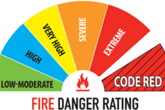
Photo: Black Saturday forced the creation of a "code red" or "catastrophic" fire danger rating.
Very high to severe fire danger has been forecast for Tasmania as the front moves through. The state is already battling several major bushfires and a total fire ban is in effect for the entire state until Monday.
There is a classic set-up that signals disastrous fire danger in Australia, so when this pattern develops it's important to sit up and pay attention.
Fire needs a spark, and then drought, high temperatures, low humidity, heavy fuel loads and the lie of the land all play their part.
Black Saturday is a textbook example but it is not alone the same pattern unfolded on Ash Wednesday and again just a few weeks ago.
What makes some days disastrous?
Photo: Fire is a part of life in Australia, but some conditions can signal catastrophic danger. (ABC Weather: Kate Doyle)
"Our worst fire days, no matter where you are, is when you've got hot, dry winds blowing off the centre of the continent," said Dr Mika Peace, a research meteorologist and fire expert at the Bureau of Meteorology (BOM).
"So what you're looking for is a really windy air mass which is going to blow the air from the centre of the continent towards the population bases."
Adding a feature like a trough or front that changes the wind direction increases the danger.
The most devastating fires in Australia's history Black Saturday (2009), Ash Wednesday (1983) and Black Friday (1939) occurred in hauntingly similar conditions.
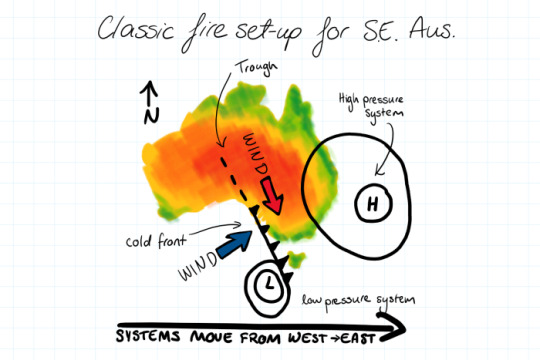
Photo: These are the conditions that have led to the worst fires in Australian history including Black Saturday. (ABC Weather: Kate Doyle)
"For south-eastern Australia, we're really looking at frontal systems where you've got a really strong high pressure system and approaching front," Dr Peace said.
Before the front comes through, strong winds bring hot, dry air from the north, but after the front the winds come from the south-west.
"What happens is you've got an ignition point and the fire will burn from north to south in the northerly winds.
"Whatever distance the fire has burned from north to south, when the wind change comes through, that becomes your new fire line and it opens up the whole of the eastern flank of the fire.
"So you get really rapid fire spread out to the east."
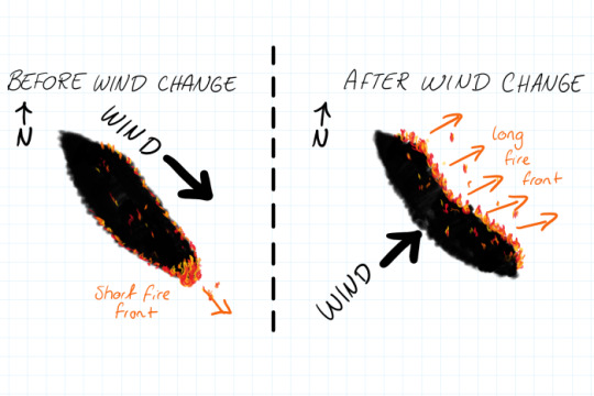
Photo: When northerly winds are replaced by a cold front bringing strong south-westerlies, anyone on the eastern side of the fire is in danger. (ABC Weather: Kate Doyle)
It was this rapid change to the east that burned through towns like Marysville on Black Saturday, the Pinery (2015) and Wangary (2005) fires in South Australia, and was involved with a near miss for Victorian fire crews early this month.
This week's wind change is not expected to be as strong as the one on Black Saturday, but the potential for danger remains.
Then there are firestorms
Dr Peace said the other dangerous factor was the instability of the air mass.
"An unstable atmosphere can lead to really deep plume development," she said.
A deep mixing atmosphere means you get an energetic fire plume and can lead to pyrocumulonimbus developing that's when the fire develops its own thunderstorm.
"Fire-generated thunderstorms or pyrocumulonimbus can ignite new fires downwind through lightning strikes," Dr Peace said.
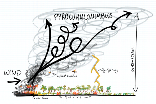
Photo: Pyrocumulonimbus storm clouds form over intense fires aided by an unstable atmosphere. (ABC Weather: Kate Doyle)
"You also get really gusty, turbulent winds which, if they blow down over the actual active fire front, can completely change the direction and the speed of fire spread on the surface.
"This has a really big impact for any ground crews or anyone who's near the fire front because you get these really rapid changes in direction."
An unstable atmosphere can also increase spot fires, when burning vegetation is lifted up and carried through the air to start more fires downwind. On Black Saturday, spot fires were recorded 35 kilometres ahead of the inferno.
Eucalypts make Australia the most dangerous place in the world for spot fires; the trees have a high oil content so the vegetation can stay alight longer as it travels through the air.
So the key message is fires can spread rapidly waiting until you see smoke before deciding if you should leave is not good enough.
You will not always get an official warning.
Countdown to disaster
Claire Yeo, the BOM forecaster embedded with the Victorian state control centre in the lead up to Black Saturday, said officials knew conditions were going to be bad that day.
"When you hear that anecdotal evidence coming from old-time land managers, making comparisons to Ash Wednesday, you stand up and listen," she said.
"Particularly when you start to see a pattern like what we were seeing for Black Saturday, which was the classic set-up: hot north-to-north-west winds and late wind change."
The difference was that it was looking worse.
External Link:Prepare. Act. Survive. NSW RFS: How fire proof is your plan?
In 2009, parts of Victoria were coming off the lowest 12-year rainfall deciles on record. It was also a record hot week, with temperatures around 45 degrees for three days straight.
There was a drought leading into Ash Wednesday, but not that bad.
Ms Yeo said she could see as early as the preceding Monday that Saturday was going to be horrific.
"Every single day leading up to Black Saturday I was able to say the same thing: the models are doing the same thing, it's still painting this dire picture."
She said when the figures were put into the forest and grassland fire danger indices (which incorporate information on fuel load, temperature, relative humidity and wind), the result was off the scale.
Black Saturday triggered the creation of a new category of fire danger: "code red" or "catastrophic".
How do you communicate that much risk?
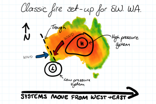
Photo: These are the conditions that have led to some of the worst fires in south-west WA. (ABC Weather: Kate Doyle)
"Even though I could see that it was going to be a disastrous day, particularly as there was already fire in the landscape, I didn't comprehend that you could possibly have that many people perish," Ms Yeo said.
She gave briefings to the fire chiefs and then premier John Brumby to explain the threat and how confident BOM was in the forecast. They in turn held media conferences to warn the public, which were uncommon at the time.
"I had to sort of come to terms with it, that many people could die even though I felt the warnings were well and truly out there.
"I went through the whole feelings of: 'Didn't I say enough? Was my communication not effective enough?'
"But over time, and after a bit of counselling and reflecting on what I had done leading up to those days, I thought I couldn't have expressed how bad it was going to be any more than what I did, which was talking about the absolute extreme.
"It's just that as humans, sometimes we find it hard to come to terms, to fit a warning with what the actual reality is."
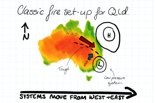
Photo: These are the conditions that led to catastrophic fires in Queensland in December. (ABC Weather: Kate Doyle) 'You know that people are dying'
Alen Slijepcevic, now deputy chief officer with the Country Fire Authority, was working in the emergency coordination centre as Black Saturday unfolded.
"I had never experienced anything like it before and I'm hoping I'll never experience it again ... but I have my doubts," he said.
Mr Slijepcevic said he first thought of the day as something out of the ordinary when he received the forecast and discussed it with Ms Yeo.
"Claire was the first forecaster that gave us the glimpse. She said, 'I have never seen this before. It will be really, really nasty'."
Photo: When a catastrophic fire takes hold, little can be done to fight it. (ABC Weather: Kate Doyle)
Nasty it was.
"On that day the wind change was incredibly strong. For the whole day we had a strong north-westerly blowing the fires into the south-east."
They knew the change was coming and that the conditions would be bad, but that wasn't enough to stop the disaster from unfolding.
"It was very stressful," Mr Slijepcevic recalled.
"We had parts of the information but not the full picture; you know that something bad is happening, you don't know how bad, but you know that people are dying in their houses and burning in their cars.
"We had lots of issues with the communications. We did not have good systems for the communities."
Some fires are unfightable and it's getting worse
Photo: As the landscape becomes fire-prone, the risk to communities increases. (ABC Weather: Kate Doyle)
Mr Slijepcevic said crews had been reasonably successful on Black Saturday in attacking some fires and putting them out, but once the flames were in the forest and took hold they were impossible to extinguish, even with aircraft.
"I think people need to understand that there are limits to what fire services or land management agencies can do in those circumstances."
The maximum intensity of a fire that aircraft can extinguish is 6,000 kilowatts, Mr Slijepcevic said. On Black Saturday he said the intensity reached 150,000 kilowatts.
"[Using aircraft] is a complete waste of time at that phase of the operation."
He said bushfires had become a social problem as much as a physical problem.
"We know that with climate change and more people moving into flammable landscapes, we are creating more risk.
"People will have to accept and learn to live with fires because that will be our norm into the future. People will have to be better prepared."
Topics:weather,bushfire,fires,emergency-incidents,emergency-planning,disasters-and-accidents,human-interest,adelaide-5000,melbourne-3000,hobart-7000,sydney-2000,brisbane-4000,darwin-0800,perth-6000
First posted January 24, 2019 07:00:55
http://www.abc.net.au/news/2019-01-24/what-makes-a-horror-fire-danger-day/10685918
0 notes
Last Seen Blogs

adinafay
Allegedly a Person

ssuminshan-official
⚔️Su Minshan⚔️

cherryblossom-enthusiast
For the girls, gays, and bisexual baes

dont-tell-them-i-died
Arlo/Charlotte

mike-wheeler-is-gay
My Blog :)