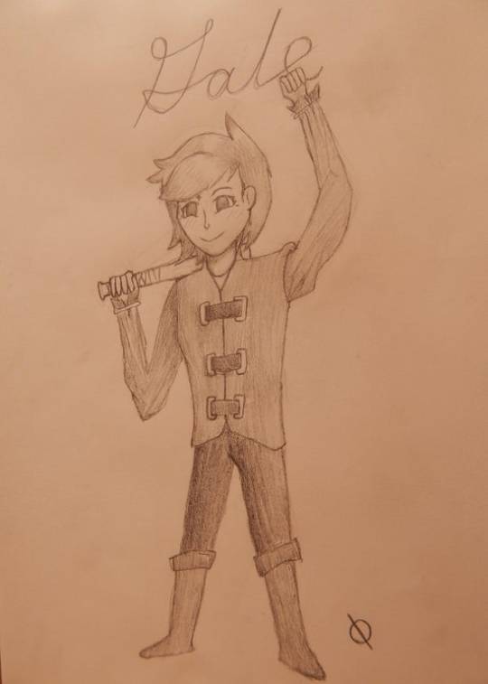
#i understand wanting to streamline the story there's way too many variables to let us do *everything*
Text
CONTROL YOUR ANGER
Ms. Aanam Verma | Head of Department | Asst. Professor Biological Sciences | CPSM College of Education | Gurugram
HOW TO CONTROL YOUR ANGER | ANGER MANAGEMENT STRATEGIES | TIPS TO OVERCOME ANGER

Most people get upset simply because they don't know what to do when they experience anger in their daily life. Sometimes aggressive behaviour may get their needs met in the short-term, but there are long term consequences. Your words might cause lasting damage to the relationship or even lead to its demise. So here by, I will like to share some simple tips how to tackle the ghost of ANGER.
When calm, express the anger

As soon as your thoughts are clear, express your frustration in an assertive but non-confrontational way. You must state your concern and needs in a direct and clear way, without hurting others or trying to control them.
Physical Activities

Physical activity like yoga, stretching, aerobic exercises reduces stress which is the cause root of your anger. Neck rolls and Shoulder rolls are good examples of nonstrenuous yoga like movements, which controls your body and harness your emotions. If you feel your anger escalating, go for a brisk walk or run, or do some enjoyable physical activities like cycling, hit a few golf ball, playing your favourite game.
Relaxation Exercises

There are many relaxation exercises but the key is to find the one that works best for you. Breathing exercises and Progressive muscle relaxation are two common strategies for reducing tension. Your breathing becomes shallower and speeds up as you grow angry. Reverse that trend by taking slow, deep breath from your nose and exhaling out of your mouth for several moments. In Progressive muscle relaxation, try to tense and relax slowly your different muscle groups in your body, one at a time, along with slow deliberate breathe. Eg. Closing tightly & relaxing your fist along with breathe in & out respectively. You can use kids small smiley ball too. Stress balls are also available in the market. Relaxation exercises take practice. At first, you might feel as they are not effective, but with practice, they will.
Warning signs

Be alert & aware of the emerging signs of anger like fast heart beat, red & hot face, clenching of fist, unable to think properly etc., so that you can take control and prevent it to reach the boiling point.
Identify Triggers

Take stock of things that trigger your anger like traffic jams, sarcastic comments, messy room, work not at time etc. You must structure your day differently and prevent the triggers to take place.
Be aware of your feelings

Think critically what real emotions are lurking beneath your anger. Sometimes anger act as a mask to protect you from more painful emotions like embarrassment or disappointment. Acknowledging underlying right emotion can help you to get the root cause of problem. For an example, if someone cancels a plan on which you were so excited, chances are you rush in anger but underlying emotion is disappointment, so you can explain your feelings of disappointment instead of making the scene. Be honest with your feelings, then only you can resolve the issue. Responding in anger just push people away.
Keep your mouth shut

When you are provoked, you may speak rubbish, which will worse the situation rather than any positive result. So, in an argument tightly close your lips as they are pasted. This will help you to take time to collect your thoughts and respond in a mature way.
Repeat a mantra

When your temper flares, repeat a mantra or calming word or phrase, that will help you to calm down and refocus. Repeat that word again and again to yourself when you are upset. ‘Relax’, ‘take it easy’, ‘you will be o.k’ or ‘everything will be fine’ are good examples.
Picture a stop sign

The universal symbol to stop can help you calm down when you are angry. It’s a quick way to help you visualise the need to halt yourself, your actions and walk away from the moment. You can put any symbol on your back of your hand which will remind you to STOP & control your anger.
Find a creative channel

You can turn your anger into a tangible production. Consider digital creativity, painting, writing poetry or journal when you feel upset. What you can't say, perhaps you can write. Jot down what you are feeling and how you want to respond. Processing it through the written words can help you calm down and reassess the events, increases understanding and more possible solutions. Emotions are powerful muscles for creative individuals. Use yours to reduce anger.
Practice Imagination

Just step into a close room, close your eyes, and imagine yourself in a relaxing scene. Focus on the details of the imaginary scene. Colour of shedding leaves.... movement of water….brightness of the rising sun etc. This practice can give you calmness, peace, serenity and of course strength.
Keep a calm down kit

Make collection of objects which helps to engage all your senses. When you can see, hear, smell and touch the calming things you can change your emotional state. So, prepare a calm down kit which may include scented hand lotion, an image of serene landscape or any relaxing scene, Audio- Video spiritual passage or quotes, a few pieces of your favourite candy. Just include all those things that you know will help you to remain calm. You can create a Portable calm down kit that you can take anywhere. For example, calming music and images, guided meditation or instructions for breathing exercises etc. to be stored in a special folder on your smartphone. Keep your bag loaded with hand lotion, perfumed wipes & candies.
Change the focus

The best way to calm down is to change the focus immediately on something else. It’s better to distract yourself with an activity. Do something that requires your focus and makes more challenging for negative thoughts to creep in. For an Example, organising the wardrobe, deep cleaning the kitchen, weeding the garden, sign a petition, write a note to an official etc. Pour your energy and emotions into something thats healthy and productive which keeps your mind occupied and won’t able to ruminate on the things upsetting you.
Listen Music

Let the music carry you away from your frustrated feelings. Put on your earbuds, move to the park or drive the car and listen your favourite music, humming & bopping your anger away.
Countdown

Feeling angry, countdown up to 10. If your anger touching the peak, start slow backward count. By the time you count, your heart rate becomes slow, and your anger subsides slowly.
Sharing with a friend

Instead of whirling in the episodes that made you angry, you must have a long talk with a friend who is trustful, understands you and your all perspectives and also help you to get rid of the problem.
Write a letter or Email

Write a letter or email expressing all the events, even minute emotions which made you angry. After that, delete it. This will help you to release the suppressed emotions and make you at ease.
Rehearse your response

Rehearse what & how you are going to say when the same type problem approaches you. This rehearsal period gives you chance to role play all the solutions coming to your mind.
Practice empathy

Fit in other persons shoes and see the situation from their angle. When you narrate a story according to their perspective, you may gain a new understanding and can overpower your anger. Think like a scientist, not a lawyer
Feel the anger but avoid action

In anger person loses judgement and problem solving skills which makes him rigid & blunt. Ambrose Bierce rightly said “speak when you are angry and you will make the best speech you will ever regret”. Anger drives us to aggress , confront, take revenge and retaliate. It’s better to go to bed angry, before sending angry email keep it for few days, just walk away when fight arises.
Self reflection

Some person are proud of their anger. Even they achieved nothing, they experience a warm inner glow of self satisfaction .They believe they have accomplished something tough, powerful and righteous. But that's not. One must see or hear himself in anger once in life. Tennis great Roger Federer who was a racket smashing brat in his junior years, was watching himself throwing tantrums on TV that put him off of it throughout the life.
Take care of yourself

Factors like alcohol, pain, fatigue, stress, sickness, unmet drives like hunger, thirst, lust, etc. act as a fuel to anger. Reduce these variables as much as possible. Take proper sleep, make routine timetable, take some time off, streamline your week, delegate, relax, and have nutrition rich diet.
Stick with ”I”statements

Criticizm or blame game will always increase tension. So, use ‘I’ statements while presenting the problem. Keep in mind to be specific and warm. Example say ‘I don’t feel good when you leave the table without keeping the plate in sink’ instead of saying ‘you never help in housework.
Take short breaks

Give self short breaks during stressful or overloaded days. A few moments of quiet time will help you feel better, focused and prepare you to handle what’s ahead without getting irritated or angry.
Work on solutions

Instead of focusing on what made you mad, work on resolving the issue at hand. Always remind yourself that anger won’t fix anything and might only make it worse.
Forgiveness

Learn to Forgive. If your anger overpower your positive side, you find yourself dipped in bitter & poisonous fluid. But by forgiving someone who made you upset will make both of you to learn from the situation and strengthen your relationship. If it finds hard to forgive the person who has done wrong to you then imagine to forgive him. This way your anger slip away.
Evaluation of anger

Analyse whether your anger is a friend or an enemy. If you see your right is being violated, you are suffering an unhealthy situation or emotionally abusive toxic relationship, then your anger can do justice. Here, you can change the situation rather than changing your emotional state. Anger gives you the strenghth & courage to take a stand and make the right change. Another case, if your anger is enemy, it will destroy your healthy relationships and make you upset. So, evaluate your anger is positive or negative for you.
Humor, the best medicine

Lightening the situation can diffuse the tension. Humor can give you insight that what’s making you angry or having any unrealistic expectations. Avoid sarcastic comments, it only hurt the feelings and also make situation worse. Diffuse your anger by looking for ways to laugh, whether playing with your kids, watching stand - up, or comedy movie.
Gratitude

End of the day, always be thankful to life, what positive things it has given you, even under hard situations. Just ignore the negative part and enrich more with gratitude for right things in your life. Anger will get no attention & will try to eliminate automatically from your life.
Know when to seek help

Learning to control anger is a big challenge. Seek help or consult a psychologist if your anger seems out of control, causes you to do more harmful things you regret.
Aanam Verma
#anger#anger mangement#anger management strategies#how to control anger#how to control your anger aanam verma tips to control your anger control your anger
10 notes
·
View notes
Text
2020 March Update
Happy New Year! Well, I guess it's a bit late for that...
Much of what transpired in the past few months will fall under polish and bug-fixing. Will and I have a mutual friend who got married, so I had the occasion to visit Will to attend the wedding as well as have Will playtest the game in its most complete form yet. He logged 24 hours of playtime and just reached the entrance of the final dungeon. Then we had to call in for the night since it was 5 AM, and I had a flight to catch in the morning.
His completion rate where we stopped was 42% of Heart Pieces, 33% of Energy Gems, and 44% of Moonstones. So... I think we have a pretty lengthy game!
This will take a while to playtest & polish... Will's daytime profession is QA Engineer so he's pretty great at catching bugs. From his playtest, we jotted down 200+ items to fix/adjust. Some as small as a simple misspelling, and some more significant (like Gail being unable to jump when standing at the edge of a steep slope). I'm about half-way through fixing that list...
(Will’s living room where much playtesting was done)
Here are some other things we've accomplished in the past few months. A lot of it falls under polish and bug-fixing, which won't sound outwardly impressive, so I'll dive in a bit under the hood.
-------------------------- Item Balancing --------------------------
There are over 200 items in the game. Of which, 90+ are healing items. While much of their flavor text was already written, their stats weren't yet finally decided. So a large effort was spent to balance them as well as possible. Initially, I balanced items by observation (ex: "The player is relying on this item a lot, so I will nerf it...") Now, I've moved to a more systematic way of doing things. I made an equation that takes in all of an item's parameters, and spits out a score. The higher an item heals, the higher the score. The longer an item takes to consume, the lower the score. And so forth.
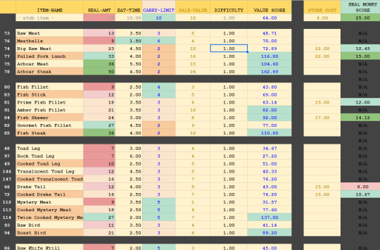
As usual, I used google spreadsheets, since they support equations. I could tweak the values of a healing item, and immediately see how its final score was affected. I also made use of automatic color formatting, so a field becomes highlighted red, if it's particularly bad, or green, if it's particularly good. Of course, the sheet is just a guideline. The aim wasn't to make all items have the same final score, but that they made sense for what they were and when you could get them. Late-game items tend to have higher overall scores versus early-game items. Some items, like doggy biscuits, have notoriously low scores across the board - as a joke!
-------------------------- Cooking Systems --------------------------
Another thing that had to be done with the healing items was finally determine their cooking sequences. 38 healing items could be cooked and will transform into something else. The way I specified that an item could be cooked was to add a a little snippet to an item's "meta data". An example would look something like, "COOK,57,62,ABXY,10,1.5,1".
In order, this specified the item_ID that would result on success (57), the item_ID that would result on failure (62), the button sequence (ABXY), the time you had to complete the sequence (10 seconds), how quickly the cursor should move (1.5x speed), and if the item multiplied on success (1). The system appears simple enough - but it was actually extremely inefficient!
For one, this system didn't allow random button sequences - all "berry fruits", when cooked would have the same button prompts and in the same order every time (ABXY). Initially, I thought having set button sequences would be a feature, but in practice, it was less fun.
Two, this system wasn't human-readable at all. I'd see a sequence of numbers, forget what they were, and have to look them up over and over.
But the biggest problem was that you couldn't evaluate an item's cooking difficulty from these numbers without manual testing. At 1.5 cursor speed, how many times does the cursor pass the center panel in 10 seconds? Maybe that's 15 times... for a 4 button sequence, the player has 11 opportunities to miss - that's too wide a berth for failure. The system also had variable penalties - if you misspressed a button prompt you loss time on the cooking meter. If you didn't press anything, you missed the opportunity, but not the time - but the clock was still ticking, so you did lose time, just not as much. In the end, the difficulty of cooking each item was all over the place. It was also possible to create "unwinnable" scenarios if I made the button sequence too long, the time too short, or the cursor speed too slow. Testing each item manually to ensure doability was too tedious and unreliable - it was a mess!
Which is why, the underlying cooking system was revamped. The new meta data looks like : "COOK,57,62,seq_length,5,spd,1.5,ease_add,2". This is a lot more readable. Beyond the first 3 entries, the arguments could be specified in any order. And their meanings were easy to understand.
"seq_length,5" means a random button sequence of 5 will be generated (no need for me to personally generate it)
"spd,1.5" means the cursor moves at 1.5x speed. I could also leave this field out to get a default value of 1x cursor speed.
"ease_add,2" - the biggest improvement to the system is how we now approach difficulty. We streamlined a miss-press and a missed opportunity as the same level of "mistake", and difficulty is framed as, "how many mistakes is the player allowed to make and still have a successful result?" By default, the player is afforded the ability to make 2 mistakes, and "ease_add,2" bumps the number of allowable mistakes to 4. We then automatically calculate how much "time" the player should have to cook something based on its cursor speed, how long the button sequence is, and how many mistakes the player is allowed to make. This was a more sensible and efficient system that let me knock out all 38 healing item cook sequences in one sitting!
-------------------------- Badges Nearly Done --------------------------
As you may recall from the last update, I was working on implementing the badges.
Thinking up the badge and having its graphic drawn is just the first half. Underneath, the code also needs to be made to track all the relevant player stats - how many times the player fished, ate, got money, used a certain move, etc. Some badges require extra guards, because they can be spoofed. For instance, the "Treasure Hunter" badge is obtained when the player has collected XXXX RIN through the course of your journey. However, there is something like a "gold exchange" in the game, where you could circularly trade gold and RIN to boost this number artificially. It's important to guard against cases like those.
So far, 30 of 33 badges are implemented. The last three have to do with late-game things that have inter-dependencies that we're still figuring out. The Speed running badge for instance is still dependent on two things. One, I need to speed run the game a few times to see how fast it's possible to beat the game and decide finally what's a reasonable time-limit. Two, there's actually a time-keeping bug which can inflate the game time if the system is left in sleep mode. I don't expect either things will be too hard to figure out - just gotta find the time for it.
-------------------------- Script Extra Polished --------------------------
We continued to polish the script, which I thought was basically done before. We added some extra NPCs here and there, and fleshed out the world with lore text where it seemed appropriate. In the end, the game's script ballooned to over 100,000 words! Hah... It's definitely DONE now however!
Some interesting things I noted as I was polishing old text - there were quite a few instances where Gail talks. I began the game's development with the idea that Gail should definitely talk since I wanted her to be a more active participant in what she chose to do. But I discovered later that if Gail talks, but only talked a little, she comes off as a very reticent person. There's no middle lane here - you're either all in or all out.
If Gail was a silent protagonist, she still talked symbolically. She is understood to be talking based on how people react to her - kinda like Link. So that's the direction I went with in the end (again). When Gail has occasion to talk, it comes in the form of a player dialogue choice. She also has an inner voice when she needs to remind the player to do something.

Another reason I went with this direction, is for brevity. Take this exchange for instance:
QUEST GIVER : Can you help me find this super rare ingredient?
GAIL : Maybe. I can't make any promises...
If Gail is silent, I can reduce those 2 lines to 1.
QUEST GIVER : Can you help me find this super rare ingredient?
GAIL : ...
-------------------------- Business Taxes --------------------------
Not too exciting, but new year means I gotta do taxes for the business. They're a lot more complicated than personal taxes, and more expensive! Since the game hasn't sold anything, you would think there'd be nothing to file. Hah! If only... The business is there so we can act as a legal entity and record expenses for when we do start selling. I really want to focus on making games, but there’s a small percentage of it that is sometimes boring and dreadful (-_-) ... still it needs to be done.
------------- Why no Public Beta Testing? -------------
As you may have noticed, I haven't put out any public calls for testing help despite being at that stage. Some have offered to help, which I appreciate! But sadly, I cannot accept. Here's the story for that.
Two and a half years ago, I got my hands on a console dev kit - that's very exciting, so I hurriedly took the steps to convert my dev station to be console-capable. After about two weeks, I had the console version working and integrated into my workflow, so all appeared good...
4 Months later, an artist needed an updated PC build to test some new art assets, so I went to build a new PC version. We use Unity, so generally you just need to click your desired build target, and hit "build". However, I now discovered that by attaching the console "hooks" into my work environment, I could no longer build to PC... It was possible, from my end, to test the game from the dev station in dev mode, which was why it went undiscovered for so long.
I did try to excise the hooks, but proved unsuccessful after a day of work. I decided to take this as an opportunity to focus exclusively on the console version first, which afforded me some niceties. Knowing that there's a standardized control scheme meant I could make full use of the control stick for the fishing mini-game. I also didn't need to create a rebindable keys menu - which is a MUST for PC versions... Most importantly, it lets me focus on making the one version as good as possible before moving onto the next. I have NO idea how those other guys release on all platforms at once...
Chalk it up to inexperience. In my defense, this will be my first commercial release, so bear with me. Don't worry, I still plan to make the PC version! It's a bit unconventional, but we're just going to go in the reverse direction of the usual. Console first, then PC, then other consoles. Wherever it makes financial sense, there we will be. (Sorry Ouya!)
Back to the original question - that's why I haven't sent out any public calls for playtesting. Current playable builds of the game are locked to my console dev kit. So actual playtesting unfolds in a very closed setting. Like what I did with Will, I literally sit behind the playtester, breathe down their neck, and watch them play, taking notes all the while.
But since I'm observing the player directly, even just one playthrough nets me a TON of bugs and adjustment tasks. So it evens out I think.
-------------------------- Trailers, Release Dates, etc. --------------------------
Alright, get your frowns ready...
We finished two trailers, and they're raring to go. BUT! We can't show them yet... We're sort of at an awkward spot where we're waiting on some conversational threads to conclude. Say we win a slot in a show - that'd be a HUGE plus for us - but that may also be contingent on us having NOT shown anything substantial yet. The game in its unrevealed state is a negotiating chip. So we're trying to leverage that... and you can only do the reveal once...
We also want to have some "actionable" items in the trailer - a launch date you could mark on your calendar, a wishlist, a website you can visit, etc. So since those things aren't entirely lined up yet, we can't let the trailers rip just yet...
Right now, I can only say we're *aiming* for a late Q2/early Q3 launch. But I can't commit to anything concrete yet. As soon as we know, we'll happily sing it from the rooftops. I hope I can update this blog sooner with good news, but if things move slowly again, I'll send out the next "we're alive" update 2 months from now (end of April).
I know it's frustrating to have nothing major after so long still, so I captured some gameplay footage... May it sate your hungers!
-------------------------- Footage 1 : Fishing --------------------------
You've seen pictures of the fishing, but never video of it in action. Well, here it is!
youtube
(And right after I uploaded the video, I noticed there actually was a video of fishing before. D’oh)
The idea is simple. First, get the lure in front of a fish, and assuming the fish isn't scared, it will soon bite. Then begins a fight sequence, where your energy meter is pitted against the fish's energy meter. Whoever's energy outlasts the other's wins.
The fish's resistance is represented by a red moving circular subsection. You fight the fish by pushing the control stick and keeping it on the subsection, which will dart around and try to escape you. Bigger and tougher variants of fish will do a "shake" which will reverse the wheel. When the wheel is reversed, so too are the controls, so it gets extra tricky!
While fishing, your energy meter doesn't recover, so one of the ways you level up your fishing ability is by finding energy gems to increase your max energy. There's another way - but we'll keep that a secret.
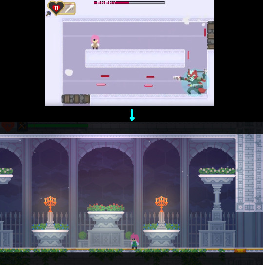
-------------- Footage 2 : Kobold Boss Fight --------------
You can actually skip the next section if you'd prefer to be surprised and you find your hunger for info sated. That's how I prefer to consume the games that I know I'm going to get. If you're still hungering for info, and you don't mind the slight spoilers, then feel free to proceed!
The next video shows the new Kobold Boss fight. Let's take a moment to reflect on the old game's visuals and how far it's come...
(we've come a long way since the time of the flash game)
youtube
You'll notice the Kobold boss has a name now - Katash! He's a significant enough character that he's earned it. The second thing you'll notice is that he looks better!
Some people have humorously pointed out that the old boss looks like Wolf O'Donnel from Star Fox. There's a funny story behind that. Basically I asked an artist to draw me a space wolf. And the artist, whom I'm assuming wasn't familiar with Wolf O'Donnel, drew that - all of it - all the animations and everything. The first time I laid eyes on it, it was already done, so it was too late to ask for edits. So I just ran with it.
That was seven years ago. Nowadays, I know to involve myself more in the process. I ask for just the design first, and we don't move forward with animations until we're happy with the design. Life lessons!
By the way, if you like Katash’s personal boss theme, give it a lesson on Will's Sound cloud (LINK)
-------------------------- Fan Arts --------------------------
Lots of fan art came in over the past 3 months!

This one is a pixel animation made by Pimez, and shows Gail singing a Christmas carol in various parts of the game. So cute! Years ago, I too was making little animated gifs for my favorite games, so it really brings me back!
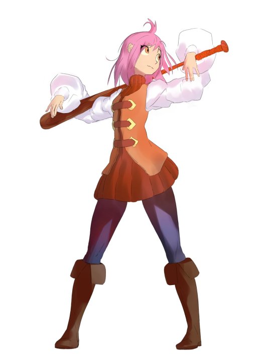
This one was made by cARTographer (twitter link) after a request by Deli_mage, so thank you both. Gail rocking stylish boots with a pose that shows confidence in her batting skills. Very anime - Love it!

Another submission of laptekosz of the Last Song of Earth area. Whereas the last picture depicted the night sky, now the orange trees are lit by a rising sun. Artfully done! Kinda makes me want to eat eggs. I hope you'll like the new Last Song of Earth area just as much :D

A new artist to the scene, Not_Quin, submitted two pictures, one of Gail and one of the Sand Drake re-imagined as a centipede. I'm always a fan of these re-imaginings! I like how it's spiky all over and appears to be wearing a skull mask. The Sand Drake is often pointed out to be too similar to Zelda's Dodongos, so maybe a long slithery body would have indeed served better. Fun fact, long ago, when we were working on Phoenotopia 2 in earnest, we actually had a giant man-eating worm planned - WIP animation depicted below. One day... one day...

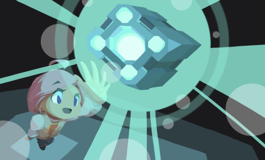
Negativus Core made two cool new arts! I'm really impressed by their use of unique perspective! Having characters run towards the screen or reaching close to the screen from afar is tricky since the proportions get all distorted - but not an issue for Negativus Core! Love the blur on Gail to show speed, with 66 in focus - really skillfully done! And the cube. Amazing!
--------------------------
I'm really honored by the huge fan art community. Thank you all!
50 notes
·
View notes
Text
How to Sell Your Business: 17 Types of Billion and Million Dollar Exits with Steph Sharp
Have you ever thought to sell your business and start anew? It’s challenging to know how to sell your business at a good price and deal. Studies have shown that business owners have a success rate of 5% in selling their businesses! It’s not just about the exit; you need to have a good strategy.
In this episode, Steph Sharp joins us to talk about how exits start with knowing how your business works. An attractive business can operate and thrive without its owner. Steph also shares exit strategies and common pitfalls you might encounter while you try to sell your business.
If you want to learn how to exit your business, then this episode is for you!
Here are three reasons why you should listen to the full episode:
Understand the ways you can make your business transferable and scalable.
Learn how to make your business attractive through the right pricing, business model, terms, and documentation.
Discover the different ways you can exit and sell your business.
Resources
Rich Dad's Cashflow Quadrant by Robert T. Kiyosaki
The 7 Habits of Highly Effective People by Stephen R. Covey
Built To Last by Jim Collins
Follow Steph’s work on Millionaire Exits and Facebook.
You can also reach Steph through her email [email protected].
Episode Highlights
Knowing Your Business Inside and Out
Steph shares her story of starting with small businesses, investment banking and capital markets, and eventually negotiations.
There are five types of businesses: charity, hobby, job, basic business, and transferable business.
Understanding your type of business makes it easier to know what exit strategies to employ.
For example, most basic businesses are profitable. However, people cannot come in and do your work.
Scalability and transferability are important aspects of exiting a business. Hear Steph’s in-depth discussion in the full episode!
There Is Always A Way Out
We don’t need to be trapped in a business for life. There is always an opportunity to create a way out.
Step back and ask yourself: why do people buy a business?
Most people don’t buy a business because it can make money. People buy a business because they believe it can make money.
Knowing this, you need to show how your business drives profits.
Make sure that your effective systems can be repeated and transferred to another.
What Are You Transferring?
Legal documents and paperwork are not the end-all and be-all to sell a business.
Transferring a business is about making sure it does not fall apart after getting sold.
The research shows that business owners finance as much as 80% of their businesses.
Financing, Earnout, and Capital Markets
Earnouts occur when owners get paid for their exit over time. This deal can create the problem of a buyer backing out a year into the contract.
When you sell your business to people who don’t know how to run it, you may eventually have to come back to take over again.
Seller financing is also a popular option for selling businesses.
Capital markets are often in the hunt for good business deals.
Listen to the full episode to get a clearer understanding of how to market your business.
Common Pitfalls of Business Exits
Steph shares that one of the biggest mistakes when you sell your business is not having an adequate financial record.
Proper business documentation is also necessary. This document should be the operating manual which details costs, clients, and the like.
When owners think of selling their business, they're often at a point where the business is deteriorating.
You need to make sure your business is attractive to potential buyers.
Typically, a business is worth about a third to half of what the owner thinks.
Profit Is Not Cash Flow
Remember that profit is affected by depreciation and other non-cash variables.
On the other hand, cash flow is how the buyer will pay off the loan for buying the business.
You need to be able to answer how many years they will be paying for the loan before they start earning money.
Disconnect Between Owner and Business
A lot of owners think they have employees, coaches, or contractors who will buy their business. This is not the case.
People will often choose to start their business rather than buying one.
This is also applicable to employees: how do you make sure your employees stay and don’t start their own thing?
Rather than just sell your business, you also need to think about how you want your lifestyle to change after the exit.
Exit Strategies
Business owners often don’t have exit plans for their business.
Exit strategies are crucial for emergencies. If you are the focal point, what happens when something happens to you?
Ultimately, you need to craft a business that can continue to work and thrive without you.
One exit strategy is going public. This causes a significant boost to your business value.
Tune in to the full episode to hear more about exit strategies!
Expected Timeline of An Exit
Steph shares that you can expect 3-4 months to pinpoint what you’re selling exactly.
Spend some time structuring your selling process.
Get attention and attract buyers quickly.
Steph’s 100% sell rate is due to the attention to correct pricing, terms and expectations, and good business documentation.
What the Data Shows
Financial statements often break down costs for labour, fuel, operation, and others.
You need to make sure your statements can show how the business operates clearly.
Too much information and detail can clutter your documentation and financial statements.
When selling, you need to be able to pinpoint patterns and trends.
It’s Not the End, It’s A Transformation
People often put off selling due to the fear of letting go of something integral to their identity.
Look at exits as an opportunity for new growth, business, and life instead!
5 Powerful Quotes
“We have no condemned people. There’s always a way out — we just have to create it. . . It used to be that we could get trapped. But with the internet, with technology today, there are so many ways out now.”
“If you’re not ready for that exit, if you don’t have a business that’s- if you don’t know how you’re going to transfer that out. . . You’ll wake up in three and a half years and you’ll look around and you go, ‘Oh my gosh, look at all these businesses for sale. How am I gonna sell mine?’”
“Sometimes it’s simply a matter of sitting down with them and clarifying what their business model really is. What drives the profitability, how do they actually do the pricing? Just because it’s in someone’s head, doesn’t mean it’s going to take you months to get it out of their head.”
“People, when they start thinking about selling, it’s often they’ve thought about it, and they leave it too long.”
“People get told they should go down a certain pathway — like franchising, like an IPO, whatever. And it doesn’t suit them personally; it’s not aligned with who they are and how they want to spend their business life.”
About Steph
Steph Sharp has been involved in $20 billion deals and worked with over 400 clients in every industry. Her experience spans professional and health services, utilities, ferry operations, technology, retail food processing, and finance.
Steph’s finance career specialized, particularly in exit transactions. She has worked with Goldman Sachs Bank of America, CNBC, corporations, individuals, private equity funds, and venture capitalists. Over the last 20 years, she has trained hundreds of entrepreneurs, business owners, and professionals worldwide to successfully exit their businesses.
Interested in Steph’s work? You can follow her on Millionaire Exits and Facebook.
You can reach Steph through her email [email protected].
Enjoy the Podcast?
If this podcast inspired you to know more about how you can become a successful entrepreneur, then hit subscribe and share it with your friends.
Rate us! We would love to hear from you. Leave us a review and help us reach more people aspiring to become successful entrepreneurs.
For updates and more episodes, visit our website. Subscribe and tune in on Apple Podcast. You can find us on Facebook and Instagram.
P.S.
Do you already have a successful business that is up and running, able to pay its bills with profit left over?
Are you interested in growing your business, automating or streamlining things, and staying one step ahead of your competition?
📨 If your answer is YES to all three questions, visit https://www.members.bestbusinesscoach.ca/problems-we-fix/ to see if we can fix what's holding you back.
Check out this episode!
#actioncoach#automation#bestbusiness#bestbusinesspodcast#business#businessbooks#businessbookstoread#businesscoach#businesscoaching#businessdaily#career#ceo#coach#company#database#entrepreneur#expert#growth#interview#makemoney#makemoremoney#marketing#million#mostsuccessfulentrepreneur#smallbusiness#topbusinessbooks
0 notes
Text
Kingdom Hearts Union χ[Cross] and fundamental failure

How do you judge a free-to-play mobile RPG? The kind with stamina timers, premium currency, and a "gashapon" that randomly dispenses characters and weapons? If you expect hours of uninterrupted play requiring dextrous, precise inputs, you're better off with a console game. But not even most portable console games can give you a satisfying play session within a lunch break, and most every mobile game can.
Although they're all intimately tied to a predatory monetization model, there's something special about a perpetual game on your phone. I hold fond memories of when Terra Battle or Tales of the Rays supplemented my life with structured play and planted a hobbyistic fervor in my mind with their clever, streamlined battle systems. There were post-launch story chapters and limited time events to frequently test my mettle, and when I just wanted to unwind, I was able to grind with easy content that didn't require my full attention. Despite some bursts of compulsive play and frustration with unlucky pulls, I felt I had mutualistic relationships with them.
My time spent with Kingdom Hearts Union χ[Cross] on Android, however, was largely parasitic. It neither provides stimulating enough combat to fully engross nor allows for the relaxing, hands-off play of an idle game. So, KHUX fails to provide the base pleasures of free-to-play mobile RPGs.

This game was first known as Kingdom Hearts χ[chi] on browser and originally for mobile as Kingdom Hearts Unchained χ, changing to its current name with a new co-op mode so unremarkable I neglect to mention it elsewhere in this review.
Battles are turn-based, and each of your attacks is derived from a medal (the primary gashapon item) slotted into your keyblade. You can tap on the screen to attack a single target, swipe the screen for a weaker attack that hits all foes, or swipe a medal to activate its special attack (they're officially named special attacks) requiring the use of a resource gauge called... "gauge." These always deal damage and may heal, grant buffs and debuffs, restore gauge, or grant ailments. Whenever you attack, the current medal rotates out to the next one until you've used each once.
Now, streamlining gets a bad rap. It's often associated with dumbing down instead of refinement. But there are so many mobile games that take advantage of their simplicity to make accessible depth. Just look at Puzzle & Dragon, the mobile puzzle RPG that requires thought and skill surpassing many of its pure action puzzler peers. In its case, shrinking the game board and allowing the free movement of pieces makes it easier to read a board WHILE offering superior board manipulation than the average match 3 (meaning more combos that you meant to make and less that come by chance). That's successful streamlining.

The medal system, unfortunately, doesn't use its simplicity for such an end. Each of your 3-7 medals must be activated one after the other in clockwise order starting with the first; your sequence of attacks is predetermined for every fight once you enter a stage. There's no dexterity or timing required for inputs. Ailments (largely useless) and enemy attack patterns are the only sources of randomization within combat, so there is no risk/reward dynamic.... and no choice. You either have enough gauge for a special attack or you don't. You either came with enough damage and healing to last or you didn't.
Though there's something resembling insight in the 1 Turn Triumph mechanic. You normally regain gauge piecemeal from damage dealt, but a 1 Turn Triumphs allow you to gain back multiple counts of gauge as long as you defeat enemies in a single turn. This requires consideration of enemy and medal attributes (red beats green beats blue) and damage distribution (single target or AoE). Clearing all enemies in a single turn is the most common requirement for objectives, optional achievements that grant currencies for character progression and the gashapon. Normally, you regain enough gauge to use special attacks at every opportunity, so you have to get a feel for how much damage you need to take out enemy formations in 1 turn, which will help you grind up enough gauge to defeat the stage boss.
Sometimes, the same objective is repeated... within the same mission. Why?
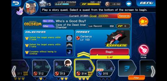
The battle design is self aware of where mobile RPGs most disappoint; they can't make stages significantly challenging to complete without seeming to have a paywall, but if it's too easy, hardcore players will become disinterested. The game attempts to address this by assigning three objectives to each stage. These might require you to defeat all enemies in 1 turn, defeat bosses in a certain number of turns, or restrict which medals you may use to on attribute. So, allowing bad players to clear stages effortlessly while offering optional objectives accommodates everyone! Hooray! The game is designed, even at high levels, around players arranging their medals in the correct sequence before stages start instead of expecting them to think turn-by-turn. I find this to be a legitimate design decision for mobile (and console RPGs like Final Fantasy XII, for that matter). I hate it, but I respect it; it lets you take a laid-back approach to character management before battle and enjoy the results of your fine-tuned set-up.
Unfortunately, the game doesn't let you play effortlessly thanks to the lack of a true auto-battle. There's an auto setting that uses special abilities for you, of course, but it doesn't move you throughout the stage. You must navigate environments and encounter foes by laboriously sliding your finger across the screen—not with a virtual joystick, but across your entire screen.
There are mobile games that get away without auto-battle. For example, Fate Grand Order doesn't have basic attacks, and its skills are cooldown based or can expend variable amounts of meter for increased damage. A simple auto-battle routine couldn't easily tell whether you want to charge limit breaks, gain critical stars, burst down enemies, or activate unique character skills; the game is too complicated for it. Puzzle & Dragon wouldn't make sense with one in the same way an auto-play option wouldn't make sense for Bejeweled. But these two games are much more demanding, one for optimal order sequencing and the other with its puzzle board. You know, actively, traditionally-for-a-video-game engaging.
There's so little to this game's combat in the first place that I find it excruciating to manually navigate through its environments. They're expertly illustrated. Beautiful, even! But they work against the mindless, chill grind the battle system is meant to facilitate. The novelty of their beauty fades as you're forced to balance your phone in one hand and scrub dramatically across your entire widescreen phone to go from left to right and back again (how I wish it had a virtual joystick so I could play with one hand!). By the way, you have to touch and hold at the far edges of the screen to reach full speed. There’s an option to tap at a location, but the player character will vary its running speed depending on the distance away. It’s always a pain to perform movement, which doesn’t even factor into combat itself and often takes up more time than battle within a stage.
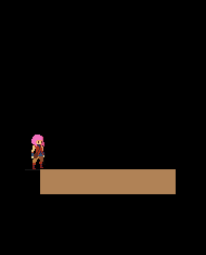
Keep in mind you have to scrub through this entire map dozens of stages in a row to clear the most common objective (defeat all enemies in 1 turn) at this scale:

If you're not used to playing mobile games, this might sound like a ridiculous complaint. But when the core combat is just an excuse to grind and make numbers go up, a shallow vessel to deliver the Good Chemical, it wears you down. Like, imagine if Cookie Clicker lacked store items that automatically produced cookies. KHUX is that kind of contradiction, a game designed to be passive that demands your attention in irritating, frequent pulses, an inconvenient hand cramp of a game.
There are more ways to play, extra mechanics, a baffling pet system... I won't go into everything the game has to offer, but know that they provide no depth to combat or medal management, merely complication. But I want to go over the main means of progression in the game: Guilt.
You level up medals to increase their power. You level up medals by fusing them together, losing all medals used to level the other. Their maximum level increases as their rarity increases. You can increases their rarity rank with materials you can grind for in daily objectives. I'll assume you understand how this kind of system works. Yet the game won't settle for this tried-and-true progression loop. It introduced the Guilt system.
So, every time you fuse identical medals together, the remaining one gets an orb (yes, it's just called an orb). The medals MUST be identical in both name and rarity. If the medal has any orbs, those are transferred to the base medal. If a 6* rarity medal (the rarest and most powerful rarity) gets all its orbs filled plus one, it rolls for a Guilt value. The Guilt value bestows a random percent bonus to damage up to 150%. Guilt value on the rarest of medals can range from 70% to 150%. What happens if you're unlucky and roll a 70%? Well, better go to the gashapon and pray for a copy! Even then, you might get a 71% and wasted a powerful medal. Good job!
The community encourages players to Guilt medals that drop freely through the story. This is the optimal sequencing of medal fusion to Guilt one of these medals:
You need to, at minimum, 39 medals of the same name at different quantities for each rarity, AND all of the medals required to increase their rarity, AND all of the medals to level them up. If you don't do it in this exact sequence, you're wasting dozens of material medals and hours of time. It's absolutely absurd.
The game, of course, severely limits the amount of medals you can carry unless you pay with the premium currency. Even the joy of 10x gashapon rolls were tainted by the hidden tax of inventory expansion. Collecting medals should be fun. Collecting medals is what makes you want to spend money. Collecting and arranging medals is all the game is, really. And it's always accompanied with grueling, tedious inventory management that does nothing but stress me out!
I haven't even gotten to the power balance of medals. In short: it's whackadoodle. After making so much effort to Guilt my common 1* Stitch medals, I got lucky as a F2P player and rolled Illustrated Xion (EX). A single use of the medal buffs your damage with itself and all other medals by over 200% for multiple turns, refills more gauges than it takes to spend, and consequently breaks the majority of content over its knee. I never once, ONCE, in the entirety of the main story, had to manually choose which special abilities to activate to conserve gauge. And I had to manually move my character all the while, find an enemy, wait for the elaborate attack animations to cease, and start again. I stopped caring about clearing objectives; I was powerful enough to clear all of the story's content without bothering.
Other games use cost systems to prevent the abuse of rare medals at early player level, only allowing the use of one or two of the rarest kind of character or weapon. Due to a variety of factors involving the pace of progression, this did not factor in at all. Even without using all of my most powerful medals at once, Illustrated Xion (EX) was enough to utterly break what was meant to be a pacey, early-player experience. I ruined the game by getting a favorable gashapon roll. This is a fundamental failure in the design of randomized collectibles in a game I haven’t seen since the early days of mobile gaming. This has been solved for years.
By the way: I only started playing to see where the story would go. The community has reached a consensus that the plot only begins to develop significantly after stage 350, months and months after release. I would say it actually picks up in the early 300s, but by the time I got to the good parts, I was too bored out of my gourd to continue despite being greatly intrigued.
The game has built its entire postgame around the use of medals like Illustrated Xion (EX) that make all previous game content trivial. Half a year after introducing the first medal of this type, Illustrated Kairi (EX), there is now a permanent budget gashapon that has a paltry chances to drop these buff medals as a way to allow the unluckiest of players access to postgame. But I'll tell you: the postgame isn't worth it. It's a skilless test of how lucky you are or how irresponsibly you spend money. And if you can access it, your medals are too strong to enjoy any other content. There are no objectives asking you to bringing low-rarity medals to otherwise increase challenge. There is a Proud Mode variant for many story stages, but these have such strict restrictions that I could barely clear any of them (the most common of which restricts special attack use to medals that have been Guilted AND have a Guilt value exceeding a certain amount, which isn't nearly as hard as it is expensive). Even verifiable trash like Fire Emblem clone Phantom of the Kill has objectives requiring low-rarity characters to provide some bracing challenges.
In conclusion, Kingdom Hearts Union χ[Cross] fails to provide what I seek from a mobile game on a basic level: relaxation or engagement. It fails to relax me thanks to its hand-cramping map navigation and the oppressive inventory management. It fails to engage with its battle system because it's designed to be largely effortless and relaxing. It is a frustrating waste of time as a time waster.
1 note
·
View note
Text
7 Ecommerce User Experience Quick Wins (Making Your Visitors Happy)
Optimizing ecommerce user experience might seem like a daunting task. There are so many variables. Where should you even begin?
When you feel overwhelmed, remind yourself that ultimately, user experience is about removing friction and guiding the customer through the sales funnel to make their online shopping experience easier.
And you don’t need to completely redesign your ecommerce site in order to make it easier for the customer to buy your products.
In fact, sometimes changes that are relatively simple to implement can have a massive effect on your business, especially as the results compound over time.
So why don’t you start by focusing on quick wins?
#1 Improve Website Loading Speed
Website loading speed is the most overlooked aspect of user experience.
Google researchers have discovered that 53% of mobile visits are abandoned if the page takes more than 3 seconds to load.
Meanwhile, 70% of the mobile landing pages that they analyzed took more than 7 seconds to fully load.
It’s safe to say that these companies could significantly increase their revenues by optimizing their ecommerce websites for speed. They are missing a huge opportunity.
Don’t make the same mistake. Use Page Speed Insights to analyze the speed of your website. Then, optimize it so that it would fully load in less than 3 seconds.
Keep in mind that a delay as short as 100 milliseconds can have an effect on the conversion rate, so every additional second is pretty much guaranteed to hurt your bottom line. You can typically improve this dramatically by optimizing your product images by compressing them and leveraging browser caching.
#2 Add a Call-to-action Button to Your Homepage
When people land on your website, don’t just let them aimlessly wander around, nudge them towards the next step in your sales funnel.
You can do that by adding an above the fold call-to-action button that immediately grabs the visitor’s attention.
This is the first thing that Google recommends in the homepage/landing page section of their “UX Playbook for Retail” because it is easy to implement but has a high impact.
For example, take a look at the Tuft & Needle homepage, where they use a bright call to action button that stands out in the overall color scheme to direct the visitors to The Mint Bundle product page.
(image source)
Note how various elements complement each other. The headline, the subheadline, the color and the copy of the call-to-action button… They all work together to get the visitor to click on “Shop The Mint Bundle” and take another step towards making a purchase.
Once someone lands on your website, provide them with a clear direction in the form of a call to action button, and then use other elements on the page to reinforce that call-to-action.
#3 Feature a Prominent Search Bar
It’s important to note that staying on top of design trends and how that relates to the overall ecommerce UX is vital to success.
According to Google’s “UX Playbook for Retail,” users that search are 200% more likely to convert on average.
That is why they suggest making the search bar visible and then featuring it prominently (it’s another thing that is easy to implement but has a high impact).
For example, when Lyst switched from displaying a search icon to displaying a search bar, their search usage increased by 43% on desktop and 13% on mobile.
(image source)
Search usage might not seem like an important metric, but since we know that visitors who use the search function are more likely to buy, it makes sense to encourage them to do it.
#4 Add Customer Reviews
People are now used to reading customer reviews before buying something online.
According to Fan & Fuel research, 97% of consumers say that reviews factor into their buying decisions.
Meanwhile, 92% of consumers say that they are hesitant to make a purchase if there are no reviews available.
(image source)
According to Spiegel Research Center, “As products begin displaying reviews, conversion rates escalate rapidly. The purchase likelihood for a product with five reviews is 270% greater than the purchase likelihood of a product with no reviews.”
However, they also note that the first five reviews have the most impact, and after that, the marginal benefits of additional reviews start diminishing.
(image source)
Adding customer reviews provides social proof that makes any product description more persuasive.
After all, everyone knows that you want to sell the product, so they expect you to sing praises to it. But what do people who bought it have to say?
For example, take a look at how Rainbow OPTX display customer reviews on their Blue Lens/Aviator Frame sunglasses product page.
Note how customers can not only submit a review but also upload a picture of themselves wearing the sunglasses (this works great for brands that sell apparel and accessories).
(image source)
It’s clear that consumers are wary of buying products that don’t have any reviews. And who can blame them? They can’t inspect the thing they are about to buy themselves, so they want some reassurance.
Moreover, when a brand doesn’t allow customers to leave reviews, it looks as if they don’t have confidence in their own products.
That is why it’s so important to enable customer reviews and then encourage people to review the products they have purchased.
Remember, the difference between zero reviews and five reviews is massive, so get on it asap!
#5 Don’t Redirect to the Cart Page after You Add to Cart
Online stores often redirect the customer to the cart page immediately after they add a product to their shopping cart.
However, this interrupts their shopping process and adds unnecessary friction, because now they have to leave the cart page in order to go back to browsing your inventory.
According to Google’s “UX Playbook for Retail” using a pop-up cart instead can help increase the average order value.
For example, when Lyst switched from redirecting to the cart page to displaying a pop-up cart, their average order value increased by 4%.
(image source)
This allows the customer to continue shopping while also reassuring them that the product has indeed been added to their cart.
Don’t get in the customer’s way when they want to buy more stuff from you!
#6 Allow Guest Checkout
Baymard Institute surveyed over 2,500 adults from the United States to find out why people abandon their carts at the checkout.
Here are the results that they got after removing the “I was just browsing/not ready to buy” segment:
(image source)
As you can see, “The site wanted me to create an account” is the second most common reason for cart abandonment at the checkout.
In fact, there’s even a well-known story about how removing that barrier led to a $300 million increase in revenue.
Jared Spool from User Interface Engineering was hired by a major retailer to improve its online store.
The retailer had a checkout flow that required the customer to either create a new account or log into an existing account in order to complete their purchase.
The idea behind this was that creating an account would allow the customer to check out faster in the future and thus make shopping easier.
However, when Spool looked at the data, it turned out that 45% of all customers had registered several accounts, presumably because they couldn’t remember whether they had one already.
Moreover, customers were submitting 160,000 forgotten password requests a day, and 75% of those requests did not lead to a purchase.
It became clear that instead of making the customer’s life easier, the registration requirement was an obstacle that prevented them from completing their order.
Spool then replaced the “Register” button with a “Continue” button and added a disclaimer to let the customers know that creating an account was not necessary to make a purchase.
This led to a drastic increase in sales which translated to $300 million in additional revenue in one year.
In short, requiring people to register in order to buy your products is a bad idea, and if you are currently doing that, it’s probably costing you a lot of money. Stop it.
However, you want customers to create accounts because that allows you to collect data that you can then use to streamline and personalize their shopping experience. So what should you do?
The best approach is to provide the customers with an option to register while also letting them check out as guests.
For example, MVMT has an “Account” tab in their homepage navigation, and if you hover over it you will be presented with the login and sign up options:
(image source)
Meanwhile, if you click on it, you will be taken to a page where you can find more information about customer accounts:
(image source)
However, if you don’t have an account, you can always check out as a guest:
(image source)
What is the lesson here? It’s okay to encourage customers to sign up, but don’t push it. They will do it in their own time if they like your products.
#7 Reduce the Number of Form Fields in the Checkout Process
No one likes filling out forms.
However, people understand that you need their information to fulfill their order, so they are willing to fill out the required fields to finalize their purchase.
You shouldn’t test their patience, though. The more fields a form has, the more likely it is to be abandoned. And most checkouts have way too many fields.
When Baymard Institute conducted a checkout usability study, they discovered that the average checkout flow has 14.88 form fields.
“Yet our checkout usability testing also reveals that most sites can achieve a 20-60% reduction in the number of form fields displayed by default.
In short: the average checkout display twice as many form fields as needed.”
But how can you reduce the number of form fields in your checkout flow?
The most important thing is to only ask for necessary information and nothing else.
For example, online stores sometimes ask customers for details like title, middle name, company name, etc. But do they really need all that? Probably not.
Also, according to Baymard, even optional fields add friction to the checkout flow:
“While it’s true that users aren’t required to fill out the optional fields, users won’t realize this until they progress to that field and see its ‘optional’ label. Hence, when users first glance over the page, the optional fields are as intimidating as the required fields (because the user has yet to distinguish the two), and can thus make a checkout step seem more intimidating to complete than it actually is.”
It’s best to remove every field that isn’t necessary for fulfilling an order.
Baymard also suggests these additional tweaks to reduce the number of form fields further:
Instead of having separate “First Name” and “Last Name” fields use a single “Full Name” field.
Use the shipping address as the billing address by default and hide the “Billing address” section behind a link.
Hide all other fields that are not required but may sometimes be needed behind links (e.g., “Address Line 2”, “Company Name”, etc.).
They used Crutchfield’s checkout as an example of a well-designed checkout flow. It only has eight form fields.
“An entire checkout flow can be as short as 6-8 form fields. Here Crutchfield’s 8-field checkout flow is shown. That’s only 54% of the number of fields in an average checkout, which has 14.88 fields.”
(image source)
Remember, every unnecessary field adds a little bit of friction and makes the customer more likely to abandon the cart.
That is why you should reduce the number of form fields in your checkout flow as much as possible.
Conclusion
The phrase “quick wins” can be deceptive because we are used to associating the effort we put into something with the results we get from it. And that’s how it usually works.
However, you have to remember that your customers don’t care about how much effort you put into optimizing user experience, what they want is an easy way to pull out their credit card and buy your products.
That is why something that sounds silly, like reducing site loading time by one second, can have a drastic impact on your bottom line.
So never discount the power of quick wins. They can add up to a lot of money over time.
The post 7 Ecommerce User Experience Quick Wins (Making Your Visitors Happy) appeared first on HigherVisibility.
from The SEO Advantages https://www.highervisibility.com/blog/7-ecommerce-user-experience-quick-wins/
0 notes
Text
3 Quick Tips to Get a Better Email Response Rate
By Jeff Harvey
No doubt you see digital marketers discussing the newest and most exciting email marketing tricks just about every day all over the internet.
Some of these hacks will promise to change the way you market your product. Some might even guarantee to take your email campaigns from 0 to 100 in no time.
But here’s a piece of wisdom… age-old marketing best practices, and not ‘new tricks’, genuinely make a difference and will continue to do so for years to come.
It takes years of trial and error to uncover these principles of email marketing. A hundred books and 100+ articles/blogs won’t teach you as much as field-testing will.
There are plenty of proven email marketing tips, many of which haven’t changed for years and won’t change for years to come. The closer you stick to some of these proven email campaign best practices, the more likely your campaign is to succeed.
This is a post for marketers who want a tested formula to get a response to their emails.
Tips to make your email marketing smarter
There are three basic components of email marketing. All three of which, when closely aligned, can replicate your email marketing success.
Design
Direction
Content
Align the three of these into your email marketing campaign, and your results will improve tenfold. But before you get on to that, ask yourself a few questions:
What is your product?
What are its marketable components?
Who is your target audience?
What is your key message to the consumer?
Who are the people who will influence your audience?
What marketing channels do you have access to?
How long will your marketing campaign last?
What are their phases?
A lot of marketers make this mistake of never doing the initial brainstorming, which often leads to their campaign going nowhere. These questions will give you a bird’s-eye view about the direction of your marketing campaign and help you establish an even better plan. Based on the answers to these questions, you can further develop and define your marketing campaign.
Now let’s walk through these three basic components of email marketing…
1. Design
Design enables consumers to perceive, navigate, and interact with your brand. The better your email design, the easier it will be for you to get a response to your email campaign. The below given guidelines will give you new ideas to create a compelling email template.
Marketing is all about simplicity and brevity. Make sure you break up the information so it’s easier for the reader to digest all of the information. To get the best response to your email marketing, you need to:
Make your content shorter.
Replace chunky paragraphs for short paragraphs.
Use bullet points, images, bold titles, quotes, etc.
Set your call to action apart using bold colors, button, or text.
Integrate social sharing buttons as well as your contact information.
To make your email CAN-SPAM compliant, make sure the unsubscribe links are placed prominently and easy to find.
According to the 2015 State of Marketing Report from Salesforce, 79% of marketers deem email content and design as both the most critical and most effective aspects of an email. You can find a great example of a streamlined, mobile-friendly design from Uber here.
A pretty send, for sure. Here are a few things we love:
The initial description is brief. The call-to-action is within the scroll, which is perfect for subscribers who just want to skim through an email to see if they can find something interesting. And the content, which is in a step-by-step explanation, looks very pleasing.
Most of all, we love how consistent the design of their promotional email is. It includes visual aspects of the Uber brand, like their social media photos, app, website, and other parts. Plus, the email is decked out with the right color scheme – not too much bright, along with geometric patterns. Best of all, their email tells their brand’s story.
To sum it up, Uber seems to have nailed it in one go.
2. Direction
The worst thing you can do as a marketer is not understand your audience and its needs. You need an audience that is relevant to the buyers’ demographic. To do this, identify your target segment by filtering significant variables such as buyers’ behavior.
When you market your product to the wrong demographic, your email ROI will decrease, and so will the most important email metrics. Your email marketing list needs to be fresh, relevant and accurate enough to increase engagement levels and turn prospects into buyers. With the integration of multi-channel marketing, it has become even more necessary to maintain an email list.
A relevant mailing list will:
Increase open rates
Increase click-through rates
Increase conversions
Decrease unsubscribes
Avoid spam filters
Increase brand loyalty
It’s ideal to partner with a reputed email marketing company who can deliver your emails as much as possible. But most importantly, a fresh and relevant email list also means you won’t get blocked by ISPs for spamming.
Here’s an example (see image below) of an email I received in my inbox a few days ago. As you can see below, design-wise the email is very bland, but it’s to the point. It reads simply like an email from a friend or a colleague, asking for a quick favor.
The email consists of a call-to-action to a questionnaire, where the sender wants to gather insights about her actual readership. It shows their obvious dedication to know all about the people who are reading their marketing emails.
Now this is a great approach to get a better response rate to your emails. Best of all, it helps impress your audience with clever and relevant promotional emails.
Now that you have an engaged email list, you can carry out A/B split tests. An A/B email split test will help you figure out which version of your email campaign is the most effective. Here’s a list of basic A/B email split tests for you to try out:
Headline copy and length
Mobile-friendly optimization
Product image sizes
One column vs two columns vs three columns
Color scheme
Time of the day
Trial vs membership/purchase
Flash sale
Testimonials in email
Prize draws or contest
Introduction length
Direct link mechanism
Coupon code
Call to action button design
Including loyalty points
A/B split tests are a great way to optimize your email campaigns. There is never a universal way to create your email marketing campaigns that will work well for each product and audience. Using A/B email testing you can greatly improve on important email marketing metrics.
3. Content
How do you want your marketing message to be presented? Does your message tell a story?
Put down facts, information, or whatever else you need to tell a story. Here’s why… consumers’ buying choices are inspired by emotions, memories and interests. With ‘storytelling marketing,’ you can weave your product seamlessly into the story and build excitement for the call-to-action. As well, numerous studies have shown that our brains are far more engaged by storytelling than straight to the point facts.
There are a few basic types of storytelling marketing:
Origin stories
Vision stories
Case studies
Why stories
Let’s take a look at a couple of online retailers that use email marketing as an opportunity for brand storytelling.
All of the best of brands have two things in common:
Have a clear brand voice
Convey a brand ethos
Crew: The U.S. retailer sends out four welcome emails in a one-week period. After the first week, subscribers are sent regular promotional emails.
All emails in the welcome email series sent over the first week are dedicated towards introducing the brand, its product range, J. Crew’s personal shopping service, and its social media accounts.
The first email starts with a note from the company’s creative director talking about J. Crew’s well-defined brand ethos. The tone of the emails makes the recipient want to explore their brand experience by visiting a J. Crew physical store.
MAC’s welcome email is a visual feast inviting readers to engage in a whole lot of ways, and engage with its product offerings. The emails are designed to look aspirational – introducing top makeup artists under the headline ‘Our Artistry’. It also encourages subscribers to get to know the artists, watch their how-to videos, and buy more MAC products in the future.
Some of the best brands of 2016, Apple, BBC, Amazon, and Facebook, for example, capitalize on storytelling. In fact, storytelling marketing is not just a way to engage customers, but to start conversations in a compelling way.
Did you know that an extraordinary process known as ‘mirroring’ occurs where our brain activity mimics that of the storyteller’s? A neurotransmitter called Dopamine, which aids in memory retention is released. The cortex (associated with thought and action) is activated more than when we’re just processing cold, hard facts. So, keeping spinning the yarn, and create a compelling story to capture your potential buyers’ hearts and minds.
Wrap
You now have a tested formula to get more responses to your email campaigns. Go ahead and make it a part of your marketing strategy. Remember, ‘DESIGN, DIRECTION and CONTENT’.
Guest Author: Jeff Harvey is an email marketing expert at FrescoData, a full-service data-driven marketing and consulting company. He has over five years of experience in Email marketing and lead generation. His core responsibilities include A/B testing internal processes to consistently improve clients return on investment.
The post 3 Quick Tips to Get a Better Email Response Rate appeared first on Jeffbullas’s Blog.
from 3 Quick Tips to Get a Better Email Response Rate
0 notes
Last Seen Blogs

meitantei-conan-hd-jp-2021
名探偵コナン緋色の弾丸フルバージョン〜(Dete

stevewalesmusic
Steve Wales Music

catheadreynolds
Cathead Reynolds

saline-coelacanth
I made an attempt

nomaji
HSWW Room Of Requirement