#mostly the symbol that..... she-ra is a huge weapon herself even without the giant sword
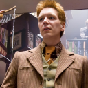
Photo
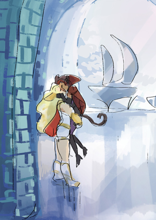

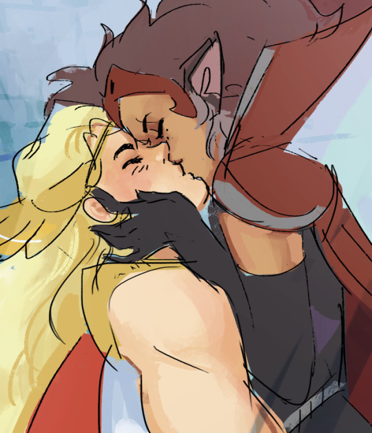
this is a peace talks, they’re negotiating, ok
#peacetalks verse#she ra#catradora#sdkjfsdf this is at the end actually#adora doesn't bring out she-ra during negotiations for symbolic reasons#mostly the symbol that..... she-ra is a huge weapon herself even without the giant sword#BUT YEA THE TALKS WENT WELL#there were ups and downs but look how far they got#also catra's a bit peeved that she's not taller than adora even in her heels now#(kingdom of snows guard walks into the hangar bay) ''excuse me sir we're negotiating''
3K notes
·
View notes
Text
Also here's a dump of other sketches with my thoughts process. Long post, so everything’s under the cut.
The Mythra:
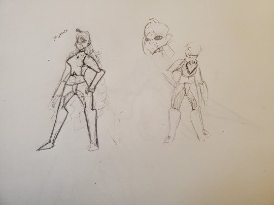
I really liked my first idea so I stuck with it. My thought process was I wanted to emphasize that she's mecha anime and therefore out of place (she already has a mech). Pants are a reference to Alvis's illegal shoes. She’s wearing a crop top because Mythra reads as the type of person who would enjoy wearing a crop top to me. She has giant gauntlet things on her arms because they look cool. I gave her two giant braids because anime (and I’ve noticed a trend of tsundere characters often having two strands of hair going outwards for some reason? And I figured “might as well copy+pasta lol). Her left eye is partially covered by hair, which is supposed to represent her feeling distant or partially isolated from the rest of the world. It’s also a character design trend sometimes used in villain characters, which I thought would fit Mythra since she’s worried about her power being used for evil in 2 and is being constantly compared to Malos in Torna. I kept the choker from the base design because it looks cool and also relates to how she’s constantly constraining herself.
I also wanted to make her buff because she’s a warrior who wields a giant fucking sword, she should be buff (like, the fight scenes involving her in Torna DLC looked a bit awkward because Mythra was swinging a giant sword around one-handed like it was nothing while also having very shrimpy arms).
Overall, I wanted Mythra to feel very alien and distant to the rest of the world. If I were to continue iterating on this, I’d probably look at some of Elma’s armor (mim and alien) for reference because doing that would allow for Mythra to look disconnected from the Xenoblade 2 cast but still feel like a Xenoblade character.
Side note: I assumed that the Aegis shape Core Crystal was a requirement. If I had the option to remove it, I probably would. It doesn’t look bad, but if the goal was to connect the Aegises with the Monado, I don’t like that Alvis’s key had to be retconned for that to function.
The Pyras:


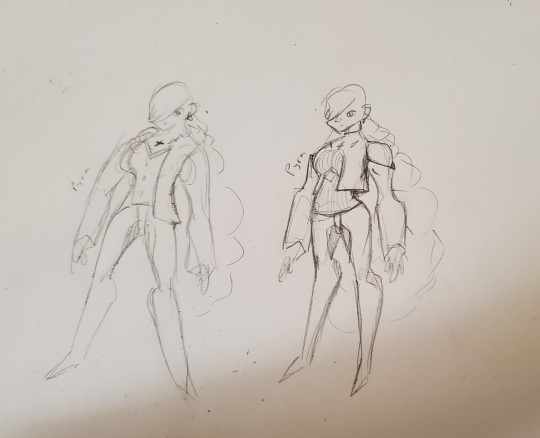
A consistent theme here between the designs was the pants. I wanted Alvis's illegal pants to be a running theme among the Aegises because they are stupid and illegal and I like them. They also look like the most vaguely scifi part of his actual outfit, so I figured giving them a shared article of clothing would be a nice way to visually connect the five character designs (Pyra, Mythra, Pneuma, Alvis, and Malos), and I wanted to keep the vaguely mecha theme going. You can see in Pyra 6 that I was tired and just drew Pyra in Alvis's attire.
I wanted Pyra to look like a mecha design covered up by something that more closely fits the aesthetic used in Xenoblade 1. So not quite mecha, not quite 1. The idea was that Pyra was trying to look more like a common person in order to appear less threatening. If she despises and fears her power, I don’t think she’d want to wear an outfit that embraces it. Putting her in more casual clothing would also contrast with Mythra and better communicate that Mythra is significantly stronger than Pyra. But all that said, putting her in full casual clothing might undercut the emotion Rex and Pyra’s first meeting was meant to invoke (of being like “oh wow, a legendary ancient weapon). And designing her to still look mecha would still be saying that “even though Pyra doesn’t want to be the Aegis, she is still the Aegis and cannot escape her power.” Which is why quite a few designs lean into the mecha aesthetic. The exact balance between mecha and casual clothing was the main thing I struggled with on this design. The final design is the one that more or less struck the balance I was hoping for.
A few of the designs are vaguely sexualized. Specifically Pyras 1, 4, and 7 all have tiny boob windows. If I were to finalize 7, I’d remove the boob window because it looks a bit awkward and I think a belt (similar to Elma’s underboob belt) would look better, but my thought process there was “do I want Pyra to be comfortable?” I don’t want to go over the top with the revealing clothing, but making Pyra wear slightly revealing clothing that she probably wouldn’t want to be wearing could help drive the point that she’s a combination of all the traits Mythra was criticized for lacking. It’s not pleasant or comfortable letting others dictate your entire existence through repeated harassment and Pyra already very heavily acts like the sexist ideas of what a woman should be, so giving her a tiny boob window could help emphasize that point. The main reason I’m saying I’d change it if I iterated on 7 is because I don’t think it compliments the design particularly well.
Another thing that stuck between each version of Pyra’s design was that her left eye is completely covered by hair. I did this for a few reasons: it would follow up on the symbolism of Mythra’s design partially covering her left eye, it would give Pyra a slight air of mystery, and it would faintly reference Alvis’s design (I want the designs to hint at each other but I don’t want it to be super obvious). The earrings were also kept between designs because they were in Mythra’s design and I wanted that to get carried over because it’s a little bit extra cohesion between the two designs.
I wanted was to use Pyra's hair to help represented Mythra binding herself. Mythra has two braids that are loosely flowing, so she's already semi bound. If I were to start drawing Pneuma, I think I'd want her hair to not be tied at all (maybe a similar style to KOS-MOS and Elly as a reference, maybe not?) or I'd just put her in really long dreadlocks or something because hair go brr. One idea I had was to just have one big braided ponytail, but another idea was to try and tie the hair up (which is what I was going for in Pyra 2). I couldn't find a way to do that in a way I particularly liked, so single big ponytail is the way I went.
You can probably see that there were a lot of ideas thrown at a wall here, so I’ll go over some noteworthy facets of each designs.
Pyra 1 had a key on her chest, it was meant to be reference to Alvis. It didn’t stay in other designs because the reference felt too obvious. The first two designs also had a giant X on her chest, it was meant to look like the outfit was binding her, but I don’t particularly care for it. Pyra 2′s pants had weird patterns on them because I was trying to visually make them look a bit distinguished from Mythra’s while still keeping the same idea, but I don’t really care for them. I also don’t like how Pyra 2 is just wearing a T Shirt. I’m not really sure what I was going for with Pyra 3. She kind of looks like Glimmer in the She-Ra reboot, which wasn’t intentional. Pyra 4 leans more into the mecha than any other Pyra. She kind of looks like a ballerina but not really. I was focusing mostly on making her look a lot like Mythra, but I feel that this design has a lot of similar issues to what I have with Pyra’s actual design where it’s sexy and looks cool, but doesn’t really fit the character. Pyra 5 looks like a heroforge character (or maybe like something that fit Mass Effect’s aesthetic if I’m being generous?). I feel that this one also doesn’t fit her character particularly well. Pyra 6 was a bit of an overcorrection and I ended up just drawing Pyra in Alvis’s outfit. And Pyra 7 is the one I actually went with.
Rexes:
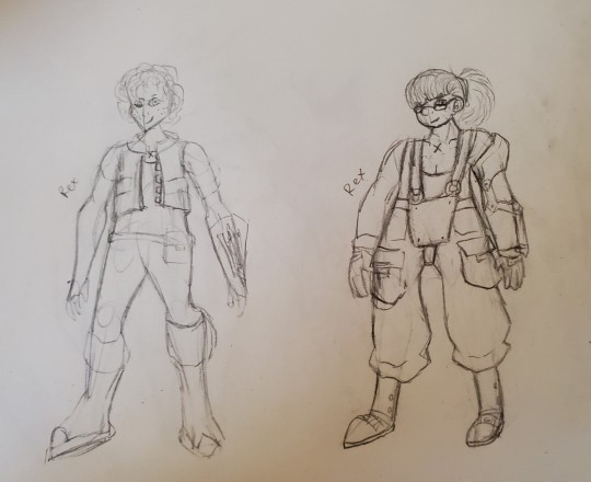
Rex 1 was more of a warm-up than anything. I put him in a vest and some pants. The hookshot and x marking were things I completely forgot about until last minute, which is why they look tacked on. He has a belt with some items in it. I wanted to give him scraffly hair and freckles to better emphasize that he’s just some kid. I don’t really like this design. I feel like if I polished it up, it would still have a lot of the benefits to base Rex while not getting as many people complaining about his pants, but the design is overall a huge “meh.”
With Rex 2, I decided to actually look up what scuba gear looks like. This design ended up emphasizing primarily that Rex has a lot of expertise in salvaging and that he’s a kid with humble origins. His strap on was based on a scuba outfit, same with the shoes. He’s also wearing pull-ups with giant pockets. I felt those imply humble origins because pull-ups get associated with rural settings. The giant pockets imply that he works with machinery. That’s also why his hair’s tied back. If you long hair and you work with machinery, that’s supposed to be tied back so that it doesn’t get caught in anything. I also gave him glasses because we need more characters with glasses.
The character’s meant to be 15 and I feel that this looks closer to 15 than 12. If I were to make future iterations of this design, I’d try to lean more into making him look 15 because he doesn’t look 15 enough to me. I’d do this by giving him acne.
He has gloves because he’ll be using a sword and it’s generally not good to scrape up your palm while using one of those. His hook-shot also now takes up his entire arm because that’s heavy equipment. I haven’t figured out how the wire is supposed to be stored without having it fuck up his arm. But the hook itself is now in a little hook cubby. I think I’d want to make the bottom of the shoes look heavier than they are since they don’t currently look great for walking around the bottom of the ocean.
Still, I’m very happy with this Rex. I mostly draw anime girls, so I’m happy with the number of things I feel I’ve gotten right with Rex 2.
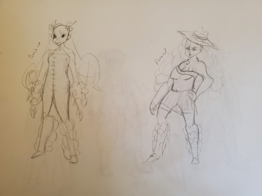
Nims and a Dahlia:


I’m a bit unsure of what I want from the Blade designs. I decided to design around their element, their rough personalities, them needing a core crystal, and their element. I also want them to look like they could also exist in the same universe and maybe not look very human? That was, at least, my thought process when drawing Nim, though that thought process was not consistently held, like, at all. A lot of my Blade redesigns don’t look very good because I didn’t have a very good idea towards what I should even be aiming for. The Blades have very generic personalities and overall feel so disconnected from the world that I’d probably just scrap every existing Blade in their entirety and replace them different characters who are better established. Like, maybe because this Blade was born from the Gormott Titan, they look like Gormotti or part giraff as a result and are more likely to have the earth element? And how many hands they’ve been through and the personalities of their previous drivers stack up to subtly influence their appearance? Like, a Blade from Gormott that ended up in Uraya for 10 lifetimes might be an earth-type cat-person with fins or something? Or maybe the more developed a Blade is, the less it resembles a human? But doing that would require writing a lot more lore per individual Blade than is actually provided. But just having something to better frame the Blades as something other than “random (mostly) anime girls that you pick up along the way” would be necessary to give them good designs.
Anyways, with Nim, I figured giving her a Saytr like appearance would be good. She has a strong association with animals and nature, which, for me, translates to “naked.” Alongside that, I looked up Nymphs and they’re also usually depicted as naked women. I also completely disregarded to the two foxes on her shoulders. They were put into Nim 1 as an afterthought.
Nim 1 is the only Nim that isn’t plus-sized because I figured “why not have some different body types among the blades?” A lot of my redesigns for Pyra and Mythra try to keep their body type more or less in tact less because I think it’s the best body type for them and more to spite the idea that them having big boobs is the reason that they’re oversexualized. Like, they are comically big, but they’re only sexualized because of how much attention the camera and design draws to them. But, that’s a side tangent. I made Nim overweight because I like drawing overweight women. Nim 1 gets the vibes of “naked lady” while Nim 2 has the vibes of “big fluffy friend” while Nim 3 is somewhat of a compromise. If I were to make a final design for her out of these, I’d definitely try and fuse some aspects of Nims 2 and 3.
Nim 3 has vines on her arms because Nymphs get depicted with vines quite a bit. The main reason Nim 2 is wearing a sun dress is because I stepped back and thought “wait, maybe some people would have an issue with a naked anime lady running around.” Nim 2 also has a transition between furry legs and no fur legs.
I didn’t really have any ideas for Dahlia. I saw someone draw a version of Dahlia based off Elsa from Frozen and I thought that might be fun to draw. I don’t really have any further thoughts on this.
Praxises:
This is sort of where I was at the point where I realized that if I wanted to redesign the blades, I’d need to figure out some unifying theme for them all. I was thinking “maybe blades could try and visually represent different aspects of being human?” This idea was only really used on Praxis and wasn’t very strongly represented. I was kind of tired when I drew Praxis 1 and Praxis 2 was a bit of a warm-up sketch.
Neither of these designs are particularly good. I wanted Praxis to be wearing those 90s bubbly arm and leg warmers because she has a bubbly personality and is a water type. I don’t know why Praxis 2 is a cowgirl.
Zenobias:

Zenobia 1 is based a bit a wrestler because she has wrestler vibes. I see her as the type of person who would do Dark Souls no armor run on the dance pad. My other thought process was “let me google the word ‘zenobia’ and see what crops up” and I saw something about a Syrian empress but I decided to do zero research, so I have no idea if what I drew was offensive towards muslims. She has a scarf tho because wind.
Zenobia 2 is based on a picture of that empress lady. I don’t think it follows her character in-game particularly well though.
Two (Blade) Nias:
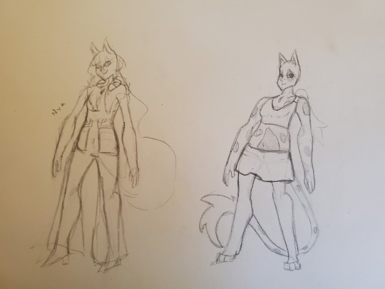
Neither Nia is particularly finished. The main requirements were that this Nia has to look like a Blade, a catgirl, and like something were she’d be able to hide the Blade parts, but not comfortably. I’m at a bit of a loss here. I think the formal wear used in her base-game design is not the way to go. The outfit just doesn’t feel like it matches her brash and snarky personality, like, at all. The first outfit was trying to throw random ideas but nothing was coming up and that’s what happened with the other. Though, Nia 2 gets bonus points for looking like a cats 2019 character. I was sketching out what parts of her body should be covered, but I don’t think I’d want to go with crop-top and skirt because Mythra already has a crop top. The tail is also debatable since I figured if I kept that, how Nia hides the tail could be a fun part of her driver outfit. I also didn’t really like how Driver Nia and Blade Nia have different hair and ear lengths. It bothered me more here than with the original Pyra/Mythra designs because Nia isn’t the Aegis, I don’t think she should be allowed to material and dematerialize her clothing, hair, and ears like that. I do kind of like the idea of giving her paws since those are things that can be easily hidden by shoes. Giving her spotted skin isn’t a bad idea but it’s not as high on the “keep” scale as the paws are (which aren’t super high in the first place).
Overall, it’s probably a bit anticlimactic to end on some lame designs, but that’s how it goes, I guess. If I were to redesign more of the Blades (or finish the Blade redesigns I started), I’d need to figure out what running themes I want from the Blade designs. I think maybe focusing on the human designs first and working from there could be a way to go. Unsure.
#xenoblade chronicles 2#character redesign#pyra#mythra#rex#praxis#zenobia#nia#nim#dahlia#xenoblade spoilers#xenoblade 2 spoilers
15 notes
·
View notes
Last Seen Blogs
will-on-the-internet
Will!

nightclimes
set the night on fire

keenkingsoul-windellover
German Windel Lover
theatreofman
TheatreOfMan