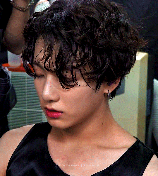
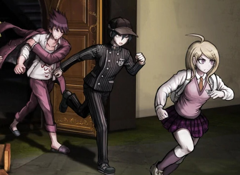
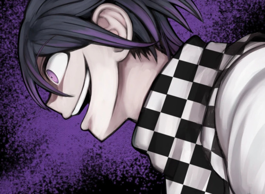
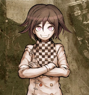
#those weird pixels on his neck/shoulder are not my doing it's also in the original vid
Photo

❤️🖤❤️ (cr. namuspromised)
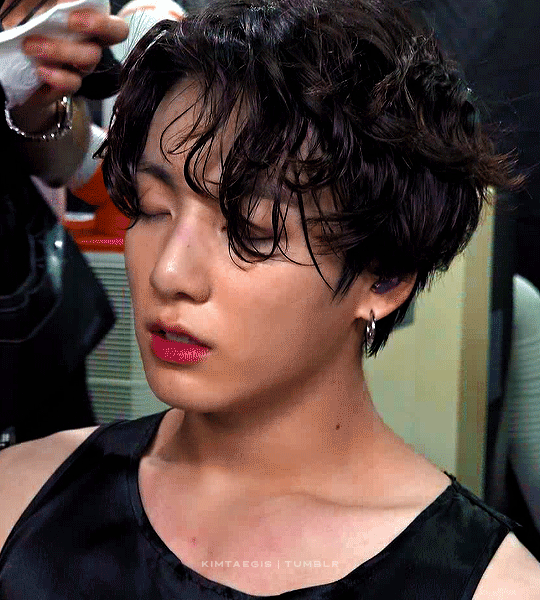
#btsgif#dailybangtan#dailybts#networkbangtan#bangtanarmynet#dailybusans#yoonkookclub#jungkookedit#trackofthesoul#usersky#userjeonjcngkook#armysource#purplearmynet#jungkook#memories 2020#*gifs#osaka jk my beloved#I think I really like that colouring; sometimes you have to choose between 100% vibrance or less grain#I chose the first#those weird pixels on his neck/shoulder are not my doing it's also in the original vid
2K notes
·
View notes
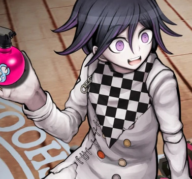
Text
v3′s art is comically terrible for a professionally distributed game in a series: a compilation
in this not-essay I will list all of the mistakes and problems I have spotted in v3′s art. don’t worry, it’s entirely for fun and I’m doing this on a whim, so please feel free to not take this seriously but also it’s hilarious and embarrassing how ridiculous this is like what happened did they speedrun the whole production or what
see, there are some things you can take as meta like “they made it bad on purpose to allude to the downfall of tv shows that have been on air for much too long” but I have a very strong feeling this is not the case due to the nature of some of these errors
disclaimer, the more I study this art, the more I fear that the artists were underpaid and underslept, so if this is in fact the case, I am so sorry to all of them but also I’m going to make fun of the art anyway
anyway let’s get started!

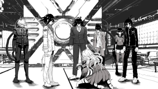
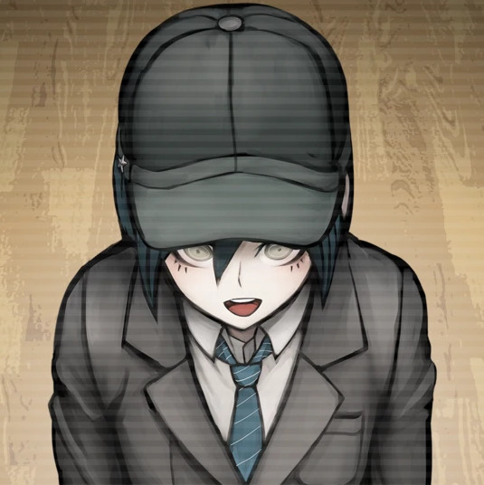
if you study this image for longer than 5 seconds, you will see that kaede is the only one fully shaded and keebo is literally just his normal sprite pasted into the image. every other character is just an ordinary ref, hence most of them facing the exact same direction with neutral expressions on their faces. it looks like a bad edit, and is probably one of the worst pieces of art in the game. it kind of gets better from here on, but my roasting will not.
with that out of the way, here’s the problem that officially bothers me the most and clarifies my viewpoint of “this is not meta and an actual lack of company communication”
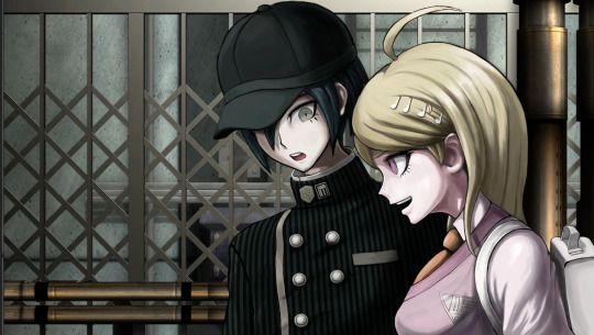
this freaking cg, which seems normal at a glance, but some wiseass was like “oh, kaede is a girl, so obviously she’s going to be shorter than the Male Protagonist™” ah, that’s funny. because if you look at the character bios, kaede is, in fact, one inch taller than shuichi and not like 6 inches shorter as she is shown here.
also shuichi’s shoulder is disproportionate and horrendous and he looks vaguely like a jojo character, but I wasn’t even thinking about that until right now.
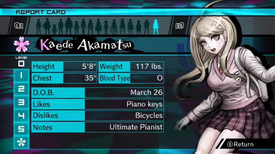
thanks guys, 50% of the fandom who has never bothered to check these bios thinks that kaede is like 5′3 (did the developers really put so little thought into her to the point where drawing her correctly in the game didn’t even matter??)
also I would like to point out that, even though this isn’t related to the art itself, yes, a character kaede’s size being only 117 lbs is unfeasible, but this applies to literally every character in danganronpa ever and it’s not new news that it’s unrealistic
update: someone in the tags informed me that in versions of the game that use centimeters, like the japanese version, kaede is actually shorter than shuichi, which just adds another thing to the list of weird decisions the localization team made for no reason. that said, after confirming this, kaede is 167 cm in the original, while shuichi is 171 cm, which are approximately 5′6 and 5′7 respectively, but one inch is still nowhere near as drastic as it is depicted above. (in spite of this, I would rather depict kaede as slightly taller, so I’m probably going to keep doing that.)
the journey continues!
bro if you want kaede to have shoulder length hair then stick to it to begin with
you can pretend this is at an angle all you want but they definitely committed the shorter kaede sin a second time
wait a goddamn second.
DO YOU SEE THIS
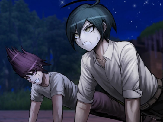
no………… it wasn’t kaede who shrank. it was shuichi who got taller
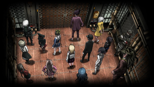
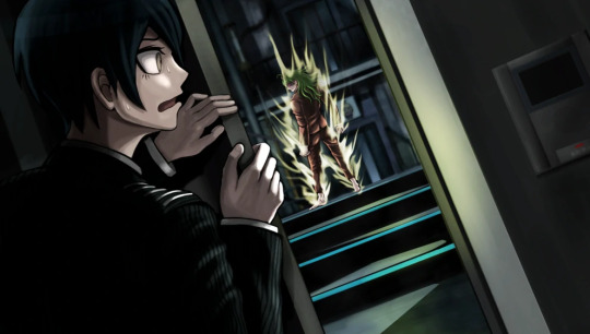
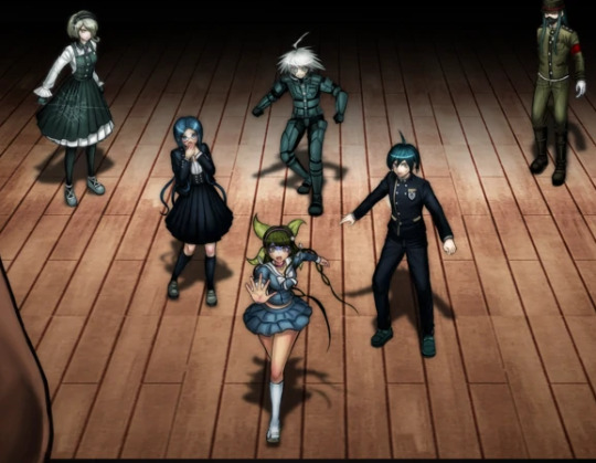
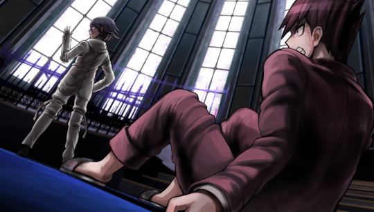
speaking of which, can we talk about how shady the perspective is in this elevator pic? look at shuichi and kokichi in comparison to kaede. kokichi, who is canonically 7 inches (edit: or 5, if you’re loyal to the original) shorter than kaede, looks taller than kaede. he’s growing too. what steroids are these gays taking

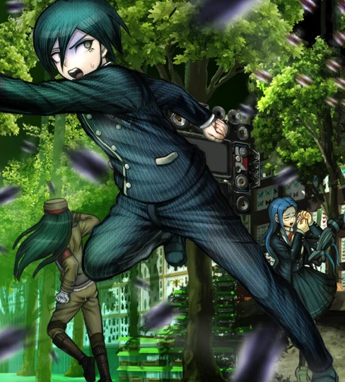
running into the room, electric boogaloo: I don’t think tsumugi is supposed to be the same height as kokichi
gonta… gonta you’re lookin a bit like a jojo character there
I love how kaito’s head looks kind of like it was pasted onto his body. why is he the same size as shuichi? shouldn’t he be high school bully size or something? his torso is teensy
ah yes, white angie.
I love this cg but why is shuichi’s right hand so much bigger than his left hand
I also love how this cg looks like they literally took pictures of trees and pasted them into the background, especially on the left. the shadows are so weird, especially closer to the ceiling, it’s difficult for me to believe they didn’t do exactly that.
return of Enlarged shuichi
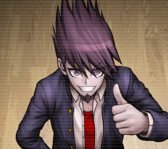
puberty update: kokichi is now taller than shuichi in spite of shuichi never missing leg day. what crimes will he commit
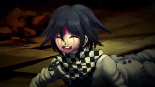
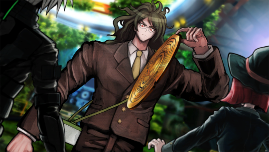
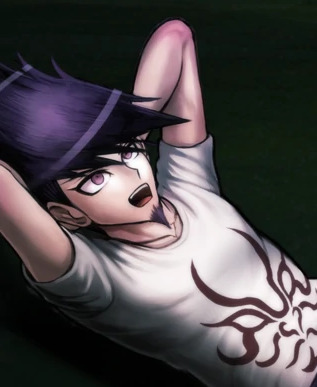
I have to mention it, guys. this has to be one of the worst danganronpa cgs. kokichi’s facial proportions look atrocious. look at the way his face sticks out like his jaw is in the wrong place. his scarf is a pasted texture. that’s it. this moment was so iconic but the cg just looks so… so… off. like something is terribly wrong, but you can’t put your finger on it.
you know what? let’s get into that ‘pasted texture’ thing.
let’s imagine you’re an artist working on a professional game. you’re assigned to draw cgs of kokichi ouma, who has a checkered scarf from hell. sure, it will be terrible to draw, but you only have to draw it once at a time! plus, perspective is pretty important, right? can you be bothered? nah, actually. let’s just copy paste a checkered pattern into the cg, because I’m sure nobody will notice. it’ll blend right in with the other cgs that someone actually put effort into drawing his scarf in, right?
no. the answer is no and I very much noticed. this genuinely looks terrible and I would understand taking a shortcut like that in fanart or even an indie game but this is a full price pc and console distributed game
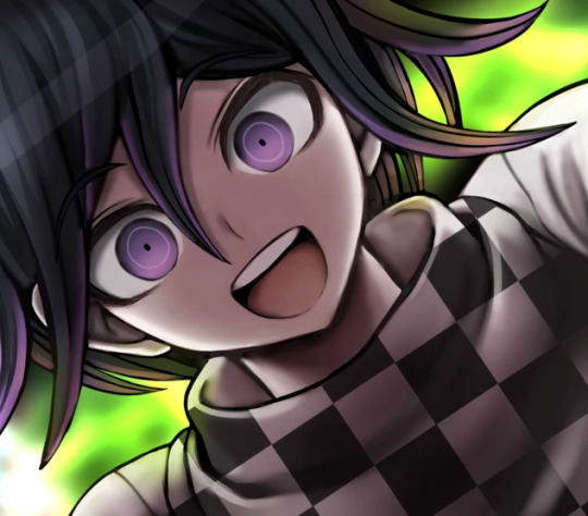
(an addition: look at kokichi’s TINY HANDS in that last one)
meanwhile, they straight up forgot to color in kokichi’s scarf in this cg.
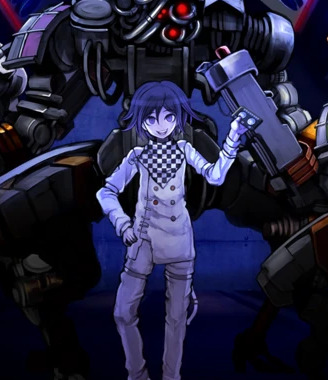
dude. I forgot about whatever the hell this cg was. anyway look at keebo please just look at him
lovin kaito’s baby arms
real talk, maybe you could argue that he’s missing muscle because he’s deathly sick, but most of his cgs don’t line up with this, and his arms just look disproportionate to his torso size (granted this is a consistent problem across all danganronpa games and a lot of characters have this weird problem, like hajime, but also kaito is bigger than hajime so I kind of have higher expectations of him) maybe it’s his stupid goatee and the way he reminds me of yasuhiro?? it creates this illusion that he’s older than he is and so I keep expecting him to look more like an adult
oh, also rantaro is missing some of his accessories in that video he made–you know the one–but I don’t wanna go back and screenshot it
also you may have noticed that I’m skipping all of the monokub cgs because I literally do not care about them and I’m not even bothering to check and see if they have artistic mistakes in them
JIMMY NEUTRON???
hey um uh kaito you seem to be missing your neck
hey guys do you like my pregame fanart
so, that done, the sprites are also pretty terrible at times. they’re not as interesting to go through, however, and downloading the full sprite sets for every character and studying every single one of them will drive me insane, so I’ll just sum some of the ones I noticed up. I made things for kaede and shuichi before deciding I wasn’t going to get into it, so here are these.

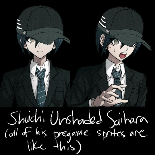
that said, other mistakes include kokichi missing his purple highlights in all of the sprites encompassing a specific pose, stray pixels all over the place on everyone, and everyone also has heavily inconsistent shading, but literally all I think about is how pregame shuichi is unshaded and two of kaede’s pregame sprites have glaring outfit change mistakes in them
anyway, thank you for taking the time to read my ridiculous ramble. in all seriousness, there’s this looming presence of some lack of communication in the development team, like with all the art and design inconsistencies, pieces and sprites that look rushed, stray pixels, and missing basic proportional stuff. these are the kinds of things that you supposedly have to pretty much have in the bag in order to get jobs in professional businesses, so it’s really weird to me that this game suffers from so many of these problems. it’s like they tried to make the art so much more crisp than the other games, but it fell on its face as they realized it was going to take longer to draw everything and they started to rush. it’s weird, because the coloring itself looks normal–it’s just sloppily drawn, and the proportions are a mess once put into the context of perspective. many of the cgs look like they were drawn by different people, and I’m still not over the fact that half of kokichi’s cgs have his scarf pasted in as a texture.
the moral of the story is that if you’re selling a game at full price that also happens to be in a series that has had 3 very good games in it already the stakes should probably be higher than this. v3 has been out for more than 3 years and it’s still $40 (did it cost more than that before? I sure hope not), and the overarching quality of the game is just not as high as the other games. I’m not saying that the other games don’t have any problems with their art at all, they’re just not as glaringly obvious and every artistic choice in those games feels intentional.
regardless, I had a blast roasting the art at 2am, so maybe you got a kick out of all this chaos.
#god I keep telling myself I'm gonna stop rambling about v3#v3 spoilers#drv3 spoilers#ndrv3#random stuff#but making this… it sounded so fun#danganronpa
657 notes
·
View notes
Photo


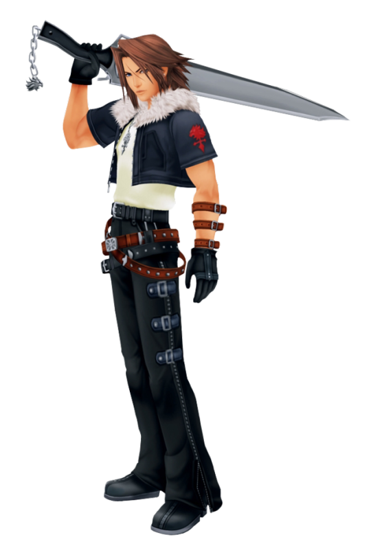
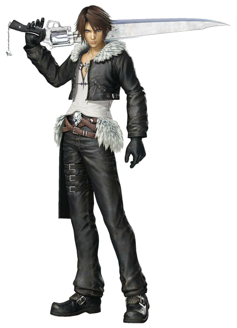
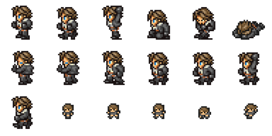

So what’s everyones favorite and least favorite Squall design? I included the different designs I could remember, if I forgot any, please add them! I never played the Dissidia games and I know there are different versions and costumes there, but just I just included one picture.
Anyway, my list, from best to worst! This is just what It hink though, there are no right and wrong here:p
1. Original Squall. He is just my favorite and still looks good in the FMVs eventhough the game is getting old! It’s just such a simple design and only silly thing is all the belts, but they are not so bad (at least not when we know how far FF characters can go with belts!). The belts doesn’t really distract from the design in this version I think.
2. Amano version. Amano has more drawings of Squall, and he never quite looks the same in all of them, but I really like how he looks in the drawing I included here. Look at those legs! To me it looks like he drew Squall’s jacket tied around his waist, allthough it is kinda hard to tell. I wish he hadn’t done that, for eventhough it’s fine in that drawing and I love the idea (it must get hot wearing all that leather all the time), I think it lead to some very weird design decisions (IMO) later on. He also looks good in all black.
3. Gonna put both KH Squalls here. I really like how he looks in the drawn version of the KH 1 design, but in game he looks better in KH 2 (which might be because it’s a newer game, but his design is also not bad). The belts are getting a bit crazier now, but I don’t mind the belts around his waist so much. It’s the belts/leather straps on his arms that I don’t understand. Longer hair is cool though. I also do miss the big arms of his original jacket, but I don’t mind it that much in this version as I think it makes sense that there are some changes. He is older and a different character than in FF8, so some changes are fine.
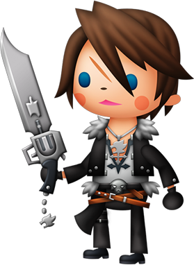
4. World of FF. I was so happy when I saw that his design was based on the Original Squall, and not on the Dissidia design. This version also has some nice details like his earrings and buttons on his jacket. Best chibi version!
5. FF Record Keeper is my second favorite chibi version. This one is also based on the FF8 version.I think these pixel characters have a lot of charm, and it’s always fun to see how much details of a character they manage to put into such a basic formula.
6.Theatherythm Squall. So this design follows some strict rules to fit in with the rest of the theatherythm cast. I think this style is not that great, but they make the characters cute in sort of an ugly way lol. And since all the characters in the game uses the same basic design it works well enough for the game. Still wish it was based on FF8 Squall and not Dissidia Squall.
7. And at last, Dissidia Squall, all of them! I absolutely hate that hip fluff thing they keep adding. I know it’s based on the Amano design, but like I mentioned above, I think in the Amano design it might be just his jacket. And even if it isn’t, he is at least not wearing fur both on his hips and around his shoulder like he do in the Dissidia one. Just WHY would he do that? It’s just too much, makes the design busy and for me it doesn’t work at all. That’s not my only problem with the Dissidia design though, but they also changed the structure of his face so much so it doesn’t really look like Squall anymore. Obviously they do this in other versions too, like in the WoFF, but the characters there follow the same design rules to fit within their universe. I don’t see why they had to change Squall THAT much for him to fit into the Dissidia games. They did great with Laguna for example. Tidus looks good and like himself, but he also looks updated and new. Squall just looks off. There is something not right about his hair aswell. They gave his jacket skinnier arms so it doesn’t look like his original jacket anymore except the fur. I actually like that Squall wears v-necks but they don’t have to be quite that deep. It’s just too much lol. I like the black details of his shirt though. Overall I think they made Squall not look like Squall in the Dissidia games by changing his structure and they they made some bad decisions when it comes to his clothes, and I wish they would stop doing that.
120 notes
·
View notes
Last Seen Blogs

marianovella
Versant Est

tillmann28
Geheime Spielwiese

overpride
Free Hong Kong

sapphicclaw
parker!
mazyann
have courage and be kind