#typographic specimen
Text
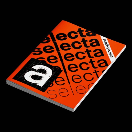
Selecta Type Specimen
www.draw-down.com
Designed by Giliane Cachin, Maxitype's Selecta Type Specimen contrasts Selecta against a series of modern historical typefaces using comparative diagrams. This typographic study exposes the research on the ‘grotesque’ genre that led to the design of this typeface, an OpenType variable typeface by Daniel Haettenschwiller currently available from Maximage.
#Selecta Type Specimen#typography#typographic specimen#type specimen#Draw Down Books#Selecta#Selecta typeface#Maximage#Maxitype
10 notes
·
View notes
Text


Typography Tuesday
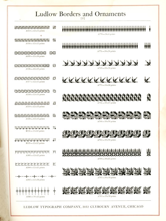
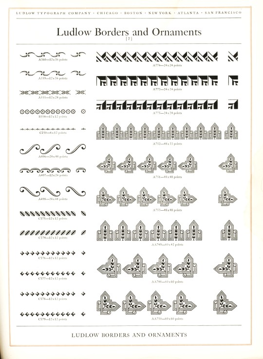
LUDLOW ORNAMENTS
Today we present some Ludlow ornaments and borders from Ludlow Typefaces: A Specimen Book of Matrix Fonts, circa 1940. The Ludlow Typograph Company was founded in 1906 by William I. Ludlow and William A. Reade to manufacture and distribute a typecasting and composing system to compete against Linotype. You can read much more about the Ludlow Typograph and its composing system in our previous post from this specimen book.
View our other Typography Tuesday posts.
#Typography Tuesday#typetuesday#Ludlow Typograph Company#Ludlow ornaments#Ludlow Typefaces: A Specimen Book of Matrix Fonts#type ornaments#Type specimen books#type display books#type specimens#specimen books#20th century type
64 notes
·
View notes
Photo

Zine/Specimen/Poster in development for Metis Foundries Odd Mono.
Check the typeface out here.
22 notes
·
View notes
Text
1923 specimen book and catalogue dedicated to the typographic art

4 notes
·
View notes
Photo
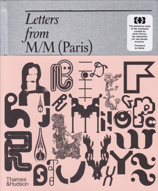


Letters from M/M (Paris)
Paul McNeil , foreword by Björk
Thames&Hudson, London 2022, 480 pages, 25.8 x 21.0 cm, Hardback with half-height jacket, ISBN 9780500025277
euro 65,00
email if you want to buy [email protected]
Letters from M/M (Paris) is a comprehensive study of the typefaces produced by Michaël Amzalag and Mathias Augustyniak since they founded their influential art and design practice, M/M (Paris).
For the first time, ninety of the designers’ typefaces are catalogued chronologically in a three-part volume, comprising the history of their development; exclusive type specimens; and detailed illustrations of projects in which they appear.
With a foreword by Björk – whose collaboration with M/M spans over two decades – this encyclopaedic volume traces the distinctive and integral nature of type, lettering and signs in the work of M/M, from one-off artistic commissions to fashion branding and their long-lasting collaborations with musicians and theatres.
This complete typographic collection is the perfect companion to the two-volume monograph M to M of M/M (Paris), and will appeal not only to graphic designers, historians and students, but to anyone interested in art and visual culture.
orders to: [email protected]
twitter: @fashionbooksmi
flickr: fashionbooksmilano
instagram: fashionbooksmilano
tumblr: fashionbooksmilano
11/02/23
#M/M (Paris)#typefaces#type lettering signs#fashion branding#musicians#theatres#visual culture#graphic design#design books#designbooksmilano#fashionbooksmilano
15 notes
·
View notes
Text
Speakers Research - Tobias Frere-Jones

About Tobias Frere-Jones:
He was born in August 1970 in New York, United States. Tobias received a BFA in Graphic Design from the Rhode Island School of Design in 1992. He joined Yale University School of Art in 1996 and has lectured throughout the United States, Europe and Australia. He received the Gerrit Noordzij Prijs, the AIGA Medal, and most recently, Cooper Hewitt's 2019 National Design Award for Communication Design, recognition of his contributions to typographic design, writing and education. Tobias Frere-Jones has been in the industry for over 25 years ad has established himself as one of the world's leading typeface designers, creating some of the most widely used typefaces, including Interstate, Poynter Oldstyle, Whitney, Gotham, Surveyor, Tungsten and Retina.
Above are some of his works from "Fifty Type Specimens",—a collection of postcards with historical typefaces selected by renowned designer Tobias Frere-Jones. Cards feature classic letterforms, pages from specimen books, and crops of letters presented in a box with the feel of an old specimen book.
Image Source:
Left Corner: The New York Times, Typography partners part ways in money fight, 2014
Right Corner: Typography Guru, Fifty Type Specimens: From the Collection of Tobias Frere - Jones, unknown published date
Bottom photo: Frere-Jones's website, Artist profile, unknown published date
Research Cited:
3 notes
·
View notes
Text
Blog Post 12
One project that I found interesting to read and that was visually appealing was the Banknote project given on page 212. I thought the concept for this project was interesting because when do you get the chance to design your currency also, I didn’t know that a paper bill or money was referred to as a banknote. I thought the compositions that were presented in the book were cool and I think I would enjoy doing a project surrounded by this concept. Another project that I had an interest in was the Latin and Non-Latin Typographic Forms project. That was just another project that I felt had a cool concept to it because we’ve combined types before. However, combining types from another language seems like it would be a lot of fun. I feel like that would just entail a lot of experimentation and I like the first piece by Fatima Bukhshaisha that was shown in the book. I can't believe that we're wrapping up our final projects for this semester and it all went by so fast. My goal is to finish strong for this semester. I like where I left off for the TypeHike Poster and I enjoyed making my type specimen. As we come to an end with our process books, I am more focused on working with my grid. I am currently building the chapter covers for my book and everything is pretty structured with the grid I want to incorporate that throughout the book to create a really clean look. Right now I’m just finishing up the pages that introduce each chapter but I’ll be starting to lay out my projects soon. I have everything gathered and written, I just need to place my stuff in the book. I'm excited to see where this takes me because the idea I have for my book right now is completely different from what I designed my freshman year. I think it’s cool to see how my style has sort of changed throughout the year but also what has remained the same.

0 notes
Text
WEEK 11

This chapter talks about the education of typographic design. While I was reading, I noticed some illustrations that looked similar to a project I did last semester in Typography 1. I enjoyed looking at the poster examples and learning that there are challenges for typographic education due to the continuous growth in technology. Typographic designers have to be critical of almost everything within their compositions or concepts. They have to think about spacing, white space, visual appeal, legibility, message, etc. It sounds like a lot, but I believe once you learn the heritage of typography, you’ll develop a sense of care and dedication. As a result, more and more effort will be implemented in the designers' compositions.
Now that we’re done with the Type Hike project, it's time to work on my process book. I was a bit stuck figuring out how to make the water look dirty or murky with the color palette given to us. But with some help, I finally have a solution. Now the poster feels more like a swamp. However, due to it being mostly dark, Artivive will have difficulty reading it and it won’t show the type specimen. As for the process book, my goal is to have it well-organized and successfully structured. I’m having trouble coming up with a fitting color palette but as of now, I have blue and red.
0 notes
Text
Week 12 Blog Post
Chapter 11 - Typographic Design Process: The typographic design process is a meticulous endeavor that merges artistry with functionality. It begins with a comprehensive understanding of the project's objectives, audience, and brand identity. Typographers meticulously select typefaces, considering factors such as readability, tone, and aesthetic appeal. They experiment with various font pairings, sizes, and spacing to achieve harmony and visual hierarchy. Iterative refinement through sketches, digital mockups, and feedback loops ensures the alignment of design intent with client expectations. Attention to detail is paramount, encompassing kerning, leading, and typographic nuances. Ultimately, the typographic design process culminates in a cohesive and visually engaging composition that effectively communicates the intended message.
Assignment 4 - TypeHike Finalizations: We are coming to the end of our TypeHike posters and postcards. I finalized my poster by printing it on the assigned 16 x 24" size and it looks even better in bigger form. I created my AR experience in Artivive at this point which is linked with my type specimen and my postcards are ready to hand off to each individual in my class! This project was definitely a fun experience! I now have to visit Joshua Tree soon!


0 notes
Text
Week 11
The reading this week introduced the challenges of modern typographic education and then proceeded to outline different influential projects used to teach students the nuances, meaning, and interrelationships of type. It was interesting to see multiple projects featured that I have done during my time in the GD+I program here and reading about their significance to typographic education as a whole. I remember being less than thrilled with some of the assignments, but afterwards, having a clearer, deeper understanding of concepts. For example, we were assigned the visual organization and grid structures project where we had to make 3 grids by hand which showed the differences between weights of type. It was definitely a detailed process but it forced me to learn how different applications of type appear to the eye.
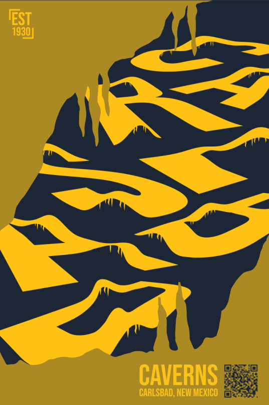
I have split my focus this week between the TypeHike project and the process book project. I was feeling stuck at the beginning of the week because I felt that my designs for my Carlsbad Caverns poster were incomplete and no longer exciting. I would sit at my computer and stare at the design for amounts of time I am not proud to admit, trying to figure out what was missing. I finally had a breakthrough after I jumped in and started experimenting with variations. I added in what looks like the mouth of a cave, which opens to reveal the cave-like letters I designed initially. I think I am very close to the final piece with this variation and am excited to work to coordinate it with my type specimen and postcards. I have also been brainstorming for my process book. I am excited to approach this process book with more freedom and awareness than the one I did for ARTS102. My idea is to produce a book which is a square shape (7 in x 7 in), and which is centered around the idea of the fluidity of my design process. I have come to learn in my classes that each new project I take on has a different workflow – a changing element which I am excited to discover with each new assignment. So my goal for my design right now is to draw out a different shape for each typography assignment I have done representing the shape my process took. I would like to keep the design meaningful, yet still simple to let my projects shine.


0 notes
Text
BLOG 11
In this week's chapter of Typographic Design: Form and Communication, It provided several examples of Typography being studied in higher education. It featured the many creative ways that the students were asked to manipulate letterforms. Many of these exercises seemed to test the bounds of human perception of letterforms, pushing the limits of how much text can convey in more unusual forms. Some tasked the students to create letterforms from images, etc. It made me want to gain a better understanding of letterform design on a character level. I feel like it takes a deep understanding of text to design with it in such bold ways.
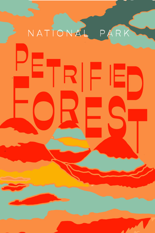
Above is my most recent draft of my National Park Poster and my Type Specimen AR Poster. After Critique this week, I've been tweaking my design to do SOMETHING with the text, as this is a Typography project. After adding more dynamic color to this set of posters, I'm seeing that I've made a misstep by building the designs around the illustration, rather than building them around the typeface. I'm feeling like I might want to go back to my watercolor wash background and build off of that again, taking advantage of the extra time. Perhaps I shouldn't have second guessed myself.
0 notes
Text
Final Major Project - Research - Introducing variable fonts
Variable Fonts (OpenType Font Variations):
Remove explicit distinctions between different weights and styles in fonts.
Represents a significant leap forward in font technology.
User Control and Reduction in File Size:
Variable fonts allow users to control parameters like weight, slant, width, etc.
Combines all variations into one font file, reducing overall file size.
Key consideration for web typography due to faster loading times.
Concept of Axes:
Variable fonts can be visualized as a slider or axis, offering a continuum of variations.
Users can choose any point on the scale, providing more flexibility in design choices.
Any axis can be created for variables like slant, width, optical size, etc.
Named Instances:
Familiar style names (light, regular, bold, etc.) still appear in font menus as "named instances."
Users can access traditional styles alongside the flexibility of variable fonts.
Examples and Demonstrations:
Play with variable fonts to understand their impact on weight, width, optical size, and other parameters.
Examples include fonts like Epilogue, Grandstander, Anybody, Imbue, EB Garamond, Recursive, etc.
Various online platforms allow users to explore and experiment with variable fonts directly in the browser.
Websites for Variable Font Exploration:
etceteratype.co/epilogue
etceteratype.co/grandstander
etceteratype.co/anybody
etceteratype.co/imbue
fonts.google.com/specimen/EB+Garamond
recursive.design
Additional websites for variable font exploration: VariableFonts.io, VariableFonts.TypeNetwork.com, Axis-Praxis, Variable Fonts, Font Playground, Very Able Fonts.
Importance of Playing and Experimentation:
Encourages users to play with variable fonts to understand their impact on design.
Experimentation helps grasp the flexibility and creative possibilities offered by variable fonts.
Benefits for Web Typography:
Faster loading times on the web due to reduced file sizes.
Enhanced design flexibility for web designers and developers.
Conclusion:
Variable fonts revolutionize font technology by providing users with greater control over font variations.
Named instances maintain familiarity while offering new design possibilities.
Experimentation and exploration are key to understanding the full potential of variable fonts.
0 notes
Text
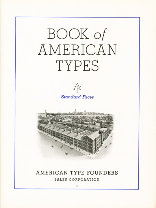

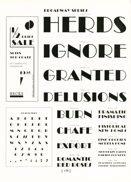


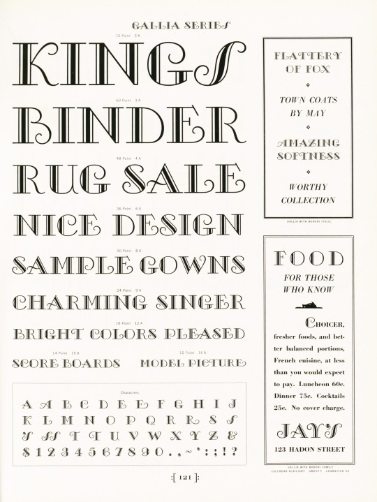


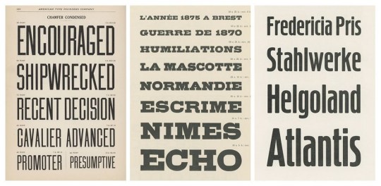
Typography Tuesday
American Type Founders (ATF), established in 1892 with the merger of 23 type foundries, was the predominant producer of metal type in America for the first 50 years of its existence, and remained influential in the industry almost until its closing in the early 1990s. In its heyday, this conglomeration of foundries produced about 85 percent of all type manufactured in the United States at the time. As a behemoth type manufacturer, it also had most of the nation's top type designers producing original typefaces for the foundry, including Will Bradley, Frederic Goudy, Oz Cooper, T.M. Cleland, and the prolific Morris Fuller Benton, who was also the head of the ATF design department.
This ATF type specimen book, Book of American Types, published in 1934 presents some of the "Standard Types" offered by ATF. As the Preface notes:
During the last decade there has been a period of experimental effort in typography the influence of which at times has carried us a long way from the traditional past. . . . No type specimen book can ever be complete in the strictest sense. As printing proceeds, new designs enter the early stages of preparation. Alphabets from leading artists and from our own pre-eminent staff of designers are being continually studied in the effort to anticipate style trends. . . . Change is inherent in progress and every effort will be made to have these separate specimens reflect the most recent trends while at all times maintaining the highest typographic standards.
This statement, along with the title and the name of the corporation, place an emphasis on the spirit of progressivism during the interwar period, as well as the exceptionalism of American initiative and design. But as the display of the Broadway Series of type (designed by Benton in the late 1920s) reminds us, "Herds Ignore Granted Delusions." Our copy of Book of American Types is another donation from the estate of our late friend Dennis Bayuzick.
View other books from the collection of Dennis Bayuzick.
View other type specimen books.
View more Typography Tuesday posts.
#Typography Tuesday#typetuesday#typography#American Type Founders#ATF#Book of American Types#Morris Fuller Benton#Type display books#type specimen books#type specimens#Dennis Bayuzick#20th century type
213 notes
·
View notes
Link
0 notes
Text
LH: Research (LO1)

A Post-Colonial Reimagining of the Role of Typography
The concept and structure of the book were developed by Portugal-based Atelier Carvalho Bernau. Its ingenious conceptual anatomy, depicted above, warrants close attention. The typographic architecture of every specimen page hangs off one of the 500+ words of a ‘world poem’ entitled ‘Here’, written for the book by the multitalented Indian poet, dancer, and teacher Tishani Doshi. Each of these words sits at the top of the page and is translated into one of 162 different languages by native speakers throughout the book, whose contributions were crowdsourced via twitter. The translated versions of the words of the poem are what you see in the enlarged specimen display itself. Each page is annotated with metadata associated with the specimen on display.
This is another project that I came across on multilingual typefaces. It aims at preserving the cultural heritage of several nations across the world by digitising their languages and preserving them so they don't go extinct.
0 notes
Text
The Line Ideas
Using 1 line to create a typeface to then create a type specimen book?
Create typographic designs that visualize music or explore the typography of famous song lyrics. *
Think about how emotions could be typographically be expressed in a line - sad - happy
Use typography to create a visual experience that displays iconic scenes from films. Use of lines and visual compositions in cinema. *
Lines in Political History - Use typography to visually represent big political events.
Explore how our thoughts can be seen as a line maybe a maze of thoughts that can be typographically display.
Think about the lines and pattern within fashion - using typography to showcase the convergence of lines, textures, and shapes in clothing. *
Methology and folklore.
Looking at the skylines of different city's analyzing the architecture *
Lines in nature.
Family Line - looking at personal history.
Lines in public - People lining up for stuff. *
Lines - Looking at the different types of "lines' that I can find in public - I could then photograph them and then display them typographically.
Lines in Language - Looking at popular phrases in a range of languages.
Data lines - Looking at strings of data and typographically displaying them and seeing the effect of that data.
Lines within design - guides - more focused into editorial design *
Photography framing how the use of lines create perspective
Illustrations - Artist and educator Paul Klee famously said drawing was ‘taking a line for a walk’
Analysing the lines of type
Lines and patterns need within public / maybe use this to create a modular typeface.
Interpret jazz music in type
Look into music in movies how one line of music can evoke emotion and create a scene. *
Files? Look at leaked files.
Exploring different fields of work, Maybe in the design or another industry?
Paths- Pick a path and follow it noting down what I see and visualise it photographically and typographic *
Origins finding somethings 'Start' and seeing how the line has led it to now.
Look at bounds in life
Sequences in stuff
Hard lines - luck, fate, or fortune
Read in-between the lines.
Line swiping on TikTok
0 notes
Last Seen Blogs
sorensenpaixd
~~ Soren Senpai ~~ RandomPicsForEvr1

createyourownnarrative
Life Is Pain // So, Create


kaitlynpcallmebeepme
MCU n Me