#what if i WANT a more detailed complicated ~difficult to navigate~ view of a website?? what if i want to send 45 paragraphs
Text
Begrudgingly trying to look for a new phone because my current one (which I’ve had for 8 years) is having some issues but like......hhh.. Every person I know who has a newer phone like.. theirs SUCKS lol.. you can’t take the back off/battery out, some you can’t even change out the microSD because apparently they expect you to just use evil ~~cloud storage~~ or whatever nonsense, they come with so many apps built in which you can disable but not fully delete (wasting space on the phone), can’t control when updates happen, one of my friend’s has to be connected to the internet just to get voicemails??? like having to be connected to wifi or mobile data just for some BASIC functionalities is insane (I prefer to keep my internet disabled at all times unless using it, hate the idea of just being internet connected constantly in the background and having all these apps sending and receiving data and giving dumbass notifications when I’m not even actively using them), SOME of them don’t even have a built-in GENERIC notes app or media player (like I’m just supposed to download spotify instead of using my collection of youtube to mp3 files?? lmao) or photo viewer (I know someone who doesn’t have a generic ‘photos’ app, just “Google Photos’ which prompts them to make an account and login every time they open the wretched thing), etc. etc. etc.
Genuinely, if it weren’t for my need to be able to use the internet to map and check bus directions/look up things on the go when needed, organize/transport files, and take photos on a whim when I may not have my camera with me - I would legit just get one of those basic non-smart phones where you can only text and make calls lol ... alas... ToT
#like i just hate simplification i hate everything being online i hate making accounts i hate cloud storage#i hate not having full control and customization of my experience i hate being forced to be connected#to the internet i hate siri or ok google or whatever the hell i hate being sent random notifications#i didnt ask for because the phone updated by itself and downloaded or enabled some shit i never wanted on there#i hate doing anything on a mobile device and everything being an app when desktop useage is so superior and so much easier#to process and do things that way and jthat i cant even open the back if i want to or change out sim cards like you used#to be able to or all this extremely easy and perfectly normal stuff that USED TO BE a function forever but it's like choice is gradually#being removed... w h y#Its the same thing with websites being oversimplified like WHY take away options and functionality to 'streamline' things and make them#more 'mobile friendly' when previously there has been both a mobile and a desktop version of websites for a long time??#what is the problem with having MORE choice? if people dont WANT to utilize the extra options and functionality then allow them#to choose to simplify things#but if people WANT increased choice and customization then the options are still present#what if i WANT a more detailed complicated ~difficult to navigate~ view of a website?? what if i want to send 45 paragraphs#of text instead of short quick messages and emojis chat style where pressing enter sends a message instead of just doing a line break#etc. etc. which yes now I'm getting away from the topic of mobile phones and just speaking in general lol but its like#I just feel frustrated that everywhere I go it seems like things I used to be able to do which were USEFUL and functional - now the option#is gone or limited or made worse. And it's not just being afraid of change like some new things are fine when they make an experience#BETTER and actually HELP but like what the hell is helpful about having 4GB of my total 8GB built in storage#taken up by pre-installed apps that I literally cannot delete and that is space I will never use.. ??? and some of the other#changes it's like.... ok?? and for WHAT?? lol#AND i know like.. you can hack your phone and make your own changes to it and stuff but I shouldnt have to do that!!!#it should be EASY to customize and have it function however I WANT it's literally something I'm PAYING for..!!#and that cloud storage shit I do not care HOW the world changes you are never going to talk me into storing important stuff on some#fucking server somewhere that I don't have control over. same thing with live service or online fucntioning video games. I will find every#possible work around to keep 'physical' copies of anything that is actually important to me. 2087 in the word war 5 google amazon#fire world wasteland I'm still going to be clinging to my little usb stick in an undergound tunnel listening to 70 yr old mp3s#and playing downloaded copies of games that are mine that i payed for and own and can play however whenever i like lol#ANYWAY .. hggh.........maybe I can find a good 2018 or 2019 phone on ebay instead of buying a new one in store#would still be an upgarde technically since mine is from 2014 lol
15 notes
·
View notes
Text
Whumping Safely 101
Many people in this community have mental health problems, face various types of discrimination, and have complicated relationships with some parts or types of whump. In particular, I aim this at people who care about the experience of survivors and others with triggers – partially because I am an abuse survivor who often flirts with triggering content as part of my love of whump.
Keeping your blog safe is difficult, takes effort, and is never a perfect process. But as the community grows and grows, it’s really important that we hold ourselves to a high standard. I would argue that this is a responsibility of all content creators, but especially those of us in the messy playground of whump.
I’ve got three sections in here: content warnings, writing with care, and community interaction. I’ve tried to make it navigable. It’s about 1.8k words. Shorter than a lot of drabbles! I welcome good-faith criticism on this topic and further questions on my own views.
Content Warnings
The biggest responsibility, in my opinion, is empowering your reader to make their own decision on whether they want to expose themselves to your writing. This also happens to be by far the easiest way to help people whump safely.
What to warn
This is a big and ever-changing topic. Some things you should warn for as a rule of thumb are anything NSFW, pet whump and box boy whump, drugs and alcohol, medical and hospital content, graphic gore, intimate partner violence, and animal harm. It can be tricky to draw the line of what counts – what needs a warning? If you’re in doubt, just warn it anyway. It doesn’t hurt.
If someone requests a trigger be warned for, even if it’s something that feels obscure or tame, show compassion and agree to the request. This is someone who cares enough about being able to read your writing that they wrote in! They want to be able to read it and enjoy it. You’re being complimented.
Otherwise, look at what other blogs tag for. You’ll see some variation in styles and levels of detail, but it’s a good way to gauge what people think is warn-worthy, when we’re often writing stuff that would already be R-rated in mainstream media.
Read Mores
The easiest way to make sure people don’t see your triggering content is to use a cut. Tumblr is not a very functional website and likes to delete cuts, but a cursory check of your posted content will usually tell you whether it’s worked. With asks, cuts are very spotty, so don’t be afraid to post an ask response separately with a screengrab of the original question. People often then respond to the ask itself with a link to the post, especially if it’s a whole drabble. Tumblr is weird and bad so just do your best.
Content notices
I.e., a quick summary before the drabble, usually in bold, to state what will be coming. I like to distinguish between using content notes (CN) and trigger warnings (TW) to indicate severity. Others might use the old phrase ‘dead dove do not eat’ to indicate this is a heavy piece, and often you will see qualifiers like ‘intense’, ‘mild’, ‘mention’, ‘referenced’ (i.e. it is discussed but not actively happening), and ‘implied’ (as the opposite of ‘explicit’). I’ve also seen a couple of people use ‘vibes’, which is a really nice way of demonstrating that it’s there, but not the focus. A quick paragraph like this, or just a line, lets people make a quick risk assessment on their reading.
This is also important if you’re sending in asks or requests to people. If you want to ask about something triggering, send an inquiry first about whether the blog is okay to hear it.
Tagging
Tagging is a chore, but it’s your primary way of warning people about your content. The main benefit of tagging is that you can be as detailed as you want, because can be tagging for content in general, not just triggers.
In a best case scenario, you’d tag the kind of whump you’re doing, tag triggers, tag characters, and even your ‘verses, because tagging is your index for your blog. If you tag reliably, you help your future self and your readers find stuff, and you also make your blog really dang safe. People who have unusual triggers can blacklist tags, and will pick up on your content tags to help them.
Don’t just tag your own writing. Tag your reblogs, tag your prompts, tag your asks. Yes, edit your asks to add the tags. Tag your images and gifs. Tag your images as images and your gifs as gifs.
If you aren’t up for detailed tagging for whatever reason, just tag for triggering content, and add stuff to that list if you’re asked to. My usual technique is to make a mental note of tags while I’m formatting and editing before posting.
Be aware that your first five tags will be used in search results. If you’re using tags that are associated with kink too, such as ‘shibari’, you might want to rethink your tag order if you don’t want interaction from those blogs. Also think about what tags might come up in non-whump contexts, such as ‘collar’ or ‘PTSD’. Some tactics for getting around this I’ve seen are adding ‘whump’ after the content or writing the tags in past tense (i.e., ‘collared’).
It is also a good idea to watch out for when you might be reblogging something whumpy that is intended as kink / porn / fetish, especially in images. Tagging these as spicy / nsfw / kink is a sensible move.
Writing with Care
Okay, now for the harder stuff.
I mean here to lay out some guidelines for how to write in a way that helps your reader build good faith. This is a much more nuanced topic, and it’s different for everyone. There will always be differing opinions on what should and shouldn’t be written about, what a good depiction of a sensitive topic is, and how to discuss that topic. I tried to strip this back into absolute basics that I hope we can all agree on.
Maybe your whump involves abuse. Maybe it’s gaslighting. Maybe it’s severe mental health problems, or addiction, or slavery, or you write about or analogise real-world issues. Whump deals with the dark stuff, and that’s a big part of its appeal. But don’t ever forget you’re writing the dark stuff.
(Try to) Know what you’re doing
Some of us play fast and loose with plots, medical accuracy, worldbuilding, and other things that get in the way of the pain we crave. This is all well and good, but when we start using whump that speaks true to people’s lived experiences, we shouldn’t be careless with it. I’m particularly talking about things that get represented poorly in mainstream media, such as abusive relationships, issues around marginalisation, mental illness and disability.
Be critical of media that you’ve consumed. Think about how its depicted things that you want to depict in turn. Look for opinions on fictional representations of those issues. Be aware that you might be more ignorant of things than you realise.
Look at how others are writing these issues, particularly if they’re writing from a perspective different to yours. If you haven’t personally experienced what you’re writing about, e.g., if you don’t have PTSD and you want to depict a character who does, seek out stuff written from or with experience. Listen to the experts.
If you’re looking for stuff about representation specifically, I recommend this collection of posts about ‘Braving Diversity’ cultivated by Writing With Colour, who are in themselves a fantastic resource for this topic, and have recommendations for other blogs that deal with intersecting issues.
Listen to others
Missteps are inevitable. Nobody is perfect. If constructive criticism is offered, that’s also a compliment to your writing. Someone read your work and thought about it, and thought you’d care about improving it. They’re offering themselves as a resource for helping you see your work in a new light.
Criticism is hard and sometimes hurtful, but even if we don’t think it’s accurate, there’s often a grain of truth in it. If someone tells you that your writing is harmful, think about why they’ve said that, not whether or not they’re correct. This is an opinion! Opinions are subjective! But what drove someone to send that in?
You don’t have to respond to all your criticism and definitely don’t respond straight away. Being respectful to those who are trying to help you means taking the time to consider it properly. Sometimes, they don’t need a response. Others, you might want to learn more about what they think before deciding. You might have already discussed the topic, in which case, you might just want to reblog your previous posts.
If it’s sent in bad faith or is outright hateful, you’re well within your rights to just delete it and move on. You might get the same criticism over and over again, and that’s exhausting, and you don’t have to retrace your steps for everyone.
But if it’s new, even if it puts your hackles up, you can always stop and wonder why someone felt that strongly about your work.
Take a step back
One of my better-known characters is a pet whumper who conditioned his victim to adore and depend on him. It’s not always easy to represent how deeply messed up that is within the text – though I think that’s part of the challenge – but in meta-commentary, I am always describing him as a creeptastic bastard lacking compassion and self-reflection. I hope to always give the reader the confidence that I know just how wrong it is.
This is a really simple thing you can do just to give readers good faith in you. Show that you know what you’re writing is dark and messed up. Show your understanding for the issues you’re handling and that they’re complicated. It might seem self-evident, but when you’re writing the really dark stuff, or unhealthy relationships, or institutionalised whump, you can inadvertently create the impression that you just think it’s fun. The fact that it’s fiction does not automatically absolve you. Show that you care about doing it right.
Community Interaction
I’m going to keep this one short and sweet because I will almost entirely be preaching to the choir here.
Be polite to others. Imagine saying what you’re saying to their face.
Don’t send anon hate. Just don’t. If you can send criticism off anon, do so.
Nobody is obligated to interact with you.
Nobody is obligated to monitor their own reader base.
If someone says do not interact, do not interact.
If someone says do not interact, why they’ve said that is none of your business.
You don’t need to spread the word about someone’s bad politics.
Ask yourself if your input is needed, or if what you’ve said has already been said.
You don’t have to take a side.
Take care of yourself. Take breaks. Remind yourself that whump is a small part of the world.
That’s all from me, folks. Stay safe.
463 notes
·
View notes
Text
Thoughts on the NSFW Purge
So, like, I’m nobody and my thoughts are unorganized, but hey, it’s my opinion time.
First of all, I don’t consider the concept of sexuality to be inherently corrosive, including for minors. I can’t personally draw a line that defines what age someone is suddenly ready to explore their sexuality. It’s probably a futile endeavor, to be honest, and there’s always drawbacks to any way you could handle it: If the parent controls it, then they could groom their child, oversight of any kind really could facilitate forced out-ing, etc. (Though, sex is not the only kind of abuse that can be harmfully ideologically groomed for by an adult who can control what media their child has access to...). And no matter what, kids find porn. It’s basically an open secret. Adults’ job is not to enable it, is all. When I was 11, like half the dudes in my grade talked about it at some time or another.
It’s a complicated subject and it isn’t tumblr’s job to navigate that, as the laws are what dictate that. I didn’t go into that to say there was an easy answer. It’s just relevant. For someone whose value system considers keeping porn out of the hands of kids to be of paramount moral importance in order to keep the chaste purity of the generation that will guide the future, or something like that (i suspect they don’t actually think that far ahead, reacting simply to the negative stimuli rather than any particular consequence), then I can see why they’d consider this a move worth making moralistically. I don’t believe in that consequence, and I don’t consider porn (or porn-adjacent content, given the restrictions) to be a negative stimulus, so that tells you a bit about how I weigh the situation.
And on that, I want to note that economics are not on my mind. Verizon will act on money. That’s not something I’m equipped to argue with. I don’t care or know, and I have no idea if they’re financially in the right. But plenty of people agree with the move, or are only bothered by the side effects and juxtaposed inactions (Which isn’t to say that I disagree with these latter two points, nor that there aren’t people who use them to support beliefs similar to mine). I may infinitely begrudge Verizon, but my quarrel is with those people, who are moralistically opposed to me. Verizon has no beliefs, so there’s no point arguing with them on that axis.
So there’s a couple points that I want to add/complicate on top of the more popularly discussed narratives, which I’ll do in whatever order.
The first of which is the relatively underwhelming presentation of most tumblr blogs. Blogs aren’t designed to shower you in content; as each element is curated, there’s generally more focus on individual posts than on other sites that allow nsfw. On the creator side, that means posts are longer, images and videos are better supported, and both of these things tend to be expressed in preview without needing to open the post separately. That’s a totally different user experience that also influences content creation/curation. Other websites have different primary goals, which is why migration is both difficult and imperfect. This general concept also applies to things like tags (which are used for a variety of things on tumblr. The existence, implementation, AND COMMUNITY TREATMENT of tags on other sites are all different).
These types of implementation details can change the tone of things a lot. It can be a lot more personal, connecting you with a person and allowing you to see other things they’re interested in, or how they communicate with people. Plenty of blogs with porn on them aren’t just porn blogs.
There’s also massive interconnectedness due to reblogging. And it’s not the same as having a video in your playlist that you saw in someone else’s, or retweeting. There’s context and captions and the choices people make to add to, remove, or replace them. It serves as an extremely easy way to find yourself in similarly-curated content, it gives you a better sense of how active a post is than a view count. Its also harder to be a purely passive commenter. It’s easier and more beneficial to like/reblog things you enjoy and incidentally create a porn side-blog if you already have an account, than it is to have a half-decent pornhub or twitter account. In that way, you get more vectors of exploration and more curated content. Sure, you might retweet all the porn you like, but it’s really not going to be the same for a user to navigate (though the vector of exploration aspect is there, sure).
Also, images and short clips just seem to flow through tumblr a lot more smoothly than the alternatives. There’s also something to say about the centralization of videos and stuff. If pornhub is working, then there’s one video, and you go there. On Tumblr, you don’t *go* anywhere unless you want to.
Next, Curation of sex content is super important. I’ve yet to find twitter or pornhub accounts that approach it quite the same way, though I admit I haven’t looked too hard. Anyways, tumblr porn blogs are generally suited to an individual’s taste (or an aspect of it). This is actually super important. As a byproduct, you can often avoid overexposure to the branches of even niche fetishes or focuses that you’re not into. There’s a lot of often subtle variation in taste and extremism that is absolutely huge when navigating this. Not just for sheer ease-of-fap-ness, but also in learning about what you’re into, what your limits are (and what they might be in real life, often different from what you’re capable of getting of to the idea of), etc. Further, any minority or people into something niche (and harmless) has something to gain when it comes to representation and stuff. I’ve found it very difficult to really find good content along specific lines on other platforms. (Though I’ve already outed myself as a deviant, I ain’t giving examples). And when I do, it tends to be super mixed in styles and extents.
Now, in both of the above categories, I touched on exploration (both the ability to do it, and the enabling of a range of things to explore that can be meaningfully different). And that’s, like, super super important and adjacent to the ultimate point I intended to come to.
And that’s (indirectly) because allowing pure porn to mix with casual subjects in the same platform makes a massive difference. That’s the crux of it, to me. The idea that you go to some sites for porn and some sites for memes and that there’s no point in intersection is what gets me the most. That’s certainly a sustainable way of doing things, and most people probably get by in that manner.
But it absolutely affects peoples’ behavior on that platform in a unique manner. Like...say what you will, but a forum where people can just argue while nudes are being posted along the same thread is fundamentally a different experience and you can totally expect that the topic and way the conversation goes will be influenced by that. It’s a different type of being open, that influences behavior and interpersonal communication. Talking to someone who knows what you’re into, even if you’re anonymous, is unique. It’s a vector of understanding.
And this type of unique environment can be huge for communities centered around a sexual orientation. Which is where my life comes in. I’ve been on places that mixed politics, cute things, funny things, and gay sex for...a long time. Longer than I was even aware I was gay. (Not because I knew what being gay was and I was in denial, but because there was such a lack of narrative around homosexuality that even when I came across things that were explicitly gay, it never crossed my mind. I also didn’t think of my life in straight terms either, really. Though I had crushes, and urges, and looked at things, it took a long time for me to actually consciously realize that there was this part of my identity that..existed.)
I have no idea how long it would have taken me to realize, let alone explore, my identity without that kind of place. It really helped a lot with learning how to process and express my sexuality and what that did and didn’t mean about the rest of my life. I got to know a lot of people, learn a lot of things, hear about a lot of life experiences, good, bad, unverifiable. Major influences, and I won’t pretend that often times these major influences were enabled because i was a horny teen with a crush or who had a particular interest in someone’s taste. (Oh gods, I still hate the fact that I can now say teen entirely as a retrospective)
To some extent, what I know about boundaries and self control and respect and consent is because of overpursuing people (aka being a creep) and being shut down. Part of the reason I prefer to be compassionate than cynical is because of interactions and stories that crop up because sex and sexuality often lead to very earnest conversations about the darker side of life. I had and have no way to verify that other guys weren’t just, y’know, being overdramatic or ‘attention-seeking’ but it was conversations like that that made me realize i didn’t want to be the kind of person who overlooked these things if they were true. And it was there I decided that even people who just want attention probably need it. You see different sides of people in that kind of community. I’m not saying anything in this paragraph is the only conclusion to the same situation, just that I question what opinions I would have without these experiences. I regret that I have so little memory of a lot of these things that I know shaped me.
Exploring your sexuality is huge on its own, but the other opportunities to explore yourself that are opened up by being in a place where you can freely express and explore your sexuality. That’s big too.
And the place I had a majority of those kind of experiences, at some point years ago, got a separate channel to put nsfw. And that just...was a fundamental change in the community. Especially when old people left and new people came who hadn’t been socialized in the old ways. It’s hard to succinctly describe, which is why I’ve simply said it’s unique so many times above, but things change a lot when you just put the nsfw elsewhere, even if you contact the same people between the nsfw and non-nsfw areas. Not just in obvious ways, or even ways that really have a visible cause and effect. But I’ve seen the shift a few times and I do believe it to be profound.
That’s the reason that I, someone who has never put anything visually sexually explicit on my blog, utterly protest against this change, and why after the change goes through, I’ll let my queue run, and I won’t just leave, but I fully expect and intend to gradually migrate off. And I hope there’s some platform out there to catch me by the time it’s tapered off to nothing.
2 notes
·
View notes
Text
Tips on how to create an effective website
If you’ve been considering a website redesign or just want to learn more about how your customers think, then this article is for you. We hope that the information we have provided has helped you get started thinking about how neuroscience can help with your digital marketing strategy and driven home the importance of incorporating it in your approach. The last thing we will leave you with before signing off is a call-to-action for our web design services if what we talked about in this blog post sounds like something you would be interested in doing yourself.
Introduction:
Creating an effective website doesn't have to be difficult. By following a few simple tips, you can create a website that looks great and functions well. In this blog post, we'll outline some of the best ways to create an effective website. So, whether you're just starting out or you've been designing websites for years, be sure to read on for our top tips!
Keep it simple
Simple is the key to a successful website. Make sure your site has easy-to understand navigation and content that's not too complicated for visitors, because they won't want trouble navigating or reading through what you've created!
Use easy to read fonts
Web design is all about fonts, so it's important to use easy-to read ones. There are many beautiful and stylish typefaces out there but if your website isn't going be seen by readers who have their computer settings set at microscopic text or old school document software (like Word) then you should probably stick with something less intricate than what we'll provide below:
1) users can customize these nowadays which makes them much easier on eyes as well - think variable widths & sizes;
2) Most importantly though, people want clean content without any clutter distracting from anything else around him/her.
Make your website responsive
Responsive web design is the future of browsing!
In today's world, there are many different types or devices that we can use to view content online. These include smartphones and tablets as well laptops with small screens on them; all these varying screen sizes need websites designed differently so they're easy-to understand no matter what kind you pick up (which makes responsive very important). But don't worry if your old computer doesn’t have any cutting edge technology because I wrote an article about how even shot putter sized computers will benefit from having their own personal page now too
Use high quality images
The images that you use for your website should be of high quality. They will help to create the desired effect and tone, as well as making it easier on viewers with visual impairments or preferences towards certain types of graphics such as Millennials who don't want something " overly cluttered."
Create a clear and concise navigation bar
Navigation bars are important for your website because they help visitors navigate through the pages. Navigation makes it easier for users to get around, find what they're looking for or if you have an online store then this can really increase sales! Keep in mind that when designing them make sure not only do all links work but also take care with spacing between words so nothing gets cut off wrong way round
Place important information in the header or footer of your website
The footer of your website is an excellent place for including some important information. The header and main content area can often get crowded, making it hard to find what you’re looking for quickly without scrolling through dozens (or even hundreds) pages in a row! This will happen if there isn't space dedicated specifically towards this purpose; but by filling up all available room with relevant data like links or contact details then users may become irritated when they have no choice other than clicking around aimlessly because everything has been crammed onto one page instead- giving them less reason whatsoever not just click out sooner.
Conclusion:
0 notes
Text
WordPress Support: How to Use WordPress Help and Make the Most of It

Consider the following scenario: you're working on your WordPress blog, either configuring configurations, adding a new theme, or configuring a plugin when anything goes wrong. Now you're lost and need assistance to get things back on track.
What steps do you take to get help with the WordPress site?
The simple solution is to go to Google and type in a search term similar to the problems you're having.
youtube
So, what do you do now?
Where Can I Get WordPress Help?
You can get WordPress help from a variety of places.
• Official sources: WordPress Codex, Admin Support, and The Developer Handbook
• Stack Exchange, Facebook, and LinkedIn Communities About WordPress, Slack, and Reddit are examples of forums, networks, and platforms.
• You can even pay for personalized and paid WordPress help on top of all of this.
In this post, I'll identify the most reputable and up-to-date sources of WordPress help to help you jumpstart the process of getting the right answers to your questions while you're experiencing typical WordPress errors. This will include forums and communities where you can ask a question and get a reliable response, well-known pages that already have a lot of responses, and other WordPress-focused helpful tools.

I'll look at five different forms of WordPress funding in particular:
I'll also give you advice about how to get the best out of these resources, including how to approach them proactively, how to word your help requests, and how to stop having a reputation for asking so many questions!
Are you prepared? Let's get started!
Identifying Your Assistance Requirements
Asking for assistance can be difficult at times. That's why, before you go searching for advice and resources on websites and forums, you can first figure out what basic problems you're having with your WordPress account. This enables you to determine which form of assistance would better suit your requirements.
Consider the following:
• Is your query about your website's hosting or the technical aspects of your WordPress setup? Clients of Kinsta will get answers to these questions by contacting our support team.
• Do you have a particular question about which you need an answer? A support site or Facebook community may be a good place to start looking for help.
• Do you want to learn a specific skill? You may be able to benefit from a lesson or course.
• Do you need additional information for a particular WordPress code? Look at the Codex or the developer's manual.
• Do you need immediate assistance with an issue or a question? You may need to pay for premium service.
Your basic specifications are specific to you and your business. Knowing what you need will assist you in locating the right provider of assistance. So, let's start with the official help outlets, which are always the first point of contact for new WordPress users.
Official WordPress Support Sources
When you have a concern about WordPress, the WordPress.org website has a range of links that can be your first stop. There are some of them:
• The site's admin screens' support pages.
• The WordPress Codex is a collection of resources for WordPress users.
• The Developer's Guide.
• The WordPress help forums are a great place to go.
• Individual WordPress theme and plugin support sections.
Admin Assistance
You can get assistance on your WordPress account by going to the Help tab in the top right corner of your admin screens. This will bring up context-sensitive support, which will assist you in understanding the current screen.
The main dashboard page also contains links that will assist you in learning how to get started, build content, and navigate your web.
The Codex is a set of rules that governs how
The WordPress Codex is a concise reference for all of WordPress's features, hooks, and groups. You'll find explanations of how the code works and suggestions of how to use it if you're using either of them with your own code. The Codex pages can be thousands of words long and incredibly informative in some cases.
However, the Codex isn't all for programmers. These resources are a decent place to start if you want to learn more about the WordPress admin screens and how to customize your account.
The Developer's Guide
The Developer Handbook, on the other hand, is mostly for programmers.
It's the official guide to the WordPress source code. It offers guidance on topics like WordPress coding principles and APIs. There are sections on plugin and theme creation, as well as the REST API and block editor, all of which were implemented with the Gutenberg GUI.
The WordPress Message Boards

If you haven't been able to find a solution in the Codex or the developer handbook, you can inquire for assistance in the WordPress support forums. Here you'll find the WordPress group ready to provide you with a wide variety of issues.
The help forums are run entirely by volunteers, who are not paid by WordPress. However, some of them work for WordPress organizations, departments, or businesses that allow their employees to share their knowledge on the forums. You should also hope to communicate with plugin and theme developers who provide assistance and support for their products (more on this below).
Finally, many are not assisted by their boss but wish to contribute back to the WordPress network by assisting more users to use WordPress. These individuals volunteer some of their spare time to assist those in the help forums. So treat them well!
You'll find support pages for all of the themes and plugins released via the theme and plugin folders in addition to the general help forums. To get to a theme or plugin's help page, go to your site's Themes or Plugins page, locate the theme or plugin, and click the View details connection. This will open a popup window with information about the theme or plugin.
Click on the WordPress.org Plugin Page icon in the right-hand sidebar to go to the theme/official plugin's page on WordPress.org. Pick the Support button from the drop-down menu.
Often do a short search before answering the question to see whether someone else has posted the same or a related question and if so, look at the answers. If not, you are free to ask your own question. However, keep in mind that although maintaining a free version of a WP plugin/theme does not generate direct revenue for the developers, they do offer help to their customers.
So, don't be offended if they don't respond right away to your question; they may have other requests on their to-do list before yours, which are most likely related to their luxury items.
How to Make Use of WordPress.org Support
It helps to use official forms of funding most properly if you want to get the most out of them. This entails starting with the most appropriate resource, understanding how to get a good response, and not bothering people.
Here are few suggestions:
• If your query is about how to use the WP admin, start with the WP dashboard's help pages.
• Then, look at the Codex and/or the developer's handbook. There's a fair chance you'll find a solution to your problem there. Raising a help query takes time which results in a pause.
• Use the search box at the top right of the WordPress.org homepage if you need to search. I found that searching the WP web using Google is more effective in terms of correcting spelling mistakes and finding a broader variety of results. Type ‘wordpress.org' preceded by the search phrase into Google to see what comes up.
• If a quest doesn't yield results, look at the Codex and developer handbook pages. They are organized logically and might be more useful if you don't know the technical name for what you're looking for.
• Often search current posts in the help forums, whether they are generic or exclusive to a theme or plugin, to see whether anyone else has already addressed the issue. This will help you find a response faster, save time for everyone (including yourself), and save you the humiliation of making your help thread closed because it duplicates another one.
• Be courteous and friendly in the help groups. Never make a negative comment about another WP user. This is a community, and those who respond to questions are volunteers. Your questions will not be answered if you are a dick.
• Be as straightforward and precise as possible when posing a question. Make it as simple as possible for everyone to grasp the issue you're attempting to tackle.
• Don't expect an answer right away if you launch a post. This isn't premium help, so don't expect it to be easy. If you do, see the section below on premium WP funding.
Support for WordPress Forums, Communities, and Platforms
There are several forums, communities, and platforms where you can get answers to your WordPress questions in addition to official sources of help. These are targeted at anyone from novice to seasoned developers, and choosing one that is suitable for you is part of the challenge.

Online forums, the best of which is Stack Swap, as well as Facebook and LinkedIn communities, are examples.
• Slack channels are a perfect way to connect with others.
Let's look at when and how you could use both, as well as how to get the most out of them.
Stack Overflow
Stack Exchange is a popular online community for web developers in general, not just WordPress developers. It has a separate section for WordPress help , which is where you can search for answers to your questions (don't ask WordPress-related questions in the general forum).
Beginner WordPress users and developers can find Stack Exchange intimidating. Its members are highly skilled programmers who can respond to both simple and complicated questions. It can also be difficult to figure out which solution is best for you since certain questions have multiple answers.
The good news is that Stack Exchange has a voting system that will help you find the most useful responses from other people. People will vote up or down on answers, assisting you in finding the right one.
When I use Google to look for an answer to a WordPress-related query, Stack Exchange is often the first result. Since it's such a huge place to browse, using Google to search it can be very helpful.
If you have a more general programming or developer query, Stack Overflow, their affiliate blog, may also be a good place to look for answers.
WordPress Groups on Facebook
WordPress's success spawned a slew of Facebook groups aimed at WP users and developers of all skill levels.
The following is a list of some of the most well-known Facebook groups:
• Advanced WordPress: Facebook's largest and fastest WordPress community. This is a closed group for WordPress developers, and it will offer guidance and resources on the platform.
• WP: This is a more common community that caters to both consumers and developers.
• WP Help: A closed Facebook community for WordPress users and creators, with strict self-promotional guidelines.
• WP Plugins: Inquire for the right plugins and get feedback on the latest plugins and their uses in this community. The questions are less academic and all about assisting you in identifying plugins.
• WP Safe: A website for asking WordPress security questions and receiving feedback about any security vulnerabilities or complaints.
• WordPress, SEO, and Internet Questions: As the name suggests, this is a group where you can pose and answer questions about WP SEO.
• WordPress Freelancers: A group of people who work as WP freelancers for a living. It's less about coding and WP use and more about using it for the industry.
• Supporting WP Products: This is a community for people who work in customer service. They discuss ways to help have assistance and how to do it. Do not come to this community hoping to get answers to your help questions; instead, enter if and when you are ready to help others. This community will assist you with learning how to do so.
• WP Speed Up: Join this forum and learn more about how to make the site run faster.
• More About WP: This group is for talk about what's new and what's going on with WordPress.
• WordPress Help and Assistance: A website run by a premium WP help company where you can ask questions and get answers.
• Make Money Using WP: Kinsta runs a group aimed at assisting individuals who make a living with WordPress.
WordPress Groups on LinkedIn
If you use LinkedIn, you'll find communities dedicated to WP help there as well. There are some of them:
• WP Experts: A group of WP experts who are interested in sales and marketing.
• WordPress Developers: The most successful WP developer community on LinkedIn. The group is reportedly up for auction, but its existence is uncertain.
• WP Web Designers: This is a group of people who use WP to create websites. It's a good place to get tips about which themes and plugins to use and how to fix high-level web design and creation issues. It's less marketing-focused than the WP Experts community and less advanced than the WP Developers group.
• WP SEO: A group for people interested in learning more about WP SEO. A repository of clues, guides, and tricks.
• WordPress Designer Party: This is a group of people who use WP to create websites. Instead of tweeting, the focus is on apps.
WordPress-related Slack Channels
Slack is becoming more and more common among WordPress professionals as a means of communication and help. These are some of the best Slack platforms for WP learning:
Are you fed up with struggling with WP problems created by your bad hosting? At Kinsta, you won't have all of these issues. Examine our hosting options.
• Make WP : The WP project's official slack channel, available to anybody with a WP .org account. Find out what's going on with WP and participate in conversations about the platform's growth.
• WP Developers' Club: A WP developer community on Slack that is open to entering. It's a great place to exchange ideas, ask questions, and learn more about WP production.
• WooCommerce: The WooCommerce slack channel is for anyone who works for or builds with WooCommerce. It's a great place to go for help with issues and questions, as well as to find other WooCommerce users because it lists nearby meetups.
• The WP Governance Initiative: This project, which was launched at WordCamp USA in 2018, is based on the values that underpin WP leadership and governance. It's not exactly a place to go for technological assistance, but you can use it to read more about how WordPress is managed and have your say.
Reddit has a WordPress section.
Since WordPress is such a common subject, it's only natural that there will be a slew of subreddits dedicated to it. Here are a few of the most well-known:
• WP: With over 67 thousand users, this Reddit is dedicated to all things WordPress.
• Pro WordPress: A Reddit dedicated to experienced WP developers, with a focus on advanced topics.
• WP plugins: A resource for WP plugin help. Use it to ask questions and sift through the answers that have already been offered.
Quora and WordPress
Quora is a place where you can ask questions and get responses from people who have unique viewpoints. You will find answers or ask questions on a wide range of WP topics and sub-topics.
• WP • WordPress Plugins • WP Themes • WP Plugin Development • WP Theme Development • WP Security • WordPress Theme Development
How to Make the Most of Forums and Groups
You'll find a lot of luck on these forums and communities if you use them properly, much as with the official platforms. Here are few pointers to consider:
• Find a party or website that is suitable for your issue or desires at the appropriate stage. In a forum for skilled developers, it's pointless to ask about writing an article.
• Always search the current threads before posting a question. To find what you're searching for, use the search tool and read through something important.
• Before publishing, see if the community has any guidelines. You could be booted out if you violate the rules on self-promotion or uploading too soon after joining the club.
• Please be courteous and polite. Nobody owes you an answer; if they do, it's because they want to help you.
• Ask questions that are straightforward and precise. You'll be more likely to get an answer, and it'll be a better one.
WordPress Support at a Premium
If you want fast, customized help, you'll have to pay for it. Some businesses charge a fee for premium service, which ensures you'll get quicker answers and be able to converse with the individual offering assistance.
Take the time to study the provider before signing up for premium WP help. Check to see how they've been checked by other customers and what kind of guarantees they make on response times.

Here are a few places where you can get premium help:
• WPBuffs: One of our happy friends, WPBuffs, offers 24/7 assistance for "extreme website operators." They can assist with web upkeep and improvements, and they also provide a help forum where you can ask questions about WordPress. To learn more about them, read our case study with Joe Howard, the head buff at WP Buffs.
• WPFixit: WPFixit specializes in WP web troubleshooting. They will answer your questions or log in to your site and address the problem, whether it's a security violation or a speed issue.
• WPMaintainer: For your current WP implementation, WPMaintainer offers updates, support, backups, and protection. Once a month, you can use them for minor tasks like downloading a plugin or adding CSS.
Updates, backups, stability, and migrations are all provided by Maintain. They also have a help button in your WordPress dashboard and can help you with a custom creation.
• TemplateMonster: TemplateMonster provides alerts, weekly debugging, 24/7 uptime tracking, and Live Chat and Ticket Support.
• GoWP: GoWP provides WP maintenance and service in as little as 8 hours.
• Hiring a developer: You can find that hiring a developer to solve your problem is the most cost-effective solution. This may be the start of a long-term partnership to help you maintain and grow your website.
To keep the web in decent condition, read our in-depth guide to WP maintenance.
Support from Kinsta
If you host your WordPress account with Kinsta, you get 24/7 help without having to pay extra for a premium service. In Q3 2019, our total ticket response time was 1 minute and 19 seconds! The below are some of the benefits of Kinsta support:
• Uploading a service ticket from your MyKinsta dashboard allows you access to experts. To learn how to successfully raise a help ticket, refer to our guide.
• Site migrations are free. Free WP web migration to your current hosting account, with no need to think about databases or archives (suggested reading: The Best WP Migration Plugins).
• Checks for uptime: every two minutes, we search to see if the platform is up and running.
• Backups: From your Kinsta dashboard, you can view your backups. Every day, the site will be conveniently backed up for you without you needing to do something (or more frequently for an additional fee).
• Defend against traffic snarls. The architecture of Kinsta is modular and designed to shield you from a sudden surge in traffic.
• Constant security surveillance. We keep an eye on your web for potential hacks and take proactive action to address them as quickly as possible.
You will have access to our Learn WP knowledge base and tools, which are built to help you get the best out of your hosting.
help for WP: Blogs, Classes, and Tutorials
If you don't have a particular issue and just want to learn how to do something with WordPress, there are thousands of journals, courses, and videos available to help you.
However, determining which ones are trustworthy can be challenging. Here's a list of the ones you can trust for reliable, up-to-date details and advice:
• WPMU DEV: The WPMU DEV blog is a source of expert advice for both consumers and developers, and it specializes in WP Multisite but also covers a wide variety of WordPress-related topics. Subscribers have access to the Academy, which offers in-depth training.
• Tuts+: Hundreds of free tutorials geared mostly towards WP developers of all levels. Premium classes are now available for developers and consumers.
• WPLift: Beginner to intermediate posts, tips, and instructions on a variety of topics.
• Elegant Themes: The Elegant Themes blog, which is home to the Divi page builder theme, contains much more than just detail about their own brands. WP users and developers can find simple and detailed guides here.
• WP Tavern: WP Tavern won't help you run your site or learn how to code in WP , but it will keep you informed of what's going on in the WordPress community. WP news from the most reliable source.
• Kinsta Blog: Our own blog includes in-depth tips and posts that go into more depth than many other resources. We make an effort to address subjects that many other blogs overlook.

In conclusion
I understand if the sheer number and range of WordPress help resources available have left you feeling a little confused.
However, if you address it correctly, with a clear view of what you want and why you will be able to choose the resource that will ideally assist you in answering your query or resolving your issue.
Here's a simplified version of how to get successful WP help:
1. Do your homework before posing a question online or mailing a help ticket.
2. Identify the dilemma you're trying to solve in detail.
3. Look for the most relevant resource and see if the query has already been addressed.
4. If it hasn't, rephrase the concern so that everyone understands what you're trying to do.
5. Don't expect a quick response, please please be courteous and respectful of those who assist you. You should be able to get answers to your questions this way.
Best of luck!
Visit Our Official Website:
Additional Resources:
https://wordpress.com/learn/
https://wordpress.org/support/article/new-to-wordpress-where-to-start/
https://en.wikipedia.org/wiki/WordPress
0 notes
Text
Survey Results
My questions:
1. What were your first impressions of this website? How does it feel or look like, be as ruthless as you like- I didn’t design it.
Replies:
[1] My first impressions when presented with the home page of the website was that the design of the website seems easy to navigate around. The top of the home page has different mini preview tabs such as, "who we are, why us?" etc which are succinct and straight to the point. The home page (which was what first caught my eye) was the background picture and the title "Welcome to NZ Ethnic Social Services", the title is clear and easy to understand and as soon as I read it, I knew exactly what this page is centered around.
[2] The layout of the site is very simple. The colours and font for the text are easy for the eyes to adjust to.
[3] It’s alright, not particularly enticing, the photo is a bit tacky-like
those ones they had up in primary schools in the early 2000’s.It’s not the best website if I’m being honest.
2. Based on the information on the website, how easy was it to understand what this Non-profit organisation was providing? Was it obvious or did it take a little longer to figure out and why?
Replies:
[1] It was quite straightforward to understand that this was a not-for-profit organization by navigating to the "Who we are" page. Although at first I had presumed the information was in the "What we do page" rather than the "Who we are" page, so I had selected the "what we do" tab first but then I realized that the exact specific aims of the organization were not under this tab so I switched to the other. This was a little confusion perhaps on my end, but apart from that it is quite effortless to identify what the organization is and its goals.
When navigating to the "Who we are tab" the information was well-put. I am not sure if this is due to personal preference, but the color on this tab (teal-like color) is not a color choice I would use together with the maroon subheadings.
[2] It was easy to figure out the aim of the organization, however if it was difficult to quickly decipher the specific services they provide.
[3] As someone who studies English, I could understand the content on
one read. However the use of jargon is unnecessary, especially if they have tried to aim their website at non English speakers. Words like ‘resilience’ would be difficult to understand. Also there are not many pictures to help explain the words.
3. What were you most drawn to if anything? [For example: Could be the layout of the page or the text titles.]
Replies:
[2] I was immediately drawn to the welcoming banner on the home page, as well as the logo with its striking colours.
[3] The Logo, it literally looks the most professional out of the entire
website.Oh and the weird old 2000’s picture.
4. Was there anything that you found was missing or lacking from the website?
Replies:
[2] There were no events to be found in the workshops tab, and I believe the contact information for the organization i.e. the address was inaccurate.
[3] On the subheadings such as ‘contact’ and ‘home’ it would be good
to have a small symbol of a phone, a home. Especially since this website is aimed at non-english speakers. Not many pictures, not much simple language.
5. Was there anything unexpected that occurred? [Did you click something expecting one thing only to get another?]
[3] Workshop and events has nothing on it
6. How quickly did you manage to find the location of the information about The New Zealand Immigration Service? If at all.
[2] Fairly quickly, as there is not a lot of information on the website to scan through. (don’t know if that’s a positive?)
[3] The address is spelt wrong. Should say ‘Te Atatu South’ (not The
Atatu Sough)
7. What was annoying, or did not make sense for this website to have or not have.
Replies:
[1] I appreciate the implementation of a gallery tab. However, I believe that if you would like a website viewer to furthermore appreciate this website it would be beneficial to add pictures that are more aesthetically pleasing (for example the first and second photo). It would be good to aim to take pictures of for example the building when the weather is a bit sunnier and with a good quality camera if possible. I do not want to ask for too much, but the third and fourth pictures would look even better if they were taken with a professional camera. One other thing that could be improved on this tab is that one whole image comes up and then you have to use the arrows to go from picture-to-picture or the mini bubbles below the photo (this is fine) but it is time consuming for the viewer and if there were a lot of photos (15 or so) the viewer would stop mid-way viewing as they get tired of clicking next to see every picture, instead it would be best to layout the pictures nicely all together so the viewer has a brief overview of every picture and can gain information about what the site really is about just by one simple scan through. The pictures should not be too large or too small but just enough to be able to view it clearly.
[2] The inconsistent capitalization of words, the use of so many different font colours, and lastly, the lack of context for the photos in the gallery.
[3] Spelling mistakes. The green boxes and the font made it look tacky.
The language, especially the jargon, is too complicated and does not make it look more professional in this context but rather makes it seems as if the technical writers lacked knowledge of their target group. The events/ workshop page since there was nothing on it. A gallery of weird photos with no context.
8. What word[s] would you associate with the current design of NZESS?
Replies:
[1] Words that I would associate with the design of NZESS are: clean, clear, understandable and informative. I appreciate how it has all the relevant information, and nothing put in there just for the sake of it. I also like the addition of a map on the "Contact" tab.
[2] Simple, easily digestible.
[3] Fern, New Zealand, Green, purple, environment, trust, connection.
9. How many prompts [Links] to useful information did you find? Were there any pages/places that could use more of them, please specify which and what would be helpful for you as a user.
[2] I don’t think there were any links to useful information? Aside from the phone and email links in the ‘contact’ tab. The address did not have a link. It could be useful to have the ‘contact us’ text in the homepage to link directly to this tab.
[3] The workshop and events page should have something on it- even if
there aren’t currently any events, the gallery pictures need context. How do their supporters help?
10. Lastly, how could we improve the layout or aesthetics of this website? Given that this is for people who may have difficulty speaking or understanding English.
Replies:
[1] Some of the tabs, for example the "How it's done" and "Who we are" tabs could also have their text structures differently instead of being in the center of the page as the text format is centered and seems like the same format which would be used for poems etc. Using this format from time to time is fine but it should not be used throughout the website. Instead using a text format which is aligned on the left side of the page is a better option because it is more predictable and even.
It would also help to put some images to make the page more interesting. Some of the information, for example where it says "Our mission" on the "Who we are" tab could be bullet pointed to make it easier for viewers to read.
Design-wise I think that this green text box can be dropped down a little to provide space between it and the line above (arrowed). Similar case is on the "How it's done" tab. The reason why is because it made me feel a little confronted and overwhelmed. Adding images occasionally to these pages can help to ease up some tension, make up for extra space which makes the page look empty and as if I should be expecting more even though that is all there is, and transcends language barriers (a image is worth a thousand words)
Some extra points:
• Can also add a text in the bottom of a page somewhere on the website saying when it was last updated/modified so people know this website is new.
• Could italicize, bolden or underline some words for further emphasis.
• The white margins at each side of the texts could also take an approach like this:
[2] Icons next to the text on the tabs, that are easily recognizable by people of all cultures e.g. phone icon, so that the website is easy for people learning English to navigate. Maybe the ‘what we do’ tab could be more pronounced i.e. highlighted green like the ‘contact’ tab because I believe it is really Important for the targeted audience to understand what services the organization provides.
[3] More pictures and symbols, more simplistic language- and if that’s not possible (but it should be), provide accurate translations and an easy access language setting for the website.Get rid of the green boxes- either change the colour to fit the website colours
properly or don't have them at all. Provide even a phone number or contact detail on the home page in case the person can’t navigate it. Use a more interesting font. Avoid looking tacky.
0 notes
Text
Everything you need to know about Web Development

Hey there. Are you interested in knowing about Web Development?
Today, you will learn everything you need to know about web development?
Do you want detailed insight into the web development process?
We are here to help you. Imagine this article as the ultimate web development Bootcamp.
Discover everything you need to know about web development for free. Yes, you heard it right. It’s free.
What is there to know about Web Development?
Now, think of your favorite website. It may be a shopping store like Zara, or a Netflix, Instagram, or a Youtube, it’s all part of web development.
In other words, web development is the exclusive process of creating or developing pages or websites hosted on the internet.
Web engineering, web content development, client liaison, web server, and network security configuration, and e-commerce development are part of the Web development process.
Web development has had a major role in shaping personal networking and marketing. Websites, once seen as work tools or commerce are now serving broadly in the communication and social networking space. Today, social platforms such as Facebook, Twitter, and Instagram act as major communication tools for engaging users.
Since, we are on the topic to know web development, equally important is to understand the working of a website. Yeah, a website. A page that you so casually stroll in a blink of an eye not once imagining the effort and strategy it took to create. You simply ask something from the internet and it produces results.
5 mind-blowing facts about Web development
The first-ever web page was created in HTML languageSymbolics.com was the first domain name registered in March 19851989 was the dark ages of the web since the screens were pitch black then.JAVA discovery was accidentalLine mode browser(1992) was the first accessible browser for world wide web
Disclaimer: In spite of the article has some frequently used technical jargon. Notwithstanding, we will try to keep it simple.
How does your or any website work?
Websites are only a bunch of files stored on the computer which is your server. To load or upload, the server has to be connected with the internet. Any website to load needs a browser (Chrome, Opera, etc ). The browser will be the client.
Any command to instantly load on the internet through the server is the basis of the working of the internet.
Let’s give some credit to our developers because anything you access through your browser came out of their heads.
Web development and it’s 3 main components
So, by now you must be curious to discover how everything works. As you read along you will love the entire process because it has invaded our daily lives.
Client-Side Coding
The term may seem all technical and jargonistic but surprisingly they are easy to grasp. Now, if I say you are a user or client it simply refers to one thing:
When you use or view a website you are a user or a client. Because anything related to an application or a program when executed through your browser will be client-side coding.
Flash, HTML5, CSS3, and Ajax are a few popular language names for client-side scripts.
Server-Side Coding
As a user or client when you make an exclusive request through your browser, the server instantly produces results.
For instance, if you provide a new command to search and the server comes up with a response instantly, the server response is the server-side coding.
ASP.NET, PHP, Java, ColdFusion, Perl, Python, and Ruby are the proven languages for server-side coding.
Database Technology
For site functioning on the Internet, it is hosted within a database server because the database has all the files for a website and its applications to function.
All websites use some form of a relational database management system (RDBMS) like Oracle, Microsoft SQL Server, Apache, and IBM (One of of largest I.T. Company around the world).
Now that we are through with our understanding of web development, let’s understand who makes all this possible because somebody is doing a heck of a job to make all this come to us in the simplest, fast, and easy form.
Simply put, what is the secret to knowing web development and its process?
Here comes our guys into the picture: The “Web developers”.
Behind all this complexity someone writes complex codes for a computer to understand and produce instant results.
Then, “What is a web developer”?
Let’s take this opportunity to discover and understand a web developer
A web developer or programmer tweaks with a design created by the design team to finally turn it into a website. It’s a complicated process since they write complex codes using a variety of languages.
For instance, you may know English or some other language of communication but to translate it to the language a computer understands is a tough ask.
These guys are proven, masters of their trade.
Hence, a typical developer will be proficient in various programming languages of coding to provide you with the best design and development to ensure better results.
Types of Web Developers
Imagine the complexity of the world of web development. People constantly work behind the scenes to deliver more on value and proven results.
Such is the maze of the web that there are different people for a different job.
Now, “What does a developer do?” the question doesn’t have one simple answer. There are different types of web developers, each of which focuses on a different aspect of the creation of a site.
It is crucial to understand the different types of web developers.
Three main types of developers are front-end, back-end, and full-stack.
Front-end developers are responsible for the sections of the website that people see and interact with. Back-end developers, on the other hand, are responsible for all behind the scenes coding that controls how a website loads and runs, and full-stack developers do a little bit of everything like a mixed bag role.
Confusions on Front-End developer and UI developer
There is a general misconception about UI developers and Front-End developers and their roles.
Agreed, that the two are equally important and interesting, but very different professions.
The more you learn about the two, the more enthralling it becomes.
To understand what a UI developer does, let’s begin with the definition of the User Interface. In the digital parlance, User Interface means every detail the user controls or interacts with (screen, keyboard, mouse, additional controllers, etc.) across multiple devices – desktops, laptops, tablets, and mobiles.
Interface development is an extremely complex process that bears elements of design, engineering, and psychology.
The primary work of an interface developer is to create a convenient interface that fulfills the user’s needs. To achieve this, you have to understand and identify the user’s requirements along with behavior patterns of a user’s interaction.
Final verdict
To sum up the difference between a UI developer and Front end developer, the below difference provides easy understanding.
A UI developer creates a visually appealing and convenient interface, while the front end developer’s responsibility is to make the interface work smoothly and fulfill its functions for the user.
The UI developer is primarily for the visual look of the page while the front end developer is concerned with the functionality and operation of the site.
Now that we are on the topic of UI developer, understanding UI design and UX design is imperative.
UI design VS UX design. Are both the same?
UI design and UX design are two of the most confusing terms in website design and app design.
The terms are often confused as single because they are frequently used together as UI/UX design? Though difficult, there are different descriptions to find more about the two.
Don’t you worry? We have you covered.
UI design stands for the “user interface.” As the name suggests, UI design is the graphical layout of an application. Any new text, new image, or buttons, and all the other things that are a part of user interaction is UI design.
“UX” design is “user experience.” Your experience of a certain app is determined by easy and smooth interaction. Whenever you navigate through an app, is your experience nice or poor?
Is your interaction fulfilling and providing you the sense of accomplishing a task?
Do you find yourself struggling to navigate through an app?
All the above questions are addressed by UX design created by the UI designers.
Now, the question is are these two related?
Yes, they are similar in practice but the two are completely different aspects of web designing and development.
Below are a few snippets that will provide you an easy and fast understanding.
UI and UX are different, but complement in nature.UI focuses on interfaces, UX develops useful user interfaces.UX helps users easily navigate for a seamless experience. UI is more of an emotional connection.UX design occurs throughout interfaces, and services while UI is only concerned with interfaces.
Conclusion
To summarize, the world is moving along at a very fast pace. Look around and you find that we are more online than ever before. The trend will continue to grow as more and more people seek convenience and comfort.
With the latest COVID-19 pandemic more and more businesses are shifting towards an online model and rethinking their strategies on how to pull customers.
The boom is evident with multiple web development companies coming up in India in recent times.
Let us know about your web development questions as we would be obliged to answer your queries.
Drop your comments for us and tell us your views.
Go ahead and read our other blogs related to the world of the web.
Read the full article
0 notes
Text
My World Cosplay Summit 2017 Adventure: First Stage and OSU Cosplay Parade
The World Cosplay Summit is a series of events that take place over a week, culminating in the stage competition that determines the winning team. There are two stage events. The first stage is all the competing countries performing their skits, followed by a concert and the winners of minor prizes. The next day is the second stage, where only the top countries compete. This is also followed by a concert and then they announce the winners. The other events are photoshoot parties and hangouts for people to dress up in cosplay, some events are ticketed and others are not.
Visiting the WCS was only one part of our vacation, so I decided to only attend two events: The World Cosplay Summit first stage and the OSU cosplay parade. This post will detail those events.

FIRST STAGE
We spent the morning at the Nagoya Science Museum, but if I were to go back and do it again I would definitely head down to the event area earlier. On the way to the Aichi Arts Center we passed Oasis 21 where it seemed the real party was happening. So many cosplayers were hanging out and taking pictures! There was also booths set up downstairs by a stage with a huge screen. If you don't have a ticket to the show, there is still a lot to see and do in the area.
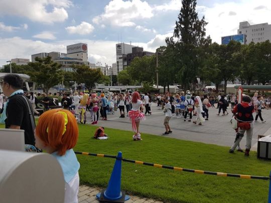
Cosplay
For this event I dressed up as Lucoa from Dragon Maid. I chose to cosplay her because of how cool and casual the outfit was; I was able to wear most of it during the day and avoided having to find a changing room. I carried the hat and wig in my backpack, it was easy to pull them out and throw them on at the event. If you want to wear something more elaborate you'll need to change in the area, I detail how to get a changing room ticket in the OSU Cosplay Parade section below.

Navigation
When we first got to the Aichi Arts center it was a little difficult to find where we were supposed to go. There wasn’t any WCS signage that stood out. It was the uniformed people standing in front of some large doors that signaled that we were in the right place. There was an information/ticket desk near the doors as well. It didn't seem like the Aichi Arts Centre was very large, so it should be easy for you to navigate.

Tickets
I bought the First Stage tickets through Ticket Pia, through a link posted on the WCS website. These tickets are digital and need to be displayed on the Ticket Pia app. We were directed to show them at the ticket desk. They checked the digital tickets and then presented us with the printed tickets. These were used at the large doors to enter.

Inside
Going in we got a brochure and a sheet of shiny tattoos. We were then brought in and shown to our seats by one of the staff members. We were a little late to the show but the venue wasn't too large so we had a pretty good view of the stage. I was expecting there to be way more people inside watching the event, but it was surprisingly bare. Especially when compared to the mass of people outside and something like 70,000 people watching the NicoNico livestream.

Performances
The performances were awesome to see live! All the costumes are gorgeous and all the performances were incredibly impressive. The teams were grouped into three blocks. They would run through the performances of each block and then we were given a short break to use the washroom and stretch our legs. I lucked out and got to sit near some fellow Canadians, who were also there to support Team Canada. During one of the breaks we had a chat and they hooked me up with a WCS Canada and Fellowsheep Cosplay pin.
After all the performances, while the judges make their decision, it switches to a concert. It felt like an instant transition! It got dark and a bunch of people in the audience stood up and broke out their light sticks! If you plan to stick through the concert, come prepared.

Outside
During the concert, the boyfriend and I decided to check out what was going on in the area. In the lobby of the Aichi Art Center they were selling band and WCS merchandise. Outside, it had gotten dark but the cosplayers were still going. It had the feeling of a casual convention or cosplay hangout. A bunch of cosplayers hanging out, talking, getting their pictures taken, shopping in the nearby stores and just having a good time. For me, it felt really familiar; I loved it.

WCS First Stage Tips:
If you pre-purchased tickets online, download the app and have your tickets ready before entering.
Go down early, there is a lot going on!
You don’t have to buy a ticket if you just want to hang out in cosplay, but you get a great view of the stage if you do.
If you bought a ticket, be prepared for *party mode* and bring a lightstick for the concert.
If you don't have a plain-clothes cosplay you'll need a changing room ticket to get dressed for the event.
If you want to take pictures, be prepared for bright sun during the day and low light at night. You may want an external flash.

OSU Cosplay Parade
The day after the first stage was the OSU shopping arcade parade and a new experience for me: getting a changing room ticket and getting dressed at the event.
After grabbing breakfast at the hotel, we headed out to find a Family Mart. It is really easy to find convenience stores in Japan, or at least in the cities we were in, because they are EVERYWHERE. They are also really convenient, selling food, snacks, umbrellas, sunscreen, backup shirts and just about anything you might need. Some also have terminals where you can buy event tickets, and that is what we were looking for.

Buying a Changing Room Ticket
Using the terminal was intimidating. I can pick out the odd hiragana or katakana character but my boyfriend and I really can’t read Japanese. We got to this point by using google translate and guessing based off limited English, and luckily the terminals in the subway for purchasing tickets had an English language button. The terminal at family mart did not. Luckily google was able to save us again and I found a guide online here:
http://eplus.jp/sys/web/yo-gaku/yo-fm/index.html.
We had trouble typing in what we were searching for so we pulled up a list of events, and looked for the name of the venue. Among the Japanese characters, X-HALL stood out. The next issue was when it asked for a phone number, since it didn’t accept either of our phone numbers. We ended up using the phone number of the hotel, so make sure you have the number for your hotel or airBnB handy. Once you’re finished a receipt will print out. You show this to the cashier at the front, pay for your ticket and receive your printed ticket in an envelope.
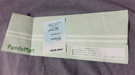
The Changing Room
The next mission was changing into costume. I chose the X-HALL changing room because it was closest to the OSU Shopping Street, and was a reasonable ticket price. When I got to the location I just had to present the ticket. They ripped up the larger part and gave me the smaller tab to hold onto for re-entry. Then they directed me to their changing room.
It wasn’t quite what I expected. It was a large room, similar to my experience with green rooms behind a stage, and didn’t have any mirrors, dividers or seats. There were a lot of cosplayers getting ready in the room, mostly just sitting on the floor and using their luggage to hold mirrors and wigs. I am so glad I had my leggings on under my jeans because I would have found it super awkward to try to get them on in front of everyone while sitting on the floor! The rest of my costume was packed in a box that fit in my backpack, so I pulled that out and got changed quickly. I didn’t have much issue getting the costume on, I planned for it to be easy to put on but I didn’t expect the room to be mirrorless and I didn’t know if my wig was on properly. I ended up asking a random girl if I could use her mirror and she let me, so thank you random girl!
Changing Room Tips:
There may be no mirrors (and no phones allowed) so you’ll want to pack your own.
There may be no seats
There are people and there may not be dividers
Change rooms are divided by male and female, so if you have a complicated costume you will need someone who can go into the change room with you to help put it on
There weren’t lockers in the change rooms, you will likely have to carry your clothes with you after changing
There isn’t any fix-it station or water, it is just a change room not really a lounge (but some people were just chilling there.)

Changed and ready to go, I meet back up with Kevin and we try to find where the parade starts in the Shopping District. There were a lot of people around and a lot of cosplayers sprinkled throughout the crowd. Unfortunately there was no signage for the WCS and we couldn’t really figure out where the parade was supposed to begin, especially since cosplayers were wandering freely and didn’t seem to be meeting up in a specific place. Luckily the parade found us. We crossed the street and noticed a bunch of people were standing along the sides of the road with cameras and thought we were getting closer. Then I heard the sound of the marching band leading the event and we got stuck standing along the side. It ended up being a pretty great view!

The parade looked similar to the Zombie Walks I’ve been a part of: the cosplayers moved slowly and stopped to pose for pictures before moving on. Once the parade had finished I followed the parade and crowd to the Osu Kannon Temple where it finished, and they were handing out cold tea. From there, we shopped and explored the area. The temple was a really cool photo shoot spot and there were food tents and a stage with performers. Cosplayers roamed around and were happy to pose for photos!

61 notes
·
View notes
Text
10 METHODS FOR Effective WEB PAGE DESIGN
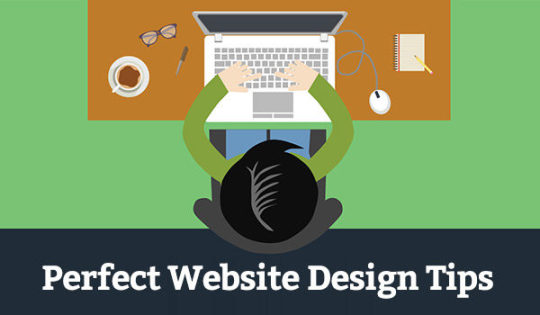
1. Plan ahead
Homebuilders and architects work off blueprints so homes don’t finish up with a toilet in the kitchen. You might say now, I would enjoy a bathroom in your kitchen. How convenient! However, you will likely be the only person to utilize it since people be prepared to see a bathroom in the (a lot more private) bathroom. Also check out California website design
Make a concise arrange for your website, your “plans,” and the business of the web site will follow. What is the goal of the web site? To complete an application? Buy something? Call hotline? Teach readers? Define the purpose of the web site and adhere to the goal, rather than adding in a complicated, out-of-place “bathroom.”
You'd be surprised just how many “toilets” I've found within pages of the website. Not merely should the whole website have an objective, but every individual web page on the site also needs to have an objective. Make every web page as though it were a squeeze page. For most of your users, the web page they land on might be the only conversation they have with your website.
2. Simplify
Don’t hesitate to use white space. Sometimes design elements on the website can overwhelm site visitors enough to make sure they are quit and leave. Internet users lazily behave. Make their job easy through simple web design.
The very best websites keep their color schemes in three colors. I am aware that some websites will have significantly more than three colors, but keep carefully the theme of your website similar by reducing and keeping constant the number of colors you utilize.
3. Screen your contact information prominently
Some individuals design their websites as though these were running from an ex-boyfriend or sweetheart and hide all-important contact information.
Make all of your contact information prominent and visible. I would suggest putting those details in the header of your website. In case your clients have questions or concerns, or if indeed they want more information, make it no problem finding.
Some individuals have explained that they don’t need contact information in the header because they have an “EMAIL US” web page. “EMAIL US” webpages are great-but imagine if the only web page your visitor views is not the “EMAIL US” web page?
4. Explain which location(s) you serve
Are you a countrywide or a local company? This is a fairly easy question, but could it be easily clarified on your website?
When you have a countrywide website and sell something, is the cart accessible readily? Which locations is it possible to deliver to? Do you have an easy-to-navigate list of products and services for every location?
When you have an area website, a visitor can start to see the area that you service. Where are you located? Have you got a local contact number? Do you provide a typical service, like domestic plumbing? Or if you’re offering something locally, have you got a storefront?
5. Make your website responsive
A responsive website changes the size of the website and viewing area concerning the device. Different cell phones, tablets, and desktops all have different display sizes. A reactive website creates the perfect consumer experience on cellular devices.
60% of individuals in America and the UK gain access to the web mainly through cellular devices.
46% of smartphone owners say their smartphones are something “they couldn’t live without.”
Almost two-thirds of adults in America own a smartphone.
34% of smartphone users go surfing using mainly their phones, rather than on the desktop, laptop, or another device.
46% of individuals using cellular devices report issues while looking at a static site. A static site is a normal, non-responsive website.
44% of individuals surveyed declare that websites were difficult to navigate on smaller devices.
You may be thinking, I don’t need a mobile-friendly website. My audience doesn’t use cellular devices.
While it can be done that your audience doesn’t use smartphones or cellular devices, it is much more likely they are doing use cellular devices but don’t visit your website due to a nonresponsive or non-mobile-friendly website.
6. Be obvious
You have .05 seconds for users to create an impression of your website. If you don't are an insect, computer, or NASA test, that's not lots of time, which means that your website must be clear in its goal. The design of the website is the 1st factor in identifying whether a consumer will keep on your website.
A user can take a look at your web page for a moment and know very well what that web page is approximate. Are you a plumber? What area do you provide? What product can someone purchase on the web page? What is this website post about?
Prospective customers make preliminary impressions immediately when they open up a website, including if they think the web site is credible. How is a consumer heading to trust you if indeed they do not trust your website?
Proceed through your website. Go through the individual webpages rapidly and objectively and find out if you realize the message of every web page. Could friends and family and the ones unaffiliated with the web site do the same?
7. Include strong phone calls to action
What would you like an individual to do? Call you for a free of charge consultation? Join a newsletter? Buy a product? Use your service?
Pretend you possess a supermarket and need to market make of cereal. You almost certainly create some type of advertising or sale to immediate users to buy that make of cereal.
Poor or no phone calls to action on the website are similar to those who own the supermarket crossing his / her fingertips hoping that individuals will come across the make of cereal they have to sell.
Even though a proactive approach is so important, 70% of websites don’t have one. Imagine, 70% of most websites mix their fingers wishing an individual stumbles upon their product.
I received dive into what color or font to use on your calls to action. My point because of this suggestion is to simply have a proactive approach. Make your call to action extremely noticeable and noticeable. Over a period, try your phone calls to action and find out those convert more business.
As a reward suggestion, surround your phone calls to action with helping explanations of why. (Why should someone call? Why as long as they subscribe? Why as long as they purchase your product?)
8. Tell guests who you are
Big-name companies spend vast amounts of dollars on branding every year. Not a solitary small business I understand has vast amounts of dollars to invest in branding (or you'll no more be a little business).
Create an “About Us” Web page!
“About Us” pages are underutilized yet important elements on the website. You can differentiate yourself from the best businesses by placing a face and name to your business. One research study demonstrated a 102.5% upsurge in sign-ups after including an image of a person or owner.
The “About Us” page is where you can build trust (if you don't come with an untrusting face-you know who you are) and help visitors get a much better notion of who you are. As easy as it noises, having an “About Us” web page may be the difference between someone phoning your business or going somewhere else.
Use your personality upon this web page to answer questions people wish to know. Who are you? How long are you in the region? Why are you special? Why are you… you?
9. Make use of a readable font/text message size
Perhaps you have ever watched a Television commercial were, by the end of the commercial, maybe for so long as 10 mere seconds, someone talks fast to go over the conditions and conditions? I’ll call this the “small print.”
A medication commercial might list the possible part results or diseases you might deal with. I think I've even heard a few of these advertisements list death just as one side-effect. Doesn’t that “small print” by the end of advertisements make you just a little anxious because you aren’t 100% sure what's happening? You might feel just like you have to indicate your daily life away as a requirement of the product.
Avoid small print as the primary print on your website. I've seen great content online lose its value since it was released with minuscule printing. In case your customer desires to learn all the written text on your web page, let them read it with a legible font size easily. You can attempt your website’s text message is large enough through Google’s Mobile-Friendly Test.
Have you ever endured to complete a CAPTCHA code to show you were human beings? (Fun truth: CAPTCHA means “Completely Automated General public Turing test to Inform Computer systems and Humans Aside.”) It’s super frustrating and hard to learn, and sometimes you merely quit and go directly to the next code.
Don’t put your visitors through the CAPTCHA code treatment by using unreadable and crazy fonts. Let your fonts reveal your business, but also make sure they are readable. Don’t put your visitors through the “small print” and “CAPTCHA code” experience!
10. Decrease weight times
I'd like to reiterate how lazy people get when they may be online. A sluggish website is the same as making someone wait around thirty minutes at a restaurant when they aren’t even sure what’s on the menu.
Wow, those were excellent tips, but what you truly wish to know is how to proceed with all of this information. It’s as soon as you have all been looking forward to. My recommendation is that you should put into action the tips I discussed.
0 notes
Photo

One thing I always loved about Star Trek was the maps of the galaxy they had on the bridge of the Starship Enterprise, showing and labeling the stars and planets of different alien civilizations. I loved the rich backdrop these maps put behind the show, making its futuristic premise of an explored galaxy of technologically advanced civilizations seem real. This map of the Star Trek galaxy from Star Trek online has all my old favourites – the Federation stars & planets in blue (that’s us), the Klingon Empire in red, and even the ultimate bad guys – the Borg – in Purple on the right. My current vocation of SEO hasn’t yet taken me to navigating the galaxy on a starship, but it has taken me deep into keyword market analysis – and that’s something that can be made to (sort of) look like it’s from Mr Data’s computer terminal on the Enterprise bridge. In SEO, keyword market analysis answers this question: What are people searching for online in relation to what you sell, and how often are they searching for those things? If you are running a website without this knowledge, it will be difficult to know which new pages to make or which existing ones to improve to achieve your growth goals in organic search. In this post, it is assumed you have already done this analysis in a spreadsheet, and having put your keywords into groups are now looking to present the findings about what the market looks like to your client visually. This post is about the market visualisation I like to use and how it’s made. If you haven’t got your keywords grouped yet, I recommend taking a look at the predecessor post to this one, how to easily group all your keywords. Market Map A Market Map is an image of a market. It’s like taking a shareable photo of what the market really looks like, as revealed by the keyword analysis you have done. This is what I mean by keyword analysis – a spreadsheet with keywords put into groups, and their search volumes. A market map turns a spreadsheet into a galaxy. In the image below: The lines show how the keyword groups are structured. The circles shows how popular these keyword groups are relative to each other by their size (also shown by label size) The colours represent the taxonomies and are customisable. The colours show the 2 main galactic empires in the venue space – ‘corporate’ & ‘non-corporate’. The circles show the relative search volume for corporate keywords e.g. ‘team building venue’ and non-corporate keywords e.g. ‘party venues bristol’, split into sub-groups that show market structure. Here’s a full size version that’s big enough to navigate like a galaxy (you may need to scroll around). Here’s a different industry twist on the same theme, this time for big tech – here’s the full size galaxy version. We can see who the big and small fry are at a glance. From big tech to broadway – your market map is an eagle eye view of any digital vertical. This one shows how popular the different shows are, relative to each other. Why use a Market Map? Keyword market analysis is how you know where to aim your search strategy. The Market Map communicates how you know this to anyone who would like to understand without asking the viewer to think about numbers, or requiring them to interact with a spreadsheet. As a single image, it can be physically pointed at, printed out and stuck on the fridge. A short verbal explainer of what the coloured structures mean is recommended beforehand. Once your audience is on board, you can sit down in the war room and strategise together for galactic domination. The astrometric data indicate that ‘Parties Near Me’ may be our best chance for success in this campaign Captain. No Excel or programming expertise is needed to make a market map. It takes 45 minutes to get familiar with a free graph making program called Gephi using the instructions in this post. Once you’ve learned it, you can churn these out in 20 minutes, depending on how much of a perfectionist you are. Delight your audience Keyword analysis spreadsheets are boring. Useful, sure. Profitable, definitely. You really should pay attention. Throw in some Excel charts and they’ve graduated from boring to a bit less boring. But still boring. The left brain is engaged and dutiful, but tired. The right brain wants to go play outside. I didn’t want to straw-man this one – it’s quite nice. But let’s face facts – it’s still a spreadsheet. I have to think about numbers. Meanwhile, outside… Edu-tain your audience and they’ll be grateful that you made their working day a bit more fun. They’ll have both brain hemispheres focused on your presentation and won’t have a memory of suffering associated with it. Give confidence without complication Once they’ve done their analysis, the analysts at a digital agency can communicate what they’ve found in a short email or phone call. It might be something as simple as ‘Focus on groups X, Y and Z in this order and follow our recommendations for implementation on this month-by-month’. But if I was paying for keyword analysis in my market, I’d want a little something more when it comes to the analysis part, because I’m not just paying for the answer – I’m paying for confidence and peace of mind. I need some understanding of why that answer is the answer, even if I’m a complete beginner in digital marketing. I want to rest easy with my own judgment satisfied, as well as putting my trust in the agency. At the same time, I’d prefer to avoid getting too deep into the numbers, and I can’t really spare the time to learn SEO myself. I don’t need all the details, just a good picture. Here’s how to make one. How to Make a Market Map for Your Client This 4 step process will require about 45 minutes of your time to learn. It is fiddly (Gephi is not very user friendly), but crucially, it does not require expertise in Excel or any coding knowledge. Turn your spreadsheet into a market map Here are the steps: Format your keyword market analysis data. Process this data using the Gephi data transformer Google sheet. Install Gephi and upload your newly processed data. Make your Market Map visualisation in Gephi. 1. Format your keyword market analysis data Most of the time, my keyword research has these columns in it from left to right: keyword, search volume, keyword group level 1 (e.g. item: theatre tickets), keyword group level 2 (e.g. show: matilda), keyword group level 3 (e.g. location: london) A Quick Recap on Keyword Grouping If you haven’t got your keywords grouped yet, I recommend reading this post about how to easily group all your keywords before proceeding. At Found we’ve moved our processes on a little since February when that post was written, with the arrival of the Keyword Categorizer. This tool in development is a custom-built solution to the problem of keyword categorization, which will soon provide the opportunity to perform the work for those who would prefer to operate outside of Excel. This is currently internal only, but here’s a sneak preview of this classy tool: Neat feature: The tool tokenizes and orders the words in your keyword list by frequency count, helping you with the first stage of the grouping So if you’ve got your keywords grouped, let’s continue. The Market Map visualisation deals in keyword groups, not keywords. So you don’t actually need your keyword column – just the search volume for each keyword, and the groups. Sound too easy? Yeah, it was. The groups need to also meet these criteria: The groups need to flow hierarchically from left to right, like the growing branches of a tree, without any blanks in the middle. Groups 1 and 2 shouldn’t have any blanks. If you have some rows containing blanks for these columns, replace them with ‘general’ or whatever works best. Group 3 can have blanks because it’s the end of the hierarchical line. Think of it like a tree – you can’t have leaves without the middle of the branch that supports them. But you can have branches without any leaves. 2. Process this data using the Gephi converter Google sheet. Gephi eats a special diet made up of 2 special csv files called Nodes.csv and Edges.csv. Nodes are the keyword groups themselves and their size, and edges are the map part – which nodes are connected to the other nodes based on the way the keyword groups have been hierarchically arranged in your spreadsheet. Turning keyword analysis spreadsheets into these 2 files is the biggest barrier to creating the Market Map. Here’s a converter that does this for you. It’s made in Google sheets to leverage the powerful Query functions that can automatically transform your keyword analysis data into the very specific format it needs to be in for Gephi to read it and make the Market Map. This should really be a web app. I grew to love Google sheets when making this after always having hated it for its latency issues. There is a lot of powerful functionality. Visit the Gephi converter here and follow the instructions. It will ask you to: Make your own copy of the Sheet first Follow the instructions Wait 5 minutes Download the 2 .csv output files Remember to make a copy first and work in the copy so the master isn’t overwritten! 3. Install Gephi So first you install the program, it’s free: https://gephi.org/users/install/ Gephi works with Java so you will need the most up to date version of Java installed and running on your system: https://www.java.com/en/download/ When I installed it and tried to open it, I got an error message and had to find, open up and edit a text file called gephi.conf in the Gephi folder: C:Program FilesGephi-0.9.2etc I needed to add the path to my java installation, which is in the double quotes on the first line below, and then save: jdkhome="C:Program Files (x86)Javajre1.8.0_191" # ${HOME} will be replaced by user home directory according to platform default_userdir="${HOME}/.${APPNAME}/0.9.2/dev" Hopefully you won’t get the error and can skip this. Be forewarned – Gephi is buggy so there’s a chance it might just not like your computer, but there are forum threads out there for most of these issues. So there might be a bit of Google searching and troubleshooting that you need to do before it works. Uploading your processed data to Gephi: Start Gephi Click new project Click data laboratory at the top Click Nodes on the left Click Import Spreadsheet and select your nodes.csv file that you created in the data converter. Click Next, Finish. You should see the below. Set Graph type to ‘Directed’ and select ‘append to existing workspace’, then click ok and you’ll see the finished Node table. Now, do the same for the edges.csv where the option exists, remembering to select ‘append to existing workspace’ in the same way. 4. Make your Market Map visualisation in Gephi Click overview, next to data laboratory. This is what you should see: Each dot is a keyword group, linked to its parent and child groups by the lines. We are the Borg. Remember us? We have assimilated Gephi now. Showing search demand Next, let’s tell Gephi to size the dots based on search demand. In Appearance in the top left: Select ‘Nodes’ Click the circles button Click Ranking just below Select ‘weight’ from the menu. Set max size to 100, then click Apply below. You should now be seeing something like this: Colour coding the keyword groups It’s all a bit black and white. Add a splash of colour by following these steps: In Appearance in the top left: Select ‘Nodes’ Click the paint palette button Click Partition just below Select ‘modularity’ from the menu. Then click ‘Apply’ below. Now there are colours that represent your keyword groups. Usually this is for the parent groups because having a special colour for each sub group starts to get silly. You can change them manually too if you want. Labeling the keyword groups At the moment you don’t know which group is which, although you can probably guess that the ridiculously huge one has the name ‘general’. This one’s simple, just a button click. Layout – Bringing it to life It’s all in a square right now – you can’t see anything really. So let’s play with the layout tab. Here is the recipe I use to create the Search Universe layout. Select Label Adjust from the Layout dropdown menu on the bottom left. Click ‘Run’. You’ll see the labels all spacing out nicely. Select ‘Yifan Hu Proportional’ at the bottom of the dropdown list and Run it as many times as it takes for it to start to look good. If it’s still looking bunched together, run Expansion or Label Adjust from the manu again a few times. When all is said and done, you should have something like this: The galaxy is taking shape. Bit it’s looking a bit rough around the edges. Now, up next to data laboratory, click on preview. Here, there are some options to help us to give the visualisation a professional finish. Finishing touches In the Preview area, there are some options to help us to give the visualisation a professional finish: Click Preview, next to data laboratory Click ‘Refresh’ at the bottom. The visualisation will appear, with some cool curved lines which create the galaxy effect. Tick ‘show labels’ on the left From the Presets dropdown menu at the top, click ‘Text outline’ Click ‘Refresh’ again. Plenty of options for you to customise the look and feel. You can have a black background if you want to. Export Your client probably doesn’t have Gephi installed, so you’re going to need to export what you have just masterfully created. To export, go to File at top left and choose the format you want. SVG – Huge, best quality but cumbersome, use for presenting. They do look good on the big screen, and you can make it look like you’re flying through the keyword groups. PNG – Small, a bit blurry, good for previews and not much else. PDF – Smaller but pretty nice quality, I like this one. And that’s how you make a Market Map. The post How to Make Your Market Analysis Look Like It’s From Star Trek appeared first on FOUND.
0 notes
Text
The 7 deadly sins of ecommerce UX
According to Statista, there were 1.79 billion global online buyers in 2018, and in 2021, the number is expected to rise to over 2.14 billion. And if you’re reading this and haven’t shopped online — especially on a mobile device — what’s your secret? My wallet wants to know.
If you’re one of the millions of retailers running an ecommerce site, it’s essential to make sure your users have an optimal experience that makes shopping easy and keeps them coming back to shop again.
Yes, your product should be quality, but KPMG International found that 30 percent of consumers would rather buy from a website they’ve previously bought from. So how do you build trust with users by giving them the best experience possible — and making them feel secure enough to complete a purchase?
Let’s explore seven common user experience (UX) mistakes ecommerce sites make that could end up costing you business.
Mistake 1: Designing for desktop
You have a beautiful site that looks great on a desktop or laptop computer. That’s all good and fair. But, uh, have you checked it out on your smartphone recently? Mobile-first thinking is an absolute must for any website, especially ecommerce.
In 2018, 52.2 percent of all website traffic worldwide was generated through mobile phones, up from 50.3 percent in the previous year. Mobile traffic currently accounts for half of all global web pages. And that number is only going to grow. If your site isn’t optimized for mobile or, better yet, responsive design, you’re losing a lot of potential customers and revenue.
Consider these when looking at your website on your phone:
Scale.Do you have to pinch and zoom in on anything? Is your font or icons tiny? Can you easily select a CTA button with your thumb without touching anything else?
Function.Are any components of your website or certain webpages broken in mobile view, like tables or embeds?
Mistake 2: Bad navigation
The heart of many websites is the menu/navigation. Users should easily be able to find relevant buckets or categories at a glance. And then, even from within a product, the choices they have there (i.e., color, size, quantity) should be easy to find and intuitive to interact with.
Good user experience sites will have products listed out in their main navigation. You can see BestBuy.com doesn’t — they have a main bucket just listed as “Products” instead of the actual product categories themselves. Displaying deeper buckets up front helps someone find what they’re looking for much faster. A study also found that hiding the first level of product categories in the navigation (like Best Buy does) makes it difficult for users to determine what site they’ve landed on.

Source: Best Buy
However, it’s ok to have the same products under multiple categories. People search for things differently, and oftentimes, a product can fit under more than one category. For example, BestBuy.com displays the same subcategory under multiple categories. “Home Theater Systems” can be found under both “Audio” and “TV and Home Theater.”
Source: Best Buy
You don’t want a customer to have to click three or more times just to get to a product they want. Less clicking is more buying. If BestBuy.com had listed out its products from the main navigation, buyers searching for “home theater systems” would’ve had to click one less time to get to the product.
Of course, if a product doesrequire five clicks on your site, many people might resort to just searching your site via the search bar for a particular item. Which brings us to the next common UX mistake.
Mistake 3: Bad site search
If a user knows exactly what product they’re looking for on your site or they’re frustrated because they can’t find it using the menu options given, they will most likely head straight to the site search bar. Make sure you have a functional search bar!It’s also important to include any necessary filters and make sure fuzzy, misspelled, and exact searches for product names or model numbers give relevant results. Here are more design tips for a site search your customers will actually like and use.
Mistake 4: No SSL and secure checkout
I don’t know about you, but before I ever use a website — and definitely before I ever buy from a website — I take a quick look at the URL and make sure it says “https” instead of just “http.” That little “s” is a big deal for your bank account and personal information!
Do yourself and your customers a huge favor and get an SSL certificate for your site. By having a digital certificate, you can safeguard personal data through an encrypted connection. Your customers will be reassured that the website is safe, their information is protected, and they shouldn’t have any worries about spending their paycheck on your site.
Mistake 5: Bad checkout experience
If you do have a secure checkout, you also want to ensure you have the following on your site for a smooth checkout process:
Guest checkout.Because who wants to spend time making an account and risk getting spammed? Buyers just want to buy! Allow them to do their thing — you’re more likely to have a repeat customer this way.
Related products to boost sales. Related products are like the “impulse-buy” candy shelves at the grocery store checkout stand. Something catches your eye and, hey, you’re already checking out, and, hey, maybe it’s on sale so in the cart it goes!
Visible shipping rates.Be upfront about shipping options and costs. There’s nothing worse than going to check out and wondering why the cost of everything jumped up significantly. If shipping rates are visible, I’m more likely to add more items to my cart for free shipping or adjust my cart, so my cost with shipping fits my budget.
Multiple payment options.There are more options today than just Visa and Mastercard. Including other payment options like PayPal, Apple Pay or AmEx expands your customer market.
Simple forms. Don’t use complicated forms, don’t require more fields than you need, and please make sure phone keyboards adjust to the requirements of the field.
Mistake 6: Mishandling out-of-stock items
A user finds the perfect item, exactly what they were looking for and it’s even on sale. Great! Potential customer then goes to add said item to their cart only to be told “We’re sorry, the item is currently out of stock.”
Would’ve been nice to know upfront the item wasn’t available, right? As a business, you want to instill confidence in your customers. Not appropriately marking items as out of stock is a surefire way to kill that confidence and get your customer to leave your site without buying anything. Make sure you find a way to mark out-of-stock items and maybe even incentivize the shopper to return by apologizing or giving them a promo code.
Mistake 7: Hidden/invisible customer service details
Customer service is essential to consumer retention. According to Bain & Company, companies that excel at the customer experience drive revenues between 4 and 8 percent higher than those of their market. And friendly employees or customer service representatives. are what makes a memorable experience that causes 73 percent of consumers to stick with a brand.
All this to say, you want to make sure that you not only have excellent customer service but promote that excellent customer service visibly on your site. If people have to hunt around for a number to call or a chat icon doesn’t exist anywhere or you don’t post anything at all regarding customer service, it’s an immediate turn-off.
What if a customer has a product question? What if they want to return an item? What if they’re having a website or checkout issue? If these things can’t be resolved because you failed to promote customer service contact information, you’ve lost a customer. Presumably forever.
UX is of the utmost importance for ecommerce sites. Taking special care to make sure your customers can easily find and buy what they want from your site will make a huge difference in your retention and sales.
What other UX mistakes do you often see on sites? Tell us in the comments!
The post The 7 deadly sins of ecommerce UX appeared first on Get Elastic Ecommerce Blog.
The 7 deadly sins of ecommerce UX published first on https://goshopmalaysia.tumblr.com
0 notes
Last Seen Blogs

gremjaylin
(Mostly) dead artist LOL

papichulo0410
Untitled

thelastpunicorn
welcome to the woods

icarus-44
I’m Honestly Surprised I Still Have Tumblr

muunsphinx
🌙 MuunSphinx🌙