#willem sandberg
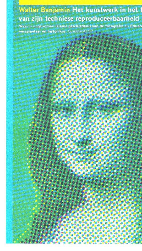
Photo

Leo Wollner: Textielontwerper, Essay by Inge Santner, Designed by Willem Sandberg, Stedelijk Museum Amsterdam, 1958 [Exhibition: December 19, 1958 – January 25, 1959] [Antiquariaat Frans Melk, Hilversum]
#graphic design#design#art#textile#exhibition#catalogue#catalog#cover#leo wollner#gretl wollner#willem sandberg#inge santner#stedelijk museum amsterdam#1950s
111 notes
·
View notes
Photo
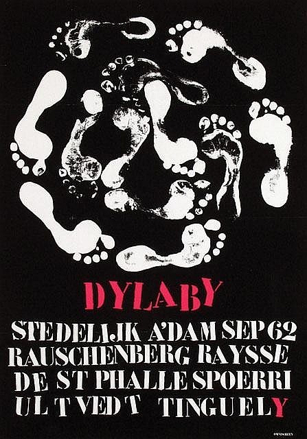
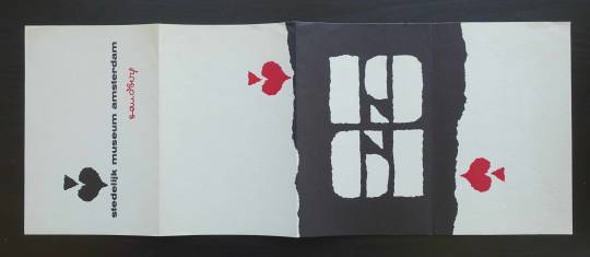
DYLABY 1962 poster by Jean Tinguely
#big fan of this poster#dylaby#it was an exhibition that like turned the space in the gallery into a labirynth#or like my teacher said like a playground lol#the name dylaby comes from dynamic labirynth#there were some tasks and objects to interact with#overall pretty nice but id die from claustrophobia perhaps#but yeah it focused on the environment of the exhibition not just the works! but how to present them in a complimentary way#it was a play and try at making the visitors interact with art more instead of just looking at it from a far#when you interact you feel more depth with what you are presented with#also kinda junk aesthetic#pretty fun project the 60s loved playing with environment#like my beloved marcel duchamp also#o i will show you in another post a fun exhibition he did#or more like was a curator of#jean tinguely#Willem Sandberg#performance
9 notes
·
View notes
Text
found David F Sandberg's youtube from the description of a podcast he was on and this just killed me

source
#james talks#david f sandberg#did not know he was autistic and it's really cool actually to know that#might have a different appreciation for his movies with that context#if you're wondering what the podcast was it was Sardonicast episode 46 talking about The Lighthouse#so the timing of the Willem Dafoe meme was even funnier
1 note
·
View note
Text
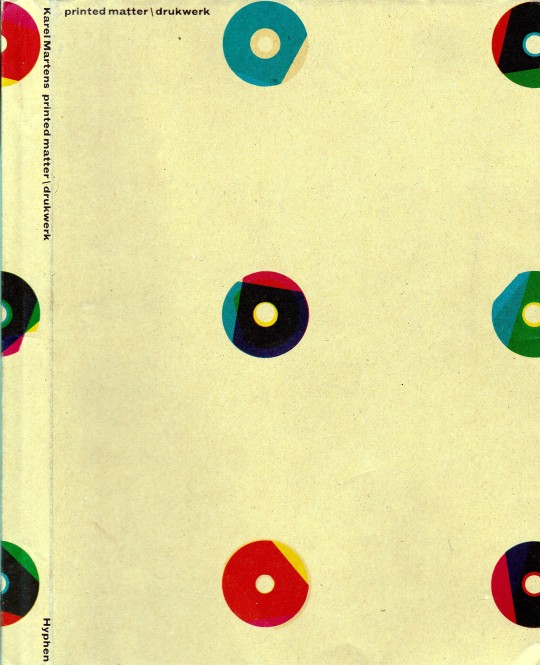


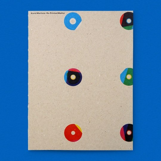
Printed Matter / Druckwerk
Karel Martens with Jaap van Triest and Robin Kinross
Hyphen Press, London 2001, Second Edition, 208 pages, 17,3 x 23,6 cm, paperback, ISBN 0 90 7259 20 0
euro 90,00
email if you want to buy [email protected]
The work of Karel Martens occupies an intriguing place in the present European art-and-design landscape. Martens can be placed in the tradition of Dutch modernism – in the line of figures such as Piet Zwart, H.N. Werkman, Willem Sandberg. Yet he maintains some distance from the main developments of our time: from both the practices of routinized modernism and of the facile reactions against this. His work is both personal and experimental. At the same time, it is publicly answerable. Over the now 50 years of his practice, Martens has been prolific as a designer of books. He has also made contributions in a wide range of design commissions, including stamps, coins, signs on buildings. Intimately connected with this design work has been his practice as an artist. This started with geometric and kinetic constructions, and was later developed in work with the very material of paper; more recently he has been making relief prints from found industrial artefacts. This book looks for new ways to show and discuss the work of a designer and artist, and is offered in the same spirit of experiment and dialogue that characterizes the work it presents.
25/05/23
orders to: [email protected]
ordini a: [email protected]
twitter: fashionbooksmilano
instagram: fashionbooksmilano, designbooksmilano tumblr: fashionbooksmilano, designbooksmilano
#Karel Martens#Druckwerk#Printed Matter#designer of books#stamps#coins#building signs#designer and artist#design books#designbooksmilano#fashionbooksmilano#rare books#MC
10 notes
·
View notes
Text
Willem Sandberg / experimenta typografica
View On WordPress
0 notes
Text
Willem Sandberg: directeur Stedelijk én grafisch ontwerper
Willem Sandberg: directeur Stedelijk én grafisch ontwerper
Willem Sandberg: directeur Stedelijk én grafisch ontwerper
#Willem #Sandberg #directeur #Stedelijk #én #grafisch #ontwerper

View On WordPress
0 notes
Text

Kijk nou! Drie jaar later heropen ik dit stoffige tumblr-account en zie ik dat 18-jarige Anouk een affiche ontworpen door Willem Sandberg heeft gerepost.
Ja hoor, die herken ik. Dat hoofd van hem heb ik van een paar planken verschoven in het depot van museum Beelden aan Zee. Een super mooi bronzen beeldje van Nel van Lith dat in 1982 is gegoten.
Ze maakte nog een ontzettend goed beeld van de architect van Beelden aan Zee, Wim Quist.

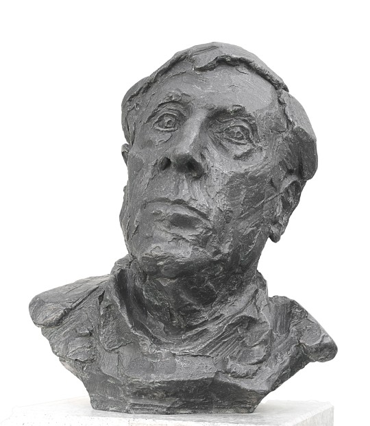
Op deze foto is het nogal een angstaanjagend beeld. Maar in het depot ontkom je er bijna niet aan. Ik heb het tussen andere bronzen, massieve mannenkoppen geplaatst die allen heel goed hun plek in de ruimte innemen.
Van Lith maakte van Sandberg ook nog een portret ten voeten uit, maar dat vind ik maar een klein kinderachtig beeldje.

Deze foto weergeeft duidelijk Nel van Liths virtuositeit in expressie geven aan een kop. Ook al heb je de man nog nooit in het echt gezien, het voelt alsof je Sandberg gewoon kan herkénnen in dit beeld. Het lijkt alsof je recht tegen de persoon met zijn rimpels en frons staat aan te kijken.
Het portret staat momenteel weer tentoongesteld in de hal bij het Sculptuur Instituut en gaat hopelijk over enige tijd gepubliceerd worden op de publieke site van het museum.
#willem sandberg#portret#design#brons#wim quist#beelden aan zee#museum beelden aan zee#sculptuur#depot#stedelijk museum#1982#portrait#bronze sculpture#sculpture#museum#sculpture museum
2 notes
·
View notes
Photo

Willem Sandberg at this desk in the Stedelijk Museum, Amsterdam.
Photo: Pieter Brattinga
2 notes
·
View notes
Photo
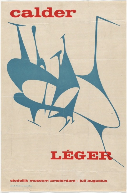
Willem Jacob Henri Berend Sandberg | Calder, Léger
Stedelijk Museum Amsterdam, 1950. Photolithograph.
133 notes
·
View notes
Photo

Willem Jacob Henri Berend Sandberg Calder, Léger, Stedelijk Museum Amsterdam, 1950. Photolithograph.
172 notes
·
View notes
Text
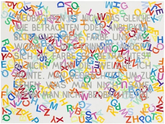
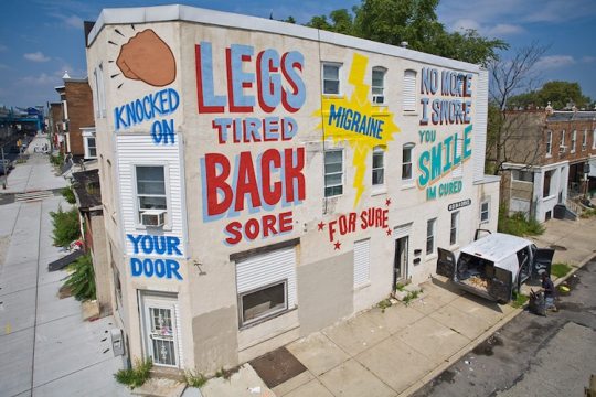
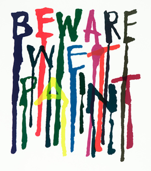
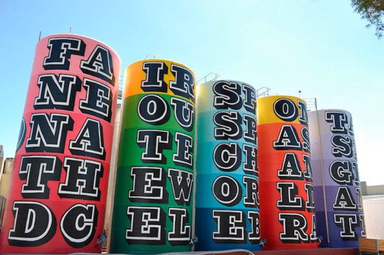
Self-directed research- letterforms
Research the work of artists and designers who use creative letterforms in their work. You should look at least 6, and post on Tumblr. You should only look at work that contains only letters, no imagery or ‘pictures. Consider what aspects of this work you like- handmade quality, message it portrays etc. These can be graphics designers, painters, textile artists......
Some suggestions:
Alan Fletcher, Jenny Holzer, Steve Powers, Willem Sandberg, Alan Fletcher Peter Davies, Jasper Johns, Stuart Davies Saul Bass, El Lissitzky, Mel Bochner, Moholy-Nagy David Carson Juame Plensa Craig Ward, Dominic McGill Tracey Emin, Bruce Nauman, Robert and Roberta Smith, John Warwicker (especially Tomato work), Dada, Jamie Reid, Ben Eine
Mel Bochner

Yoko Ono
Steve Powers

Juame Plensa

Tracey Emib
Alan Fletcher
Ben Eine
11 notes
·
View notes
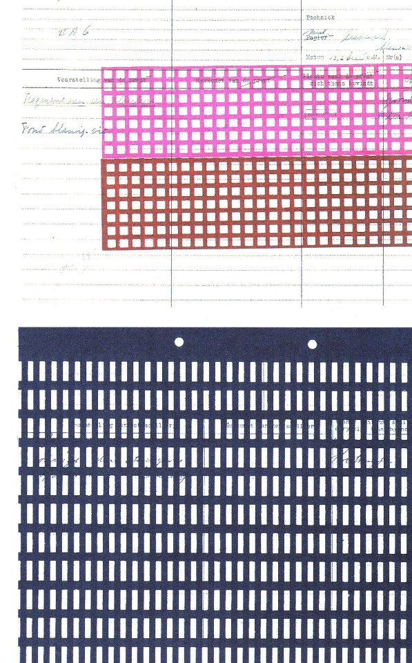
Photo

Leo Wollner: Textielontwerper, Essay by Inge Santner, Designed by Willem Sandberg, Stedelijk Museum Amsterdam, 1958, Soft cover with textile jacket [Exhibition: December 19, 1958 – January 25, 1959] [Jeff Hirsch Books, Wadsworth, IL]
#graphic design#design#art#textile#leo wollner#gretl wollner#willem sandberg#inge santner#stedelijk museum amsterdam#1950s
112 notes
·
View notes

Photo
JUST ADDED! LIMITED COPIES! Re-Printed Matter / Karel Martens Available at www.draw-down.com The work of Karel Martens occupies an intriguing place in the present European art-and-design landscape. Martens can be placed in the tradition of Dutch modernism, in the line of figures such as Piet Zwart, H.N. Werkman, Willem Sandberg. Yet he maintains some distance from the main developments of this time: from both the practices of routinized modernism and of the facile reactions against this. His work is both personal and experimental. At the same time, it is publicly answerable. Over the decades of his practice, Martens has been prolific as a designer of books. He has also made contributions in a wide range of design commissions: including stamps, coins, signs on buildings. Also a renowned teacher of graphic design, Karel Martens is co-initiator of the Werkplaats Typografie, a two-year master’s design program related to ArtEZ, Arnhem, and guest professor at Yale University, New Haven. Intimately connected with this design work has been his practice as an artist. This started with geometric and kinetic constructions and developed in work with the very material of paper. And he has been making monoprints over a long period. Its first edition was published in 1996 on the occasion of the award to Karel Martens of the Dr A.H. Heineken Prize for Art. In response to continued demand, the book has been extended to 2019 and appears now in this fourth edition presenting almost sixty years of practice. #KarelMartens #RePrintedMatter #Design (at A'dam) https://www.instagram.com/p/B3-7PoSHBE_/?igshid=1slluxbwup6gq
9 notes
·
View notes
Text
Wim Crouwel: Mr. Gridnik
Liefhebbers van grafische vormgeving worden dit najaar verwend: na de opening van ‘Kleurrijk Japan’ opent deze zaterdag nu ook ‘Wim Crouwel: Mr. Gridnik’, een eerbetoon aan Wim Crouwel (1928-2019).

Wim Crouwel, ‘Vormgevers’, 1968. Collectie Stedelijk Museum Amsterdam
Wim Crouwel was een van de bekendste ontwerpers van Nederland, en ook internationaal beroemd onder andere door zijn werk voor het Van Abbemuseum, het Stedelijk Museum Amsterdam, zijn letterontwerpen (bijvoorbeeld het geometrische lettertype New Alphabet uit 1967) en zijn bedrijfslogo’s.
Voor het Stedelijk Museum was hij van 1963 en 1985 verantwoordelijk voor grafische uitingen van het museum. Hoe hij daar terecht kwam? Toen Edy de Wilde in 1963 vertrok als directeur bij het Van Abbemuseum om directeur bij het Stedelijk te worden, vroeg hij Wim Crouwel, die daar als vormgever werkzaam was, met hem mee. Crouwel maakte wel liefst ongeveer 400 affiches en ruim 300 catalogi voor het museum. En dat niet alleen: hij ontwierp zelfs de huisstijl van het Stedelijk. Na zijn vertrek bij het Stedelijk werd hij zelf directeur van Museum Boijmans van Beuningen. Daarnaast was hij ook nog eens lector, hoogleraar, organisator en woordvoerder.
Naast Wim Crouwel besteedt de tentoonstelling ook aandacht aan de andere belangrijke grafische vormgevers van het Stedelijk, zoals Willem Sandberg, Anthon Beeke, Experimental Jetset, en Mevis & van Deursen.
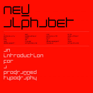
Wim Crouwel, ‘New Alphabet Kwadraat-blad’, 1967. Collectie Stedelijk Museum Amsterdam
New Alphabet
Herken jij iedere letter in ‘New Alphabet Kwadraat-blad’ hierboven? Doordat de letters alleen uit horizontalen en verticalen bestaan, zijn sommige letters vrijwel onherkenbaar. En dan ook nog geen kapitalen? Dat ging veel vakgenoten toch echt te ver en er ontstond een levendig debat in onder andere de vakliteratuur. Dit debat was eigenlijk ook een van Crouwels doelen, dus mission accomplished 😉
‘Wim Crouwel: Mr. Gridnik’ is te zien tot en met 22 maart
#behind the art#stedelijk museum amsterdam#stedelijk museum#stedelijk#amsterdam#wim crouwel#grafische vormgeving#graphic design#kunst#art#moderne kunst#modern architecture#blikopeners#tentoonstelling
2 notes
·
View notes
Last Seen Blogs

ellaine08-blog
sephy

weightloss-for-tomorrowland
Rach 🌞

fucking-imperfect00-blog
TEACH ME HOW TO LOVE
joan-crawford-uncensored
Joan Crawford Uncensored
wosoamazing
WOSO