#Goodinmaginations
Text
Dasher - Issue 6 - front covers
In the story of issue 6, dasher will go down to the sewers of Blackpool to face of against a terrifying creature that threatens the lives of not just the residents of Blackpool, but the entire world too.
Currently, I have made 3 different versions of the front cover based of the story line of issue 6. Right now, I've focusing on which of the 3 is best suited for it.


Once I make my choice, my next task will be to upload it onto the last page of issue 5 to tease issue 6 to the readers for when they finish the current issue.
#dasher#adobe photoshop#photoshop#comics#issue 6#design#designs#2023#frontcovers#front cover#Goodinmaginations#superhero genre#superhero#the beast below#artwork#cgoodin#version 1#version 2#version 3
2 notes
·
View notes
Photo


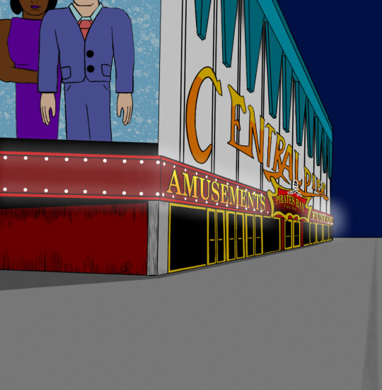
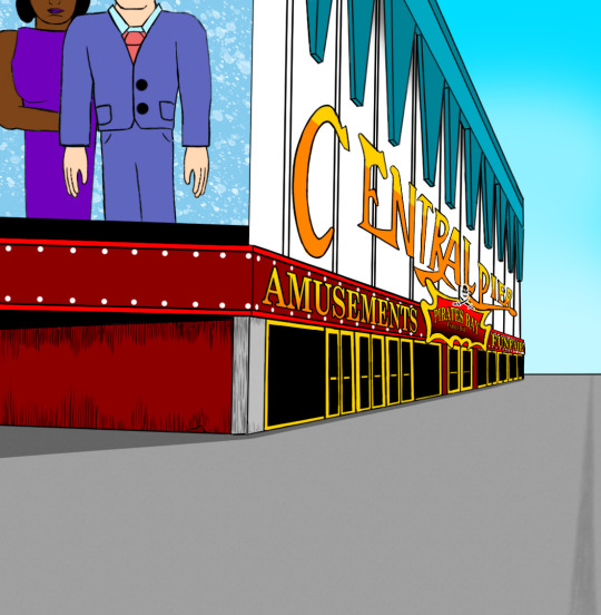


These are drawn images of Blackpool Central Pier entrance which I plan to use for issue 5 of Dasher. I had to do a bit of research to find out what the front entrance looks like so I can get the design right for the story. The Central Pier is where Dasher will be battling the main villain in issue 5 as he tries to save his love interest.
For future use, I changed the skies so I can later use them for future issues in different times of the day. This will save me more time from redrawing the same background image of the locations.

I also made the ruff map layout of the Central Pier based on my research. I looked up on which rides are at the Central Pier and labelled them on the map so I know what rides I should draw in the story.
#Dasher#goodinmaginations#blackpool#central pier#front entrance#Photoshop#Adobe Photoshop#2023#artwork#cgoodin#map layout#layout#blackpool central pier
2 notes
·
View notes
Text
School Dinning Hall - Layout
I have been working on multiple drawings for the school canteen area for the Dasher comic series. It had taken me nearly 3 days to get them all done, as well as the ruff interior map.


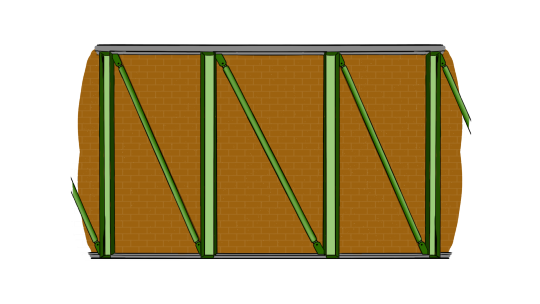
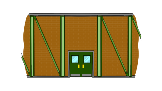

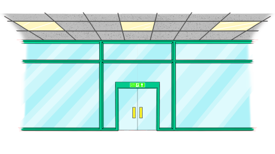

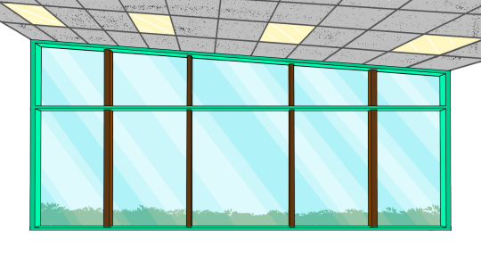

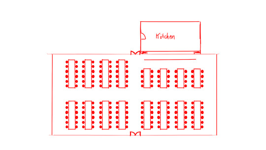
When I first drawn the layout of the school, I thought that I didn’t need to do the interior designs of the canteen area. This was when I first started the series. However, I didn’t want to take any chances in avoiding the work that might have been needed for my upcoming future issues.
I started with the interior walls. Then I moved on to do the outside views of the canteen. In addition, I have done 2 different versions of each viewing angle of the canteen, at day time and at night time.
The Plan I thought of doing with these viewing angels was to reuse them for future issues so I wouldn’t have to keep redrawing them again as I always had done. Thanks to this, I can avoid that so I can get each page of my comics done quicker than before.
#cgoodin#goodinmaginations#Dasher#layout#interiors#Photoshop#AdobePhotoshop#canteen#2022#design#comic#comicseries#superherogenre#artwork
2 notes
·
View notes
Text
Dasher posters
For nearly a week, I have been working on some posters for my Dasher comic series to advertise my story. I wanted to make all of my posters look cinematic based on my research on posters for other comic books.


What I like is the effect that it gives to the viewers, because three of them have backgrounds revealing where the series will be taking place.
#Dasher#posters#design#photoshop#adobe photoshop#goodinmaginations#comic series#superhero genre#comic art#2024#Blackpool
1 note
·
View note
Text
Mistakes fixed
I have completed issue 6 of Dasher. However, before I could publish it onto kindle, I need to fix a few mistakes from my previous two issues.
Issue 2 was about 34 pages long, but my intention was to make it 32 pages long. I have taken out 2 pages that I don't think were needed for the story. Plus, at the end of issue 2, I did some experimenting with Dasher's speech bubbles to see how it would look if the outlines were white and the inside was blue. After doing some checking, I quickly realized that these speech bubbles weren't right for the story, because it had made the text barely visible for the readers to read.. So I made sure to correct the speech bubbles to make the text stand out.
I had comments about the front cover of issue 2 that it should have Dasher on instead of a giant helmet changing colour. Based on the comments, I have looked into the cover and decided on changing the design to make it more eye catching.
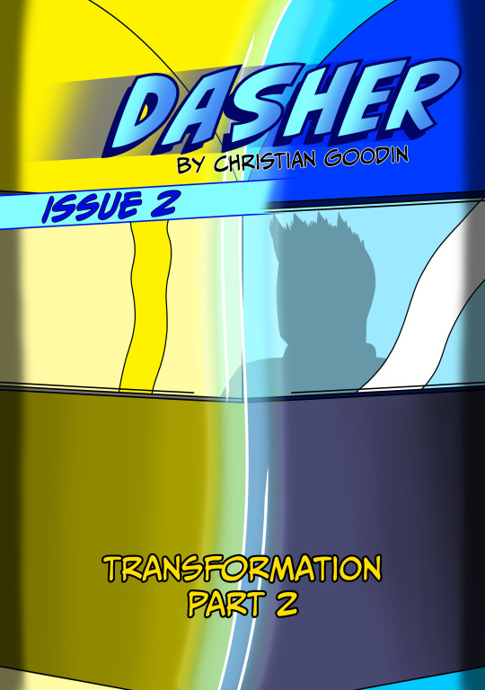

On the left is my original design, and on the right is the new and improved design of the front cover. Instead of changing the colour of the helmet, I have thought about showing the main hero changing from a normal kid into a superhero to reflect on the story as well as the title transformation.
After I have changed the front cover of issue 2, I had to re-upload it onto the back page of issue 1.
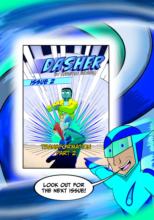
These fixes were needed to better advertise the next issue for the readers. I have completed the changes and I am still trying to find the right opportunity to publish issues 1 and 2 again on kindle.
In the synopsis page of issue 1, there was a misspelling on one of the words. So I corrected the spelling and published issue 1 on kindle without regard to the changes that I needed to do in the first place. I am going to wait 72 hours to see if I will get the chance to publish issue 1 again with the changes I have made.
#dasher#2024#issue 1#issue 2#mistakes#update#synopsis#front covers#comic series#goodinmaginations#transformation#part 1#part 2#Adobe Photoshop#Photoshop#designs#kindle
1 note
·
View note
Text
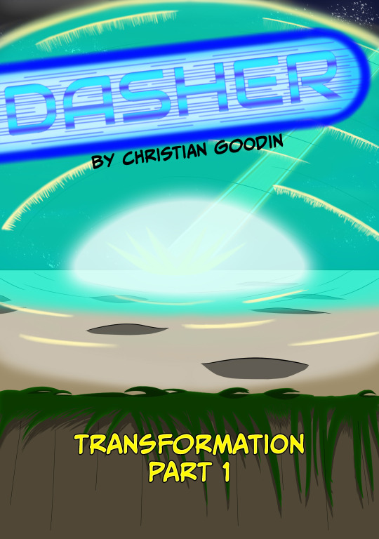
Issue 1 - Update

Recently, I have had an anonymous feedback from someone about the front cover from issue 1 of Dasher, saying that the cover was missing something relating to the character. So I thought about adding the main character onto the reflection of the window as he looks out into the explosion of light as it happens in the story.
I have used Adobe Photoshop to make the update for the front cover. I have also updated the comic on Amazon and on Goodinmaginations so everyone can see it.
#dasher#adobe photoshop#photoshop#goodinmaginations#comic series#superhero genre#design#layout#comic art#artwork#issue 1#updated#front cover
1 note
·
View note
Text
Memory library - layout
In issue 6, I was planning for the main protagonist to enter into their own mind and experience what their own world inside of their own brain is like. I have used Adobe Photoshop to build the layout of the mind inside each character for when they get corrupted by the villain.

The mind will be like a library of memories stacked onto bookshelves. Each book is colour coded to indicate what kind of day the characters have had. In the middle of the library is a stair case. Each level of the library is represented as a year. The library is made up of a green crystal material which reflect on which colour the character would want to have for all of their memories.
In the map layout, you can see the section where I have written coma void. If a character has entered into a coma, then they would have to be outside of the library.

In issue 6 when Dasher is getting corrupted, all the books will be infected with the swarm. The swarm will change all the books into red as a way of corrupting the mind of a character.
#dasher#adobe photoshop#photoshop#goodinmaginations#comic series#superhero genre#artwork#designs#layout#comic art#2023#library#bookshelves
1 note
·
View note
Text
Front room - Layout
I have been working on the layout for one of the rooms in Lucas' house. In issue 6, I plan for there to be a scene where Lucas, Ben and Matthew are recovering after meeting the villain. I wanted to plan the layout of the from room so I can get a good idea as to how it will look in the comic.
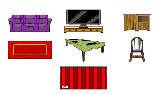
Before I got started on creating the viewpoints of the room, I wanted to list down the furniture so I can make sure I wouldn't forget to include them into the layout. This included the furniture that would be shown in the background of the viewpoints. I had drawn a sort of chart that would give me an idea as to what the furniture would look like in the viewpoints.
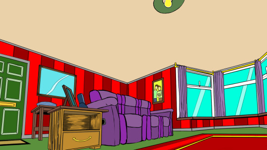


I have drawn 3 viewpoints to get a good view of the room layout. As you can see, I made sure that everything is in place exactly as where it is shown on the layout map. The layout map is what I have used to plan where each piece of furniture will be located in the room.
#dasher#adobe photoshop#photoshop#goodinmaginations#comic series#superhero genre#design#artwork#cgoodin#front room#living room#viewpoints#issue 6#furniture#decoration#2023#Lucas Wilson#home#layout
1 note
·
View note
Text
Blackpool sewers layout
For issue 6 of Dasher, I wanted to plan how the sewers were are going to look by planning out the layout and the look of the sewer tunnels. I based my designs off my research of the sewer drains so I can get the look and feel of them for the next Dasher issue.
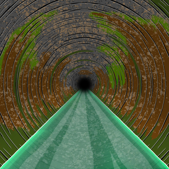
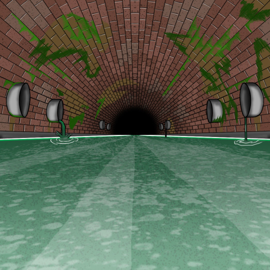
The difficult part was to find the images of what was inside the sewers. Based on what I found, I used Adobe Photoshop to draw these two images at the top. One tunnel made of pure concrete and the other build up by brick with large sewer drains on the walls. On these two images, I had added some dirty texture onto the walls to give it the feel of a place that was disgusting to be in, exactly like how a sewer would be.
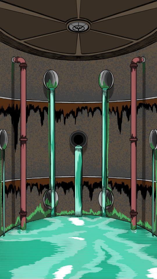
I thought about designing the inside of a sewer pumping station. In the comic, I thought about making Dasher's conflict in issue 6 take place in this exact spot. Again, this image was based on my research on sewers in the UK.
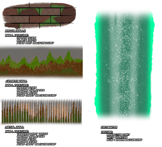
This here is my texture display for the sewer images. I have made a list for each image so I know what texture is on which walls. I've also made a list of textures of the dirty water too.
#dasher#adobe photoshop#photoshop#artwork#cgoodin#designs#design#goodinmaginations#sewers#issue 6#superhero genre#texture#2023#comic series
1 note
·
View note
Text
Dasher - Volume 1 - covers
Since I've been working on a few issues of my comic book series Dasher, I decided to work on the covers for my first volume. I used Adobe Photoshop to design the front and back covers of the volume. It had taken me a few days to get them done before I could join all of my issues together.

On the front cover, I thought about giving each character different shades of blue to match the colours of the main protagonist, but upon thinking that, i thought that giving each character their own colours would be better. The backgrounds of the front and back covers are supposed to reflect on the event called "The shock" which was what gave Dasher his powers.
On the back cover, I did a bit of research into what explosions looked like so I can properly design the shock on the background. I had drawn a dark soot cloud above the shock. Based on the shapes of explosions I found in my research, they all had a dark soot cloud above which carried dust and smoke. I planned the synopsis before I got to work on the back cover, but the words needed tweaking before I was satisfied with the description.
#dasher#adobe photoshop#photoshop#goodinmaginations#superhero genre#design#artwork#cgoodin#synopsis#volume 1#volume cover#designs#2023#front cover#back cover
1 note
·
View note
Photo


As I was working on the comic script for issue 5, I have thought about developing a map layout for the stanzeil science vessel for the Dasher comic series. I used my reference sheet of the alien ship to get a ruff idea of the map layout as well as labeling each area on board.
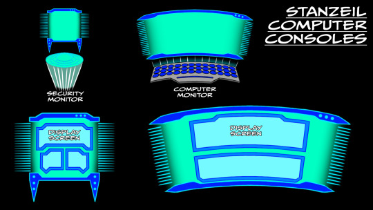
In addition, I wanted to work on the computer displays for the comic series for when the stanzeil characters continue to watch Dasher. These designs will be used as references for when I begin to write issue 5 or more. The design shows that each computer screen has more than one display screen, to make it differ to the ordinary earth computer screens.

In my spare time, I managed to design the camera that would be watching Dasher. I’ve also thought about designing the display screen on the top right side as a reference.
In the future, I will be thinking about designing the interior walls of the ship. I will have to do some research first before I can get started on the interior.
#Dasher#goodinmaginations#2023#stanzeil#layout#map layout#comic series#superhero genre#Photoshop#Adobe Photoshop#designs#artwork#update
1 note
·
View note
Text
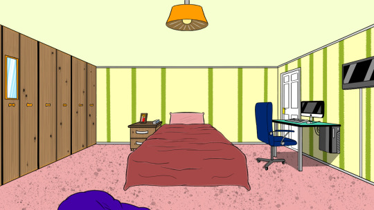
Julie’s Home - Layout
This location was down for issue 5 of the Dasher comic series for near the end of the issue. I started by drawing the layout of the house to have an idea of what it should look like based on my research of all the Blackpool houses. Thanks to this, I have used Adobe Photoshop to design 2 viewpoints of the house in different times of day.
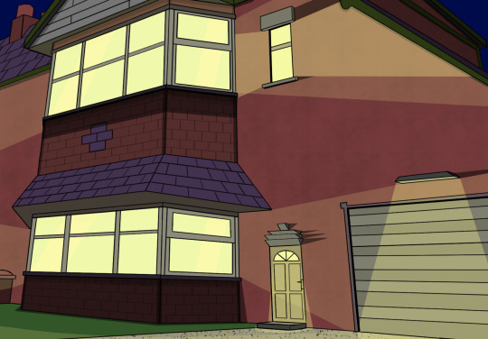

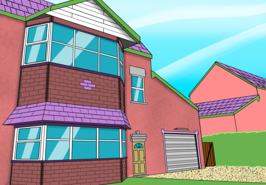

To design the house, I had to start with developing the map layout of the house interior first. I hand drawn the map on a sheet of paper and scanned it into the computer.
I have design Julie’s bedroom within the house thanks to the map layout I hand drawn. based on the layout, I worked out what details I needed to put. E.G. A computer desk, bean bag, TV and a mirror attached to one of the wardrobe doors.

#Dasher#goodinmaginations#Photoshop#Adobe Photoshop#2023#layout#house design#comic series#viewpoints#interiorworks#backgrounds#superhero genre#artwork#view angels
1 note
·
View note
Photo

In Issue 5 of Dasher, I plan to make one of my characters look possessed by Killswarm. This sheet shows my basic plan for what my characters would look like when they’re possessed. I have drawn different body parts to show which parts of the human body would change during the possession.
#Dasher#goodinmaginations#artwork#layout#Photoshop#Adobe Photoshop#2023#superhero genre#issue 5#killswarm#human possession
1 note
·
View note
Photo

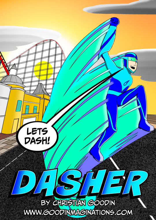
Recently, I have completed the front cover of issue 5 for the Dasher comic series. To create this front cover, I thought about the story line in this issue and created this image to give the impression to the readers for what will happen. Based on my research, I found that there are some comics out there that sometimes have speech bubbles from characters who are one those covers. So I thought about taking a line from my issue 5 comic script and applied it to this front cover.
For this issue, I planned to introduce a character who will be Dasher’s greatest villain and is also a threat to all of Blackpool town. This villain is who I wanted to work on for sometime ever since the beginning of the comic series.
This front cover also shows a girl being carried in Dasher’s arms away from the danger behind the hero. With this image, it will tease to the readers that Dasher does have a love interest. I am hoping that this is what the image will tease to the readers, because this is my first proper attempt to introduce the relationship development between the two characters.
#Dasher#goodinmaginations#front cover#issue 5#comic series#superhero genre#Photoshop#Adobe Photoshop#Rampage#cgoodin#artwork#2023#superhero
1 note
·
View note
Photo
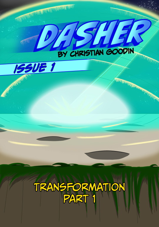
While I’ve been doing my comics, the one thing I failed to notice as a comic writer was the issue numbers that were supposed to be on the front covers. As you can see, I have made some changes to the front cover of issue 1 by adding the issue number as well as making the title font more visible to the readers.
In the previous version, the title did not stand out because of the motion blur behind it. I changed it because I noticed the title had blended in with the motion blur which made it look unreadable. So I went ahead to change it by replacing this title font with a new one I made on Photoshop. I also added a different kind of motion blur and turned down the opacity to make it look readable to the readers.
Once I’ve fixed the front cover, I applied what I’ve done to issue 1 to all the over issues I’ve written. Now, my comic series has a more readable title font on the front covers.


#Dasher#Goodinmaginations#comicseries#issue1#issue2#issue3#issue4#Photoshop#AdobePhotoshop#frontcovers#update#superherogenre
1 note
·
View note
Photo
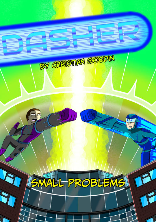
Today, I have just completed the front cover of issue 4 for the dasher comic series. To create this front cover, I had to base it for the story of issue 4 to show what it could be about for the reader. In my personal opinion, I am proud of this front cover, however I am prepared to have it changed depending on the feedback I will get from my viewers.
When I created the front cover, I wanted to experiment more with the shadow layers to give more lighting to the background for the explosion effect behind the building. The explosion will represent the threat for Dasher to face against in issue 4 along with the villain on the left side of the image.
After my previous attempts to make my front cover for previous issues, I have learned that they weren’t engaging enough for the readers to want to see to make the stories look exciting to read about. So based on their feedback, I wanted to draw Dasher and his next villain clashing at each other over the front cover to give a more exciting feel to the story.
#Dasher#goodinmaginations#front cover#issue 4#comic series#superhero genre#Photoshop#Adobe Photoshop#small problems#cgoodin#artwork#2022#superhero
1 note
·
View note
Last Seen Blogs

b1ttersweetzomb1e
snoopy kinnie
zeglyth
tom blyth & rachel zegler daily
goyourwaybro
Go Your Way Bro
lilyskiss
Pop

tofreheatsticks
TOFRE heatsticks