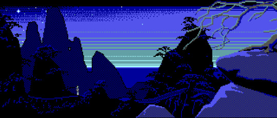
#Torrens
Photo
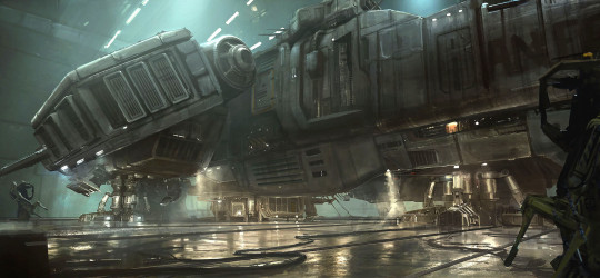
Alien: Isolation (2014)
#2014#gaming#concept art#science fiction#Alien: Isolation#Alien#Isolation#Amanda Ripley#Amanda Ripley-McClaren#Anesidora#Sevastopol Station#Sevastopol#USCSS Torrens#Torrens#MSV-7760#Weyland-Yutani#Weyland-Yutani Corporation#powerloader
195 notes
·
View notes
Text

Max, the handsome Kelpie cross
- Devil’s Kitchen, VIC Australia
#pet photography#devils kitchen#dogs of tumblr#photography#learning photography#torrens#studentphotographer
4 notes
·
View notes
Photo

For more sports content like this follow oraclesportsnetwork on Instagram!
1 note
·
View note
Text
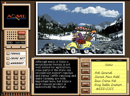
2D Aesthetic analysis of: Where in the USA is Carmen Sandiego (1994)
Where in the USA is Carmen Sandiego? is a PC game from 1993 by Bro/derfund Software that seems to be about finding the wanted outlaw Carmen Sandiego. This game uses a comic style with realistic backgrounds (photographs) and less realistic characters with similarly matching colour palettes that appear in the corner widget on the interface. The backgrounds aren't incredibly saturated and use a lot of mutated oranges, greens, and greys, similar to what you would find in a city, while the characters in the webcam widget are a bit more saturated, though not overly outlandish in their colour schemes. I imagine this is to make the characters stand out. The title character, Carmen Sandiego, particularly is particularly easy to spot due to her iconic red dress and hat, which stick out a lot in the cityscape of the introductory scene in which she appears.
This game's art direction isn't incredibly consistant, but it fits the premise of a detective looking for carmen sandiego well enough. The game doesn't try to be serious and embraces it's cartoony sort of style and logic in both it's writing and it's style. However, I believe that it would have fitted better if the backgrounds where drawn in the same style as the interactive characters instead of real life pictures, the real life people and background with cartoony characters pasted on top is a bit too silly for this game. However, this game seems to be educational, which sort of justifies the real life pictures used.
Overall, the aesthetics of the game work for what the game wants to be, which is an educational game with puzzles and a mistery included, but the style is still quite incoherent and could have done better by including the educational elements but using drawn pictures instead of photos (just drawings of the places and people rather and the actual places and people).

0 notes
Photo

Having calmness and cozy vibes with blue and greens.
1 note
·
View note
Text
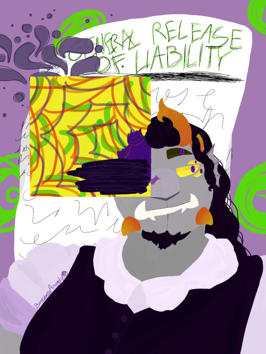
A Wavier Signed in Lime Ink
#Banesberry art#altoclef.exe#GRAGFARATRAGRRGRGRGEHEGEG#Throws this at everyone at Mach 5 LOOK AT THISSSSSSS#I just imported the picture of the physical drawing so the canvas was fucking huge and I was lagging half the time 😭😭#Anyways theres a playlist linked that is custom sorted in chronological order have fun nerds#Torren Arache#buckshot roulette dealer#buckshot roulette#homestuck#homestuck troll#homestuck oc#homestuck troll oc#buckshot roulette art#homestuck fansession#homestuck art#Blasting both fandom tags with my bullshit again
117 notes
·
View notes
Text

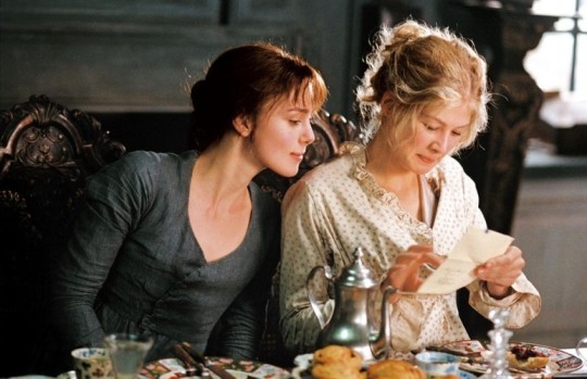


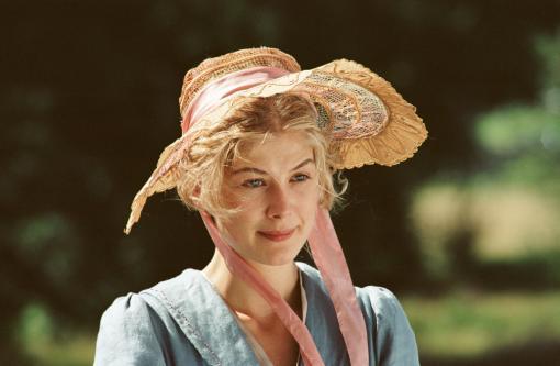
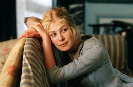

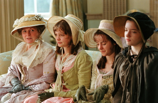

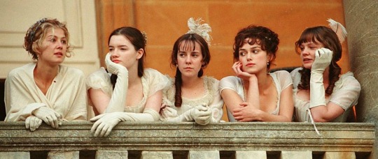


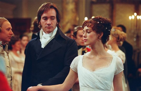
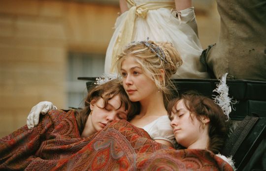
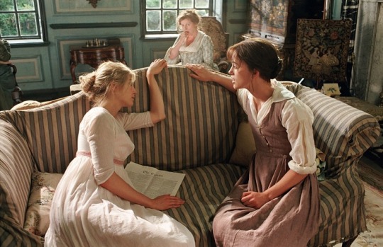


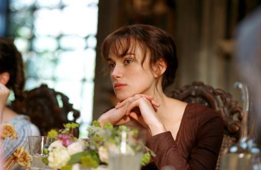


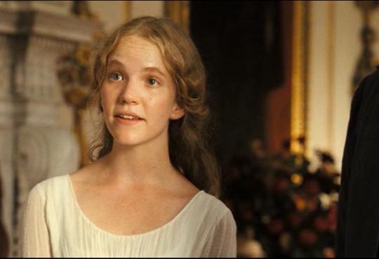
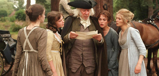

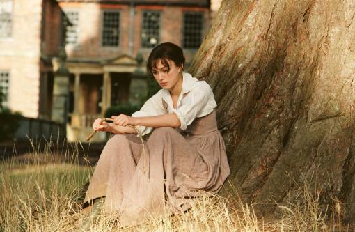


#pride and prejudice#pride and prejudice 2005#stolz und voruteil#keira knightley#matthew macfadyen#rosamund pike#brenda blethyn#carey mulligan#donald sutherland#tamzin merchant#jena melone#penelope wilton#talulah riley#pip torrens#peter wight#tom hollander#judi dench#simon woods#rupert friend#kelly reilly#joe wright
296 notes
·
View notes
Text
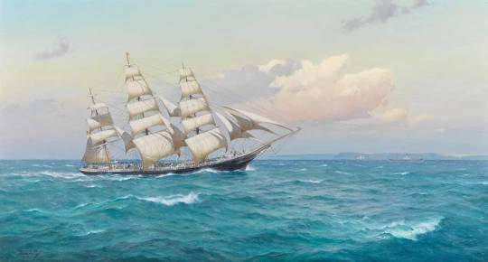
First sight of England. The Torrens, in the Channel, 1893, Derek G.M. Gardner (1914-2007)
70 notes
·
View notes
Photo
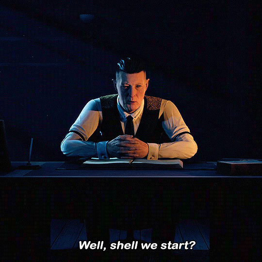


THE DARK PICTURES: The Devil In Me 2022
#gamingedit#horroredit#the dark pictures the devil in me#the devil in me#the dark pictures anthology#the curator#pip torrens#horror games#vg#thedevilinmeedit#tdpedit#mygifs#mikaeled#dailygaming#gamingnetwork
595 notes
·
View notes
Text
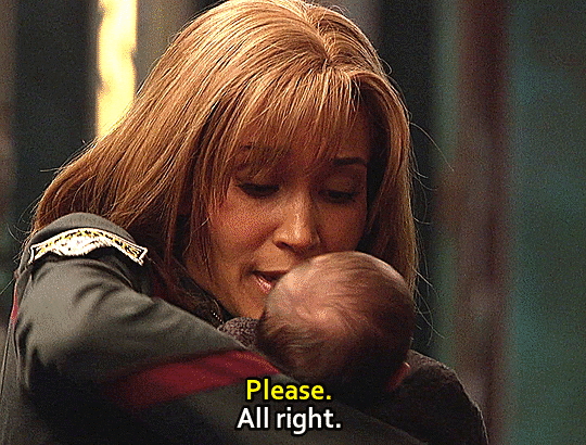
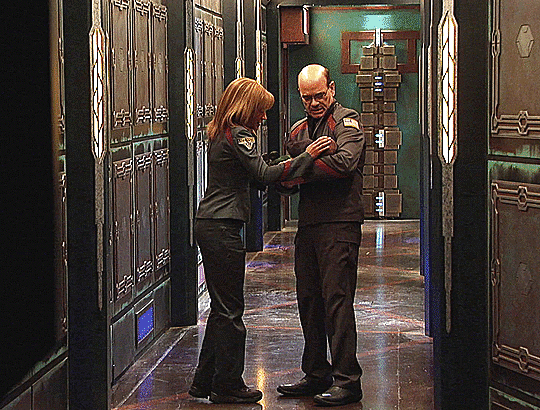
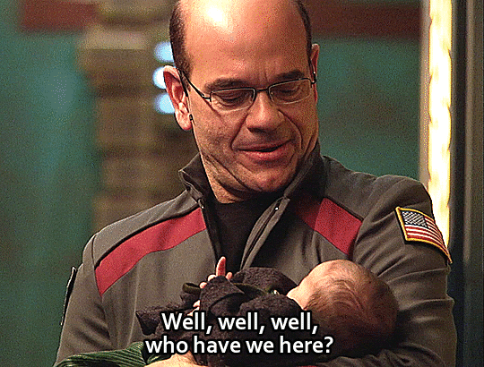

Take this baby and away!, "Broken Ties"
#action mom! AWAY!#Stargate Atlantis#SGA#Broken Ties#Teyla Emmagan#Richard Woolsey#Torren#sgaedit#stargateedit#syfysource#GIF#my gifs#it's not a stargate rewatch rewatch#Hide and Queue
214 notes
·
View notes
Text
34 notes
·
View notes
Text

Trying to sneak up on these kids for a candid is close to impossible. I only have mere seconds before they pull a funny face.
0 notes
Photo

For more sports content like this follow oraclesportsnetwork on Instagram!
0 notes
Text
2D Aesthetic analysis of: Loom (1990)
Loom is a Lucasfilm adventure game released in 1990 that follows the story of a young Bobbit, a member of the weavers guild. This game adopts a dark aesthetic from the get-go, opting to use a complementary colour palette of dark blues and orange, with the former being the most dominant. The artistic approach taken leans towards the realistic as strongly as one can when working with the limitations of the 1990s hardware: The lineart, when used, is subtle and only accentuates the shadows or form of the object or creature represented, creating a lot of artificial detail. Furthermore, shadows and light seem to be favoured over solid colouring.
The game itself has a typical fantasy setting with guilds and magic; however, its writing is rather casual and somewhat comedic for most of it (with the exception of certain characters who are more serious in nature, like the elders). In this way, the game's direction rather contradicts its initially dark aesthetic. However, I would say that the art direction works pretty well as, in conjunction with the lighthearted writing, it juxtaposes an unserious character with a pretty serious world, which creates an element of charm for the game as a whole, which makes it more memorable and unique. It reminds me of Undertale if Undertale had a dark, serious aesthetic.
Some recurrent motifs in this game include the melodies that are used as spells (which are revealed through context and
can then be used whenever the opportunity arises) and strings (which represent the guild of the main character).

1 note
·
View note
Text
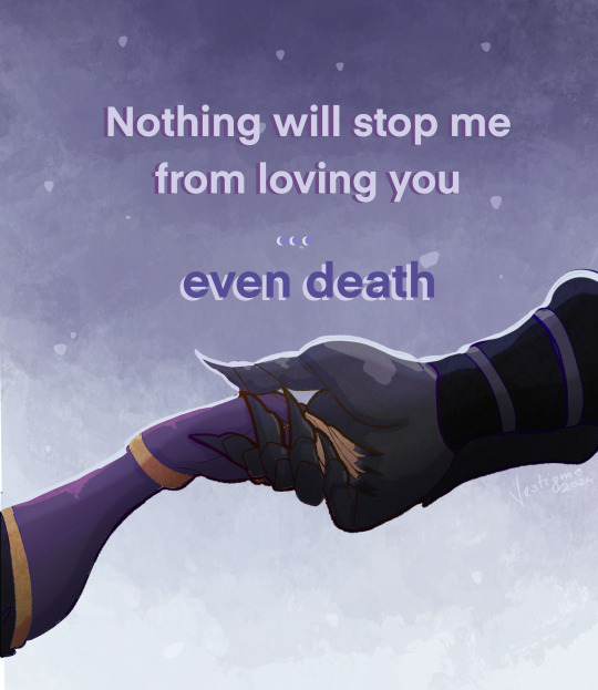
Torren and Manni's confession 💜🫶
#oc: torren#mannimarco#ship: torrenarco#doodle#tes#the elder scrolls#elder scrolls#eso#tesblr#eso oc#altmer#high elf#bosmer#wood elf#I need to draw smth tender#eugh eugh they do evil later#and necro
25 notes
·
View notes
Text
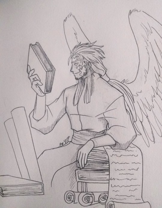
Darksiderstober Day 10: Tomes
Thought it was right to finally include Torren in the Darksiderstober lineup, and what prompt to match him then his love/obsession with Books and Tomes of any kind. He has all sorts of books ranging from the historic to the forbidden, All knowledge in his eyes should be available to those ready to learn about it. Hope ya like and stay tuned!!
Darksiderstober prompts, Art and Torren are mine
Sponsored by @imagine-darksiders and @another-darksiders-blog
Prompts are here
#darksiders#darksiders art#penart#darksiders oc#fanart#darksiders original character#darksiders ocs#darksiderstober art#darksiderstober 2023#darksiderstober#darksiders inktober#darksiders inktober 2023#inktober#art prompt#angel#angel oc#darksiders angel#torren#darksiders angel oc#male oc#darksiders angel original character#darksiders torren#books#male angel#darksiders 2#darksiders 3#darksiders genesis
55 notes
·
View notes
Last Seen Blogs

freedomhypnosisnyc
Freedom Hypnosis


fabitrindade
As vezes pequenas palavras dizem grandes coisas.

thejnlc
The Julius Nyerere Leadership Centre (JNLC)

yeonjoon-s
one day at a time