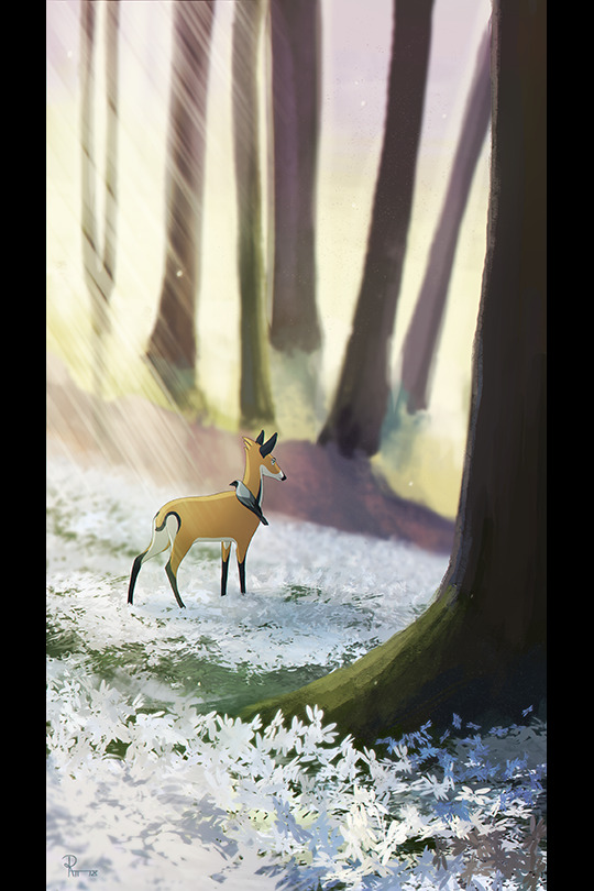
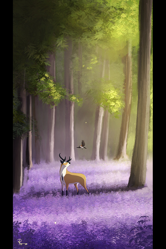
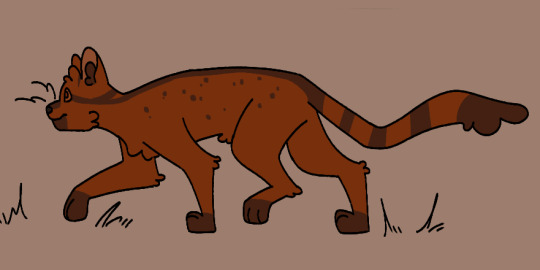
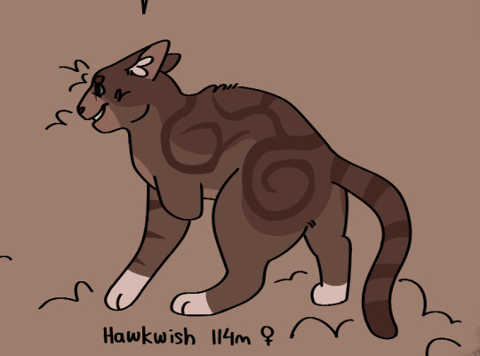
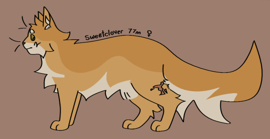
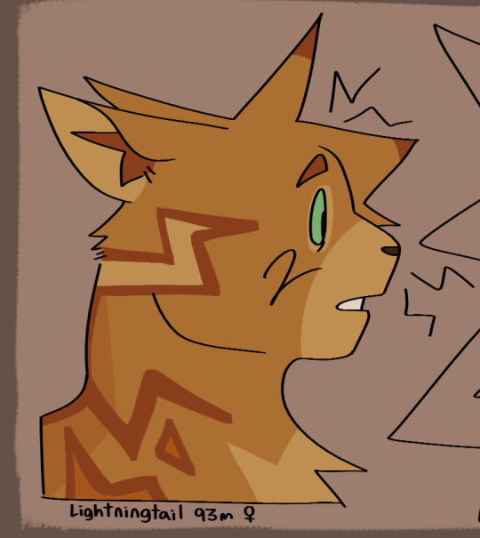
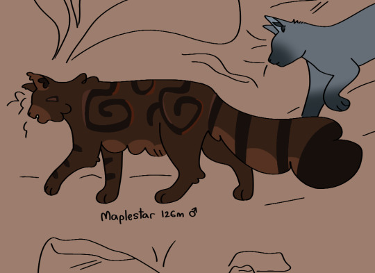
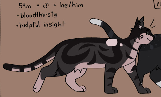
#Wanted to draw them in this simplified style I'm working on!
Text
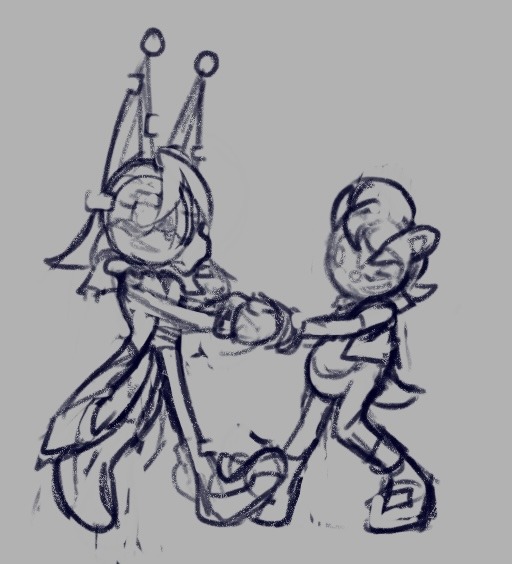
🏠❤️☀️🦋🪶🐛🐾✉️🌸The Neighbourhood!🌸✉️🐾🐛🪶🦋☀️❤️🏠
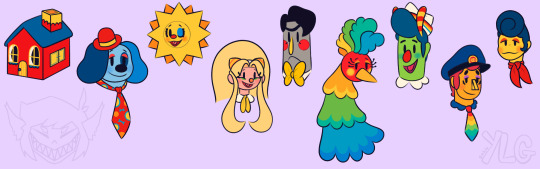
#Grem Draws!?#okay for anyone wondering why im posting this again for some reason it was tagged as mature???#I have no idea why but I didn't know how to fix it sooooo I'm trying again! away#onto my rambles!#Wanted to draw them in this simplified style I'm working on!#love them sm#I'm gonna do characters outside of home now >:}#the canvas is larger than what I'm showing and it needs to be filled!#if I still have space? OC time!#ok. character tag time! no more rambling!#welcome home#wally darling#welcome home wally#eddie dear#welcome home eddie#howdy pillar#welcome home howdy#poppy partridge#welcome home poppy#frank frankly#welcome home frank#julie joyful#welcome home julie#sally starlet#welcome home sally#barnaby b beagle#welcome home barnaby#home#welcome home home
105 notes
·
View notes
Photo

#pastelartchallenge on twitter from https://www.youtube.com/watch?v=nf2Nsbh12Mo&t=1s
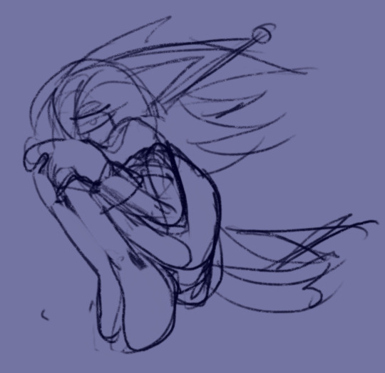
Didn’t do the first one cuz I recognized who it was nearly right away and didn’t feel like doing a from memory challenge lolol
The second one was really fun to follow along with, I based her crop top off a vampire squid cuz I thought that’d be cute. Also I discovered octopus have a sideways eyes! So I put something like that on the bows and in her eyes. I made her hair two twintails cuz they mention the hair has a bow “kinda like Miku” and twintails is what I got from that lolol. I also made the top of the ponytail into that round up-do cuz it kinda looks like the bulbous part of an octopus head.
I think she turned out really really cute!! I hope you like it!!
#pastelartchallenge#I dunno what else to tag this lmfao#haven't been the most satisfied with the way I draw faces recently#but I feel like this one turned out really cute!! Not quite as expressive as I want#but I'm working on it lolol#art rant incoming#I wanna add more stylization#but with all the more simplified styles that I really like#I realized in my very professional studies of their work#that part of their stylization is to really downplay certain facial features or even get rid of them entirely#the most expressive pieces especially#cuz if you get rid of certain features or make them smaller#you can exaggerate the other features without the face feeling cramped#Was referencing a specific artist whose art is just so expressive#and I tried applying what I saw to my own work but it didn't#well#work#lol#and I came to realize that what I liked so much were the expressive mouths they had#but to get these expressive mouths#this artist drew really small noses or none at all#so the mouth could be all over the place without looking cramped#A lot of stylization seems to be like#you have this much space#the face#and you have this many features to choose from#and a lot of other people will start losing features and amplifying others for their purposes#but I'm over here like refusing to let go of a single feature in my grubbie little hands#34#ezil art
3 notes
·
View notes
Text
Lesson 1: "White Man Painted Black"?
Okay, I recognize that this is a strong foot to step off on! But! If you learn nothing else from this series, if you decide for whatever reason to forsake me: this is the ONE perspective I'd like you to take away!
You may have heard this quote before, when Black fans deride a character design as 'a white man with the brown bucket tool'. On its face, it means exactly what was said. But specifically, what it means is that we recognize that whomever designed the character drew the way they normally draw for a 'default' character in their mind- default usually meaning White/Eurocentric features- and they added a shade of brown within the line art to make that character now 'Black'.
Now if you're feeling defensive, wait just a moment! This discomfort is not inherently a bad thing!
I'm going to use both a 'real world' example first, to show you what your Black fans and peers are seeing, and perhaps you will also understand our discomfort!
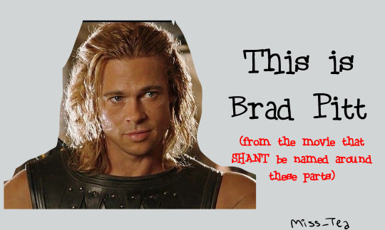
(if anyone was curious, my folder for this lesson is titled 'brad' lmao and you'll see why)
(I'll have y'all know that I actually worked very hard to make Blackface Brad look mildly presentable lmao I'm sorry, I'm wheezing, I can hardly breathe looking at him 🤣)
You see how, despite knowing where this was going, and using one of the darkest shades of brown in my Skin Tones arsenal, you still know that that's Brad Pitt? That nothing about his hair texture, his lips, his nose, or really anything other than the palette change... changed? And you can still see that?
It's incredibly hurtful to be told that that's supposed to be you. You know it's not, you know why it's not, but rather than hearing how it makes you feel unseen and what they could do to be better (since they wanted to draw a Black character!), the artist lashes out at you.
And as an artist, you might have worked VERY HARD to do this! That might be a real handsome guy you drew!! But... is he really Black? Did you walk into it with the intention, that you were drawing a Black Character, or did you draw a character that just happened to be Black? It seems like a silly thing, but it matters!
Okay. I just finished laughing over Brad. Now let's get into some more perspective changes:
Now, imagine you drew a character. You want to make her Black, so you change the hair and skin colors. All right! You have your Black character... right?
Changed ONE feature about her? (You should obviously change more than one feature, but let's just go with the simplified example.)
What if, instead of just changing her palette, we changed her:
Hair?
There isn't nearly enough time in the world, let alone in this little scribble and blurb, for me to describe the IMPORTANCE of Black hair in Black character design. There are so many ways to do curls, afros, braids, twists, locs, SO MANY HAIRSTYLES!! Get used to searching in the 3C-4C hair textures!!!! I plan on doing an entire lesson or two on hair alone, but suffice it to say, Hair Texture is thee BIGGEST giveaway that you 'painted a white person Black'- from cartoon styles to realistic! It reveals itself in your writing as well- just based on how your character takes care of their hair, how your describe the texture, how other people might perceive it... it lets me know just how much research was done. Because we can have straight hair! But again, that's a conversation for a whole 'nother lesson so- come back later 👀?
Lips?
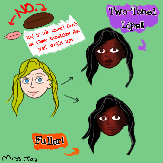
I love our lips, I really do. There's a long history of shaming Black women in particular for the way our lips look. So when I see them done in all their glory, it makes me very happy. Two-toned lips vary in shade and intensity, so make sure you're using references if you want to be 'realistic', but it doesn't have to be that hard. Even a little subtle shift like this in the design/story description lets me know that a creator was thinking about me.
Nose?
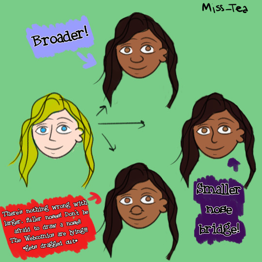
One thing I've noticed ever since I starting drawing is that... people in a lot of mangas/manhwas barely have noses! I admit, out of all the features on the face, the nose isn't the most important. I think they should be, especially when you want to emphasize that your characters look different! People have different types of noses! I especially want to gear this towards those with a goal of drawing realistic portraits and the like- there, the nose is ANOTHER dead giveaway. There are Black people with aquiline and straight noses- we aren't a monolith- but is that why you drew it? Consider why you went for that nose specifically. That's part of the intent, in all this!
Now, you might be looking at me and going "Ice... this is just character design". To which my answer is: Yes! It is! It feels so basic, and yet if you ask your Black friends/peers how often they've come across this feeling of not being properly drawn/written, from fanart to professionally produced works, it's unfortunately common despite how simple of a concept it is.
I hope that you can walk away from my first lil lesson with new eyes. Remember, it's the thought that counts, but the action that delivers!
1K notes
·
View notes
Text

Ever wanted to be a marketable 90s fad that was doomed to fail? Well now your dreams can come true! For just $30 a character I will draw your fursona or character as a floppy beanie plushie :3 DM me if you're interested in grabbing a slot! I'll send you a quick form to fill out ^w^
Commission rules:
- This is for art only! NO physical beanies are being made.
- This is not a YCH! Poses may be similar but each one will be unique.
- Character designs will be simplified!!
- I’ll make it as accurate to your character as I can, but keep in mind these are supposed to be a little silly and wonky.
- MUST have ref sheet or image I can work from.
- No clothing, naked beanies only.
- Accessories (glasses, piercings, etc) CAN be added but please specify! Otherwise they will be NUDE.
- Small items/ props can be added for an additional charge!
- If there is a certain style of beanie not listed here you want me to draw, feel free to ask if I can do it! I only drew a few examples, but there’s more out there.
- A lot of this is customizable, so if you want different tag color, no tag at all, whiskers/no whiskers, a different species on a certain beanie style, etc, I’m open to ideas!
- Payments through Paypal invoice only.
- Turnaround time for these will vary. I’ll be working on them in between my regular commissions.
Feel free to edit your commission and use as memes, icons, stickers or whatever! As long as you’re not selling it, you’re good x)
Update: I had increase the price on these, they're taking me a lot longer to finish than I expected! I'm averaging about 4-5 hours to complete each beanie. Also I've had a pretty big demand for these, so my queue has gotten pretty long! Expect completion times for new slots to be about 2 months.
#sorry i made this way more complicated than it needs to be xD#tldr i'll draw your fursona as a beanie for $30
476 notes
·
View notes
Note
Hey there! Long time lover of your art, and my curiosity got the better of me. I've checked your FAQ but I'm dying to know if you have any tips/tricks for how to render gold. No matter which style you draw it in, whether more painterly or simplified (like for Étienne & Benoît), your gold accents always feel like they have the crucial elements of both warmth and the like. reflectiveness?? ITS THE GOOD STUFF either way
OGH THIS IS GONNA BE A BIT HARD TO EXPLAIN BECAUSE it's a lot of accumulated studies but I'll try ;u;
FIRST OFF: I feel like I have to say that these are all just shortcuts- I've learned just enough about gold to be able to convey the illusion of gold on what I draw, in the fastest way I could do it, for quickly putting the ideas in my head on paper, but this is by no means a comprehensive guide!
If you really want to study the physics of it all, the way it would work with different materials and styles, then I highly suggest doing a lot of self-studies!
Even when painting smth new- if it's really something I want to work hard on, I tend to have gold references open on the side so I can look at them and figure out how they work!
Ok, so moving on:
I like to look for references because the type of gold/material is going to affect the reflectivity and the way I'd shade it, but by default I love doing the more chrome-y type of material on my stuff bc it reads the best as gold, yanno? Unless of course the thing I'm doing calls for more matte/textured types...

Then depending on the colors surrounding the gold item, as well as the colors on the gold item, I can figure out the colors I want to use!
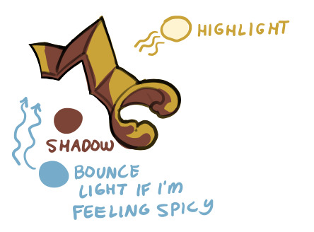
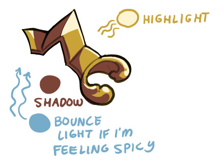
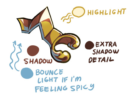
By default though I like using a sort of yellow or yellow-orange with deep browns for the gold itself, light cream/white for the highlights and light blue for the bounce light (which is actually the simulation of an effect where the blue sky's color bounces off the ground and up onto your item!)

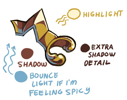
I feel like the 'warmth' that you are seeing is the interaction between the reds and yellows of the gold, contrasted and made much warmer with the blue bounce light!
It's hard to see on the next one, but I airbrushed the Highlight color on an Overlay (sometimes an Addition) layer, which helps add a glow!
For the Genshin style mockups I had to do some research because the specific way of shading gold that the MHY artists utilize usually go for less saturated, lighter yellows and browns, and not everything is shaded chrome-like!

You can see my attempts to mimic the flatter shading on these parts of Etienne's outfit:

and then return to my more usual shading methods on these next parts, which were more in line with the shading on the red box in the examples above!
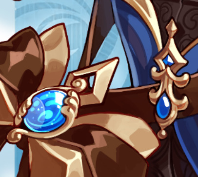
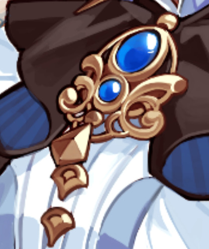
it's a bit long, but I hope you find what you were looking for in here somewhere! ;u;
495 notes
·
View notes
Text
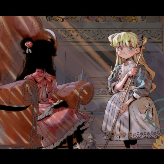
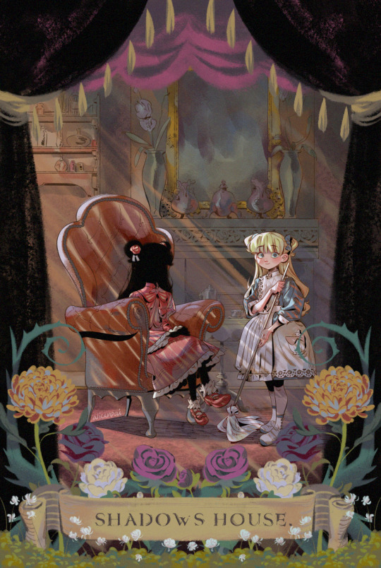
the shadow and her living doll 🌹🌼 print for montreal otakuthon! come see me at next week from aug 11-13 ✌
you can grab it as a print here if you so wish ! WIPs & other thoughts under the cut
shadows house is such a fantastic series & i wholeheartedly recommend it... the story delves into super dark horror elements but doesn't present itself as a story with no hope. hope must be found and then tenaciously gripped with all one's heart, much like pandora's box. it tickles the victorian gothic part of my brain forever imprinted on me since i was 14 haha...
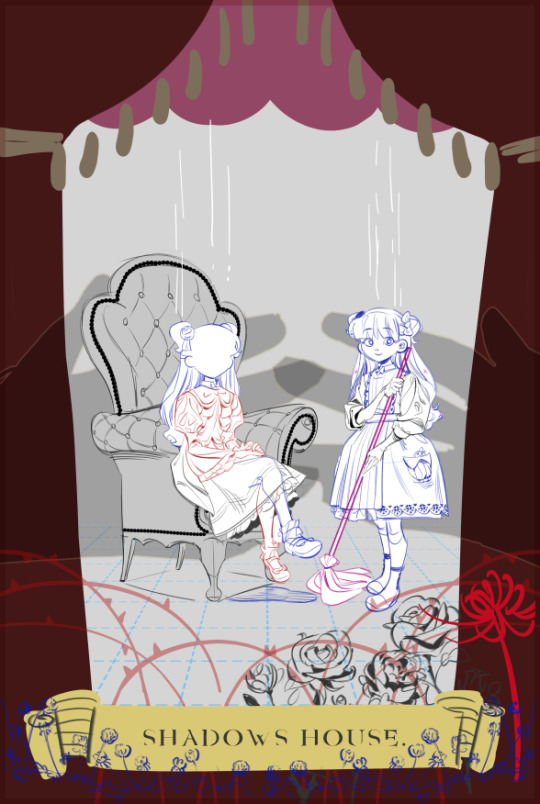
in the first draft i had marionette strings hanging above the characters (kinda reminds me of Erased.. since I just finished rewatching that ahaha...) & shadow puppet hands on the sides, almost as if gripping each character. i decided against it in the end, to let the characters shine in the spotlight (literally).
i also wanted a more active or lively pose, but kept in line with the stiff victorian portrait style, caused by long camera exposure times. i'm not sure if that worked out better bc i'm unsure if this drawing is interesting to people wahahaha.
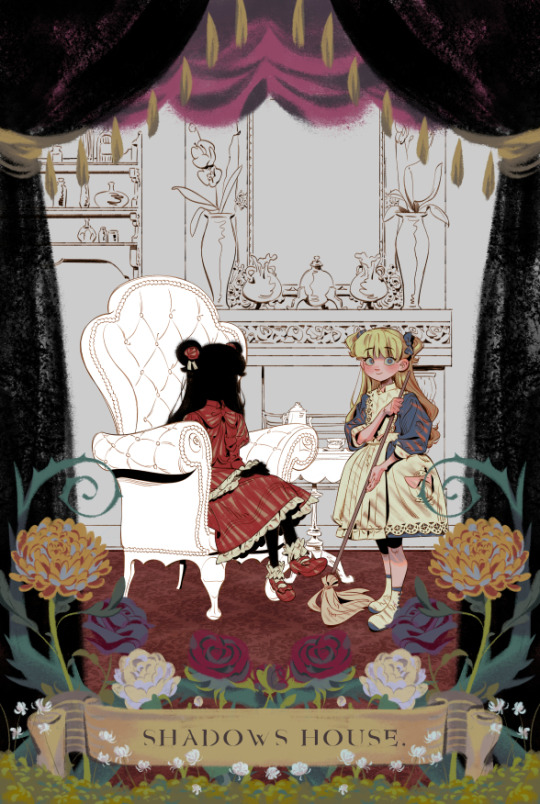
initially i also wanted more of a dollhouse theme, but each draft got more and more muddy, so i decided to save it for another day (i'm around ch 90 in the manga, so probably a good call to save a more complex idea until i'm all caught up)
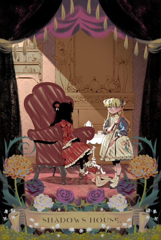

^ quick 5 min style test i posted recently! in that post i stated that i wanted to streamline and simplify my art style more, especially after the recent bunch of illustrations i did in the past winter that took way too long to complete, at the sake of my health.
im continually looking for areas to simplify more in my art, but one of the areas i will NOT skimp on is depicting fabric!!!!!
what also helped was working on my sense of structure in my spare time, so that i could be better at depicting form without relying so much on shading to show 3d forms. i love colouring, but i need to be working smarter, not harder from now on. using 100000 shades and highlights is just not feasible anymore wahaha.
in this drawing i loosened up with the bg and kept it rough, inspired by the wonderful xeroxed bgs of 101 dalmatians, and only implied details, rather than actually rendering all of them.
the tldr is that i draw too slowly i just would like to be able to make more drawings more often!!
901 notes
·
View notes
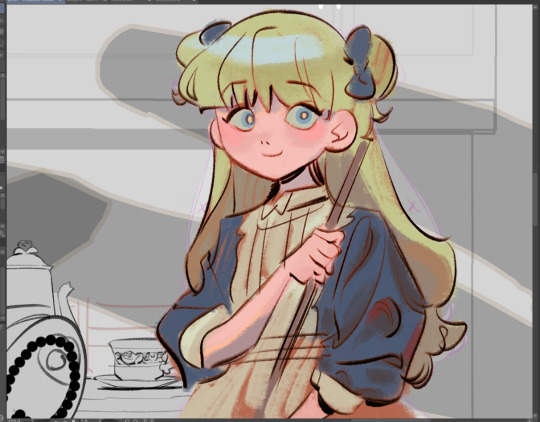
Text
Another much overdue ask compilation!
Some short-ish lore asks (Gale, Gort, DU drow relationships and pet-companion preferences) and a couple of art/advice ones sprinkled in. THIS IS BY NO MEANS ALL OF MY ASKS so as usual I appreciate everyone's patience!
I actually think he'd give them a pass entirely as soon as he noticed. Correct me if I'm mistaken but half-drow get No love from underdark drow and are usually surface babies right? So that fruit is miles away from the tree lol.
I think he generally has a bit of a soft spot for mixed kinds since he himself feels like an amalgamation of sorts.
Thank you! They're kind of a pain in the ass to draw at times for that very reason but man I do like the look 😩if other people like it too then that makes it all worth it!
THAT'S TRICKY TO ANSWER BECAUSE OFTEN TIMES I'M NOT... REALLY TRYING. I've draw a ton of horror comics for mine and my partner's series' SAD SACK and SORTIE, so I think it just comes naturally to me 😅 also I do genuinely find expressive and, uh, rugged faces more attractive? (I think they look rugged, again that's what people tell me at least.)
I think the secret might be adding bits of realism in there. I get a lot of comments about the wrinkles and eyelashes I add to my art, as well as the way I draw individual teeth (though I've lately been making an effort to simplify my style in favor of drawing faster, so I haven't done that as much or in as much detail.)
Both symmetry and the lack of it can also add to that effect. I have employed both facial unevenness and almost point-perfect symmetry to achieve something a little frightening or otherworldly in my work.
[MORE UNDER THE CUT]
Thank you so much!!! The contrast is very much intentional, that's what DU drow's character is all about ;)
Hahah well I somewhat doubt Bhaal would care that his spawn gets named, but either way he stripped himself of his name as soon as he killed his foster parents and abandoned the Underdark. He had a drow name that I jotted down somewhere but it's completely irrelevant because nobody has used it since he was a child, and he doesn't remember it (even pre-tadpole/having his brain scrambled.)
Here's a little write up about his origins that might shed some more light on that:
https://meanbossart.tumblr.com/post/739688837431836672/did-drow-ever-have-a-childhood-before-the-temple
And about his original drow-given name and the reason behind it: https://meanbossart.tumblr.com/post/741350986692591616/drow-had-to-have-been-given-a-name-by-his-adoptive
Everyone just referred to him as his supposed race, or as Bhaalspawn or Bhaal's child, and any other similar titles. Orin called him "kin" and "brother" and Gortash likely called him his associate. Post-tadpole the camp grows entirely used to calling him "the drow" and he has no desire to change that or to choose a proper name.
THANK YOU BOTH SO MUCH😭 no reason to be intimidated, I'm just some rando drawing BG3 fan art LOL
I've been drawing since I was a child, and started taking it semi-seriously when I was 16 years old, so twelve years ago! That's around the time where I got my first non-display tabled and used that well into my twenties, prior to that I only did stuff on paper and liked to do inks color with pencils. I never really ventured into traditional painting at all except for a little bit of water-coloring in college.
Traditional and Digital art are very much different beasts. Which one you want to start with is, in my opinion, just dependent on what you want to do. Digital art gives you a lot of tools that makes learning easier, but you might find yourself having much steeper of a learning curve if you ever decide to do traditional art instead. If you want to be good at both, you need to practice both, since the skill doesn't entirely translate from one medium to the other.
Naturally you will be able to draw well on either, it's just... Different. I will say though, that I think if you're still learning you should use whatever allows you to look directly at what your hand is doing, so either traditional or display tablet/Ipad. I have no idea what a non-display tablet would do to a beginner, but remembering my experience with it I feel like it might be a huge detriment to developing the skill (feel free to share your experiences in the replies if you disagree, as I would definitely be curious to read them!)

YOU KNOW ME BABY IT WAS MESSY AND COMPLICATED the tldr.: is that they were "buddies", absolutely no romance intended there on either mine or DU drow's part, but due to his nature the friendship was extremely weird.
Here's a couple of replies where I go into more detail about it:
https://meanbossart.tumblr.com/post/739191190871818240/i-dont-have-a-particular-question-in-mind-sorry
https://meanbossart.tumblr.com/post/744952815768764416/so-not-sure-if-youve-covered-this-but-i-thought
That's definitely reserved for the vamp LOL DU drow very much enjoys when Astarion teases and fusses over him, and while Astarion probably got a kick out of acting that way around such a big and scary looking guy at first, I think by "now" (later and post-game) he's pretty much immune to DU drow's looks and just enjoys doing it in earnest.
He's not at all averse to being touched (even rather intimately) by close friends, but he wouldn't be quite THAT vulnerable with anyone else.
HE REALLY DISLIKED GALE... He irked him out by seemingly fostering a rather persistent romantic interest in him for at least half the time they spent together (very much based on my interpretation of their in-game interactions at the time, though my Gale might have been a little bugged.)
But also they had a... Fairly in depth relationship still? Gale was a staple in my party, and even though I antagonized him constantly by the end of the game it still felt like they had so much weight in each other's lives, if that makes sense. I might need to do a bit of an "update" on the DU Drow/Gale lore sometime, I feel like I've had some thoughts since that warrant more exploration of their dynamic (you can find a lot of old asks about it if you just search the Gale Dekarios tag in my blog though).
The gist of it is that DU drow found him arrogant and duplicitous, his constant optimist irritated him to no end and felt like it veiled a stream of self-pity (two things DU drow despises) Gale's attempts to get through to him only added insult to injury. By the end of the game he decided to pursue the crown of Karsus and this only lost him even more respect in Drow's eyes, seeing as he doesn't value godly power at all.
I was pretty overwhelmed by the game at the start so I actually missed a lot LOL including Scratch. I did get the owlbear cub though, which DU drow gladly welcomed into camp since it was injured - but I think he would have wished for it to remain a wild animal and to return back to it's home after it had grown up a bit. He didn't really make a "pet" out of it more than he just looked after the little guy in the way it's mother might have, probably with Shadowheart's help.
He wouldn't be opposed to proper pets though if one were to stumble into his life. He'd definitely be more of a cat guy because of their independence and strong little attitudes.
It is very hard to build proper rapport with him. He will be "friendly" to most people who have a good sense of humor about them, but friendSHIP is another thing entirely.
I think it's kind of circumstantial. He's very economical in his relationships and doesn't really seek them out at all - so a situation where he's forced to be in someone's company might be the only way to develop a bond with him, as he doesn't appreciate insistence either and that's more likely to push him away. He doesn't value status or titles either (kind of looks down on them really) so that won't help.
I think he just likes people who are true to themselves and their nature, sometimes even if the nature is one he disagrees with at it's core. This is why he liked Gortash, why he and Shadowheart got along so well, and why him and Astarion fit together so seamlessly despite seeming so different. Likewise I think it's why he didn't jive with people like Gale or Wyll, because they seemed to be rather... Dishonest with themselves and their own end-goals.
153 notes
·
View notes
Note
I love Golden Shrike! I've had my own comic idea for about a decade now, but I'm wondering, for you, how long did it take you to be confident enough with your art to start your comics? had you attempted panels and backgrounds earlier and didn't put them out because you weren't happy with them yet? I'm almost done with my characters and writing but I'm worried I'm not good enough to actually start doing panels
(these are just my views and experiences! there's as many approaches as there's artists)
I was BAD when I started comics, but then I again I was a kid who didn't care if my bunny-cat-digimon comics weren't good enough, it was just fun to do. Which is what it should still be, fun and a fulfillment to you. I think the happiest an artisit can be is when they can draw like they have no audience.
My comics stopped in my teenhood when I actually wanted to make something good. I made so much groundwork but VERY rarely got to the actual page production because I thought everything should be perfect, but we all know there's no such thing. When I noticed all my attempts were doomed, I stopped making them for like ten years until I was zapped with Fuck It We Ball-mentality. And it's the best thing that has happened to me. Childhood whimsy. Make your own toys.
Did I make test pages for Golden Shrike before starting production? Well, the first page of the comic is a test page. And the second page. And the whole first chapter. I just never stopped. Not smart but it's what works for me. Starting these 'test pages' has kickstarted two bigger comics for me, Golden Shrike and Jet and Harley.
Sure I made couple of style tests for GS even though I had a clear visual vision from the start, but Jet and Harley I just started to draw without any real practice pieces, just based on couple of CSP brushes I wanted to use. This isn't very smart as you'll likely find out later that MAN, this style takes too much effort, but if you're unlike me and don't care so much for consistency, you can always simplify it on the fly. And even I've had to change it: I stopped shading after chapter 5, briefly used 3D assets in upcoming pages, now I'm gonna shrink the font a little. They're teeny tiny things for readers, but huge for me.
There's many comic authors who like to plan every little detail before getting to work, but it doesn't work for me so I can't say much about it. I have a skeleton to follow, but I fully flesh out each chapter one by one when I reach them with pages, because I like to revisit my old visions with fresh brains. When you actually get to work, you might realize some scenes aren't needed, or they'd be better changed. Don't be scared to crack some ribs off your story skeleton. Being too loyal to your old vision can often hinder you.
Starting production is the biggest monster in comic making, but after the first step you'll mow over it leaving it in your dust and create a baby you can be so proud of. I wish you, and everyone else on the cusp of their projects GOOD LUCK, HAVE FUN, LOVE YOUR WORK.
197 notes
·
View notes
Text
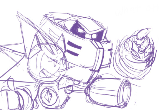


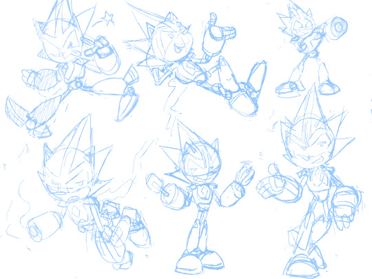
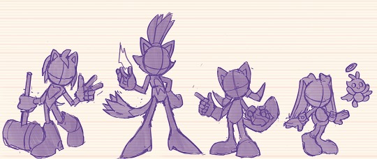
Sonic WIPs and Scribbles from 2023 (Notes Below)
Gave Chaos the Angel Chao ... "Ears" ? So that All Forms (Neutral/Dark/Hero) have some form of Representation. (The two split ... Hair? Things? In the back already resemble the Devil Chao, since the Light Chao only has one.)
Solaris Exists! ... Crazy. I recall this redesign being bit tricky because it was just so hard to see what the fucking thing looked like Originally, but I did my best. Tried to show the Bird/Eagle Theming, and to simplify the design so People like Me could understand it. I wanted this design to look like a counterpart to Chaos -- because in this AU, Solaris is from, you'll never guess...the Sol Dimension!
Gave Team Dark a sort of... cohesive color scheme with eachother, so they really look like a Unit. Plus, Rouge wearing Red just... Makes sense, considering her name, even if I enjoy the Purple color scheme as well.
Similar color scheme thing here with the Babylon Rogues -- They all share Red/White/Yellow -- I took the darker colors out of these designs to not be so similar to Team Dark haha. The amount of points on each of their...Chest...Fluffs?? matches the amount of feathers they have on their head Respectively . Changed Storm the most -- I wanted to make his "Hair" Silhouette more Unique from Wave's, and really just wanted an excuse to give a character a Cool Jacket . The Shoes ... I phoned those in a bit, I'll probably change them Later...
Sharddddddd. Throughout my Scribbles (including some here) You might've seen me struggle to decide what Quill Style to give him -- his OG style? Or the Metal Sonic style? Eventually, I decided I didn't need to choose -- I could do both. It's not demonstrated that well in these, but it's basically the same style the Bits have in Sonic Universe: The Silver Age -- just thinner and more Pointy .
Ahhh Faceless Jumpscare! This is what they look like when I'm trying to work on Poses and Colors but don't want to Commit to a Face yet, haha . Nicole, I'm always changing her design it seems -- don't be surprised if it happens again! But I based her handheld off various devices Tails uses -- I wanted it to be compact while being more Modern than the Nokia Flip Phone. Changed her hologram form slightly to resemble her handheld -- her ears are the antenna, and the rings are on her feet like how the ring is plugged in at the bottom. Made her vest longer too! So it looks more like her Reboot Outfit . Just a little.
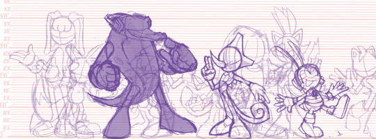
And that's mostly it! I've been on a quest to draw Every Character in my Sonic Au -- I've sketched about... 35 so far? Here's a Screenshot of a bit of the Madness on that canvas haha.
#sth#shard the metal sonic#blaze the cat#chaos 0#marine the raccoon#storm the albatross#e 123 omega#solaris#nicole the holo lynx#sally acorn#shadow the hedgehog#rouge the bat#jet the hawk#wave the swallow#amy rose#cream the rabbit#silver the hedgehog#sonic au
111 notes
·
View notes
Text
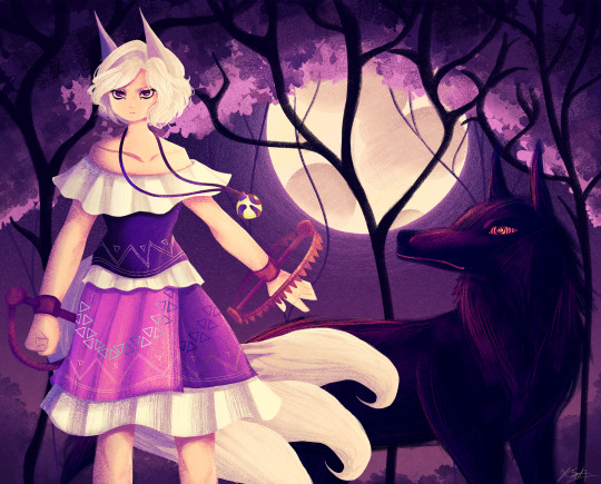
Ok the WIP I posted a little while ago is no loner a WIP yipeeeeeee I am so tired of looking at this drawing.
Artist's Notes:
THIS DRAWING IS FINALLY DONE YAAAAAAAAAAAAAAAAAAY!
Ok so this drawing was a WIP that I had had sitting around for a while, and so because I wanted to do a test run with the new face style I'm trying out, I decided to pick it back up again. Now you may notice that compared to the other version of the WIP, the shading is different, and that's because I had to change all of it to match the light source of the moon, which was.... not exactly fun (especially cuz I stayed up late at night to finish this which was tiring), but it was worth it because I am a lot happier with the shading now. Also, when I initially redid the shading on the white trim of her outfit, I ended up making them look like indiscreet white blobs that just looked... bad, so I had to fix that and I think it looks a lot better.
My favourite parts of this drawing have to be the face and the hair, though I'm not surprised about how much I like the hair since hair is my favourite thing to draw. Also the wolf, I really like how the wolf turned out, since I also love drawing animals from time to time. I also like how the background turned out.
Also, Enoko's design was a hit hard to get right, and I decided to add the white trim separating her shirt and skirt mainly because I didn't like how abruptly it changed in the original design. Also, for some reason her dress makes me think of 1800s-y southern/western clothes, which has given me the headcanon that Saki gave her these clothes when they first met. Makes me wanna draw the two of them together in very western styled clothes, I think it would be cute. I also changed up some of the colours on her original design to fit in more with the palette that I was going for with this piece. Also, I like how her tails turned out, mainly because when I was working on some of the sketch for this I tried to make them smaller, but they didn't look right so I just went "fuck it" and made them big and poofy. Also drawing her wolf ears was fun, I like drawing simplified wolf ears like that. Overall, I'd say I did a good job incorporating elements (like the bear trap hands, the tails, the gem) in a way that didn't feel like they were out of place in the piece (something I was concerned about with Enoko's design).
All in all, I wouldn't call this my best work, but I do like a lot of aspects of it. I've also noticed that I'm kinda getting a bit frustrated with certain parts of my style like the lighting (mainly the lighting), so I think I wanna try and branch back into that more painterly style that I started out with when I first started posting here while still mixing in some elements of my lineless style. Also, I need to get better with my colour values, mainly just for clarity since I kinda think that's where this drawing falls flat a little.
100 notes
·
View notes
Note
Related to FallenClan designs! All your designs are super amazing, what’s your simplifying process/how do you decide design for cat pelts? Cause I always struggle with simplifying/deciding how they look especially bengals and cats with white patches… thanks if you respond!
I’m ADHD and struggle with consistency and simplifying lol, though more complex designs are pretty, I lean more towards what you do w/ you’re cats as they are simple but still super pretty + it makes it easier to consistently draw them all for stuff like this! (These comic like moon updates :])
(Also hope none of this came off as offensive, it’s all meant positively! I really really admire you and your designs :])
ty for the compliments!!! very sweet ask and I shall do my best to give a good response o7
generally my method with designing characters/drawing is to just wing it. fuck it we ball basically. but i DO take a lot of inspiration from other people's warriors art, taking the time to analyze what i like about their styles and what different sorts of patterns i can use
(i also regularly consult the Clangen Sprite Guide for better looks at white patches/tortie patterns and such, highly recommend)
the first thing i decide when i'm designing a new cat is what fur texture i want them to have. i have four that I pick from (pictured below, in order), wavy, spiky, curly, and square.
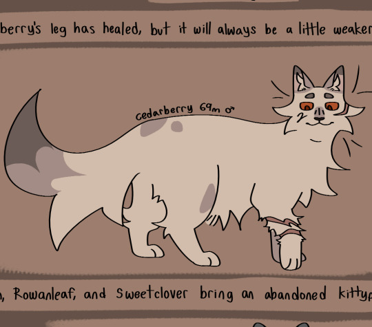
i decide the fur pattern based on the cat's personality (a more stoic cat might have square fur, while someone more bubbly might have curly, or someone more excitable have spiky, so on and so on), and also based on their parents/how many cats i've designed with that fur pattern recently.
after that is snout shape, which is probably my favorite part. i love to draw cats with a very pronounced snout, not unlike an oriental shorthair, but i generally slide around between that and a more typical, stubby snout, occasionally veering off into the very square snout of a maine coon. this is also a great spot to determine how sharp you want their jaw to be, which is something that can really help set a design apart! (a couple of snout examples below)
then i usually move onto colors. i like to pick an undertone for the cat first, so i know what sort of pallate to work with. as you can see in the pictures below, ravenstar has a purple/blue undertone, and toadbelly has orange/red undertones
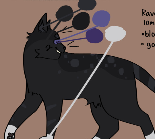
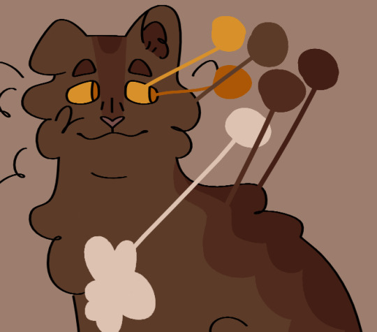
this helps me make all the colors look nicer together, so i don't end up doing something like making a very warm colored cat with blue-toned white patches (which would make the white patches look super cold/too bright), which can be a really cool stylistic choice, but isnt what i tend to go for
once i've drawn out the cats fur shape and picked my colors, i'll move onto the base coat. over my time of having the fallenclan blog i've discovered that having a very simple pattern underneath the normal pattern can add a lot of visual interest to a cat, and make them look less plain.
here's a good example! one of the first cats i designed, oaktuft. their pattern was super basic--one base color, plus the inside of the ears, and then the color of their patterns.
and here's another cat that i designed a little more recently--Shiverspots! you can see that even just the small change of adding a bit of a lighter color to her underbelly made a world off difference. plus my style got a lot more defined lol
i have a couple of different base patterns that i use. here's a few more examples. i've even started to experiment with more than two colors!
once i've got the base done i move onto patterns. this part can definitely be tricky; trying to make a dozen brown tabbies with short fur be distinct can be . a challenge. i like to follow the steps of what i've already designed--a cat with spiky fur might have very sharp, angular stripes, and a cat with curly fur might have much rounder ones.
i think a good rule of thumb for if your pattern feels a little too basic is just to throw some more colors in there. another shade of orange, a more pale tint to some of them, whatever. and don't be afraid to erase it and start again! sometimes a design just won't work, and thats fine :)
the final thing i do is to add little design quirks. a particularly sharp jawline, downturned eyes, a crooked smile or a gap tooth, whatever! little things can really give your cats character.
i really hope that this helped!!!
#fallenasks#fallenreferences#<new tag i guess???#looking back at this i suppose i lied at the beginning . i do have somewhat of a method
61 notes
·
View notes
Text
Ninjago Remastered Designs!

THEY'RE DONE! After months of work!!! They are DOOOOOOOOOOONE. WOOOOOOOOOOO! Lol! Welp, these are my Ninjago designs! Basically, this is my take on the Ninja if they were in a 2d animated cartoon! And yes! I will be drawing more characters. Tumblr butchered the quality, so close ups and design notes are below the cut. They're pretty detailed, so I highly recommend checking them out. Feel free to ask questions about the designs! ⬇️⬇️⬇️ - ✒️🐉


When designing these outfits, I tried to take inspiration from the ones in the show. And in terms of art style, drew inspiration from early 2000s cartoons, (Action Adventure ones specifically,) Anime inspired shows, and even a hint of traditional Disney animation. And while I designed them with a 2d cartoon in mind, most of the designs would most likely have to be simplified for them to be used in animation. So let's get started!
Kai: Kai was a pretty fun to work with. I actually didn't plan on giving him a sleeveless outfit. But it happened! And I like it! If you'll notice, the flame pattern on his vest mirrors the pattern on his sister Nya's outfit. I thought that would be a cool detail to include. It was inspired by their March of The Oni outfits. I also made sure to include his scar and bandaid. And gave him reddish brown eyes to signify his elemental power. Him and sister I imagine being Brazilian/Taiwanese. So I hope I captured their ethnicity properly. I'm pretty happy with this design. Especially his hair, which was hard to replicate.
Jay: Jay was a hard one for sure. I wasn't too sure how to vamp up his outfit. So I started by giving him some lightning patterns on his Gi. (At least I think that's what it's called?) And I decided to make it look a little baggy and soft. It just seemed to suit him. I tried something a little more form fitting and didn't look right. Also! A fun detail I included was his half the Yin Yang pendent around his neck! And of course Nya has her half. I imagine him having Irish ancestry, so I gave him pale, freckled skin. And gorgeous curly red hair. (As a fellow red head, I'm very proud.) Overall, I think he turned out pretty adorable. And his face is spot on.
Nya: Nya I pretty much got right on the first try! I just had a really clear vision of her in my head. I gave her a grey outfit with bright, vibrant blue details. The pattern on her Gi is inspired by Koi Scales. And she has her half of the Yin Yang pendent around her neck. I really like this one, because while it is simple, it's beautiful. And I think it reflects her element nicely. The only thing I missed was to give her a symbol like the rest. But overall, I love it! One more thing is that I wanted to give her and Pixal different hair. So when I finally release my Pixal design, you'll see that while they both have ponytails, I gave them different cut and styled ones. Should be neat!
Zane: Zane was the first one of the Ninjas I redesigned! I love how he turned out. I tried to give him a splintered ice effect on his outfit inspired by his Core minifigure and gave him his faithful falcon companion. Falcon has his old greyish purple feathers, but blue icy eyes to match his owner. I also wanted to give Zane flowing sleeves, that would look very majestic waving about in a blizzard wind. He is also incredibly tall. Taller than Cole even! I was inspired by the giant humanoid robots I'd seen in movies. In his cloaking disguise, I imagine him looking German. With blond hair, blue eyes, and light skin. I also like to think Dr Julian was German. (Was this influenced by my German ancestry? Who knows?)
Cole: You would not believe how many times I had to redraw this man's face. Haha! I just could find that sweet spot! That face that perfectly encapsulated his strong, but gentle personality. But I think I did it! His outfit is based on his Oni Trilogy Gi, with orange detailing. And he has his Island ponytail and bandana. I absolutely loved that hair style on him. So I had to use it! And if you'll notice, he has a beautiful tattoo on his right arm, with his symbol in the center. I imagine him being half Maori, from his mother's side. And the tattoo was inspired by Maori tattoos I saw pictures of. I'm not too sure how accurate those images were. But hopefully I hit the mark.
Lloyd: Finally! Our green Ninja Lloyd! His outfit was inspired by two things. Dragons, and his outfit from the Secrets of Forbidden Spinjitsu seasons. I gave him a beautiful golden dragon and cloud pattern on his clothes, a leather arm guard, and shoulder pads. If you look closer, you'll also see he has cat-like dragon eyes which pays homage to his dragon and Oni heritage. I like to think that depending on his emotions, his eyes will go from slits, to big and wide. So they are good indicators for his mood. I also imagine him being Japanese. But his powers give him his classic blond hair and green eyes. I'm very happy with this design. His hair, eyes, and face all look exactly how I see him in my head.
Well, that's all. I hope you enjoyed these designs and notes! I assure you, you will see more of the them.
Bye! - ✒️🐉
#ninjago#lego ninjago#ninjago lego#ninjago fanart#ninjago lloyd#ninjago jay#ninjago cole#ninjago au#nya smith#lloyd garmadon#lloyd ninjago#lloyd montgomery garmadon#jay ninjago#jay walker#nya ninjago#ninjago nya#cole brookestone#cole ninjago#cole brookstone#ninjago kai#kai jiang#kai ninjago#kai smith#zane ninjago#zane julien#ninjago zane#My art#ink dragon#Ninjago Remastered
77 notes
·
View notes
Note
What are the tf2 Kumamon weapons like?
been having a complicated few days but I finally had the energy to sit down and do this so here we go!!!
I feel soldier kumamon would have standard kumamon's weapon as it kinda reminds me of the rocket launcher already? even thought they aren't similar, but reading up on kumamons wiki info and how it's a soldier and such I'm like yeah it fits
As for pyro kumamon...well it's an ice digimon so a flamethrower does not make much sense so pyro kumamon has been changed to uhh... cryo kumamon! they got a freeze gun now! I made the chamber that I assume would store the fuel transparent because I like the idea of seeing the freeze juice sloshing inside hehe
As for the other mercs? I think their weapons would look mostly the same just slightly simplified? although tf2's style is already rather cartoony so not a lot of change would be made in my opinion, if you wanna know about how they WORK however...well
Having established that it's an ice type digimon that shoots snowball projectiles the rest is sort of easy? standard bullets are just snowballs meaning heavy's is a snowball minigun for example (lol that's adorable) I know that this technically means I've referred to soldier's rockets as "standard bullets" but bear with me ok?? haha get it? bear? ahem anyways- soldier shoots COOL snowballs ok? SPECIAL snowballs there ya go-
Demoman's are just a different kind of snowball as the wiki I'm checking says kumamon has a variety of different snowballs it can use
We're just gonna interpret "according to purpose" as "depending on the class" and say demo kumamon has sticky snowballs and uhh pill snowballs? im more inclined to say they are sort of explosive ice cubes bc snowballs do NOT bounce
Sniper kumamon probs shoots piercing icicles straight into ya brain from his patented Kumma Co rifle (haha see what I did there?)
As for Engie's sentries-
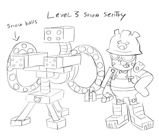
I told myself I was NOT going to draw a sentry EVER IN MY LIFE but midway through writing this post I was like no no no no I must illustrate this. Level 3 snow sentry is slightly taller than the average kumamon unlike in game tf2's sentry that is slightly shorter than real engineer, this is not because I am some sort of genius mastermind with huge plans in mind this is because I suck with proportions (and I drew this without having a reference of the sentry next to engie at hand) But anyway the snow sentry has a steady supply of snowballs to kill you with <3
I have NO idea how medic's medigun would work let's just say it does, same goes for spy's disguises
Anyways uhh I didn't intend for this to go for so long or get so in depth I just tried to be as faithful as I could to both digimon and tf2 but 1: I am new to digimon I am like a freshly born baby I had to go look through 3 different digimon wikis for info on this stuff bc i wanted to take my fictional polar bear SERIOUSLY and 2: while I AM a huge tf2 fan I am not knowledgeable on the weapons department so this was a real doozy for me
If any of you digimon/tf2 fans have any ideas/suggestions or even corrections I am all ears! these are just my ideas coming from someone who made a crack au at 12 am one night because some random anonymous person on the internet told them to
Also I've been calling it kumamon the entire time but it's name is also chackmon???? I feel properly pranked
#tf2#tf2 soldier#tf2 pyro#tf2 engineer#digimon#crossover#digital art#i uhhh im gonna create a tag for this au bc the posts are PILING UP lmao so here goes#tf2 kumamon au#demos art#demos ramblings#ask#anon#kumamon#chackmon
33 notes
·
View notes
Text
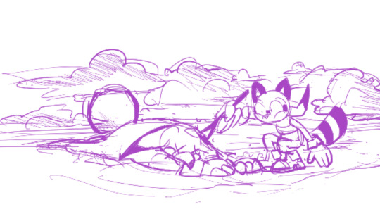
passed out for a couple of hours and when i woke up this was on my canvas
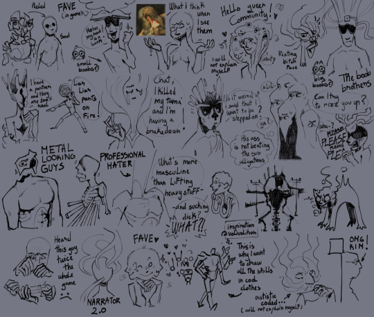
like I said "I will not explain myself". hope you guys injoy the brainrot on display
if it's not evident, I did not plan this at all
This started more like a sketch for logic to understand how to draw them and then i got bored and I started to doodle the other skills and this is what ended up
I want to learn how to simplify all of them in a cartoony style... it's not really working
these are 100% just for me but whatever
also thinking to draw some of the skills in cool clothing becourse I think that would be awesome
I put all the skills in the tags cuz I'm insaneeee >:}c
#disco elysium#art#de fanart#digital art#my art#disco elysium skills#de skills#de logic#de encyclopedie#de rhetoric#de drama#de conceptualization#de visual calculus#de volition#de inland empire#de empathy#de authority#de esprit de corps#de suggestion#de endurance#de pain threshold#de physical instrument#de electrochemistry#de shivers#de halflight#de hand/eye coordination#de perception#de savoir faire#de interfacing#de composure
42 notes
·
View notes
Note
Hi, I used to draw a lot but I've not drawn/created for a long time now, any tips to get back into it?
Or rather the whole thing about making art for yourself, I used to get a lot of attention for being good at art from other ppl and I'm not sure how to connect it back to myself again
I'm also contending with the Autism "It needs to be done in this way" and the ADHD "I can't focus for shit"
Also please don't worry if you don't know what to say, I'm just trying to get a variety of opinions to try and untangle my brain
Thank you in advance 💕
i think a good way to get back into creating *for yourself* whether its to come out of a dry spell or just to get back to creating things that you like, is what i call 'backtracking' (bearing in mind that my particular methods may only work for me! im lucky ive never struggled with focus when it comes to drawing things, but maybe some of these things will help as my main goal when drawing is to entertain myself!)
also before i move on this i think is valuable: you gotta draw things that you aren't gonna post sometimes. it's fun and fulfilling to make art for an audience, and wanting attention is not shameful (ITS HUMAN!) but also we live in panopticon times and i think its good to train your "i am alone doing something for myself and no one has to see it" muscles.
backtracking is a couple different things:
look back to when you were really young. what kinds of drawings were the most fun to do? what did you spend time on or get really into? for me, this was a few things! tracing cartoons, drawing up elaborate scenes of lots of little creatures doing a thing, and designing little characters as paper dolls and making their houses and little furniture and accessories and such to cut out and play with. also getting paint all over my hands (i still paint my whole hand whenever im done doing something with acrylics before i wash up! its stimming)!
backtracking here is when you try to take those things and make use of them now. try to find that old joy and use it in a way that makes you happy today, even if it's something small or silly or embarrassing. it can really help you rediscover what parts of art make YOU happy!
if you're regularly drawing and in a slump, backtracking for me is stepping back and doing either more exercises and practising the things you feel like you already know how to draw (ie. studying angles of the face or pulling up imgs of rooms on pinterest to see how normal people arrange furniture etc.), or simplifying your drawings to a level that feels more relaxing and less stressful. (ie. chibis instead of more detailed characters etc.) i find i kind of fall back to chibis when i feel lost, and then sort of rebuild from there. its fun to let my style change as i grow!
ALSO! im telling your autism this for your adhd's sake (this is useful for anyone i think): if there is a part of art that you do not enjoy doing or find boring but you feel it is an important or necessary step in the process? the secret is it isnt! art is made up. if you hate lining, dont do it! if youre a digital artist and get caught up picking a brush every time because you feel like you need the perfect one? switch to mspaint for a bit to get the nerves out. it can be really freeing!
art is for having fun and fulfilling our need to create. the rules are all made up and not real. perfectionism is the little death that something something i forget. yeah
31 notes
·
View notes
Note
hi sry this is a lil long but i just felt like giving my own comments about ur post re: feeling left out/regarding more detailed work, and wanted to say that your work singlehandedly has inspired me SO much to the point that because of your more simplistic coloring/shading and focus on movement/body language, i was finally able to find a coloring/rendering style that i actually like aesthecially and enjoy doing! i've struggled w replicating color in a way i like digitally for over 6 years but your work, and especially so your sketchbook scans on patreon have been so useful for inspiration and for my own understanding of anatomy and what not. we're always our own worst critics with comparison and whatnot, but please know that your work and your style are a huge accomplishment and skill in their own right, and your comics inspire me to keep studying so i can one day make my own!!! i'm so thankful you share your work with us and to have come across it and be able to draw inspiration off it! your colors, expressions, and the palpable intimacy and dynamic character interactions are so amazing and specifically unique to your work, never doubt the impact it has just because of other's having a different style or approach or something <3
This is so extremely nice I don't even know what to say!!! I honestly feel so hyped that my style inspired someone else, I feel like it's not something I expected and its SO COOL. I sometimes feel like my style isn't particularly STYLISH you know, I often admire really strong punchy styles, so it's nice to hear my own kind of chiller style is inspiring! And that the things I enjoy come across as strengths, too!
Also I am so happy to hear someone enjoys my sketchbooks haha, they're really precious to me but I also try not to be too fussy about my art in them which means it's not 'beautiful'*- they're for studying and/or chilling out, so it's SO nice that it's inspiring nonetheless!
Wishing you the best in your art journey and also I think if you want to make comics you should just give it a go! Make teeny tiny comics! [it does not have to be good]
[tangent oh my god] I feel very hypocritical because for the longest time comics were something my friends made and I didn't know how to, and I felt like my style didn't work for comics, but honestly when I eventually sat down and started a long comic the style happened out of necessity, I Had to simplify or I wouldn't be able to keep up. And you can see from the links that I just did sketchy comics before and that was fine! I think it was just as valuable as making polished pages. I actually probably ended up making comics For Real because I made a silly fandom ask blog, where I kept wanting to say more than I could do in one image, and that gave me the confidence to try something longer with OC's.
ANYWAY thank you so much!
*I find polished sketchbooks so inspiring, but its so limiting imo to try to make a beautiful sketchbook HAHAHAH
#this is so many backhanded negatives about my own work im sorry i swear I am not fishing#I love my work!#but i always want to get better!#I get really excited about learning new stuff#opening my sketchbook to draw fucking collarbones or some shit lol#mal talks
35 notes
·
View notes
Last Seen Blogs

lammiebooboo
Life as how I see it....

djxksks
제목 없음

cacklebat
Mów mi hache oglądaj

itstartedin1989
1989

fogatasusurrante
Baúl y Fogata Susurrante