#flip frame
Text
Uncovered: The Ninja Tales
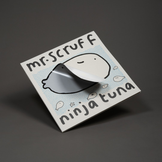
2. Mr Scruff - Trouser Jazz Deluxe 20th Anniversary Edition (2023) AND Ninja Tuna Deluxe Triple LP out today! (29/03/24)
Part II of our ‘Ninja Tales’ series for our ‘Uncovered’ blog explores the creative for two re-releases from Manchester’s own Andy Carthy aka Mr Scruff on Ninja Tune. We speak to Ninja Tune's Head of Production, Sean Preston to get the full story.

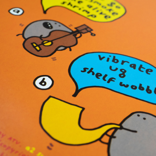
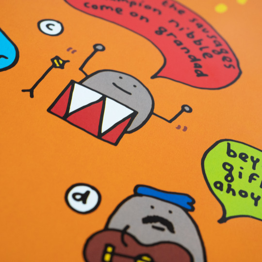
Former fine art student at Sheffield University, DJ and Cartoonist, Andy Carthy’s iconic line art cartoon drawings have illustrated gig flyers, record sleeves and merchandise and usually accompany him at gigs as live animated visuals. Mr Scruff's cartoons feature across his body of work are a big part of his identity, instantly recognisable to electronic music fans.
Trouser Jazz, originally released in 2002, celebrated its 20th anniversary with a Deluxe anniversary edition on a double LP with blue/red vinyl to match the cover palette of the original iconic artwork by Mr. Scruff & Airside with an “infinity” peelable trouser sticker on the cover to reveal silver and gold foiled 20th anniversary trousers.

Ninja Tuna, the fourth studio album by Mr Scruff, originally released on CD in 2008 through Carthy's personal Ninja Tune, is the latest Mr Scruff album to get a fancy makeover and is released on 29th March 2024. Now available for the first time on vinyl, the record is presented as a deluxe triple LP housed in a gatefold greyboard sleeve, complete with bonus tracks, pressed on Biovinyl and also with an “infinity” peelable tuna sticker on the cover.

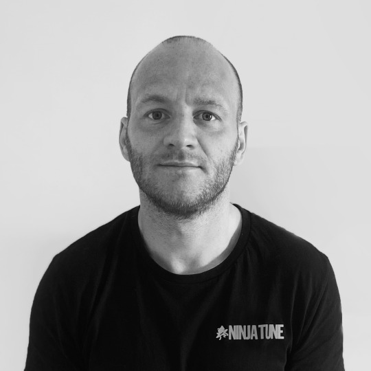
We spoke to Ninja Tune’s Head of Production, Sean Preston to get the story behind the creative.
Sean explains, “These two records first came out decades ago when budget and RRP limited what we could do. Ninja Tuna didn’t even get a vinyl release. The two new versions utilise the same "gecko sticker” design to take a product concept and roll it out across the act's work. When ‘Trouser Jazz’ came up for an anniversary edition, it felt like a really good opportunity to delve into the original artwork, honour it, and bring it to life. It’s a fun, interactive and borderline silly design package, that is apposite to Scruff’s playful and tongue-in-cheek cartoons.”
He continues, “I had become aware of a “gecko” sticker thanks to music product maestros SixtySix Productions, specifically Emily Robbins there. The sticker is in fact more like velcro than a normal sticker adhesive, which is why it’s often called "infinity peel”. In fact, like velcro you prob get a few thousand re-peels of it, so whilst “infinity” is a stretch, it’ll take some debunking in practice.”

Sean continues, “We took the trousers which make up the original front cover’s central feature, and created new 20 year anniversary trousers, foiled in gold with a beautiful silver belt. Then, traditional marketing sensibility troll that I am, I placed the standard blue trousers over the top as a sticker. The trick here is not only covering up the expensive bit to leave as a surprise for buyers, but to create a small deboss into the sleeve where the foil trousers are, and present the record as it originally was, with the old school blue trousers sitting in place, flush against its surroundings. Of course, at home, once those trousers are peeled off, the owner of the record can put them wherever they want. My Trouser Jazz trousers currently sit on my copy of Bob Dylan’s Street Legal.”

With today’s release of Ninja Tuna on vinyl for the first time the new package design was in keeping with Trouser Jazz's concepts.
Sean told us, “Part of the decision to present Trouser Jazz with this peel and reveal gatefold sleeve was made with an eye on future Scruff reissues. This week we release Nina Tuna on vinyl for the first time, and as a 3LP no less! Its cover features a centrally located tuna fish. No free copies to anyone guessing what we’ve done with it! Andy (Mr Scruff) was very up for reinterpreting the original CD artwork, and got to work on new illustrations to exist alongside original illustrations."


"The main tuna dude on the front gets a beautiful new coat (scale even?!) of silver. It really shimmers in the sun. It’s so fun working with artists like Scruff, he’s totally open to ideas and has such vital advice and feedback. I think initially I was steering towards a greyboard to replicate the original CDs, but availability of that type of board wasn’t what it was 15 years ago, and it tends to be difficult to work with when you want to use heavier versions of it that are necessary for a heavy duty gatefold sleeve.”

Sean continues, “It’s a small thing, but I’m dangerously self-satisfied with the inner sleeves. They spell out NINJA TUNA between them, and reveal vinyl discs pressed onto BioVinyl, which is a relatively new thing in the world of vinyl offered by Optimal Media in Germany. There are a few specifics about Biovinyl that make it a better choice for the environment, but the key is using biogenic waste like cooking oil rather than petroleum. It’s something we are trying to encourage more use of, with one eye on truly eco-friendly, carbon neutral vinyl alternatives that are in development.”


Sean Preston is an award winning product designer and artist from London. He is Head of Production at independent record label Ninja Tune, a bastion of ground-breaking music since 1990, working with artists such as Black Country, New Road, Bonobo, Thundercat, Mr Scruff and more. Sean founded Fiction magazine and publisher Open Pen.
We already loved both these records, but Ninja Tuna getting a first release on vinyl is particularly pleasing for us of course. We shall be peeling and un-peeling our copies with glee! We were also extremely chuffed to have got some words from Andy Carthy (Mr Scruff) himself about this project, “I really enjoyed collaborating on the design with Ninja Tune’s Sean Preston. Both albums needed a lot of re-drawing & re-writing hand-written text, so I did the bit that I am good at (potato drawings & writing) & Sean did the professional design bit, which I struggle with beyond basic illustrator fiddling. The daft hype stickers were fun to do as well!”
With Mr Scruff's back catalogue getting this delightful vinyl upgrade, we're hopeful that there’s another one on the way to complete the set.... !!

NINJA TUNA (Vinyl Debut Edition) by Mr Scruff is released on 29th March 2024 on Ninja Tune. Design by Mr Scruff and Sean Preston. Vinyl record FlipFrames by ART VINYL
#art vinyl#play and display#lp cover frame#vinyl record frame#record cover art#best art vinyl#flip frame#mrscruff#trouserjazz#ninjatuna#ninja tune#art and design#creative process#vinyl records#vinyl collection#vinyl artwork
9 notes
·
View notes
Text
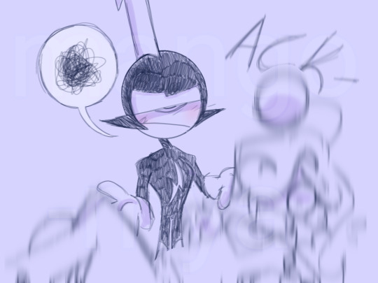
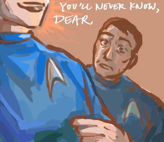
the expression change...


from rage to utter fondness for Jenova...
you might not notice it but there's a subtle change in how his gaze softens from image 3 to 4
the animators are trying to kill me.
#it's even better seeing the change in the cutscene#just me flipping through frames on youtube to absolutely adore this#ffvii rebirth#sephiroth
424 notes
·
View notes
Text
based on one of my fav posts
#danny phantom#I COULDNOY GET THAT VIDEO OUT OF MY BEAD AFTER I WATCHED IT I JAD TO MAKE THIS#gray ghost#valerie gray#danny fenton#vlad masters#vlad plasmius#sorry its so low quality i have no idea how to edit these other than manually flipping through every frame in Procreate screen record😭😭#im not in with the times there is definitely easier ways but om not figuring them out rn#ALSO OM SORRY VALERIE IS SO INCINSISTENT KN ALL MY POSTS THIS IS HER TJE REAL HER in my brain
154 notes
·
View notes
Text
★ SERPAZ TERRITORY ★


Frames and transparent gif of her dance
#I went through the trials to make this#animating in flip a clip then realizing I couldn't make it transparent#having to figure out how to extract the frames one by one in high quailty#editing those frames to be transparent in my drawing program#compiling this all in capcut and figuring out the scroll effect#the green screen effect would just eat serpaz btw which is why I couldnt use it#art#animation#teto territory#serpaz helio#vast error
174 notes
·
View notes
Text
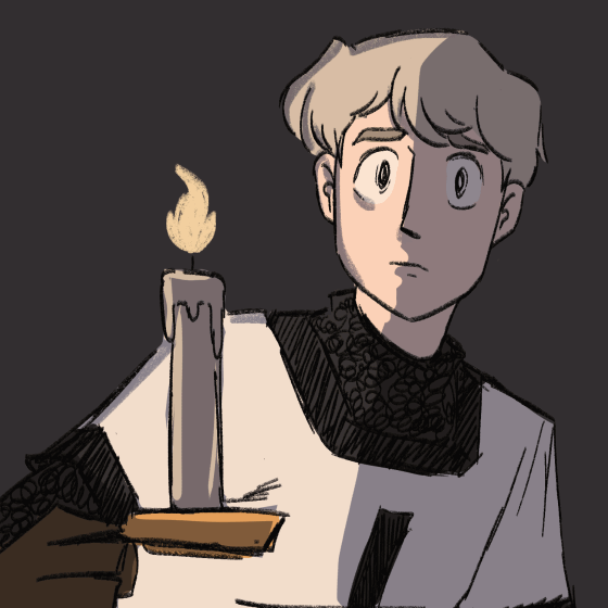
took clip studio's animation function for a lil test run!! so have a rough lil lighting test of young gil with a candle
#hetalia#hws prussia#gilbert beilschmidt#animation#2d animation#its the way i kept hammering f and g#to flip frames like i was in harmony#still havent figured out the csp equivalent jksdjkds
645 notes
·
View notes
Text
"the fault, dear Brutus -" (Julius Caesar)


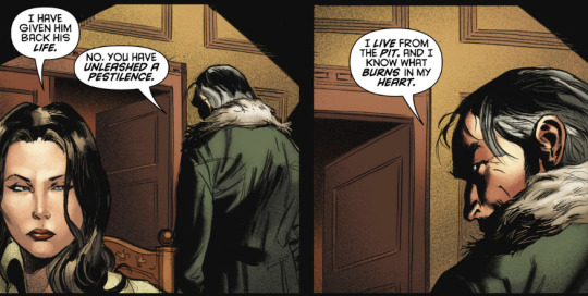


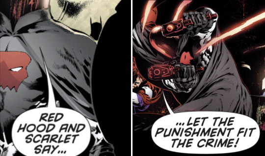

Quotes from A Critical History of English Literature by David Daiches. Panels from Death in the Family, Under the Red Hood, Lost Days, and Batman and Robin.
#OKAY SO i have been thinking about the hamlet post since i reblogged it the other day so i had to find panels to fit it#anyway i don't post about him much BUT#i do find jason fascinating both in terms of the Nonstop Emotional Intensity but also because on a narrative level#this is hard to articulate and possibly you need access to my dartboard of string in order to understand but#at some moments it's almost structurally as if you took the hero of a classic tragedy#and you put him in a story where he's the villain#it's like. what if hamlet but the story was told from the point of view of laertes#what if antigone but our pov character was ismene#you take the epic greek tragedy-esque stage and the tragic dramatic hero outraged at a terrible crime and the pile of bodies#and like. all of that is still true!! he really did get murdered!! it was really bad!! it's legit that he is mad about it!!#but then you frame it all from the perspective of the people going#'you just killed my dad and drove my sister to suicide you jackass'#and!!! they're not wrong either!!#and just ahhhh the way you can do that perspective-flip is just endlessly fascinating to me#web weaving#my comic art but we are using the term ''art'' loosely
91 notes
·
View notes
Text
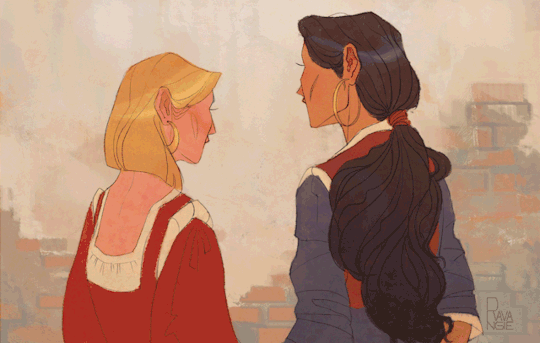
Everyone, look, i did a thing!
I am very proud of the thing that i did!
I took the very first sketch I ever did of Tulia and Miguella, redrew it and turned it into an animation. Watching the girls come alive frame by frame was truly magical, and i am very happy with the result, definitely going to come back to animating again.
More Tulia and Miguella here
Also, Happy Holidays, everybody!✨
#the road to el dorado#animation#gender flip#tulio and miguel#artists on tumblr#tulia and miguella#2d animation#frame animation#fem tulio#fem miguel#frame by frame#fanart#fan art#dreamworks#just art 2023#ravangie art#art
1K notes
·
View notes
Text
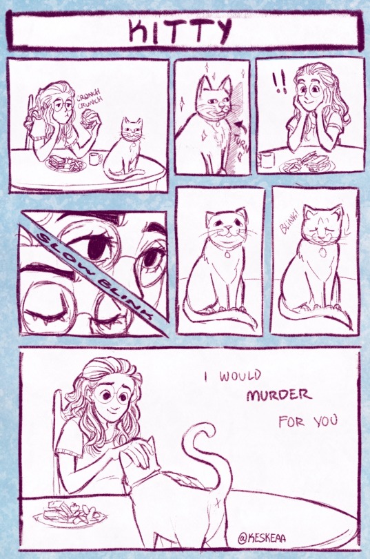
Can she even comprehend the lengths I would go
#crazy cat lady posting don’t mind me#my art#comics#comic art#cats#furbaby#original comic#artists on tumblr#procreate#digital artist#sorry if this isn’t really cohesive in how I posed the subjects I tried following this comic tip and idk?? still trying 2 understand comics#but the tip was to not have the subjects be aimed to look out of the comic but rather in? guiding the viewer with where they’re looking#I could’ve done it better if#I remembered that tip from the vet go instead of flipping frames lol
427 notes
·
View notes
Text
'I flirted with the idea that instead of being trans that I was just a cross-dresser (a quirk, I thought, that could be quietly folded into an otherwise average life) and that my dysphoria was sexual in nature, and sexual only. And if my feelings were only sexual, then, I wondered, perhaps I wasn’t actually trans.
I had read about a book called The Man Who Would Be Queen, by a Northwestern University professor who believed that transwomen who were attracted to women were really confused fetishists, they wanted to be women to satisfy an autogynephilia. And though I first read about this book in the context of its debunkment and disparagement, I thought about the electricity of slipping on those tights, zipping up those boots, and a stream of guilt followed. Maybe this professor was right, and maybe I was only a fetishist. Not trans, just a misguided boy.
About a year later, on the Internet, I come across a transwoman who added a unique message to the crowd refuting this professor. Oh, I wish I remember who this woman was, and I wish even more that I could do better than paraphrase her, but I remember her saying something like this: “Well, of course I feel sexy putting on women’s clothing and having a woman’s body. If you feel comfortable in your body for the first time, won’t that probably mean it’ll be the first time you feel comfortable, too, with delighting in your body as a sexual thing?”'
-Casey Plett, Consciousness
#this quote always moves me almost to tears when i remember it#i'm not a trans woman and i don't share the author's specific experiences with transition#but it really moves me that she frame transition as joyfully giving yourself permission to approach your body#not as something that has to be disciplined and deprived and made small in all these various ways#but as a means for experiencing pleasure and joy and delight and for insisting that our feelings and desires are worth#valuing and exploring and treasuring#i always used to think of prioritizing those things for myself as selfish and irresponsible#but who does it harm to want to experience pleasure in your own body?#it's such a beautifully simple and powerful switch to have flip in your head#and equally why are we forced to deny our own pleasure in transition and anything else related to our bodies in the name of moral rectitude#this is why i get so confused and pissed off when other trans people are fatphobic for example#like why are you so invested in politics of shame and disgust that never had any purpose other than#violently disciplining people as if they've violated moral codes by existing in a body#to say nothing of white people being racist in gay and trans communities#like again this system of violence is foundational to homophobia and transphobia#so why are you acting like it has nothing to do with you#even if you are unmoved by the urgency of other people's suffering which btw you should be moved by#what do you hope to gain by acting a collaborator and handmaiden to those systems#Casey Plett#she really is one of my favorite authors i wish more non-canadians read her#this quote is from a series of columns she did ont transition and every single one is a banger#i love when she talks about the people-pleasing elements of dysphoria and transition denial#she's so sharp about noting how many of us deny our own dysphoria on the grounds that others like and validate our bodies#that's how i always felt during my cis conventionally feminine era#it pleased other people so much and also that reception felt so hollow and joyless to me because i hated it#i get less of that positive feedback but that feels so unimportant next to the joy and pleasure i get to experience#said with the understanding that i'm very privileged in being able to prioritize those things without fear. but it was a switch flip#personal nonsense
114 notes
·
View notes
Text
Idk man this popped into my head and I could NOT get it out until I drew it so!!! Here!
#where did bro fall from#i would've made the last frame a bit nicer but i have to go to bed and it's a school night so#erm!!! what the flip!!!#wander over yonder#commander peepers#woy oc#woy ocs#oc x canon#oc x canon community#my art
114 notes
·
View notes
Text


Some more NieR #10, this time from LO stage. I'm kind of sad I didn't get to do the genga for all of it (iirc there was a schedule conflict) but I saw that they kept most of my animation in the finished episode! Which is always nice ( 〃▽〃)
#nier anime#nier#nier automata#nier 2b#2d animation#i also have lo from ep 12 but its mostly rather boring#it was a looooonnng sequence of 9s walking around being very tiny in frame#no sick flips and explosions
262 notes
·
View notes
Text
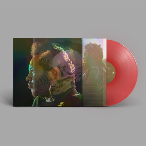
Uncovered: The Ninja Tales
1. Thundercat - Apocalypse Anniversary Edition
Art Vinyl's quest to ‘Uncover’ the stories behind some of the best vinyl record artwork each year never ceases, and so we turn to take a look at a selection of upcoming releases for 2024 from the consistently excellent independent record label Ninja Tune in our new sub-series ‘Uncovered: The Ninja Tales’.
First one off the press is American bassist, singer-songwriter, Stephen 'Thundercat' Bruner and the Apocalypse Anniversary Edition. This 10th Anniversary reissue of Apocalypse arrives on 15th March 2024 on Brainfeeder and Ninja Tune and features two previously unreleased songs. The original sleeve design is taken to the next level for this release, and we caught up with Ninja’s Head of Production and Design, Sean Preston to give us the exclusive creative process low-down.

Thundercat - Apocalypse 10 Year Anniversary Edition (2024)
Sean says, “This one took the remaining few hairs left on my scalp. Six months of getting it to where it is now, but I’m really happy with how it’s turned out. The brief was to create a sleeve of the existing portrait front cover, that somehow showed Thundercat's portrait skull with holography."
The mark of 90s print processes associated with comic book and cartoon collectables has run through the artworks of Thundercat’s back catalogue of releases, married with striking portrait photography that is often dark or dark-humoured.
Sean told us, "Thundercat is really into holography, constantly pushing the boundaries of what is realistically achieved. With the previous Golden Age of Apocalypse reissue we even had to work with the company that makes tiny holograms for VISA’s credit cards!”
He continues, "The issue we have today is that a lot of the old techniques are no longer workable. Print has streamlined and that often means "holographic print” is actually just standard litho printing on top of reflective cards and that wasn’t enough for us here. Brainfeeder’s Adam Stover came up with the idea of working with implementing a holographic aspect to the original front cover portrait that would present a sort of x-ray of Thundercat, in which a skull would be visible in certain lights. The challenge was to print both the standard colour portrait as per the original, and the holographic skull, which should only be visible in certain lights."
Our conversation with Sean reveals that what at first brief appeared to be an unattainable outcome for this Anniversary edition, in fact culminated in a blend of two quite ordinary techniques to get to an extraordinary finish - a deluxe rainbow holographic sleeve with gold foil detail, housed in transparent PVC outer slipcase with “x-ray” holographic skull print.

Thundercat - Apocalypse (2013) and Apocalypse 10 Year Anniversary Edition (2024)
Sean explains, “We needed to create something new, which is so hard to achieve these days. Holographic techniques don’t really provide the ideal for what we wanted to achieve. Light exposure ink isn’t really at the point where it would create something with the effect of depth and transition we were looking for. I find sometimes the desired effect needs to be unpacked and rebuilt, so when the initial tests didn’t get us to where we wanted to be, we married two fairly traditional print methods in a way that I don’t think has been done before.”
Sean elaborates, “Though we wanted the skull to appear beneath the portrait initially, I found a way to achieve the desired overall consequence of a skull appearing from a portrait, was to have two separate sleeves engage with each other, and in a way that created something we could consider be a new, or at least unique to this release.”
We asked Sean about the techniques used on each sleeve to create this final synergy between them.
He told us, “The first sleeve is a standard print onto a rainbow mirriboard (like silver wrapping paper that presents a rainbow effect under light). By printing the first card sleeve with the original front cover portrait of Thundercat on the iridescent mirriboard, we could get much closer to our ideal by printing a second outer sleeve to cover the first, on a clear APET (a more environmentally friendly plastic) sheet with a process called Cast & Cure. This process is nothing new, but is usually employed on its own, or as an alternative to varnish, but usually as the primary feature of the packaging. It leaves a holographic impression on the clear material which isn’t immediately obvious on its own, but it does react well to light.”
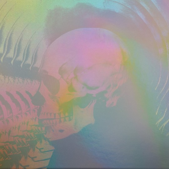
The process didn’t stop there however, as Sean tells us, “Of course, in attempting to create something unique, where the two components will actually land in print, takes us to the unknown, and as such requires a fair amount of testing and development. We wanted something that had more depth in certain areas - aiming for that x-ray aesthetic. We eventually applied a small partial white base in areas and took further measures with the portrait printed mirrirboard cover to increase its vibrancy. Something that really ties the room together from my perspective is the fine gold lacquer (like a gold foil) that we applied for Thundercat’s crown. So regal!”
Sean Preston is an award winning product designer and artist from London. He is Head of Production at independent record label Ninja Tune, a bastion of ground-breaking music since 1990, working with artists such as Black Country, New Road, Bonobo, Thundercat and more. Sean founded Fiction magazine and publisher Open Pen.

Sean Preston, Head of Production at Ninja Tune
With creatives like Sean pushing boundaries and reimagining tried and tested processes to achieve the music artists' end vision, we the humble vinyl collectors, are rewarded with a unique album artwork to cherish. He says, "What I love about this is that in a record shop, you’d approach the record sleeve and it would just look like a slightly iridescent version of the original cover - but on closer inspect and interaction, the skull effect comes to life and reveals the x-ray effect."

APOCALYPSE - TEN YEAR ANNIVERSARY EDITION BY THUNDERCAT is released on 15th March 2024 on Brainfeeder and Ninja Tune. Album FlipFrames by Art Vinyl
Art direction & design by Stephen Serrato – reworked for the Anniversary edition by Adam Stover. Design by Ninja Tune. Cover photography by B+.
#art vinyl#record frames#play and display#lp cover frame#vinyl record frame#record cover art#best art vinyl#thundercat#apocalypseanniversaryedition#flip frame#newalbumartwork
3 notes
·
View notes
Text
you are my sunshine, my only sunshine
you make me happy when skies are gray

(prompt fill for @mcspirkevents' mcspirk bingo prompt "gone with the wind".)
static frames below:
ouch! neck deep in aos bones feels rn... lmk if i should make a fix-it or somethin
#yeah so yesterday i said id try not to get distracted.. Guess how well that went LMAO#SORRY BONES hes going thru it in this one but literally this is all aos canon. aos is so mean to him and for what#not a single drop of closure... tos bones would flip shit if he found out. Thats the real reason why bones prime never shows up in aos#YEAH BTW PLEASE LOOK AT THE STATIC FRAMES PROCREATE HAS A ASTRONOMIC GRUDGE AGAINST THE 3RD SLIDE FOR SOME REASON#it would NOT stop crunching that one single GODDAMN FRAME in the gif. like full on colour blowout. like WHAT DID IT EVER DO TO YOU#YEAH SO I HAD TO SCREENSHOT IT AND PUT THAT IN THE GIF. EXCEPT MY IPAD SCREENSHOTS THINGS WEIRD. so its CONSPICUOUSLY BRIGHT#the 3rd and 4th frames are meant to have the same background color. every time i watch the gif i am filled with unimaginable rage#WHAT DID THAT FRAME EVER DO TO MY IPAD. what unforgivable crimes did it ever commit to be disrespected like this#ok rant over tags now :))#star trek#star trek aos#star trek fanart#mcspirk bingo#mcspirk#mcspirk fanart#spones#mckirk#spirk#star trek alternate original series#aos#spones fanart#leonard mccoy#bones mccoy#spock#jim kirk#did not use a single ref so the fact that the uniforms are reasonably legible as aos is a win (not like i use refs for anything else lol)#spirk is holding hands in that last frame!! gay people moment#OH AND I DID THIS IN LIKE. AROUND 3 HOURS? ive been meaning to draw that first frame for ages now so YIPPEEEEE#i did have a different caption in mind tho. Guess ill redraw it in the future LMAO#dust medibang paints
123 notes
·
View notes
Text
amethio_rave.mp4
#pokemon horizons#pokemon amethio#amethio#video#my art#song is “my smile is extinct”#anyway i figured out my art program had an animation feature and making a gif is easy cool awesome#adding audio? by talos i am not skilled at that. half the struggle is downloading mp3 files to work with#but this is the result. there's only two actual frames in there. just flipped or doubled to look nice lmao
73 notes
·
View notes
Text

drawing wukong everyday in a different art program
day 8 - gartic phone
#i drew half of the frames then flipped some of them in aseprite#technically its not cheating since i still drew them all in gartic :3#lego monkie kid#monkie kid#lmk#sun wukong#my art#gartic phone#animation#gif#2023
236 notes
·
View notes
Text
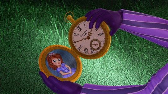
#this scene should be discussed way more#like do yall realize how much roland cares about sofia#forget for a moment the stuff roland did towards cedric that he was raised as seeing acceptable to do#everyone was mean to cedric favoritism is horrible but man#yall saying roland would not do more for his family let alone sofia and it's like bro he would#man tries putting in the effort AND EVEN IF HE'S NOT PERFECT he goes through so much growth throughout the series#this frame means everything he carries that watch all around and he flips it to both sides#sofia the first#stf#king roland#keep tags I'm kind of scared about sharing thoughts outside tags bc not a lot of people like roland#Dads and Daughters' Day
77 notes
·
View notes
Last Seen Blogs

chushanye
i ate a whole funnel cake

00pbz
\\٩(๑`^´๑)۶//

annamccachren
Release the McCachren

parkinglothummus
Untitled

bonez-yard
Bonez