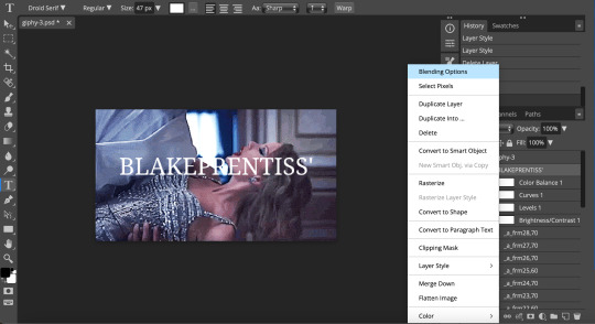
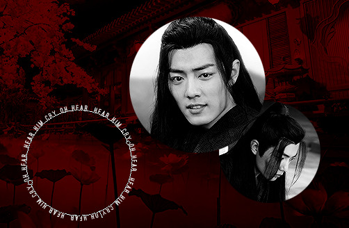
#or if you want me to show a tutorial for an actual gif with font choose one I did in a gifset and I'll explain that one specially
Note
I hope you don’t mind me asking this, but how do you keep your text/captions so sharp in gifs? Especially the 540 ones. It’s like ✨✨✨ in your gifs
Hey, no I don't mind, sorry for the late answer
So this is kinda a difficult question to answer but I'll try my best to just show you what I do, and then I'm sure you can compare your own method and find what you wanna change in your method
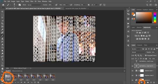
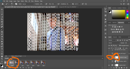
So all my gifs are are 540px width, the only thing that changes is the height, and every caption is always on top of the coloring layers, because if not the caption looks ugly
Let's start with my default one which is 540x350
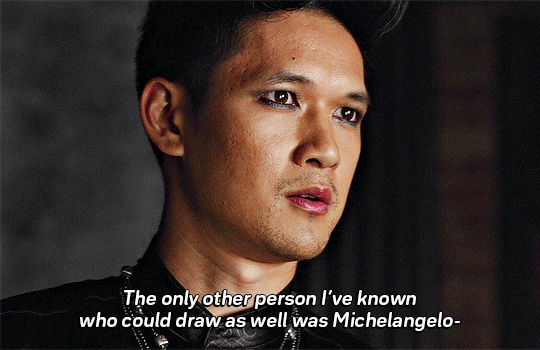
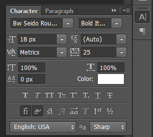
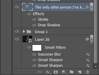
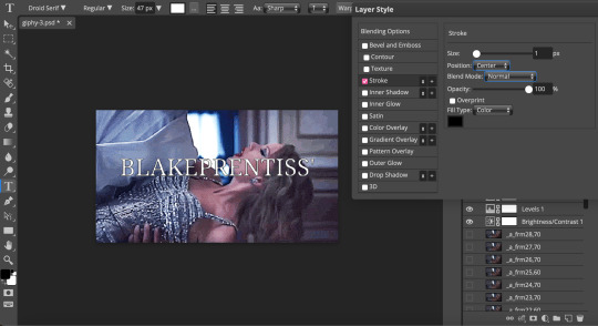
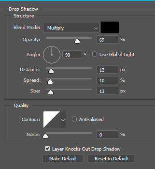
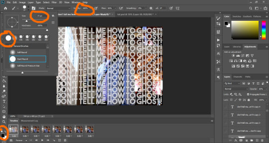
On top you have my default the size 18px that I use for the caption at the bottom of the gif, bold italic, it’s a rounded font, VA = space between the letters, aa is sharp always, bottom you have my default layer style stroke and drop shadows
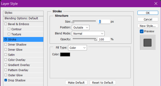
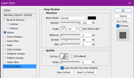
Here are my settings for stroke and drop shadow, I almost always use these settings, my advice for you is to find your own settings that you like
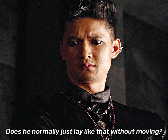
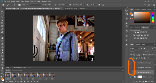
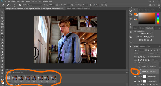
Next there is 540x450, the only thing different is that the caption "Does he normally just lay like that without moving" is 20px instead of 18px because the gif is bigger and I want to keep it easy to read on mobile and on desktop, and the little joke caption is 16px I think
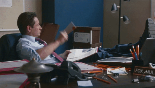
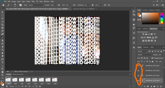
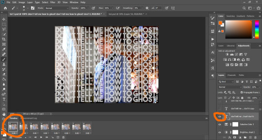
And then we have the monster that is 540x540
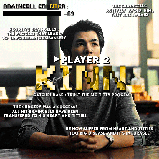
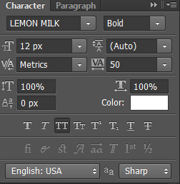
There is just so much going on in this, first of all everything is in all caps, whats great with that is if everything is all caps, the captions can be smaller and it will still be easy to read, so 12px works, and I added space between the letters with VA and made it bold, also I advise to have a sans serif font if you gonna do this
Second of all there is part of the gif that are brighter than others, which mean it would be harder to read because my captions are white, so what I did was to play more with drop shadow, I put opacity higher for the lighter parts for example “The braincell actively avoid him, They are afraid” the opacity is 74% cuz it’s straight up in a white part of the gif but for the catchphrase, it’s on Kinn’s grey shirt which is darker so 50% opacity works
You can also notice that I changed the angle from my default one that is 47 to 138, just because of the lightning of the gif it just looked better to me when I was making it
For the words “Player 2″ and “Kinn”, you can visibly see that the opacity is at 100% because again it just looked better that way to me, a lot of gifmaking is just adjusting stuff to wtv looks better in your eyes the moment you were making it
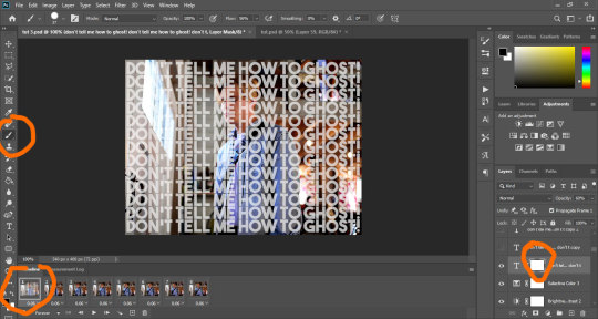
I’m sure there is a bunch of ways to make captions more sharp but personally I just use stroke and drop shadow 90% of the time
Hope this helps
#ask#photoshop#come back if there is things you want explained more#or if you want me to show a tutorial for an actual gif with font choose one I did in a gifset and I'll explain that one specially#if I still have the psd that is
22 notes
·
View notes
Text
lovely anons have been requesting a gif tutorial, and while there's plenty photoshop ones out there I think there's only a couple photopea ones (if you dont know photo pea is like an internet photoshop basically) so I thought I'd make a little tutorial on how I do my gifs!
first you're gonna want to use any gif making platform to actually turn your video clip into a gif. I personally use giphy but I know there's a bunch of other platforms for this. then you're just going to open the gif in photo pea either by clicking "open from computer" on the home page or dragging it in from finder (Mac) or files.
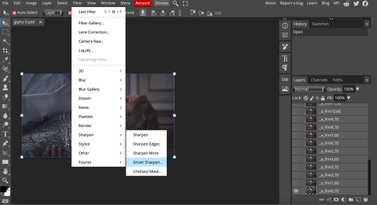
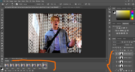
IF YOU'RE MAKING A GIFSET: the first thing I do is make sure all of my gifs are the same number of frames. its important to do this if you want all of your gifs to restart at the same time! to do this I just go to the side where all the frames are listed - this one has 29 frames (note: it says 28 on the top frame, but the very first frame is listed as 0, so always add 1 to the top number to know now many frames there are). what I do is find the gif with the least amount of frames and then make all the gifs the same number - depending on what part of the gif I want to keep/delete I'll delete frames from the beginning, end, or both which usually requires some basic math
next, I click on the top frame, press shift, and then press on the bottom frame to select all (unfortunately there's no keyboard shortcut for this I don't think). then I'll click filter -> sharpen -> smart sharpen that way I can freely customize the sharpness of each gif depending on it's original quality. usually I do 200% at 0.5 pixels but I'll adjust if necessary.
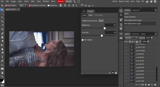
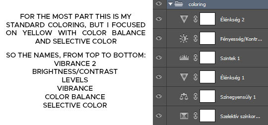
now comes the actual coloring of the gif! all of these will be adjustment layers (layer -> new adjustment layer).
first I'll select the brightness/contrast layer and play around with those settings until it looks good to me.
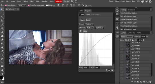
next, I'll play around with the levels and curves layers until it looks how I want it.

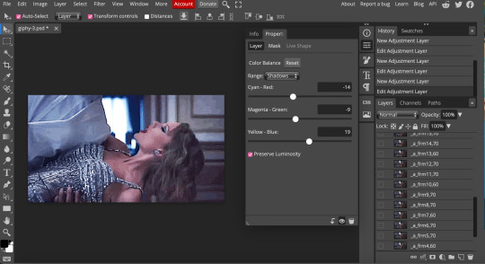
sometimes I'll stop here if it looks good, sometimes I'll play around with the saturation adjustment layer, or in this case I'll edit the color balance to deepen some of the shades that aren't popping out how I want.
IF YOU'RE MAKING A GIFSET: the easiest thing I've figured out for coloring multiple gifs to save time is duplicating these adjustment layers to each gif in the set (layer -> duplicate layer into; it'll prompt you to select the psd you want to add the layers to). when I do this I turn off the visibility for each one and one by one turn them back on (starting with brightness/contrast) and adjust them if necessary.
if I'm not adding text this is where I'll end, but sometimes I like to add texts to more of my creative gifts. usually I'll follow a tutorial (@usergif resource directory has a bunch of good tutorials that can be adapted to photo pea, or I'll just look them up on Tumblr itself). sometimes I like to do things a little simpler, which is what I'll show here.
you're going to click on the T towards the bottom on the left sidebar, type put your text, change your font (photopea has a ton and I'm not too picky but you can download fonts from the internet and upload them), as well as color and size (don't forget to select all of the text when you do this!!) then click on the cursor icon to move the text to your desired placement.
then click on the layer in the right sidebar and select blending options.
I'm going to add a stroke of 1px in black to my text and position it to the center. I do this on every text I add to gifs (even if the text is black, which I ended up changing this one to) to add some extra size/detail.
you're more than happy to stop here, but I like to play around with some of the other blending options until I'm satisfied. sometimes I'll lower the fill to 0-30%, or in this case, I changed the blending option to overlay to get the desired effect. (both under blending options)
I followed the same steps with my second row of text, except I changed the font and then warped the text a bit after placing it where I wanted by T -> warp -> arch and changing the settings.

and you're done! file -> export as -> gif to save it! I also like to do this periodically throughout the process to make sure the gif is giffing if you know what I mean

#gif tutorial#photopeablr#photopea#photopea gif tutorial#mine*#tutorial*#tutorial#gif making tutorial#gif making
18 notes
·
View notes
Note
hi, i love all of your recent graphics !! i was just wondering if you could explain how you make the 3d text?? it looks sooo cool
YES!!! I definetely can because its actually super super easy!!
I'm gonna show yall how to do this with any kind of letters/words in photoshop in a 3 easy steps!

for this you're gonna need:
the newest version of photoshop
a computer good enough to run the 3D program in photoshop
step 1: font!
I personally just use Arial black but you can basically use any and all fonts but I recommend using one that's bold and thick more then scipt.
but basically, you just write the word you want to use with the colour you want.
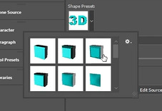
step 2: 3D objects
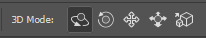
you go to the '3D' in photoshop, make sure it's available by going to window -> 3D

now you make sure you have your text layer selected and you click on the 3D extrusion and then create! I recommend saving before and after clicking the button bc this slows down ur computer massively.
now your workspace should be changed to the 3D one, your font has changed and should look like this now!

now you can play around with these top buttons to move it around
and these to change the shape, distance and extrusion with these

this is all upto what you like and want to do yourself. personally I like making the shape preset the third option bc it gives the most depth
and I recommend playing around with the contour to add more depth

this is what my 3D model looks like after playing around with those settings

step 3: depth and texture
now I go back into my normal workspace by clicking on the top right icon
to which I'm just back in my normal preset workspace. here's im going to move my obect to the middle of my canvas and turn it into a smart object by right clicking
now you could be done here but I like adding some extra depth and texture. I do this by double clicking and going into the layer styles.
here I like adding gradient layers one that is a light yellow with color dodge and a blue or brown with multiply and make sure they're on opposite sides of the text to which you get something like this.

then I personally like adding this same gradient to the background and adding noise to the bg and the object which just gives extra texture!

and that's it!!! have fun, enjoy do with it whatever you like it's a lot of fun to play around with!
please @ me on my tracking tag if you use this tutorial to make smth i'd love to see it!!
12 notes
·
View notes
Note
Can you make a tutorial on how you made this text? Thank you!! craintheodora(.)tumblr(.)com/post/736628145752588288
Sure! The text on this post is actually super simple:
Go ahead and make your gif and color it however you want. My coloring for this set was really basic. Just a curves layer and then a black & white gradient map.
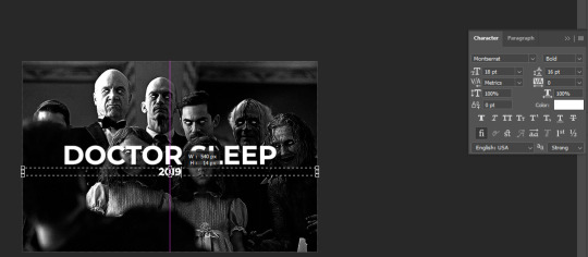
Press 'T' on your keyboard to call up the text tool. I always click and drag from the left side of my gif all the way to the right to create a text box and then type my desired text. Here are my settings for this set:

and here's how it looks right now:
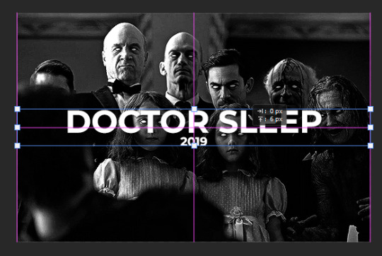
I then add a drop shadow just to give it some dimension. To access the blending options menu, you can either double-click on the text layer in your layers panel or right click on it and select blending options. Here are my settings (which are usually my go-to drop shadow settings, but feel free to play around with opacity, blend mode, and the distance, spread, and size to see what look you like best):

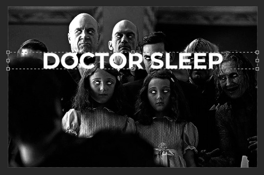
Then, I create another text box just below the main text. The only thing I change here is the font size because I want the year the movie came out to be less of the focus compared to the title:
Using ctrl+T, you can drag this wherever you see fit. The magenta line down the center is telling me that the text layer is perfectly vertically centered.
Finally, I select both text layers. To do so, hold down ctrl and click one layer and then the second layer. Then press ctrl+T again and scoot the layers around until both center guides show up. This is so the text (as a whole) is centered both vertically and horizontally, right in the middle of the gif:
That's literally all there is to it and we have our finished gif!

Please let me know if you have any further questions or want to see any other tutorials!
7 notes
·
View notes
Text
Gif tutorial by Alinelovelace
Alright, I'll be doing 3 things here today:
1.) Sharing the programs and websites I use
2.) Showing y'all a tutorial on how I make my gifs (this is my first tutorial, so if anything doesn't make sense, don't hesitate to message me, send me an ask, or comment on this post!!!!!)
3.) Sharing some resources by insanely talented gif makers (because I learned how to make gifs by following tutorials)
It's probably important(?) to mention that I use a Windows laptop
A.) Programs and websites:
ezgif: to make my gifs and do light editing
You can make gifs with video clips or screen caps. I'm not advanced enough to use screen caps, though they're supposed to make gorgeous gifs. I use ezgif to make the actual gif and edit the timing (which I end up having to tweak on Photoshop but...)
I also like ezgif because no watermarks!! I will do anything in my power to get rid of watermarks from websites and editing programs because they bother the hell out of me!
Photoshop: for the rest of my editing
This is where I recolor and add text.
A great alternative to Photoshop is Photopea, which I've used before I "obtained" Photoshop. It's FREE and online, so you don't have to download anything! I highly recommend it if you really want to get into gif coloring !!!!
Currently, I get my videos from torrents (bc I have a wide selection for my family to watch on our tv). But I used to use the Xbox game bar on Windows to record the clips I wanted on online streaming sites (unfortunately there's not a whole lot up and running anymore), then cropped and cut them. If anyone's interested in that, I could probably post a separate tutorial for that another time :)
There's also screen cap websites out there and YouTube. And probably dozens of other ways to get videos that I don't know about!
Video cutter
If you use full length episode videos and don't know how to crop them on your laptop (like me)
★★★★★★★★★★★★★★★★★★★★★
B.) Tutorial:
I'll be remaking the first gifset I ever made since I've learned A LOT since then! It should be pretty simple since there's only one set of subtitles.
Another time, I could do an edit tutorial like my That 70s Show ones. It's just taking the same concepts as this tutorial though, and playing around with colors, fonts, and font placement.
1.) Find your video/screen caps:
Since I no longer have the video from my first gifset, I just googled "Mulder throwing pencils season 10" on YouTube. After finding the video, I copied the link and pasted it into a YouTube to MP4 site ((this site has never given me popups or tried to get me to download something that isn't my video file)).
2.) If your downloaded video clip is short enough, you can just stick it into ezgif. If not, you may have to cut it using a website or a computer program.
Ezgif.com -> video to gif -> browse -> select your file -> upload video
3.) After clicking upload video, you should find yourself on this page:
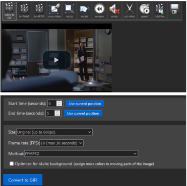
If you need to do any kind of video editing (cropping, rotating, resizing, etc) this is the place to do it! This is also where you make your gifs.
For the first gif, I don't need to change the start time, since I'm starting at the beginning of the video. 0 seconds is fine. But for the stop time, I'm going to play the video, pause where I want my first gif to end, then press "use current position" by end time.
I don't usually touch the settings for size, FPS, or method. If the gif doesn't have a lot of movement, I check "optimize for static background"
Then press convert to gif.
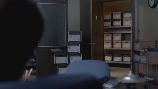
Here's the product I got. Since it's such a short clip, it moves a little fast for me.
I'm going to click "speed" which is below the gif. You're brought to this page:
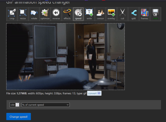
This is completely up to you for speed, but I find that between 60% and 85% end up looking good. If you don't like it, just change the number in the box and press "change speed".
I ended up with mine at 65% of current speed.

A little better, right?
The gifs that turn out best are 3 seconds to 10 seconds in my experience. This one is 1.5 seconds, so it's a little fast.
After that, rinse and repeat for every gif you need to make.
4.) Editing time! This is for Photoshop (if you use Photopea, I very much recommend this tutorial. It's very well explained!)
Go ahead and open all of your gifs once Photoshop is booted up. Then click window -> timeline
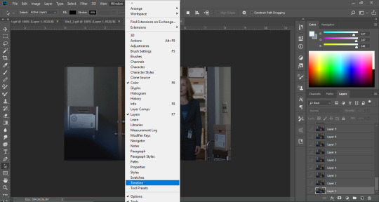
Now you have a handy dandy little timeline on the bottom.
The first thing you're going to do click play and decide whether or not your gifs are running at the speed you want. If yes, move on to next step.
If not: click on the three lines -> select all frames -> little drop down arrow. You should have a variety of times available to choose. Usually, I click other, then put somewhere between 0.04 and 0.08 seconds. Click play again. If you don't like it, try this step again.
If you need to crop your gif, three lines -> select all frames. Press "c" on your keyboard and crop accordingly.
4a.) Color editing
This is where things get complicated. Just remember coloring is subjective and everyone does it differently. This is just an intro to the different tools most gif makers use to alter color.
You don't have to use all of these! I definitely pick and choose depending on how I want the coloring to look. When I'm making a gif set, my coloring isn't as adventurous as when I'm making an edit. It doesn't feel worth it to give away my settings for this gifset since it changes depending on the coloring and lighting of the scene.
All of these tools can be found under "create new filter adjustment layer"
• Brightness/Contrast
This one is the easiest in my opinion. It's pretty straightforward. The more you drag brightness the right, the brighter your gif gets. The more you drag contrast to the right, the higher the contrast is.

• Curves
This adjusts lighting with color values. It's another tool that's hard to explain. I just drag the little circles on the chart until it looks good

• Color Balance
Like every other setting, exactly what you do with this tool is up to you. Color Balance adjusts the overall tint of your gif. I recommend editing highlights, shadows, and midtones for the best results.
• Channel mixer
This one is one of the most complicated tools when making gifs in my opinion. It's best for getting rid of weird colored tints (think the blue coloring in Twilight). I'll just link a tutorial here for it. I don't make enough gifs to know how to explain it.
• Selective color
Hands down my favorite tool, though not only specifically for gif making. This tool allows you to select a color (reds, yellows, greens, cyans, blues, magentas, whites, neutrals, blacks) and edit each color group. For example: my skin in photos usually has a weird red tint. I can edit the reds in my photo using this tool to make it look less abrasive.
You just play around with the different colors and bars for each color until each color group looks good. I recommend hitting the highest value to see how the color changes/what parts of the gif are affected by the change.
In the instance below, I wanted to see how magenta affected the blue colors, so I dragged magenta to 100. Now, knowing what kind of color changes magenta will make to blue, I can adjust accordingly.
Messing around with the each color put me here:
• Vibrance
Another pretty self explanatory tool! Vibrance and saturation bars make the gif colors more colored and vibrant.
• Applying the filters to all frames
Shift click to select all the filters, and drag them above all the layers. They should now be applied to all the frames.
If not, select all frames with the three lines menu drop down like before -> click the little eye to turn off visibility, then click it again to turn it back on. You should be able to see everything now.
In order to carry the same colors from gif to gif, I take pictures of each setting and edit each filter adjustment layer accordingly. I side by side compare and make adjustments if the coloring doesn't match quite right. I'm sure there's a better way to do this, but I'm not experienced enough yet.


4b.) Subtitles
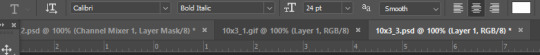
This part isn't too bad. For subtitle text, I use Calibri. Myriad pro bold italic and Arial are also really good options though!
• Text
Go to the sidebar and select text. Drag yourself out a box approximately where you want your subtitles. Type whatever you want. If you don't like where it is, click the move tool and drag it wherever you'd like.
Here are my text settings:
• Blending options
Right click your text layer and select "blending options" at the top. I edit stroke, which adds an outline. I also edit drop shadow, just because it adds a little depth to the text

• Applying to all frames
Drag the text layer to the top, just like you did with the adjustment filter layers when coloring. The same troubleshooting applies.
5.) Exporting
I know there's other ways to do this, but this is the way that makes the most sense to me.
Select all frames on the timeline -> file -> export -> save for web (legacy) -> save
With everything together, you go from:
To:

I had the subtitles in two parts because my first one had the subtitle in two parts (consistency).
Happy giffing!~~
★★★★★★★★★★★★★★★★★★★★★
C.) Resources:
This is a collection of resources both for Photopea and Photoshop
Photopea Resources:
Photopea giffing tutorial by @heroeddiemunson
Photopea gif coloring tutorial by @heroeddiemunson
Photopea removing yellow tint tutorial by @lacebird
Photopea gif making tutorial by @aragarna
Photopea gif making tutorial by @ashleyolsen
Photopea changing background color of gifs by @benoitblanc
Photoshop tutorials:
Giffing tutorial by @dqmeron
Subtitle tutorial by @itsphotoshop
Blurring gif backgrounds by @clubgif
Inverted colored text tutorial by @spaceslayer
Gradient text tutorial by @tawaifeddiediaz
Gif coloring tutorial by @logangarfield
Color consistency tutorial by @clubgif
Channel mixer tutorial by @zoyanazyalensky
11 notes
·
View notes
Note
Your Lord of the rings gif is AMAZING!
Can you please give any tips/hintd on how you achieved the colouring, mostly on the first gif. I am just doing my first ever blended gif set, thankfully its almost done, so I know how really hard these gifs are to make, yours are sooooo beautiful!
Its this set.
https://www.tumblr.com/armchairaloof/740180861385900032?source=share
hi! thank you!!
the first one of that set really turned out the best for me (as in it became what i set out to create), but it was mostly due to getting the right scenes for the gif. i've found that for blending that's the most important aspect. in general, for me it helps to approach blending with a "less is more" mindset. since you're combining so much, it's easy to overwhelm your canvas with everything you want to show so you have to be a little heartless in cutting the colors/frames/whatever that don't work without getting lost in the regret of what could have been. that's my approach to it, anyway!
luckily i hadn't deleted the psd yet so i can give you some more specific examples below!
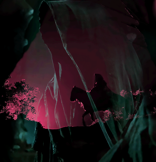
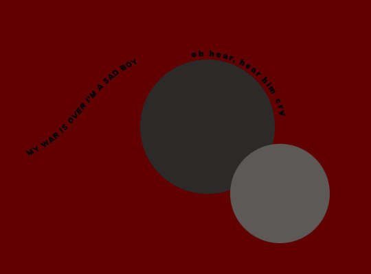
as for coloring, i went into that set knowing i wanted black to be a main feature (servants of darkness and all), and i played around with the secondary colors before landing on pink/red and that cyan/teal/blue/green color, which is actually just what you get when you set it to difference/exclusion when the base color is the pink.
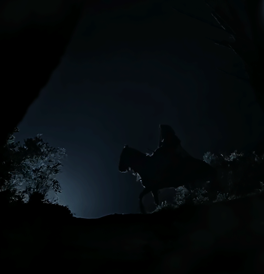
the base gif (the rider silhouette on the hill) was already mostly black with a white-ish highlight, so my coloring on that was changing that to pink/magenta. base without coloring ⬇️
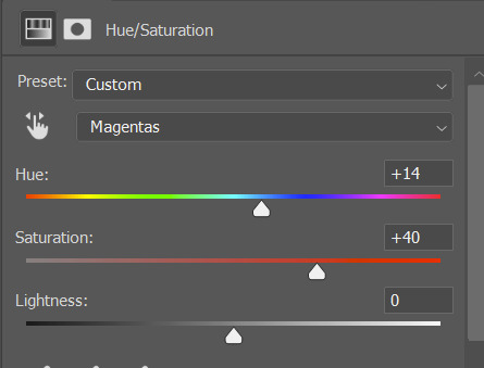
then i used a gradient map of a magenta gradient i liked, set to overlay to tone it down a bit on everything but the highlights, and then i added a hue/sat layer just for the magentas to make that pop.

base with coloring ⬇️

you can see that there's some wonky lines now in the pink from messing with the little light the scene had in the first place, but for this case i don't really care because it's going to be covered up with the overlay anyway. what i needed from the base was sharp contrast and pink, and that's what this is giving me.
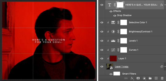
then below are the layers i used for the overlay (which is the close up of the nazgul). the folder itself is set to exclusion instead of overlay or screen (i could have done screen, but i found that exclusion gave a better depth of color in this instance). and the adjustment layers are just upping the contrast and minimizing the leftover colors - basically just playing around with it all until i got something i liked 😅
there's a layer mask to help paint over anything else in the clip so there weren't as many distractions. and then as i said earlier, i set the folder to exclusion and again tried to minimize other colors with a selective color layer. i always use a levels layer on my gifs as the first step, then brighten/contrast if it needs anything else. you can fix a lot with just levels though! this is the levels setting i ended up with ⬇️

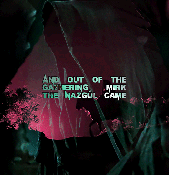
which got me to this! ⬇️
and with the lettering (which i had to add in my own tiny upside down v for the û because the font didn't have that 🙄) set to difference to get that green/cyan color again, this is what i ended up with ⬇️
i hope that helps! feel free to ask anything else! i've never walked through my blending process before so sorry if it was confusing lol. here's a tutorial that also deals with this kind of blending (focusing on black space/silhouette) that's similar.
the best advice is to just have fun with it :) and when in doubt, add more layers :) :)
4 notes
·
View notes
Text
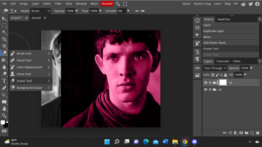
quick tutorial for merging in photopea for @lightasthesun ♥️♥️
1 - okay first is to color the two gifs you want to blend together! after you color and such, save and then reopen so that there are no * next to the name of the gifs (and there are no open layers besides the gif itself)
2 - duplicate one of your gifs into the other by right clicking the folder! im using the scene here that i absolutely hate LOL but you can change which one is on top by just moving the folders when they are in the same place
3 - now you should see that there is an * in the one you just duplicated the gif into - this shows us that this one is bein edited. you can put either one on top, its up to you and what your making! but i like having the pink one on top and the more solid color on the bottom here.
4 - now you can line up the top layer how you want it! since arthur is more to the left, i can put more of merlin's heartbreaking eyes in the frame without covering arthur too much. then you make sure the gif you want to blend is the one selected, go to layer, raster mask, and click add (reveal all). a white box should show up next to the name of the gif like this!
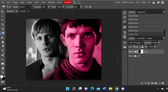
5 - a little thing here that ive learn is that you have to make sure that the two colors in the bottom left corner is white and then black second. if it isnt, it wont erase what u want it to!
6 - now you can go to the erasure tool and get rid of anything you dont want! i like using it with no hardness bc i think it goes on better, but it up to you ofc. if the gifs aren't just layered over the other and i want to move the top one to the side, i like to do 100% opacity to get rid of the hard separation line and then go to like 50% or 20% to make the gif flow into the bottom one more. also!! i sometimes change the opacity of the top gif to like 85% so it could be more blend-y (esp if i am not erasing and just layering one on top of the other), but if both gifs allow 100% opacity, then i usually do that!
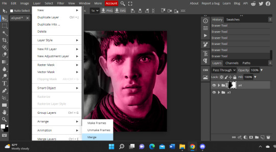
7 - LAST STEPPP wooo okay so now that you have it blended and stuff to your liking, you go to layer, go down to animation, and click merge! now when you export as a gif, they will be together. and instead of having two layers on top of each other, you will now have on the side like a3 + a4!
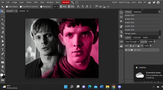
and voilà, you are complete!! here is the final gif! i like to dither the gifs (even though it takes 100 years to load) bc i think it makes them smoother LOL
hopefully this helps♥️🥺!! please lmk if you ever want me to make anythin else for photopea!! i am not an expert at all but ive been fuckin with it for over a year now LMFAO rumi taught me this actually!! and how to change the coloring of fonts and such :')
28 notes
·
View notes
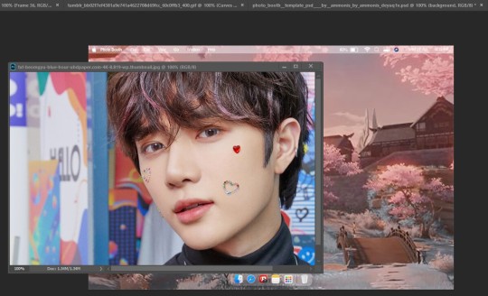
Note
I wanted to ask for a little tutorial if you're willing to give one ... On your #USERGYU/TAE doc, you used the photobooth template by ammonis on deviantart. How do you replace the image they had originally to but Beomgyu?

no worries, anon ! your ol' buddy coconut's here to help out. for this tutorial you're going to either need photoshop or photopea & ammonis' template - or any other template that this tutorial applies to.
under the read more you'll find a step - by - step guide accompanied by visual aids to adjust the template image. if anything is unclear, or if you get stuck, you're more than welcome to hop back into my asks or directly message me.
firstly, we're going to open ammonis' template psd in photoshop or photopea. as you can probably see, i resized & edited the template for #usertae's styling. don't worry, though ! i'll show you the process.
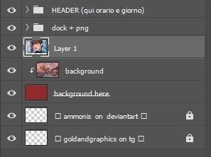
we're going to delete the grouped layers circled below - you may also get missing font prompts, just okay those and skip through them.
with these deleted, we should now only have header & dock + png as folders in our layers section now. lets now resize our image - i find the template was quite big for the images i wanted to use, so i found this to be an easy fix. unfortunately i can't recall what sizing was actually used for #usertae but i'm going to go for 897x600 as shown below. the option to resize your image is in image > image size > and the window that appears shown below.
now, lets open our image. when it's opened, click and drag on the file name at the top of the screen as shown below.

it'll create a little window that hovers over your template - just like this.
so, now we have our picture of beomgyu ready to go. we're going to make sure we're clicked on the beomgyu window and look to the layers section - click, drag, and drop the image layer ( that'll probably be titled background ) onto the template.
from there, just align your image up nicely - squish it, pull it, nudge it over . . . do your little thing and make sure it lines up nicely. just make sure your image layer is above the template's "background" layer.
now, we're going to right click the beomgyu image layer and select, "create clipping mask" - as shown below.
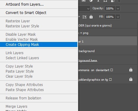
and voila, we're done. this is my finished tester image.
i hope this tutorial helped.
8 notes
·
View notes
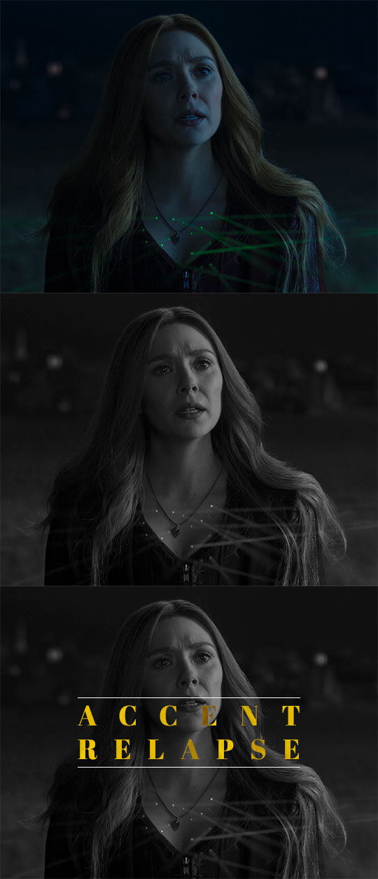
Note
thank you for explaining! do you never run into the issue of 'difference' changing your color to much once you set that to the blending mode? cause i have actually used a similar method, sometimes it comes out great but sometimes the colors are totally wrong. it usually happens if the background is a similar color. not sure how to fix that.
you’re welcome!
and yes i definitely know what you’re talking about with “difference” changing the color!! this tutorial explains why it happens better than i can, but basically what happens is the blend mode is inverting the color, and that inverted color is what looks wrong. unfortunately, i can't remember exactly what ive done in the past to fix it (definitely depends on exactly what you're trying to do) but the color overlay should hopefully be able to cover that, even if you’re just choosing a color to neutralize it
i think the simplest way to try to fix it is by changing the font color. this might take a little trial and error, and also depends on exactly what the issue is
another option is using “overlay” as your blend mode instead of difference. it still gives the transparent look, but without the weird color transformation. this works best with lighter gifs, as it can be very hard to see over darker colors. i used that in this gifset for the all pink row
another alternative would be mixing and matching? maybe? so if part of the text looks good keep that, and make another layer for the part that doesn’t and try to play around with it until it matches. i haven’t done that for this particular issue, but i have done it for other things. this definitely works best in gifs with minimal movement, at least in the area where the text is
i tried doing some examples to show what i mean, hopefully they make sense:
using this gif as an example again, i moved the text so that it was overlapping with a color similar to what i want to use. the color of the “transparent” text changed from blue to green:

for reference, here's what it looks like using the same process as before (difference + color overlay)

and here's a color overlay in white to just neutralize the green, in case you wanted to keep just the white text for the transparent part
first thing i tried was changing the color of the text. this was the closest i got to the original color overlay color, and i got there by changing the font color from white to a shade of pink

its a little darker than i wanted, but still pretty close. the biggest difference is now theres now white contrast. you can see the shade of pink used for the font on her hair at the end of the gif
and here's the overlay gif:

personally, i think this looks the best of the alternative options. i could’ve easily moved the text back over to the side, and it wouldve been close to perfect, but i wanted to show how it looks over the darker colors.
(i tried to do an example of using multiple methods, but with the contrast between light and dark and the movement in this gif, it wasn't coming out right)
overall, adding the color overlay gave me the best result. when the colors are so similar, you won't get much of the white text showing through, but ignoring that, this is what works for me. after that, i would say try using overlay, or other blend modes even, just to test it out. changing the font can also work, but how it works will depend on exactly what you’re gifing
i hope this helps!! let me know if i can try to help anymore :)
0 notes
Note
Hi first of all I’m in love with your gifs and your coloring 💖 , may I ask how you did the typography on your Peter Parker set with the red coloring? Thank you so much in advance! 🧡
hiiiiiiii you've made my entire week, just so you know 🥺🥺❤️ and yes! bear with me because it's my first ever walk-through/tutorial/whatever you wanna call it lmao SO pardon the screenshots if they're wack 💀 i'll put it all under the cut, hope it makes sense & if it doesn't don't hesitate to send me an ask like tf was that you rambled and made zero sense, i'd probably agree with you lol i’m basing this off of these two gifs i’ve done where the text is “revealed” by movement of a subject in the foreground.

text reveal in a gif!
so first off, i use video timeline in PS as opposed to frame animation timeline; hence, if you use frame animation to make your gifs i'm not sure if this will translate over exactly the same and i do apologize if that's the case!
i've done this twice now & love it because it's actually way easier than i ever imagined it to be 😂 what it boils down to is creating a layer mask that is not locked to your text layer & changing said position of that mask at various time points/keyframes of your gif!
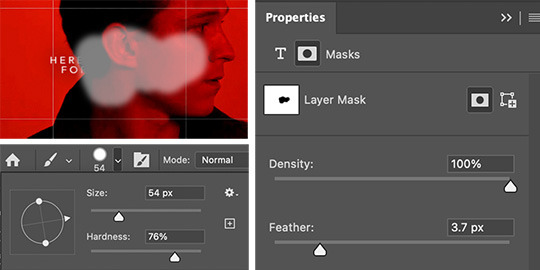
first, create your text layer with whatever font, drop shadow, gradient overlay, blending setting, etc. that you prefer. it should be your top layer of the psd & you'll start with something like the image on the left. then you'll add a layer mask while selecting your text layer (the white rectangle with a cut-out circle in the middle at the bottom), your layer panel should now look like the image on the right.
now it's time to paint your layer mask! depending on the intricacy of the mask, i'll mess with the diameter/size of the brush but otherwise i typically use around 70% hardness as my settings. using the black brush (while selecting the layer mask as shown above) you'll want to "erase" aka mask the part of the text that is on top of peter's face since we're having his head movement "reveal" the text. if you need to see what you're painting the shortcut to make the layer mask visible to you is "shift+\" (for mac at least lmao). i included my mask settings as well - granted this is just for text layers. i use ~30px for the feathering when i’m masking for any kind of overlays/coloring/etc.
once you've got your layer mask painted & primed you're ready to get to the fun (read: more time-intensive) part. the next step will be crucial to the process, if you don't do it or forget to, it'll quite literally never work & instead just frustrate the hell out of you. you've got to unlock the layer mask from the layer itself. as in, see that little chain link in between T and the layer mask box? yeah? click it!!! unlock that bitch!!! hit the jackpot!!! discover things you've always dreamed of!!! (this works for any layer mask on any layer btw, it is my secret weapon i'm obsessed i will forever unlock that bitch anyways moving on). so now you should have a painted layer mask (i chose to make it visible for the screenshot) & an unlocked layer mask (i chose to show a before & after for this), in the end your layer panel (not your timeline panel) should look like the following.

the next thing is to make that mask move with purpose. we’re going to essentially tell it where we want it to be at specific time points. when you mark those keyframes, the mask will move itself as fast or as slow as it needs to in order to get from its previous location at whatever keyframe to its new location at the next keyframe. so now we’ll be working in the timeline panel - like i said, i use video timeline, not frame animation, it’s what i taught myself ps with so outside of very very specific things, i always stick to video timeline.
you’ll want to scroll to your text layer and hit the down carrot on the far left in order to bring up a dropdown list of customizations (you’ll notice there’s a lot of others things you can make text do - like change the warp aka wiggle or change the style aka seamlessly morph to a different color). we’re focusing on the “layer mask position” (which folks if you’re following along, is also how you you can make your coloring stay in the background even if your subject moves significantly in the foreground!). i typically start at the beginning of my timeline and work my way through the gif. i’ll want the layer mask to be “visible” so i can see where it’s moving as i go.
since everything should be prepped correctly and in the right spot, you’ll start by hitting that little diamond to the left of “layer mask position” and a new point should pop up on your timeline to the right - that indicates where the layer mask is on the overall canvas. now, take your time cursor bar thing and move it along the timeline to see your gif (and peter’s head position) progress. depending on the amount of movement you may only have a few keyframe points needed or you may have a lot (similar to this particular gif). anytime there is significant movement, you will need to move your layer mask which will automatically create a new keyframe. this means you need to have your move tool (shift+v) on and layer mask square selected. placing of keyframes does take some practice, you’ll get the hang of how fast it takes the mask to move to a certain place & not necessarily need a keyframe at every. single. frame. that would be exhausting. sometimes for jerkier movements you’ll need to be more exact, and other times you can let the gif do the work and have the mask glide into position in time with peter’s head (or whatever is revealing/hiding your text layer).
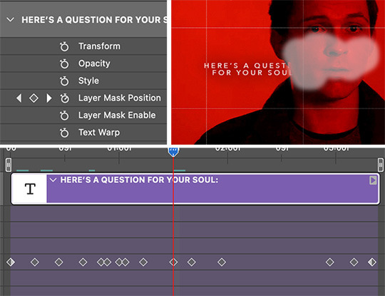
essentially the point is this: scroll to the next pertinent position on your gif. ensure your layer mask is selected & you’re using the move tool. move just the layer mask to where it needs to go. a new diamond point should appear on the timeline signaling a new keyframe for the layer mask’s position. rinse, repeat until you’ve made it through the entire gif. then you get to “hide” the layer mask again with shift+\ and play your gif through to see how you did lol. see if the text reveal is smooth or if there’s parts that go too fast, too slow, or are off in terms of what it hides where.
you can click and drag your diamond points if need be as well! they aren’t set in stone if it’s easiest to adjust that way. typically ps will also “show” how the mask is moving if you slowly drag your timeline cursor along and have the mask visible, sometimes that can be helpful when fine-tuning your mask position.
i think that’s that! hopefully this made enough sense & wasn’t too rambly or like just plain nonsense. i wasn’t sure your ps level anon so i tried to explain every step, please do not take offense if you knew half of this already!! feel free to send follow-up questions, or if you see something else you’re curious about (not that i think i’m like. the shit at ps & gif-making lmao. i’m not. but i’m happy to help if i can!)
#ask#anonymous#ps asks#this was actually kinda fun???#and maybe way more in depth than the anon meant but listen#i went all in#can't stop me now#photoshop tutorial
174 notes
·
View notes
Text
Background Text Effect Tutorial
Got asked by @owenpatrickjoyners how I did the effect for this gif:

First of all, let me preface by saying that this actually took a whole lot of time and it still came out really choppy, so the first tip I can give you is if you’re gonna do this effect, you better have a shit ton of patience and choose a gif where the character doesn’t move alot because it will make things so much easier.
I’m using photoshop 2020.
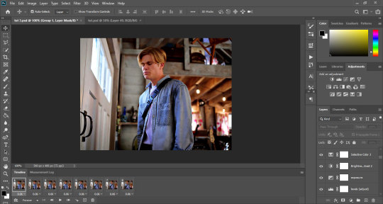
This is an advanced tutorial that supposes that you already know how to create gifs and add text (i’ve explained how to add text layers here, if you want), so the first thing you wanna do is make the your gif, resize, sharpen, add adjustment layers and whatever else you want to add and then save the psd files (just as a precaution).
Once you’re satisfied with the gif, open your animation timeline bar to the frames animation mode.
This is what mine currently looks like (I’m just doing 8 frames for the tutorial):
Now we’re gonna add the text layer that’s later gonna become the background. I’m choosing The Bold Font as my font, set to Bold, size 29pt, line spacing set to 30pt.
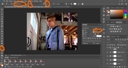
You’re gonna fill the page with the text so it fills the whole space, then you’re gonna make sure the first frame in your animation bar is selected and you’re gonna set the text layer’s opacity to 60.
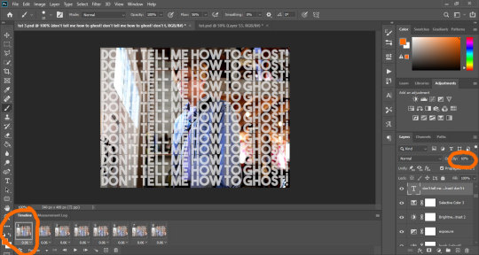
The first thing you’re gonna do is duplicate the text layer to match the number of frames you have. I have 8 frames, so I’m creating 8 text layers. Then you’re gonna hide them all by clicking on the small eye icon next to them:
Your text should now be hidden:
So, this is where it gets tricky, because to get a good result (which I didn’t really manage that well), you have to work the layers one by one.
Start with the first layer. Make sure the first frame is selected in the animation bar, and click on the small eye icon of the first text layer to make it appear.
For the first frame, if you make any change, it applies to the rest of the frames, so before we do anything else, we’re gonna make sure it doesn’t. To do that, just select all the other frames, and hide the text on those by clicking the eye icon:
Now, select the first frame again. Add a layer mask to the text layer by clicking on the mask icon at the bottom of the layer tray.
Your text layer should now have a small white rectangle next to it. Click on that rectangle, grab a hard round brush, make sure the selected color is black, opacity set to 100%, and use it to hide the text on Alex. You do that just by clicking and dragging the brush all over him. I’m starting with my brush sized to 37, but depending on what I need, I might change the size to make sure I get the edges.
If you don’t know much about layer masks and how to use them, I’ve explained it a little bit in this tutorial.
Basically, the black brush hides anything on the layer, and the white brush makes it reappear.
As you work and mask the text, you’ll notice the white rectangle start getting some black color in the shape you’re hiding. Once you’re done and satisfied, your frame should look something like this:
Now you’re gonna move on to the next layer. You’re gonna select the second frame on the animation bar (which should only show owen with no text). You’re gonna make the second layer of text appear by clicking on the eye, add a layer mask to it like we did before, and then start masking the text on owen the same way you did before.
Alternatively, you could just duplicate the original text layer and work on the existing mask, but you would have to go back and hide that layer from the first frame and all the other frames. It’s up to you.
And now you’re gonna repeat the process on each frame. Select a new text layer, add the mask, hide the text on owen. It takes a whole lot of time, energy and patience, and if you look closely at my og gif, I didn’t do much of a good job, lmao.
This is why I mentioned it might be better to use gif with minimal movement - if the characters are not moving, the edges stay aligned and you can use the same layer on multiple frames instead of having to do them one by one.
Anyway, once you’ve done all your frames and layers, your psd looks something like this:
And once I save (check this for more details on my save settings), my gif looks like this:

And that’s it!
If I skimmed over anything or you feel it’s not clear, just hmu and I’ll try to do a better job at explaining things :)
I hope this works for you! <3
#tutorials#resources#photoshop 2020#photoshop tutorials#gif tutorials#my edits#kinda#tuts*#owenpatrickjoyners
79 notes
·
View notes
Photo

From planning to posting, share your process for making creative content!
To continue supporting content makers, this tag game is meant to show the entire process of making creative content: this can be for any creation.
RULES: When your work is tagged, show the process of its creation from planning to posting, then tag 5 people with a specific link to one of their creative works you’d like to see the process of. Use the tag #showyourprocess so we can find yours!
Thank you ali for the tag on this collaboration with @nyx4, ali! @wendashanren
tagging: (I mostly talk about collaboration for this one but if you check #showyourprocess most people talk about how they made their creations or check my first post about giffing here!)
@elysean for this set
@timothyolyphant for this set
@sugardaddyahxu for this set
@jun-hee for this set
@bloominflowers for this art
I wanted to collaborate with Jackie on a set. We’d talked about it anyway, and thought about what we could work on. So when I saw this request on mdzsnet, i knew this was the one for us.
wei wuxian, black/red, cql, yp!wwx/sunshot campaign scenes/nightless city scenes, the lyrics from "the war" by syml
I knew Jackie loved Syml, so she’d want to make this request, so I put both our names down to claim it, then when Jackie was online checked if she’d prefer to do this one solo, or shared. She loved the idea of a collab, so we got to work.
First we listened to the song a couple of times, thinking about how it worked for wei wuxian. then we broke down which lyrics we wanted to use and the general scenes for them.

We split them out across a number of gifs (originally it was 4 but I don’t have a screenshot of that) with a general idea of scenes we’d work from for each. As you can see, I do plan but my notes tend to be sparse reminders rather than detailed. jackie wanted to dig the angst knife in deep and wanted the ‘my war is over’ to coincide with wei wuxian falling off the cliff, so we worked back from that for our scene choices.
Jackie:
Originally it was going to be 4 gifs, all of them with the lyrics that made it to the final set, but it would have been too much text on each gif so first we decided on a gif without text in the middle before deciding on spreading out the song a bit more which led to the 7 gif set.
We started making gifs 1 and 3. in my usual fashion i made about 10 gifs to pick which scenes i wanted to work with & jackie made 1 because she isn’t an idiot.
Jackie:
Kareena does make a ton of gifs just to choose one or two, which is both amusing and amazing. I have proof!
Luckily we’re both admins on WoHDaily, so we used the drafts in there to share a post we could both edit gifs in & out of.
I’d wanted to do a silhouette edit similar to one in @lan-xichens lovely overlay tutorial, but it wasn’t coming out the way i’d liked, so I had to keep trying different things until it worked as I’d envisioned.
I finished a touch before Jackie who had taken time to pick emotionally devastating scenes for her gif, so we used my red throughout both, but then tweaked each gif with feedback from each other.
Jackie:
When we first decided on the scenes, I waited for her to do the first gif so I could match her colors. Once she made the first one, I showed her this template I made so we could visualize how it’d look.
Then we moved on to the next gifs. This was harder, because we didn’t want to overload the set by making every single gif super fancy, so we tried out a variety of things to see what would hang together nicely.

Above is an example of one idea of mine that got discarded. I think i had 3 iterations before we got to the gif below.

Jackie:
I then moved on to gif #6 and I made a gif which Kareena completely shut down. She said, Jackie, this is really ugly. I accepted it, because she is the one with the skills here, and because she was right. (KAREENA: this is a lie - the gif is *gorgeous* but it just has a lot going on in an already busy gifset.)
There was too much going on in that gif and it didn’t really fit with the set we were making. The gif we ended up with fit much better and I’m glad she said something. For the last gif, I showed her a few shots and we both agreed on those two (wwx crying, walking backwards on the cliff). I made a couple of gifs that Kareena was nice enough to say were gorgeous, but I thought they sucked. Third one is what we ended up with.
For me, most of the work was in getting the scenes to fit the lyrics and to work with the color scheme that the requester gave us.
We continued to work this way, making ideas and sharing them, tweaking or discarding or remaking as necessary until we were both happy with the gifs. It wasn’t too hard to get them to work as a set, it was mostly about communication and honesty. jackie and i get on well enough to crit each others gifs without worry, so we both liked what was created. We pushed each other, Jackie knows I’m very lazy & she didn’t let me slack. I pushed her in other areas so that we both tried out new skills.
Once the seven gifs were made, it was time for typography! We spent a little time discussing our love of simple fonts, sharing a few examples, before I handed over to jackie as the typography queen.
Now, fonts:
Yup, I like simple fonts and for the typography not to take over the whole set. Luckily, Kareena feels the same way, so early on we decided on two fonts, one of them to highlight a word here or there. I showered her some fonts samples, we agreed on a style, and then I got to work.
The fonts used were:
Ostrich Sans https://www.fontsquirrel.com/fonts/ostrich-sans
Memories https://www.dafont.com/memories-2.font
I kept it simple, just looking where the text would look best. I didn’t know how to wrap text around a shape before, which is what I wanted for gif #3. Turns out it’s very easy and people probably know this already but I’m a ps noob (lie). Still putting this here just in case anyone wants to know.
Using the Ellipse Tool/Custom Shape Tool, I made a circle 2px bigger than the bw gif i wanted to wrap the text around. I didn’t want the shape to be visible, so I chose Path there. (If you choose shape, the actual shape will be visible in whatever color you have chosen)

With the Type Tool, just hover over the line of the shape and a squiggly thing will appear. Click and start typing. I then dragged the text and fit it over the bw gif. I made the shape on the side so I could see it clearly, but you can make it over the actual shape you want the text to wrap around. Listen, this is the best I can describe it ✌
We discussed how to post the set. Since it was a group effort, should one of us post it or should we post it via the net? Since we’ve also got another request lined up to collaborate on, we decided that I would post this set & Jackie would post the next one.
TLDR:
It was fun, it was about communication and compromise. Pushing each other in our weak spots, nitpicking at each gif to make them the best we could, agreeing why one gif might not work in this set. It was about mixing two styles but still creating something we both liked! It was enough fun we have two more collaborations planned, just to keep having fun and to keep learning.
22 notes
·
View notes
Text
#showyourprocess
From planning to posting, share your process for making creative content!
To continue supporting content makers, this tag game is meant to show the entire process of making creative content: this can be for any creation.
RULES — When your work is tagged, show the process of its creation from planning to posting, then tag 5 people with a specific link to one of their creative works you'd like to see the process of. Use the tag #showyourprocess so we can find yours!
thank you szabina @patel-dev for tagging me!!
This is the set I'll be looking at, more specifically these two gifs:

1. planning
I made this set for the free choice day of wandavision appreciation week, so once i had the idea to use tvtropes, i headed to the website and read through all the tropes listed for wandavision. i took note of all the ones that could work with a simple scene in my notes app. when i got to the end of the list i went through the tropes i'd chosen and narrowed them down. then i set out to collect all the clips i wanted to use. since i knew i wanted to use some that had prominent yellow tones i decided to contrast them with black and white gifs that have a yellow accent in the form of the typography. this all sounds very methodical, but when i'm not making something for a specific challenge i don't plan things out at all, i just wing it.
2. creating
bear with me, because my photoshop is in hungarian. i'll do my best to use the proper terms, but no promises. i use cs6. so after i have the clip i want, i record it using kmplayer and import it into photoshop. i save all my psds often while i'm working because i have been burned by photoshop just crashing on me randomly. for the yellow gifs i chose scenes that already had yellow tones so i only had to enhance the colors and add some basic coloring to make it pop. that one looked like this:
1. without coloring
2. with coloring
3. with coloring and typography

this is the coloring i used for the yellow gifs with some adjustments as needed:
for the black and white gifs i didn't need to find scenes that had any kind of dominant color so i was free to choose whatever. this is how the second gif looked:
1. without coloring
2. with coloring
3. with coloring and typography
for the b&w gifs i used very little coloring:

that's all for coloring. as for typography, i used Abril Fatface 40 pt, one of my go-to fonts. for the yellow gifs i just had white text and adjusted it to be in the middle of the gif. for the b&w gifs i had the same font, but put the blending mode of the text to difference and added a yellow color overlay, changing the blending mode of the overlay to linear burn. ava (@anya-chalotra) has a ton of amazing photoshop tutorials, she talks about this here in more detail, i highly recommend you check it out if you're interested. as for the horizontal lines, i just used the pencil tool to draw a white line that's as long as the text, positioned it then made a copy and moved it into position at the bottom of the text. then i linked the two layers so that i could move them together and not mess up the spacing.
i think this is everything in the way of creating. lmk if something's not clear! i'm by no means great at photoshop but i'll answer any q's to the best of my ability.
3. posting
i either post my gifs immediately after finishing them or i sit on them for an eternity, there is no inbetween. for this particular set, since i made it for an appreciation week, i had a day when i had to post it. i actually only finished it the evening it had to be posted because i debated what to do for free choice for way too long. some other sets i made for the same event i had already done like a week before the event started bc there i had clearer ideas.
i hope this was at least a bit interesting to read, and not painfully long
tagging: (if you want, no pressure)
@inejz-ghafa with this set
@smallest-stories with this set
@wandasmaximoff with this set
@niinazenik with this set
@amandaseyfried with this set
#showyourprocess#szabi i completely just stole the way you formatted this bc i'm lazy#i am quite a rambly person if you couldn't tell#but i hope this made some semblance of sense and wasn't boring#dare i say maybe it was even helpful??? probably not#in any case i love to highlight creators and their amazing sets#so if nothing else check out the ppl i tagged bc they all make stunning stuff and are overall really inspiring#i said i wouldn't do this for a few days but i'm procrastinating as always so here we are#sorry i'll shut up now
14 notes
·
View notes
Text
show your process
To continue supporting content makers, this tag game is meant to show the entire process of making creative content: this can be for any creation.
RULES - When your work is tagged, show the process of its creation from planning to posting, then tag up to 5 people with a specific link to one of their creative works you'd like to see the process of. Use the tag #showyourprocess so we can find yours.
I have been tagged by @lordbelacqua to talk about this gifset (thank you sm, I always wanted to make my own sort of gif tutorial hehe). Also, shout-out to lordbelacqua’s gifset here.
Since this is going to be long, I put everything under the cut.
planning: so since this is an inspired gifset, obviously the idea came from another post, this one here and as you will see this post has an insp credit on its own, but the user changed their url so I had to do some search to find their gifset. anyway, it’s here. the first gifset includes the greek words ‘eros’, ‘philautia’, ‘storge’, ‘philia’ but you will notice in my gifset I have an extra word which is ‘agape’ (my personal favorite as a greek person), this extra word I saw from the second gifset.
At first, I wanted to do this with #alina starkov from #shadow and bone, but I realized that the word ‘eros’, i.e. romantic love would go for #darklina, whilst ‘storge’, i.e. familial love, would go for alina and mal, and becaure of the ship wars in the fandom, I didn’t want to potentially attract haters from doing this. btw, someone else did this after I posted the yennefer gifset and I was really happy to see it, especially because they used many moments/relationships I had in mind, so shout-out to @darkstarkova for the gifset.
anyway, I also ended up choosing yennefer because for me it just felt much more meaningful to do such a gifset for her, since she has so much love to give and so few chances to do so. I also wanted to do right by it and use quality frames, so I went the extra mile and downloaded higher quality episodes. then I had to choose the shots that would work. some of the words, like “eros” and “storge” and “agape” I already had an idea what they would be, but for the words “philautia” and “philia” I had to fast-rewatch some episodes again. long story short, I first planned to blend this gifset for “philautia”, i.e. self love:
but then I rewatched the scene at the end where yennefer burns it all and as she was remembering all the times she’d been abused and maltreated, I teared up (I always do) and that scene just felt much more powerful to me, because it was then that she truly accepted herself and “let her chaos” be unleashed.
giffing: to sharpen my gifs, I used the light sharpening action from this post. for the coloring and blending I’ll use the first gif as an example, but more or less, I didn’t follow any specific color palette, but went with what looked nice and what didn’t. so at first I had this gif:
after I finished staring at this (took me a few minutes), I actually focused on the coloring. so first I used a curves layer and chose the light and dark areas (left pic below). Basically you choose the marker in the yellow circle to choose the lightest spot on yor gif, and the marker in the dark circle to choose the darkest spot respectively. I also play individually with the greens, blues and reds (right pic below) until I get a lighting base that I like:

Now at this part I usually just add a levels and brightness layer to further enhance the light and dark spots. At this point the gifset looks like this:

personally I didn’t like the red tint on their faces and the cyan tint on geralt’s hair, so I used a selective color layer and turned up the cyans in the reds and turned down the cyans in the cyans like below. I also turned down the yellows in the cyans but I see that this didn’t change much, so it’s something I simply forgot to turn back to normal.

I also added a color balance layer. With this I usually increase the blues, the magentas and cyans for midtones, shadows and highlights. So now:

At this point, I add a gradient map layer in b&w, right-click on it, select ‘blending options’ and turn it to soft light, then play with the opacity if necessary:

Usually this is where my coloring ends, but I still didn’t like the result so I played around some more and ended up adding a second gradient map layer in b&w, left it at normal blend mode and turned the opacity down to 47%. So this is what I have finally:
So then I colored the second gif similarly and blended it in. For blending gifs, I follow this tutorial here. So now I had this:

As you can see, the coloring and light of the blended gif doesn’t match the base gif. Adding a similar second gradient to the blended gif didn’t really work nice. Then I decided to turn it b&w with a simple black and white layer and voila, the result just clicked.
For the text I downloaded various fonts from here. So the title line “eros” is in the Bellerose font and the rest are in the Avenir font from here. I used the gradient text effect described here for the title line. And as for the second subtitle text, I simply opened “blending options” again, set the fill opacity to 0 and used a white stroke of size 1 px. Final result:

For the rest of the gifs I did similar coloring and blending.
arranging: To arrange, I simply play around with what looks good. The size I used is 540 x 450, because in the first gif I needed yennefer’s dark hair to take quite a large proportion of the gif, so that I could place the blended gif on (it does not show on light areas), so this determined the dimensions for the gifset.
posting: I always “save as draft” before I post any gifset because I want to make sure all gifs play out correctly and also I want to see if the mobile app shows them correctly as well. So after I verify this, I add the caption and I search the necessary blogs to tag to spread awareness.
I’d say it is my most quality gifset yet and I am kind of proud of it :)
I’m tagging:
@starkkov for this gifset | @captainheroism for this gifset | @swanthief for this gifset | @aleksander-alina for this gifset | @the-darkling for this gifset
of course you can just ignore this or choose another creation of yours to show the process for <3
13 notes
·
View notes
Text
#showyourprocess
From planning to posting, share your process for making creative content!
To continue supporting content makers, this tag game is meant to show the entire process of making creative content: this can be for any creation.
RULES — When your work is tagged, show the process of its creation from planning to posting, then tag 5 people with a specific link to one of their creative works you’d like to see the process of. Use the tag #showyourprocess so we can find yours!
I was tagged by @baoshan-sanren for this word of honor set (thank you!!!)
I'll be tagging:
@cescedes for this wangxian set with really interesting blue coloring
@thatgothsamurai for this fanart of Wen Kexing that lives in my head rent free at all times
@yvlan for this lovely lwj set
@ostardust for this heartrending wangxian set (especially the last gif with the blue coloring in the trees)
@absentia123 for this aesthetic edit of Wen Ning
no pressure, especially if you’ve been tagged already or if you made the edit a while ago!!
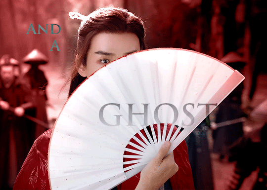
I was very excited about this set. I started thinking about it when I was writing a meta about Zhou Zishu that included the line "A ghost and an assassin, two entities who should never see the light of day, walk side by side in the human realm."
I thought that could serve as a summary for the drama as a whole, so I tweaked the wording and turned it into a gifset.


Process:
1. Choose moments -
gif 1 was Zhou Zishu as an assassin, so it had to be ep 1
gif 2 had to parallel gif 1 with a shot of Wen Kexing looking towards the camera, and I wanted a moment with the red robes, so ep 31
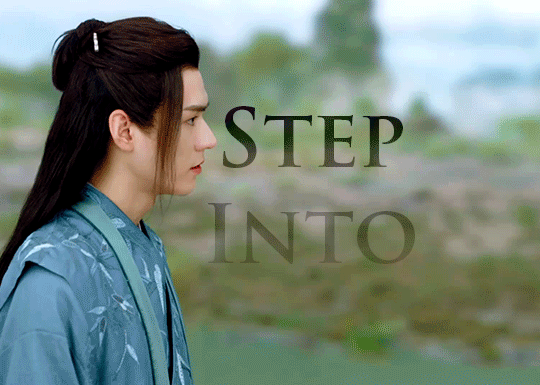
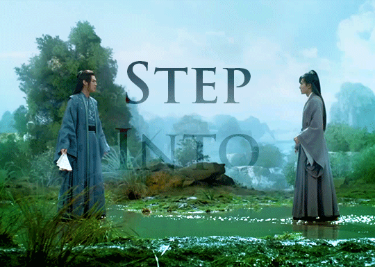
gif 3 has the text "step into," so I chose the moment in 32 when Zishu steps towards Kexing for a visual pun
gif 4 had to be episode 37 when they're diffused in light (I found 37 on tumblr, downloaded it, and cropped it to avoid the subtitles)
That also meant the set started with Zhou Zishu's first appearance and ended with the final shot of the whole show, and it set up a nice color gradient of dark to light.
2. Import video frames to layers in photoshop - I have the raw .mp4 files downloaded, dm me if you want to know where to get them. I use frame animation, so I then selected 63 frames for each gif and set the frame rate to 0.07. I really like all gifs in a set to be the same length, and I think 0.07 usually looks natural and smooth, so I try to have my number of frames as multiples of 7. Does that matter? Probably not, but it makes me feel better.
3. Create smart object from layers
4. Add base coloring - for Word of Honor, I borrow @zhouszishu 's coloring as a base, which they shared here. I do my own coloring for cql sets, but their WoH base coloring is gorgeous and I like saving time.
5. Add text - I used Trajan Pro Bold, which is a basic font that comes with photoshop. I tried using a fancy font I downloaded from the internet first, but then I realized I didn’t know what I was doing and gave up. :)
6. Sharpen gif - I follow this glossy sharpening tutorial
And now for the fun part -- figuring out how to add effects!! I am a photoshop newbie in many ways, so I was looking at tutorials while doing this.
The process was largely the same on each gif, so I'll break down the most complicated one:
I had the base gif and the base coloring, and I wanted to make the background red.

Following this tutorial, I used a giant soft brush (300-400 pixels, 0% hardness) and colored the background red, then set the blending mode to color. I did the same thing in black around the edges, but with blending mode soft light. There was still some blue showing through between the ribs of the fan, so I used hue/saturation to desaturate the blues to make it less obvious.
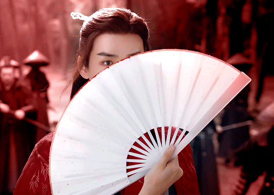
Then I added the text and set the blending mode on the text to "difference" to get the effect of reversing whatever is behind it.

I then added a gradient mask (solid to transparent), clipped the mask to the text layer, and played around with it until the gradient was visible, but you could still read the text. And we end up with this!!
I then repeated that with each gif, and made additional adjustments on each, including using a giant soft brush in black around the border of gif 1 to make the rooftop less visible and intensifying the greens in gif 3
I had subtly different versions of gif 1 and gif 4 saved, because I wanted the text to dissolve into the background, but also to make sure you could still read it. I also made an alternate version of gif 3. I like to save multiple versions and usually an alternate gif or two to make sure I actually like the way things look when they're uploaded. So I made this:
But I decided that final version was more satisfying even though the text placement is meh, because he actually completes the movement before the loop restarts.
And that's it!! Nothing too complicated, and I am in awe of so many other creators on this site. But thanks for tagging me!
5 notes
·
View notes
Photo
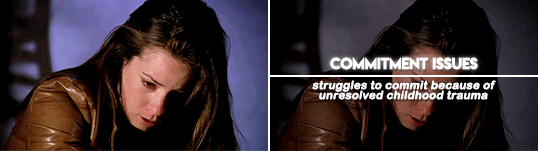
hello again! this tutorial was requested by emily ( @perfectlystiles ) and it’s basically how i make my similarities edits! by the way, this edit is not my original idea, and i first saw it done by @karazrel, but i’m unsure where it originated from. there’s no need to credit me if you follow this tutorial. by the way, i did figure out how to make these all by myself by reverse engineering the ones i had seen, so this method is 100% created by me, and there are probably more efficient ways out there!
[ the gif i’m using for this tutorial was created by @macherierps ]
anyway, i’m going to show you how to turn this, into this!
ok, so the first step is to resize your gif to whatever you want the dimensions to be. i used the 268x151 dimensions. then add your coloring (if you use one!) and, now we had the dividing line in the center of the gif.
first, you right click your shape tool, selecting the “line” tool. use your mouse to drag a line across the gif, and you’ll know that it’s centered after your angle says 0.0°. release your mouse, and a new layer will have been made that says “shape one”, and a kind of transparent line will show. visuals below.
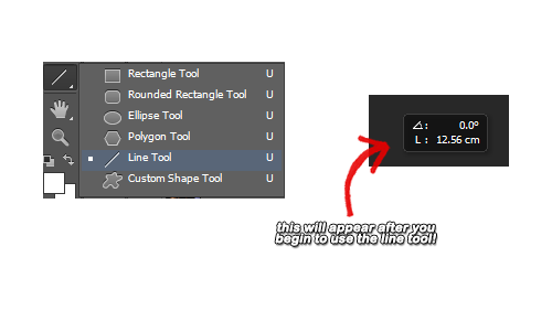
after you do that, select the “shape one” layer, and right click it. then you should see an option that says, “rasterize layer”, choose it. the line should then turn white. you can use your transform controls to make the line a little bigger, but that’s completely up to you. i make mine just a tad larger, but i also think how it looks naturally is good too!
with the “shape one” layer still selected, go to the top tool bar and choose “select” and then, “all”. a border should appear around your gif. then go to “layer” at the top of the tool bar, and scroll down to “align layers to selection” and choose “vertical centers”. you can also choose “horizontal centers” but, it won’t change anything about the the line, and is just a waste of time. after that, hit “select” again, and then “deselect”. visuals below.

now that your divider is taken care of, we move on to the text.
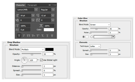
the first font is lemon milk, which you can download here if you don’t have it! this is the font you are going to use for the actual similarity, (eg: commitment issues). here are my settings for the font, and also my blending options. i use drop shadow, and outer glow, which you get to by right clicking the font layer, and it’ll be at the very top.
select the font layer and align it with the “align layers to selection” that i talked about before, except also use the “horizontal centers” option. then your text should be going through the line, and just use your arrow keys to move it above the line. i typically move it so that it looks like the text is sitting on the line, and then up five more. visuals below.

next you have your definition/clarification. your example of the similarity (eg: struggles to commit because of unresolved childhood trauma). the font i use is arial rounded mt bold, which if you don’t have, you can download here! below are my settings for the actual font, and also my blending options. i use drop shadow, and stroke for this part of the text.
again, use align layers to selection to center the text, and use your arrow keys to move it under the divider instead of going through it. i usually move it until it looks like it’s just below the divider, and then five more. visuals below.

and then, you should have your gif! use this same process on the rest of your similarity gifs, and the gifset should look smooth, and the lines should connect like mine do!
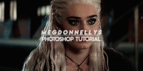
#*#ps tutorial#itsphotoshop#photoshop tutorial#my tutorial#megdonnellys tutorial#// this is trash but uhm#// go nuts lol#// i remember trying to figure out how to make these types of edits at first#// probably took me about five hours#// only reason i'm making the tutorial lol#// don't want anyone else to spend five hours trying to figure out this shit
81 notes
·
View notes
Last Seen Blogs

eystatic-blog
Untitled

ofsoprano-blog
mistress of my actions
fuckyeahmilojamesthatch
i swim pretty girl

inky-duchess
WRITERLY
l0reenthusiast
the hero and the warrior- *gunshot*