#the lineart's bad because its technically the sketch layer
Text
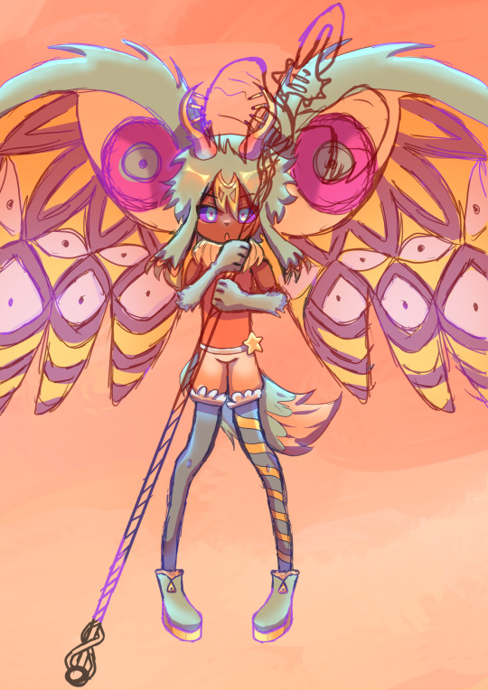
FORGOTTEN LAND'S SECOND ANNIVERSARY :3
I AM SOOOO BACK
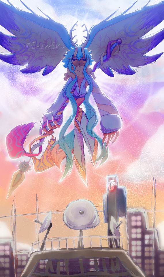
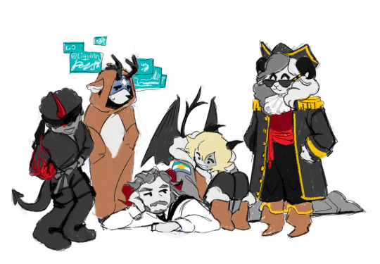
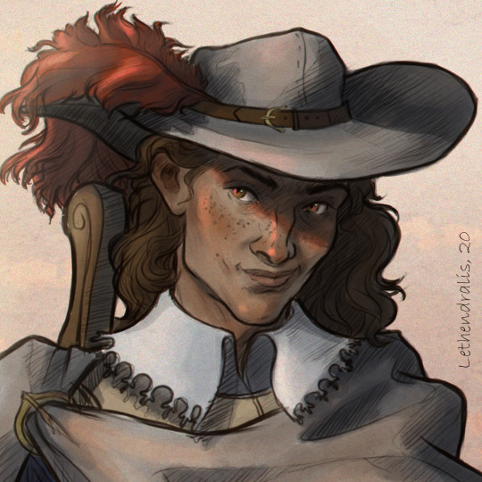
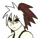
I started this drawing yesterday around afternoon and finished it just a few minutes earlier.
I went with a messier type of drawing instead of more clean like the elfilin one from yesterday, i find it fun doing it like this, mostly cause i dont have to worry about making it perfectly so i dont get as frustrated as normal. Id place this one as my second best digital drawing. im pretty sure i havent posted what i consider my best digital drawing here, tho i do have it in instagram, i might post it here one day, tho these two are way too tied up, i love how this came out, its not exactly like how i imagined it but its really close to it, and also itd say that since i dont tend to play around lighting that much, this was such a joy to draw and i cant help but stare at it a lot, at least until i start hating it because i made quite a lot of errors. i also changed my elfilis gijinka just a tad bit from last time, but its not that big of a difference, mostly.
ofc i had to draw elfilis for forgotten land's anniversary, i tend to deny it in my head but yeah they're my fave of the kirby characters even tho i hate them a bit. I wanted to draw some more doodles, like, elfilis eating cake, kirby car, a bunch of other stuff (not elfilin cuz i already drew him yesterday) but when i tried i couldnt draw anything more, guess this drawing burned me out a lot, huh?
you can definitly tell i spent all the efforts on him cuz if you look a bit closer to the bottom part you'll see its almost barely detailed, but i mean, they're the focus so make sense i guess for me not add that much detail there. um also, maybe because i dunno i had OVER 130 LAYERS jeez no wonder firealpaca was slowing down so much, i need to manage my layers better next time, tho i did do something i keep forgetting, wich is naming them (most of them at least) that was a real life saver
Also, antares (fecto elfilis' spear/cadaceus), as always, was a pain to draw, but this time its probably been draw the most accurate out of every other drawing ive made with it in it, i didnt notice it was like, a little curved when it reached the blade
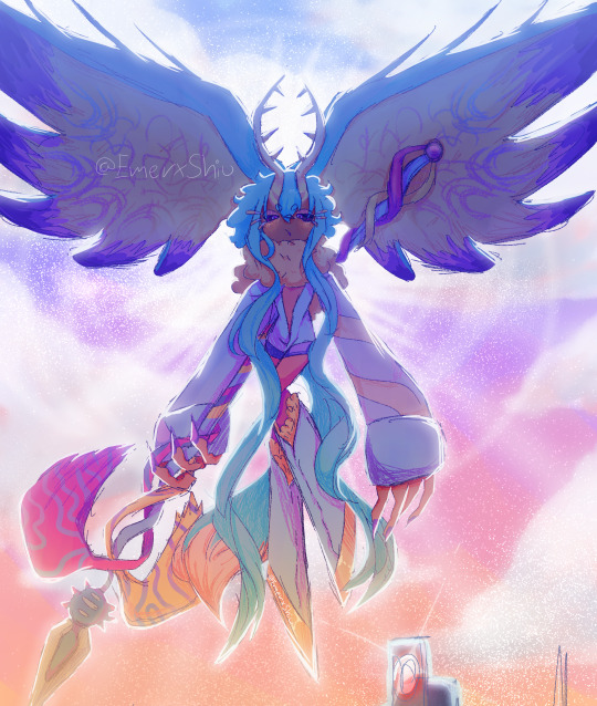
some close ups since his face is a bit hard to see
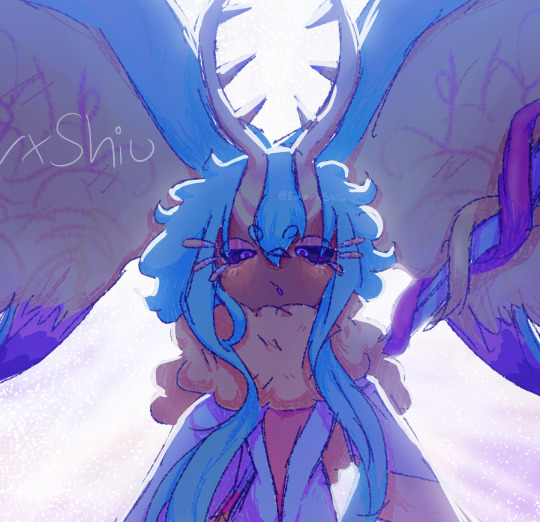
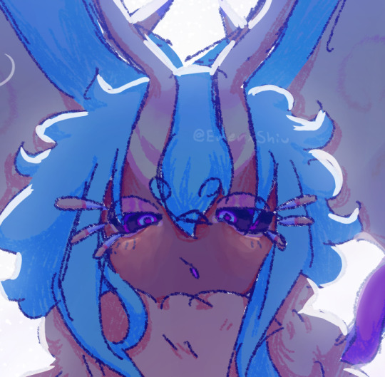
silly :3
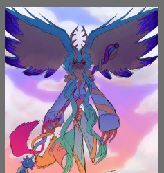
fun fact! actually, this is technically a redraw, somewhere around between february and march i started a fecto elfilis drawing for the first anniversary, but i couldnt finish it in time, and i never finished it
thats...quite the improvement! (i remember being so proud of it)
also his wings are like that cuz i did not want to draw the pattern, its way too hard, i literally copy pasted it, wait, i was talking about the 2024 version but i looked at the 2023 one and i just noticed it also has the pattern copy pasted, i guess some stuff never changes since i still abuse the ctrl+c ctrl+v to this day
Also i ended up making a huge error there, i was planing to add the phantom spears from orbital pulsar (the attack he does first when you battle them at lab discovera) but theres an innacuracy, when they do the attack, they always close their eyes, i had actually sketched him (well i mean both these drawings are basically the first sketch (2023) or second sketch(2024) with some color, shadows and lighting. i didnt do lineart in the 2024 one cuz i wanted to be a bit like the og i made (too bad i sketched that one with black since the og was sketched with white due to me drawing the bg first)) with his eyes closed but them decided to make them open for a reason i cant remember, maybe i thought itd look nicer? idk
ive had the idea of redrawing this for quite some month now so it was kinda already planned
background cuz i think it came out really pretty
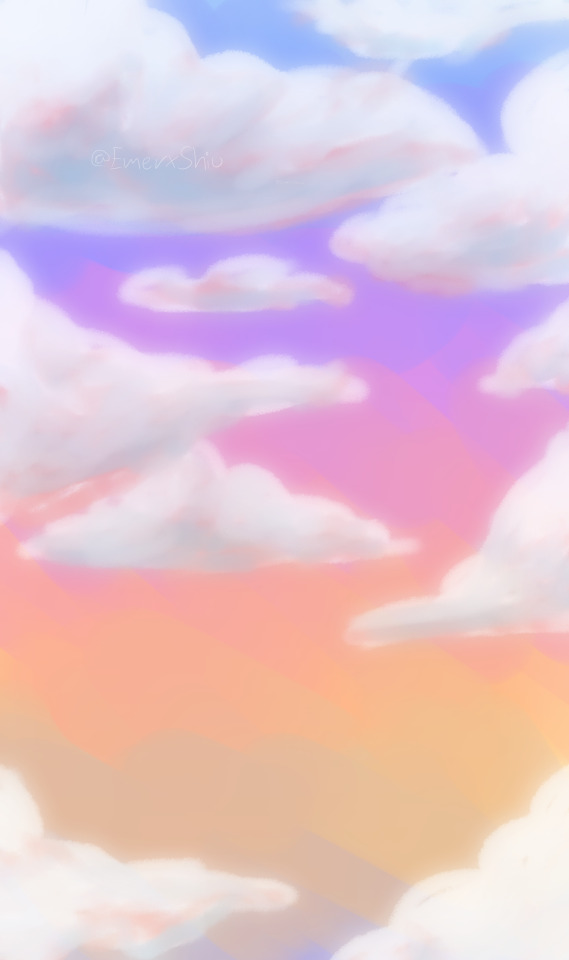
doesnt have the little stars since without elfilis and the structures it looks fucked up. the actual sky in game is more blue, but the clouds have some orange, in the 2023 ver. i made the sky orange, and in the 2024 ver i wanted it more accurate, but i didnt wanna loose the orange sky, so i did a gradient. pretty...
also here's a screenshot i took when i was like halfway trough it, its barely noticeable but i changed his mouth in the final drawing
I really love katfl, like a buncha whole lot, its basically almost my first mainline kirby game. 100% the demo, finished the game in almost one day, i literally play it monthly, like, every month i put the card in my switch, start it up, get morpho sword, and go shred elfilis in lab discovera. i would probably not even be here on tumblr and the kirby fandom if it werent for it. and i love it so much i genuinly cannot express how much i like it and treasure it with words or anything
Thank you for reading my unnecesarily long rambles lol
I hope i'll post tomorrow and dont forget like usual
Jambuhbye!
#art#fanart#kirby#kirby fanart#kirby gijinka#silly#digital art#firealpaca#fecto elfilis#fecto elfilis gijinka#my wife fecto elfilis and his new drip#yep changed them again#fecto elfilis lives in my head rent free 24/7#fecto elfilis fanart#kirby and the forgotten land#katfl#katfl spoilers#katfl second anniversary#kirby and the forgotten land second anniversary#katfl fanart#kirby and the forgotten land fanart#please reach a lot of people i spent way too much effort on this drawing#kirby series#kirby elfilis#kirby of the stars#:3333#:3#digital artist#artists on tumblr#small artist
44 notes
·
View notes
Photo
Days by days, tell me, tell me.
So tell me which way to go.
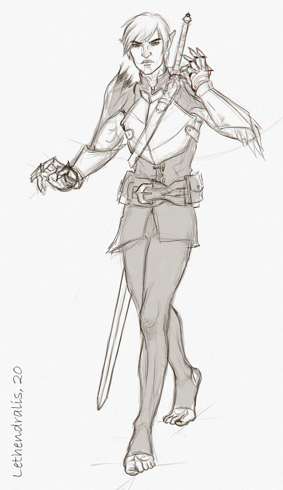
#jj project#jjp fanart#im jaebum#park jinyoung#scene redraw kinda#is putting the lyrics to a song in the caption still cool?#im super late to the jjp comback but i had to draw this scene#school got in the way#still figuring out how to use krita too#guess who just found the blur tool#but backgrounds are hard#the lineart's bad because its technically the sketch layer#but this has already taken me four hours so im posting it anyway
11 notes
·
View notes
Photo
heres everybody who has horns! just because
though im sure everybody has different horn hc’s for the dsmp cast, like ranboo having horn ect.
who from the dsmp cast do YOU think has horns?
also heres my mspainting process under the cut just for shits and giggles
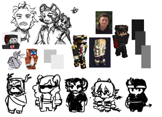
1) first i gather up pre-existing designs i already have and then references for canon designs. (this is also where you come up with your colour palette, at least it is for me, i decided to use a mostly monochromatic one, with slight pops of colour from the pre-existing colours in the palette.((all pre-existing art is made by me btw! i DO sometimes use other peoples art as references for style ideas, though often enough i like my own designs well by themselves!(((the schlatt + tubbo drawing is actually all the way from january of 2021!))
2) then comes the beta sketching! this is where you come up with composition for the piece and make notes for later on in the drawing process. think of this step more as thumbnail sketching, youre here to make the VAGUEST and the most CLEAREST messy sketch possible. i also like using a very light sketching colour, because it shows up (because of the lack of layers) when you start to make your clean sketch on top. (and you COULD use a normal pixel brush for this step and then just draw in black over top with the pixel brush again and then use the black and white trick to erase the sketch, but this is easier for me)

3) now its time to make your alpha sketch! this is where you start to define shapes, and the faces! now is also time for details that you wanna keep track of like buttons and fingers

4) then its time for the colours! i forgot to copy the drawing before i started to clean up the colours with lineart, but captainpuffy jschlatt and tubbo are all still all without lineart! this is also where you wanna fine tweaking your drawing, like for example making puffy taller (she looked a bit too squished!) and all that. i just made a quick copy of the puffy drawing and gave her longer legs, as well as cleaning up her legs.
5) then its lineart time! add all the details you missed and remember to look back at your references to see if you want to add anything! (i added tubbos scars here, as well as eryns devil horn, and schlatts legs lmao. i forgor the legs before this) technically, you can literally change literally anything at literally at anytime. mspaints flexible like that. though if the lack of layers scares you, i recommend making copies of the pieces of the drawing you want to fix or start over on! because of how bad the undo redo mechanics are, i just recommend the copy strategy, as that way you dont loose any progress on having to erase something if you dont like it.

this is what my canvas looks like actually! i work on a pretty big canvas, which comes in handy when you need to move stuff around, and wanna keep your references close by for guidance
last tips:
+ i recommend making a physical colour palette on the canvas itself, as the little colour palette youre given only fits a certain amount of colours on it. (i usually have it either right next to my drawing, or with the refrences corner)
+ i recommend having very big canvas settings! you can always trim and shuffle stuff around if you want to, but the bigger the canvas the better for your process so nothing gets interrupted by bumping into the edges of the border (though beware of saving anything bigger than 5000 x 5000! you might not be able to open it ever again...)
+ putting in your references on your canvas firsts helps a lot with the blank space fear! so its a lot easier to start doodling if theres already stuff on the page.
+ when youre moving stuff around on the selection tool, i recommend using the transparency setting thing, that makes it so that the colour of your background is transparent instead of one solid piece youre moving around. helps a lot!

+ i recommend picking one singular background colour to work with to make things easier, i like using the plain white colour because it comes automatically, but you can actually pick literally any colour you like! you can of course change it at any time, but its a bit harder to change the background colour later on
#dsmp#dream smp#captain puffy#jschlatt#tubbo#eryn dsmp#callahan#dsmp fanart#liquidraws#my art#mspaint#mspaint process#tutorial#basucally a tutorial i mean
106 notes
·
View notes
Text
Artist Meme
Was tagged to answer this set of interesting questions by @kourvo
(original post is here: https://kourvo.tumblr.com/post/621355098110640128/artist-meme
Thank you so much for that!
Let’s see....
1) What is the character you've drawn the most (Can be original or fanart)
This precious boy. I can never get enough of him. One of the most compelling characters I have ever come across. Love everything about Fenris and can relate to him on so many levels!
2. What colour do you often use?
Gray and brown are my faves. And all other colours have the same chance of appearing in my artwork :D
3. Any colour you are bad at using?
I don’t think so...I love them all, even the pinks and yellows people usually find hard to incorporate into a colour palette. Tell me in the comments if I��m wrong :)
4. When drawing people, where do you start?
Funnily enough - either with the front of the hairline or with the left eyebrow. Don’t ask me, why - I don’t know myself.
5. What is a character only your eraser will love?
Hmmmm...any sort of villainous character. I can’t draw evil people convincingly. I’m a huge softy at heart.
6. Which of your works took the longest time?
Big scale commission I did for @pikapeppa, featuring all the Inquisition companions, along with Fenris, Rynne and Carver Hawke. That one took almost 3 weeks, due to its sheer scope and my relative lack of experience in such large works. Pika was extremely patient with me though, for that I am eternally thankful!
7. What techniques do you use when you want to improve in drawing?
Classical art studies. Varying my technique, themes I choose and software I use. I try to experiment and go outside my comfort zone often.
8. What do you think of the art of the person who gave you this ask meme?
I adore Lillymon’s technical skill, refined style and limited colours! She is a huge inspiration for me!
9. What art tools/media are you good with?
DrawPile, Photoshop, graphite pencils and liners. That’s about it :)
10. Art tools/media you are bad at?
Traditional paints. I have no formal artistic education and my lack of knowledge comes to the forefront whenever I have to paint on a real canvas. It’s so much trial and error, you can’t even imagine....
11. What do you think about your own art?
Lately it’s one of the last few things that were bringing me joy. I hope I won’t lose the passion for it. Because at this point I’m not sure I’ll be able to find some occupation I will be genuinely interested in and good at it. I don’t know if me gravitating towards moody fantasy art speaks about my fear of facing reality. If so, idk what to do with that. I do hope to develop my skills and being able to support myself financially as an artist.
12. Do you consult references for your drawings?
Yes. A lot of them. Anatomical atlases, schemes for both academic and manga art, photographs found online and taken on my own, copying colour palettes from classical art - anything goes. I think it’s essential to develop your technical skill.
13. What do you like about your art?
Lately - consistency, both in terms of produced results and in sticking to the timelines I set to myself. I hope this lasts. I would also like to branch out to other themes and not confine myself to quirky fantasy characters, so I’m working on developing my own story behind the scenes (spoilers) :P
14. What habits do you have while drawing?
Only the bad ones, lol. Hunching forward in front of the screen, forgetting to eat, drink and letting my eyes rest. Tilting my head to the side instead of rotating the canvas....I’m an idiot XD
15. Are you good at drawing faces facing right?
I think that’s the thing I’m good at!
16. How frequently do you draw?
For the last 1,5 years - almost every day without fail, for good or ill.
17. What do you do when you have artist's block?
Change occupation and work myself into a depressed state. I changed work places in the last few years a lot, working as an interior designer, draftsman, textile designer, a cook, a bartender to name a few.
18. What must you have when you draw?
No commotion around me and a cup of some hot beverage.
19. Do you have a lot of stray lines (messy lineart)?
In the starting stage of my work process - yes, like you wouldn’t believe! If it’s a personal doodle, I sometimes just leave in as am under layer and draw clean lines on top of that mess. It looks cool in a way.
20. What is drawing to you?
An essential part of what helped me to retain my sanity in the last year and a half. Hopefully a lasting profession that will help me pay bills and survive on my own, if my life falls apart entirely later.
21. Your art goal from now on?
Broaden the themes I depict, improve my technical skill, work on personal creative project and not only fan arts. And most of all - not giving up on it this time.
22. Artists you've had influence from?
To name a few: @kallielef @kourvo @shayafury @fairsparrow who I met here on Tumblr, and many others who I follow and zealously study their works for clues on how to improve my own work.
23. Artists you like?
I am following them all either here or on Instagram, I also do my best to share their works on my side blog!
24. Which is easier to draw, humans or animals?
It was animals earlier. But now that I started to diligently study human anatomy, I would say it evened out! I’m quite confident drawing humans/humanoids now!
25. Show us an old drawing
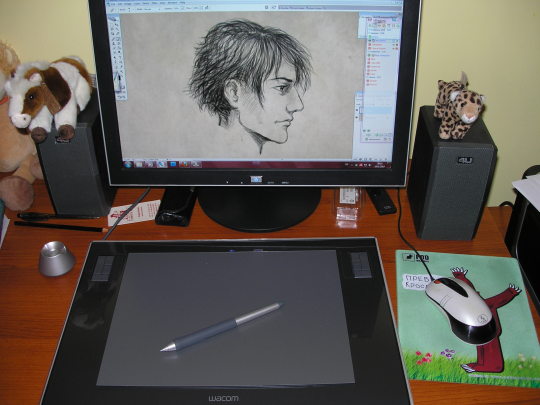
My first digital drawing from 2010 when I first bought my tablet!
26. What is the charm-point of your art?
I ummm....I don’t really get the question? Is that like the the strongest suit of me as an artist? Intense expressions maybe? Idk. Let me know in the comments :D
27. What is the first thing you would draw if we're talking about fantasy?
Broody warriors, he-he
28. Please draw your most beloved character:
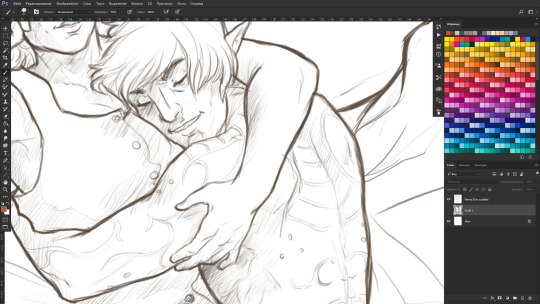
Here’s a sneak-peek of me drawing him right now! :D
29. When thinking of characters is it mostly female? male? or androgynous/no sex?
I usually gravitate towards depicting strong-willed, caring, passionate, brave, honest men and women.
30. What did you draw yesterday?
Started cleaning up that sketch from the last question, actually!
31. What is the funnest part to draw?
A circle. Mostly because you’d die laughing seeing my struggle to draw a believable one XD
32. What part of other people's drawings do you notice first?
colours, mood, eyes, hands.
33. Regarding backgrounds, what is your method of making it easier to draw?
pick your favourite textured brush, find a good reference for mood and colour scheme, zoom out, squint your eyes and start slapping colours like mad. You’d be amazed at how much you’ll be able to achieve in 30 minutes with this approach. Bare white background is the enemy - destroy it! >:)
34. What colour coordinations do you like?
Gray or brown as a main colour and then deep, earthy, saturated colours to complement the main one. Pink and orange is the combination I strangely enjoy using lately too.
35. What character did you last draw?
Fenris and Eris :)
36. Does your style change easily?
I don’t think so. More like it’s evolving slowly into something more serious and deliberate.
37. What part of drawing do you pay most attention to?
Facial expression, body movement, mood and light effects. Not so much the composition and framing, he he.
38. How do you feel about drawing adult art?
Tbh, I don’t consider straight up porn to be ‘adult’ exactly. To me adult art means aiming towards serious topics, exploring complex emotions and ideas, being honest with your viewer. I did doodle a few more steamy sketches of my OTP just to see if I could, but it was definitely a tongue-in-cheek kind of a artwork that I don’t take seriously.
39. Do you like criticism from others?
If it’s friendly and in done in private - I welcome it always.
40. How many people do you normally draw per artwork?
1 or 2. Rarely more. Crowded battle scenes are definitely not my thing :D
This was fun! Tagging forward to @shayafury @schoute @stella-minerva @nug-juggler @kallielef and anyone else wishing to go through such a long questionnaire!
50 notes
·
View notes
Text
A BASIC GUIDE TO DIGITAL ART ON PROCREATE
okay so i joined the digital art scene about a year or so ago and it has been a total whirl! there’s so much stuff that’s so confusing and hard to understand at first. And that’s okay! A stupid amount of what constitutes as “good” or “complex” art is to do with layers, patience and experience.
and because literally every tutorial on here is for Paint Tool Sai i thought it might be useful for those of us using Procreate! because i don’t have sai and i have a relatively shit laptop by comparison to my Ipad.
so without further ado - here is how to make a KICKASS piece of art on procreate
1. REFERENCE + SKETCH
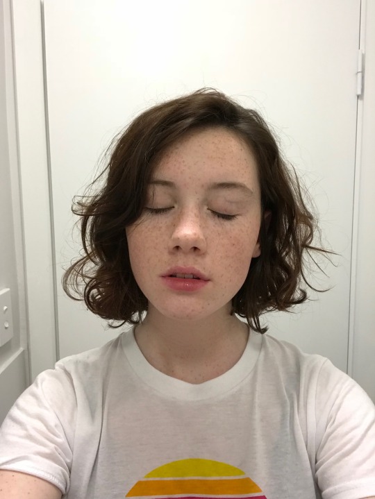
the first thing you're gonna wanna do is collect any references you need for thing youre tryna make. you can collect references by finding stock images, using other artists work (i use these mostly for colour refs cause i SUCK at finding good colours). however when i make art nowdays i usually just snap a selfie and use that. for this work i did the last option (see below)
after grabbing my reference i decide on the style i wanna use. for beginer artists what i suggest doing is just pasting the image onto your canvas, opening layers and adjust the opacity to around 20% by clicking on the little N on your layer with the photo. then once thats done add a new layer by clicking the + and work over that
for more experienced artists experimenting with style just stick that bad bitch reference in the corner, then open a new layer and sketch in your own style.
when it comes to sketching i usually do little flicky lines. i do this with a mid grey (like 50% white 50% black) i recommend the “Narinder pencil” which you can find by clicking the little brush at the top, selecting sketching and then selecting that bad boy. you can adjust size and opacity using the sliders to the side of the screen.
when sketching you just wanna get a rough idea of where you’re gonna do your eventual lines - don’t worry about it being smooth or anything just get down where everything goes
once you’re done you might have something like this:
this brings us too...
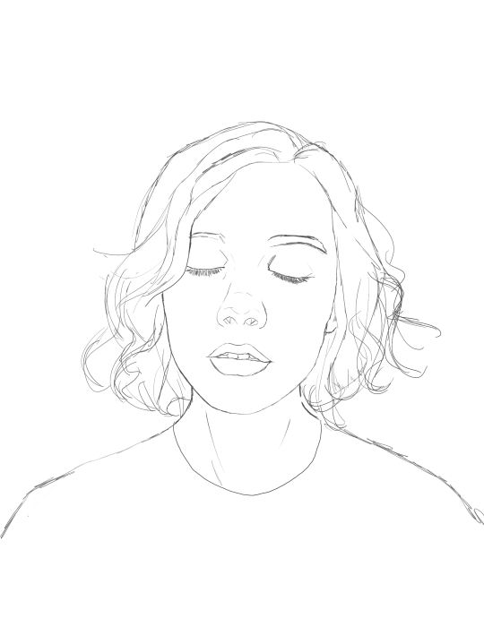
2. LINE ART
for beginners - lineart is just a sexy word that means a clean drawing with hard lines so you can colour it easier and it looks prettier. you want to do this on a new layer so you can delete the sketch one later.
your goal with lineart is to make it three things:
1) its gotta be seamless so you can select the insides, don’t leave little gaps between lines
2) its gotta be smooth! jagged lineart isn’t NEARLY as sexy as smooth curvy lines
3) this one is more of a tip - but lineart generally looks better if you do thinner lines inside your shape with a slightly thicker border line. again this isn’t essential but i find it looks cuter
the way i get my lineart all cute is by using the monoline brush (found in calligraphy). sometimes i use my own modified version of the Technical Pen (found in Inking) but mostly monoline is pretty neat. You can use whatever brush you want but mostly you just wanna ensure that its nice and smoooooth. you can do this by selecting the brush and then clicking it again. this will bring up a popup menu like this:
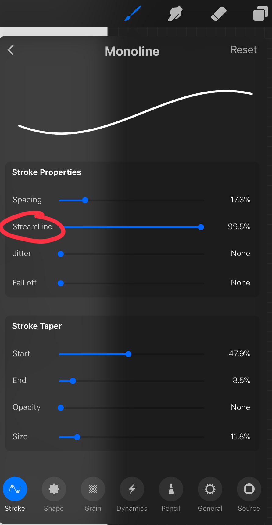
most of these brush settings are complicated and stupid and i’ll do a big post about it later. the only one that really matters here is streamline. if you wanna use a different brush for lineart just wack that slider up between 80-100% and you’re set.
once your lineart is finished on a seperate layer go to your layer menu and unselect the little tick on your sketch layer. you should be left with something like this.

3. ADDITIONAL DETAIL LINEART + MONOCHROME BASES.
once your focus lineart is done you can add detailed lineart by repeating the same process with sketching and lineart i described above. i like to do details separate because if i dont like it i can just delete the whole layer without destroying my focus.
what i find important in these now is using my favourite fuckin tool in this whole program. you can find it here:
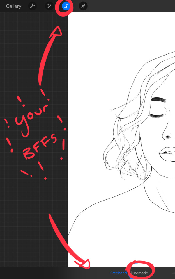
Only start using this once youre 100% done with your lineart. once thats done - make sure youre on the lineart layer and click that weird little s at the top of the screen. go to the bottom and click automatic. then select somewhere INSIDE your lineart. it should do something like this:
don’t freak out! what that blue stuff means is that you've just selected the inside bit of your lineart. continue selecting until your subject is 100% coloured in.
MAKE SURE THE BACKGROUND/STUFF OUTSIDE YOUR LINEART ISN’T SELECTED.
ALSO MAKE SURE YOU’VE SELECTED THE LINES THEMSELVES. THEY WILL TURN WHITE ONCE THEYRE SELECTED.
if u fuck up and select something by accident that’s all g, theres a little undo button on the bottom. if you click on the paint brush or another tool and you cant add stuff to your selection you can reload the mask by holding down on the weird s and the selection will reload. If there are certain bits of your work that you’re struggling to select with automatic selection that’s also not an issue. just click the “freehand” setting next to the automatic setting on the bottom and you can now use your stylus to draw around what you want to select.
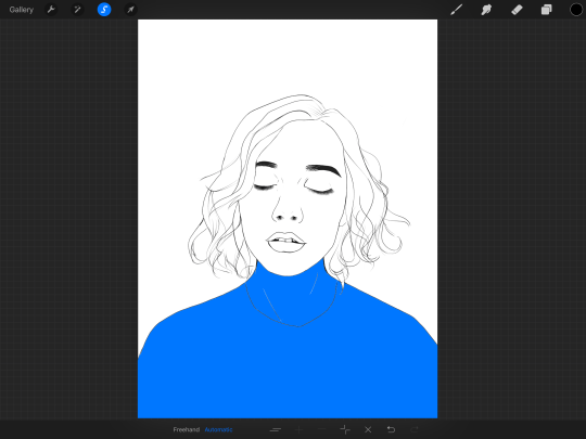
once you’ve selected your foreground in its entirety - THEN click the layer button. insert a new layer underneath your lineart layer. Using literally any brush (works best if you get one from the painting section) colour EVERYTHING white. just get round brush and colour all of it. you wanna keep your line art layer separate over the top.
once all of it is coloured hold down on the weird s tool until it reloads the selection. then look along the bottom of the screen and click the little button that looks like 2 arrows pointing at each other.
THIS INVERTS YOUR SELECTION.
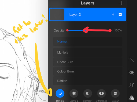
Open a new layer and make this entire thing a grey. THIS IS WHOLE STEP IS OPTIONAL BUT ITS SUPER USEFUL AND THE SELECTION TOOL IS SUPER HELPFUL FOR GOOD ART. DOING THIS WILL BE SUPER USEFUL WHEN YOU COLOUR STUFF LATER.
once you’re done it should look something like this:
4. BASE COLOURS
okay so this is where shit starts to get real. The goal of putting down base colours is to make is easier to add eventual shading to your piece and decide your colour scheme. This is where the white layer you just used is gonna become your BITCH.
you wanna start by duplicating your white layer you just made. You do that by opening your layer menu and swiping that thot to the left. this is what should happen:
click duplicate. Select the top duplicate you just made and select our favourite weird s tool. click inside your shape and the whole white shape should go blue (become selected). next, open a new layer on top of the white layer. colour in your base colours and now none of it can go outside the lines. you didn’t even have to do a billion selections. you just select inside the white blob on the layer we made the step before, opened a new layer and started colouring. fucking superb. so much time saved. DO YOU KNOW HOW MUCH I USED TO SUFFER BEFORE I THOUGHT OF THIS. HOW LONG I SPENT SELECTING AND RESELECTING I CANNOT
A TIP FOR PEEPS NEW TO THIS PROGRAM - if you use your finger and hold down on a colour you’ve just used it acts like an eyedropper tool so you can pick up any colour you want. like this:

once you got your base colours done you can either:
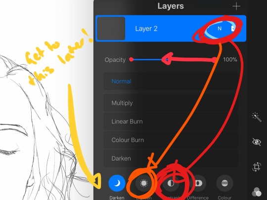
1) go to your grey layer you made in the last step and select the tick next to it. once you’ve done that scroll to the bottom of your layers and select background. it will open a colour wheel. pick your background colour.
2) you can use my second favourite tool from this program! go to your grey layer you made in the previous step. click on it, then click on it again. (not the little n just click the whole layer) this menu should pop up:

oh MAN okay so.
“alpha lock” pretty much means that it locks whatever is on the layer. when you get another brush and go over a layer with alpha lock turned on you can only paint over what you have previously put on the layer before turning on alpha lock. Its like automatically selecting everything on the layer. its fucking brilliant.
anyway.
scribble over your grey layer (once alpha lock is on) and boom you have a base for your background.
NOW YOU KNOW ABOUT ALPHA LOCK YOU GO BACK TO YOUR LINEART LAYER. SELECT ALPHA LOCK. COLOUR IN YOUR LINES ROUGHLY 2 OR SO ISH SHADES DEEPER THEN YOUR BASE COLOURS
(minus eyes i like to keep the lines around them black.) this will make your art like 100000000 times nicer (majority of the time)
once you’re done you should get something like this:
this brings up to...
5. SHADING!!!!!!!
this is my favourite step tbh.
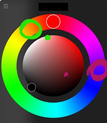
what you wanna do is chuck on a new layer over the top of your base colours. and go into your brushes. pick up your basic bitch “round brush.” this is (in my opinion) the best painting brush in the program. Its the thing you can do the most with. so what you wanna do it get a slightly deeper colour from your colour wheel by yeeting your colour selection slightly more saturated and slightly more dark. dont just make it blacker move your colour selector on a diagonal to get a nicer colour. (i’ll eventually do a colour theory ref but today is NOT that day.)
i like to do colouring in short, light strokes. DON’T PRESS TOO HARD. you wanna get that cute little gradient.
A THING FOR BABY ARTISTS: on every art program i have ever used, the blending tool SUCKS. it makes paintings UGLY AF. (wow another tutorial i have to do at some point.
i HATE the blending tool.
SO HERE IS HOW I COLOUR MY ART TO MAKE IT LOOK, YKNOW, GOOD:
Unless you’re drawing something SUPER freaking smooth like a bubble or some shit. when you wanna blend colours what you gotta do is:
1) put in your darker colour.
2) use your finger to bring up the eyedropper tool to select a mid colour of the colours your blending together - a mix between your lighter and darker colour. (remember that tool? it looks like this)

3) Paint the colour you just made in the middle of your lighter and darker shades. REPEAT THIS PROCESS ON EITHER SIDE OF THE COLOUR YOU JUST PUT DOWN TILL IT LOOKS GOOD. The result is an WAY sexier piece of art.
once you’ve put in all your shadows repeat the same process with highlights.
FUN TIP:
if you decide you dislike a colour or want to change the colour you already did all the shading for you can change the colour without any major drama. You can do this by select ing the colour on your colour wheel you would like to change your already shaded work too. (make sure you’re on the right layer.) then hold down on the colour dot on the top bar (next to your layer settings) and drag it to whatever you want recoloured. let go of the dot and it should recolour your work (including all the shading you’ve done granted that its on the same layer) like this:
once you’ve got all your shading done it should look something like this:

6. background and pretty bits
so! youve got this kickass work but nothing surrounding it. lets fix that.
In procreate there is SO MUCH you can use to spice up a work. a SCARY amount even. this is when layer settings are gonna start to come in handy.
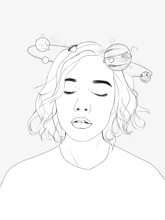
ill do a masterpost on procreate brushes for backgrounds later, but for this piece what im gonna do it head over to the Luminescence section and pick up a “nebula brush”. this makes a complex galaxy kinda design in a randomised stamping pattern that is frankly SEXY AS ALL HELL. Select a layer below your base colours but above your background colour.
IMPORTANT NOTE: this brush’s blend mode is autimatically set to “add” (ILL DO ANOTHER POST ON THAT LATER)which means if you go over the same spot heaps of times it will eventually go a bright white. This can be nice, but its not really what i want cause its kinda intense. to make this thing go glowy but not ~too~ glowy im gonna lower the brush opacity (the bottom slider) to around half way. i set my colour to a light yellow and a darkish pink and put in some nebulas!!!!
once that was done I wantd to add some more colour variation so i popped open a new layer - selected the lightleak tool and lowered the brush opacity using the slider to around 20% just to spice some shit up
you can kinda do whatever you want for your background. sometimes its nicer just to go into artistic, select a random brush and draw a square underneath what you were doing. backgrounds can be super detailed or super easy it doesn’t really matter to be 100% honest.
THE PART 2 OF THIS STEP WILL ADD HEAPS OF DIMENSION TO YOUR WORK AND MAKE IT SUPER PRETTY:
adding light effects over the TOP of your main subject often creates a more realistic sense of depth. In simple terms it just makes the thing look more 3D and nice. to do this, get a random brush with a nice (preferably light) colour. i picked up a “bokeh brush” from the Luminescence section. make this pretty big. sprinkle your brush across the page on a NEW LAYER above all of your work so far, including line art! Then open your layer menu and click that little n in the corner again. Remember this one:
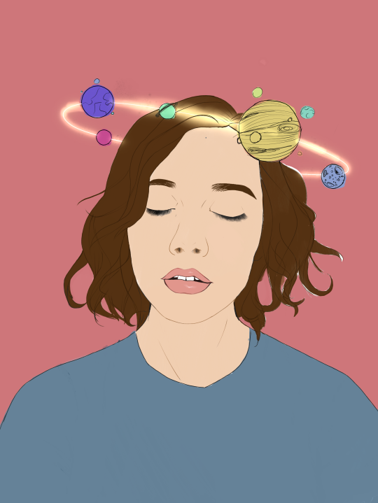
click the little n. then go down to the bottom and select a layer setting from either of the 2 groups circled (i normally like overlay for this type of thing) you can mess around with layer settings and opacity till you find something that looks super nice. My piece now looks like this:

pretty cool right. now we’re gonna make it EVEN COOLER.
7. LIGHT FILTERS
this is something i picked up from artists like softmushie and cryptidw00rm. (not gonna @ them here cause they probs dont wanna get tagged in my shitty tutorial thing but yeah i owe so much to those two especially)
for those unsure of what im talking about: light filters are layers you add over work to make the lighting on it seem more natural and pretty. you do this by colouring over your natural highlights and shadows with different colours and then messing with the layer settings to make it seem like its being hit by sunlight. these layers go BELOW your foreground stuff (the bokeh lights from step 6) but ABOVE your lineart.
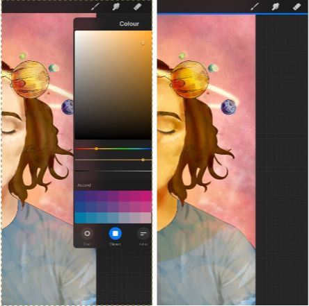
start by opening a new layer. select a colour similar to where the green outlines are here:
now on this layer paint over anywhere where the sun or other light source would be normally hitting (like cheekbones hair etc.) this can be kind of like shading. dont worry if it looks shit at first we’re gonna change it.
open a new layer beneath the one you just made. Using a colour similar to one circled in purple above colour over all the shadows in a piece. it should now look like this:
now open your layer settings on the purple/darker layer by selecting the N like we did with the foreground layer before. you can play around from here by setting the layer mode to anything from the “darken” or “contrast” menu. For this work i chose overlay. I then lowered the opacity until it looked nice.
Repeat the step above with the lighter highlight layer. when adjusting this one make sure you set the layer mode to anything from the “lighten” or “contrast” menu. For this work i did hard light.
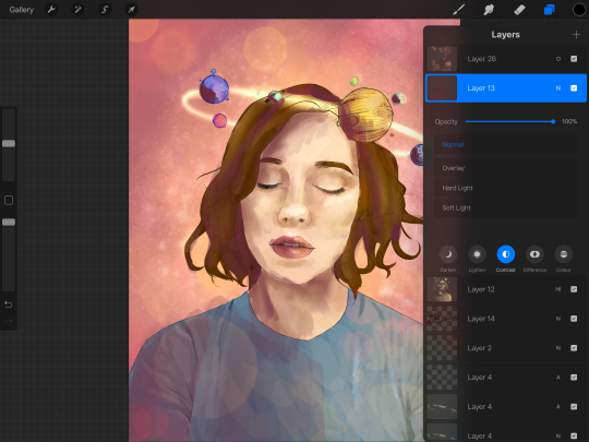
your peice should now look kind of like this:

AND YOU’RE DONE!!!!!!!!
look at that sexy thing you just did. Congrats on creating an awesome peice of art!!!!!!
if you guys are interested in more tutorials like these or have any reqs for similar stuff send me a question or a dm to my blog @plasticbattleaxe
if you create anything by following tutorial that you want me to see don’t hesitate to tag me or submit it to my blog!!! i love seeing y’all make art
also - i know it’s annoying - but reblogs > likes. thanks for your support
i hope someone finds this useful!!!!!
#reference sheet#art reference#reference#art ref#procreate#procreate ref#zoeyeets#plasticbattleaxe#plasticbattleart#layer ref#art tutorial#art studyblr#art tips#ref artist#tutorial
1K notes
·
View notes
Last Seen Blogs

starchei
hi, welcome to chaos

junikle
Untitled

bigwstyles
Untitled
mizz-britt
Britt

song-project-down-money
Untitled