
Last Seen Blogs

widegreeneyes
Tenderness Is A Virtue

exhibitionsvisited
Exhibitions Andrew Bracey has visited
ginginnystories
GinGinny Stories
suppvrt-blog
ℳ⁎;☆ ʏᴏᴜ'ʀᴇ ᴡᴇʟᴄᴏᴍᴇ

merreedabeno
Merreeda Beno
Photo
2 notes
·
View notes
Photo
Other ancient WIPs I finished, I think 2015
6 notes
·
View notes
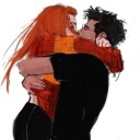
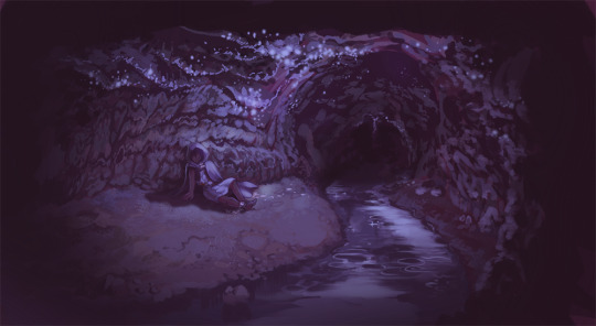
Photo

Crawling in my skin
These wounds they will not heal
Fear is how I fall
Confusing what is real
4 notes
·
View notes
Photo

was testing out some new brushes here, you can see the improvement in “understanding how these brushes work” from top to bottom
2 notes
·
View notes
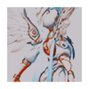
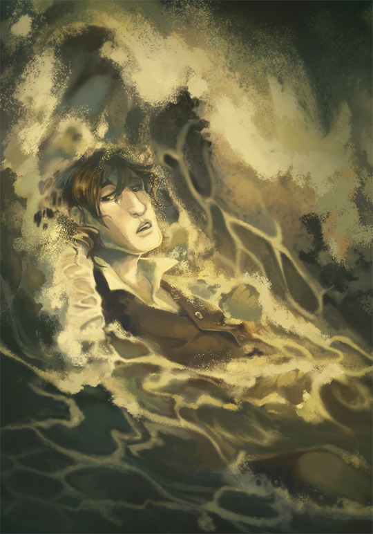
Photo
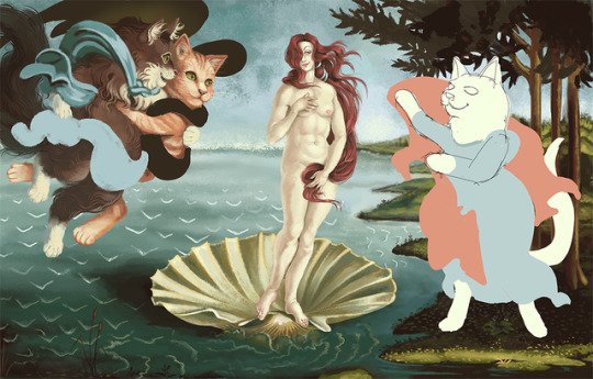
I haven’t quite finished but i am EXTREMELY PROUD of my hot take on the birth of venus involving jason edward delaney and cats
3 notes
·
View notes
Photo


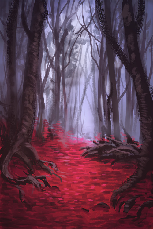
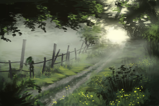
Some forest studies I’ve done while listening to lectures for an online course. Source for pics 1/3, source for pic 2, source for pic 3
4 notes
·
View notes
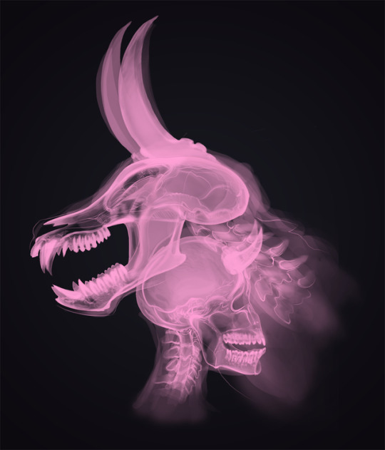
Photo
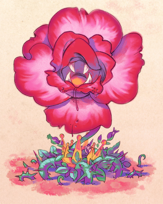
This one is much more recent -- it’s my interpretation of the Tyrant Rose from Ryuutama
20 notes
·
View notes
Photo


I needed a spot to put these to show someone, so for my first publicly posted art of 2017…. have some old rpg maker stuff I did in the style of the vx ace RTP (but please don’t use these for your games on the off chance any rm folks run across this, the majority are samples of requests i filled for other people)
2 notes
·
View notes


Photo


Some backgrounds for Demon Slayer
3 notes
·
View notes
Photo
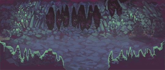
you know what’s a good idea? posting wide-ass pictures to tumblr
7 notes
·
View notes
Photo

#freya#freya crescent#ff9#food#guess who finally stopped reblogging things to their art blog and finished something#this person#this person right here
168 notes
·
View notes
Photo

I don’t know how I got to this article on logo design but I’m very scared
10K notes
·
View notes
Photo

ok here’s something posted to the right blog
2 notes
·
View notes
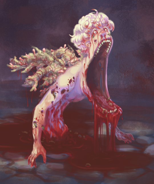
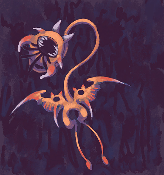
Note
Hey do you offer any colouring tutorials? I was really fond of the way you did Lemon bread from Undertale
It’s more of a “here’s my logic and process” rather than a tutorial, but for the most recent pic of Reaper Bird I saved a bunch of progress screenshots and wrote some notes. I don’t go into the technical side too much (like, I don’t explain what a clipping mask is for instance) but I use Photoshop CS5 and a Huion tablet. My layers tend to be a trainwreck so I did not take any screenshots of those ah-hahaha
hella pics under the cut

Usually I work from a sketch, whether that’s something I’ve scanned or something I’ve drawn digitally. In this case, you can see where I moved the sketch around. There’s a note in the upper right that says “+wide/rounder head, bigger head too” indicating I recognized I problem with the drawing but didn’t feel like correcting it in my sketchbook.
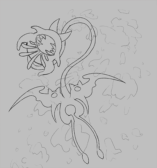
I went over the sketch with a pencil brush. Here I lightly sketched in rough ideas of where I wanted the moths to go.
I’m figuring out the overall tone and amount of darkness. I like weird wiggly abstract backgrounds so I scribbled one in.
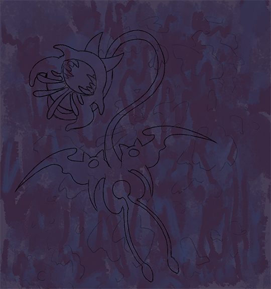
The abstract wiggles made it hard to put down flats, so I hid that layer while doing flats. Generally, I keep the lines and the color on separate layers.

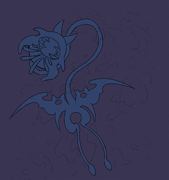
I used 2 colors here, an orange and a yellow-green. In general, I try to keep the amount of colors small and create new colors by mixing existing ones. I used a brush from a set ikrutt has released – I’ve been trying out more textured brushes lately. I picked orange and green because when I think of Reaper Bird, I think of death and whatnot since…y'know…reaping… which also makes me think of autumn and harvest stuff. So I picked orange for the main body and threw down something greenish that I knew I was going to change later. I also picked orange because I have a blue/purple background, so orange would stand out nicely as a complementary color.
When I pick a starting color, I aim for something fairly desaturated and a little on the darker side.
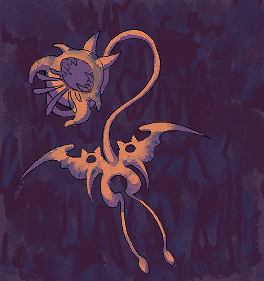
With the same brush from the previous step, I picked a purple color and started plopping down shadows. In this case, I am thinking of a light source that is mostly shining from above and I’m just trying to get a rough idea of reaper bird’s form. I want it to look like it has some 3 dimensional weight to it.

I grabbed the original orange base and start refining the form. I know I want something kinda crusty looking.

I realized the singular orange body was kinda boring, so I added a second color at the tips of certain areas. For now, I put it on a separate layer and use white to figure out where I want this second color to be. Then I can just lock that layer’s transparency and slap in different colors to see what I like.

In the end, I settle on red. Note that when I’m picking new colors, I try to do it relative to the existing colors. I also added a lighter orange to make the raised/highlighted areas stand out more.
I added a cool grey as a third color. Originally it was just on the teeth, but then I changed the beak color and put it on the tips of the red to help make the colors fit together better.

The old background wasn’t doing it for me, so I tried a different abstract wiggle. In this one I wanted to emphasize force and direction, so i used lots of jagged pointy lines.

Finally I get to the moth clouds. I start drawing moth shapes in the general vicinity of the color blobs from earlier. To minimize distraction, I turn down the opacity on the other layers.
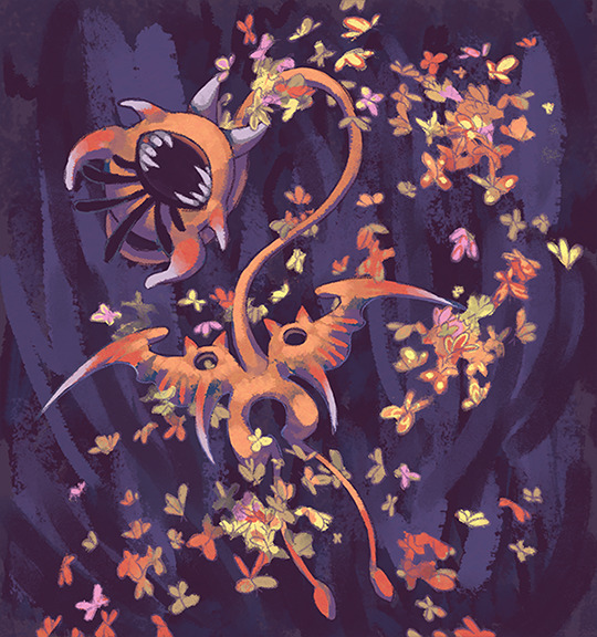
For coloring the moth clusters, I pick two new colors - a yellow and a purple - and try to add some individual detail here and there. I don’t get too worried about trying to detail every single moth. Here is where I really try to get that “autumn” set of colors.
I start refining the details. The changes are probably gonna look a little subtle at this point, but I brightened up the grey areas since I want them to come across more as white. I also refined the background a little bit. At this point I’m getting to the fussy bits.
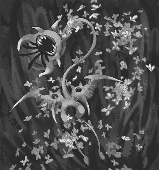
As an aside, I check things in greyscale every now and then to see what my values look like.

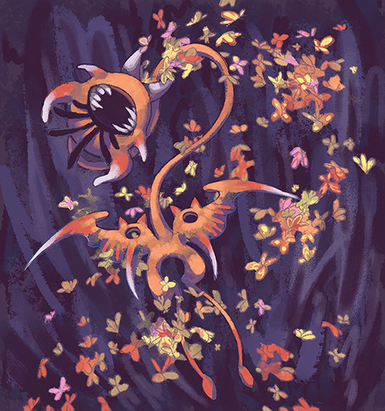
As part of the fussing, I added a secondary blueish light as if it was shining from the bottom and behind. This is to help make reaper bird stand out from the background. I put a gradient over the moths using a clipping mask since I felt the colors were clashing a bit too much.

I set the gradient layer over the moths to overlay at 70% opacity. I liked the look so much I just slap an overlay layer over the whole pic.

While I’m not too worried about making this look like the lemon bread pic, I still liked that kind of chaotic background effect so I added a wave filter.
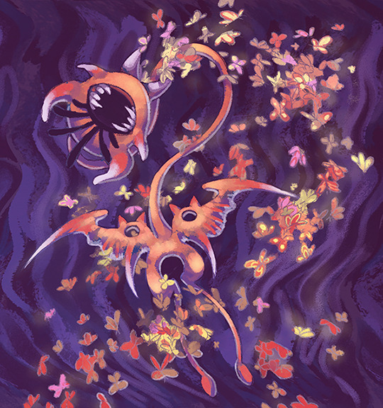
I thought the yellow stood out too much, so I took an airbrush and added clouds of moth dust here and there. I also lightly brushed some yellow over reaper bird’s body to try and make things mesh more. I also added shadows on reaper bird’s body from the moths.

Finally, I get those white bits as bright as I want them. At this point I tell myself I’ve fussed enough and it’s good to go.
8 notes
·
View notes