
pictopye
Pictopye
Howdy! With more than 14 years of experience in the art industry, I've worn many hats and developed a diverse set of skills. Outside of my career I delight in exploring new artistic mediums, hiking, reading, gaming, and knitting. Anything spooky or odd is a siren song for me as well!
33 posts
Don't wanna be here? Send us removal request.
Last Seen Blogs

shinozaki888
Untitled

jisookimlove
CHU
jfckitty
all the shit i hear is boring

ghost-hiro
DARLING!!
floofle-universe
This Blog Is Extremely Inconsistent requests open
Photo
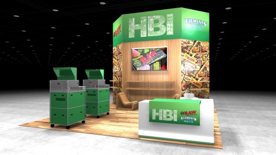

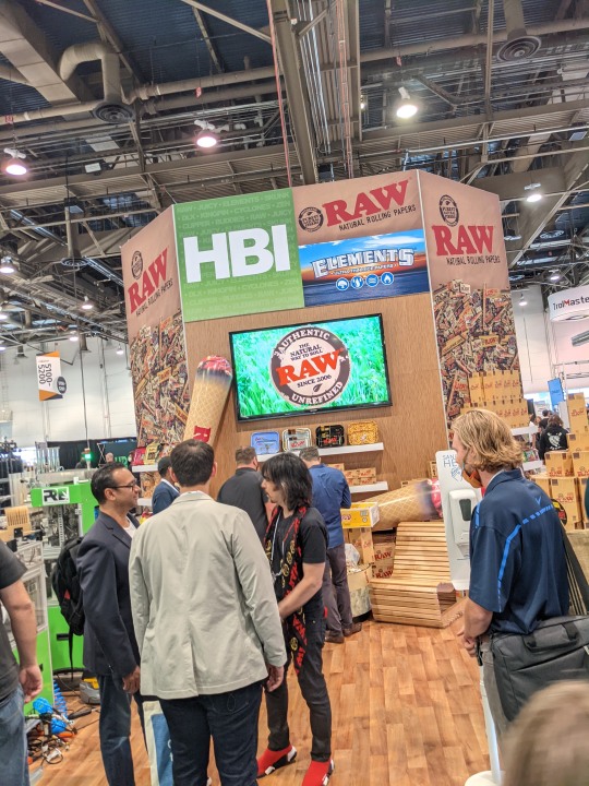

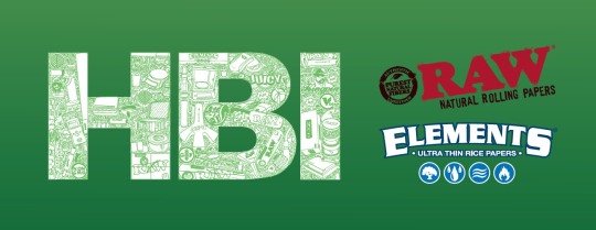


Trade Show Booth Fall 2021
Designed For: HBI International/BBK Tobacco
Trade Show Graphics
Designed:2019-2021
For the Fall CHAMPS trade show in Las Vegas 2021. The Art Director decided to re-utilize the 'HBI' graphic I had made for a internals. He thought that it'd be ideal for showcasing HBI's innovative, supportive teamwork, & creativity that I had brought forth. I re-formatted my design from t-shirt size to large scale dimensions for our vendor to use not just as a singular panel, but also part of the line-up of images that rotated across our center-screen.
People commented on the fun things the spotted in the logo, and really liked all the details, products, & unique feel that this brought to the show.
1 note
·
View note
Photo


HBI Logo Illustration
Designed For: HBI International/BBK Tobacco
Internal T-shirt Design & Trade Show Graphics
Designed:2019
In 2019 I got to ‘doodle’ the HBI international logo for an internal t-shirt design. The original plan was to use HBI’s various products to create the letters HBI for a holiday shirt. When I started to map the design out, I noticed that there was a lot of extra space, so I began to fill the gaps with humor and jokes that our company shared within its culture. Coworkers and their unique traits are peppered throughout the design while allowing the products to still be at the forefront. This illustration was so popular & beloved by my coworkers that it ended up getting used as a backdrop header at a large trade show convention showcasing us – the HBI family.
0 notes
Photo


Doodle-dom
Personal Study
Designed:2004-Present
I have always had a special spot for Dadaism. A byproduct of this is my hobby of making silly and absurd doodles, and then leaving them around the workplace or with friends. I have always been a bit nervous to showcase these in my portfolio because I worry about people see this as “unprofessional,” but bringing a little sunshine to my co-workers with silly drawings is a key component of my workplace ethos. I think it’s important to create joy and laughter with my peers through small ways.
0 notes
Photo


Sun Gazer Farms Logo
Personal Project
Designed:2019
After finishing a certification course in Permaculture in early 2019, I started toying with the idea of creating a brand or logo that could be used for my family’s 3.5-acre homestead. We are working to reestablish native flora and fauna to the local area while also looking to grow our own food, and there are certain instances where a logo and branding would be useful. I wanted the logo to include various local elements that would give it a sense of place out in the Sonoran Desert.
The design is based upon the Gilded Flicker. Our home hosts multiple species of animals, but we have quite a few families of flickers who make a frequent ruckus around our house – banging their beaks against on our tin roof every spring morning to claim territory from their competitors – rattling us from sleep at the same time. Their antics have given them a special place in our hearts. Within this design the flicker’s speckled chest has been reshaped & colored to be more akin to another desert staple - saguaro fruit, which are tasty treats for birds and humans alike. The additional graphical elements harken to motifs used by the Tohono O’odham, whose land we live upon. All together showcased in a sunset-themed color scheme (if you’ve never seen a desert sunset, I recommend it). Which pairs perfectly with the name that we chose: “Sun Gazer Farm,” as life in the desert is dictated by the sun and its constant presence in our lives.
#Illustrations#Vector#Permaculture#Sun Gazer Farms#Gilded Flicker#Bird#Sonoran Desert#Tohono O'odham#Saguaro#Sunset
0 notes
Photo

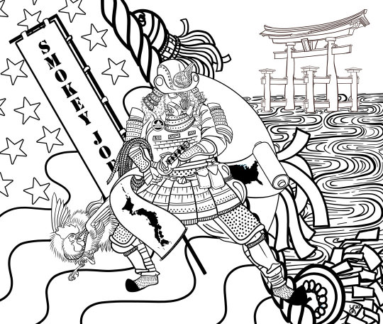
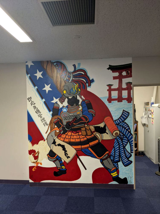
Smokey Joe USAF
Large-Format Illustration Project – USAF Misawa Base, JP
Designed: 2020
My younger brother is the 3rd generation of my family to be in the Air Force, and while he was stationed at Misawa AFB, his unit was asked to create a mural honoring ‘Smokey Joe’ the character mascot of the Air Force Civil Engineer Corps. They wanted the mural to have the American culture of Smokey Joe blended with the Japanese culture of Misawa’s location to show both cultures working together within the base. Since my brother is not an artist, I was brought on board to create the design that they would project onto the wall for painting.
I started this project with research, as I wanted to show an authentic representation of Japanese culture as opposed to a misinformed caricature. One of the larger elements I wanted to utilize was a Nobori – flags that samurai would carry into battle – typically they held the family/clan’s name or crest (kamon) on it. One of the Japanese liaisons that worked there kindly provided my brother & his team a kanji translation for the Civil Engineer Corp as a ‘family’ rather than just using ‘Smokey Joe’ – “Readiness & Emergency Management Family”. Which I felt was a great addition to the piece & brought more cultural relevance, as well as cohesion to the overall design.
I chose to create the design in a Ukiyo-e style. I felt that this style would be more forgiving for the non-artists who would be painting this piece onto the wall. The bold, but natural line shapes would be easy for them to trace, then paint over especially when combined with a simple color palette.
#Illustrations#Photoshop#Illustrator#Misawa AFB#Japan#USAF#USA#AFCEC#Smokey Joe#Ukiyo-e#Mural#Large Format#Design
0 notes
Photo

Flora
Personal Study Project
Designed:2015-Present
For this study, I wanted to experiment with painting plants as if they were a matte painting. For each of these pieces, I want to use a workflow similar to the creation of a matte painting – breaking sections of the illustration down into large “chunks” of color that are slowly filled in with detail to get the desired result. This study has helped to sharpen my drawing skills, as well as improved my ability to break larger detailed visual pieces into smaller sections for easier work.
0 notes
Photo

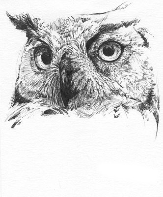
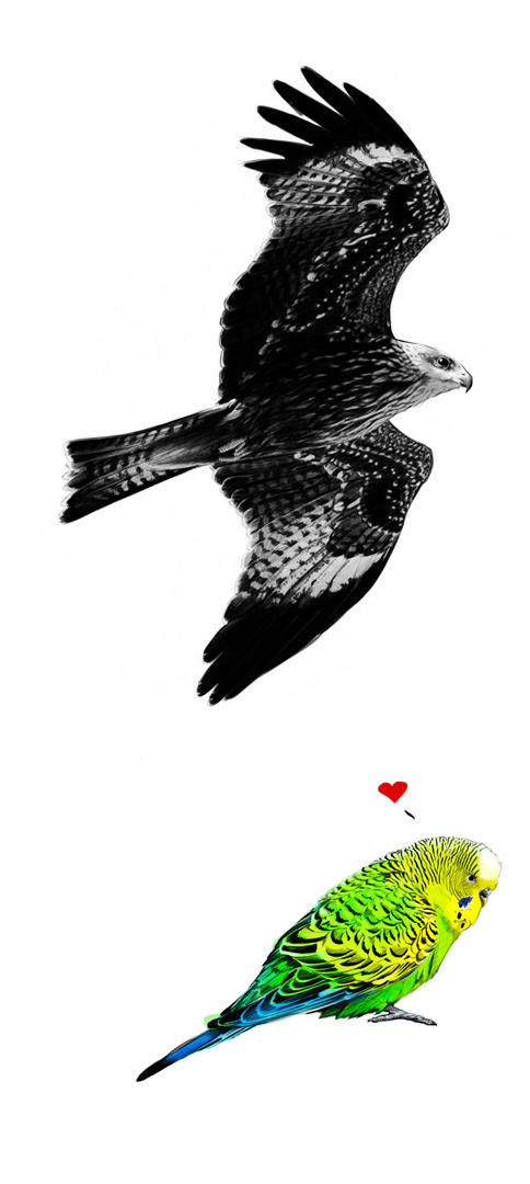
Animal Sketches
Personal Project
Designed:2004-Present
If you were to ask 5 year-old me what I loved most – it’d be animals. I have always been utterly amazed at the diversity of life in our world, and whenever I find myself with a little time to doodle, sketch or speed paint, you can pretty much guarantee there will always be at least one animal. Here’s a showcase of some of my best animal pieces
0 notes
Photo
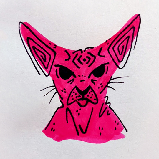
15 Cats & Life
Personal Study Project
Designed:2021-Present
I love cats. I love cats so much that I have 15 of them. Because I’ve always had a soft spot for cats, I really wanted to use them as a focus to experiment with bold broad shapes and simple lines. The goal of this study is to create these images with minimal but expressive details. I deconstructed realistic photos of cats into solid shapes and lines, working to capture only the necessary essentials of what makes a specific cat special and unique. I really am enjoying this study, as it has helped me to discern how many graphical elements are really necessary in any given design, plus I get to draw cats!
0 notes
Photo


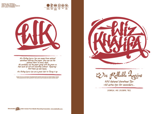

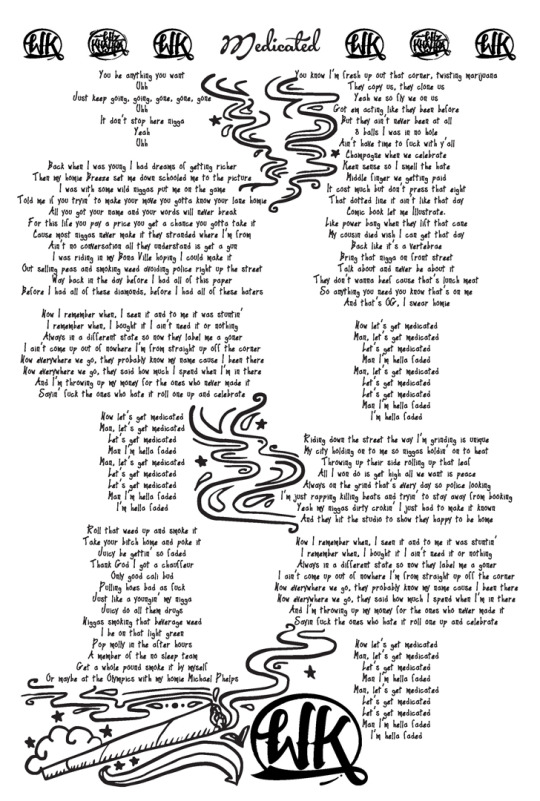
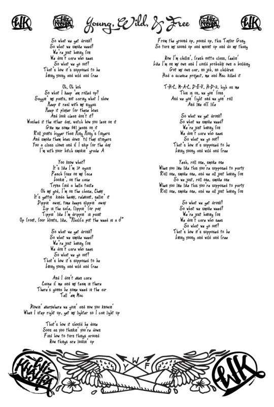
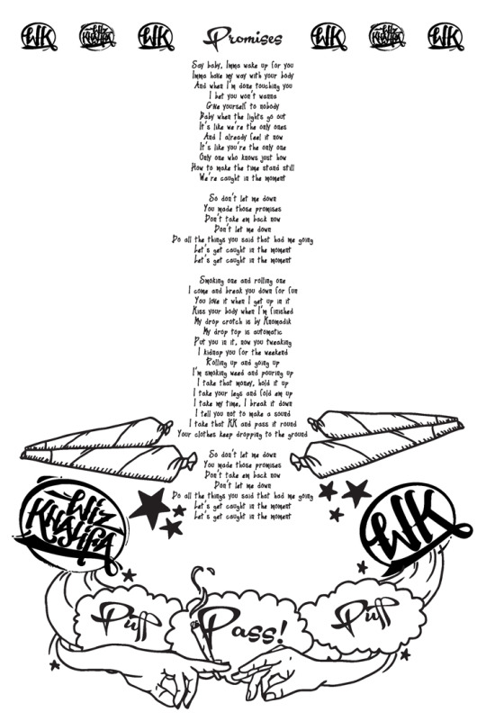

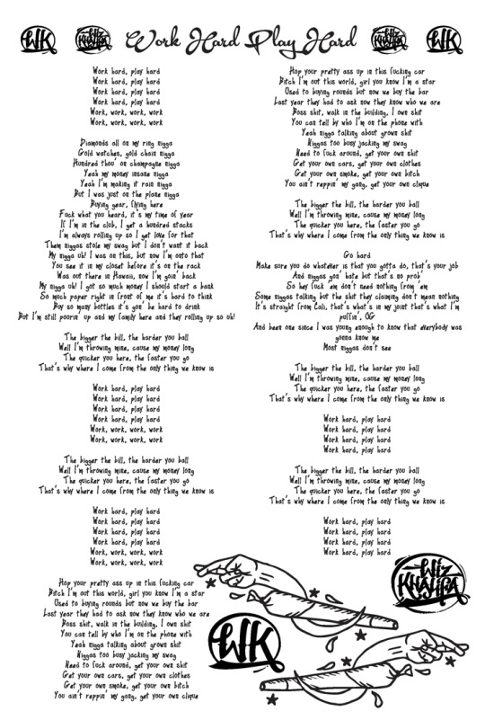
Wiz Khalifa Rollable Lyrics Tip Book
Designed For:
HBI International/BBK Tobacco & Warner Music Group + Wiz Khalifa
Designed: 2016
One of the first big projects that I was given after starting at HBI was to create a rebranding of RAW’s Tip Book into a limited-run Wiz x RAW ‘RAWlbook Rollable Lyrics Book of Tips’ as part of his personal product line. He wanted these tips to be special and look like they were handwritten by him. As such, I couldn’t use just any font to make this happen, & I needed to create custom vector graphics by hand, & lay it all out -- in under two days to meet the deadline. This project needed to please multiple levels of management, clearing not only my Creative Director, but also the Founder of HBI & RAW, Warner Music’s Executive team, and Wiz Khalifa himself.
I decided the best route was to go super sketchy with the style – like something you’d find hand-drawn with a sharpie in a notebook. I felt the bold lines would blend well with the Wiz x RAW logos that needed to be incorporated into the piece as well. I used a Wacom tablet inside of Illustrator to get clean organic shapes that would be crisp for printing in soy ink. This piece was incredibly successful, popular with RAW & Wiz fans alike.
0 notes
Photo


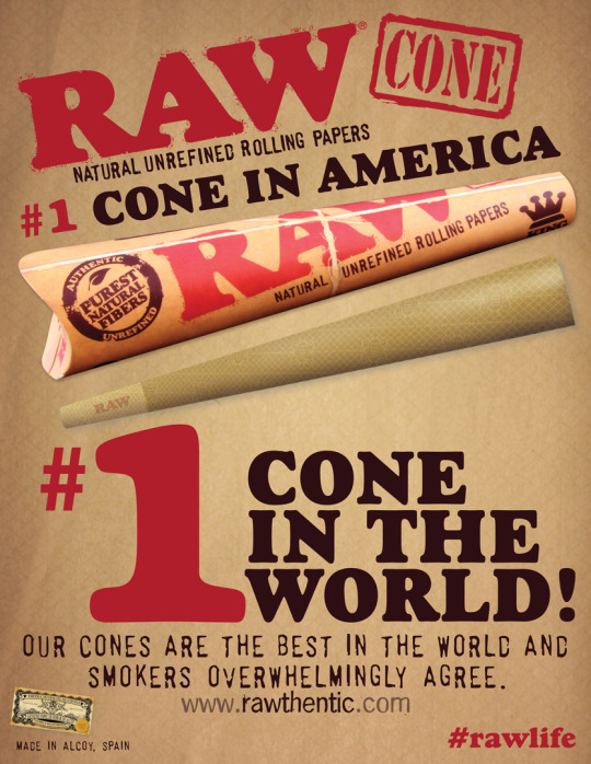
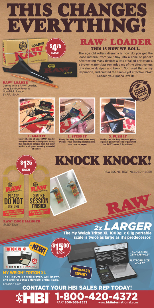

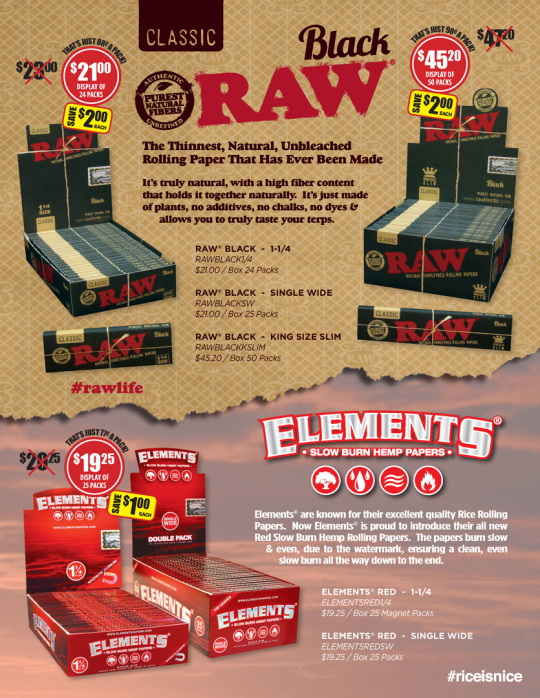

HBI Print Assets
Designed For: HBI International/BBK Tobacco
Designed: 2015-Current
RAW rolling papers is HBI International’s best-selling product line, and during my time with HBI, I have had the opportunity to work with this brand & others in a multitude of settings. Under the art direction of Ian Kobe, I have done a little bit of everything from internal works like sales promotional pushes to spark our sales team to political and non-profit promotionals to holiday cards. I’ve created B2B sales pieces; convention and large-format signage pieces; new logos, branding, and packaging for partnerships and new products. I’ve also gotten the chance to become very knowledgeable regarding compliance and adherence to design standards set by the FDA & local state governance for smoking paraphernalia. It really has been a wild and fun ride working with HBI International and the RAW family.
#Print#HBI#RAW#Elements#MyWeigh#ProScale#vector#Raster#Banners#Posters#Displays#Advertising#Illustrator#Photoshop#Product Art#Packaging#Photography#Photo-edit#Sales Promotions#Internals#Featured
0 notes
Photo
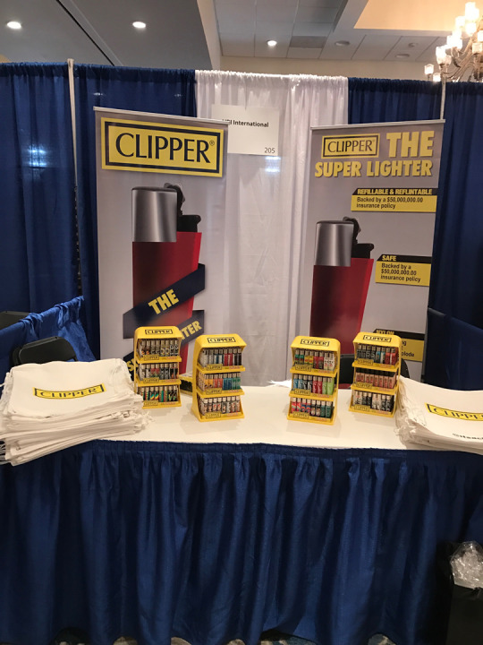
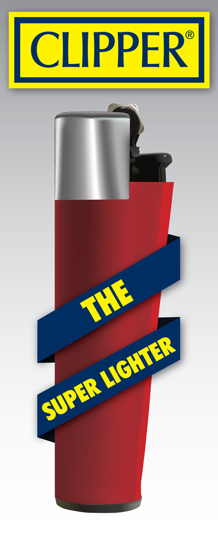
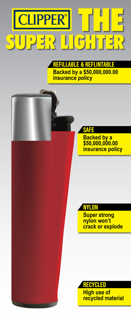

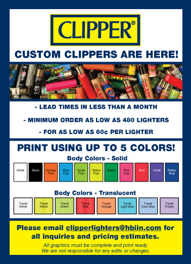
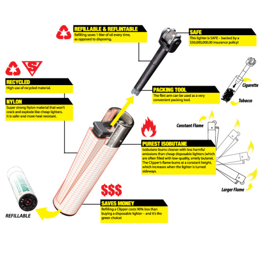

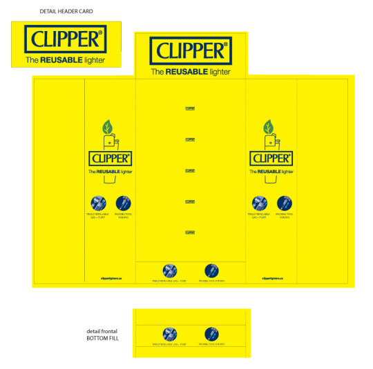

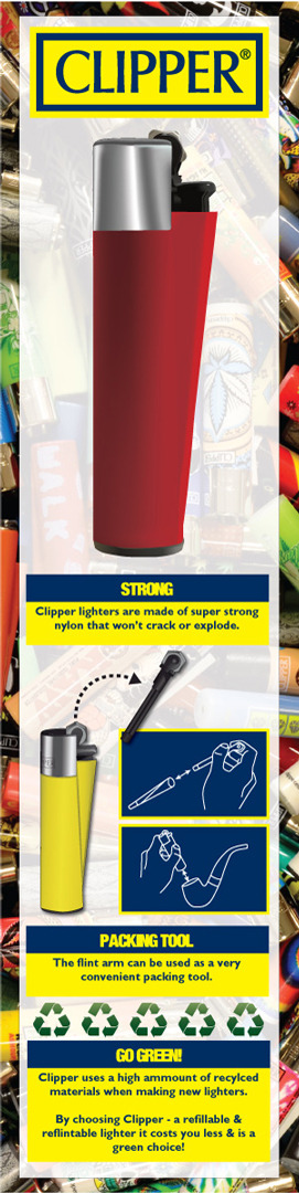
Clipper Print Assets
Designed For: HBI International/BBK Tobacco & Flamagas S.A.
Clipper ‘The Super Lighter’
Designed: 2016-2019
Clipper lighters are purported to be the world’s #1 lighter since it is re-fillable, re-flintable, utilizes butane, and is designed after a motorcycle’s gas chamber for maximum efficiency. I worked on many assets for Clipper over the years when their parent company, Flamagas S.A., was partnered with HBI.
HBI was the sole distributor of Clipper lighters to the U.S. market up until the contract expired in 2019.
This is a sampling of some of the assets I made for them during that time.
Retractable Banners, Custom Print Fliers, Re-built vector graphics, Display Cases, Display Side Panels.
0 notes
Photo
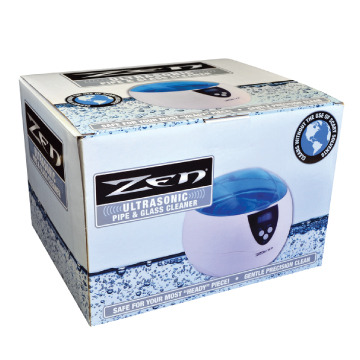

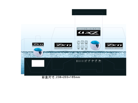
Zen Cleaner Packaging
Designed For: HBI International/BBK Tobacco
Designed:2017
The Zen Cleaner was the first build-up packaging I did at HBI that only featured the logo & vector elements – but no photography or layout. I ended up cloning a long strip of water bubbles to imitate the way in which the Zen pipe and glass cleaner would function. I added a subtle gradation behind the bubble line to keep the packaging clean and legible.
0 notes
Photo
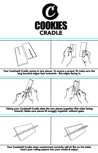

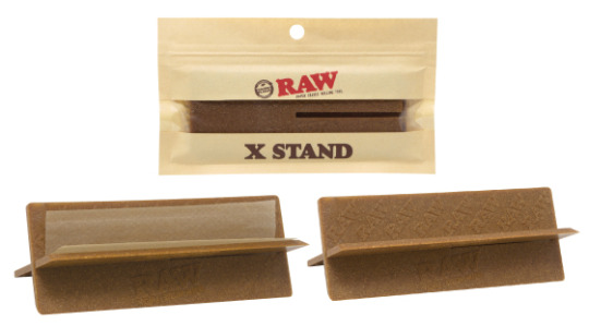
Cookies Cradle & Raw X-Stand Instructions
Designed For: HBI International/BBK Tobacco & Cookies
Designed:2016
Every now and then we must create some instructions for products we sell – and this was a unique situation when HBI was partnered with Burner’s ‘Cookies’ line. I ended up taking photos of the art director’s hands putting the unit together and operating it, then vectorized the graphics into easy-to-visualize instructions.
0 notes
Photo


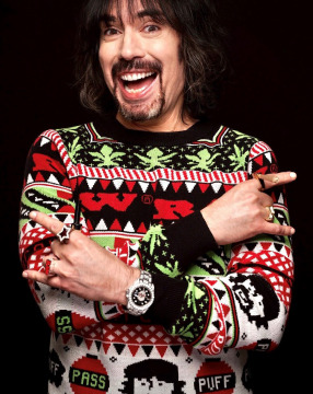
Raw Ugly Sweater
Designed For: HBI International/BBK Tobacco
Designed:2021
Josh was looking to have a RAW themed ‘ugly Christmas sweater’ made, and since I have a background in knitting, my Art Director Ian Kobe felt I'd be best to set up the art for manufacturing the piece. It was challenging dialing in how many details the mass-produced sweaters could contain, and we ultimately had to simplify the design for mass production. In the end, it came out looking good, Josh liked it (as seen in the pic above), and plenty of RAW smoking enthusiasts were happy for some festive apparel.
This sweater now has a re-release slated for Fall/Winter season of 2022 which has already sold out as of early Oct!
#Print#Product/Packaging#sweater#apparel#ugly xmas sweater#HBI#RAW#pattern#knitting#Illustrator#vector
0 notes
Photo
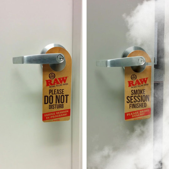

Raw ‘Do Not Disturb’ Instagram Photo-edit
Created For: HBI International/BBK Tobacco
Designed:2017
This is one of my most favorite social media images that I created for HBI & Josh - the founder of HBI & RAW Rolling Paper’s Instagram feed.
I spliced a few images my supervisor had taken of the sign on a door in our office, and added all of the smoke effects inside of Photoshop.
0 notes
Photo


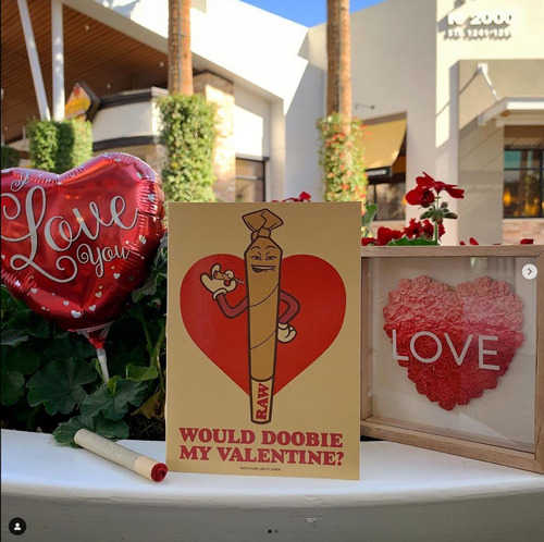

Mr. Blunty
Designed For: HBI International
Designed:2018-Present
We never created an official name for this character, so I’ve been calling him ‘Mr. Blunty.’ Mr. Blunty came about because Josh, the founder of RAW rolling papers, wanted to create new RAW-themed patches to go with some of the latest line of RAW backpacks and bags.
I decided to go cartoony, creating two separate pre-rolls; one a lit cone signing out “420” with his hands and smoke plume; and the other was an unlit Mr. Blunty.
This character was popular enough to create a Valentines day card featuring his presence. I had to modify his face to be less ‘high’, his arm, and hand to hold a lit pre-roll. I then created a few options for his facial expression for my Art Director & Josh to select from.
I let my art director know that they should choose the card design that reflected a popular Tiktok trend at the time for best results.
Ultimately, that was the version that was selected, and it sold really well, enough to sell out once & need re-ordering!
#Print#Product/Packaging#HBI#RAW#Character Design#Mr. Blunty#Illustrations#Photoshop#Illustrator#Featured
0 notes
Photo

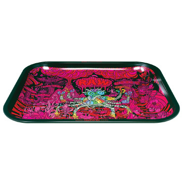
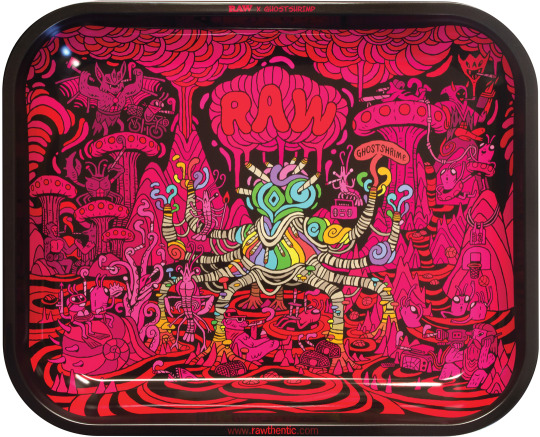
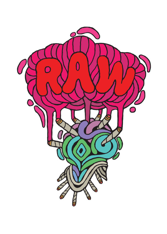
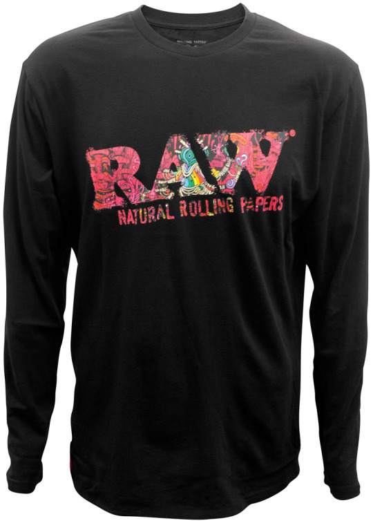

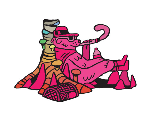

Ghost Shrimp Cut-outs
Designed For: HBI International/BBK Tobacco & Ghost Shrimp
Designed:2021
Ghost Shrimp is an amazing independent artist best known for creating the iconic look and feel of ‘Adventure Time.’ Turns out that he also really enjoys using RAW products. HBI via my Art Director Ian Kobe contacted him to see if he’d like to do any collaborations with us – which he was excited and happy to do. I was brought on later on the 3rd set to tackle character cutouts for possible apparel use, and to subtly extend the print design so the bulk of the art design wouldn’t warp when put onto trays. Getting to do little things like this with & see some fantastical work from artists I admire is always a highlight!
0 notes