Last Seen Blogs
pantyhosensexygirls
women

detective-with-one-arm
"I'm not a pig. I'm a wolf in pig's skin."
kingsinjin
Itsinjin
tomsrwilber-blog
Aidan Schneider

delosmersin
olgunsever
Text
Digital Final
Just like my experiments, I’m not fully happy with my final digital piece for a number of reasons.
I chose to make my composition a more square shape as I wasn’t having any luck with the portrait or landscape A2 sizes and I feel like that was a good choice as it’s a middle ground and in a folio it would work well as a ‘hero’ piece. I started off with a very low opacity, close-up layer of corrugated cardboard from one of my mixed media experiments however it is so faint that it is almost invisible. I continued by adding a close up of bubble wrap from the same experiment. I feel like bubble wrap links well to my section one work and the repeating pattern that was present in many of my paintings. I used the zigzag distort filter on this layer to create a warped effect on the bubble wrap and this helps to convey the idea that a lack of expression can lead to a person having a distorted and warped perception which can make them lose control and lead to gambling or addiction issues. I inverted the colours and played about with the colour hues, finally deciding to make it a blue colour that was similar in tone aswell as texture to my first development painting in section one. The next layer is probably my most important one as it features what I consider to be the intended focal point of the piece. This is a cropped close-up of the zigzag stitching from my final mixed media series and I am really happy with how it has came out. I used the twist distort filter and changed the hue to orange, a very expressive colour that featured heavily in my section 2 work. Having said that, I feel like the zigzags aren’t as noticeable as I would have wanted them to be, especially with the filtered bubble wrap layer below it. My next layer which ended up being put lower down also came from my final series, the crossword pattern which has became a focal point in my work so far. I would have liked to have used my final work more in my digital piece but I don’t think it works well for digital use. I felt like my piece was so far lacking something and I ended up adding a distored die to the image to convey the idea that a lack of expression can lead to addictions like gambling or anti-social behaviour. I then added a second die, this time a lot more distorted and with a much lower opacity, to create a motion blur effect as if the die has been thrown. Finally I added a segment of my final work with a loose thread to the corner to add some texture and lead the viewers eye to the die. In all while so didn’t really like my final digital piece, I think it conveys my theme well in aspects like composition and technique but lacks in colour which is disappointing.

0 notes

Text
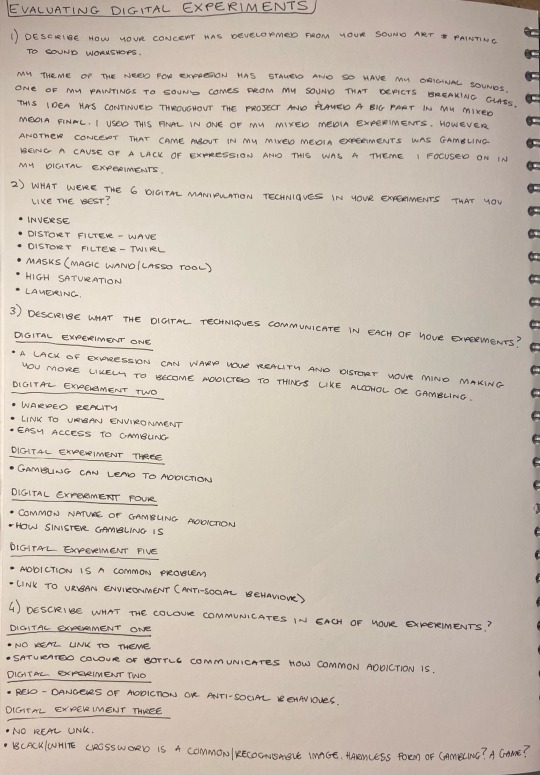
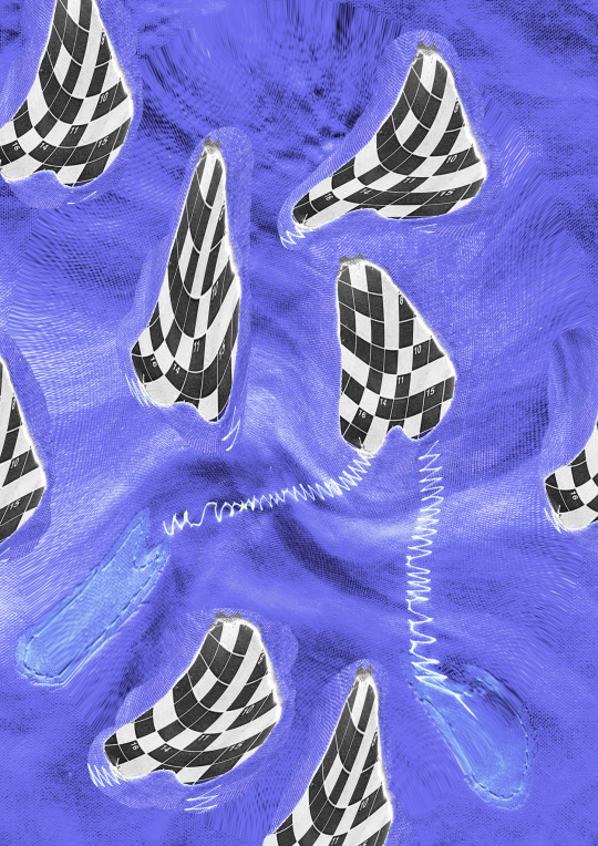
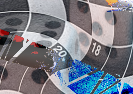
Digital Experiments
I’m not really happy with my digital experiments and I hope to learn from these in order to make a final that I am fully satisfied with. These experiments use some of my reference photos, as well as my mixed media experiments. I used various effects, filters and techniques on photoshop to create these experiments. One that stood out to me was the first one where I used the wave filter to create a distorted effect on my mixed media experiment. I really like the purple colour of the composition but don’t think it fits my theme at all. I also liked using the twist filter which created a spiralling effect on my images and I think I want to take that forward. I enjoyed inverting the colours of my images to create very interesting colours especially in my final experiment which features inverted racing results. I think so need to use the crossword pattern in my final digital piece as that has been a staple in my project for quite some while.


2 notes
·
View notes
Text
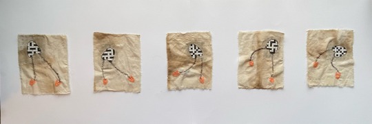
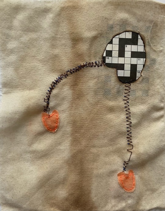
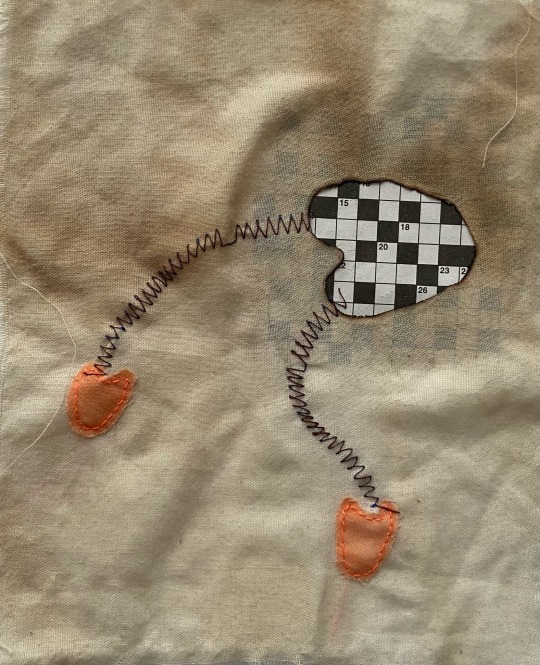
Mixed Media Final
I am fairly happy with how my final series has came out. I opted for doing 5 small 5” x 7” pieces in a series which showed movement. I chose to arrange them going from left to right as that is the way a humans eye naturally moves (when reading a book, looking at pictures etc) and I wanted to show movement of the ‘figure’. In my final series I chose to focus on the need for expression and hoe a lack of expression can lead to things like addiction, in this case gambling hence the crossword patterns. The ‘figure’ is seen to be in a different position in each piece to show that it is dancing, a common form of expression. I chose to make the ‘body’ of the figure the crossword pattern to show that gambling can be on someone’s mind if they aren’t able to express themselves. The feet are a bright orange colour as it is a strong expressive colour that is pretty out there. I really like the texture formed by burning the holes to allow the bottom crossword layer to show through. The stitching for the feet is quite poor and I wish I spent some more time on it however the same can’t be said about the machine stitching. The machine I was stitching with kept breaking and the threads kept tangling or snapping so I’m glad I didn’t spend more time on it as I spared my sanity. I’m happy with how it turned out given the circumstances and I like the contrast in textures the threads give. I mounted my series on two bits of A2 card so will have to find a way to fit it in my portofolio.


0 notes
Text
Final Compositions
Compositions for my final piece. Favourite is No. 2 by far.


1 note
·
View note
Text
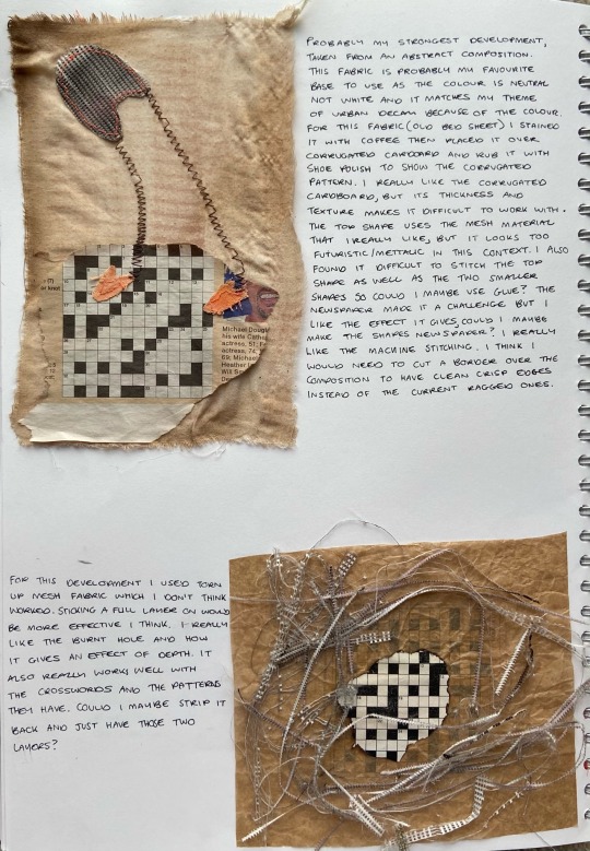
Mixed Media Developments
I really like my four developments that I have came up with and feel they all have helped to give me an idea of what to do for my final. My favourite development is my first one, which reminds me of the work of Joan Miró which was the direction I wanted to go in. I like that one of my abstract compositions has managed to become a focal point for my project. I do feel however that this development has lots that needs tweaked or improved on to make a successful final piece which I talk about in my sketchbook.

1 note
·
View note
Text
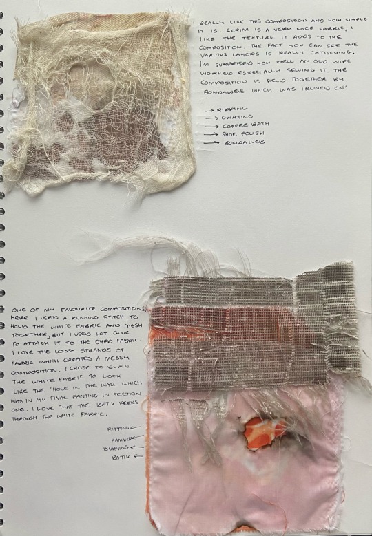
Fabric Manipulation
These were really fun to make and experiment with. I didn’t enjoy the sewing aspect of it at the start but it grew on me. I really like the batik dyeing but think the orange might be a bit too vibrant (I could maybe dilute the ink with even more water?). Using coffee to stain the fabrics was also something I liked as it gave them a nice worn out colour which goes with my theme. I really liked working with the scrim.


8 notes
·
View notes
Text
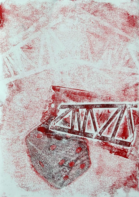
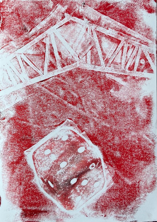
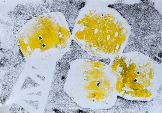
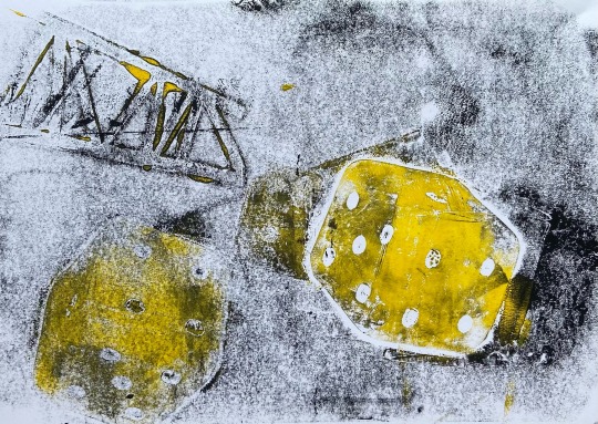
Printing
My prints using stencils came out pretty well I think. I tried to focus on making interesting compositions that linked to my work from Section 1 and I think I achieved that. I chose to include die in my prints as gambling can be a result of a lack of expression which is my theme. I really like the yellow/black colour way as it looks hazardous, like the derelict buildings are.


1 note
·
View note
Text
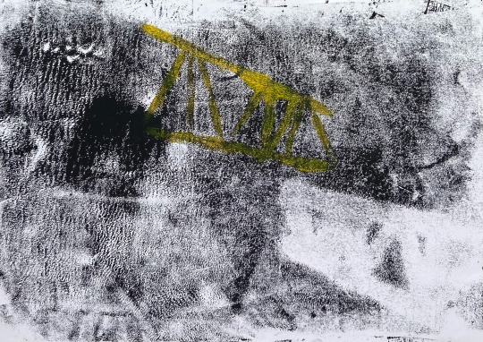
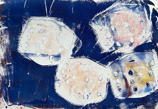
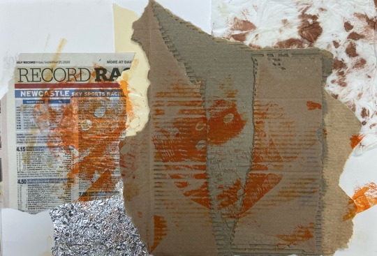
Stencil Relief Printing
I’m not really happy with how my 3 prints ended up. I don’t think my prepared surfaces were flat enough as I used corrugated cardboard in some of them. The ink didn’t really show up too well in places either which I don’t like. I do like the die stencils though and think they are definetly something I should try and use in my later works.


2 notes
·
View notes
Text
Paper Manipulation Compositions
I found it really hard to link my compositions to my sound painting so instead I took a more experimental approach, looking at what works and what doesn’t. I really like the texture of the corrugated cardboard and the bubble wrap. The use of the big letter ‘B’ surprised me as it’s a really bright colour but it wasn’t overwhelming in the composition. I think for next time I should try and incorporate more borders rather than letting my materials leave the assigned border as that makes the composition a bit heavy on one side.


2 notes
·
View notes
Text
Paper Manipulation
Manipulating various papers in many different ways to get interesting results.

0 notes
Text
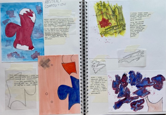
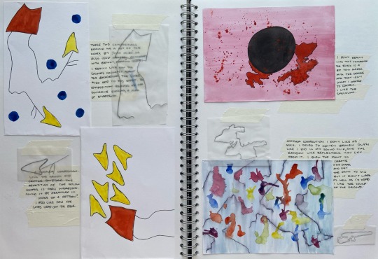
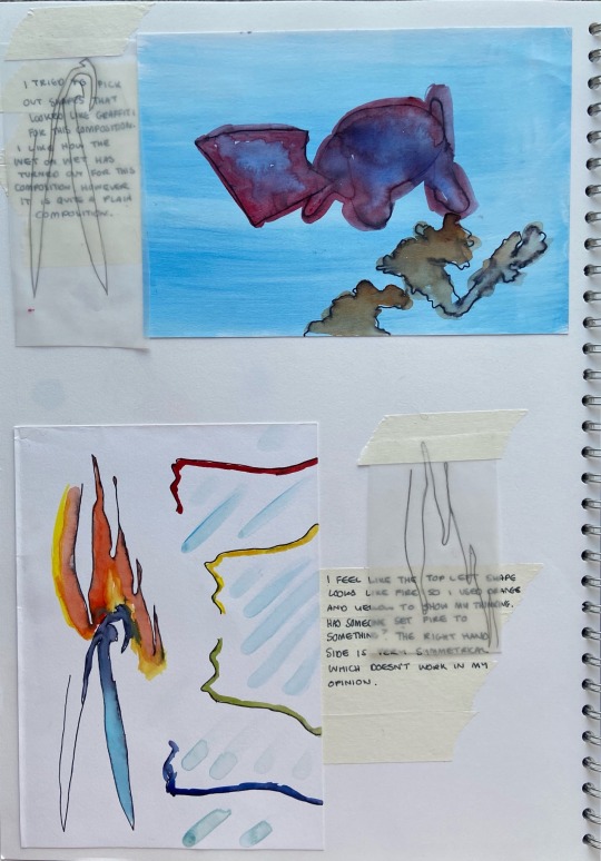
Abstract Compositions
Following on from the painting from sound workshop, we had to come up with abstract compositions that used certain shapes from our studies. We traced these out on tracing paper and then created compositions. I found it difficult to relate my compositions to my theme of the need for expression and most of my compositions lack a theme or direction, regardless I’ve been able to practice techniques and see what works and what doesn’t going forward.
0 notes
Text
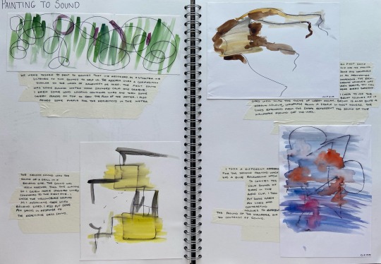
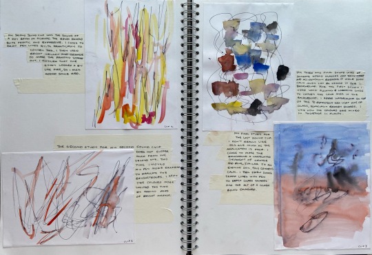
Painting from Sound
I really enjoyed painting from sound as the results came out very expressive and required a bit of thought as well. I felt like my sounds weren’t the easiest to paint to as they were quite short and basic but I’m still happy with the results given the circumstances. I would have preferred using a different media to watercolour, but it works well with the fine liner pen and how it washed out.
1 note
·
View note
Text
Sound Clip 3
My final sound clip depicts someone being frustrated and smashing some glasses by accident. In the background you can hear some faint music. Perhaps the person is frustrated because they aren’t close to the music. Music is a form of expression.
0 notes
Text
Sound Clip 2
Sound Clip 2 is a clip of a dry paintbrush on a canvas. I chose to do this as painting is a form of expression. The fast movements of the brush could also suggest that the person is frustrated, and needs to paint to feel better.
0 notes
Text
Sound Clip 1
This is from a video I took when filming my video for Section 1. In the video you can hear some breaking wood as well as peeling wallpaper. I chose this as I feel it goes well with my theme of Need for Expression. Breaking wood and peeling wallpaper could be considered vandalism and that is something that I think stems from a lack of expression which leads to people doing things out of boredom.
0 notes
Text
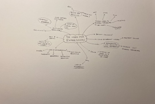
Sounds Mindmap
Mindmap showing my thinking on the sounds to record for the next section of the course.
0 notes