#I made the image too small and now it looks blurry on desktop :<
Text
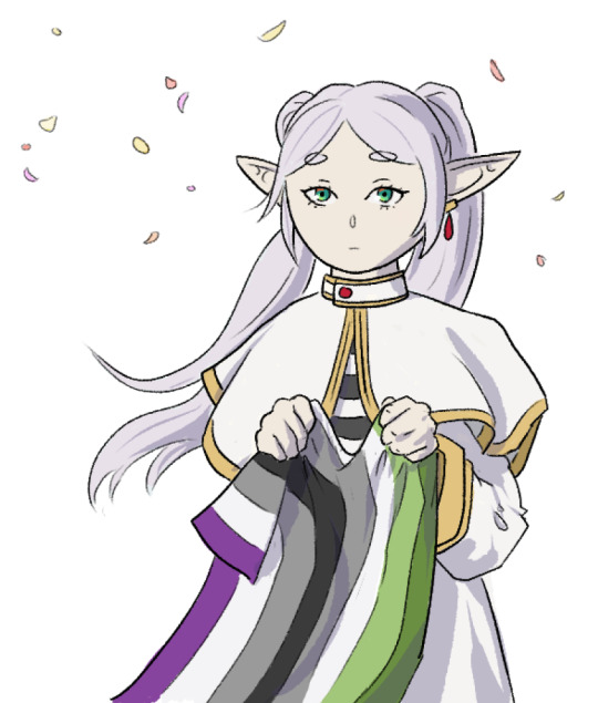
frieren my beloved
#I made the image too small and now it looks blurry on desktop :<#lesson learned for next time...#sousou no frieren#frieren: beyond journey's end#my art#ppl on reddit get VERY mad if you say you relate to frieren in an ace or aro way so anyway I'm making her even ace-r and aro-er#out of spite#a.art
27 notes
·
View notes
Text
My GIF making process!

I’ve been asked many times for a tutorial, but because I get really detailed, I always get overwhelmed by the idea. But I finally decided to buckle down!
Just so you know: I don’t use PSDs in this, and I don’t import layers to frames or anything like that. I like the hard way—at least in gif making, I believe you get higher quality gifs. Join me as I show you how to make gifs by loading videos directly into the Photoshop timeline and my coloring and sharpening techniques.
Tools used:
Mac OS X (only necessary for the first step, and there are other ways around it with a PC)
Adobe Photoshop
YouTube Purchases (any streaming service will work)
Topics covered:
Obtaining the Source Material
Loading the video file into Photoshop
Prepping, Cropping, and Resizing the Media
Adjustment Layers
Sharpening
Exporting
Obtaining the Source Material
There are a few different methods for obtaining video to work with. Proper YouTube videos are nice, but finding any major motion picture in that format is difficult, if not illegal.
Once I realized I could get really great quality video by doing screen recordings from streaming services, I stopped worrying about finding (and pirating) high resolution video files. So now, I just go to whichever streaming service I need to, pick out the movie or show, find the spot, and record small snippets.
Mac screen recording instructions:
On a Mac, Command+Shift+5 will bring up the screen recording dialogue.
Resize the frame of what you want to record within the browser.
Go to a second or two before, press the “record” button, and then begin playing the video, remembering to keep your cursor out of the recording box.
Use the Space bar to pause your video when you’ve gotten the snippet you need. Stop the screen recording by clicking the ⏹ button that is in your menu bar at the top of the screen.
Important: when the recording appears in the bottom right of your screen, click on it, and then trim the video on either end. This will help your computer convert the video file to the type that can be opened by Photoshop.
Click “done” and it will appear on your desktop, ready to be used!
PC Users: ??? Here’s a Google search I did for you
Loading the video file into Photoshop
Lots of people use this process for making gifs (a great tutorial!). I didn’t even know it existed until last summer, when I’d already been giffing for years. I wish I could still do something like that with these screen recordings, but the files are absolutely HUGE, especially on Macs with double retina displays, which actually increase the dpi by a lot. Making screencaps of them fills up my hard drive, almost immediately—even when I’ve got 20 gigs of free space to work with. So what do we do? We just. Open the file. In Photoshop. Et voila!
You can do this with any type of video, not just screen recordings.
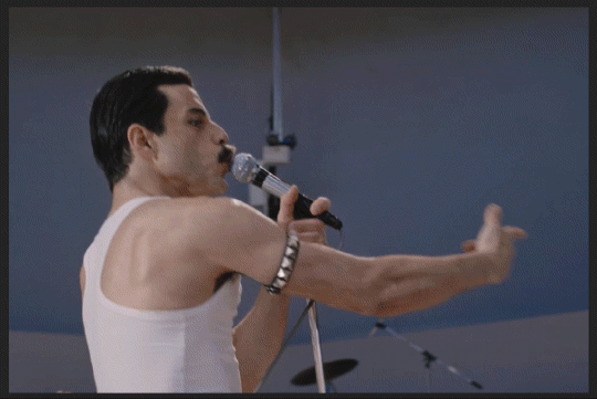
Prepping, Cropping, and Resizing the Media
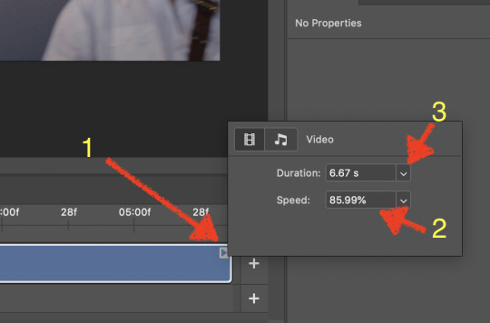
When Photoshop loads your videos up, it makes the video hilariously fast (something about frame conversion). You must slow it down for it to look natural. THIS MUST BE DONE BEFORE YOU RESZE. Your Photoshop timeline window should be at the bottom of the screen. See that little triangle in the top right of the video?
Click on it, and a menu will appear to change speed and duration.
Change the speed first- usually between 80-85% will seem realistic. (I actually went a little faster than I usually would on this at almost 86%—I don’t recommend this)
Press the button next to duration and pull the toggle all the way to the far right (if you don’t do this, full length of the video will be cut off).
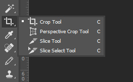
Now you’ll want to crop it. Ever since Tumblr upped its GIF size limit, I have been playing around with 7:5 ratios, but let’s go with 3:2 for now. Use the Crop tool, pick out 3:2 in the top left (it may say 2:3, but you can switch that) and then find the most suitable spot in your gif for that. Hit enter on your keyboard.
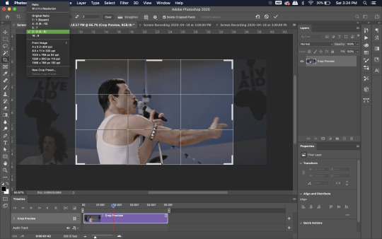
Some things to keep in mind when cropping:
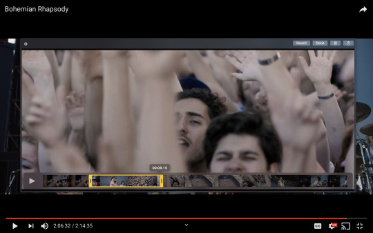
Most videos come in 16:9 ratio (BoRhap is even wider). If it’s a wide shot, you’ll need to do the full 16:9 to not lose anything. Of course, experiment and find what’s right for you!
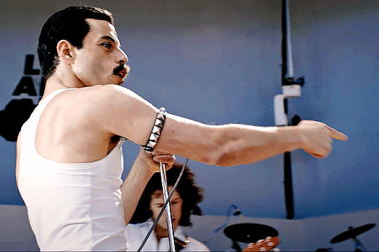
As you can see above, I moved forward in the timeline and made the crop to a point in the video when the broadest movement was happening.
Certain videos WILL have a black or red bar that may be imperceptible until you’ve already exported the gif. Just crop in a little tighter on top and bottom to avoid them.
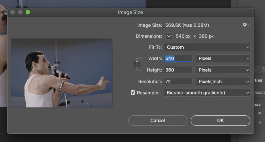
Now you’ll need to resize your gif to be the correct size for Tumblr. If you don’t use Tumblr’s exact dimensions, your gifs (as uploaded) will appear blurry or pixellated. We’re doing a full-width gif here, which is 540px. On a Mac, I use Command+Option+I (for “Image Size) to open the resize dialogue. You can also find it under Image->Image size...
Make sure to also have “Resample” checked. Lately I’ve been playing around to see if different options are better. Most GIF makers use “Bicubic Sharper (Reduction)” and they are not wrong to do so. I’ve just been unhappy with it lately, so I have been trying this other setting out, “Bicubic (smooth gradients)”.
Click OK. A dialogue may come up that asks if you want to convert to a Smart Object. The answer is yes, okay, do it. The only major caveat is that you can’t go back and change the timeline speed. That’s why we did it first. But you can preview the speed now that it’s smaller, and if you don’t like it, use Command+Z (or “Undo”) and go back a couple steps to get the speed you like.
You may find, especially on a Mac screen (and possibly other displays), that at 100% your gif looks too small to be 540px. That is the curse and blessing of working with super-high resolution hardware. Zoom in to 200% and proceed about your business. This is what it will look like on Tumblr.
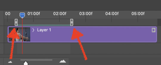
You may find it helpful at this point to begin by defining the beginning and end of your gif by moving around these bumpers. It’s safe to keep gifs under 02:00f in length. Under half of 01:00f will be way too short. (I tend to overshoot in length and then trim the beginning and the end once I see how big the gifs are upon exporting.)
Adjustment Layers
Now the creativity and fun begin!
There are a LOT of ways to get creative here. I’m going to keep it simple, very simple, but I strongly recommend opening up a new adjustment layer of each type and trying to figure out what each does!
You’ll find the adjustment layer menu at the bottom of the Layers window.

Curves
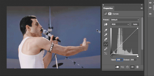
There are a lot of ways to make Curves work for you! It can do the job of Brightness/Contrast, it can do Levels, it can do Color Balance! We’re going to use it mainly to help with brightness here, but also to level out some of the tones. One of the quick tricks you can do is use the droppers on the left side of the Properties window. There are three- one with a white tip, one gray, one black. These can help define what your white tones are (and whether they need to be more of one color or another), and so on with your blacks. Sometimes it works, sometimes it doesn’t; in this case, I think it doesn’t:
That looks totally blown out and somehow also too dark!
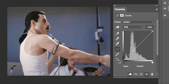
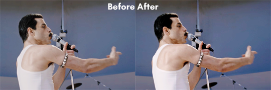
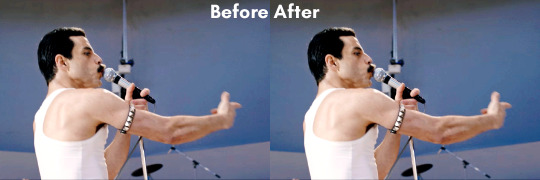
So instead, we’re going to use that little hand with the finger pointing out and some arrows pointing up and down. This lets you define which sections you want to get brighter or darker, and how much. It doesn’t do color correction. In the example below, you can see I dragged up on a white spot and down on a dark spot. Then, I moved points around on the curve itself to refine (which the gif here doesn’t show...).
Vibrance/Saturation x2
Next, I’ve been using @gwil-lee‘s Vibrance/Saturation trick (I know you said you learned it from someone else, but I learned it from you!).
Create a Vibrance Adjustment layer, bump the values up a bunch, and then change its Fill to somewhere between 2-9%. Change the Blend Mode to Color Burn. Then make a copy of that layer keeping everything the same, but make it Color Dodge. I can’t quite define what these do, but it makes it punchier!
Color Balance
Most people are familiar with this. For this gif, I’m going to make the shadows more Cyan/Blue and the highlights more Red/Yellow. Just a few points each.
Exposure
I brought the Exposure up a bit, but not enough for you to need to read about, haha.
Selective Color
Here’s where you make fine adjustments to colors. This particular scene is extremely simple, color-wise, so keep it simple. I’m going to bump up the cyans/blues, take up the black by just a point or two, and maybe bump up the yellows and reds a tiny bit. (And as always, remember, the “opposite” of cyan is red, the opposite of magenta is green, and the opposite of yellow is blue. CMY/RGB!)
I think at this point I’m going to call it with the adjustment layers. You can go absolutely hogwild with more of them! But at this point, I’m ready to start sharpening!
Sharpening
I do three sharpening filters these days. These are all under Filter->Sharpen. Make sure your media layer (default called Layer 1) is selected as we go through this! (Also, this can really take a toll on your processor, so don’t say I didn’t warn you.)
Sharpen- This layer does the basic job
Smart Sharpen (Amount: 10%, Radius: 10, Reduce Noise: 4% Gaussian Blur)- This layer gives texture
Smart Sharpen (Amount: 500, Radius: 0.3, Reduce Noise: 12% Gaussian Blur)- This layer gives refined sharpening and smoothing
Fiddle with these as needed! Let your gif play all the way through- this may go slowly as your processor works on it. Make sure the beginning and end points make sense.
Exporting
After You’re going to have to use File->Export->Save For Web (Legacy)... or use the shortcut of Shift+Option+Command+S. This could take some time for the dialogue to pop up! Be patient.
In my opinion, these are the best gif export settings for crisp edges and no noise:
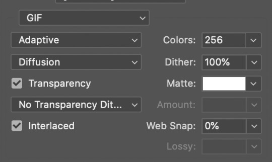
Now you see how big the file is in the bottom left. Tumblr won’t let you upload anything bigger than 10MB and it’s safer to stay under 9MB, in my experience. When your gif is too big, you have a couple options. You can close the dialogue and change the length of your gif.
OR, you can uncheck “Interlaced” and bump up the lossy to 1 or or more. This will create noise. Sometimes, that’s a good thing!
Here’s without lossy:
Here’s WITH lossy: (Honestly in a fast moving gif like this, it’s almost imperceptible, but I can see it!)

And now that I’ve exported, I can see what there’s a little black line on the bottom! So I’m going to trim that off and call it good! You can see the full gifset here.
Hope you enjoyed! Reblog if you try this out or learned anything. Feel free to reach out with questions any time!
310 notes
·
View notes
Photo

Welfare vs Wealthfare
If you enjoy these cartoons, and can spare it, please support my Patreon! A $1 pledge really matters.
If the image on Tumblr is too small, or blurry (wtf Tumblr?), try reading it here instead.
****
Another collaboration with Rachel Swirsky!
I don’t have much to say about the politics of this issue that isn’t covered in the cartoon. Accepting help from the government is seen as morally shameful for the poor – but routine for the ultra-wealthy.
The script for this one was one of those back-and-forth collaborations in which it becomes difficult to recall who wrote what. The initial idea came from Rachel, and the idea for the specific format and layout came from me. The particular gags were written by both of us. I remember that I wrote the kicker gag as “Queen of England,” and Rachel changed it to “Beyonce,” which definitely made it funnier.
Oh, and if anyone’s wondering, there really were thousand-dollar bills once, but the government hasn’t printed any since 1945. If you happen to come across one, it’s still legal tender – but you’d probably get more than a thousand dollars by selling it to a collector. Several different designs were used for thousand dollar bills, including one featuring Alexander Hamilton.
A special thanks on the sidebar to patron N.K. Jemisin, who – among many other accomplishments – recently won the Hugo Award for “best novel” two years running. Rachel and I are both big fans of N.K.’s novels, and you should check out her website.
TRANSCRIPT OF CARTOON
At the top of the cartoon, in large letters, is the title “WELFARE vs WEALTHFARE.”
Below that, the cartoon is divided into three columns. The columns on the left and right show regular cartoon images; the middle column only contains a caption for each row. The left column is underneath the word “Welfare” in the title; the right-hand column is underneath the word “Wealthfare” in the title.
ROW 1: HANDOUTS
Welfare Panel: A man holding a grocery bag is startled by an angry man in a necktie yelling at him.
NECKTIE MAN: Let me see those groceries! You better not have spent your food stamps on anything nice!
Wealthfare Panel: A well-off looking man in a jacket and tie stands looking aloof, with his arms crossed and his nose up in the air. Behind him, a man wearing a tie is kneeling on the ground and begging.
KNEELING MAN: PLEEEEASE let us buy you a new stadium! We’ll give you $200 million dollars!
ROW 2: HOUSING
Welfare Panel: A woman stands at a pay phone, the phone held to her ear. She has luggage with her, and an anxious looking ten year old son.
VOICE FROM PHONE: Sure, we can help with housing. Looks like we’ll have space for you in… Four years.
Wealthfare Panel: A wealthy-looking older couple, wearing sunglasses and casual-nice clothes, stands in front of an enormous yacht.
WOMAN: We legally declared our million-dollar yacht our second home.
MAN: So now we deduct its mortgage from our taxes!
ROW 3: CRIME AND PUNISHMENT
Welfare Panel: A building with a sign, which says “welfare office.” Voices come from inside the building.
FIRST VOICE: Pee into this cup.
SECOND VOICE: But I don’t use drugs!
FIRST VOICE: Exactly what a druggie would say!
Wealthfare Panel: A wealthy looking businessman sits in a large executive chair, reading some papers. Behind him, two younger, slightly nerdy looking people talk to his back, looking anxious.
NERD 1: Look at all these crimes! I’m sorry, but you’ll have to pay a modest fine.
NERD 2: But you can deduct it from your taxes!
BUSINESSMAN (unconcerned, barely paying attention): Uh-huh.
ROW 4: BANKRUPTCY
Welfare Panel: A security guard in a brown uniform lounges in front of a house, leaning on a sign that says “For Sale By Bank.” A father holding an infant, and his young daughter at his side, look aghast.
GUARD: The bank says “thanks for the swell house!”
Wealthfare Panel: Another businessman, seated behyind an enormous desk; the desktop is mostly empty, although he does have a laptop and a desk calendar. Behind him is a big window with a cityscape view.
BUSINESSMAN: Hello, government? I gambled away billions of my bank’s assets. Give me my bailout in thousand dollar bills.
ROW 5:THE BOTTOM LINE
Welfare Panel: Uncle Sam has his back turned towards a mother carrying an infant. His expression shows contempt. He holds out a tiny check to her like it’s a dead fish. A line from the check points to a little ¢ symbol.
UNCLE SAM: Take your welfare, MOOCHER.
Wealthfare Panel: A smiling wealthy man looks on as a smiling Uncle Sam brings in a wheelbarrow overflowing with piles and bags of cash.
UNCLE SAM: Here’s this month’s delivery, sir!
Kicker panel at bottom of strip
We see the necktie man and the food stamps user from the first panel. The necktie man is yelling again.
NECKTIE MAN: You have a refrigerator AND a cell phone? What are you, Beyonce?
38 notes
·
View notes
Text
AntiSepticEye Edit Tutorial (PhotoShop)

I’m sure a lot of you out there need some help making Anti edits, or just never knew where to start, or just want to know how other people do it. I like to think I’m pretty handy with PhotoShop, so I made up a little guide for y’all.
There’s also a tutorial on coloring eyes at the bottom!
Step One: Find your image.
Yeah, I know, we’re starting here. Bleh. But it’s really important that you get the right resolution for a picture, okay? So I’m just gonna make sure you get it.

When you search for your image, make sure you’re using the tools and that you’re searching for a fairly large image. Larger than 2MP is the best option, but sometimes doesn’t have what you’re looking for.

When you find the image you’re looking for, hold on - it might not be the biggest size you can find. Make sure you Search by image first.
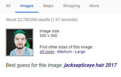
This should pop up underneath the search bar of the new page. Click on All sizes, it’ll take you to another page with just that image.

Clicking on the first usually brings up the biggest one, but sometimes they’re of bad resolution and you have to click through. If it takes a second to load, chances are it’s nice and big. But wait! Don’t just click and drag.
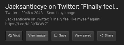
Make sure you View image to get the highest resolution! It’ll open in a new tab.

You’ll need to right click and Save image as…. This will allow you to save to the desktop, or whatever work folder you’re using. Hooray! Now you have the best possible image to use for this.
Step Two: Prepare the image.
Okay, so you have it now. You need to get it into PS. But before you open a new canvas, hang on.

OPEN. Yes. I’m literally showing you how to open a document. Deal with it.
Now that you have it open, it’s best to crop it to whatever size you want. Just so it’s easier to work with.

It was pretty okay as-is, I just wanted it a little more tight around the shoulders.

Now, duplicate your layer. You can do this by pressing Cmd-J or Ctrl-J.
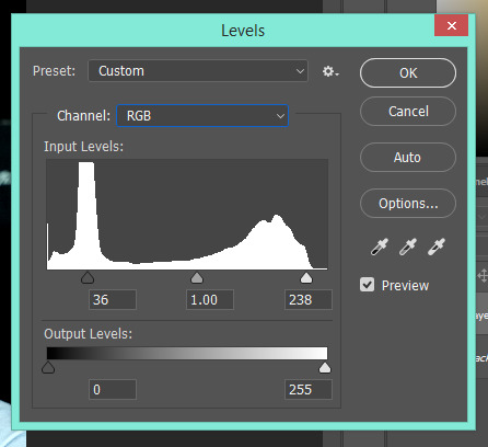
On this layer, we’re going to adjust the levels (Cmd-L or Ctrl-L). If you don’t know how to do that, just bring the black and white arrows in closer to eachother with preview on. It’ll look right eventually.
Step Three: Basic Overlay.
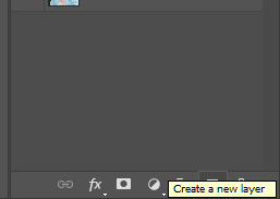
Start by making a new layer. Simple.
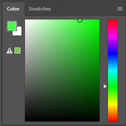
Pick a shade of green. Make it bright, but not infinitely saturated to oblivion. I picked this lovely shade, but it doesn’t really matter in my opinion.
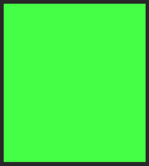
On your new layer, fill in the whole canvas with your green. Ta-da.

In order to actually see Jack under it, you’ll have to change the layer style to “Color.”

It’s still way too bright and saturated, so we’ll need to dull it down a bit by lowering the opacity to... about 50% in most cases.
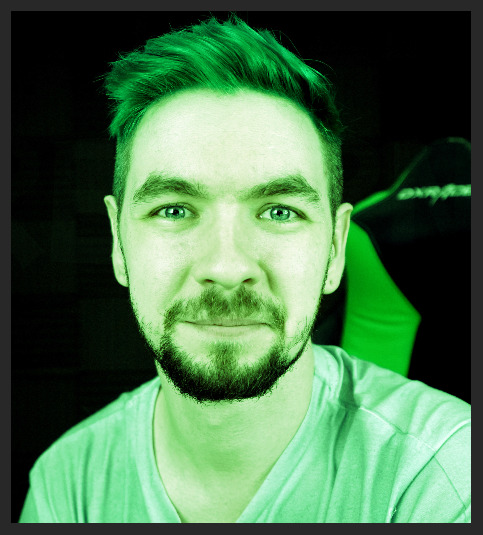
There, that looks better.

So now, with the color layer still selected, let’s mess around with the Hue/Saturation menu a little bit (Ctrl-U or Cmnd-U) with preview on until it looks good. I settled on this, which was -15 Hue and -45 Saturation.
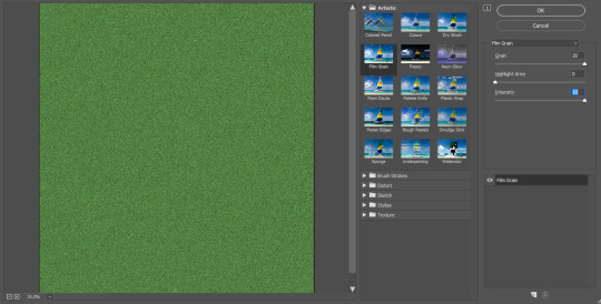
Step 3.5 (Optional): Using Filter Gallery.
This part is completely optional, but it allows for much more playing around - if you are using a program similar to PhotoShop but don’t have the actual thing itself, such as Gimp, you can skip this step.
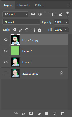
So now, we need to make another copy of Layer 1, and place it overtop of the green layer for the moment.

On this layer, we’re going to open up the Filter Gallery so we can mess around with it.

For Anti, one of the best filters is Film Grain. Crank that up to max and you have yourself something pretty cool. Messing around in these can take up hours of time just seeing what horrific creations you can make, but don’t take too long or you’ll forget what you’re doing.

Especially when you discover this button.

Now, what I’ve done is added some maxed-out Rough Pastels overtop of the film grain, giving it a sketched and blurry look.
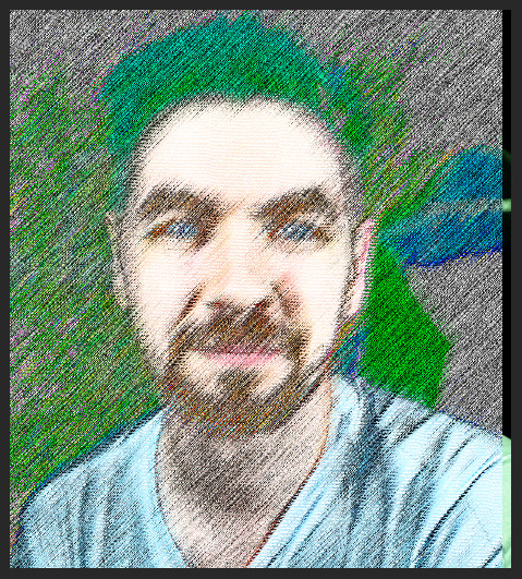
After bringing that in, I decided I wanted it offset to be more noticeable - but there’s a gap.

So I copied that layer and left it in place, tuning them down to 25%.

There’s still a gap.
To get rid of it, I just select that gap and place a layer mask on the second effect layer.
There’s a bit of a glitch on the edge, but who cares - it’s Anti.

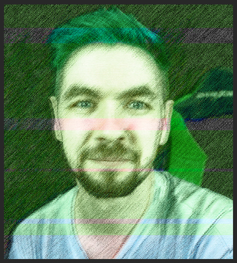
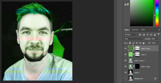
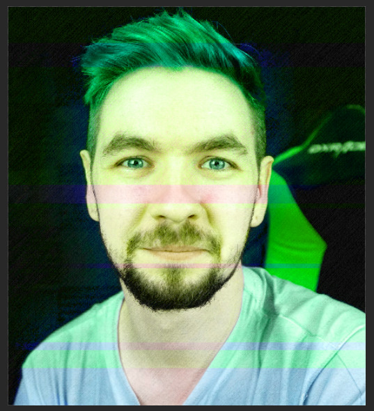
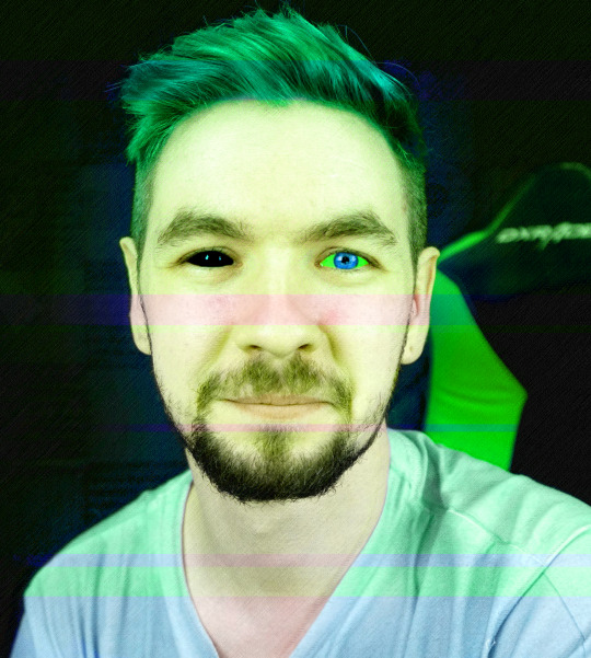
So now, I’m gonna move the green to the top, so it affects everything.
Much better. It kinda looks like a watercolor painting.
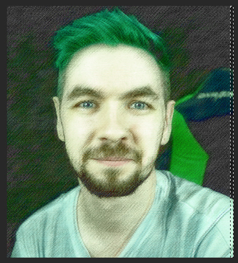
Step Five: Adding Glitches.
Now, if you’ve looked over Robin’s edits of Anti, you know his glitches are somewhat subtle and more auditory than anything.
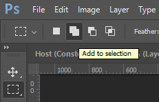
Making sure to use the Add to selection tool, select some bars over the entirety of the image. Just three or four.

Make sure to avoid areas like the eyes and face aside from a few small bars. Now, all we need to do is invert selection (Ctrl-I or Cmnd-I) add a layer mask to the green layer.
Good, that lets a few more normal parts peek through.
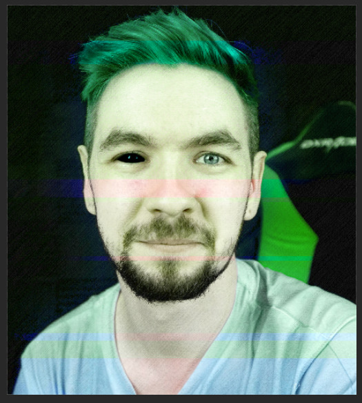
Now duplicate that layer, we’re going to do something cool with it.
Turn that entire layer into static, the easiest way is to use Filter Gallery but you can also just tint an image of static green.

Now it’s starting to get a bit more of an Anti feel to it.
I switched the static’s layer style to Hue just so it would pop more, and look just a bit less flat.
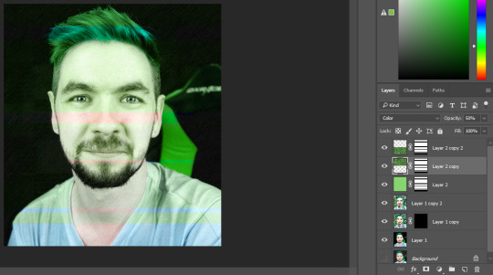
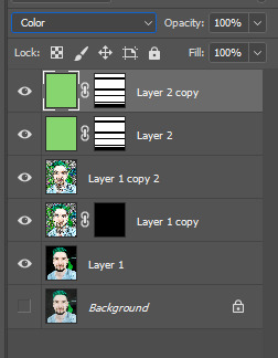
Now, because of the hair problem, what I did was chop the layer in half. Turning the top one back into Color and leaving the bottom part in Hue.

Yeah, doing stuff like this requires a lot of layers. It makes things easier to tweak in the long run, especially if you did something wrong in an early step.

If you’ll notice, Anti has a bit of a glow around him sometimes. To replicate that, we need to select Jack - but not just any old way, no. This is the only time I’ll recommend use of this, but we’re using the magnetic lasso tool. Copy the layer of Jack, and do this on the copy.

Just draw around him, it doesn’t have to be perfect and if it looks choppy or messy, good.
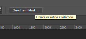
Now, select and mask.
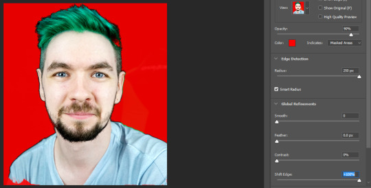
Crank up not only the Edge Detection and Smart Radius, but also Shift Edge. That gives it that weird, off look. Use this selection to create a layer mask.

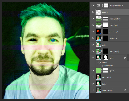
Now comes the glow. Double-click on the layer and you’ll be brought to this menu, where you can add an outer glow.

Mess around with it while you have preview on, just have a little fun. The jankier, the better. If you want to use Divide, make sure the color you’re using is the exact opposite of the color you want it to come out as.

When you’re done, make sure you put the full green layer all the way on the bottom.

Now, all the way at the very top, we’re going to add an adjustment layer for Hue/Saturation.

Adding +50 makes the whole thing just a bit more saturated, which gives it an Anti vibe.

You don’t want to oversaturate the bits of Jack, though, so make sure you add that same layer mask to keep it inside the Anti part.
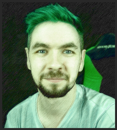
Step Six: The Eyes.
It’s coming along pretty well, I’d say. You can stop here, or keep going, make tweaks and add more glitches. It’s up to you, really. Have fun with it. However, if you want to know how to do the eyes, well then. I’m absolutely here to teach you.
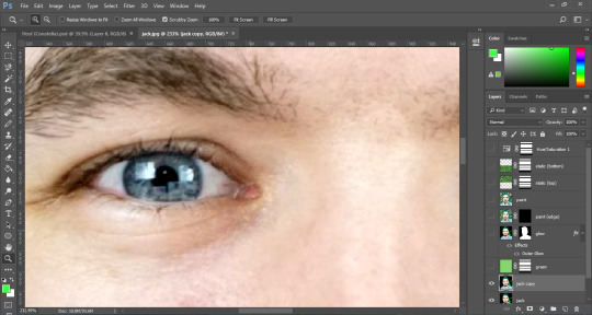
First, we need to get real up close and personal. Turn off all the layers except the bottom one, and duplicate that. This is what we’re working with.

You can use the lasso tool first to get a rough approximation of the eyes, then make a layer mask around that, but you need to use the brush tool to refine the layer mask by hand until it’s only the eye.

When the other one’s done, you should have something horrific staring back at you. :)

Now, the first thing we’re going to do is oversaturate the eyes. That’ll make them pop even more.

Turn on the layer beneath it, and you can see it’s just a subtle change but it’s crucial.
Once you turn the other layers back on, though, it’s like we’ve done nothing at all.

So, to fix this, we just move the layer up.

I actually oversaturated them again after that, and it’s such a small difference but it really stands out. Now, if you want to make black demon eyes, it’s really simple.

Just make another duplicate of your base layer, add the eyes layer mask, and then turn down the levels almost all the way until you’re satisfied. Make sure they still shine a little! That’s what makes them look good, and not just painted black.
See? Now we’re really getting somewhere. The last thing is, of course, the Septic Eye. on a new, blank layer, set your brush’s flow and opacity down to 20-30%, and color in the sclera green and the iris a much brighter blue.

It might be a little rough around the edges, so don’t be afraid of using a soft eraser to touch it up.
Don’t worry if it looks bad up close, either. No one can tell from a distance.
Now, just turn all the other layers on, and voila. Pretty neat, huh?
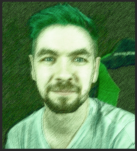
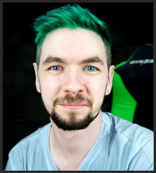
Here’s the full, finished image. I had a lot of fun making this! Might make a Darkiplier tutorial too, if y’all want that. Let me know if there’s anything you’d like to know how to do, I’d love to help out.
#jacksepticeye#antisepticeye#septicart#photoshop#tutorial#edit#my edit#artorsomeshitididat3amwhilebeingstalkedbyantisepticeye
101 notes
·
View notes
Text
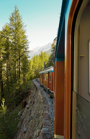
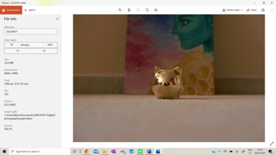
CAMERA EXPLORATION
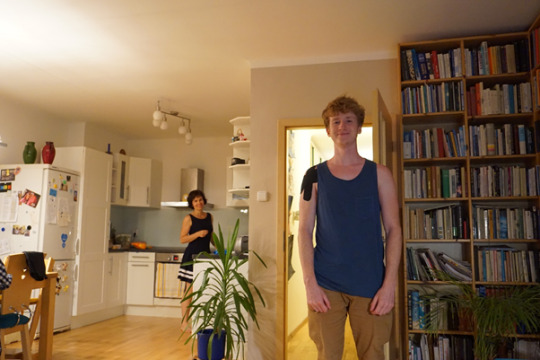
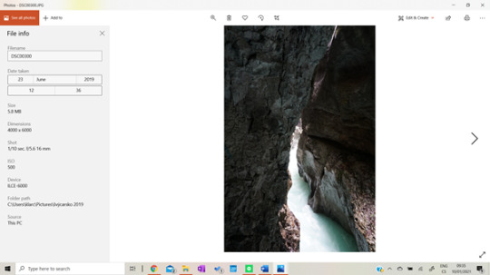
I started photography a year and a half ago when I impulsively bought my very first camera. I wanted to start for quite some time, but I didn’t have the equipment necessary. One day, when I was in Prague with my boyfriend, we went to Datart (store selling electronics) to look at some cameras (at least the intention was just looking) and I ended up leaving with my brand new Sony a6000 camera. It was the biggest expense of mine at that time (little did I know that paying rent will be much worse lol) but I didn’t regret it once.
SONY Alpha A6000 black + 16-50 mm f.3/5

In the beginning, I was so terrified of using manual settings, and in addition, I am that type of person who absolutely hates reading manuals and always tries to figure everything out myself. I somewhat knew that there is something like ISO, aperture, etc, but I only used automatic for the first couple of days. Here are the very first shots I made using automatic only.

I really loved these shot's quality (which was definitely the camera’s work, not mine:D) but I knew that I couldn't keep shooting on automatic forever.
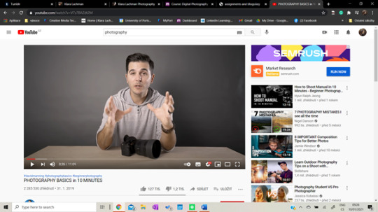
One of my experienced friends sent me a video that explains everything really well.

https://www.youtube.com/watch?v=D92Xizn4MWU
It’s in Czech, but the title basically means ‘The basics of photography’. This had helped me to start diving into manual settings more and more and to fall in love with the process. After this one, started watching videos in English, because I was going to start studying in the UK in about two months and wanted to know all the terms.
https://www.youtube.com/watch?v=V7z7BAZdt2M
Here are a few more resources I found really helpful.

https://www.sony.net/Products/di/common/images/products/qb9a/ILCE-6000_4DFOCUS_Camera_Settings_Guide.pdf
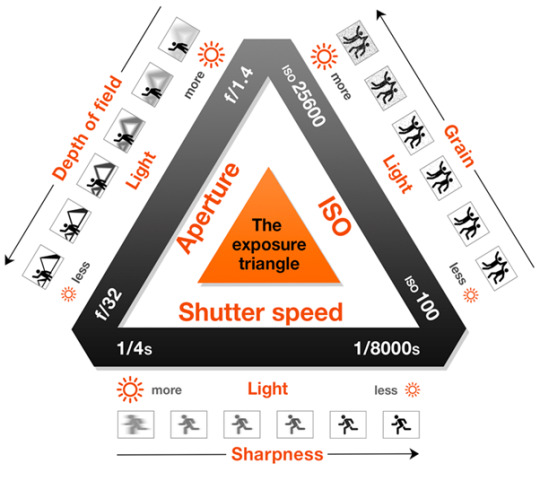
I started slowly familiarize myself with all the terms and after a while, it suddenly stopped being so overwhelming after all.

S: Shutter-priority autoexposure; you set shutter speed, and the camera automatically selects the proper aperture setting
A: Aperture-priority autoexposure; you select the aperture setting, and the camera automatically chooses the correct shutter speed.
M: Manual exposure; you select both the aperture setting and shutter speed. Full control over other picture settings.
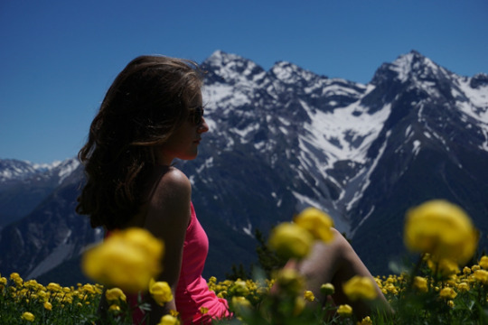
Almost right after my big camera purchase, I went on a family trip to Switzerland and took my camera with me. These are some of the very first photographs I took using M/A/S.

I played with different shutter speeds and was so excited when I actually saw the difference. You know that feeling, when you only read about something, watch videos and then you try it yourself and it actually works? Even though these photographs are terrible I was so excited to finally bring theory into practice.
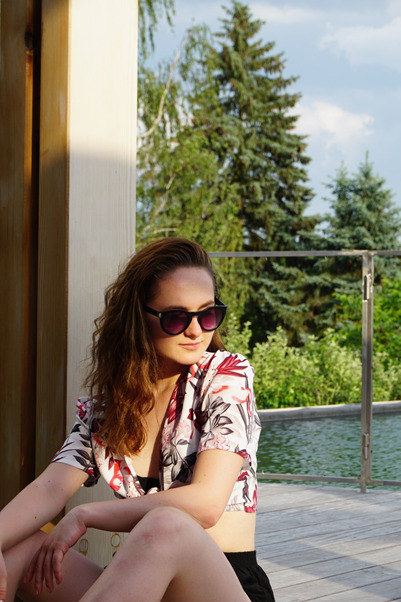
I started playing with the aperture and it quickly became my favorite thing to do. I really wanted to recreate the effect of blurry objects in the front and in the back and my focal point nice and sharp in the middle. At that time I had no idea what a depth of field was, but I was really happy with the results. And even now, after all that time I don’t think that these photos are too bad...
All these photographs are unedited. I didn’t have desktop Lightroom access, I used the free 7 day trial on my laptop, but then didn’t want to pay for the Adobe creative suite, so I would just edit my photos using the free version of Lightroom on my phone. My camera has a wifi feature, so I could just connect it to my phone and send over all the files I wanted.
Here are some of the photos I edited using the mobile Lightroom version.


I shot all these as JPEGs and only, later on, discovered that it’s much better to shoot in RAW, as the full quality of the photograph is preserved. I found out watching this video which teaches how to shoot better landscape photographs with the exact same camera I have. https://www.youtube.com/watch?v=hQm8Eh1h7iA

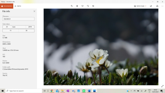
I played with different shutter speed settings and created these photographs that perfectly demonstrate what shutter speed does.


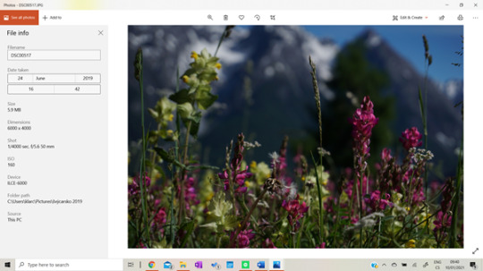
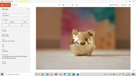
As for the aperture, I didn't find any old photographs that would show me, exploring my camera, so I created a few in my room to demonstrate its effects.

In this picture, you can see how different aperture values look like in practice - a smaller value means a bigger gap.
I have created this example with a golden pig and one painting of mine to demonstrate what the aperture does.
As you can see the aperture changes how much light is let into the lens and how big is the focus area. In the first picture, the aperture is at a really low value, therefore it’s opened at its maximum. Therefore, the background behind the subject is very blurry.
In this second picture, I increased the aperture value to 11, therefore it lets only a very small amount of light inside the camera and the focus area is much bigger. The position of all subjects and the camera remained the same.
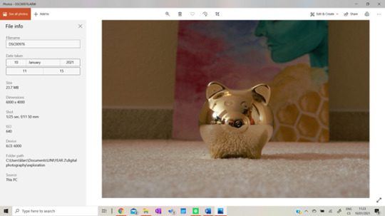
As you can see, the picture looks very different, you can now quite clearly see what is behind the subject.
Another thing to explain is the depth of field. It is closely related to the aperture and it directly affects the amount of background blur.

The closer is the position of the subject to its background, the clearer the background gets, on the contrary, the bigger the distance between the subject and the background, the blurrier the background gets.
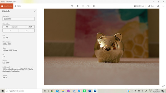
As you can see, the camera settings and its position remain the same, the only thing that changes is the position of the subject. The closer it’s to the camera, the blurrier the background and vice versa. By playing with the depth of field combined with aperture values you can change the blurriness of your background and come up with some really interesting photographs.
Lower values of aperture are perfect for portrait photography as it makes the subject stand out.

Higher values are on the other hand much better for landscape photography, where you want everything to be in focus.

Thank you so much for reading this post and I hope you enjoyed it!
Love Klara
0 notes
Text
You’ve Got Mail!
Summary; Photographer!Dan has been living in Scotland for three years now. He’s worked hard to be able to sell his work as a living and gain a stable income, yet his comfortable lifestyle seems to be missing something. The small town of Buckie never seems to feel like home and he can’t seem to figure out what he needs to overcome to feel at ease. Until one day where Dan watches as mailman!Phil slips and falls across the street from him. In a simple act of kindness, Dan might have changed his life in ways he couldn’t even begin to imagine. But will it be for the better or for the worse?
Genre; fluff, just complete fluff
Chapter; 1/?
A/N; I’m finally writing again! I know it’s a miracle. I’m planning on making this chaptered if you guys like it so make sure to drop me an ask and tell me if you want more. (Also my desktop crashed when I was writing out the summary and everything so I had to start it a l l over again it was hell) Here is a playlist you can listen to while you read that has all the songs mentioned in the fic. And this is Dan’s house if you wanted a visual (his bedroom is the 5th image). Thank you to @purehtml for helping me with my grammar, writing structure and overall just being a great friend and beta reading it. Also, thank you to @libraerie for her encouraging words during the writing process. -J
Warning; Light swearing
Word count; 3,522
Clicking my camera’s flash down with my finger I hold it up to my right eye, putting one knee on the pavement far faster than I needed to. ‘That’s gonna leave a nice bruise’ I thought, mentally scolding myself as I felt the sharp sting starting to turn to a dull throb. There are a bird and a stray dog just across the street from me and they seem to be having a standoff. There is no way I’m missing that opportunity; the bird lungs at the sturdy looking mutt, flapping its wings and puffing its chest. The dog snaps at the bird and gets the tip of its wing in between its teeth. I quickly set my camera to burst and press down on the capture button much harder than I need to. The bird screeches and pulls it’s wing out of the dog’s mouth, most likely ripping it as it did so, and flies away. The dog’s prize seems to be a tipped over container of fries laying on the ground by a bin and the dog scurries to eat it up. When it’s finished the dog makes a sharp turn and runs off the sidewalk, checking behind itself before disappearing into the perfectly pruned park bushes. I stand back up and walk to a nearby bench to inspect my knee and look over my photos. A small pang of guilt goes through my chest as I realized I didn’t even think of trying to help the poor dog. ‘Probably would have run away from its meal if I tried that.’ I thought. I set my backpack down beside me and put my camera away before starting to roll up my jeans. The faded denim proved to be much harder to roll then I first thought, the roses embroidered on the side made it difficult to fold over itself. But as my knee finally gets past the sea of denim I can already see it was turning a darker red than I’d like. Sighing in annoyance I push my jeans back down and brush them flat to my leg before retying my shoelaces. My phone buzzes in my back pocket and I reach around to look at it. ‘Just twitt-’ I look up to see the time on my phone, ‘-wait isn’t my train leaving right now?’ I jump to my feet and grab my bag, quickly looking both ways before dashing across the road.
As soon as my feet hit the cobble of the underground streets, I knew I was doomed to miss that train. God knows why I kept running, the stop was scheduled for 5 and it was currently 5:02. I was only halfway there as I stopped and huffed at the base of the stairwell. ‘Should have just gotten the bus’ I thought, but of course, I had to be stubborn and go all this way.
“Damn it-” I put my hands on my thighs and tried to catch my breath “-nope forget it bus it is, you win lungs.” There’s a small trickle of people walking by me as I stretch my back and slowly ascend back up the cobbled steps. Stepping back onto the open streets of the city I can smell rain in the air. ‘Of course,’ I mentally sneer as I pick up my pace. I can feel my legs burning with every step and the air starts to feel thicker as thunder rolls in the distance. ‘My legs are going to be burning tomorrow’ I thought, slipping by a group of giggling teenagers. I manage to contain a snort as one of them trips over their own legs and crashes into a light post. Becoming bored of my surroundings I pull my phone out of my pocket and plug in my headphones. I click on Wild Horses before turning a corner and continue to the stop. After 5 minutes of walking, I can finally see it in the distance, I slowed down my pace and finally let my legs have a rest. Luckily this stop seems to have a cover over it, meaning if it does start to rain at least I won’t be sopping wet. Just as I reach the stop rain gently starts to fall on my arms. I rush to step inside and lean on the glass, surprisingly there doesn’t seem to be anyone else nearby or inside the bus stop. The only people around were those kids and they already ran back down the sidewalk and into a Starbucks to escape the rain. Looking down I see a snail crawling on the outside of the glass, I quickly grab my camera from my bag to take a picture of it before walking outside of the cover.
“Aren’t you photogenic,” I say, taking the snail, and moving it to a nearby tree. ‘At least I got some nice picture out of all this’ I thought, I put a black and white filter over the photo and slip my camera back into my bag. ‘Right, it’s 5:11 so I’ll only be here for about 20 minutes’ I thought whilst looking around the small shelter that doesn’t seem to have benches. I decided to take up residence in the corner, sliding my backpack onto the ground and unzipping the front pocket. My last two-way ticket for Buckie is squished at the bottom of the pocket. I sit crisscross next to my bag with my head leaning against the wall after shuffling my Spotify for the fifth time. Jet Pack Blues starts to play a little too loud as the windows begin to cloud from the rain beating down at full force.
“And then a 4-hour ride home-” I sigh, closing my eyes, and rolling my shoulders “-that I’ll hopefully be sleeping through.” Watching the rain patter against the window was calming until a clap of lightning hit a nearby building and scared me half to death. The Greyhound bus rolls to the curb at 5:30 sharp and I rush up the steps to try and keep my hair at least a little dry. I hand over my ticket and turn to look at the bus, trying to find a seat. I settle into a seat in the back to my right that has no one in the aisle, that way I can lay down. It isn’t packed, but there is a good amount of people dispersed around the bus, most of them asleep or on their phone. I skip a couple of songs before seeing Warm Foothills load up on the screen. I set my bag down in my lap and cross my arms over my chest, I can’t read most of the signs out the window since the rain is making the glass blurry. I pull out my camera once again to record as the bus starts to speed up. A leaf lands on the window and startles me, but I change my focus and manage to get a shot of it before it gets ripped off and thrown back into the wind. I put my camera back into my bag and lay my head on the window as I watch the old buildings and lush greens whiz by. I let the deep hum of the bus and the tapping of rain lull me to sleep as I hear Warm Foothills fade out and Bloom take its place.
My eyes opened to the sound of a loud hiss coming from the bus, signaling a stop. I put a hand on where my head was resting and feel the indent on my skin, trying to soothe the dull throb. I pull out my headphones to hear the announcement and realize Coffees for Closers was blasting in my ears. A ding sounds into the bus and a digital screen flashes the words DUFFTOWN STOP.
An automated voice then plays, reading out “Next stop, Buckie. Next stop, Buckie. We hope you’ve enjoyed your trip-” I put my headphones back in and tap on the song Hook before looking at the time on my phone, ‘8:31 pm’. Didn’t know I could sleep for that long on a bus without being jolted awake. ‘A new record,’ I thought, chuckling to myself. While the bus is stopped I take the opportunity to stand up and bend my already sore legs. I stretch my arms over my head and my hand hits the top of the bus as I yawn. As I sit back down I swing my legs over the two seats to my right and my ankles fall off the end of the row, oh the joys of being 6’4. I let my back rest against the chilled window and watch the people walk by the bus. A girl with red hair and a daisy behind her ear bumps into my feet while putting her bag in the overhead compartment. She didn’t seem to notice, but seeing her put her bag away made me realize that my own bag was now on the floor. Copying her actions, I stood and put my bag into the compartment. I pushed my camera back into its protective pocket before zipping it shut. The bus starts up again and I stumble back into my seat, resuming my last position, and zoning out on the window across from me. It’s stopped raining but the edges of the window still have raindrops clinging to the sides of them. Since Dufftown is so close to Buckie I didn’t bother trying to fall back asleep, instead, I pulled out my phone and started to edit my pictures from the museum. It was the only reason I ever went into Edinburgh anymore, other than going to that one underground cafe. With its fairy lights and vine-covered windows, it was like my little treat for leaving town. Before the bus stopped outside town I got a solid folder of pictures cropped and edited, even posted a couple to Tumblr. I put my phone in my back pocket and lifted my bag from the overhead latch and onto my shoulder. I held onto the seat in front of me while the bus came to a halt, the digital screen now read BUCKIE STOP. I smiled at the driver as I passed them and slowly walked down the steps and jump onto the pavement. The puddle on the ground under the steps bursts and, surprisingly, makes little sound.
My walk home wasn’t too eventful, the same it always is. I’ve walked home from this stop so many times I remember the one night I had a dream about doing it. I smile to myself as I pass by “Off the Wheaten Path”, it’s a small gluten-free bakery run by a mom and son. A metal sign with a Wheaten Terrier growling at its reflection in a puddle hangs high above the sidewalk. I’d eaten an egg and cheese sandwich before I left today but that was it. I couldn’t resist the enticing smell of chocolate radiating from the shop as turned around and stepped inside. The shop was empty except for one guy who was sat by the door, he looked up at me through his book and gave me a quick smile when the bell rang on the door. I sit down at one of the tables and put my bag beside me, unzipping it. I grab my wallet and leave the bag hanging on my chair as I wander up to the counter. The cafe itself looked old with its handmade wooden tables and sturdy whitewashed chairs. There were tons of potted plants laying around the shop, some hanging from the ceiling and others balanced on uneven shelves. A woman with bright green eyes peaks around the entrance of the kitchen and smiles at me.
“Hello love, you’re just in time! We’ll be closing in about 35 minutes” she says with a thick Scottish accent. She walks up to the counter and grabs a notepad with a pen clipped to it as I scan the chalkboard menu.
“What can I get for you?” she says, as soon as I see the words “Pistachio Muffin” written on the board I’m sold on it.
“A pistachio muffin and croissant ham sandwich,” I pull out my card as she scribbles my order down and pins the paper on a corkboard behind her; her handwritten name tag reads ‘Skye’.
“Sure thing, my son Kenny’ll bring it out to you,” she turns the card reader to me and I swipe my card, flip it around in my hands until the screen says, “Transaction Complete”. I head back to my seat and pull up Tumblr to queue some posts. A couple of minutes later Kenny taps me on the shoulder and I jumped out of my skin. My phone drops into my lap as I look up at him, but this happens to be a common occurrence. I’m naturally a jumpy person but it always ends with a good laugh. In his hand is my plate with a pistachio muffin and croissant sandwich.
“Sorry sir didn’t mean to rattle ya,” he says, sliding the plate in front of me. He seems rather shy and I take that as a hint to keep the conversation brief.
“No worries, I tend to be a jumping bean.” My fingers itched to grab my camera and take a picture of the way he’s smiling at the ground. His glassy hazel eyes watching his own shoes as he smiles. Of course, it would be extremely rude of me to pull my camera on him; although I know it’s the only thing holding me back from doing so. His short and curly yellow hair was covered in flour and dough, and his slightly hooked nose had a smudge of brown powder on it. ‘Probably some spice or something’ I thought to myself, giving him a patient smile. He pulled a small bell out of this apron and set it next to my plate.
“If ya need anything just ring that bell.” I watched as he walked away, putting my phone on the table. When I lift the bell a small piece of paper falls out with a number scratched out onto in a hurry. ‘Names Kenny if you ever want to chat’ I chuckle to myself as I pocket the small folded paper. ‘Have to put it in my phone when I get home.’ I thought.
When I left the bakery, it was a little after 9, so I was expecting to see my Amazon packages on my door. But when I turned the corner down my street, I saw the mail truck on the right side of the road. I crossed the street so I wouldn’t have to confront him and continued home. It still frustrated me that my house had to be the one all the way at the end of the block. I know full well I don’t get enough exercise so I deal with it, realizing it’s good for me. As turn past the pillars at the entrance of my house, Rosy comes up and rubs on my leg, meowing at me. I smile at the small white and orange kitten and kneel down to pet her. I could hear the bell around her neck and small silver name tag softly tapping against each other. She’s been here ever since I moved and seemed to always be around my house. Either in my backyard, at my door, or sleeping on my windowsill at any and all hours of the day. When I asked my neighbor, he told me that she belonged to someone on my street that didn’t seem to care for her anymore. Ever since I’ve just adopted her as my own as she’s such a sweet cat. Being someone who leans to the antisocial side I can also appreciate the company. I’ve thought about putting a cat door in many times but I just haven’t gotten around to ordering one. I’ve gotten into the habit of just letting her in when I open the door or, her more common entrance, jumping in through my back window. I always keep it open for her during the day but I shut it at night, most mornings I wake up to her sleeping on the window in front of my bed. As I go to open my door I hear the mail truck pull up to the house across from me. I turn around so I could put my backpack on the ground and dig my keys up. When I look up, however, I see 3 packages on the ground and a man slowly picking himself up. For a moment, I thought of just getting into my house and forgetting it ever happened. But my sympathetic side pipes up and I think back to all the times I wish someone would have given me a hand. I knew I’d never forgive myself if I turned a blind eye. I left my keys and my bag at the door, swiftly stepping over Rosy and awkwardly jogging over to him.
“Hey, are you alright?” I hold out my hand to help him up and he seems shocked to see me standing there, but grins at me nonetheless.
“Um, I think so? Might have a couple bruises but I’m fine otherwise. Just tripped when I was stepping over that ledge.” He nodded his head to the small curb that protruded from the natural grass. I have tripped over those damn curbs many times so I could sympathize. I remember the time I was in my yard trying to get a shot of the sun shining on the water. I tripped on that damn ledge and fell just like he did, the fall cost me my favorite lens. He takes my hand and stands up from the ground, brushing off the dirt from his uniform pants. His once white and pressed shirt is now covered in dirt. He turns and picks up two of the three boxes and starts walking back up to the house.
“This might sound strange but, where did you come from? I didn’t see anyone around when I left my van.” I ran to collect the other package, following him to the door.
“Oh, I live across the street and saw you on the ground and, well, I didn’t want to leave you there.” I set the box down next to where he left the others on the porch. He smiles at me as we walk back to his van.
“Well thank you, do you have anything I was supposed to bring you?” he reaches into the passenger seat and pulls out a scanner.
“Just a couple of things, some soap, shampoo and-”
“And a cat collar?” his words caught me off guard but I managed to laugh it off.
“Yeah, yep, that would be me.” Rosie’s collar seemed tight on her lately so I decided to order her a proper one. It’s made of leather and, if my measurements were right, it should fit her perfectly. ‘Need to get some bowls too so I won’t have so many dirty dishes.’
“And your name is Daniel Howell, right?” He says while entering something into the scanner. He turns to pull open the sliding door on the side of the van as I cringe at my own name.
“Yeah but it sounds really posh when you say it like that. You can just say, Dan.” I put my hands in my back pockets and rock on my feet.
“And your name?” I ask. The door slams shut and two small packages are handed to me.
“Phil, Phil Lester. I just got this job a couple days ago and it seems that even in such a small town there’s a lot to deliver.” I grabbed my packages and take a step back from him as he heads around to the driver side of his truck.
“Well, it was nice to meet you, Phil. See you next Wednesday?” He jumps back into his van and rolls down the passenger window. And I swear the smile he gave me was bright enough to blind you if you stared at it too long. His head tips ever so slightly and for a moment, his tongue starts to poke out of the side of his mouth as he smiles.
“Yeah, see you next Wednesday, Dan.” The van came to a roaring and rattling start, sounding as if it’s run these streets a thousand times. I watched as he made a U-turn and drove away after I crossed the street. Rosy meowed and let herself in as soon as I got the door unlocked. I set my bag down and let my keys fall onto the glass table by the door with a loud clang. I click the Bluetooth button on my phone and it instantly connects to the speakers scattered around my house. First Day of My Life starts to play as I lean the back of my head against the door. As the lyrics bounce around the hall I take a deep breath and smile, to no one but myself; I finally felt like this little town was becoming home.
15 notes
·
View notes
Text
20 Best New Portfolios, September 2018
Hello Readers. It’s September, so as soon as your kids are off to school, maybe you can finally have a five-minute power nap. Take that power nap with equal parts gusto and relief, dear Reader. You’ve earned it.
Last month, one of you asked for less “ultra-modern” designs, and the design gods have seen fit to provide. We still have some of that ultra-modern goodness — because apparently now that it’s been started, we can’t make it stop — but I managed to find and sprinkle in a few more classic-feeling designs. Enjoy.
Note: I’m judging these sites by how good they look to me. If they’re creative and original, or classic but really well-done, it’s all good to me. Sometimes, UX and accessibility suffer. For example, many of these sites depend on JavaScript to display their content at all; this is a Bad Idea, kids. If you find an idea you like and want to adapt to your own site, remember to implement it responsibly.
45royale
45royale is one of those sites that combines minimalism with a healthy love of gradients.The layouts are simple, and the type is good, but it’s the use of color that truly makes this site stand out.
Platform: WordPress
RedElegant
RedElegant embraces a classic and more corporate-client-friendly aesthetic with just a touch of that material design feel. It’s the sort of design you’d expect to see at a bank.
Interesting side note, the WordPress theme used seems to be a heavily customized version of the Twenty Seventeen default WordPress theme. The extent of the customization makes this site impressive, as I would never have guessed this if I hadn’t looked at the source.
Platform: WordPress
5e Rue
5e Rue combines a fairly minimalist and classical feel with light hints of more modern artistic flourish, and a bold use of blue. The serif heading type overlaps with illustration-style bits in a way that creates a beautiful yet staid experience. It puts me in mind of a classic Parisian café, and not just because the studio itself is in Paris, okay?
Platform: Static Site
Co-Partnership
Co-Partnership has gone for the solid background with the big sans-serif text, and just a little bit of asymmetry. Well, there’s nothing at all wrong with using a tried and true formula.
I particularly like what they do with their logotype. The ever-shifting branding is a nice touch of art direction on an otherwise very simple site.
Platform: WordPress
Object
Object goes hard on the use of color as art direction. Just about every page has a different palette, and the overall effect is quite pleasing. While I’ll admit that the “hero” section on their home page is a bit of an eye-gouger, the overall effect is a pleasant one.
Platform: WordPress
60fps
60fps specializes in motion design, so it’s to be expected that their site will be a bit JavaScript-heavy. Even so, the animation used feels understated, even while making its presence known so clearly. With unique-feeling layouts and good typography, the whole experience is one of the better ones I’ve seen in the “presentation site” category.
I just wish they would stop with the scroll-jacking. I’m not a fan.
Platform: Static Site
Hochburg
Hochburg uses a very light touch with animation and a very simple, minimalist, and grid-based look. One thing I do rather like about the home page is this very light animated static effect to highlight portfolio pieces when you hover on them. It’s just a good-looking plain old dark layout, and I love it.
Platform: Contao CMS
Rimini Berlin
Rimini Berlin is interesting for in that the entire site is an accordion element. Sure, the implementation is a bit too JS-dependent for my taste, but it does preserve navigational context on this one-page site in a fairly clever way. Give me a pure CSS implementation, or at least some simple fallbacks, and I’d have nothing to complain about.
Platform: WordPress
ED.
ED. goes for full minimalism, and a classic three-ish-column approach. In fact, I’m kind of a fan of the way the columns shift around a bit when you click on a project, even if I’m unsure about this trend of letting your branding clip onto the content of your site. It’s a simple effect, but it works, and allows for a certain flexibility in this simple layout.
Platform: WordPress
Intervaro
Intervaro goes for full minimalism with a touch of material design, by which I guess I mean drop shadows and a fixed navigation bar. That’s Material Design, right? And Material Design is the new corporate aesthetic?
Whatever, it’s a simple and good-looking portfolio site. Bonus points: they implemented a rather fantastic-looking dark mode for users who find that easier on their eyes.
Platform: WordPress
Modest Department
I find myself fascinated by the choices made on Modest Department’s portfolio site because they went with very intentionally small thumbnails for everything. Is it to fit with the name? Is it to save people’s bandwidth? Either way, it does both.
The small thumbnails and wide spacing naturally draw the eye in and make you really look at what they’re showing you. It would be inadvisable for an extended browsing experience, but it’s great for a quick portfolio. It’s not great for those with visual impairments, but they could zoom in, and clicking on a thumbnail gets you a full-sized video in any case.
Platform: WordPress
Koto
Koto’s studio portfolio has gone with a one-column portfolio site, relying on their use of color and branding to help them stand out. And it works. Every element feels very intentionally placed despite the almost extreme simplicity. And I can’t fault the way they use illustration-style elements.
Platform: WordPress
Jane Studios
With all of the comparably simple sites on this list so far, we were due for another artsy one. Enter Jane Studios, a site so minimalist, artsy, and generally PowerPoint-like, we might have reached peak modern design. I’ll never be a fan of that in-all-the-corners navigation, but the rest of the site is an excellent example of its kind,
Platform: WordPress
Raxo
Raxo gets a spot on this list only partly because I’m a sucker for horizontal layouts like the one they have on their home/landing page. The rest of the site is a fairly simple and business-like affair with a strong but not overwhelming use of solid red.
Once again, I’m going to complain a bit about the navigation, though. Hamburger icons are bad enough on a desktop site, but it’s not even a hamburger icon anymore. It’s a circle. Come on. The rest is pretty good, though.
Platform: Static Site
RubyAnne Designs
RubyAnne Designs, which is abbreviated very awesomely as “RAD”, is an architecture firm. Unlike many architecture sites, this one skips a lot of the fluff and just shows you the houses already. The aesthetic is nearly brutalist, but don’t let that stop you from checking it out. It’s a fantastic example of a simple, clean, and not at all overdone architecture portfolio.
Platform: SquareSpace
Robin Mastromarino
Robin Mastromarino is an interaction designer, which means you should expect lots of animation. The animation is fairly low-key, though, and doesn’t detract from this delightfully clean and well-structured site.
The click-and-drag slideshow probably works better on mobile than it does on the desktop. Well, mobile is a huge market, so that works.
Platform: Static Site
Célia Lopez
Célia Lopez’ portfolio lands squarely in artsy territory with lots of 3D-ish graphics and that aesthetic form that’s just so “modern” that I feel like inventing a new word for it. Supermodern? Anyway, as presentation sites go, this one looks absolutely lovely. I love the heading type, especially.
Platform: JS App(?)
Hamish Stephenson
Hamish Stephenson’s flim and photography portfolio is dark, simple, and… smooth? Look, it feels smooth. Maybe that’s just because Samuel L. Jackson stares out at you from the portrait section of the site, but it just looks “cool”, in that dark and honey-voiced narrator sense of the word. Like old jazz.
Man, blurry background elements have never gotten so much praise, but here we are.
Platform: WordPress
Sebastian Chen Speier
Sebastian Chen Speier’s one-page portfolio is fairly post-modern, minimalist, and basically defines the phrase “dead simple”. It does that whole hover-over-text-to-see-a-preview thing, but with a twist: click, and you’ll get different preview images. It’s not the most intuitive setup, but it’s worth checking out for the novelty alone.
Platform: Static Site
Helder
The Helder agency site is of that school of thought that holds bold text in high regard. It’s all bold. All of it. Then there’s the strong color changes (that still somehow work), the stark imagery… it’s just a design that doesn’t hold back. And yet, it still looks kind of reserved for all that.
Platform: WordPress
Add Realistic Chalk and Sketch Lettering Effects with Sketch’it – only $5!
Source p img {display:inline-block; margin-right:10px;} .alignleft {float:left;} p.showcase {clear:both;} body#browserfriendly p, body#podcast p, div#emailbody p{margin:0;}
20 Best New Portfolios, September 2018 published first on https://medium.com/@koresol
0 notes
Text
20 Best New Portfolios, September 2018
Hello Readers. It’s September, so as soon as your kids are off to school, maybe you can finally have a five-minute power nap. Take that power nap with equal parts gusto and relief, dear Reader. You’ve earned it.
Last month, one of you asked for less “ultra-modern” designs, and the design gods have seen fit to provide. We still have some of that ultra-modern goodness — because apparently now that it’s been started, we can’t make it stop — but I managed to find and sprinkle in a few more classic-feeling designs. Enjoy.
Note: I’m judging these sites by how good they look to me. If they’re creative and original, or classic but really well-done, it’s all good to me. Sometimes, UX and accessibility suffer. For example, many of these sites depend on JavaScript to display their content at all; this is a Bad Idea, kids. If you find an idea you like and want to adapt to your own site, remember to implement it responsibly.
45royale
45royale is one of those sites that combines minimalism with a healthy love of gradients.The layouts are simple, and the type is good, but it’s the use of color that truly makes this site stand out.
Platform: WordPress
RedElegant
RedElegant embraces a classic and more corporate-client-friendly aesthetic with just a touch of that material design feel. It’s the sort of design you’d expect to see at a bank.
Interesting side note, the WordPress theme used seems to be a heavily customized version of the Twenty Seventeen default WordPress theme. The extent of the customization makes this site impressive, as I would never have guessed this if I hadn’t looked at the source.
Platform: WordPress
5e Rue
5e Rue combines a fairly minimalist and classical feel with light hints of more modern artistic flourish, and a bold use of blue. The serif heading type overlaps with illustration-style bits in a way that creates a beautiful yet staid experience. It puts me in mind of a classic Parisian café, and not just because the studio itself is in Paris, okay?
Platform: Static Site
Co-Partnership
Co-Partnership has gone for the solid background with the big sans-serif text, and just a little bit of asymmetry. Well, there’s nothing at all wrong with using a tried and true formula.
I particularly like what they do with their logotype. The ever-shifting branding is a nice touch of art direction on an otherwise very simple site.
Platform: WordPress
Object
Object goes hard on the use of color as art direction. Just about every page has a different palette, and the overall effect is quite pleasing. While I’ll admit that the “hero” section on their home page is a bit of an eye-gouger, the overall effect is a pleasant one.
Platform: WordPress
60fps
60fps specializes in motion design, so it’s to be expected that their site will be a bit JavaScript-heavy. Even so, the animation used feels understated, even while making its presence known so clearly. With unique-feeling layouts and good typography, the whole experience is one of the better ones I’ve seen in the “presentation site” category.
I just wish they would stop with the scroll-jacking. I’m not a fan.
Platform: Static Site
Hochburg
Hochburg uses a very light touch with animation and a very simple, minimalist, and grid-based look. One thing I do rather like about the home page is this very light animated static effect to highlight portfolio pieces when you hover on them. It’s just a good-looking plain old dark layout, and I love it.
Platform: Contao CMS
Rimini Berlin
Rimini Berlin is interesting for in that the entire site is an accordion element. Sure, the implementation is a bit too JS-dependent for my taste, but it does preserve navigational context on this one-page site in a fairly clever way. Give me a pure CSS implementation, or at least some simple fallbacks, and I’d have nothing to complain about.
Platform: WordPress
ED.
ED. goes for full minimalism, and a classic three-ish-column approach. In fact, I’m kind of a fan of the way the columns shift around a bit when you click on a project, even if I’m unsure about this trend of letting your branding clip onto the content of your site. It’s a simple effect, but it works, and allows for a certain flexibility in this simple layout.
Platform: WordPress
Intervaro
Intervaro goes for full minimalism with a touch of material design, by which I guess I mean drop shadows and a fixed navigation bar. That’s Material Design, right? And Material Design is the new corporate aesthetic?
Whatever, it’s a simple and good-looking portfolio site. Bonus points: they implemented a rather fantastic-looking dark mode for users who find that easier on their eyes.
Platform: WordPress
Modest Department
I find myself fascinated by the choices made on Modest Department’s portfolio site because they went with very intentionally small thumbnails for everything. Is it to fit with the name? Is it to save people’s bandwidth? Either way, it does both.
The small thumbnails and wide spacing naturally draw the eye in and make you really look at what they’re showing you. It would be inadvisable for an extended browsing experience, but it’s great for a quick portfolio. It’s not great for those with visual impairments, but they could zoom in, and clicking on a thumbnail gets you a full-sized video in any case.
Platform: WordPress
Koto
Koto’s studio portfolio has gone with a one-column portfolio site, relying on their use of color and branding to help them stand out. And it works. Every element feels very intentionally placed despite the almost extreme simplicity. And I can’t fault the way they use illustration-style elements.
Platform: WordPress
Jane Studios
With all of the comparably simple sites on this list so far, we were due for another artsy one. Enter Jane Studios, a site so minimalist, artsy, and generally PowerPoint-like, we might have reached peak modern design. I’ll never be a fan of that in-all-the-corners navigation, but the rest of the site is an excellent example of its kind,
Platform: WordPress
Raxo
Raxo gets a spot on this list only partly because I’m a sucker for horizontal layouts like the one they have on their home/landing page. The rest of the site is a fairly simple and business-like affair with a strong but not overwhelming use of solid red.
Once again, I’m going to complain a bit about the navigation, though. Hamburger icons are bad enough on a desktop site, but it’s not even a hamburger icon anymore. It’s a circle. Come on. The rest is pretty good, though.
Platform: Static Site
RubyAnne Designs
RubyAnne Designs, which is abbreviated very awesomely as “RAD”, is an architecture firm. Unlike many architecture sites, this one skips a lot of the fluff and just shows you the houses already. The aesthetic is nearly brutalist, but don’t let that stop you from checking it out. It’s a fantastic example of a simple, clean, and not at all overdone architecture portfolio.
Platform: SquareSpace
Robin Mastromarino
Robin Mastromarino is an interaction designer, which means you should expect lots of animation. The animation is fairly low-key, though, and doesn’t detract from this delightfully clean and well-structured site.
The click-and-drag slideshow probably works better on mobile than it does on the desktop. Well, mobile is a huge market, so that works.
Platform: Static Site
Célia Lopez
Célia Lopez’ portfolio lands squarely in artsy territory with lots of 3D-ish graphics and that aesthetic form that’s just so “modern” that I feel like inventing a new word for it. Supermodern? Anyway, as presentation sites go, this one looks absolutely lovely. I love the heading type, especially.
Platform: JS App(?)
Hamish Stephenson
Hamish Stephenson’s flim and photography portfolio is dark, simple, and… smooth? Look, it feels smooth. Maybe that’s just because Samuel L. Jackson stares out at you from the portrait section of the site, but it just looks “cool”, in that dark and honey-voiced narrator sense of the word. Like old jazz.
Man, blurry background elements have never gotten so much praise, but here we are.
Platform: WordPress
Sebastian Chen Speier
Sebastian Chen Speier’s one-page portfolio is fairly post-modern, minimalist, and basically defines the phrase “dead simple”. It does that whole hover-over-text-to-see-a-preview thing, but with a twist: click, and you’ll get different preview images. It’s not the most intuitive setup, but it’s worth checking out for the novelty alone.
Platform: Static Site
Helder
The Helder agency site is of that school of thought that holds bold text in high regard. It’s all bold. All of it. Then there’s the strong color changes (that still somehow work), the stark imagery… it’s just a design that doesn’t hold back. And yet, it still looks kind of reserved for all that.
Platform: WordPress
Add Realistic Chalk and Sketch Lettering Effects with Sketch’it – only $5!
Source
from Webdesigner Depot https://ift.tt/2PZj4xF
from Blogger https://ift.tt/2Q2qvnw
0 notes
Text
20 Best New Portfolios, September 2018
Hello Readers. It’s September, so as soon as your kids are off to school, maybe you can finally have a five-minute power nap. Take that power nap with equal parts gusto and relief, dear Reader. You’ve earned it.
Last month, one of you asked for less “ultra-modern” designs, and the design gods have seen fit to provide. We still have some of that ultra-modern goodness — because apparently now that it’s been started, we can’t make it stop — but I managed to find and sprinkle in a few more classic-feeling designs. Enjoy.
Note: I’m judging these sites by how good they look to me. If they’re creative and original, or classic but really well-done, it’s all good to me. Sometimes, UX and accessibility suffer. For example, many of these sites depend on JavaScript to display their content at all; this is a Bad Idea, kids. If you find an idea you like and want to adapt to your own site, remember to implement it responsibly.
45royale
45royale is one of those sites that combines minimalism with a healthy love of gradients.The layouts are simple, and the type is good, but it’s the use of color that truly makes this site stand out.
Platform: WordPress
RedElegant
RedElegant embraces a classic and more corporate-client-friendly aesthetic with just a touch of that material design feel. It’s the sort of design you’d expect to see at a bank.
Interesting side note, the WordPress theme used seems to be a heavily customized version of the Twenty Seventeen default WordPress theme. The extent of the customization makes this site impressive, as I would never have guessed this if I hadn’t looked at the source.
Platform: WordPress
5e Rue
5e Rue combines a fairly minimalist and classical feel with light hints of more modern artistic flourish, and a bold use of blue. The serif heading type overlaps with illustration-style bits in a way that creates a beautiful yet staid experience. It puts me in mind of a classic Parisian café, and not just because the studio itself is in Paris, okay?
Platform: Static Site
Co-Partnership
Co-Partnership has gone for the solid background with the big sans-serif text, and just a little bit of asymmetry. Well, there’s nothing at all wrong with using a tried and true formula.
I particularly like what they do with their logotype. The ever-shifting branding is a nice touch of art direction on an otherwise very simple site.
Platform: WordPress
Object
Object goes hard on the use of color as art direction. Just about every page has a different palette, and the overall effect is quite pleasing. While I’ll admit that the “hero” section on their home page is a bit of an eye-gouger, the overall effect is a pleasant one.
Platform: WordPress
60fps
60fps specializes in motion design, so it’s to be expected that their site will be a bit JavaScript-heavy. Even so, the animation used feels understated, even while making its presence known so clearly. With unique-feeling layouts and good typography, the whole experience is one of the better ones I’ve seen in the “presentation site” category.
I just wish they would stop with the scroll-jacking. I’m not a fan.
Platform: Static Site
Hochburg
Hochburg uses a very light touch with animation and a very simple, minimalist, and grid-based look. One thing I do rather like about the home page is this very light animated static effect to highlight portfolio pieces when you hover on them. It’s just a good-looking plain old dark layout, and I love it.
Platform: Contao CMS
Rimini Berlin
Rimini Berlin is interesting for in that the entire site is an accordion element. Sure, the implementation is a bit too JS-dependent for my taste, but it does preserve navigational context on this one-page site in a fairly clever way. Give me a pure CSS implementation, or at least some simple fallbacks, and I’d have nothing to complain about.
Platform: WordPress
ED.
ED. goes for full minimalism, and a classic three-ish-column approach. In fact, I’m kind of a fan of the way the columns shift around a bit when you click on a project, even if I’m unsure about this trend of letting your branding clip onto the content of your site. It’s a simple effect, but it works, and allows for a certain flexibility in this simple layout.
Platform: WordPress
Intervaro
Intervaro goes for full minimalism with a touch of material design, by which I guess I mean drop shadows and a fixed navigation bar. That’s Material Design, right? And Material Design is the new corporate aesthetic?
Whatever, it’s a simple and good-looking portfolio site. Bonus points: they implemented a rather fantastic-looking dark mode for users who find that easier on their eyes.
Platform: WordPress
Modest Department
I find myself fascinated by the choices made on Modest Department’s portfolio site because they went with very intentionally small thumbnails for everything. Is it to fit with the name? Is it to save people’s bandwidth? Either way, it does both.
The small thumbnails and wide spacing naturally draw the eye in and make you really look at what they’re showing you. It would be inadvisable for an extended browsing experience, but it’s great for a quick portfolio. It’s not great for those with visual impairments, but they could zoom in, and clicking on a thumbnail gets you a full-sized video in any case.
Platform: WordPress
Koto
Koto’s studio portfolio has gone with a one-column portfolio site, relying on their use of color and branding to help them stand out. And it works. Every element feels very intentionally placed despite the almost extreme simplicity. And I can’t fault the way they use illustration-style elements.
Platform: WordPress
Jane Studios
With all of the comparably simple sites on this list so far, we were due for another artsy one. Enter Jane Studios, a site so minimalist, artsy, and generally PowerPoint-like, we might have reached peak modern design. I’ll never be a fan of that in-all-the-corners navigation, but the rest of the site is an excellent example of its kind,
Platform: WordPress
Raxo
Raxo gets a spot on this list only partly because I’m a sucker for horizontal layouts like the one they have on their home/landing page. The rest of the site is a fairly simple and business-like affair with a strong but not overwhelming use of solid red.
Once again, I’m going to complain a bit about the navigation, though. Hamburger icons are bad enough on a desktop site, but it’s not even a hamburger icon anymore. It’s a circle. Come on. The rest is pretty good, though.
Platform: Static Site
RubyAnne Designs
RubyAnne Designs, which is abbreviated very awesomely as “RAD”, is an architecture firm. Unlike many architecture sites, this one skips a lot of the fluff and just shows you the houses already. The aesthetic is nearly brutalist, but don’t let that stop you from checking it out. It’s a fantastic example of a simple, clean, and not at all overdone architecture portfolio.
Platform: SquareSpace
Robin Mastromarino
Robin Mastromarino is an interaction designer, which means you should expect lots of animation. The animation is fairly low-key, though, and doesn’t detract from this delightfully clean and well-structured site.
The click-and-drag slideshow probably works better on mobile than it does on the desktop. Well, mobile is a huge market, so that works.
Platform: Static Site
Célia Lopez
Célia Lopez’ portfolio lands squarely in artsy territory with lots of 3D-ish graphics and that aesthetic form that’s just so “modern” that I feel like inventing a new word for it. Supermodern? Anyway, as presentation sites go, this one looks absolutely lovely. I love the heading type, especially.
Platform: JS App(?)
Hamish Stephenson
Hamish Stephenson’s flim and photography portfolio is dark, simple, and… smooth? Look, it feels smooth. Maybe that’s just because Samuel L. Jackson stares out at you from the portrait section of the site, but it just looks “cool”, in that dark and honey-voiced narrator sense of the word. Like old jazz.
Man, blurry background elements have never gotten so much praise, but here we are.
Platform: WordPress
Sebastian Chen Speier
Sebastian Chen Speier’s one-page portfolio is fairly post-modern, minimalist, and basically defines the phrase “dead simple”. It does that whole hover-over-text-to-see-a-preview thing, but with a twist: click, and you’ll get different preview images. It’s not the most intuitive setup, but it’s worth checking out for the novelty alone.
Platform: Static Site
Helder
The Helder agency site is of that school of thought that holds bold text in high regard. It’s all bold. All of it. Then there’s the strong color changes (that still somehow work), the stark imagery… it’s just a design that doesn’t hold back. And yet, it still looks kind of reserved for all that.
Platform: WordPress
Add Realistic Chalk and Sketch Lettering Effects with Sketch’it – only $5!
Source p img {display:inline-block; margin-right:10px;} .alignleft {float:left;} p.showcase {clear:both;} body#browserfriendly p, body#podcast p, div#emailbody p{margin:0;}
https://www.webdesignerdepot.com
The post 20 Best New Portfolios, September 2018 appeared first on Unix Commerce.
from WordPress https://ift.tt/2Pz0Emu
via IFTTT
0 notes
Text
What Facebook Image Sizes Should I Care About?
There are 300 million photo uploads to Facebook every single day. If you’re behind one of those uploads to a brand page, then you need to care about Facebook image sizing.
Badly sized images are blurry, stretched, and can cut out key messages that you need to convey. So why not take a look at the Facebook image sizes you should be using and the best tools for creating and resizing images for Facebook.
2017 Updates
Before we dive into the different Facebook image sizes, let’s take a quick look at some of the image updates that happened in recent months:
NEW IN JUNE: Pages can now use a video as their cover photo- how cool is that! Read on for more information.
Facebook introduces three new templates for Canvas Ads — Showcase Your Businesses, Get New Customers and Sell Products.
GIF comments have now been enabled to celebrate the 30th anniversary of the GIF format. Marketers can post GIFs by Giphy and Tenor in the comments box, Facebook Messenger, or in status updates.
The 20% rule for text on images was removed although images without text still perform better.
On May 25, Facebook announced that they’re adding a new full-width ads format for Facebook Audience Network. According to Facebook, full-width ads increased the ads’ user engagement (CTR) by 58% and monetization (CPM) by 34%.
1. Facebook Page Cover
Your Facebook page cover displays at 828 pixels by 315 pixels on the PC and 640 pixels by 360 pixels on smartphones. Sounds easy, right? Creating the PC-friendly image is easy but ensuring the text fits well for mobile viewing can be tricky. Even Facebook expert Mari Smith mentioned it when she uploaded her latest Facebook cover.
Mari says “Given the fact that approximately 90% of Facebook users access the platform predominantly on mobile, it’s best to design your images & content to allow for that.”
Remember too that Facebook also reduces image quality for all photo uploads. If you have a designer, then make sure they know this and keep the file size small but the resolution high.
TAKEAWAY: When you are uploading a new cover photo, immediately check it on tablet and mobile to ensure the text and image displays properly. If you are a well-established page then it pays to practice on a dummy page or upload the image at a time when your users are not online.
2. Video Covers
Yes, they are here! Video covers for your page are displayed at 820 x 312 pixels and can run from 20-90 seconds. Wait a second though, before you rush in and upload a cool video, take a bit of time to plan properly. The Facebook cover video loops after 90 seconds so if you want it to go for that long then you need to remember this.
However, conveying a lengthy message in your 90 seconds probably won’t work. That’s because sound is muted unless the viewer wants to turn it on and listen all the way through. The video will automatically start to play when someone visits your page, but you should opt for a video which is eye catching, conveys your message but doesn’t require a user to unmute or watch the entire length.
Takeaway: Check out this video we made for Contentworks Agency. You will see that the elements are on brand with the hot air balloon carrying the brand’s message across the clouds. Simple yet effective with no sound required. Animaker is a great tool for those wanting to try their own animated videos.
3. Facebook Posts
The optimal size for post (shared) images is 1,200 x 630 pixels however the maximum width and height in your Facebook feed is 2048 x 2048 pixels. The orientation of your image—whether it’s horizontal or vertical will determine which dimensions Facebook uses to show your image.
I tend to stick with 2048 x 2048 for most Facebook posts as I find this produces the nicest fit and displays any text in a clearer way. Again, as with the cover, you should check that images are displaying correctly on mobile and tablet as well as PC.
Takeaway: Your Facebook image doesn’t need lots of text as any messages should be written in the status bar and not the image. Whilst the 20% text rule was officially scrapped, Facebook still maintains a low ranking and reach for images with lots of text. See the below examples from Facebook.
Image source
4. Images for Posts with Links
When you share a link to Facebook, let’s say from your WordPress site, the image associated with that link will also be displayed. You can see a preview of this below:
In my experience, the image is usually 470 pixels x 246 pixels although tall images like infographics, will display at 158-pixel width and 237-pixel height. (Check out Venngage for making great infographics.)
Choosing an image to go along with a link, starts within your WordPress site because Facebook looks at the Open Graph tags for a page which specifies the image that Facebook should use when sharing in the News Feed.
The easiest way to add the image you want, is to use a plugin like Yoast SEO for WordPress, which handles the code and implementation for you.
Takeaway: One great way to respin the same piece of evergreen content is to change the Facebook image that goes with it. One way to do this without even entering your WordPress panel is to paste the link and then click the + button next to the original image. Upload a new image and then hit x to remove the programmed one.
4. Facebook Group Cover
For your Facebook Group cover image, you need to use the size 1602 x 500 pixels. In the center of that image is an area of 886 pixels wide which is the area which displays on all devices. Therefore, any key image or text should appear in this area. Remember, as with all page covers, Facebook group covers are governed by the rules of Facebook.
Your cover is public.
Covers can’t be deceptive, misleading, or infringe on anyone else’s copyright.
You can’t encourage people to upload your cover to their personal timelines.
Takeaway: With the new Facebook redesign, Facebook Groups don’t have nearly as much visibility on the home page stream. Creating an exciting cover image that sizes properly on all devices is key to attracting new members.
5. Facebook Event Cover
If you are hosting or promoting an event then creating one on Facebook is important for attracting attention. The correct Facebook event cover size to use is 1920 x 1080 pixels.
Remember too, that any photos you upload on the event wall will be resized to 1920 pixels wide. If you upload a smaller size then your image will be stretched causing a fuzzy or blurred appearance.
Takeaway: Canva is a great tool for creating a Facebook image because in addition to preset templates, it also allows you to create custom dimensions. No chopping or cropping, design your event cover at the correct size to begin with!
6. Facebook Carousel Images
Facebook Carousel photos display at 600 x 600 pixels and it’s important to get it right as they can be a really engaging way to promote your business. Check out this great Carousel from Hulu.
According to data collected by Kinetic Social, these ads can also drive up to 10 times more traffic to advertisers’ websites than static sponsored posts and they get a 72% higher click-through rate. The Facebook carousel format enables marketers across Facebook and Instagram, to show 3-5 images, headlines, and links or calls to action in a single ad space.
Takeaway: Use PicMonkey to create a series of perfectly sized Carousel images. If you need to crop an image once it’s uploaded to Facebook, click Reposition Image to drag and drop the Crop Image tool onto the part of the image you want to show.
7. Facebook Ad Images
When you are creating a Facebook ad you will need to pay attention to the different image sizes that will be generated. Your ad can be displayed on Desktop Newsfeed, Mobile Newsfeed, Right Column, Instagram and Audience Network. Digital Marketer does a great job with its Facebook ad images as you can see below:
Some key points to remember when you are creating a Facebook image for your ad:
Keep the text to a minimum – too much text looks cluttered and won’t get seen.
Stick to 2 or 3 colors and make them strong.
Yellow increases conversion rates by 14.5%.
Eyes and lips in images increase click through rates.
Recommended News Feed image size: 1,200 x 900 pixels.
Right column image size: 254 x 133 pixels.
Takeaway: If you are using real photos of your products then be sure to edit them to look amazing first. Try Be Funky which allows you to add filters, remove imperfections and create image collages! Still not sure? Check out Amanda Webb’s great article on Facebook ad tools right here.
What Facebook image sizes should I care about? All of them! It is a good idea to keep a note of the key sizes you and your designers will need and be sure to communicate them effectively before the creation stage.
Which Facebook image tools do you use? Leave a comment and let us know.
The post What Facebook Image Sizes Should I Care About? appeared first on Agorapulse.
What Facebook Image Sizes Should I Care About? posted first on http://ift.tt/2qbaJ0t
0 notes
Last Seen Blogs

jetstudies
jennifer studies

wisepersonshepherdbagel
Unbetitelt


namelessalessandra
𝑨𝒍𝒆𝒔𝒔𝒂𝒏𝒅𝒓𝒂🫶🏻
lost-highwayy
heartbreaker