#I’m lazy so I’m not gonna redo the artwork
Text
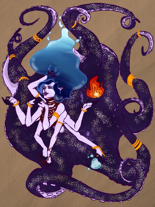

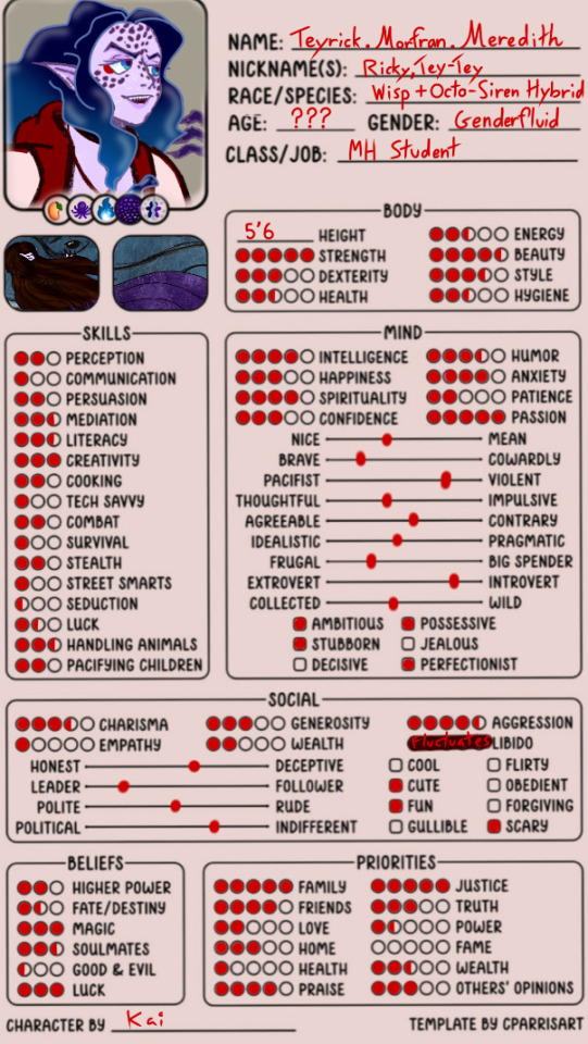
Monster High self insert!!
She’s a hybrid between a Wil’ O’ Wisp’ and an octopus siren.
I’m not that good at drawing fire but that’s what her hair is made of……
Also I just realised I forgot some of her scales on her mer form…. Well sucks to suck me…
#monster high#wil’ o’ wisp#clawd wolf x OC#oc x cannon#I’m lazy so I’m not gonna redo the artwork#siren oc#octopus sirens can exist#I know they can#some people are into that thing…#also did you know that sirens just sing about what you really want most#mine would sing about mango’s#what about yours?
8 notes
·
View notes
Photo
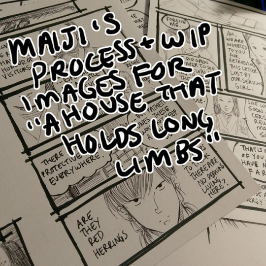
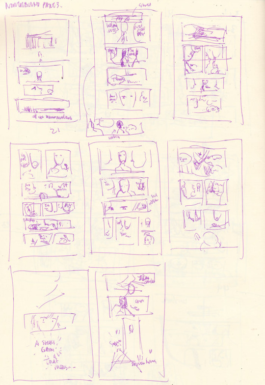
Process and wip images for A House That Holds Long Limbs (Part 3)
Previous process and wip documentation: Part 1 / Part 2
Read the pages for part 3 here (full complete version will be linked from YYH North Bound master post)
In Parts 1 and 2 I went through the transitions between idea, script, thumbnails and final art in quite a bit of detail. This time I’ll share script and thumbnails and point out some of the biggest changes, and then talk about how I scan and clean the final artwork.
Script and thumbnails

Biggest changes:
Dialogue changes every-freaking-where. Changes in word choice, moving things around to make the dialogue flow better, rewriting to make things flow better up to the umpteenth hour (i.e., right when I’m inking).
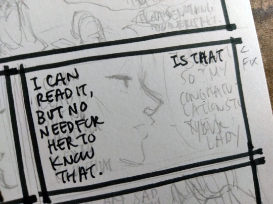
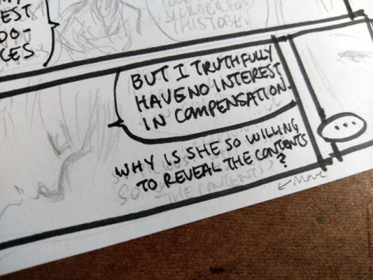
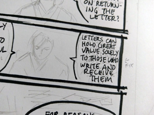
Page 24 “It is enough to know the letter has been delivered” - this thought has been transplanted onto the next page. I was also running out of space on each page for so many wordy words. Looking back now I’d probably like to move Hokushin’s “I can read it, not that she needs to know that” earlier in the sequence of panels, but it’s too late and whatever.
Page 25 split into two pages because 1) the dialogue started growing on the first of the 2 pages and I wanted to give more emphasis to the woman dropping her “tee hee I’m matchmaking” bomb and Hokushin’s “lol get me out of here” expression.
The last page with Raizen did not exist in the script or the thumbnails. I tacked it on at the last second because the previous change increased the page count to 9. I’m drawing 2 pages up on an 11x8.5 sheet of paper (so each page is about 5.5 x 8.5), so this meant I was left facing an empty page. I impulsively threw in a “meanwhile, Raizen’s shenanigans” for fun.
As an aside, this level of dialogue is what I was anticipating the hypothetical “let’s separate Hokushin and Raizen with some random NPC offering a job” scenario to involve (see Part 1 process and wip discussion). You can see why I was so eager to ditch that idea and find something simpler and more efficient.
I feel like "I was (too) careless!" is such a stock (shounen) manga phrase. Therefore I must work in "Seems like I underestimated [...whatever thing they underestimated]" and "Impossible!!" into upcoming parts of the story lol.
Inking
Part way through inking I actually ran out of ink in my new cartridge. I had started the comic with 0.3mm Muji black pen, and it ran out a while back. I switched to 0.4mm (because that’s all they had in stock at the time)... and then actually ran out of the ink part way through on these pages. @atorier lent me a 0.3mm refill so these pages mix both thicknesses in the art. I can’t really tell the difference though... can you?
Part 3 was super fun to illustrate because it’s 90% subtle facial expressions, one of my favourite things to draw. The downside is WAY TOO MANY WORDS BEING SQUEEZED IN EVERYWHERE. I’ve never been very good at managing my speech bubbles - drawing them, positioning them, and fitting words in them. I never give them the time needed for proper planning and I often write rather impatiently, as if I am jotting down a note, instead of carefully lettering each word. They’re simply very sloppy, which results in a lot of mistakes...
It used to be that when I made a mistake in the later stages of the art (mainly, inking) I’d cry and throw everything out because I’m a complete failure, this is all worthless, etc. Nowadays I’m like uhhh... #@^&^#$!!! Oh well. Depending on the mistake I still have moments of I’M A COMPLETE FAILURE, but then I just redo it on the side or add a note to myself to fix it on the computer for the final version. Here you can see a whole bunch of mistakes around lettering and placement of things.
And this is just to make it more legible. It’s still ugly lol. (That’s why I use a font for my webcomic...)
Scanning / editing
Long Limbs is drawn in black and white which makes it a hell of a lot easier to scan/clean/prep final art. I use an old Canoscan LIDE110. I’ve upgraded once or twice but always to another Canoscan (basically whatever the latest version of this series is). It’s a cheap workhorse and lots of other scanners use Canon’s scanning technology so it’s always suited my purposes very well.
For black and white lineart, I scan at 600 dpi black and white. These are my settings as they show up in the default scanner software:

For clarification, the only parts I really pay attention to/change is Color Mode (black and white) and output resoluton to 600 dpi. Most of the other stuff was already calculated or set.
Industry practice is generally 1200 dpi for black and white line art, with 600 being a “if your computer can’t handle it and is gonna blow up... this is sufficient”. I rarely bother going up to 1200 mainly because I don’t usually have applications where I need it for output (this comic is not intended for print, for instance. And even if I ever do someday print it for whatever reason, it’s not likely to be bigger than a small comic). Scanning in black and white mode also conveniently kills most of the pencil lines I still have left so that post-scan cleanup work is minimized to a degree.
Here’s a shot of the page that was scanned.
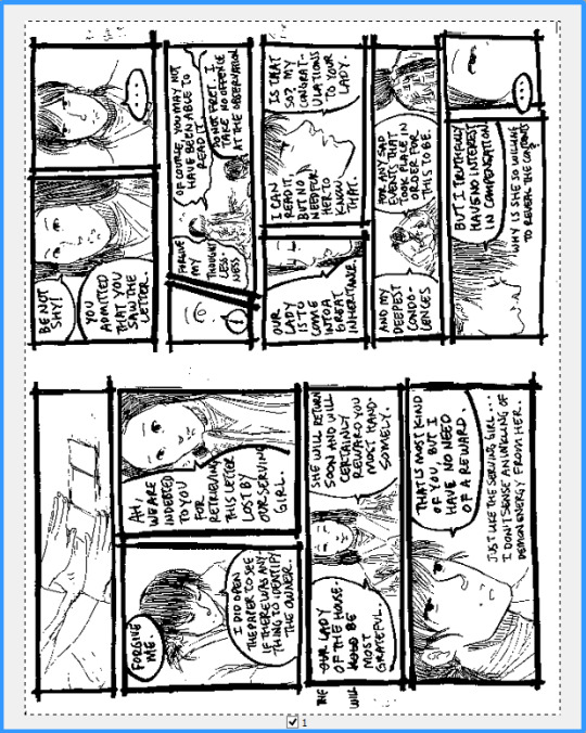
Oh god look at all the mistakes that need to be fixed hahaha.
On the computer, I crop the individual pages and save them separately. Then I blow up to 100% and start selecting/deleting unwanted dust/artifacts/dots etc. Sometimes I also just use the eraser for cleaning fine details, but select+delete is faster for large patches.

This is also the opportunity to make corrections. To be honest, there’s not much retouching on these pages because I am lazy and trying to get them out as quickly as possible, so it’s mostly getting rid of artifacts, a few stray lines from ink smearing if I smudged or erased before it was fully dry, cleaning the shapes of a few letters to make them more legible, deleting errors and pasting the fixes over where the errors used to be, and any really stupid mistakes I’ve made - like drawing the fixes to Hokushin’s hitatare in Part 2. For redrawing/adding new parts on the computer, since the art is in black and white mode at such a high dpi, almost any brush will work great and look indistinguishable from the scanned lines when scaled down.
I save a high res TIFF for my archives. Then I convert to greyscale (better for maintaining details when I resize, since black and white can drop things that aren’t 100% black or white), and resize to 72 dpi at 700 pixels wide. 72 dpi has long been the standard for on-screen viewing - nowadays screens can display higher resolutions (e.g., retina) but this looks fine to me so I’ve long stuck with good ol’ 72. I arbitrarily picked the 700 dpi width - it seemed a good balance of “not too small” and “looks big enough to let you see the art nicely” on Tumblr. Below are my settings to resize:
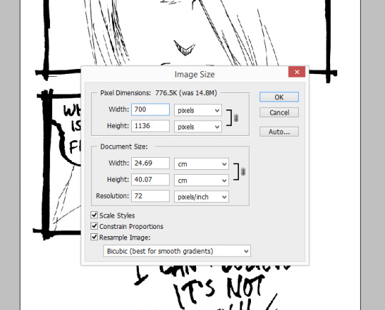
Again, the above I mostly only pay attention to width and resolution. All the other stuff is mostly default or autocalculated. All my pages are different heights, which I don’t really care about since I’m just posting them on tumblr and pixiv. Finally I save as JPG for posting.
Ta da!
#yu yu hakusho#comics#fanart#hokushin#raizen#wip#process#drawings#yyh north bound#art by Maiji/Mary Huang#scanning artwork#cleaning artwork
5 notes
·
View notes
Last Seen Blogs

daily-dose-of-danno
Daily Screenshots of Our Favorite Ghost Boy

schrodingersunemployment
Clown Thing

st4rb0yru1z
% ៸៸ ST4RB0Y ٬ 💭 ++ ?

gainonearnmore-blog
Gainon

emerald-skies-art
🌿🌸 EmeraldSkies 🌸🌿