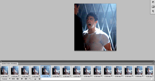
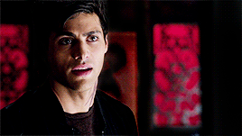
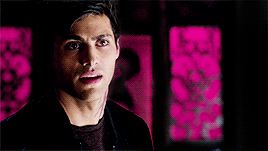
#So I went to use the hue saturation and brightness menu to increase the saturation instead of just pickingthe right colors (another mistake
Text
I HAVE FINISHED THE PROJECT!!!!
It took forever but I did it. Also if it looks crunchy it’s because you’re supposed to look at it from farther away xoxo, Moss
This shit took me hours >:(
All because of the stupid layer limits procreate has (and because i am incapable of doing this effectively)
Also sorry Ik this is really anticlimactic
@faggotful-enby
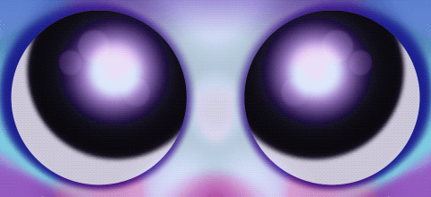
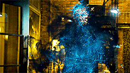
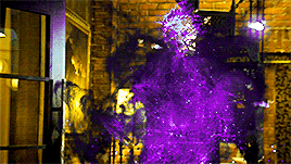
#Ok so#Karl#The reason it’s sort of your fault#This is a tale so buckle in#Alright i had just closed out tumblr dot com and was ready to do something interesting#So a thought crossed my simple mind “why not draw something”#A Mistake#So I opened up procreate and decided to draw some eyes (definitely not because they’re the only thing I know how to draw)#So I did#And because you had been in my brain i chose to do them in purple (you are purple in my head)#Eventually I got done with the eyes after a bit of a struggle because i couldn’t get the fucking placement right#So i moved on the the eye liner#because if i don’t add eyeliner they just float in the void#hashtag just me not knowing how to draw problems#And during that I had a thought (bad)#“Hey i’ll use the trans flag colors for this”#Which to be fair was pretty cool of me#BUT#When I was picking the colors i had the saturation really low (mistake)#So I went to use the hue saturation and brightness menu to increase the saturation instead of just pickingthe right colors (another mistake#Then I got messing with the hue#and it was cool#So i spent several hours animating a color changing thing#which originally was just supposed to have the eyeliner shift colors#but then I decided the eye looked cooler#Now it’s 2:30 am :|#I don’t think i should be allowed to do things on tumblr dot com.com anymore#not because of the art thing but because of my tags#this should be a war crime#but i’m making it worse
14 notes
·
View notes
Text
how i colour gifs
so i was asked by an anon if i could show how i colour my gifs! i’ll be honest my colouring isn’t too indepth but i can give some tips on how i colour certain videos that have certain lightings and whatnot!
before:
after:

so the main adjustments i use for every single gif i make are:
exposure
vibrance
levels
curves
brightness/contrast
selective colour
other adjustments i use sometimes are:
colour lookup
hue/saturation
colour balance
these ones i’ll use more for when i’m doing gifs that require more colouring editing.
personally i like to make my gifs vibrant and have the black areas of the gifs as dark as possible. so i’m starting off with this gif:
the lighting is pretty good so it doesn’t need much editing but i do still want to make it more vibrant and have their jackets as black as possible.
to get the black areas to the darkest it can be, there are two options. option one is i would use a mix of curves and levels. i would start off with the curves and use the eye dropper tool that is filled with black and click on that then i would click on the lightest part of the darkest part of the gif then it’ll automatically recolour the gif so the area that you selected would be black.
so for this i would click on jongho’s right shoulder which is the lightest part of his jacket.
curves does a good job at doing some of the colouring for you cause it’ll adjust the entire gif to make that part black! but you can also enhance it by using the levels tool but it can make the entire gif darker so i wont be using it for this one.
the other method is with the colour selective tool and all you do is when you click on the adjustment click on the dropdown menu and select black:


there’s not much of a different except that the second option tends to make the gif less vibrant and takes out the life a bit in their skin tone and i normally use that more for performance gifs rather than regular gifs. now you can enhance it if you want with the levels but since this gif is on the darker side i won’t.
to make it vibrant mainly the vibrance/saturation tool! with the vibrance all i do is that i set the vibrance setting to close to the highest option or the highest option if i needed to. for this gif i only went up to 70+ but you can go up to 100 if you want.
then i use the exposure tool darken up the hallows of the face a bit more by having the offset in the minus. i also increase the exposure a bit to add more dimension to the high points of the face.

next i’ll use the brightness/contrast tool to kinda make it look a bit matte by having the contrast in the minus numbers and i’ll brighten it up a bit more as well~

finally i don’t really like my gifs being too yellow so i’ll use the colour selective tool and go to the yellows and adjust the yellows by making them a little more warm and lowering the saturation of the yellow at the same time.
51 notes
·
View notes
Text
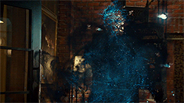
I decided to make another coloring tutorial because I need people to know that dark/muddy raws aren’t the end of the world
Part 1 of this tutorial, I’ll show you how to get from A to B
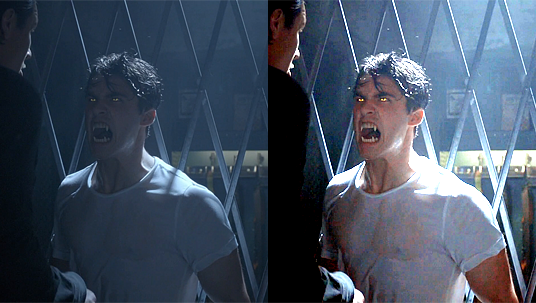
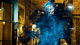
In Part 2 I’ll explain how to fiddle with compression settings in Photoshop to get from this default, which washes out the yellow in his eyes

to this custom, which keeps the pop of color

--
Part 1: Color Correction
I’m gonna go into this with the assumption that you know about Photoshop’s adjustment layers and how to create basic gifs.
I’m using Photoshop CS5, so it’ll look slightly different on later versions.
-
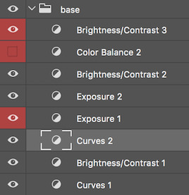
I always begin with a simple Curves layer. By utilizing the white eyedropper and black eyedropper, I immediately get color back into Theo’s skin tone
I’ve used a different part of the gif to emphasize finding the brightest and darkest part. All you need to do is click on the individual eyedropper and then click on the “white” (and then “black”, respectively) part of the image. The nifty part is you can keep clicking around until you’re satisfied with the results.
I start with the white eyedropper
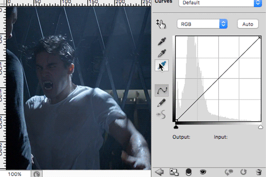
Then I switch to the black before returning to the white one because, if you notice, both the white and black eyedroppers also change the Red, Green, and Blue lines (i.e. the ratio of reds, greens, and blues that make up the image)

Trial and error will help you learn to find the best white and black parts. Plus check with other frames of the gif to see how it works as a whole.
So, step 1, Curves

-
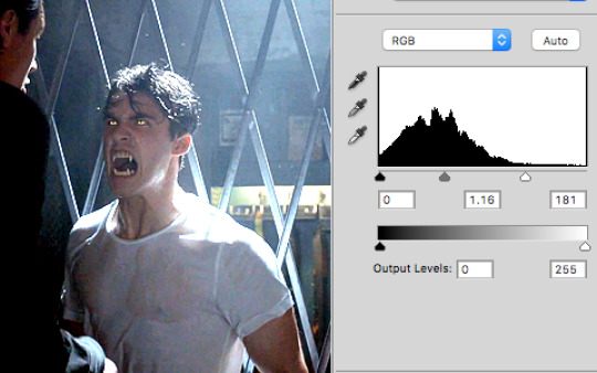
Step 2 is lighten it some more with Levels
-
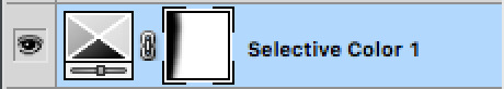
Step 3 is bringing out the color in his skin. For this I turn to Selective Color.
The main channel I always fiddle with is the Cyan bar. Then I tinker around until I land on something that I like. This is entirely a subjective process based on your personal taste and what affect you’re trying to achieve in the image.
For this particular gif, I seriously increased red in Reds
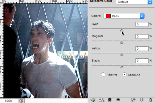
I actually reduced the reds in the Yellow while increasing the magenta

And I completely removed all the Magenta by turning it into a reddish-yellow

I didn’t like the way that the other dude’s face is so saturated now, so what you do to fix that up--especially because there’s not a lot of movement on his part--is you take the lasso tool and select around him

Make sure you’re on the Selective Color layer and click on the white box (the layer mask)

Now press Delete/Backspace on your keyboard and Deselect (either Ctrl/Cmd+D or in the menu bar Select > Deselect)
The deleted area will likely have a sharp border around it, so go to Filter > Blur > Gaussian Blur and smooth that baby out. It should end up looking something like the following
So here’s before Selective Color, after Selective Color, and then after the lasso+blur trick

-
Step 4 is Hue/Saturation!
It functions really similarly to Selective Color except you can more directly control just the saturation and brightness of a specific color (and also adjust its hue to left or right on the color spectrum)
First I want to return to the yellow in his eye and bring that out more (I never said this process was straightforward *sweatdrop*)
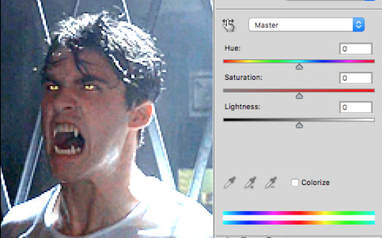
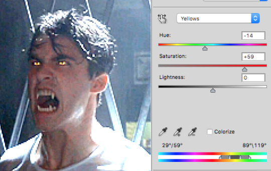
Then I want to bring out the blues of the background to contrast it more with the foreground
For this, I went into both Blues and Cyans and boosted the saturation of both

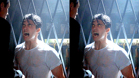
Before and after (again this is entirely subjective and you could just as easily exaggerate it way more than I did)
--
Part 2: Compression
It’s all nice and fine to color correct, but the final result could become all wonky after gif compression.
In the case of Theo’s eye color, Photoshop decided that there’s not enough yellow in the image (a calculation based on all the still frames together) to justify keeping yellow in the 256 color table

It’s a minor thing, but I worked damn hard on editing that yellow and I want to keep it!
Here’s my trick for fooling Photoshop into thinking a tiny drop of color is important on the color table...
1) Remove frames that have less yellow in them (and/or crop the image, though in this case it’s already pretty cropped so I skipped that step)
Click on a frame then hold Shift and click on another frame to select a group of them. Next click the trash bin to delete

-
2) Create a new Hue/Saturation layer and turn up Yellows to 100% Saturation

Tweak the range of color (in the case, reducing the green) by clicking on the bars at the bottom and dragging them until you’re satisfied with the result

-
3) Go into the save screen for a gif
Notice how the automatically generated color table has all these bright reds, yellows and oranges it didn’t have before

Click on the drop-down on the top-right corner of the Color Table.

Select “Save Color Table...” and save the table wherever you want on your computer
-
4) UNDO ALL THE CHANGES
After you save the table, you’ll return to the gif save screen. Click CANCEL.
Go into your image History and DELETE every step you just did
-
5) Save the gif with the new color table
Return to the gif save screen and click on the color table drop-down menu again. This time click “Load Color Table...” and select the table you just created.
The yellows in the eyes remain this time because the table itself includes enough yellows to recognize it during compression.
-
And that, folks, is how I get bright, saturated gifs from muddy/dark messes!
To reiterate, we went from this to this
You can check out the final gifset: here
57 notes
·
View notes
Note
can you pleeease tell us how you color your gifs? they're amazing I can't get colors like that, like the make me choose malec or inverted one or the one for the latest episode you are not your own. please? they're gorgeous!
of course i can !!!!
first of all, thank you so so much for saying that about my gifs !! it means so much that you like them !!!
so i’m gonna show you two examples if that’s cool? one from my you are not your own set and one from my 1x12 set.
you’ll need:photoshop (i use cc)basic knowledge on how to gif/base colour (i’m gonna focus on how to bring out/manipulate colours here rather than just general base colouring)
so first, i’ll be telling you how i got from this:
to this:

first off, scene selection is really important! the original scene had blues in it, which is easy to make purple, and the background was a kind of reddy orange, which you can make yellow. picking scenes which you can easily manipulate the colours to something you want is super important and cuts down your work by a lot!
so firstly, i just apply my base colouring. nothing fancy, just some curves, brightness and exposure! like really..nothin fancy:
which gives me this:

as you can see, all it’s done is brighten up the gif in general, giving more light. this helps make colours appear brighter and more vibrant!!
then the fun part!!! selective colours !! my advice here, when manipulating colours, is work in small stages. don’t expect to completely get from one colour to another in one sc layer. a lot of the time it takes two, even three layers to get to a point where i’m happy.
first i started working on making the background yellow! i started with a selective colour layer and i adjusted redmy setting were: cyan +33, magenta -26, yellow +100which gave me this

this made the background a lot more yellow, but there was still quite a bit of orange in there that i wanted to get rid of, so i went in with another sc layer, but this time, adjusting yellows instead of reds.my settings were: cyan -63, magenta -41, yellow +100, black +36which gave me this
this did almost nothing at all, but it was important for my final sc layer which really made the background almost perfect. again, adjusting yellows, my settings were: cyan -30, magenta -31, yellow +96which gave me this

this final layer made the background significantly more yellow, but there was still a teeny bit of a reddish tinge that was bothering me, so i added a hue/saturation layer, and selected yellows from the drop down menu (where it says “master), and upped the saturation to +20, which gave me this
saturation layers are super helpful in making a colour extra vibrant !! with the background sorted, i moved on to making the blues purple. i started with….u guessed it …. a sc layer. i adjusted the cyans this timemy settings were: cyan -100, magenta +100, yellow -10which gave me this

this started bringing out the purples, but it wasn’t purple enough, so i went in with another selective colours layer, this time adjusting bluesmy settings were: cyan -100, magenta +100, yellow -90which gave me this

i then wanted to make the purple a little deeper, so i took another sc layer (last one i promise !!), and adjusted magentamy settings were: cyan +3, magenta +69, yellow -12which gave me this

i then took a final hue/saturation layer to make the purple more vibrantmy settings were: blues - saturation +19, magenta - saturation +18which gave me the finished product!!
so for the 1x12 gifset, i used a pretty similar technique, but it was a lot easier i think!
so i’ll be showing you how to get from this:
to this:
so first i started with my base colouring, again, nothing too fancy, just a few small adjustment layers to get my gif looking brighter and something like this

so first i wanted to get a bit of negative space going on, to enhance blacks and increase the contrast, so i created a new layer and took a black brush (making sure hardness was at 0%). i set the layer to overlay instead of normal, and painted over the bits i wanted to be black, giving me this
then it was time to make the reds pink. i took a selective colour layer and adjusted the reds. my settings were: cyan -69, magenta +100, yellows -72which gave me this

it made alec’s face very pink as well, so to fix this i created a layer mask, and with the brush set to black (0% hardness), i painted over alec’s face to give me this
bc the general colour scheme of the gifset was blue/pink, i wanted to add some blue in as well. so i made a new layer, set the brush to black at 0% hardness, and set the blending mode of the layer to colour. this desaturated the area, giving me this

desaturating the area allowed me to then paint over that area in blue, without any colours from underneath interfering. so then i took a paintbrush set to blue (#0096ff), set the blending mode of the layer to overlay, and painted over that same area, giving me the finished product!

i hope this was…vaguely helpful !!! let me know if you have any more questions !!! but honestly just loads of selective colour layers and one or two saturation layers are the key !!!! also this is gonna sound dumb but practice? the more practice you get, the better you get at knowing what’s gonna work and what’s not going to !!! but yeah, i hope this is okay
#Anonymous#bisexualsmagnus#(<-- hope this is what you guys were looking for !!)#ps tutorial#ps help#mine#it's so surreal that people ask for like.... tutorials from me#i just click shit i swear#idk what im doing !!#asks
109 notes
·
View notes
Text
Basic Photoshop Skills
CROPPING
While most of us think about cropping only in terms of preparing an image for print or web display, the truth is that the crop tool can be invaluable when it comes to either correcting or creating an entirely new composition. The crop tool went through a major overhaul in CS6, giving the user the option of either dragging the image itself through the crop box or switching back to “Classic Mode” in the tool settings. In either case, saving presents for size and resolution is a great way to get a more accurate look at how your image will appear when printed or posted on line. I prefer using the crop tool in Classic Mode. It may be just because it’s what I’m used to, but dragging the crop box around the image (rather than the other way around) feels like a more intuitive approach to me.
BRIGHTNESS & CONTRAST
Brightness and contrast adjustments can be a valuable tool in finding and correcting flaws in exposure. Remember that it is very easy to take these adjustments too far, so apply them carefully. While I think it’s important to be comfortable with these tools in Photoshop, I do think they are adjustments much better suited to RAW files in Lightroom. Remember that RAW files contain much more information than JPEGS and processing those files in Lightroom is non-destructive. Still, though, being able to adjust brightness and contrast in Photoshop is a basic skill that often comes in handy.
CURVES & LEVELS
As long as we’re on the subject, curves and levels are basically a more advanced approach to brightness and contrast. While the brightness and contrast sliders apply global changes to the image, curves and levels allow you to make much more targeted, finely tuned adjustments. Each, for instances, allows you to precisely pick black, white, and grey points within the image and make adjustments based on those selections. Curves can be a little intimidating at first, but once you get a handle on it, you’ll wonder how you ever got along without it.
SATURATION
Just like adjustments to brightness and contrast (regardless of method), be careful when adjusting the saturation. It’s very easy to bump it just a little too much and be left with a result that seems to defy the laws of nature. If you are going to make adjustments to either hue or saturation, I strongly suggest clicking the drop-down menu in the dialog box and switching from Master to whichever of the colour selection options is mot likely to yield the result you’re looking for. One of the most common uses of this tool in my workflow is for adjusting skin tones. More often than not, a slight reduction in the reds is all that it takes.
WORKING WITH LAYERS
Coming to an understanding of layers was like hearing angels singing as clouds parted before my eyes. The concept itself is pretty basic. Each layer contains data. How much of that data is visible is based on each layer’s opacity and blending mode. Think about an actual printed photo for just a moment. Now think about placing a sheet of paper directly on top of it. We know there is a photo underneath the paper layer, but we can’t see it right away. As we remove bits of paper, parts of the photo below begin to emerge. Now think of the top layer as an exact copy of the original beneath it. By making changes to the opacity of the top layer, as well as to the blending mode (how the layers interact with each other), we can make specific, targeted changes to parts of the image, rather than global changes that may go too far. Another benefit to mastering layers is that it allows you to make each image adjustment on its own layer, preserving the original and creating a finer sense of control over the edits.
SHARPENING
This is another one of those Photoshop skills that takes practice and a light hand. You’re walking a fine line here between “sharp” and “what the hell happened?” When you apply sharpening, you are basically increasing edge contrast. This means that small/fine features stand out more. Using the Unsharp Mask option lets you fine-tune the application a bit better than general, global sharpening, but either option is best applied on its own layer. As with adjustments to brightness and contrast, sharpening is a step that is probably best applied in Lightroom. Either way, however, it should always be your last edit. When it comes to my own workflow, I only apply sharpening after I have already cropped the image to its “final” size and resolution. I do this last because you require a different amount of sharpening for print than for web, etc.
CLONING AND HEALING
The clone stamp and healing brush are two of your most important friends when it comes to removing unwanted elements from your image. This can be anything from spots on your sensor to stray hairs and facial blemishes. The clone stamp allows you to sample from specific areas within the image in order to blend your corrections as seamlessly as possible. This is particularly important when working on faces. The spot healing brush samples from the pixels immediately surrounding the area you wish to correct. Varying the size and hardness of the brushes will help you avoid the tell-tale brush strokes and artefacts that some photographers leave behind.
CONTENT AWARE FILL
The first time I saw what content aware fill could do I was speechless. First introduced in PS CS5, content aware fill is basically the clone stamp on steroids. After drawing a selection on larger unwanted elements within the frame, content aware fill “reads” the surrounding area of the image and (usually) seamlessly removes those unwanted elements. As miraculous as content aware fill might be, however, you do have to be careful when using it because it doesn’t work perfectly with every photo, particularly when it comes to busy backgrounds.
COLOR BALANCE
Whereas saturation adjustments address how much colour is present, colour balance addresses how the existing colours interact with each other. Curves and levels adjustments do a great job of dealing with the contrast between mid-tones and highlights, for example, but being able to target how colours appear in those same mid-tones or highlights can help you make subtle changes to the overall feel of the image, particularly when it comes to colour temperature.
*Taken from: Guyer, J. (2017). 12 Essential Photoshop Skills Every Photographer Should Know. [online] DIY Photography. Available at: http://www.diyphotography.net/12-essential-photoshop-skills-every-photographer-know-video/ [Accessed 21 May 2017].
0 notes
Last Seen Blogs

yakamozdraws
yakamozdraws
faispasci
some kind of nature

kunstellation-one
Lis's hard stan hours

sharonscarters
Now @ Maryjanes

movie-reviewer-perhaps
movie reviews i guess