#and they're tiled to work chronologically
Text
thinkin' about caspar...
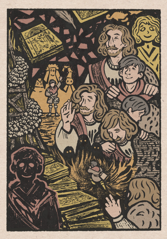
#thinkin' HARD#pentiment#andreas maler#caspar of salzburg#august maler#my art#can i do the thing you're not supposed to do and explain the piece#i'm really proud of the idea#there's four sets of drawings in this#each pair mirrors each other in composition/subject with one representing the start of the second act and the other representing the end#and they're tiled to work chronologically#(super super spoiler warnings for act 2)#so you start top right with the ghost of august#who's standing behind haunting andreas' interactions with caspar#as he holds caspar's shoulders and takes on that lost fatherly role#near them is andreas' masterwork and what's probably a copy of it in progress by caspar#you move on to see andreas leaving caspar alone by the fire at saint john's eve#flanked by three people masked to protect themselves from spirits#and then transition into caspar pulling andreas out of the fire at the abbey#(with his hands on andreas' shoulders now)#then caspar running into the fire toward three spirits- with andreas no longer waving goodbye but trying to call him back to him#then the books caspar saved#and then the ghost of caspar- mirroring august as a son andreas lost#and no#no i'm not ok!!!!#please talk to me about this arc i can't get over it 😭
1K notes
·
View notes
Text
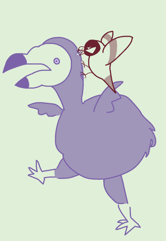
Bestiaryposting Results: Ilyecham
Presenting the results for the Ilyecham -- a name which continues to look wrong in Tumblr's sans-serif font. That's:
Ilyecham
There we go. As usual, if you're not sure what this is about, you may find an explanation at https://maniculum.tumblr.com/bestiaryposting . The text from which the artists are working is here:
I saw one post saying something along the lines of "if these things are going to keep being birds, I'm going to have to learn more about bird-drawing." I regret to tell you that the Aberdeen Bestiary has a whole section on birds, so they are indeed going to keep coming up. They make up, like, a third of the entries I have queued. Sorry. Or, if you wanted motivation to practice your avian drawing skills, you're welcome.
Also, sorry this post is a couple hours later than usual -- I had Other Obligations this evening.
Anyway, here's the art, in roughly chronological order as per usual.
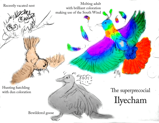
@embervoices (link to post here) has drawn both a colorful adult and a less-colorful juvenile, and moreover provides us with a quick vocabulary lesson, which I always enjoy because I'm a language nerd. (They also wrote their own image description -- thank you for that, saves me some time.) I absolutely love that the Ilyecham "greedily seizing larger birds" is here represented by a hatchling aggressively going after a "bewildered goose". The linked post includes some notes on design decisions also.

@miapcain (link to post here) has done another beautifully stylized picture, showing multiple Ilyechams and their aggressive behavior. I love the style of course, and I also like that these have an almost sandpiper-like body plan with long beaks, which they apparently use to stab other birds -- or at least I think that's what the one in the bottom right is doing, which I think is pretty cool. The blue heads are a nice visual touch also, I think. The kind of tiled geometric background feels very period-appropriate, exactly the sort of thing you'd see in a particularly richly-illuminated manuscript.

@sweetlyfez (link to post here) notes that there aren't many visual details in the description, so she decided to draw a regular bird of prey and then add a wizard hat to indicate that it is armed with spirit, which I love. I actually laughed out loud when I saw her explanation of why the hat. Excellent choices, no notes. Also I think this is a pretty good bird drawing on its own merits, hat aside.
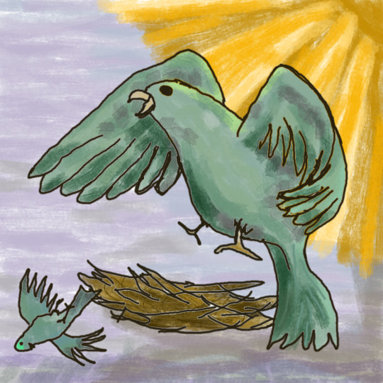
I continue to enjoy @rautavaara's drawing style (link to post here). I really like the way the rays of the sun are drawn here, specifically. Their Ilyecham is molting in an extremely dramatic fashion, missing whole clumps of feathers, which I think looks quite cool and communicates the idea well. (I worry a little bit about how long it's going to be able to stay in the sky with so many wing feathers missing, but they're apparently quite unpleasant birds, so maybe a rough landing is well deserved.)
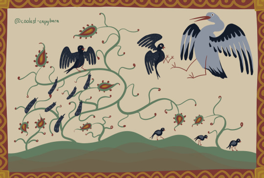
@coolest-capybara (link to post here) has drawn us a whole family of Ilyechams. Also in excellent medieval style, as usual -- the stylized drawing are kind of all in a cluster in this post. I like the plants; coolest-capybara is quite good at drawing plants in a way that looks just like the Unidentifiable Medieval Foliage you'd expect in a manuscript. We can see one parent exhibiting its molting behavior, another fighting a much larger bird, and three poor little juveniles walking off looking a bit dejected. Hits all the highlights of the description very well, I think. The linked post includes a brief description and a few close-up details of the image.
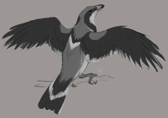
@silverhart-makes-art (link to post here) would like to acknowledge that this is "kind of a mess" and "the wings are just gonna look like that", which I think is an example of artists holding themselves to very high standards because this looks very realistically rendered to me and I have no idea what might be wrong with it. That's a damn fine bird drawing right there. The linked post includes a pretty thoughtful explanation of which behaviors in the provided description are reminiscent of which birds, and how silverhart has combined elements of a few different birds to make this one.

@karthara (link to post here) has drawn us what is unmistakably a bird of prey, and briefly explains in the linked post what birds this is inspired by. I think the feather pattern is very interesting, particularly the blue on the head. Something about the way the shape of the pattern interacts with the bird's eye looks very cool. A certain je ne sais quoi, if you will.
@hairycarrot (link to post here) has done a pretty cool-looking sun in the corner of the page. One of the unexpected things I'm enjoying about these is that multiple artists decided to have fun with how to draw the sunshine in which the Ilyecham spreads its wings. Poor little guy falling out of the nest there... buddy I don't think that one is quite ready to fly.

@treesurface (link to post here) shows us an Ilyecham creating a breeze by beating their wings, as described in the entry, which I like. Their Ilyecham is equipped with a dangerous-looking pointed beak for the purpose of fighting larger birds, and the look in its eyes definitely helps with that impression. The linked post provides an explanation of design decisions.

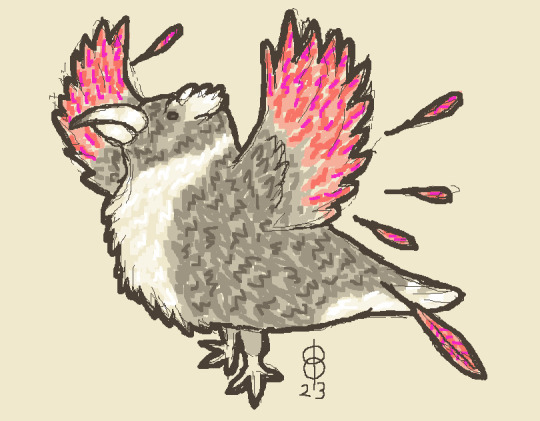
@strixcattus (link to post here) notes that the description provided reminds them of a number of small raptors, but that all of those raptors look kind of alike, so they've given their Ilyecham a striking feather pattern to stand out from the crowd. I really like it, the pattern is excellent. I also like that we're seeing the return of an animal from a previous entry: that thing it's grabbing in its claws is a Holghras chick from a couple weeks ago. (Though I'm slightly torn because I like those little muppets, and the Holghras has enough problems without being attacked by an Ilyecham.) Strixcattus has again provided us with a modernized description of the creature in question, which is amazing as always. If any of y'all enjoy worldbuilding half as much as I do, you owe it to yourself to read these.

@moustawott (link to post here) has drawn us a very small-looking bird here, performing stationary flight to aid in its molting behavior. The feather pattern is very good, in my opinion, and I like how the molted feathers are kind of blowing away behind it. Also an excellently-rendered bird in general.
@pomrania (link to post here) envisions the Ilyecham as looking old and grumpy to fit the vibe of its described behavior -- an early draft of this drawing includes a speech bubble reading "get a job you freeloaders", which I think hits the mark pretty well. (For early drafts and additional commentary on the design, see the linked post) I like the eyebrows, I like the severe color scheme over most of the body paired with the colorful wings, and I like that this is the closest to what I pictured when I read about the Ilyecham, namely this:

(Not that it's an eagle, but you know. Vibes.)
@mobileleprechaun (link to post here) has very clearly depicted a small bird attacking a larger one. They note "heavy Season’s Greason’s inspo" and you know what? I totally see it. I also enjoy the decision to make the larger bird a dodo.

Another cool pen drawing from @cheapsweets (link to post here), who also has some thoughts about how this particular nib works for drawing. Pretty well done birds, I think. I enjoy the one on the right just shoving the juvenile out of the nest, and the stylized sun is also pretty cool. The linked post includes a detailed explanation of the design decisions, and also has some questions about the entry that are probably rhetorical, but I figure I can try and shed some light on a couple of them anyway.
Again, we have a lot of behaviours, but nothing in terms of a physical description… Did the author just thing ‘everyone knows what birds look like’, was this just a bird that the reader was expected to be familiar with, or were they all like 'I’m not describing yet another bird… :p’?
I think it's a little of all of those, and also that the author tends to be more concerned with the symbolism of the animal than naturalistic description. So if, say, the color of its feathers doesn't have a symbolic meaning attached to it, the author won't bother to tell you. Related to that...
Hang on, this is going to be some kind of inspirational virtuous animal thing, isn’t is… :p I can imagine some medieval scribe writing 'and so, the ilyecham represents the cardinal virtue of fortitude’ or something…
Interestingly, this bird's parenting style is basically the only part of its description that doesn't have any symbolic explication attached. The molting in the south wind gets, like, pages of material though, including the fantastic assertion that it's the south wind because God comes from the south but the Devil comes from the north. Literally, that's what it says:
God, it is said, will come from the south. The Devil from the north; God from the south.
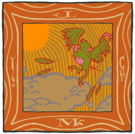
Moving on, let's take a look at the Aberdeen Bestiary illustration.

Honestly, that also kind of looks like Sam the Eagle.
However, this is the entry for the Hawk. Yep. Turns out hawks are inherently opposed to the welfare state, which... actually lines up more than it should with present-day politics.
I don't have much more to add here, because most of my thoughts on hawks boil down to "Tobias was a pretty good character in the Animorphs series".
Pretty sure that's not how wings work, anatomically. But nevertheless. End of post.
73 notes
·
View notes
Text
blood-stained tiles
@febuwhump day 14! thus begins our Flashback Arc!!! oh boy!! BACKSTORY!!
(to be clear, in case anyone's been secretly following along or is catching up now: this takes place chronologically way before anything else i've written for these guys so far! the next few pieces will follow this one directly)
cws: blood, panic
Milo taps their hand rapidly against their leg and exhales loudly, blowing hair out of their eyes for probably the fifth time this evening. Coren was supposed to be here five—they check their phone—no, eight minutes ago. Where the hell are they?
It's okay, they're not super punctual, it's normal, it's fine, they try to weakly reassure themself. It doesn't work. Sure, Coren's not usually a punctual guy, but when you're doing corporate espionage, a little timeliness so your accomplice doesn't think you're fucking dead would be nice.
Milo takes a deep breath in and out. Okay. Fuck it. It's been ten minutes. They're going in.
Everything looks normal inside at first. Milo's sure they don't look normal, but they try their best to act natural. They're still in their work clothes, thankfully. If they move quickly and with purpose, hopefully no one will notice they don't work here.
They keep their eyes on the tiles. Super cool, super casual, normal and natural and HOLY SHIT IS THAT BLOOD?
Milo stops, too rattled to even pretend like they have an excuse, and stares at the ground with a sense of rising dread. Oh god. Yeah, that's blood on the shiny linoleum floor, alright. That is absolutely blood. Oh no. Oh no.
Milo's heartrate and footsteps quicken in tandem as they follow the trail through the building, go go go go go and oh stars if Coren's hurt they'll— don't think about it, don't think about it, the blood splatters are getting larger, it's a trail now, oh god, what are they doing, what if—
They round a corner. They stop. They feel the world fall out from under them.
Coren is there. The source of the blood is there, also. The source of the blood is not Coren. Coren is, however, covered in blood.
Milo's breath leaves their lungs in a punched-out gasp, and Coren turns to look at them.
#febuwhump#whump#febuwhumpday14#blood#anxiety#oc: milo#oc: coren#oh i need a tag for this story huh. well it can wait#sliding this one under the wire lol
8 notes
·
View notes
Text
dev diary #15yrs late
youtube
so, figured we'd maybe do an episode to look at the dlc stuff (maybe just the big packs? maybe bundling the one-offs together?). wanted to do up a few sets that worked wiv (almost) entirely the materials, stickers, and decos from each one.
started off wiv MGS since, like, chronological; and that's always been a favourite from both gameplay and what we actually got out of it. the material set is really strong, and aside from the very obviously branded stickers, there are some real useful ones in there.
playing through it now, tho', and really sitting down wiv it, not just tear-assing through because new stuff in LBP (at the time), and it doesn't sit perfectly easy, you know? like, i get that the setting was running off the then-released Guns of the Patriots, and that was in the Middle East (partially? haven't played Metal Gear after the second one; not out of any distaste, just being in Japan, and none of the later ones being in English; which, like of course, but then all the Silent Hill games Konami did had full English menus, so, like, there was a hope to be dashed); it just feels like a lot, given what's been going on in Palestine, the battle damaged marketplace background, you know?
i've had this thought before, and hundreds before me, so nothing novel, but we're really too damned cavalier, ghoulish, even, to be using the settings of other folx' suffering for our entertainments. it'd be one thing if it were something more distant (tho', even then, how distant is distant enough? everything carries on effecting things even after the event is wrapped), but it's not like 2008 was sunshine and roses for the region either. as an american, like, we've been and are tits deep in ruining people's lives over there since i was a kid (and before, no doubt). i mean, Konami's not an american company, but still and all.
anyways, been trying to figure out how, and how much, i really want to bite off on that topic for this particular video. maybe not too much, it is LBP after all, but i can't just not say anything about it, you know?
also, i would really love to figure out what region/country specifically the materials are referencing. they're all named, like, "Middle Eastern tile" and "Middle Eastern lattice," and that doesn't much sit well either.
anyhoot, the sets turned out nice, at least. also unexpected prominent watermelon in the background, so i can say "free Palestine" wiv my voice *and* wiv a visual pun.
#littlebigplanet#little big planet#lbp#lbp1#lbp3#dev diary#drawing board#end genocide#free palestine#Youtube
5 notes
·
View notes
Last Seen Blogs

gems1g
a constellation of thoughts

shrimpin-aint-easy
BIG SHRIMPIN’

angelvigilante
Scarlett Ross Art

m-a-estore
M_A_Estore