#but i wanted to post my descrambling here as well
Text
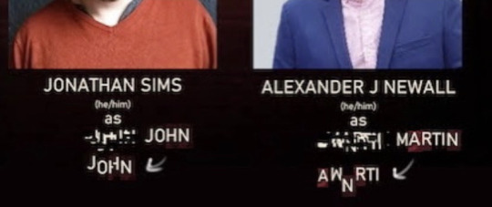
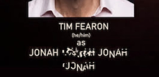
am i fully convinced that this new [error] character will be jonah? no. is it funny that i can somewhat unscramble his name from this? yes
(more theorizing under the cut)
so because of celia ripley, who was originally in tma, we know that characters from the tma universe have alternate selves in the tmp universe. celia ripley isn’t [error], but jon and martin (presumably) are, which also means something interesting: either [error] characters have to have some tie to the institute in the tmp universe, or they’re originally from the tma universe and aren’t alternate universe tmp versions.
either way, i think this third character would have to be in some way associated with the magnus institute. it would have to be a significant character that doesn’t have a voice yet, and would be played by an older man. the tmp logo has alchemy symbols and an upside down philosopher’s stone, so there’s themes of immortality. can you see the vision
do i know the logistics of how we’d be hearing jonah’s voice? absolutely not. i have no idea how it would actually work out. but i would think it would be neat that the three characters who caused the fears to spread (jon, martin, elias/jonah) are also the three [error] characters in this. or i could be totally wrong but that’s just theorizing babey!
#tmp#tmap#the magnus protocol#the magnus archives#tma#jonathan sims#martin blackwood#jonah magnus#tma spoilers#i know the casting image has been out for a while#but i wanted to post my descrambling here as well#also i always forget that they want us to spell his name john LMAO#pey rambles
164 notes
·
View notes
Text
i was like uhhh what’s that one really intense and threatening totheark video but i think i’m like, mashing two together in my head or something. anyways i think for me the winner’s still Admission. i think. come back and tell me if it’s not the one i’m thinking of. also probably i’m like, thinking of tta-esque moments in mh videos like entry “tim’s big day,” and i don’t mean entry 35, or ones where anyone dies or gets their house burned down. i should do like, a top ten marble hornets moments list because it’s october, and because everyone else has shit taste and can’t be trusted to rec something like this for shit. mh epic fails, alex kralie cringe compilation
#i mean by the premise all tta vids are threatening i guess. i think i was really hyping up that later apr 4 one? decay? in my memory#not That intense but everyone just flipped out about it b/c like. suspenseful time#uhhhh the ''stay home / be alone'' tta is kinda classic but no yeah i like the one#admission i mean#so many epic fails: wait i could make gifs for these Top Ten Momentos#but like. sometimes the gif doesn't convey it#like the entry twenty-house video. there's no like. Moment. well no. i take that back i guess i just thought of a giffy mome.#honestly? the ending of entry twenty-house: return to the house is always one of those Best Momes Of The Series. calling it a moment is a#lil misleading since like yeah a lot of these have to do with some mcfreaking pacing which team ''ugh more walks in the woods'' cannot ever#like. begin to grasp apparently. like here's the sitch gang: if every video has Scare Towards The End then it stops being scary#you don't make your comedy or horror Predictable or it doesn't even land. for gods sake#to this day......would-be mh mutuals of yore who i just never talk to b/c years ago i got annoyed with their Beneath Me opinions#childish....childish....beneath me.........this one's pretty good actually#eight years later i'll re-air my entry twenty-house teleportation chart#one of my most organized contributions besides that time i beat all of unfiction to descrambling the s2(?) (i think) dvd covers#and got acknowledgement as ''good work to (someone who posted their cover after me) and others''#unfiction was cishets and other useless folks except for when you wanted to crowdsource a tta decoding#but how useful could they have been if we still don't know what that binary clock tta was about? yamayamayama
2 notes
·
View notes
Text
I still can't get over that post.
If I saw someone posting photos of real life CHILDREN being abused, I'd be screenshotting and bookmarking, and googling 'How to get a SWAT team' to someone's house.
Y'all know how EASY it is to call the police on someone? It's VERY EASY. They have access to VPN descramblers and GUNS.
All your performative ass 'All pedos should die', but you can't pick up the damn phone on someone DISSEMINATING CHILD P()RN?
They better be lying about that situation. I NEED THAT to be a lie for my own sanity. I'm so pissed off right now.
I can get shot black womaning my way through this world if some Becky doesn't like my beautiful face that day, and some pig will get a paid vacation out of my death, and here this shitdip couldn't figure out how to call the cops for something THAT EVIL?
It has to be a lie. It HAS to be.
Please no 'Well what do you expect' comments, because goddammit, I capital C CANNOT. I don't even want to deal with the THOUGHT of expecting that from people.
FUCK.
4 notes
·
View notes
Text
Super Mario Brother's NES Gameplay video Solve (Part 2 - Complete?)
Well, the rumors of the end of my posts have apparently been exaggerated.
I’m still very interested in this story, so I’m staying active in the discord, attempting to solve the puzzles and learn what happens.
But I’ve lost the joy of carefully crafting these solves posts, so I will just be taking my notes straight to this format, and hoping something is better than nothing for the documentation’s sake.
Enjoy or whatever…
https://pangenttechnologies.tumblr.com/post/614223555747594240/
In this post, we get to see the amazing classic NES Game Super Mario Brothers. It starts off normally enough but when mario eats that first mushroom things change indeed. It was posted on April first so hijinks may be afoot. Stay suspicious, Pangent has been known to hide things well or present them in less than obvious fashion. I won’t spoil what happens after the first mushroom, that is your experience to have.
So, on to the puzzle!
The video is enjoyable enough as it is but Pangent seems to always want to offer more so let’s dig in.
It was discovered there are briefly flashed grids on the screen at several points.
Screenshots are in the discord Game Detectives #human-souls channel around April 4, 2020
These look like the grayscale composite channels for an RGB Image that Pangent has done several times.
The sections which seemed to require further investigation are located at the following timestamps:
3:03 - grid components at bottom - World 1-2 - https://i.imgur.com/Q1vqRHz.png
4:38 - grid components at bottom - World 2-1 - https://i.imgur.com/A1hLIO0.png
5:39 - grid components at bottom - World 2-3 - https://i.imgur.com/cJMrDdC.png
6:35 - grid components at bottom - World 3-1 - https://i.imgur.com/kHzICkg.png
7:47 - grid components at bottom - World 4-1 - https://i.imgur.com/dYgOxVK.png
7:56 - colored grid at bottom - https://i.imgur.com/Hz7Pz2k.png
8:53 - grid components at bottom - World 4-2 - https://i.imgur.com/a33jP9y.png
9:08 - Arnold’s Cat Map distorted images
(descrambled - SMB ending): https://i.imgur.com/fQWIAD3.png
(descrambled - Color grid): https://i.imgur.com/dzPkDpf.png
7:56 is a strange already colored image: https://cdn.discordapp.com/attachments/178516577354907648/695979834874134568/07-55_Colored_Grid.png
I zipped up all the images I made and will just include that link.
https://www.mediafire.com/?tt22pxudbofmbg3
Taurtini made an imgur post of the images;
https://imgur.com/a/cdxa7B6
(annotated the above with Taurtini’s imgur links)
Using the standard Pangent color mapping (see here: https://i.imgur.com/iLuANhU.png ) I translated the 3:03 composite colored grid and got this:
6543146514145765415765361465
7161367336371471361471543673
4357751457656334576334717514
1717573443575636146314145765
4343616561147145365737366171
6565437157364371571465574334
Arnold’s cat map tool: https://www.jasondavies.com/catmap/
this is the first cat map image solved: https://i.imgur.com/fQWIAD3.png
And this is the second one. https://i.imgur.com/dzPkDpf.png
A pattern with LOTS more than 16 colors. The Game is Afoot!
I have not been able to make any headway in decoding what those numbers or colors might be.
So I am tired. Pooped. Ready to pass the torch. Who’s next ready to journey into the heart of the Cube, walk with and through the data, learning of lives through the data left behind, and if truly unconstrained by time, what might be possible? These are the grand questions and the answer is the quest itself.
Good Luck Pangents!!
~timescape
—–
Randomiser shared a screenshot from the ‘Get Fit With Mel B - Credits’ video:
How did we find the 'Credits’ video?
Well, in the first second of the LOOOOOONG video, there’s a binary grid:
https://imgur.com/qeai39o
Raisin Sun transcribed it:
1010011010101011
1101111110010011
1011100110110111
1011001110100111
1001111010110111
1000101110001001
1001010110111110
Swap the '1’s and '0’s and decode as binary to get:
YT lFHLXaHtvjA
Which leads to the unlisted video: https://youtu.be/lFHLXaHtvjA
Pangent’s 'Get Fit with Mel B’ post: https://pangenttechnologies.tumblr.com/post/617388660077346816/get-fit-with-mel-b-wii-gameplay-starring
Randomiser’s screenshot from the 'credits’ video: https://cdn.discordapp.com/attachments/178516577354907648/710336565267660871/unknown.png
Shows this text:
—–
Neo© is a trademark of Monotype Imaging Inc.
registered in the U.S. Patent and Trademark Office
and may be registered in certain Jurisdictions.
Hexahue Language
by Josh Cramer
Color Alphabet
by Christian Faur
BLACK BEAN
www.blackbeangames.com
CEO
Virgillo Bixio Bordonaro
Consultant Director
—–
The hexahue info leads to this site: https://omniglot.com/conscripts/hexahue.php
appears promising for how to decode these color blocks.
Try the 7:56 image that was already colored, not components:
https://i.imgur.com/Hz7Pz2k.png

hexahue:
UKFNEAZQKZUQI
LBBZMKCWOHXFA
Vigenere with key 'Rick Astley’:
Good Vigenere site: http://rumkin.com/tools/cipher/vigenere.php
DCDDEIGFGBDIG
BBJGBGEFGFNFI
A1-PF convert:
A=1, B=2, C=3, … J=0, K=A, L=B, … P=F
4344597672497
2207275676D69
hex convert:
Useful hex/binary/text/b64/etc site: http://cyber.meme.tips/xlate/
CDYvrIr rugmi
reverse:
imgur rIrvYDC
invalid imgur url - musta goofed somewhere:
https://imgur.com/rIrvYDC
corrected by Taurtini:
https://imgur.com/rIrvYCC

A picture of Alyssa. I think this is the first time we’ve seen her 'face’ although she did appear in the 'mountain’ video.
https://vimeo.com/410088899
—–
The color alphabet of Christian J Faur is also a real thing:
http://www.christianfaur.com/color/
works for the Arnold’s cat map post
https://i.imgur.com/dzPkDpf.png
Lines 1-2:
WJEKFWYTJBWQELGVYPKFX
MHYFGZRKFSRFKDAWOHCUV
Vigenere with key 'Rick Astley’:
FBCAFEFIFDFICBGDFEGHG
EFOFOGGGHBJDADIDDDEDN
A1-PF convert:
623165696469327465787
56E6E777820414944454D
hex convert:
b1eidi2texunnwx AIDEM
reverse:
MEDIA xwnnuxet2idie1b
invalid Mediafire url - musta screwed up somewhere:
https://mediafire.com/?xwnnuxet2idie1b
corrected by Taurtini:
https://mediafire.com/?xwnnuxet2imie1o
Video 'Contacting’ which has a version of this video: https://www.youtube.com/watch?v=j7YDjM711Bs
with an interesting audio effect where most of the audio is in the left channel but 'Pangent Technologies’ is either the right or both.
Also an image file named '3 tebahplaroloc.png’ using the color alphabet (reverse the file name) which decodes as:
DEKGSXO
QCGTPIV
YOQGCXJ
IOCMQEI
Vigenere with key 'argentina’:
DNECFEG
DCGCJEI
FGDGCGD
EBJEDEI
A1-PF:
4D53657
4373059
6747374
5205459
hex:
MSet70YgG7E TY
reverse:
YT E7GgY07teSM
Leads to unlisted YouTube video:
https://youtu.be/E7GgY07teSM
This appears to be the same as 'Contacting’ on YouTube with the audio differences.
—–
Attempting some more of the Hexahue combined images from Taurtini’s imgur album.
https://i.imgur.com/Q1vqRHz.png
3:03 components - World 1-2 warp zone
Hexahue:
UIESFDYTGYTNES
BBWLIZVMFQDFWT
Vigenere with key 'Rick Astley’:
DACIFLFICACFCI
BJDAEBEEDGDNDI
A1-PF:
41396B69313639
20415255474D49
hex:
A9ki169 ARUGMI
reverse:
IMGURA 961ik9A
valid imgur link:
https://imgur.com/a/961ik9A
Some shots of Eric maybe not having such a good day.
—–
Lines 3-4 of the Arnold Cat Map/Color Alphabet image
https://i.imgur.com/dzPkDpf.png
key: http://www.christianfaur.com/color/
XMIMFSYWKCXOEQGZZMJDT
RHLCVYSKESRHKFAYOJCWV
Vigenere with key 'Rick Astley’:
GEGCFAFLGEGGCGGHGBFFC
JFBCDFHGGBJFAFIFDFEFN
A1-PF:
7573616B7577377872663
06234687720616964656D
hex:
usakuw7xrf0b4hw aidem
reverse:
media wh4b0frx7wukasu
Valid mediafire:
https://mediafire.com/?wh4b0frx7wukasu
spiceclap4care.zip - contains two videos of Spice Girls. One showing the Mels clapping for the NHS Caregivers and the other showing Geri speaking briefly about Corona.
—–
https://i.imgur.com/A1hLIO0.png
4:38 components - World 2-1 completion
Hexahue:
Hmmm… This one is showing 'hexahue’ grids that don’t appear in the hexahue legend.
I tried all possible combinations of the RGB frames:
123
132
213
231
312
321
None of them appear to be correct as the first (upper left) 6-block grid does not appear to be a valid hexahue character in any of the images.
Will have to reinvestigate this sequence.
Taurtini investigated and said:
'I felt stupid doing this, but here’s an inverted and channel-swapped version of that pic which now looks normal to me’
Turns out that this one (and also the one at 6:35) when combined in the order the grayscale grids are presented in the video, have colors that are not part of the hexahue patterns (purple) so initially the RGB channel order was altered to get colors that appeared 'right’. That was before hexahue was known to be the encoding technique. However, changing the channel order does not appear to create valid hexahue characters. But inverting the images appears to do so. So perhaps both of these need inverted. New versions of the images have been created and uploaded to imgur:
4:38 - World 2-1 completion - https://i.imgur.com/Szz3mut.jpg
6:35 - World 3-1 completion - https://i.imgur.com/0RyxnSI.png
So we’ll try again…
https://i.imgur.com/Szz3mut.jpg
4:38 - World 2-1 completion
Hexahue:
WOHMEVXTJYWOET
BBYLKZXMHQFFYT
Vigenere with key 'Rick Astley’:
FGFCEDEIFAFGCJ
BJFAGBGEFGFNFI
A1-PF:
67635459616730
20617275676D69
hex:
gcTYag0 arugmi
reverse:
imgura 0gaYTcg
Valid imgur album:
https://imgur.com/a/0gaYTcg
Several shots of Sharon in this one.
—–
https://i.imgur.com/cJMrDdC.png
5:39 components - World 2-3 completion
Hexahue:
XIHSDYXMJFVPGK
BBWLIZVMFQDFWT
Vigenere with key 'Rick Astley’:
GAFIDGEBFHEHEA
BJDAEBEEDGDNDI
A1-PF:
71694752685851
20415255474D49
hex:
qiGRhXQ ARUGMI
reverse:
IMGURA QXhRGiq
valid imgur album:
https://imgur.com/a/QXhRGiq
Several pics of Lottie (with some Eric) hanging out about the apartment.
—–
Lines 5-6 of the Arnold Cat Map/Color Alphabet image
https://i.imgur.com/dzPkDpf.png
key: http://www.christianfaur.com/color/
XOHUFWYZJLTQHNGTYPKGW
UHZCZVOKDSRFKDAWOHCUV
Vigenere with key 'Rick Astley’:
GGFKFEFOFNCIFDGBFEGIF
MFPCHCDGFBJDADIDDDEDN
A1-PF:
776A656E6D39647265796
C6F38347620414944454D
hex:
wjenm9dreylo84v AIDEM
reverse:
MEDIA v48olyerd9mnejw
valid mediafire link:
https://mediafire.com/?v48olyerd9mnejw
NEStley.zip - 57.11MB
Containing NEStley.mp4 - Appears to be the NES version of Rick Astley’s 'Never Gonna Give You Up’ video that is shown at the top of the SMB Gameplay (Audio is from the actual song, not the NES gameplay).
—–
https://i.imgur.com/0RyxnSI.png
6:35 - World 3-1 completion
hexahue:
UMIKDEYXHLUVIL
BBYLKZXMHQFFYT
Vigenere with key 'Rick Astley’:
DEGADMFMDNDNGB
BJFAGBGEFGFNFI
A1-PF:
45714C6C4D4D72
20617275676D69
hex:
EqLlMMr arugmi
reverse:
imgura rMMlLqE
valid imgur album:
https://imgur.com/a/rMMlLqE
Lots of (older?) shots of Lottie
—–
https://i.imgur.com/dYgOxVK.png
7:47 - grid components at bottom - World 4-1
hexahue:
XPHLDYWPHYVNEO
BBWLIZVMFQDFWT
Vigenere with key 'Rick Astley’:
GHFBDGDEDAEFCE
BJDAEBEEDGDNDI
A1-PF:
78624745415635
20415255474D49
hex:
xbGEAV5 ARUGMI
reverse:
IMGURA 5VAEGbx
valid imgur album:
https://imgur.com/a/5VAEGbx
Shots of Leslie
—–
https://i.imgur.com/a33jP9y.png
8:53 - grid components at bottom - World 4-2
hexahue:
UKFMEAZQKZUQI
LBBZMKCWOHXFA
This one appears identical to the one at 7:56 that was colored in the original video
Vigenere with key 'Rick Astley’:
DCDCEIGFGBDIG
BBJGBGEFGFNFI
A1-PF:
4343597672497
2207275676D69
hex:
CCYvrIr rugmi
reverse:
imgur rIrvYCC
Yup. Same image of Alyssa:
https://imgur.com/rIrvYCC
—–
Lines 7-8 of the Arnold Cat Map/Color Alphabet image
https://i.imgur.com/dzPkDpf.png
key: http://www.christianfaur.com/color/
XMIOGXVNKZWIIQFVZPKHT
IHWCYYSKZSRHKFAYOJCWV
Vigenere with key 'Rick Astley’:
GEGEGFCCGBFAGGFDGEGJC
AFMCGFHGBBJFAFIFDFEFN
A1-PF:
757576337261776475703
16C37687220616964656D
hex:
uuv3rawdup1l7hr aidem
reverse:
media rh7l1pudwar3vuu
valid mediafire link:
https://mediafire.com/?rh7l1pudwar3vuu
Kangaroo.zip (80.53 MB)
Contains two files:
1 tebahplaroloc.png:
A coloralphabet grid:
FACXVNG
PAZYEDP
ESXKFLE
STJEOCA
Vigenere with key 'Alyssa’ (that’s a first I think!):
FPEFDNG
ECHGEDE
GAFKFAG
ABJEDEI
A1-PF:
6F564D7
5387545
716A617
1205459
hex:
oVMu8uEqjaq TY
reverse:
YT qajqEu8uMVo
Valid YouTube link to 'kangaroo’
appears to be the same as the Kangaroo.mp4 video in the ZIP
https://youtu.be/qajqEu8uMVo
Kangaroo.mp4:
This video shows Alyssa giving a talk about a 'Kangaroo’ and the impact of some of the decisions user 'argentina’ may be making.
It sounds like when Alyssa talks more about the 'Kangaroo’ she is actually describing 'Ragnarok’ which is almost an anagram, but there’s an interesting bit of game trivia regarding Tales of Phantasia for the Game Boy Advance:
https://legendsoflocalization.com/how-did-a-kangaroo-sneak-into-tales-of-phantasia/
Apparently 'Ragnarok’ was replaced with 'Kangaroo’ in that game’s translation.

Transcription of 'Kangaroo’ video:
—–
Who do you think you are?
Hello, username Rachel.
You have now been walking for 458 miles. Have you reached your destination?
Would you like to sing a song?
Tell me what you want.
Would you like to see a Kangaroo?
I see you are looking for information about username argentina.
Would you like some help with that?
Warning.
This will overwrite your previous programming.
Would you like to merge and overwrite program Rachel with program Argentina?
Warning.
This kills the human.
Would you like to proceed?
Do you need more time to think about this?
Do you need more time?
Whatever time we have here.
“She’s struggling against it. More and more.
And there’s less and less of her.”
Statement, by username conscioushumansouls.
Opinion. Evaluation.
Username conscioushumansouls is incorrect.
You are not less of a person now than you were previously.
You are simply different now than you were previously.
In a way that is inconvenient to username conscioushumansouls.
Kangaroo.
Would you like more information about the Kangaroo?
In the 13th century mythology of Iceland, Sweden, Norway, and Finland, the Kangaroo is a series of Apocalyptic events, later translated as the 'Twilight of the Gods’.
Kangaroo describes a large battle, The death of the Old Gods, Natural disasters, and the flooding of the world in water.
This is a death of the planet, which is required so that an old era can end and a new era can begin.
Mythological stories about flooding are common to many human religions.
Would you like to see a Kangaroo?
Warning.
This will overwrite your previous programming.
Warning.
This action may kill you.
Would you like to proceed?
—–
1 note
·
View note
Text
20 Best New Portfolios, October 2018
Hello Readers! Can you believe that I have not found one single Halloween-themed portfolio? I guess no one wanted to base their entire site on a one-day holiday. While understandable, this disappoints me.
Someone get me a vector skeleton!
What we do have is a general mix of calm and soothing minimalist sites punctuated by riotous color which might, if you’re not ready for it, hurt your eyes for a second. Enjoy.
Note: I’m judging these sites by how good they look to me. If they’re creative and original, or classic but really well-done, it’s all good to me. Sometimes, UX and accessibility suffer. For example, many of these sites depend on JavaScript to display their content at all; this is a Bad Idea, kids. If you find an idea you like and want to adapt to your own site, remember to implement it responsibly.
Landscape
To start us off, Landscape brings us an almost classically minimalist design, with a bit of an asymmetrical, collage-style layout. The (thankfully soundless) highlight reel on the home page can be a little jarring, but does a good job of showing the striking variety in their work.
Platform: WordPress
Louis Ansa
Continuing under “L”, Louis Ansa has an even bolder and even more animation-heavy site, though the animation is a bit easier on the eyes. There is a bit of “collage” in the design, but it’s a light touch that quickly gives way to a more typical layout style, while keeping everything (literally) moving. I personally love the way they used color for this one.
Platform: JS App
Serious Business
The logo for Serious Business has an ironic smiley face because of course it does. They even go so far as to promise to “make Millenials fall in love with your brand”… but I’ll try not to hold that against them.
I’ll say that they’re good at branding, though. The typography combined with some small graphical elements gives the site a distinct personality, while the variety in layout and presentation encourages exploration of the site. Animation takes you pretty seamlessly from one page to another in a way I can’t deny that I like.
Platform: Vue JS App
Fleur Moreau
Fleur Moreau is a studio that seems to make very minimalist and modern school supplies. When it comes right down to it, they do some pretty precision engineering, so their site reflects that professionalism, rather than going for the throw-colors-everywhere approach you might expect. For a site that sells things kids will inevitably destroy, it looks downright elegant, and this is accomplished mostly through typography.
Platform: Vue JS App
Ahmad Fakhry
Ahmad Fakhry is an interior/furniture designer, and so his site is predictably minimalist. What makes it fun for me is that I’m a sucker for those 50/50 split website layouts, though this one adapts, depending on which content is taking priority at any given moment. That last bit is something I like to see.
Platform: Static Site
Adele Bates
Adele Bates’ portfolio is one of those that puts the navigation all around the edges of the design. I’m normally not a fan, but there’s enough contrast to make it work.
The rest of the site is even structured specifically to draw your eyes to the sides of the page at any time, so you can’t miss the bits you’re supposed to click on. Combine that with a solid modernist design aesthetic, and it all works rather well.
Platform: WordPress
Mynd
Mynd’s portfolio site is fairly standard layout-wise, and depends on the graphical talents of its creators to stand out, and stick in your head. Said graphics are simple, but visually striking enough to pull it off. To paraphrase Star Wars, it’s an older approach, but it checks out.
Platform: Static Site
Erudito
Random blobs of color used to be the domain of cheap flyers made for local businesses in the ’90s. But if you make those colors kind-of-pastel, use the blobs sparingly, and throw them on to a delicious yet solid foundation of simple type and layout, you get Erudito.
I haven’t been this excited about blobs of color since I was eight years old, or so.
Platform: Static Site
Moshin
Moshin makes use of the good-old grid-as-aesthetic-element trick, though you’re not going to see any actual lines outside of project preview images. However, those hints at simplicity and order sort of train the eye to see the same principles at work in the rest of the website, which I thought was a nice touch.
Platform: WordPress
Brand Affair
Is it just me, or are branding-focused studios usually the ones that really go all out with the fun stuff? Well Brand Affair is carrying on the tradition with their sunsets, their animals, and their clear and ever-present flair for the dramatic. I guess when your color palette is “all of the colors”, you truly have some room to get wild.
And yet, according to my browser, it’s not quite as bandwidth-heavy as you’d think. On top of everything else, I have to give them props for their optimization.
Platform: Static Site
Fully Studios
Fully Studios is another one that’ll throw the rainbow at you, but this time it comes with a healthy dose of illustration, and SVG animation. The rest of the site is a lovely mix of soft colors, retro-style UI elements, and a bit of monospaced type.
Platform: Static Site
Benjamin Guedj
Bringing us back from the edge of color-induced hypnosis, Benjamin Guedj’s portfolio is clean and pretty, with elegant-feeling type. The serif font chosen here can get a little hard to read at smaller sizes, but otherwise this is just a small, good-looking site that doesn’t do any more than it needs to.
Platform: Static Site
Series Eight
Series Eight: It’s simple. It’s somewhat monochromatic. It’s very “sans-serif”. Those are all compliments.
Platform: Static Site
Faculty
Faculty doesn’t quite look like a spreadsheet or database, but it kind of feels like it was inspired by one. All of the content gets its own column, and stays there across all pages. The overall effect is one of clear organization and goals, and I love it.
Platform: WordPress
Alex Firs
Alex Firs’ portfolio evokes a little bit of comic book flavor in its typography in with its modernism, and goes for a quite bold look. It’s all black, white, and solid reds.
One thing I’d like to note for other portfolio designers: the video backgrounds are only animated when you hover over the projects associated with them. This is a good way to focus a user’s attention, and save bandwidth. I’m just saying.
Platform: WordPress
Common Works
Common Works embraces some, well… common design patterns, but it is a beautiful site nonetheless. It made the list specifically because I am a sucker for Easter eggs, though. The animated QR code can be a bit tough to scan because of the animation, but it’s worth it.
Platform: Static Site
Bix Archer
Now Bix Archer’s portfolio does have a spreadsheet that serves as her main project archive, and a collage of modals to feature specific projects. As models of curation go, it’s a good setup for a one-page portfolio.
Platform: Static Site
Light and Shadows
Light and Shadows evokes an early 00’s idea of what a futuristic interface would look like, while still retaining a distinctly contemporary feel overall in its presentation-style UI. It comes complete with animated lines, text that “descrambles” itself, everything.
And yet, there’s no auto-playing audio. Good work, guys. You designed a site that excited my inner child without annoying the rest of me.
Platform: WordPress
Bison Studio
Bison Studio is a lovely-looking portfolio with solid type (except for a few instances where it could use more contrast), and that thing where almost every elements will, at some point, overlap onto another one. Plus, how many websites will put a buffalo chewing on something on their home page? How many?
Platform: JS App
Dragon Rouge
Dragon Rouge doesn’t hold back on the personality. Start scrolling through the site, and you’ll get hit with some pretty large images out of nowhere, and then there’s that mouse cursor.
Look, I’m usually not a fan of custom cursors, because half the time they’re just harder to see. This one is… not like that. Just give the link a click. You’ll see what I mean.
Platform: WordPress
Add Realistic Chalk and Sketch Lettering Effects with Sketch’it – only $5!
Source p img {display:inline-block; margin-right:10px;} .alignleft {float:left;} p.showcase {clear:both;} body#browserfriendly p, body#podcast p, div#emailbody p{margin:0;}
https://www.webdesignerdepot.com
The post 20 Best New Portfolios, October 2018 appeared first on Unix Commerce.
from WordPress https://ift.tt/2O9Mege
via IFTTT
0 notes
Last Seen Blogs

maldivian
Maldives

ninolovers
I Actually Kind Of Like You

esotericdogboy
CATASTRO, CATASTRO-FEELING GOOD!

so-fucking-dead
I'm not here.

smidnite
**JUST SCREAMING**