#dashboard infographic chart
Text
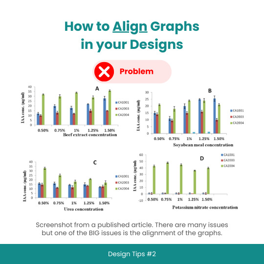
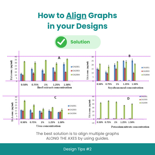
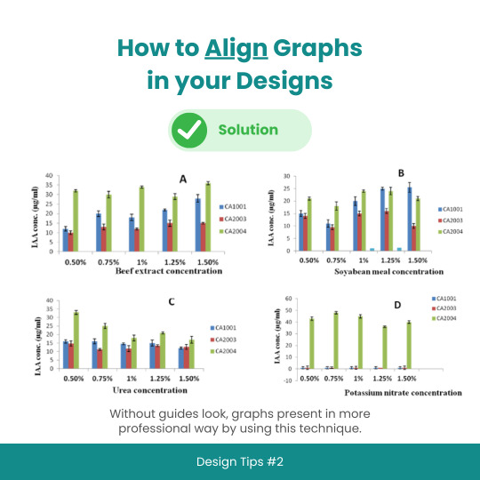
Design Tips #2: How to Align Graphs in your Designs
#designtips#datavisualization#graph#data#statistics#analytics#dataisbeautiful#chart#dashboard#datagram#dataart#infographic#informationisbeautiful#datatellingstories#datadesign#ddj#datasketch#dataviz
3 notes
·
View notes
Video
Dashboard and visual report Designer download in Excel.
Dashboard constructor with data visualization, allows you to design reports in Excel from a library of 13 diagrams and graphs in a few clicks of the mouse.
#dashboard#excel#download#report#msexcel#powerbi#datavisualization#excelvisual#charts#infographics#financial
2 notes
·
View notes
Text
From Curious Novice to Data Enthusiast: My Data Science Adventure
I've always been fascinated by data science, a field that seamlessly blends technology, mathematics, and curiosity. In this article, I want to take you on a journey—my journey—from being a curious novice to becoming a passionate data enthusiast. Together, let's explore the thrilling world of data science, and I'll share the steps I took to immerse myself in this captivating realm of knowledge.
The Spark: Discovering the Potential of Data Science
The moment I stumbled upon data science, I felt a spark of inspiration. Witnessing its impact across various industries, from healthcare and finance to marketing and entertainment, I couldn't help but be drawn to this innovative field. The ability to extract critical insights from vast amounts of data and uncover meaningful patterns fascinated me, prompting me to dive deeper into the world of data science.
Laying the Foundation: The Importance of Learning the Basics
To embark on this data science adventure, I quickly realized the importance of building a strong foundation. Learning the basics of statistics, programming, and mathematics became my priority. Understanding statistical concepts and techniques enabled me to make sense of data distributions, correlations, and significance levels. Programming languages like Python and R became essential tools for data manipulation, analysis, and visualization, while a solid grasp of mathematical principles empowered me to create and evaluate predictive models.
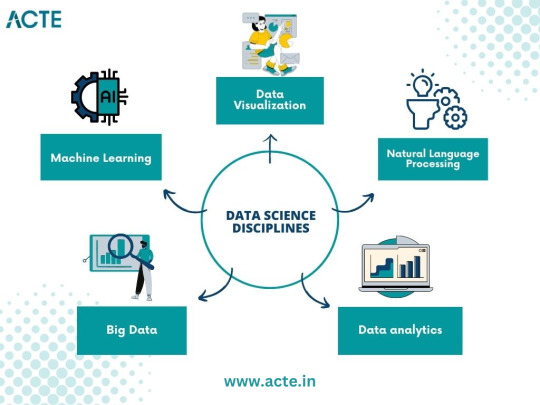
The Quest for Knowledge: Exploring Various Data Science Disciplines
A. Machine Learning: Unraveling the Power of Predictive Models
Machine learning, a prominent discipline within data science, captivated me with its ability to unlock the potential of predictive models. I delved into the fundamentals, understanding the underlying algorithms that power these models. Supervised learning, where data with labels is used to train prediction models, and unsupervised learning, which uncovers hidden patterns within unlabeled data, intrigued me. Exploring concepts like regression, classification, clustering, and dimensionality reduction deepened my understanding of this powerful field.
B. Data Visualization: Telling Stories with Data
In my data science journey, I discovered the importance of effectively visualizing data to convey meaningful stories. Navigating through various visualization tools and techniques, such as creating dynamic charts, interactive dashboards, and compelling infographics, allowed me to unlock the hidden narratives within datasets. Visualizations became a medium to communicate complex ideas succinctly, enabling stakeholders to understand insights effortlessly.
C. Big Data: Mastering the Analysis of Vast Amounts of Information
The advent of big data challenged traditional data analysis approaches. To conquer this challenge, I dived into the world of big data, understanding its nuances and exploring techniques for efficient analysis. Uncovering the intricacies of distributed systems, parallel processing, and data storage frameworks empowered me to handle massive volumes of information effectively. With tools like Apache Hadoop and Spark, I was able to mine valuable insights from colossal datasets.
D. Natural Language Processing: Extracting Insights from Textual Data
Textual data surrounds us in the digital age, and the realm of natural language processing fascinated me. I delved into techniques for processing and analyzing unstructured text data, uncovering insights from tweets, customer reviews, news articles, and more. Understanding concepts like sentiment analysis, topic modeling, and named entity recognition allowed me to extract valuable information from written text, revolutionizing industries like sentiment analysis, customer service, and content recommendation systems.
Building the Arsenal: Acquiring Data Science Skills and Tools
Acquiring essential skills and familiarizing myself with relevant tools played a crucial role in my data science journey. Programming languages like Python and R became my companions, enabling me to manipulate, analyze, and model data efficiently. Additionally, I explored popular data science libraries and frameworks such as TensorFlow, Scikit-learn, Pandas, and NumPy, which expedited the development and deployment of machine learning models. The arsenal of skills and tools I accumulated became my assets in the quest for data-driven insights.
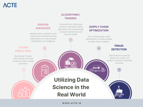
The Real-World Challenge: Applying Data Science in Practice
Data science is not just an academic pursuit but rather a practical discipline aimed at solving real-world problems. Throughout my journey, I sought to identify such problems and apply data science methodologies to provide practical solutions. From predicting customer churn to optimizing supply chain logistics, the application of data science proved transformative in various domains. Sharing success stories of leveraging data science in practice inspires others to realize the power of this field.
Cultivating Curiosity: Continuous Learning and Skill Enhancement
Embracing a growth mindset is paramount in the world of data science. The field is rapidly evolving, with new algorithms, techniques, and tools emerging frequently. To stay ahead, it is essential to cultivate curiosity and foster a continuous learning mindset. Keeping abreast of the latest research papers, attending data science conferences, and engaging in data science courses nurtures personal and professional growth. The journey to becoming a data enthusiast is a lifelong pursuit.
Joining the Community: Networking and Collaboration
Being part of the data science community is a catalyst for growth and inspiration. Engaging with like-minded individuals, sharing knowledge, and collaborating on projects enhances the learning experience. Joining online forums, participating in Kaggle competitions, and attending meetups provides opportunities to exchange ideas, solve challenges collectively, and foster invaluable connections within the data science community.
Overcoming Obstacles: Dealing with Common Data Science Challenges
Data science, like any discipline, presents its own set of challenges. From data cleaning and preprocessing to model selection and evaluation, obstacles arise at each stage of the data science pipeline. Strategies and tips to overcome these challenges, such as building reliable pipelines, conducting robust experiments, and leveraging cross-validation techniques, are indispensable in maintaining motivation and achieving success in the data science journey.
Balancing Act: Building a Career in Data Science alongside Other Commitments
For many aspiring data scientists, the pursuit of knowledge and skills must coexist with other commitments, such as full-time jobs and personal responsibilities. Effectively managing time and developing a structured learning plan is crucial in striking a balance. Tips such as identifying pockets of dedicated learning time, breaking down complex concepts into manageable chunks, and seeking mentorships or online communities can empower individuals to navigate the data science journey while juggling other responsibilities.
Ethical Considerations: Navigating the World of Data Responsibly
As data scientists, we must navigate the world of data responsibly, being mindful of the ethical considerations inherent in this field. Safeguarding privacy, addressing bias in algorithms, and ensuring transparency in data-driven decision-making are critical principles. Exploring topics such as algorithmic fairness, data anonymization techniques, and the societal impact of data science encourages responsible and ethical practices in a rapidly evolving digital landscape.
Embarking on a data science adventure from a curious novice to a passionate data enthusiast is an exhilarating and rewarding journey. By laying a foundation of knowledge, exploring various data science disciplines, acquiring essential skills and tools, and engaging in continuous learning, one can conquer challenges, build a successful career, and have a good influence on the data science community. It's a journey that never truly ends, as data continues to evolve and offer exciting opportunities for discovery and innovation. So, join me in your data science adventure, and let the exploration begin!
#data science#data analytics#data visualization#big data#machine learning#artificial intelligence#education#information
16 notes
·
View notes
Note
Fake Title:
Homesick at Space Camp
(what did you think I wouldnt give you something in theme)
send me a made-up fic title and I'll give you a premise!
I posted this ask game a few days ago and, as you know, I have been occupied between Birth Festivities and also My Job And Closing A Show but know that you forced my hand here:
(it isn't necessary that one have read RED ATMOSPHERES but it uh. helps.)
Homesick at Space Camp
tw: referenced addiction and recovery
Inpatient fucking bites.
Leaving inpatient is fucking worse.
And that’s got something to do with a fundamental lack of trust in the guy walking out the front door despite an active attempt to make amends with that particular fuckup, and less to do with the miles of broken glass of his own he’s just dragged his soft, naked belly through for the last month and more to do with looking Wayne Munson in the eye.
Wayne’s old pickup’s rolling fucking coal, engine running, in the parking lot outside the state funded joint he’d called mi casa for the last 32 days because he’s done his fucking nickel and he only had one emergency contact on his intake form because the only phone number he’s ever been able to commit to memory was a landline in Indiana.
“I’m supposed to give you this.” he manages to croak out, standing on the driver’s side of the Chevy, all grown ass adult, 31 years old and everything. Wayne’s got the window down and his arm hanging out the side, AM radio turned down low through the blown out speakers, looking straight out the windshield.
He’s had to do a real cataloging of all of his shit on a pretty short schedule these last couple weeks; enumerate the ways and the shit that haunts his brain and his bones and all the different forms running away can possibly take. Figure out what he’s lost - where the holes are and what he’d like to get back, the kinds of aspirational shit that’s maybe grounded indefinitely - y’know, like personally - shit that’s gone unsaid that needs saying if there’s any future that has him in it and the sum of it has revealed a humiliating running theme.
(He knows that’s his lingering commitment to a sense of dickheaded I’m Fucking Fine talking - the thing about it being humiliating - he can hear Bonnie from group’s voice politely but firmly reminding him that he deserves grace - but being a creature that thinks or feels any kind of thing about any kind of thing at all remains a new and raw kind of existing and he’s still stress testing the whole thing. So. Y’know. Trial and error here.)
Handing Wayne a folder with doctor’s names and emergency numbers and group meeting schedules, Great Lakes area outpatient programs, pamphlets on signs of relapse, bills he’s not sure anyone’s got the money to pay, feels not too dissimilar to handing Wayne another notice from the school board that he’s fucked it up again and he has to choke down a stale guilt that’s nearly a decade old. Same flavor of fucked up and guilty and sorry and scared he’s been on his bathroom floor and Reid’s couch and the bedroom floors of strangers in different ways. Same way he’s been homesick for places and people that don’t exist anymore left to haunt his own skeleton all these years.
Wayne takes it, flips through the xeroxed charts and glossy three fold infographics hums to himself with an accompanying eyebrow gesture briefly at, fuck, something, and he just stands outside the fucking truck and starts to hope Wayne will just floor it and leave him coughing on diesel fumes and he can just spend the rest of his life here on the curb.
But Wayne tosses the whole thing up on the dashboard, pushes it down towards the vents so it's jammed down in there, won’t slide when he takes a turn too tight - which he will if Wayne still drives like shit, keeping all his expired Plant parking passes company and jerks his head towards the passenger seat minutely and just says;
“Lets get you home, kid.”
8 notes
·
View notes
Text
Graphic and Digital
In today's dynamic digital landscape, the synergy between graphic design and digital technology has revolutionized the way we communicate, express creativity, and interact with the world around us. From vibrant websites and immersive mobile apps to captivating social media content and interactive user experiences, graphic design plays a pivotal role in shaping the digital realm. Let's delve into the intricate relationship between graphic design and digital innovation and how they continue to push the boundaries of creativity and expression.
Visual Storytelling: Graphic design serves as a powerful tool for visual storytelling in the digital age. Through compelling imagery, typography, and layout, designers can convey complex narratives, evoke emotions, and engage audiences in meaningful ways. Whether it's crafting brand identities, designing infographics, or illustrating user interfaces, graphic designers harness the power of visuals to communicate messages effectively across various digital platforms.
User Experience (UX) Design: In the realm of digital product design, UX design is paramount to creating seamless and intuitive user experiences. Graphic designers collaborate with UX specialists to design interfaces that are not only visually appealing but also functional, accessible, and user-friendly. By understanding user behaviors and preferences, designers leverage graphic elements to enhance usability, navigation, and overall satisfaction with digital products and services.
Responsive Web Design: With the proliferation of smartphones, tablets, and other devices, responsive web design has become essential for delivering consistent and optimized experiences across different screen sizes and resolutions. Graphic designers play a key role in designing flexible layouts, scalable images, and adaptive typography that adapt seamlessly to various devices, ensuring a cohesive and engaging user experience on desktops, laptops, and mobile devices alike.
Motion Graphics and Animation: The integration of motion graphics and animation adds a dynamic dimension to digital content, captivating audiences and enhancing storytelling capabilities. Graphic designers leverage animation techniques to bring static designs to life, create interactive elements, and convey complex concepts in a visually engaging manner. Whether it's animated logos, explainer videos, or interactive infographics, motion graphics infuse digital content with energy, personality, and interactivity.
Branding and Visual Identity: In the digital realm, establishing a strong brand identity is essential for standing out in a crowded marketplace and building brand recognition. Graphic designers play a central role in crafting cohesive visual identities that reflect the essence of a brand across all digital touchpoints. From logos and color schemes to typography and imagery, designers create brand assets that resonate with audiences and leave a lasting impression in the digital space.
Data Visualization: As the volume of data continues to grow exponentially, the need for effective data visualization becomes increasingly important. Graphic designers employ principles of design and information hierarchy to transform complex data sets into visually compelling and easy-to-understand graphics. Through charts, graphs, maps, and interactive dashboards, designers help users make sense of data, gain insights, and make informed decisions in the digital realm.
Augmented Reality (AR) and Virtual Reality (VR): The emergence of AR and VR technologies has opened up new avenues for immersive and interactive experiences in the digital domain. Graphic designers collaborate with developers and 3D artists to design virtual environments, create 3D models and textures, and integrate graphic elements into AR and VR applications. From virtual tours and interactive games to augmented reality marketing campaigns, designers push the boundaries of creativity and innovation in the realm of digital experiences.
In conclusion, the fusion of graphic design and digital technology has transformed the way we communicate, interact, and experience the world around us. From crafting captivating visual narratives to designing intuitive user interfaces and immersive digital experiences, graphic designers continue to play a vital role in shaping the digital landscape and pushing the boundaries of creativity and innovation in the digital age. As technology evolves and new opportunities emerge, the intersection of graphic design and digital innovation will continue to inspire creativity, foster collaboration, and drive meaningful engagement in the digital realm.
Web Development Company in Dehradun
0 notes
Text
How do I build a financial management app?
As customers keep on grapple with monetary financial uncertainty about by the approaching downturn, planning applications have turned into a well known method for following costs and save money. As per the review, the main 10 money arranging applications saw a typical 56% expansion in downloads throughout the course of recent years. It has made personal finance app development highly profitable.
Probably, the best model is Mint - an application that has turned into the true norm in the fintech business. In the beginning, it was only a venture tracker with a couple of choices, and presently it has changed into a simulated intelligence -enabled financial counseling stage with 25 million clients.
Personal Finance App Market Review
Whether planning, wanting to take care of obligation or monitoring your credit, your financial life needs continuous control. Furthermore, what could be more helpful for this reason than a mobile application that anyone can introduce on a cell phone or tablet? This accessibility has established that mobile applications, not web versions, have turned into the most promising segment in the finance business. Today, pretty much every client has installed at least one banking or financial application on their mobile device.
Although money the board procedures are very complex, present day finance applications make them a lot more straightforward and more clear. Unsurprisingly, the personal finance app market is growing at a CAGR of 5.7% and will reach almost $1.49 billion by 2026. These predictions produce popularity for individual finance application development before long.
Also read: Mobile app development company in Dubai
What Do Customers Expect From Personal Finance Apps?
When figuring out some way to construct an individual finance application and send off it, you should consider the base arrangement of highlights expected by the market. Nonetheless, to make it onto the FinTech software list of competitors, you should address clients' issues somewhat more than they expected. How precisely? We should examine the good to-have highlights that might motivate clients to pick your finance solution over your rivals.
Data visualization
Infographics, graphs, and dashboards are vital for a planning application since they attract attention and dazzle clients. Likewise, showing information in charts and infographics makes the data justifiable and sensible. Look at the utilitarian dashboard in Airthings, where Important's designers assisted the Norwegian tech company to picture air quality information in a user-friendly interactive format.
Gamification
An individual finance mobile application like Mint isn't intended to be entertaining. But it doesn’t have to be boring. Gamification involves game-like elements in a budgeting app to encourage engagement. You can add elements like a points system, prizes, and achievements to keep clients intrigued and stimulate cost savings or something different.
Also read: Best mobile app development company in abu dhabi
Take a gander at our case, where Relevant’s group gamify Kaizo's administration stage for help groups. Our designers laid out a scalable and maintainable arrangement with dazzling UI/UX. The gamification of client care prompted expanded client inspiration and improved engagement.
Strong security and standards compliance
In any sort of application, delicate information must be secured. Be that as it may, security is particularly fundamental in a planning application since it has direct admittance to a client's financial accounts. According to this survey, financial/banking data is the kind of data people fear losing control over the most. For that reason high security is an unquestionable necessity for a planning application.
Integration with banks and payment systems
The conspicuous benefit of a planning application is the capacity to interface every one of your accounts together. Because of this comfort, an application can cover and screen all client finances in a single spot. Be that as it may, the planning application should uphold integration with different banks and payment systems to get this going.
AI-powered financial assistance
Utilizing man-made intelligence, you can convey profound experiences into financial training with ideas and proposals to effectively control their costs to arrive at objectives. Besides, computer based intelligence technology can consequently classify costs and show an all holistic image of which category clients spent more cash on. It permits you to altogether customize your finance application and be in front of the opposition.
Also read: Mobile app development companies in uae
What Highlights The Individual Finance Application Should Have in 2024?
In this section, we present the elements of individual finance applications that are major to applications of this kind and will assist you with figuring out how to construct an individual finance app, a budget app like Mint. What elements will be high demand in 2024?
Analytics and reports
Utilizing this feature, clients can monitor their financial exercises to appropriately oversee and set aside their cash. Because of efficient information, clients can get everyday, week by week, month to month, and yearly reports to see pay, costs by category, outlines of payees, gauges, and so forth.
Synchronization
Clients of a planning application will maintain that all their cash should be accessible open on a similar computerized stage to see data and information about their financial situation. Your application must sync all user accounts, debit and credit cards, etc., to get the relevant information. This permits shoppers to see information and information from all accounts in one digital climate and better deal with their spending plan.
Registration and account creation
Any application begins with enrolling and making a account. Yet, with regards to finances, authorization and security require exceptional consideration. The best practices for protecting delicate client information are two-factor validation, finger impression or voice acknowledgment, and the age of a one of a kind security code.
Notifications and alerts
This feature is expected for the financial application, so we prescribe adding it to the usefulness. Be that as it may, ensure the updates are opportune and non-intrusive. You can likewise think about other pop-up message situations, for instance, informing your clients when their objectives are met or reminding them to remain on spending plan.

0 notes
Text
DATA VISUALIZATION SERVICE
Our Data Visualization Service is designed to help businesses effectively communicate their complex data through visually appealing and easy-to-understand charts, graphs, and infographics. Our team of experts harnesses various techniques and tools to transform raw data into actionable insights, enabling informed decision-making. Simplify your data analysis and enhance your business success with our professional data visualization services.
Transforming Complex Data into Clear Visual Insights
Are you struggling to make sense of your complex data? Our data visualization service is here to help! We specialize in transforming complicated datasets into clear and visually appealing insights. Our expert team utilizes advanced visualization techniques to create visually compelling charts, graphs, and diagrams that make it easy for you to derive meaning from your data. Transforming numbers and trends into easy-to-understand visuals not only simplifies the information but also helps you uncover hidden patterns and trends that might have gone unnoticed. Don't let complex data overwhelm you – let us turn it into clear visual insights that drive informed decisions and propel your business forward. Trust our data visualization service to unlock the true potential of your data for better decision-making.
Enhancing Decision-Making with Custom Data Visualization
1. Visualize Complex Data: We understand that raw data can be overwhelming and challenging to interpret. Our team specializes in transforming complex datasets into visually appealing and intuitive visualizations. By using charts, graphs, and other interactive visuals, we simplify the information and make it easily understandable, enabling decision-makers to quickly grasp key insights.
2. Identify Patterns and Trends: Data visualization goes beyond just presenting numbers; it uncovers patterns and trends that may not be apparent in spreadsheets or raw data. Our custom data visualization service helps you identify correlations, anomalies, and outliers, enabling you to make data-driven decisions. By spotting these patterns, you gain a deeper understanding of your data and can make more accurate predictions for future outcomes.
3. Explore Multiple Perspectives: Decision-making often requires considering different factors and variables. With our custom data visualizations, you can explore multiple perspectives by visualizing various dimensions of your data. We can create interactive dashboards or visual reports that allow you to analyze data from different angles, enabling you to make well-rounded decisions.
4. Communicate Insights Effectively: Our data visualizations are not only visually appealing but also highly effective in communicating insights. By presenting information in a visually compelling manner, our custom visualizations help you convey complex ideas to stakeholders, clients, or colleagues in a straightforward and engaging way. This enhances communication, promotes understanding, and fosters alignment among decision-makers.

0 notes
Text
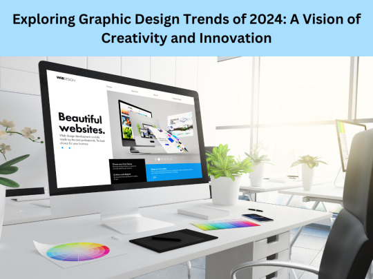
Exploring Graphic Design Trends of 2024: A Vision of Creativity and Innovation
Introduction:
In the ever-evolving realm of graphic design, trends serve as guiding lights, illuminating the path toward creativity and innovation. As we delve into 2024, the landscape of graphic design continues to shift, influenced by technological advancements, societal changes, and artistic experimentation. This essay aims to dissect and explore the prevailing graphic design trends of 2024, showcasing the fusion of tradition and innovation that defines this era.
click here for designer
Sustainable Design:
Sustainability has emerged as a cornerstone of modern design philosophy. In 2024, graphic designers are increasingly embracing eco-friendly practices, opting for recyclable materials, minimalistic designs, and energy-efficient processes. From utilizing sustainable fonts to incorporating environmentally conscious color palettes, designers are weaving sustainability into the very fabric of their creations.
Augmented Reality (AR) Integration:
The integration of augmented reality into graphic design has unlocked a realm of interactive possibilities. In 2024, designers are leveraging AR to blur the lines between the digital and physical worlds, creating immersive experiences for users. From interactive packaging designs that come to life through smartphone apps to AR-enhanced advertising campaigns, this trend adds an extra dimension to graphic design, captivating audiences in new and innovative ways.
Neomorphism:
Neomorphism, a design trend characterized by soft shadows and subtle highlights, continues to gain traction in 2024. This minimalist approach to UI design creates a sense of depth and realism, reminiscent of physical objects. Graphic designers are employing neomorphic elements in user interfaces, logos, and branding materials, infusing designs with a sleek and modern aesthetic that captivates the eye.
Nostalgic Revival:
In a world marked by rapid technological advancement, there's a growing yearning for the nostalgia of yesteryears. Graphic designers are tapping into this sentiment by incorporating retro elements into their work. From vintage-inspired typography to retro color schemes, this trend pays homage to the design styles of decades past while infusing them with a contemporary twist, creating a sense of familiarity and comfort for audiences.
Motion Graphics:
With the proliferation of video content across digital platforms, motion graphics have become an integral part of graphic design in 2024. Designers are harnessing the power of animation to bring their creations to life, captivating viewers with dynamic visuals and engaging storytelling. Whether it's animated logos, explainer videos, or social media content, motion graphics add a layer of depth and interactivity to graphic design, making it more accessible and compelling.
Data Visualization:
As data continues to proliferate in the digital age, the ability to effectively communicate information through visual means has never been more critical. Graphic designers in 2024 are tasked with transforming complex data sets into clear and compelling visuals that resonate with audiences. Through infographics, charts, and interactive dashboards, designers are simplifying complex information, enabling viewers to grasp key insights at a glance.
Cultural Diversity and Inclusivity:
In an increasingly diverse and interconnected world, graphic designers are embracing cultural diversity and inclusivity in their work. From representation in imagery and typography to the use of inclusive language, designers are striving to create designs that resonate with people from all walks of life. This trend not only reflects the evolving demographics of society but also promotes empathy, understanding, and unity through design.
Abstract and Organic Shapes:
In contrast to the rigid geometric forms of the past, graphic designers in 2024 are embracing abstract and organic shapes to add visual interest and dynamism to their creations. From fluid lines and asymmetric compositions to organic patterns inspired by nature, this trend celebrates the beauty of imperfection and spontaneity, infusing designs with a sense of energy and vitality.
Conclusion:
As we journey through 2024, the landscape of graphic design is characterized by a harmonious blend of tradition and innovation. From sustainable practices and augmented reality integration to nostalgic revivals and cultural inclusivity, designers are pushing the boundaries of creativity while staying rooted in timeless principles. By embracing these trends, graphic designers are not only shaping the visual aesthetics of our era but also forging deeper connections with audiences across the globe. As we look to the future, one thing is certain: the evolution of graphic design will continue to be a testament to the endless possibilities of human imagination and ingenuity.
#business logo#typography#poster design#digital design#adobe photoshop#mockup#creative logo#motion design#canva
0 notes
Text
Data Visualization Melbourne: Transforming Data into Actionable Insights
In the age of big data, the ability to effectively visualize complex information has become crucial for businesses of all sizes. In Melbourne, a city known for its vibrant business landscape and technological innovation, data visualization has emerged as a key tool in decision-making processes. Data Visualization Melbourne, a collective term for the various experts and services in this area, is leading the charge in transforming raw data into clear, impactful visual stories.

At the heart of Data Visualization Melbourne is the recognition that in a world awash with data, the real challenge is making sense of it all. Businesses are inundated with information from multiple sources – sales figures, market research, customer feedback, and more. The key is to not only gather this data but to interpret it in a way that is accessible and useful. This is where the expertise of data visualization professionals becomes invaluable.
These experts specialize in using tools and techniques to create visual representations of data. This can range from simple charts and graphs to more complex interactive dashboards and infographics. By doing so, they turn abstract numbers into tangible insights, revealing trends, patterns, and anomalies that might otherwise go unnoticed.
Data Visualization Melbourne professionals focus on customization and relevance. They understand that each business is unique, with its specific set of challenges and objectives. As such, they work closely with clients to ensure that the visualizations they create are not only aesthetically pleasing but also relevant and actionable for the specific business context.
The power of data visualization is most evident in its ability to facilitate better decision-making. By presenting data in a more digestible format, it allows business leaders and stakeholders to grasp complex concepts and large amounts of information quickly. This clarity leads to more informed decisions, ultimately driving business performance and growth.
Furthermore, Data Visualization Melbourne is not just about presenting current data; it's also about forecasting future trends. Advanced visualization tools, combined with predictive analytics, enable businesses to anticipate market changes, customer behavior, and potential risks, providing them with a strategic advantage.
In conclusion, as Melbourne continues to thrive as a hub of business and technology, the role of data visualization in this growth cannot be overstated. Data Visualization Melbourne stands at the forefront of this movement, turning the challenge of big data into an opportunity for innovation and informed decision-making. For businesses looking to stay competitive and agile in an increasingly data-driven world, embracing the power of data visualization is not just an option; it's a necessity.
For more info:-
Microsoft Power Bi Excel Consulting
Analytics Companies in Australia
0 notes
Text
Data Storytelling Consulting: Transforming Insights into Impact
In the fast-paced world of business, where data is abundant but insights are crucial, the art of data storytelling consulting emerges as a powerful tool. It’s not just about numbers and charts; it’s about crafting narratives that resonate with stakeholders, driving meaningful decision-making.
The Power of Visuals
In the realm of data storytelling consulting, visuals play a pivotal role. Infographics and charts become the storyteller’s brush, turning complex datasets into comprehensible masterpieces. Customized dashboards further enhance the visual appeal, offering a real-time view of critical metrics.
Crafting Compelling Narratives
Understanding the audience is at the heart of effective data storytelling. Consultants must tailor their narratives to resonate with diverse stakeholders. Real-life examples become the threads weaving through the story, making it relatable and impactful.
Data Interpretation Techniques
Simplifying complex data is an art form. Successful consultants excel in distilling intricate information into digestible insights. Highlighting key findings ensures that the audience grasps the most critical aspects of the data story.
Technology Integration
In the era of digital transformation, leveraging tools for data storytelling becomes essential. Automation takes center stage, streamlining the consulting process and allowing for more in-depth analysis within shorter time frames.
Overcoming Challenges
Data accuracy concerns and information overload pose challenges in the world of data storytelling consulting. Addressing these issues head-on is crucial for maintaining trust and ensuring the efficacy of the insights presented.
Impact on Decision-Making
The true measure of data storytelling’s success lies in its impact on decision-making. Consultants wield the power to influence stakeholders and guide strategic choices based on the narratives they construct from data.
Case Studies
Examining both successful projects and failures provides valuable lessons. Case studies showcase the tangible results of effective data storytelling, offering insights into what works and what pitfalls to avoid.
Future Trends
As technology evolves, so does the practice of data storytelling consulting. Emerging trends, from advanced visualization techniques to innovative storytelling practices, shape the future of this dynamic field.
Advantages of Professional Consulting
Professional consultants bring a wealth of expertise to the table. Their ability to interpret data goes beyond surface-level analysis, providing businesses with tailored solutions that align with their unique needs.
Steps to Implement Data Storytelling
Implementing data storytelling is a systematic process. It begins with a thorough assessment of business needs and involves collaborative efforts with key stakeholders to ensure alignment with organizational goals.
Measuring Success
Key performance indicators (KPI) are vital in evaluating the success of data storytelling initiatives. Continuous improvement is the hallmark of effective consulting, ensuring that strategies adapt to changing business landscapes.
Testimonials
Client experiences and positive feedback serve as testimonials to the impact of data storytelling consulting services. Real-world examples of transformative insights highlight the value consultants bring to the table.
Importance of Training
In a rapidly evolving landscape, building and maintaining data storytelling skills are crucial. Continuous learning ensures that consultants stay at the forefront of industry trends, delivering the highest level of service to their clients.
Conclusion
In conclusion, data storytelling consulting transcends the traditional boundaries of data analysis. It transforms insights into impactful narratives that drive decision-making and shape the future of businesses. As we navigate the data-driven landscape, embracing the art of data storytelling becomes not just an option but a necessity.
FAQs
What sets data storytelling consulting apart from traditional data analysis?
Data storytelling consulting goes beyond presenting numbers; it crafts narratives that resonate with stakeholders, making data more meaningful and impactful.
How can businesses overcome data accuracy concerns in the consulting process?
Addressing data accuracy concerns involves implementing robust validation processes and ensuring transparency in data sources.
What role do visuals play in effective data storytelling?
Visuals, such as infographics and charts, serve as powerful tools in conveying complex information in a compelling and accessible manner.
Why is continuous learning important for data storytelling consultants?
Continuous learning ensures that consultants stay updated on emerging trends and technologies, enhancing their ability to provide cutting-edge solutions.
How can businesses measure the success of their data storytelling initiatives?
Key performance indicators (KPIs) serve as benchmarks for evaluating the success of data storytelling initiatives, providing tangible metrics for improvement.
Ready to Tell Your Data’s Story? Request Demo!
#data storytelling#data storytelling consulting#data storytelling services#data storytelling consulting services
0 notes
Text
Visual Symphony: 10 Innovative Approaches to Data Visualization
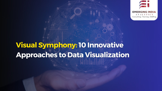
24 Visual Symphony: 10 Innovative Approaches to Data Visualization
Introduction to Data Visualization
Welcome to the enthralling world of data visualization, where numbers and statistics come alive in a visual symphony! In today's data-driven era, information overload is a common challenge. With vast amounts of data being generated every second, it can be overwhelming to make sense of it all.
That's where effective data visualization comes into play. By transforming complex datasets into visually appealing and easily understandable representations, we unlock insights that might have otherwise remained hidden. It's like turning raw ingredients into a mouthwatering feast for the eyes!
In this blog post, we will delve into the fascinating realm of innovative approaches to data visualization. We'll explore how traditional methods pale in comparison to these cutting-edge techniques that push the boundaries of creativity and interactivity.
So get ready to embark on an awe-inspiring journey through 10 groundbreaking ways in which data can be brought to life. From interactive dashboards and augmented reality experiences to animated charts and gamified visualizations – prepare yourself for an explosion of colors, shapes, and stories that will leave you craving for more!
Let's dive right in as we uncover the secrets behind successful data visualization strategies that captivate audiences like never before. Are you ready? Let’s begin our exploration!
The Importance of Effective Data Visualization
Data visualization is not just a fancy way to present information; it plays a crucial role in helping us make sense of complex data. In today's world, where we are bombarded with vast amounts of data every day, effective visualization has become more important than ever.
When data is presented visually, it becomes easier for our brains to process and understand the patterns and trends hidden within. It allows us to identify key insights quickly and make informed decisions. Without proper visualization, valuable information can get lost in the sea of numbers and figures.
Good data visualization also enhances communication. Instead of presenting dry spreadsheets or lengthy reports, visual representations engage our audience on a deeper level. They help simplify complex ideas and facilitate better understanding among different stakeholders.
Furthermore, effective data visualization promotes transparency and accountability. By making information accessible through interactive dashboards or infographics, organizations can provide real-time updates that empower their employees and customers alike.
Effective data visualization is essential for unlocking the true potential of your data. It enables you to see beyond the surface-level statistics and gain meaningful insights that drive innovation and growth. So don't underestimate the power of good visuals – they have the ability to transform raw numbers into actionable knowledge!
Traditional Methods vs Innovative Approaches
Traditional Methods vs Innovative Approaches
When it comes to data visualization, traditional methods have long been the go-to for presenting information in a visual format. Bar graphs, pie charts, and line graphs are all familiar tools in the data visualization toolkit. While these methods continue to be effective in conveying information, innovative approaches offer new and exciting ways to present and interact with data.
One of the most notable differences between traditional methods and innovative approaches is interactivity. Traditional methods often present static images or charts that provide a snapshot of the data at a specific point in time. However, innovative approaches like interactive dashboards and infographics allow users to explore the data themselves, providing a more immersive experience.
Another area where innovative approaches shine is through augmented and virtual reality. These technologies take data visualization to another level by allowing users to step into a virtual world where they can manipulate and interact with visualized data in real-time.
Animated charts and graphs are also gaining popularity as an innovative approach to data visualization. By adding motion and movement to traditional static visuals, animated charts can convey complex patterns or trends more effectively.
Storytelling with Data is another innovation that takes advantage of our innate ability to connect with narratives. By weaving together different pieces of information into a cohesive story, this approach engages viewers on an emotional level while still conveying key insights from the data.
Advancements in technology have also led to 3D visualizations becoming more common in recent years. This allows viewers not only see their datasets from different angles but also gain better spatial understanding of their relationship within the dataset.
Heat maps and tree maps are yet another set of innovations that provide unique perspectives on large datasets by using color gradients or hierarchical structures respectively.
Social media visualizations leverage user-generated content across various platforms such as Twitter or Instagram for mapping trends or sentiments among communities virtually effortlessly!
Visualizing big data has become increasingly important as we generate massive amounts of information every day. With innovative approaches like data mining and machine learning, we can now extract meaningful insights from vast
10 Innovative Approaches to Data Visualization:
Data visualization is a powerful tool that allows us to understand and interpret complex information in a visual format. While traditional methods of data visualization have been effective, there are now innovative approaches that take it to the next level.
One such approach is using interactive dashboards and infographics. These allow users to explore the data themselves and gain insights through an engaging and dynamic interface. Augmented and virtual reality take this even further by immersing users in a virtual environment where they can interact with the data in a more intuitive way.
Animated charts and graphs bring life to static data, making it easier to comprehend trends and patterns. Similarly, storytelling with data adds context by presenting information in a narrative format, allowing audiences to connect with the data on a deeper level.
3D visualizations provide depth perception which enhances understanding of spatial relationships within the data. Heat maps and tree maps use color gradients or hierarchical structures respectively, enabling quick identification of patterns or hierarchies within large datasets.
Social media visualizations tap into vast amounts of user-generated content from platforms like Twitter or Instagram, revealing insights about public sentiment or behavior. Visualizing big data involves handling massive datasets efficiently using technologies like parallel processing or distributed computing.
Gamification of data turns analysis into an interactive game-like experience, making it fun while also encouraging engagement. Collaborative visualizations allow multiple users to work together simultaneously on exploring and analyzing shared datasets in real-time.
These innovative approaches open up new possibilities for how we perceive, analyze, and communicate complex information through visuals. By embracing these tools, we can unlock valuable insights hidden within our ever-increasing volumes of data.
- Interactive Dashboards and Infographics
When it comes to presenting complex data in a visually appealing and easily understandable way, interactive dashboards and infographics take center stage. These innovative approaches allow users to explore data at their own pace, interact with different elements, and gain insights in a more engaging manner.
Interactive dashboards provide users with the ability to customize their view of the data by selecting specific variables or filters. This allows for a more personalized experience, as users can focus on the information that is most relevant to them. Infographics, on the other hand, condense large amounts of information into visually striking graphics that are easy to comprehend at a glance.
The beauty of interactive dashboards and infographics lies in their ability to simplify complex concepts without sacrificing depth. By incorporating interactive elements such as tooltips or hover effects, these visualizations enable users to dig deeper into the data by revealing additional details upon interaction.
Moreover, these approaches offer seamless integration across multiple devices and platforms. Whether accessed on desktops or mobile devices, interactive dashboards and infographics provide an immersive experience that keeps users engaged and informed wherever they may be.
By harnessing interactivity and captivating design principles, organizations can effectively communicate their key messages using data-driven visuals. Interactive dashboards and infographics empower audiences to actively participate in the exploration process while ensuring meaningful connections are made between various datasets – ultimately leading to better decision-making processes.
- Augmented and Virtual Reality
Augmented and virtual reality (AR/VR) have revolutionized the way we experience data visualization. These innovative technologies take us beyond traditional two-dimensional screens and immerse us in a whole new world of interactive visualizations.
With augmented reality, users can overlay digital information onto their physical environment. This allows for a truly immersive and dynamic data visualization experience. Imagine being able to see real-time stock market trends projected onto your office wall or exploring complex datasets in a three-dimensional space.
Virtual reality takes it even further by creating entirely virtual environments where users can interact with data in ways never before possible. Whether it's diving into a virtual ocean of financial data or walking through a virtual cityscape of social media interactions, VR opens up endless possibilities for engaging with complex datasets.
One of the key advantages of AR/VR is the ability to manipulate and interact with visualizations in real time. Users can navigate through graphs, charts, and maps using hand gestures or controllers, making it easier than ever to explore large amounts of information.
Moreover, these technologies offer an unprecedented level of immersion that helps users better understand complex concepts. By placing them directly within the visualized data, AR/VR enhances comprehension and retention compared to traditional methods.
The applications for AR/VR data visualization are vast - from educational tools that bring historical events to life to business analytics platforms that provide intuitive insights into sales performance. The potential for innovation is limitless as developers continue to push boundaries and create new ways for us to visualize and interact with our data.
Augmented and virtual reality have unlocked exciting opportunities for enhancing data visualization. Their immersive nature allows users to explore information like never before while improving understanding and engagement. As technology continues its rapid advancement, we can expect even more groundbreaking approaches to emerge in this field.
- Animated Charts and Graphs
Animated charts and graphs have revolutionized the way we visualize data. No longer confined to static images, these dynamic visualizations bring data to life in a captivating and engaging manner.
With animated charts and graphs, you can tell a story with your data. Instead of simply presenting numbers on a page, you can create an interactive experience that guides the viewer through the information. This not only makes it easier for them to understand the data but also keeps them engaged throughout the entire process.
One of the key benefits of animated charts and graphs is their ability to show changes over time. By animating transitions between different data points, you can easily highlight trends, patterns, or fluctuations in your data. It allows viewers to see how variables evolve and interact with each other dynamically.
Moreover, animated charts and graphs enable you to focus attention on specific elements or subsets within your dataset. You can use animations to reveal hidden insights or emphasize particular aspects that are crucial for understanding the bigger picture.
Additionally, animations add an element of interactivity to your visualizations. Users can explore different aspects by interacting with the chart or graph directly - zooming in on specific sections or toggling between different views - allowing for a more personalized and immersive experience.
Animated charts and graphs are powerful tools that enhance our understanding of complex datasets by bringing them to life visually. They engage viewers through storytelling techniques while highlighting important trends and enabling exploration of various aspects within the data set
- Storytelling with Data
Storytelling with data is a powerful way to convey information and engage audiences. By weaving a narrative around the numbers, data visualization becomes more than just charts and graphs—it becomes an immersive experience that captivates and educates.
One innovative approach to storytelling with data is through the use of interactive visualizations. These dynamic tools allow users to explore the data themselves, uncovering insights and connections that might otherwise go unnoticed. With a few clicks or swipes, users can dive deeper into the story behind the numbers, gaining a richer understanding of the topic at hand.
Another effective technique is incorporating real-world examples or case studies into the data visualization. By presenting relatable scenarios, viewers can see how the data applies to their own lives or industries. This makes it easier for them to grasp complex concepts and draw meaningful conclusions from the information presented.
Utilizing compelling visuals such as images, videos, or even animations can also enhance storytelling with data. A picture truly is worth a thousand words—by using visually striking elements alongside numerical figures, you can create a more engaging and memorable experience for your audience.
Furthermore, contextualizing the data within a larger narrative helps bring meaning to raw numbers. By framing statistics within an overarching storyline or problem-solving journey, viewers are compelled not only by what they see but also by what they feel emotionally connected to.
In today's world overflowing with information overload, it's crucial to present data in a way that captures attention and promotes understanding. Storytelling with data offers an exciting opportunity for businesses and individuals alike to communicate effectively while fostering engagement and retention in this ever-evolving landscape of information dissemination
- 3D Visualizations
3D visualizations have revolutionized the way we perceive and understand data. By adding an extra dimension, these innovative approaches take data visualization to a whole new level. With 3D visualizations, complex datasets can be transformed into immersive experiences that engage and captivate users.
One of the key advantages of 3D visualizations is their ability to provide depth and perspective. Instead of representing data as flat objects on a screen, 3D visualizations create a sense of space and allow users to explore information from different angles.
Furthermore, 3D visualizations enable the representation of relationships between variables in a more intuitive manner. By using depth cues such as size, color, or position in three-dimensional space, patterns and trends become more apparent.
Another exciting aspect is the interactive nature of 3D visualizations. Users can manipulate objects, zoom in or out, rotate views, and even interact with virtual environments. This interactivity enhances engagement and facilitates deeper understanding.
Moreover, by combining data with realistic textures or animations within a three-dimensional environment, storytelling possibilities are greatly expanded. Complex narratives can be conveyed through visually stunning scenes that bring data to life.
In summary, 3D visualizations offer an innovative approach to representing complex data sets by providing depth and perspective while enabling interactivity and storytelling capabilities. They enhance engagement and facilitate deeper understanding by creating immersive experiences for users to explore information from different angles
- Heat Maps and Tree Maps
Heat maps and tree maps are innovative approaches to data visualization that provide a unique and visually appealing way to represent complex information.
A heat map is a graphical representation of data where values are encoded as colors, allowing patterns and trends to be easily identified. It uses color intensity to convey the magnitude of a variable across different categories or regions. This allows for quick analysis and understanding of large datasets with multiple variables.
Tree maps, on the other hand, use nested rectangles or squares to display hierarchical data. Each rectangle represents a category or subgroup, with the size proportional to its value within the hierarchy. By organizing data in this way, it becomes easier to compare sizes and spot outliers within each level.
Both heat maps and tree maps offer an intuitive visual representation of data that goes beyond traditional bar charts or pie graphs. They allow users to explore patterns, relationships, and hierarchies in a more interactive manner.
These innovative approaches can be particularly useful in fields such as finance, marketing, and healthcare where there is often a need to analyze complex datasets quickly. With their ability to condense vast amounts of information into digestible visuals, heat maps and tree maps enable decision-makers to identify insights at a glance.
In conclusion,
heat maps and tree map are powerful tools for visualizing data in an engaging and efficient manner. By utilizing these innovative approaches, organizations can gain valuable insights
and make informed decisions based on clear visual representations of complex information.
So why stick with traditional methods when you can take your data visualization game
to new heights?
- Social Media Visualizations
Social media has become an integral part of our daily lives, with millions of people around the world using platforms like Facebook, Instagram, and Twitter to connect and share information. With such a vast amount of data being generated every second, it's no wonder that social media visualizations have gained so much popularity.
One innovative approach to visualizing social media data is through sentiment analysis. By analyzing the emotions expressed in tweets or posts, we can create visual representations that show trends and patterns in public opinion. This can be particularly useful for businesses looking to understand how their brand is perceived online.
Another interesting way to visualize social media data is by mapping out connections between users. Network graphs can reveal clusters of influencers or communities within a network, helping marketers identify key individuals to engage with or target.
Real-time dashboards are another powerful tool for visualizing social media data. These dashboards provide live updates on metrics such as engagement rates, reach, and sentiment scores. They allow marketers to quickly assess the impact of their social media campaigns and make informed decisions based on real-time insights.
Visualizations can also help us understand the virality of content on social media platforms. Heat maps can show which parts of an image or video receive the most attention from viewers, while tree maps can display the hierarchy or popularity of different hashtags or keywords.
By incorporating interactive features into these visualizations – such as hover-over tooltips or click-to-reveal additional information – users can actively explore and analyze trends in real-time themselves.
In conclusion... Oops! I almost slipped into concluding there! But let me just say this: Social media visualization techniques are constantly evolving as new technologies emerge and more sophisticated algorithms are developed. By harnessing these innovative approaches, businesses can gain valuable insights from social media data and use them strategically to drive growth and success in today's digital landscape
- Visualizing Big Data
Visualizing Big Data
Big data is a term that has gained significant attention in recent years. With the explosive growth of digital information, organizations are faced with the challenge of making sense out of vast amounts of data. Traditional methods of data visualization often fall short when it comes to handling big data sets. However, innovative approaches have emerged that allow for more effective visualization and analysis.
One approach to visualizing big data is through the use of heat maps and tree maps. These visualizations provide a way to represent large volumes of information in a compact and easily interpretable format. Heat maps use color coding to indicate the intensity or density of a particular variable across different regions or categories. Tree maps, on the other hand, display hierarchical structures by dividing an area into rectangles that are sized and colored based on specific attributes.
Another innovative approach to visualizing big data is through social media visualizations. Social media platforms generate massive amounts of user-generated content every second, making them rich sources for analyzing trends and patterns. By using advanced algorithms and machine learning techniques, researchers can visualize social media data in real-time, allowing for better understanding of public sentiment towards certain topics or brands.
In addition to heat maps and social media visualizations, 3D visualizations offer another innovative way to explore big datasets. By representing complex relationships between variables in three dimensions rather than two, users can gain deeper insights into patterns that may not be apparent otherwise.
The gamification of data is yet another exciting approach to capturing interest while exploring big datasets visually. By turning complex analyses into interactive games or challenges, users can engage more deeply with the underlying information while having fun at the same time.
Collaborative visualization tools also play an important role in making sense out of big data sets as they enable multiple stakeholders from different backgrounds to contribute their perspectives on complex problems effectively.
These innovative approaches bring new possibilities for exploring and understanding large volumes of data quickly and intuitively. With the continuous growth of big data, it is essential for organizations to embrace
- Gamification of Data
Data visualization has come a long way in recent years, and one of the most innovative approaches is gamification. By incorporating game elements into data visualization, it becomes more engaging and interactive for users. Gamifying data not only makes it fun to explore and analyze but also encourages users to actively participate in the process.
One approach to gamifying data is through leaderboard systems. By ranking users based on their performance or insights derived from the data, competition arises, driving engagement and motivation. This can be particularly effective in educational settings or business environments where teams can compete against each other to uncover patterns or make predictions.
Another way to gamify data is by introducing challenges or quests within the visualizations themselves. Users are presented with specific goals or tasks related to the dataset, which they must complete in order to progress further. This adds an element of excitement and achievement as users strive to unlock new levels or earn rewards.
Incorporating rewards and incentives is another aspect of gamification that can enhance user experience with data visualizations. Users may receive badges, points, or virtual currency as they interact with the visualizations and achieve certain milestones. These rewards not only provide a sense of accomplishment but also encourage continued exploration of different aspects of the dataset.
Furthermore, storytelling can be integrated into gamified data visualizations by presenting information in a narrative format that unfolds as users delve deeper into the visualization. This creates a more immersive experience where users become active participants in unraveling the story behind the data.
Gamification offers a fresh perspective on how we interact with and derive insights from complex datasets. It taps into our innate desire for challenge, competition, and reward while making data analysis an enjoyable endeavor rather than just a task we have to complete.
- Collaborative Visualizations
Collaborative Visualizations: Unleashing the Power of Data Together
Data visualization is not just about creating beautiful and informative visuals; it's also about fostering collaboration and driving collective insights. Collaborative visualizations empower teams to work together, share ideas, and make data-driven decisions more effectively.
With collaborative approaches to data visualization, multiple stakeholders can collaborate in real-time, accessing and interacting with the same set of data. This allows for a seamless exchange of ideas, perspectives, and expertise that can enhance problem-solving capabilities.
Collaboration brings diverse viewpoints to the table, sparking innovative thinking and encouraging creativity in interpreting complex datasets. By pooling resources and knowledge through collaborative visualizations, organizations can uncover hidden patterns or trends that may have otherwise gone unnoticed.
One example of collaborative visualization is interactive dashboards that enable team members to explore different dimensions of data simultaneously. By providing a shared platform where everyone can contribute their insights in real time, these dashboards foster collaboration while saving valuable time spent on back-and-forth communication.
Another approach is using virtual reality (VR) technology to create immersive environments where teams can visualize complex datasets together. In VR settings, users can interact with 3D models or walk through virtual landscapes representing intricate information structures. This enhances engagement and facilitates group discussions around the presented data.
Furthermore, gamification techniques applied to collaborative visualizations add an element of fun while encouraging participation from team members. By turning data exploration into a game-like experience with challenges or rewards systems, organizations stimulate active involvement from individuals across departments or disciplines.
As a result of collaborative visualizations, organizations can harness collective intelligence to transform how they analyze information. Ultimately, they lead to better outcomes by fostering innovation, facilitating decision-making processes, and facilitating real-time collaboration among diverse stakeholders. By embracing these innovative approaches, companies are unlocking new possibilities that go beyond traditional methods to unleash the power of data together.
0 notes
Text
0 notes
Text
Understanding data reporting: types, benefits, and examples
Working with analytics is often disliked by many due to historically boring data reports that require special skills for interpretation. Unfortunately, in the 2020s, a significant number of businesses still rely on suboptimal data reporting strategies. It’s essential to explore how data reporting can be done effectively to transform this into a benefit for companies.
The success of companies depends on collecting, tracking, and analyzing data, covering a wide range of information such as marketing campaigns, sales figures, team efficiency, key performance indicators, and various metrics. Data reports act as a heartbeat monitor for a business, indicating its overall health.
In this post, we will delve into the fundamentals of data reporting, exploring different types of reports and their business advantages. We will also discuss the significance of data visualization for better comprehension and decision-making.
Understanding Data Reporting
Historically, data handling was manual and time-consuming, needing more freshness of real-time updates. Modern reporting tools and analytics platforms automate and enhance reporting processes, providing well-formatted, real-time information. This allows decision-makers to draw conclusions and take prompt action.
Data reports can take various formats, including traditional reports with raw numbers, visualized data using graphs and charts, and enhanced solutions like intuitive dashboards.
Importance of Reporting
Despite the straightforward need for businesses to handle data analytics, challenges persist. Many employees are not “analytics-literate,” if reports are time-consuming to create or understand, it becomes a red flag for businesses. Outdated reporting methods, such as static PDFs and Excel spreadsheets, contribute to employee dissatisfaction and stress when working with data.
Effective reporting is crucial because it allows businesses to uncover insights, cut costs, and make informed decisions. Organizations can eliminate manual work and reduce errors by implementing automation and custom reporting solutions.
Benefits of Data Reporting
When modern tools and data analytics work together, businesses experience immediate tangible value. Proper data reporting offers several advantages:
Better Understanding of the Big Picture: Simple-to-use dashboards keep teams on track, making crucial information accessible to analytics specialists and regular users.
Not Missing Critical Insights: Real-time updates lower the chances of overlooking essential business discoveries, whether positive opportunities or negative trends.
Faster and Informed Decision-Making: Curated, well-presented data simplifies perception, enabling more precise decision-making based on accurate information.
Enhanced Budget Distribution and Planning: Data reports provide a comprehensive information view, helping allocate resources effectively and make informed budget decisions.
Plenty of Room for Customization: Data reports can be tailored to suit various objectives, enhancing usability and flexibility.
Data Reporting Methods
Data reports can be static or interactive, with auto-updating options for continuous access to fresh data. Common approaches for presenting data include:
Narrative Reporting: Verbal or written format, often used for market research or presenting conclusions.
Tabular Data Reporting: Organizing data in tables, commonly used for calculations, financial reports, or database information.
Statistical Data Reporting: Providing an overview of statistics and data analysis results using tables, graphs, text, and comparisons.
Graphical Reports: Focusing on visual elements with minimal text, using various charts, graphs, and other visualizations.
Dashboards: Interactive visual reports incorporating various data representation types for near-time or real-time data monitoring, facilitated by powerful tools for dashboard reporting.
Infographics: Mixing various data formats emphasizing visuals, usually static but visually appealing.
Types of Data Reports
Data reporting can take various forms, including overview reports, SEO reports, key performance indicator reports, customer reports, sales reports, status reports, financial reports, and research reports.
Tips for Reporting Data Effectively
Define the Report’s Purpose: Clearly identify each report’s aim to avoid complexity and ensure it serves its specific purpose.
Decide on the Metrics: Pin down relevant metrics, considering whether they can coexist in one report or need to be split for better evaluation.
Check the Data Sources: Ensure transparent data sources, merging methods, and data trustworthiness to obtain accurate results.
Organize the Data: Integrate data from multiple sources into a centralized system to avoid blind spots.
Consider the User: Make reports adjustable for different user roles and ensure accessibility from various devices for effective collaboration.
Mind Usability: Simplify reports with clear layouts, colors, and element placement, enhancing data relevance and usability.
Check Data Accuracy: Prioritize the quality and accuracy of displayed information, avoiding duplicates, outdated data, and inconsistencies.
Closing Remarks on Data Reports
In a constantly changing market, businesses must stay up-to-date with the latest and most relevant data. When approached thoughtfully, flexible and modern data analysis reports offer a comprehensive view, allowing companies to make informed decisions and stay competitive in the long run.
0 notes
Text
download Luminar AI Photo Editor

How will analytics impact business intelligence and situational awareness?
Business intelligence (BI) and situational awareness (SA) are two key concepts that enable organizations to make better decisions, optimize their performance, and respond to changing environments. BI refers to the process of collecting, analyzing, and presenting data to support decision-making, while SA refers to the perception of the elements in the environment, the comprehension of their meaning, and the projection of their future status.
Analytics is the science of discovering and communicating meaningful patterns in data. Analytics can enhance both BI and SA by providing more accurate, timely, and relevant insights that can inform and guide actions. In this blog post, we will explore some of the ways that analytics can impact BI and SA, and how organizations can leverage analytics to achieve their goals.
Analytics can impact BI and SA in three main ways: by improving data quality, by enabling advanced analysis, and by facilitating data visualization.
- Improving data quality: Analytics can help organizations ensure that their data is reliable, consistent, and complete. Data quality is essential for BI and SA, as it affects the validity and reliability of the insights derived from the data. Analytics can help organizations identify and correct data errors, inconsistencies, and gaps, as well as integrate and harmonize data from different sources. Analytics can also help organizations monitor and maintain data quality over time, by detecting and alerting data anomalies, changes, and trends.
- Enabling advanced analysis: Analytics can help organizations perform more sophisticated and powerful analysis on their data, using techniques such as machine learning, artificial intelligence, natural language processing, sentiment analysis, predictive analytics, prescriptive analytics, and more. These techniques can help organizations discover hidden patterns, relationships, and insights in their data that are not obvious or accessible through traditional methods. Analytics can also help organizations automate and scale their analysis processes, by using algorithms and models that can learn from data and adapt to new situations.
- Facilitating data visualization: Analytics can help organizations present their data in more effective and engaging ways, using tools such as dashboards, charts, graphs, maps, infographics, animations, and more. Data visualization can help organizations communicate their insights to different audiences, such as managers, customers, partners, or stakeholders. Data visualization can also help organizations enhance their SA, by providing them with a clear and comprehensive view of their environment, as well as highlighting the most important and relevant information.
Analytics is a powerful tool that can transform how organizations use data to support their BI and SA. By improving data quality, enabling advanced analysis, and facilitating data visualization, analytics can help organizations gain deeper insights into their environment, make better decisions, optimize their performance, and respond to changing situations.
The Business Analytics is the home of original and real Business and Market News of the United Kingdom and rest of the world. We are sharing the best news about Business and Other Niche.
0 notes
Text
Executive Dashboard
Bullseye Engagement offers an exemplary Executive Dashboard, a comprehensive tool designed to empower leaders with real-time insights and data-driven decision-making capabilities. In today’s competitive business landscape, having a streamlined and visually intuitive dashboard like Bullseye’s is pivotal for executive-level professionals to efficiently monitor, analyze, and strategize.
Understanding Bullseye Engagement
Bullseye’s Executive Dashboard is more than a mere data aggregator; it’s a strategic command center that amalgamates key performance indicators (KPIs), metrics, and critical business information into a singular, user-friendly interface. Its design is tailored to suit the specific needs of executives, presenting information in a visually appealing and easily digestible format.
Features & Functionalities
Customization
The Executive Dashboard is highly customizable, allowing executives to tailor their view based on their roles, preferences, and focus areas. Whether tracking sales figures, operational efficiency, employee engagement, or financial metrics, this tool can adapt to showcase what matters most.
Real-Time Data
One of Bullseye’s standout features is its ability to provide real-time data updates. Executives no longer need to rely on static reports; instead, they can access live, up-to-the-minute insights, enabling quicker responses to changing scenarios and market trends.
Visual Representation
The dashboard employs visually appealing charts, graphs, and infographics to represent complex data sets. This visual approach aids in quick comprehension, allowing executives to grasp trends, patterns, and outliers at a glance.
Accessibility & Mobility
Bullseye ensures accessibility across devices, enabling executives to view critical information on desktops, tablets, or smartphones. This mobility ensures that decision-makers are always in touch with essential metrics, regardless of their location.
Data Integration
Seamlessly integrating with various data sources and systems, Bullseye’s Engagement dashboard brings together information from disparate platforms. This integration streamlines the process of gathering insights, eliminating the need to navigate multiple systems.
Goal Tracking & Performance Metrics
Executives can set goals and track the progress of various initiatives through the dashboard. Clear visualization of performance against set benchmarks aids in aligning strategies and making informed adjustments as needed.
Benefits for Executives
Decision-Making Agility
With real-time insights readily available, executives can make agile, data-backed decisions. The ability to swiftly respond to market changes and emerging opportunities becomes a competitive advantage.
Improved Strategic Planning
The Executive Dashboard equips leaders with a bird’s-eye view of organizational performance. This vantage point fosters better strategic planning by identifying areas for improvement and growth opportunities.
Enhanced Transparency
Transparency is crucial in fostering trust and alignment within an organization. Bullseye’s Engagement dashboard promotes transparency by making vital information accessible to relevant stakeholders.
Time-Efficiency
By consolidating data from multiple sources into a single interface, executives save valuable time previously spent sifting through reports and systems. This efficiency allows them to focus on strategic initiatives.
Empowering Leadership
Armed with comprehensive insights, leaders are better equipped to communicate effectively, align teams, and drive organizational success. The dashboard empowers them to lead with clarity and conviction.
Conclusion
In essence, Bullseye Engagement’s Executive Dashboard is a game-changer for executives seeking to navigate the complexities of modern business environments. It goes beyond data visualization; it’s a catalyst for informed decision-making, strategic planning, and effective leadership. Its intuitive design and robust functionalities make it an indispensable tool in the arsenal of any forward-thinking executive, fostering agility, transparency, and success within organizations.
For more info pls visit: BullseyeEngagement or send mail at [email protected] to get a quote.
0 notes
Text
Data Visualization and Communication Skills: Essential Components of DSML Training
With the increasing availability of vast datasets and powerful computational tools, organizations are leveraging DSML techniques to gain valuable insights, predict trends, and automate processes. As the demand for data scientists and machine learning experts continues to soar, professionals in these fields must equip themselves with a diverse skill set, including data visualization and communication skills.
Data visualization and communication skills play a pivotal role in DSML training. While data scientists possess strong technical expertise to analyze and model data, the ability to effectively communicate complex findings and insights is equally essential. Visualizing data in a compelling and accessible manner enables professionals to bridge the gap between technical analysis and practical application, making data-driven decisions more accessible to stakeholders. The purpose of this blog is to shed light on the importance of data visualization and communication skills for professionals pursuing a career in data science and machine learning. It will explore how these skills contribute to businesses, research, and academic publications, concluding with insights into future trends in data visualization and communication for DSML.
What is Data Visualization in DSML?
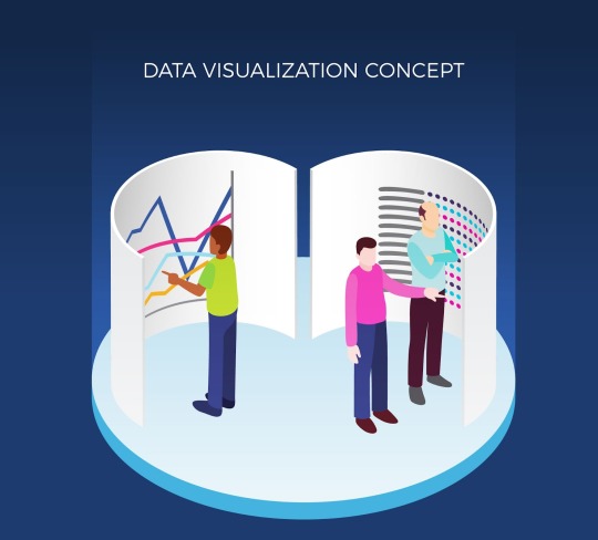
Data visualization implies the visual depiction of data as well as information to convey complicated relationships, patterns, and trends in a more intuitive and lucid approach. By transforming raw data into visual elements like charts, graphs, and maps, data visualization enhances comprehension, aids decision-making, and facilitates effective communication of insights. It is a critical component of DSML as it allows data scientists to identify patterns, detect anomalies, and draw meaningful conclusions from vast datasets.
Types of Data Visualizations in DSML and Their Applications
Static vs. Interactive Visualizations
Immobile visual depictions are stable portrayals of information, like conventional bar diagrams or circular graphs, ideal for summarizing information. On the other hand, interactive visualizations facilitate users to dynamically explore data, granting them the ability to delve into specifics and garner more profound insights. Interactive dashboards and data exploration tools have become popular choices for data scientists and stakeholders alike.
Charts, Graphs, and Maps
Charts and graphs, like line graphs, scatter plots, and heatmaps, are commonly used to visualize numeric data and relationships between variables. They help reveal trends, correlations, and outliers. Maps, especially geographic information system (GIS) visualizations, help display spatial data, which is valuable in fields like logistics, urban planning, and epidemiology.
Infographics and Dashboards
Infographics are a blend of data visualization and storytelling, using visual elements and concise text to convey information on a specific topic or issue. Dashboards, on the other hand, are comprehensive visual representations that render a real-time preliminary view of key performance indicators (KPIs) as well as metrics, aiding in monitoring business operations and progress.
The Power of Visual Storytelling and its impact on Decision-Making
Visual storytelling is an art that involves presenting data in the shape of a narrative. It goes beyond merely displaying charts and graphs by contextualizing the data in a way that resonates with the audience. By crafting a compelling data story, data scientists can create an emotional connection with stakeholders, influencing decision-making and inspiring action. Effective visual storytelling humanizes data, making it relatable and memorable, which is particularly valuable when presenting findings to non-technical audiences.
What is the Significance of Mastering Data Communication Skills for Effective DSML?
The Art of Data Storytelling
Identifying the Audience and Purpose
To create a powerful data story, data scientists must first understand their audience and the purpose of the communication. Different stakeholders have diverse standards of technical specializations and preferences. Tailoring the data story to meet the needs and expectations of the audience ensures maximum impact and engagement.
Crafting a Compelling Narrative
A compelling narrative organizes data into a logical sequence, guiding the audience through the insights and key takeaways. A well-structured data story introduces the problem, presents the analysis, and concludes with actionable recommendations. Employing storytelling techniques like characterizing the data, setting the context, and highlighting the implications adds depth to the narrative.
Read more: Importance of Data Storytelling for Data Scientists
Data-driven Presentations and Public Speaking
Effective Presentation Techniques
When delivering data-driven presentations, data scientists should put emphasis on lucidity, minimalism, and pleasing appearance. Presenters must strike a balance between technical depth and simplicity, avoiding overwhelming the audience with jargon while ensuring accuracy. Engaging visuals, concise language, and a coherent flow are essential for maintaining audience attention.
Dealing with Complex Data in a Straightforward and Compact Form
Communicating complex data requires breaking it down into digestible chunks. Presenters should use analogies, metaphors, and real-world examples to elucidate complex concepts. Visual aids, such as animations and interactive elements, can aid comprehension by simplifying intricate relationships and processes.
Data Reporting and Documentation
Importance of Well-Structured Reports
Clear and concise data reports are invaluable for documenting findings, methodologies, and conclusions. Well-structured reports help stakeholders revisit the analysis and conclusions at their convenience, promoting transparency and trust in the data.
Conveying Insights and Recommendations
In addition to presenting raw data, data reports must convey actionable insights and practical recommendations. Data scientists should offer a roadmap for decision-makers to implement data-driven solutions effectively.
What is the Role of Data Visualization and Communication Skills in Business and Research?
A. Enhancing Stakeholder Engagement and Decision-Making
Data visualization and communication skills facilitate effective collaboration between data scientists, business leaders, and stakeholders. Engaging visualizations help stakeholders understand the implications of data-driven insights and support informed decision-making.
B. Communicating Data Findings to Non-Technical Audiences
Non-technical stakeholders often lack the expertise to interpret complex data. The ability for communicating data findings to stakeholders data findings in a simple, accessible manner ensures that data-driven insights are understood and embraced across all levels of an organization.
C. Impact on Academic and Research Publications
In academia, data visualization and communication skills are critical for researchers to present their findings clearly. Compelling visualizations and well-crafted data narratives enhance the impact and reach of research publications, contributing to the advancement of knowledge in various fields.
Data Alchemy: Unveiling the Magic of Visualization and Communication in DSML Training
Data visualization and communication skills are essential components of DSML training. As data science and machine learning continue to shape industries and drive innovation, professionals must master the art of transforming raw data into compelling visualizations and engaging narratives. Effective data communication bridges the gap between technical analysis and decision-making, ensuring that insights are understood and acted upon by stakeholders across different domains.
Looking ahead, the future of data visualization and communication in DSML holds immense promise. Technological progressions, like augmented reality and AI-driven automation, will revolutionize how data is presented and understood. Embracing these emerging trends will allow data scientists and machine learning experts to harness the full potential of data and drive transformative changes in their respective domains.
As you walk on your DSML journey or seek to intensify your existing skills, remember that mastering data visualization and communication is an ongoing process. Stay curious, explore new trends, and be open to incorporating innovative approaches into your practice. By continuously honing your abilities in data visualization and communication, you will not only excel in DSML but also make a lasting impact on the organizations and industries you serve.
1 note
·
View note
Last Seen Blogs

duradefensecannabis
Dura-Defense

dramioneasks
dramioneasks

gaag
Untitled

bonney-d
OP artblog

darqtexanz
DarqTexanz