#eyeballed the pose so it might look a bit weird idk
Text
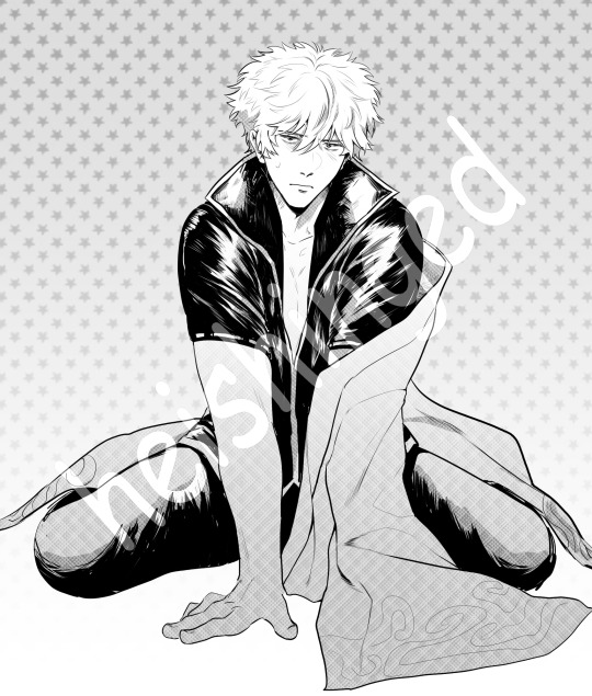
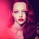
[ID: Digital grayscale art of Gintoki from Gintama, shaded in strong black and screentone gradients. Gintoki is kneeling with his hands between his thighs, supporting his body. His shirt is unzipped a bit more than usual, and his yukata is hanging loosely on his side. He looks annoyed. The artist's watermark is huge and overlayed on him. End ID]
i feel so alive rn
#e#krispeaks#gintama#gintama fanart#jiwa perak#my art#eyeballed the pose so it might look a bit weird idk#idkkk#idk!!! 😁 like.#idk#i need everyone who's not gintoki to leave me alone#this is. VERY different to what i usually post but#🥺#well you see. look at him.#sorry about the huge ass watermark LMAO
67 notes
·
View notes
Note
(Aphex) Mod shit can we straight up get a design shitting edition for InsaineMembrane's designs?? APHX-714, APHX-666, APHX-667, APHX-838, APHX-1263, APHX-843, APHX-1341, APHX-1032, APHX-1737, DPHX-1431. in order of how they have them on the website. Love u sorry for torturing u </3333. Tried not to grab any dupes that have been on the blog before but if I got some that have been featured before please roast me to death. Also hope I'm using pronouns they're comfy with but let me know if I'm not
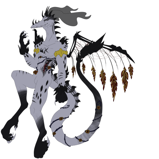
at first i was going to tell you to go fuck yourself because i dont want to but then the bus got delayed so here i am. this one has the faintest hints of a good design actually and that's probably because it's not a clusterfuck of shoddy textures and glaring colors. still not that impressive but considering who makes these it's almost passable. the spikes always look terrible and jut out from weird places, and it took me a second to realize the black clouds on the eyes are wisps but i have less to shit on this other than it's just a touch ugly instead of glaringly ugly
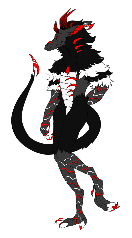
of course they have the 666 one and it's as needlessly edgy as it could be. not even that edgy either compared to the usual clusterfuck. the legs remind me of big bird and its hand behind it looking like it's trying to pull out a wedgie really decreases the edge factor. on the nose also looks like a nose clip for people who go swimming. most of it's just repeating patterns for the sake of filling space
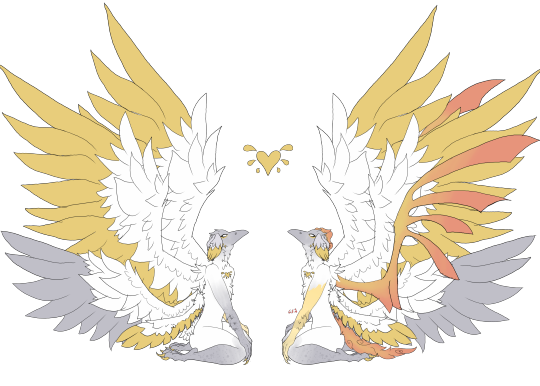
i might just have very low standards but this design is completely fine. the right version gets to the weird overcomplicated nonsense but the one on the left has nothing wrong with it. right looks like it got a disease
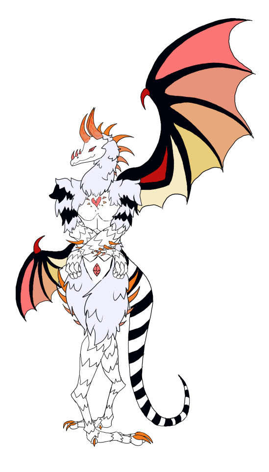
I kind of appreciate the various poses these are drawn in but this one's closer to what i expected. a shitton of spikes and zigzagging segments that is more confusing than anything, on a pose that is clearly either eyeballed or traced somewhat because anything that has to be drawn from scratch has incredibly low skill. they've gotten better at color placements though. idk i feel i just have to reward actual progress. this does not stop it from looking a lot like a chicken or the fuckugly hands though
im glad you discovered the darken layer in procreate now can you learn some better things too. same spikes though im unsure if these are standards for the species or whatever. idek what the effect is trying to pull off or why the right wing looks broken. in fact both wings appear broken because they just out of the wrist when usually wing membranes are connected to the hand themselves. the eyes almost look like trypophobia and the amaazing stamp brush used for the circles

click on the link because this one couldn't be assed to be properly colored in at bits or even have the lineart connect. idk what the reference was but why is it doing a weird look over the shoulder. points i guess for trying to copy what a flail looks like even if it's incredibly obvious. the horns don't make a lick of sense and nothing is even which is almost a breath of fresh air compared to the over used symmetry ones. almost, it still looks bad.

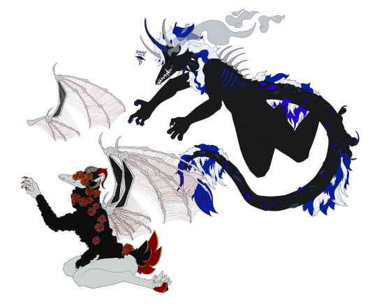
idk which part of it lets it have two bodies with entirely different designs but sure let this person make more bad designs. these would actually look fine if anyone else was designing them, though right one is very hard to see because it's mostly black god forbid this be drawn with any shadows or you'd lose the bitch
this looks like a crook because of the mouth and limb situation. the lines aren't smooth at all do they do this with a mouse

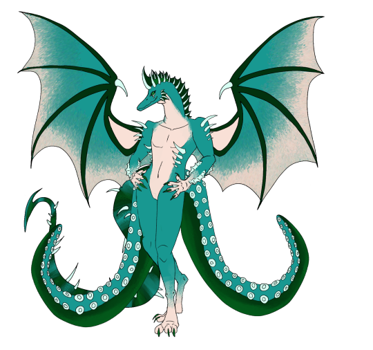
another common sign a person's a beginner is their overuse of a single interesting stamp brush. it works for the wings but does not work as well for the wrists or ankles. the tail is very hard to see past the two octopus tentacles in face they are covering it entirely. the webbing on the forearms make little sense
another attempt at a plague rat. the limbs are already jacked up but they couldn't even make them look attached or like they'd even bend properly. also apparently the mask is a trait too. the subtle tint of gross piss yellow adds a nice touch for infected sewer rat just fix the anatomy and this almost could be decent

0 notes
Last Seen Blogs
cluttermortis
there was a hole here. it's gone now.

cosmicu
hot pink bitch named breakfast
beautyinthebird
Beauty in the Bird
raregualla
RARE
starplekz
Starplekz