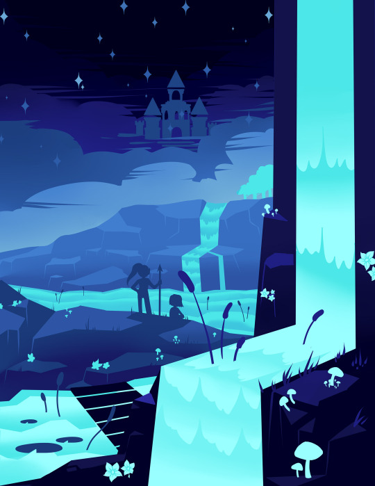
#i forgot i dont like the texture of canvas but im gonna use up these little random boards i have anyway
Text
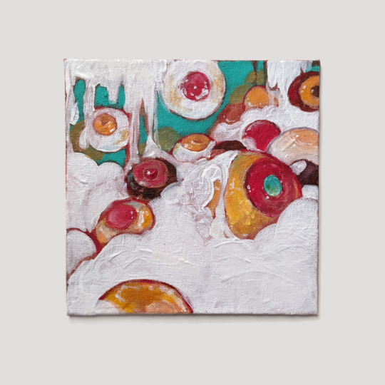
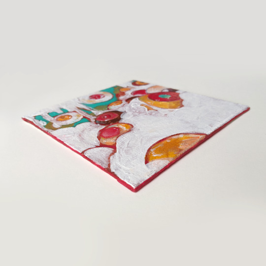
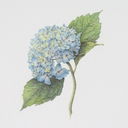
small eyeball painting, acrylic
#traditional#artists on tumblr#art#painting#acrylic painting#eyes#i forgot i dont like the texture of canvas but im gonna use up these little random boards i have anyway#i have no idea what im doing
538 notes
·
View notes
Text
My approach to flat colors + limited palette drawings
This is a follow up to this post i made about how i go about figuring out a color palette for my limited palette drawings. an anon asked me about my actual technique of finishing them so this is gonna be an explanation of how I work in a limited palette with flat colors. I ended up with these thumbnails for a sketch last time so we’re gonna work from here and I’m gonna sort of walk through how i got to the finished version

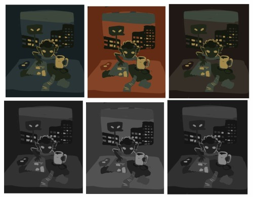
first things first: every part of this process is just developed as a result of me messing around. take my advice with a grain of salt and if you think you know a way to do something better/that makes you more comfortable. go with that over what I say.
I’m honestly a little surprised when people express confusion about how i draw like this because it’s SUPER simple - literally all you’re doing is just stacking solid color blocks of shape. its very imprecise despite how sharp everything ends up looking.
First things first is that you want to decide how you will be handling your edges throughout the duration. Do you want your shapes to be ultra-sharp and precise, or do you want a little bit of a wobblier, grainier edge? Both can look good but it’s VERY much a matter of situational basis. i’ve been favoring looser and grainier shapes so that’s how i’m going to be working on this.
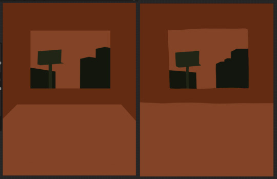
on the left here, you can see the shapes made with precise rectangular selections and an untextured pen, on the right, freehand drawn shapes and a grittier pen. There’s something immediately pretty different feeling about them. So play around with that first - its not something that’s fun to change halfway through! But lets step back a minute. It helps to work large to small. The two biggest shapes here are these orange chunks and everything gets stacked on top of them so i’m gonna do that first.
Now, a key feature of what i do: clipping masks. almost all digital art programs have them. What a clipping mask does is it constrains the pixels of a layer to the transparency of the layer below it. Here I have the light orange layer, and then on top of it the buildings and billboard are clipped to the orange. Most of you probably already know this and I’m overexplaining a bit, but there was a time when i didnt know how clipping layers worked and someone had to explain it to me.

now you’ll notice the shapes of the buildings are rough, and sloppy. here’s the fun part: since this is all about stacking shapes, only your exterior edges matter. this all gets filled in. be as sloppy as you want when you’re making your shapes. in fact, the outside edges get trimmed out a bunch to when i do this - i go in and erase them clean. Don’t be too finnicky about drawing perfect and precise! its a waste of time. As long as the silhouette is what you want, the interior can be a nightmare.
Working this way, it’s important to keep your layers stacked in a way you can make sense of. Right now there are four layers here: the background dark orange, the two main orange rectangle shapes, and then the buildings on one layer and a billboard on the other. I rack up a LOT of layers doing this and it makes it annoying in some aspects, but being able to freely recolor any one chunk without losing my detail is a key aspect of this.
So, I block those out
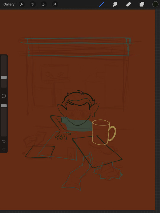
Next, I do the same for the smaller chunks that are still main shapes. There are once again, a lot of layers here. The top layer is the hair - you can see the head showing through it. The head and arm underneath the hair, same layer. Then the cup. Then the light green pieces of paper. Then the dark green ones.
The cup is technically farther forward than the head and arm so you would think it’d go on top, but the point isnt to recreate the foreground and background hierarchy with layers so much as it is to group things in a way i can work with. The cup goes underneath so it can be grouped with all the other objects on the table.
now, i just go and fill in all the shapes. i forgot to do the blinds but i get them later. you might notice a lot of these shapes are pretty rough, which was harder to notice before they were filled in. Now that I can see better, I go in with an eraser and clean up the edges until they’re the shape I want

sometimes erasing leaves little bits of ‘noise’ around objects like on this napkin here. i like to keep a little bit of this noise for texture, but if you dont like it make sure to get rid of it! if you’re working very crisp this will stand out a LOT
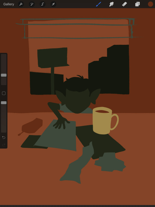
Next up is to add some detail onto the objects
I flipped the canvas here because the head shape was wrong - the ears were uneven and i wanted to fix it. I want to go about adding detail onto the billboard and buildings. i do all detail with clipping masks - but the objects are clipped to another layer and so nothing can be clipped to them. instead, i unclip them and just erase by selection for the same effect
all of the text on the papers is clipped to the papers below it. the buttons are clipped to the phone. the yellow photos and card are actually another independent layer on top, in case i want to recolor them separately. im indecisive and end up recoloring things a lot. For the most part these objects are starting to become recognizable as more than just shapes
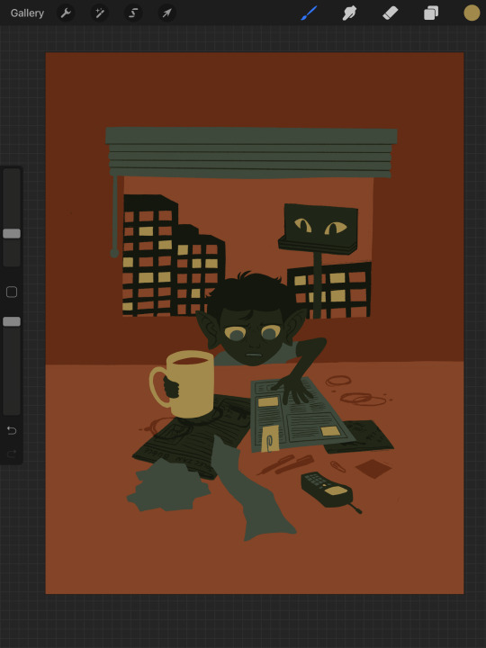
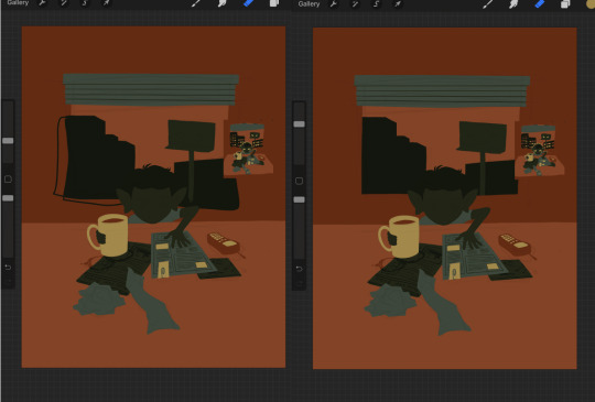
i go in an add the details on the background and character now. theres some more stuff on the table. the lines of the face and ears are on one layer, and the flats of the eyes below that. Here’s what each group of layers is, and what they look like on their own

The background/bottom chunk. Just the table, window, and shirt.
The middle bit. All the stuff on the table and the blinds.

Finally, the top, which is just his head and arm.
now this stage is the bare bones of the drawing. you can more or less tell everything that’s happening. it reads. but its very much lacking in something - it doesnt have a ton of depth or interest. and adding that additional detailing, the dept and interest, is where stuff starts getting REALLY tricky and subjective.
im gonna take you to a much simpler scenario to show the sort of options i go through at this stage
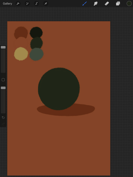
ahh its our dear friend, sphere casting shadow. this is, more or less, the kind of image we have. you can tell whats happening but it’s lackluster. there are TONSSS of ways frm here that you can go add interior detail to a shape once it has been established. here are some quick and SUPER rough examples
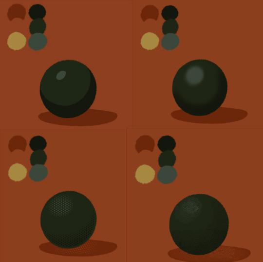
from top left to bottom right: flat cel shading, softer airbrushed/gradient shading, halftone, and a textured brush. Each of these has their strengths and weaknesses. They can also be combined.

for example, here’s the solid cel shading being used to contain a gradient/airbrushed detail. This image - probably the single oldest piece of my art i still willingly show people - is entirely colored with gradients being contained in cel-shaded chunks. It has a sort of soft, luminous quality but without losing its crispness.
here’s a super quick bust with some variations of stuff going on. obviously this is no masterpiece but you see how different types of detailing can interact with each other and be used to distinguish materials too.

With the mob psycho comic I did, the detailing that wasnt line was done using a variety of halftones of different shapes layered on top of each other


by contrast parts of my ace attorney comic use a textured brush and have a sort of blended, papery feel
any of them can work for pretty much anything as long as you are using it with intent. practice around. mix styles of finishing together. find a comfort zone. the more you do it the more intuitive it becomes and at the heart of it this process is a very intuitive way of drawing because of how far removed it is from realism.
Now here is the trick - light and shadow.
Everything up to this point has been very flat and adding detail helps but there’s only so much that can accomplish. To get HEAVY light and shadow you need to think about things differently. I think if there’s any part of this process that’s complicated, its this one.
To truly get the most out of your palette, you need to pick chunks of an image to be in higher/lower light and then either ‘step up’ or ‘step down’ the colors in that chunk. here’s what I mean.
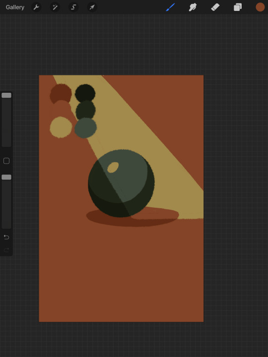
Here’s our ball with a beam of light on it. Everything Within the beam of light is one step in our limited palette lighter than anything outside of it. Here’s how I go about doing this: the shape of the beam of light is below everything else. Then, once I have the shape blocked out, i select it. With that selection in place, i go to EVERY SINGLE LAYER that’s effected, lock the opacity, and recolor that chunk. So what’s going on here is that there is only one more layer - the beam of light, below everything but the background, and the rest of this effect is just caused by every layer above it now being two-toned following the exact same silhouette. THIS is why it’s so important to keep your layers separate - if the shadow and highlight had been painted onto the base directly, i would not be able to do this without significant effort.
This works with all of the finishing techniques I talked about above
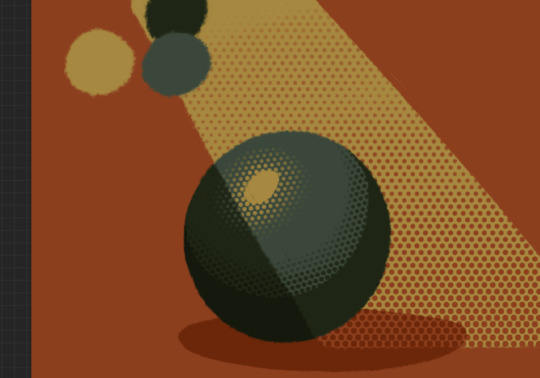
A combination of cel shading and half toning, all stepped up to give the appearance of heavier light on one area.This is also how I go about rendering transparency in this style. All of my layers are fully opaque and I allow the colors to do the work of conveying transparent material

Here’s our ball with the patterned/textured brush shading, being viewed partially through a window
it’s obviously not a very representational way of working, but as long as your audience UNDERSTANDS what you’re trying to convey, then you’re executing it successfully.
So with that, now we’re gonna go and finish this drawing.
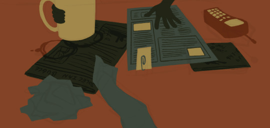
For this one, I decide a big central shadow is necessary. In the original thumbnail, he was backlit, which I still plan on doing, and that wouldn’t make sense without casting a shadow.

I’ve had to change the colors of some objects entirely in order to get this to work right. This is what I mean when I call this an intuitive process - some stuff felt weird, so I changed it. This also involves a bit of problem solving. The newspaper is now unable to be separated from his hand. Sometimes changing the color of an object makes that object look better, but ruins its relationship with the objects around it. It’s up to you to learn how to adjust and finagle things until you get it where you want.The paper he has and the napkin underneath it also all blend together now.
The next few parts of this process are REALLY just trial and error, where I toss a bunch of spaghetti at it until it works. It’s hard to decide what to screenshot, because I don’t know what will or will not be part of the finished drawing. To that end, you can watch the recording of this drawing here. This video isn’t edited at all so it contains a couple of minutes of really shitty sketching, and then all of the color thumbnailing work i did in the last post. Actually getting started on these final colors begins around the two minute mark. It is also sideways, I am sorry I don’t know why.
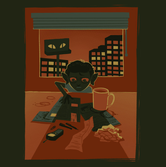
Now, here you can see where I’ve more or less worked things out. His hand’s not on the cup anymore because my friend pointed out it didnt have an arm attached to it. I added some halftoning to make a gradiating effect in the sky and on the table to give the impression of a sunrise. His eyes are different but as of posting this, I don’t like them and am probably about to go back and change them again. The Cup now has a shadow and some rim lighting. His hand is in shadow. The stain on the napkin is big enough to define the edge of the paper on top of it.
Little things like that.
The more you draw like this the more the way you need to think about your space becomes natural. I hope this helps and I wish you all the best of luck!
117 notes
·
View notes
Last Seen Blogs

new-hyperfixation-every-month
i have thoughts
marblellous
doctor! that's nerve tissue!
oikawasann
岩ちやん ~ !!♡
[semi-hiatus]
mo-ld
The Waves
quiltedbunny
something for everybun 🐇