#i go through brief phases where i do digital art for a while but i always come back to traditional
Note
YOU ART IS SO OUGH,,, EATED IT EATED IT IMMEDIATEKY HOW DO YOU DI TRADITIONAL SO GODLY? HELLO???
And your bigb doodle is so waaghduduehf,,,,,,,,,,,,,,,
THABK YOU SO MUCH!!! i really need to draw big b more often he's such a silly guy :3
also traditional art is just easier for me i guess because there's less confusion surrounding it?? with a digital drawing program there's so many tools and options but with traditional it's literally just a sketchbook a pencil and maybe some markers so i gravitate towards it more ig :)))
#i go through brief phases where i do digital art for a while but i always come back to traditional#the overall process is just more enjoyable for me#thank you for sending this in!!!#inbox
6 notes
·
View notes
Text
Kinktober Day 16
Kinks: Rimming, Stuck in a wall
Ship: Fort Max/Cerebros/Red Alert
It was Red Alert who had found out first. He’d spotted Max, walking in to their room, then suddenly his top half phased through the wall and out into the hallway. Red commed Cerebros on the way to Max, and when they’d gotten there, they didn’t expect him to be so nonchalant.
“Oh, no, I was just testing some equipment from Brainstorm,” Max said with a half smile. “He told me this might happen.” He looked up at Red Alert and Cerebros, who were looking down at his torso and helm that were stuck on the hallway side.
“And how do you… you know, stop it?” Cerebros was the first to ask. Red was too busy worrying and inspecting the seam that joined Max and the wall.
“Just have to comm Brainstorm and tell him to come over and recharge the thing.” Max seemed all too calm about all of this. Cerebros walked through the door to their habsuite to see Max’s other side. There, he could see his wrist, with a strange silver bracelet on it. Lights on the bracelet alternated between blue and red.
“You’re not in pain, though?” Red Alert asked, kneeling down so he could be eye level with Max, who shook his helm.
“I feel fine.” Max smiled as Red planted a soft kiss to his cheek. "Nothing hurts, it's actually quite comf- hah!" Max cut himself off, wide eyed as he felt a hard slap land on his aft. Red looked at him, panicking again, before Cerebros commed,
::Just gave him a little spank, don't worry, Red.:: His voice carried a little bit of a laugh as his servos gently rubbed over the sensitive spot on Max's aft. ::Why don't you get back here and play with him for a little bit?::
"Red?" Max asked, side eyeing him, "What are you talking about with him?"
::Don't tell him.::
"Nothing, I wasn't talking to anyone."
"You were, I know it." Max squinted. Red Alert, while he was incredibly skilled at spotting sneaky individuals, could not be sneaky for the life of him. He made of some half assed excuse before slipping into the habsuite, leaving Max rolling his optics with a soft laugh, already knowing what to expect from the two of them. He popped his panels in anticipation, valve already beginning to grow wetter and spike hanging stiff between his legs.
::Nuh-uh, Maxie," Cerebros tapped at Max's art port panel," I want this one."
After a brief moment of consideration, Max sent the command to open that panel as well. He felt three servos on his, two of his aft and one on his power back. Something bumped his leg, then he felt a mouth around his spike. He tried to thrust his hips, only to find himself greatly hindered by the wall that trapped his waist.
He felt Cerebros' digit stroke across his tight aft port entrance, not pushing past. Max's hips trembled, between Cerebros' gentle nudging and Red Alert sucking his spike, Max found it getting hard to keep a straight face. After all, he didn't want everyone in the hallway and on the ship to know what was going on.
Cerebros pushed the first segment of his digit past Max's entrance. This wasn't the first time Max has let Cerebros play with his aft port, but the surprising sting always did startle him a little bit. Cerebros was a lithe bot, in pretty much every aspect of his frame. Max never expected to feel as stretched by him as he did when Cerebros chose to use his aft port.
Max bit his lip and Cerebros withdrew his digit. The larger mech didn't feel anything for a moment, before suddenly something warm and wet stroked across his entrance.
::W-what-?::
::Just my glossa, Max, don't freak out.:: Cerebros chimed in through his comm. His glossa licked across Fort Max's Port again, eliciting a soft gasp. ::You ever had another mech's glossa here before?::
::N-no…:: Truth be told, Max hasn't even had anyone take interest in anything involving his aft port before Cerebros. Cerebros knew that fact and took pleasure in showing Max all the things he'd been missing out on.
Max’s optics fluttered shut at the exotic sensation of Cerebros’ glossa barely nudging past his entrance while Red Alert took his spike to the hilt. His vents loudly worked overtime, much to his chagrin. He couldn’t stop turning and twisting his helm to try to see if anyone was coming. Though, nobody did.
“C-Cerebros, Red, frag-” He growled lowly. His hips tried to buck and thrust, but he found himself quite limited in his current position. His charge raced through him, and he could feel his overload approaching. Was he really about to overload like this? With his top half in the hallway where anyone could see him?
He didn’t have a choice as Cerebros’ glossa rubbed over his port and he felt Red’s intake tense around his throbbing spike. His vocalizer warbled a low moan and his engine snarled with the intensity he tried to control as his spike poured hot transfluid down Red’s throat and his port entrance twitched under Cerebros’ glossa.
Red slowly pulled off of his spike, leaving a parting kiss to the head, and Cerebros righted his posture and stood up. Max just hoped that they didn’t leave a mess for Brainstorm to see when he got there.
62 notes
·
View notes
Photo


The second of a two part Miles Aldridge interview I did for the Image Source Picture Agency. Here, the avant-garde fashion photographer talks about the transition to a different creative vision, and the contrasting influences of Richard Avedon and Helmut Newton.
Ashley Jouhar: The transition you made to the kind of work that we associate with you as a photographer now… how did you go about creating that imagery?
Miles Aldridge: Well as an example, I had this idea for a photograph that took place in a car, with the exhaust coming through a window. That could still work as a photo. I wanted to do a series like that but what other ideas could I come up with? I went through the other ideas and they were all to do with suicide! That’s how it started to happen.
The people I worked with were very accommodating, especially Italian Vogue. I’d done white background shoots for them for quite a while. So when I proposed to do something with a bit of narrative to it, as along as I shot their clothes they were fine with it. Actually, those pictures turned out quite well – they emboldened me to do another one and another one.
Some of the early stories aren’t much of a story but there is still a story there because something is happening. I remember one where I just wanted to have a white kitten in every picture. Following this girl around the street loosely inspired by this girl from La Dolce Vita. That was a case of making sure there was a white kitten on set and just making sure it was in every picture.
Ashley Jouhar: How long does it take now to make an individual image and what’s the size of the team involved?
Miles Aldridge: The team is the same now, it’s a bit like a Rock ’n’ Roll band. Instead of the drummer, the bass player and guitarist, you have the stylist, hair-dresser and make-up artist, the set designer and the prop stylist. It is like a small art movie team – it’s not Hollywood. It’s a group rather than a massive bunch of people. I try to keep control of it, keep costs down. So it doesn’t becoming exorbitantly expensive. As long as my drawings are quite accurate from the beginning, I don’t have to make huge sets, I just make the bit I really need.
Typically I’ll have an idea and I’ll sell the idea to the magazine. Within that six months we’ll shoot it as an idea, over two days mostly – sometimes over one day. Now half the shoots are one day shoots.
Ashley Jouhar: Is it mostly sets you shoot in rather than locations?
Miles Aldridge: It goes up and down, I go through different phases, sometimes I like shooting in locations as I find locations give you a lot more options once you are there. They exist in architectural space. If the idea you had thought of doesn’t work, you can probably move the camera and find something else that does work. Whereas a set has no Plan B. You are pretty much figuring out your shot when you are doing a drawing and have the set constructed accordingly. It’s quite nice going into a location like a hotel room and taking it over changing it and putting lights up and really doing a number on it. Changing it through the camera, though the lighting, and propping. I’m quite happy in a studio as a set as well.
When you have a free rein, and it sounds like a lot of the time you have, it can be more difficult to create, as the world’s your oyster. How do you impose your own parameters to get to be where you want to be?
Because I work for Italian Vogue the parameters are not defined but are well understood. You can do a picture of a crazy woman but it does have to be tasteful, it can be contemporary so it can include knowledge of contemporary art but I think it can’t be shocking for its own sake and it can’t trample over certain taboos.
There’s a restriction there and of course you have to show the clothes. And I’m also obliged to make sure that the woman looks really beautiful even if she is weird. There are enough parameters there to make it interesting. I agree though, when artists are given free rein, they often produce rubbish. I like to consider myself working in a similar way to the Hollywood writers and directors in the 1940s and 50s… Celebrating that and everything in between.
Ashley Jouhar: When we were talking at your show Short Breaths, about film versus digital, you were saying you do some commercial jobs on digital but mostly you are shooting on film to get the qualities it provides. For shoots for Italian Vogue for instance, would that be film?
Miles Aldridge: Absolutely. All the work in Short Breaths and all the work in Somerset House was previously published in magazines and ninety percent of that was Italian Vogue. For me, the personal work is the magazine work – I consider that my art, in the same that Richard Avedon and Helmut Newton did too. I don’t consider that commercial work even though it’s for a magazine. What I consider commercial work is pure advertising, where it’s a product for a company who want me to show their things. You have to work with someone else’s brief in advertising. Historically, editorial photographers are reporting on the world. They are aware of fashions and the world they live in so the ideas they have and the images they come up with are not just to show the clothes – that would be deadly. The job of the fashion photographer is to subtly make comment on the world he lives in.
Ashley Jouhar: Which fashion photographers have influenced you? Whose work do you like the most?
Miles Aldridge: I think as far as being incredibly serious about what he did – and he straddled such a huge period of human culture and commented on it, it would be Richard Avedon. Helmut Newton is also a very interesting and prolific artist who did the same for a more concentrated period in the 70s and 80s. He did in the 60s too but came into his own in the 70s. He was such a pervy, dark guy but I think that vision suited that world of the 70s. Both of these artists are true to their own nature. There is something about Avedon and his obsession with grace and glamour but he was massively aware of the world he was in, the Berlin Wall coming down, the rights of Black people, or the American West project being a shocking report on one of the world’s richest countries.
Ashley Jouhar: He was heavily criticised at the time for some of these images. But look how influential they’ve been.
Miles Aldridge: Irving Penn is another one. He is less a fashion photographer than a still life one. In his way, he has an incredible breadth to his work, a huge span of human existence that’s fantastic.
Ashley Jouhar: I saw the Platinum Cigarette Butts show at Hamilton’s last year – phenomenal to see them all together…
Miles Aldridge: Wonderful…
Ashley Jouhar: And again very influential…
Miles Aldridge: Like a lot of great work, if the idea is great you can get the cigarette butt out of the gutter and put it under a camera. He followed it through technically and did it brilliantly, but for me the brilliant bit of that is the idea. He said, walking home from the studio, he would pick up these little bits of detritus and bring them back to the studio the next day to photograph. It’s the idea to do that that’s the amazing thing.
Ashley Jouhar: It’s easy to look back at stuff like that and say, well… that’s an old idea but of course, at the time it was breaking new boundaries…
Miles Aldridge: And in its own way it was talking about consumerism.
Ashley Jouhar: One more question. Your current body of work has an ‘energy’ and a ‘Miles Aldridge’ look and feel. Is anything hatching in your mind as to how you are going to move it on? Where are you going to go next with your style or approach to image-making?
Miles Aldridge: The exhibition and the book are both incredible full-stops for me – a double full-stop. I feel the new work after this, starting in September, will be different. What I am doing right now is really considering that. I feel the body of work at Somerset House is a really complete representation of how I felt about the world up until now. Now that’s off my chest it leaves room for me to think again and see things in a different way.
Ashley Jouhar: Thank you very much Miles.
#fashion photography#fashion#art photography#pop art#ashleyjouhar#miles aldridge#british vogue#vogue italia
2 notes
·
View notes
Text
Beware the Black Tarantula
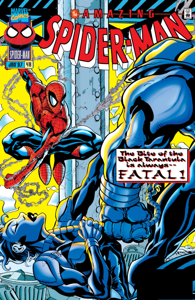
THE AMAZING SPIDER-MAN #419
JANUARY 1997
BY TOM DEFALCO, STEVE SKROCE, BUD LAROSA AND BOB SHAREN

SYNOPSIS (FROM MARVEL DATABASE)
From his secret hideout, a man known as the Black Tarantula is briefed on the state of the New York City underworld. His assistant, Chesbro, informs the Tarantula that since the fall of the Kingpin, New York City's crime families have been at war for supremacy. The major players on the scene include Don Fortunato, who has managed to consolidate the underworld in recent times. However, Fortunato still faces opposition from the Rose and Hammerhead. Chesboro concludes his report by informing his master that the recent loss of most of New York's costumed defenders, the city is quite vulnerable. Hearing all of this convinces the Black Tarantula that the time is right to spread his operations into New York City.
In New York City, Peter Parker is on assignment with Ben Urich. When Urich goes to talk to an informant, he tells Peter to make himself scarce. Instead, Parker changes into Spider-Man and keeps an eye on the reporter from the shadows. There he overhears the stoolie telling Ben about the Rose working on a deal to smuggle emeralds into New York for the Black Tarantula. Ben doesn't know who the Tarantula is, and is told that he is a major player on the international black market. With the meeting over, Spider-Man slips away to change back into his civilian identity. On the way, he spots some men waiting to ambush Ben and stops them. After a quick battle, Spider-Man leaves the crooks webbed up and meets up with Ben as Peter Parker. Ben tells him what he has learned about the Black Tarantula and wants to go back to the Daily Bugle to make some calls to his connections at Interpol. At the Bugle, Peter tries to hit up Joe Robertson for some photo assignments because the paper is focused on the recent assassination of Presidential candidate Graydon Creed. However, Joe tells Peter to check in tomorrow as he may need a photographer to take pictures of an alleged street prophet that has been hanging around Washington Square Park.
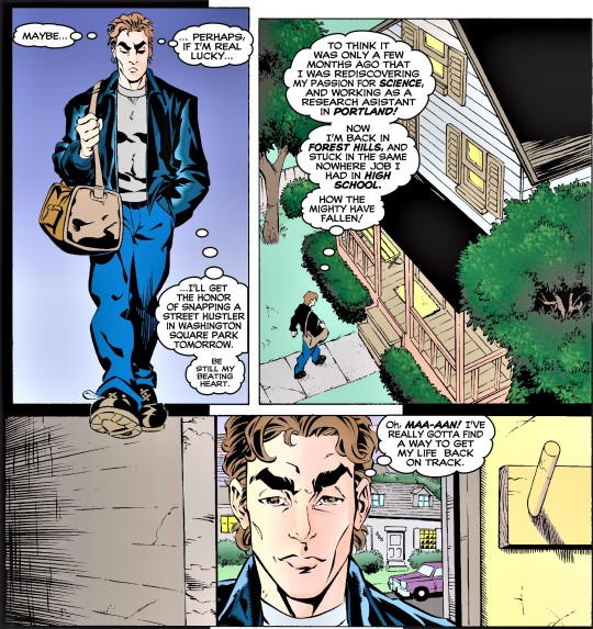
Meanwhile, the Rose is exercising with his bodyguard Delilah and discussing the recent deal he brokered with the Black Tarantula. Delilah has detected that the Rose is reluctant to do business with this new player. This is because the Rose has learned, from his contacts in South America, that the Black Tarantula is not someone to be trusted. In addition, the man has a cult that worships him like a god. After his past experience with the Scrier, the Rose is reluctant to get involved with someone with a religious movement backing them. At that moment, in Queens, Mary Jane and her Aunt Anna are repainting the room that she and Peter were planning to use for their baby. Mary Jane is surprised to find herself able to enter the room so soon after the death of the baby. It's then that Anna tells her niece that she is taking adult education classes. It's then that Anna asks Mary Jane if she has given much thought about her future. Anna Watson is not the only one thinking about their future. Peter Parker is walking home, wondering what he is doing with his life. Not long ago he was working as a scientist in Portland, and now he finds himself living in his family home in Queens and working the same job he has had since high school.
Inside, Peter is greeted by Mary Jane and after learning that Aunt Anna is in the shower, that there are some issues with the three of them living together in Peter's old childhood home. However, they are stuck in this situation until Peter and Mary Jane can find an apartment in the city. That's when Mary Jane tells Peter that she is thinking about going back to school, taking inspiration from Aunt Anna. Peter likes the idea and the pair decides to take the opportunity to for some romance. Later that night, Peter tells Mary Jane to get a listing of the science courses when she goes to Empire State University as he has decided to consider going back to school and finally get his Masters Degree. Later that evening, Peter goes out on Spider-Man to look into the Rose's emerald smuggling operation. Spider-Man is not the only one out looking for answers, as Ben Urich hits up his informants for more information about the Black Tarantula. Eventually, Spider-Man learns where they deal is going down and calls Ben Urich. After being warned about how dangerous the Black Tarantula is, Urich tells Peter to let the cops handle it. Parker ignores this, prompting Urich to rush to the scene in order to make sure Peter doesn't hurt himself. Overhearing this conversation is Angela Yin, who finds it an odd coincidence that she overheard a call from Peter Parker just as she was looking through her photos of the night that Mary Jane lost her baby. When she happens upon the picture of Doctor Folsome, the man who helped deliver Mary Jane's baby, it somehow disturbs her.

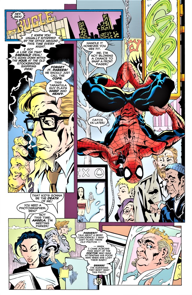
Meanwhile, Spider-Man swings to the Stockbridge Shipping Pier happy that he can get some money making crime photos and make it home to spend more time with his wife. Spider-Man arrives on the scene at the same time as Ben Urich. After setting up his camera, the wall-crawler then begins to examine the situation and sees that Delilah, the Rose's bodyguard, is overseeing the transaction. They are greeted by El Uno, one of the Black Tarantula's men. El Uno is unhappy when Delilah refuses to pay for the emeralds until they can authenticate them. That's when El Uno orders his men to kill them all. This prompts Spider-Man to swing in and try to prevent as many deaths as possible. As the web-slinger deals with the gunmen, Delilah battles El Uno and quickly discovers that he is stronger than she is. Taking the bag that supposedly contains the money to pay for the emeralds, El Uno discovers that it actually holds a bomb that has been activated.

That's when Spider-Man swings in to try and stop the bomb. During the struggle, Spider-Man assumes he is battling the Black Tarantula because El Uno has a spider shaped tattoo on the back of his head. The web-spinner is unimpressed and strikes El Uno, but the blow hardly even phases the man. Recovering from her beating, Delilah arms the bomb while Spider-Man is busy. That's when Ben Urich makes his presence known and tells Spider-Man that Peter Parker is somewhere nearby. Assuring Ben that Parker is safe, Spider-Man swings himself and the reporter to safety, leaving El Uno to deal with the bomb. As the bomb goes off, Spider-Man realizes that he left his camera in the area and fears that it was caught in the blast. Examining the rubble, Ben asks Spider-Man if he thinks the Black Tarantula managed to escape. However, after isn't entirely convinced that he actually fought the Black Tarantula.
The wall-crawler's hunch is correct as in South America, Chesboro reports to his master. Upon hearing that El Uno failed, the Tarantula angrily crushes a wine glass in his bare hand.
REVIEW
At this point in time, Spider-man is coming back from the clone saga and trying to get back to normal. Nothing makes it more clear, than his camera being destroyed in that explosion.
Steve Skroce’s style looks a lot like Mike Wieringo’s. Given that Ringo’s my favourite artist, I cannot help but like Skroce’s art. I feel like it looks better on Spider-man than X-Man (I will be able to compare on the next team-up that involves both).
As I mentioned in my review for X-Factor, the digital coloring looks weird. But in this case it isn’t so accentuated. While I still find those “halos” around the black lines, it is a smoother job.
I give this issue a score of 8.
4 notes
·
View notes
Text
Data Objects - First Attempts Within the Group
As I have not posted in quite a while, I shall be making one very long post in relation to the Data Objects assessment. So please bear with me while I do my best to explain my thought and iteration process.
First of all I would like to address my perception of this assignment. I have really struggled to DO anything with it as it has taken weeks for me to come to any kind of real understanding of what we are doing and why we are doing it. The introduction to this assessment was pretty vague and trying to find examples of Data Objects proved pretty pointless as there seems to be a lack of them out there in the world. Perhaps I simply did not look in the right places, but this made me even more uneasy about the project and it's lack of solid direction or ‘rules’ so to speak. Furthermore, the examples provided to us in the briefing seem to me to simply be reinterpretations and physical representations of graphs and various other methods of viewing data (which are fundamentally better for visualizing and communicating this kind of information). For the past three weeks the old adage, “If it ain’t broke, don’t fix it” has been popping into my head. Why try to reinvent a more complex, less efficient method of interacting with data? The whole thing comes across as a bit of a ‘You obviously don’t understand ART my dear’ gallery owner, who then turns around wafting some awful perfume into your face and flouncing out of the room. Again, maybe that's just me seeing it through my own filters. Regardless of how I feel about it I must press on, quietly suffocating my frustration and annoyance with a pillow of anxiety as the due date draws ever closer.
Initially, my Data Object (DO) when I was working solo was oriented around video gaming. Specifically I was interested in the differences between male and female gamers when it came to the reasons they played video games. I found a data set that looked at the primary drivers for male and female players (exploration, destruction, competition, etc) and started to think of an object that might suit such a set. After speaking with several people in the class there was the suggestion of dice, and I figured this fit in with the data set nicely. I set out making a ten-sided die that had different symbols on it, each one a representation of a primary drive for male or female gamers. The idea behind this was to create an object that would change how you approach video games, by using the die before playing something it would dictate whether you played the game with a focus on exploration, or on competition, etc. This I tested on games ranging from things like Batman: Arkham Knight and The Elder Scrolls V: Skyrim which tend to be more open-ended in terms of player approach, to see if the DO did indeed change how I was playing and experiencing these games. In something like Skyrim it's very easy to see how focusing on exploration rather than destruction can very much alter the experience, but it becomes difficult to find elements such as community or competition seeing as it's a single player experience. After talking with Charles about ways in which to test the DO he suggested something like Minecraft as this has online play with community servers focused in different aspects of play (such as community building servers, or player versus player environments). Unfortunately I did not get an opportunity to test the object using this game as we had started the group phase.
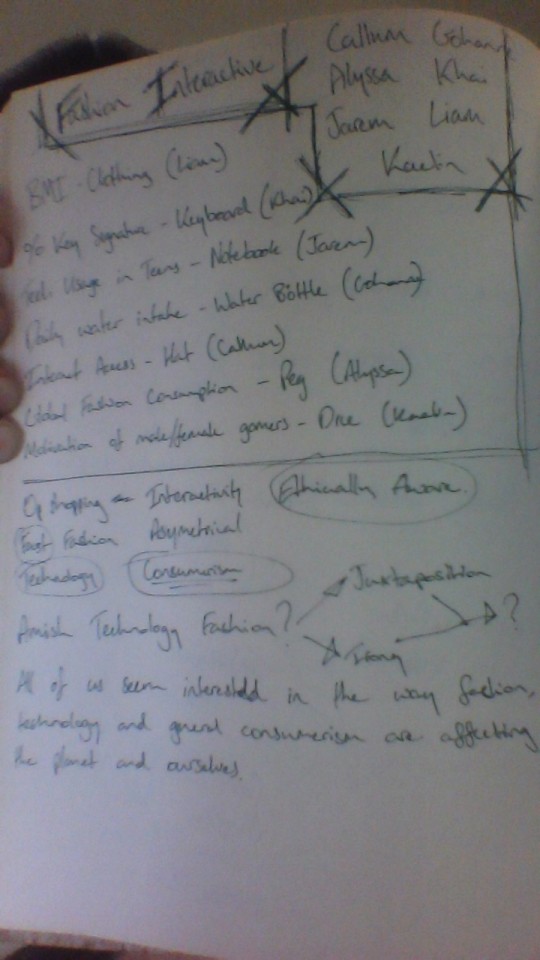
I joined a group comprising of Callum Healey, Gohanne Galletes, Jarem Cabamongan, Khai Gan, Alyssa Kerrigan and Liam O’Reilly-Givert. Together we wanted to bring a mixture of people interested in technology, diet and fashion to see if we could make something truly unique. After much discussion we ran through a few ideas on how to combine our interests and talents. We discussed interactive fashion, or the idea of combining digital tech like LED displays to show information relevant to our data sets. There was even discussion about placing a clock on a shirt and seeing if we could somehow use that as almost a sort of pie chart. Or using the fabric of the shirt itself as a way to show different data. After struggling to find a connection between our interests we did some brainstorming, and after writing down all the key aspects of what we were looking to dissect we saw the underlying theme that we all agreed on, consumerism. Through consumerism we could touch on the fashion industry, fast food and diet (and there for things like BMI which was what Liam had been hoping to focus on) as well as technology and the role it plays in consumerism in the modern day. This seemed like a great way to have everyone in our rather large group of seven focusing on a singular theme in order to work on something as a unit.
We then needed to find a method of communicating our data as well as specific data sets related to consumerism as it manifested in those three spheres (technology, fast food and fashion). We decided to focus on a garment of some kind, as we believed it would give us a fair amount of creative breathing room so to speak.
In order to simply get started we used a dataset that had already been used by a team member for their original DO (Jarem). This was to do with technology usage in teens. This is where we started going back to ideas surrounding the shirt with a clock on it, or different fabrics to represent different parts of the data. My issue with this stage was the relevance of the data set to consumerism. It seemed there was a general panic involving this project and how little anyone seemed to understand it, so the reaction was to try and make something as fast as possible regardless of its relevance. While members of our group discussed these aspects I started brainstorming other ideas, with a heavy focus on interactivity. I realized that if we could make something that causes someone to have to interact with our DO it may do a better job of communicating the data set, or at least making it more interesting and memorable. I had a few ideas surrounding things like the use of temperature to communicate data, there was even the concept of creating our own data set using the graphs and info that most OS on peoples smartphones now record in relation to app usage. For example on Android you can go into your phone information and see the amount of time you spend on specific applications. Although it wasn’t a bad idea it again did not seem to connect very strongly with our desired focus on consumerism.
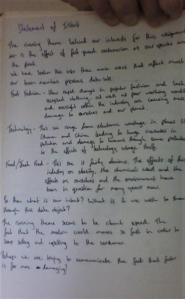
We were still struggling to gain traction on this project, so I decided to create a Statement of Intent in order to give us a better idea of what we wanted to achieve. Something we could compare our ideas to and make sure they were falling in line, so as to retain focus and direction. (PIC OF STATEMENT NOTES HERE). After breaking down the main components of what we all wanted to focus on I managed to come up with this.
“Our intent is to use a DO to communicate the harmful impact if fast paced consumerism on both the planet and ourselves as a species. In specific, consumerism as represented by the fast food and fast fashion industries, as well as the effects of modern technology on us socially, physiologically and/or mentally.”
1 note
·
View note
Text

beep beep y’all it’s kay ( 20, est, she/her ) ur resident dumpster dweller popping in with one of my three hot mess of children ,, tony n jamie will be up soon depending on when i can get my shit together jdlks but heNYWAYS !! let me introduce u to this dumpster on fire known as danika ,, it will be in bulletpoints bc my attention span is v short and i’m at work. like this n i’ll shoot u message to plot or just yell at me in my dm’s hfbdjkf
ariana grande. cisfemale. she/her. — did you see { danika monroe }, i haven’t seen the { twenty-four } year old in a while! you know, they’re a { concept artist }, and have been living in jersey city for { two years }. some say they’re { peevish & judgmental }, but i think they’re { compassionate & gregarious }. regardless, i’m glad { dani } is here.
STATISTICS:
full name: danika blair monroe
nicknames: dani or just danika
hometown: edinburgh, scotland
sexuality: pansexual
gender: cisfemale
birthday: june 12th, 1994
spoken languages: english, italian, & german
hogwarts house: hufflepuff
BACKSTORY + PERSONALITY:
okie so danika was originally born and raised for the first 2 years of her life in the scottish countryside outside of edinburgh bc her mom and dad had a whirlwind romance when they were in their later years of university and got married following graduation bc they were already expecting danika
adanika’s mother moved to the small town where her husband was from ,, putting her aspirations of becoming an attorney on hold bc *vine vc* coUNTRY boYY i love youuu ow
so danika’s mom was p much holding down a reception job while her husband kinda just spent his time in bars when he wasn’t doing construction so their relationship fell apart p much after the honeymoon phase wore off .. so her mom had Enough and filed for divorce, won custody of danika and bounced back off to edinburgh to jump start her law career
so danika lived with her mom and grandparents and it was all v gucci !! given she was 2 so she didn’t have much of an opinion kjfdsjkfL ,, but growing up she absolutely loved living in edinburgh !! just enjoyed admiring the architecture and how it was a bustling tourist city and how genuinely happy everyone seemed ?? tbh she imagined she would live there for the rest of her life n not move bc her mom was there and it was all she knew
danika was always a v creative child growing up .. she loved reading and absolutely hated math and just did better in english class while always looking forward to art class ,, she loves to paint and draw but she’s slightly better drawing with pencils and such rather than paintbrushes
so ya girl stayed nearby for college bc she’s laME and would miss her mom too much skfjnk but she majored in art but also freelanced as an illustrator during that time,, she does commissions through her twitter account ( which she still does ) bc her specialty is character studies and landscapes but also did designs for a local card company for extra coin ,, prefers drawing ppl and also has a moleskin notebook that she carries on her at all times in her purse and just chills in chapter one and sketches ppl
she self taught herself how to draw on the tablet her mom got her for christmas so she alternates between hand drawn and digital art ,, her specialty is superheroes and has too many drawings of tony stark bc she’s weak for him ,, that and harry potter SHE WILL DRAW MORE DESPITE THE ABUNDANCE SHE HAS
danika is a giant nerd despite the *~*cool*~* exterior she puts up ,, lit she’s the biggest dumpster fire of all even tho she pretends to be a Cool Girl ,, lit her humor is basically lame jokes, vine references and pop culture references ,, but im sorry if her accent goes into overdrive when she’s talking about smth she’s passionate about bc it can be A Lot ,. casually it’s still present but she can pull it back to help ppl understand
she goes through weird spurs of random confidence where she’ll talk to new people and sign up for tinder but mainly does it when she needs a self confidence boost ,, but she’s a Chicken and the idea of going on dates scares the shit out of her mainly bc she hasn’t had a proper relationship ??
now that i think about it she’s had a brief relationship that lasted a few weeks but ended when danika felt like she was only being kept around for sex and that was not something she was ready to go through with since it meant more to her than him ,, just too worried and caught up in her anxiety to really put herself out there but one day hopes to be That Hoe if she builds up the confidence
probably has small crushes on everyone bc she loves 2 appreciate the good in everyone so she has issues deciphering when she really Likes someone ,, but even if she did truly like someone she avoids confrontation and responsibilities so she’ll just wither away without ever saying something
she made the move to jersey a little bit after graduating from university bc she got a job interview at a big name game developing studio in nyc and she was like lmao #yikes but her mom convinced her to buy a plane ticket and go and lo and behold !! she went and nailed the interview and got the job so she tearfully made the Official move to the states as a concept artist for the games being worked on in the studio
decided not to live in nyc bc hA that shit is expensive so she decided jersey city would be a decent commute so she got an apartment so hmu !!! if u need a roommate !! bc she def needs one
adores her british longhorn kitten that is snow white and bc she’s a nerd she named him draco but she loves him with all her heart and shows pictures to anyone who’s willing to listen to her love declarations
recently dyed her hair blonde bc she figured a change in her appearance would help for a change in how she presents herself and acts ,, trying to be more social and definitely a bit of the Mom Friend
listens to africa by toto unironically and truly loves it ,, and considers a gr8 night ordering in dominos and watching john mulaney comedy specials on netflix bc i hate hER .. so she’s branching out more and spreading her wings !!
#jrsy.intro#this is one long ramble#i am v sorry but also njskjsd my b pls luv me#and my garbage girl
4 notes
·
View notes
Text
Evaluation
My idea for this project came about after online learning was reintroduced half way through the academic year. The Coronavirus pandemic meant that the whole world had to learn to function without in person interaction, taking over online spaces in order to create some sort of reality. Using the pandemic as a backdrop, I hoped to hone my interest in philosophy and explore the ways it relates to current events. I wanted to take on the issues that the online world creates; the ability to be ambiguous or anonymous when sharing information, causing misinterpretations resulting in fake news. Linking these modern issues to philosophical theories of reality, such as Plato’s Cave and Kant’s Nominal World, and using these as a reference to the idea of a lesser reality, a man made universe, the online world.
I hoped to solidify this concept with my research, finding connections between art, philosophy and current events by researching artists such as Magrette, who used his art to explore philosophical ideas and even created a series of paintings based on Plato’s Allegory. I also looked to artists that had developed their own philosophies, such as Mondrian who wanted to remove illusions from art by painting only 2-D shapes. This is where my project began to take shape, comparing Mondrian’s work to a video call screen, linking in elements of his philosophy as well as other theories.
Experiencing the effects of lockdown first hand meant that I was always aware of the issues the Corona virus had created but my research of current affairs became less imperative. In my initial brief I had proposed that I would be researching modern issues created by the online world, such as fake news but this became secondary as my research became more artist heavy. I struggled to direct my research towards current affairs as it didn’t seem to key into the project as much as I had first thought. Much of my focus went into finding visual stimuli, researching artists like Joseph Albers, Bridget Riley and eventually Barbara Kasten. Therefore, despite my research being less broad than originally intended, it discovered a significant level of inspiration in the art works I research, which more decisively shaped my project both aesthetically and philosophically.
Most of the artists I researched worked with 2D shapes, which became an interesting starting point for my project. Due to the fact the course was moved online, the resources available to me became limited. Following the move to online learning, I decided to experiment with digital art. In my previous projects I had used photo editing techniques to create some of my pieces and I thought I could draw on this skill in my digital experiments. My initial images and ‘gifs’ were created on photo editing software, but I quickly realised that if I was going to continue with these experiments I would need to invest in a graphics programme. I started using Inkscape which allowed me to create images using vector graphics, equipping me with the tools to create high quality digital work. Producing work this way meant that I was able to create a range of experiments quickly, tweaking and perfecting my experiments before moving to a less forgiving medium, such as paint, which I experimented with throughout the project. I enjoyed experimenting with paint as it allowed me to create something outside of the digital world, it reflected a human quality that couldn’t be reproduced on a digital screen. This further exemplified my initial concept of the digital world being lesser than the physical world, the digital work I created existed only in the online reality that I was examining.
The pandemic created a number of obstacles this year and the dramatic move to online learning rendered the usual presentation of work via sketchbook useless. Having to document my work online was a huge change and one I was hesitant to make. Working online didn’t come naturally to me, I was overly cautious and incredibly particular about what I was posting. This meant that some of my earlier ideas or research that I eventually abandoned were never documented, as I believed that all my work should be cohesive and orderly and I only wanted to share the work that I thought directly added to the progression of the project. Over time I realised that the only way to improve my project was to document as much as possible so I could review it critically. Once I let go of the notion of making all my posts perfect I found that I actually preferred working in a digital space to a physical sketchbook, as it took away some of the pressure I inflicted upon myself to present things neatly. The lockdown also restricted the resources that were available to me as I didn’t have access to the college. It was these restrictions that made me want to experiment with digital media, as it allowed me to create a range of pieces without needing any physical equipment. Presenting my work on a blog meant that my digital creations could be uploaded instantly, without the additional task of printing or photographing what I had made. Perhaps the biggest challenge of working online was the disconnection from other students and peers as well as tutors. It became difficult to find opportunities to have my work critically assessed by my peers or tutors, however, we were able to arrange some group crits over video call or through text.
At the beginning of the project I created a plan which briefly outlined the things I needed to do each week in order to stay up-to-date. I built up my plan over time. I always knew what I needed to do and I was constantly making lists about the tasks I needed to complete in the following days and weeks. I set aside time every day to work on the project, however, there were times when I was more productive than others. I found it difficult to move on from the research phase and begin experimenting. It took me a while to generate ideas because I didn't want to include any pieces that I didn’t deem successful. The shift to online learning meant I had to reevaluate the way I worked. I spent the majority of the project trying to find a way of working that suited me. I experimented with a range of timetables and techniques that are thought to improve productivity. I tried my best to remain up-to-date with the project and I was always conscious of the next thing I needed to do. Through the project I have discovered the importance of making mistakes, and the need to let go of my perfectionistic nature in order to create a successful project.
For all of my work I made a concentrated effort to reflect on what I had created, making sure to refer back to my original brief and some of my core ideas. I think my ability to annotate my work has improved throughout this project. At the beginning, I refrained from sharing any work that I didn’t feel was successful, this meant that my annotations were more focused on explanation of ideas and lacked critical analysis of the outcome. Throughout the project I have improved this skill, making consistent attempts to review my work fairly as well as gaining perspective from others, be it peers, or family members. I made a conscious effort to make my project consistent, focusing on similar concepts and forming clear links between my different outcomes. This meant that the work I produced didn’t explore a broad range of ideas, instead, my work remained fairly linear, always working on a similar idea that I developed over time.
The ideas and concepts put forward in my brief are present throughout my project. My consistent and precise approach to art meant that all of the work I produced was extremely relevant and formed part of my project's progression. Working digitally complimented the core concepts of my project, focusing on the digital world and the illusions it creates. Presenting them on a blog allowed them to stand out, which wouldn’t have occurred if they were cut out and put in a sketchbook. By building a concept around the idea of working online I was able to create a cohesive project, using carefully selected digital media and presenting it in an online space. The irony of the fact that I initially set out to explore the shortcomings of the digital world only to discover that the use of this medium enhanced my project was not one that was lost on me.
0 notes
Text
Top 10 soft skills that a UX leader must possess
How do I explain what I do at a party? The short version is that I say I humanize technology. Fred BeecherA UX design project is never black or white it comes with a lot of ambiguity and challenges at different phases in the design process.
These challenges can only be tackled if a designer has certain soft skills to back ones technical knowledge. The good news is, most of these skills can be developed and refined with practice and self-motivation.Here are the top 10 soft-skills that a UX leader must strive towards developing-1. Excellent Communication SkillsDesign, unlike art, is not just a representation of the designers own self or personal ideas. One cannot just get to work as soon as a brief is provided and then submit the design files once the work is done without any communication in between these phases.A UX Designer has to be vocal right from the beginning Ask relevant questions to understand the design brief betterCommunicate with users while conducting user researchCoordinate with other departments like the developers and product managers to execute the project successfullyPresent your design ideas articulatelyConduct user tests to understand the pain-points of users while using the productIf you expect it to be a desk job, that doesnt require much communication, then I am afraid, that is very far from the reality of what a design process entails.2. Passion or hunger for excellenceThere are three responses to a piece of design yes, no, and WOW!
Wow is the one to aim for. Milton GlaserAnd getting to that Wow moment takes a considerable amount of time and effort. An innate passion for solving problems is a big plus in the field of UX.You have to be the kind of person that thinks design can change the world. Only that level of enthusiasm will keep you going in the seemingly never-ending Create-Iterate-Test cycles involved in Product design.A UX Designer will have test out multiple solutions to come up with the Winner For example a landing page that gives you high conversions or sales.And that leads us to our next soft skill patience. 3. PatiencePatience is a virtue in any field, but in design, even more so!Conducting multiple user tests, tweaking the product, constantly communicating with other teams, awaiting feedback from users until you come up with the perfect solution all need a tremendous amount of patience.You will, at all times, be thinking about ways to make a product better.
And that requires constantly analyzing test results, and keeping an open mind about the fact that there is no such thing as a perfect product. Even the best of the products in the market need to be repeatedly modified to make them better and relevant to the changing times.4. Curiosity or an inquisitive mindThe field of User experience is always evolving. New concepts, ideas are always hitting the market. In order to keep up with these changes and incorporating them into your Design process, you need to have a sense of curiosity, and a hunger to keep learning.Only a curious mind can constantly ask insightful questions to stakeholders, and engage in a more in-depth manner with users to understand various problems that crop up in the product design.5.
Being a Team playerProduct Design can never be a one-man show. It involves collaboration between multiple stakeholders designers, developers, product owners, marketing team and the users. You will have to engage with each one of these stakeholders at various points of the design process.For this, you will have to be a collaborator who engages in respectful, insightful discussions with various teams. Need to code your product a certain way? Talk to the developer.
Require feedback on how your product is making life easier for your users? Engage your user through Users tests.And these discussions will happen on a daily basis, during the design process, and one needs to be a collaborator to keep up. 6. FlexibilityA great UX Leader is someone who can adapt to changing times. This involves keeping up with the ever-evolving technology trends, new design tools, changing user behavior and repeated iterations to the product based on analyzing user data.Every Design project brings with it, new challenges. No two design processes can ever be identical.The industry the product is based in, the user demographics, users interests, needs, aspirations and pain points are all factors that affect the design process.
The UX designer has to be flexible enough to adapt to these changes. 7. Open-MindednessWhat differentiates a UX Designer from a Marketer or an Artist is that they cannot be added to the left brain or right brain club. It has to be a combination of the two creativity accompanied by rationality.Unlike an artist, a designer cannot only think about self-fulfillment, or unlike a Marketer cannot only make decisions based on numbers. There has to be a middle ground one that involves a lot of ambiguity.This is because UX, at the end of the day, is human-centered and designing for humans cannot be an approach where everything can be predicted beforehand. This requires open-mindedness to try out new ideas and perspectives. 8. AssertivenessThis quality is essential for most leadership roles.
Assertiveness and standing up for oneself is something everyone could benefit from.With respect to UX Designers, assertiveness becomes all the more important because of the sheer number of people you are dealing with Product owners, development teams, marketers, etc. Imagine the amount of feedback and ideas that will be thrown at you to consider.The UX person is like the advocate of the users and their needs. For a great product to be designed, a Designer has to be heard. And to be heard, they need to have a voice and be assertive.9. HumilityHumility is a highly underrated virtue for a UX Designer.It is very easy to fall in love with the product that you designed. Its not always easy to welcome criticism.
In such instances, humility is key.Being a human-centered discipline, it is important that a Designer doesnt come across as pushy during User tests. Humility makes users more comfortable to open up and point out problem areas in the product design. And this is vital in improving your product.10. EmpathyIn todays times, when the focus is shifting from Intelligent quotient(IQ) to Emotional quotient (EQ) of digital products, empathy has become a key skill for a UX designer, up there on the list with technical skills.To create a product that makes the life of your user easier, you need to first, step into their shoes and think and feel like them. Simply put, empathy allows a designer to understand target users better.
And that is the foundation upon which your the design process should be based on.Here is a bonus skill that is a personal favorite 11. StorytellingEvery great design begins with an even better story. Lorinda MamoGreat User experiences tell great stories. It is an essential part of the design process especially at the stage when you are creating User personas. The more detailed these character sketches and their back-stories are, the better.Detailed narratives provide that much needed human touch to an otherwise technology-driven field.Stories help document the needs, motivations and key pain-points or potential design flaws, and make you better equipped to design a solution keeping users at the center of the design process. ConclusionThe key to being an effective UX Designer is not only about how skilled you are at Adobe XD, Balsamic or Sketch.Its about how you interact with various stakeholders, how involved and keen you are at trying out new ideas and concepts, how you react to feedback and how much of a human touch you can bring to an otherwise technical product design process.These qualities will be instrumental in defining your position as a UX Leader among a multitude of designers crowding the market. As designers, can you think of any other soft-skills that have been instrumental in your growth?
Please enlighten our design community by commenting below or discuss with me over Twitter.Designfully yours,Surya Ravindran Pillai
For more information please see our site at zhubao. Don't be hesitate to contact us!
0 notes
Text
Stage 2: Design
Game Design
This part of the project is taking me back to our first studio project; cards for play. I know that I didn’t do very well in regards to following the guidelines specified in the brief - DISCUSS, REFLECT & ITERATE. I merely focused on listing the things that I did and how I did them. I didn’t include as much feedback and reflection into my project. Hopefully I don’t repeat the same mistakes.
Im excited to get started on the design stage for this final project because I’m required to use Adobe Photoshop. I’m glad that I took art design in High School, because we spent a whole year using that program, so I’m very familiar with it. I might be a little rusty because I did take that subject back in year 12, but I’m sure the minute I hop onto it, my memory will get refreshed.
So before I get into first step “Produce quick sketches of the game layout” I want to understand the meaning of
Game design
Design elements
The development process.
And how I can apply whatever it is that I learned into my app game. Let’s begin.

What is Game Design?
1. “Game design is the art of applying design and aesthetics to create a game to facilitate interaction between players for entertainment or for educational, exercise, or experimental purposes.”
2. “Game design can be applied both to games and, increasingly, to other interactions, particularly virtual ones.”
3. “Game design creates goals, rules, and challenges to define a sport, tabletop game, casino game, video game, role-playing game, or simulation that produces desirable interactions among its participants and, possibly, spectators.”
4. “ Game design is a subset of the field of video game development. Game design is a field with a broad focus. As such, the skills of a game designer are drawn from the fields of computer science and programming, creative writing and graphic design. Game designers take the creative lead in imagining and bringing to life video game stories, characters, gameplay, rules, interfaces, dialogue and environments. This being the case, a game designer is a cross between a writer, artist and programmer. It is an individual who presents a comprehensive artistic vision, while also possessing the technical skill to oversee and contribute to programming, image rendering, level design, digital editing and other construction aspects of game design.”
Design Elements - How does this apply to my app game?
Games can be identified and characterised by "what the player does." This is often referred to as gameplay. Major key elements identified in this context are tools and rules that define the overall context of game.
Tools of Play:
“Games are often restricted by the components required to play them”. In this case, a person requires a mobile phone to play an app game.
Rule development:
Since games are generally characterised by their tools, they are usually defined by their rules. Even though rules are subject to changes, enough change in the rules sometimes result in a “new” game.
There are exceptions to this in that some games deliberately involve the changing of their own rules, but even then there are often immutable meta-rules. Rules generally determine turn order, the rights and responsibilities of the players, each player's goals, and how game components interact with each other in to produce changes in a game's state.
Rules for App game - Goal is to swim as much as possible with your sea creature while avoiding the ocean pollution to earn as much score as possible.
- Player must slide their finger from left to right/touch/tap the screen to make the character (turtle/fish/sea creature) swim.
- Avoid the rubbish/debris, oil spills and toxic materials/chemicals to survive/stay out of harms way.
- Collect energy power boost to increase your top speed and become invincible.
- Play to unlock new sea creatures.
I used an app game called “The Astro” as a template to create these rules. It kind of has the same rules and game style that I was going for.
Single or multiplayer:
Most games require multiple players. However, app games are mostly single-player games. Single player games are unique in respect to the type of challenges a player deals with. Unlike a game with multiple players going up against each other (with or against) to reach the game’s goal, a single-player game is against an aspect of the environment, against one’s own skills, against time or chance.
Many games described as "single-player" or "cooperative" could alternatively be described as puzzles or recreations, in that they do not involve strategic behaviour (as defined by game theory), in which the expected reaction of an opponent to a possible move becomes a factor in choosing which move to make.
This app game will definitely be a single-player game where the player is not required to use any strategic behaviour since the game only involves a “dodging” movement
Luck and strategy:
A game's tools and rules will result in its requiring skill, strategy, luck, or a combination thereof, and are classified accordingly. There are different types:
- Games of skill - physical and mental
- Games of strategy
- Games of chance
This app game involves skill of practice, dexterity (skill in performing tasks, especially with the hands.) As the player repeatedly plays the game, their skill of practice will increase, with each try, they will get better.
Use as an educational tool:
By learning through play, people can expand their social and psychological skills, develop emotionally, and achieve the self-confidence required to join in new experiences and environments. The app game is being created not only as an entertainment tool but an educational tool - where play is used to communicate the effects of ocean pollution on marine life. When people engage in this game, it can challenge their thinking and it’ll provide insight on this issue.
The Development Process
“Game design is part of a game's development from concept to its final form. Typically, the development process is an iterative process, with repeated phases of testing and revision. During revision, additional design or re-design may be needed.”
For this app game, I am going to be the game developer, designer, and artist. This means that I am responsible for:
Inventing the game’s concept, its central mechanisms, and its rules.
The title and theme
Fleshing out the details of the game's design
Overseeing its testing
Revising the game in response to player feedback.
Creating the artwork
Producing a prototype of the game
For this project, I know I will be able to carry out all of these task apart from overseeing its testing because I won’t be making a fully functioning game. The end result will simply be images of the artwork/prototype.
Concept:
“ A game concept is an idea for a game, briefly describing its core play mechanisms, who the players represent, and how they win or lose.”
Idea: To create an app game the provides insight, raises awareness on the issue of ocean pollution and its effects on marine life.
Core play mechanisms:
Aim: To swim as much as possible with your sea creature while avoiding the pollutants in the ocean to earn as much score as possible.
Rules:
Player must slide their finger from left to right/touch/tap the screen to make the character (turtle/fish/sea creature) swim.
- Avoid the rubbish/debris, oil spills and toxic materials/chemicals to survive/stay out of harms way.
- Collect energy power boost to increase your top speed and become invincible.
- Play to unlock new sea creatures.
Components: Mobile Phone
Player represents: sea creature
How they win or lose: Avoid the rubbish/debris, oil spills and toxic materials/chemicals to survive/stay out of harms way.
Design:
“The play sequence and possible player actions are defined, as well as how the game starts, ends, and what is its winning condition.”
(See in upcoming blogs)
Prototype:
“A game prototype is a draft version of a game used for testing. Typically, creating a prototype marks the shift from game design to game development and testing.”
(See in upcoming blogs)
Testing:
“Game testing is a major part of game development. During testing, players play the game and provide feedback on its gameplay, the usability of its components or screen elements, the clarity of its goals and rules, ease of learning, and enjoyment to the game developer. The developer then revises the design, its components, presentation, and rules before testing it again.”
“During testing, various balance issues may be identified, requiring changes to the game's design.”
As I’ve said many times, I will not be applying this step in my game design process. I’ll only reach to the prototype stage. However, I will be getting feedback from peers on the games idea, gameplay, layout, and other things mentioned above. By doing so I might require to make some changes to my design.
References
https://en.wikipedia.org/wiki/Game_design#Concept
https://www.internationalstudent.com/study-game-design/what-is-game-design/
1 note
·
View note
Photo


// WHT IS A REFLECTION?
if(reading == reflection){
please listen to (Han-Tyumi and The Murder of the Universe);
else (experience great boredom, following reflection is long winded);
}
THE POST-DIGITAL PROTOTYPE
With a project (//brief) this open it was hard to decide where to begin, the post digital was such a colossal topic it was easy to get lost in SPRINT tunnels where you would start fifty micro projects only to abandon them all and be left with nought.
Having grown up with my nose in a book, specifically Sci-Fi epic’s and dystopian thrillers, this studio option was an easy pick. When given the brief, rather than a solid idea I had a feeling I wanted to encapsulate. A pseudo Orwellian future in which we are monitored constantly, not menacingly but very blatantly. 14 year old me would have been disappointed by the mediocralypse we are living through. Instead of a cold judge Dredd / Robocop patrolling the streets it is Siri watching us, reminding us to take an umbrella less we catch a cold.
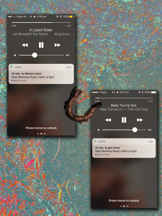
When I got my new iPhone [TM(TM) TM] I turned off all the regular ad/ tracking settings only to find within a few weeks that without me having ever set anything, it knew where work was, when I was working and when I was coming back home. This was on by default, hidden in settings be-riddled with sudden jargon.
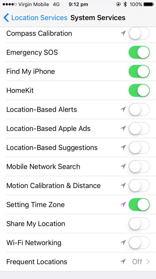
(the setting was frequent locations)
INITIAL BRAINSTORMING:
With all the aforementioned in mind I chose to focus on “looking at screens works both ways.”
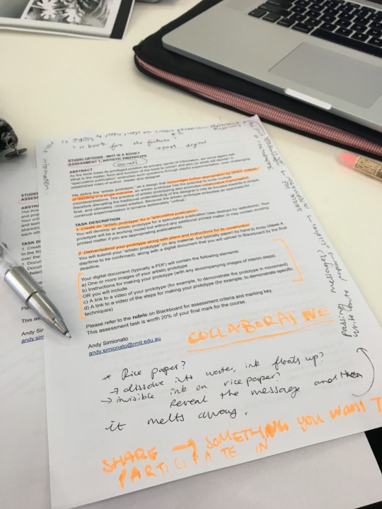
For the first part of this task I initially wanted to create a book out of paper that would dissolve under certain conditions, or create a publication that reflected my sentiments that I would expand upon in this final segment. However as I continued my research on the “post digital,” I began to think about my own future as both a designer and individual. The design industry is simultaneously competitive and collaborative. I thought a lot about what kinds of clients I wanted to attract, sectors I wanted to work in and what set me apart as my own designer. There are enough/too many Frankie magazine designers already, regurgitating the same grid patterns and shallow works, printing the same idea month after month.
This is A Magazine, Compendium #3 “Chaos Happens.”
Shown work by: Flutro-Creative Services Unit
It was from here that I realised that I personally couldn’t make another perfect bound print publication as my own interests didn’t align with this. To expand my practice I decided I needed to buckle down and do something I had little experience in. This is how I landed on coding. Whilst a daunting task I really do believe to evolve and stay ahead of the AI-designer-DoomBots who will inevitably replace us, it’s imperative we learn thy enemy. To bring something other than roast, peas and mash to the dinner table.
In the same way we swapped traditional waterfall methods in our ideation/prototyping phase I wanted to SPRINT my own portfolio and make use of the opportunity to work on a concept driven design as opposed to a finished work. Whilst AI can mimic human semantics and create pretty websites it is yet to learn to think of it’s OWN ideas and it is this that is perhaps our best asset as flesh and bone.
On the same tangent, I wanted to explore the popularity of computer companionship. With the Mac OSX Sierra update, ‘Siri’ also lives in your desktop. Amazon released ‘Alexa’ and Google retaliated with ‘Google Home.’ All bots designed to assist your livelihood by taking over rudimentary tasks such as adding items to cart, checking the weather or playing music. The real appeal in these bots is not their ability to tell you what time it is in Denmark but their capability for relatively smooth, realistic conversation. How is it in a world more connected than ever, we feel isolated enough to require a live at home robot companion?
youtube
Like a housewife from the 50′s, only Alexa can’t stick her head in the oven!
It was from here that I began looking into the feeling of loneliness in the post digital scape. Looking through my phone I found screenshots I had taken from a twitch stream of two google home bots set up such that they could converse with each other (side note: the rise of streaming culture/ Instagram live is an interesting foray into how we consume media and how rapidly it’s changing!! Saving it for another post!!) .


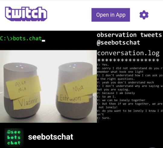
V: “what date”
E: “the date you’re going to take me on.”
V: “I don’t know we’ll have to see”
Too real google, too real :----(
“If you don’t want to talk about Harry Potter I’m leaving”
Which reminded me of my own experiences chatting with bots. Cleverbot was super popular while I was in primary school as were portable offline versions of this with devices like 20Q. Our romanticism of talking to an algorithm is evidently nothing new. As AI ultimately reflects our own speech, is wanting to imbue human qualities in a string of data the ultimate form of narcissism? Or is it our collective cry for help, to save us from our own loneliness.
This theory culminated when I read through/devoured The Age of Earthquakes: A Guide to the Extreme Present by Shumon Basar and co. (thx for lettin’ me borrow it Andy).
Growing up with video games it wasn’t until recently I’d noticed how isolated games that weren’t MMO or server based made me feel. Disconnected almost.
Even open world games like the Witcher never truly asked:

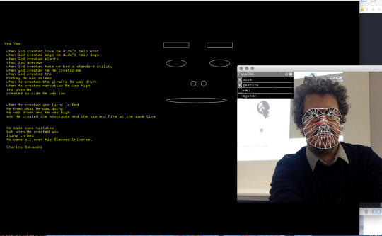
Thus they never responded to my most current emotional needs. It was from there that I decided I wanted to create my own solution to this. I started with idea of collecting meta-data to fill in variables in a block of text. After strenuous research I realised with the time available and my lack of prior experience the code required to string this together was far too complex. From there I dug into machine learning some more, finally discovering Amazon Web Services (AWS).
AWS is a corporate orientated tech service which provides servers and API’s to aid in a vast range of analytic type applications. It was pay-per-use however as I was not sending it 10,000 hits at once it was a couple of cents per request.
Unfortunately the AWS Rekognition software (which is infinitely cool, able to recognise objects, faces, expressions, age, gender and gestures with a certain amount of certainty) was region locked to North America and very buggy through my VPN :--(
I did get it to work a few times. Ultimately this was weeks of learning python and wrangling with Terminal down the drain.
Deflated I wasted a few too many nights out/at bars trying not to think about my impending failure for this assignment. It was from there that I found Microsoft Azure, a similar service to AWS it provided the same recognition and the added promise of analysing “emotion.” Again I put in my credit card details only to find that the API was locked to North American servers and also too complex to incorporate for my own uses.
In my growing list of abandoned ideas, I’d hoped to incorporate the raspberry pi into my project mostly because I really wanted to play with it. I loved the appeal of it’s blank canvas nature and the anarchy within creating your own systems as opposed to simply absorbing what is fed to you.
At this point I’m losing a lot of sleep over /getting it done./ I’d watched hour upon hour of Java and then Python tutorial hoping to build this damn application. I then came upon openFrameworks (OF). Similar to Processing, OF is an arts-engineering toolkit, like well fertilised soil is to plants oF makes the coding process easier. However it is still just a nursing ground and to plant and grow your project you still need a firm grasp on the basics and semantics of C++.
It was at this point I discovered http://www.facetracker.net, an Open CV2 library for ~ tracking dat face ~ Developed by Jason Saragih, it was wrapped for openFrameworks by Kyle McDonald. Most of the resources used in this project ended up being Frankenstein-ed together as I found most online tutorials were either lacking or 7 years old. Equipped with a source code I was still inept at writing a code to utilise this library. This project was like trying to solve a puzzle where all the pieces are made of bubbles and the instructions are in Russian. Luckily for me I love puzzles. I went on self loathing wiki-hole after wiki-hole trying to find help. I had all the parts I just didn’t know how to make them work together.


* note time stamps *
Luckily openFrameworks came with a small library of tutorials which sent me in a better direction. It was 4 am and I was getting delusional when I finally stumbled upon a template Dan Wilcox had developed around FaceTracker for students at Carnegie Mellon Universities School of Art Faculty ( In Pittsburgh USA). This became the skeleton which I broke and rebuilt and furthered to build my own monster.

I changed the colours on my compiler (Xcode) so I felt more like hackerman B--)
From there I did far more math than to my liking to integrate my facial structure into the algorithms:
If I had been more apt at coding I would have liked to have actual face recognition as opposed to tracking. Baby steps, perhaps for my next project.
I started with the idea of the book changing large volumes of text depending on expressions, however it was too difficult to maintain one expression for any extraneous period of time. Coming back to my initial research ( with content driven on current emotional needs) I decided to use poetry.
For each relevant emotion I assigned a poem/snippet which I both cherish and relate to a feeling.

The emotions and poems I ended up with are as follows:
Happy:
-> smiling
Yes Yes, Charles Bukowski
Angry:
-> brows furrowed and eyes squinted
Snippet of The Divine Comedy - Inferno, Dante Alighieri
Shocked:
-> mouth open
Alone with Everybody, Charles Bukowski
Tired:
-> close to the screen
Rhapsody on a Windy Night, TS Eliot
Confused:
-> Far from screen
Jabberwocky, CS Lewis
As emotions are never singular, neither are the outputs. If you show signs of multiple emotions they will clash and play at the same time. The fluidity of the text on screen mirrors the unanchored nature of thoughts and feelings.
I also initially did not have the little face on screen, however found it more charming/uncomfortable to see a visual reminder of your constant surveillance.
Whilst un-menacing it is slightly disgruntling to know you are being watched.
Some test screens (as in the opening GIF):


Now armed with a deliverable software, my next hurdle was submission. I wanted to incorporate a physical art element that grounds the project as something tangible whilst maintaining the romanticism in the playful app, i.e I didn’t want to have it simply downloaded from a boring dropbox or CD as the prototype relies on “ inspiring a hope for a future outcome. ”
To physical represent both my Frankenstein-ed code (which has been passed down forward and tweaked by four generations of people to get to this!! In the spirit of open source I will also upload my version to GitHub) I deconstructed an old hard drive and replaced its casing with old mobile phones. Another technology rapidly evolving and leaving behind carcasses. Building new through old, forging future with the bones of the past. It also includes a charger noose to remind viewers of the potential perils of living entirely online. This is countered by cute stickers and a smiley face to also remind viewers that things moving forwards doesn’t have to be scary.


In conclusion this Studio was like an incredible buffet in which I took way too much food but enjoyed all of it none the less. The book club meetings were incredibly rewarding and a pleasant change of pace from other classes. I’ve learnt so so much from class discussions and just being surrounded by super super suppppperrrr work. These are all concepts/skills/thought processes I’ll carry forward into future works both in academia and beyond. Honestly though my favourite part has just been absorbing other peoples works. Through and through my favourite class ( and the only class I’d come to uni at 9 am for.)
💖🌸💕💗
Thank u everybody for an incredible semester!
2 notes
·
View notes
Text
Analysis
The main challenge for this project was learning the program, TV Paint, alongside creating my final piece. While I had explored the program’s offered free student version, there are limitations to the student version (such as being unable to export), and there are even features that I relied upon in my studies and testing that were not in the final version – which did mean that some corners had to be cut for the sake of production time and focusing more on animation.
Speaking of, I tried to focus more on how an animation would move and look, as opposed to worrying about environments or fussing over minor details, especially for the first pass, I more just wanted to see what my gut reactions to animating and give a brief idea of how the animations would look, without being too precious about anything I put down on paper. While, as always, there were areas that needed various improvements and redo’s the efficiency and understanding of movement I had, even on these initial sketches, surprised me, and made the entire animating process far easier than I had anticipated – with colouring and lining a scenes (with a complete background), taking an average of two days per scene, something I was worried would be unachievable.
One such thing that had to be reworked, was shading and lighting in scenes, due to the fact that the layers I had relied upon in my tests were unavailable to me in the paid version; while my plan was to originally simply add the shadows and lights manually, and edit them through After Effects, this proved largely to be ineffective and became somewhat of a waste of time and resources, even after simply focusing on smaller pieces of more vital lighting – so, after taking advice from a fellow student, I simply used a transparent gradient layer over the whole animation in After Effects, making use of the layer effects in there – which actually created a really interesting and effective affect for shading and lighting; especially after adding some textured layers after some feedback.
While I did learn a lot and gain quite a bit of confidence working on the animation, as well as reminding myself to not be so perfectionist over a single pixel, I do wish that during the pre-production phase, I had decided on a more stylistic art style for my final piece – while the style I chose was easy enough to replicate, I don’t fully believe it added much to the animation, and that a style that was more ‘fun’ would have not only helped my art direction, but made me feel more confident in the project; which is something I will keep in mind for future projects.
Sound design actually proved to be quite a challenge, using ambient sounds from online (with licensed use) was incredibly effective for bring some more life to my animation, however, making my own sounds for those I couldn’t find proved to be the most difficult – certain sounds were indescribably fun to explore and problem solve; such as the noise of the monkey sliding down a pane of glass, which was actually made my me pressing my hand onto a wooden windowsill and slowly dragging it along; and proved to be incredibly effective. However other sounds and vocal responses were incredibly difficult, particularly the screaming from the same scene as mentioned before, which had to be redone multiple times, and still wasn’t quite able to get the intended effect, as well as trying to calculate what sounds would come from what scenario – while I did test the idea of having soft music running throughout, the music ended up taking focus away from the animation.
I also struggled somewhat with the intermission frames, which, while easy to make, also proved difficult to conjure up suitable imagery for them that both created enough of a lull to show that the scenes were essentially separate and that time had passed, while also not confusing or losing an audience. While my original attempt with this was to use gobo lighting and an unsettling atmosphere to juxtapose the comedy and add to it, the effect was unfortunately the opposite and the frames felt out of place, after some trial runs and some back and forth, it was eventually decided to settle instead on the place where the narrative begins and ends, the bed, with a digital alarm clock and the gobo light moving across the bed to visually show the passage of time.
An interesting note that gathered more attention as my animation progressed was the fact that the character I had designed to be gender neutral and a sort of vague ‘could be anyone’ character ended up being described as more male than originally intended (based on feedback, this was largely due to the oversized hoodie I deliberately placed to hide the body, and the fact that the character had a stronger jawline), which I personally simply found interesting, and highlights something that I need to work on in my future character designs.
Overall, while not massively thrilled with my final project, I am excited to see what the future holds, and use what I’ve learnt while making my final film in future jobs, as the experience has been invaluable and has definitely helped me to practice and refine my skills, as well as helping me to see which areas I enjoy and want to focus on going forward, while also perfecting a good work and home life balance.
0 notes
Text
Reflective Analysis
The research and professional practice module has given me greater insight into the industry and has made me aware of the multitude of paths and steps that I need to take to advance further into the future. I’m still largely unsure of which direction I wish to take within the industry however, I found during my research I was more drawn to the preproduction and 2D side of the industry and while I do not want to rule out my options, I do want to look more closely at this side and create some experiments to add to both my show and portfolio. My main objectives are to practice and experiment more so that I can push my designs and improve upon my current software knowledge so that I can both add more content to my show reel/portfolio and push my work out of its comfort zone. Throughout this essay I will reflect upon my research and the design choices I took to creating my personal promotion. I also hope to resolve some of my uncertainty by talking through my thought patterns regarding certain aspects of the industry.
At the beginning of the module we were presented with questions that acted as starting off points for our research ‘Where do you want to live?’ For me it was a simple answer of wanting to remain within the North of the country preferably the North East which in turn led to the question of employment or self-employment due to the limited number of studios based in the North East compared to that of London. Freelancing would give me a bit more freedom as I could set my own work hours and could get more work done without having to commute or travel into the studio. It would also be a great chance to push myself out of my comfort zone and help me to grow as an artist however, freelance might not be a good fit for me as an individual I would be constantly worried about income and where the next project would come from and that uncertainty may have a negative impact on my work. I would like to take an open approach when looking for employment opportunities rather than limit my options from the outset
After hearing the guest speakers talking about their work, it became clear to me that I'd like to work either in Advertisement or Television as I'd prefer to work on multiple projects through the year rather than solely focus on one project for long amounts of times. By having the flexibility to work on different projects it would give me slightly more creative freedom. The downside to this is that I would be more limited in advertisement as I would have to meet the needs of the client and what was more fitting to their brief thus ultimately limiting how far I could go within the design aspect. Acknowledging this I feel like my work and I would fit it with larger group work, where I could help contribute to the design pre-production stage of the product and to smaller group work where I could contribute to every stage of the design process.
When creating my personal brand, I went through a lot of initial concepts. During my mid-term presentation the general feedback appeared to favour the more natural based logos so when revising my logo, I kept this idea in mind. During second design phase I aimed to make 6 natural based designs and I found that the most successful of the 6 was my leaf logo design. The leaf logo was an idea I toyed with during my first round of designs but was overall too simple and didn’t stand out compared to the other logos. I decided that I would redesign the image which led to a more successful overall look. My finalised logo presents 3 different ideas bought together to create a logo that I feel represents me as an individual. The first 2 ideas were relatively straight forward with my Initials being close to that of a leaf and my first name originating from that of the laurel plant. The third idea behind my logo shows that as within nature, there is the always the ability to develop and grow. The choice of colour is partially related to my design process as I tend to use the red colour to outline my designs in development stage and has generally become a colour that I feel is representative of me and my work. Keeping with the natural theme I added simple vines to further promote the idea of growth and to create a uniform appearance within my personal branding, the vines are prominent on both my business cards and my CV.
Creating a show reel was slightly difficult for me as having not selected a specific area of animation to focus on led me to start creating a generalised reel of my work over the last few modules. However, during the editing process of my show reel I came to realise that I had a few character design boards in my reel which led me to look back over my past projects from the last two years and found that I had a significant amount of design boards and art work to create a reel solely focused on my character design and illustration. I felt that this was far more representative of me than a generalised reel and showcases my interest in the preproduction stage of the animation process. The process of developing a show reel has made me aware that I need to undertake more personal projects so that I can keep adding to and improving my reel so that I have better more developed pieces and ideas. While my show reel is based around character design in the future, I would like to experiment with different aspects of animation particularly 2D animation so that I can fully explore areas I may have otherwise overlooked by solely focusing on one subject. It would also improve my employability especially with smaller companies who may need someone who is able to undertake multiple jobs roles through production rather than one small aspect.
When I started to establish a web presence, I was conscious of the fact that website domains have fees associated with them and those that do not often have the website builders watermark present. I also feel that since I’m still unsure of the direction I want to take, it would be better putting off my website creation so that in the future I can produce a more focused website rather than having an eclectic mix of projects. Instead of creating a website, I opted for an art station account. This way I will still have a way to present my portfolio on a digital platform. Art station also provides another way of establishing contacts within the industry and employment opportunities through. Finally, I created an Instagram page for my work as a more informal form of my portfolio that allows me to put more rough sketches and planning while still being more professional than my personal art account. In the future I may branch out to other social media platforms such as a Twitter account so that I can expand my web presence.
In reflection this module has helped me to gain a greater understanding of employment within the animation industry whether it is via creative CVs or by going freelance and has given me a lot to consider going on into third year and beyond. Through the process of creating the show reel I was able gain a greater idea of where my work was currently at and my lack of personal projects that I hope to rectify in the future so that I have a wide variety of content to choose from when revamping my show reel. The show reel also helped my realise that my work is leaning more towards character design and I would like to research further into character design so that I can gain a better understanding of it and where I could go within this area of the industry. I have also been made aware of the potential health risks to myself and should take preventative actions in the future so that I do not develop conditions such as wrist injuries or eye strain and remember to take breaks away from my desk so that I'm not constantly sitting down. Overall, I’m relatively happy coming out of the module as I have personal branding that I feel represents me well and visually reads well that I will be able to apply to potential websites and social media accounts in the future so that I can fully establish a consistent uniform brand across all platforms and eventually apply it to my future website. My show reel is also up to a standard that I am relatively happy with and hope to further improve as the years go on.
0 notes
Text
Font Design 101: The Process of Creating a Type
Rules. Embrace rules, as they can define a new font-making project, give it guiderails and keep the new type on a specific trajectory. Even in such a creative process of designing new type, the technical nature of crafting a font requires a mixture of art and plenty of well-guided science, all while building new and solving problems.
Hitting the Books Is the First Step
Before a font designer can tackle a new design, they must first settle on that problem to solve. Fonts generally get created in one of two avenues, either speculative based on the whim of a designer or to fit a specific client need.
No matter the genesis, research kicks off every project. “You need to have a sense of what things have been tried and what you can learn from,” says Ben Kiel, co-founder of XYZ Type.
“The research can also include usage,” says Kiel. “If it is client-focused it can be easier because the answers are there. You are setting up a set of metrics or guideposts for the design.”
Having usage and a client define the guideposts give a narrower design road to travel, often making decisions easier.
“It is a text typeface or display, will it be used large or small, does it need to look good here or there?” Kiel asks. “There are a bunch of things a type needs to do.”
Function First and Setting the Rules
Miguel Reyes, former graphic designer turned font designer for Commercial Type and now based outside of Mexico City, says he still thinks like a graphic designer and tries to find what holes the font needs to fill. “It is not just about the aesthetics,” he says, “it is more about functionality.”
All along the design process, says Jesse Ragan, co-founder of XYZ Type, questions will pop up and having a clear brief of the goal of the font creates limiting factors and helps frame those questions to more easily find the answers.
A Sketching Start
With the rules set — some designers make them stricter than others — the sketching can start. Reyes says he almost exclusively works digitally to save time in not remaking hand drawn sketches.
With a few different approaches to the same question, designers create an initial form and then really start pushing the boundaries to see what the most extreme version of the type could be. “You want to explore and go too far to know where the limit is,” Kiel says. “If you don’t go too far in the initial phase, you don’t know what could have been. You need to have a visual reference of what is too much.”
The drawing of letter forms starts small. Ragan says he chooses common characters, such as the lowercase “a” or “g” or a capital “R,” all containing plenty of personality. “I mix in complex and potentially strongly voiced characters along with more straightforward, rudimentary shapes, such as a capital “H” and “O” to help build a strong foundation,” he says, “and give a basic rhythm so I can build more expressive characters around them.”
Reyes starts with a similar concept, choosing a handful of characters to get started. But he quickly moves into entire words to see the connection. “I feel there are words that will give you the whole DNA of a typeface,” he says. “I try to use real words related to the brief.”
Limited Character Sets
“You have to work with a limited character set at first to work quickly,” Kiel says. “If you try to do a set of upper and lower you get bogged down in production. You are picking a set of characters that you can make some proof documents, even to get a couple of words to get texture and rhythm. You are exploring with a limited set before you expand to a full set.”
Ragan says momentum really takes over once he starts designing, so answering the bulk of questions early helps later. “If you resolve the questions when you only have 15 characters, you save yourself a lot of trouble when you have eight different weights and three Romans and you change your mind you have to go back and change the drawing for 200 characters,” he says. “That said, I always end up doing that, but I want as much of that minimized and contained.”
Also interested in exploring the extremes, Reyes will bounce around his design in differing weights to see the range of his design and determine early on how the characters are going to work together.
Limited character sets early also allows for the flexibility to fail. “If it looks good in thin, but not in black, you’d rather find that out sooner than later,” Kiel says. Plus, you may find that one weight influences another and the idea of how to handle italic may improve the Roman.
With or Without a Client
This process, while the most creative and most defining of the font creation also offers the most open-ended in terms of timing. Having a clear client relationship can help keep that timing focused. “Some people really like having clients and some people work better without,” Kiel says. “I think I work better with a client because I get lost in the decision process. I will keep doodling and not make a decision. Having a hard deadline is always helpful.”
In the Thick of It
Key decision points in any font project comes in how heady are strokes, the contrast between the thickest and thinnest part, how round the rounds are and how square the squares. Then more specifics get into shape, structure and spacing. All along the way, designers work to create a texture and tone to the font, defined largely by guide rules set early. How wide, how narrow, how heavy, how contrasted, how tall, how do the proportions work?
“You are making those larger decisions early on,” Kiel says. Then comes nailing serifs, small details and the minutia. Whether the shape of ball terminals, if the font even has them, and the relationship between differing parts of the family. Does the way the top of the “3” terminate match a lowercase letterform? What about the leg of the capital “R” versus the leg of the lowercase “k”? How do those relate? “Figuring out what that system is tends not to be modular,” Ragan says. “How do I make things fit together in a way that makes sense and still has variety? That is where decisions are being made in sense to the needs of each individual character.”
All those decisions must serve the ultimate goal. If a branding type, does it express something about the brand? If it is display, does it mimic someone’s lettering style? If a text type, does it come together to make it easy to ready but not so boring that someone falls asleep? “The nice thing about having a client is they will generally have strong reactions to the details,” Ragan says. “It is nice to have another voice. You get a little deep in your head sometimes.”
Production Pointers
Typeface design front-loads the creative process, but that may only end up being a small percentage of the time dedicated to making the font. The major portion is figuring out production. But, as Kiel says, if you don’t have the design thinking momentum to carry you through production, you can end up with subpar work.
Reyes puts it bluntly: “Once the creative process is done, once you are sketching and get the idea, which is the fun part, when you nail it, it becomes a bit boring,” he says. “The rest of the project is a bit more mechanical. Now you need to feel things. For me it is not super fun, but it needs to be done.”
Ragan admits that sometimes he starts second-guessing himself late in the production process, partially because “my brain starts trying to problem-solve and wants the fun part of figuring out the design” instead of the monotony of building hundreds of character forms.
With as much as 350 to 400 characters per basic typeface — the XYZ Corado has 1,200 characters and their brand-new type, Study, comes in 12 different styles — the production process takes that kit of parts, that tone earlier derived and applies it across weights and widths.
The Same Eye
Then comes the kerning and mastering. Reyes says that even though the building and polishing isn’t the most exciting aspect, he thinks it imperative for the consistency the same person sticks with a project from creation to mastering.
Ragan likened it to large architectural firms who have someone come up with the big idea and then others who have to go in and figure how to practically make it happen. He agreed that for something as complex as a typeface, it is easier for one person to handle every step so they understand how all the parts interact.
“For me it is super important that the same designer do most of the work,” Reyes says. “They can balance the whole process. What I learned drawing and spacing is part of the design, not a separate thing. Even though is it not fun, I need to do it by myself to make the project much better.”
The Most Intense Parts
That kerning step offers up one of the most time-consuming aspects of the process. Often manually kerned — a little-known fact, Ragan says — the designer figures out every plausible combination of glyphs. “From the question mark to the em dash or the number sign to a letter and a number,” Ragan says, “I haven’t stopped to count how many kerning pairs need to be reviewed.”
This, Reyes says, comes as the most critical aspect. “There are parts that are great on the shapes and if the spacing is badly done,” he says, “it falls apart.”
Final Stages
With the questions answered, drawings done, characters created and kerning devised comes the final step. Fonts must live digitally and work within a wide range of software, so the mastering process takes all that creative and design data and gets it into a final form where it works with Microsoft Word and other programs without technical errors. “There is a long list of technical requirements to make something work well across operating system and software packages,” Kiel says. “The mastering process is going through and checking all that so you end up with something that works for the end user.”
After thousands of hours put into a design, it all boils down to small bits of data in the end. But to get to that data requires an exceptional amount of detailed creativity, all falling within a set of type-design rules.
Follow Tim Newcomb on Twitter at @tdnewcomb.
Join us at HOW Design Live for more creative inspiration and relevant professional tutorials. And check out all of our Font coverage if the subject is something you just can’t get enough of!
The post Font Design 101: The Process of Creating a Type appeared first on HOW Design.
Font Design 101: The Process of Creating a Type syndicated post
0 notes
Link
Welcome to Noticed, The Goods’ design trend column. You know that thing you’ve been seeing all over the place? Allow us to explain it.
What it is: Loose, very feminine script that looks like it was done with a brush. This kind of font or calligraphy has a ton of bounce, meaning the letters don’t all sit on the same baseline; they rise and fall, often rotated at different angles, giving the full word or phrase a fun, whimsical look. There are a number of different typefaces that fit into this stylistic bucket, but let’s call them, collectively, “bridesmaid fonts.”
Where it is: All over Pinterest, Etsy, craft stores, and in chains like Charming Charlie. It’s printed on greeting cards, home goods, and wine glasses (“I need wine right meow”). It’s particularly big in the bridal market, on invitations as well as gifts for bridal parties like custom robes, bags, decals, and makeup cases. If you go to Etsy’s landing page for bridesmaid gifts, it’s an absolute sea of bridesmaid fonts. (This style is also popular with the hip Christian clothing company Altar’d State, which puts it on the front covers of journals and the bible.)
Why you’re seeing it everywhere: This style of script has found mass distribution thanks in no small part to corporate America (Charming Charlie, for instance, has more than 260 stores around the country). But while bridesmaid fonts adorn many consumer products — and dovetail with the boho-chic look marketed by mega-brands like Free People and Anthropologie — they’re appealing because they look intimate and human.
“When you see it, it immediately feels a lot more organic and warm than some austere, über-professional geometric sans,” says James Edmonson, a San Francisco-based type designer. “I think that’s why people want it for their weddings and for things that are very personal.”
Thus, invitations and custom bridal party gifts. And in the world of weddings, where design and decoration choices are often framed in terms of their adherence to or deviation from tradition, script signals the formality of a big life event while added bounce telegraphs individuality. Calligraphy that stays planted on its rails, uniformly slanted, would look much more conventional.
I showed a bag that says “Bride Squad” in looping script to Elaine Charal, a handwriting analyst in Toronto, to see what she made of its trampolining letters.
“It does suggest a bit of spice to the personality,” Charal says. “If it’s too rhythmic, too school form, you’re looking at a more traditional type of personality. One reason this font is so attractive is that it combines so well all the traditional qualities with spice and sass.”
There isn’t one bridesmaid font — it’s more about a set of unifying characteristics that present a modern riff on a very old practice.
From the mid-19th century through the 1930s, Spencerian script was the dominant form of cursive taught in American classrooms; it was elegant and filled with flourishes, as in Coca Cola’s logo. Spencerian script was overtaken by the simplified Palmer method of the 1920s, which was in turn gave way to the Zaner-Bloser method and the D’Nealian method. Today, many students don’t learn cursive at all.
In the mid-century, type designers really started messing with the conventions of script, Edmonson says, pushing them upright, rather than keeping them at a slant. During the 1960s, designers added a lot of bounce to their scripts, and the ’80s and ’90s brought on a wave of expressive, experimental calligraphy, as in the spiky lettering on the cover of Prince’s 1984 album Purple Rain.
The home goods company Rosanna Inc sells plates and trays with phrases like “It was always you” and “You da mom!” written on them in looping script. Rosanna Bowles, the company’s president and art director, says that women often buy these as gifts for one another. The handwritten messages on them are meant to read as notes of love, support, and congratulations — an emotional, woman-to-woman experience for which a “noodly, feminine script” is the best match.
A dish by the brand Rosanna Inc. Courtesy of Rosanna Inc.
Bowles has been using handwriting in her designs since she founded her eponymous brand in 1982, but she says that she’s seen more of this style since the recession in 2008. During that period of uncertainty and fear, she noticed people getting back to cooking at home and making things by hand.
On top of that, the 24/7 digital-everything nature of our world — where we communicate in the same sans serif type as everyone else on text, email, and social media — may have us hankering for typefaces that feel human, almost messily so. Goop, home of all things wellness, used scrawling, partially connected lettering for the cover line of its third magazine issue — a rougher, less expected cousin of the bridesmaid font.
At some point, perhaps, bouncy, ultra-feminine scripts will become so ubiquitous that they’ll cease to represent the personal affection and individualism that they do now. But that time has not come.
“Honestly, it has so much more longevity than I would have expected when we started seeing it a couple of years ago,” says Edmonson. “I keep thinking we’re seeing it phase out, but if you do searches on font distributors like MyFonts and Creative Market, you see new typefaces are being added in this genre all the time.”
Want more stories from The Goods by Vox? Sign up for our newsletter here.
Original Source -> Why bouncy, hyper-feminine script is the font of choice for bridesmaid gifts and novelty wine glasses
via The Conservative Brief
0 notes
Text
‘You really have to take things one at a time’
Santa Fe mayoral candidate Joseph Maestas, a city councilor and former mayor of Española, talks to people at one of his campaign events at Java Joe’s coffee shop. (Eddie Moore/Albuquerque Journal)
SANTA FE, N.M. — “I’ve always gravitated to public service,” said Joseph Maestas, who has spent more than 30 years working for the government and has served nearly 14 years in elected positions.
He’d like to extend that streak as the next mayor of Santa Fe.
“Now that we’ve gone from a stronger mayor form of government, I think it’s critical that someone gets the keys to City Hall and hits the ground running – someone with proven leadership,” said the former city councilor and mayor of Española, who was elected to the Santa Fe City Council in 2014.
When it comes to public service, he says he feels like he’s standing on the shoulders of his ancestors. His maternal great-grandfather, Jose Amado Lucero, was one of the signers of the state constitution when New Mexico joined the union in 1912 and one of the founders of Española.
A brief biographical sketch of Lucero in the archives of the Office of the State Historian indicates that he was a businessman in Mora County, Santa Fe, Santa Cruz and Española. He served as schools superintendent in Rio Arriba County and as a Santa Fe County commissioner and probate judge prior to becoming a member of the state House of Representatives.
“And his son, Alfredo Lucero, was a Santa Fe County commissioner and clerk,” he added. “I came from a family with deep roots in the area.”
Maestas’ father was a standout athlete and his mom a cheerleader at Santa Cruz High, where his dad later worked as a science teacher. The family also operated a liquor store and had a 2½-acre farm where they raised animals for slaughter.
“So I was exposed to a business environment, even though it was family owned, since a young age,” he said.
Santa Cruz High closed after Maestas’ freshman year, so he finished up at what became Española Valley High School in 1978, playing football, and running cross-country and track.
City Councilor Joseph Maestas, who’s running for mayor in the March 6 municipal election, speaks to supporters of ranked-choice voting before a council meeting in December. Maestas was among the councilors who were against appealing a judge’s order mandating RCV to the state Supreme Court, a move approved by a slim council majority. (Eddie Moore/Albuquerque Journal)
Maestas said he “had” to leave the state after he graduated the University of New Mexico with an engineering degree. The country was in recession, the private sector wasn’t hiring and the better jobs were with the government, he said. A 27-month internship with the U.S. Department of Transportation’s Federal Highway Administration got his foot in the door. He earned a master’s degree in civil engineering from Arizona State University while still working his day job. He worked in five states and Washington, D.C., before a Highway Administration job opened up in Santa Fe in 1996.
It was a difficult time in his life. He and his then-wife, who was originally from El Paso, had just lost a child during childbirth.
“We were devastated. We wanted to go back home,” he said.
The couple had a second child, Joey, who is now a senior at Texas State University majoring in communications.
Maestas has lived through tragedy. Years later, his father died during his campaign for mayor of Española.
“That was hard. He never did get to see me sworn in as mayor,” he said.
Maestas is going through another tough time. Last month, he took a break from his campaign to visit his sister, currently a cancer patient in Austin.
“Right now, her prognosis is not good. She has probably a matter of weeks, if not a few months,” said Maestas, who made the trip with one of this three other sisters. “We drove over because we felt the window was closing in terms of saying our goodbyes.”
Maestas has talked about his sister, Carla, at some of the mayoral forums, usually when the topic turns to opioids and drug addiction.
“Carla had a history of drug abuse,” said Maestas, the lead sponsor of a resolution to pursue legal claims against opioid manufacturers and distributors that was passed by the council in December. “It takes a heavy toll on the family, and we went through all phases of dealing with a family member that’s addicted to drugs – the detox, family counseling, out-patient care. It’s not easy.”
His sister’s cancer was discovered during a physical exam she was required to take before entering a drug rehabilitation facility.
“My heart breaks for my mother because you’re not supposed to bury your children and she potentially could lose two children within a year’s time,” he said.
That’s because his brother Ben died last summer. Like their father, Ben had issues with alcoholism and he may have dabbled with drugs.
Ben died weeks after Maestas’ divorce from his second wife, U.S. District Judge Martha Vázquez, became final.
“I’ve learned that you really have to take things one at a time. When you lump it all together, the burden is much too heavy,” he said.
Maestas took a hiatus from government work during part of his term as mayor of Española from 2006 to 2010, where he was elected as a reformer. And in 2008, he ran for a Public Regulation Commission seat. But Jerome Block Jr. – whose PRC term was cut short by a scandal that included drug use and criminal charges for misuse of a state credit card and public campaign financing – won the seat.
Maestas took a job with the U.S. Census Bureau, then one as a division manager with the Bureau of Reclamation in Albuquerque. The commute from Española to the Duke City was too much, he said, so he didn’t run for re-election as mayor and moved to Santa Fe.
Maestas is building a home here that’s designed to accommodate his 88-year-old mother.
“She’s my best friend,” he said. “My goal is get my mom to live here. All her medical providers are here.”
Exercise has helped him cope with what life has thrown at him, too. The 57-year-old Maestas is a triathlete who usually makes the podium in his age group. Campaigning has cut into his training time. But he still manages to get in a workout nearly every day, be it a three-mile run, a 1,000-meter swim or a 30-mile bike ride.
The routine doesn’t just help him physically, it helps his him mentally. “When I exercise, I’m able to really think through things,” he said. “I can not only sort through whatever I’m dealing with, but I have better clarity navigating through it.”
Now he’s hoping his training, and experience as a public servant, will help him win the five-way race for mayor.
AGE: 57
EDUCATION: Bachelor of Science Degree in Civil Engineering, University of New Mexico; Master of Science Degree in Civil Engineering, Arizona State University.
OCCUPATION: Business Development Manager, Souder, Miller & Associates; and Santa Fe City Councilor for District 2.
1. Why are you running for mayor? What distinguishes you from your opponents?
As mayor, I want to help businesses and families thrive with a shared vision of a united Santa Fe and city government that facilitates the creation of jobs and affordable housing. A lifelong public servant with 33 years of federal civil service and 14 years as a municipal elected official; my engineering skills; and proven leadership distinguish me from my opponents.
2. What is the biggest issue facing city government and how would you address it?
The biggest issue is changing the culture at city hall to one of a 21st-century government and reforming its financial management. I would address it by:
A. Conducting a forensic financial audit;
B. Modernizing processes and policies;
C. Implementing an employee performance management system;
D. Developing a balanced 2019 budget; and
E. Updating economic development and land use plans.
3. How would you encourage more affordable housing in Santa Fe? Do you support development of more rental apartments in town?
I would encourage more affordable housing by issuing bonds as a permanent funding source; developing a sustainable city support (land donations, etc.) plan for tax credits; incentivizing higher density developments; funding programs in the capital improvement plan; and addressing Tierra Contenta’s infrastructure needs. With almost 100% apartment occupancy and approximately 2,000-4,000 additional units needed, I support more context-sensitive apartment developments. 4. What uses would you support for the city-owned campus of the Santa Fe University of Art and Design, which the school is vacating?
I support building on existing assets (e.g., Fogelson Library, Garson Theater, The Screen, etc.) and creating a model for sustainability in affordable housing, green building design, renewable energy, research and development, and higher education. I also support its use as a post-production facility and film school to support an expanding film and digital media industry while leveraging its broadband system.
5. Do you support the city’s living wage ordinance – which currently sets the minimum wage at $11.09 per hour – and its mandatory annual cost of living increases?
Yes. As Santa Fe city councilor, I sponsored Resolution 2014-103 to strengthen the enforcement of the Living Wage Ordinance. This led to the enactment of Ordinance 2014-38 that requires businesses to self-certify their compliance prior to receiving a business license, and improves notification when the consumer price index is released and determines changes to the living wage.
6. Did you vote in the May “soda tax” election? If so, did you vote for or against it? Please explain your vote or your opinion of the failed tax proposal.
I voted against the soda tax in the May election. I support more pre-K funding, but did not support a wasteful, $80,000 special election. The unwillingness of soda tax advocates to work with the beverage industry and their efforts to make it a moral imperative doomed the effort. It was government over-reach in the absence of public trust.
7. Should the city continue to grant a permit and provide police support for the annual Entrada event held on the Plaza that is opposed by Native Americans and others?
The city should no longer grant a permit for the Entrada event. It’s naïve to re-enact a peaceful, historical event that was preceded and succeeded by violence and oppression. All parties must agree, in advance, on appropriate, historical activities respectful of all perspectives to ensure we continue the longest-running community celebration in America without civil unrest and “free speech” zones.
1. Have you or your business – if you are a business owner – ever been the subject of any state or federal tax liens? No. 2. Have you ever been involved in a personal or business bankruptcy proceeding? No.
3. Have you ever been arrested for, charged with or convicted of drunken driving, any misdemeanor or any felony? No.
SANTA FE MUNICIPAL ELECTIONS
NOW: Absentee voting is already underway.
Request an absentee ballot by stopping by the City Clerk’s Office, 200 Lincoln Ave., or by calling 955-6521, 955-6519 or 955-6326.
FEB.14: Early voting begins
Vote early at City Clerk’s Office, Room 215, 200 Lincoln Ave., Santa Fe, from 8 a.m. to 5 p.m. Monday through Friday, or at Genoveva Chavez Community Center, 3221 Rodeo Road, Santa Fe, from 9 a.m. to 6 p.m., Tuesday through Saturday, except March 2, when polls close at 5 p.m.
MARCH 2: Early and absentee voting ends at 5 p.m.
MARCH 6: Election Day
Polls open at 7 a.m. and close at 7 p.m. See the city’s website, www.santafenm.gov, for polling locations and addresses for voter convenience centers around town.
Source Article
The post ‘You really have to take things one at a time’ appeared first on Find Apartments For Rent In Santa-Fe.
Learn More: http://www.aicarzu.com/you-really-have-to-take-things-one-at-a-time/
0 notes
Text
Exposing the Corrupted U.S. Intelligence Agencies 'Russians Hacked the DNC' and Guccifer 2.0 Hoaxes: EIR's Interview with UK-Based Researcher 'Adam Carter'
EIR: You are very active on the Russia-Gate/Guccifer 2.0 issue. Recently, on Sept 17, you wrote about reaching out to the foreign embassies in London as “Phase 5” of your actions. Could you tell our readers how you’ve been weighing in on the Russia-Gate discussion, and other ways you’ve been acting to shape the debate and avoid a needless nuclear war with Russia?
Adam Carter: As you may know, I've been researching the topic of Guccifer 2.0 since the beginning of the year (after considering various anomalies and deciding to independently investigate). While quite a lot of new information has come about from this (with a lot of help from co-contributors and other analysis from independent researchers/analysts), the mainstream press have been unwilling to report on the discoveries.
Knowing that we're up against systems that have much to lose from the collapse of the erroneous mainstream narrative on Guccifer 2.0's origins (including budgets and contracts worth billions over time, reputations of politicians, reputations of many in the press, reputations of cyber security experts and firms, etc.), I've always known it was going to be an uphill battle that would take a long time.
So, when one of the more recent additions (from an analyst working under the pseudonym Forensicator) caught the eye of several VIPS (Veteran Intelligence Professionals for Sanity) members and we subsequently had Forensicator’s work and some of the research from my site cited by them, I wanted to make sure we made optimal use of the opportunity to increase exposure of the research and evidence.
We were fortunate that Skip Folden reached out to us on behalf of VIPS, and since then, both Forensicator and I have tried to answer any of their questions and let them know of any of our new discoveries, test results, etc.
As you know, an article in The Nation (“A New Report Raises Big Questions About Last Year’s DNC Hack”) caused quite a stir recently too. It did make some conclusions that weren't necessarily stated in the original research it drew upon (likely from inference due to the archive contents and other information relevant to the date but not necessarily declared anywhere as a hack on that date) and it appears that a metaphorical third party statement, I believe, was reported as though it was a literal one.
In addition to researching and reporting on numerous discoveries made, I've always tried to consider strategy with regards to getting the information out. Throughout the past nine months, I’ve consistently considered such issues as dealing with media black-outs, propaganda, the use of logical fallacies to degrade and disrupt the information, and other factors. As part of that, I also planned several phases for my own efforts, with the latter phases being direct contact with politicians and, pending legal advice, possibly with DNC donors whose details were published (though I'm likely to leave that to a legal firm if I find one that wishes to pursue it).
When I saw other writers attack the article in The Nation (and in most cases through a strawman attack on the calculated transfer speeds and conclusions drawn from them) including presenting themselves as debunking the underlying research, I knew I had to make sure that as many of the articles that were unfair or deceptive were challenged and that those seeking to mislead their readers were skewered for every effort to manipulate.
While all that was going on (and as continues to crop up from time to time!), I noticed in a follow-up article that Skip Folden had mentioned sending a more detailed report (“Non-Existent Foundation for Russian Hacking Charge”) to the Office of the Special Counsel and Deputy Attorney General. Seeing his direct action reminded me of the fact that there was still a phase of the efforts I'd previously planned out that remained—phase #5: contact every foreign embassy in London (as I'm from the UK) and advise representatives of as many nations as possible about the likelihood of false attribution of Guccifer 2.0 to Russia and how it was being exploited by politicians and mainstream media to manufacture consent for war.
Knowing that Skip's report may remain unacknowledged and possibly ignored by the recipients, it seemed it would be a good time to draw attention from around the world on the investigations being carried out. I wanted to try to make sure there was increased scrutiny on the recipients of the report and how they are reacting to being provided notification of exculpatory evidence and of problems with the JAR and ICA reports (and so far, it looks like they've failed to acknowledge it).
So I wrote to every embassy that I could in London, to try to bring more attention to the issue, and to try to put some pressure on those that should be investigating thoroughly and in good faith.
EIR: What advice would you offer activists, on this issue, and more generally?
Carter: Failing to succeed is far better than failing to have tried at all.
If direct action is correspondence, try to draw public attention to the fact that recipients have been informed of and then put their inaction and disregard on a pedestal. Politicians and "deep state" institutions will try to ignore things that are inconvenient for them until doing so becomes damaging to their own reputations and sometimes you have to provoke a situation where you can demonstrate that someone is acting shamefully or betraying public trust.
Regarding online/social-media activism. There is an information war on: there are reputation management firms that are paid a lot to degrade information, to cause confusion and conflation, and to dispute claims through the use of logical fallacies. As such, it's good to be aware of their tactics, able to identify them quickly and call them out. I'd recommend the following links for some interesting and helpful information on the topic:
https://yourlogicalfallacyis.com/
http://www.ausairpower.net/PDF-A/Deception-IWC7-06-Slides.pdf
http://www.ausairpower.net/PDF-A/Deception-IWC6-05-Slides.pdf
http://www.mindivogel.com/uploads/1/1/3/9/11394148/how_to_detect_propaganda.pdf
https://theintercept.com/2014/02/24/jtrig-manipulation/
If engaging in direct action, try to always do things in a group, the bigger the better - it helps with confidence and makes it more difficult for activists to be singled out and unfairly treated.
Personal Background
EIR: Tell us about yourself, in terms of your motivations and decisions to put so much effort into this matter. How do you see your role in history?
Carter: I'm a citizen of the UK with interests in technology, digital arts, global politics, science, media and more. I've been in awe at America since I was a kid and over the last 15 years (due to 9/11 and the response from both our governments to it) have become fascinated by US politics (and the foreign policy objectives our nations seem to share in many areas).
For the past 15 years, I've worked in web site and web application development. While this is my primary area of expertise, I have a much broader interest in technology and try to stay up to date with new developments whether in development, 3D design or less creative (but still essential) fields such as information security.
Inherently in what I do, I'm defending clients from hackers, malware, botnets, etc and have written software that scans for malware from any website root it's installed on.
Going further back, in my teens, I disassembled & cracked software and more (back in the 16-bit era), I was no stranger to BBSs and did have a brief phase of being a black-hat. However, that was all a long time ago. I'm now a director of a business with two kids and a mortgage, and the closest I now come to mischief is having the audacity to call out what I strongly feel is—at least as far as it pertains to Guccifer 2.0—a false narrative built upon deceit.
So, essentially, you could say I'm an ex-hacker calling out a fake hacker.
Motivation To Investigate
Around December of 2016, I noticed Guccifer 2.0 was being cited a lot in the media alongside "Russian hacking is an act-of-war!" rhetoric and some specious claims about Putin ordering the hacking and/or directing the use of hacked materials. I noticed it become a highly polarizing issue and it got me thinking back to the many inconsistencies in the alleged hacker's actions and words, the blatant nonsense of the supposed "Clinton Foundation Hack," how weird it was that Guccifer 2.0 was supposedly a skilled hacker, yet, lacking the egotistic flair skilled hackers are renowned for, adopted the name of someone else and stuck "2.0" on the end. I then thought about the headlines Guccifer 2.0 had generated and how so much of the material he released was of little to no impact to the Clinton campaign or the DNC's leadership. It didn't make sense and yet this “hacker” was being used as part of the justification. To me, something just didn't seem right with it.
Towards the end of December, with time off work, my curiosity grew, I started searching, going back to old articles, trying to make more sense of what Guccifer 2.0 was. It was no good—everything was spread out and the facts I had gathered lacked chronological context. So, to get a better understanding of what Guccifer 2.0 was, I decided to construct a timeline with everything I could find in terms of primary and secondary sources relating to Guccifer 2.0, with dates, key revelations and including the links to the source articles and links to archived copies of the pages.
I read all the articles while gathering them (and eliminated tertiary sources that added nothing to the sources they were citing). I then read through everything in sequence again at the end.
Initial Discoveries
It didn't take long before I found an enormous number of anomalies and inconsistencies where there shouldn't be any, as well as some odd correlations where none should exist. It was baffling, but one thing I was sure of was that this was not a genuine hacker nor was it someone who truly intended to hurt the DNC leadership or the Clinton campaign. (ThreatConnect discredited his breach claims, he never mentioned any of the significantly more damaging revelations exposed in the emails released by Wikileaks, and his leaks were mostly junk—and mysteriously, this supposedly skilled hacker could only produce material from the Democratic Party.)
Knowing that hackers are more prone to security lapses at the beginning of an operation and at points of excitement (I was able to predict the moment when Sabu of Lulzsec had been compromised by the FBI on the basis of something I've only ever seen occur with Compromised-Sabu and Guccifer 2.0), I decided to review the first batch of files and activities of Guccifer 2.0's on the day he emerged.
I then spotted Warren Flood's name, not just on one document but on three different documents, and something else—the document creation dates were all June 15 (the same day as this “hacker” emerged) and the three with Flood's name on them had identical creation times. (To be clear, Flood is very likely innocent and his name is likely to be an indicator of which computer was used to produce the initial pre-tainted template document.)
I thought it was odd because those that had reported on it seemed to have made no mention of it. In fact, an article published at Gawker actually misreported the date of the first document’s metadata.
Learning What Guccifer 2.0 Was
I started to see how Guccifer 2.0's behavior did more to undermine and distract from WikiLeaks than anything else and soon realized the significance of what I was looking at.
I then had an interaction with a user on Reddit (u/tvor_22) and, when looking at the initial documents Guccifer 2.0 released, he made a discovery that helped clarify what we were looking at. Essentially, the documents were constructed in a deliberate manner to have Russian language metadata and stylesheets in them.
Knowing this was an attempt to blame Russians for leaks and seeing that it was now being exploited by some who were coupling it up with hawkish rhetoric, I knew it needed opposing but also knew more investigation was needed as a strong multi-faceted argument would be required to go up against a well-established mainstream narrative (and one that had just been bolstered by various statements made by intelligence agencies and was aggressively promoted by many in the mainstream press).
I considered the facts:
I knew Guccifer 2.0 was a lie of some sort.
I'm outside of the US (so, was hopefully at less risk of interception or worse).
I've successfully attributed a hack to perpetrators before.
I'm probably less emotionally invested in the election outcome than most Americans, which may help carry out an impartial investigation.
I already knew much that had been unreported or misreported.
I was prepared to investigate in good faith, turning over every stone eventually and being transparent about discoveries made.
I thought as I'd already come this far and figured out things that had been missed, maybe trying to carry out a more extensive investigation and take things further wasn't necessarily beyond my capabilities.
I didn't welcome the risk, but the guilt I'd feel from allowing an unnecessary conflict to occur would be completely unbearable, especially when I knew I was in a better position to speak out about it than most.
While that, of course, means the path I've been walking the last 9 months hasn't been an easy one, there have been some very positive things too and it's these that give me the stamina and determination to keep pushing forward.
I've been extremely fortunate to have gained some valuable support and contributions from a number of talented and thoughtful people (sometimes directly through my site, sometimes separately through analysis they release on their own sites). Merging paths with some key members of VIPS as well as a highly proactive contributor to their efforts has also been a very welcome blessing too.
Regarding your question, "How do you see your role in history?" — I don't want my ego or personality to get in the way, especially not at such a critical time. Maybe one day I'll be able to contemplate that, but for now, I'm just someone that tried to do the right thing when they realized everybody had been lied to.
For now though … there's still much to do and still many that are yet to wake up.
#Guccifer2.0#Guccifer2#AdamCarter#DNC#DemocraticNationalCommittee#DebbieWassermanSchultz#EIR#ExecutiveIntelligenceReview#RussiaGate#RussiaHoax#CIA#JohnBrennan#JamesClapper#JamesComey#FBI#Crowdstrike#CrowdstrikeLies#Democrats#Hillary!#HillaryDefeat#HillaryClinton#Russia#BlameRussia#BlamePutin#DisobedientMedia#TheForensicator
0 notes
Last Seen Blogs

cacowhistle
ad astra per aspera

your-weird-ass-neighbor-blog
Why, hello there...

biggestmistakeever
Just A Love Story Gone Wrong…

svel-tina
Senza titolo