ashleyjouharphotowords
ASHLEY JOUHAR WORDS ABOUT PICTURES
Insights, reviews, observations and comments about visual culture and social trends in photography.
24 posts
Don't wanna be here? Send us removal request.
Last Seen Blogs

studycarewithgsbrar
Study Care with gs brar

emerxshiu
Definitly not a rat
hereforthespncontent
Untitled

hamaccokodomoclinic
題名未設定

fairyfireflies
Cherry Blossom
Photo


‘The Value of Diversity’.
Article written for Photo Agency Superstock, on ethnic representation in commercial photography.
The Victoria's Secret model Leomie Anderson said last year “Diversity is not a trend”.
How right she is. Trends come and go, although some may last longer than others. But we’re talking about real life here. The world is huge. It’s diverse. And every person in it is unique.
However, in a worldwide advertising campaign recently, United Colors of Benetton applied an algorithm to create six faces from raw data, representing the ethnic diversity of six global cities generated from statistics including skin tone, hair type and the shape of a model’s face.
It was an interesting idea for a campaign and received a lot of press but the resulting images show perfection and beauty in an imaginary cross-section of society. What the viewer sees are idealized faces that don’t actually exist.
Back in the real world, consumers respond strongly to the richness, variety and diversity in human faces, as we are increasingly seeing in many marketing campaigns.
A couple of years ago, Helena Price, a photographer who has worked in tech for the last 10 years decided to shoot a series of portraits called ‘Techies’ that shine the spotlight on the underrepresented folk working in California’s Silicon Valley. Known for its predominantly white male workforce, technology companies there aren’t exactly celebrated for their diversity.
However, at least one company has been busy putting into place systems to ensure diversity is at the heart of its workforce. By 2015, Intel had hit its target of ensuring that 40 percent of its new hires were underrepresented minorities and women.
We say a person has ‘kind eyes’ or a ‘mean mouth’ - or they look furtive, inscrutable, pained, doleful or mischievous. Or any of the dozens of other emotions the human face can convey, expressing endless diversity.
That diversity is an essential part of the infinite variations, individuality, subtleties and nuances which make up the human face; across shape, expression, skin color, hairstyle, age, gender, sexual orientation, race and ethnicity. That diversity is an essential part of being human.
#diversity#ethnicity#race#advertising#skin color#marketing#digitalmarketing#digitalmanipulation#ashleyjouhar
0 notes
Photo


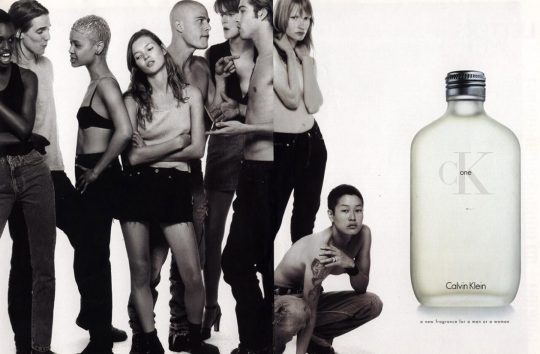
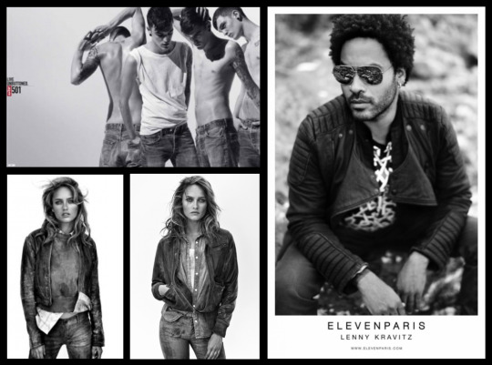


For the Image Source Picture Agency, I wanted to explore the legacy of Richard Avedon’s influential series ‘In the American West’ and how the approach has become visual shorthand for Truth and Authenticity.
In 1985, when Richard Avedon first published his influential book of portraits, ‘In the American West’, he wouldn’t have known that its influence would still be being felt today. At the time, of course, this photographic record of drifters, miners, oil patch workers and other marginalized folk was met with outrage. To a public used to a romantic notion of the west, Avedon’s work was thought to be disturbing. It was also felt that he, a resident of New York City, was being critical of the American West.
The uncompromising approach that Avedon used with his subjects awkwardly comporting themselves in front of his camera, revealed them as they really are – as close to a ‘Truthful’ portrait as you are likely to get.
Then came the Steven Meisel CK One campaign, also borrowing a truthfulness and simplicity in its portraiture from Avedon’s originals but moving it into a more androgynous area.
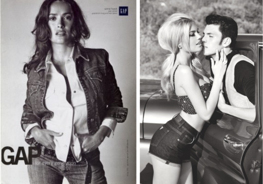
Not long after, Avedon was asked to shoot a Levi’s ad campaign for BBH in London, shooting the subjects in precisely the same way but wearing Levi’s clothing. Why? Levi’s wanted the association with gritty truthfulness. The ‘take-out’ by a consumer would be that this is authentic clothing that is worn by simple, honest folk. What you see is what you get. The handwritten headlines underlined the individuality of the clothing and how it was worn.
Since then we have had GAP campaigns, most famously shot by Albert Watson, a master of lighting techniques and black & white photography. At this point the ‘truthfulness’ is coupled with a more commercial, fashion edge. It is an approach that wants to add a little gloss to the grit. After all, you don’t want to alienate your target market.
Guess Jeans moves it closer to fashion and sex. Most often shot by Ellen von Unwerth, the truthfulness has been replaced by cheeky, provocative poses but still retains a shred of authenticity with its black & white photography (shoot anything in black & white and you immediately communicate ‘truth’).
Levi’s have skirted around the original Avedon shot campaign on and off ever since the original. Here’s an example from the mid noughties. You can see traces of the original but it is a watered down version, adjusting itself depending on the Marketing people at Levis and sales, no doubt. In more recent times we have had press campaigns by ‘Eleven Paris’ and a distinctive landing page that gives us a few pointers that it sprang from the loins of ‘In the American West’ and True Religion Jeans where you can trace directly back to Avedon’s original portraits and the Levi’s ads that followed.
To the left are a couple of very recent Levis’ campaigns. One of them has gone colour – but you can still spot the heritage…
In the seventies and early eighties, Avedon’s single-minded eye captured those fragile, real life Americans on a large format camera. In the years since, his vision has been appropriated by advertisers as a ‘go to’ style that can immediately portray heritage, honesty and authenticity.
Marketers will continue to buy this look off the shelf to sell their own wares but that doesn’t lessen the original impact that ‘In the American West’ had and continues to have. As the publisher of the book said “Richard Avedon’s ‘In the American West’ is widely regarded as a landmark project in photographic history and a definitive expression of the power of photographic art’.
#art photography#documentary photography#portrait photography#richard avedon#in the american west#ashley jouhar#master of photography
4 notes
·
View notes
Photo


‘Why health is the real wealth today’.
Written for the Superstock Picture Agency, here’s a piece about the value of good health in our society today.
The definition of wellbeing is given as ‘The state of being comfortable, healthy, or happy’. The synonyms associated with it are ‘Welfare, Health, Good Health, Happiness, Comfort, Security, Safety, Protection, Prosperity, Profit, Success, Good Fortune and Advantage.
From this we can see that wellbeing encompasses more than simply exercising and eating a balanced diet. Wellbeing also includes good mental health, a sense of security, friendship, some financial security and contentment with your lot in life.
So wellbeing is no longer limited to a healthy body; today’s vision is more holistic.
Indeed, emotional health is now on par with physical health as more and more people find life satisfaction and a greater sense of purpose in the balance of mind, body and spirit.
Nic Marks of the New Economics Foundation says, “Well Being is not only about the individual but also about values grounded in a broader, shared understanding of how the world is and should be.”
Over the last 50 years, the population of Great Britain has become richer - but despite this, evidence shows that mental wellbeing has not improved.
Many of the things people often aspire to and believe will improve their mental wellbeing - such as possessions or more money for luxury holidays - on their own, do not lead to a lasting improvement in the way they feel about themselves and their lives.
Stills and video that convey not only physical fitness but also communicate a healthy mind, a positive approach to life, mindfulness, tranquility and a sense of being at one with your surroundings are popular. These images have many uses in marketing too, communicating key concepts around Health, Wellness, Escapism, Freedom, Getting Away from it all, Tranquility, Care, Fitness and Purity.
Being aware of the present – to your own thoughts and feelings right now, and to the world around you – can improve your mental wellbeing. This is particularly difficult to achieve, however in our tech-driven world, where a moment doesn’t pass, it seems, without us reaching to check our smartphones; our attention directed to a screen, rather than the world around us.
Mindfulness is recommended by the National Institute for Health and Care Excellence (NICE) as a way to prevent depression.
Richard Davidson, one of the early pioneers, scholars and teachers of mindfulness in the US believes that working with kids and teaching them about mindfulness early on as part of their education is going to be really important. He explains, “Teaching kids these kinds of skills early in life can have multiplicative effects as the kids develop. Being able to practice these skills at a very early age can set a child up for a much more positive developmental trajectory.”
This mental wellbeing, self-esteem and self-confidence are very important to young people, along with good relationships, and a positive engagement with the world. As Sarah Stewart-Brown, professor of public health at the University of Warwick says, ”It's useful to start with the idea that overall wellbeing involves both the mind and the body. And we know that physical and mental wellbeing are closely related."
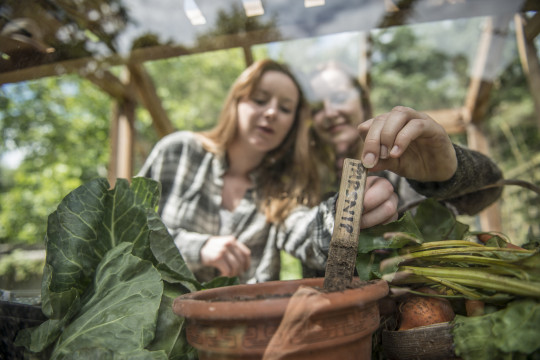
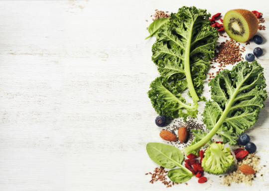
Nutrition is another very topical piece in the jigsaw of our overall wellbeing. This includes not only our health but the health of the planet too. The provenance of our food is very important nowadays. How the food was produced, where it’s from and whether it is sustainable are questions that are not going away any time soon. Take for instance beef and its impact on our health as well as the impact of its production on the environment. The demand for beef worldwide is resulting in the destruction of a delicate ecological balance on earth – and this is now a big problem that needs reversing.
The knock on effect is that more and more people are choosing plant-based diets and among young people in particular, there is an increase in veganism.
The benefits of a plant-based diet are many and varied as such foods are rich in fiber, vitamins, and minerals. This can result in a decrease in both blood pressure and in low-density lipoproteins (bad cholesterol) that in turn reduce the risk of diabetes and help maintain a healthy weight. All of these can result in lessening the chances of heart disease.
However, obesity is a huge global problem that is steadily increasing. In the USA, for example, obesity affects 78% of Hispanics, 76% of Blacks and around 66% of Whites over the age of 20. For the under 20’s the figure is 31%.
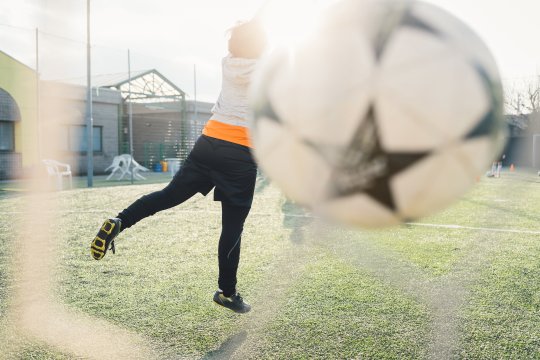
This is down to an imbalanced diet coupled with inactivity and a sedentary lifestyle where work (and leisure) involves sitting for hours on end looking at a screen. 60% of Americans don’t get the recommended amount of physical activity and 25% of those adults aren’t active at all.
In light of the rise in obesity amongst youngsters, a wellness movement called Children’s Healthcare of Atlanta launched a campaign they called ‘Strong4Life’, which makes improving family nutrition and physical activity habits fun and engaging. It also provides parents and caregivers the support they need to accomplish their goals.
Gretchen Reynolds of The New York Times says of physical activity, “You get prolonged life, reduced disease risk — all of those things come in in the first 20 minutes of being active. This is all that’s needed to reach the level where happiness and productivity in every day life peaks.”
Top concepts associated with stills and motion showing a physically active lifestyle are Competition, Speed, Fun, Vitality, Adventure, Strength, Success, Skill, Determination and Effort.
People are equating happiness with good health more than ever, as good physical and emotional health allows us to do the things in life that we’d like to do. This is the motivation to keep minds and bodies healthy
In a study of more than 10,000 participants from 48 countries, psychologists, Ed Diener of the University of Illinois and Shigehiro Oishi of the University of Virginia found that worldwide, people rate happiness as being more important than any other life outcome - including living a life with meaning, become rich, and getting into heaven!
#health#wealth#ashleyjouhar#stock photography#photography#healthyliving#happiness#mentalhealth#wellbeing#mindfulness
0 notes
Photo


‘Point of View imagery. It’s personal’.
A piece written for Superstock Image Library about our own view of the world, brought to the fore by Instagrammers and Influencers.
Not so long ago, a photograph taken from a perspective that included the photographers’ feet, shadow, arms or other intrusions that impacted on the actual image was considered a snapshot.
‘Proper’ image makers looked down on this kind of photograph as the work of weekend photographers or amateurs who didn’t understand the craft, history and art that goes into making a proper photograph.
Despite that, there has been a tradition of well-respected photographers like William Egglestone and Vivian Maier allowing their point of view and presence to be part of the image they are making – with their reflections or shadows forming part of the framing as they clicked the shutter. Lee Friedlander in his ‘America By Car’ series even included the steering wheel, dashboard and occasionally himself reflected in the wing mirror to form an essential part of the composition of the photographs he made.
https://whitney.org/Exhibitions/LeeFriedlander
The unstoppable rise of digital photography, smartphones, the internet and social media has allowed all of us to become photographers and has democratized the whole process. It has reduced the cost of photography to virtually nothing, making it accessible to just about everyone. And it has produced endless platforms on which to present our image making. From our perspective. With our point of view.
It’s very empowering and everyone loves it. And because of this, it’s perhaps not surprising that a style and visual approach has arisen from platforms like Instagram that has in turn had an influence on professional photographers and their approach to shooting.
Selfies are the most ubiquitous device employed by anyone recording their day-to-day existence. Selfies are the product of people wanting to share the evidence of what great stuff they are up to throughout each and every day. The irony of such spontaneous ‘record’ shots is that they are actually heavily edited to ensure that the person posting is viewed in the best possible light. With the photographs being filtered and toned, retouched and smoothed, everybody now has in the palm of their hand a very powerful device to promote themselves globally and ensure they stay ‘on brand.’ A prime example of this is Kendall Jenner, who has mastered the art to perfection.
https://www.instagram.com/kendalljenner/?hl=en
The close relation of the selfie is the point of view shot or POV. Instead of pointing the camera at yourself to show where you are, who you are with, how fabulous your life is and so on, the camera is turned away to show the view you have, where you are walking, the event you are at, what you are eating and the kinds of places you are visiting. The POV shot ensures that the viewer is as close to experiencing what you are experiencing and seeing what you are seeing first hand, without actually being there.
This POV approach has been very influential in stock photography, video, commercial photography and film making - as well as in marketing in general. It immediately engages an audience in visual terms that are accessible, human and authentic. We all respond to things that strike us as familiar. When we laugh at a joke where we recognize the situation well, we enjoy the joke even more. Imagery can work like that too. You connect powerfully with images that you not only look at with your eyes but ‘feel’ too on an emotional level, because you have been there, you have experienced something very similar and you have viewed it from that viewpoint.
The viewpoint is the key. It’s normal. It’s nothing fancy. There’s an intimacy to it – and stylistically, you and I could shoot it. That’s the point. And because you and I could have shot it – and millions of people on Instagram have done just that - it has become visual shorthand in marketing imagery selling in categories such as food, vacations, childcare, sports goods, agriculture, cars, pets… you name it.
Amateurs have also inadvertently introduced less considered crops to mainstream visual culture, via platforms such as Instagram. The limitations of their photographic skills have resulted in an honesty and an authenticity in the way their images are shot. This has proved very effective as a marketing tool because it imbues products and services with a perceived trustworthiness that is in short supply in advertising today.
Of course not any old POV image selected at random from an Instagram feed is automatically a desirable advertising shot. Production values still come into play and despite the filters, there are still some terrible pictures on show. You can’t make a silk purse out of a sow’s ear!
Some of the POV approaches have become tropes or clichés; that’s not to say that they aren’t incredibly popular, however. For instance, a Russian couple started shooting those ‘follow me to’ images that we see on Instagram in great locations all over. You know the ones, where the POV shows the photographer’s arm coming in to shot at the bottom of the frame, being led by his/her partner, who is forging a path forward, facing away from the camera as if on a once-in-a-lifetime adventure. The viewer (us) is seemingly right there in every picture, experiencing the ever-changing scenery, in every single glamorous location.
The couple responsible for this influential and popular POV approach to travel photography soon became the world’s top travel influencers and spawned a million copycats worldwide!
Commercial photographers and filmmakers have the opportunity to glean influences and visual and cultural trends like this to inform the images they make. This way, they can stay relevant, saleable and in tune with what marketers and customers want. POV imagery is just another visual approach to add to their repertoire that they can draw on when required to make impactful, contemporary stills and video.
Likewise image buyers. Their antennae should always be attuned to visual and cultural trends informing their picture buying choices. That way they are in a position to make connections with consumers, providing immersive visual experiences and positioning products and services as accessible and desirable.
So ‘point of view’ imagery is shorthand for describing visual content that is shot from a different perspective, that is involving, immersive and super sensory. Imagery and video that is shot to make the viewer feel like they are a part of the action and really involved in what is going on.
Ultimately it is about creating the feeling that it’s a personal experience.
#instagram#ashleyjouhar#photography#pov#digital photography#stock photography#influencer#kendall jenner
0 notes
Photo


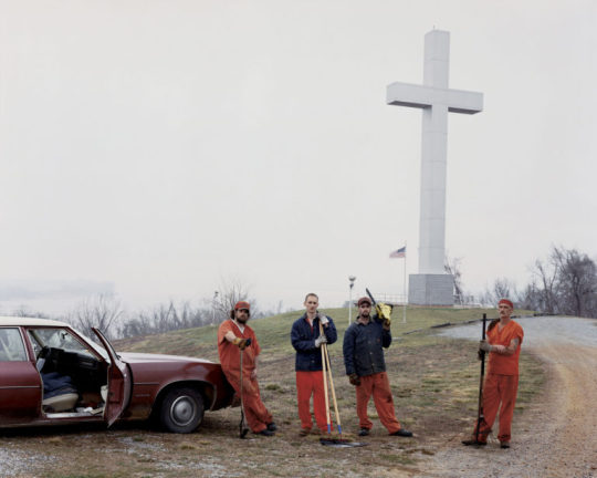
Who, what and when with Canadian Photographer Phil Bergerson, published by Image source.
Who?
Phil Bergerson, who since 1995 has made many road trips throughout the US, criss-crossing the continent and recording American Artifacts. He has been photographing and exhibiting internationally for over 40 years and his work is held in many prestigious public and private collections internationally and appeared in publications such as The New Yorker and The New York Times Magazine
What?
Exhibition and Book release of American Artifacts at WORK Gallery, London WC1X 9NG.
Decisive moment?
The American Dream, in a book! Published by Black Dog Publishing, this beautifully assembled collection of around 130 photographs is presented as page after page of square format images framed by crisp white borders – a visual précis of American Popular Culture, on the turn. His framing of subject matter are a reminder of just how iconographic the America landscape is, the extent to which interiors and exteriors are marked with signage, graphics and image/icons. Bergerson as photographer is a collector of the iconographic waste material of the American Dream.
This rich set of images – some of which have an almost Pop Art feel – encapsulate America’s promise to its people and any outsiders who want to grab a piece of The Dream. Raw, graphic compositions taken with a very selective eye show the hopes, aspirations, consumerism, patriotism, success and glamour of American Culture. Trouble is, this collection of images now represents the downside. The ongoing recession and its effects on the US are recorded here in full, glorious colour – and without, the colour palette of capitalism when the money moves on and the light goes out.
The elements in each picture are very human without actually including people as they show poignant tableax by shopkeepers, flyposters, town planners, window dressers, graffiti artists and blue collar workers, all unintentionally arranged for Bergerson’s camera to record. These husks of American Culture are in predominantly urban settings; small town environments that the great US citizens of the past built in the pioneering spirit of yesteryear. What we are left with is the detritus of that culture and the slightly hollow feeling that we have all been duped by the illusion of The American Dream.
Trend?
Is it Art? No, it’s Documentary Art. It’s a kind of ‘re-cycling’ or ‘up-cycling’ where Bergerson has taken notice of what is there on the streets of America and re-purposed it into something else – poignant and strangely beautiful, via his vision. This style of photography – honest, truthful, beautiful to look at but telling it like it is, will resonate with today’s Instagramming, selfie-ing, image generating generation. But over and above that it is also classic ‘Road’ photography in the tradition of Walker Evans, Lee Friedlander, William Egglestone and Stephen Shore. This approach to image-making never goes out of style.
Art meets Commerce?
More and more advertisers want a slice of this raw realism these days. It lends credibility to brands to appear un-art directed, real and in touch with the consumer their product is aimed at. Photographers are also striving to achieve this look and feel in their personal work which they show to Art Buyers and commissioning clients in order to win jobs.
It may cost clients a lot of money, research, styling and photography production fees to achieve this off the cuff slice of life – but carefully constructed, it doesn’t have to show!
One question for the image maker?
The American Dream has been such a powerful myth driving an idea of America, in the harsh light of the 21st Century, is it still possible to recycle The American Dream?
#americana#american photography#phil bergerson#ashley jouhar#colour photography#art photography#documentary photography#american artifacts
2 notes
·
View notes
Photo
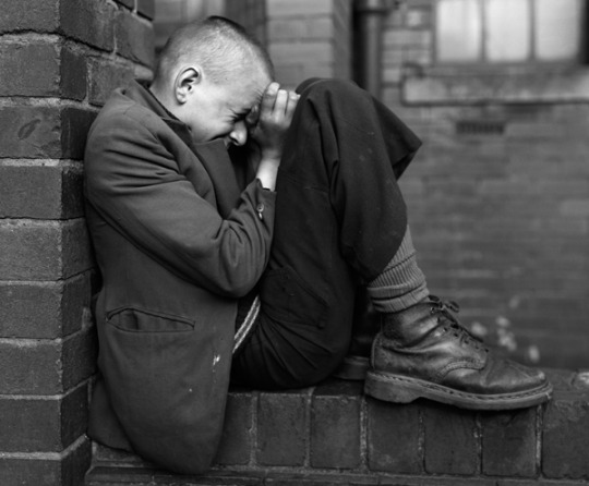

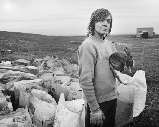

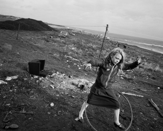
‘Who, what and when’ with Chris Killip at the Deutsche Börse Prize, for the Image Source Picture Agency.
Who?
Chris Killip
What?
Deutsche Börse Photography Prize exhibition – shortlisted for ‘What Happened Great Britain 1970 – 1990’
Decisive Moment?
Robert Frank said, “There is one thing the photograph must contain – the humanity of the moment. This kind of photography is realism. But realism is not enough – there has to be vision, and the two together can make a good photograph.” Chris Killip’s photographs certainly have both. There is a strong sense of composition to even the busiest of images – for example in the ‘True Love Wall’ photograph, where a man faces a brick wall, wind-strewn rubbish swirling around him as if he’s part of the refuse. We can’t see his face but we can feel his quiet despair very strongly.
Trend?
I’m not sure these photographs fit into a trend but they are certainly part of a great tradition of strong black and white work by photographers such as Paul Strand, Bill Brandt, Walker Evans and August Sander.
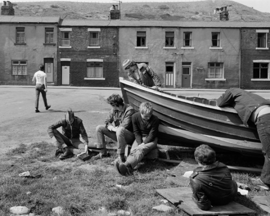
Which Image? Which Room?
‘The Boat Repair, Skinningrove, North Yorkshire’. The image is fairly bleak but there is a calm to the picture and the subjects – an air of resignation too. The rowing boat, grounded on dry land is almost a metaphor for the young men going nowhere fast. I would hang this image in my hallway so I could look at it every time I walked by. It is sad and poignant but at the same time aesthetically and compositionally strong.
One question for the Image Maker?
When you shot these images, which was the stronger agenda - the political or the human one?
youtube
#documentary photography#reportage#ashley jouhar#chris killip#blackandwhitephotography#deutsche börse photography prize#photography
3 notes
·
View notes
Photo


In a revealing interview for the Image Source Picture Library, I talked to Miles Aldridge about his early influences, 90’s fashion photography and how at the moment of news-stand success he headed off in a radically different creative direction.
Miles Aldridge shoots sexy, glamorous women in opulent settings. But all is not what it seems in his pictures. Scratch the surface and a common thread runs through the imagery – the strange ominous unease of the dreamworld. Film-maker David Lynch wrote, “Miles sees a colour coordinated, graphically pure, hard-edged reality”. Artist Glenn O’Brien says Aldridge, “uses impeccable instinct in crafting something like ‘stills’ from the fractured narratives that we normally experience nocturnally and unconsciously.”
Aldridge talked to me about his influences and traced the rich visual journey he took from being a graphic design and illustration student, through music promos, to being a photographer who has shaped and stretched the idea of the fashion photograph.
Ashley Jouhar: What was your background to taking the kinds of photographs you take now and what was it that kick started your career in photography?
Miles Aldridge: Well, my father [Alan Aldridge] was a famous illustrator and art director so I grew up around quite surreal, psychedelic and sometimes shocking imagery – and it seemed clear to me I would go into the arts and follow my father. So I went to art school to study illustration, which was incredibly liberating – because I had been at Grammar School and none of my fellow students were interested in art. Being at Central St Martin’s around 1983 – surrounded by a lot of like-minded and talented people – the teachers, the studies and the classes were very good and I immersed myself in everything for the first year and then specialised in Graphic Design with an illustration bias.
Ashley Jouhar: So at that point you were exposing yourself to all the disciplines – life drawing, filmmaking, illustration, graphic design – the whole lot?
Miles Aldridge: I was also getting exposed to cinema, taking girlfriends on dates to see art movies, not blockbusters. I was seeing David Lynch films and it broadened my horizons immensely.
I did become an illustrator when I graduated from art school but I found it quite boring and I wasn’t anything like my father who was a sort of psychedelic whizz kid right in the middle of swinging London, working with everyone from David Bailey to The Stones and The Beatles. So he was really tapping into the zeitgeist. But I didn’t find the work very challenging and I was still very young so I started making enquiries about pop videos. It seemed to me that the film directors I liked were artists, packaging their thoughts and point of view of the world into hour and a half statements.
Ashley Jouhar: A little like you are now doing with your current imagery, except in a photograph?
Miles Aldridge: Yeah, but at that time I had no film training, apart from a couple of days at art so it was all quite new to me. But I bought a Super 8 camera and started shooting films. Then I bumped into Derek Jarman in Soho, who was often drinking tea in the same café I used to hang out in called Maison Bertaux. He was interested in me because I was a good-looking young man and I was interested in him because he was a famous film maker and so we had a few conversations. He was very enthusiastic and encouraging and through this naïve enthusiasm I started to make films. Another person who came into my life then was Sophie Muller, a well known video director who pretty well invented the form, shooting videos for The Eurythmics and many others.
Ashley Jouhar: MTV was exploding at this time so it was perfect timing for you, in the right place at the right time?
Miles Aldridge: Yeah, yeah, exactly and actually because of people like Derek Jarman and other like-minded artists were doing Super 8 presentations to music because of its relatively low cost it was very much the film medium for the 80s. You don’t need masses of finance to make a film on Super 8 – the idea is translated quickly to images. So I started making pop videos for a while.
Ashley Jouhar: Were you coming up with the concepts for these videos – were they very much ideas-driven shoots?
Miles Aldridge: Yes, very much so and I was good at coming up with the ideas but I wasn’t very good with the music! I would come up with an idea that might be loosely based on something from the universe of Hitchcock, Lynch or Godard and I was aware of cinematic tricks and conceits and would play with those. Like for instance, The Shining – I would do a pop video based on a long corridor with different weird things happening in different rooms but I didn’t really know how to put it all together with the edit. During this time I suppose I would have been known as a middling pop video director and therefore lived in a council flat, didn’t have any overheads as such so was very happy doing the odd pop video and hanging out with my girlfriend, who it transpired wanted to be a model. That’s when I took these photographs of her because she looked very much like the kind of girl of the moment – that sort of grungy, heroin chic sort of look of the time.
Ashley Jouhar: I remember it well – the bed-sits and anti-fashion poses.
Miles Aldridge: Yes, and the pictures of her were very well received at Vogue and they asked who had taken them and it was explained that it was this girl’s boyfriend. I was then called in to Vogue to meet them and I had this amazing realisation that instead of all this hard work involved in making videos – starting at five in the morning and ending at five in the morning, horrible food and no money to do anything, I could possibly become a fashion photographer.
Ashley Jouhar: So those original pictures, did you imbue them with something that we would recognise now in your work?
Miles Aldridge: No, I shot them all in black and white on Hampstead Heath on a Nikon and the film was dropped into Snappy Snaps… and picked up two hours later and pasted into her portfolio! They were really, to all intents and purposes, a boyfriend photographing his girlfriend. I mean she wasn’t styled and there was no hair and make up and she wasn’t trying to sell any fashion. Because that was what was happening with London photography then, when fashion photography almost slipped into Reportage.
Ashley Jouhar: Yes, it was very pared down compared to what had gone before.
Miles Aldridge: Yes, very much so and the heroes of that period were people like Robert Frank and Bruce Davidson and also Richard Avedon’s book ‘In the American West’ was kind of like a bible for that kind of styling.
There was this idea of real people rather than glamorous people being pushed to the forefront and being shown as something heroic and wonderful. So I moved from illustration to video to photography in the space of about six years, I think. I really enjoyed the photography and the early work was really about being locked in studios with very beautiful creatures and trying to think how to photograph them. I didn’t come with any technical knowledge – all I had was an eye that still serves me very well today and those pictures were almost a repetition of the boyfriend/girlfriend pictures earlier where in my imagination, these models who were now wearing fashion clothes and hair and make up were, for that six or seven hours in my studio, my girlfriend. Interestingly, when the hair and make-up and styling was being done and I wasn’t paying any attention at all, I left that up to them. In a way, I liked to rendezvous with the model on the white background and see her there for the first time with my camera.
Ashley Jouhar: So at this point your shoots were very spontaneous with what was happening, there were no storyboards planned out or themes?
Miles Aldridge: Yes, it was very spontaneous, it was about having a good time, listening to loud music and being swept up in the energy of a pre-9/11 fashion shoot and I mention 9/11 because after that, the whole world and especially fashion became much more gloomy and serious. Up until that point it was a big party. There was so much energy and money sloshing around and I enjoyed the decadence of it.
Ashley Jouhar: When did you start shooting in a more ‘David Lynch-ian’ way with these very considered, choreographed images and sets?
Miles Aldridge: Well, literally all I was shooting was white background pictures for magazines like W and British Vogue. Those pictures were about energy and shapes and in a way my talent was in trying to find graphic shapes on the flat two-dimensional page. I was successful with that kind of work straight away and sort of fell into it but at a certain point I looked at all this work and I remember I was at a magazine store in New York and saw a cover for W magazine, a cover for British Vogue and a cover for a magazine called Vibe – three white background covers, all by me. One could feel really good about oneself with that but for some reason, seeing them all there together I kind of loathed it and wondered where I’d got lost. Because back when I was an art student and even doing pop videos I was much more interested in darker and stranger things and the books I grew up with were books on Hieronymus Bosch and Breugel. The complete opposite of what I was producing, which I thought was trash. I felt really uncomfortable about that, even though my pockets were full of dollars.
Ashley Jouhar: So this was the turning point?
Miles Aldridge: I realised that when you get into a photo studio as a photographer, even if you said nothing and were dumb, the picture would still get taken because there is the momentum the stylist, the hair and make up artist and the model bring to the shoot that creates the energy for these pictures to occur. Instead of giving myself up to the madness and the freedom of the shoot, I wanted to put the brakes on it – to divert that energy and create a picture you really want to do in advance.
In part 2 Miles tells us how he creates the ‘fantastic’ images that have become his signature pieces…
#fashion photography#miles aldridge#vogue italia#british vogue#art photography#art#ashleyjouhar#pop art#david lynch
3 notes
·
View notes
Photo


‘The New Masculinity’.
The changing face of men’s identity in the early 21st Century, written for the Picture agency Superstock.
Masculinity is changing. Outdated ideas of what it means to be a man in today’s society are under threat – and rightly so.
Machismo was the ideal once upon a time. For some men, being a man was all about standing tall, not backing down, masking your emotions, casual sexism and disguising your vulnerability with aggression.
But sensitivity, empathy and vulnerability are not to be feared. And for many men, they never were. But for others, the stereotypes they saw in movies, books, advertising and marketing prevailed and underlined to them what it takes to be a real man. That, and trying to fit in with their peers has perpetuated the myth that ‘Boys will be Boys.
The ‘Boys will be Boys’ excuse (or in Donald Trump’s case the ‘locker-room’ banter excuse) is trotted out for some of the more odious male behaviour in society when we seek an excuse for bullying, cruelty and misplaced aggression as typical male behaviour or a rite of passage into an all-male environment such as a club or a sports team.
This has come to be known as Toxic Masculinity, which researchers have defined, according to The New York Times as a set of behaviors and beliefs that include ‘Suppressing emotions or masking distress’, ‘maintaining an appearance of hardness’ and ‘The use of violence as an indicator of power’ (think ‘tough-guy’ behaviour.)
The Toronto based author, Rachel Giese has already written in depth about feminism and gender equality from the personal perspective of girls and women, questioning the stereotypes of femininity and being female. Everyone believes nowadays that girls can achieve whatever they want - excelling at sports, for instance or becoming a scientist, an engineer or a pilot. Ridiculous as it seems, this wasn’t the case in society seventy or eighty years ago.
Rachel Giese realised that masculine stereotypes and maleness hadn’t really been challenged in the way that feminine stereotypes had. Bringing up her son, she became curious about how gender norms and expectations regarding masculinity were affecting boys’ attitudes and behaviours.
She says, “Probably the best antidote to toxic masculinity are more expressive, open, caring, liberated forms of masculinity. By that I mean, forms of masculinity that value kindness, nurturing, intimacy, respect, humility, tolerance and curiosity”.
She feels it is important to show young males that a quality like strength comes in many forms. Not just brute force, but also standing up for what’s right. Showing your vulnerability takes plenty of strength and courage, as does being allies with girls and women in the fight for gender equality. This was in evidence in early 2017 on the global Women’s Marches and more recently on the #MeToo marches across the world, as many men turned up to the rallies alongside women to show their support.
This #MeToo movement has brought the issue of Toxic Masculinity into very sharp focus.
The way masculinity is portrayed has a huge impact on young men’s sense of self-worth and self-esteem and what it means to be masculine.
Part of the confusion of what it means to be a young man today has led to suicide being the number one killer of all men under the age of 45 in the US and the UK.
Male mental health is in crisis - and according to the World Health Organization, there were an estimated 793,000 suicides worldwide in 2016 (the last year global data was available.) Most were men.
The reasons for this shocking statistic are complex but one thing we in the business of visual communication can do to help bring about change is to start portraying the multi-faceted nature of masculinity with more balance.
Brands are beginning to represent men more realistically. There are examples exploring male vulnerability and sensitivity, with some high profile examples like Gillette’s ‘The best a Man can be’ campaign,
https://www.youtube.com/watch?v=koPmuEyP3a0
gaining global awareness by pointing out the negatives of one-dimensional alpha male behaviour.
Gillette is willing to back up their stance by donating $1 million per year for the next three years to non-profit organizations in the US running inspirational programs to educate and help men of all ages achieve their personal best and in doing that become role models for the next generation.
This is leading to a change in masculine identity where males are being portrayed in a more rounded way – showing their nurturing, reflective side and conveying emotions.
Gillette say, “As a company that encourages men to be their best, we have a responsibility to make sure we are promoting positive, attainable, inclusive and healthy versions of what it means to be a man.”
We have seen the emergence of the metrosexual and an increase in stay-at-home dads and their depiction in the media. Things are moving on again now as more brands are beginning to show masculinity in general in a more realistic, three-dimensional way. In doing that they not only create a deeper connection with consumers but also something to which more young males can relate.
This should in turn have a very positive impact on men’s mental well being.
Dove’s #RealStrength campaign demonstrated this very well
https://www.youtube.com/watch?v=QoqWo3SJ73c
where the brand and its skin and hair care products were neatly tied in with how men care emotionally, by showing the powerful bond between fathers and their children.
It asked the question, ‘What makes a man stronger?’
Before giving the answer, ‘Showing that he cares.’
According to Dove, 90% of men around the world say that their caring side is part of their masculinity and strength. If that is the case, then the shift in how 21st Century masculinity is portrayed is well under way. Young men however are the group who really have the opportunity to change things. Because, as Gillette say, ‘The boys of today are the men of tomorrow.’
0 notes
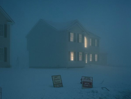
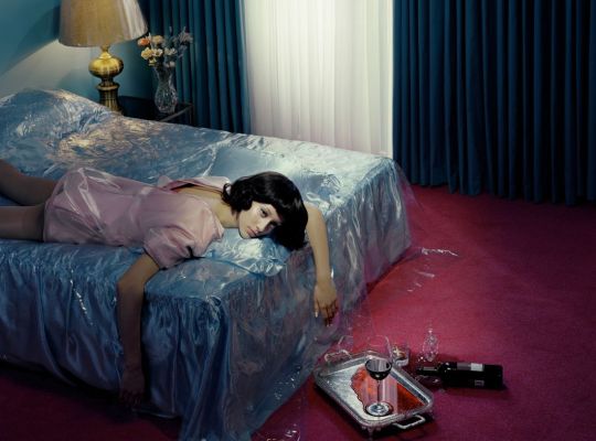
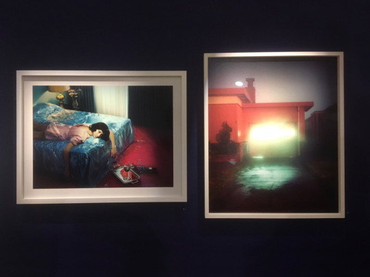
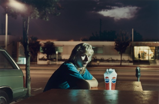
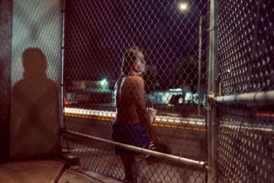
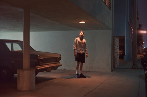
Photo


I visited Gregory Crewdson’s Cathedral of the Pines exhibition for the Image Source Picture Agency. On show at The Photographer’s Gallery in London, it is impressively staged over three whole floors of the gallery and doesn’t disappoint in its unsettling, painterly beauty.
The word that keeps coming to mind when viewing this series of images is ‘Trapped’. Either physically in a room or a house or a relationship. Or psychologically, where the impact of the unknown in these photographs weighs so heavily on the people in them.
They are trapped in their own heads by their demons, worries, dark secrets, a shady past, things they have done or things they are about to do. We all know this feeling in some shape or form – and this is why the pictures resonate so strongly with us.
David Lynch unearthed a vision of America in the influential Twin Peaks and his movie Blue Velvet. You can sense the same uneasy, queasiness in these pictures. Crewdson has often conveyed this darker view of America in his photographs but in this series he has added layers to it with softer lighting and a painterly palette of muted tones.
Ostensibly, we see the dark underbelly of the US. But perhaps in these unpredictable days in the United States it is a more accurate reflection of the mainstream reality; not the populist, upbeat vision of what outsiders consider to be America.
Hopper-esque in the impact of their psychological weight on both the people portrayed, as well as us, the viewer, we find ourselves projecting our own experiences, thoughts and preconceptions onto what has, or is unfolding in each image.
There is no clean cut conclusion in each image, however; just an open narrative for us to dwell on ourselves as we stand in front of the pictures, marvelling at the expertise with which each photograph has been assembled.
#art photography#cathedral of the pines#gregory crewdson#american photography#american dream#art#ashley jouhar
2 notes
·
View notes
Photo


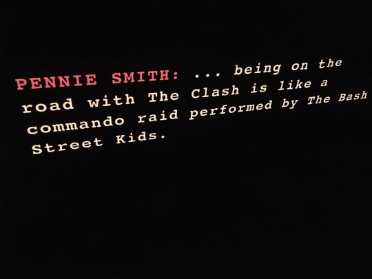


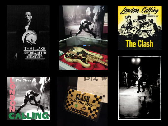


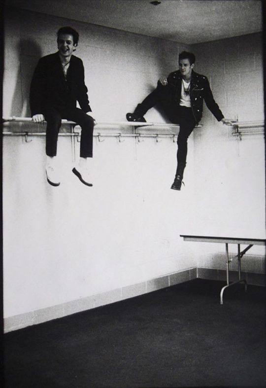
Review of the London Calling show at The Museum of London, featuring the work of legendary Rock photographer, Pennie Smith.
The Clash’s ‘London Calling’ exhibition has just opened at The Museum of London, celebrating the seminal album of the same name. The album, released in 1979, is considered to be one of the most influential of all time, affecting acts as diverse as U2, Bruce Springsteen, Nirvana, the Beastie Boys and Public Enemy. Chuck D has said that Public Enemy set out to be the rap equivalent of the Clash, before adding “They’re the band that changed everything.”
Showing they had more in their tank than their counterparts, London Calling signalled a move away from the limitations of punk rock and incorporated Joe’s love of R n B and Rockabilly, Paul’s Reggae fixation, Topper’s Jazz approach to drumming and the special musicianship and talents that Mick Jones provided. Simonon used to put together mix tapes of tracks tailored for each new US city they approached on their first tour there, ranging from rock and reggae to rockabilly and ska. This music would ultimately feed into what became the eclectic, ground-breaking mix of songs called London Calling.
On show at The London Museum are over 150 items, most of which belong to the band members. You can see handwritten lyrics for songs, Joe Strummer’s notebooks, Topper Headon’s drumsticks, the band’s clothing and the iconic smashed bass guitar that Paul Simonon destroyed on stage at the New York Palladium show. A key component of this exhibition is Pennie Smith’s black and white photographs, capturing a band at the height of their powers and delighting in the impact they were having on their first tour of the USA. The photographs taken by Smith featured on the London Calling inner sleeves are all displayed here as 10” x 8”prints, emanating as much urgency and energy as when she first took them.
So, how did Pennie Smith become the official ‘War Photographer’ for one of the best and best-loved bands of all time?
Born and bred in West London in 1949, she went on to study graphic design and fine art at Twickenham School of Art in the late 1960’s, where she first discovered photography. She produced flyers and posters for various bands in the 60’s, along with anti Vietnam posters but wasn’t a really a keen follower of music, despite many musicians attending West London art schools at the time.
After art school, through rock journalist Nick Kent, she tagged along for interviews with musicians like the Stones, Alice Cooper and Lou Reed, taking photographs of them without any particular agenda. She would shoot instinctively, capturing small moments of Alice Cooper drinking a cup of tea, for instance, rather than playing up to the camera as the ‘godfather of shock rock’. On the back of these assignments with Kent, she landed her first proper job at the NME, where they loved her approach. This led to her first big NME commission: big being the operative word, since this involved going on tour with rock gods Led Zeppelin.
Fast forward to November 1976 when Smith was 27. By now a well-respected and established freelance photographer at the NME, she’d been asked to cover a gig by a band called The Clash at The Royal College of Art. She was suffering from a bout of 'flu at the time and was not really feeling well enough. However, something compelled her to go, she says. Turning up, but feeling decidedly under the weather, she spent a total of 10 minutes in the band’s dressing room, instinctively snapping away, before deciding she’d covered everything she needed to. She didn’t bother going to the actual gig.
Not long after, she heard that the band wanted to meet her properly, and she thinks the Royal College of Art gig was a sort of test. If so, she says, “I passed.” Strummer rang and asked if she’d take more pictures and she photographed the band regularly after that. She and the band had a natural affinity with each other; something she hadn’t experienced with any other musicians before.
Smith’s trademark and what The Clash liked was her ability to capture “the quiet moments away from the stage”. This approach coincided with a key moment in the NME's history and Smith was at the heart of the action.
Having clicked with The Clash, Strummer asked her to go to America with them to photograph the whole 1979 US tour of around 29 dates. Travelling everywhere by bus, she saw America unroll before her eyes and set about capturing life on the road with a band she clearly loved. Compared to other bands, she considered them more at ease, happy to hug each other and mess about. The band constantly made her laugh and when she raised her camera to take a picture, they trusted her completely.
As they journeyed round the US, the first port of call on arrival in each new city "was always a thrift store, where the band would pick up hats, clothes and stuff for shows. They didn’t have stylists, like today’s bands," says Smith. "They did everything themselves.”
On September 20, 1979 at New York City's Palladium, Smith captured what is considered to be one of the greatest rock photos of all time when Paul Simonon smashed his guitar to pieces on stage. Two things were fortuitous to ensure this moment was captured; firstly, Smith almost didn’t go to the gig that night, as after so many months on the road, she felt she had exhausted all the variations of shooting the band live. However, instead of going out to dinner with friends, she decided to attend the gig. Secondly, on this particular evening, she was standing on Paul’s side of the stage for a change, instead of Mick Jones’, where she usually stood. Watching the gig she realised Paul was in a really bad mood and things weren’t going that well, mainly because the crowd seemed to be stuck in their seats, unmoved, rather than reacting in the way the band were accustomed to. Suddenly Paul was coming towards her with his bass raised above his head, before suddenly smashing it down on the stage. She was standing less than six feet away and instinctively rattled off a couple of frames. “It wasn’t a choice to take the shot,” Smith says. “My finger just went off.”
Developing the negatives from that night on the road, she looked at the resulting contact sheets on the tour bus with the band. Joe Strummer selected the Simonon image as the cover shot for their upcoming album ‘London Calling'. Smith wasn’t sure about this, because the photograph was out of focus. That was the one the band wanted though - and the rest is history.
The photograph immortalised Simonon’s rage in grainy black and white. It was an emotional response, he later said, to a stiff New York audience that sat all night in their seats and didn’t move. “You can’t really tell it’s Paul,” says Smith. “But I guess that’s the point.”
Complimenting this iconic shot was the punchy layout, artwork and pink and green lettering for the London Calling cover. This was unashamedly lifted wholesale from Elvis Presley’s self-titled 1956 debut. “When that Elvis record came out,” says Simonon, “rock’n’roll was pretty dangerous. And I suppose when we brought out our record, it was pretty dangerous stuff too.”
The fruits of Smith’s work on the US tour were published in 1980 in the best selling book ‘The Clash, Before and After’. A widespread critical success, the double album London Calling has sold over five million copies worldwide and has often been mentioned as one of the greatest records of all time.
It also now has its own exhibition, showing in the city that it celebrates. And the city that made The Clash the band they are.
#rock n roll#the clash#joe strummer#paul simonon#mick jones#topper headon#pennie smith#museum of london#documentary photography#reportage#rock photography#punk rock#reggae#ashleyjouhar
5 notes
·
View notes
Photo


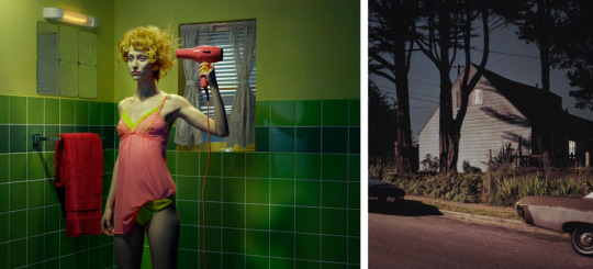

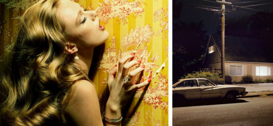
Written for Image Source, a review of ‘This Side of Paradise: Narrative, Cinema and Suburbia.’
I visited the Private View the other night for ‘This Side of Paradise: Narrative, Cinema and Suburbia’ jointly featuring the work of artists Miles Aldridge and Todd Hido. I got to speak with the photographers and also hear what they had to say in a very interesting Q and A chaired by Giles Huxley-Parlour at his Piccadilly gallery.
Miles Aldridge came out of fashion and imbues his pictures with a bold, sexy but dysfunctional allure. Women are caught in the midst or at the end of doing something, always set within the interior of a suburban house. These are like movie stills from a David Lynch production with Edward Hopper overtones of ‘What happened?’ or ‘What is about to happen?’
Todd Hido, on the other hand trawls through suburban neighbourhoods that remind him of the streets where he grew up in Ohio. He shoots from the outside, capturing lonely looking houses with, more often than not, light coming from one room only. What is going on inside these houses, the viewer asks? It taps into the idea of the things that might go on behind closed doors in all innocent-looking neighbourhoods; something David Lynch unearthed so well in his classic movie ‘Blue Velvet.’
A few of the images were hung to play off each other, one from each artist, side by side, the narrative in each crossing over into the other, suggesting the inside and outside shots of the same scene.
On display are twenty large, impactful photographs, showing how these two popular contemporary image-makers, despite a huge difference in their visual approach, convey a cinematic, brooding unease in their pictures.
youtube
#fashion photography#reportage#documentary photography#art photography#huxley parlour#todd hido#miles aldridge#this side of paradise#cinematic#suburbia#glamour#british vogue#vogue italia
0 notes
Photo


Review for the Image Source Picture Agency on the brand new MACK edition of Alec Soth’s Sleeping by The Mississippi launched at the Huxley Parlour gallery. I went along to see the images – and the photographer, up close and in the flesh.
Alec Soth took a series of road trips along The Mississippi River, shooting landscapes, interiors and folk he met along the way, building up a kind of loose narrative, like pieces of a jigsaw that the viewer can put together. He is a great ‘book’ photographer in this respect, I think, as the whole story can reveal itself when the images are looked at as a unified whole; as you do in a book.
Soth himself has said “Anyone can take a great picture. But very few people can put together a great collection of pictures. It is incredibly difficult to put these fragments together in a meaningful way. And this is my goal”.
So like a jigsaw, all the pieces are essential in playing their part to give the complete overview – or as complete an overview as possible. Because, like Robert Frank before him with his pioneering book The Americans, you can get meaningful insights into America and its people here – but it’s not prescriptive in its message.
There’s a sadness that permeates this whole documentary series – of lives unfulfilled, of disappointment and of resignedness. But this is where, through Soth’s eyes, documentary meets poetry; and the result is a trip along a river that acts as a metaphor for life, encompassing childhood, hopes, dreams, art, religion, politics, sex and ultimately of course, death.
#magnum#alec soth#sleeping by the mississippi#art photography#reportage#documentary photography#ashleyjouhar
3 notes
·
View notes
Photo


‘Who, what and when’ with Juergen Teller for the Image Source Photo Library.
Who?
Fine art and fashion photographer, Juergen Teller.
What?
Photography exhibition: Juergen Teller: Woo! At the ICA Gallery.
Decisive Moment?
Being human. It comes across in Juergen Teller’s photographs. The celebrity portraits and the ads might have an inverted glamour but they all feel as ‘real’ as the more personal imagery he shoots.
Trend?
Authenticity, visual truth, honesty – it’s not going away and whatever you want to call it, Teller’s imagery has always had it. Whether he is shooting Lily Cole or a dog portrait, he catches the right moment and feeling, crops a certain way and makes an image that you can relate to. It may be the cluttered setting, the awkward pose or the flashed treatment that does it but the images feel rooted in the everyday, somehow.
Which Image? Which Room?
Kate Moss, dishevelled in an old wheelbarrow. I would hang this in my shed to inspire me before a spot of gardening! It’s a striking image of Moss and is so powerful because it is as far away from high fashion as you can get. It shows how important the collaboration between photographer and subject is in Teller’s photographs to create and choreograph these ‘real’ moments!
One question for the Image Maker?
Are you the love child of Nan Goldin and William Egglestone?
0 notes
Photo


‘Who, what and when’ with American photographer Philip-Lorca diCorcia, for Image Source.
Who?
Philip-Lorca diCorcia, whose work encompasses art, documentary and staged photography.
What?
‘Hustlers’ exhibition, David Zwirner Gallery, New York City.
Decisive Moment?
Many of Philip-Lorca diCorcia’s images are heavy with atmosphere, longing, sadness and unfulfillment and this series, taken between 1990 and 1992 doesn’t disappoint! Filmic, serene and quietly powerful, this set of pictures of male prostitutes on the streets around West Hollywood look like stills from movies depicting the Hollywood reality as oppose to the dream that so few can harness.
Trend?
This photographer sets them. Along with Jeff Wall and Gregory Crewdson, he choreographs slices of reality, re-enacting scenes he has witnessed but shows them as if they really happened, using real people and careful staging. These images typify the current visual language we are seeing – reportage style photographs that have been carefully art directed with great production values.
Which Image? Which Room?
diCorcia paid for the modelling services of the male prostitutes who posed for him, much the same as any client might and these are recorded in the titles of each picture – a neat, relevant way of naming and titling each image. I would choose ‘Eddie Anderson, 21 years old, Houston, Texas, $20’. The image uses consumer icons like the hamburger, take-away coffee and a jukebox juxtaposed with Eddie himself. He is a piece of meat, much like the burger and the placing of his subjects amongst such consumer icons is a recurring theme throughout this series. Eddie is on the outside looking in, maybe hungry for a meal but certainly one of the ‘have-nots’ in LA. The richness of the colours is striking and the composition balanced and graphic. Some of this series is almost like Pop art photography. I suppose the kitchen would be the obvious place to hang this image, although the burger could be a tad more appetising!
One question for the Image Maker?
Your pictures are very still and serene. Is that something that you always have in mind when creating your ideas and your approach to shooting? Would you ever consider shooting more energetic ‘caught moments to convey the same ideas?’
#philip-lorca dicorcia#art photography#american photography#ashleyjouhar#documentary photography#art
6 notes
·
View notes
Photo
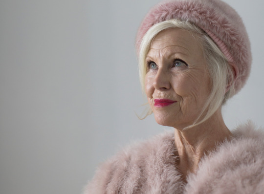
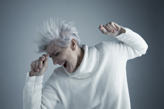


‘The vibrancy and vitality of the color grey’.
A piece written for the Superstock Agency on how and why sixty is the new thirty.
“You can’t avoid getting older, but you don’t have to get old,” said George Burns, the well-known comedian and centenarian a few years ago.
Ageing is all in the mind. Seniors aren’t counting their time away, begrudging the march of Father Time; instead they are looking forward, thinking about everything they still want to do and achieve in life.
People are living longer nowadays. The Boomers have a larger disposable income. They are retired, or semi-retired so they have more time on their hands and the choice of what to do with all that time. They are fitter, more active and have a younger outlook.
Don’t forget that in the Sixties, when huge social and cultural shifts occurred and men and women no longer dressed like their parents as soon as they turned 21, they expressed themselves through music, art, sex and fashion. Those folk that were responsible for the Sixties revolution are now in their seventies. Times may have changed but their outlook hasn’t. Don’t underestimate their vibrant joy for life - and image usage capturing this should be about attitude and spirit, not age.
A good example of this came from retail giant Marks & Spencer in the UK. It has made older women feel proud about the stage they are at in life and recently ran a fashion campaign celebrating these strong women and their achievements. With notable figures like Emma Thompson, Tracey Emin, Helen Mirren and Annie Lennox featuring in the photographs, they made their point clearly and stylishly and were shot by another notable older female, Annie Leibovitz.
According to AARP, nearly 10,000 adults turn 65 every day. This group of sexagenarians has over forty-five times the net worth of their younger counterparts. That’s a lot of potential for marketers to target.
Senior consumers want to see marketing showing moments of fun, energy and adventure. And despite what younger generations may believe, they are also eager consumers of technology. According to the Pew Research Center, ‘The 74+ demographic is the fastest growing among social networks.’
Research conducted by ‘Pragma’, the Retail and Commercial Strategy Consultants, says many see ‘growing older’ as a positive, as they have more time for experiences and what they want to do with their time.
These folk are redefining ageing. They are taking risks, travelling the world, returning to study, being entrepreneurial and starting second careers. Their kids have flown the nest, so they are enjoying rich cultural lives, moving back to cities to be near theatres, galleries and museums and because they don’t feel old - they still feel like they are in their thirties or forties - they have no interest in slowing down.
Gransnet.com revealed recently in research conducted through its subscribers that 30% of over fifties say that they respond well to ads that make them feel something - ads that are funny, sad or surprising.
These seniors are choosy customers who are wiser, more rational and less influenced by fashion and trends than younger consumers. Imagery and marketing messages need to be subtle and engaging, showing independence, a freedom of spirit and a sense of adventure, capturing emotional truths, caught moments and credible casting. All underpinned by concepts around Vitality, Wisdom, Experience, Energy, Enthusiasm, Adventure, Fun, Love and Togetherness.
Many usages of this imagery are within the healthcare industry, conveying a positive, upbeat approach to life, health and vitality. Others may be cross-generational family images celebrating key milestone moments such as birthdays, anniversaries and weddings. This shows the family unit representing dependability, longevity and resilience in these tough economic and political times.
Other popular imagery usages are in business, with seniors of all ethnicities, shapes and sizes, featuring in regular business pictures as part of the workforce - as well as in top management positions. And then there are the more unusual, artisan, craft-based businesses too, where the presence of a skilled, more mature worker/owner communicates key concepts around Tradition, Quality and Heritage.
However, British Vogue’s beauty and lifestyle director Jessica Diner, says, “In 2019, women over 50 remain conspicuous by their absence in the beauty and fashion industries, as well as the wider media landscape. Age discrimination most definitely still exists, both consciously and unconsciously, leaving many women feeling excluded and invisible.”
Presenting an elegant middle finger to those who think age is a barrier, May’s issue of British Vogue features octogenarian Jane Fonda along with a celebration of the creativity and talent of older women. Fonda says “It’s important to understand that older women are the fastest growing demographic in the whole world. It’s time to recognize our value.”
The ‘Non-Issue Issue’, as Vogue has billed it, is published in partnership with French cosmetics company L’Oréal Paris. Fitness fanatic Fonda joins the likes of Helen Mirren in the magazine that editor-in-chief Edward Enninful, who has made it clear he wants to make fashion more inclusive, describes as proving that “a person’s age will always be a more intriguing, nuanced and inspiring factor than a simple number could ever suggest."
For imagery, communications and content to really resonate with seniors, there has to be a tangible benefit, like all effective advertising.
Maria Garrido, CEO of Havas X says it needs to help, inform and educate. For content to be more relevant, it needs to focus on important lifestyle elements such as staying healthy, staying connected, love and relationships, travel and experiences. With a keen interest in technology, when they have a positive experience with a product or service, 68% of seniors say they share it with their social networks.
Being in good physical shape is one of three top priorities for 41% of seniors. The second is staying in touch with what is going on in the world, identified by 77%.
The third priority, according to 46% is ‘having people in my life who really care about me’.
There is a huge still untapped opportunity to turn silver into gold. Whatever you call the over fifties - older, mature or senior, ageing ain’t what it used to be.
Thank goodness!
0 notes
Photo


‘Who, what and when’ for the Picture Agency Image Source on the graphic fashion of Erwen Blumenfeld.
Who?
Photographer Erwin Blumenfeld (1897 – 1969), who with Conde Nast’s Alexander Liberman created some of the most memorable, pioneering, and still unsurpassed fashion imagery.
What?
Blumenfeld Studio:New York, 1941-1960 at Somerset House, London.
Decisive Moment?
I was familiar with much of Blumenfeld’s work but I was struck by how modern many of the colour images felt and how graphically strong they are. The collaboration with Alexander Liberman, the influential Vogue Art Director, was a very productive one and resulted in many beautiful images. But not only were they beautiful, they were underpinned with strong concepts. The ‘colour siblings, family of five’ picture, for instance, is a very innovative way to illustrate gloves and at the same time add glamour and visual wit to a fashion photograph.
Trend?
He was a master at taking beautiful photographs but then took them to another level in the darkroom. William Ewing, the respected curator and writer says, “His highly original and visionary work was a seamless blend of the negative and positive: taking the picture in the studio and making it in the darkroom.” Many of today’s influential fashion photographers do the same – it’s just done digitally.
Which Image? Which Room?
The girl with the red dress raised above her head. It immediately makes me think of a poppy with delicate red petals and a slender stem. The pose is elegant and raunchy at the same time, which is a fine line to walk for anyone! Blumenfeld walks it successfully though and achieves a beautiful, graphic, iconic fashion image that goes way beyond fashion. It looks like art to me!
One question for the Image Maker?
Iconic covers like the Red Cross war time image are more like graphic design. Do you consider yourself an image-maker rather than a photographer?
2 notes
·
View notes
Photo

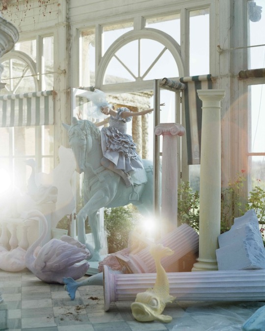


‘Who, what and when’ for Image Source, on Tim Walker’s elegant and extravagant exhibition at Somerset House.
Who?
Tim Walker – a singular talent and one of the world's most inventive photographers.
What?
Photography exhibition: Tim Walker – ‘Storyteller.’ It’s much more than simply an exhibition though. The layout of the exhibition, the graphics on the walls and the presence of many of the props used in the photographs add to an exhibition that is more like a theatrical experience. Perfect venue, perfect time of year, feels like Santa’s Grotto for photo-obsessives.
Decisive Moment?
Showing how to let your imagination run wild. Tim Walker is never restrained by the job in hand – simply selling clothes – the imagery transcends that job and as a result he positions the clothing and the setting as a package selling dreams. He integrates the dream setting, the model and the clothing in one magical photograph. The beauty of it is that he has the creative freedom to do so!
Trend?
Fantasy and escape from the drudgery of every day life. Times are tough. Reality can be grim for many people in these austere times. The imagery has a wit, creativity and a fantasy element that takes viewers out of themselves and acts as the perfect antidote to these challenging times.
Which Image? Which Room?
The large doll in the blue dress attacking the model, Lyndsey Wixon, over the barbed wire fence! The image feels Hitchcockian in a way, except there are no birds, crop dusters or shower scenes, simply an oversized Shirley Temple causing GBH! It’s funny and bizarre but compositionally very graphic with its colour palette of blues and the green of the grass. The large doll is on display at Somerset House too and looms over the exit door to the exhibition – the last thing you see as you leave, in fact.
One question for the Image Maker?
I can see Cecil Beaton’s influence in your imagery and the large scale production approach of Gregory Crewdson, although visually his work is nothing like yours. I know you assisted Avedon too but who else’s style and approach had an impact on your image making?
#tim walker#photography#fashion#fantasy#ashley jouhar#somerset house#british vogue#haute couture#stylist#props
1 note
·
View note