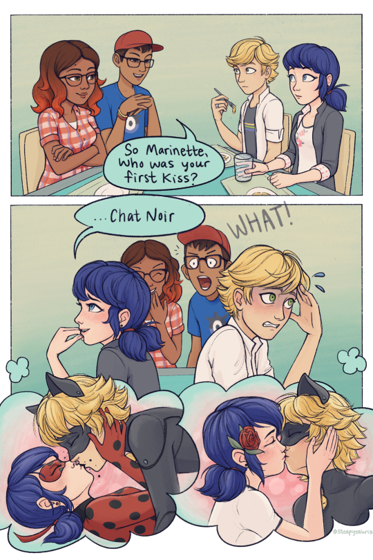
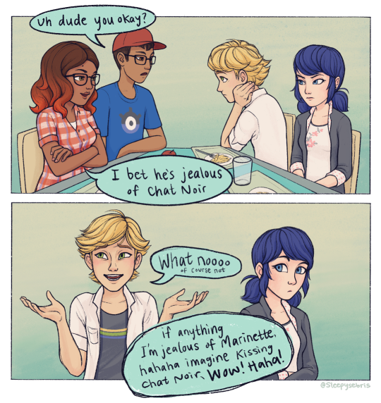
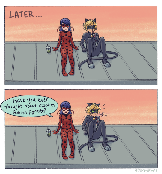
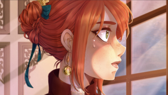
#i had to redraw the first couple of panels like five times
Text
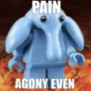
ml secret santa gift for @raindrops-on-the-roof ! ✨
sorry for being a week late i have this problem where i over-detail things that were meant to be simple. I wanted to do a silly lil love square comic and somehow get alya & nino in there, and at the time, elation was all i could think about! lol (this takes place in a reality where that was the last episode i watched)
Thank you @mlsecretsanta for hosting such a cool event 💙
#mlss2k22#miraculous ladybug#my art#ml elation#elation spoilers#dark cupid#love square#ladynoir#marichat#djwifi#adrienette#ml leak free#so real talk i actually forgot how to draw#i had to redraw the first couple of panels like five times#i really need to draw more it was very sad and scary#so yeah that's also why it took so long to finish LMAO#ive been looking at it for so long that i dont know if it's even remotely funny#my ml comics
20K notes
·
View notes
Text
2021 Creator Self-Love Extravaganza!
Rules: It’s time to love yourselves! Choose your 5 favorite works (fics, art, edits, etc.) you’ve created this year and link them below to reflect on the amazing things you’ve brought into the world in 2021. If you don’t have five published works, that’s fine! Include ideas/drafts/whatever you like that you’ve worked on/thought about, and talk a little about them instead! Remember, this is all about self-love and positive enthusiasm, so fuck the rules if you need to. Have fun, and tag as many fellow creators as you like so they can share the love! <3
Tagged by @bubblesthemonsterartist
Weirdly enough I am less reflected over this year than I was the one previous. In 2020, I had goals. In 2021, I just DRUMMED ON as long as my inspiration would let me! I indulged, I think, for the most part. 😂 However, looking back, I daresay I am proud. I have experimented more than I realized, and my pieces look rather good for it~
Year total: 184 artworks, 1 gif
1. Obiyuki Almost Kiss This would be one of many artworks I would scream into Joanna’s dms about; one of those THIS HAS TO BE GOOD OKAY-type artwork. The Concubine!AU means a lot to me, and the fic she and Jen wrote even moreso. This artwork was the first time where I applied 3D models during the sketching stage, and a perspective grid for… well, that’s rather self-explanatory yes?
2. “When doth mine husband return to me?” The first in what would be a series of “Annie says she’s gonna sketch, then 30 hours later has to admit she lied”. LOL. One of many redraws this year, I tested new ways of both coloring and shading with this one - not to mention the lineless background that I was mighty proud of, for being entirely made up on the spot. I feel like this artwork marked the spot where I got more into harmonizing colors, while also playing with stronger contrasts.
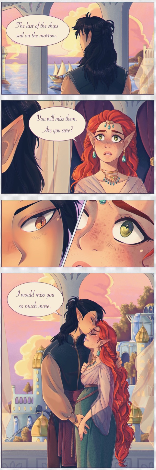
3. Miss me when the ships sail West Omigosh this one. I made a couple comics this year and this is my fave. Again, lots of focus on vibrant colors - I find my style benefits from sacrificing some realism in favor of impressionistic, striking scenery. Comics are also challenging, bc you know that in order to tell the story well, you have to choose the right panels, and I have never been good at minimalism. This was also my first venture into chromatic aberration! Which has quickly become a favorite!
4. Now and then, forever the same While this artwork isn’t really impressive in its own right - it was a quick sketch, where color setting and atmosphere was the most important, to instantly tell a story. But. BUT. I made a gif! For the first time in ten whole years, I went back to try and animate something. It was a lot of work, ngl, but it really paid off in the end, wow.

5. Wheel of Fortune Ngl, that whole week went by in a flurry. I made seven pieces from scratch in exactly 7x24 days. THAT is a record in its own right. This one was perhaps my favorite of the lot, for it came to me so naturally. And it felt like I applied all the news tricks I’d learned this year into a single piece, and best of all, I got to try one of my favorite palettes!
BONUS: Ladies of the Witcher AU Just because I can, and because I wouldn’t forgive myself if I didn’t! These aren’t even about quality or detailwork, but the fact that I still remain so proud of these designs. Eleven actually badass-looking girls and women, none who can be mistaken for one another, and whose energy is entirely her own.
If I can preserve even half of the subconscious energy I’ve channeled towards art this year, for next year, I will be overjoyed! Here’s to hoping~
Tagging: hmmmm, my darling @jaqdaw-art, @nokaru, @qob-vrisk and @ccprovolomies if any of you feel ever so inclined 😘
#tag meme#2021 wrap-up#myart#akagami no shirayukihime#snow white with the red hair#ans#obiyuki#i am proud and happy and also rather confused#185 works??#where?? how?? did i have the time for all this#i’m not conscious enough half the time to realize ahahaha
50 notes
·
View notes
Text
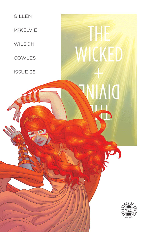
Writer Notes: The Wicked + the Divine 28
Spoilers, obv.
I mentioned in the back of the issue that I was thinking that Imperial Phase Part I would just end with no climax. As in, what would be more proggy and self-indulgent than to do that? Just to assume that people would accept a whole year of issues as a single trade, and have that slow build. And if people are expecting a surprise, not having a surprise would be the bigger one?
Except I plotted out the fucker, and realised this issue would end the trade, and that works pretty well as a climax. Not as big as any of the other ones, arguably, but wider and certainly a change of status quo. Plus it's an unexpected answer to the question of “Who's going to die?” undermining the assumption that it has to be one of our core cast.
This is probably a good example of how I talk about knowing everything in WicDiv, but the execution being more flexible. As in, all these beats are there, but working out how to play them came when planning these two arcs.
It's a hard issue for me, to be honest. WicDiv is definitely in a cause of anxiety place for me now, and thematically I can see why. WicDiv is always a juggling act, but I'm aware I'm juggling knives.
Jamie's Cover:
The last of the first half of Imperial Phase. The design continues to the second half of Imperial Phase, with variations. I think this one is particularly beautiful, but pointed.
Elsa Charretier's Cover:
We met Elsa when we were launching WicDiv in France. Glenat, our French Publisher, had commissioned her to do a WicDiv print. That was beautiful, and we asked her if she'd be up for a cover. And lo, this was born. The commission was glamour and sex – I think I suggested the idea of a sun in a martini glass. Elsa summoned this panorama that I just lose myself in.
It's also one of our rare Alt covers which is actually coloured by Matt Wilson, who took a pretty radical approach to the image. Matt Wilson for Eisner!
Page 1
Last time I talked about having a surplus of material and working out how to present it, and it actually all compressing down worryingly well. I had my list of things I wanted to happen before the party. I realised that some of them – mainly Sakhmet related – I could move into issue 29. Which left this, which I felt as an incredibly low-key mundane scene made a fun thing to hard cut from to the party.
Roehampton chosen due to me doing a seminar at the University there last year. I felt that Blake would be teaching in a place like it.
Jamie had a hefty re-write of this one when drawing it, and we chewed over the execution in chat a little. “The script is the start of a conversation, not the end of it.”
Wall stuff was also done in conversation. I gave Jamie a bunch of suggestions and we unpacked a little more. Shall I go though and say what they all are? I'm not sure if I can recognise them in fragments. That's Girl's Generation, the K-Pop band on the left. They were the primary visual inspiration for the Valkyries. Oh – and Jamie tells me that's Katy Perry on the right.
Page 2
I am very fond of the side-eye of Blake in the second panel. Strong Jamie expression.
Behind Blake is... League of Legends, Ghost in the Machine and Voltron.
And another really strong face in the last panel.
Page 3
Oddly, Cassandra's habit of little encouraging asides to people seems to be a thing now. How will people read them in world? Actually sincerely or patronising? I guess it depends how defensive they were feeling on any given day.
Page 4
A call back to Larkin's This Be The Verse, quoted by Luci in the first issue, recalled by Laura in issue 6.
My first draft title was Pride, drawing a line between Blake's parental pride and Sakmet's pride of lions. And then we remembered it'll also call to mind Pride, which when there's a slaughter at a pansexual orgy, is definitely not a comparison we wanted to make. So we went to this.
I suspect these writer notes are mainly my “here are some of the landmines we nearly stepped on” log.
Page 5
Originally the line was a lift of Lady Vox's in Phonogram, but something more noxious was clearly better. I called for the cocaine-tool, and Jamie out-did himself. The mosquito-like device emerging from the helmet is quite the thing. I suspect this is a left over Iron Man idea.
The visual element of the performance of the colouring-stage added symbols came from Matt. He was playing with various overlapping shapes, which were beautiful, but didn't seem to be anything other than a cute aesthetic. And then we realised that if we made them all Amaterasu symbols it'll integrate into the whole book. And lo, it does.
When plotting this issue, it's very much a “okay, what order CAN they be in.” I suspect I'd have rather taken more time to get to the confrontation, but everything else is more important to be in its place. Space is the interesting one – I suspect given an infinite budget we'd have have played more space to introduce this party/temple, probably with a issue-8 style dance-floor shot. But we don't, so we go completely the other way with this very TIGHT open, and put you in the middle of this slightly disorientating party you build up piecemeal.
Page 6
This involved some consultancy here, as I suspected (and I was right) that the original draft of Cassandra's dialogue let Woden off the hook too easily. We ended up tweaking a bunch to make her angrier to start, and still angry at the end, even after she takes Woden's point. I suspect I'd have gone even further given a chance to do it again.
(I mean, do you believe Woden that he didn't click? Plus that he knows the implicit threat by saying he didn't click – as in, he definitely could click if he wanted to. This is particularly noxious by Woden.)
End of the page is the closest we get to an establishing shot of the club/temple, btw.
Note that Jamie has moved away from a strict eight panel grid here, which suits the material. That panels two and five are these relatively smaller moments means that it would be dead space.
Page 7
And notice the strict eight panel grid here, which Jamie maintains as all these beats are basically of equal narrative weight.
Panel 7 is Jamie redrawing the splash from Brandon Graham's issue. Clearly relevant to what's coming further down the line.
In an issue of fairly bleak jokes, I think Woden's last panel takes the prize.
Page 8
The sequence is the last bit of set-up for the end of the issue. I suspect a re-read of the last couple of issues will see what I considered the necessary Sakhmet beats to get here. Next issue has more, but it's all very morning-after.
Special call out for Clayton for the second panel, which uses a PING! To basically split this panel into two panels in terms of reading. There's Amaterasu's first line... a small delay – and then the next piece of information. This is joined to the left-right movement across the panel from seeing the back of her head (I'm leaving!) to the right side of the panel (Where we then see she's looking at her phone.)
The softest beat of the issue, and probably one that I'd have stressed more if it was only a grace note, would be the reason for Baal's absence. Persephone assumes it's because that she is there, hence the segue in conversation on hurting people.
(In a boring practical way, Baal and Minerva not being here streamlines an issue which all the cast are present at. They don't need to be here, and their absence says more.)
The last three panels on the page are the closest that Sakhmet has come to a speech. Originally, there was about twice as much dialogue, but we worked it over obsessively to get to the core essentials (and try and avoid juxtapositions which we simply didn't want.) C and I shouting various takes and word-switches for about an hour in the living room.
All the WicDiv characters depress me. I think Sakhmet depresses me most of all.
Page 9
Anyway, yes, Sakhmet, that is a very good look.
Sakhmet's entry for the bleak joke competition, evidently.
Page 10
That we cut away from Casssandra means we get to cut back to her after the reasonable stage of an exchange and straight into this.
Hmm. There's something odd about this issue in terms of how pretty it all is, versus the emotions that are flying around. That's Amaterasu all over though.
The third panel was key for us to have Amaterasu's lines juxtaposed by Cassandra's response, so that it couldn't be taken out of context. A character responding to another character's incoherent racism is important context. I considered the archaic spelling “Moslem” but decided that while I'm sure that Amaterasu would use it, it wasn't worth putting in the text. It's offensive enough anyway.
Page 11
Some fascinating character work by Matt and Jamie on Amaterasu's speech to camera. The passive-aggressive nature of her threat is particularly sickly.
Cass' swearing is a delight.
I think I originally did something like “Clawing her eyes out” and tweaked as I) gendered ii) with where the issue goes, sets up all sorts of uncomfortable resonances with both Morrigan and Sakhmet. WicDiv is designed to be viewed as a hologram, so removing data strands that aren't intended is key.
(I mean, I talk about being anxious earlier? That's certainly a reason. There's so many moving parts in this fucker, and for all our efforts we can’t be sure that some of them are going to mesh awkwardly. We can always miss something.)
Anyway – there goes Cass, told to go home, the first of the people to leave the party. Everyone else gradually leaves, until it's just the people who remain. Woden doesn't get an exit, but let's be candid – no-one would have ever assumed Woden would be invited to the orgy.
And Dio takes over as the connective tissue. Hmm. Re-reading this after a few weeks is making me realise how tightly wound it really is. I had a friend write to tell me how many panels the last two issues had. 26 with 127 and 27 with 142. I did a quick count, and this one is (about) 119, so a little down, but when an average mainstream comic would have around 80 panels in (No more than a 5 panel beat, with average panel count lower than due to splashes, action pages, etc) it speaks to how compressed this is running on. No wonder I feel like it's going to explode.
Anyway, Dio. What have you seen?
Page 12
The main worry on this page was not making the storytelling too comic. The “someone leaves” And then “Someone unexpected follows pushing first person out of the way” can definitely come across as slapstick. Jamie doesn't do that, so phew. It's setting up for the destination.
The hyper-distorted close-up-to-reader Amaterasu symbols here are fascinating. Well done, Matt.
Page 13
And out in the street. Matt's glow from the door, into the cold blues of the street is strong. Immediate change of mood.
(Also, has me thinking of the break to darkness in issue 8 before going back to the party, as a structural parallel)
I don't actually use much contemporary slang in WicDiv. I suspect this isn't actually something people have noticed. As such, I had a good hard think before using Ghosting, but it's the right word and sentiment. And – well – Ghosting and Goths is an interesting line.
The goth kids absence from the comic have been notable. As they'd been major players earlier, they were always going to step back so other characters can move closer to the spotlight. I realised pretty early in planning Imperial Phase that the necessary retreat from the spotlight would be a way to explicitly introduce the plot. We could delineate their absence.
Page 14
Yeah, I'm uncomfortable too.
I don't think it's worth talking about this in any more detail now. Probably more later as we continue into the story.
Dionysus is the character who has most often surprised me in WicDiv. When he enters a scene, he goes in an unusual direction. He asks slightly different questions from most of the cast. “She chased him out the building and now he looks like this? Clearly...” seems a fair leap to make.
Page 15
“I love you, but...” is one of the more obvious bits of connective tissue in the issue.
Jamie does an interesting choice in terms of panel 4 and Persephone's response.
Another bit of peak Amaterasu here in the “What happened to my party?” response. Upset of her party not going according to her plans is, of course, how the arc starts for Amy as well.
Matt obviously gets the colouring interesting – all amber here – but Jamie is doing a lot to bridge the gap between two sub-scenes. That fifth panel re-sets it all, and hopefully Amaterasu's voice carries people back inside.
Page 16
The first panel landed very well. There's a lot of emotional weight that this has to carry, and suggesting of other things, and it seems to hold together. I suspect you can patch together all the Persephone Lines To Camera in WicDiv and get an interesting portrait of where she thinks she is.
(I mean, this is Jamie. It's never just about the line. I can't even imagine trying to write this stuff for another artist.)
My favourite person in all of WicDiv may be the guy in the hat in the bottom panel who goes “You know – actually, no, I don't think so. I think I'll have an early night” when presented with this offer. Good call, random person.
Interesting choice of panel breaking by Jamie on the last panel, which gets a sense of the rush of the response.
Page 17
Well, yes.
Page 18
When someone asked me about sex scenes a while back, this was already written and perhaps even being drawn, so I was aware of this in terms of a hypothetical WicDiv scene scene. Let's quote the thing here for reference...
We certainly don’t linger on the sex scenes. There’s an orgy in issue 11. There’s one beat where you see Morrigan and Baphomet in issue 16. There’s the repurposed Sex Criminal pages in 14. There’s very little kissing in terms of what you actually see - there’s one in 20 and one in 24, so far. While at the same time, characters having sex with one another is one of the things which drives the plot.
Speaking generally, I’ve got no moral reservation about sex scenes in stories per se. It always speaks to the effect the story is trying to have. To state the obvious, in erotica it’s very much the point of the thing.
There’s a couple of problems specifically in WicDiv…
1) Seeings someone have sex has a tendency to make the scene about you watching. Our characters are often, in their own way, viewpoint characters. Anything which makes a character perform for the viewer is against our intent there. There’s times we’ve approached it, and Jamie has very much backed away when we approached the page, as it was just extraneous. Why do it if it serves no purpose?
2) Probably more importantly, sex is usually dead pages in terms of drama. The fight scenes WicDiv does are almost always not about fighting. They’re about a change of dramatic states, a visually interesting way to push the plot along. Go through a fight scene and note down what you learn about each character in it. You can certainly do that in a sex scene… but dramatically speaking, the “decision to have sex” and “how you feel afterwards” are the key beats. So we linger on them a LOT.
But there’s certainly sex scenes I’ve written in my notes, and they’re much more character driven things, one way or another. I suspect one will come up sooner rather than later, though watching how we do it will be the interesting one.
That “interesting” sits uncomfortably with me, as it sounds like I'm foreshadowing this awful mess, when I'm talking in terms of craft. How do you do that and stay to our aims? The things I'd point to here is primarily Jamie's choices – how he chooses to frame nakedness, how he chooses to frame sex. Generally speaking, this is an illustrative scene. The neutrality is key – Amaterasu's nakedness in panel 6 would be a key one. There is no pose for the readers' eye's delight. This is a character who happens to be naked. Or at least, that's how we hope it's read.
(There's also other things – we thought that if Sakhmet is the first character to be shown naked just as she turns on a killing range, that has a lot of semiotics in there we'd like to avoid.)
Page 19
You know how life can just shatter in a second? I guess that's what we were going for here. Just one character being thoughtless, and...
(Fill in “That escalated quickly” gif, obviously)
For my money, perhaps Jamie's best art of the issue is the last two panels. The suspended glass, and then that close up – which is not one, but both of the best single expressions in the book.
Page 20-21
Amaterasu runs – I've seen some people think that Sakhmet killed her in this scene, which is one of those “you always must remember your audience is diverse in terms of how much they're aware of things like knowing what a character's power looks like, especially when a larger than normal percentage of your readers are new to comics.” I'm not sure there's much we could have done, except maybe a “come back!” from Sakhmet in the first panel. But that feels too crass for the people who DO get it. Balancing what is too opaque and what is too crass is basically 95% of comics for me.
This spread was budgeted as a single page, in terms of the amount Jamie has drawn. I may have done it anyway, but it is a way to ensure that we have a page turn onto the image on page 22.
(Also visual symmetry with Sakhmet in issue 17, where the black out image is also used.)
Page 22
I like how careful Jamie is here as well. I suspect the page with the most colouring tweaks in it, as Jamie wanted it to have the correct level of horror to it.
I originally had a more on-the-nose element to the image – a message scrawled in blood – but as much as I like a good System Shock homage, it was decided it was just too much. It's a Grand Guignol beat, sure, but not like that. It seems that there is a thing such as “too unsubtle” even for WicDiv.
Page 23
When originally planning the book, I thought this flashback was going to be at the end of Rising Action. After writing it, we realised we didn't need it – Persephone terrible and resplendent, with all the awful potential didn't need anything else. This is probably a good example of what I talk about in terms of when we say “we know all the material – it's just a question of execution.” I find myself thinking of how movies are really made by the editor, cutting scenes around.
(There's certainly things I've wanted to get in this arc which I've lost as something else was always more pressing. You may remember me saying one of my worries about year 3 in WicDiv was it was mainly girls being involved with girls, and there wasn't enough male/male intimacy? That would be an example of something which I'd like to find a place for, but have failed to do so far. Still, onwards.)
As a craft note, I'd point towards “6 months earlier” as a choice worth considering for creators. If you just write dates to control flashbacks rather than stating the relative position, you will lose your reader almost completely. They don't remember what period a story is set in just via numbers. They need either word based hand-holding or something much more visual in the story. Be very careful with this shit.
Page 24
In an issue as compressed as this, a page of Ananke way back in issue 21 me a luxury. But for someone like Ananke, it's so rare I hope it's interesting. Some strong expression work in here.
Clearly the advantage of that mask of hers is that it means it's harder for people to see that she's been crying.
Page 25
A “free” page in terms of budget, though Jamie clearly committed to it with the hand.
In the third year's hardback, we may include our somewhat hilarious lettering trial runs where Chrissy and Katie tried their handwriting. The final one is actually the work of Marguerite Bennett, who as a self-described Supervillain seemed a good person to ask to do it. Also, I've seen enough of her pen when signing issues of Angela, so knew she had a fascinating font. She was enormously ill and bed-ridden, so it was touch or go whether she would be able to do it, but thankfully it all came together. Thanks, M.
Page 26
A complete re-use of the opening of issue 21, with the final panel turned into a (tweaked) repeat of the penultimate panel. Once more we return and all that.
We'll be doing a little tweak to this page in the trade in the penultimate panel, to put a little glow on the machinery.
Page 27
We had to debate whether to put the present date or the flashback date here, but settled on this.
And that's it. Coming up shortly is the 455 AD special, which certainly fits thematically in with this arc and Andre (and Matt) have done wonderful work on. Then the trade in June, and back with Imperial Phase Part II in July.
Thanks for reading.
134 notes
·
View notes
Text
Note: this is a re-posting of an interview I had published nearly five years ago on a different website (that web archive is no longer available, making this re-post necessary for posterity, if nothing else). The following Q&A session was drafted October 17, 2012.
Patrick “Patch” Zircher [pronounced: zer-ker] is the artist and co-writer of Valiant’s all-new SHADOWMAN series, launching November 7, 2012 from the resurging publisher. Co-written with Justin Jordan (THE STRANGE TALENT OF LUTHER STRODE), the new Shadowman series is about New Orleans’ worst nightmare coming true. As these dark forces begin to claim the Big Easy as their own, Jack Boniface must embrace the dark legacy he was born to uphold as Shadowman. He will become the only thing that stands between his city and the legions of unspeakable monstrosities. Zircher, Jordan and Shadowman are poised to not only occupy the darkest corners of the revised Valiant Universe, but perhaps shine some light and hope there as well.
Zircher, In Passing
Earlier this year I met Patch Zircher somewhat in-passing at my local comic shop. I didn’t know who he was at the time until an old former colleague at the store informed me. He was there mainly to purchase comics for his preteen daughter (trade paperbacks of Marvel’s Runaways, I recall), but was also there searching through the back issue bins for some oldies-but-goodies. He, the store staff and I geeked out in a brief conversation about when exactly the transition from the Silver Age to the Bronze Age of comics supposedly occurred. As we departed the store I was left with the impression that Zircher’s a humble, laidback and rather approachable fellow (the kind I suspect would talk with you forever should you meet him in Artists Alley at a comic con someday), and was jazzed that this awesome artist is a fellow citizen living locally in a suburb neighboring mine. A few Twitter conversations eventually led to the following interview you are about to read.
Hey Kids, Meet Patrick Zircher!
BRANDON RUCKER: Are you a native of our ‘great state’ of Indiana? If so, where did you grow up?
PATRICK ZIRCHER: I grew up in Ohio and Arizona, but moved to Indiana when my kids were born. I actually missed fall and winter.
RUCKER: How did you get your start as an illustrator of comics? How we’re you finally discovered?
ZIRCHER: That’s hard to answer because there were a lot of stops and starts. Right out of high school I was published in paper and pencil role-playing games, then inked, wrote, and drew comics for smaller comic companies like Eclipse, Blackthorne, and Caliber. Art became a full-time job when I started drawing Green Hornet for Now Comics. Back then, I sent art samples (photocopies) in the mail. I would draw on the envelope to get submissions editors to notice. A few years later I was hired by DC at the San Diego Comic Con and a short time after that by Marvel for New Warriors. This is all in the ‘long ago and far away.’
RUCKER: I’ve seen your early pages for this new series, and Patrick, I have to say that I’m blown away. Admittedly I’m a latecomer to your work having discovered it at Marvel the last couple of years. You’ve recently alluded that your work from 5-6 years ago is not worthy of your name. In what ways do you feel you’ve improved? Do you feel like you turned a certain corner when you went digital?
ZIRCHER: I was joking a little, but I do try to improve each year. I’ve never been satisfied with having a ‘set way’ of drawing. As far as improvements, I think my storytelling and panel compositions are stronger, as well as anatomy and gesture, spotting blacks and contrast. Ha, everything I guess. To be honest, improvement came when I began inking my own work. It isn’t that other inkers aren’t talented, but inking is, to some extent, redrawing for me – a second chance to improve on the pencils and layout.
RUCKER: Since I’m a follower of your Twitter feed, I’ve come to realize that you are a kindred spirit when it comes to music. What positive affects does music have on your artwork?
ZIRCHER: I’m a music geek, as a listener – I can’t play at all – and tailor what I listen to with what I’m drawing. Drawing involves long hours at the board so I’ve been putting together a ‘mix tape’ with hundreds of songs that keep me in the zone when working on Shadowman. It’s how I justify my passion for “Daemon Lover” by Shocking Blue.
RUCKER: Do you have any favorite artists among your peers?
ZIRCHER: Many. But listing them only makes me regret the ones I left out. I will say the overly-flashy art, the absurdly detailed art, the no-attention span- jumbo-figures-on-every-page kind of guys usually leave me cold. I’ll take a great storyteller who can frame and compose panels, pages, and sequences over the loud guy every time.
RUCKER: You recently said on Twitter: “Never say never, but that’s my last Marvel piece [AVX Consequences #1] for a very, very, very long time.” I assume that this, well, one: refers to your exclusive contract with Valiant, and two: you’re as happy as a fat kid in a candy store at Valiant.
ZIRCHER: I love working at Valiant. I was unhappy at Marvel. It happens. As far as exclusives, as I said, I love working at Valiant, but I just don’t sign exclusives anymore. I’m working exclusively for Valiant because I want to – not out of a contractual obligation.
RUCKER: There’s a huge boom in creator-owned comics these days, perhaps the most ever in the history of the medium. Do you have any interest in possibly doing something creator-owned in the future?
ZIRCHER: Yes, but co-writing and illustrating Shadowman is a full plate. And the plate’s full of good food. There are so many projects at Valiant I’d be happy to be a part of that making a creator-owned book isn’t a priority right now.
Shadowman #1, pg. 1
Shadowman #1, pg. 4
Shadowman #1, pg. 5
RUCKER: What was it about the Shadowman character that attracted you? Were you a fan of the 1990s version as well?
ZIRCHER: I was a fan. Like a lot of fans though, sometimes you’re as much in love with a character’s potential as you are their actuality.
RUCKER: With all due respect to all the previous creators who worked on the character, what is it about this new iteration of Shadowman that you think makes it just as good as, if not better than the original?
ZIRCHER: Well, first, I admire the talents of the book’s previous creators. Bob Hall wrote and drew quite a few issues and you can see he put a tremendous amount of energy into the work. Comics have evolved a different style of storytelling since then and the work Justin Jordan, myself, and colorist Brian Reber are doing on the book reflects that.
RUCKER: The return of Valiant Comics is obviously great for fans of the characters and the industry overall. What was the main aspect about the all-new Valiant that attracted you to the point where you decided to stop working for Marvel?
ZIRCHER: I’m very attracted to working at a company that’s really in touch with its talent. Everyone at Valiant is excited and enthusiastic and I wanted to work with people who felt that way.
RUCKER: The Valiant re-launch has been executed very methodically and with great care and precision. Given your relationship with Warren Simons, were you (and writer Justin Jordan) hand-picked for the Shadowman series, or did you two have to pitch against other creators in consideration/contention?
ZIRCHER: I was under contract with Marvel at the time Valiant was putting together its initial titles so we didn’t get together until later. Fortunately several of my favorite Valiant characters were in the early (re-) developmental stage. Warren and I wanted to work together on something with equal enthusiasm so we discussed a variety of characters. Comics is a business, but I think it’s a key element, an often neglected one, to match talent with titles and characters they want to work on. As far as Justin, he’s a writer both Warren and I really wanted. We had read Luther Strode and both saw a personality in Justin’s work that would enliven Shadowman. When Warren told me Justin had pitched for Shadowman, I couldn’t believe the serendipity of it.
RUCKER: Did you, along with Justin, have a lot of freedom to revamp and re-design the character and his world according to your shared vision?
ZIRCHER: I think so. It’s a team effort that includes editorial. Valiant is building a cohesive universe and an editorial perspective is part of that. Personally, it’s thrilling to be in the early stages of comics universe-building. Co-writing is a fascinating process because, in many ways, a third writer is born, with a style that is different from the individuals and yet, not.
RUCKER: Have you had to do any specific research for this new series, perhaps research on New Orleans, or jazz culture or what have you?
ZIRCHER: A lot of comic creators research and I’ve been doing that for years. With New Orleans, so many clichés are used in comics based in the Big Easy that we’re purposely taking it easy on the New Orleans-specific references. They’ll come, you just won’t have Mardi Gras, the French Quarter, jazz, the bayou, voodoo queens, and above-ground vaults all thrown at you in the first issue.
Shadowman #2, pg. 2
Shadowman #2, pg. 4
RUCKER: In your own words, how would you pitch the new Shadowman series to prospective new readers – the on-the-fence fan or the naysayer?
ZIRCHER: Shadowman is about a guy named Jack who is bonded to a supernatural spirit. After that, everything in his life changes. I’m having a crazy, good time making the book and that DOES show in the pages. If you’re on the fence after seeing the previews there probably isn’t a whole lot I can say. Justin’s dialogue could charm a cat out of a tree. Brian’s colors are gorgeous. If you want a very good comic, you’ll find it here.
RUCKER: For those unfamiliar with your work, what of your previous work would you recommend people check out prior to Shadowman’s release –something you’re proudest of?
ZIRCHER: Captain America Vol. 3 [trade paperback of Ed Brubaker’s recent run], or Batman: The Man Who Laughs with Brubaker. Terror Inc. with David Lapham; Mystery Men with David Liss; Hulk of Arabia with Jeff Parker. Or pick up Thor: Ages of Thunder with Matt Fraction. Warren [Simons] gave a copy of the Thor book to Valiant’s publisher, but his son took it so he had to get another one. That’s as strong a recommendation as I can think of.
UPDATE: Currently Patrick Zircher’s work can be found on the DC Rebirth Action Comics series from DC Comics where you can find him having a ball drawing Superman and Lex Luthor-Superman, plus a dastardly host of supporting characters and villains.
Patrick Zircher: Into the Shadows, Man | Q&A Note: this is a re-posting of an interview I had published nearly five years ago on a different website (that web archive is no longer available, making this re-post necessary for posterity, if nothing else).
0 notes
Last Seen Blogs

rajeshitor
Rajesh Kumar Das
autism-crime
“Villain, I Have Done Thy Mother.”
byst4nder
Byst4nder

mysecretobsessionsonblast
CBT and Chicks