#i have to make some adjustments to my art to make it suitable for printing so it might look a little different is all i'm worried about
Note
hey! just wondering if you sell prints, saw that hayley williams piece you did and id love a print of it, its fantastic
Hi!! Thanks for reaching out about this, and I'm so happy you like my work. I'll answer this publicly if you don't mind, because a few other people have asked as well!
I don't currently have an online store set up, but I can make and have made individual prints for people on demand before! Anything 8.5x11 inches or smaller. I usually print these myself on card stock; there are other customizable options since I only do these one at a time, like adding holographic film to the print or making stickers. Right now I can't really do clothing or tapestries, but anything you can run through a printer is theoretically possible?
If you'd like a print of a specific piece (like the one I did of Hayley recently), I'm pretty sure I can figure it out for you! Just DM me for more details and I'll see what we can work out :)
Art is not my job so I'm still figuring out a work flow... if this all sounds too complicated don't worry about it! I'm grateful you would even ask!
#tl;dr i can do individual prints i'm pretty sure!#i have to make some adjustments to my art to make it suitable for printing so it might look a little different is all i'm worried about#i paint really high res so that shouldn't be a problem but i've had issues with color in the past#if you're really interested in getting something specific from me i'll make a real effort to sort this out in the very immediate future!#and of course keep you updated to make sure it looks the way you want#really exciting that people are interested enough in my work to maybe pay for it :')#thanks for asking in any case!!#replies#g1deonthen1nth#about#my art#honestly i'm also a little worried about copyright when it comes to fan art?#i've never monetized my art before because i'm a little worried about that kind of thing#since i work from reference and don't want to take anything from other creators#but like... one print isn't bad right? i don't know i'd genuinely welcome feedback on this#i'm facing unemployment so i'm looking to maybe get more into art professionally but i realize i don't know that much :')
2 notes
·
View notes
Text
Clean White Final and Evaluation
This is my final digital ‘Clean White’. Many thanks to Aidan. Still to come - My final print of whom I have chosen one of the models that Julie organised for us.

What was the project theme and what did you think of it?
The Clean White Project was straight forward. Capture a model/student against a clean white background. The aim was to have the background contain NO greys and have an even white surface. Since white in the RGB colour scale tops out at 255, we were told to aim for around 250.
Learning to create a clean white background was challenging and rewarding. Rewarding in the sense that, once you achieved the clean white, there was a sense of accomplishment.
What part of the project did you enjoy the most/found most interesting (making the photographs? Optimising images? printing?)
I have always enjoyed working with models and working with the other students is no different. I liked that, while working in groups, we got to know each other better. We also learned techniques from each other and learned to work together harmoniously.
Working with models is a rewarding experience. So yes, directing them, and taking unique images is the most rewarding part of this brief for me. The image of Aiden above was one of my best images. It is pin sharp. And this, as most of us all know, has been a challenge for me from the start of the course. I am more shaky than I used to be, and coupled with a new camera I wasn’t yet familiar with, made capturing sharp images almost impossible for me from the onset. This has been extremely frustrating.
What I also enjoyed was optimising the images.
What new techniques have you experienced?
Learning how to create a clean white background has been a new experience for me. While I have taken images against a white background before, I never needed to achieve the ‘perfect white’. In my own studio in America, I used continuous lighting to capture my portraits. So, learning how to use the light meters and the Flash studio lighting coupled with the white boards to create the clean white background was extremely satisfying. I had actually never used professional Flash, so that was a new experience for me as well.
I have been working with Photoshop, since almost its inception. I enjoy technology and learning new software. I was excited to learn more about Lightroom from Alex Reilly. While I had used it before, I had never used it to its capacity. We were taught how to use Lightroom to better convert our images to black and white while in Imaging class. From now on, I will be using Lightroom for all my conversions.
What technique would you like to develop further?
To be extremely honest, capturing a clean white on film. That is what I want to perfect. I took 3 rolls of film during our clean white project and still have yet to find one negative with a suitable amount of sharpness that I can print. I may have to revisit the studio to retake those images. This distresses me, as I feel quite behind at the moment.
Which photographers did you research throughout this project?
To prepare for the Clean White Brief, I researched such photographers as Albert Watson, Irving Penn, David Bailey, Platon Antoniou, and Flóra Borsi.
How have they influenced your photographs?
Through my research of other photographers, I have revisited some amazing images. In future I would like to pursue other techniques of capturing the clean white background. I have learned that each and every photographer has their own technique which works for them.
What is important to me is the art of capturing such an image. The striking eye contact in Aiden’s image above is something I like to achieve, however, I also like indirect eye contact in something more art inspired. Say for instance, Flóra Borsi’s artistic white background work.

One of my favourite images is of Alfred Hitchcock taken by Albert Watson in 1973. I would like to create images like this.

Another favourite of mine is Irving Penn’s image of Jean Patchett, 1949. These images are something to aspire to.

Which technique did you enjoy the most?
I enjoy working with the models the most. I feel at ease talking with them and want them to feel comfortable with me.
I enjoyed learning the technical aspects of attaining the clean white image. The set up information we received was invaluable.
I also enjoyed taking the digital image into Lightroom and Photoshop to utilise my digital skills to perfect the image.
What do you feel is the most successful part of your project and why?
Capturing Aiden’s digital image. As I said above, it is crisp and clean. His direct gaze captures the viewer. Learning how to capture the clean white portrait, and also, my skills in the digital darkroom, Photoshop and Lightroom.
Did you encounter any problems in your project?
At first, it was capturing a sharp image, then it became the darkroom. The darkroom used to be a haven for me - the ambient red glow, the magic that happens when the print is put into the developer. The whole process.
However, now that I am having difficulty capturing a sharp image on film, and the fact that the darkroom has a chaotic atmosphere when the entire class is present; these things for me, aren’t conducive in creating a viable print. I find that I become unfocused and almost confused due to the noise level and people bumping into each other.
I also did not realise there was a shorter enlarger desk in the darkroom. I have been having problems, not only turning on the power, but also being tall enough to use the focus finder to sharpen the grain of the negative. Every single test strip I have exposed has been blurry.
That being said, I have my own darkroom up and running now, and while it is quiet, and no one is telling me to get out of their way, I am realising that I cannot see the grain in the focus finder any longer. I am worried that the darkroom is no longer the haven for me it used to be, and that I will not be able to satisfy this portion of the brief.
How did you learn from them and how did they affect your final images?
Once I became aware of my difficulties in taking sharp images, I worked on that problem. I sit in a chair while taking photos, or use a tripod. Period. This helped me to capture sharp images, in not only studio, but in Location class as well during the Qualities of Light brief.
As far as the darkroom is concerned, I have yet to use the shorter enlarger desk, and will do so this coming week. If I do not have any viable negatives, I will hopefully reshoot my clean white film on the Fridays provided. I will revisit this evaluation once I am able to capture a usable negative and have printed it.
What would you do differently given the chance to complete the project again?
Setting up for a clean white is a technique.
- I would explore different techniques until I found one that worked for me every single time. That being said, I was able to capture a good image of Aiden, but what I mean is, adapt the technique for myself.
- I would take care to remember what I learned the first time around, about myself. That I need the tripod, or a chair.
- That I need to direct the model so that I do not take the wrong perspective and take ‘under the nose shots’.
- Take my time. I tend to rush about due to my bipolar. When I am excited about a brief, I can be so driven, I forget to enjoy the process as well.
Discuss any technical issues with your final images? (Focus, sharpness, exposure, highlight/shadow detail)
As I have touched on above, most of my technical issues have been my focus. I have also had issues with my perspective, taking images, due my height, and not asking the model to crouch/make themselves shorter. The ‘under the nose shots’ are usually unattractive and do nothing for the model. So for me, Focus, Focus, Focus.
Also, I would pay attention to my exposure, which was my 2nd challenge during the Clean White brief. What I mean by that is, on my subject. I was finding that I was over exposing my subject, paricularly the actors that Julie arranged for us.
If you were asked to do a project using this technique what would you do ? What ideas do you have ? This may be explained as a visual, a drawing, sketch, photograph.. you decide how you present this section
This was one of the best images I took other than Aiden’s above. This model had a unique look. I feel I captured him well, however, the sharpness is not there, though the model is extremely happy with the images he received, I could not use them for my finals. Again, always insure you have the best possible focus. Failure to do so destroys an otherwise awesome image.

This model was a pleasure to work with. The problem, I was much shorter than she was, and because of my excitement, I did not insure that she was in proper perspective while capturing her images. She was wearing white make-up which was problematic for me, and I was over exposing her. Notice, the only sharp area here is her sweater. I was having focus issues with my camera, and I was not working the problem.

Another image of the same model. It rocked, but the only sharp area was her right eye, and, she is terribly over exposed. My solution. Slow down. Be mindful of exposure. Use the light metre every time you make any type of adjustment, and CHECK images often in download room or on tethered laptop.

This is how to set up a clean white studio. I used the boards to contain the light and to control possible spill. This also puts distance between the model and the background, which is very important in clean white images.

Below, on the floor, you can see the directionality of the light spill. I stand my model in front of that area.

Lights should be positioned at 45 degree angles toward the backdrop. I realise this can be done with 2 lights, but I believe 4 would be better. Two above, two below. That way the backdrop is lit evenly and lowers the chance of vignetting. Because of the size of our class and the studio, this is impossible.

I will always metre my background to insure even lighting and to get accurate readings. Thank you Alex Reilly.

Setting up the key lighting and metering with test subject is the next important step. The background lighting should be around one stop brighter that the key light for the subject.

The model is the most important person in the room as far as I am concerned.

Putting the model at ease, I feel, is my most important job. If he or she is not completely comfortable, the image will be stiff and unnatural.

5 notes
·
View notes
Photo


Kiriska: It’s telling for these two questions to come in together. ;)
Prints are an option, as much as anything else is an option. Prints are often recommended for those getting started because they are cheap to produce and are a low investment way to get your feet wet. They also tend to have great margins (the difference between your production cost and your selling price).
Making a bunch of prints that may end up not selling will lose you a lot less money than making a bunch of charms or other “more merchy” options that may not sell.
That said, prints aren’t for everyone. Lots of artists have difficulty composing full illustrations VS drawing floating figures that are more suitable for charms or buttons or stickers. Plenty of artists just plain don’t like drawing prints. Art that isn’t suited for prints may have extra difficulty selling, etc. Still, it can be difficult to know whether or not prints will work for you without having tested it yourself. Everyone’s work is different!
85% of my sales at cons are prints. Nattosoup doesn’t really do prints at all.
So, person A, maybe prints aren’t for you. Or maybe some adjustments need to be made before prints do better for you (display positioning? more prominence to prints? different kinds of illustrations? hard to say without more specifics, but there are a million factors that can go into whether any given thing will sell). If you want to keep doing prints, experiment!
If you don’t, then focus on what has been working for you and push to make it work even better. Cheaper items like stickers and buttons depend largely on volume to be worthwhile. There exists artists who do only stickers or buttons, but they sell hundreds to thousands of them. How can you tweak your display or inventory to push for that kind of volume?
And person B, if you don’t wanna do prints, don’t! There’s no rule, no law, no anything that says you have to do prints. If you think your work works better for other items, go for it. It is likely a higher starting investment, but if you’re willing to take that risk and can afford it, then go for it. You know your work best. It isn’t like you can’t choose to add them later. :)
(I started out with like 5 prints and mostly merchy things like buttons and bookmarks. Nowadays my inventory is almost entirely prints.)
17 notes
·
View notes
Photo

Art Marker Testing Workshop
Download for free here: http://fav.me/ddmuvcs
____
So what is this, exactly? Aside from one of the last hold-over art pieces from before my tablet went kaput...
If you've been following me for a while, you may remember the Colored Pencil Workshop (Free Resource!) I released last year. This is essentially that but adjusted for testing markers instead.
Now, the above image was designed with Alcohol-based markers in mind, and I'll go pretty blow-by-blow over what's here and my intentions for how to use it in a second, but I did try to leave it open-ended enough that you could use it for other kinds of markers too, hence why it's called the "Art Marker" Testing Workshop instead of "Alcohol Marker" Testing Workshop. Granted, I don't think it will work for every kind of marker, especially depending on the paper you print it on, but at the very least it should work with most if not all kinds of alcohol and water-based markers.
My major rules for using the workshop are:
1. Please DO NOT remove the "Created by MysticSparkleWings" Mark
2. Please DO NOT re-upload or redistribute the empty worksheets without my explicit written permission (If you've say, filled one out for a review/blog post/etc. and want to upload it, that's fine as long as you follow Rule 1)
I've actually been wanting to make a worksheet like this for markers--more specifically, alcohol markers--for quite a while, I think even before I actually made the Colored Pencil one. But I didn't get around to making that dream a reality until because I only had so much experience with markers myself as an art supply, and I had trouble coming up with what seemed like good/useful tests. Now that I have some more experience with markers under my belt, while not perfect, I've managed to come up with a solution I'm happy with.
Now then, as for my intention of how you would actually use this (or at least how I'm going to use it):
Up at the top on the left, we have a "Color Samples" box, and next to that an area for some general information about the markers. Both of these should be pretty self-explanatory, I think.
I wanted to have an area as a little pop of color to the worksheet, and for a while, I struggled with what that should be. In the end, a color sample box seems like the best fit, as markers can come in as small as sets of 6 that may not have "default" colors to rely on for testing. (As opposed to say, colored pencils, which even in small sets usually have at least a red, blue and yellow.) You don't have to put a sample of every single color you have here, (some markers can also come in sets as large as 200) but you also can if you want to.
Same as with my colored pencil worksheet, I also put star ratings for Packaging and Appearance. I used Star Ratings because that just makes more sense to me to be able to quickly compare different sets, as well as it might be helpful when recommending markers to others or writing a review.
Underneath the Color Samples box, we have a "Layering and Lift Test" box. This one takes a bit more explaining.
Most markers, as I've observed, will show slight variations in tone between 3-4 layers. As in just one layer may be noticeably lighter than 2 layers, 2 layers may lighter than 3, and so on. Usually, you can see a difference in up to 4 layers, and after that, they all look pretty much the same. But it does depend on individual colors and it can vary from brand to brand. Hence why the test is here. I marked off the rectangle in 5 sections, one for each layer, with faint horizontal dotted lines. This way you can get relatively clean layering without having distracting black lines that might make it harder to see the color difference.
Speaking of, you can also see this rectangle has one black vertical line towards the right. This smaller part of the rectangle is for using a colorless blender (or clear blender solution; alcohol for alcohol markers, water for water-based markers) to see how well the color lifts. You can use multiple layers of the blender if you want, or you can just use one layer.
Next to that, there's a "Line Samples" box, which might also be self-explanatory. Just a box for seeing the different kinds of lines you can get from your marker. This one is particularly good for dual-ended or chisel-tip markers.
The circle underneath the Line Samples is a "Smooth Coverage" test area, which probably looks a little strange. I purposefully put a square in the middle that's not meant to be colored in so that you start coloring in one area of the circle and work your way around. As you color, you can see how smooth or patchy the ink coverage is, and when you circle back around to where you started, you can see how the ink looks when slightly drier ink meets the fresher ink. This is also equipped with a star rating, as some brands/colors will do better with this than others.
If we moved back to the left, there's an "Ink Smudge" test. The idea is to do multiple layers/passes over the ink marks using a light-colored marker (as light-colored markers usually show smudging better) to see how or if the ink moves. The workshop prints out with one thinker and one thinner line so you can see how the markers smudge with your own printer ink (which might be important if you print out coloring pages or the like). But I tried to leave some space so you can add 1-2 more sets of testing lines for the different pens/inks of your choice that you might want to test for smudging. (And it doesn't have to be black ink! If you use colored ink/pens you can easily test those too!)
The bottom section is for an assortment of blending tests, most of which I think speak for themselves.
1. Create a gradient from dark to light with one marker using multiple layers
2. blend two marker colors together using just those two markers
3. blend two marker colors together by touching the marker tips together for a few seconds
4. Create a gradient from dark to light using one marker and either a colorless blender marker or colorless blender solution
5. blend two marker colors together using a colorless blender as needed
And of course, last but not least there's an "Additional Notes" section and an Overall Star Rating. The Notes area is for things you might notice during testing, additional tests you might have, any star ratings you need to explain to yourself, etc. Stuff like that. I wanted to have at least a moderate bit of space for that, just in case.
The Overall Rating is essentially what you would rate the markers on a site like Amazon, though there are two ways you could go about getting this rating: 1. Be like me and just go with your gut after taking all of the tests and information into consideration, or 2. Average all the other star ratings together.
It's not perfect; I'm sure there are some other tests I could've added that I've left out, and even for what's here I'm thinking I may go back and rearrange how things are placed slightly, but for the time being I think it's suitable for my needs.
I think this will be a good resource for myself to figure out what markers do what things best, and in theory, I'll be wasting less scrap paper and time trying to test things as they come up. Plus, I'll have more of a standard when doing marker reviews. (Though all of the tests are based on things I was already checking for; that'll just make it easier to compare and to refer back to after I've not used them for a while).
And as I said at the top of the description, I did try to leave this open-ended enough to use with many different kinds of markers, but it was designed primarily with alcohol-based markers in mind, which I'm sure affected/influenced which tests I came up with and included.
Either way, now we can all test out our art markers to our heart's content
____
Artwork © me, MysticSparkleWings
____
Where to find me & my artwork:
My Website | Commission Info + Prices | Ko-Fi | dA Print Shop | RedBubble | Twitter | Tumblr | Instagram
1 note
·
View note
Text
50 Most Amazingly Talented Graphic Designers To Observe On Instagram Study
Graphic design uses visible compositions to solve problems and communicate ideas through typography, imagery, coloration and kind. Claire Broadley, a web site designer with over 20 years expertise creating websites, detailed her many web site internet hosting points on this blog publish In it, she described how after sooner or later of being together with her first host, her web site went down after a blizzard hit the hosts' data facilities.
When it comes to creativity, it maybe extra useful to rent a freelance graphic designer who handles all side of your venture as in comparison with an agency where creativity could also be stifled due to the many palms that a design has to undergo earlier than being given the green gentle.
Enhance your picture, stand out from the rest of the pack and spend some cash on a graphic designer from the get go. The fitting designer will work along with your finances and assist you prioritize what gadgets you need within the first year of your enterprise and what it's best to think about as your company grows.
Prior to joining 99designs, she based weeDECOR, an ecommerce company promoting customized wall decals for infants' and youngsters' rooms, and also labored as an government advertising marketing consultant for True&Co, a wildly successful ecommerce startup specializing in custom-fitted ladies¹s lingerie.
Designers need to take into account multiple components relating to the target market, laws and rules of creative harmony, the psychology of colour and shape , impression on human notion and emotions, the current conditions in the marketplace as well as business targets of the model or company.
A certificates in the field, or an affiliate's diploma, could also be adequate in some cases, but the U.S. Department of Labor experiences that fledgling designers are more likely to land a high quality job solely after incomes a bachelor's diploma.
Whereas print design usually means designing for fixed layouts where the designer knows exactly how the content shall be displayed to customers, net design requires bearing in mind the truth that customers can be viewing their content on a variety of gadgets, every with completely different pixel densities, colour profiles, and screen ratios.
We started playing with the idea of a Māori snowflake and I import the recordsdata into here they usually get carried away as you may see in working files and we will use our software program to integrate what we now have designed.
The coding work for digital initiatives sometimes gets assigned to a front end web developer That mentioned, as the fields of graphic design and net growth increasingly intersect, it does not damage for graphic designers (and particularly web designers—extra on that in second) to add HTML & CSS to their arsenal.
This query can reveal a lot about whether or not the graphic designer you're interviewing is genuinely considering your company and what they're going to be working on. If they are not, it'll show in the last product - and that is a dropping state of affairs for everybody.
From handcrafted typographers, illustrators and painters, proper by way of to animators and 3D designers, there may be an Instagram page for just about every inventive area of interest and to prove this, we've determined to compile a list of some inspiring designers and avid ‘grammers that we predict will carry some type and creativity to your every day feed.
There are lots of logos which might be excreted by designers” day by day, who may very well be good at their major work (be it illustration, comedian art, web page format, and many others.) however who think of logos as easy” and treat them as such, leading to generic or overly advanced work the patron space will reject.
A web designer should understand the best way to work with XML , HTML , and basic internet programming scripts A print designer should understand the processes involved in printing (including, notably, offset printing ) to be able to produce press-ready artwork.
Over time, I've labored with a whole lot of corporations at Artisan Talent that had tried creating their very own distinctive brand identities however struggled as a result of they acquired dangerous advice in regards to the components and process of graphic design It is value hiring a professional.
Suitable for each full freshmen and those that already have some information of the business; this course will prepare you for a profession as a graphics designer by means of familiarising you with the ideas, principles and - most importantly - the software you will have to know.
A UI consists of all the issues a user interacts with—the display, keyboard and mouse—but in the context of graphic design, UI design focuses on the user's visual experience and the design of on-display graphic parts like buttons, menus, micro-interactions, and extra.
It's straightforward to describe what the objective of a graphic designer is and that's to communicate the meant idea or idea to target audiences for shoppers through the usage of designs across varied platforms The precise definition of a graphic designer, however, is more complicated than that as it is dependent on their role in the challenge that they have been tasked with.
For instance, any designers from a developed market country (such as the US, Canada, the UK, and many others.) might be dearer than one other candidate from growing international locations (reminiscent of India, the Philippines, jap European nations, and many others.), even when their skill ranges are the same.
For a lot of artists, together with graphic designers, growing a portfolio—a set of completed works that demonstrates their kinds and skills—is essential as a result of employers rely heavily on a designer's portfolio in deciding whether or not to hire the person.
Having iconiceyes logo maker helps you set up your portfolio to go well with all your corporation needs - as an example, perhaps you may embrace 'Projects', 'About Me', and 'Contact Me' sections, so guests can peruse your content after which contact you with out ever leaving the site.
Ideally, your portfolio will feature your sharpest, most impressive 10-20 designs - undoubtedly, somebody pursuing your portfolio will not have the time to take a look at extra, and in case your first couple tasks are impressive enough, they shouldn't need to. Nonetheless, it is equally essential you show potential shoppers your versatility.
Raster pictures may be edited in Adobe Photoshop, logos and illustrations in Adobe Illustrator, and the ultimate product assembled in one of many major page format packages, reminiscent of Adobe InDesign , Serif PagePlus and QuarkXpress Highly effective open-supply programs (that are free) are additionally used by each professionals and informal users for graphic design.
Because the economic system rebounds, there are some nice areas of opportunity for expert graphic designers in both the web and print worlds, and plenty of of these jobs are in a number of the most secure, most traditional sectors of the financial system.
You also need to rigorously overview candidates' portfolios Look for examples which are much like the projects you need your new graphic designer to tackle. Candidates should showcase past work from planning to conclusion, citing processes used and outcomes achieved, comparable to increased sales.
Now, in my decade + of expertise working with designers, I can guarantee you that regardless of where your designer lives, how skilled they are, or how long you have worked together, designers will make a mistake with the copy and content material of a venture.
Your designer is more than possible glad to accommodate an additional job or an adjustment right here and there, but will certainly admire your consideration in asking how a lot time it'll take (reasonably than when you just assume it is a fast fix).
1 note
·
View note
Note
Hi there! Do you have any experience creating prints? I’m looking to make a circle skirt that has a repeating pattern around the lower half. I have no experience creating prints, and I don’t know where to begin! Everything I find online is tutorials for making circle skirts with pre-printed material :c Thanks so much!
By creating prints, do you mean producing a repeating design graphic that will be commercially printed onto the skirt (using Spoonflower, dye sub, etc.), or doing the actual, physical printing itself? I’ve done both, but I’m not sure which answer you want. :)
For the graphic, you may be able to find what you need (or something you can modify) online. Lots of stock photo/clip art/graphic design resource sites have libraries of images that are designed to tile or repeat. Some are free; others cost only a few dollars to download a vector that is editable, resizable, and will give you a clean print graphic. Also, fabric printing sites such as Spoonflower feature huge catalogs of ready-to-print designs, so there’s a chance someone might have already made what you want!
If you can’t find the exact design you need, you can create it yourself using image editing software. A vector graphic is best (you’ll need a program like Adobe Illustrator or Inkscape), as vectors create the cleanest lines and can be resized infinitely. If you’re working in a program like Photoshop or GIMP, or using a raster image (from a JPEG, photo, scanned drawing, etc.), make sure you’re working in print resolution (300+ dpi). Otherwise, when you print the design, you could end up with fuzzy edges or artifacts (pixel fragmentation). Important: If you’re creating a graphic to be commercially printed, be sure to use the design specifications/templates provided by the print service!
The trickiest part of creating a repeating pattern is getting the image to line up perfectly when it repeats. For bilaterally symmetrical designs, I create one half and then mirror the image. To make sure it will repeat cleanly, I slice the complete image through the middle and swap right and left halves so the “ends” of my graphic are actually the center of the design. That way, it’s instantly apparent if something isn’t lining up, and I can make adjustments more easily. You can also use an online image tiling program such as Repeater to check how it will look when printed.
There are a number of generators and tutorials for creating repeating graphics online. Or, if you just aren’t comfortable doing design work yourself, you can always buy lunch for an artist and ask them to help you out! (Note: If it’s a complicated design or requires more than a few minutes of work, do more than buy them lunch. Always pay artists fairly for their time!)
Now, if you’re talking about doing the actual printing, then you have a couple of options. Block-printing on fabric is imperfect and time-consuming, but it produces a unique garment and gives you a lot of control over the color/design. The principle is basically like using a rubber stamp, only you’re using concentrated fabric dye instead of ink. (I recommend using a batik fabric primer to keep the dye from bleeding or spreading.)
If you have a digital graphic you want to use, you can also print on paper-backed fabric rolls (available at some fabric/craft stores) using an InkJet printer, and then applique the design onto your garment. The printable fabric is usually a medium-weight twill, so it’s not suitable for all garments, but it’s great if you just need graphics on one area and don’t want to pay for a whole custom printing/dye sub package.
With ANY garment that has a repeating pattern, be sure to plan carefully if you need the image to line up over seam lines, as seam allowance will eat up a little bit of the design. You may need to buy a little extra fabric so you can be flexible in how you lay out your patterns for cutting.
I hope some of that was helpful. Good luck!
10 notes
·
View notes
Text
The Too Many Layers Of A Goddamn Subway Station
Day 1: Soulmate
Lavi’s travelled across an mountain ranges and vast tracts of land to make a suitable Grand Romantic Gesture, but the South Korean subway system has brung him low.
Lavi hadn’t thought he would find love online, but past 30, he had been pretty confident and wholly all right with not finding love at all. Lenalee had pushed for him to try it out, after meeting a Mystery Man a couple of continents away that’s sweet-talked her right good over the Internet.
“You have like 50 tabs open on your browser anyways,” she’d said, that mixture of exasperated and fond that Lenalee wears so desperately prettily, “what’s one more?”
So Lavi had signed up on XOXO, as a man between 25 to 35, interested in absolutely anybody for absolutely anything.
It had taken abooooout 45 minutes to get his first dick pic, and about 13 days before he’d seen a profile pic of a man with abs so singularly beautiful his soul had attempted to leave his body. In theory, Lavi’s not particularly vain, and he’d like to think he’s long since left his horny adolescence.
In practice, he’d gotten a head rush from how hard his blood had started pounding, staring at a picture the size of 2 thumbs. Coming up with a good opener was hard, because in the face of a body like that, how do you compete?
When in doubt, rely on what you know, yeah, is an adage Lavi lives by. So at 2 AM on a random Wednesday night, Lavi had sent a message to Mr. #2938 and asked him
Hey babe, would you like to know more about how the reinvigoration of the Aral sea’s fundamentally linked to the development of Central Asia?
The reply had come the day after, short as anything.
The fuck kind of porn bot are you?
That wasn’t a no, so Lavi took it as a victory and a reason to basically summarise the first lesson of his Central Asia 101 class, and 11 and a half months on he’s done pretty much everything with Yuu that 2 men can do online.
(Lord god, but there isn’t a body part on Yuu that isn’t a solid 11/10, even over the world’s shittiest Skype connection and like an 8 hour time difference).
He’s not Crushing Hard, there are no Butterflies In The Belly, he doesn’t stay up at late hanging on to a call with Yuu, and he doesn’t get anxious waiting for a good morning text, but they’re coming up close to the 1 year anniversary of Lavi taking a leap and Yuu not shooting him immediately down, and for all that people say he can be awfully callous and awfully cold sometimes, Lavi wants to do something really nice for prickly, unflinching, and unflappable Yuu.
The heavens align, sort of. Mostly it’s Lenalee coming through like the world’s best wing man on retainer. She’d moved out to South Korea a couple of months ago, poached by the South Korean Olympic Martial Arts Centre to coach magnificent women to do magnificent take-downs, and moved in with her Mr. XOXO.
Allen’s very sweet, and surprisingly well-adjusted and normal for a professional e-gamer, but it takes all sorts and it’s pretty clear he’d jam a joystick down a man’s throat for Lenalee so it’s all good.
Yuu is also a transplant, on a faculty exchange from his home university in Japan to teach Japanese to university students in Seoul. It’s a sign, surely, that Lavi’s meant to go to South Korea, meet up with Yuu for some real hot ‘nd heavy make-outs, catch up with Lena over a bunch of beers, and good-naturedly get slaughtered at Mario Kart by Allen.
Between himself, Allen, and Lenalee, it doesn’t take long before Lavi’s crafted a plan to show up in Seoul, dressed to the nines to go pick up Yuu from school and take him out to a banging barbecue restaurant.
All systems go, Lavi doesn’t tell Yuu during the last Skype conversation they’ll be having on different continents, because it’s a Surprise.
“So, darlin’, I’m going to be away f’a few days at some weird team-buildin’ thing in the middle of the woods. There’ll be radio silence for a bit, yeah, but I’ll see you Wednesday?”
Yuu is grading papers while they talk; Lavi’s current hypothesis is that Yuu lowkey enjoys having Lavi for background chatter while doing tedious work, and he’s seen nothing so far to make him think that isn’t the case. With a flourish as he graciously bestows a C+ on the last paper of his stack, Yuu looks up and into the camera, nodding with his default cranky expression on. “I remember, idiot. Just try to avoid getting yourself killed on a school outing, and I’ll pick up if I’m free when you call.”
For how aloof he sounds, barring actual emergencies Lavi has noticed that Yuu never actually fails to be there on the other side of a ring, and it’s stupid thrilling for something so simple.
It sure makes the tickets neatly printed and tucked inside his passport feel like a lovely weight, and Lavi blows a kiss of barely-contained excitement when he says goodbye.
And with a long-suffering sigh, Yuu catches the silly kiss before he hangs up.
Shit, this is gonna be slamming.
-
He gets to Seoul and it’s like an omen, how easy it is to stroll out and grab a cab this sweltering summer’s day, and get driven smooth as anything all the way to the small apartment Allen and Lenalee share. The key’s in the keybox, the miss and the mister are away at work, and Lavi has pleeeenty of time to unpack, shower, slap on way more deodorant than he’s ever needed to in his entire life, and roll out in his best dishevelled-but-cute outfit. Lavi had wanted to get flowers, because in for a penny in the game of grand romantic gestures, in for a goddamn tonne.
But it’s 39 degrees out, and forget flowers; he can’t even guarantee his own survival.
The nearest subway station is bewildering to get to, his GPS giving routes that miiiiight work if he was a disembodied spirit that could pass through walls but sure don’t help a sweating, mildly heat-stroked man deeply regretting his choice of putting on a dashing, damned scarf.
It takes an hour and black spots dancing in his vision for Lavi to call it quits and give up for the day, heading back to the appointment. It’s fine, though! He hadn’t told Yuu to expect him today, and he’s jetlagged as all hell anyways!
A quiet meal at home when Allen and Lena come back for work is really what the occasion calls for, and then tomorrow!
Tomorrow!
Yuu better be ready to get swept straight! Off! His! Feet!
-
Okay! With a grubby print-out map from Allen and a pep-talk from Lenalee, well-rested and leaving early in the morning, Lavi actually makes it to a train station!
So maybe it isn’t the train station he’d been aiming for, and maybe it doesn’t have the line that has a stop near Yuu’s university, and the lady at the ticket counter calmly and confidently pretended she couldn’t hear him when he wanted to ask her for directions!
Never mind! He goes back out on to the streets to try and find the right subway stop, gets turned around so bad he somehow ends up in a residential area, and stops off to get have some spicy fried chicken and a mug of beer in the middle of the afternoon.
It’s been that kind of day, but it’s not even lunchtime. Lavi’s got a Ph.D. in agricultural practices in Central Asia during the Soviet Era, if he can figure out the lay of the land in early 1930′s Uzbekistan, he can figure out how to get to (uhhhh)Sangsu!
The waitress doesn’t speak a whole lot of English, but she’s got the sweetest, most sympathetic eyes a man could ask for, so Lavi drains his beer and tries (and tries) again.
-
It’s gone 11 at night when Lavi’s phone rings. He barely hears it over the sound of other people’s merriment, but what’s there to not be merry about? People are out with their friends, eating barbecue and drinking strong liquor next to a lovely river!
Lavi is by himself, and he doesn’t know where he is, and his best pair of black shoes look battered to hell and back after many, many hours walking the many, many streets of Seoul. He’s given up, wholly and completely. Finding a train station is the second most difficult challenge of his life.
The first would be finding one that could actually take him to where he needed to go. In a burst of inspi-madness, Lavi had decided to just say Fuck The Public (Transport) and try to walk to Yuu’s university, and he’d done his level best but his level best is just not good enough in this city that is gently, gently killing him.
So it’s gone 11 at night and he’s eating barbecue solo when his phone rings, and it’s Allen. For a face-to-face acquaintanceship of under 2 days, Lavi’s taken to Allen really fast, and he even manages to sound cheerful when he answers the call. “Hey hey, Allen! You’re off training early.”
It’s a testament to how good Allen is as a person that he doesn’t make a single mention of the clearly manic energy emanating from Lavi and this phone conversation, instead just laughing good-naturedly. “Internet went down at the team house, so I’m actually just about to head home. Lenalee said you’re still out, but not in a fun way?”
Lavi’s never heard of a politer way to say “I heard you fucked up something awesome and you’re still fucking up?”, but he appreciates it. “Saw a cathedral, yeah, ‘nd even said a Lord’s name not in vain, but it sure feels like god doesn’t want me t’see my boyfriend. Couldn’t tell you th’name of it, Allen, but some shithole station had me wanderin’ in her belly for almost 2 hours, ‘nd now I’m just drowning my sorrows.”
Allen hums in complete non-judgement, and there’s a sound of some rustling and bustling. “Tell you what,” he says, voice smooth and ridiculously soothing, “how about you send me your location, and I’ll come join you for a bit? Lenalee’s not going to be back until tomorrow morning anyways, so we can mope together for a little while.”
Sounds like the best damn news Lavi’s heard since he arrived at this godforsaken city! He sends his location while still on the phone to Allen, and the prospect of an almost fun night out with an actual friend even manages to cheer him up a little.
Things are looking up!
(A little).
-
Somehow, despite the crush of human bodies and borderline intolerable humidity, Allen’s sitting next to him and ordering a beer for himself 34 minutes after the phone call. “You’re pretty close to where a bunch of the e-sports teams have their training offices,” is all that he would say. “It’s a popular area with a younger crowd, so happily the booze tends to be cheap.”
As if Lavi needed the extra stress about feeling like an Old Man in a sea of young, red-faced students on top of all the rest of it! But the booze really is cheap, and 4 cups of rice wine can soften even the hardest of edges. He waves a waiter over and points randomly at something on the menu that he hopes will be hot and spicy enough to give him indigestion to battle the impending hangover, and Allen adds his food order that’s so long the waiter had to flip over his pad 3 times.
He’s had worse nights, is what he tells Allen once they really start getting into this late late dinner. “Like catchin’ hella malaria when I was helpin’ out with some research in Honduras, or that time our van got stopped by a bunch o’ Russian officers with mad big guns. This is pretty much just like gettin’ stood up, only I’m standin’ myself up. Unintentionally. Why’s the train system here got such a grudge against me, Allen, what’ve I done t’piss into Seoul’s makkori?”
Allen shoves toppogi into his mouth by the fistful, like it’s normal to treat fried rice cakes like they’re popcorn, and slaps a sauce-covered hand on Lavi’s back. The SMACK! sound doesn’t go very far in the noisy bar, but Allen’s laughter does. “That sucks, for sure, but that’s Seoul, mate. But chin up, things really will get better.”
All that intense key smashing must do wonders on a man’s arm muscles, because Lavi’s back is stinging a little from the blow. “Will it?” he says, filled to the eyeball with dubiousness. “’ve only got 2 more days of leave left before I have t’head back, and if my track record’s shown anything, ‘s that if I try to catch th’train to get to th’airport, I’m stuck here for good.”
Allen’s been futzing with his phone all night, and Lavi’s mostly hoping it’s not active sexting Lenalee because he really, truly does not need that to top off this shit sundae. It’s got to be something good, though, because the latest bzzt bzzt of a message has Allen smiling with all his teeth out, and it’s an oddly menacing look on a man who’s still a little baby-faced in his mid twenties. “Oh, ye of little faith.”
“What’s that meant t’mean?” There’s too much alcohol and fatigue in his system to figure out Allen’s point, or to follow his line of sight that’s now hovering a solid 3 feet above Lavi’s left shoulder.
“It means,” Allen says as he gets to his feet, dropping a few thousand won for his share of dinner, “that you owe me and Lenalee big time. It’s been ages since I had to commit identity fraud, but we’re lucky that universities aren’t super suspicious when you tell them you need to contact a faculty member.”
“Wha-” there’s a lot to unpack there.
There’s even more when he feels a hand span the nape of his neck, and flailing like the almost drunkard he is, Lavi gets pulled back, head tilted and all he sees is a lot of glossy black and, whole ass, the most good-looking face God’s ever managed to put on this planet.
“Yuu!”
Holy shit.
“I got a call just now asking me to pick up a lost child.” Yuu looks like climate change and rising global temperatures happened to other people, not a hair out of place despite a full day at work and a horrific heat wave slamming the city. “Hell of a team-building exercise, huh?”
“Th’absolute fuckin’ best.” Lavi’s laughing really hard in this incredibly uncomfortable position, and under normal circumstances he would probably be really annoyed that despite being the one that blew a lot of money on flights and planning, he still got out-Grand Romantic Gesture’d by Yuu playing fetch.
These are not normal circumstances, it’s in fact their first time meeting in real life, and Lavi’s just a besotted fool who’s all the way gone. “Babe, c’mere, I want to kiss you f’real, real, yeah!”
With fond exasperation, Yuu nods and releases his grip on Lavi’s cuff, ready to get all these polite First Times out of the way so he can head the hell on home already and bring Lavi with him.
It’s beyond anybody’s prediction (except Allen’s, as he’ll tell Lenalee later) that Lavi would be so devoid of all coordination that losing the anchor at his neck has him slipping right off his seat in an effort to get closer to Yuu’s face, a dead fish flopping over.
Lavi looks up; Yuu and Allen look down at him, and Allen’s face is a picture of sympathy and amusement (his hand is full of his phone, as he takes pictures of this tableau). “Lavi, it’s really been a rough trip for you, hasn’t it?” Allen’s not really expecting an answer.
But Yuu’s helping Lavi up, a confident arm secure around Lavi’s waist, and Lavi’s nooooot entirely sure when (if) he’ll stop being so delighted. He snuggles up to his boyfriend of one (!) year, and winks at Allen ineffectively.
“Been bad, but it got a whole lot better real damn quickly. I guess that’s Seoul, mate!”
- - -
A/N: It’s day 2 of AUgust and I’m already late. ALSO why did I feel the need to force in that ending pun? Why emphasise my prioritising of bad wordplay over the actual theme? We all have questions, if I’m honest (and none of them will be addressed!!).
#auyeahaugust#au yeah august#i'm not even putting in 2k18 we getting this done bith#dgm#laviyuu#lavi#kanda yuu#Lenalee Lee#Allen Walker
14 notes
·
View notes
Text
Digital and Physical mood board comparison
In this post, I have began to explore particular artists I've enjoyed and apply them to samples. When looking for inspiration of layouts for the zine, I enjoyed the monochrome aspect of these images below. My tutor told me they would be achievable with a screen printed process. I decided to try this as well as digital outcomes and compare the two and I will be using both physical and digital aspects within my work.

(Singapore’s limited-edition Rubbish FAMzine) available at https://eyeondesign.aiga.org/singapores-most-creative-family-meets-its-patriarch-in-the-latest-rubbish-famzine/
As I begin to move away from research, I found myself feeling slightly confused with my visual works identity. To solve this, I went into the print workshop to create some background samples inspired by the work above. I decided that I should create some screen print examples of particular patterned with the generated screens they had that I could work into potentially. When creating, I decided that I would also create similar samples digitally and see the difference between the two as I will be back and forth between both styles of work. Below was this process.

These are my screen printing outcomes. I hadn't doesn't this process in a while and I was unhappy with the outcome. I think I didn't apply enough pressure to the screed because the paint looked bubbly and thin against the paper. I unsure whether the paper had caused this either because I'm the paints are more suitable for fabrics. Nevertheless, despite not being as florescent as I hoped, I realised that these outcome may be suitable for my aesthetic of the zine. I needed to try to be more creative rather than being really precise with my zines. As this is heavily based of collage work and scanning in, having these base samples can always be useful to keep in case I wanted to layer on top of them or even reworked into them digitally.
I did this this digitally with the help of a new technique within photoshop. When explaining my wants of using this style of work to my tutor, with help of the inspiration above, he suggested a technique called ‘duotone’. In the next post I will explain this process better however, I was able to get the result on the right with this. This image was taken in the print workshop when I was creating the failed samples. I loved the paint consistency and colours so when I was clearing up, I took a few pictures of the paint. Then, I worked into them digitally using duotone as well as ‘threshold’ to make the two contrasting colours, green and pink. I loved this style especially from an outcome I was originally disappointed with.
I knew I wanted a lot of content within this zine and my tutor highlighted the importance of creating breathing room for the zine in order to keep them interested in between the text. This is what sparked my interest in creating some pages with less chaos so the readers were able to focus back on my intentions of the book. The image on the left suits this idea which is why there is only typography work present. I created this with a technique which I had learnt in the previous module. Using a standard font, I matched it with the colours on the right image and then went into liquify to build the warped effect.

These are more samples with the new technique of duotone in photoshop.
As I discussed earlier about having breathing space, I decided to correlate some sample art which I could potentially use in the zine. I thought it would be best if I were to create some pieces which were also interactive to the readers as this was a self-help book. Many self-help book have imagery or note pages where the reader can feel inspired by their personal journey. The image above was created to be used as a poster in the readers room. I wanted this piece to be smaller than the rest and have a removable slit so the reader was able to remove and place wherever they wished. This was to maximise the engagement of my audience. This was also inspired by many children's magazines but with content which I believe would reach my audience a little better than toys. I loved this idea however I'm unsure if this outcome is suits my current theme. It looked fairly flat to me despite the collage in the center. If I were to create this again, I would render the work with more physical aspects like pen marks as the font because this poster is digitally based except for the background. The background is actually one of my screen printing examples which I made in the print workshop. Although they didn't turn out the way I wanted to, I used them to create this piece. I did this by scanning in the image, using the liquify tool to add the warped effect and finally adjusting the saturation to create the orange undertone. I loved the outcome of the background and inspired me to develop these outcomes with other physical work I didn't like.
To conclude this post, although the screen printing examples didn't work out as well as I hoped, I used them to my advantage to create a new style of work which I intend to use in my final outcome. Despite not finding the images which originally inspired me suitable for my theme anymore I will adjust the existing work and layer them to create the contrast of physical and digital work within my zine.
0 notes
Text
What Do Women Actually Want From Maternity Fashion?
From surviving the rigours of labour to how to rid your mind of that horrific birth story your colleague told you, to whether you and your partner will ever agree on a name, being pregnant provides one with more than enough scenarios to fret about. Wardrobe worries might seem superficial compared to the massive changes you’re going through but look a little closer and they’re very much intertwined.
The past year has seen celebrities like Emily Ratajkowski, Chloë Sevigny, Gigi Hadid, Jodie Turner-Smith and Emma Roberts, and influencers like Vashtie and Marawa making fashion statements of their baby bumps. Meanwhile Nike and SKIMS unveiled dedicated maternity ranges. Is it finally possible to dress well while expecting? “For the longest time, maternity wear had been relegated to the back of brands’ minds, and expectant mothers had little choice when dressing their ever changing bodies,” explains Lyst’s retail data expert Morgane Le Caer. Suddenly, “highly scrutinised celebrity pregnancies shone a spotlight onto maternity fashion” and inspired a change in the market. Le Caer says that while the category has expanded to include more choice, influencers wearing non-maternity clothes while pregnant proves there is still a gap in the market for trend-led ranges.

Art director Africa Daley-Clarke of @thevitamindproject has three children and honed her style to be adaptable to pregnancy, breastfeeding and “the never-ending fourth trimester”. Mixing oversized styles and her favourite ‘slow fashion’ brands allowed her to avoid maternity wear altogether (with the exception of bras). Africa wears Monica Cordera trousers – a Spanish brand with timeless wide-legged looks that come in one size, adjustable to fit UK sizes 6 to 14 (not size-inclusive but useful if you fall within those smaller sizes) – teamed with oversized shirts and knitwear like Misha and Puff popcorn sweaters.

Blogger and podcaster Olivia Purvis of @livpurvis was able to adapt her day-to-day wardrobe while pregnant with her first baby as her taste runs to “smock dresses or A-line vintage maxi dresses – both of which work well with some sturdy tights”. She continued browsing secondhand shops, sizing up and “typically picking things that wrap, or have button-downs”. Olivia loved independent brands like April Meets October, Clary and Peg and Moon Mama Vintage, as well as Monki on the high street, but regretfully had to step away from her “impractical pie-crust Laura Ashley vintage favourites”.
Fashion designer Doone Murphy launched her own line, Doone London, to solve the problem of breastfeeding without losing her personal style. Doone, who describes herself as “dress-mad, wearing dresses every day of the year”, found herself breastfeeding in the bathroom at events as her outfits needed removing so that she could nurse. She created a range of super feminine, printed maxi dresses (not specifically maternity wear) with button-down fronts for easy access, suitable for – though not limited to – breastfeeding.
Besides oversized styles, form-fitting garments like knit separates also accommodate a changing body, notes author and speaker Katherine Ormerod, who’s been through three pregnancies. “I wore a lot of ribbed knit skirts and trousers,” she says, “stretch, shirred and ribbed dresses and separates from Rixo, H&M and Club Monaco in my usual size, which clad me for the full 40 weeks.”

Dressing your bump for formal situations can be trickier. Katherine recommends “Isabella Oliver – I love their stretch dresses, they fit so well and have taken me through all three pregnancies. It’s worth investing in a really good piece that can act like a blank canvas for your regular jackets and coats.” Alternatively, simple black trousers and an accommodating white button-down shirt work well with a smart coat or jacket, whether or not you can fasten it.

Plus-size women have a harder time of pregnancy dressing, as writer and editor Marie Southard Ospina explains. After a relatively straightforward experience of wearing her “usual swing dresses” with her first child, “during my second pregnancy I started showing earlier and gained much more weight in my belly, as well as elsewhere. I’m a UK size 24/26 and had to contend with the lack of plus-size maternity wear and that options designed for a pregnant person’s changing body weren’t available.” As a result, Marie adapted regular clothes. “I sized up and just accepted the fact that they’d be ill-fitting and snug around my tummy. I found one miracle jumpsuit on ASOS Curve that fit well in all the right places, that I adored.” Her other favourite brands are Loud Bodies and Isolated Heroes. “Independent brands and designers often make the most interesting pieces in size fat. My style is mixed but I love gaudy, loud pieces, as well as pin-up, vintage-inspired silhouettes.”
Carmen Zolman, senior design director at Nike, had multiple requirements to fulfil when working on the brand’s blockbuster maternity line. Their starting point was an analysis of more than 150,000 body scans of women globally to determine how the body grows during pregnancy. “We also worked closely throughout the design process with 30 female athletes, elite and everyday, who were either pregnant or post-partum, to listen to their needs and gather their input and ideas,” she explains. The entire design process took more than three years and tested more than 70 different materials to apply the right one to every area. From her own pregnancy experience, Zolman remembers “being in the locker room and not feeling great about what I was wearing. Most of the options had ruching on the side, uncomfortable materials and the cuts just weren’t flattering. Bad design should never be a barrier for a woman to stay active and healthy, especially during and after pregnancy.”

From a financial and sustainability point of view, it makes sense to work with what you have and buy only what you’ll want to keep in your wardrobe for longer than six months. “Sustainability should be a key consideration for any brand developing maternity wear,” says Francesca Muston, VP of fashion at trend forecaster WGSN. “The window of use is so short compared with the length we should be aiming for the lifespan of any product.” She believes that adaptable products which can be worn and modified through pregnancy and beyond, with consideration for breastfeeding, post-operation comfort and washable materials are essential.
Vintage dealer and curator Selena Williams of @Selenasshop__ has continuously dressed in colourful vintage pieces during her pregnancy. “My pregnancy journey has been a lovely time to experiment with different looks and styles to match my ever changing, growing body. Bright colours have boosted my mood and my top pregnancy wardrobe must-haves are comfy high-waisted leggings, trousers with elasticated waistbands, oversized knitwear and dungarees. At the beginning of my pregnancy I googled maternity trousers and leggings, only to find boring, overpriced pieces.” Her advice? “Buy a few sizes bigger! There are tons secondhand that won’t cost you the earth.”

Pregnancy, and early motherhood even more so, is like a tunnel out of which you emerge a different person. “After having my eldest, I actively rebelled against the notion that mothers should dress in respectable or modest clothing,” Marie says. “I dyed my then bum-length hair bright poppy red, broke out dark, punkier lipsticks and wore my gold satin trench to the Co-op. I didn’t want to lose myself and my love of sartorial expression, and my look became even more extra.” The second time around, though, “I was just so tired. I had a toddler and a baby, plus work (as I’m self-employed, I couldn’t take extended mat leave). I lost the energy to play with clothes and makeup, and found myself in a leggings-and-hoodie routine.”
Africa describes being “very intentional with my wardrobe. For the most part, I’ve always invested in good quality, transitional pieces.” She adds: “I’ve embraced the fact that my body has never stopped shifting in the 30 years I’ve had it. Pregnancy is no exception and there’s no need to hold on to hope of returning to an older version.”

Katherine observed how fluctuations in shape can throw your style. “Not pregnant I’m a 32B bust but when breastfeeding I’m a 34E, which can be disorientating. It took me well over a year to get ‘back’ to my old size and even then my body was different,” she explains. “It’s hard to feel the mojo to wear super sexy things when you’re depleted, leaky and fricking exhausted! But it comes back with a little time.”
“What you wear can have a huge impact on how you feel and after your body has and is continuing to change throughout pregnancy and breastfeeding, it’s so important to feel your best in a good quality piece of clothing,” Doone says. “I think there’s a big hole for well made, elegant and sustainably and ethically made maternity clothes. I hope I can help fill a little part of that with my dresses.”
Despite a slew of well-heeled celebrities and influencers showing us how to style your bump, and brands offering up impressive dedicated maternity collections, there’s still a gap between what pregnant people want to wear and what’s available. The lack of maternity jeans (an item it’s hard to continue wearing in regular size) in styles other than skinny came up again and again when talking to women about what they want to see from the market, while size-inclusive maternity wear is a real blind spot. Then again, a little creativity (the elastic band trick is a much-loved hack for good reason) plus trial and error in styling pre-pregnancy favourites may be just as good a solution – for the sake of our wallets and our planet.
Like what you see? How about some more R29 goodness, right here?
The Truth About Going On Maternity Leave
Butch & Pregnant: The Photos We Hardly Ever See
Intimate & Honest Photographs Of New Motherhood
What Do Women Actually Want From Maternity Fashion? published first on https://mariakistler.tumblr.com/
0 notes
Text
Wedding Plans in 2015
It enables to visualise your favored wedding. Women have long planned their ideal wedding day, Custom Made Jewellery however with the robust have an impact on of celeb marriages the current fashion for weddings has unfold far and huge, and is not restrained to the vastly rich. The picks you now have are fantastic, and lots of old traditions are being ditched or subtle for greater cutting-edge day ones. So wherein do you begin?
Well, there have been plenty of movies to watch for thought or thoughts; The Knot, Love clearly, My Best Friends Wedding, even TV hits like "Friends" had its proportion of weddings. These are great, however these weddings are approximately particular characters and personalities. They are high-quality to poach thoughts that you could construct on and refine, however in the end...
Start it with YOU! That's right, suppose 'big ego', 'no limits' and start at the top! Pretend for a moment you have got a bottomless pocket and pass beforehand and draw up your ideal wedding ceremony due to the fact you are about you!
So design all of it to your pad, appearance and research from the excellent weddings that inspire you- from the marriage dress to the ceremony and on to the reception(s). Yeah this is right, you could have multiple and it does not even have to be sooner or later both as some weddings cross on all week. It's a one-off unique day for you and there will be no others to suit it.
So now you've got a rough best wedding ceremony planned right? Well, perhaps your price range is a attention, so time to start making your dream wedding ceremony work on your practical wedding ceremony. Keep in mind your dream wedding though as it may be feasible for to overlay some of it onto your practical one. Hopefully, you have months till the large day so perhaps consider beginning with the less complicated stuff first; things you may cross and discover right now and work into your finances. In a wedding there are belongings you have to have, things that should be there (however no longer crucial) and things that you may easily afford to lose, specifically if it does no longer be just right for you.
The wedding get dressed and the venue are the first to arrange. Put yourself in an imaginary white room and visualise your dream dress acting on you. Next believe the white of the room turning into your venue. So which one seems better, less expensive, and practical in your thoughts? A Church or a registry office... ?
WEDDING THEMES
Themed weddings are a contemporary fashion in 2014, and from what I am seeing as a photographer there also are famous colour and food topics. If a fave shade is important to you then this may be start of your topic. Since the royal wedding of Kate Middleton and Prince William, a brand new conventional style benchmark turned into set and additionally because the movie "The Great Gatsby" there was a definite flow in the direction of the 1920's appearance.
Now subject matters do include a fee tag, however will genuinely stand out for years to come. For subject matter inspirations take a look on-line and see what catches your eye.
THE DRESS & THE SHOES
wedding ceremony footwear
The selections obtainable are more various than ever before, and in the long run you your dress and shoes are going to be the centre of attraction and remembered. Your photographer bases the wedding pix round you. Everyone else who brings their cameras are going to be pointing them at you as properly. Therefore, one component to preserve in thoughts: region your dress and shoes on the top of the budget list.
So what is current right now? Functional dresses that may be used time and again? Or something that flickers glamour and taste?
"Less is More" 1855 poem "Andrea del Sarto
Wedding clothes in hues apart from shades of white are simply something distinctive - creative and ambitious. They can be used over and over. Blush colorations, like red or peach are coming round again. A fashionable, pale, shimmering crimson is actually some thing to do not forget but in my opinion you cannot beat white. The classic white dress still sits at the pinnacle and has finished for loads of years.
Wedding portraiture
Depending on where you've got your ceremony, there are some issues to maintain in thoughts. A church wedding historically way hiring a unique vehicle to get you there. You ought to additionally think about the time you have got within the day as nicely; how lengthy will the journey be from A to B after which to C. If you are having a expert photographer, ensure you propose with him/her in which, how long and what sort of photography you would really like.
What's hot right now could be total coverage, and I locate the most interesting pix are the pre-wedding ceremony ones: the bridal prepping photographs of the makeup artist at paintings, the hair being styled, the marriage dress placing up prepared to be worn, the shoes, the state-of-the-art sparkling jewelry. As a society, we are now, greater than ever interested by the who, how and what went into creating a massive occasion. Look at any popular movie on DVD and Blu-ray nowadays and you may frequently locate the making-of documentaries are honestly longer than the film.
Preparation
Preparation
We like seeing the main actors in between takes, behaving certainly and offering a little perception into their actual personalities. The equal applies to you, your bridesmaids, the Groom and grooms men. You clearly are going to be a superstar for the day and seeing the bridesmaids having a touch amusing getting geared up is exactly what you are going to need to look back on... No matter how antique they're.
A rite in a lodge may additionally imply no automobile is required, and you could loosen up a bit more due to the fact everything's central; all roads factor to one venue for absolutely everyone concerned. Also guests can book rooms for the night time so your reception does no longer ought to have a set end time.
Now permit's now not overlook a few key details both, have you concept about how the ring gets offered all through the rite? A favourite in the meanwhile is a adorned pillow with pins at the rings, or the own family canine sporting it down the aisle on call. Just be innovative, it is the little things that add that speciality.
Some church buildings and registrars have policies you want to be aware about and this is made clean when you are booking with them. They normally insist on only one respectable photographer being allowed to photo the event. This is not intended to be suggest or too controlling but it is a information protection trouble and in a few instances a copyright issue as nicely with reference to the venue. For instance, on the subject of the signing of the legitimate sign up no pictures is allowed - complete stop. This is a policy all officials will observe. But as soon as this formality is finished the photographer is free to seize the satisfied couple signing a fake e book rather.
Respect and Social Media
Something to keep in mind is the release of guest images onto social media at the night time of the marriage. You may or won't have an opinion on this, however a few couples ask their visitors to keep again their pictures and not submit them directly to social web sites till the legit ones are launched to so as hold their 'distinct' excellent. What I recommend is to ask every person on their invites to ship their pics to the bride and groom afterwards, and let them be the primary to peer their very own wedding.
Now I need to factor out a few facts right here: newbie photographers are anywhere and most of the people very own a few quite true cameras which can rival the photographers own device. Does this mean that uncle David is going to get the same snap shots as your hired photographer? Do you really want a photographer at all?
I can virtually say I even have in no way been wowed by those snaps. People do get lucky occasionally with perhaps 1 in 50. I even have but seen most of them emerge as online in social media web sites with titles like; pinnacle 100 worst wedding ceremony pictures though.
The factor is, you need a professional for quality and peace of thoughts. Like Jamie Oliver cooking a Wedding Breakfast or Maggie Sottero designing a unique get dressed, professionals in their field have the suitable device and skills to supply. A professional photographer is aware of what to look for and in which to be. You cannot assume a member of the family or pal to take on such a duty. The expert brings back-up facilities so no photograph is lost. He/she has the competencies to procedure your pictures and keep them nicely afterwards. Your employed photographer could have be versed in adjusting your snap shots, sprucing and cropping them to fit industrial print requirements geared up for printing.
DETAILS OF THE RECEPTION
Hunger - After a rite, maximum guests are hungry and thirsty. When making plans your wedding reception it might be sensible to provide canapés/appetisers with any reception beverages. These will revive any flagging visitors, and potentially save you any early inebriation.
Wedding reception
Cake - The wedding cake is a subculture that people seem to be re-vamping and modernising. Recent weddings I actually have attended have seen the slicing of the conventional iced fruit cake take a backseat and sometimes just no longer appear in any respect! This may be seasonal preference, as an example, iciness tastes veer towards chocolate and wealthy flavours, while in summer time I actually have visible light sponges, lemon cake or maybe simply an amazing antique cheesecake. Wedding fairs are presently promoting ice-cream desserts that double as a dessert for the Wedding Breakfast, or layered tiers of frosted cupcakes that can be dispensed on the large day with out the need to reduce the cake.
Messages - The conventional way is a visitor signing e book, it's a incredible keep sake to take home. But there are already new ideas available. How approximately a wishing well that guests can put little notes into? Once you're finished with it after the wedding, stick it in the lawn and permit nature grow round it.
Presents - A super way to make the speeches extra interesting is giving out offers to those who have helped and been there for you, you can even strive a a laugh raffle or supply out lottery tickets.
Kids - If there are youngsters present, you may be sure that they'll be bored and ready to begin running around, having amusing and generally getting under your ft. You can plan for this too, via having bubble blowing bottles available to hand out. It appears top on the snap shots too and is such fun even the adults be a part of in!
Staff - If you're having a large themed wedding ceremony, it is worth checking with the caterers in the event that they have a few form of uniform. A concept right here is request group of workers wear white gloves, they simply look classy and clean.
Food - The cutting-edge take on the Wedding Breakfast is less conventional with extra highly spiced delicacies at the menu. Styles vary however, through the years peoples tastes have simply modified. The greater creative your food the extra memorable your day can be, and depending on how lots time and money you have, how approximately attempting an eight route meal? It's all approximately the flavor.
Music at the same time as you consume - If you visit any wedding ceremony fair you'll locate some exquisite musicians to pick from. They can accompany your meal playing the piano or harp and will frequently play something you request. At one wedding I included recently the subject became rock, so the pianist become playing hits from ACDC, Metallica, Pink Floyd, Queen, Slip Knot and plenty of, many more. It turned into exclusive and funky!
Up lighting effects - Hiring a few lighting fixtures for the night is a first rate manner to absolutely alternate the temper of your event and deliver it an super appearance. Up lighting factor on the partitions and ceilings and may be set to a coloration to fit your theme. White fairy lighting fixtures can create a pretty history for your night time picture's and are in particular powerful after dark.
Night Music - Cover bands are famous in the interim and there are some fantastic businesses obtainable focusing on weddings. They will play your favourite tracks on request. Disco's, well do you need a disco? Technology is good enough now to be able to pretty a lot create your very own custom playlist that blends into each music from a computer or iPod/iPad. Just plug that into the band's amplifier and click play. You can alternate your own track with the band to present them a ruin. By the manner... Recollect to feed the band!
Flowers - Real or Fake? Its a hard one to decide upon, and it is able to be pretty nice to have vegetation to hide parts of employed halls. For others its some thing to perhaps forgo and overlook altogether. It without a doubt topics on how much importance it has for you.
0 notes
Text
Page to Screen- Evaluation
For this project, Page to Screen, I had to develop some outcomes based off a novel that has been made into a film. The main focus of this project was target audience so my experimentation was reliant on in depth research in association with the target audience of the book/movie. The book/movie I received was Harry Potter and the Deathly Hallows which was difficult to pinpoint a target audience for because it is a story loved by so many people of different genders and ages. The outcomes developed were digital pieces of work in the form of a movie poster, a book cover and an animated gif.
To arrive at these outcomes I had to go through experimentation and research, looking at artists such as Lotte Reiniger (a well known silhouette animator in Germany) and many processes including lino cutting, screen printing and papermaking. Doing research allowed me to explore and experiment with my artwork to find out what fit best with Harry Potter. Throughout researching I decided to dip into the aesthetic of real life witchcraft and started to completely reimagine the Harry Potter aesthetic. I didn't want to stray too far from the dark personality the books had already set out, and I had to keep the target audience in mind. Would they be attracted to something so different from the original style? Would the audience read/watch the story in the same way if the artwork was different? Would they be confused that the artwork did not match the story even though it will still based on witchcraft? These are all questions I answered by doing research on redesigned book covers and film posters and understanding how other artists reimagined the artwork.
The target audience for Harry Potter was so wide it was difficult to design a cover and poster that would appeal to all ages equally. To overcome this issue I looked at the differences in designs between books and posters aimed at a younger audience against books and posters developed for a more mature audience. I noticed that book covers made for adults were more refined and detailed whereas children’s covers were more about large simple shapes and bold colours which would naturally grasp a younger audience’s attention. I experimented with posters and book covers directed at both groups of target audiences and decided to make the book cover for adults, opting for a simplistic but detailed layout, and the poster for a younger audience, making this look more magical with bolder colours and larger shapes.
This project really made me think about who I'm making this artwork for. In previous projects I was making the artwork to just complete a project. However, in this project I valued the processes behind developing target audience profiles because it allowed me to create art that had a purpose and I had one main goal to work towards which was “will this attract the right target audience?”. I will take this new learning away for future projects and set a target audience if the project does not already ask for it. I have found my outcomes are much more thought out and suitable with a clear target audience in mind.
Throughout the page to screen project I have used a wide variety of materials and both simple and complex processes, each have helped me develop experimentation to lead me to my final outcomes. Typography processes and techniques used on Illustrator at the beginning of the project really helped me to understand the links the audience automatically makes to a movie based on the fonts on the poster (if a poster has a western font the audience immediately knows it's going to be about cowboys).
My hand based processes haven't been as developed in this project as my digital based processes, which is something I will take with me to new projects and focus on creating more hand based textures to use. Throughout the project I have been filling up a small booklet with collages, screen and lino prints, typography experimentation and illustrations which has served as a creative way to get ideas down and to just experiment with available materials whilst on my offsite weeks. I have also experimented with making my own paper which then led me to develop some minimalistic posters using screen printing techniques. I used my screen prints in multiple developmental pieces which shows my ability to incorporate both hand based and digital techniques to produce a well refined piece of work that attracts the target audience.
My focus for this project was on digital based processes because I wanted to pick up old skills that had started slipping from me during lockdown and further develop those skills. To create most of the digital drawings I used a mixture of Adobe Illustrator and Adobe Photoshop. I used Illustrator for vector outlines and typography, and Photoshop for adding colour or editing an image (for example using image, adjustments, hue/saturation). I really enjoyed using digital based skills because I was able to continuously develop posters and book covers by swapping and changing parts that would evolve into a new design. To create the digital drawings, like the skull, I used my touchscreen laptop and digital pen on photoshop.
As a result of the pandemic we had to be split into offsite and onsite groups. To make it easier to showcase our work we had to set up Tumblr blogs where I creatively analysed research and my personal practical development. Having an online blog worked well for me because I was able to focus on writing the information on my posts instead of finding ways to creatively show my analysis within my sketchbook, and a blog looks much cleaner, neater and more professional. One thing I've learned with keeping a blog is I have to be more organised, so if I wanted my posts to run in order I had to plan ahead and get those posts out before other work. An example of this is uploading my screen prints before I can upload poster experiments with them so that I can show where they have come from. For my next project I will aim to organise my work in a way that makes the blog flow and transition between processes and practical work seamlessly.
The biggest part of research that helped me the most was visiting the Harry Potter Studio Tours. I was able to fully understand and see the aesthetic and style that the films were adapted into. I gathered many images that I used and referenced from as well as a great amount of knowledge about the books and films.
A weakness within my project is not adding in all the research I've been doing onto my blog. Whilst I have kept up with including research on main processes and artists, I will work towards having much more in depth research on everything I look at in my next project. However, a strength is that I have been undergoing lots of experimentation exploring different styles, compositions and design techniques to produce the best outcomes that I can. This project has proved to be a challenge for me in ways to do with not being at college every week as well as opening me up to new ways of producing art for the target audience.
0 notes
Note
Can I ask for some art advice? I'm a super beginner and proportions are the bane of me, in both realistic and cartoon attempts. How do / did you practice proportions? Did you have to work at it a long time until you were happy with it?
this dude does a good demonstration, and covers more than just faces:
youtube
he explains it in a way that makes you realize everything is relative to everything else. something he doesn’t really cover however, is using a grid to help you better grasp how things are proportioned to help you better understand how to change them to fit what you’re doing.
things is, i still struggle with proportions, and it’s largely due to old habits that i had. i would always elongate and make things heavily lop-sided, which is still something i struggle with when free-handing. i keep a straight edge or some sort of ruler in all of my sketchbooks now, just in case i feel something isn’t quite right.
Anonymous said:
First off, I love love love your stuff. Always makes me giggle. So thanks! :) I really like to draw stuff, and some days I do crazy stuff way out of my league and other days I can't draw a square - the latter is really frustrating and makes it hard to keep drawing - if today happens to be a bad art day I'm afraid gonna hate what I draw. Do you experience this and how do you get through it?
thanks!
I DO EXPERIENCE THAT
something a lot of people don’t know is that i’m currently a chronic pain sufferer. it largely impacts my mood and ability to draw. i firmly believe that a happy artist is a good artist, and when pain gets too much, i go into Rage Mode and everything i make looks, to me, like garbage.
what i do to overcome it is just......enjoy the pocket. that time where you feel good, and you’re really into what you’re doing, find that pocket and live in it for a minute. you can’t always be on top of it at all times. some people take years-long breaks just to find the pocket again.
but you say you do “crazy stuff way out of your league”--realize that the crazy stuff you’re doing, that is your league. that’s what you do. what you made didn’t just happen on pure chance. that’s your art.
it’s ok to realize that not every piece is a masterpiece. i can’t begin to tell you the thousands of pieces that have been deleted, thrown out, and never shown the light of day.
Anonymous said:
Hey, Scout! Do you usually know what size canvas you want to draw/paint on or do you keep adjusting the size as you go along? Do you have any favorite sets of dimensions, or standards you like to work with? (I just keep adjusting mine as I go because I don't know what I'm doing I guess?)
heya! i do normally know the size of canvas i’m going to work with. thing is, once you start creating pieces for print, your idea of concrete dimensions becomes a little more strict. you never know when something might take off, so you have to be ready to have it in a size suitable for printing.
comics are the only things i don’t really care what dimensions i have, but i work really tiny with them. especially post-episode comics! i always have a 500x900 72dpi canvas open in case i wanna whip up a quick strip
#askbutt#long post#I THINK THIS IS THE LAST OF THE ART ASKS#thank u for ur time i hope these answers helped a tiny bit#Anonymous
129 notes
·
View notes
Text
Starting my Lookbook-Title page
Title pages are important as they need to show enough content that will not only portray their own message but additionally have something that would engage a person to read on willingly. It was important I did this yet not getting too carried away with it at the same time. My original idea which I had drawn out before hand is to portray the mess inside a males mind with the use of multiple images layered on top of each other near the head region of the model. I also want to add some dripping art illustrations using the Pen tool which I have also drawn in my last page to tie the book pages together. Here is my progress of this first page.

I used this portrait from the Phase One photography blog website because I felt as though it was good representation of emotion rather than a standard apathetic face. I also liked how the colour of the picture was black and white as this benefited my message being more visible. My main focus of this page was the middle of the models head and the content I will put inside their “mind” rather than the whole of the models face. I had to duplicate this image twice so I could cut the top of his head off and use it as a lid. I did this using the Polygon Lasso Tool going around the areas I wanted and then right click the selected area so I could inverse the image making the selected area still on the page rather than the background. I was now able to move the top of the head once making it into its own layer but now I was left with a gap where the image once was. This is why I needed a copy of the image so I could select some of the background of the image using the Marquee Tool and enlarging it to slot in this gap. I also clicked on the Image heading ,running across the bar at the top, and adjusted this slightly using the Brightness/Contrast feature so it could blend into the background without any harsh lines as I realised some areas of the images background were different shades. Using the Smudge and Blur Tool also helped me get rid of any harsh lines from the Lasso Tool.

I decided I wanted to add more primary images into this trend rather than majority of them being found of the internet. I decided to take a bunch of pictures of my hand positioned in a claw shape that could help portray an eerie environment to the page. I wanted my hand to look as though it was climbing out of the models head as if it was escaping itself to portray this concept a little better. I felt as though a hand crawl of the hand helps symbolise this escape and needs some people may feel in their life. I think majority of my work may be overemphasised as I find it hard to portray escapism and psychedelia through images without every image looking similar.

When working on my flyer I picked up this idea of cutting the bottom half of a model and turning the image upside down to shift the dynamic of the page a little more. I wanted to do this again but with this image of No Sesso SS20 collection so when I added it into the models head it made the work look as though a person has opened the models head and seen all its clutter. I didn't want these images to look neatly placed but as though they are all crammed together to help portray a persons mind better and how busy and drastic a humans thoughts can be. I used the Masque Tool again and then inverted the image so I could use the Lasso tool to cut around the the models legs and remove the background.
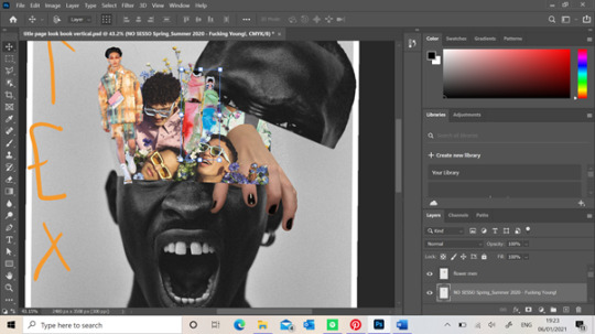
Here you can see where I've positioned this previous result. I've added my hand into the image aswell using the Lasso tool to remove the background. I have also added a Louis Vuitton campaign photo which takes up majority of the space. What I liked about this image was that the models not only had different poses which helps make make the work look more messily put together, but they were surrounded by flowers. When reading the article their intentions were to show the new popularity of men who aren't afraid of showing their “feminine” side, removing any toxic masculinity which I liked the concept of. I wanted to add this image to this particular page make it look as though it were the models thoughts which were completely different to his angry exterior. And I think how his head is now opened up and looked as though it is spilling out of his mind shows how dangerous bottling up these emotions can be and showing these trapped feelings doesn't cause anyone harm. Not only this but this image matched the colour palette quite easily as there is so many different colours in the palette rather than a few similar shades. I felt like I needed some more fashion content onto this page which is why I added the image on the left. The printed co-ord is by Wooyoungmi’s SS20 collection and helps gives the reader a glimpse of the potential garments within this trend.


I decided to create a mood board on Pinterest for this module as it find this app useful when finding relatable images to one another. When researching psychedelic art, I came across the Etsy artist Anna Sorokina that had created loads of abnormal editorials which I loved the idea of including in my work to show the abnormality of someone's thoughts when hallucinating into certain places within their mind. A piece of her work which inspired this stage of work is below. I started with a image of the ocean which I found of google. I realised a lot of these types of art were set in front of different landscapes which is what makes then so abnormal and what I might do throughout this lookbook. I used the Marquee tool to cut out thin, long rectangles of the ocean that could look like tears when I add them into the models eyes. I then used the Eraser tool to cut around any unwanted areas of the ocean around the models eyes so it looked more realistic. I realised that where these “tears” were positioned, they would flow over another models face. I decided to progress further with this step and use the Eraser tool again to neatly cut some of the ocean so the sunglasses on the models face were visible. This made it look like the tears were flowing behind the models eyes now which I loved the look of. I also kept the ocean image that filled the lenses area of the models face and used a filter on the right of the screen to make the ocean blend behind the lens. You can see above that the sunglasses still had their lenses colour but if you look closer you can still see the textures of the waves within the ocean image. Overall I loved this outcome of this section of the page as it further explains the emotions a man may not portray to others and keep trapped within themselves.
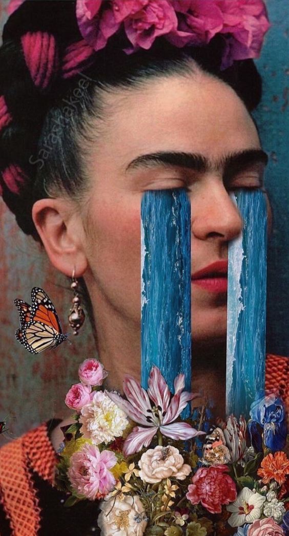

When looking at my work from far away, all the images blended in nicely which is what I wanted however not to the extent where you can’t see the different images. I decided to use the Pen/ Brush Tool to outline certain images with the colours from the colour palette so they were visible slightly. Also when adding the Louis Vuitton image on top the hand, a certain area fell over the top of my hand which I didn't want. I had to duplicate the image of the Louis Vuitton models and Marque the area I wanted and then used the Eraser tool to cut around the areas which covered parts of my hand. Doing this made it look like my hand was pressing into the flowers and reaching out over the models head. This could portray certain dark tendencies or triggers within a mind that influencing the need to escape. For instance a person may break their diet by eating some chocolate which was triggered by seeing it in their cupboard. Although this doesn't sound like the standard form of escapism you may picture in your mind, knowing the chocolate will give a person a short feeling of happiness from its taste, it is considered as escaping their everyday habits. As I stated earlier, I also wanted to add some sort of trippy art which I had already made in the back page of the book so I decided to add some coming out of the models mouth. When I finished this, I didn't really like how it looked against the other pieces of work so I decided against keeping this in my title page.

Here is the final result of the title page without any typography which I will complete in InDesign. I enjoyed creating this page because I hadn't really seen the any other lookbook laid out like this from the examples I've looked at. When showing this work to the tutors, I was slightly worried that there wasn't much dark psychedelia which is often perceived by a person however I didn't want to over think this as I know I will show this in the other pages of my look book. However, I will add aim to show some of this through the typography of the title name. One of my tutors also complimented my layout of the photoshop page, saying he hadn't seen anyone use a square page layout yet. Although I didn't plan on doing this any way and I just didn't know the ideal page size, it worked in my favour. This is because he said this size would be suitable for an Instagram post. I realised as because we aren't printing these out unlike previous years, it would be interesting if these where posted on social media instead as a way of showing the lookbook. As the world of work is taken over by technology, this could've been a cool way to show my look book to others if it was to be shown to businesses looking at trends, moving the fashion industry forward.
0 notes
Last Seen Blogs

nitoricons
nitoricons
plantwhore
sarah
they/them
rolandtowen
autistic katara my beloved
thedarkmongoose
thedarkmongoose

lorapopovax
Lora;