#it's amazing what a palette swap can accomplish
Photo
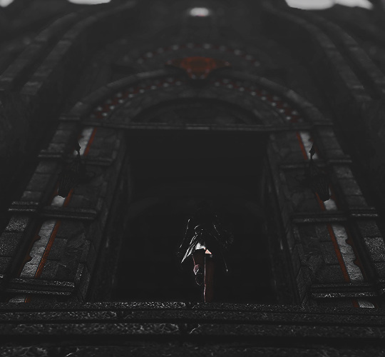

“be careful when you cast out your demons that you don’t throw away the best of yourself.”
― friedrich nietzsche
#ffxiv#ff14#final fantasy xiv#final fantasy 14#mateus#balmung#crystal data center#midlander#hyur#screenshots#piper fairfield#or maybe a nameless oc because im still smitten with her ;__;#it's amazing what a palette swap can accomplish
17 notes
·
View notes
Text
my thoughts on persona 5
ive had this in my drafts for like a month and i just now finished it so TAKE IT
THIS ISNT SPOILER FREE!!!! so only read this if you’ve finished the game/don’t care about spoilers. im gonna be comparing it a lot to persona 4 (and 2 / 3 to a lesser extent) so if you haven’t played it and dont want spoilers DONT READ THIS!!!!
i went into persona 5 with high expectations. i’ve been a big fan of the entire series for many years, and like everyone else, had been eagerly awaiting the delayed release of the game; and for the most part, i wasn’t let down. there are very few real issues i have with the game, and despite my bias toward persona 4 i can definitely say that this is the best installment in the series so far.
persona 5, much like p4 did with p3, takes the best things from p4 and improves upon them. you can tell that a lot of care went into this game to make it as polished as possible. all of the things that made p4 a great game are present and more. the characters are very fleshed out and diverse, just as in any persona game. the game also does an excellent job in making you feel connected to the characters. when the characters were plagued with anxiety, so was i. when the characters were depressed, so was i. it really made me feel immersed in the world.
the graphics are also obviously an incredible step up from the previous persona games. the game in general is absolutely beautiful. it’s so vibrant in it’s colors and constantly gives the impression of a bustling city environment. not to mention how stylish the UI is. it’s really apparent that the persona team utilized their resources to their full potential in how fluid all the menus are alone. the way loading screens and menu changes transitioned into each other was so stylish that it had me sifting through menus just to watch the animations. over all the art direction for this game has surpassed all other persona games so far. everything is so incredibly polished, from the cutscenes to the normal gameplay. i can only think of two or three occasions in which a texture looked off to me, and that’s mostly me just nitpicking.
i love the concrete theme of the game as well. from the personas to the social links, everything feels as though it ties together under the thief motif. i really loved that every social link fell under the theme of “someone who has been ostracized by society” and how it enforced the idea that the phantom thieves were necessary in this world. the way each social link has a coinciding mementos request made the social aspects of the game feel a lot more connected to the battle aspects, as well as the fact that social links can now grant you special battle abilities. the fact that they added this aspect is one of the best things added to the social link system in my opinion. it gives you more of a reason to try and max a character’s social link if you aren’t particularly interested in the character to begin with. (however, personally, i didn’t find any of the social links in this game to be uninteresting.) the way they incorporate maxed social links into new game+ is incredibly useful as well. it helps make you feel as though you really accomplished something in your previous play, as well as making you feel motivated to finish the things you were unable to last time.
the battle system and the dungeons are LEAGUES better than any previous persona game. the flow of battle is so much more fun; the baton pass ability brings a whole new aspect into battle. that and the ability to easily ambush enemies makes you feel as if youre really in control of your battles and makes it a lot more fun. i also love love love LOVE the battle aspects that they brought back from persona 2. demon negotiation was one of my favorite things about p2 and i was ECSTATIC to learn that they brought it back with p5. not only does it give you the ability to get exactly what you want out of battle, but it makes you really excited to fight new enemies!!! i was always really excited to get into a battle in a new area to see what personas i could recruit. the fact that youre battling the actual personas rather than the same palette-swapped shadows every dungeon is also super cool to me. it made me really excited to see a shadow that i recognized and be all “OH THAT’S SHIKI-OUJI!!!! I NEED THAT GUY!!!!”
dungeon navigation is so much more fun too. i can’t even begin to express how happy i am that they incorporated puzzle elements into the palaces. it made navigating them so much more fun compared to previous games where you just ran around hallways opening doors until you found the stairs. it made every dungeon feel different and unique, and most importantly really fun!! another thing i really appreciated was the ability to switch party members in the middle of a dungeon. it really encouraged you to use every party member rather than just sticking to a select 3 like previous games, in addition to making it a lot easier to keep your teammates balanced and around the same level. i found it really convenient to be able to just switch someone out when they were low on SP compared to having to either leave or use SP recovering items on them. it also made it a lot easier to finish palaces in a single day (if possible).
most of all though, the story telling elements in persona 5 truly live up to the standard set by previous persona games. my god, was the story telling in this game amazing. the foreshadowing was PHENOMENAL. every once in a while i was able to pick up on something small, and then when they pieced all those little things together at the climax HOLY SHIT. i was literally hyperventilating when they flashed back to goro mentioning the pancakes. the part where he first joined the thieves had me second-guessing whether someone else mentioned pancakes in that scene and i was just overthinking it. but when it turned out to be a real thing I WAS SO EXCITED!!!! not to mention the twist of the fucking century with igor being a fake. the entire time the tone of the velvet room felt off compared to the previous games, but it really didn’t become apparent until the true igor returned. once he did, and lavenza became herself again, i seriously almost cried because of how at home i felt in the velvet room. speaking of crying though... this game had me in fuckin tears on so many occasions. the character writing and development is so much. the way it makes you really feel like all the characters are good friends makes me so emotional. it’s such incredible writing, the way it sneaks up on you and before you realize it you’re fighting yaldaboath and you realize how much you love every single character in this game and you don’t want it to end.
now with all that praise out of the way, i do unfortunately have a few qualms with the game as well.
my firstt issue is how similar the structure of the story is to persona 4. the characters are all quite different, and the environment is drastically different, but the narrative, namely in the latter portion of the game, is strikingly similar to p4. that isn’t necessarily a bad thing per se, p4 is really good and p5 did an excellent job of improving upon something already great, as previously stated. however, due to my familiarity with p4 i was pretty much able to predict how the end of p5 was going to play out, more or less. because of this i actually was convinced that i had to call everyone up again to fight through one more palace on the last day, like with izanami in p4. it’s not the worst thing that they could’ve done, but i guess i just would’ve liked to see them create something a little more different.
now my BIGGEST issue is just a personal thing that im sure not everyone can sympathize with. however, it honestly kind of ruined the end of the game for me. nobody so much as mentions goro after his death. sae brings him up, like, once, and shido talks about him before you fight him, but.. thats it. he wasn’t even in the credits along with everyone else. it honestly broke my fucking heart. it felt like they all forgot about him. goro is my favorite character in the game, so im definitely biased, but still... i would have liked to see them at least bring him up in some of the more climactic moments of the ending, or just had some kind of mention of him other than “he’s missing”. i felt so empty when the game ended. it was a wonderful ending, dont get me wrong. i just... wanted goro to be there. im not saying that he shouldnt have died, (i mean, i would have liked it if he didnt, but it wouldnt have been necessary to make the ending satisfying for me) just that they at least acknowledge him more after his death. idk. maybe im just being nitpicky, but that really dampened the ending for me.
anyways thats it like comment and subscribe thanks
3 notes
·
View notes
Text
Internet Designing Tips
Website Design Tips:
Easy That's exactly how you would certainly like life to be, right? Particularly when you're creating a website by yourself. Yet that does not indicate you want the site to look serious and also simply useful. you desire it to be rather, wise and also react as well as relocate when you connect with it, while saying all that you wish to say to its site visitors. There are little pointers and Features incorporated into software just for people like you.
Love what Flash can do however do not recognize exactly how to utilize it? Macromedia considered you and built a feature right into Dream weaver that lets you create great animated Flash switches simply by getting in criteria. Intend to have button react to a mouse-over however have no concept or perseverance to create one with graphics software program? You can make a quick and easy mouse-over switch right from within FrontPage. What do you do if you require to enhance 150 pictures within an hour? No need to panic, image prepared can aid you out with a little bead. Take a look at the different tips that make life less complicated or better for you as an Internet designer.
- Animated Flash Button & Macromedia Desire weaver:
Dream weaver allows you develop some custom vector graphics from within the software application. You can make Flash and embed them right into your Websites. There are different sort of design that you can choose for these from the available set-play back kind of buttons.Arrow designed switch, buying cart switch And so on, or make some of your own.
Making a smart interactive button is basic in Desire weaver, choose insert-interactive Image-Flash Switch. Type the window that opens select different switch design by taking a look at the sneak peek photo below. Customize the switch the way you desire it by including the name of the button, the Font shade and also typeface dimension, after that specify the LINK that the switch has to connect to. The switch is conserved with SWF extension you can sneak peek the switch in your internet browser to see if it looks the means you want.
- Easy Mouse-Over Buttons:
Mouse-over as well as Front Page? Oh Yes. The software program has actually stopped a couple of hassle-free functions up its sleeve, among which is "Hover switches." Approved, these buttons do not have snazzy graphics they appear like normal button blocks, however they respond to mouse-over and you can archive it really just. Here's just how.
Select Insert-- Web element. in the window that opens up, choose Dynamic Impact in the element type and select the Hover Switch effect on the right. Type in the message that must appear on the button, select a typeface for the text, define the URL to connect to on clicking, and choose the dimension and color of the switch. In the drop-down food selection for Result, Radiance is the default selection. Attempt it-- you can pick the shade of the glow-check the button in preview mode-the button brighten when you relocate your mouse over it. There are several various other effects readily available that are worth checking out, particularly the bevels rather neat!
- Cool Results With DHTML:
DHTML or Dynamic HTML supplies some amazing results that could make your Web pages stand apart click? Or your web page to tons with a shift Effect? DHTML will do this for you in addition to various other little techniques. After you have actually constructed your Websites, from the menu bar, pick Format-Dynamic HTML Impact. A device bar shows up in the workplace. Pick an occasion from the very first fall listing. This might be on 'click' double-click.' Computer mouse over or web page tons. Depending upon the occasion chosen below, the next Drop-Down checklist supplies the possible effect that can be accomplished, This can be an adjustment in the shade as well as design of the font style if it is message, a border included around it, or in instance of a picture, you can change the photo with one more one by a swap.
Most of the effect toggle Meaning if there was a font modification on click, an additional click will certainly transform the font back to what it was previously. Nonetheless, some results are one-time like the going away act of a picture or button.you pick 'fly out' from the effects list for this. On 'page lots' you can have the chosen text drop in word by word, or hop in, spiral in, zoom out, and more. This is especially beneficial for promotions or parts of the web page that you wish to attract the individual's interest to.
- Animation Backwards:
You've made a computer animation making use of photo Ready-may be a tween of placement, opacity or results or a by hand put as well as adjusted computer animation backwards? No demand to re-tween or by hand position the structures backwards; simply click on the little arrowhead in the animated combination and also select Opposite Frameworks. You can additionally produce an elastic band result by duplicating the forward series (little arrow > copy Structures), pasting it at the end of sequence (little arrowhead > Paste Frames > 'Paste after selection ') and after that, by choosing the freshly pasted sequence and also using Reverse Frames on this.
- All It Takes Is A Droplet:
Intend to optimize a number of pictures with the same setups? Produce a "bead "and conserve time.
Open the maximize palette in Image Ready with your image open. Establish the optimization to what you want-file kind (JPG, GIF or PNG), quality (reduced, medium, high), lousiness, dither and so on while previewing the result in the "maximized" tab of the major in the Optimize combination. This creates what is called a "bead" which contains your optimization setups. Save this droplet anywhere you want, state on your desktop computer.
Currently drag the folder containing the pictures to be enhanced onto this bead. All the images in the folder will get maximized the method you defined. This might take a while depending upon the number as well as size of the images in the folder. You can likewise go down photos individually onto the bead.
- Exact Locations:
Wish to connect various components of a picture to numerous Links? You can do this by cutting the photo and assigning links to the pertinent slices, but the drawback of this is the lack of precision: piece is necessarily rectangle-shaped. Likewise, pieces are pieces of the image.
Claim you're dealing with a Web page for youngsters regarding the different parts of old castles. You would certainly like the parts-dungeons; moat, guard towers, therefore on-to have exact rollovers and links to ensure that the details is conveyed appropriately. Instead of pieces such a pictures and also set aside web links, make use of photo maps, pick the polygon Picture Map tool in Photo Ready as well as outline the component you intend to speak about precisely. Even circular picture maps function relatively well in some areas. You can change factors of the map edge after completing the shape, too.in the image map scheme, you can specify the LINK to link to along with ALT text. To preview your job, conserve Enhanced as a HTML documents as well as examine it in a browser.
- Enhance Your Web Graphics Quickly:
In spite of the cable Internet links as well as high-speed modems, Web graphics are still limited speed-wise. The websites that load fastest and also work most reliable have well-optimized graphics.GIF images are normally good for line drawings as well as illustrations while JPG ones are best fit for pictures. Besides file layout, there are different aspect that impact the enhanced picture like the 'lousiness'- the amount of data in the image that you agree to give up for smaller documents size-the number of shades you need minimum, whether you can have dithering or otherwise, so on.
In Photoshop, to check out various optimization settings, click Conserve for Web. A window opens up showing the present image in addition to various choices as well as menus on the right. in the image window itself, you can see 2 tabs: 2-up tab to see 2 versions-the original and the optimized-for comparison in addition to time needed to pack the photo according to numerous modem speeds. The 4-upshows you 3 variations versus the original. These previews serve and practical, as opposed to having to by hand save the photo repetitively in different methods and contrasting each of them.
- Making A Banner Advertisement:
We're all aware of banner advertisements that we see all over the Internet: a strip with an image as well as message that becomes one more as well as another conveying some information. Clicking this advertisement takes you to the website that the business is advertising for. You do not have to make use of GIF Builder or any other graphics software program to animate such an advertisement. You can make it quickly utilizing Front Web page. Select Insert-Web component-banner ad manger. In the home window that opens, define the size of the advertisement, the transition result, the variety of seconds to present each photo, the LINK to link the advertisement to as well as include the images you've prepared. That's it.
This feature might additionally be used you want to share a couple of photographs curled likewise be made use of when you intend to share a few photos or images yet don't desire the images to be save-able on the cline's side; right-click will not deal with these images. Although the pictures might be discovered in the cache, at the very least they will not have the ability to be copied straight.
0 notes
Text
Best-Kept Secrets: Favorite Design Decision

Besides the wonderful opportunity of peeking into vibrant and personally decorated homes each week, one of the things I enjoy most about the home tours here on Design*Sponge is that they essentially form a vast pool full of creative ideas, tips and tricks to be inspired by and learn from. I can't even tell you how many times I've thought to myself “I'm going to try that too!” or “Amazing - I would have never come up with that!” It's the clever solutions and personal touches that usually get me most excited.
Best-Kept Secrets is our new series where we gather design tips and creative tricks by people from some of your favorite home tours. We'll cover various topics and areas related to decorating or designing a home, and let you in on the most invaluable advice from inspiring individuals from past home tours who've tried it, lived it and loved it. To start off the series, we reached out to people from around the country to share the favorite design decisions that they have made in their homes. We'd love to know yours, too!
For me, leaving color out of my decor and instead using even more of it in my wardrobe has been my best design decision so far. Knowing that as long as I keep to my color(less) palette, everything I bring home, whether old and worn or shiny and new, will work wonderfully together. It has given me a sense of calmness I was missing in my previously saturated decor. That being said, I still love colorful homes, probably more so now that I can admire them freely here on D*S! If you scroll down you'll see some design decisions that are directly opposite to mine, which is perfect - we're all unique! -Sofia


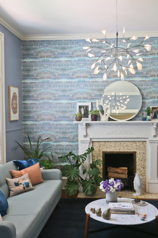
Batya and her family's Colorado home is a celebration of wallpaper and cheerful colors.
Portait by Matthew Eaton / @matteatonphotography, interior photography by Batya Stepelman
“I love the look of layered design that is personal. It can be accomplished by purchasing pieces over time (don't decorate all at once or you'll end up looking like you live in a showroom!), mixing high and low, bringing in unique art, and incorporating older personal objects [and] heirlooms with newer pieces (many of mine were made by friends). As I work on our space, layer by layer, I'm always cognizant of the people who actually live in our home. I'm a mother of two rambunctious boys who often bring their friends over - nothing can be too precious or delicate. We want to be comfortable when we entertain and enjoy our surroundings, which is why you'll never find anything white in my home!”
Batya Stepelman, founder of WallTawk / @walltawk
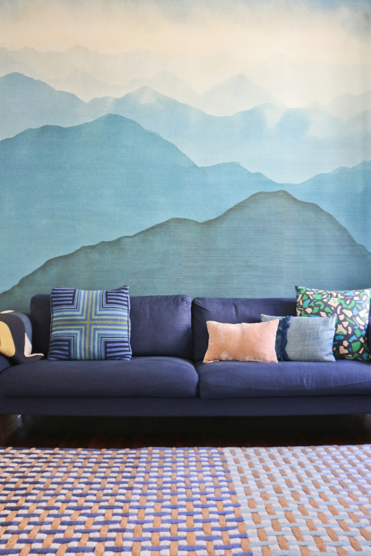
Wallpaper Creates a One-of-a-Kind Family Home in Colorado
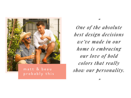
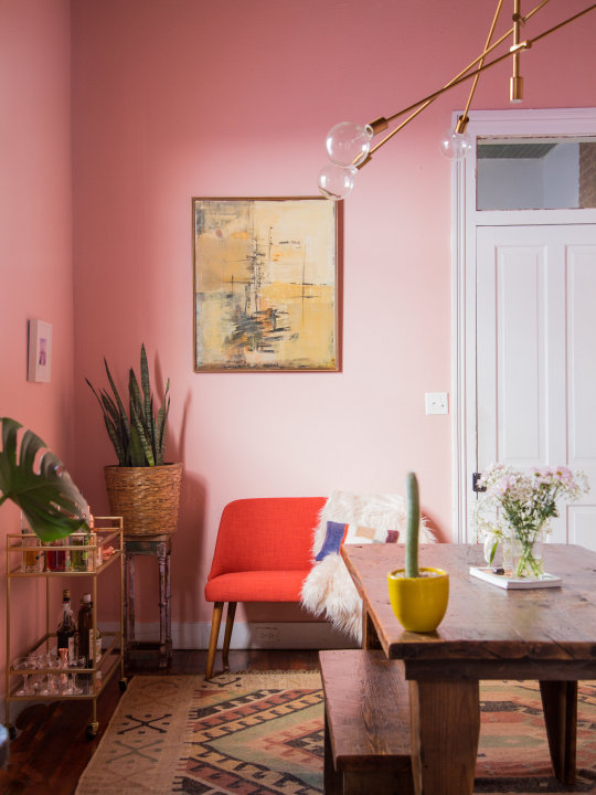
Matt and Beau wanted their living room to feel as fun and over-the-top as the dinner parties they love to host in the space. Photo by Matt and Beau / Probably This
“One of the absolute best design decisions we've made in our home is embracing our love of bold colors that really show our personality. In our last apartment, we both knew we wanted something over-the-top for our dining room because it's where we like to throw over-the-top-but-cozy and casual dinner parties, so we went and painted the entire thing pink (Mellow Coral by Sherwin Williams). Growing up, Beau always wanted a pink bedroom but couldn't have it because of the whole boys-don't-like-pink thing, so it was pretty important for us to embrace that desire and put a pink room somewhere in the house. The room was a conversation piece for anyone who entered, and it became a hit online. It's hard to be in a bad mood when walking through a pink room every day, or really any room that fits your particular desire, no matter how bold.”
Matt and Beau of Probably This / @probablythis
Before & After: A Vintage Camper's Revamp


Clara moved her living room from one space to another after living in and trying out her new home for six months. The new living room and arrangement is perfect for her needs. Portrait and interior photo by Banner Day Consulting.
“It's been about a year since I moved into my house and I'm still figuring out how to decorate each room. When we moved in, I furnished the designated dining room as the living room because it was adjacent to the kitchen, and it had the best view. If you saw my home tour on Design*Sponge, you can see the original arrangement. About six months in, I realized this was a mistake. Although we don't entertain too much, when we did, the busing of plates and serveware became a workout. It's important to experiment, try out different ideas, styles, and learn from the unexpected. Even if it didn't work out in this instance, I'm glad I did it this way. Although TV would tell you otherwise, designing a home to last takes patience, thoughtfulness and a bit of perseverance!”
Clara Jung, founder of Banner Day Consulting / @bannerdaysf
A Designer's Home In Berkeley, CA Is Warm and Inviting
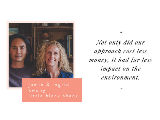

Jamie and Ingrid filled their fisherman's shack with made, found and swapped pieces. Interior photo by Luisa Brimble / @luisabrimble.
“The best design or decorating decision we made in our home was not actually a conscious one. It was more an extension of how we live and adhering to what we believe in.
We love the ocean and bush and have always felt a sense of responsibility to look after it. And we have always preferred old things over new - old furniture, old cars, old wooden boats and old houses. We fell in love with the shack because it's a place where we can combine our love of old things with our respect for the environment.
Hand-built by fishermen using timber and stone they found on site close to 100 years ago, the shack was simple and practical and aligned perfectly with our philosophy of being content finding only what you need, rather than forever seeking all that you want.
So to us, furniture didn't have to be from well-known designers, brand new, or the latest trend. It just had to work. Almost everything in the shack was repaired, recycled, restored, reused and repurposed. If we didn't already own it or couldn't find it secondhand, we just made it. Not only did our approach cost less money, it had far less impact on the environment. And when you look out the windows here, you become very aware of just how important that is.
The shack is our simple little shelter where we feel most at home, most connected to, most in awe of, and most protective over the environment and where we hope our family, friends, and guests do too.”
Jamie and Ingrid Kwong, owners of The Little Black Shack / @thelittleblackshack
A Respectfully Restored Fisherman's Shack on the Australian Coast
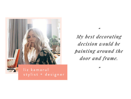
By painting the area around her front door, Liz was able to highlight the height of the room and create a colorful statement. Photography by Liz Kamarul.
“My best decorating decision would be painting around the door and frame. It accentuated how tall the ceilings are, made the door feel larger and all for a few dollars of paint. I always say that paint is the easiest and most affordable way to change a space and enhance architectural features!”
Liz Kamarul, stylist and designer / @liz_kamarul
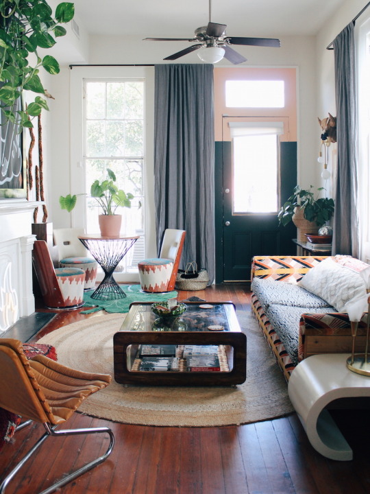
A Bohemian Apartment In New Orleans Makes Pattern Play Look Seamless
Before & After: A Drab Laundry Room Becomes A Bright Dining Nook
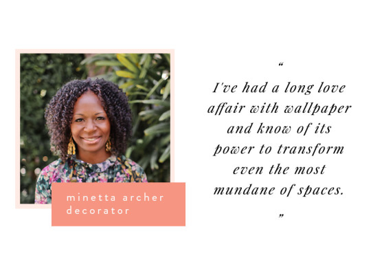
Minetta transformed her bedroom with golden wallpaper. Now, this room is her absolute favorite space in her New York apartment.
Portrait by Chelsea Prestin / @chelseaprestinphoto, interior photography by Minetta Archer.
“The best design decision I've made in my home was to install wallpaper. I've had a long love affair with wallpaper and know its power to transform even the most mundane of spaces. Being a renter, I really didn't want to deal with the product and installation costs or having to take it down when I moved. After attempting to do a stencil in my bedroom as an alternative and failing miserably, I decided to bite the bullet.
I had gotten a vintage German wallpaper sample from eBay and, as luck would have it, the seller had a few rolls available. It wasn't enough to cover the entire room as I had hoped, but with some strategic cuts and placements, we made it work. Four years later I'm so glad I made the decision. My bedroom is my absolute favorite room in the apartment. The wallpaper sets a very glamorous yet playful mood. It gave me the courage to take other design risks and to wallpaper many of the other spaces in the apartment. I wouldn't change a thing!”
Minetta Archer, decorator / @minettaarcher
A Harlem Rental that Fearlessly Embraces the Color Wheel

In her guest bedroom, Emily placed the bed in front of a row of windows - now the room feels spacious and centered. Portrait by Andy Cosnotti /@cloudandcolor, interior photo by Emily Cosnotti.
“Putting beds in front of windows! This seems like a total design mistake but if your headboard is lower than your window frame or is not solid and allows light to pass through, it can look great in front of a window. In both our master bedroom and guest bedroom, the bed in front of/under the window solution made a huge difference to the flow and feel of the room. I recently redecorated our guest bedroom and moved the bed from being squeezed into a corner to in front of a row of windows. Now it feels centered in the room, with space for larger nightstands and easy access to both sides of the bed. Every time guests visit they can't believe what a difference it made!”
Emily Cosnotti, stylist and photographer, The Sweet Beast / @thesweetbeast
Blush and Moody Tones in a Pittsburgh Home for Photographers
Before & After: Layers of Frills Become a Modern Board & Batten Powder Room

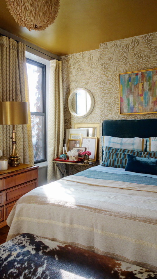
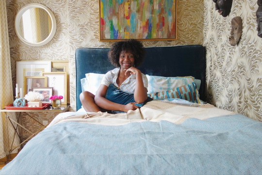
Splurging on a good bed made all the difference in Hannah's main bedroom. Portrait by Patchin Podes, interior photo by Shawna Ankenbrandt
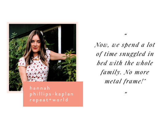
“I believe the best design decision I have made in my home was getting a great bed for our main bedroom. For years we slept on a metal frame, so when it came to decorating our new home I decided that my biggest splurge would be our bed. I am so happy we went for it. Every time I would walk into our bedroom before I would think about how we needed a new bed. It was constantly on my mind, and when you see something in your home that really bothers you it's a sign that it needs to be changed. We chose the Nest Bed from DWR with a beautiful wool cover, which can be switched out if you ever wanted to change the color of the bed. Now, we spend a lot of time snuggled in bed with the whole family. No more metal frame!”
Hannah Phillips-Kaplan, founder of Repeat + World / @repeatworld
Warm Minimalism in a Los Angeles Family Home

0 notes
Last Seen Blogs

miamlsunshine
Champagnemami

mysticsybil
Something stupid, I'm sure

ivaindia1
Institute
of Vedic Astrology
grapevynerendezvous
In The Eighth Year Trick's LPs

unshvded
𝐠.𝐬