#nick satinover
Text
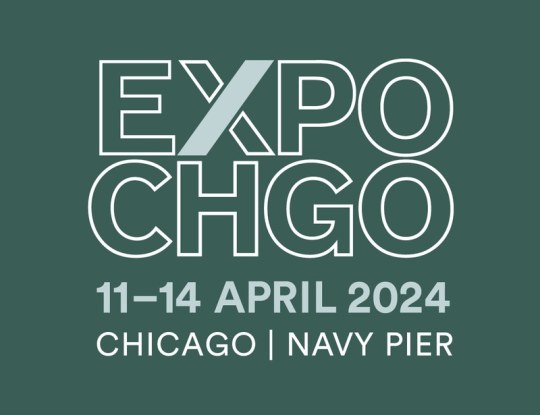
Manneken Press at EXPO Chicago 2024
[vc_row type=”full_width_content” full_screen_row_position=”middle” column_margin=”default” column_direction=”default” column_direction_tablet=”default” column_direction_phone=”default” scene_position=”center” top_padding=”10%” constrain_group_1=”yes” bottom_padding=”10%” text_color=”dark” text_align=”left” row_border_radius=”none” row_border_radius_applies=”bg” overflow=”visible”…
View On WordPress
#Anna Kunz#aquatint#Art Fair#Chicago#contemporary prints#etching#EXPO Chicago#Jill Moser#John Yau#Judy Ledgerwood#Kate Petley#limited edition#Matt Magee#monoprint#monotype#Nick Satinover#Philip Van Keuren#photography#photogravure#Richard Hull#Rupert Deese#Sarah Smelser#works on paper
1 note
·
View note
Photo
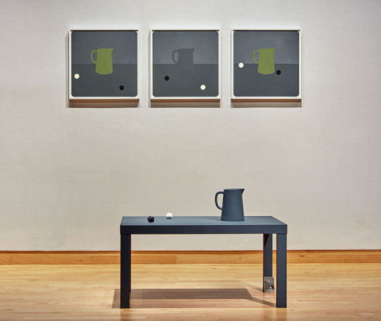
(image above: "Themes for a Left-Handed Pitcher", 2021: "Still Life with Left-Handed Pitcher (04-06)", 2021. serigraphy, pochoir, collage, acrylic ink, gouache on paper; "Left-Handed Pitcher Still Life (II)", 2021. particle board, acrylic ink, concrete, polymer clay; "Perfect Games (Theme for a Left-Handed Pitcher)", 2021. projected sound from single speaker. 9:00 min. (infinite loop))
While at Dunedin Fine Art Center to hear Ry McCullough’s talk, I was reminded of seeing this work at the USF Contemporary Art Museum last year as part of Skyway 20/21: A Contemporary Collaboration. The discussion was great and touched on a lot of interesting topics, especially around his use of collage.
From the gallery’s wall plaque about Themes for a Left-Handed Pitcher–
Inspired by the perfect game Los Angeles Dodgers’ pitcher Sandy Koufax threw against the Chicago Cubs in 1965, Themes for a Left Handed Pitcher engages compositional fielding of the domestic pitcher and black and white balls in a callback and comparative dialogue between sculptural objects and works on paper. Inviting playful and participatory discovery, the project includes an amplified palindromic sound score and a zine, which are both available to download. Interspersed with abstracted baseball references, the project evokes a change-up between the fabricated and found forms, the known and the unknown.
On McCullough’s website you can find the downloadable zine and the audio file mentioned in the description above and its a chance to check out more of his impressive collage pieces. For his most recent work, also check out his Instagram.
In addition to his independent practice, he is part of the collaborative project, small_bars, with artist Nick Satinover.
From the small_bars information page about the project-
Within their collaborative practice they explore the structural authority of their band name moniker, small_bars. This ambiguous name serves as an all-encompassing banner which simultaneously referencing pixels on a screen, lines of type of a letter press, halftone processes, and the physical clubs and venues their former bands played. As small_bars, McCullough and Satinover are able to generate a collection of collateral materials such as audio recordings, videos, printed ephemera, performative events, and structural arrangements, all of which support and expand the notion of what the moniker suggests. This collaborative effort seeks to use the form of a band-like entity to create a space where the acts of publishing, printing and performance co-exist.
#ry mccullough#florida artists#skyway 20/21#dunedin fine art center#artist talks#interactive art#collage art#collage#sculpture#pitcher#art#art shows#usf cam#usf contemporary art museum#florida art shows#tampa art shows#small_bars#nick satinover#sandy koufax#homonym#sound art#collaborative work#mixed media
0 notes
Text
Nick Satinover
Another exciting new addition to the official People of Print Membership is artist-printmaker Nick Satinover who resides just outside of Nashville in the ever-evolving middle Tennessee sprawl. Nick is an Assistant Professor of Studio Art in the Department of Art and Design at Middle Tennessee State University. Within this role, Nick teaches all levels of printmaking and covers all traditional processes as well as digital and experimental approaches to the medium. He is a father to twin boys (of course, multiples, right?) and pet-parent to an adopted kitten.
His work is informed by observations of the built environment, poetics, colour phenomenon and printmaking’s relationship to signage and didactic information. His current studio works utilise formal abstract language in conjunction with text to create images that create ambivalent visual experiences. Depth vs flatness, pattern vs gesture, chromatic vs achromatic, clarity vs ambiguity, compression vs openness are all strategies employed in his works. These dichotomies point to the negotiations people make as they experience the world which contains them.
Would you like to become a People of Print Member? Fill out this form to submit your application.
nicksatinover.com
from Blogger http://lamurdis.blogspot.com/2018/05/nick-satinover.html
0 notes
Photo
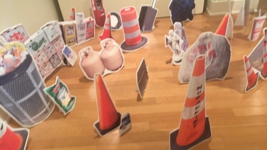


Today, I paid a visit to the STAMP Gallery to check out the (Sub)Urban exhibit. The exhibit featured artwork by artists Nick Satinover, Benjamin Rogers, Yoonmi Nam, Amze Emmons, Sang-Mi Yoo, and Christine Buckton Tillman. I enjoyed walking around viewing all of the interesting pieces. A lot of them were bright and vibrant and easily caught my attention. I really thought the 2D artwork on the ground(displayed in the top picture) as interesting, for it was something I had not seen before in the STAMP Gallery.
0 notes
Text
Davis Gallery Show Write-Up
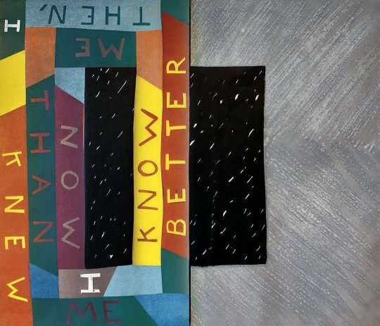
Walking into Davis Gallery I was unaware of which piece I wanted to focus on. As I walked around some more I noticed Nick Satinover’s A Pink Slip Fashioned Flag for Geneva bold on the far wall. Here I noticed a large, rectangular shaped figure that contained the words worry, and work, simultaneously scattered around the entire canvas. Within the figuration of the words, there were a few blocks that included diamond shaped, multiple colored, figures, breaking up the words drawing attention to another focal point of the piece.
The first aspect that captured my eye was the use of different colors and different scales in which the colors were displayed. On a large woodcut there were various different segments of the two words work and worry. Both the cutout words ranged in all sorts of different colors and sizes. Colors such as light green, dark green, pink, yellow, red, blue, black and really everything in between. In addition to the different colors and scales, some of the words that appeared on the canvas were strategically placed upside down. Something within the canvas that distorted my view of the piece was how some of the words were cut off and didn’t make it on the canvas. I appreciated that were was no main focal point, rather I was able to gaze my eyes throughout the entire canvas, grasping as much as I could when thinking about the artist’s intentions.
0 notes
Text
“Signs and Signifiers” Write-Up
Signs and Signifiers Write-Up
10/15/17
The new art show on display at the Houghton House, “Signs and Signifiers” has quite a powerful display bringing together a culmination of work from multiple artists. The message is very simple but important as well. Nick Ruth explained that signs are everywhere, and we are constantly overlooking them, but they play such a significant role in our daily lives that we shouldn’t be ignoring them. It is amazing how much control a simple stop sign has in our life, and its ability to keep us safe, yet we never really think about it. In putting together this show, awareness for such signage has been brought forward in a very creative way.
One of my favorite pieces in the show was Oli Watt’s No Parking which simply has 6 identical No Parking signs in a sequence with the background color of each ranging from yellow to red. The simplicity and presentation of the piece was a highlight for me, and I could see a whole series of color sequenced signs put together that would be very successful in bringing attention to regular signs.
Another piece I loved was Nick Satinover’s A Pink Slip Fashioned Flag. The combination of the different presentations of the words “Work” and “Worry” are not only visually pleasing in their array of colors and sizes, but also do a good job of playing with the idea of the stresses that come with working. I think it is interesting that Satinover decided to include multiple diamond shapes through the piece, and I would like to know why he included them.
Overall, I believe the entire show works very well together. I would love to see more work like this, and I think it could be really powerful for artists to put on more public displays in which they alter signs or even possibly a billboard series. It would not only bring attention to the individual artist’s work but also achieve the goal of the “Signs and Signifiers” show, to bring attention to the overlooked signage in our everyday lives.
0 notes
Photo
Introducing a new artist at Manneken Press, Nick Satinover. Pictured is “Time Is A Distance (4)”, 2020. Lithograph on kozo paper, edition of 5. 14.75 x 17.25 inches. Check out the selection of prints by this artist at Manneken Press. #limitededitionprints #artprintsforsale #artprintsonline #artprint #fineartprint #fineartprintsforsale #fineartprinting #originalprint #printcollector #signedprint #NickSatinover #mannekenpress #clevelandfineprintfair #collectprints #textinart #timeisadistance #lithograph #limitededition #worksonpaper (at Manneken Press LLC) https://www.instagram.com/p/CUDkXrxBfTK/?utm_medium=tumblr
#limitededitionprints#artprintsforsale#artprintsonline#artprint#fineartprint#fineartprintsforsale#fineartprinting#originalprint#printcollector#signedprint#nicksatinover#mannekenpress#clevelandfineprintfair#collectprints#textinart#timeisadistance#lithograph#limitededition#worksonpaper
3 notes
·
View notes
Photo
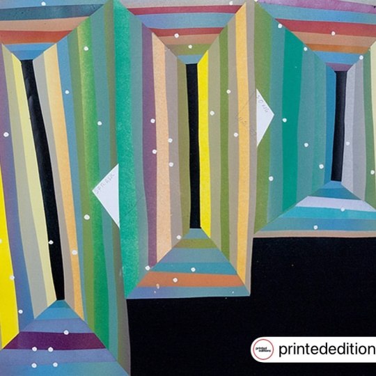
“Sprawl Song” by Nick Satinover available at Manneken Press. Lithograph 2017 Edition Size: 5 14.5 x 16.5 inches14.5 x 16.5 inches Signed Interested in this piece? Contact @mannekenpress #artistsoninstgram #artwork #artoftheday #fineart #collectprints #interiordesign #contemporaryart #contemporaryartist #worksonpaper #kunst #artonpaper #printmaker #printmaking #fineprint #artprint #artista #artgallery #artgalleries #originalprint #modernart #modernartist #modernartists #artcollector #NickSatinover #sprawlsong #lithography #limitededition #artcollector #printcollector #text (at Manneken Press LLC) https://www.instagram.com/p/CVJ4XnbMDbl/?utm_medium=tumblr
#artistsoninstgram#artwork#artoftheday#fineart#collectprints#interiordesign#contemporaryart#contemporaryartist#worksonpaper#kunst#artonpaper#printmaker#printmaking#fineprint#artprint#artista#artgallery#artgalleries#originalprint#modernart#modernartist#modernartists#artcollector#nicksatinover#sprawlsong#lithography#limitededition#printcollector#text
1 note
·
View note
Text
Nick Satinover
Another exciting new addition to the official People of Print Membershipis artist-printmaker Nick Satinover who resides just outside of Nashville in the ever-evolving middle Tennessee sprawl. Nick is an Assistant Professor of Studio Art in the Department of Art and Design at Middle Tennessee State University. Within this role, Nick teaches all levels of printmaking and covers all traditional…
View On WordPress
0 notes
Last Seen Blogs

dreamspacemodulardesigners
Untitled

treasuresjewelry
Treasures Jewelry ®
hararatshop-ir
Donyaye Hararat Store
astercontrol
Aster
interstellarsushi-blog
OC Bound